Repositioning a leading healthcare technology brand
Guiding the brand evolution into the next step of the business
Sector
Discipline
Client
Dr Foster
Year
2018
Dr Foster are a healthtech company who work with clients to deliver solutions and actionable insights that drive decisions on the quality and value of connected healthcare.
The Dr Foster brand became part of Telstra Health, a business unit of Telstra Corporation (Australia’s leading technology and telecommunications company) in 2015.
We worked closely with Dr Foster and Telstra Health to help with the co-branding, strengthening the brand and reinforcing Dr Fosters position as a leading healthcare solution provider and data insight expert.

An updated look
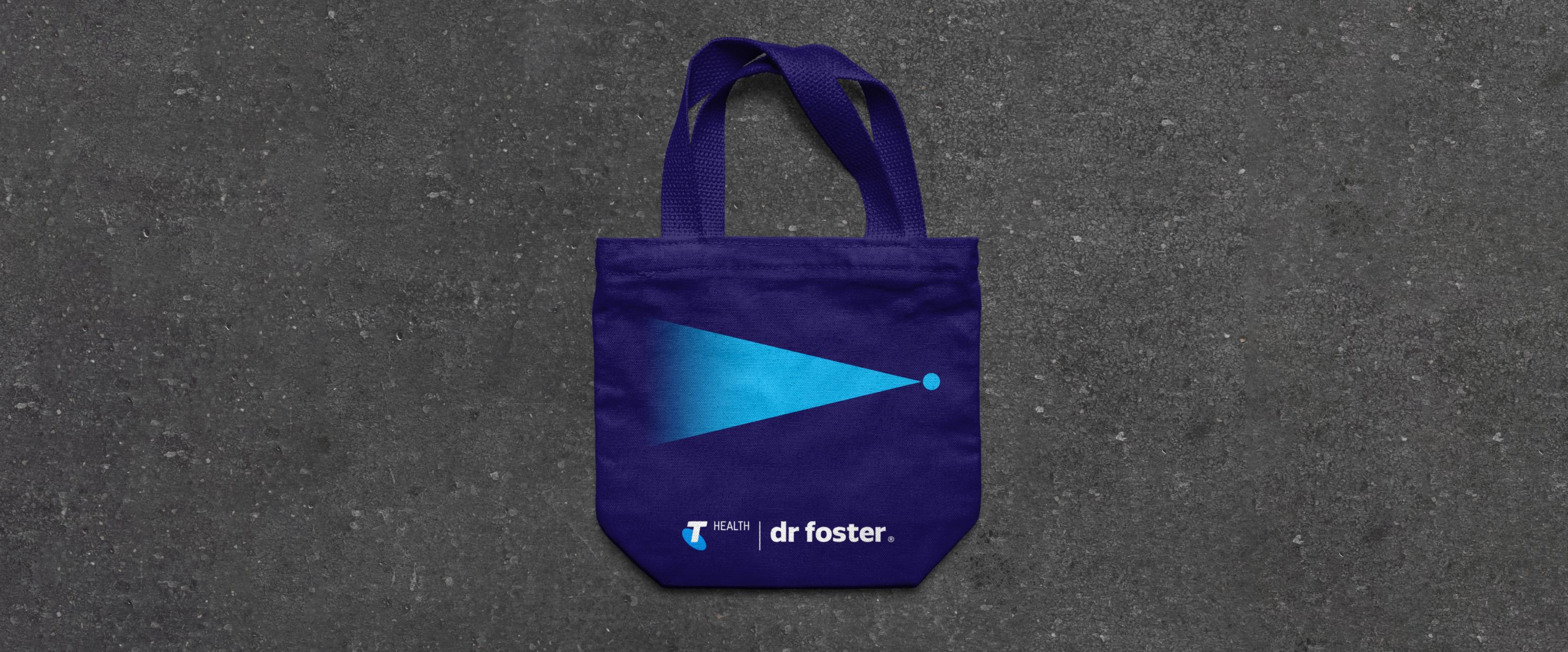
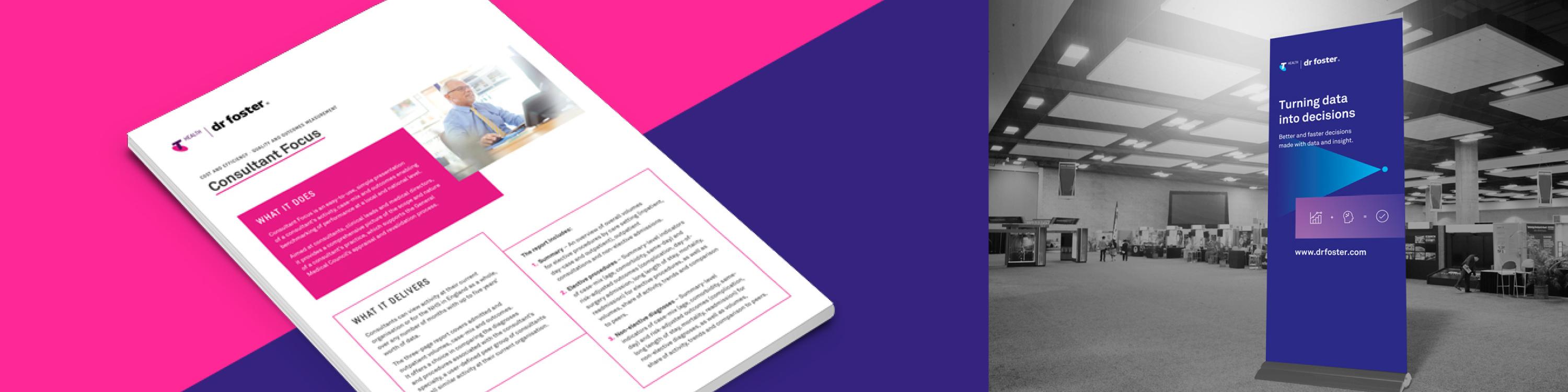
With the newly refreshed and re-energised positioning of Dr Foster an updated visual style was required to reflect this. While maintaining the connection with Telstra Health, the opportunity arose to create a new look for the brand. A bold visual style was developed that would introduce new energy and vitality into the brand. A more dominant use of typography and strong colour was created along with simple geometric forms to aid in brand messaging.
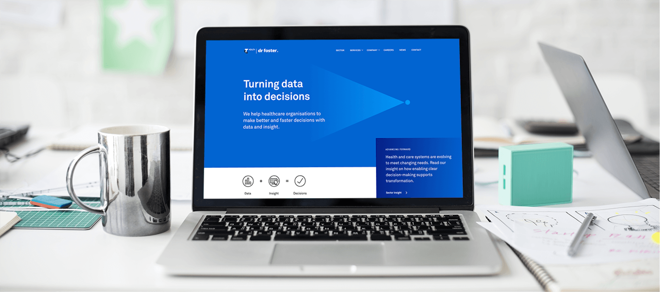
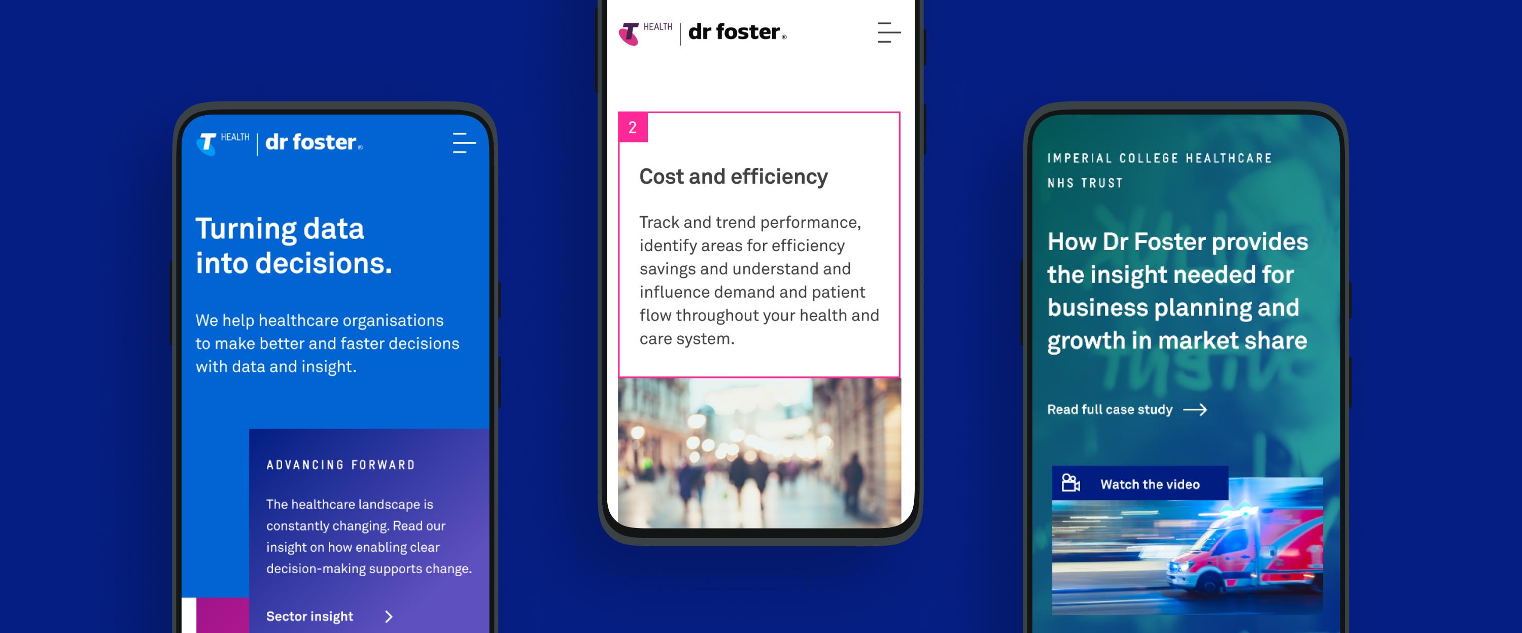
The concept of Turning data into decisions was introduced as a tagline and is visually represented by the shape of the triangle, open on one end and flowing into a single point. This helps to signify the vast array of data insight that help enable a decision and positive change to occur for the end client.
A refreshed website, powered by WordPress
Our approach to the redesign of the Dr Foster website was to strip away unnecessary content and help to clarify the core messaging and brand presence. The previous website had become outdated and required a complete audit. Extensive site mapping and wireframing led to a clear structure and systematic approach throughout. The site was designed using a modular approach with the reuse of a group of key components across the whole site. This helped enable a simple user CMS where the client is confident and free to make modifications to, or to add new content, to the site.
Brand application
In addition to the new website the brand has been rolled out across a range of media and applications. This includes an updated stationery set, infographics, banners, wall graphics and various brand collateral. A consistent approach to the brand styling has been carried throughout all applications of the brand. A Brand Book to be used internally was created to showcase the new brand along with the updated positioning, mission and values. This helps to incapsulate how the brand has developed and moved forward.