Humanising hearing tests, using the sound of birdsong
We designed and built Hearing Birdsong, a pioneering tool to assess hearing loss at home
Sector
Discipline
Client
Kennedy Woods, Design Age Institute
Relevant links
Year
2022
Hearing loss is an unaddressed issue for millions of people. It can make conversations and social interaction harder, increase isolation and is linked to cognitive decline and increased risk of dementia. More than 40% of over-50s have some level of hearing decline. At work it can stop people fulfilling their potential or force them to leave or retire early. Yet most of us don’t go for hearing checks. There is social stigma and fear attached, not helped by a mechanical clinical process.
Kennedy Woods – a social impact architecture and design practice – wanted to change this. Addressing hearing loss is a huge untapped opportunity for long-term cognitive health, productive extended lifespans and improved quality of life. Co-founder Tom Woods came up with the idea of Hearing Birdsong, a new way for people to explore and monitor their hearing that revolutionises the current clinical process. It humanises screening by using pleasant, familiar sounds of nature and birdsong and it’s done in the comfort of home, so that people can assess and protect their hearing health and long-term wellbeing.
The concept was awarded a grant by the Design Age Institute to develop it into a working digital prototype. Studiomade won the competitive tender to partner for both the design and development build of this innovative and pioneering product.
The result is a collaboration between Studiomade, researchers, engineers, designers, developers, clinical practitioners, volunteers, experts from UCL, Imperial College and the Dyson School of Engineering and people with hearing loss. Hearing Birdsong was exhibited as part of the Design Museum’s Future of Ageing exhibition in 2022.
What we did
Audio soundscape
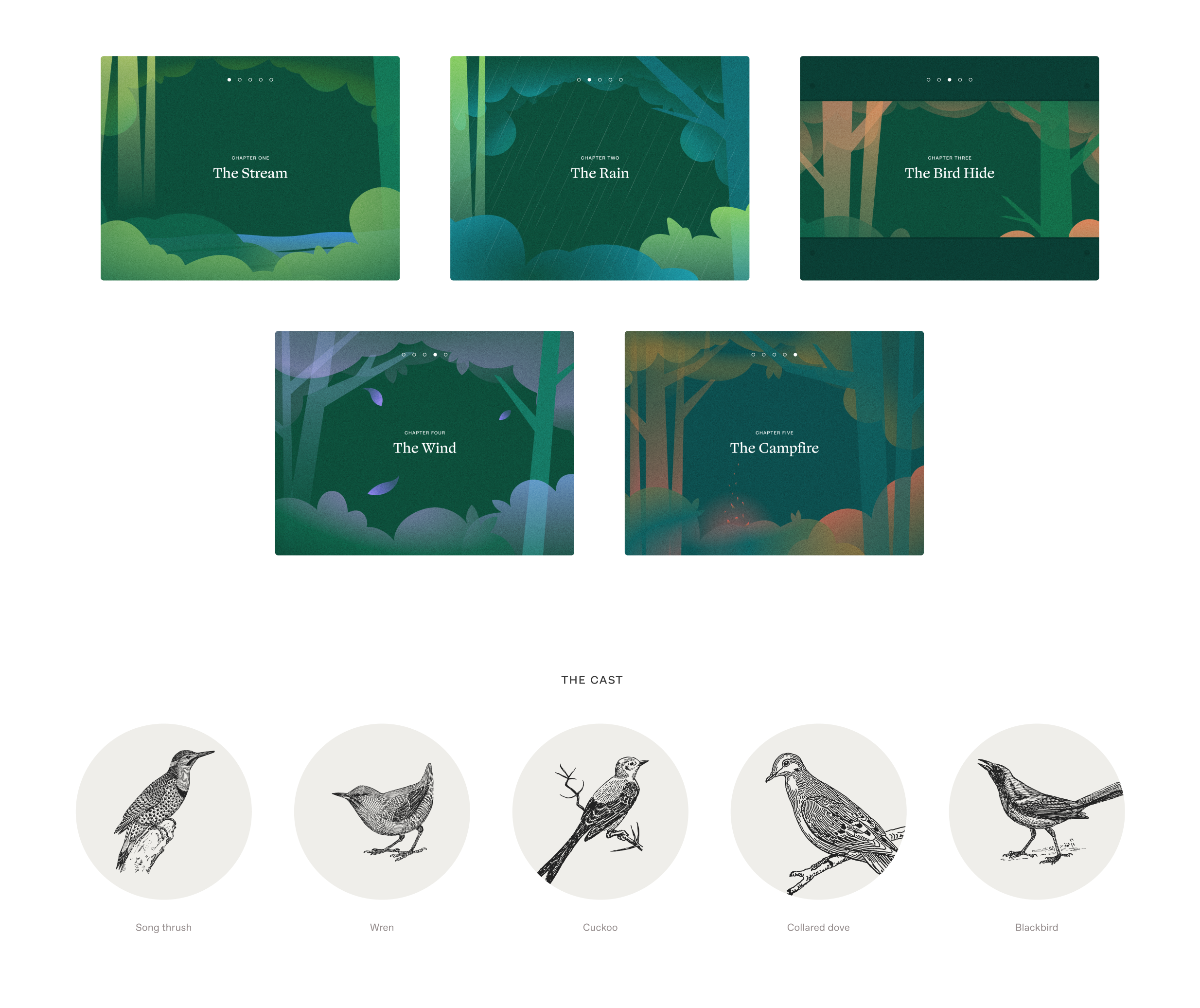
We replaced the mechanical, abrasive sounds of a pure tone hearing test with a richly detailed forest soundscape: the songs of five familiar British birds alongside successive sounds including a flowing stream, rain and wind. These were engineered to blend into a dynamic yet calming audio experience. It uses bird calls that occupy a narrow band of frequencies, the same frequencies examined in a traditional hearing test. This gives users performance indicators across their entire hearing range.
We worked with Professor Adrian Davis OBE, a scientist specialising in the public health aspects of hearing. He helped us define the logic and select which type of hearing test to use within this format. We also consulted with prominent consultant otorhinolaryngologist Taran Tatla. The audio was created and output by Oscar Jones, a PhD student at Imperial College London.

Language and safeguarding
This experience was intended to provide a less abrasive option than the traditional hearing test, so we didn’t want people to feel isolated or scared by potential issues. The product had to be supportive as people did the test and received their results.
The language we used in the script had to be accessible and feel natural to as many people as possible. Based on interviews with key stakeholders, we made decisions throughout the process to adapt the language to resonate with the intended audience. For example, we used the word woods instead of forest as it was felt that forest can conjure up images of a dark and intimidating setting.
Design, development and user testing
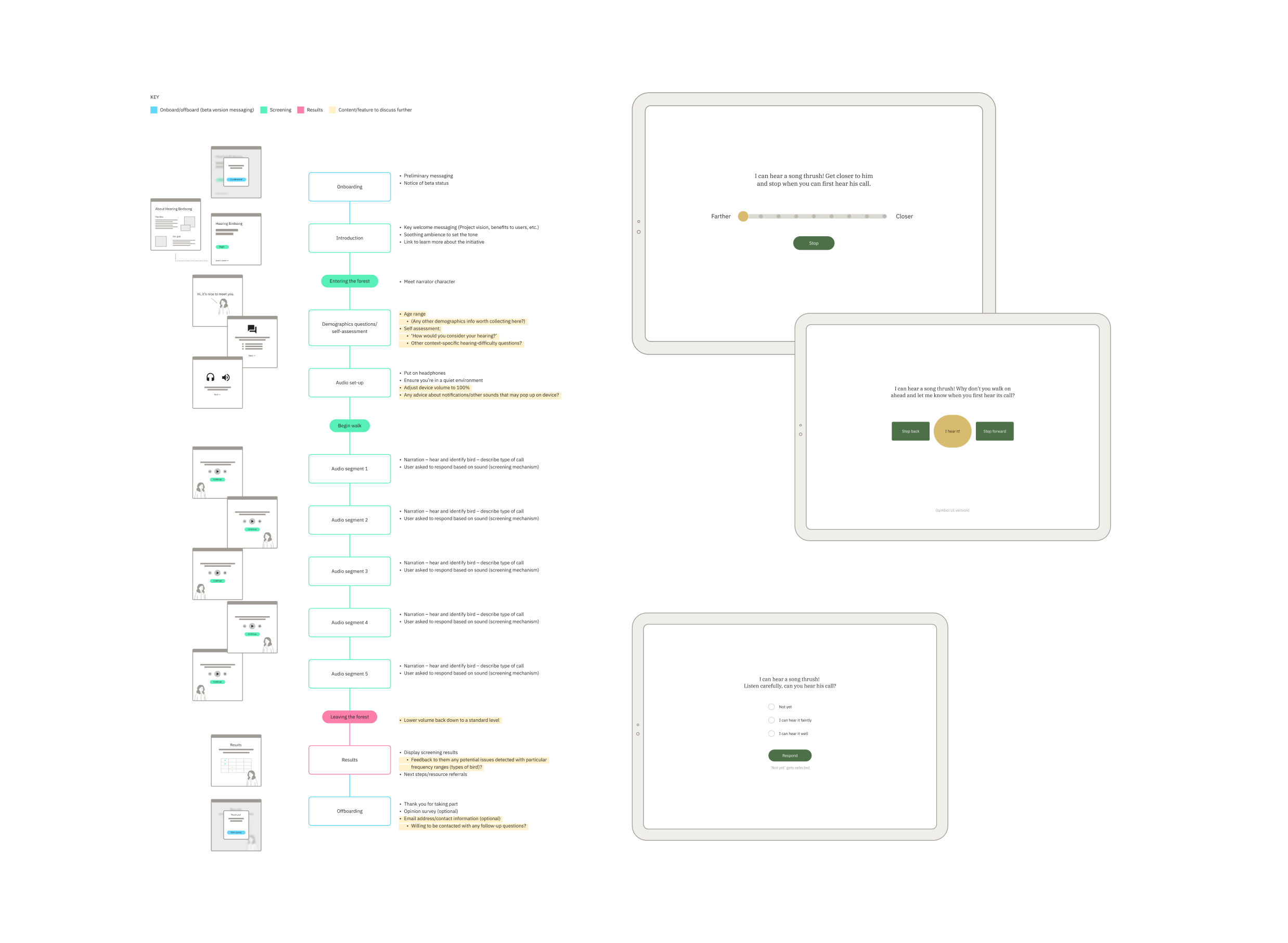
We developed a journey through woodland, deciding what scenes the user would go through, and what sounds they would hear at each stage. We designed screens, buttons and language.
Throughout the project, a control group tested our design and development iterations. What elements were visually distracting? What language was inaccessible or off-putting? How would users with hearing aids interact with the tool? We also worked with people in one-on-one sessions to test elements including logic, timings, the visual look and overall feeling.
This gave us many insightful observations. We brought all of these into our work as we progressed and built a refined experience that would meet our audience’s needs.

Approach to UX and UI
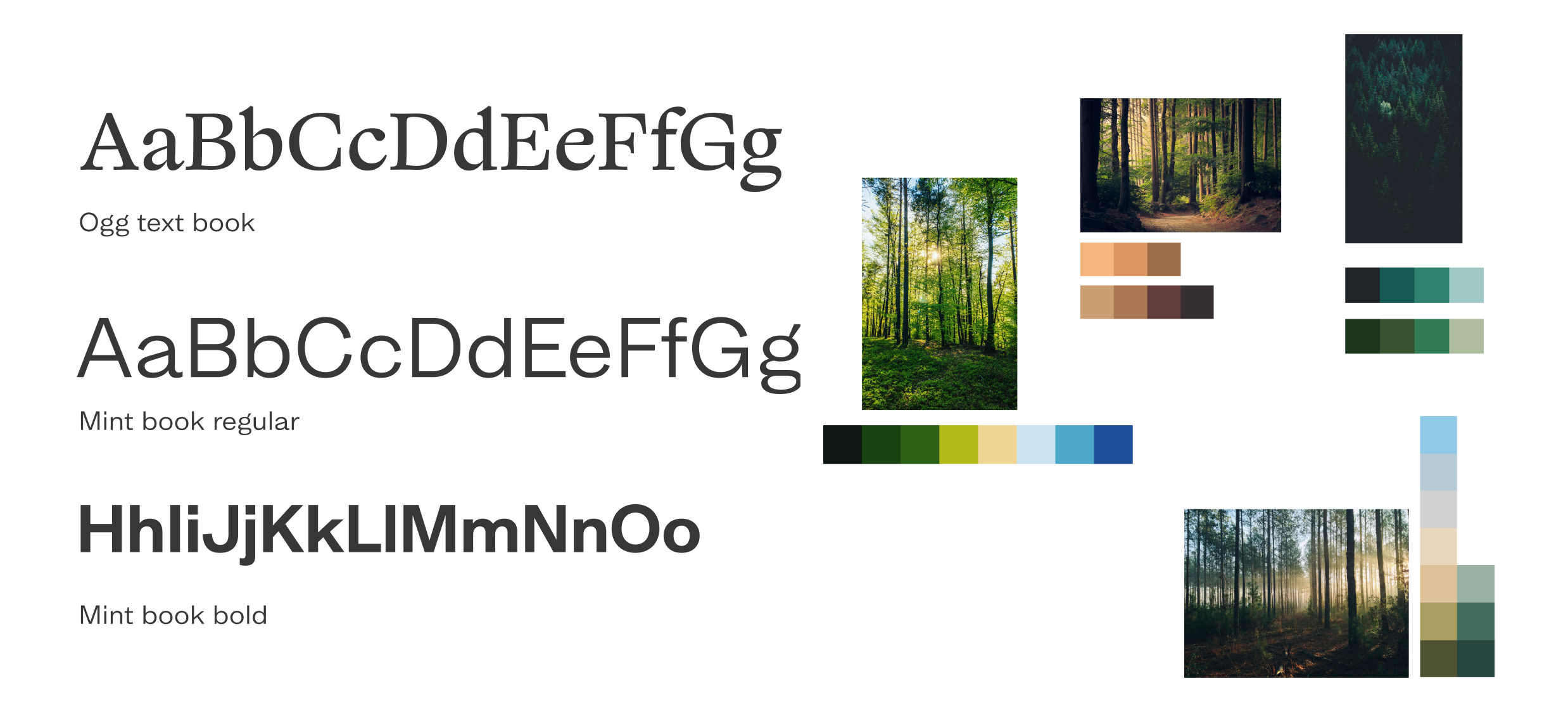
Design accessibility was essential. We looked closely at typographic choices, colour (contrast accessibility and legibility), illustrations, and the size, clarity and consistency of interactions. We wanted this online woodland to feel immersive and calm, so we used soft colour transitions, simple shapes and movement to create a playful world inspired by children’s storybook illustrations.

Pairing visual design and audio
The audio soundscape required a visual and illustrative approach that enhanced the user’s experience but kept the focus on the sound. We drew all the illustrations, crafting a series of options before arriving at the final selection used in the beta product. At points when users are asked what they hear, we softly blurred the background illustration in order to keep the focus on the sound, not the scenery. We decided not to show birds, so that people wouldn’t be prompted to say they could hear them and could use their imagination.
The results screen
It was important to get the results screen right. The explanatory language has to be clear and concise, and graded results can’t be confrontational or judgemental. We give a clear result for each stage of the test and link to external helpful resources where users can go for expert advice. Over time, as the product is used and feedback is gathered, we’ll gain further insight and be able to tailor it to effectively support people who need help.
The outcome
Consumer appetite for digital health support is growing. Digital health solutions are creating a hospital-without-walls approach that blends in-patient care with alternative models including community and home support.
We successfully designed and built a working digital prototype and took Hearing Birdsong into its beta phase.
Through media coverage, online and social media campaigns and the Design Age Institute, thousands of people in 100+ countries used it. Multiple contributors have all helped to get it to this point as a working digital product. The project is now ready for funding and future expansion and development, with the hope that it could become an NHS screening tool.