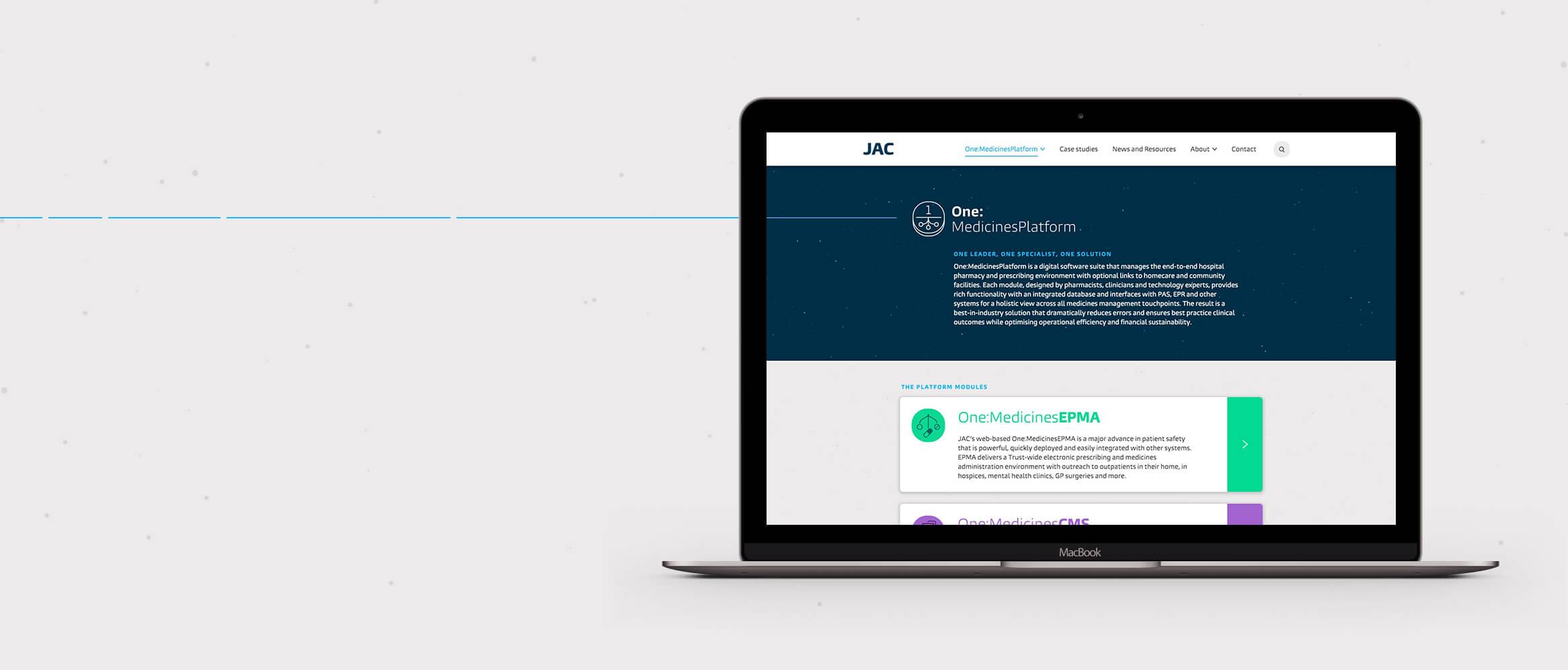
Repositioning a leading medicines management company
A brand update and cohesive digital proposition for JAC
Sector
Discipline
Client
JAC
Year
2017
The challenge
JAC is a global medicines management company providing bespoke solutions for hospitals and care providers, to increase patient safety and aid patient care. But with a disparate approach to discussing each of its products, there was a commercial need to create a single tone of voice and concept around its proposition, with nuances for individual products.
We were selected to update JAC's brand and create a cohesive digital presence that would be a stronger showcase for its unique and life-saving products.

Rebranding
JAC defines itself by offering the most advanced solutions within its marketplace and furthering patient care. Our branding process included a number of workshops to gain stakeholder insights from the JAC team.
The personality and positioning for the brand had to centre around its scientific nature and the focus on precision. To visually communicate the idea of advancing, progression and motion we used a moving line for digital and a broken line, to suggest movement, for printed materials.
Our new approach elevates the insightful work and services that JAC provides, underlined by the mantra of "advancing medicines management".

Iconography
To represent different aspects of the core offering we created two icon sets for the product suite and other aspects such as interoperability, to better communicate JAC's offer. We used the Burlingame typeface, as its curvature and personality counterbalances the clinical aspects of the site. We harnessed the curves of the letters to create icons which, like the font, are not perfect circles.

Consistency
To maintain consistency across all platforms we helped to direct the brand implementation, setting the tone and best practice for how the visual style and system works. We documented the stylistic details, such as corner radius on brand elements, type sizing, line weight and other dos and don'ts.

Photography
We chose two photographic directions: inspirational star images that include a sense of motion alongside location, or real-world scientific photography. These reflect the personality and aim of patient care at the heart of the JAC brand. This equipped JAC with all the elements needed to effectively communicate the brand across all platforms and mediums, physical and digital.

Outcome
The new identity gave JAC a stronger positioning and consolidated how it presents its product range. By uniting these under the One:MedicinesPlatform, we established a narrative that can be more easily communicated to customers. Our design approach has elevated JAC’s website, with a clear structure and a strong visual style focused around user experience. This work significantly contributed to JAC's acquisition after launch.