A refreshed brand identity and website for an industry heavyweight
Positioning MediaSense; a global media advisor
Sector
Discipline
Client
MediaSense
Relevant links
Year
2020
Design and brand exploration
MediaSense are a global media advisory company working across multiple facets of the industry and delivering a wide range of services. We worked with them to create their previous brand presence and website which featured a bright palette taken from the colours within the logo as well as vector iconography that signposted the services available.
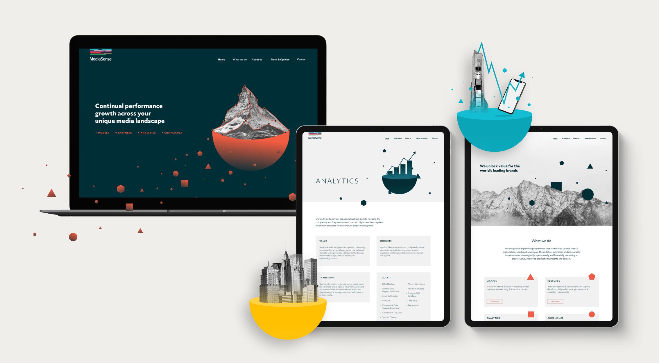
MediaSense have grown exponentially since we last worked with them, setting up new offices and over doubling its workforce alongside being responsible for some of the largest media pitch processes conducted globally. We wanted to reflect this by creating an assertive, beautiful new digitally focussed brand presence. In retaining the brand equity that they have, we left the logo untouched and looked to develop a contemporary visual style that better reflects their position as leaders within their market.
With a central message of continual client growth across the media landscape, we wanted to establish a visual style that reflected the company’s attention to detail, focus and exemplary execution.


We initially explored creating a ‘media landscape’ that could then have elements of analytics or data set within it – the idea of parts becoming a whole. We investigated the use of patterning to show the concept of growth also using the shapes as flexing holding elements for content and utilised cinemagraphs to demonstrate continual performance, complemented by photography of nature.

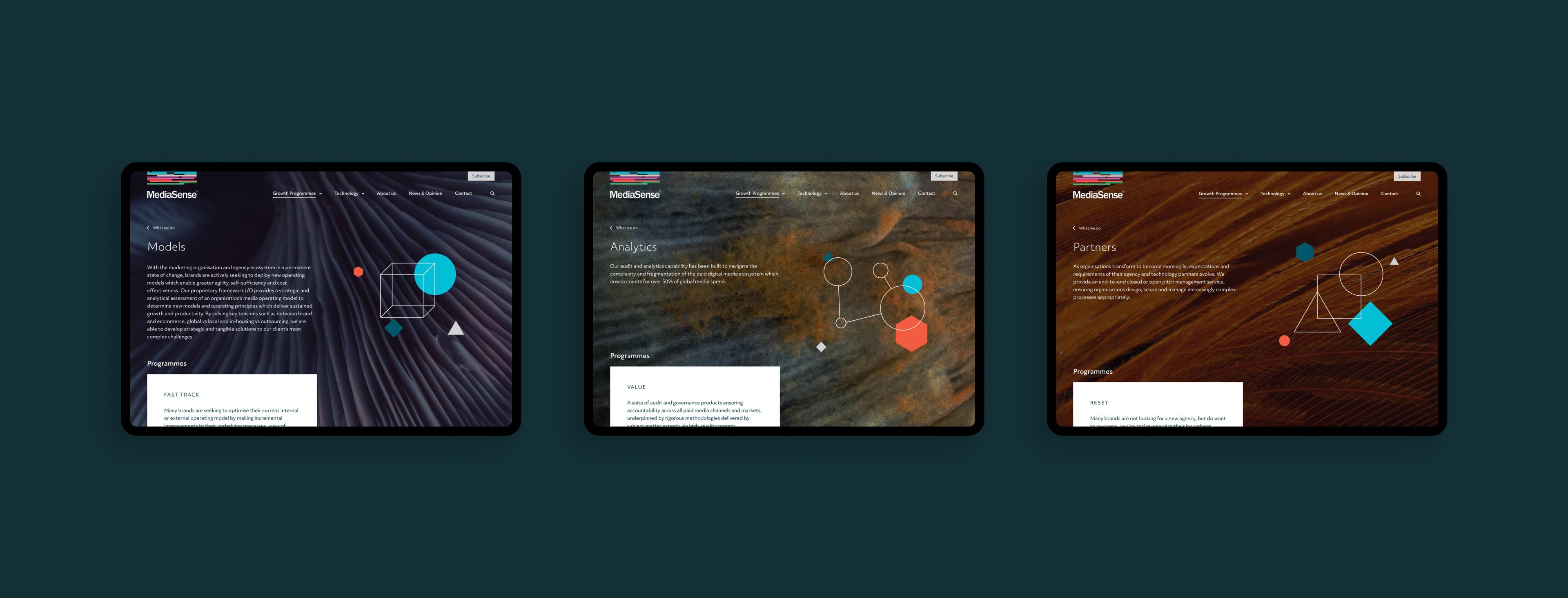
The client responded positively to macro image use alongside incorporating unique illustrations and animations representing each service area. The use of macro photography allowed us to use visuals in a textural way, giving that calm feeling that nature brings while still creating something visually interesting and different.

The role of animation
We wanted to incorporate animation within the digital presence to reinforce the sense of evolution and also to bring interest for users. Within the conceptual work we were considering how and where animation could play a role not only on the website but also in wider brand engagement.
Social video generates 12 times more shares than text and images combined and so we wanted to give MediaSense animated elements that would allow them to talk around their services or key brand stories such as their ‘Media 2020’ report – gaining maximum traction. The continuity between the website and marketing also helps to strengthen brand engagement and increase notoriety.
As we began to execute our chosen creative direction, we developed a delicate illustrated approach to represent each service line – this lent itself perfectly to animation. The clean strokes weaving, rotating and sliding in and out of each other playing with depth and shape, overlaid on macro photography.
Digital functionality: powered by WordPress
As well as looking visually arresting and providing a clear overview of the services that MediaSense provide, the website remains a business tool, portraying an interesting and professional look and feel to the media world. MediaSense actively generate insightful content and analyse the media landscape. Showcasing this content in a meaningful manner was important. Our digital team created a truly bespoke experience, powered by WordPress as a Content Management System.

Brand guidance
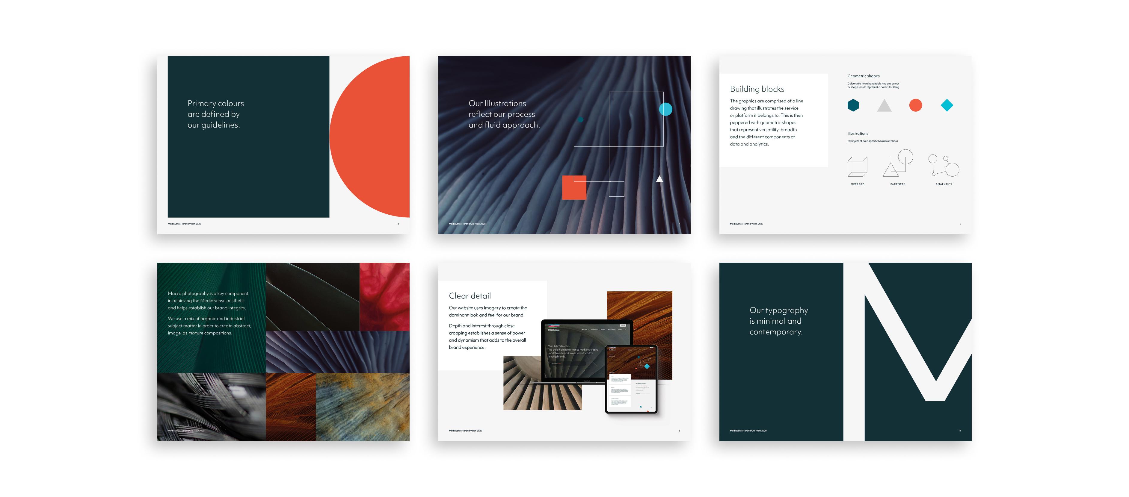
In order for a brand to be successful it has to be easy to use and the company has to be invested in ensuring best practice. Empowering internal teams about the new look and feel can really enhance sales and company pride. We created a vision document that highlighted key elements of the brand and how they were used to share within MediaSense.

