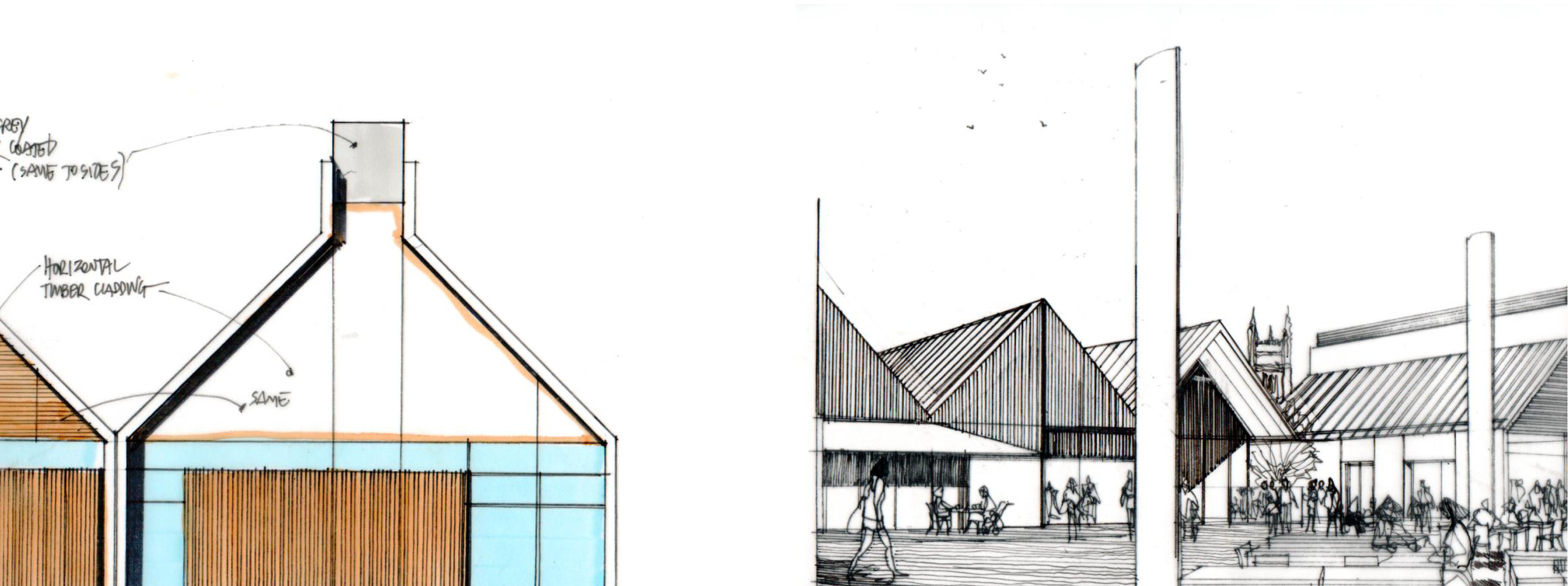
An architecture design practice established in 1985, PRC currently operate with three UK offices (in London, Milton Keynes and Woking). Shortly after moving in next door to us (hi neighbours!) they knocked on our door asking to borrow a cup of design & development expertise. We happily obliged and have enjoyed working with their team for the past few months building a new online portfolio and revitalising the approach to their brand.
Brand review
Our work on their site began with an examination of their current brand presence. As an established practice with years of history, they had a trove of past work and had accrued many different ways of referring to it internally and putting it on display for potential clients. We worked closely together to find the right foot to put forward and what traits were paramount to their vision for the company.
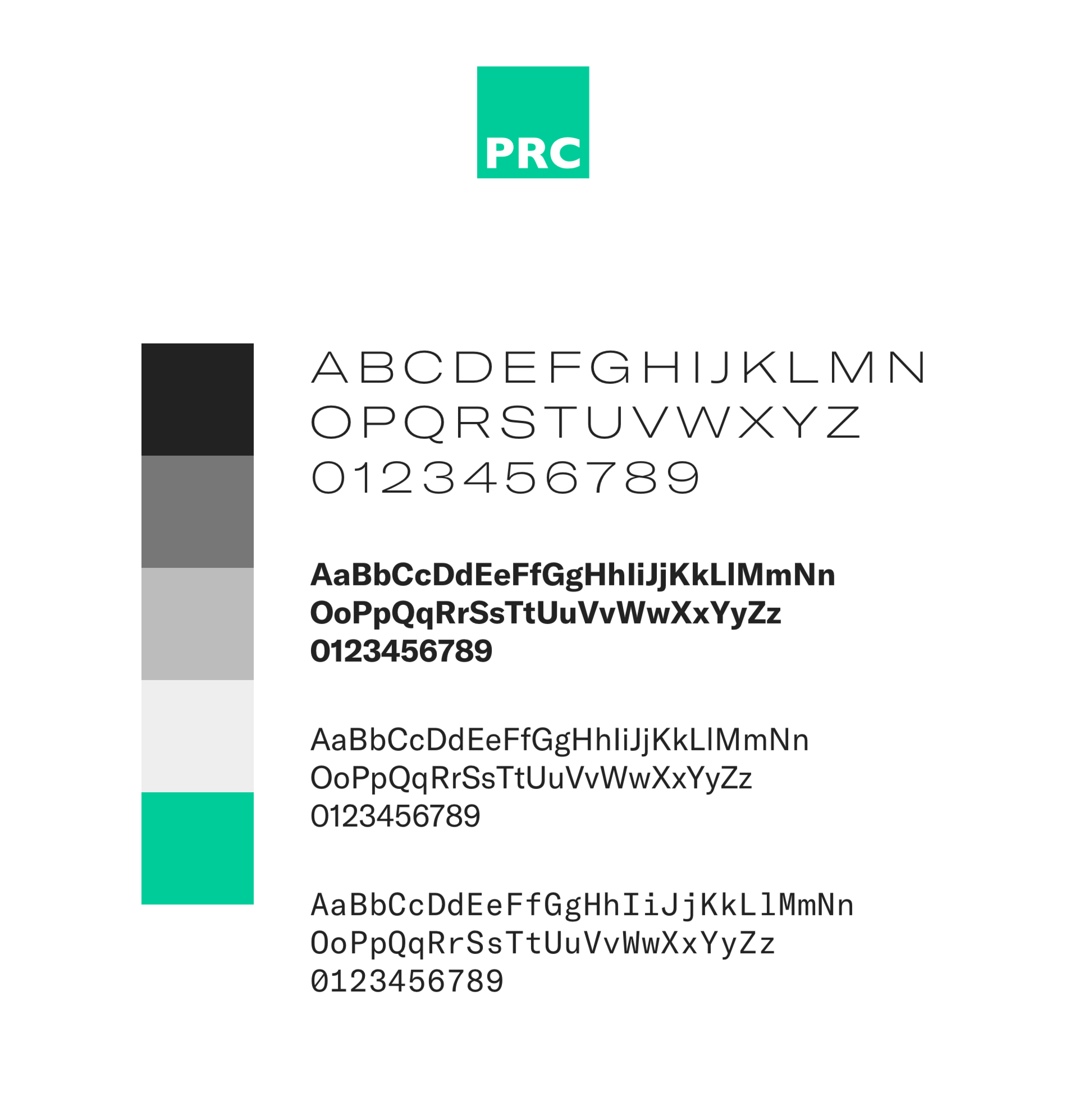
As this was not a full-fledged brand overhaul, we were aware that our new design work would need to sit well alongside some of their current branded collateral. We decided to take cues from their logo and current brand style to inform our approach and build out a refreshing visual tone that didn’t make anything they were continuing to use look out of place.
We continued to use their logo and made a decision to clarify their colour palette to a core charcoal, white, and vibrant green. We selected a type family with a range of styles and weights that would enable us to create a distinct personality while preserving a clean, clear overall presence.
We knew that photography would also be a key ingredient to the success of their portfolio. We worked together to identify key project styles and photography that embodied the work they wanted to be showing more of, and are continuing to work together to establish a plan for building a strong portfolio of project photography in the future.
Content
When we set out to begin work on the site, we began by putting together a plan for the content, and describing each area to make sure generating this content would be both reasonable to achieve and relevant to the overall vision to the project. We worked with their team to identify methods for content production and how we could structure the content management system to meet their team’s needs.
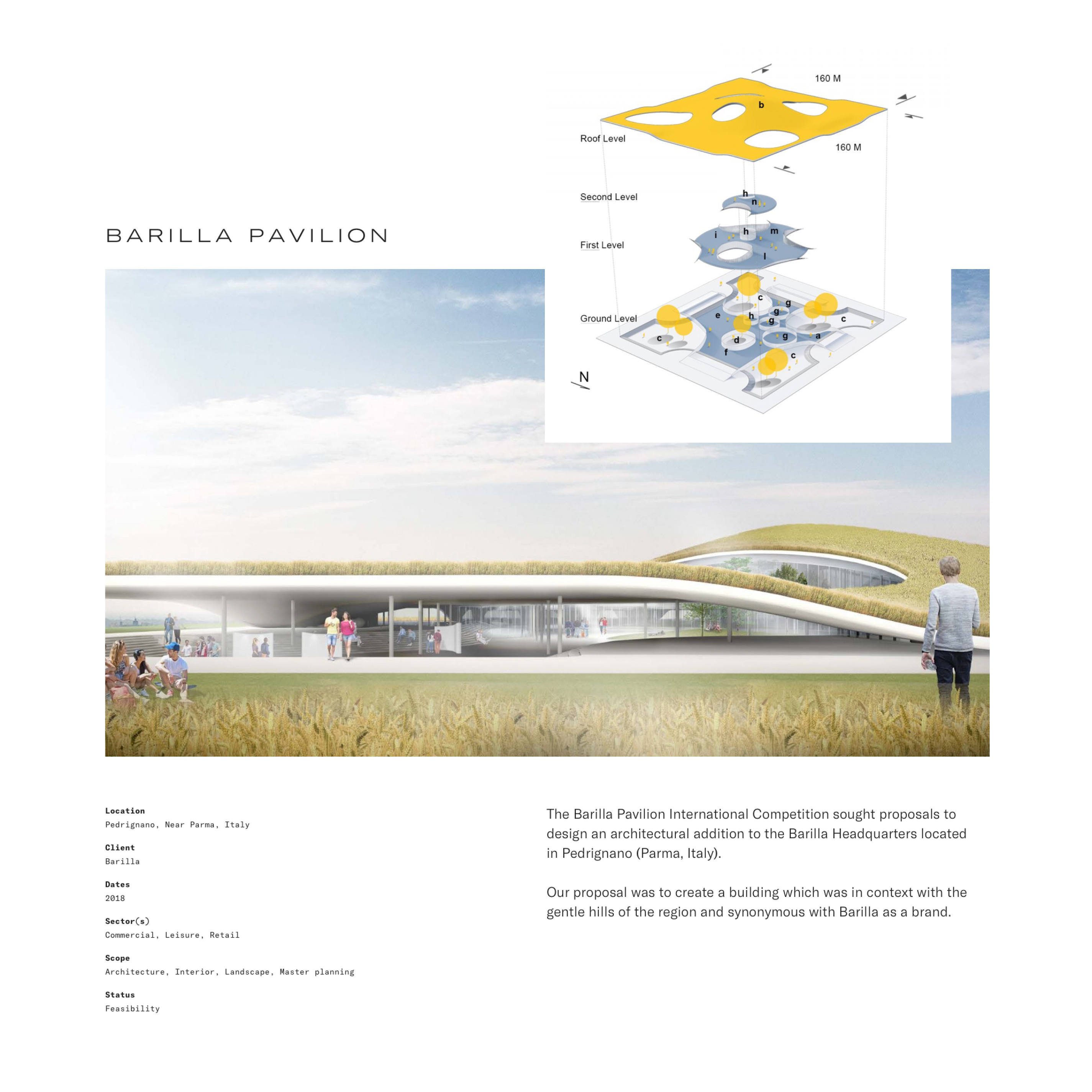
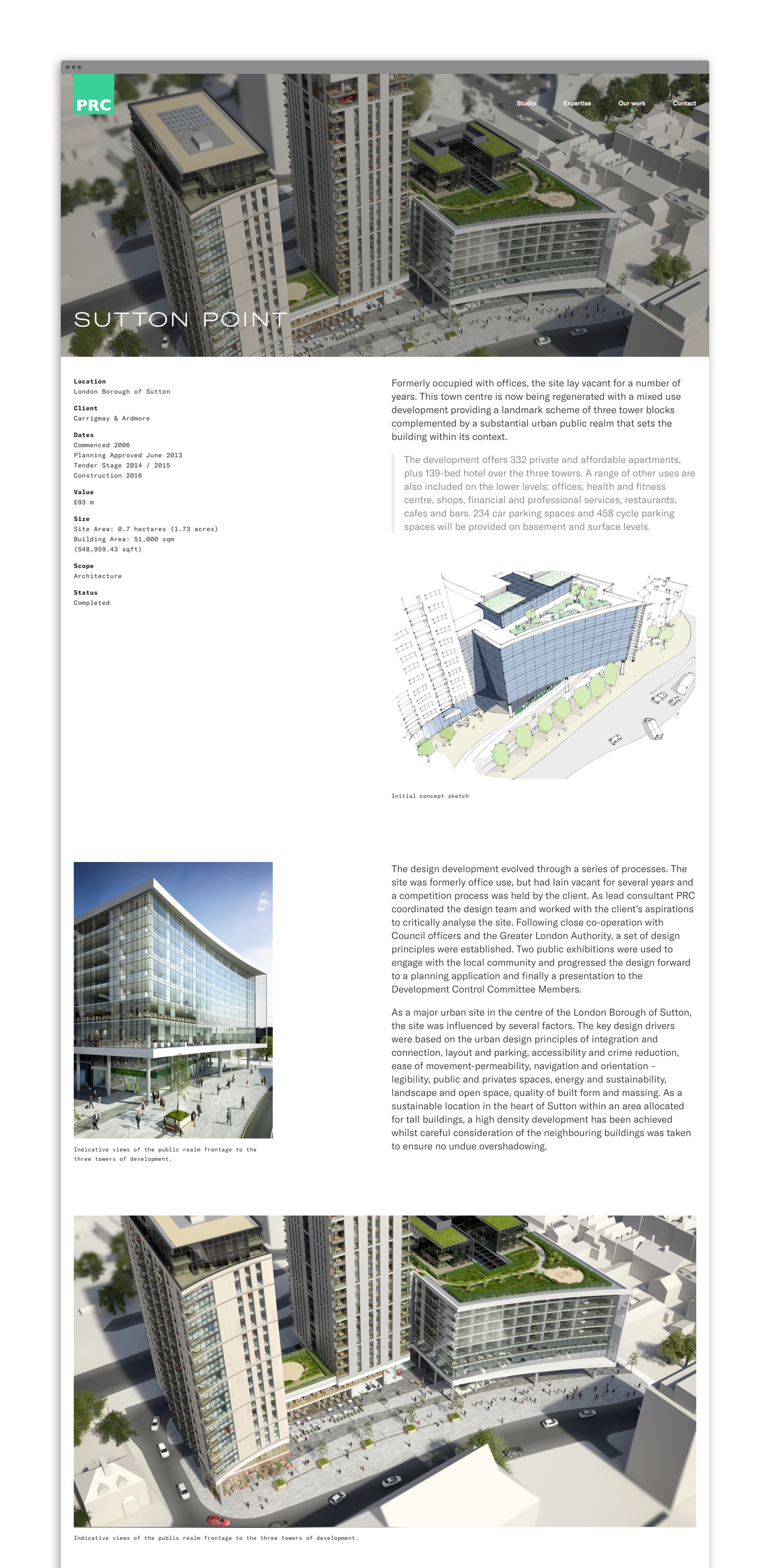
For their portfolio, we divided their work into two categories: Projects and Case Studies. Projects are shorter in length and are included on the site to show the broad range of skills and experience the PRC team have. These include brief summaries of the project and an image gallery showing the work undertaken. Case Studies are in-depth examinations of a select few projects they want to spotlight from their portfolio. We created a modular system that enabled their own team members to create long-form pieces with a range of layout and content options.
Project Gallery
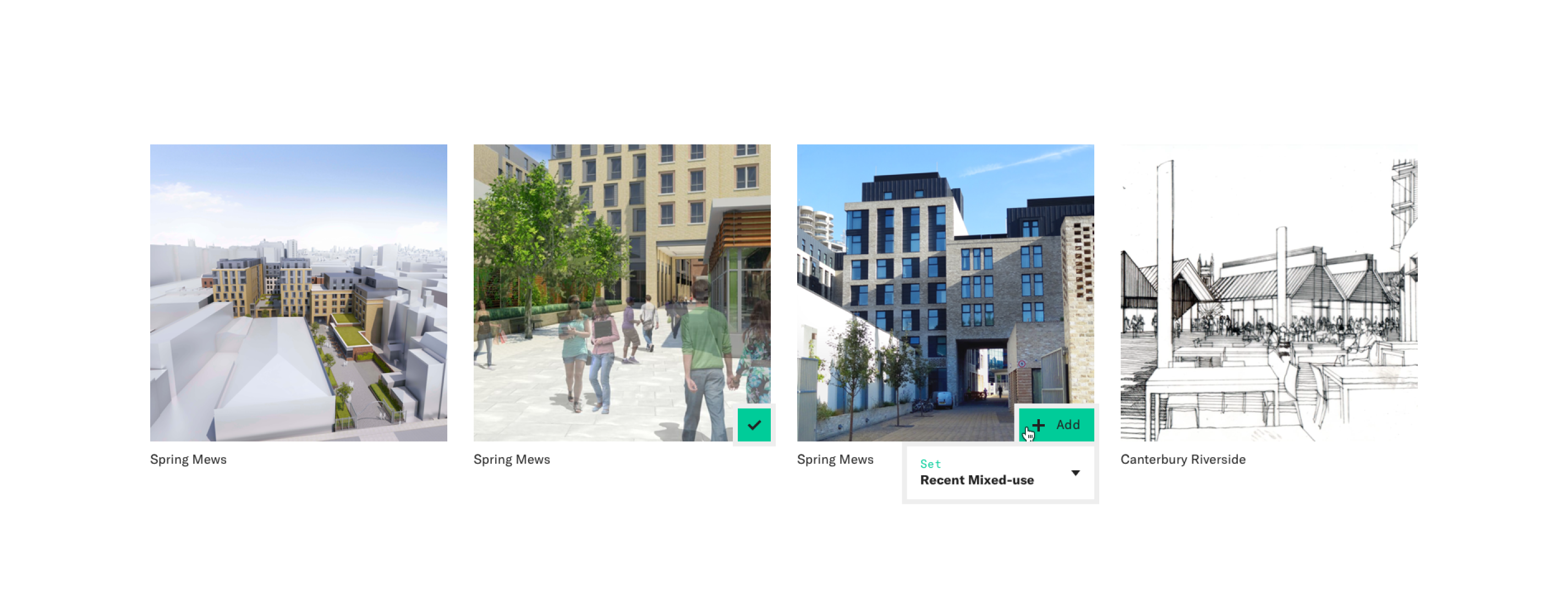
In putting together our plan for the content on the site, PRC realised the potential value in creating a full company portfolio of their projects that was browsable and searchable. We are working with their team to build an internal tool that will enable their own staff to browse through all projects added to the site, create and internally share custom project image sets, and use as a resource to show off their work to clients.
Studiomade have been invaluable in helping us to review the work we have, and the way we present ourselves. Their independent viewpoint brought fresh insight into our curation process, and have strongly influenced the direction of the new site. They made a huge effort in getting to understand us, our work and approach, and have been a really enjoyable team to work with. We are excited about progressing this next stage of work together, taking the lessons learnt in developing the website, and using them to improve other areas of client engagement.
Studio Director
PRC Architects