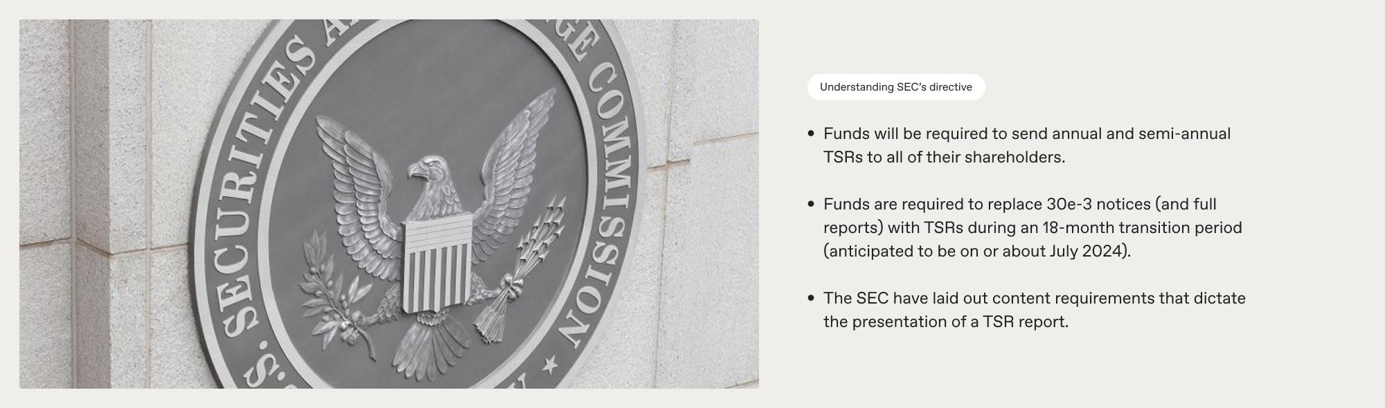
Shareholder reports are among the most important documents that investors receive. Until 2022, they were also among the longest and the hardest to decipher. In January 2023, the US Securities and Exchange Commission brought in amendments to modernise these reports.
SEC Chair Gary Gensler, announcing the change, said: “Shareholder reports are amongst the most important documents that fund investors receive. These reports, however, often are more than 100 pages in length. As a result, a retail investor looking to understand the performance, fees and other operations of a mutual fund or exchange-traded fund may need to sift through extensive financial information. Today’s final rules will require fund companies to share a concise set of materials that get to the heart of the matter.
"Further, today’s final rules are designed to promote transparent and balanced presentations of fees and expenses in investment company advertisements.
"The rule amendments will require funds to provide concise, tailored shareholder reports that highlight key information, such as fund expenses, performance, and portfolio holdings. The instructions for the revamped reports will encourage the use of graphic and text features to make them more effective."
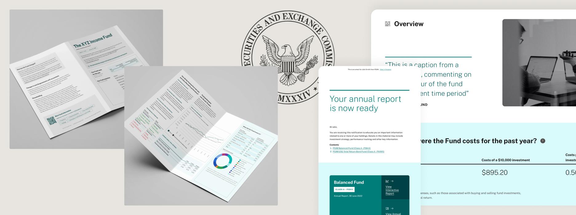
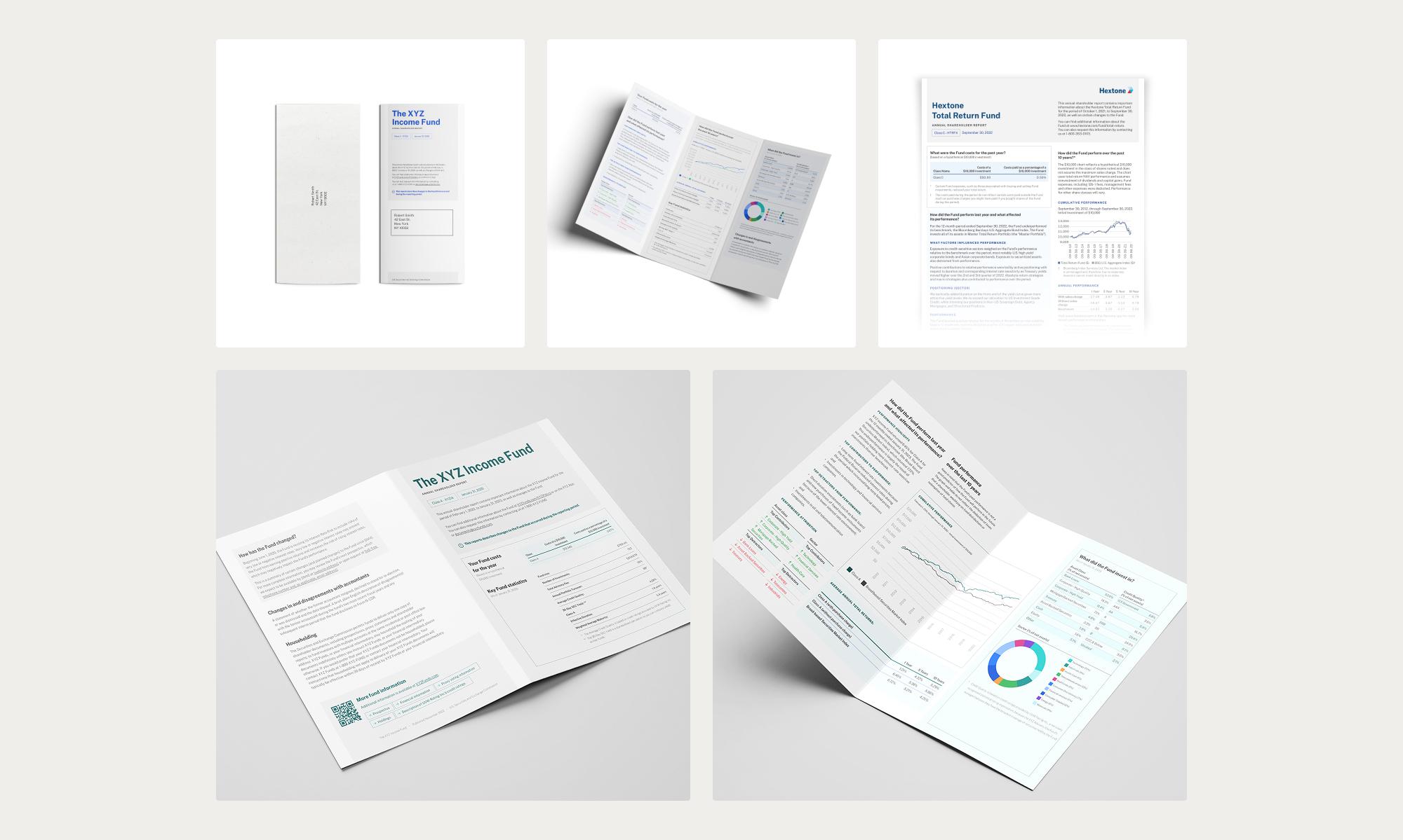
Adopting change directives and coming up with unique design solutions is something we deal with all the time at Studiomade. In this case, for Broadridge’s Tailored Shareholder Report (TSR), it took the form of information design and data visualisation. Our design had to give a refined experience for the reader as well as meeting all the SEC’s requirements.
What we did
Define the content
We had to cater to every eventuality so that our design met all requirements, particularly in this situation, where the detail of the document has legal implications and real-world application may have unique use cases. We had to design to a worst-case scenario, where the longest title, shortest chart and every type of source detail could be included within a TSR structure, with a templated approach that would work well every time.
A clear, concise structure
We needed a systematic reading flow. In a report like this, shareholders want to see at-a-glance top-line information as well as a deep dive into the data. Our team plotted all the content components so that we could present and prioritise them in the best way, with a design that leads the eye through an appropriate hierarchy of information and doesn't frustrate the user by hiding details that they need to easily see.
This is a good stage to work with test audiences. Qualitative research informs our design decisions and helps us understand users' needs and frustrations. We were able to check that in meeting the SEC guidance we hadn’t lost sight of the users’ requirements and their reading experience.
Typography and colour
With all the information defined, we built a design system that would work across a suite of communications, meeting accessibility guidelines and best practice.
Intelligent use of typography is of primary importance with copy heavy publications. We created a strong and consistent style and hierarchy across heading styles, subheadings, tables and body text. Consistency creates familiarity for the reader, so that they instinctively understand the flow and pattern of a document and the eye quickly recognises the purpose of a content element.
The role of colour also has a large part, particularly when communications are co-branded. We built a wide-ranging colour palette that can expand and flex as required.
We also used iconography to help signpost users to key information quickly. The structural planning work that we carried out earlier in the process was particularly valuable here, so that high-priority information could be given an icon or signifier to draw attention to it.
Testing and delivery
Designs are interpreted slightly differently by every user so this was another good point to test on an audience. Working with systems such as usertesting.com we sense-checked our choices, iterating on our work to make improvements and create a design that's both engaging and functional.
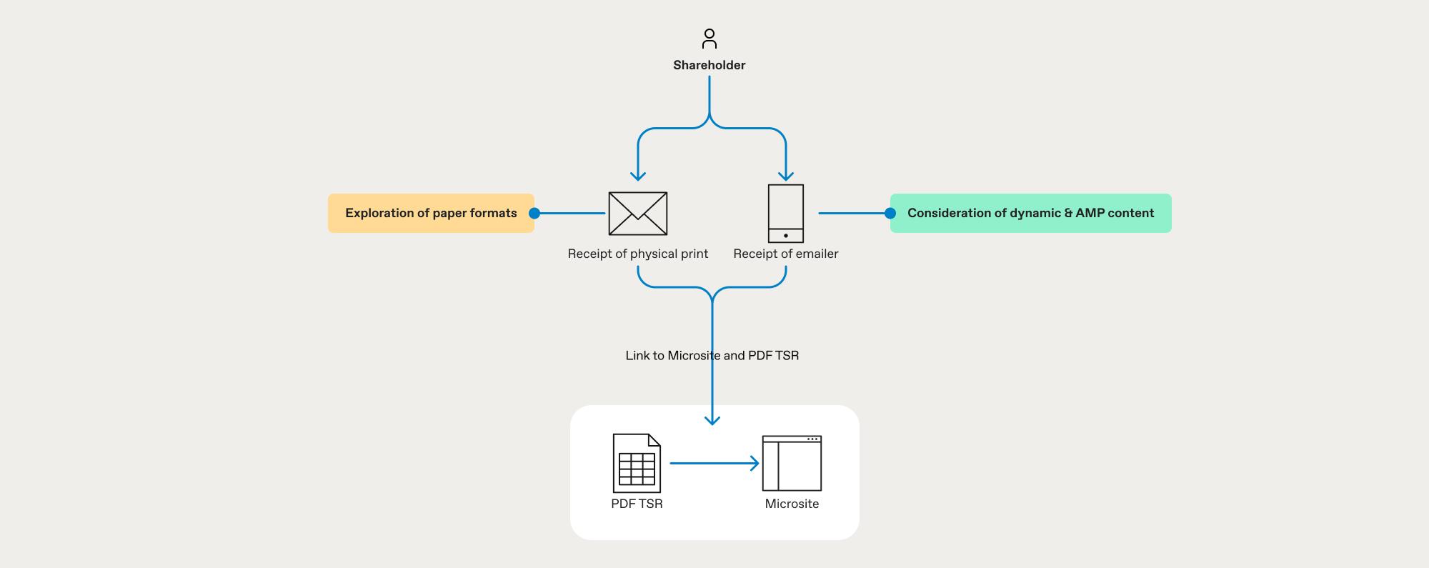
Another change in the SEC regulation was to make the process greener. Printing and sending hundreds of reports and thousands of pages to shareholders isn’t the most environmentally friendly method. Our solution altered this approach with a digital experience, designing a microsite to house the multiple reports needed by investors with multiple share classes.
This was a key part of our process review, providing efficiencies to scale and doing less harm to the environment.

The outcome
We created a tailored shareholder report that contains all the condensed, legally required information, plus a microsite housing reports for individuals and investors with multiple share classes. Investors can now quickly find essential information, both top-line and deep dive, without ploughing through a report that’s hundreds of pages long. Broadridge can be confident that it is providing investors with what they need as well as being compliant with the new SEC regulations.
Are you a fund brand or broker?
If you're looking to tackle the SEC challenge and refine how you communicate with investors, let's talk. Our team integrates directly with yours, supporting you with the changes you need to make. Talk to us today about how we can partner with you.