Brand identity for a global strategic insight group
Designing a refined visual identity and website for STRAT7
Sector
Discipline
Client
Strat7
Year
2022
STRAT7 is a global strategic insight and customer analytics group. It helps businesses to understand, predict and act on change, through technology-powered data and insight. In 2019 it had received investment from its founders and private equity investor Horizon Capital, and since then it had made four acquisitions to build on its capabilities and expand its international footprint.
In 2022 the leadership team were ready to take the business out for a new round of funding and acquisition, to grow the group’s talent and skillsets and add to its service offering. They wanted a refined brand identity that would improve its presentation and make them a strong investment proposition – and they needed it quickly.
What we did
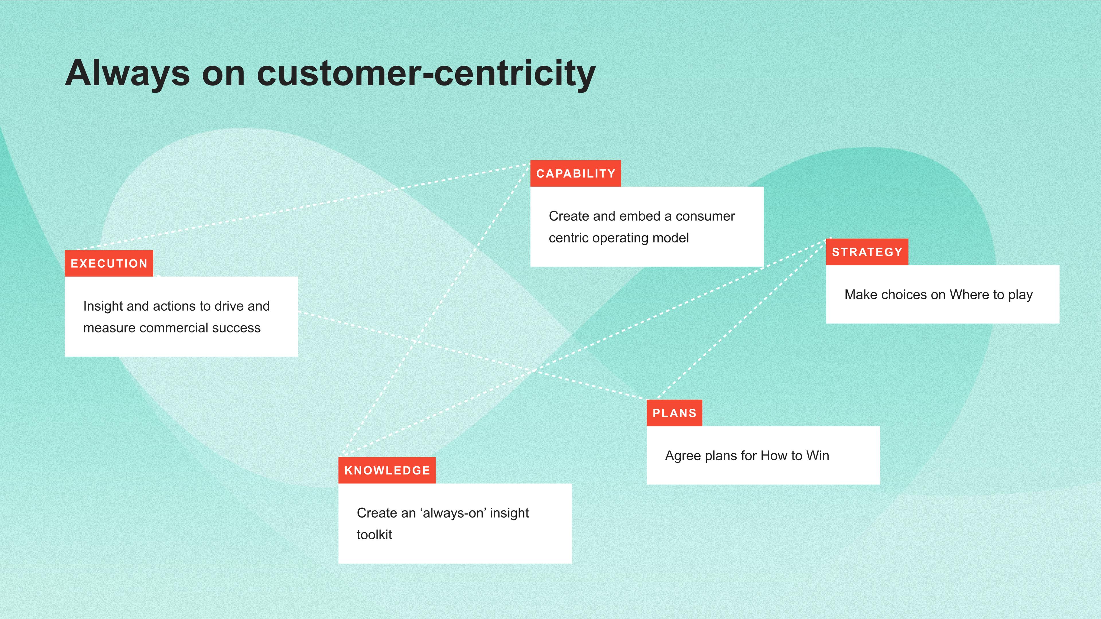
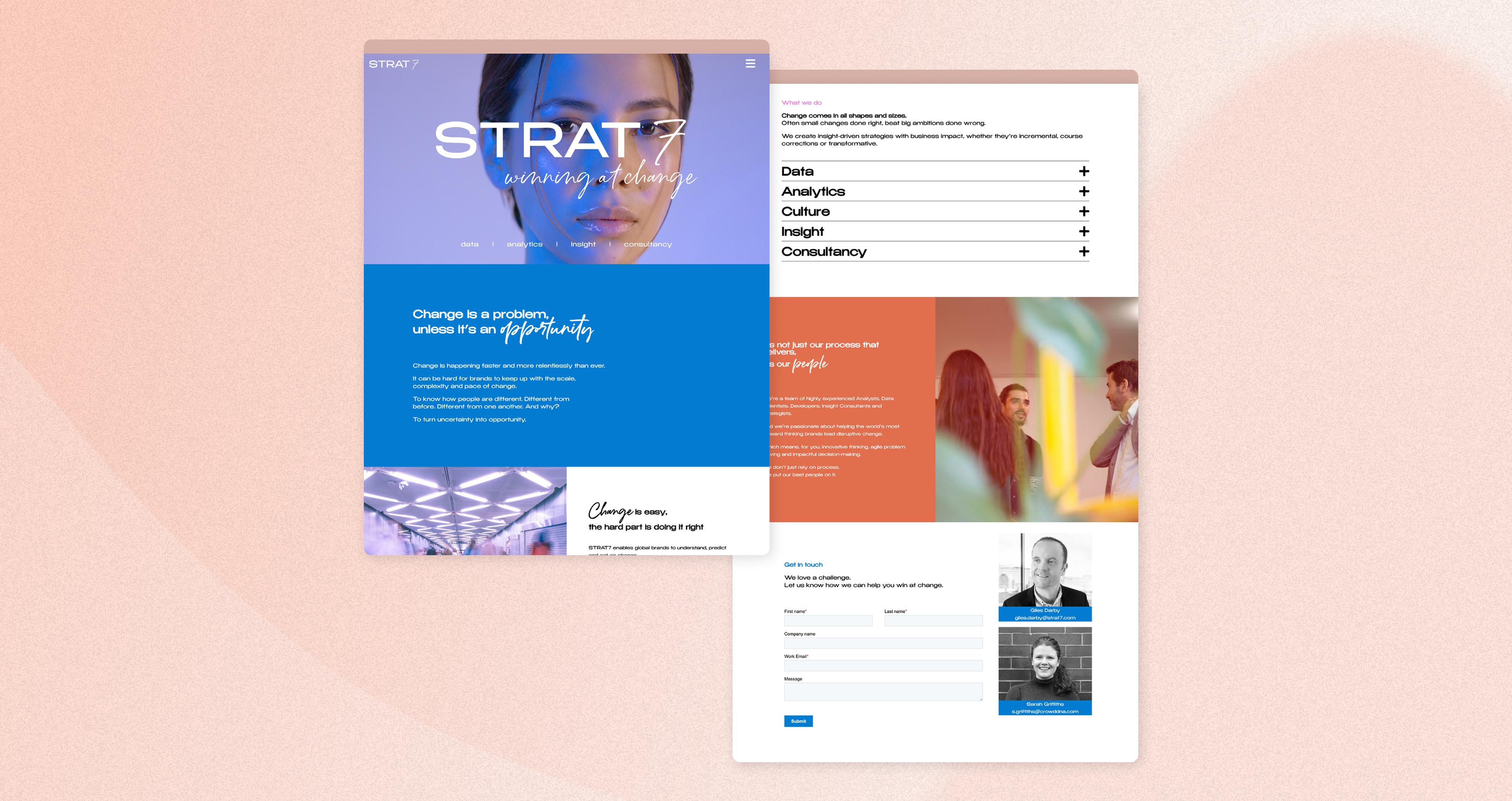
Our brief was to provide a choice of possible creative routes. We designed four directions around the concept of Change, and showed how each one could work across the website, presentations and other implementations.
We presented them for review and STRAT7 selected their favourite for final refinement and rollout.
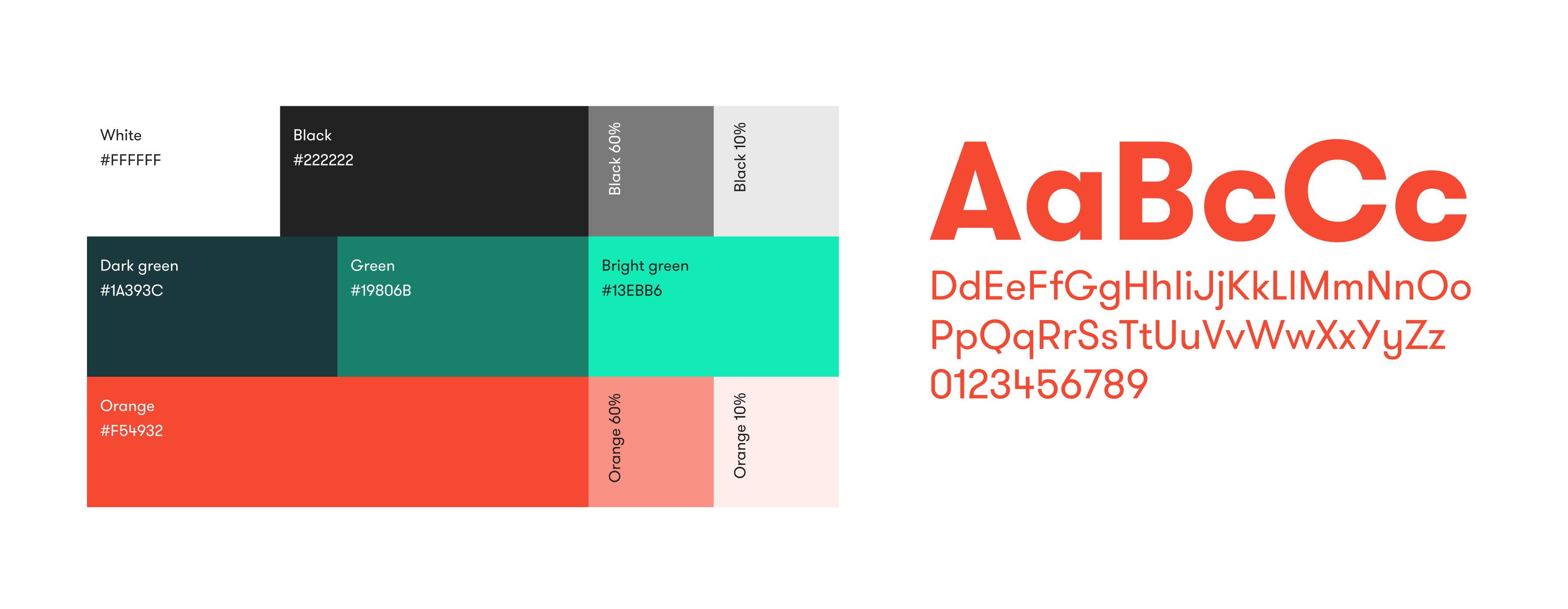
Colour palette
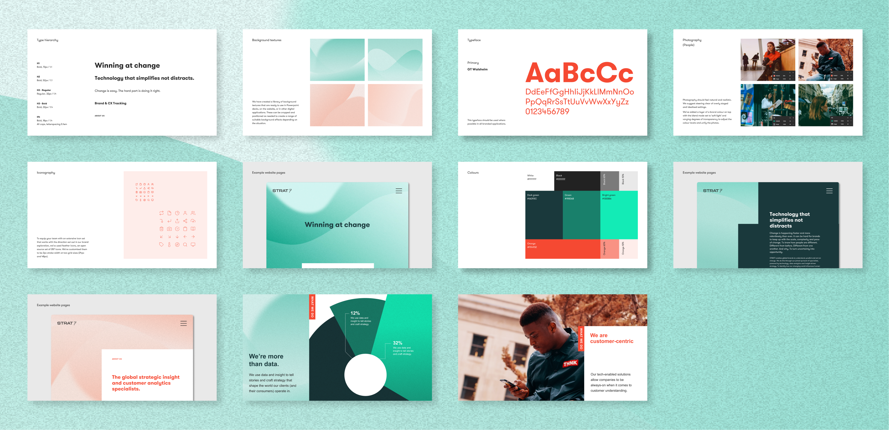
With different consultancies within the STRAT7 umbrella group, colours needed to be consolidated and streamlined, for a more unified approach. We built a new, fresh palette.
Animations
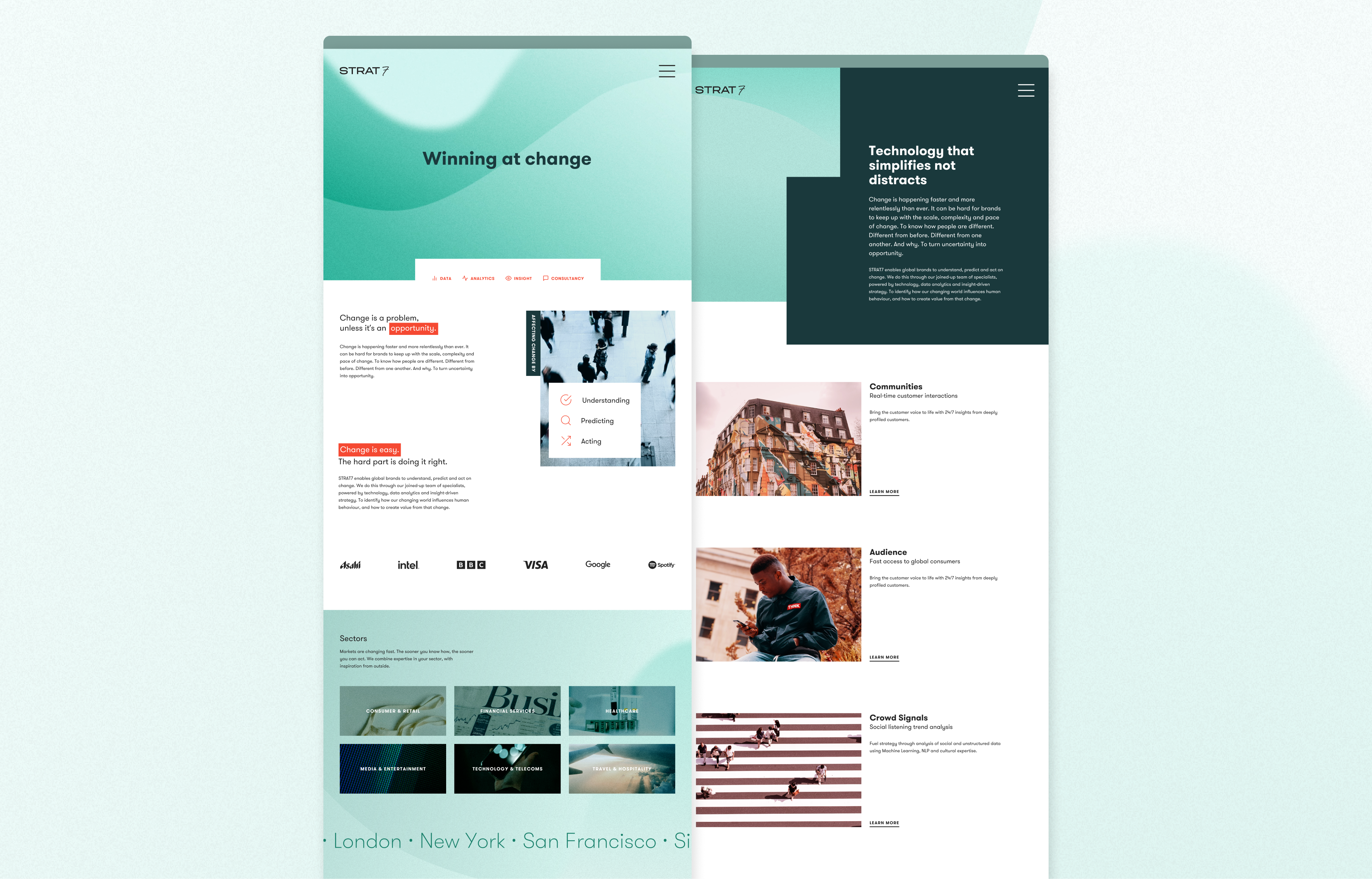
We created textural, illustrative moving backgrounds in the new colours, to reflect the idea of transition and dynamic momentum. These textures are used on the website banners and can work across different platforms and materials, and can be animated or static.
Logo
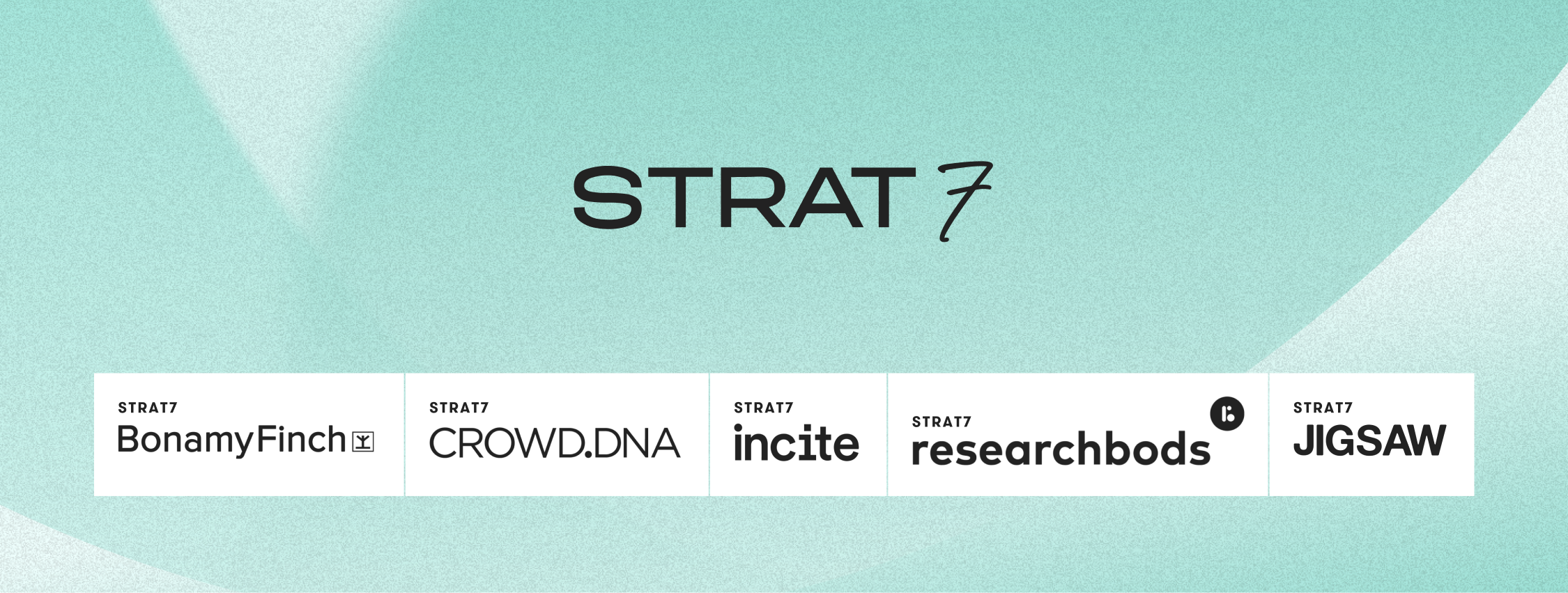
The STRAT7 logo was refined slightly for digital usage, adjusting the weight to make it more robust and legible at smaller sizes.
Photography
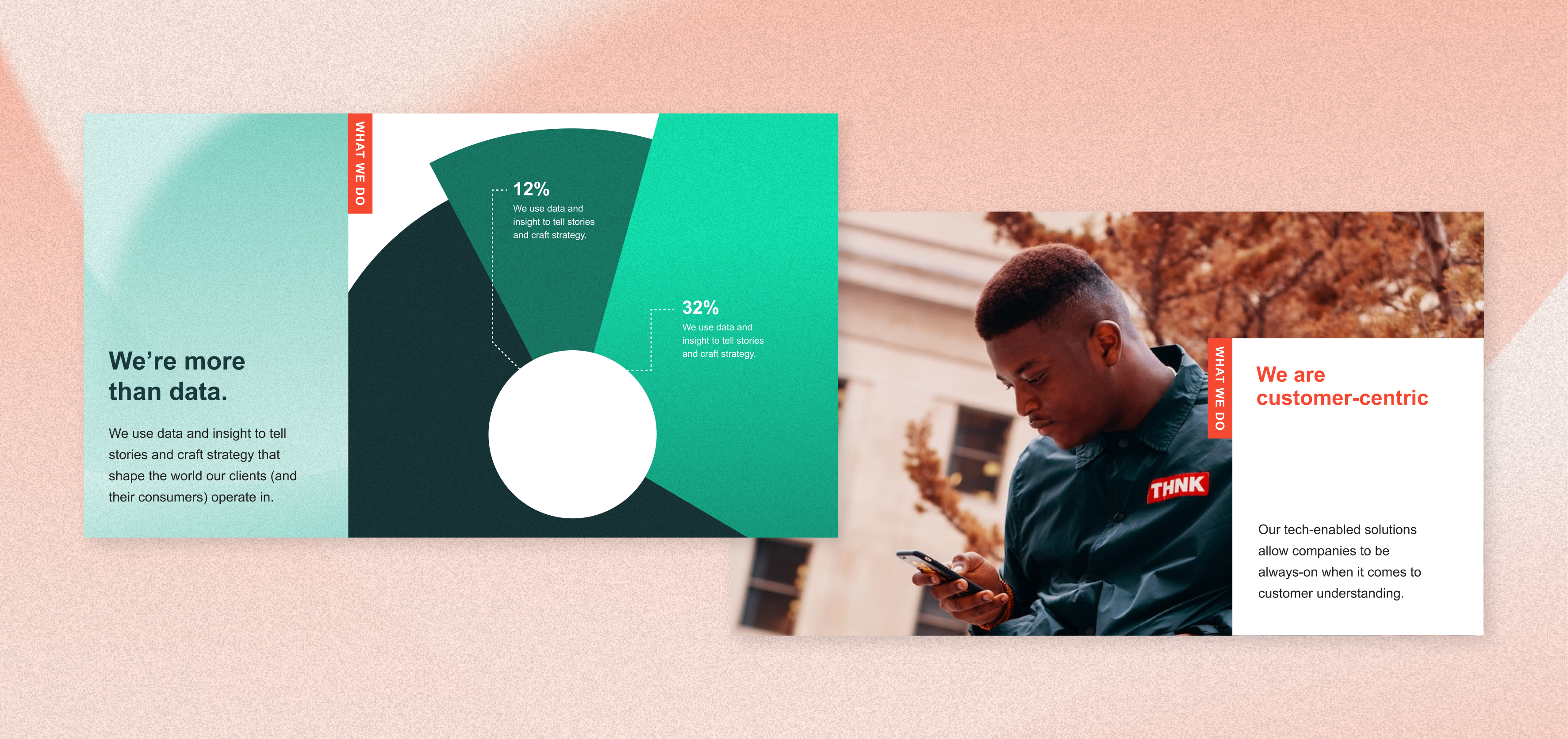
We reviewed the approach to photography and decided to use images of people looking natural and positive. We added a transparent overlay of a brand colour to help images feel consistent.
Outcome
The client wanted to implement the new designs themselves across the website and other materials. We compiled a guidance document that enables them to do this easily, quickly and consistently. Our creative approach works across uses, from social assets and animations to Powerpoint presentations, and can be easily expanded by the STRAT7 team. It’s ready to be rolled out to all the companies in the group so that they all look visually coherent but can retain their own distinct identities.
