Digital presence for groundbreaking UK superfund
Creating a platform to inform and promote
Sector
Discipline
Client
The Pension Superfund
Relevant links
Year
2018
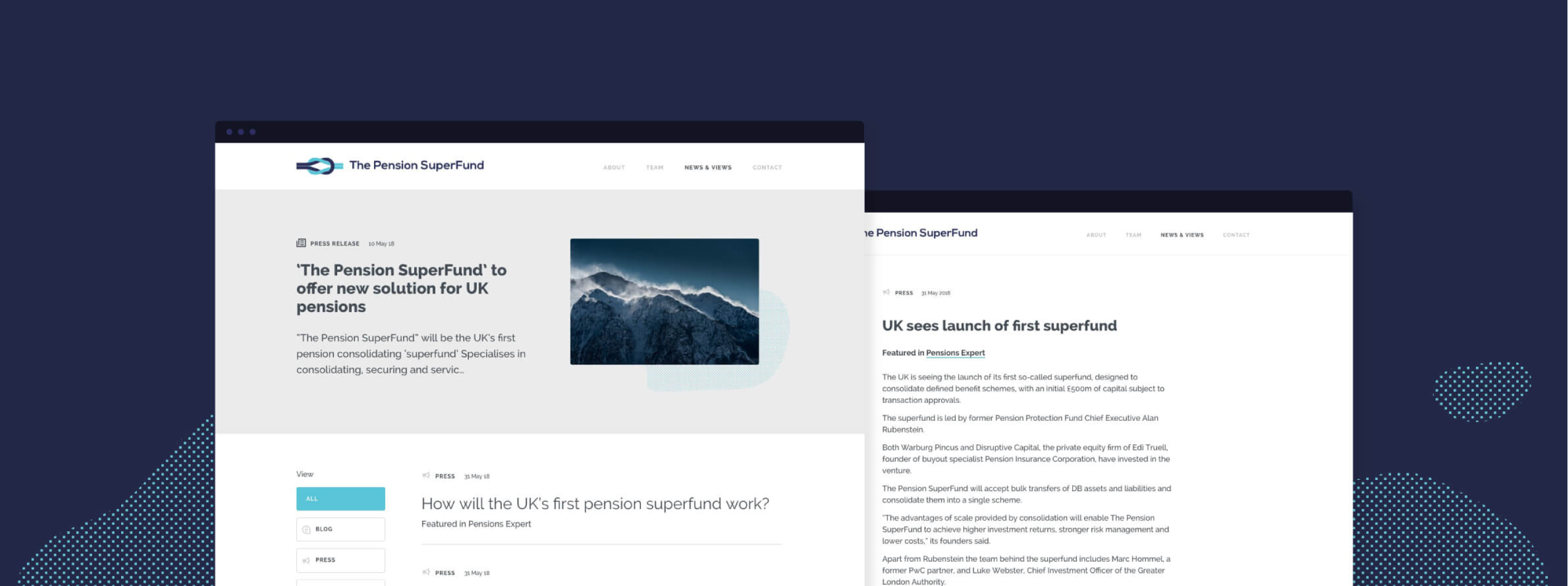
The Pension Superfund is the UK’s first consolidating pension ‘superfund’. Their product was entirely new to the market and so we wanted to create a clean and concise brand presence that visually presented the messaging and benefits in a simple and clear manner.

Appropriate design
Our design team introduced a streamlined colour palette and a monotone illustration style to ensure that the messaging was not overwhelmed. The site’s main purpose is to provide information to potential stakeholders, validating the Superfund’s existence and clarifying their proposition. We created a ‘news and views’ area to promote opinion and insight, to capture interested parties and motivate engagement of getting in touch. Utilising subtle animations and abstract textures to add visual interest and create a stylised design approach, the brand can flex as necessary.
A brand to build on
The brand base that has been created will support The Pension Superfund as it grows. The textured elements used within the design are flexible allowing them to be used effectively across a wide range of campaign materials whilst keeping brand consistency. The illustrations also serve as the beginning of a visual library that The Pension Superfund have ownership over going forwards.