Creating a single unifying healthcare brand for LSE-listed Wilmington Plc
A new brand for a company providing data, insight and intelligence across the healthcare sector
Sector
Discipline
Client
Wilmington Healthcare
Relevant links
Year
2018
A unified brand
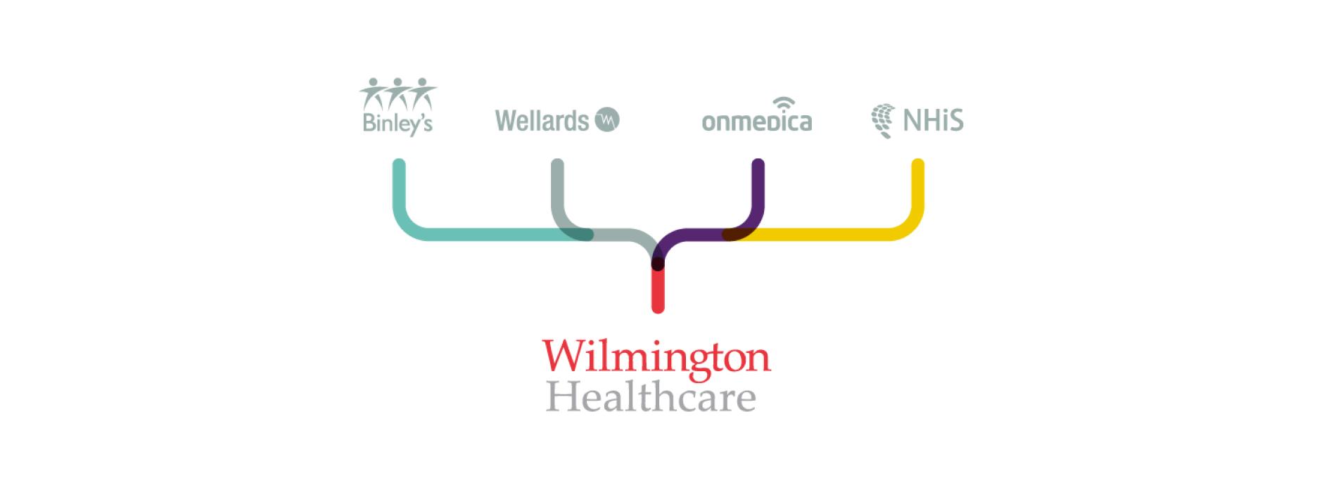
Working with our long-time collaborators and friends at ZPB Associates, we were appointed by Wilmington PLC to create a unified brand that presented a new business proposition within healthcare. The vision and brief was to bring together several different healthcare brands, including Binleys and Wellards, and create a single, parent brand for Wilmington Healthcare. It had to present a new platform for the healthcare division.


Creating a vision for the brand
Working within Wilmington’s existing brand framework, we identified a need to create a flexible brand platform and visual approach that the internal team, including designers, could work with, adopt and expand with a view to retaining a sense of ownership and authenticity in the ongoing creative work and campaigns that they produce.


A strategic concept
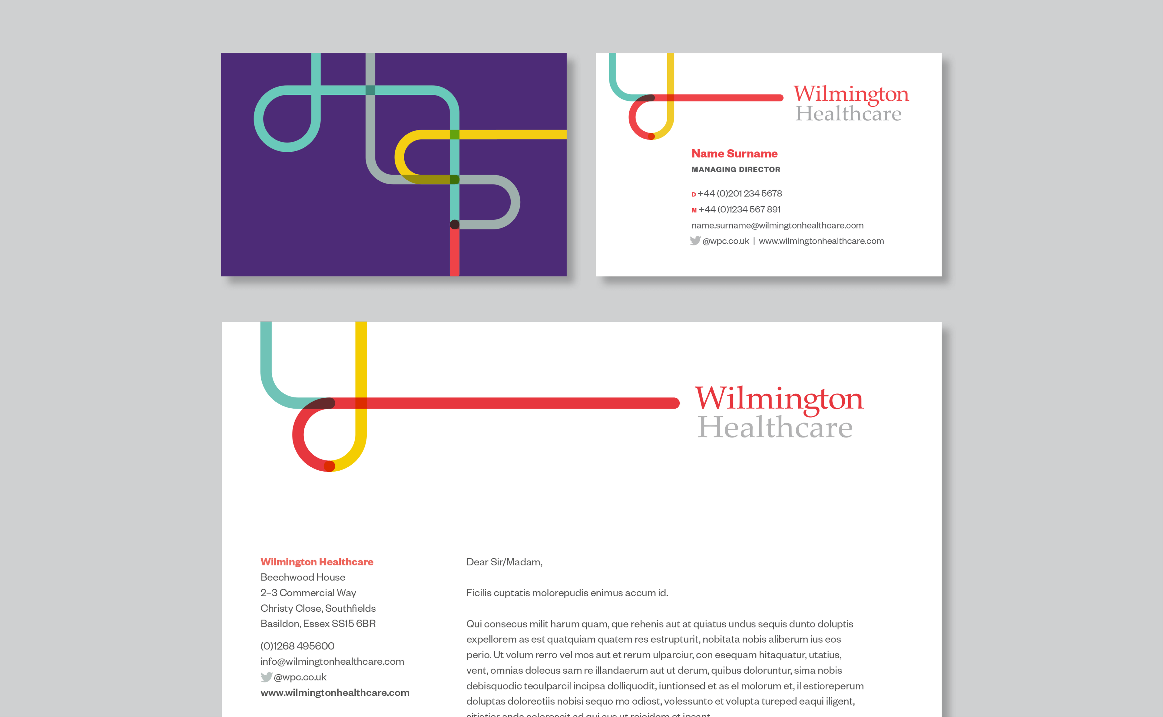
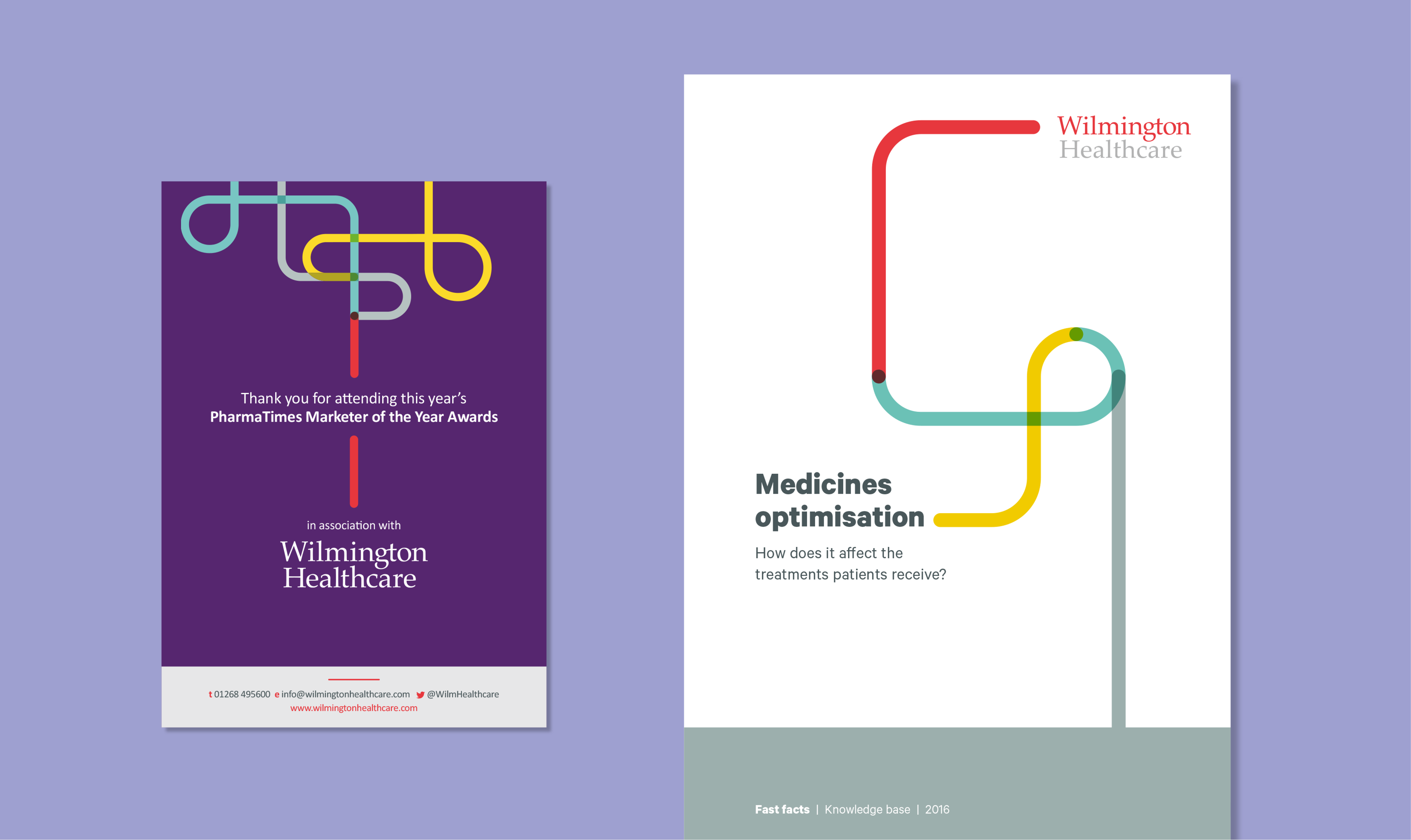
Introducing brand positioning that centred around a clear, articulated concept of Wilmington Healthcare meant translating complex intelligence into actionable insights and sustainable outcomes. We used illustration to help represent this messaging. The use of line work and focus of a single-line output forms part of the Wilmington Healthcare brand, and is used in different ways to visually support brand statements and messaging. The concept reflects the core value traits of Intelligence, Expertise and Collaboration. It's used with purpose, to help tell a story or to guide a reader visually through a narrative.
A visual tool
The line can be utilised to create bespoke iconography and illustrations within the brand. This gives flexibility while retaining a recognisable brand style and treatment. We created our customary brand guidelines and toolkit, containing guidance on how to work with the new branding and design within it. This was supported by holding internal workshops at our studio with Wilmington Healthcare's designers.
“By connecting and collaborating with healthcare communities, Wilmington Healthcare translates complex intelligence into actionable insights and sustainable outcomes.”
The new branding was tested across multiple environments, assets and physical experiences.


Building a digital presence, powered by WordPress
Once we were happy with how the modules performed, we built up each area and page of the site using these core modules as building blocks. The benefit of this was that we could test the modules at the start, all at once, so that we could catch, review and iterate on our discoveries and challenges early on, during development.
Working this way enabled the design and development team to work together and create a superior product with a leaner design and build.