Unit 29 Ventures launched its first enterprise in 2020: The Cove, a luxury florist and concept store in Royal Tunbridge Wells. It has built up a loyal and discerning customer base of people with a taste for premium products made by local independent makers and distillers.
After two years, investor Phil Reid – who is the founder and Strategic Director of Studiomade – decided it was time for Unit 29’s next venture: a unique, small batch rum.
The concept and name
Unit 29 Ventures recognised an opportunity to launch a rum brand centred on sustainable packaging, the concept of reuse, and supporting a sustainability charity.
The vision was for a rum inspired by the ocean, locally made in Kent, and led by its values: distinctive quality in the ingredients and materials, clean efficiency (reduced waste and efficient production methods), and growth and rejuvenation of natural resources (contributing to a cause and enjoying life while doing it).
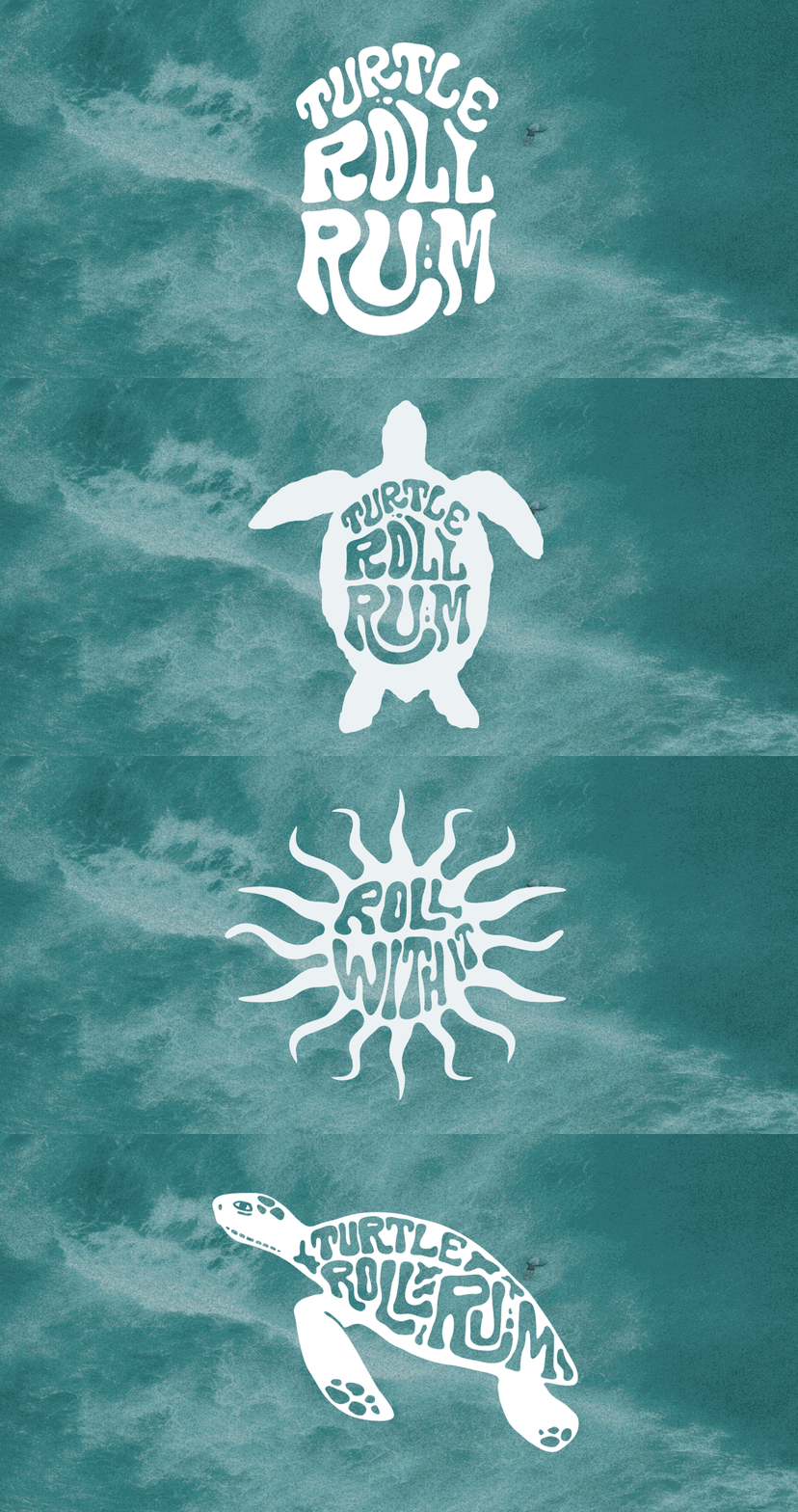
Based on a love of the sea and surf, and reflecting this new venture and its first step into the drinks industry, we named it Turtle Roll. Before you can line up a wave when surfing, you have to get out past the ones that are breaking all around you. The turtle roll technique helps you get past barriers, jump over hurdles and achieve greatness. Unit 29 hoped to do the same with Turtle Roll Rum – taking beginner steps with an ethically produced rum, hoping to effect positive change in our oceans.

The taste
Unit 29 Ventures and Studiomade worked together to craft the brand story and narrative of Turtle Roll Rum, which in turn helped brief the ingredients and taste. We worked with a talented expert, Callum Giblett, Managing Director at The Custom Spirit Co. He and his team defined different taste directions and, during a rigorous six-month phase of tasting, exploration and user testing, whittled down multiple recipes and ideas into the winning formula.
Turtle Roll Rum has been imagined and produced locally to Tunbridge Wells in Kent. It is distilled with Venezuelan, Dominican and Jamaican sugar cane, using a clean, high-quality and sustainable production process that runs fully on renewable energy. The concept, ingredients and commitment to sustainability all emerged from appreciation for the sea and ocean-side living.
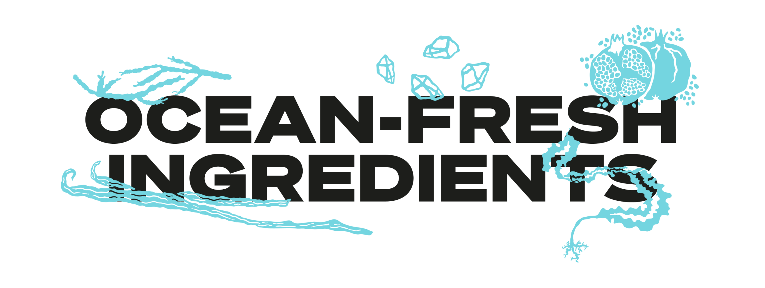
In the final produced recipe, Turtle Roll Rum blends notes of pomegranate, lapsang, vanilla, black cardamom and sea salt with oceanic botanicals samphire and sugar kelp. These intriguing layers of sweet and salt create a rich and smooth flavour profile.
As part of Turtle Roll’s sustainability commitment, 10% of profits are donated to Project Seagrass, a charity working to restore and protect seagrass, a wonder plant that’s crucial to the health of our oceans.
Brand positioning and identity
Turtle Roll Rum is positioned as a challenger, independent brand with a premium feel, priced in line with the small-batch market. We were inspired by product brands that are driven by a mission beyond the product itself; companies with sustainable, ethical values at their core.
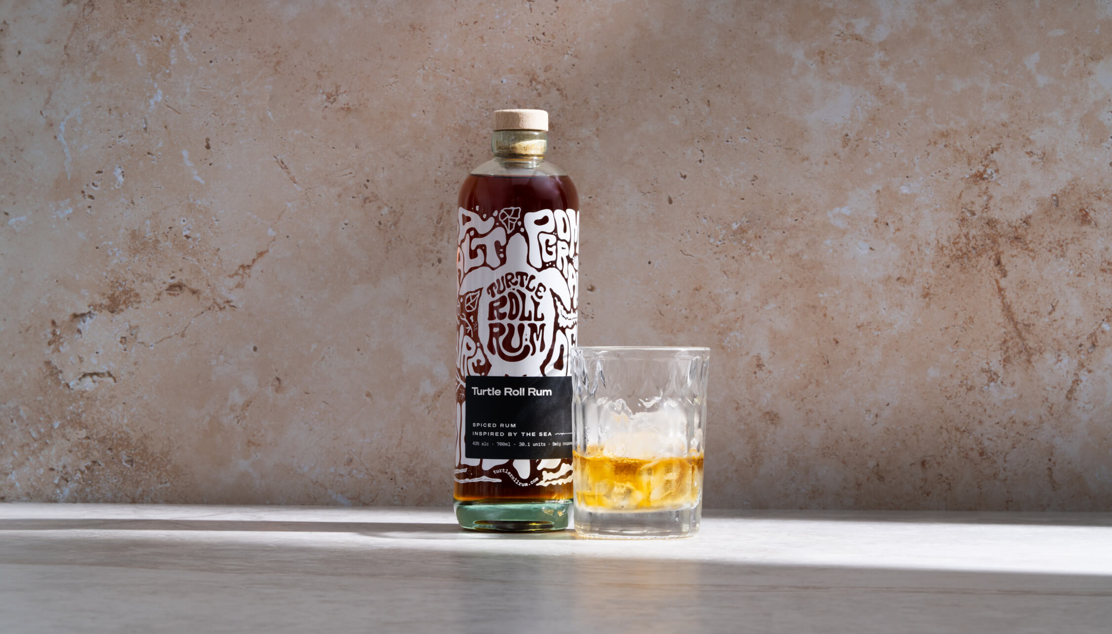
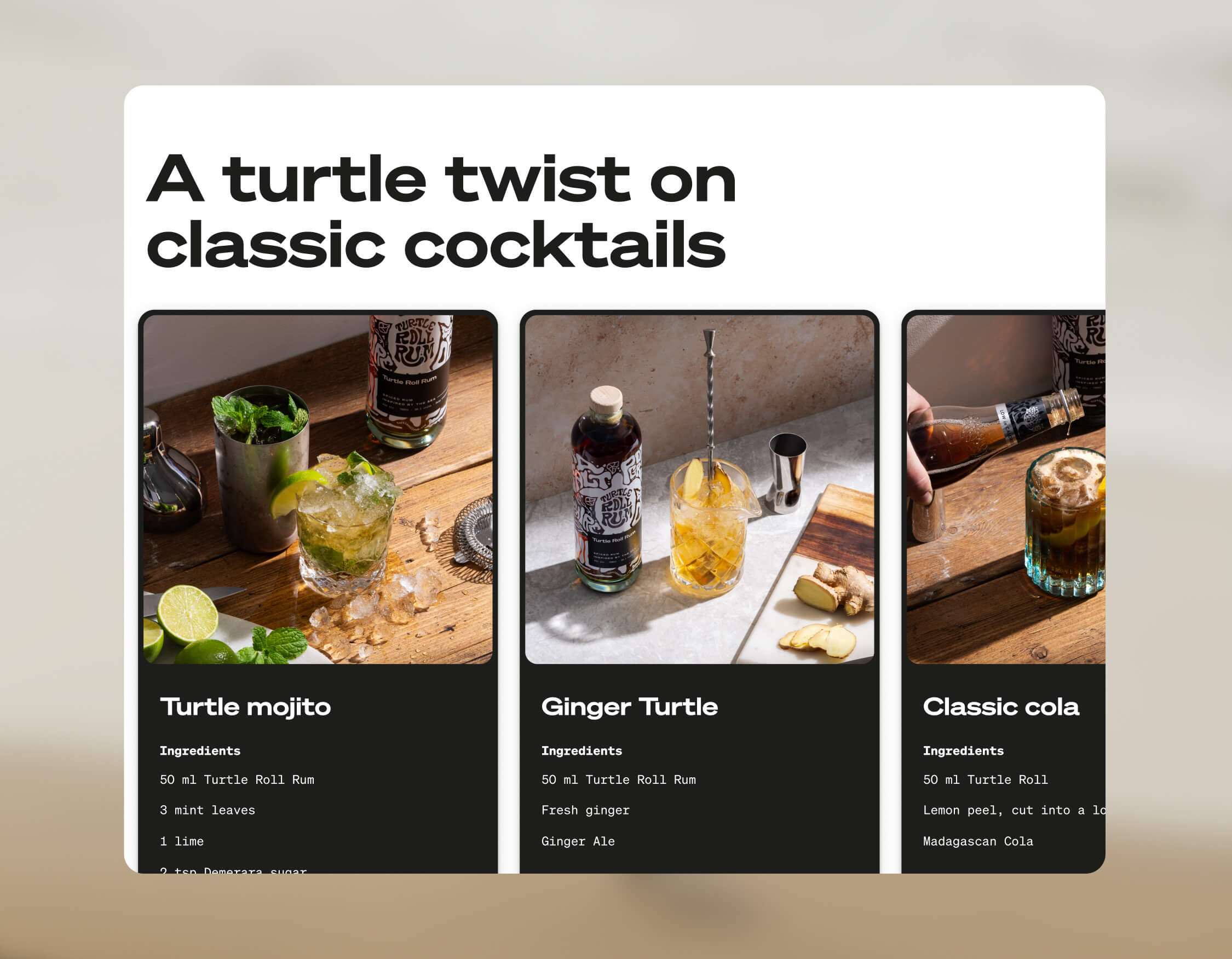
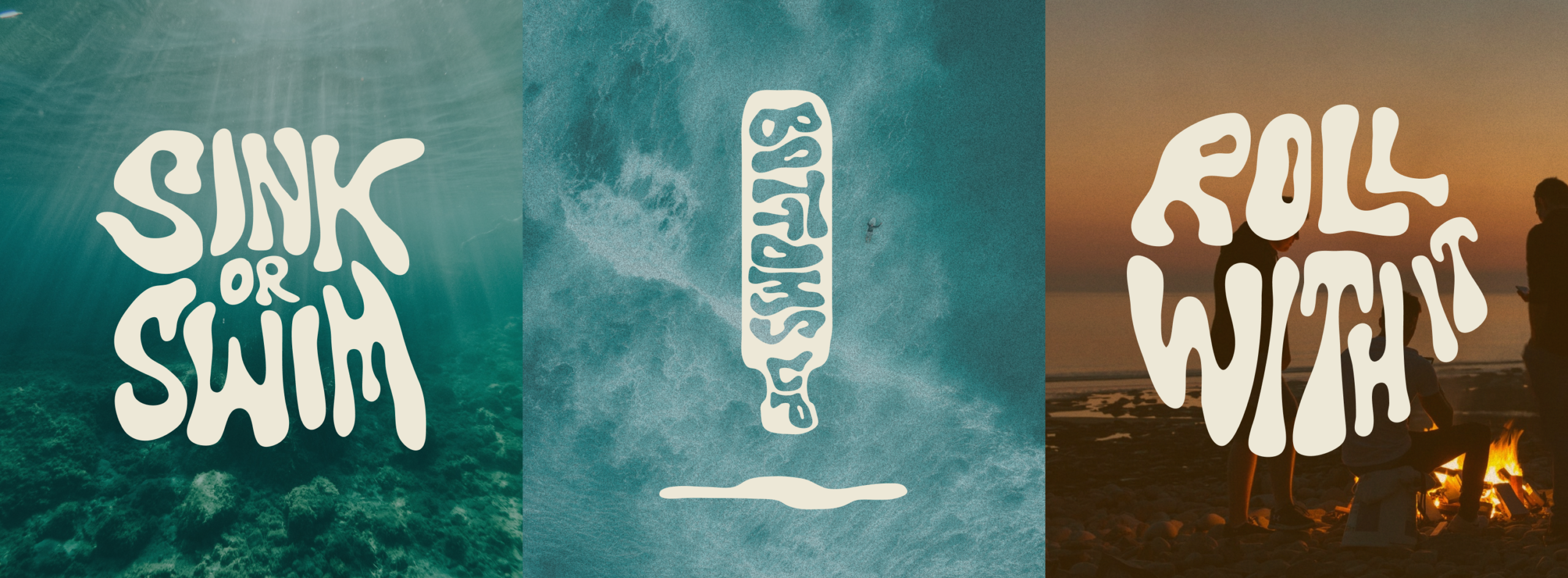
Our design director Angelo Iannelli wanted typography with a feeling of the sea so crafted loose, hand-drawn lettering, paired with the Söhne Breitt font as a contemporary counterpart. The illustrations, all hand-drawn by the Studiomade team, emulate typography distorted as if looking through water. The aqua tones and grainy texture of some of the photography were inspired by vintage surf photos e.g. 80s Miami.
Brand messaging
We use language that suits a modern, challenger brand, giving it a distinctive voice, casual rather than polished, yet with a premium feel. We use enticing flavour and ingredients descriptions to appeal to an audience of taste makers who are on top of trends and like to discover new experiences. To keep it relatable, we sprinkle in light-hearted, ocean-inspired phrases, particularly on social media.
Product photography
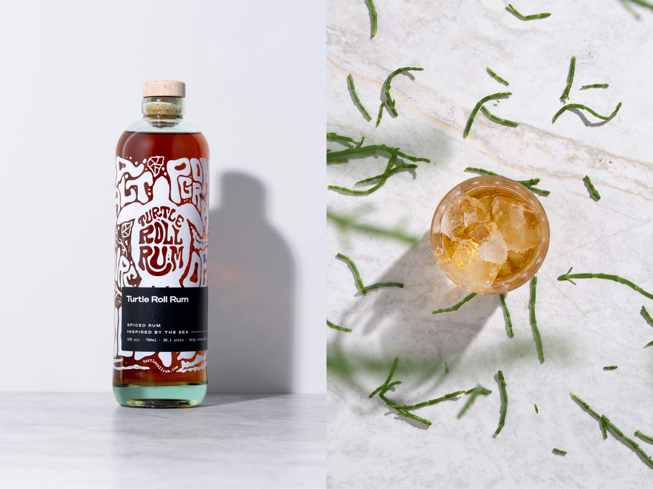
The images were shot by the wonderful team at Névé Studios. After creating mood boards to drive our creative direction, we decided that product photography should be bright and spacious, playing with light, shadow and interesting angles, and reflecting the fresh ingredients that give Turtle Roll its taste. The images feel realistic rather than glossy e.g. cocktails being made and drinks being poured. This is interspersed with imagery of oceans and waves, evoking the open feeling of the sea.
E-commerce
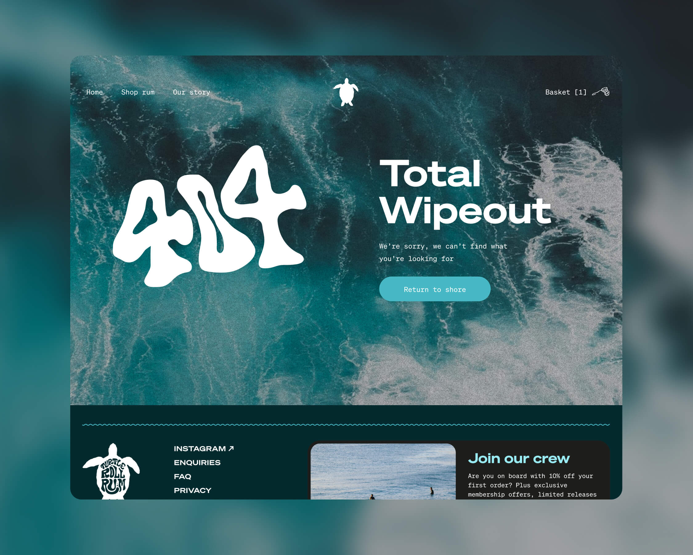
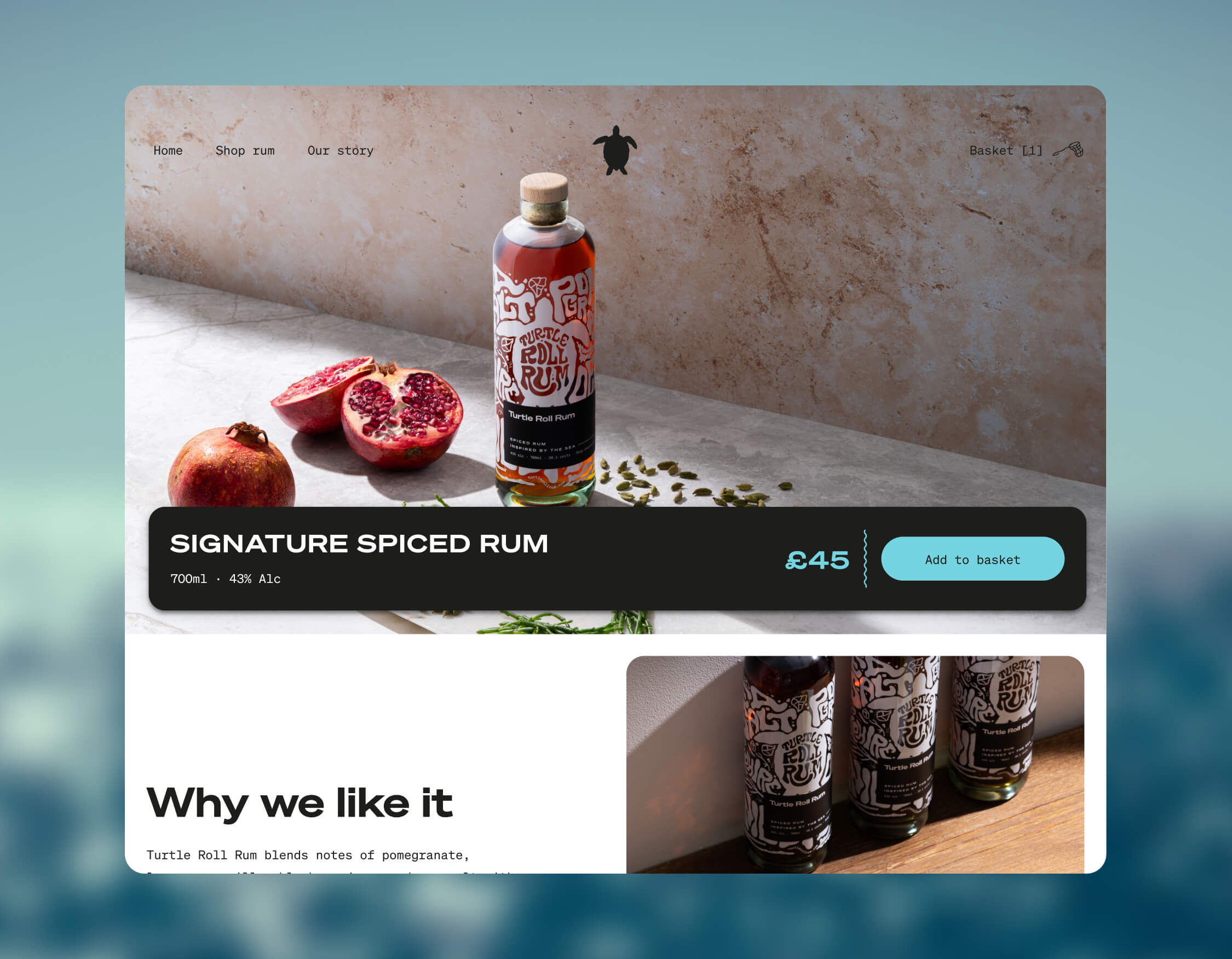
Turtle Roll Rum was conceived to be predominantly sold direct to consumer. This means that the customer experience and how the brand is presented online are paramount. We wanted to best present the personality of Turtle Roll Rum and establish a brand connection with customers, rather than it being a sales push.
To this end, we built a custom e-commerce experience, with every aspect individually designed. We applied the visual identity and brand voice across the website, and created a user journey that includes purchase. We opted for Gatsby hosted on Netlify, for good performance and speed. We integrated Stripe for payments and set up a bespoke webhook to promptly relay order details to our fulfilment company whenever there’s a successful transaction. We added Mailchimp integration for automated emails to complete our loop.
Bottle and packaging
We researched, trialled and tested multiple bottle manufacturers and product variants, to find the most sustainable options possible.
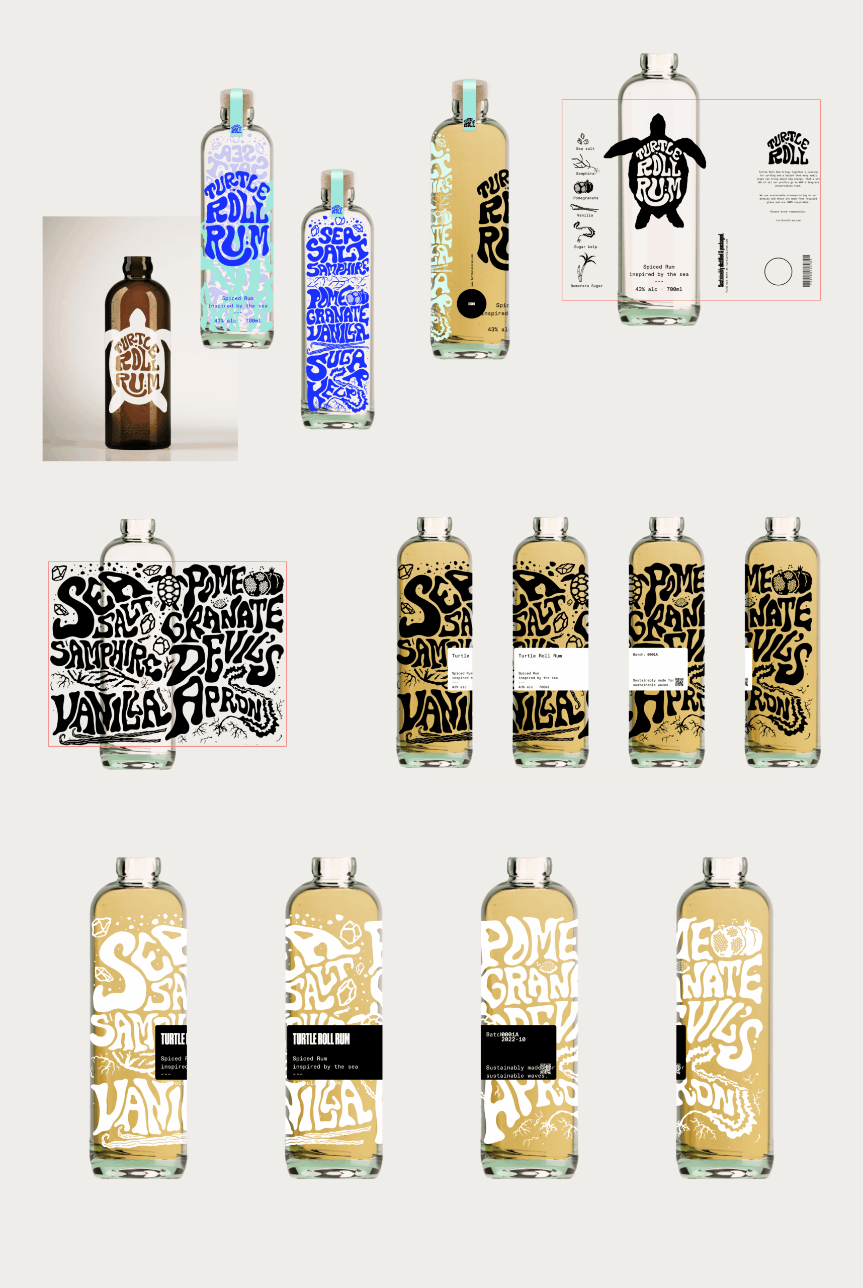
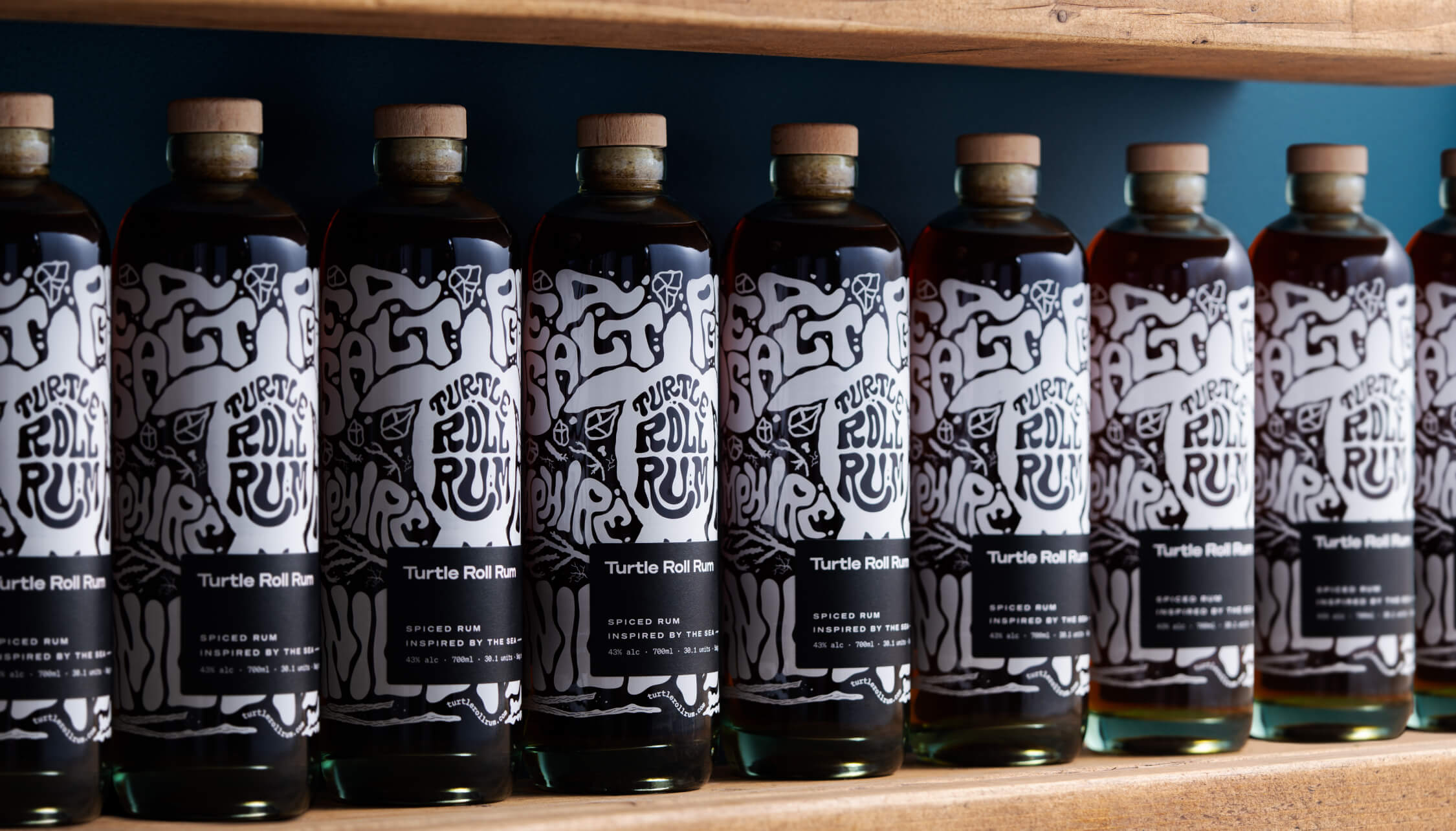
Each bottle is made from 100% recycled glass and screen printed (using sustainable ink), with custom-drawn artwork and lettering that highlights the ingredients. It’s overlaid with a 100% recycled ECF paper label, printed with soy inks and the cork is sealed with a fully compostable, plant-based shrink wrap.
The cork stopper is made with activated charcoal, as this removes the need for additional chemicals and industrial processes. Packaging for shipment is made from bamboo pulp, a more abundant, renewable resource than cardboard.
A focus on re-use
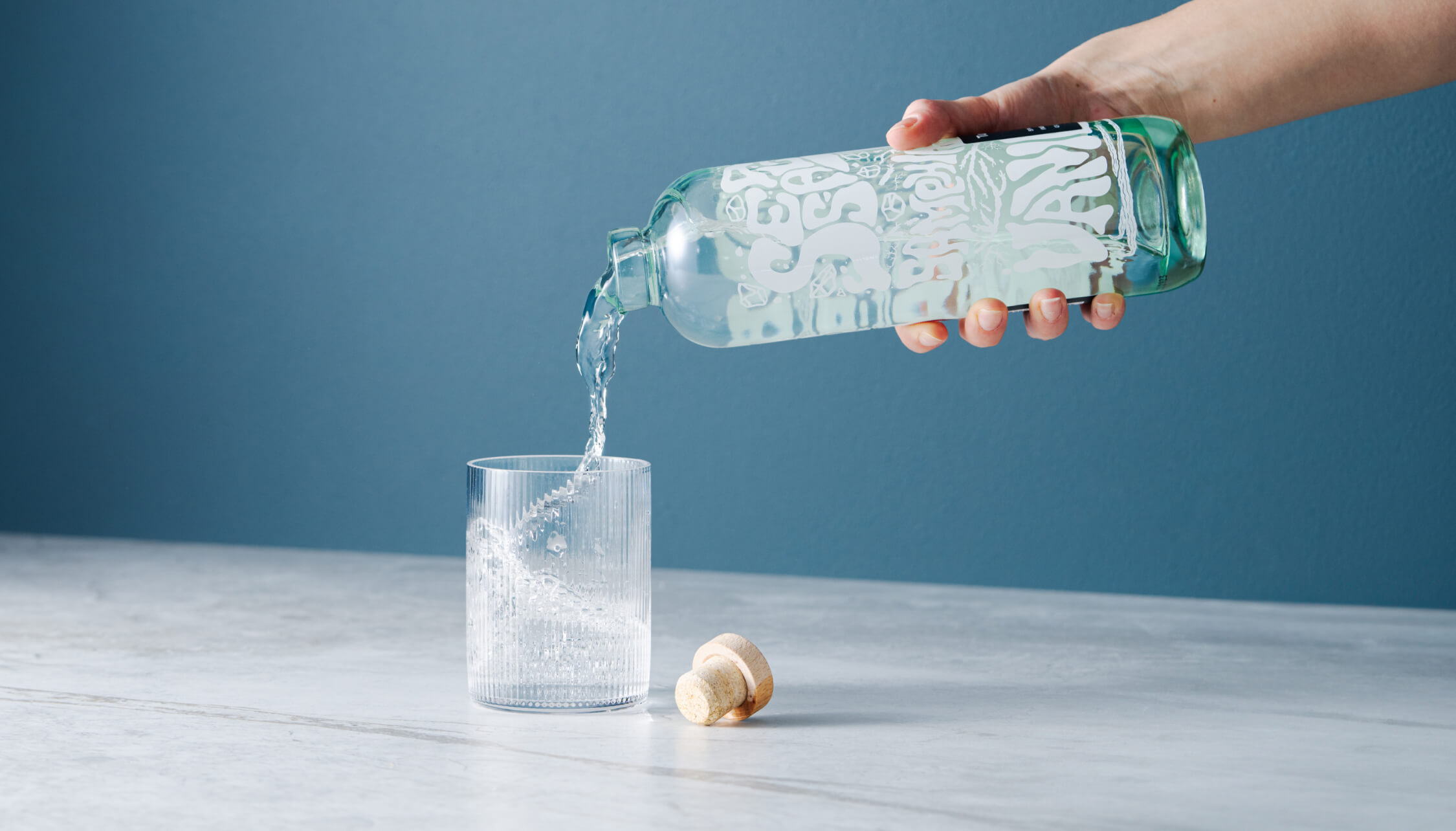
After enjoying the rum, we encourage people to reuse the bottle as many times as possible before they put it into recycling. Our intention was to create a product that sparks conversation and brings a bit of fun to kitchens and dining tables when used as a pitcher for water or vase for flowers.
Merchandise
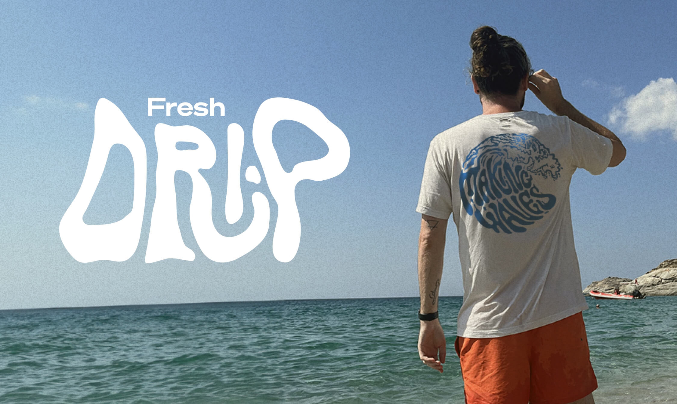
Unit 29 Ventures also wanted branded merchandise so we teamed up with Teemill. We chose them for two reasons. First, their t-shirts and hoodies are made from organic cotton, and they can be returned to be remade into something else once they’re worn out, creating a circular economy, which aligns with Turtle Roll’s value of sustainability. Second, customer purchases are printed and shipped to order, rather than us having to buy and hold stock. From a commercial perspective, as a new venture, this allows us to test users’ buying intent and decide where to focus on growing the range.
The outcome
With commercial strategy and investment from Unit 29 Ventures, and creative, brand and digital activation from Studiomade, we partnered to create a unique, small-batch, premium spiced rum, with sustainability at its heart. The initial limited run of 1,200 is now available at The Cove in Tunbridge Wells, at turtlerollrum.com and proudly stocked at a growing number of bars and restaurants (ideally close to the sea!) in Kent and the South East.
Are you thinking of creating and launching a new product? To discuss how Unit 29 Ventures and/or Studiomade can help you, contact our Founder & Strategic Director, Phil Reid, on phil@studiomade.co
A new direction for an inspiring AI-led health startup
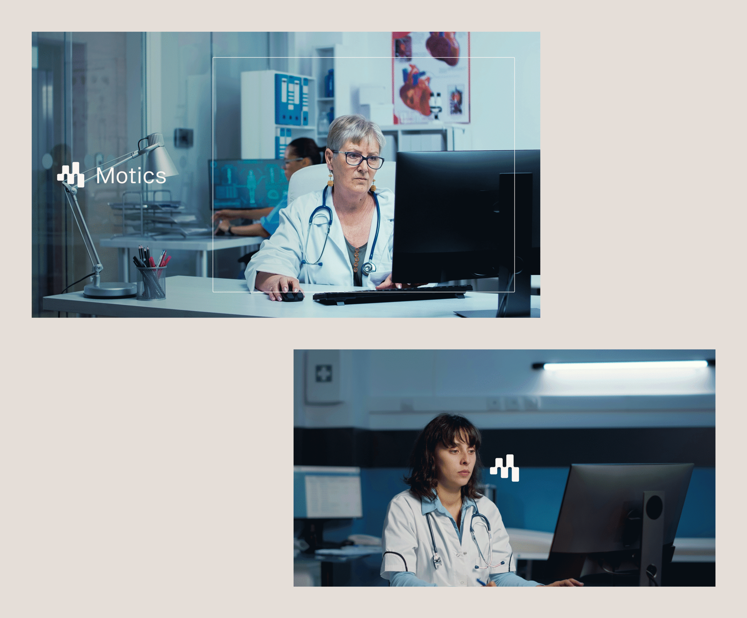
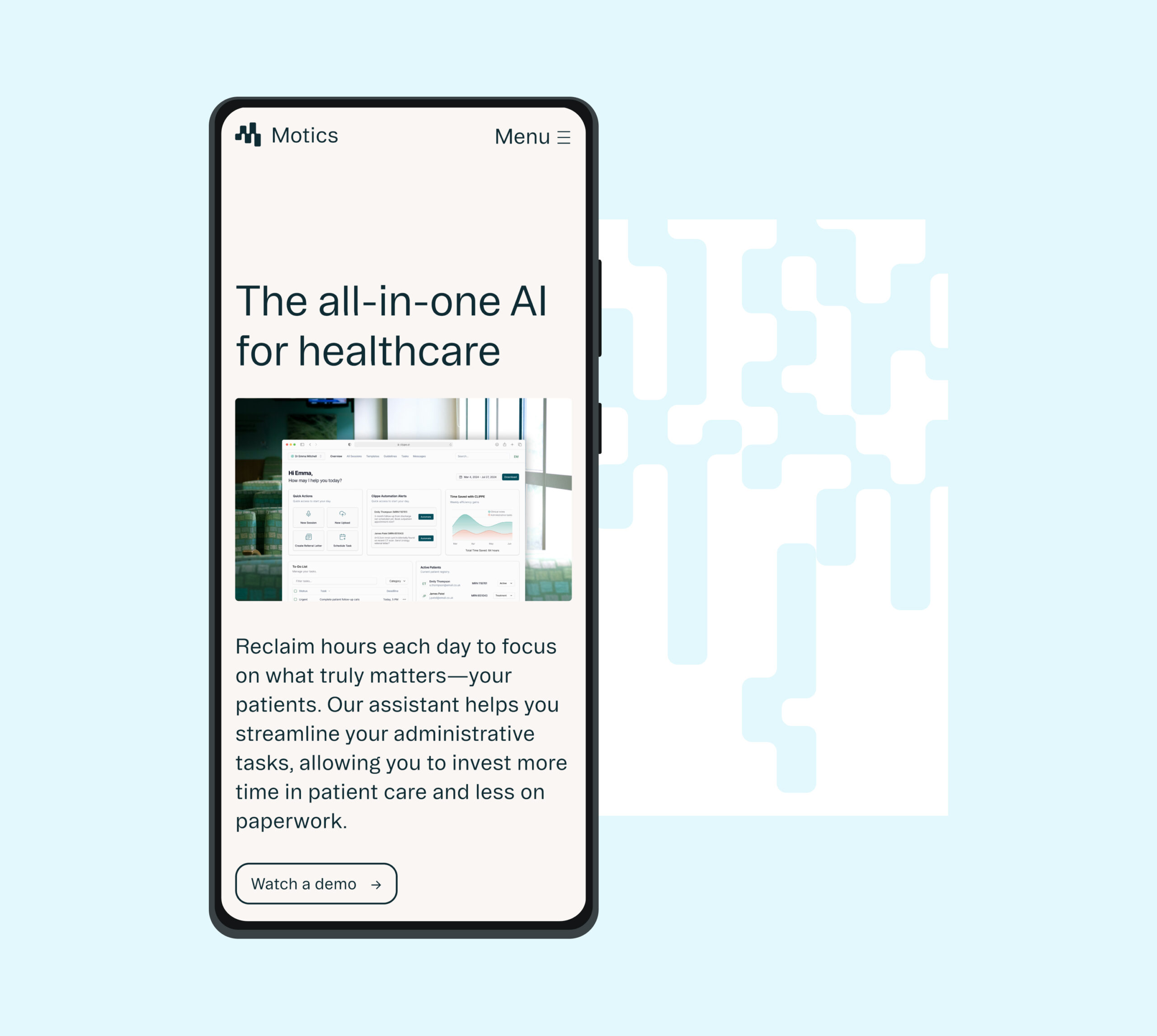
The market for AI in healthcare is booming with the opportunity to make real improvements in patient safety and efficiencies. With so much noise, how can an independent change-maker stand out? Motics automates clinical note taking, referral letters, and more to save hours a day, enabling clinicians and hospitals to spend time doing the things that really matter. The tool helps to improve patient safety, flag errors and deliver a much more efficient method to manage compliance. It delivers a complete AI strategy with full compliance, adhering to NHS and HCPC standards, minimising errors and improving documentation quality.
Understanding their position
Working with startups often means keeping pace with rapidly evolving products and ambitions. This demands a flexible, iterative approach to achieving clearly defined goals and objectives.
This project centred on clarifying the client’s unique positioning and creating a versatile creative platform that would empower them to clearly communicate their distinct value. We ensured the brand was adaptable enough to scale fluidly and evolve seamlessly alongside their ongoing growth and aspirations.
In guided workshops, we explored why they exist, the value they offer to clients, and – crucially – got to know the people behind the business. We learned their story, the path they’d travelled, and their vision for the future. From these sessions, we defined their core values as ‘adaptability’, ‘tenacity’, ‘precision’, ‘resilience’, and ‘responsibility’ providing a clear tonal framework to inform creative decisions and authentically reflect their ethos and ambition.
Ethical, responsible AI
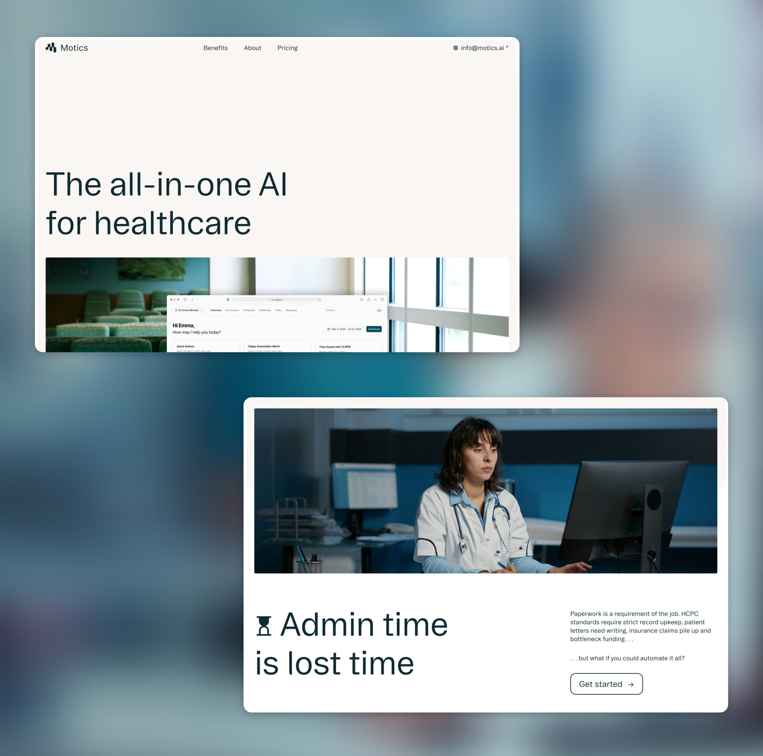
Healthcare is a notoriously crowded market – one that is scary to stand out in. Being safe and trustworthy is often more powerful than being a disruptor. A key goal for the project was to create a brand that helped Motics stand out from the crowd, but also reflected their commitment to compliance and ethical use of AI as a tool.
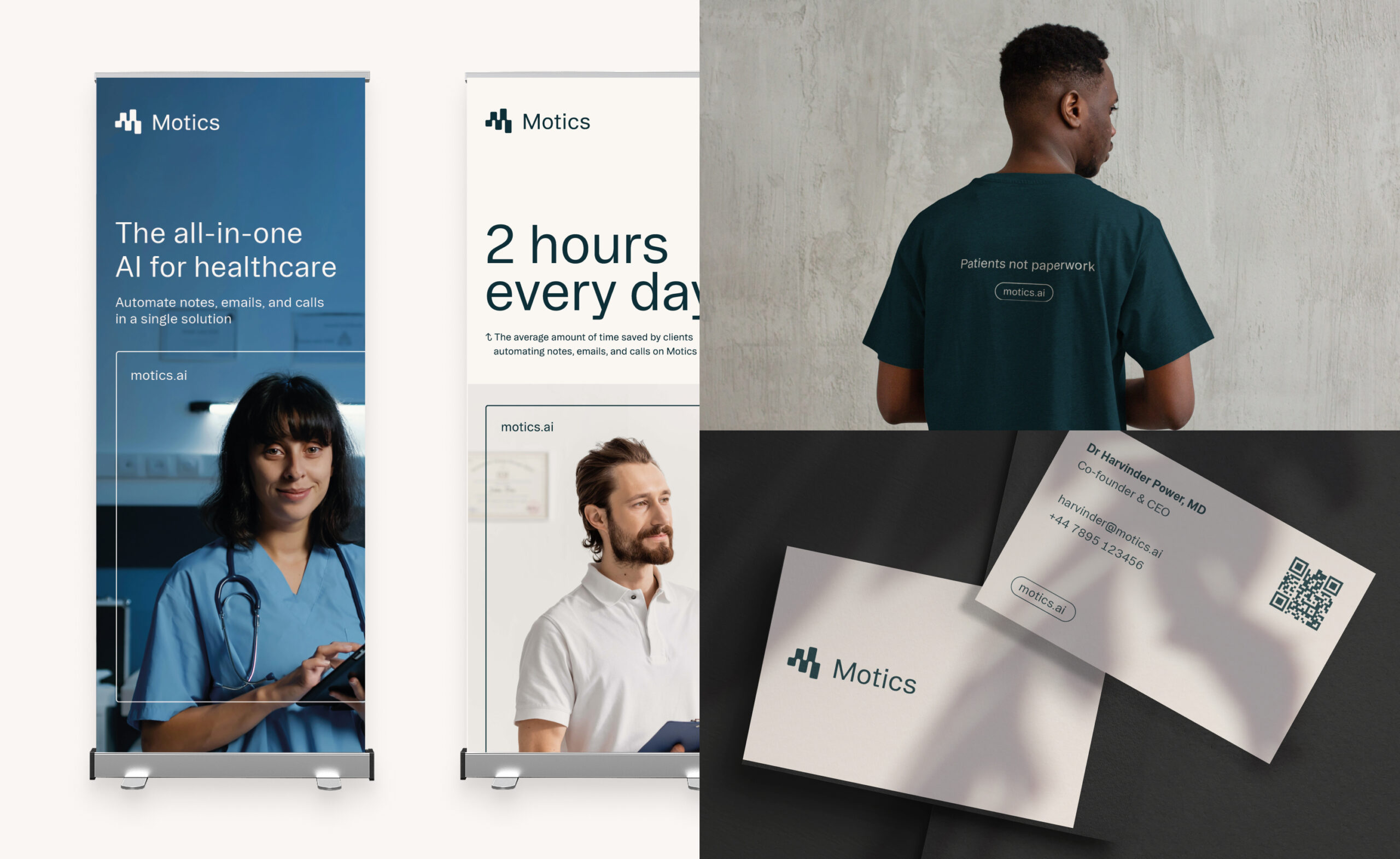
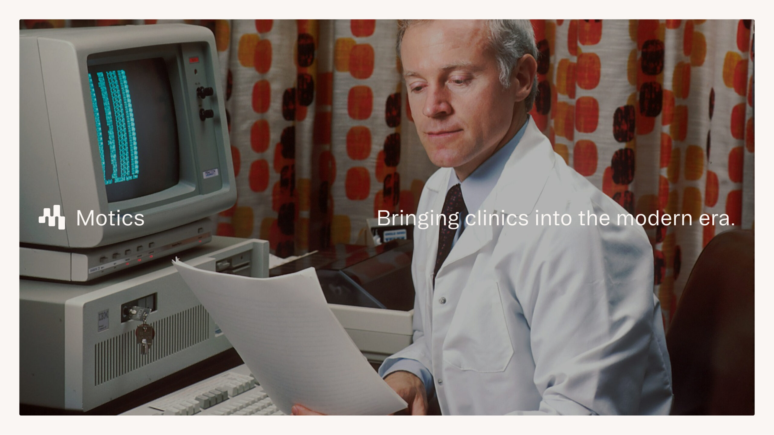
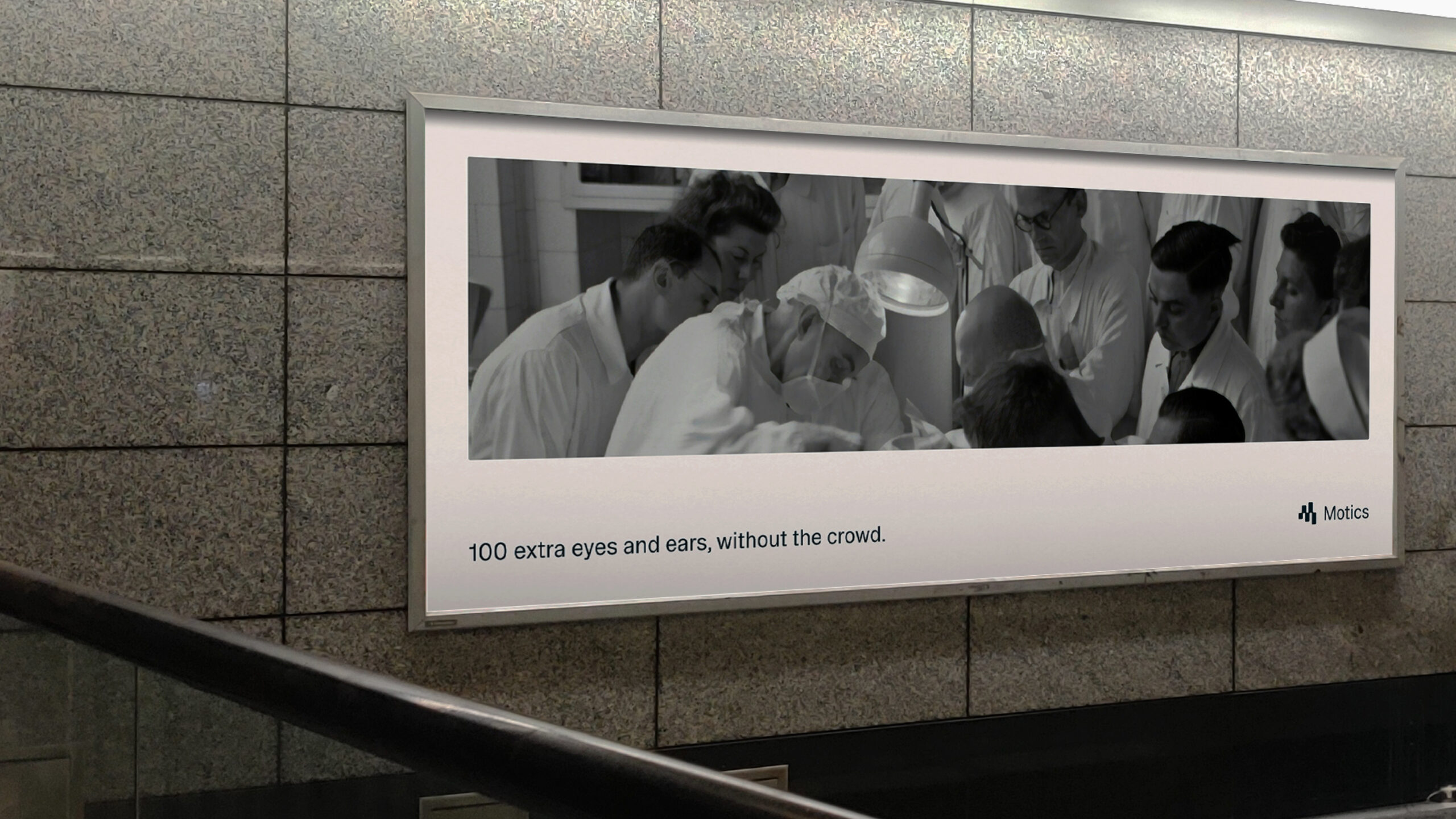
We developed a creative approach for the brand that prioritised clarity and simplicity in the presentation of information. Similarly, we chose an approach to photography that was informed by Motics’ focus on functionality over form. They’re creating real innovation that help real doctors and clinicians, not science fiction for futuristic labs that don’t exist. The occasional use of older photography also serves as a nod to how far healthcare and technology have progressed.

More than a mark
The Motics logomark needed to reflect the continual development and evolving knowledge that underpins their operations as a business. We designed an abstract ‘M’ that is both fluid and calculated in its movement. Through its motion, the mark suggests loading and thinking, bringing an added sense of personality and becoming a living and breathing representation of the brand.
Developing a design system
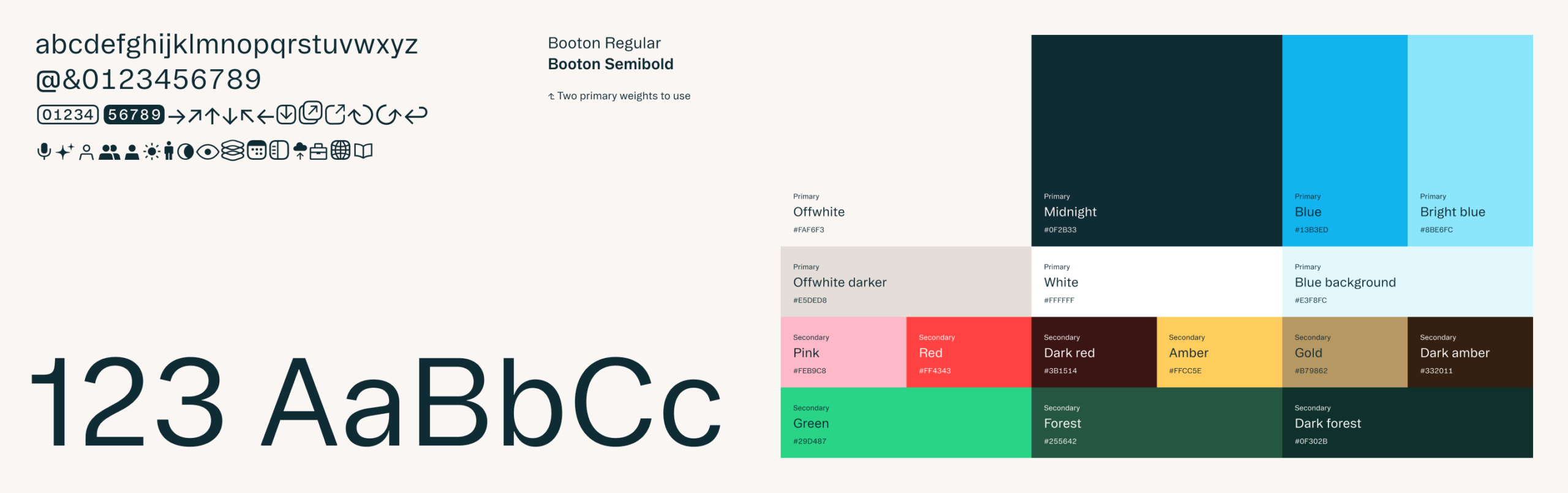
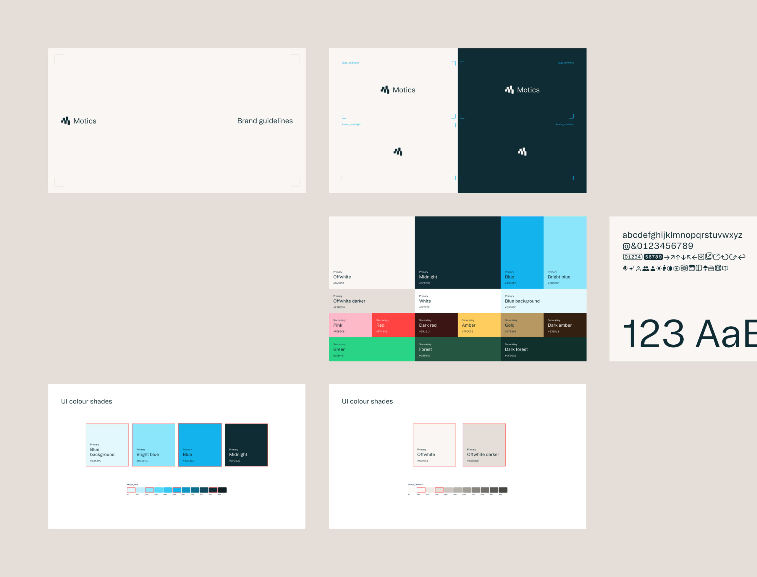
To enable the Motics brand to grow and evolve in a cohesive way we created a foundational set of guides on colour, type, and photography. We worked directly with them in a shared Figma environment which made sharing assets and thoughts on the design process incredibly efficient. We provided insight on their current product UX and UI and worked to update their use of their existing product design library. The components that we have provided equips the Motics team with tools to consistently implement the brand themselves while allowing room for growth and adaptability as they grow.
The next stage
We are now working with Motics to develop their digital presence across their web and product experience, taking insight from audience input and needs with those that have already interacted with the new brand.
Today & Tomorrow
Motics was the first company to benefit from our Today & Tomorrow initiative, designed to support transformative startups in different market sectors. This program provides emerging businesses with tailored brand strategies and creative solutions that align with their long-term ambition. For Motics, this meant crafting a forward-thinking brand identity and toolkit that supported their innovative AI-driven healthcare solution while ensuring scalability as they grow.
By participating in the initiative, Motics received a dedicated strategic delivery that balances immediate needs with future-proof design principles, reinforcing their position as a trailblazer in the healthcare sector.
Project background
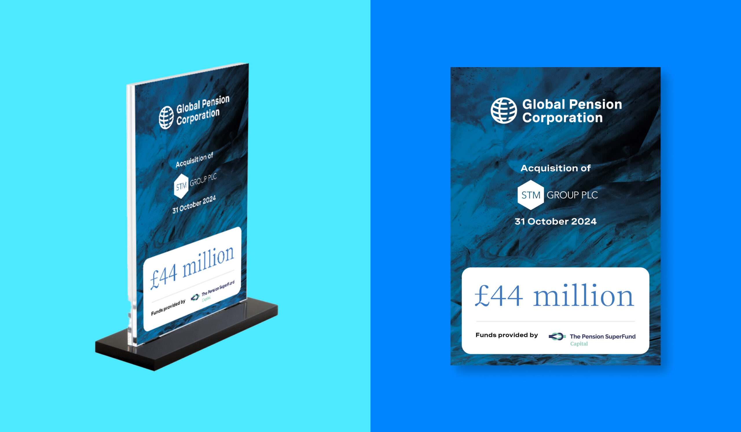
Following the acquisition of STM Group Plc, Global Pension Corporation (GPC) sought to establish itself as an innovative leader in pension management. This transition aimed to set new industry standards and establish the organisation as a trusted resource for international pensions, life assurance solutions, and more. With a clear mission to bring transparency, security, and quality to pensions and savings, GPC partnered with Studiomade to create a cohesive brand transition and digital presence that would resonate with a global audience and position it as a forward-thinking company within the financial services sector.
Our objectives
We were tasked with developing a brand identity that would:
- Reflect the organisation’s expertise and innovative approach to pension and savings solutions
- Build brand visibility while emphasising a mission to evolve the pensions landscape for the better
- Provide brand unification across multiple business units and regional entities as part of the acquisition process
- Establish a strong and scalable digital presence with an engaging, informative website ready to release at the point of purchase.
Brand Development Process
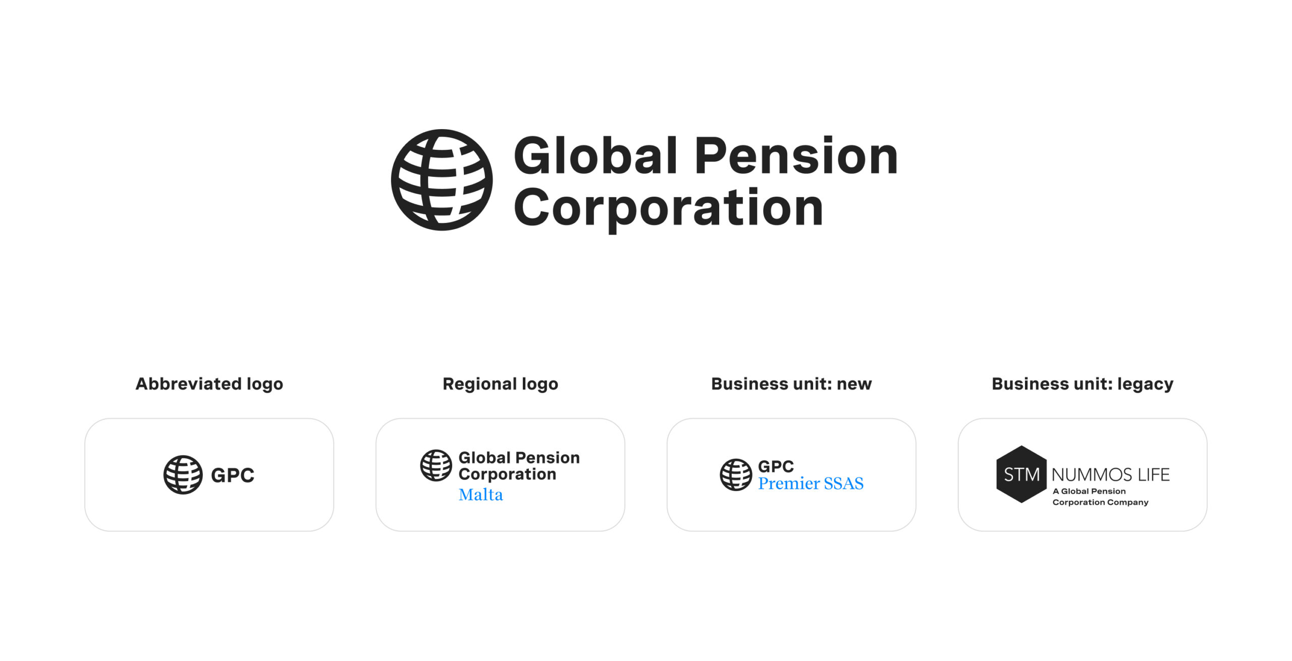
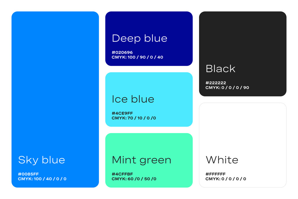
We worked closely with the client to design a brand approach and visual identity that would convey strength, trustworthiness, and modernity. A colour palette was chosen to evoke tranquility and stability, while gradients were used to add depth and sophistication. The primary brand logo features the full ‘Global Pension Corporation’ name, with a simplified ‘GPC’ variant for specific brand applications and avatar use. A clear naming hierarchy was developed to maintain consistency across the organisation’s global regions and business units to provide clarity to existing and new clients.

Tone and messaging
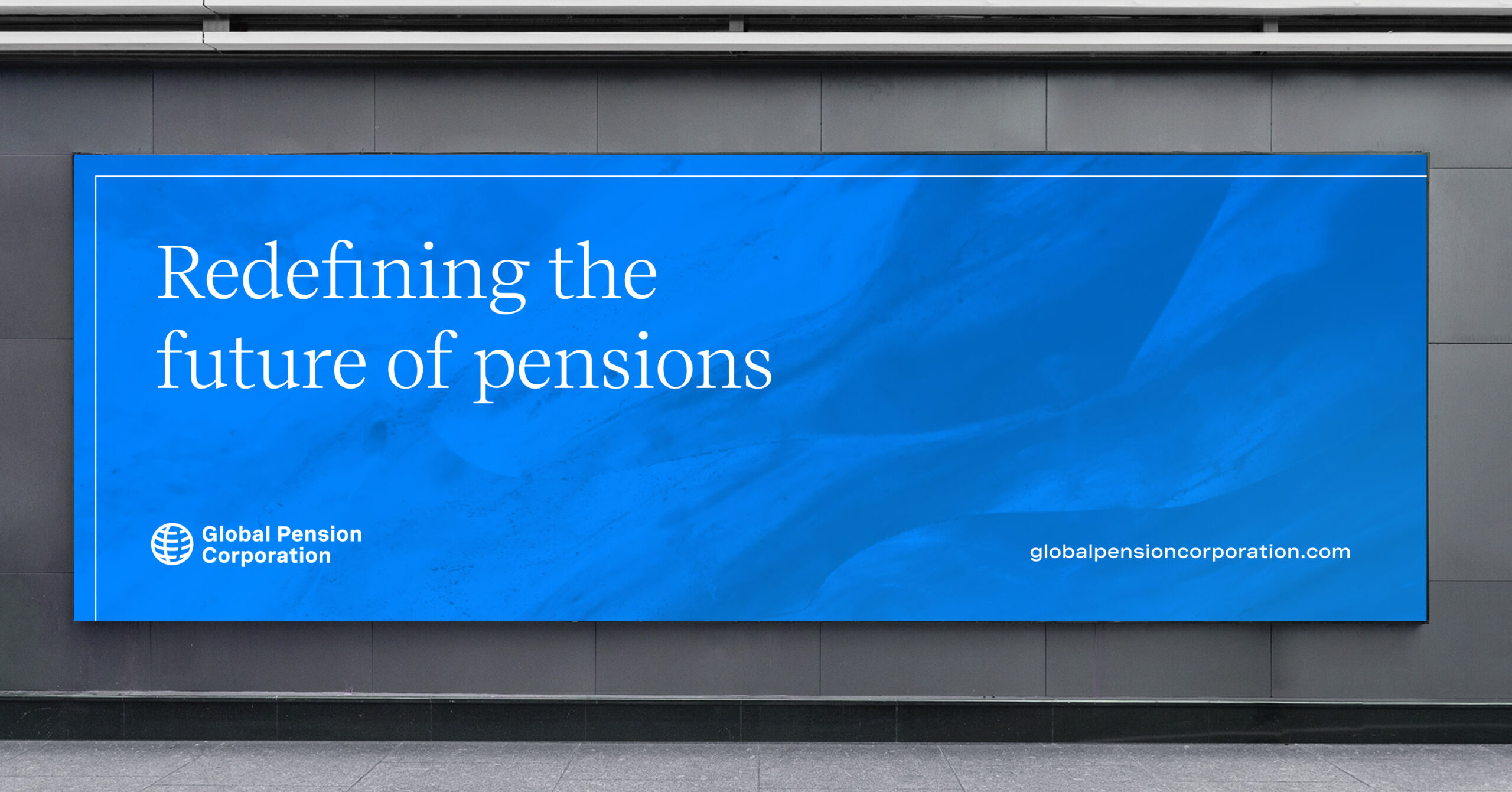
The brand voice was crafted to be both professional and accessible, resonating with corporate clients and individual policyholders. Messaging was centered on GPC’s commitment to ‘a brighter, more secure retirement for everyone’, reinforcing the company’s client-focused approach. Key phrases like ‘Redefining the future of pensions’ and ‘Unwavering support’ were used across brand materials to emphasise GPC’s dedication to excellence and client satisfaction.
Digital presence and customer experience
We developed a user-friendly website (custom-built in WordPress) that provided a showcasing of all business units acquired through the STM Group Plc purchase. The website was designed with a clean, structured layout, incorporating linework from the brand style and organised through sections that guide users to GPC’s services, expertise, and values. Emphasis was placed on easy navigation and the ability for an individual to quickly locate relevant information on pensions, trust management, and product offering. High-quality photography of natural landscapes, coupled with subtle gradients, created a visually engaging experience reflective of GPC’s values. With a siteplan that allows for simple scaling as product strategy evolves, the presence is a building block to wider customer experiences that will launch in the future.
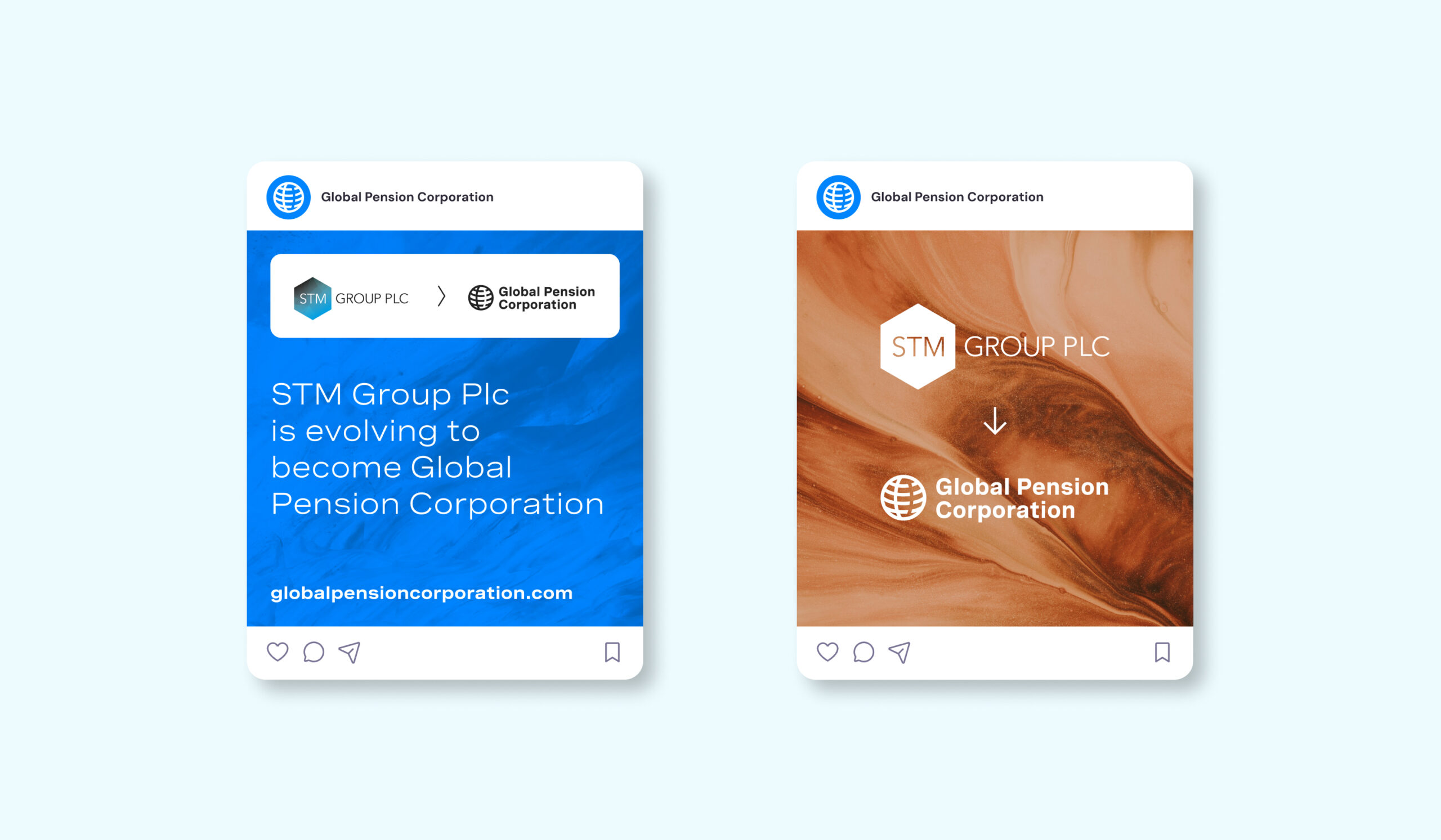
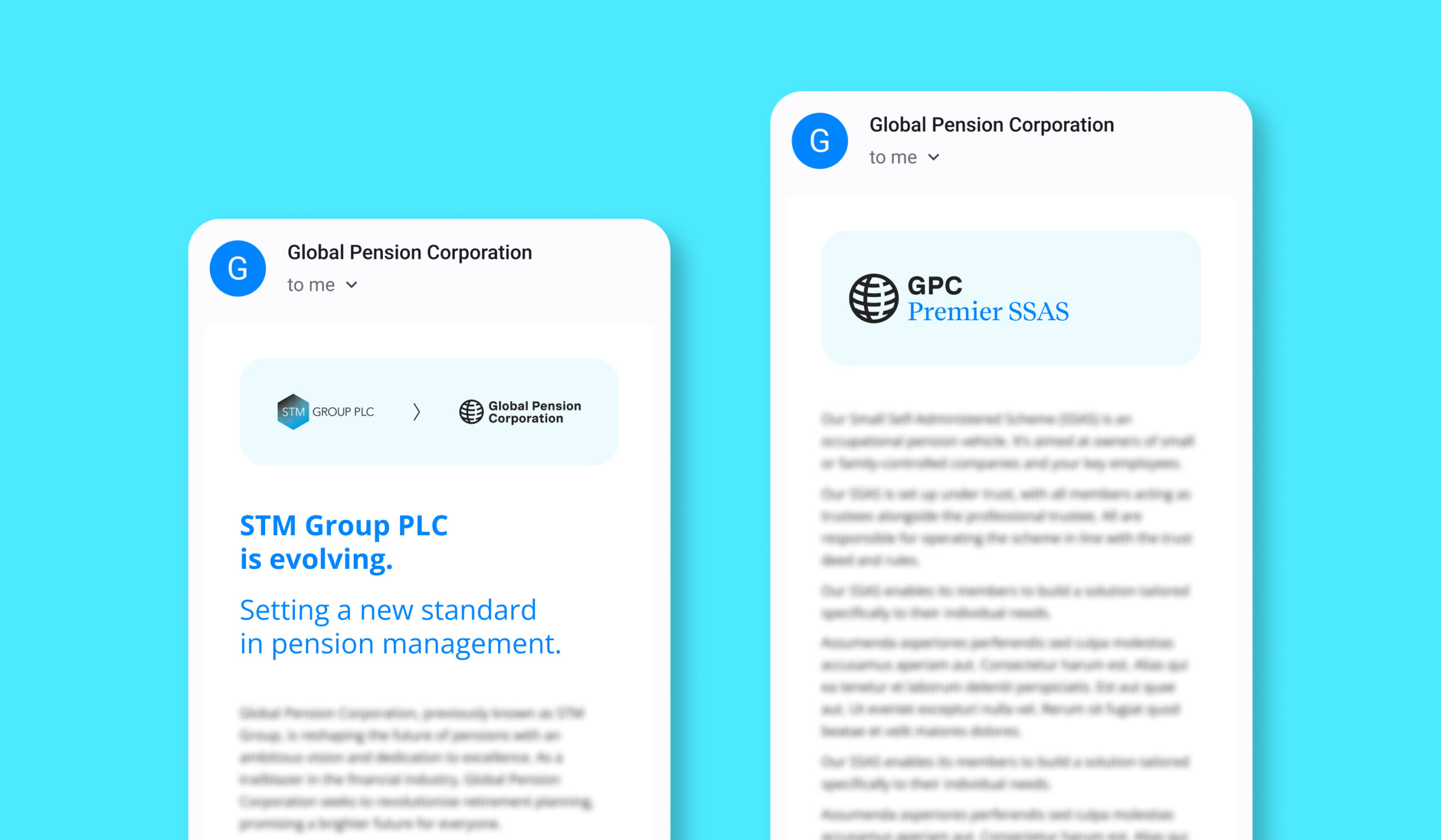
In addition, our team managed the email engagement and communications outreach that informed existing customers and IFAs to the brand change and introduction of Global Pension Corporation.

Brand guidelines and digital templates
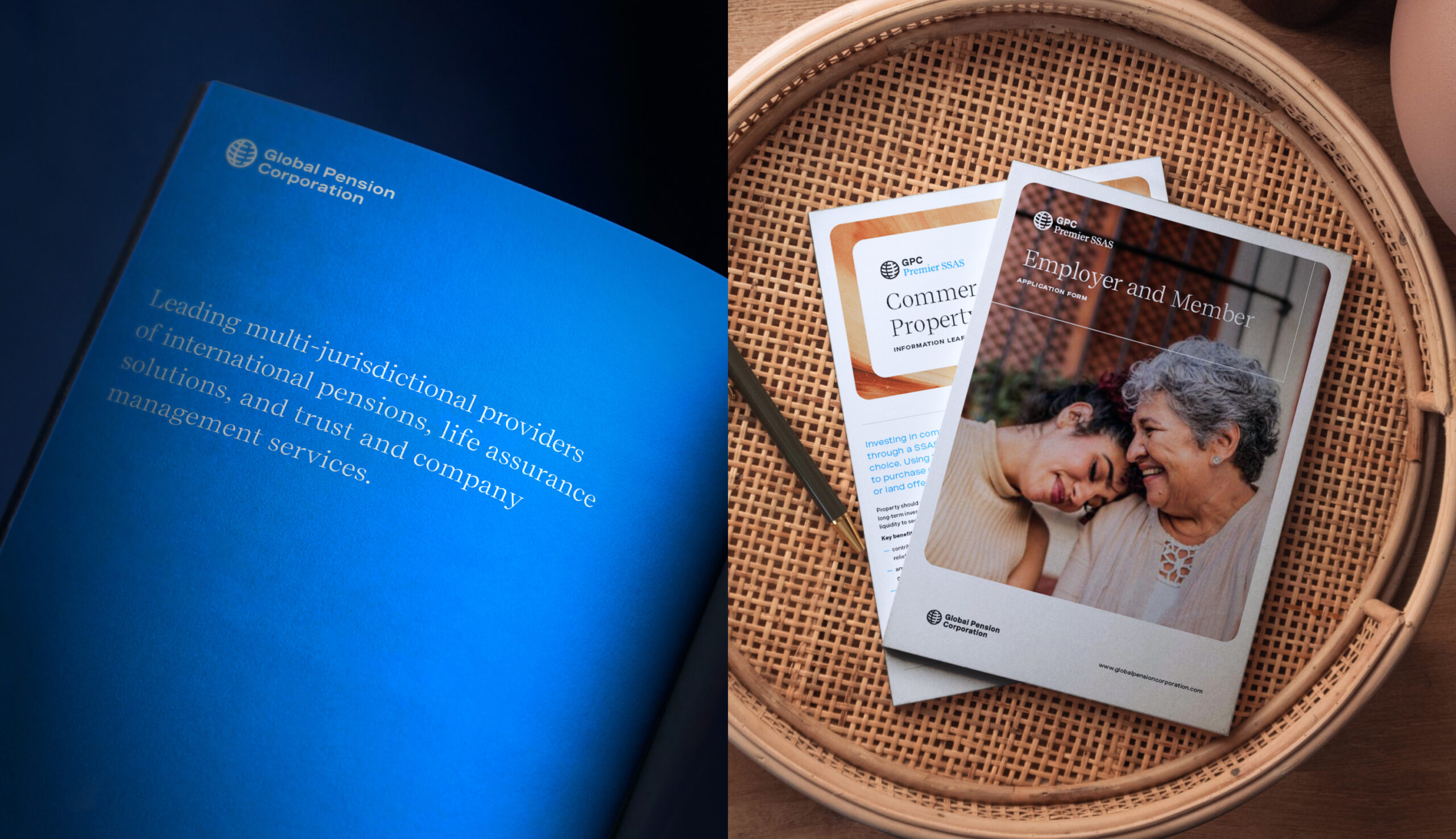
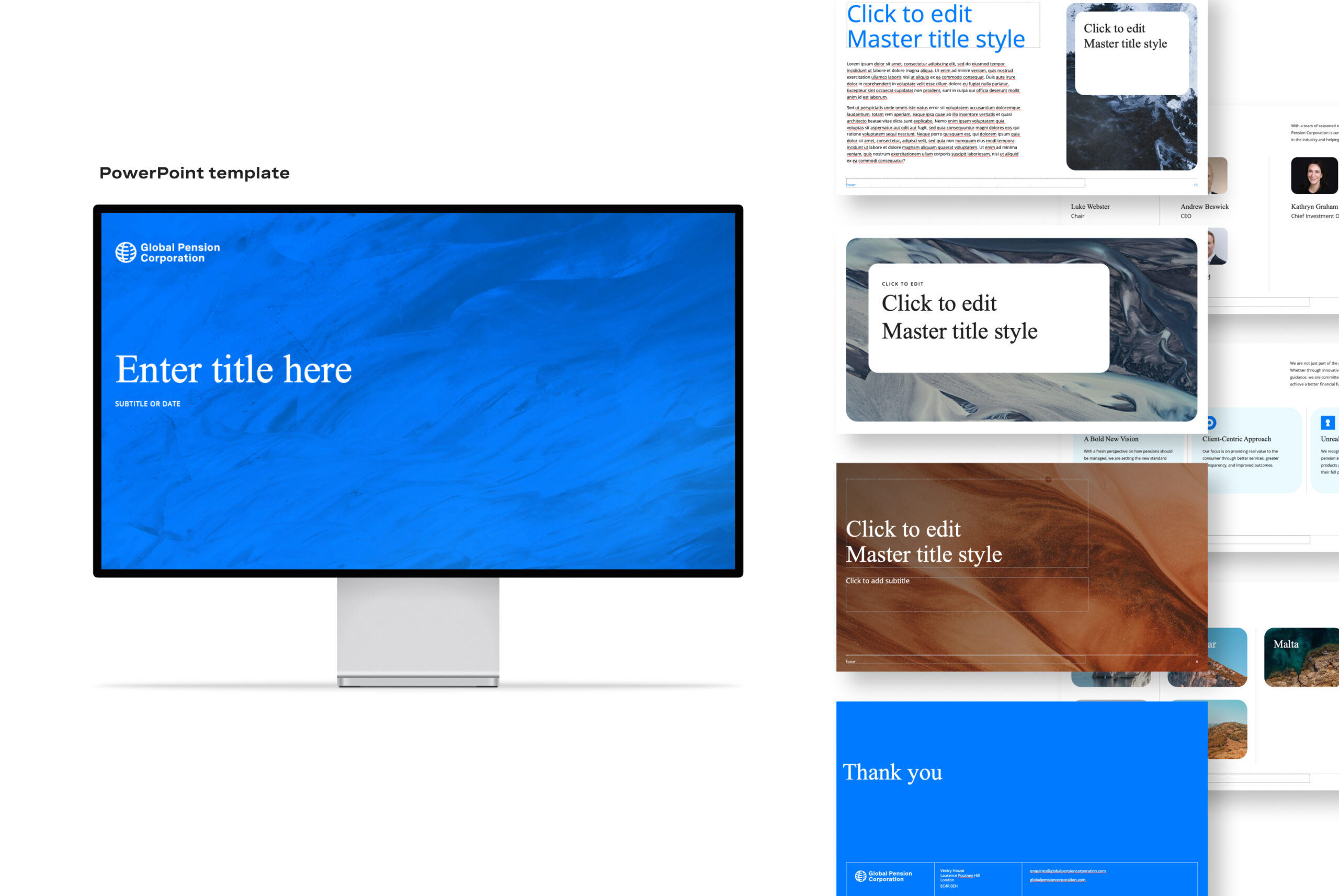
In addition to the website, we provided the existing internal team a resource library comprising of brand guidelines and templates for social media, email, presentations, and marketing materials, with live Figma and InDesign references to ease implementation. This collaborative approach helped ensure brand consistency across digital and print platforms. Our assets were designed to allow easy customisation, enabling GPC to communicate quickly and effectively with diverse audiences across its various regions and business units.
Outcomes and market impact
This cohesive brand approach, messaging, and digital presence has contributed to GPC’s growing credibility and visibility in the pension and savings marketplace. Clients can now engage with a brand that embodies trust and innovation, gaining confidence in GPC’s ability to deliver secure and forward-thinking pension solutions.
Conclusion
Our work with Global Pension Corporation exemplifies the power of strategic branding to help define a company’s market position, particularly as part of an acquisition process. By creating a visually engaging brand and cohesive guidance to implementation, we have enabled the GPC team to communicate its purpose effectively, paving the way for future growth and success within the pension and savings sector.
Project background
Rosebury Real Estate was founded with a clear vision: to bring a new level of expertise and insight to the retail property market, drawing on over 130 years of combined experience among its team members. Their focus on data-driven, analytical approaches to property investment meant they needed a brand that would reflect both their rich industry knowledge and their commitment to innovative, real-time insight.
We were commissioned to create a brand identity that aligned with Rosebury’s goals, positioning them as a forward-thinking, market-leading force in the commercial property sector.
Brand objectives
The primary goal was to craft a brand that would encapsulate Rosebury’s expertise while differentiating them in a competitive market. Specifically, the brand needed to:
- Highlight Rosebury’s deep experience and heritage within the Out-of-Town Retail sector
- Establish a strong, professional presence that would appeal to high-level investors and property managers
- Convey trustworthiness, innovation, and a commitment to excellence.
Translating the vision into reality
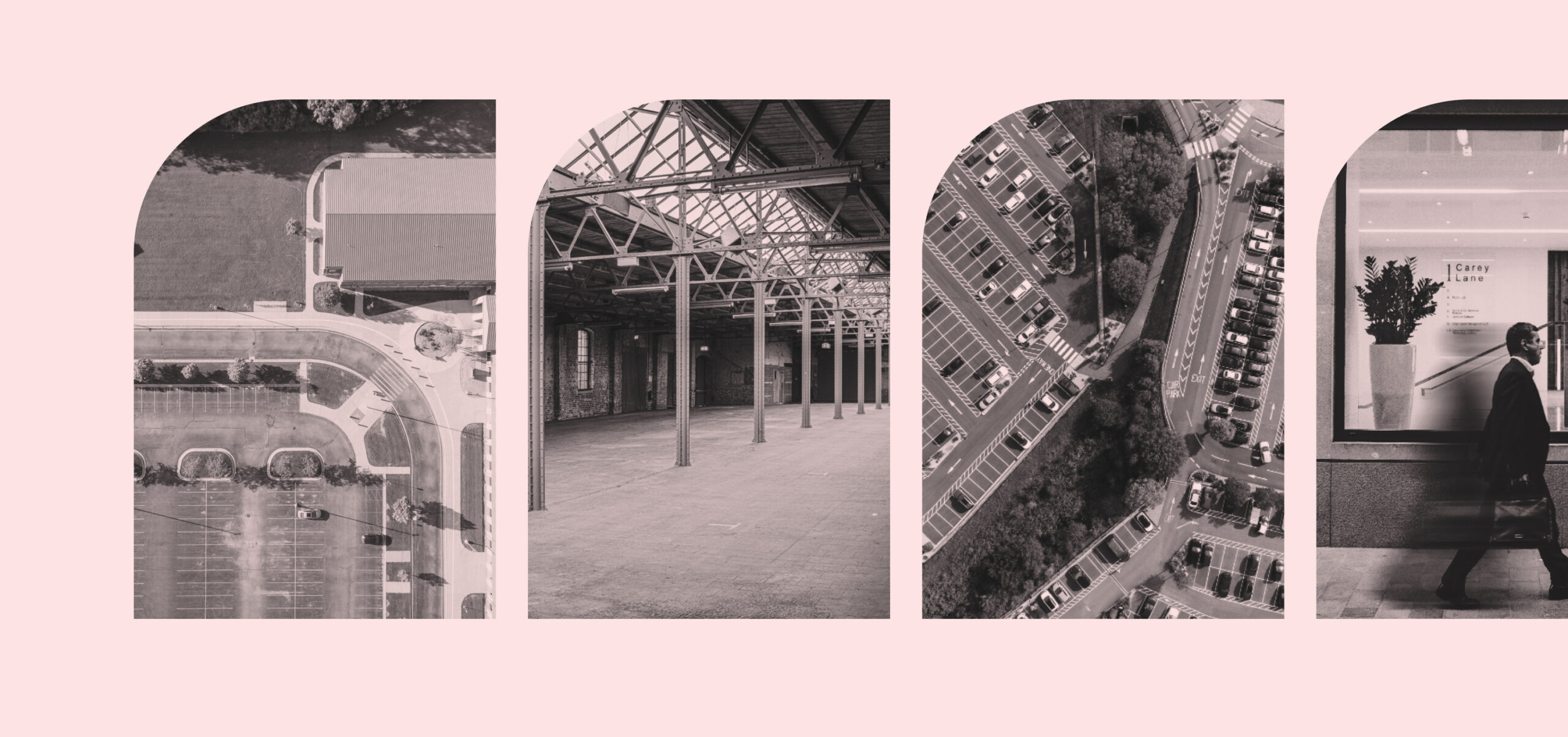
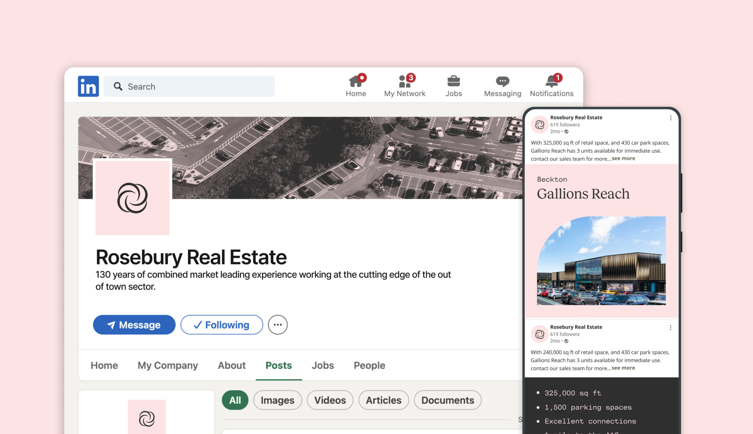
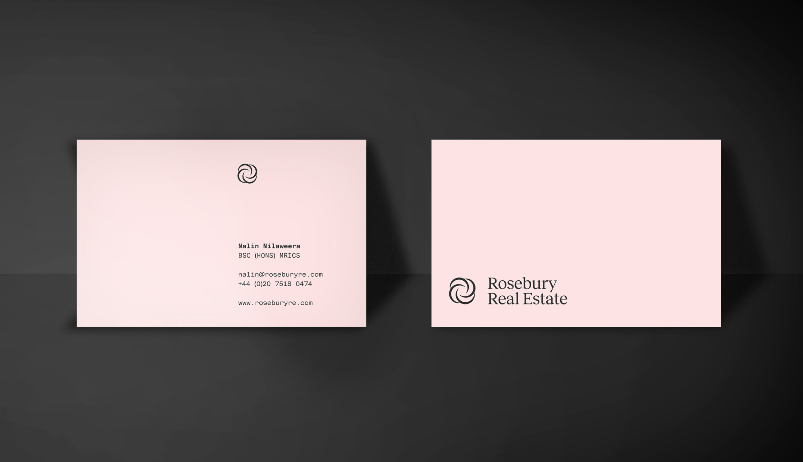
To capture Rosebury’s vision for their brand, we worked together and homed in on key tonal words of ‘warmth’, ‘refinement’, and ‘analytical insight’. We developed a visual approach that balances a sense of warmth and personal touch with an underlying precise nature driven by data and accuracy. ‘Rosebury Real Estate’ and the abbreviated ‘Rosebury RE’ were developed in typographic form, with the visual mark paired alongside the colour palette to provide a refined and sophisticated approach.
Messaging and brand voice
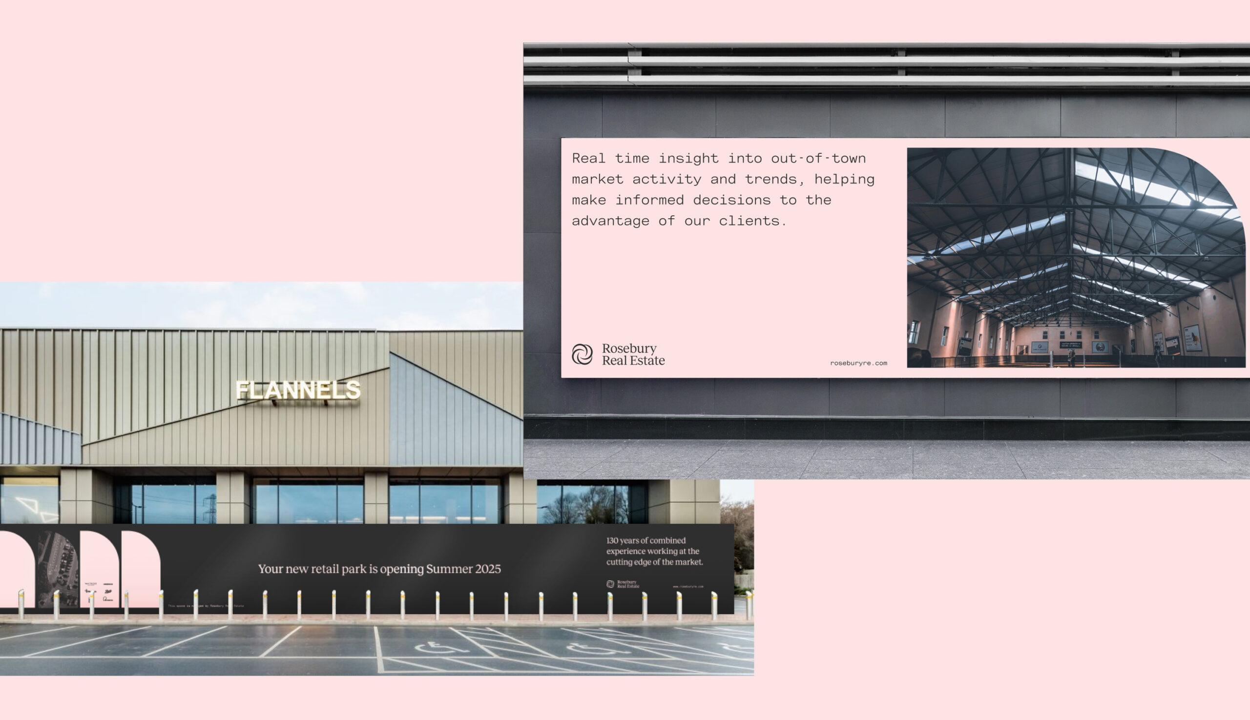
The tone of voice we developed takes similar inspiration from their visual cues and emphasises clarity, expertise, and reliability. We made sure to highlight Rosebury’s analytical approach, ability to provide real insight, and dedication to helping clients maximise their property investments. Language such as ‘Real-time insight into market activity and trends’ and ‘Empowering informed decisions in property investments’ were developed to reinforce their analytical approach.


Brand expansion
Our implementation of the brand spanned a simple (WordPress) website presence, flexible template creation and guidance to how the brand should evolve to best reflect Rosebury’s services, expertise, and market insight.
Outcomes and market impact
The brand identity successfully positions Rosebury Real Estate as a knowledgeable, experienced, and forward-thinking firm. With a visually cohesive approach, Rosebury RE is now positioned to attract high-value clients looking for expertise in the commercial out-of-town retail sector. The brand’s emphasis on real-time insights and data-driven strategies has helped differentiate Rosebury from competitors, enhancing their visibility and reputation.
The DB pensions landscape
There are more than 5,000 defined benefit (DB) pension schemes in the UK (schemes which pay pension benefits based on salary and length of service) with £1.4tn in assets. Around 9.6 million members are relying on them for their expected retirement income. However, private sector DB schemes are in decline and an estimated £400bn worth of trustees and sponsors are seeking full settlement of member benefits by transferring their assets and liabilities.
But there are challenges in the marketplace. Demand for settlement is surpassing supply. Sponsors (usually the employer), who may be under financial stress, need enough money to fulfil their pension commitments to employees and are looking to remove their financial risk. Trustees, who oversee pension funds’ management, have to safeguard members’ interests even if it means sponsor insolvency. Stakeholders need strategies to navigate this.
PSF Capital’s solution
PSF Capital has launched a new solution to the market, CovenantPlus. This Capital-Backed Funding Arrangement (CBFA) gives DB schemes access to external capital to help them meet their funding and investment objectives, using an agreed strategy and timeframe. It gives sponsors cash-flow certainty and removes risk. It gives trustees a strong covenant, protection from scheme failure and greater security in protecting member’s pension benefits, supporting their end-game strategy.
Our role
We helped craft and position this new venture including building the brand, establishing a look and feel that best suited the B2B marketplace and crafting a digital presence that would talk to all stakeholders. Our input included client engagement and lead generation through the delivery of a seamless digital experience and gated content.
Working within the finance sector often involves short timeframes were opportunities need to be seized quickly. Our work with Covenant Plus allowed for a 3-month timeframe, where all ideation, content planning, design and development was tackled – allowing for the concept to be realised and released to market quickly.
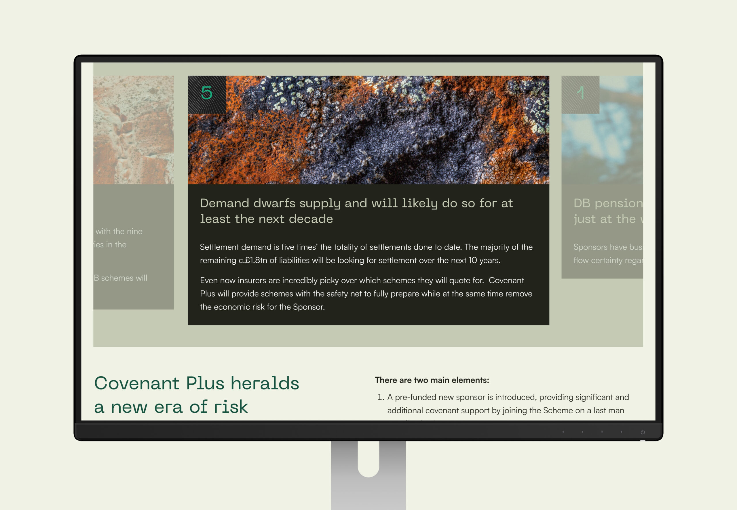
We created areas of open access content along with locked content to encourage registration and lead gen. Once registered, users were provided access to a data room and case studies showing details of solutions PSF has provided to other schemes.
Brand creation
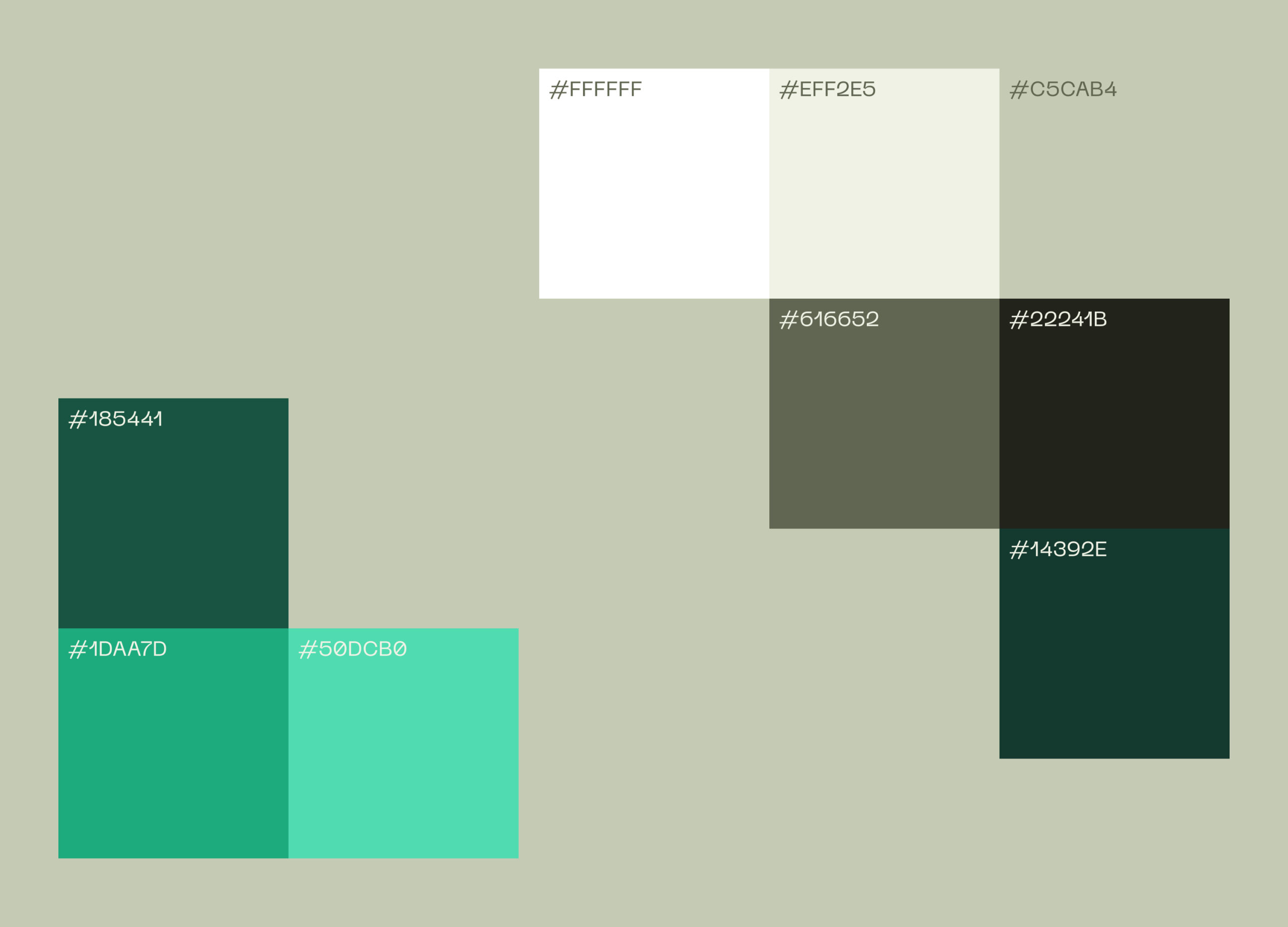
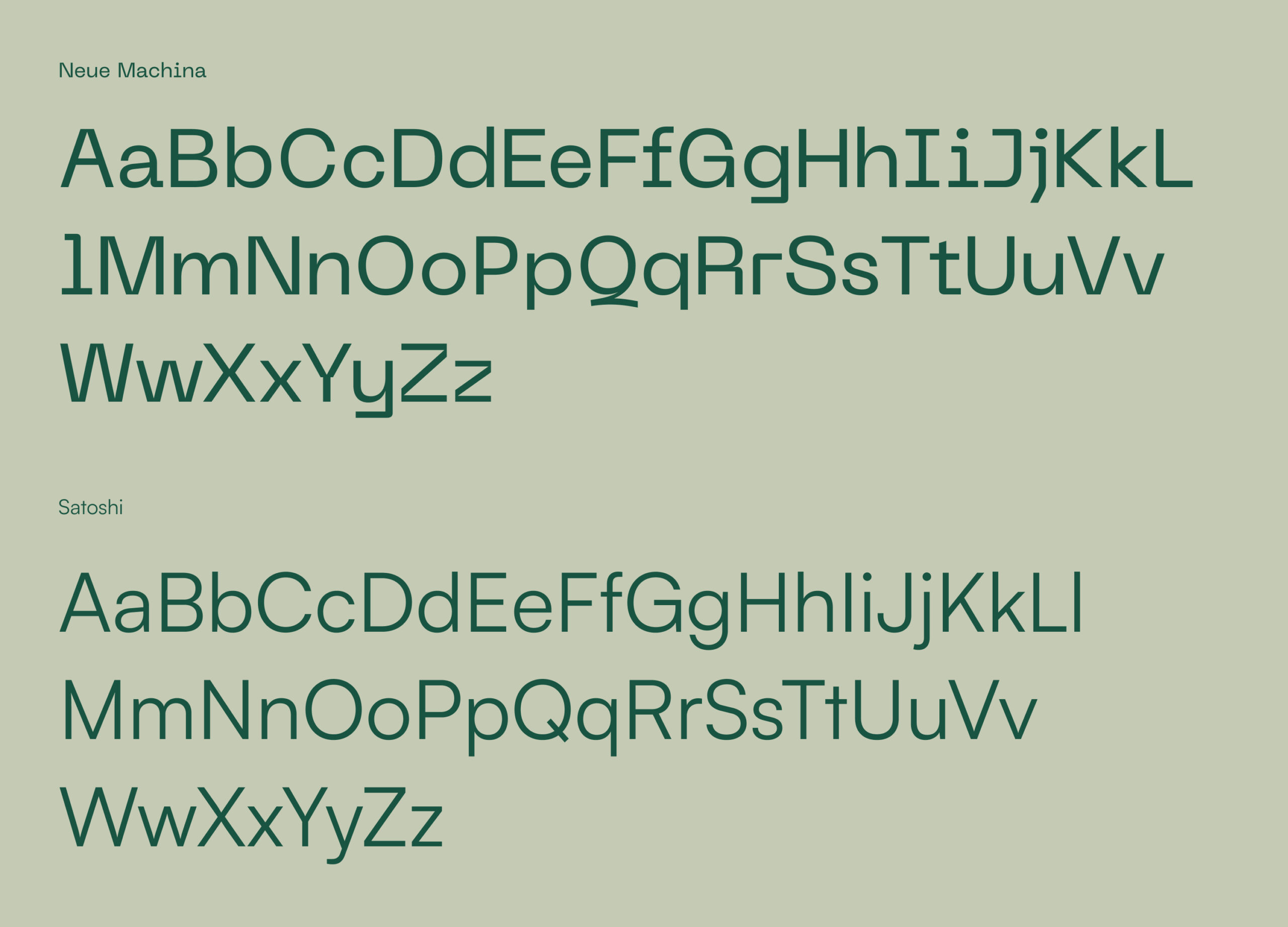
Our visual identity for the brand centres around safety, trust and certainty about the future. To invoke these feelings we’ve used strong architectural images with 90° angles and encased the logo and brand motif in robust holding device. PP Neue Machina is the typeface, chosen for its personality, echoing the straight edges and secure nature of other brand components. We particularly like the detail of the inktraps (where some corners are removed from letterforms) as this gives character to the typeface and is very distinctive for this ‘secure’ brand.
The outcome
CovenantPlus is a belt-and-braces approach to reaching a settlement or managing a scheme in a run-off period, removing related economic risk for the sponsor and removing the sponsor risk for the trustees. As PSF’s chosen creative partner we helped to launch a venture that manages risk, gives sponsors and trustees more security, and supports a better future for employers and their pension scheme members.
Educore initially approached us to design and build a website for the Educore Foundation. However, as we explored their needs, it became clear that their three linked organisations – Educore Services, Educore Foundation and Educore Academy each had distinct purposes and audiences and needed to renew their overall creative brand vision. This project therefore evolved beyond a single website into a strategic transformation, helping Educore better articulate its educational mission, unlock new funding opportunities, and craft a more unified brand presence.
Goals included:
- Moving beyond the “school-only” perception
- Creating an umbrella brand that supported sub-entities
- Establishing a digital presence that could better attract partnerships and funding
- Reflecting core values of innovation, care, and educational excellence.
Brand Identity System
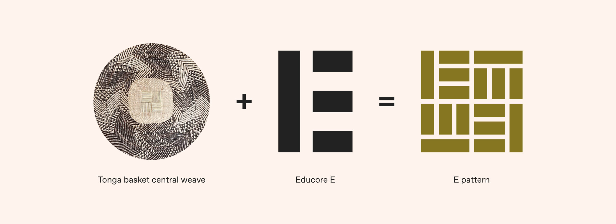
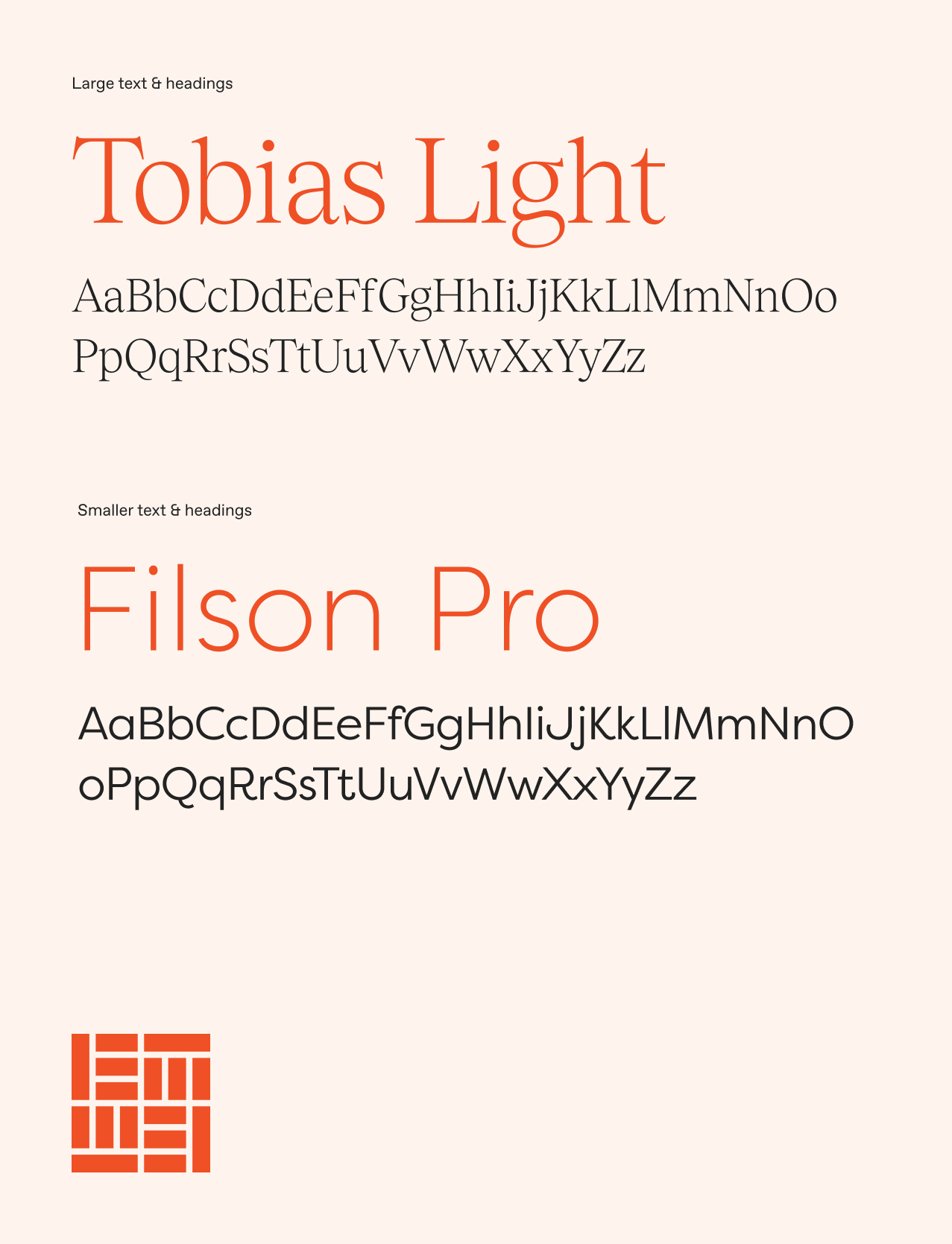
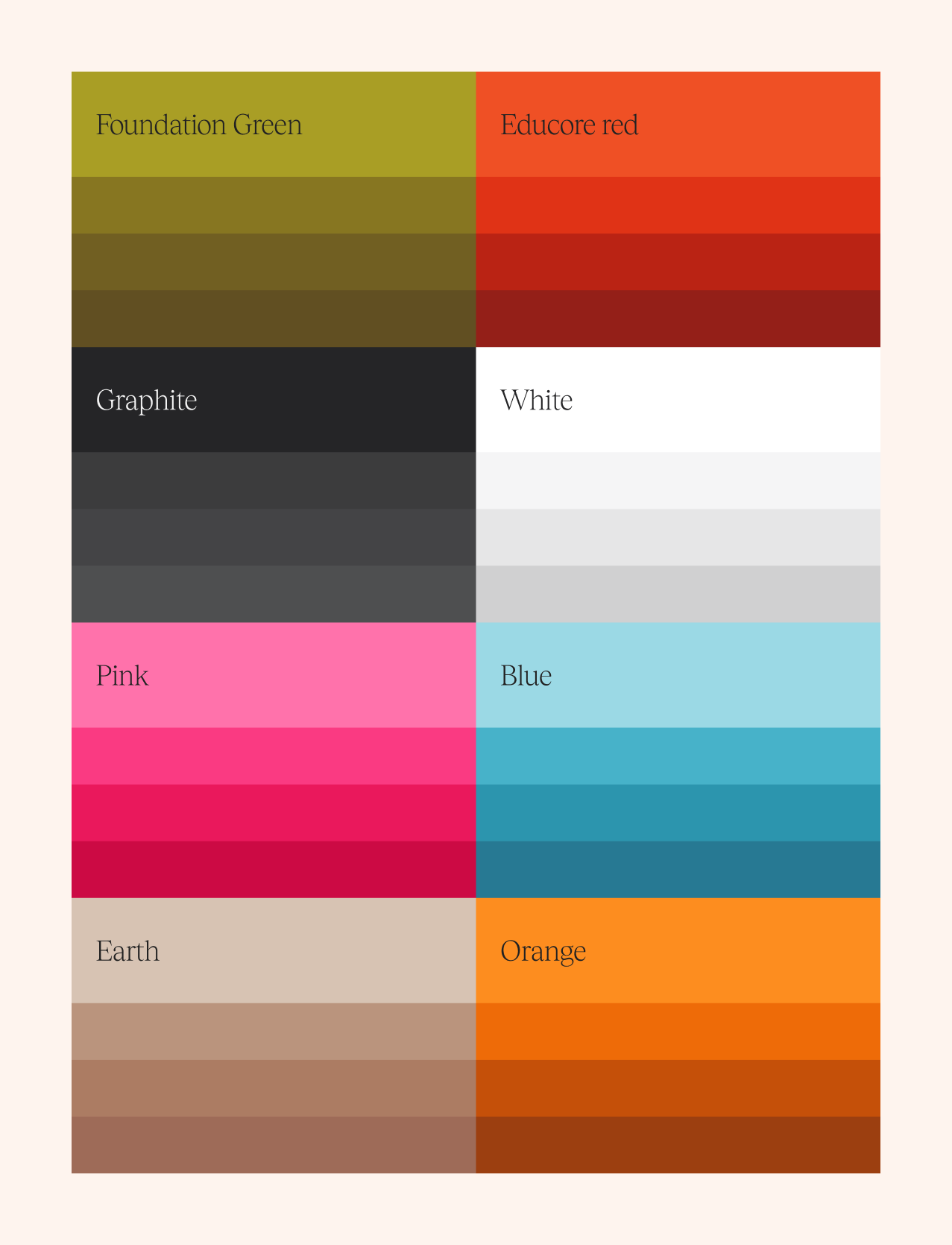
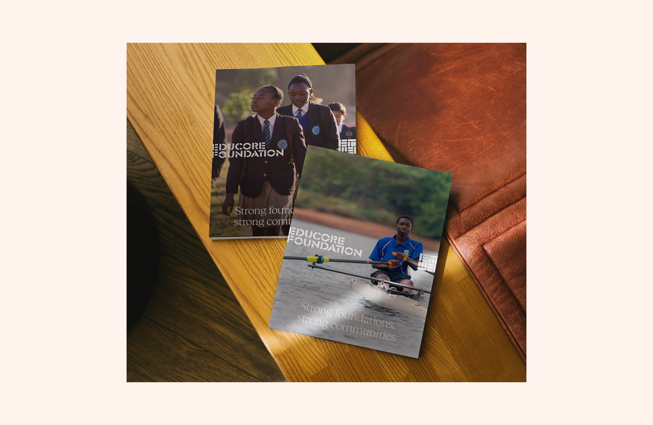
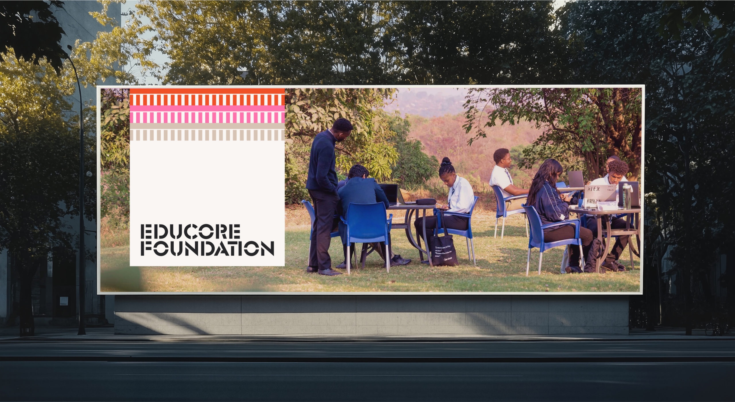
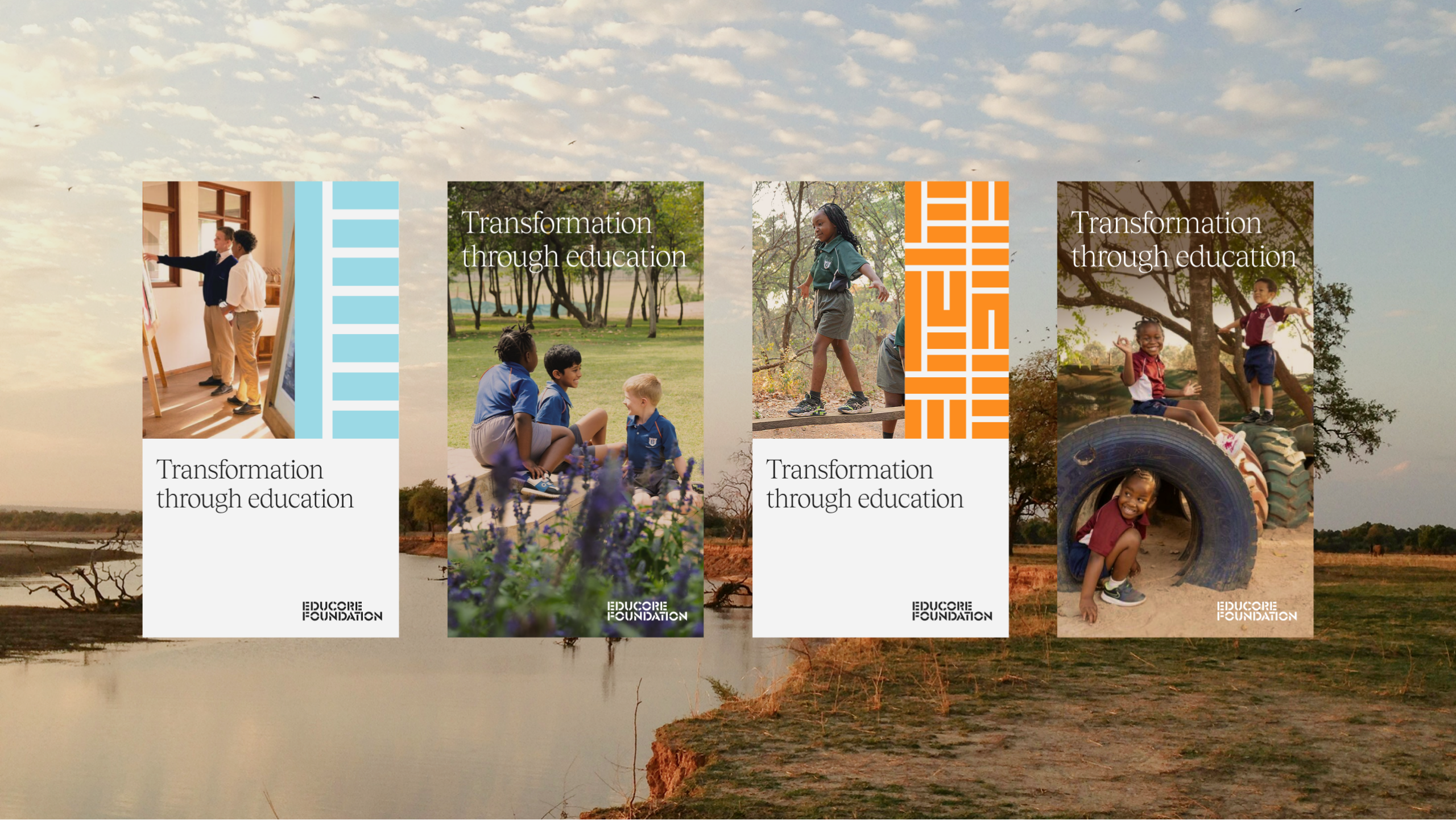
The presence of the existing Educore sub-brands meant that we needed to provide points of difference while still ensuring everything felt unified. We evolved the colour palette, typography, and iconography to bring warmth, clarity, and credibility to the Educaore brand. While maintaining echoes of the original identity through the logo, the new brand added depth and energy suitable for diverse audiences – from funders to educators. We utilised large amounts of the amazing photography that they had throughout the organisation, putting this front and centre throughout to show their work and real results. Through this strategic rebranding, Educore positions itself as a unified, purpose-driven organisation committed to educational excellence and community impact.
Website Redesign
We developed a new website for the Educore Foundation, working with the team to streamline messaging and create content with purpose allowing them to communicate the Foundation’s story and mission clearly.
Key features include:
- Modular design to scale as required
- Dedicated sections for mission, impact, and donor engagement
- Narrative-led content structure to resonate with partners and funders
- A bespoke WordPress build that was easy to administer for the team post launch.
Outcome
Educore now presents a confident, purpose-led brand that reflects its broad vision for educational impact. The Foundation is positioned to engage donors, partners and communities with clarity and purpose helping unlock greater opportunities for funding and collaboration.
The project also sets a framework for scalable growth across other brand areas, with the Academy and Services identities ready to be rolled out utilising their own distinct takes on this cohesive brand system.

What’s next?
With the Foundation website launched, we’re continuing to work with Educore to develop their brand system across their partner organisations to support their long-term growth.
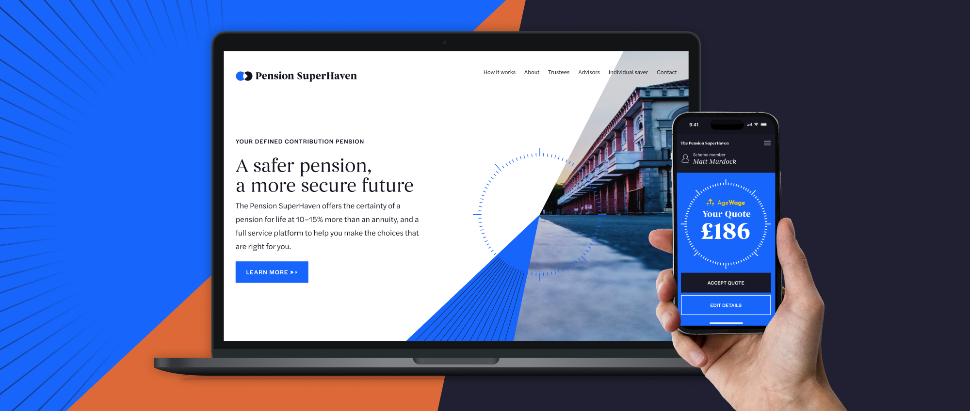
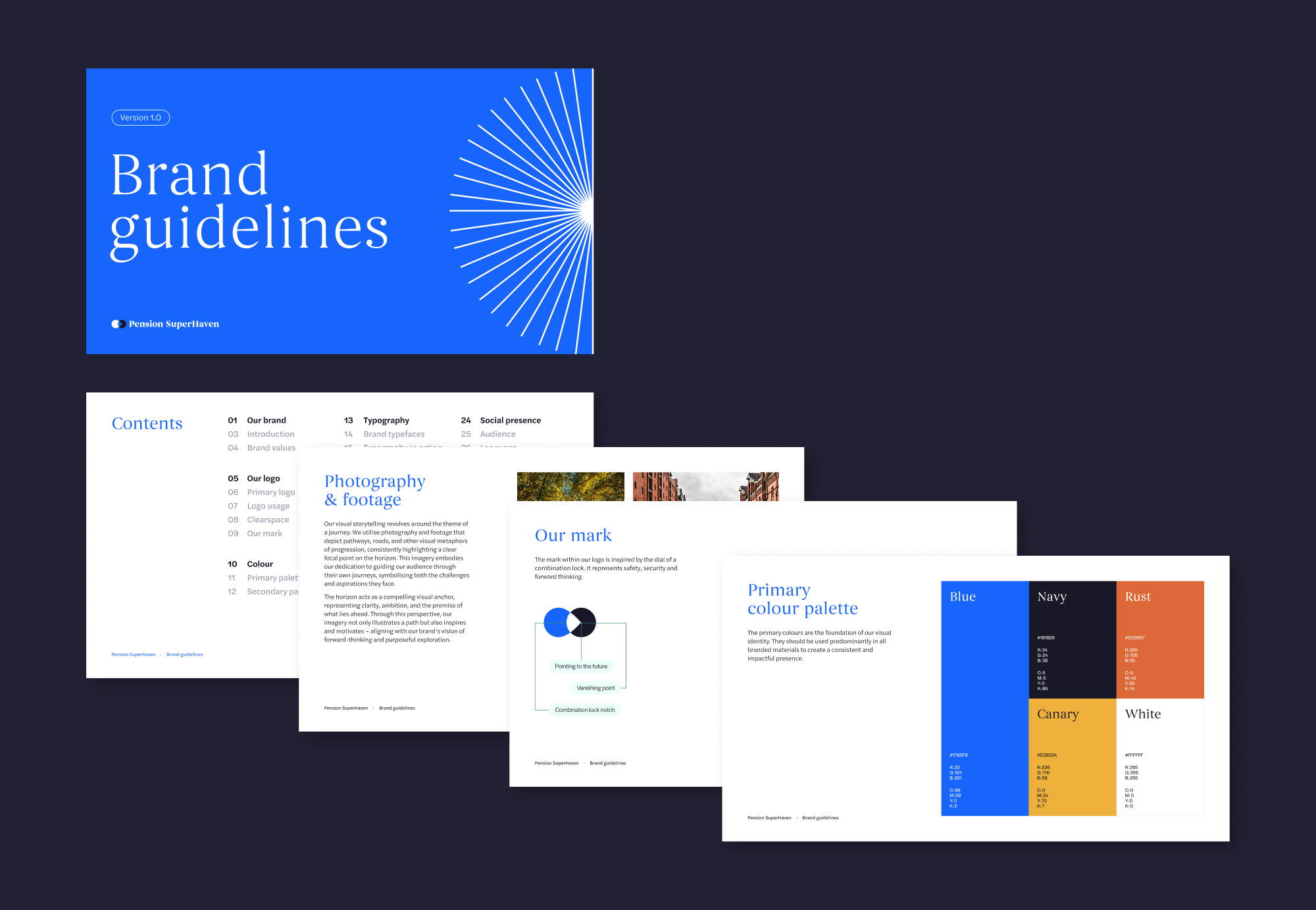
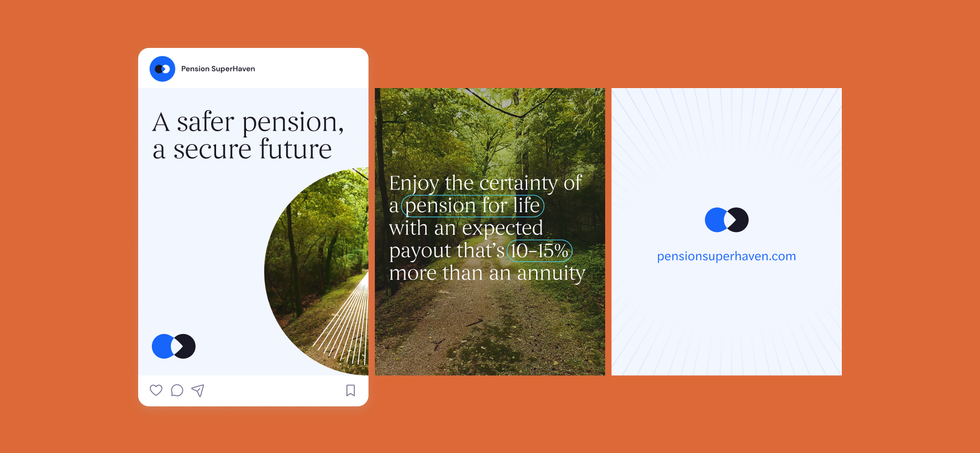
Pension SuperHaven were a new company created in order to sell Pension Products in partnership with Age Wage, primarily defined benefit. The challenge was to position PSH as a trustworthy new company within the financial services sector as well as bringing a sense of humanity and transparency to the brand. They needed a brand that would allow them to communicate across all physical and digital platforms consistently.
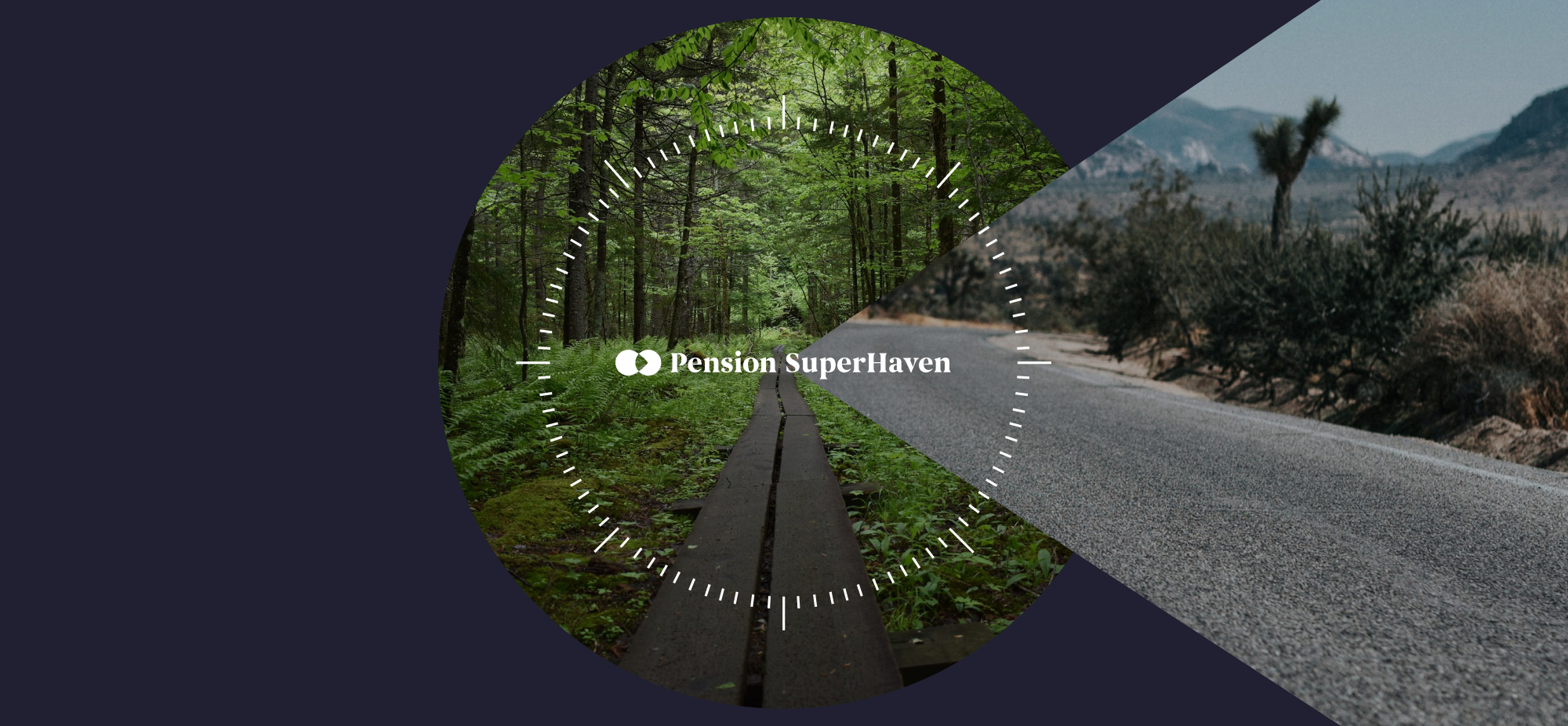
We crafted a compelling brand and website, ensuring clarity in financial guidance. From strategy to execution, we designed a seamless digital experience, making pensions accessible and engaging. Our work reflects trust, simplicity, and innovation, empowering users to navigate their financial future with confidence
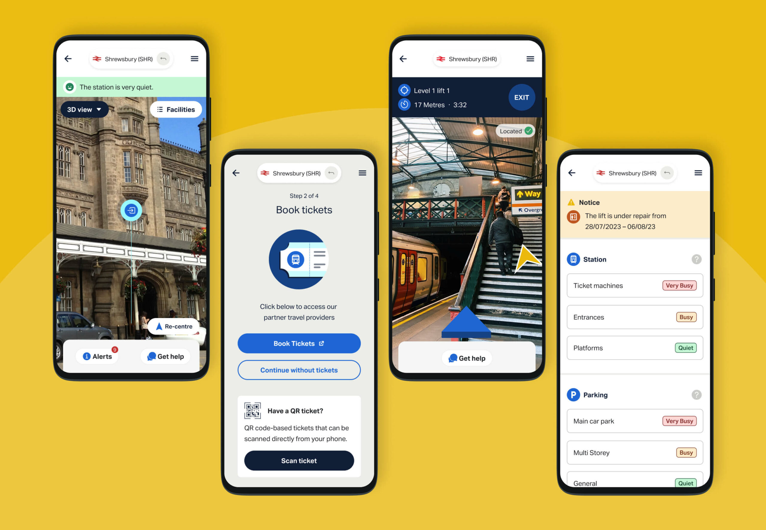
Indoor wayfinding company Briteyellow had created an early prototype for a navigation app, Briteway, for Transport for Wales. Briteway helps people with reduced mobility or disabilities find their way around train stations. After winning funding from the Design Age Institute (with whom we are rostered as a creative agency), Briteyellow wanted us to help develop the full product for a beta launch.
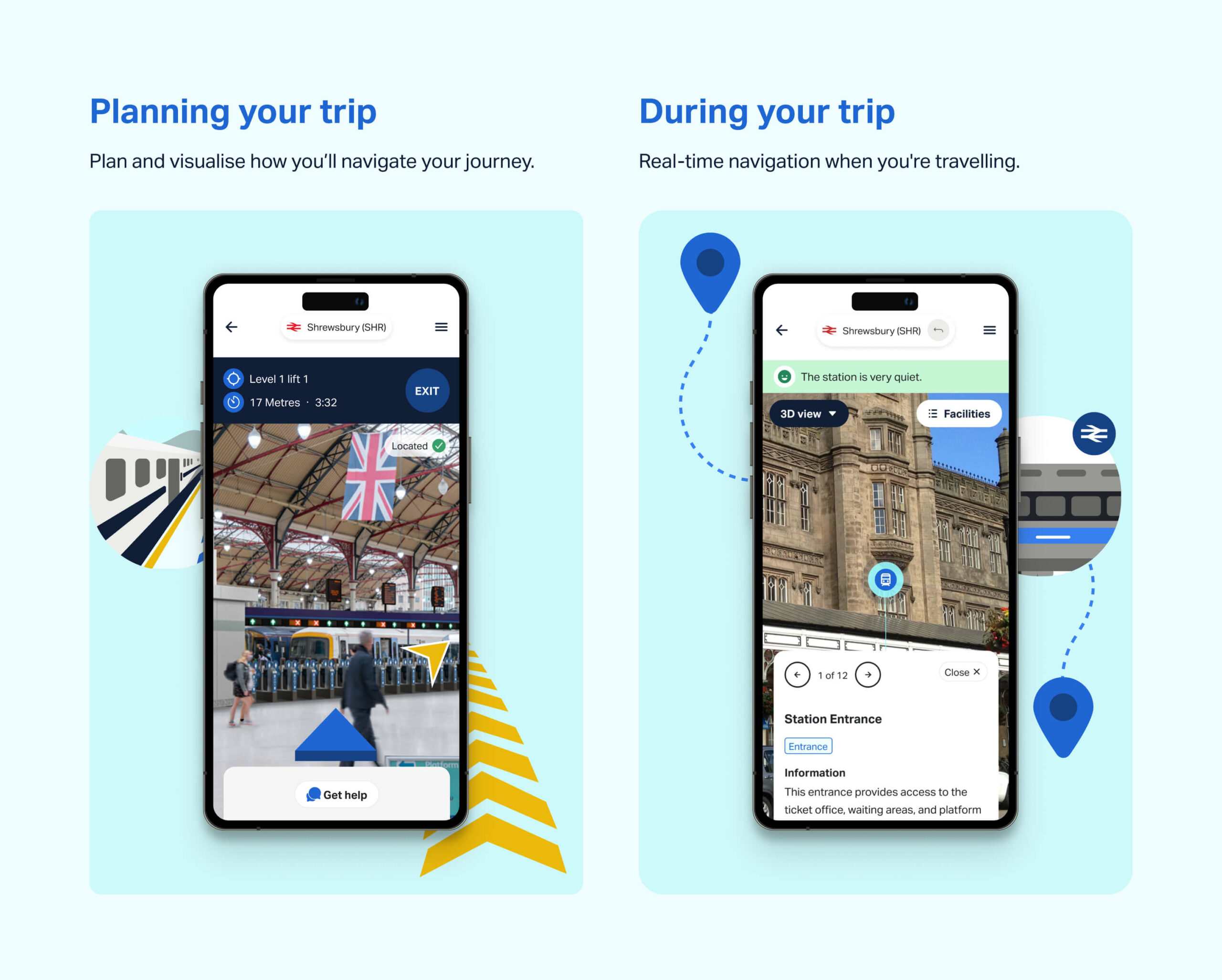
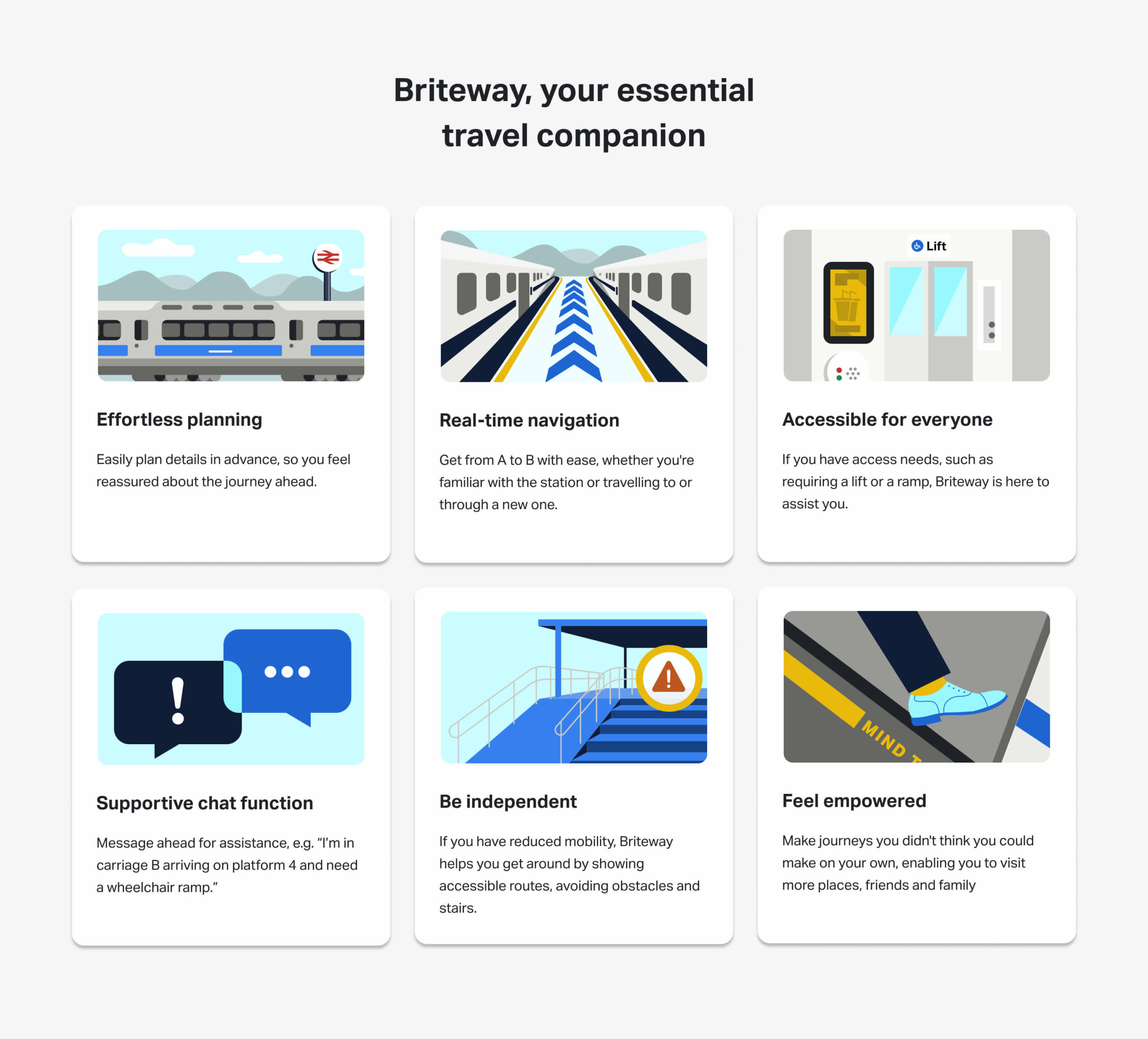
Using live 3D images, Briteway helps people avoid obstacles, stairs and disruption by showing accessible routes, lifts and station facilities. Travellers can also plan in advance by seeing what the facilities are, such as ticket offices, cafés, shops and toilets. It’s like Google Maps for train stations.
What we did
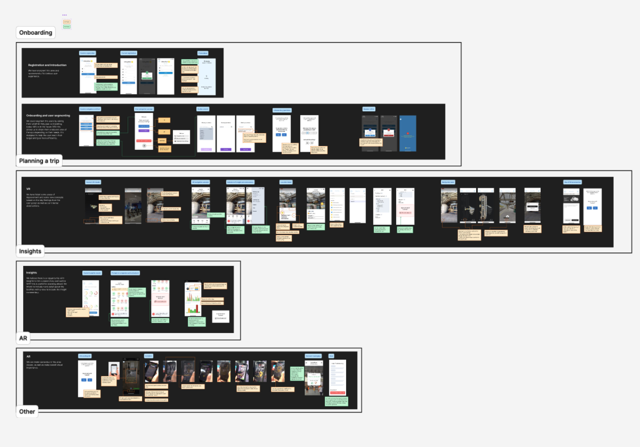
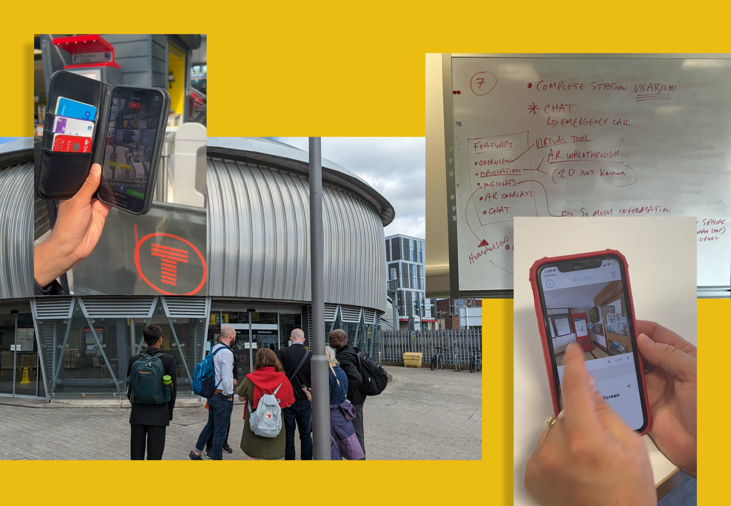
We did a full UI and UX review and update of the app, including user testing (some online and some live at Newport train station) and created a report of our findings. We used these findings to design a new user journey, make structural amends, and redesign functions and screens that needed improvement. We then retested these with the same cohort of users to validate and iterate our changes, so that the app is easy to understand and use.
UI and UX
The product uses 2D aerial views (satellite images) for journey planning and 3D real-time images for live navigation inside stations. We improved the UI and UX for these and made them easier to access, and created a suite of icons for facilities such as lifts and escalators, so that users can find them faster.
We improved existing navigation aspects, such as images overlaid with arrows that people can follow to get around, and included ways for train passengers to call for help in stations if they need it.
Accessibility
Accessibility was our primary consideration, as we were designing for elderly and other people with mobility and access needs. We created a UI and UX that works for people with low vision, blindness, hearing impairments, cognitive impairments, motor impairments or situational disabilities. At the same time, we wanted the product to appeal to everyone. We created a user experience, including the language, that also works for their carers and for all train travellers who want to plan ahead and navigate more easily around train stations.
The product has to look simple, clear and accessible, so that all the focus is on the functions, images and navigation. We kept to the brand colours of blue and yellow and used them on a plain, light background, so that nothing detracts from the user experience.
Our typography had to be suitable for different screen sizes and meet accessibility guidelines so we chose Activ Grotesk, as it’s very functional with lots of weights and legible at small sizes across different devices and browsers.
Product positioning
We repositioned the product with new messaging, a reason to believe for potential partners, and a narrative consumers can connect with. This messaging focuses on empowering people with mobility needs to get out, be independent, visit friends and family and enjoy life. It connects with people’s emotions, taking them from where they are – feeling unable to travel on their own, because they don’t know what obstacles or access to expect at train stations – to feeling confident and reassured about travelling.
Funding
Briteway has been partly funded by The Design Age Institute, which brings together designers, businesses, researchers and communities to help address the challenges and opportunities of an ageing society. This project was part of DAI’s Transport & Mobility Pathfinder Innovation Programme, supported by the UK Research and Innovation (UKRI) Healthy Ageing Challenge delivered by Innovate UK, the UK’s national innovation agency.
The outcome
Briteway is now a clearly defined proposition, putting Briteyellow in a strong position to secure partnerships with more train stations around England and Wales. The app is currently in beta, being tested by train travellers in six stations in Wales: Cardiff Central, Cardiff Queen Street, Newport, Pontypridd, Chester and Shrewsbury. As more stations are added, Briteyellow will improve the app based on user feedback, to help thousands more people feel confident about travelling by train.
Unit 29 Ventures launched its first enterprise in 2020: The Cove, a luxury florist and concept store in Royal Tunbridge Wells. It has built up a loyal and discerning customer base of people with a taste for premium products made by local independent makers and distillers.
After two years, investor Phil Reid – who is the founder and Strategic Director of Studiomade – decided it was time for Unit 29’s next venture: a unique, small batch rum.
The concept and name
Unit 29 Ventures recognised an opportunity to launch a rum brand centred on sustainable packaging, the concept of reuse, and supporting a sustainability charity.
The vision was for a rum inspired by the ocean, locally made in Kent, and led by its values: distinctive quality in the ingredients and materials, clean efficiency (reduced waste and efficient production methods), and growth and rejuvenation of natural resources (contributing to a cause and enjoying life while doing it).
Based on a love of the sea and surf, and reflecting this new venture and its first step into the drinks industry, we named it Turtle Roll. Before you can line up a wave when surfing, you have to get out past the ones that are breaking all around you. The turtle roll technique helps you get past barriers, jump over hurdles and achieve greatness. Unit 29 hoped to do the same with Turtle Roll Rum – taking beginner steps with an ethically produced rum, hoping to effect positive change in our oceans.
The taste
Unit 29 Ventures and Studiomade worked together to craft the brand story and narrative of Turtle Roll Rum, which in turn helped brief the ingredients and taste. We worked with a talented expert, Callum Giblett, Managing Director at The Custom Spirit Co. He and his team defined different taste directions and, during a rigorous six-month phase of tasting, exploration and user testing, whittled down multiple recipes and ideas into the winning formula.
Turtle Roll Rum has been imagined and produced locally to Tunbridge Wells in Kent. It is distilled with Venezuelan, Dominican and Jamaican sugar cane, using a clean, high-quality and sustainable production process that runs fully on renewable energy. The concept, ingredients and commitment to sustainability all emerged from appreciation for the sea and ocean-side living.
In the final produced recipe, Turtle Roll Rum blends notes of pomegranate, lapsang, vanilla, black cardamom and sea salt with oceanic botanicals samphire and sugar kelp. These intriguing layers of sweet and salt create a rich and smooth flavour profile.
As part of Turtle Roll’s sustainability commitment, 10% of profits are donated to Project Seagrass, a charity working to restore and protect seagrass, a wonder plant that’s crucial to the health of our oceans.
Brand positioning and identity
Turtle Roll Rum is positioned as a challenger, independent brand with a premium feel, priced in line with the small-batch market. We were inspired by product brands that are driven by a mission beyond the product itself; companies with sustainable, ethical values at their core.
Our design director Angelo Iannelli wanted typography with a feeling of the sea so crafted loose, hand-drawn lettering, paired with the Söhne Breitt font as a contemporary counterpart. The illustrations, all hand-drawn by the Studiomade team, emulate typography distorted as if looking through water. The aqua tones and grainy texture of some of the photography were inspired by vintage surf photos e.g. 80s Miami.
Brand messaging
We use language that suits a modern, challenger brand, giving it a distinctive voice, casual rather than polished, yet with a premium feel. We use enticing flavour and ingredients descriptions to appeal to an audience of taste makers who are on top of trends and like to discover new experiences. To keep it relatable, we sprinkle in light-hearted, ocean-inspired phrases, particularly on social media.
Product photography
The images were shot by the wonderful team at Névé Studios. After creating mood boards to drive our creative direction, we decided that product photography should be bright and spacious, playing with light, shadow and interesting angles, and reflecting the fresh ingredients that give Turtle Roll its taste. The images feel realistic rather than glossy e.g. cocktails being made and drinks being poured. This is interspersed with imagery of oceans and waves, evoking the open feeling of the sea.
E-commerce
Turtle Roll Rum was conceived to be predominantly sold direct to consumer. This means that the customer experience and how the brand is presented online are paramount. We wanted to best present the personality of Turtle Roll Rum and establish a brand connection with customers, rather than it being a sales push.
To this end, we built a custom e-commerce experience, with every aspect individually designed. We applied the visual identity and brand voice across the website, and created a user journey that includes purchase. We opted for Gatsby hosted on Netlify, for good performance and speed. We integrated Stripe for payments and set up a bespoke webhook to promptly relay order details to our fulfilment company whenever there’s a successful transaction. We added Mailchimp integration for automated emails to complete our loop.
Bottle and packaging
We researched, trialled and tested multiple bottle manufacturers and product variants, to find the most sustainable options possible.
Each bottle is made from 100% recycled glass and screen printed (using sustainable ink), with custom-drawn artwork and lettering that highlights the ingredients. It’s overlaid with a 100% recycled ECF paper label, printed with soy inks and the cork is sealed with a fully compostable, plant-based shrink wrap.
The cork stopper is made with activated charcoal, as this removes the need for additional chemicals and industrial processes. Packaging for shipment is made from bamboo pulp, a more abundant, renewable resource than cardboard.
A focus on re-use
After enjoying the rum, we encourage people to reuse the bottle as many times as possible before they put it into recycling. Our intention was to create a product that sparks conversation and brings a bit of fun to kitchens and dining tables when used as a pitcher for water or vase for flowers.
Merchandise
Unit 29 Ventures also wanted branded merchandise so we teamed up with Teemill. We chose them for two reasons. First, their t-shirts and hoodies are made from organic cotton, and they can be returned to be remade into something else once they’re worn out, creating a circular economy, which aligns with Turtle Roll’s value of sustainability. Second, customer purchases are printed and shipped to order, rather than us having to buy and hold stock. From a commercial perspective, as a new venture, this allows us to test users’ buying intent and decide where to focus on growing the range.
The outcome
With commercial strategy and investment from Unit 29 Ventures, and creative, brand and digital activation from Studiomade, we partnered to create a unique, small-batch, premium spiced rum, with sustainability at its heart. The initial limited run of 1,200 is now available at The Cove in Tunbridge Wells, at turtlerollrum.com and proudly stocked at a growing number of bars and restaurants (ideally close to the sea!) in Kent and the South East.
Are you thinking of creating and launching a new product? To discuss how Unit 29 Ventures and/or Studiomade can help you, contact our Founder & Strategic Director, Phil Reid, on phil@studiomade.co
The Hong Kong Investment Funds Association (HKIFA) is a non-profit organisation representing the fund management industry. It exists to cultivate the development of the fund industry in Hong Kong; enhance the industry’s professional standards, in line with international best practices; and maintain the region’s status as the major fund management centre in Asia.
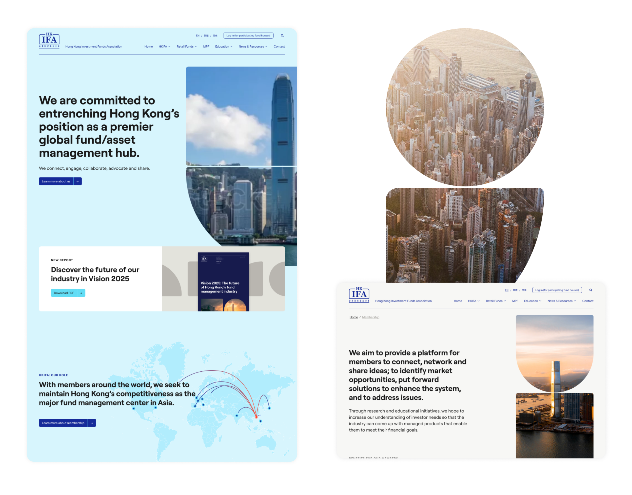
Its website no longer reflected its position in the industry. The organisation wanted a bespoke new digital presence that better presents the expertise, services and knowledge base it offers to its members. It had to be brought up to date in how it looks and how it functions, have an easy-to-access resource library for members, talk to broad audience groups and be a tool for communication within the organisation.
What we did
We built an improved, user-led digital environment using our proven steps, from initial strategy through to design, prototyping, user journey and website build that functioned across multiple languages. We began by refining the messaging, and crafted a core narrative that presents HKIFA’s market advantage and positions it as an authoritative knowledge base, with an easy-to-access resource library for members.
With the client located in Hong Kong, we ran remote, interactive workshops to manage and lead product development from concept through the development process. This will continue with review and performance monitoring post-launch.
Design and build
We redefined the digital structure, considering how content will sit and how each audience will navigate around it. We designed a creative look and feel – with a clear UI and UX – to uplift the brand, with a user-focused and human-led approach (as we do for all digital product creation).
There were a number of specific requirements. It had to be secure, GDPR compliant, scalable, follow W3C content accessibility guidelines, integrate with existing data, have multi-language functionality, be easy for HKIFA’s teams to use and update, and able to manage CRM database integrations and future portal additions. It also had to offer English, Formal and Simplified Chinese translations.
Crafting a bespoke WordPress environment allowed us to meet all these requirements. The platform is a safe GDPR-compliant infrastructure that accommodates existing information and can integrate with any other existing data that HKIFA holds. We built in rich, organic-focused SEO as well as data analytics and reporting, so that results can be easily measured. We employed WPML translations allowing HKIFA complete control over all language input.
Automated display of data
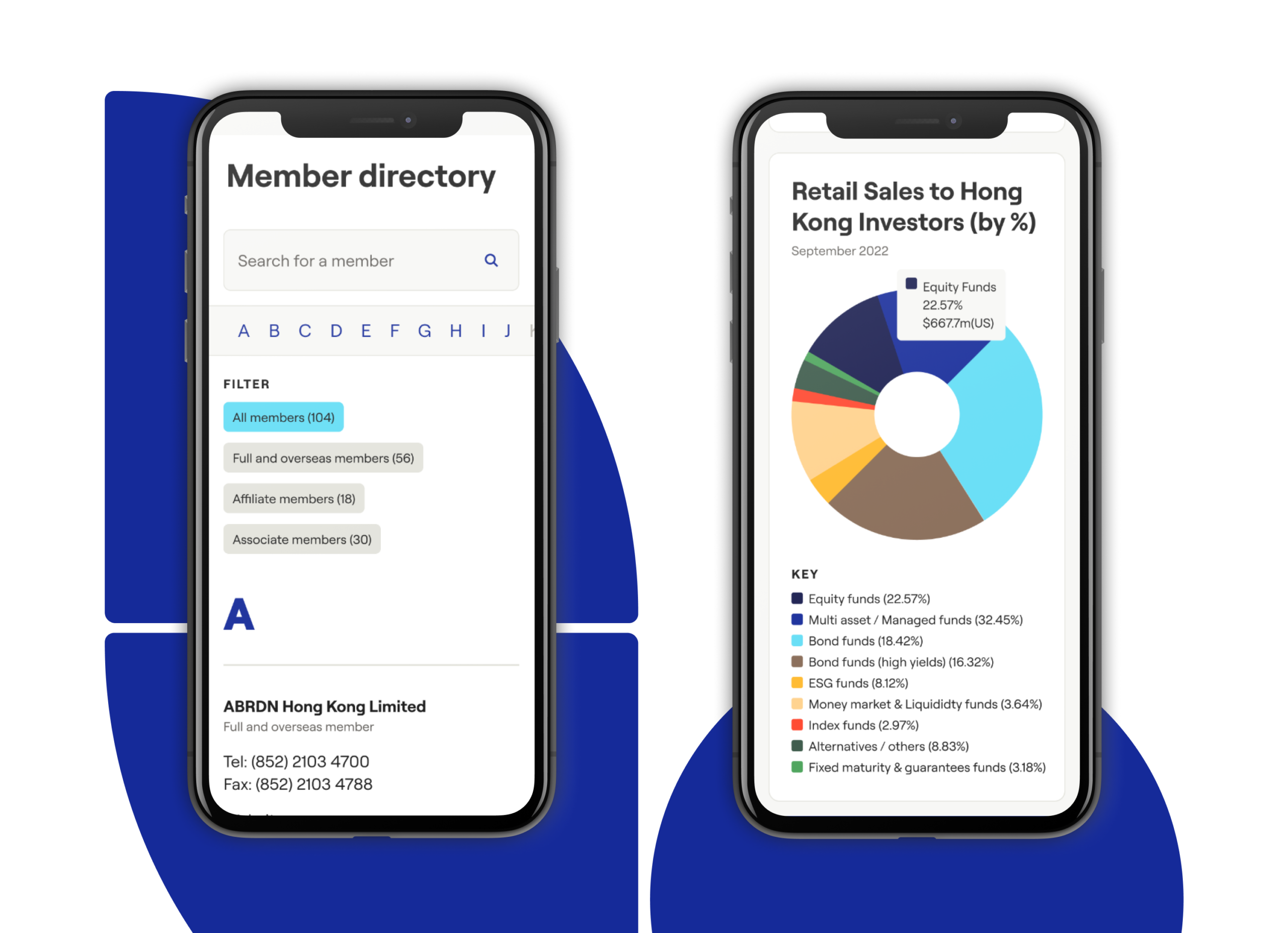
A unique element of our digital delivery is the automation and display of data pulled directly from third-party vendors linked to HKIFA. This includes organisations such as Morningstar, FTSE Group and Lipper. Our team wrote a number of individual automation scripts, which run at set times to retrieve new data from multiple sources, and adds latest versions directly to the HKIFA website.
For daily MPF figures (Hong Kong’s mandatory provident fund for retirement savings) we retrieve an updated file every morning, extracting figures and adding these to our own database, which is then displayed on the HKIFA website. This has removed significant manual input that previously had to be done by the HKIFA team, and gives visitors a lot of added value through real-time data.
Digital infrastructure
The website is hosted on Kinsta, a Google Cloud hosting environment that utilises a tech stack optimised for WordPress. It can handle high traffic spikes easily and is secure, with two-factor authentication, GeoIP blocking, hardware firewalls, many advanced features and active and passive security measures. In the future we can plan and develop prioritised integrations where necessary with custom APIs as required.
Content management system
To empower HKIFA’s internal team we developed a digital platform that they can independently control and manage, with a WordPress CMS that’s simple, functional and easy to use at launch and in future. It’s able to handle the future content additions and database integrations that have been part of our project requirement planning.
The outcome
We built a bespoke, strong, scalable digital platform and brand presence that meets multiple client needs around functionality, data automation, language translations and accessibility. It positions HKIFA as the authority it is, improves the way members can engage and access knowledge and insights, and is set up to easily adapt to data-led future needs.