Background
Most people who drink alcohol won’t ever need treatment – but many are curious about how much they drink and whether it’s affecting their wellbeing. The challenge is finding information that’s relevant, reliable and non-judgemental.
Drinks Meter was designed to meet this need. It is a digital tool (web and app) that gives users instant, personalised feedback based on what they’ve shared about their drinking. Instead of offering blanket advice, it reflects back patterns using evidence-based strategies – motivating people to think, adjust, or take action if they choose. The tool is entirely anonymous, user-led, and grounded in harm reduction.
Conceived and independently funded by Professor Adam Winstock – consultant psychiatrist, honorary clinical professor, and founder of the Global Drug Survey – Drinks Meter builds on his ongoing mission to make drug and alcohol information accessible, human, and evidence-informed. Continuing our long-standing relationship with the Global Drug Survey, we were brought in to position, design, and develop the Drinks Meter brand and digital product.
Approach and Build
From the start, our aim was to create a product that felt intuitive and supportive – something people would not only use, but return to. Working in close collaboration with Professor Winstock, we began with the structure and logic of the tool. He provided the core content and functionality; our job was to shape the user experience around it.
We took an iterative, user-first approach, refining the journey step by step. The final product was built using a single responsive codebase – meaning we could deliver a seamless experience across mobile and desktop from one build.
UX and UI design
We started by mapping the tool’s logic – how users input data, how responses are calculated, and how feedback is presented. Once the flow was clear, we layered in the visual design: a clean, uncluttered UI that supports easy navigation while reinforcing trust and clarity.


Brand identity
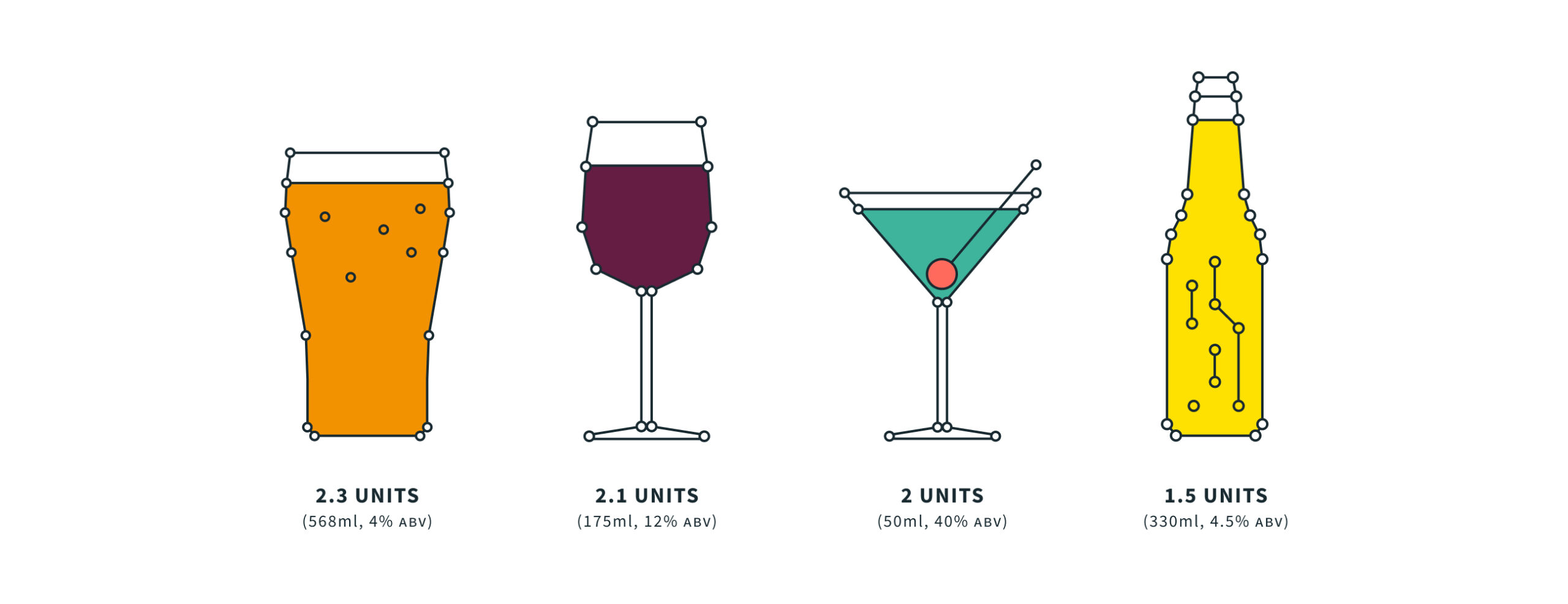
The brand needed to work across platforms – from in-app to physical print, PPC campaigns to outreach materials. We created a flexible identity with a bold, data-centric personality. The visual system combined vibrant, nightlife-inspired hues with custom illustrations to add warmth and approachability. The result is a brand that feels distinct from traditional health services – modern, motivating, and human.
We gave the product a scientific feel while also keeping it simple and friendly, pairing lightweight typography with thin line and stroke architecture. Alongside the brand colour palette we introduced neon elements, and added depth and detail with illustrations and iconography.

Technology
We used a single codebase so that we could deploy the app natively across different digital stores and platforms, including Apple, Android and as a desktop web tool. We opted for a hybrid web/app approach, wrapping our single product for deployment using Adobe’s PhoneGap. This meant that updates could be applied in one place and distributed across the device range quickly and easily. It’s available on the App Store and Google Play and as a responsive website.
Since launch, the brand and product has been extended to attract greater commercial opportunities, with new features released. Our architecture has expanded to accommodate unique localisations of the tool including offline data submission, localised content and other enriched features.
New functionality for Australia
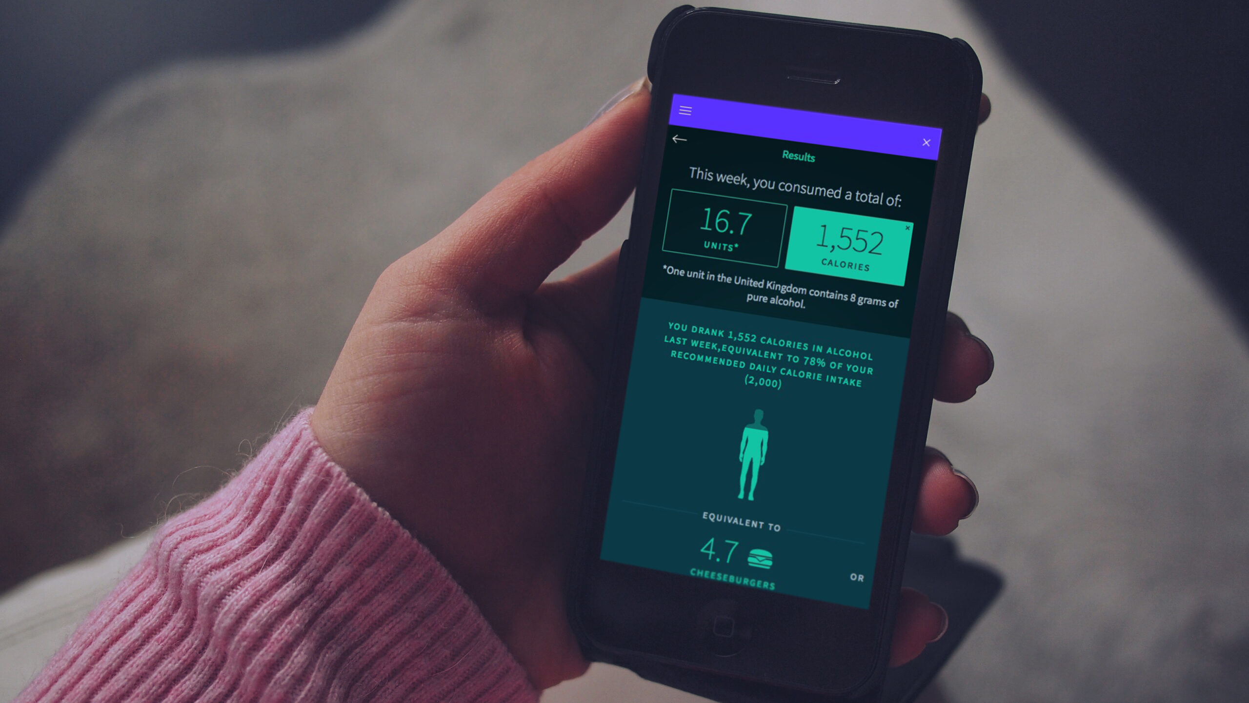
In 2018, the New South Wales government in Australia commissioned Drinks Meter to deliver new functionality to help combat severe issues with alcohol abuse in the state. We collaborated on new functionality, UI and UX, with a new diary component that attracted repeat usage of the app.
The new version led to proven behaviour change. Before using it, 32% of users agreed with the phrase “I am changing my drinking habit right now”; afterwards this increased to 44%. The number who agreed with “There is no need for me to think about changing my drinking” dropped from 52% to 45%.
The outcome
Drinks Meter has been commended by healthcare professionals, such as Professor Paul Wallace of University College London, who said: “It’s relevant, attractive, easy to use and provides useful feedback. It’s a great tool.”
In an independent peer-reviewed analysis1 of 32 eSBI apps (electronic screening and brief intervention) used by young people, Drinks Meter was the most highly rated by users, particularly for the information and feedback provided in the app.
In the first 3 years after our redesign, the app supported more than 50,000 people in 170 countries around the world.
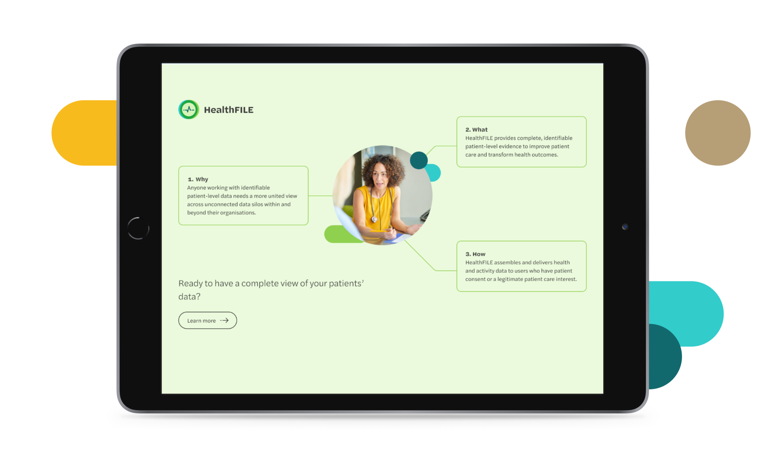
FITFILE is a health information platform for providers of therapeutics and diagnostics who need real world evidence. As an early-stage business moving quickly and growing fast, they came to us having outgrown their previous website. As an organisation, FITFILE were starting to build new partnerships with clients and needed a digital presence that more effectively communicated their value.
Strategy & language
We kicked the project off by working together to understand and streamline how they communicate their position in the market and the unique value they bring to their clients. As a healthcare technology company, there were plenty of acronyms and specific terms used to describe their operations that needed decoding. We worked with them to establish an understanding of their target audience groups and what their perspective would be when visiting the website.
Website design & development
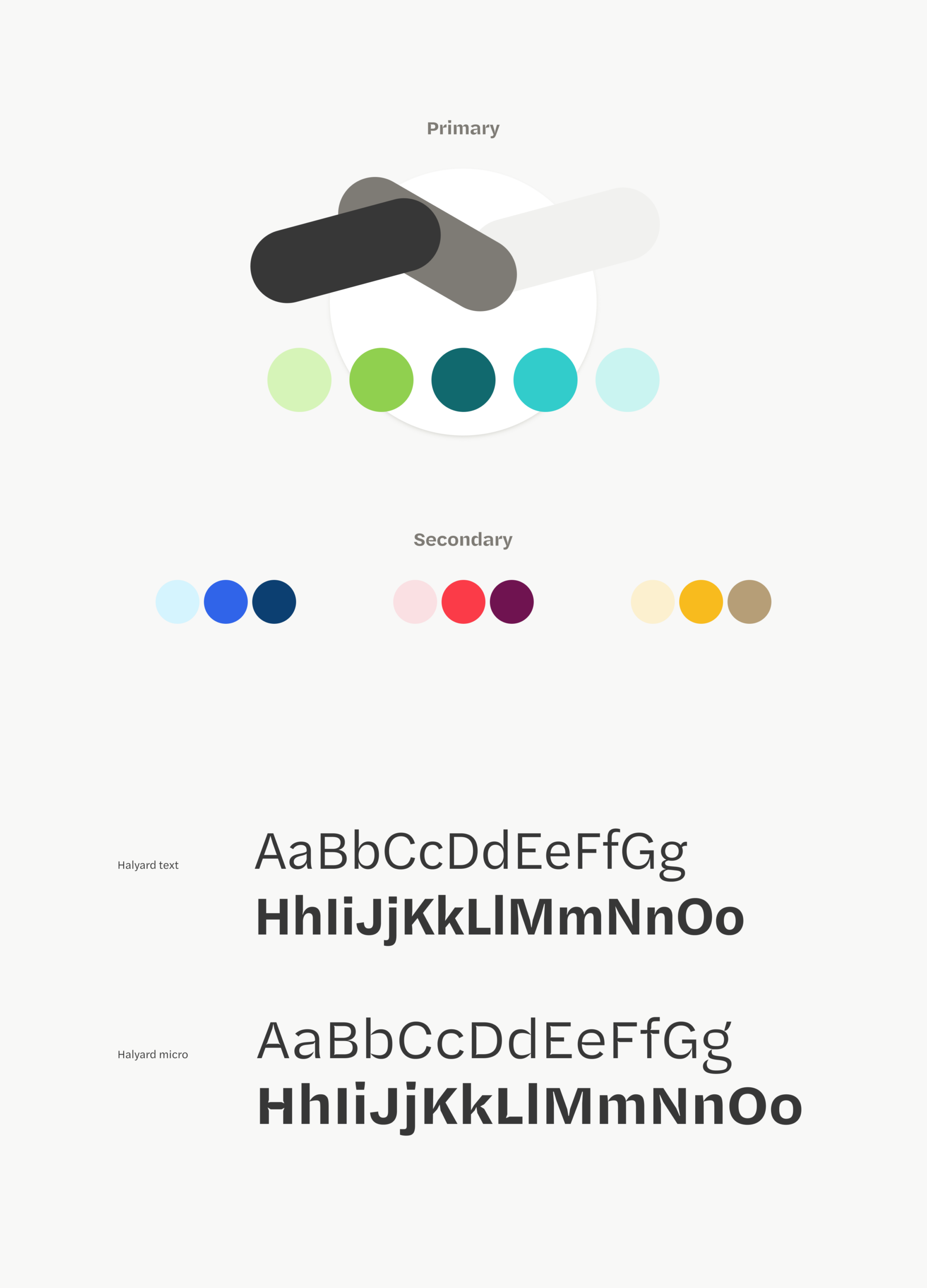
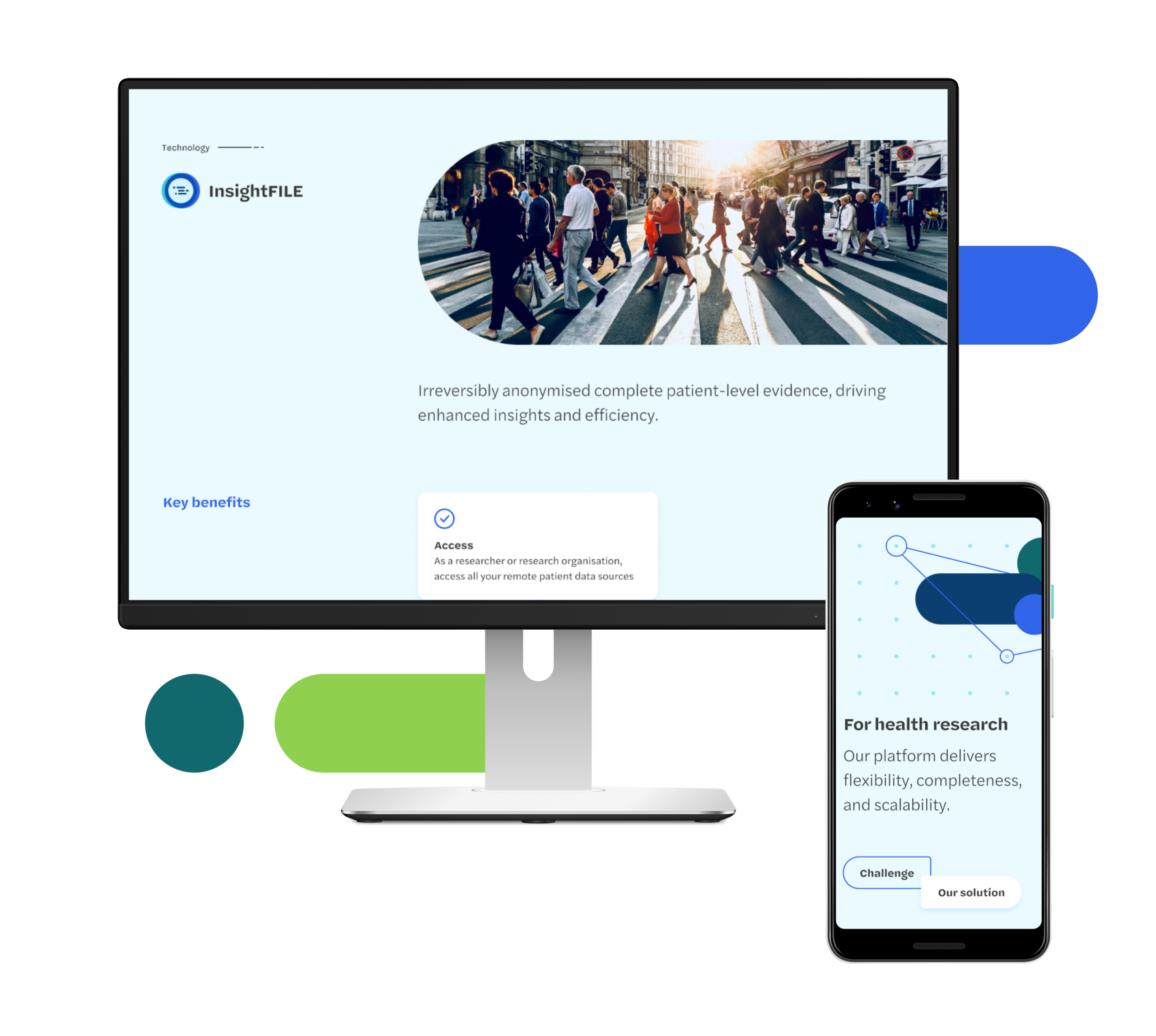
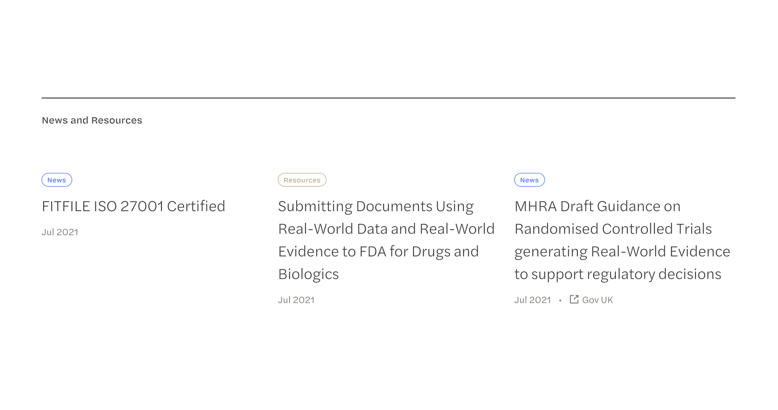
As this project did not involve a full rebrand, we knew the updated website design would need to work alongside some of their current branded materials. We took cues from their logo and current brand style to inform our approach and built out a new visual tone that built on their existing brand language and didn’t make anything they were continuing to use look out of place.We worked together to establish a content plan for the website and develop the tools they’d need to effectively publish and control their content.
The result
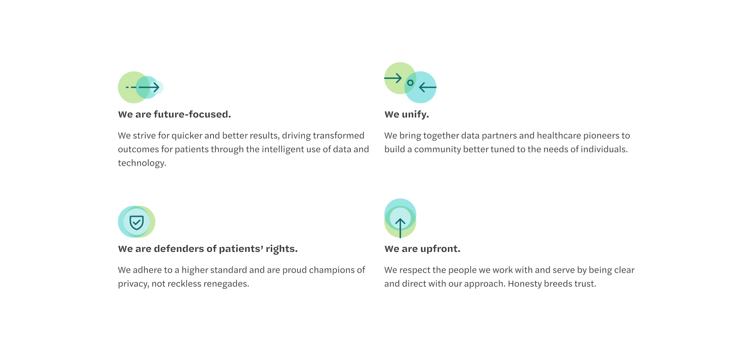
FITFILE are positioned with a clear messaging strategy and tone of voice that best reflects their value and brand.
The modular digital design approach that we have created allows growth alongside the Company, with a flexible architecture established that the brand can build from. We worked directly with their in-house technology team to ensure that site hosting and ongoing management was informed, and have provided a creative direction that will shape brand assets and communications moving forwards.
Poor communication in the NHS is a big factor in poor patient care. It also has severely detrimental effects on healthcare professionals, contributes to staff burnout, and wastes public funds (an estimated £1 billion a year in England alone).
Better communication between staff and teams can save costs, improve health outcomes, improve patients’ experience – and ultimately make staff’s jobs a lot easier.
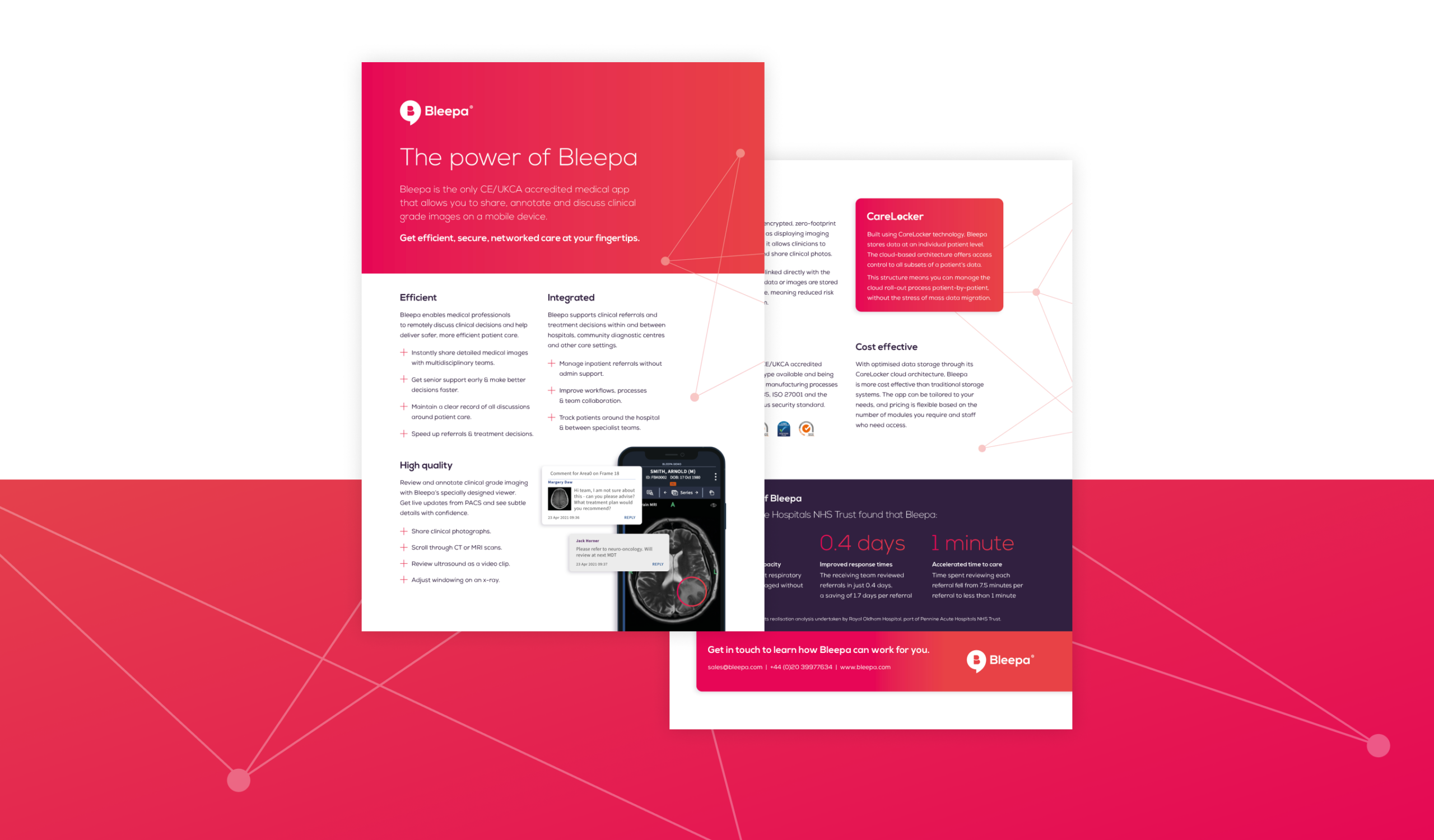
Bleepa is one of only a few communications tools accredited for clinical use in the NHS, created to resolve issues such as siloed specialist care and remote working. It’s a digital hub, holding reports, referrals, clinical-grade images and more, with an instant messaging function that enables clinicians to communicate securely to discuss cases, decisions and patient treatment. They can view and annotate clinical photos, scans and X-rays, add test results and notes to records, share comments with colleagues, manage patient referrals and get second opinions. It transforms how they work, making them more efficient, leading to better patient care – and making their jobs easier.
We were asked by parent company Feedback Medical to help grow awareness around the Bleepa product and brand. We worked with the team to establish a digital content strategy, increase Bleepa’s presence and run digital marketing campaigns.
What we did
Bleepa is an innovative health-tech product that can transform how healthcare professionals work and communicate, but its existing website didn’t reflect that. It was crammed with information and it wasn’t clear what users should understand about the product or what action they should take.
Bleepa had to have a strong website in place before we could look at driving any traffic to it. This meant giving the site a strong, clear visual identity. It needed a tone of voice that resonates with its audience of clinicians and healthcare providers, with clear messaging that effectively shows them what Bleepa does and why they need it.
We would also define a clear user journey so that people would know exactly where to go and which would generate leads.
Getting the messaging right
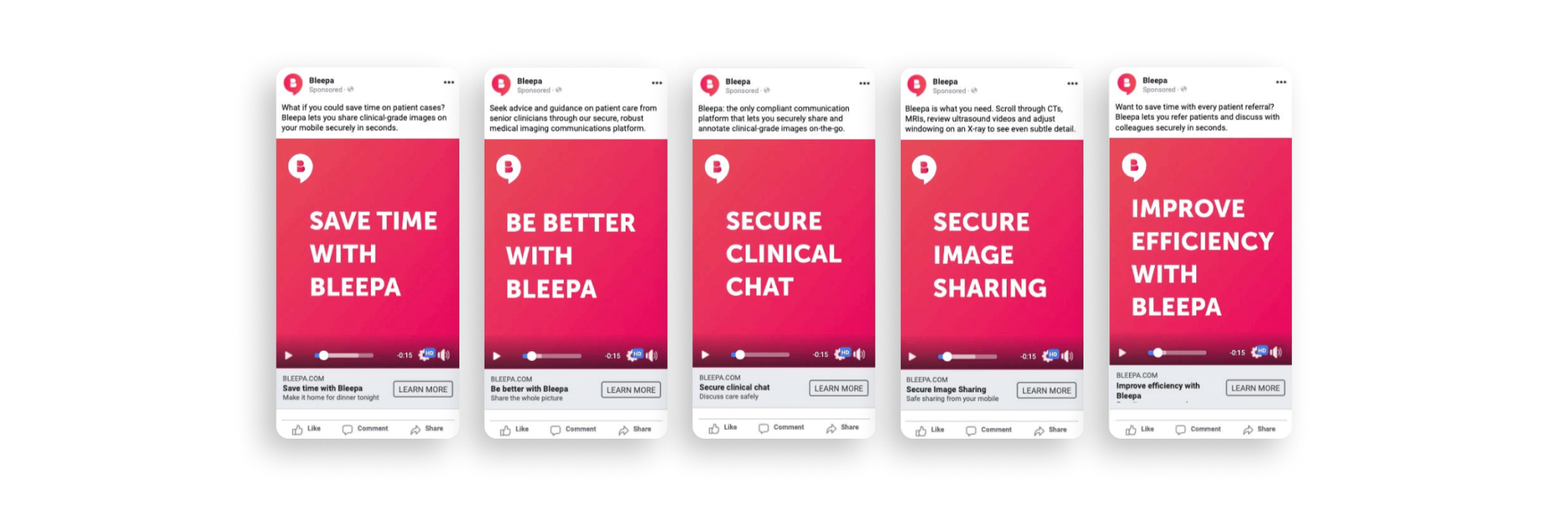
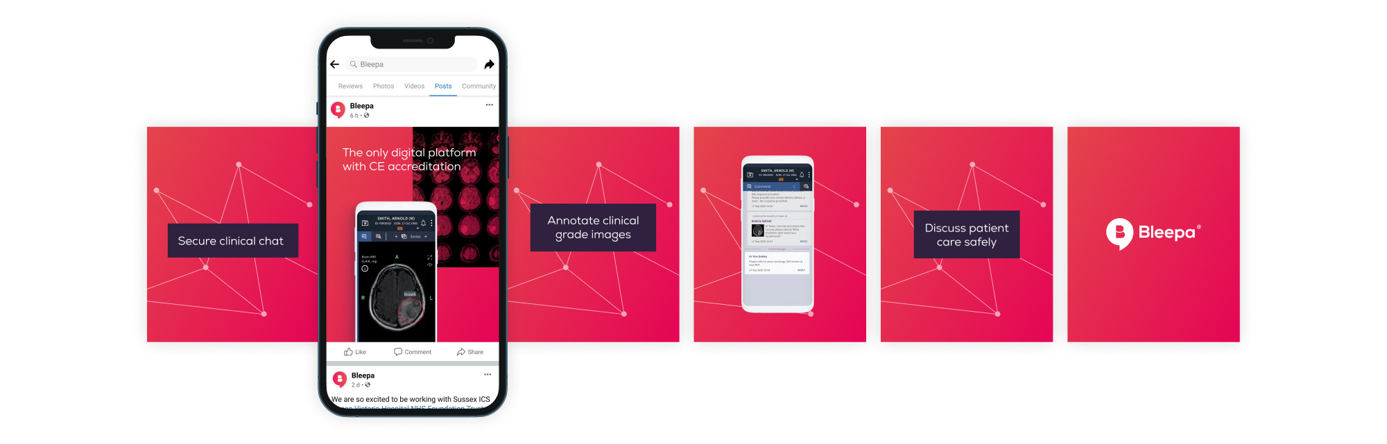
We wrote five potential key messages and tested them with users. We made simple text-based adverts and ran them on Facebook, targeting a broad, medically focused audience group. ‘Secure clinical chat’ was the clear winner. We took this into the next level of testing, around tone and creative.
Next, we considered the tone of voice. We wanted this to be based on engagement, not our assumptions, so we created three options to test: bold, clear and direct; emotive and approachable; intelligent, clever and precise. The third one got the best response.
With this research we now had a brief for the brand’s messaging. We knew that secure clinical chat was our main point of difference and that the tone of voice should be intelligent, clever and precise.
Website design and development
We carried out an audit of the existing site, reviewing the UI, UX and analytics to see how users were interacting with it. We defined what changes were needed, and prioritised the home page and the demo page, as these are integral to sales conversion.
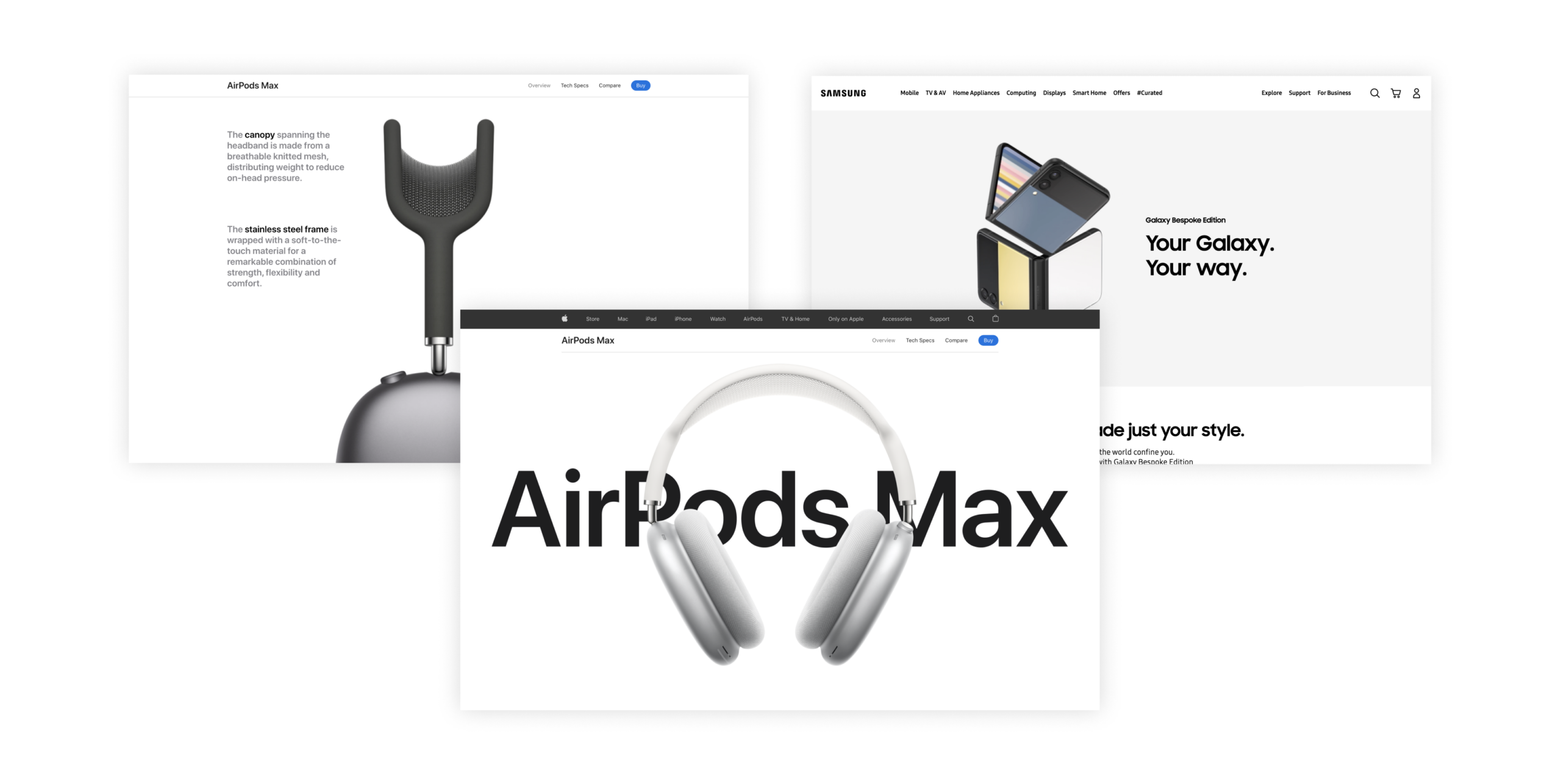
For the look and feel, rather than the traditional healthcare sector, we were inspired by strong, clean, confident consumer brands like Apple and Samsung. This would make the product feel self-assured and market leading.
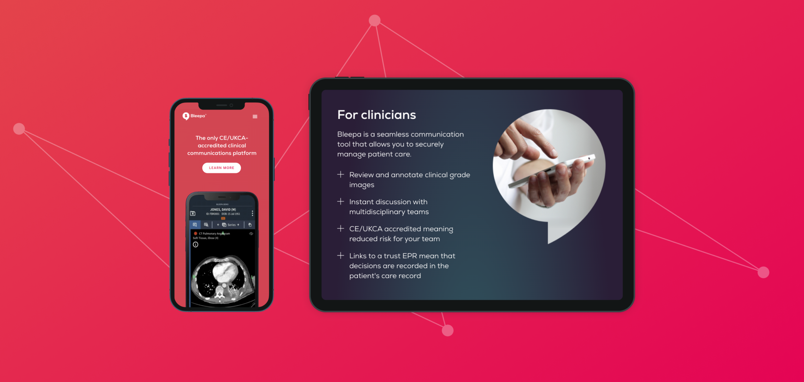
Our new design has strong, clear messaging throughout with a consistent tone of voice, in line with the results of our research. The digital product and app are the focus, with a clean presentation. CTAs are streamlined, to keep the user journey clear and purposeful and funnel users to a page with a video demonstration of the product, validating the messaging. This pushes users through to the next level of the sales funnel, and conversion rates can be tracked through analytics.
A brand awareness campaign
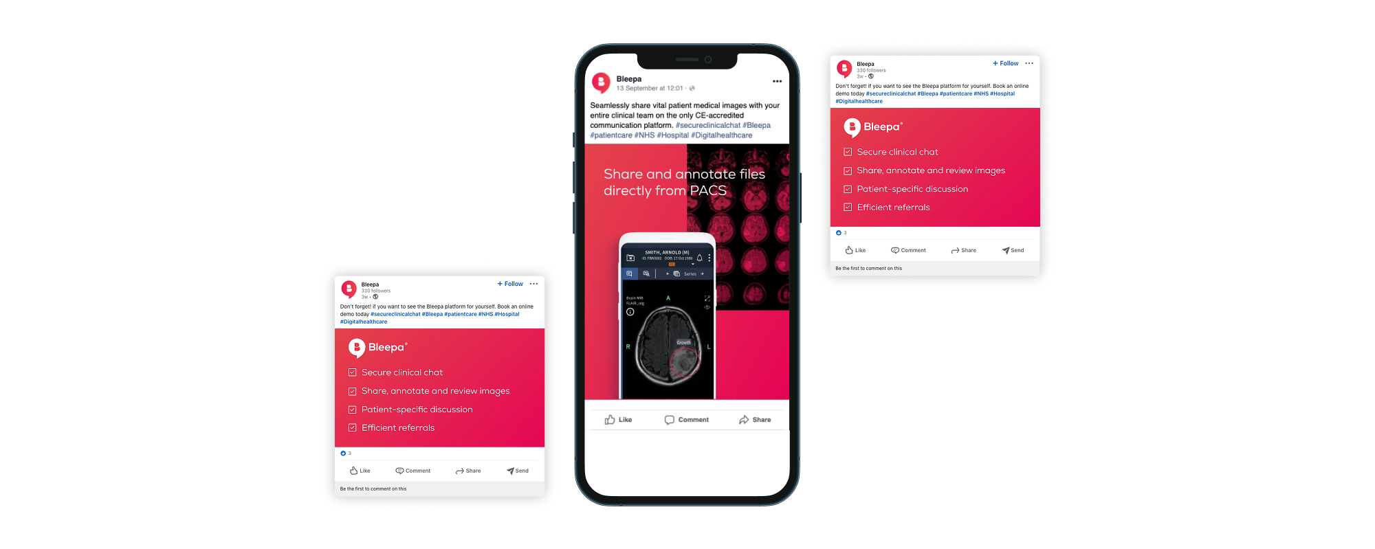
With a new website with a clear user journey and a strong presentation of the product, we could move on to driving traffic to it. We worked on an ongoing digital strategy and a number of digital and social campaigns including Facebook and LinkedIn.
The marketing campaign was consistent with the website, in visuals, messaging and tone of voice. This consistency and clarity gives authority, builds engagement, reduces bounce rates and increases ROI.
Our campaign content showed details of the app’s functions, demonstrating exactly how Bleepa benefits clinicians and medical procurement teams. One campaign included a downloadable fact sheet, creating engagement with the user while allowing the team to monitor downloads and keep users in the sales funnel.
From 2022 to 2023, website traffic and user interest in Bleepa increased by 382%.
Additional projects
We designed and built a website for Carelocker, the cloud data technology behind Bleepa. Feedback Medical was then able to take this to market as a separate product, as well as open up international opportunities, beginning with India. The website is available in English and Hindi.
Feedback Medical is also involved in supporting and delivering patient pathways for community diagnostic centres (CDCs) across England. These provide earlier diagnostic tests for millions of patients, helping to tackle the NHS’s elective care backlog. Bleepa provides the digital infrastructure that connects local care providers so that they can securely share diagnostic information and teams can communicate faster and make more informed clinical decisions. In 2021, we ran a social campaign showcasing Bleepa’s involvement in the initiative.
Outcome
Through brand strategy, content planning, website creation and ongoing creative production we have contributed to brand and business growth. We have built a collaborative relationship, supporting Bleepa’s team to improve sales, grow engagement and make Bleepa part of the conversation, and providing tools to help. Our work has helped to make Bleepa one of the leading medical communication apps on the market, with their team in a strong position for further growth and new opportunities.
What is Funding Cloud?
Funding is the fuel that companies need to grow, adapt and survive. But all too often, businesses find it hard to secure the finance they need. There are too many confusing products, complex application forms and long waits.
When it was set up in 2011, Funding Options set about to transform the business finance market. Its aim was to make sure every business owner could make an informed choice and have access to instant funding decisions. Since then, it has helped more than 10,000 businesses get the finance they need, quickly and easily. That’s more than £0.5bn in funding for businesses across the UK and Netherlands.
In 2021, Funding Options had been developing and building its technology stack to help offer faster funding for clients and greater transparency for their partner lenders. This development was to be launched as a new platform, Funding Cloud.
What we did
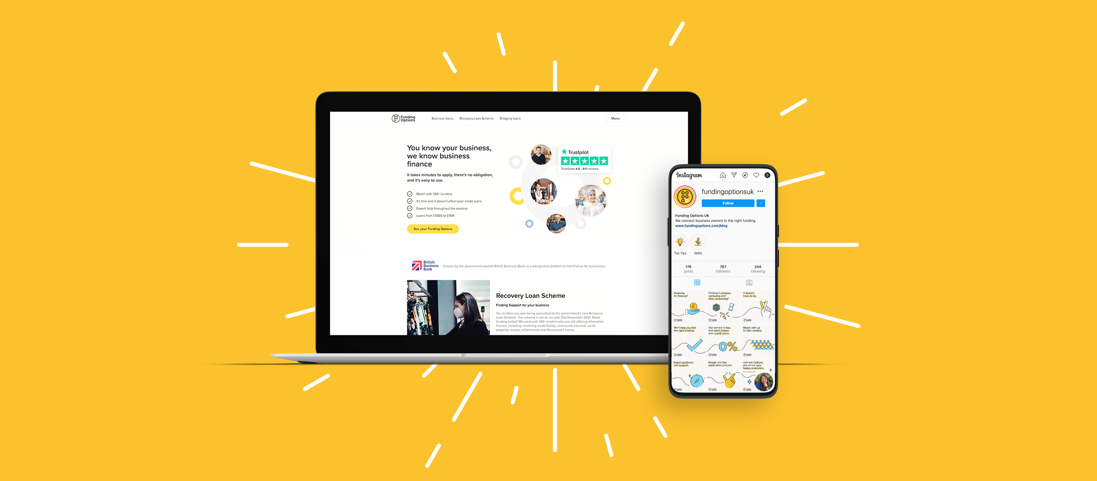
We were brought in to help develop a launch campaign and positioning for the new product. Funding Options wanted to refine its message and establish how the launch would be communicated to its audiences of businesses and lenders. We were also tasked with developing a look and feel that’s consistent with the core brand but with a note of difference, and creating a product video showcasing and explaining Funding Cloud.
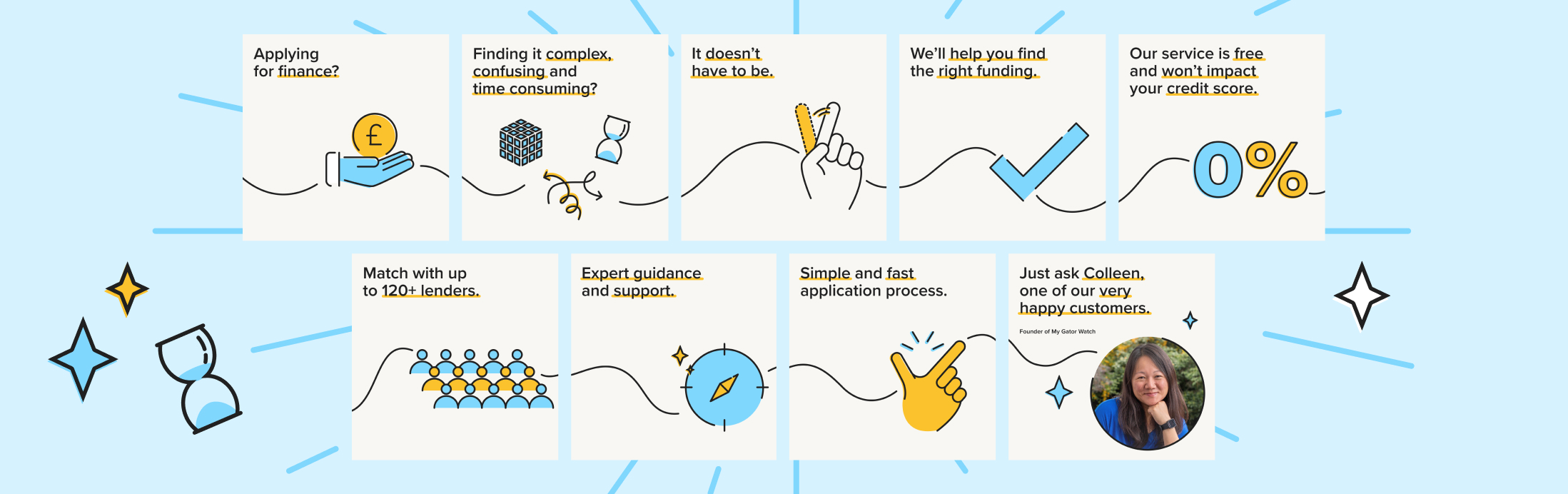
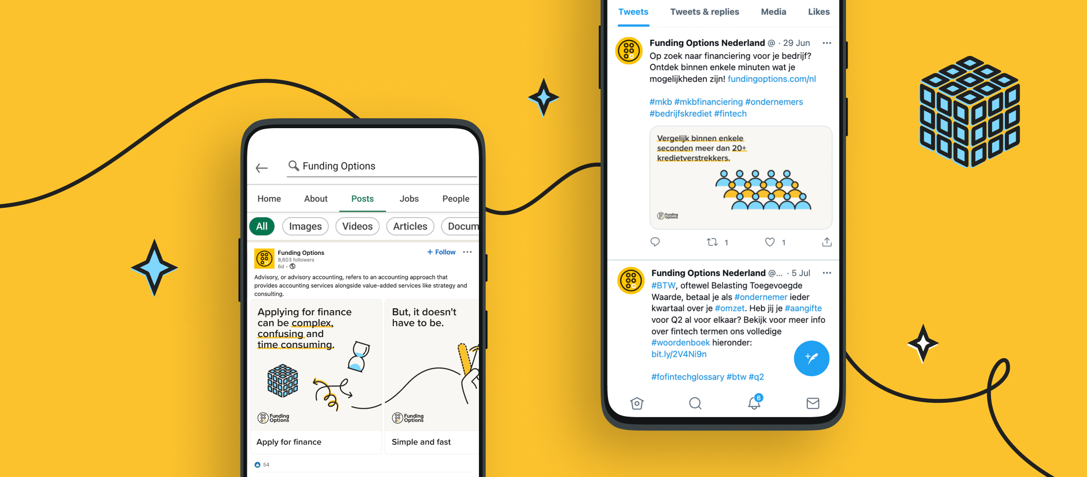
Funding Options also wanted a fresh tone and creative for its social activations, for SME and Advisory audiences. We created a number of animations to run as paid and organic social advertising for the Dutch and UK markets. We were retained for creative support for a period of three months to provide this.
Our approach
The timelines on the project were quite condensed. We quickly pinned down the messaging so that it could feed into all the other elements of the launch. Our role was to help review and refine it, with a strategic narrative and story that best reflects Funding Cloud’s position in the market and how it benefits its customers.
We began by identifying the product’s advantages of connection, speed and empowerment. For lenders, we focused on more granular concepts around transparency, customer matching and real-time views of customers. For businesses, we highlighted the lack of red tape, precise fund matching and the breadth of Funding Cloud’s lender network, using a simple tone of voice that gives confidence in Funding Cloud. Our language and strategic messaging then fed into Funding Cloud’s digital presence, as a destination for customer engagement.
Look and feel
With the messaging in place, we created a visual style for the look and feel of the campaign and product launch. Funding Options had already begun stripping back its core brand elements so that it could build a new direction. This gave our design team a degree of freedom to inject new creative elements and develop a best practice for animation and video that could be used in the future.
At the same time, our design resonated with the rest of the Funding Options brand and didn’t step so far away that it distracted from other communications. We used the core colour palette to create a soft, approachable visual style, with a printed style guide for brand consistency. We created visual motifs for businesses and lenders so that they could be easily identified in the video. These audience groups continued to be signposted within other communications as well as associated live event(s).
The result
Our work launched Funding Options’ new product in a clear, cohesive and exciting way. The messaging framework and the fresh visual look will also be used across wider communications, allowing the company to build on its brand awareness and increasing its customer base.
As the wider brand develops, we continue to work with the business to deliver further brand engagement.

Spring Nurseries is partly owned by the charity Action for Children and offer award-winning, affordable early years education and childcare, with all their nurseries rated 100% Good or Outstanding by Ofsted, or equivalent standards in Scotland and Wales. Earlier this year, Spring purchased Oscars childcare, primarily offering holiday clubs and operating out-of-school care in Edinburgh and the Lothians since 1992.
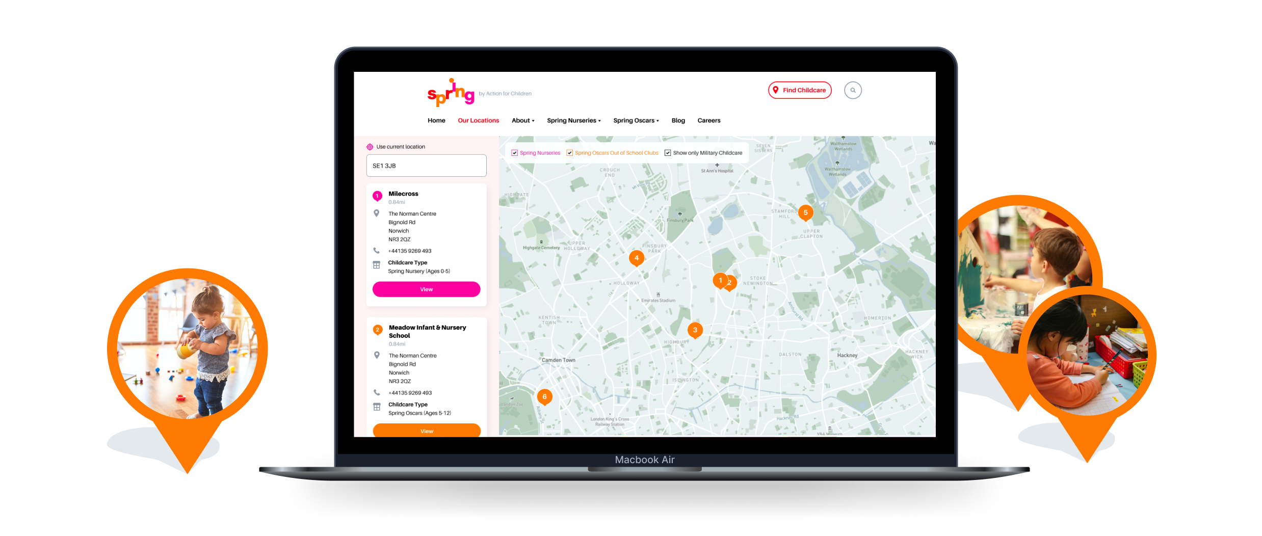
As an organisation they faced a challenge; to deliver a website and digital experience that demonstrated their brand as part of the Action for Children family as well as bringing in the existing Oscars brand under their umbrella without confusing prospective clients.
Setting a structure
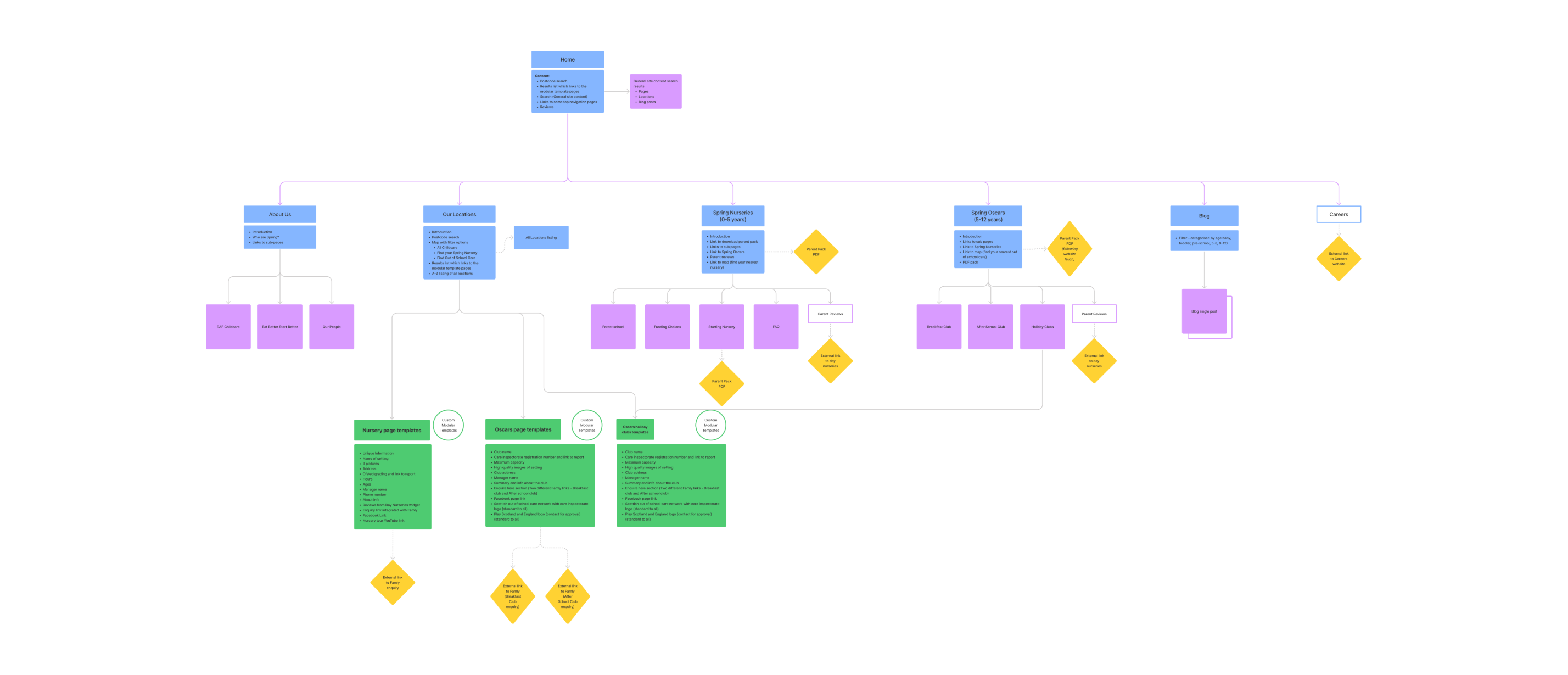
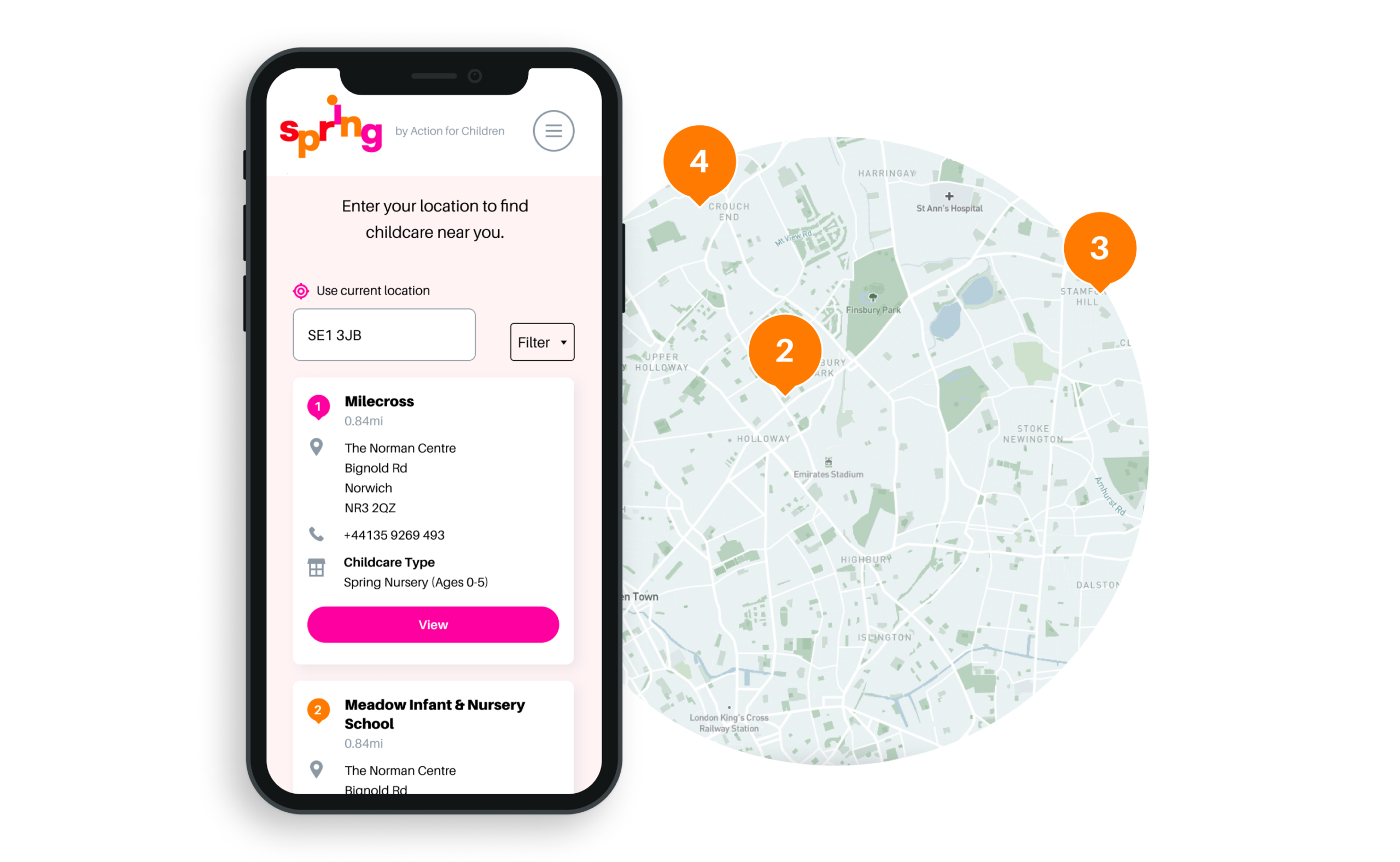
Although the final resolution appears quite simple, the website content is wide-reaching and specific. There are Spring childcare nurseries that run during the day, each for a specific age group and there are nurseries that cater primarily to the military such as the RAF. With Oscars seasonal holiday clubs and Oscars breakfast and after-school clubs for specific age groups, our Studiomade team had to build a controllable Content-Mangement-System that could tackle all needs and be super flexible.
Our key concern was making this depth of content quick and easy to navigate without being overwhelming. This made the wireframing and CX stage imperative so that we could ensure that all content was catered for including anything seasonal. This was also valuable for ensuring that all functionality such as integrations with Daynurseries.co.uk were included.
Managing the brand
We have worked with Action for Children for a number of years across other projects such as their successful Secret Santa campaign and Byte Night. From this client experience, we have a really good understanding of their core brand which positively helped when tackling this project. A lot of the ideas such as bold bright colours and patterning had been replicated throughout and adapted in a manner that best suited overall brand consistency.
Although this bright and primary colour palette really works well for young children, reflecting a bit of their sense of life and excitement, it did bring some design challenges. When dealing with intense saturated colours it can sometimes appear overwhelming to users and doesn’t necessarily allow for different ‘volumes’ of call-to-action. To tackle this, we made additions to the palette which provided the UI a breadth needed to craft an effective digital design language.
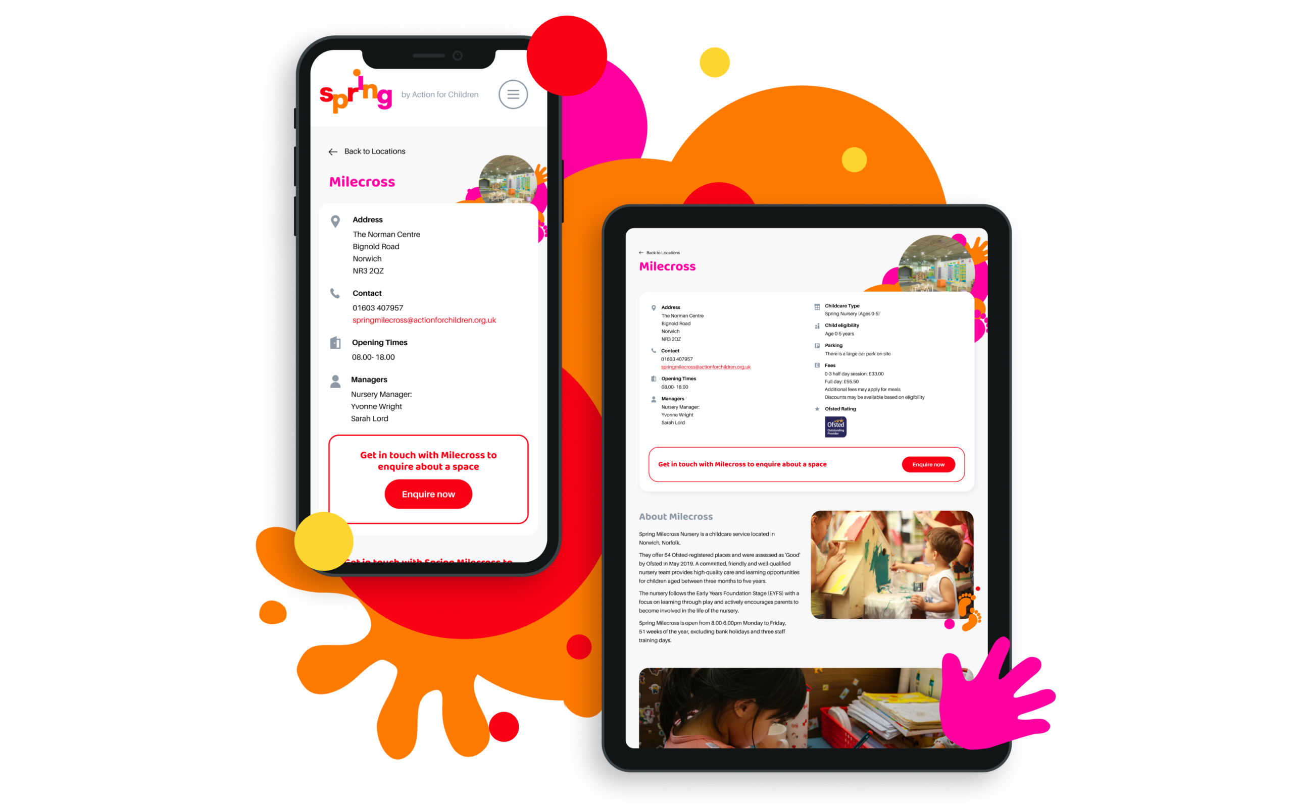
We wanted to keep the playful nature throughout and so used the patterns of hands and feet around key modules as a sort of colourful frame and created small illustrations for key facts such as the Ofsted rating and the day nurseries figure. We also softened all the edges to keep that approachable feeling, giving large photography modules rounded corners and bringing in the brand font ‘Baloo’ with its nod to bubble writing within all headings.
Providing the client ownership
A really common issue that clients share with our team as part of briefing a digital project is previous experience of how hard it is to edit or update their website. The existing Spring website which we were replacing had very little built into it’s Content Management System and the way it had been built meant that it wasn’t modular meaning things wouldn’t repeat throughout the site. We ensured that all content points could be controlled within the CMS in a clearly set out way so that the website really worked as a business tool. This allows the client to easily make a wide range of content changes including but not limited to the addition in new nurseries (which would then automatically add them to the map), updating of holiday club pages, adding new after-school clubs and promoting any element they liked within the main header.
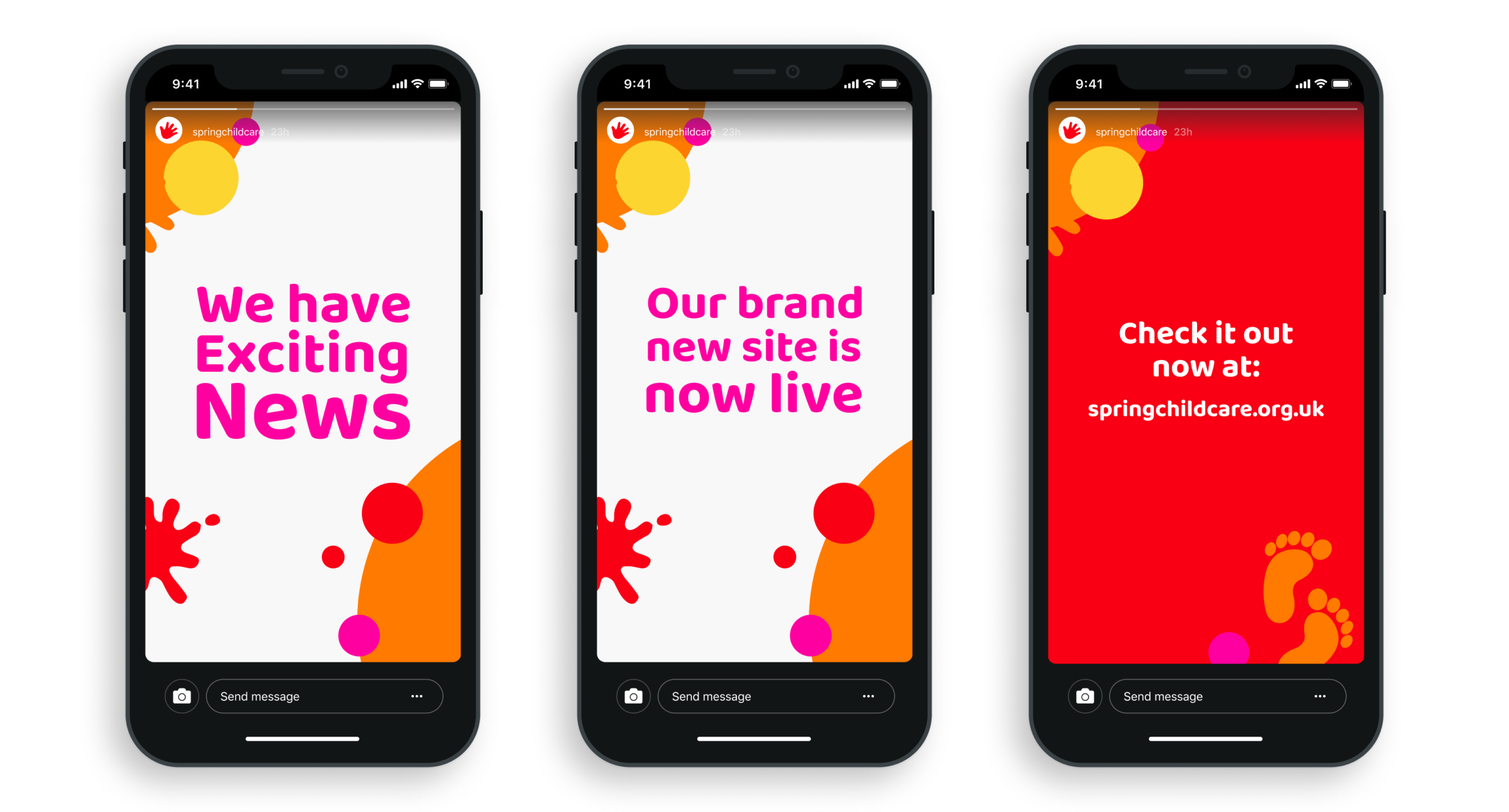
We also wanted to give the client the tools to ensure that they could promote the website well socially and so built a series of animations for them that they could use across each of their Nursery Instagram profiles aiding announcements and promoting particular events. Their fun, playful brand being brought to life within these small idents.
The result
We have established a united digital presence for the merged business. With a newly defined and completely customisable Content Management System, the client continues to receive excellent customer feedback on website performance, communication functionality and overall effectiveness.
A brand with purpose
There are now so many consumer brands vying for our attention across so many platforms that only a few transcend the noise and become bywords for their values. Aesop, Monmouth and Patagonia, for example, are synonymous with quality, care and environmentally conscious. It’s not just their products that have helped them reach the pinnacle in public perception; their branding and carefully crafted design has given them the bedrock needed to expand from.
The idea for The Cove began in lockdown, believing in the importance of the high street to local communities, particularly small businesses. Phil Reid, the founder of Studiomade, and florist Amy Lethbridge wanted to bring a personal touch to shopping in Royal Tunbridge Wells, through a premium retail experience. Next to a luxury, seasonal floristry service, The Cove stocks a curated product list that alternates throughout the year – with one key principle:
“We wanted to support aspiring product designers and distillers, championing the growing demand for high-quality, small-batch created goods with a purposefully slim product range that is not found in traditional supermarkets or outlets.”
Concept and approach
The driving thought behind The Cove was to help people discover exciting and unique products that aren’t mass produced and are created by really passionate people – independent makers and creators. These thoughts were what led to the name ‘the cove’. Something that reflects intrigue, curiosity, safety, protection, cosiness – and above all a sense of discovery. Think back to smuggling times and a cove often yielded lost treasures, provided a cornerstone for new opportunities and safe-guarded those brave enough to venture forth.
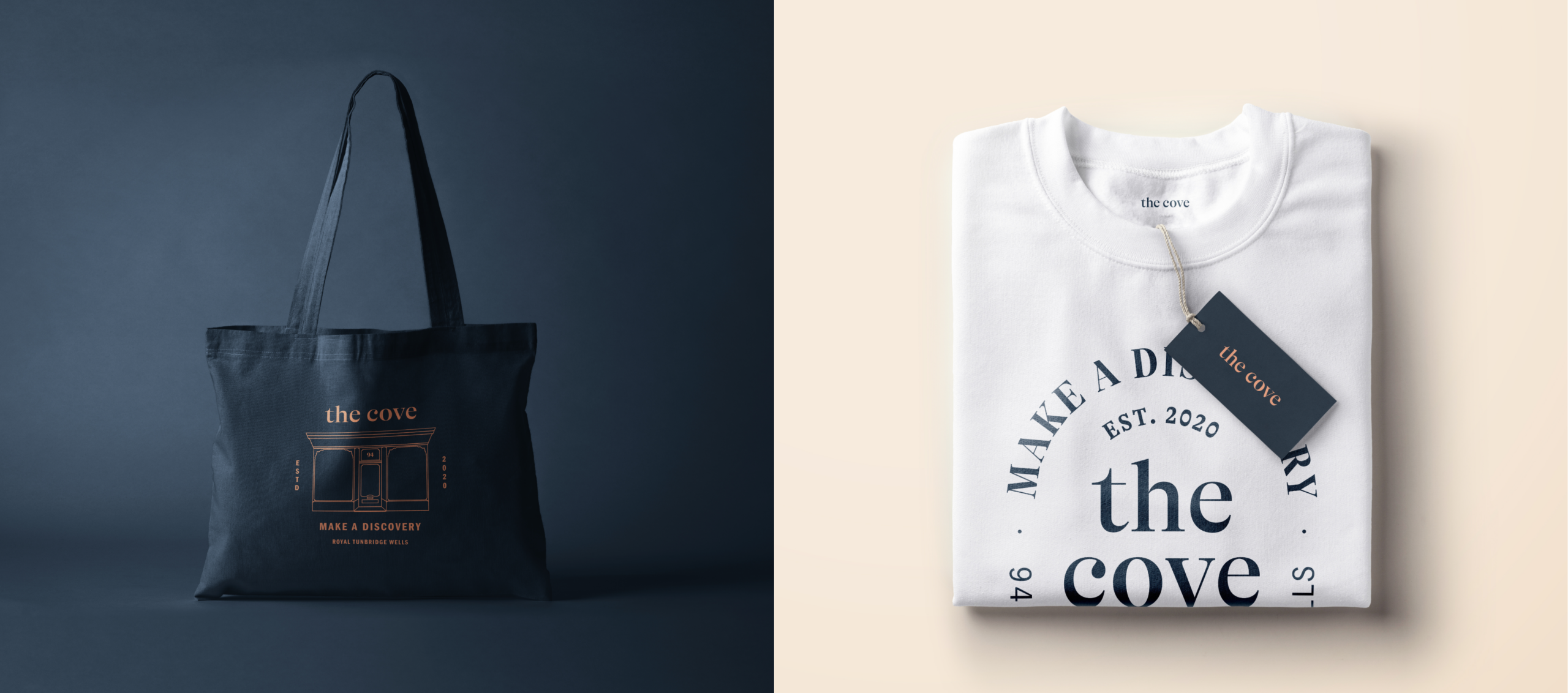
Today, smart brands reflect their surroundings and work with a local, cultural and modern verbal and visual vocabulary. We wanted the brand to echo the timeless architectural elements on the physical listed building, ensuring that the brand had a quiet sophistication. Creating emotional connections with customers can be difficult to master but in curating an experience that is unique and intimate plus distinct the brand and overall proposition is able to set itself apart.
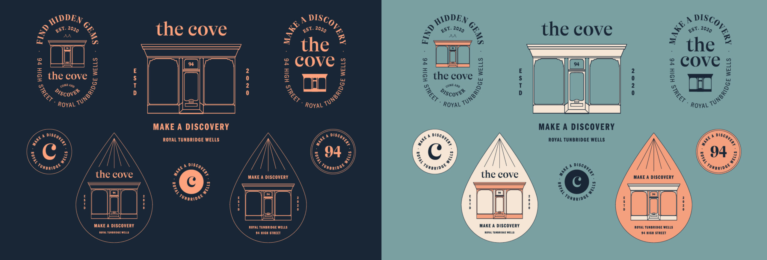
The Cove brand like any other had to translate across all platforms. So rather than entirely focussing on the digital we could communicate through unique environmental designs and sensory experiences our purpose and intent, to really help people enjoy the High Street again and connect to aspiring, lesser-known brands and products.
This restrained branding is designed to allow people time to make their own discoveries, the store and digital presence providing environments where consumers can take their time with nothing shouting at them on where to go and what to do.
Providing a platform for the creators
In the store these stories can be shared by The Cove team, spreading the individual origin about each product. By sharing their real value and point of difference, people have the opportunity to discover something new that they would never normally consider.
Bringing the brand alive through Shopify
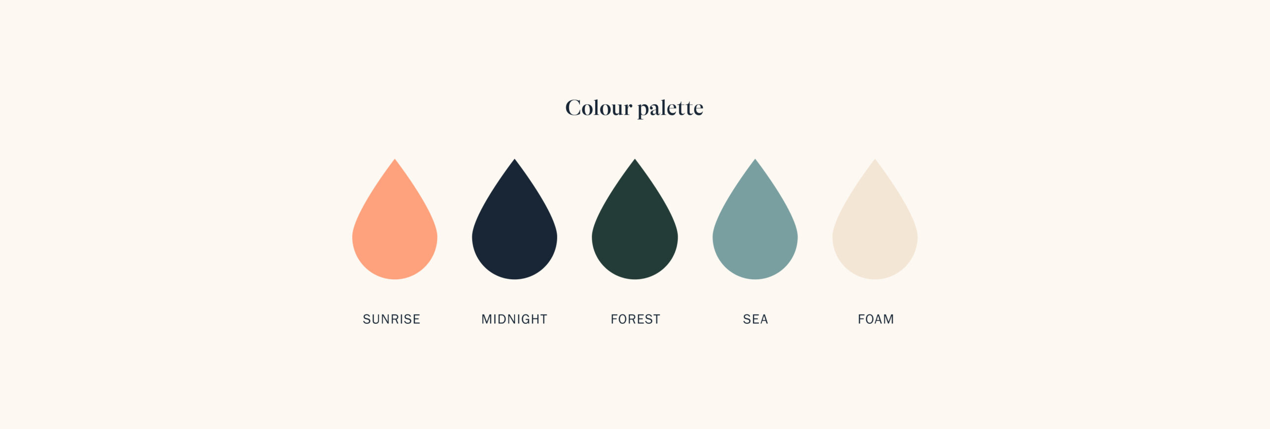
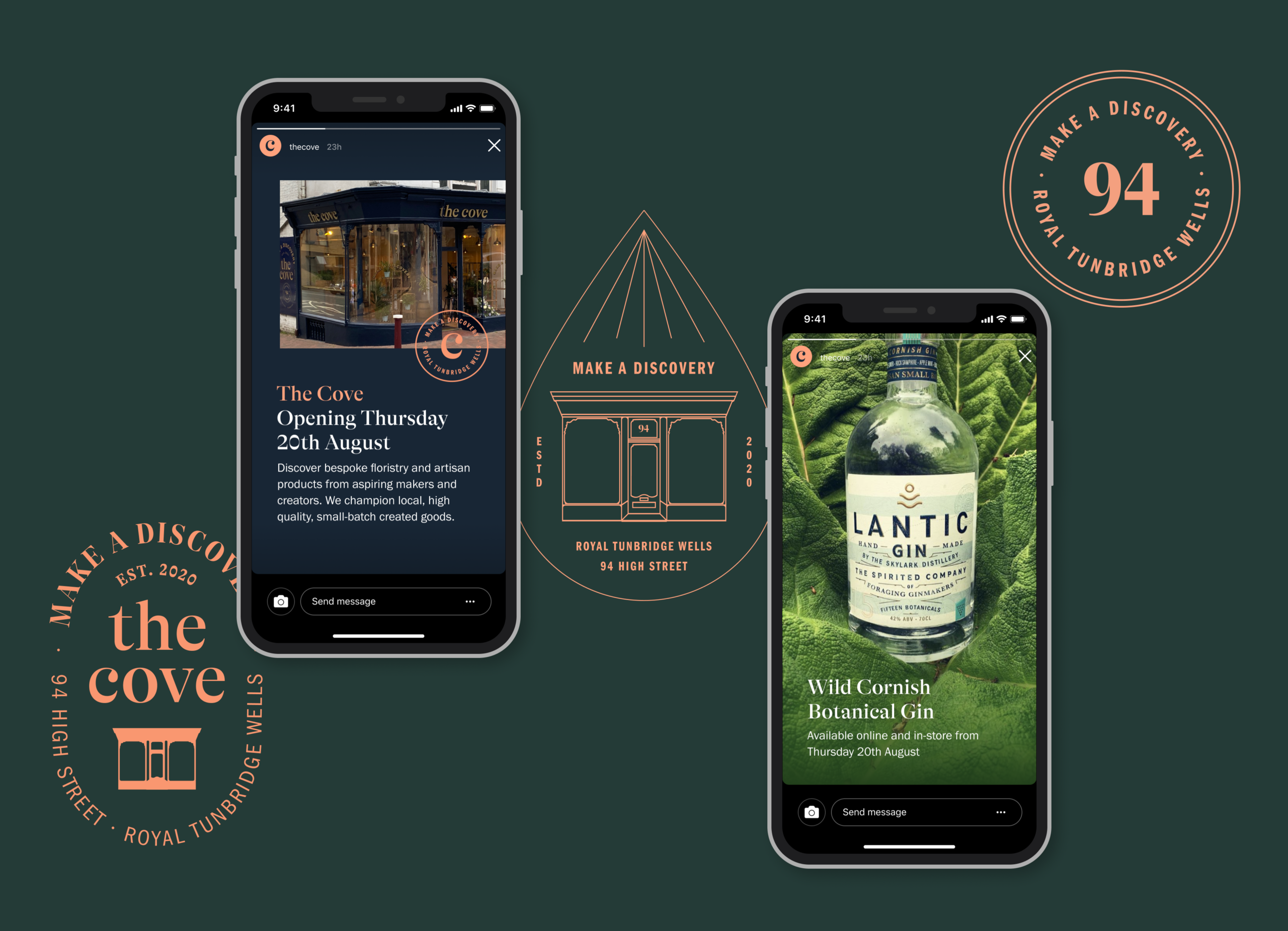
The calming colour palette was selected by sampling a breadth of nature photos from sunsets and natural coves in the UK. The font GT Alpina was selected due to it’s high contrast and fluidity, the terminals reflecting water around a geographical cove. We also added messaging that peaked the curiosity of passing foot traffic on the windows, inspired by vintage apothecary styling – reinforcing that sense of discovery and curiosity.
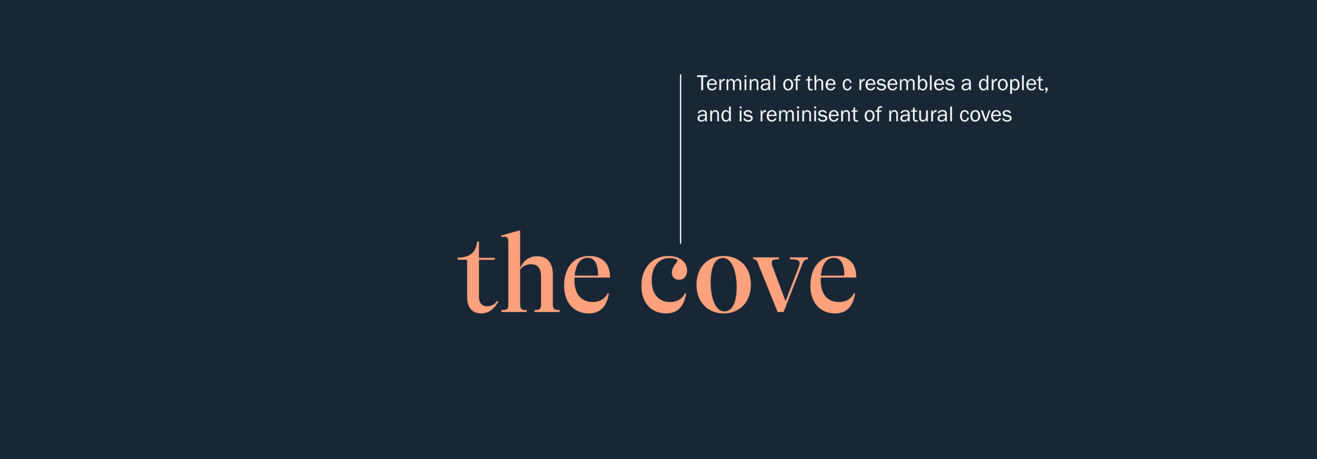
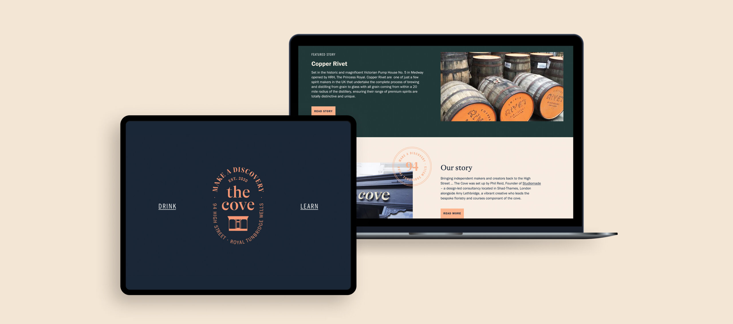
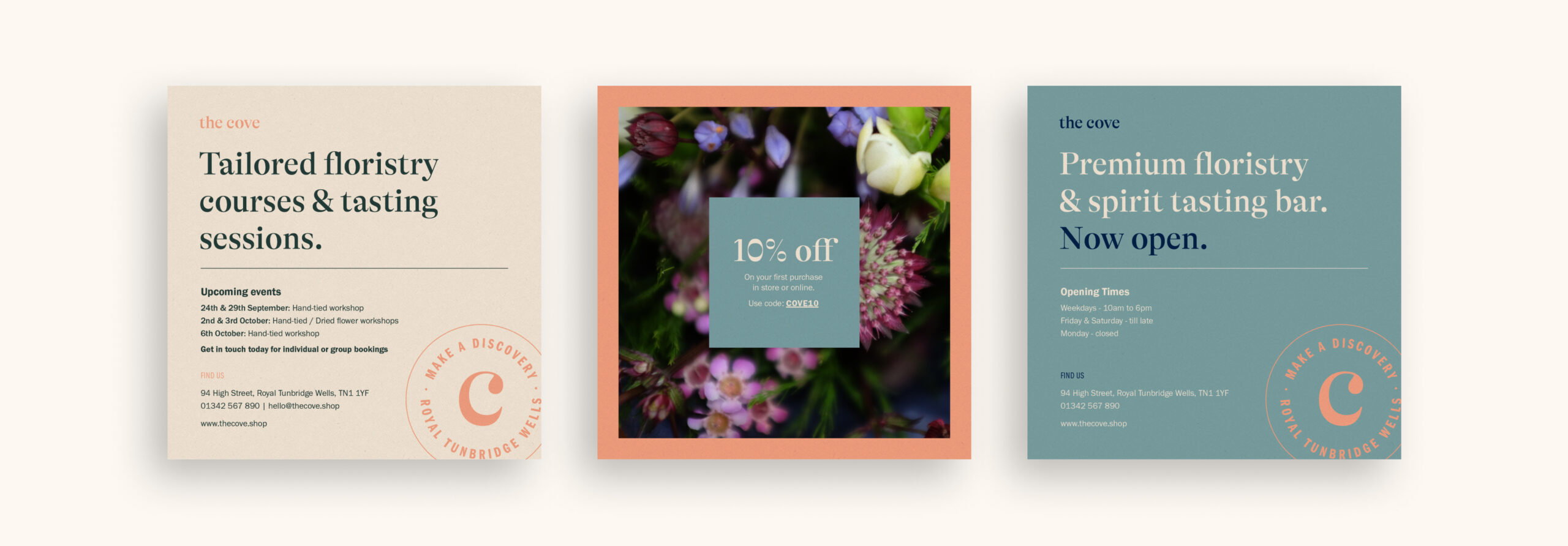
The digital presence (built on Shopify) gave us a bit more space to be playful with the brand. Using the GT Alpina in a large weight to focus users on key statements we brought in a round stamp element that could be animated to bring interest, also used throughout physical materials such as loyalty cards. We created a teardrop monogram in the footer inspired by the droplet in the letter ‘c’ to bring some illustration to the brand that would also work well across larger promotional materials such as email campaigns.
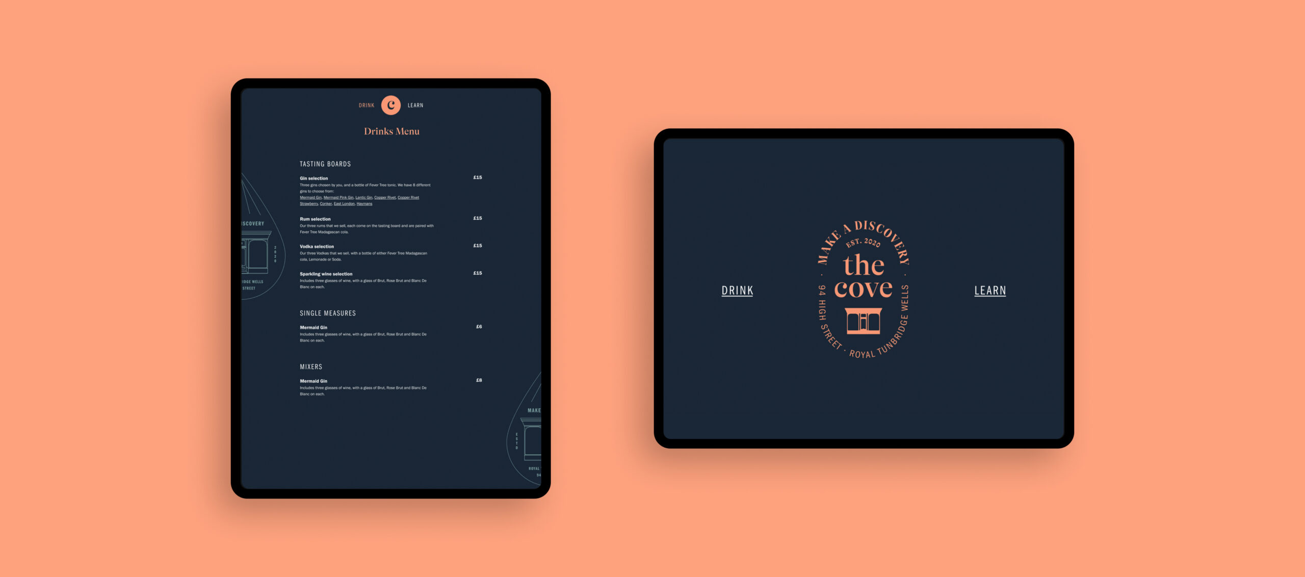
Our digital input didn’t end with the Shopify experience, by creating an app for customers we have helped them safely peruse our drinks menu and view tasting notes for all products stocked. We wanted this to reinforce the storytelling and the care and passion that had been put into making each item The Cove stocked.
Power of photography
We needed amazing photography to tie the design elements and the products together, while reinforcing the sense of calm and personal discovery we wanted to cultivate. Our design team created a best practice document that will allow everything to be cohesive and communicate one unified story. Every element and item associated with The Cove supports its brand look, feel and values.
A positive story
The Cove has launched as an entirely new retail concept within a challenging time. Observing possible commercial opportunities, the business and brand look to bring something special back to the High Street. The public response to the concept and overall proposition has been extremely positive, with a social presence actively growing and learning courses booking up!
Visit The Cove website or find them on Facebook and Instagram. Close to Tunbridge Wells? Stop in and say hello at 94 High Street, Royal Tunbridge Wells, Kent, TN1 1YF.
With many major fund raising projects and events scrapped due to the Coronavirus sweeping the globe, charities are faced with a huge hole in their funding. UK children’s charity Barnardo’s acted fast and saw an opportunity to test a concept that would help their supporters as well as secure valuable donations.
In looking for a team, they found that Studiomade could provide quick thinking and ingenuity to help launch Super Seekers – a new initiative which offers activities to parents to help encourage and entertain children during these stressful times.
This special project had a window of just two weeks for the MVP to be completed in, but the tight deadlines meant high energy and excitement from everyone that worked on it. An impressive demonstration of what a great concept paired with a dedicated studio and client team can deliver.

Creating a narrative
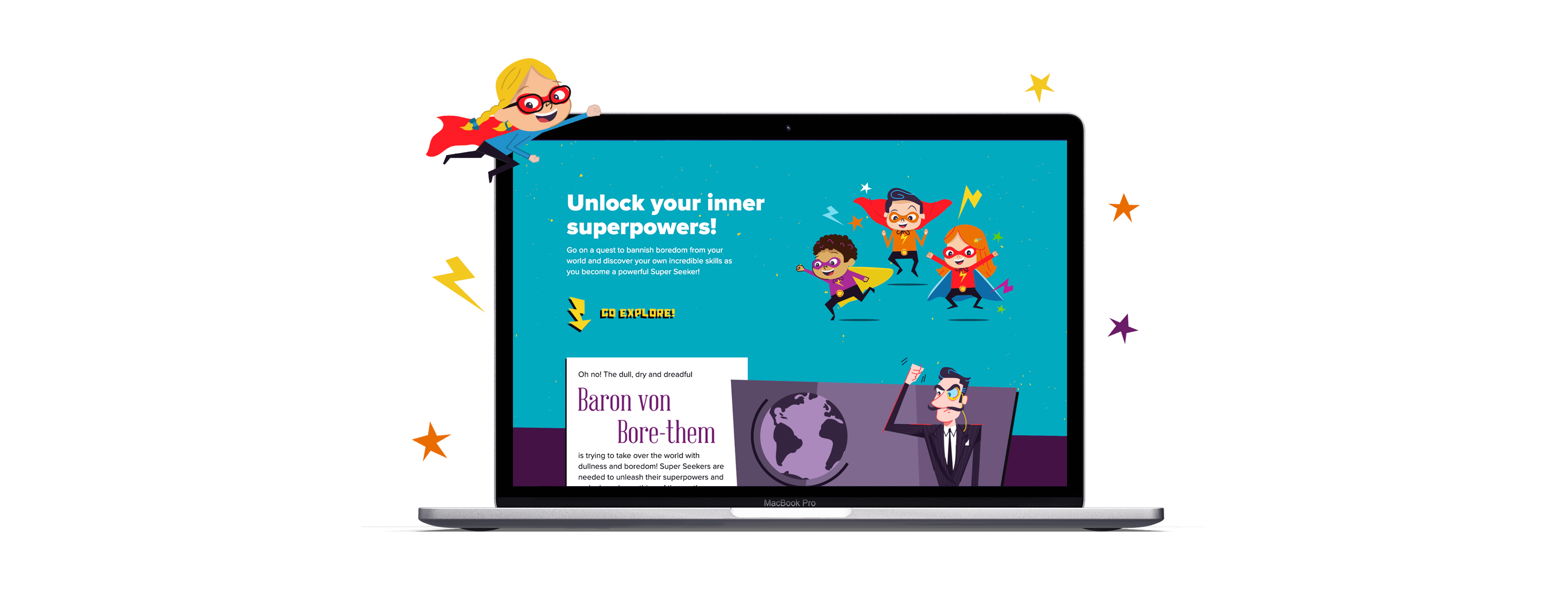
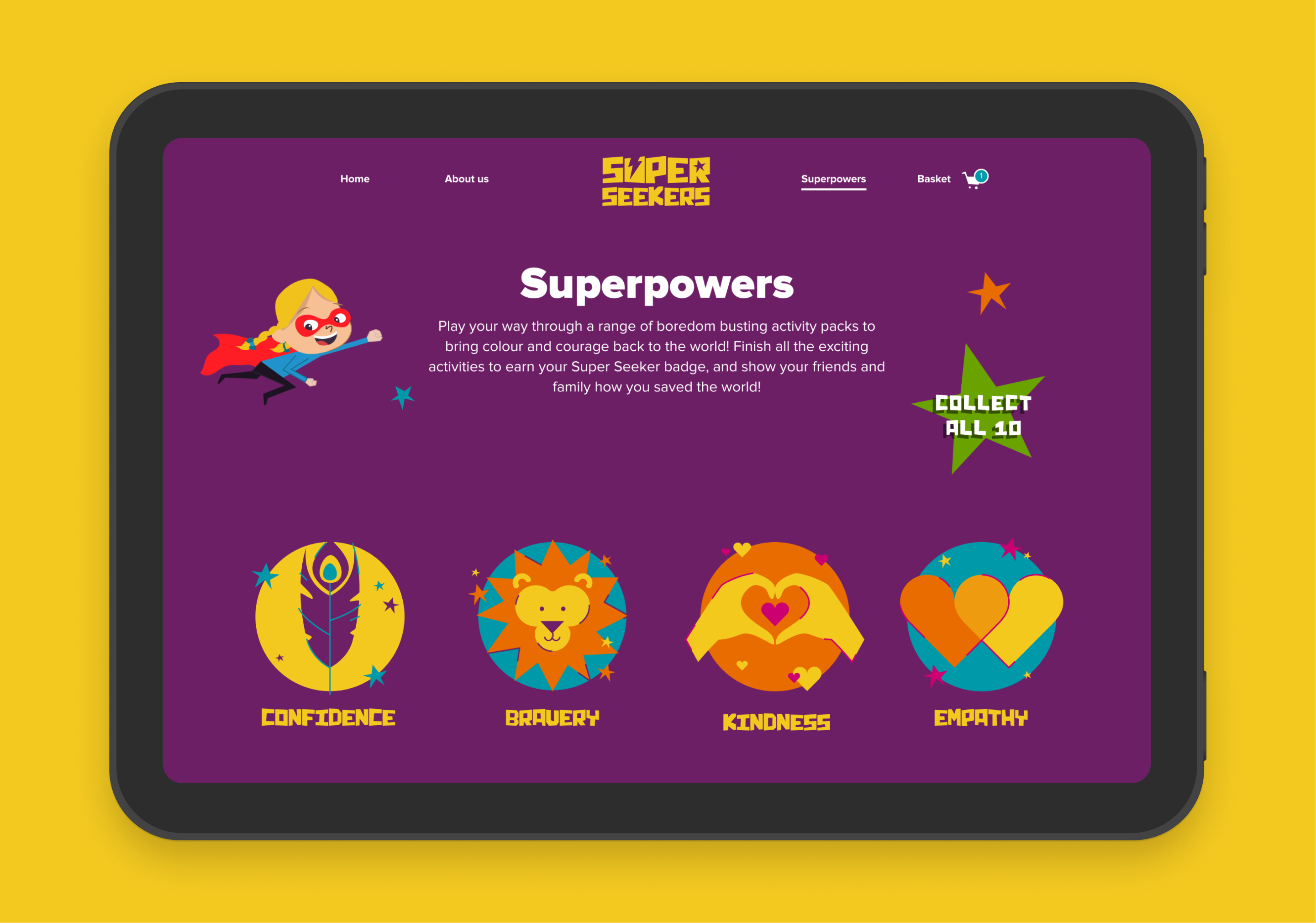
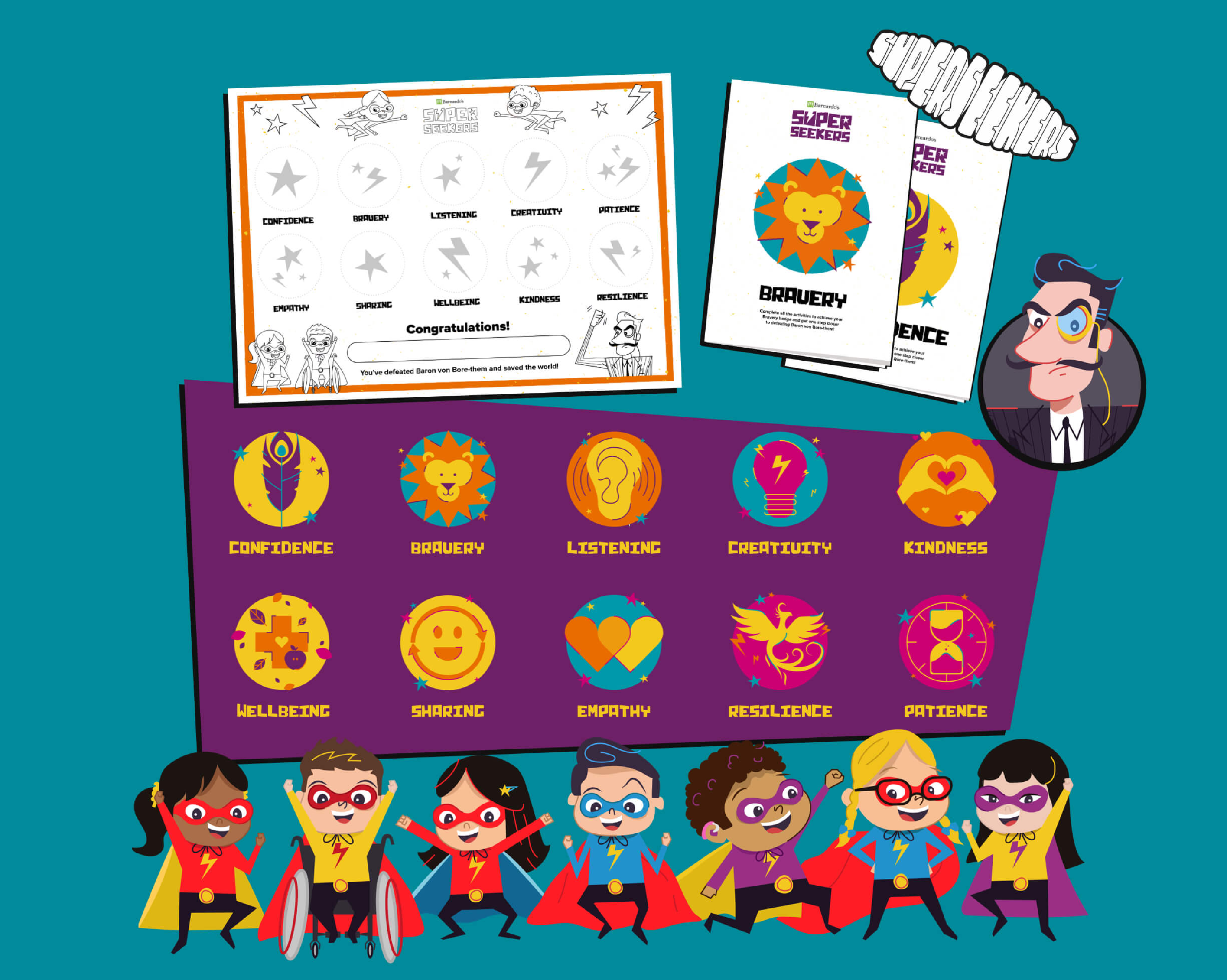
Barnardo’s wanted to create a narrative to engage children, parents and carers alike. We worked in collaboration with Barnardo’s to develop these characters. The vision for the Super Seeker heroes and heroines brought personality and realism to the concept. The villainous Baron von Bore-Them is intent on spreading boredom to the farthest reaches of the globe and only the Super Seekers can help stop him. They must complete all the activities, each earning them a life skill badge enabling them to defeat the Baron.
As well as providing the brief for our campaign concept and illustrations, this narrative serves a wider purpose of helping move users around the website as well as fully immerse them into the experience – creating better engagement and hopefully a higher donation for Barnardo’s.
Demonstrating value
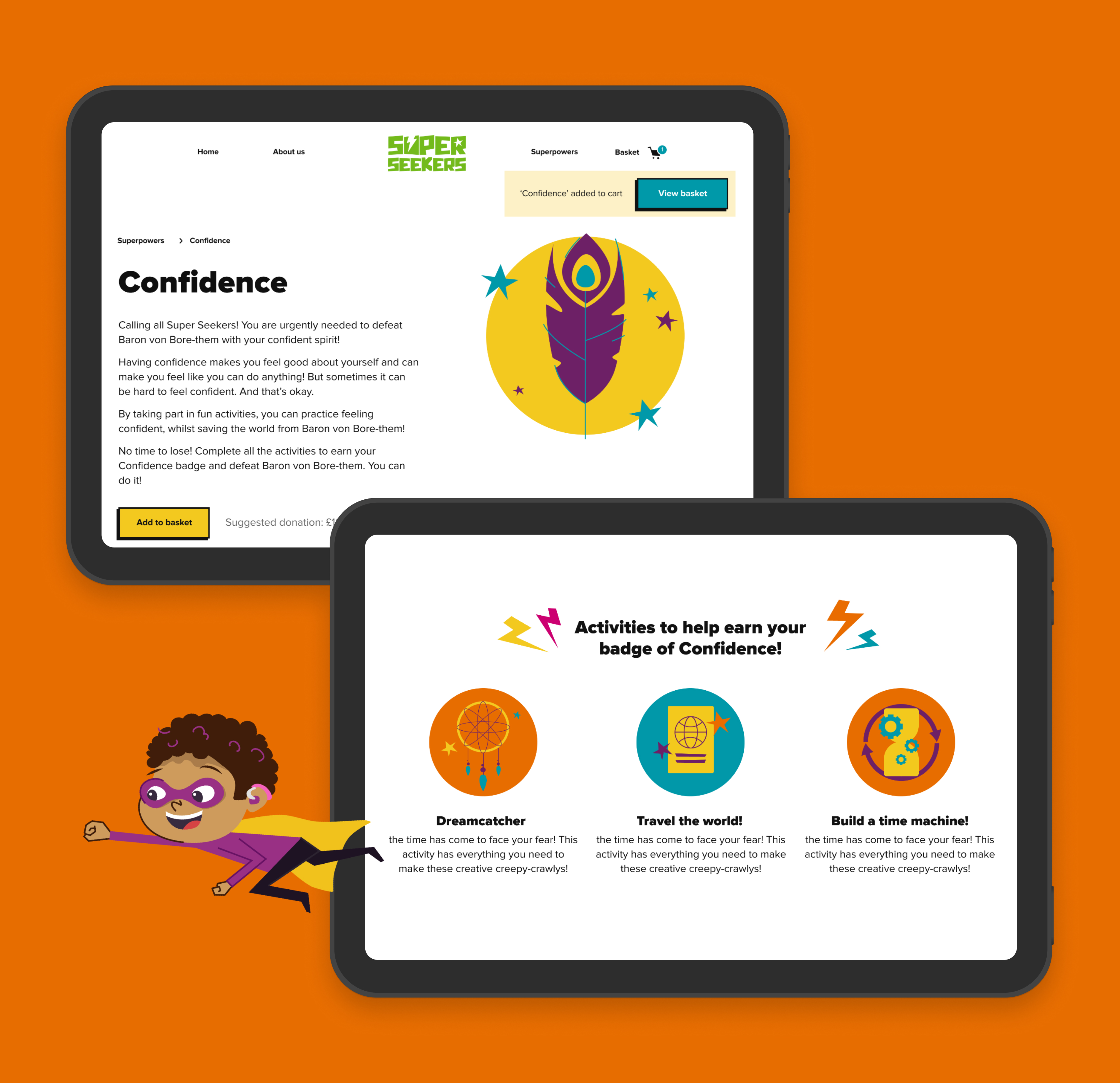
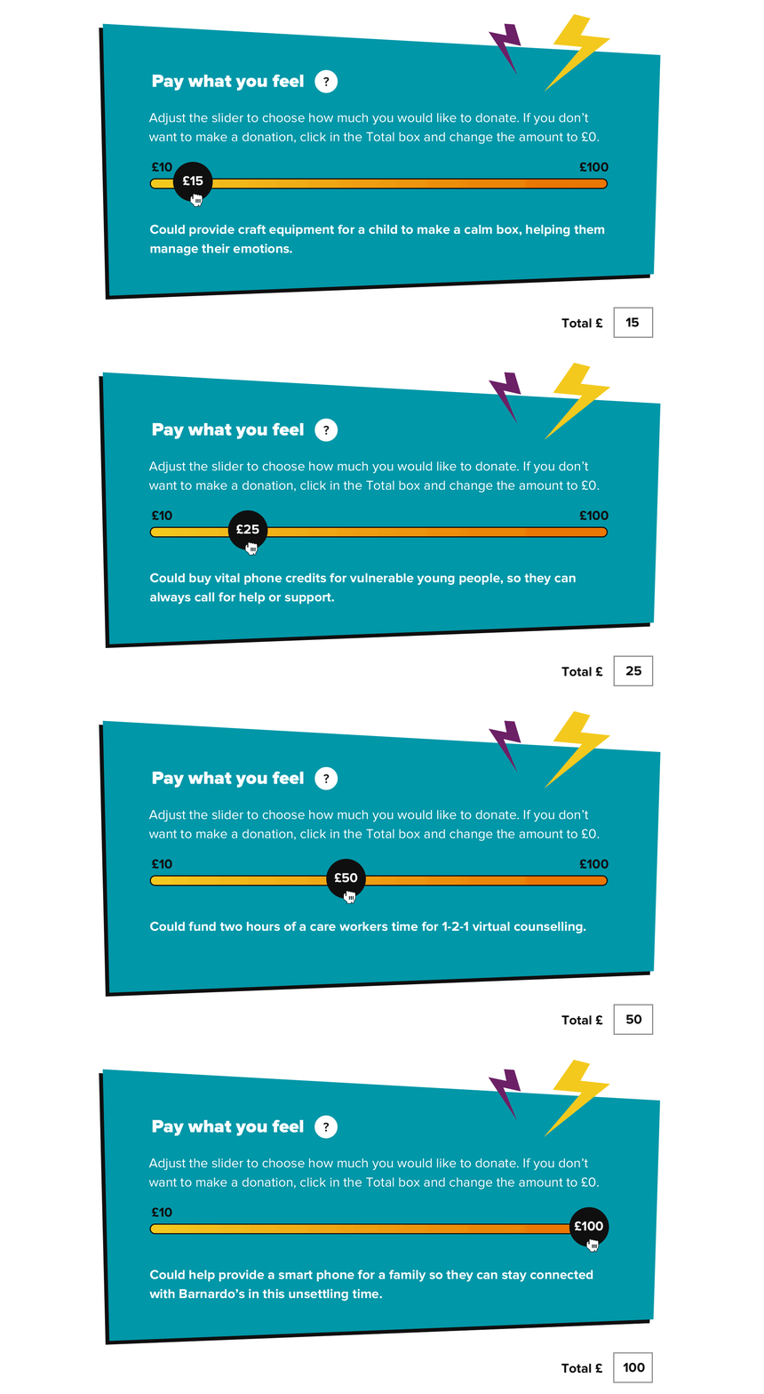
The Super Seekers website has many purposes – to entertain, to educate and ultimately deliver donations for Barnardo’s. While the first two are extremely important, the last is the mechanism that will allow all of this good work to continue. We wanted to try and show users the value of their donations and encourage a higher level of gifting where possible.
By informing users of what an increase in donation may mean to children and families supported by Barnardo’s, we helped to build an emotional connection with visitors that would relate to what Barnardo’s are looking to achieve.
The donation mechanism
Charities work with many donation mechanisms which require compliance, tracking integration and database management, often alongside creation of data protocols and frameworks.
With technical project scoping tackled within the briefing phase, using our knowledge of payment gateways we were able to identify that a Stripe payment integration was possible. It could have been a choice to use Barnardo’s existing main gateway however this would have required much more development time and would have interrupted the user flow. It’s important to not overlook functionality options to ensure that the best choice for the project is made. Here, Stripe was invaluable in delivering smooth development that could be actioned within the very short project window.
We integrated the payment workflow into our own database creation, providing the Barnardo’s team with GDPR-compliant data that they required.
A brand that lives
Our vision for Super Seekers brought this concept to life and delivered something that works across a wide range of digital and physical channels. The narrative helps shape communications and gives the project a voice of its own, complementing Barnardo’s brand tone. The look and feel brings the little Super Seekers to life and engages users in their battle against Baron Von Bore-Them, making an exciting reality that gives Barnardo’s capacity to grow their world going forward continuing to highlight their knowledge and experience.
Results
This campaign including donation website is a great example of how clients working together with our studio can deliver something incredible in a short timescale. A clear concept leads to fast decision making and a product that can continue to evolve after launch.
Barnardo’s have achieved a much needed new donation product while helping to support their audiences around the country. This has been a really rewarding project to be involved in.
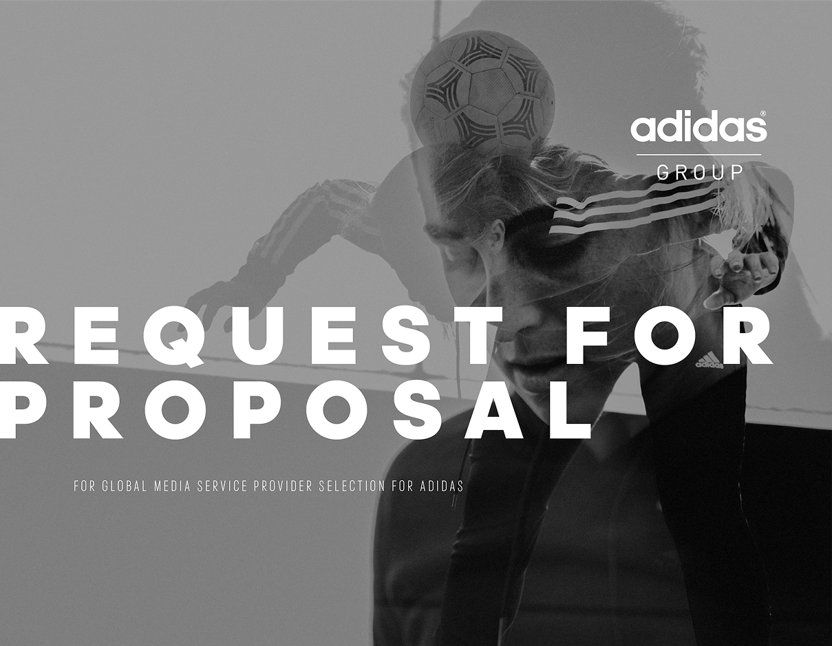
We have worked with MediaSense as a client for a number of years, delivering a number of iterations of their site and continued brand work therefore when they landed the contract to deliver the request for proposal for Adidas Global Marketing Services it seemed the perfect way to join forces.
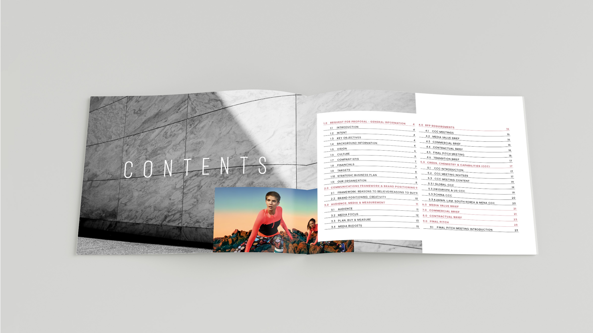
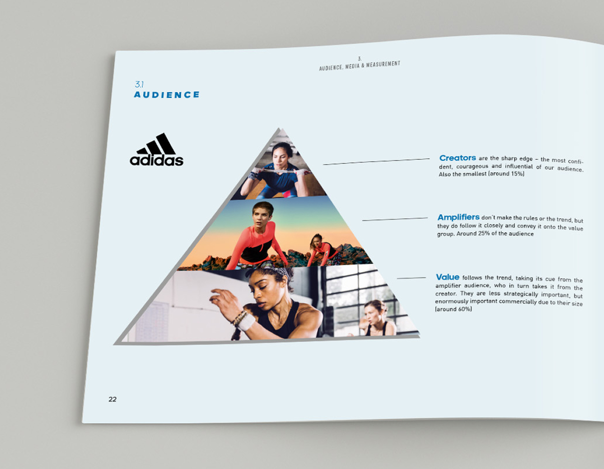
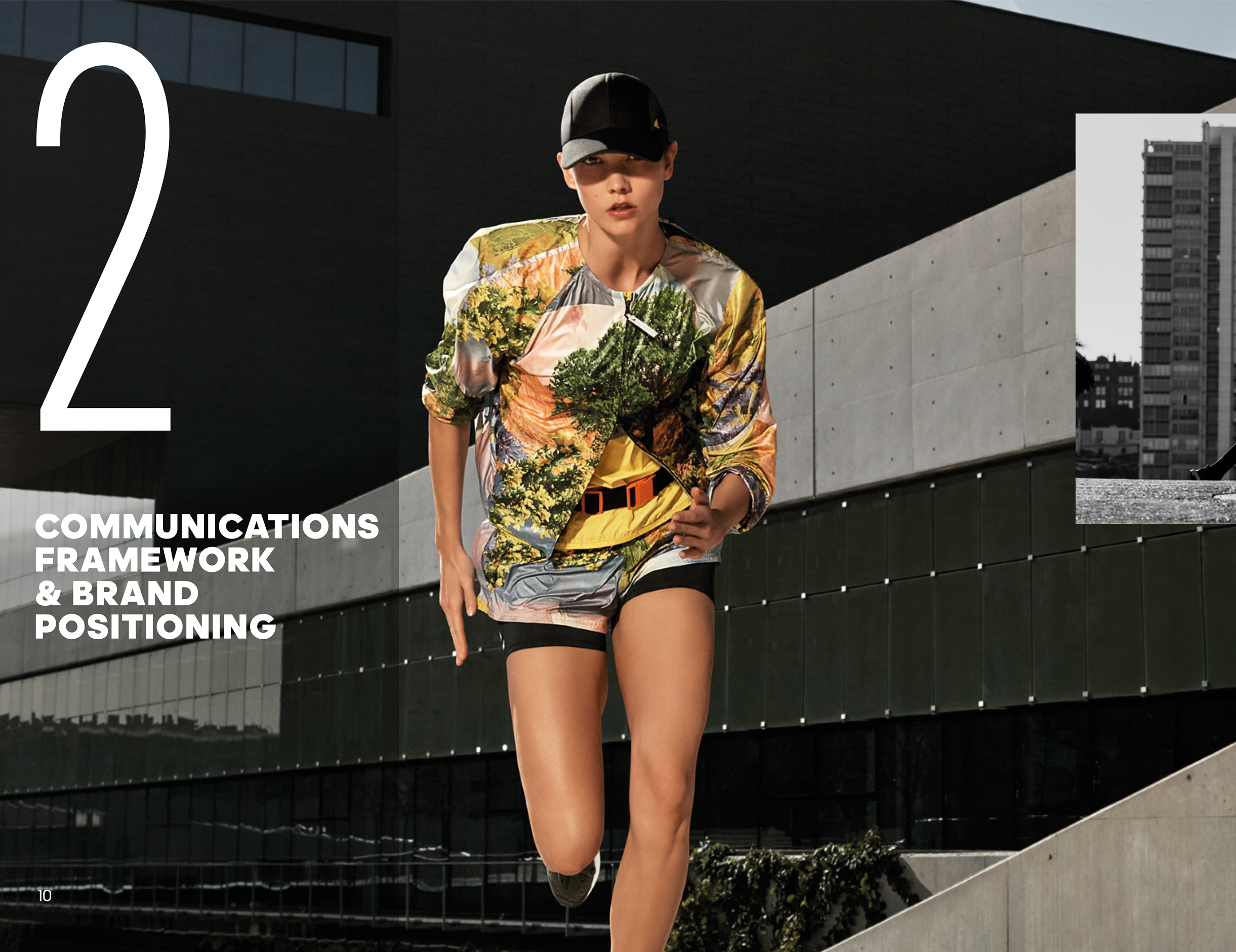
This document needed to represent the Adidas brand core values as well as detailing the pitch requirements and scope. We created a unique look and feel to the document that sat within the parameters of the Adidas brand look and feel. We made use of the incredible photography library, bringing a sense of dynamism, movement and energy to the document.
Design and brand exploration
MediaSense are a global media advisory company working across multiple facets of the industry and delivering a wide range of services. We worked with them to create their previous brand presence and website which featured a bright palette taken from the colours within the logo as well as vector iconography that signposted the services available.
MediaSense have grown exponentially since we last worked with them, setting up new offices and over doubling its workforce alongside being responsible for some of the largest media pitch processes conducted globally. We wanted to reflect this by creating an assertive, beautiful new digitally focussed brand presence. In retaining the brand equity that they have, we left the logo untouched and looked to develop a contemporary visual style that better reflects their position as leaders within their market.
With a central message of continual client growth across the media landscape, we wanted to establish a visual style that reflected the company’s attention to detail, focus and exemplary execution.

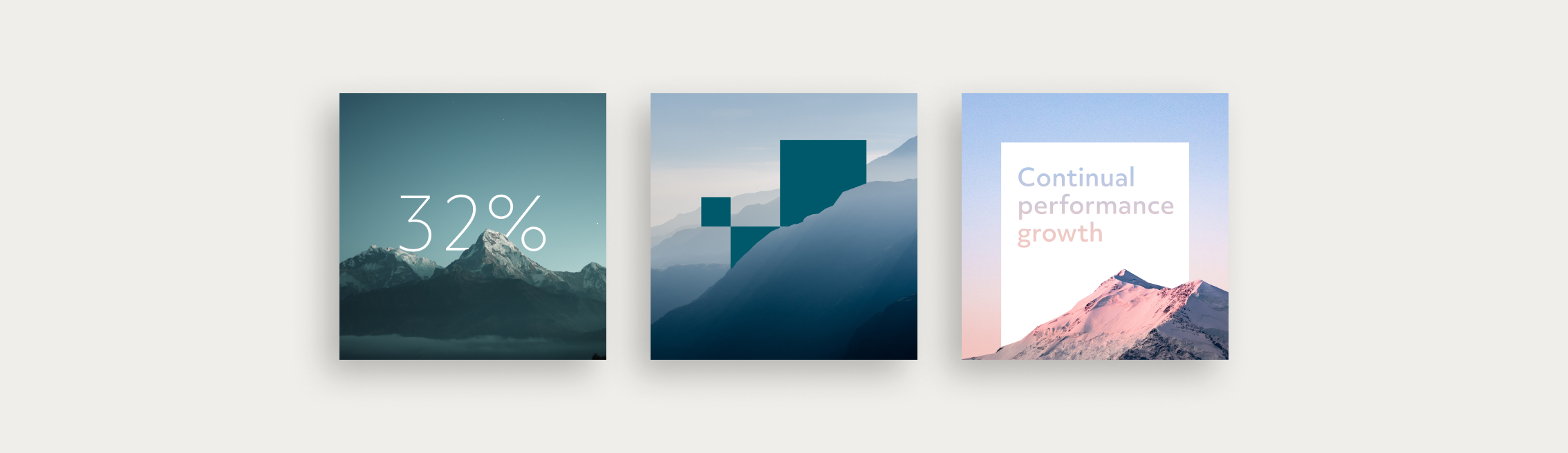
We initially explored creating a ‘media landscape’ that could then have elements of analytics or data set within it – the idea of parts becoming a whole. We investigated the use of patterning to show the concept of growth also using the shapes as flexing holding elements for content and utilised cinemagraphs to demonstrate continual performance, complemented by photography of nature.
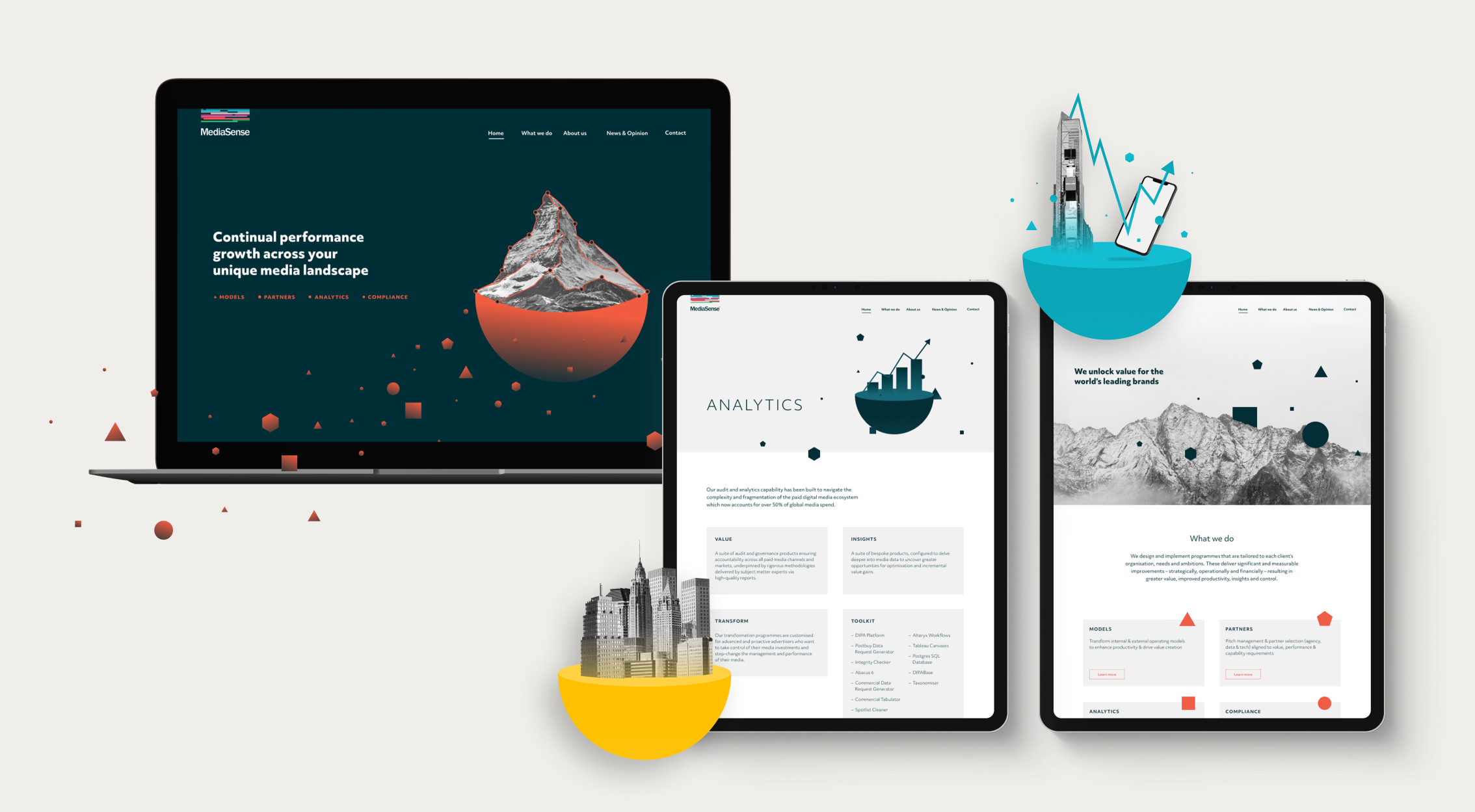
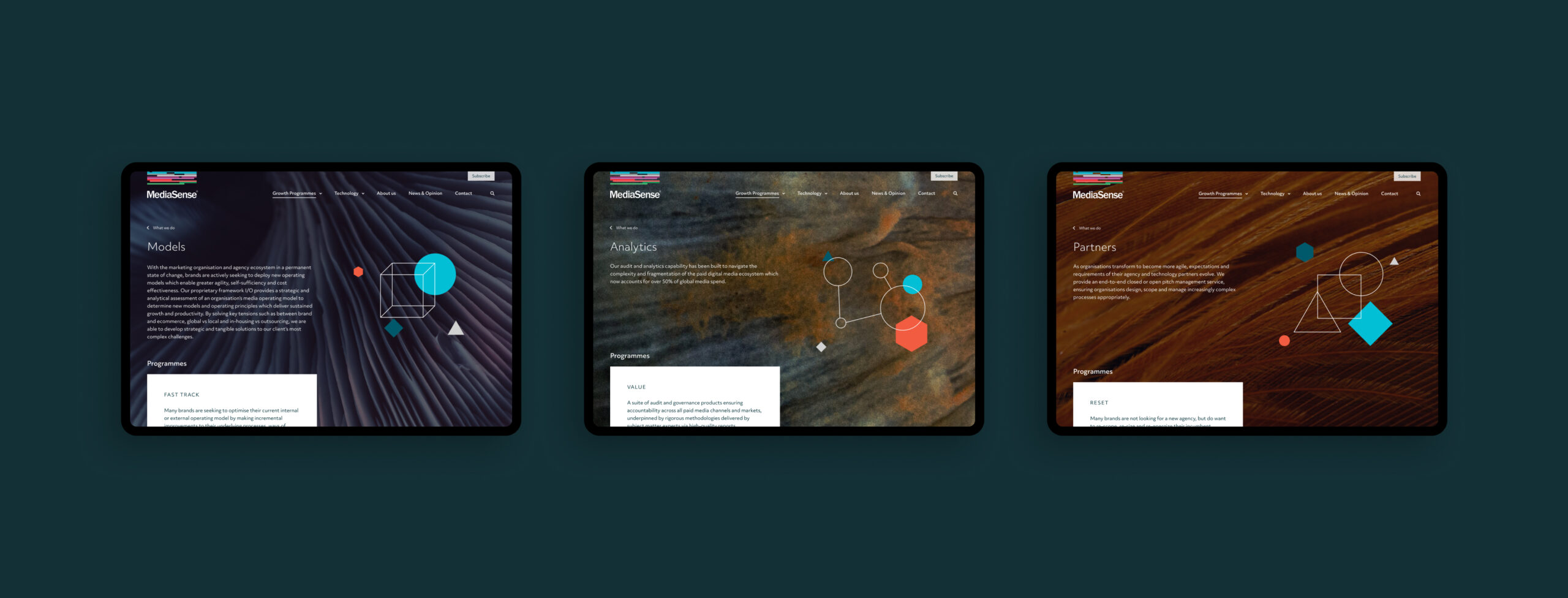
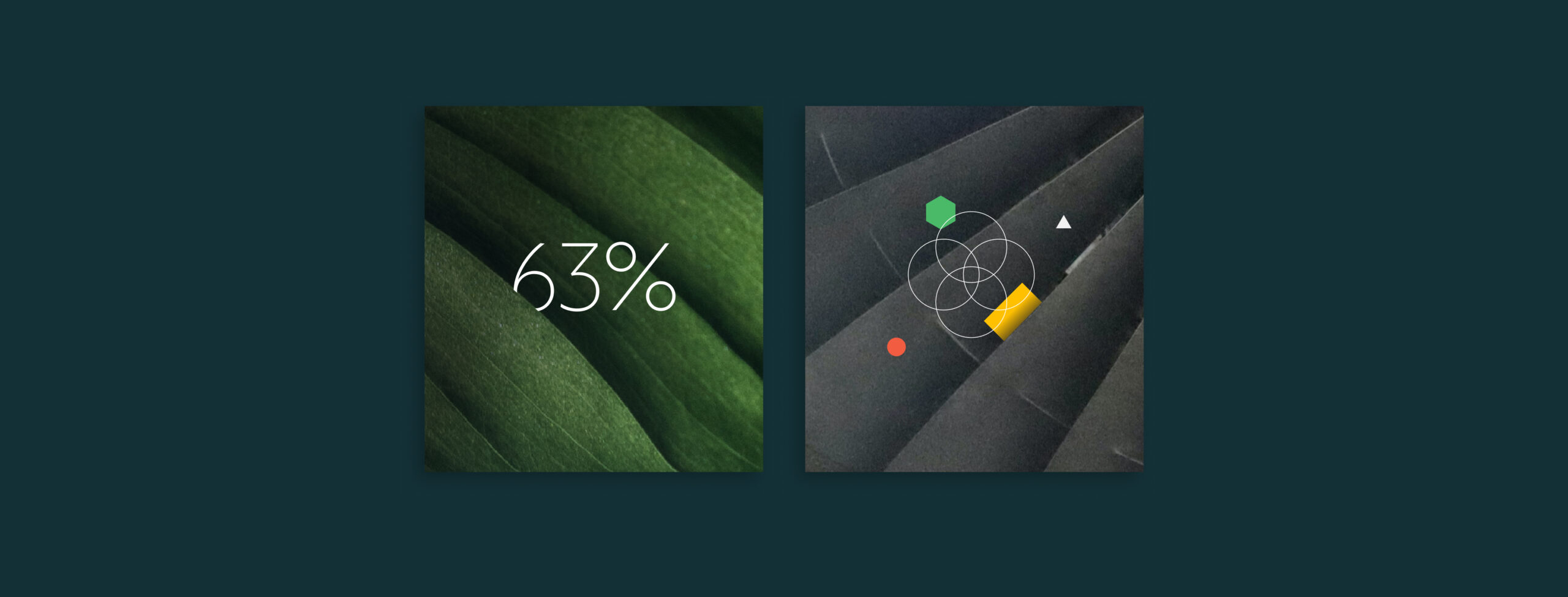
The client responded positively to macro image use alongside incorporating unique illustrations and animations representing each service area. The use of macro photography allowed us to use visuals in a textural way, giving that calm feeling that nature brings while still creating something visually interesting and different.

The role of animation
We wanted to incorporate animation within the digital presence to reinforce the sense of evolution and also to bring interest for users. Within the conceptual work we were considering how and where animation could play a role not only on the website but also in wider brand engagement.
Social video generates 12 times more shares than text and images combined and so we wanted to give MediaSense animated elements that would allow them to talk around their services or key brand stories such as their ‘Media 2020’ report – gaining maximum traction. The continuity between the website and marketing also helps to strengthen brand engagement and increase notoriety.
As we began to execute our chosen creative direction, we developed a delicate illustrated approach to represent each service line – this lent itself perfectly to animation. The clean strokes weaving, rotating and sliding in and out of each other playing with depth and shape, overlaid on macro photography.
Digital functionality: powered by WordPress
As well as looking visually arresting and providing a clear overview of the services that MediaSense provide, the website remains a business tool, portraying an interesting and professional look and feel to the media world. MediaSense actively generate insightful content and analyse the media landscape. Showcasing this content in a meaningful manner was important. Our digital team created a truly bespoke experience, powered by WordPress as a Content Management System.
Brand guidance
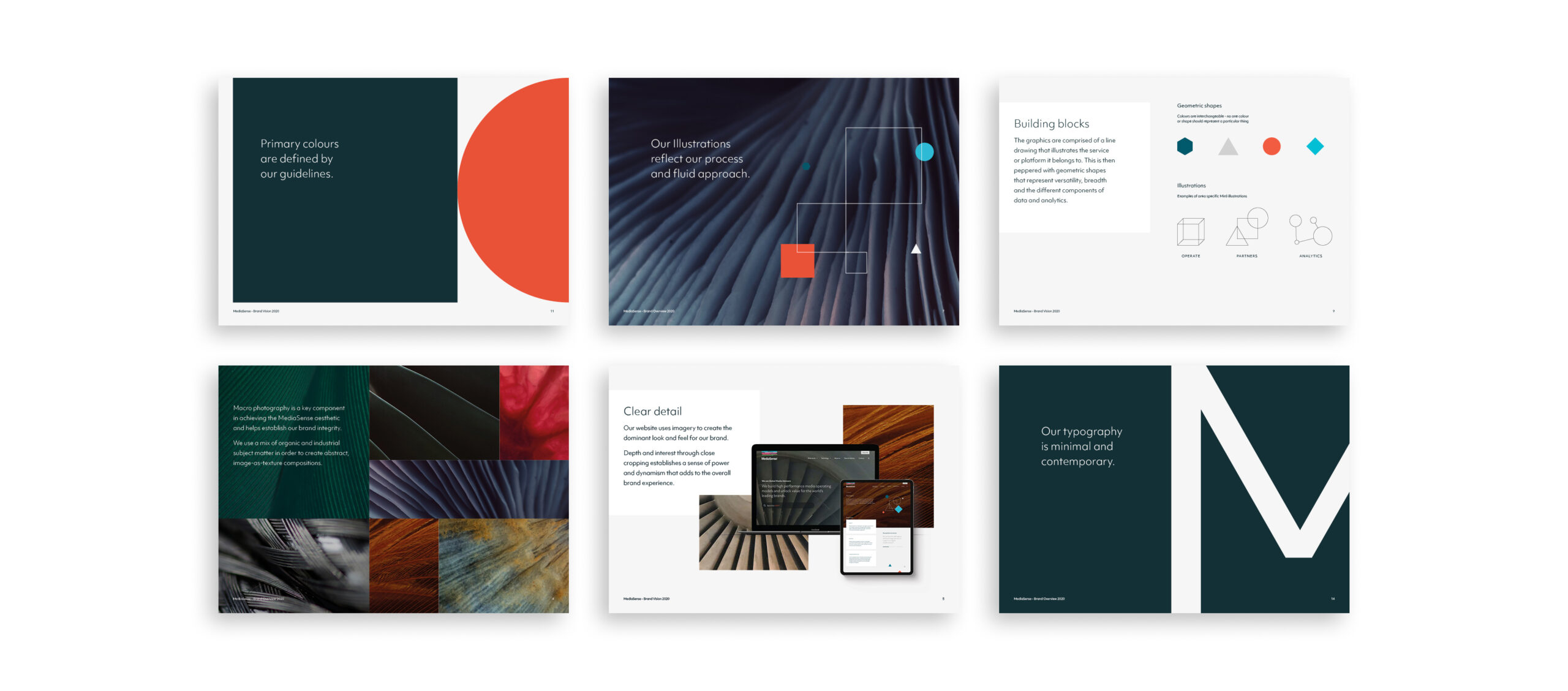
In order for a brand to be successful it has to be easy to use and the company has to be invested in ensuring best practice. Empowering internal teams about the new look and feel can really enhance sales and company pride. We created a vision document that highlighted key elements of the brand and how they were used to share within MediaSense.
Grappzie is an app where users can create bespoke greetings, invitations and personalised designs in minutes, then share them digitally through WhatsApp (especially Groups), iMessage, email etc. The platform also provides high-quality, on-demand physical prints, so users can send their cards and designs through the post. We helped design and build the brand and develop the product, and we had such faith in the product and concept that we also became a key investor for the company.
The product entered the market within a year of the initial concept, including pre-seed investment and brand establishment.

Creating a fun, aspirational brand
The look and feel for the product had to be approachable and fun, to reflect the personality of the product. We chose a bright colour palette and a font family that has a playful element, which then informed the styling throughout. We designed an illustrative style that was punctuated with fun lifestyle photography.
Digital marketing was central to the product’s growth so we created a brand that would translate well across all devices and platforms.
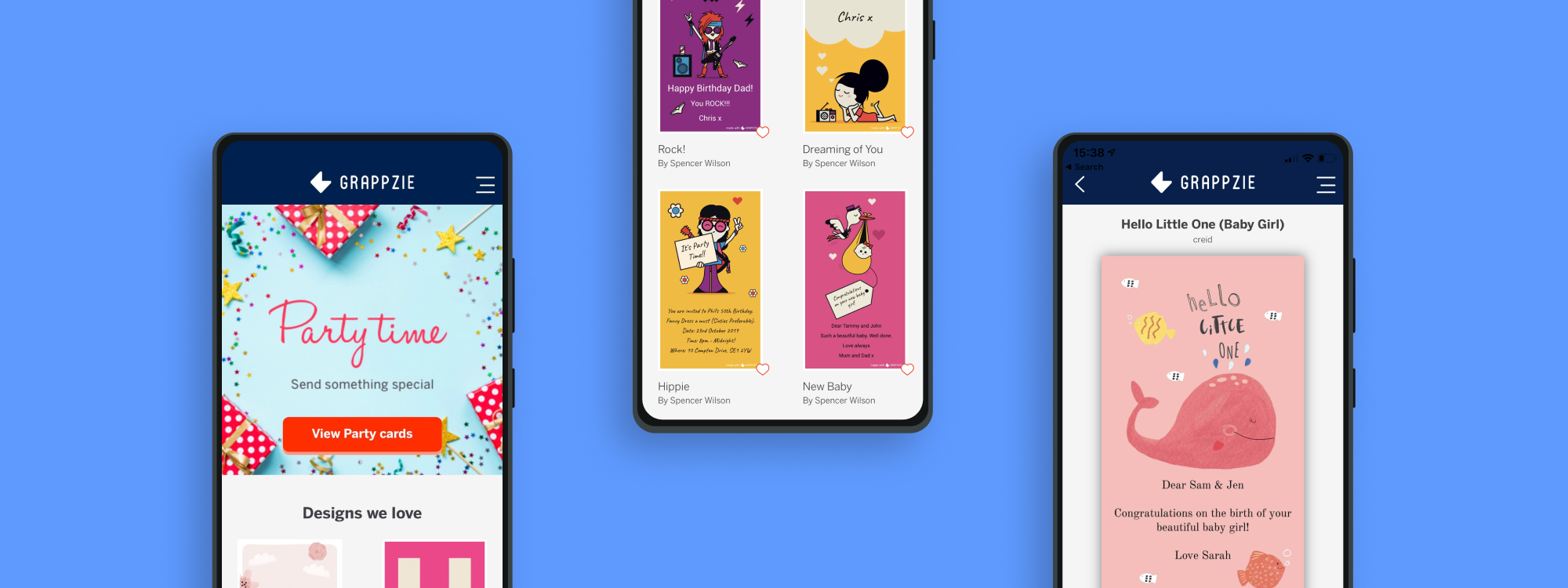
The digital product
We worked in an agile way, designing the user journey flow, working in design sprints and testing our design and UX theory with users, putting our learnings and user feedback into practice as we developed the app. We made the UI as simple and clear as possible so that it was intuitive to use and clearly signposted.
Launching Grappzie
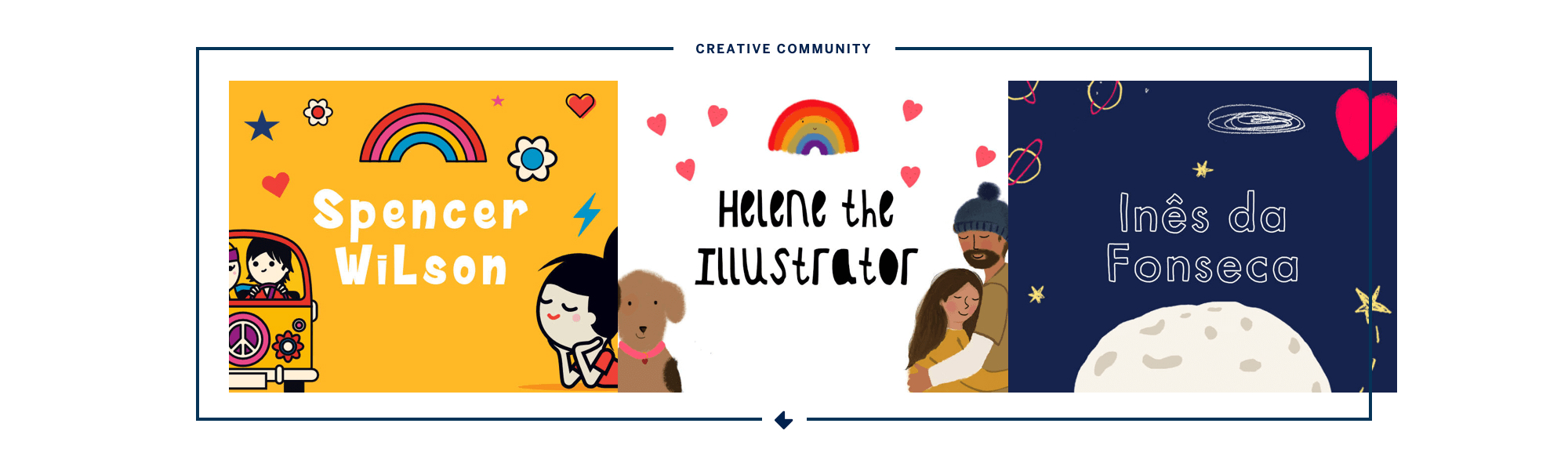
Throughout the development process we shared insight and strategy around how to grow Grappzie’s market share in such a large industry. One idea that we pursued was introducing artists’ and illustrators’ designs to the platform, to build a creative community within it. This allows users access to exclusive designs that they can also personalise, adding another valuable feature to the product.
We’re continuing to support and work with Grappzie as the platform grows.