An architecture design practice established in 1985, PRC currently operate with three UK offices (in London, Milton Keynes and Woking). Shortly after moving in next door to us (hi neighbours!) they knocked on our door asking to borrow a cup of design & development expertise. We happily obliged and have enjoyed working with their team for the past few months building a new online portfolio and revitalising the approach to their brand.
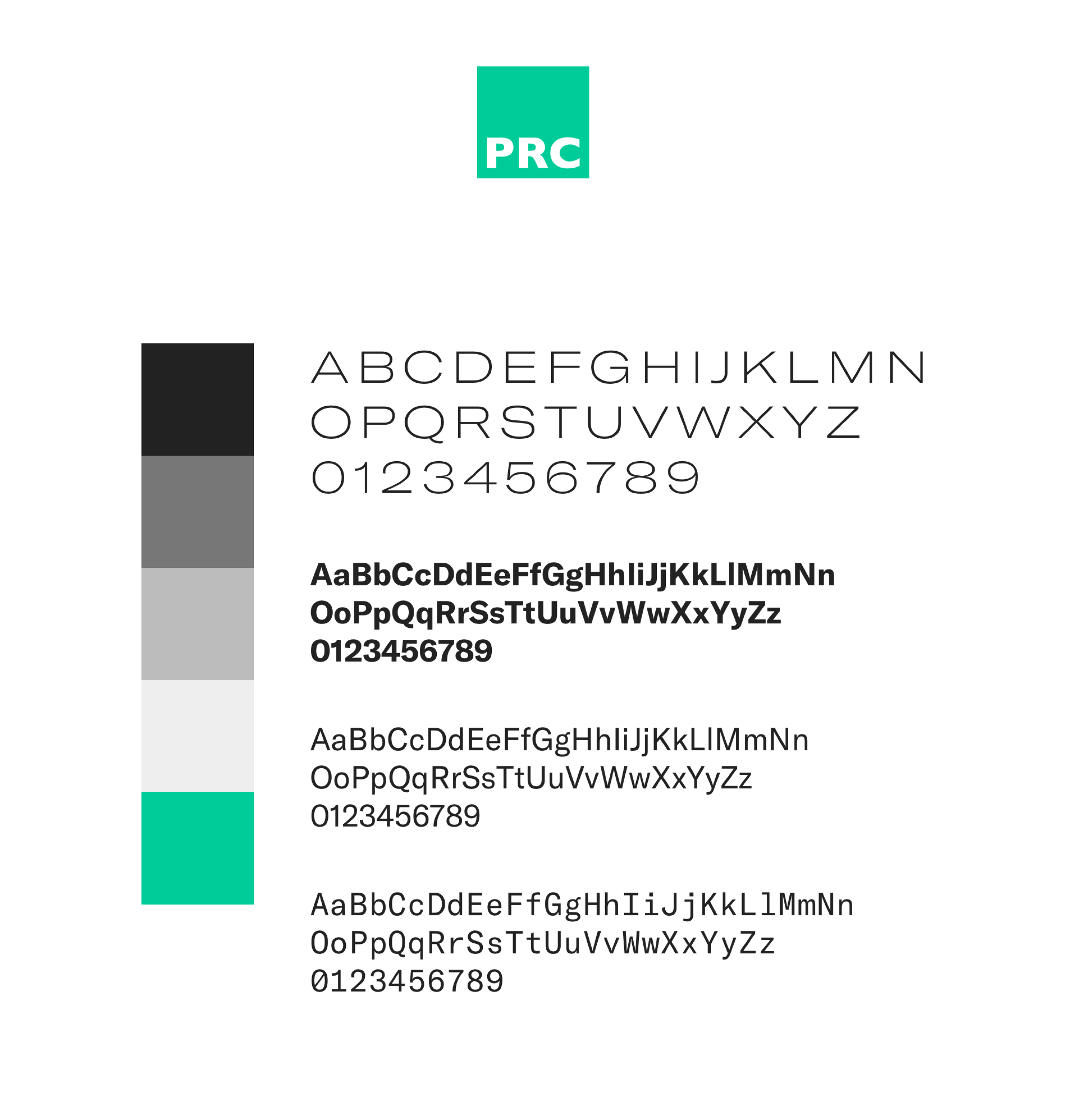
Brand review
Our work on their site began with an examination of their current brand presence. As an established practice with years of history, they had a trove of past work and had accrued many different ways of referring to it internally and putting it on display for potential clients. We worked closely together to find the right foot to put forward and what traits were paramount to their vision for the company.
As this was not a full-fledged brand overhaul, we were aware that our new design work would need to sit well alongside some of their current branded collateral. We decided to take cues from their logo and current brand style to inform our approach and build out a refreshing visual tone that didn’t make anything they were continuing to use look out of place.
We continued to use their logo and made a decision to clarify their colour palette to a core charcoal, white, and vibrant green. We selected a type family with a range of styles and weights that would enable us to create a distinct personality while preserving a clean, clear overall presence.
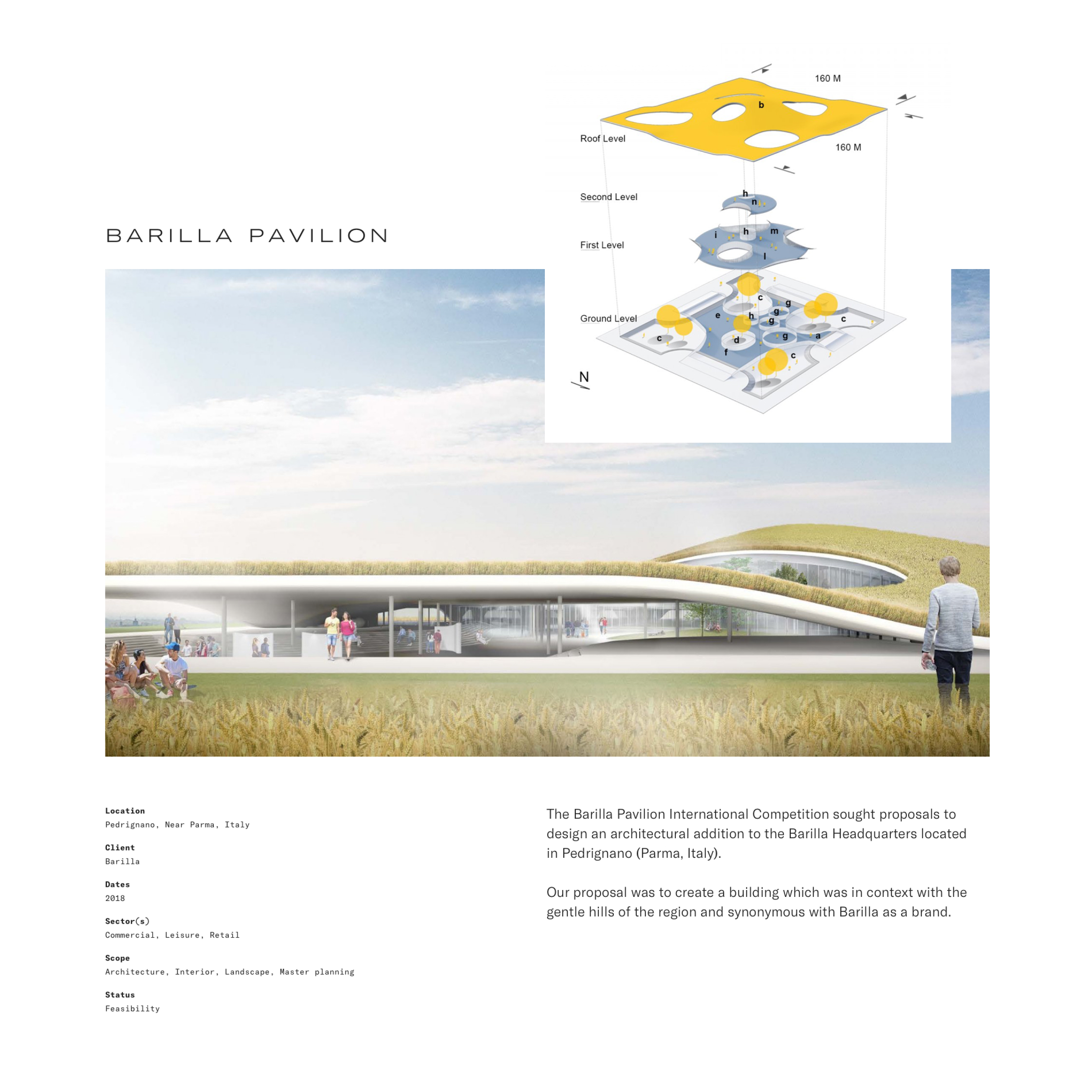
We knew that photography would also be a key ingredient to the success of their portfolio. We worked together to identify key project styles and photography that embodied the work they wanted to be showing more of, and are continuing to work together to establish a plan for building a strong portfolio of project photography in the future.
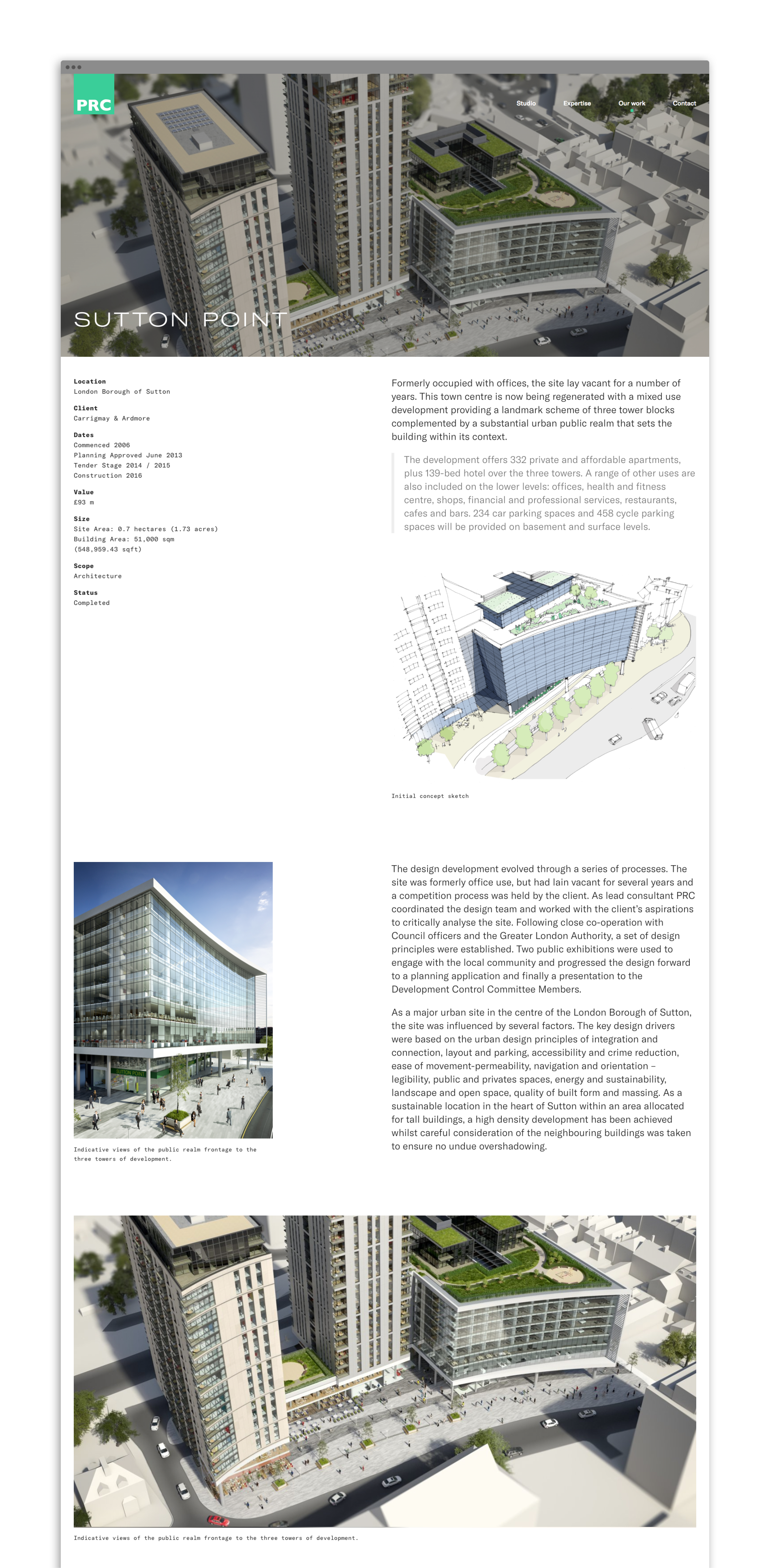
Content
When we set out to begin work on the site, we began by putting together a plan for the content, and describing each area to make sure generating this content would be both reasonable to achieve and relevant to the overall vision to the project. We worked with their team to identify methods for content production and how we could structure the content management system to meet their team’s needs.
For their portfolio, we divided their work into two categories: Projects and Case Studies. Projects are shorter in length and are included on the site to show the broad range of skills and experience the PRC team have. These include brief summaries of the project and an image gallery showing the work undertaken. Case Studies are in-depth examinations of a select few projects they want to spotlight from their portfolio. We created a modular system that enabled their own team members to create long-form pieces with a range of layout and content options.
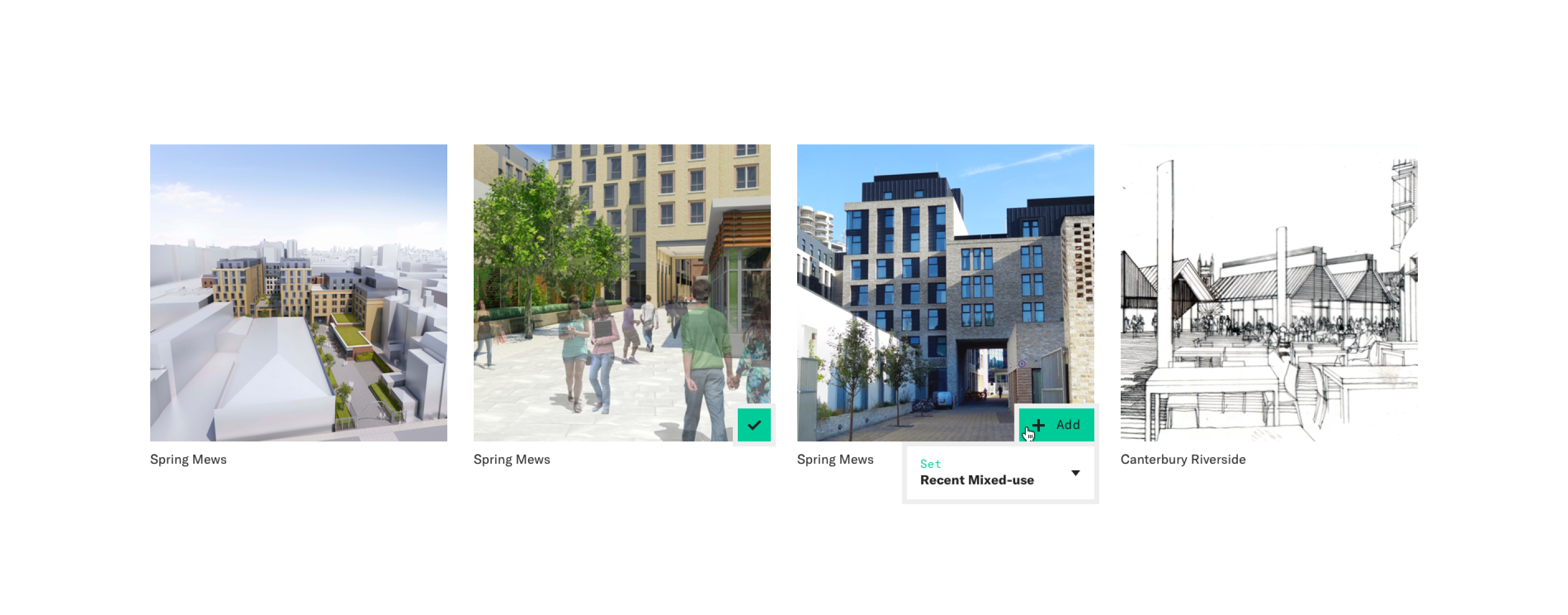
Project Gallery
In putting together our plan for the content on the site, PRC realised the potential value in creating a full company portfolio of their projects that was browsable and searchable. We are working with their team to build an internal tool that will enable their own staff to browse through all projects added to the site, create and internally share custom project image sets, and use as a resource to show off their work to clients.
Dr Foster are a healthtech company who work with clients to deliver solutions and actionable insights that drive decisions on the quality and value of connected healthcare.
The Dr Foster brand became part of Telstra Health, a business unit of Telstra Corporation (Australia’s leading technology and telecommunications company) in 2015.
We worked closely with Dr Foster and Telstra Health to help with the co-branding, strengthening the brand and reinforcing Dr Fosters position as a leading healthcare solution provider and data insight expert.

An updated look
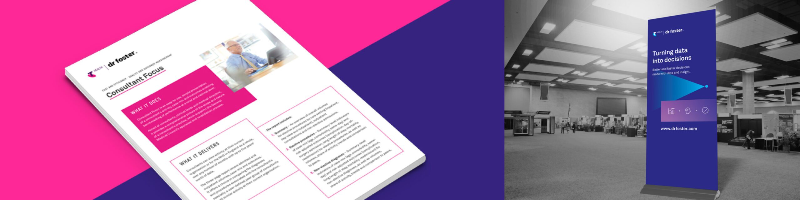
With the newly refreshed and re-energised positioning of Dr Foster an updated visual style was required to reflect this. While maintaining the connection with Telstra Health, the opportunity arose to create a new look for the brand. A bold visual style was developed that would introduce new energy and vitality into the brand. A more dominant use of typography and strong colour was created along with simple geometric forms to aid in brand messaging.
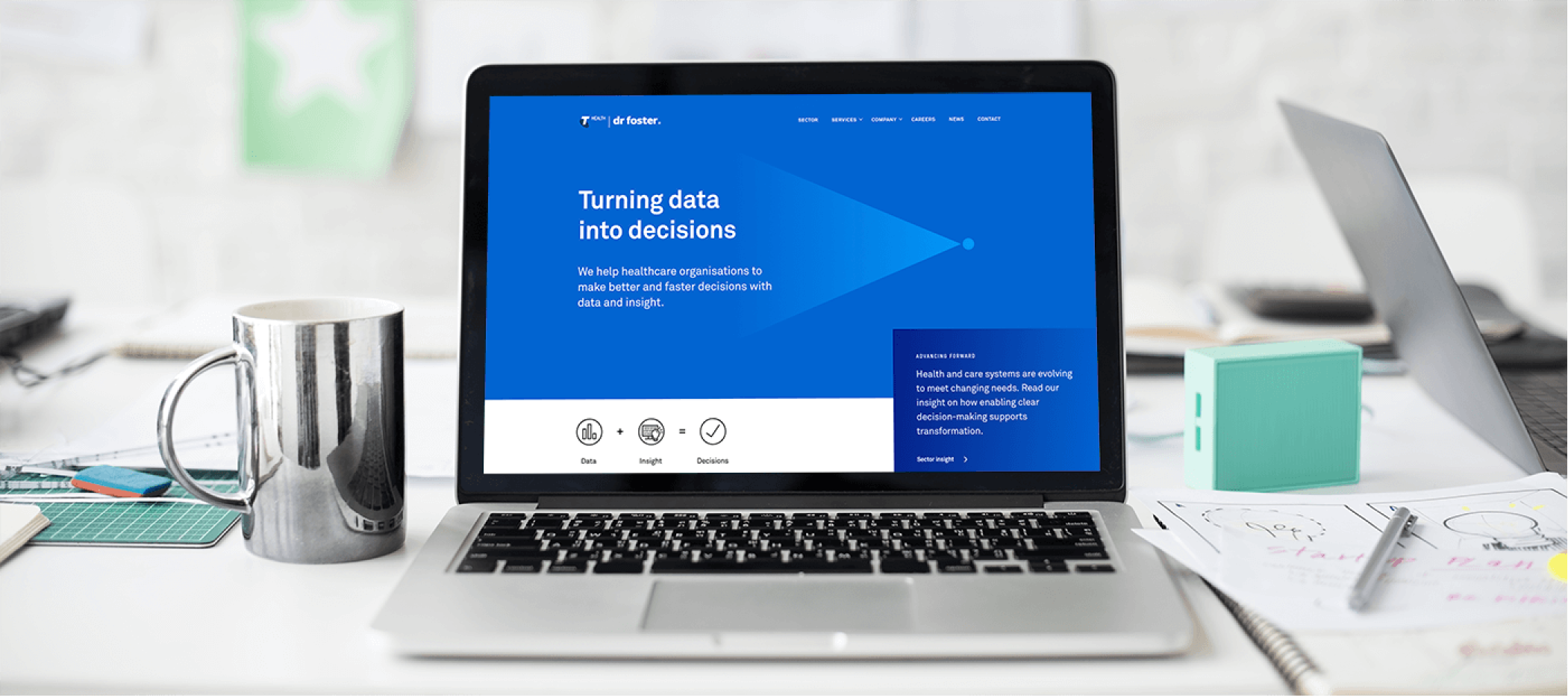
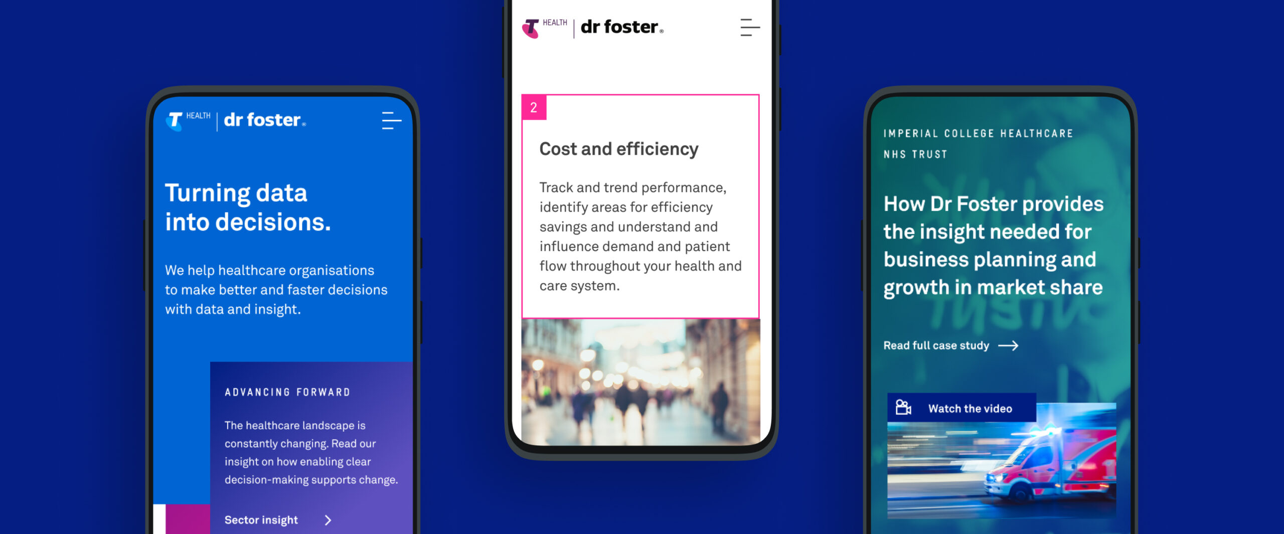
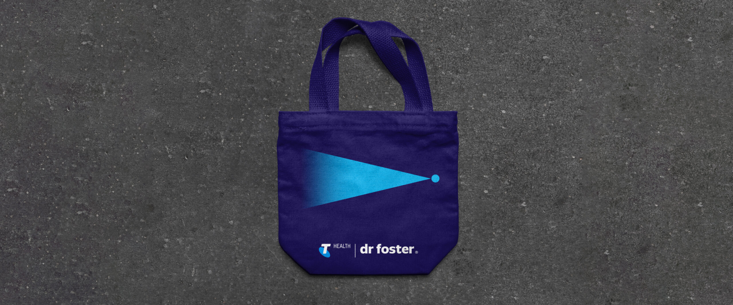
The concept of Turning data into decisions was introduced as a tagline and is visually represented by the shape of the triangle, open on one end and flowing into a single point. This helps to signify the vast array of data insight that help enable a decision and positive change to occur for the end client.
A refreshed website, powered by WordPress
Our approach to the redesign of the Dr Foster website was to strip away unnecessary content and help to clarify the core messaging and brand presence. The previous website had become outdated and required a complete audit. Extensive site mapping and wireframing led to a clear structure and systematic approach throughout. The site was designed using a modular approach with the reuse of a group of key components across the whole site. This helped enable a simple user CMS where the client is confident and free to make modifications to, or to add new content, to the site.
Brand application
In addition to the new website the brand has been rolled out across a range of media and applications. This includes an updated stationery set, infographics, banners, wall graphics and various brand collateral. A consistent approach to the brand styling has been carried throughout all applications of the brand. A Brand Book to be used internally was created to showcase the new brand along with the updated positioning, mission and values. This helps to incapsulate how the brand has developed and moved forward.
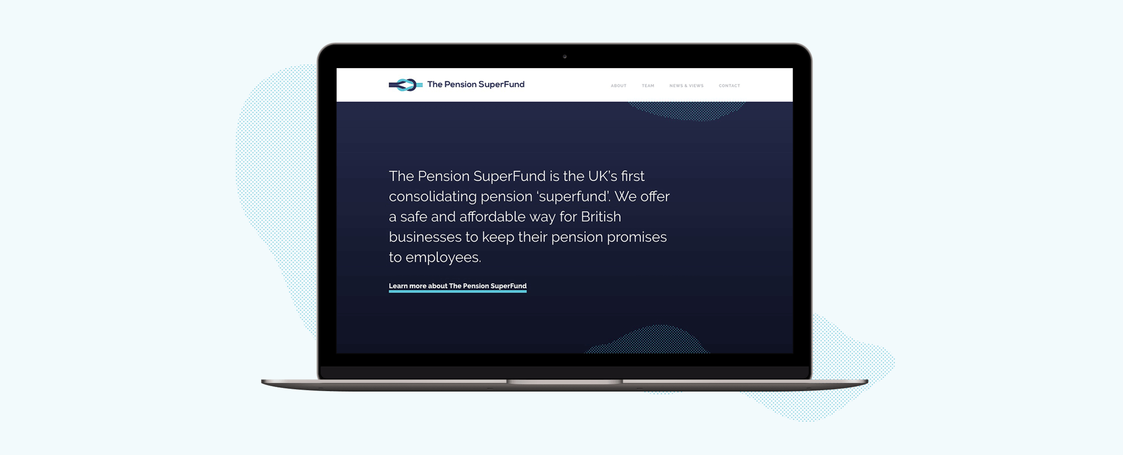
The Pension Superfund is the UK’s first consolidating pension ‘superfund’. Their product was entirely new to the market and so we wanted to create a clean and concise brand presence that visually presented the messaging and benefits in a simple and clear manner.

Appropriate design
Our design team introduced a streamlined colour palette and a monotone illustration style to ensure that the messaging was not overwhelmed. The site’s main purpose is to provide information to potential stakeholders, validating the Superfund’s existence and clarifying their proposition. We created a ‘news and views’ area to promote opinion and insight, to capture interested parties and motivate engagement of getting in touch. Utilising subtle animations and abstract textures to add visual interest and create a stylised design approach, the brand can flex as necessary.
A brand to build on
The brand base that has been created will support The Pension Superfund as it grows. The textured elements used within the design are flexible allowing them to be used effectively across a wide range of campaign materials whilst keeping brand consistency. The illustrations also serve as the beginning of a visual library that The Pension Superfund have ownership over going forwards.
A unified brand
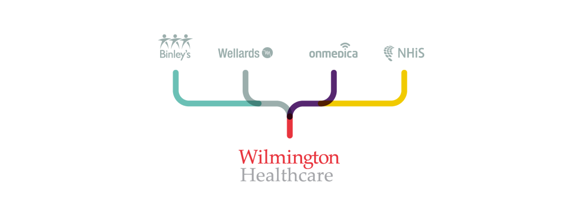
Working with our long-time collaborators and friends at ZPB Associates, we were appointed by Wilmington PLC to create a unified brand that presented a new business proposition within healthcare. The vision and brief was to bring together several different healthcare brands, including Binleys and Wellards, and create a single, parent brand for Wilmington Healthcare. It had to present a new platform for the healthcare division.

Creating a vision for the brand
Working within Wilmington’s existing brand framework, we identified a need to create a flexible brand platform and visual approach that the internal team, including designers, could work with, adopt and expand with a view to retaining a sense of ownership and authenticity in the ongoing creative work and campaigns that they produce.


A strategic concept
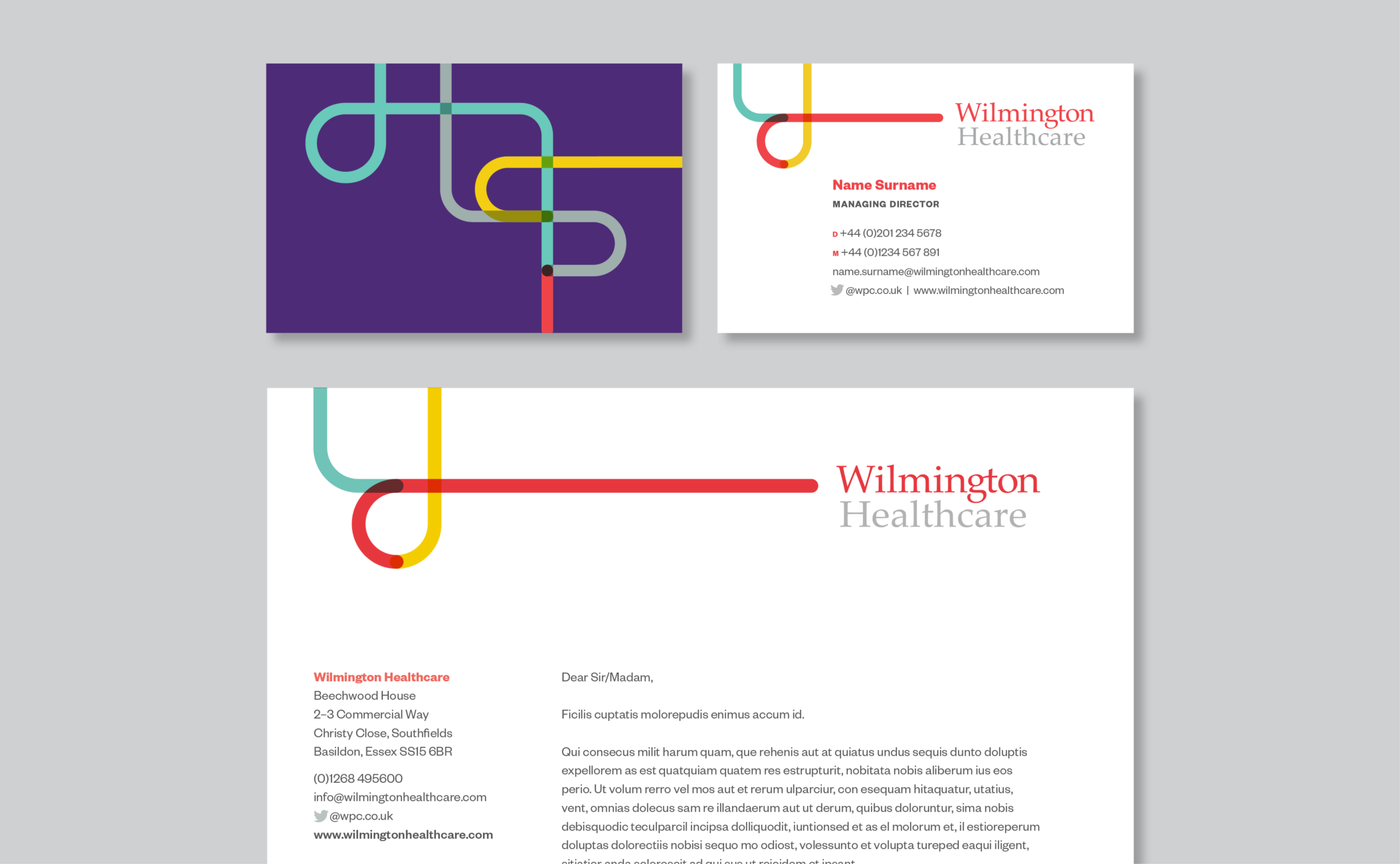
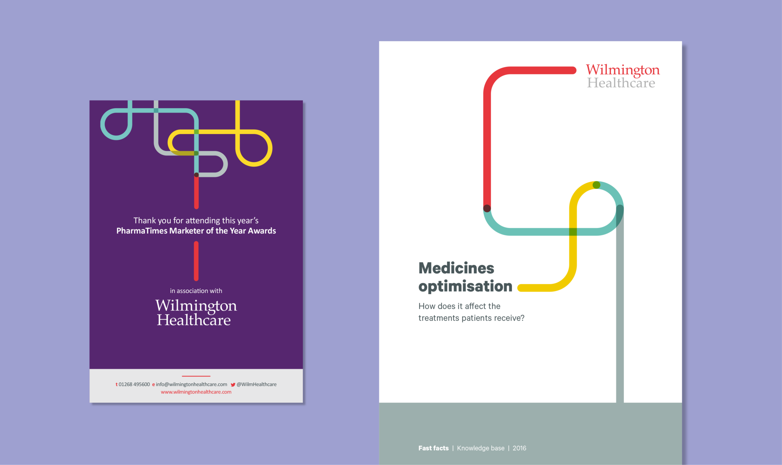
Introducing brand positioning that centred around a clear, articulated concept of Wilmington Healthcare meant translating complex intelligence into actionable insights and sustainable outcomes. We used illustration to help represent this messaging. The use of line work and focus of a single-line output forms part of the Wilmington Healthcare brand, and is used in different ways to visually support brand statements and messaging. The concept reflects the core value traits of Intelligence, Expertise and Collaboration. It’s used with purpose, to help tell a story or to guide a reader visually through a narrative.
A visual tool
The line can be utilised to create bespoke iconography and illustrations within the brand. This gives flexibility while retaining a recognisable brand style and treatment. We created our customary brand guidelines and toolkit, containing guidance on how to work with the new branding and design within it. This was supported by holding internal workshops at our studio with Wilmington Healthcare’s designers.
“By connecting and collaborating with healthcare communities, Wilmington Healthcare translates complex intelligence into actionable insights and sustainable outcomes.”

The new branding was tested across multiple environments, assets and physical experiences.
Building a digital presence, powered by WordPress
Once we were happy with how the modules performed, we built up each area and page of the site using these core modules as building blocks. The benefit of this was that we could test the modules at the start, all at once, so that we could catch, review and iterate on our discoveries and challenges early on, during development.
Working this way enabled the design and development team to work together and create a superior product with a leaner design and build.
The world of competitive sport is one associated with excitement, passion, hard work and the unique ability to bring all types of people together. When working on other sites such as global sports marketing brands TLA Worldwide and GSE these were all values that we tried to portray through design and user experience. With this site we wanted to add a deeper sense of personal experience.

The website needed to reflect Sir Chris Hoy’s brand of ‘everyday greatness’, taking people on a journey with Sir Chris from his childhood to where he is now. We were fortunate in that the team were able to provide incredible photography that we could make integral to the design aesthetic. As a subtle reference to cycling, we created a visual device of vertical lines to be used as a texture that worked with the existing brand, helping to frame photography and to form subtle animations helping pace the content of the site.

Showcasing all dimensions to the brand
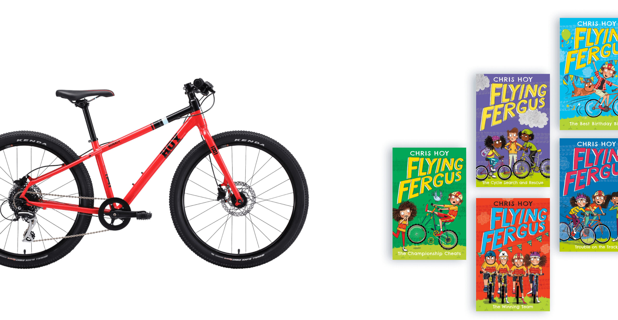
Sir Chris wanted to bring people up to date on his career and showcase the varied work that he now does through public speaking, crafting his own HOY Bikes as well as his hugely successful Flying Fergus children’s book series. We created a simple navigation system to break down each of these areas, ensuring that users had all the information they needed to make contact, ensuring the site operates as a useful business tool for him and his team.
A look behind the curtain
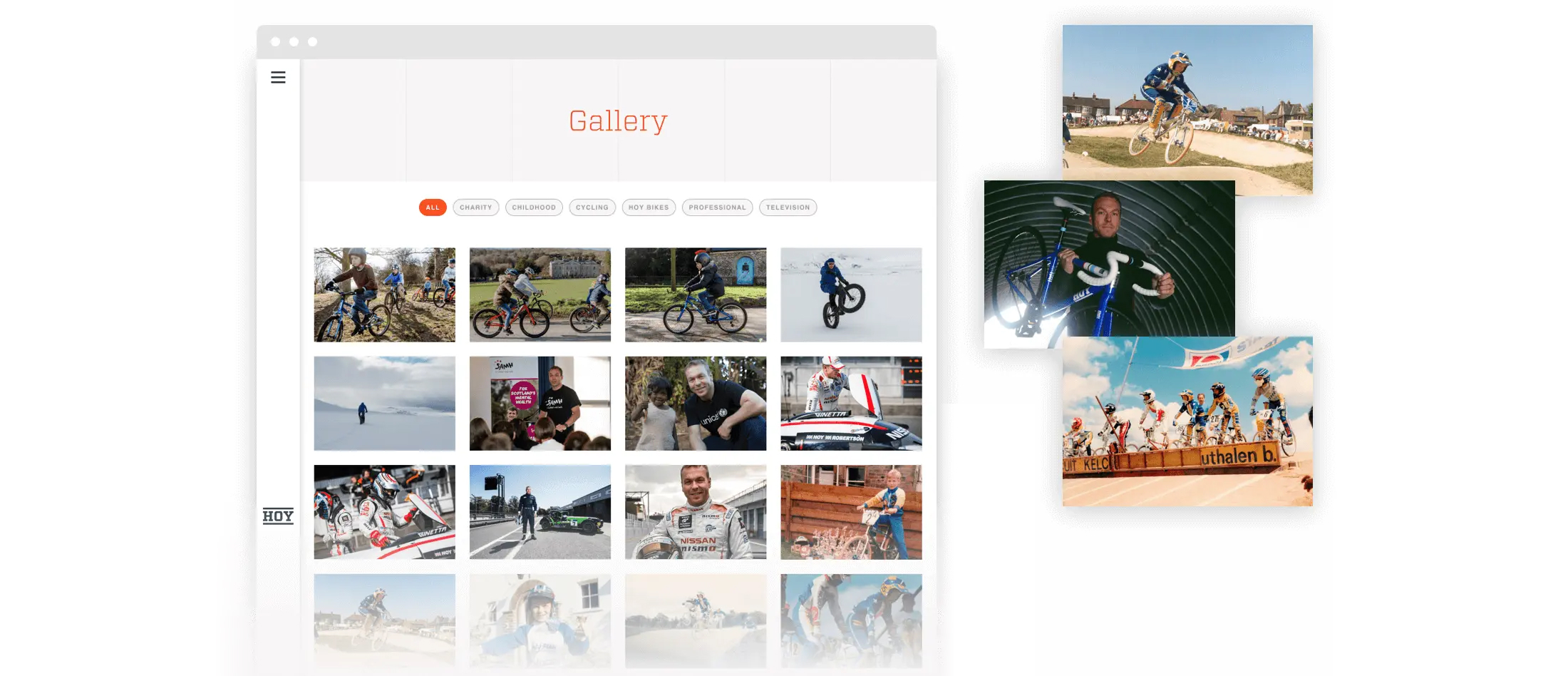
The site includes personal stories and photography that simply can’t be found anywhere else. This provides a real sense of personality and enables Sir Chris ownership of this digital brand space – something increasingly important across both social and digital platforms today. We included a gallery for the site so that journalists and enthusiasts could find a range of photography which spanned all aspects of Sir Chris’s career, again making sure the site functioned as a useful tool.
Everyday greatness, in one place
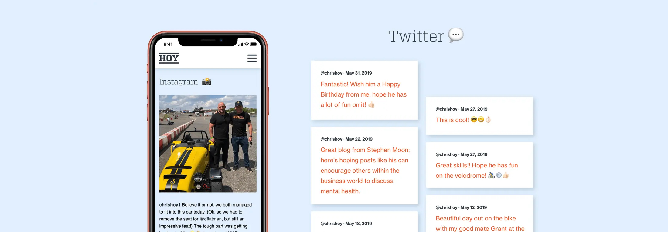
The site really captures the excitement and care behind everything that Sir Chris takes on. Aggregating his social feeds combines various content sources into one place, leading those interested in both him and his brand to a single destination where you can really see his personality at the fore.
Positioning and presence
MediaSense have made their name helping major brands get the most out of their – often complex – media ecosystems. Having worked with the likes of Adidas, BP, Virgin Media, and Lexus on their global media buying strategies, they’re no small fry. We were approached and selected to revitalise their brand and create a new digital presence for them that clearly communicated their vision of the industry and the services they offer to their clients.

Workshops
We worked closely with the MediaSense team over a series of workshops to lay out the core components of the brand that would inform the rest of the project. Together we identified their unique vision and values and began to create an agreed style of writing for the creation of their brand content. The result was a clearly defined direction and a content strategy for developing the site and taking forward how they speak about their business.
Visual style
Their existing logo needed to be maintained to retain consistency and recognition with their ongoing clients and to build on the equity they had already earned as player in their industry. As such, we used the logo as a primary source for establishing the new visual brand style. We brought forward the vibrant colour palette contained within the logo and created a distinct design sensibility that prioritises a clear presentation of content.
In addition to our work on the site our design work would also need to be applied to a range of brand collateral templates such as word documents and powerpoint presentations. We reviewed how they produced these documents internally and worked with them to create new templates that would help them maintain consistency in their presentations and communication with their clients moving forward.
Website
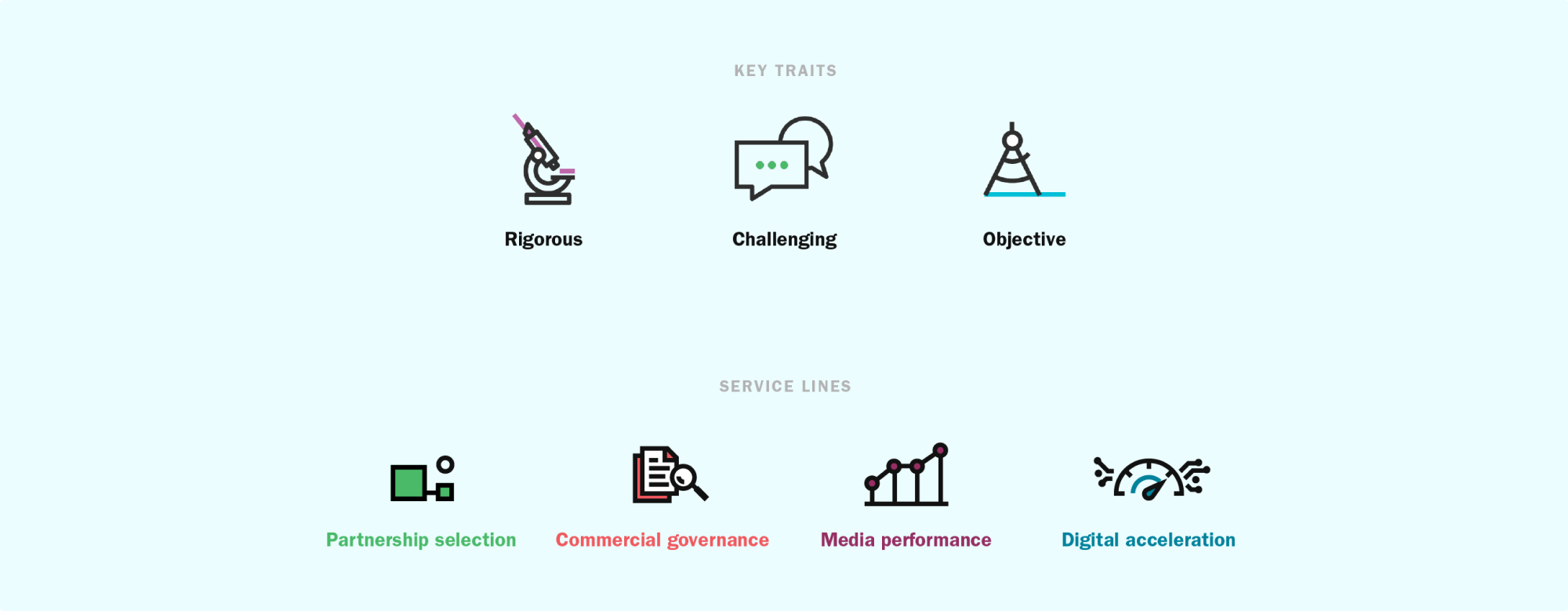
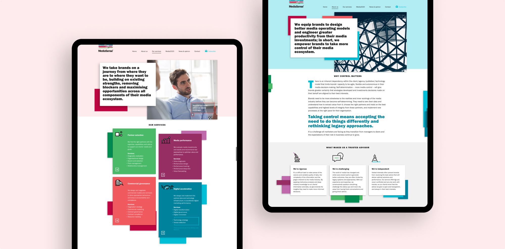
Our mandate was to build an engaging site that clearly communicated their process and service lines, distilling everything they do into language that would make it accessible to all. To aid this effort, service lines were broken down into four main sections, each with its own colour and set of illustrations. This meant that each area of work could be detailed individually and helped to clarify their offering to potential clients.
Another driving force in the development of their new site was to establish MediaSense as a respected resource for news and opinion on the state of the media landscape. They already produced articles and content regularly for external publications, but didn’t currently have a reliable process for adding anything to their existing site. We created an area within the new site that enabled them to post both original content as well as feature links to external articles they had either written themselves or thought would be relevant to their audience. We included custom search and filter tagging, as well as an ability to provide downloadable content behind an email submission field that serves as a great way to capture data from interested users.
Client background
Blossom Years is a trusted provider of nursery education with multiple sites across South East London. Known for delivering high-quality early childhood education, their commitment to creating safe, stimulating, and nurturing environments for children underpins their success. With a strong reputation already in place, Blossom Years approached Studiomade to develop a brand identity that would encapsulate their values while appealing to both parents and caregivers seeking a reliable, engaging educational experience for children.

Project objectives
The goal was to craft a brand that resonates with parents, communicating Blossom Years’ dedication to excellence in early education, and creating a memorable, inviting brand impression. Key objectives included:
- Defining a brand voice that balanced warmth and professionalism.
- Developing visual elements that would appeal to both parents and staff.
- Creating a digital destination that is easy to navigate, informative, and reflective of the Blossom Year’s ethos.
- Refine the user journey to encourage lead generation and enquiries.
Voice and messaging
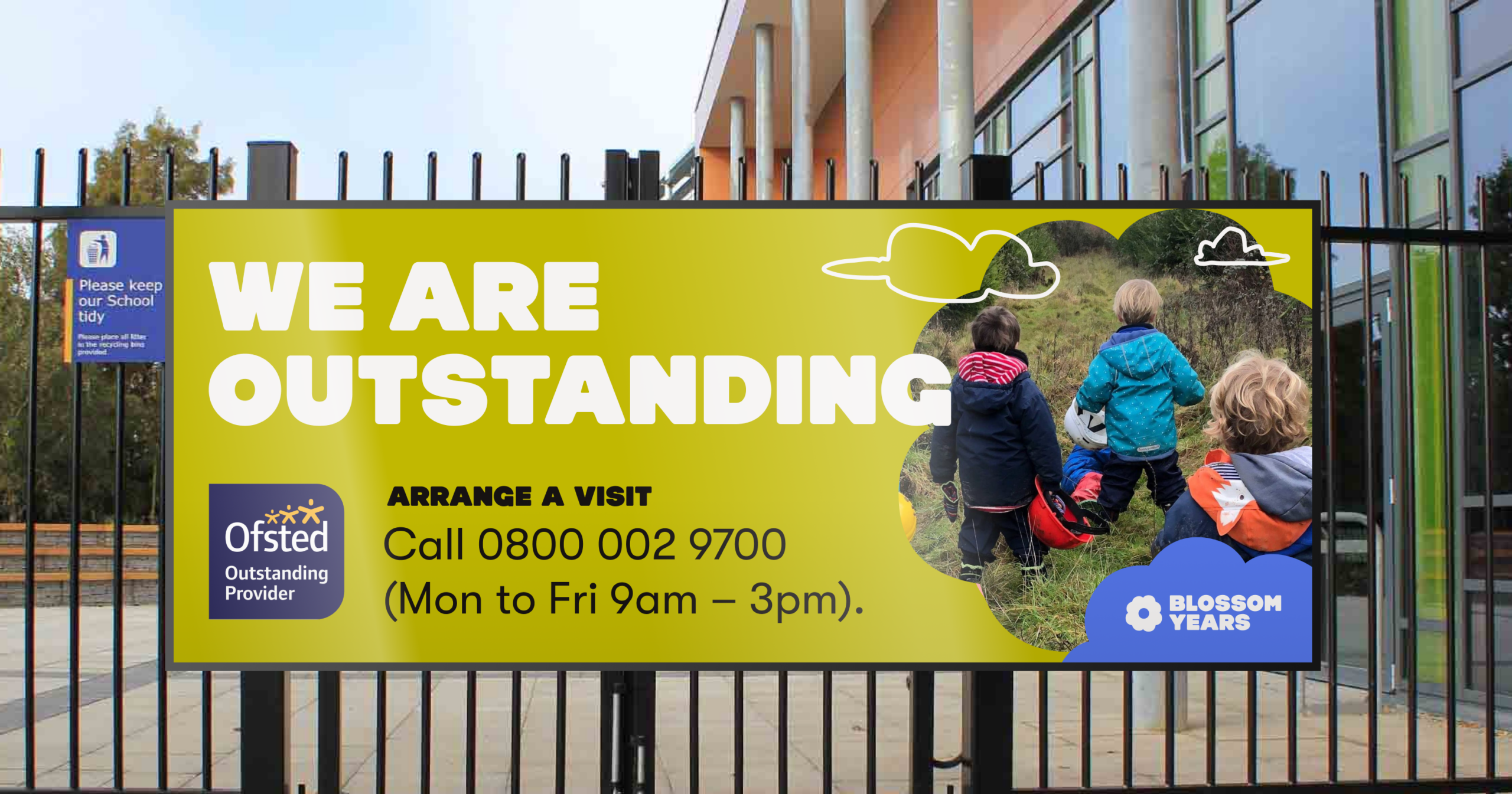
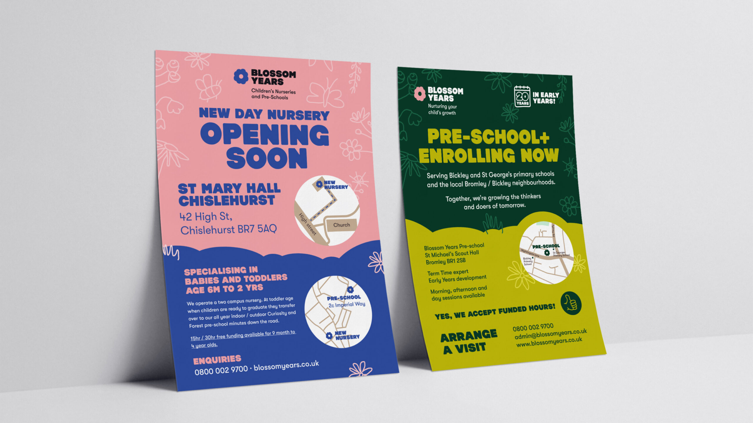
We began by shaping the brand voice around the values of care, educational excellence and a positive learning environment. Emphasis was placed on a visual approach that felt friendly yet authoritative, conveying trustworthiness and a passion for nurturing young minds. Core messaging, such as ‘a safe, stimulating, and caring environment for children’ was integrated across all brand touchpoints, reinforcing the idea of a welcoming and professional nursery setting. Taglines like ‘We are outstanding’ and ‘Arrange a visit’ directly encouraged parental engagement, adding to the approachable and proactive tone.
Visual Identity
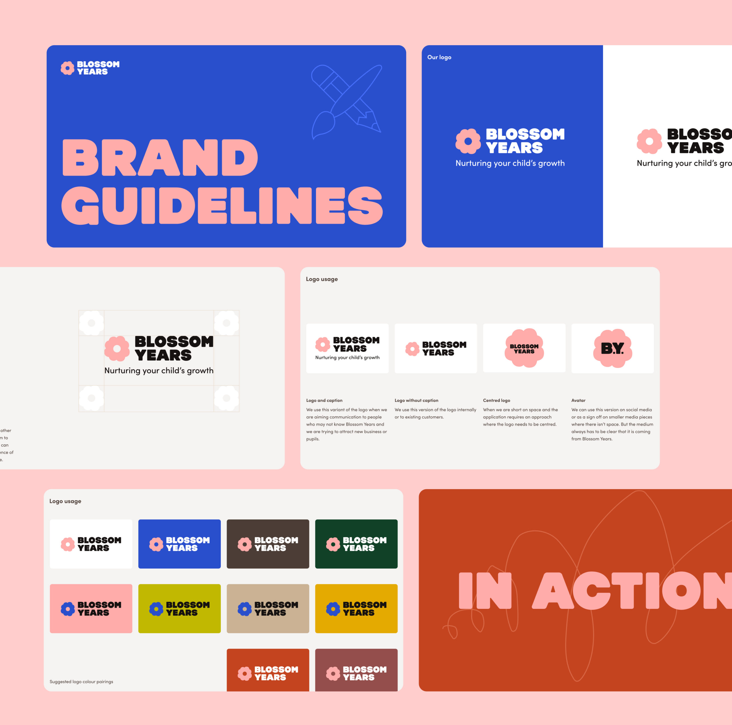
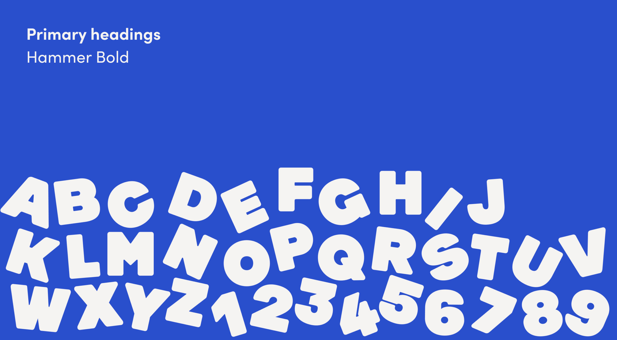
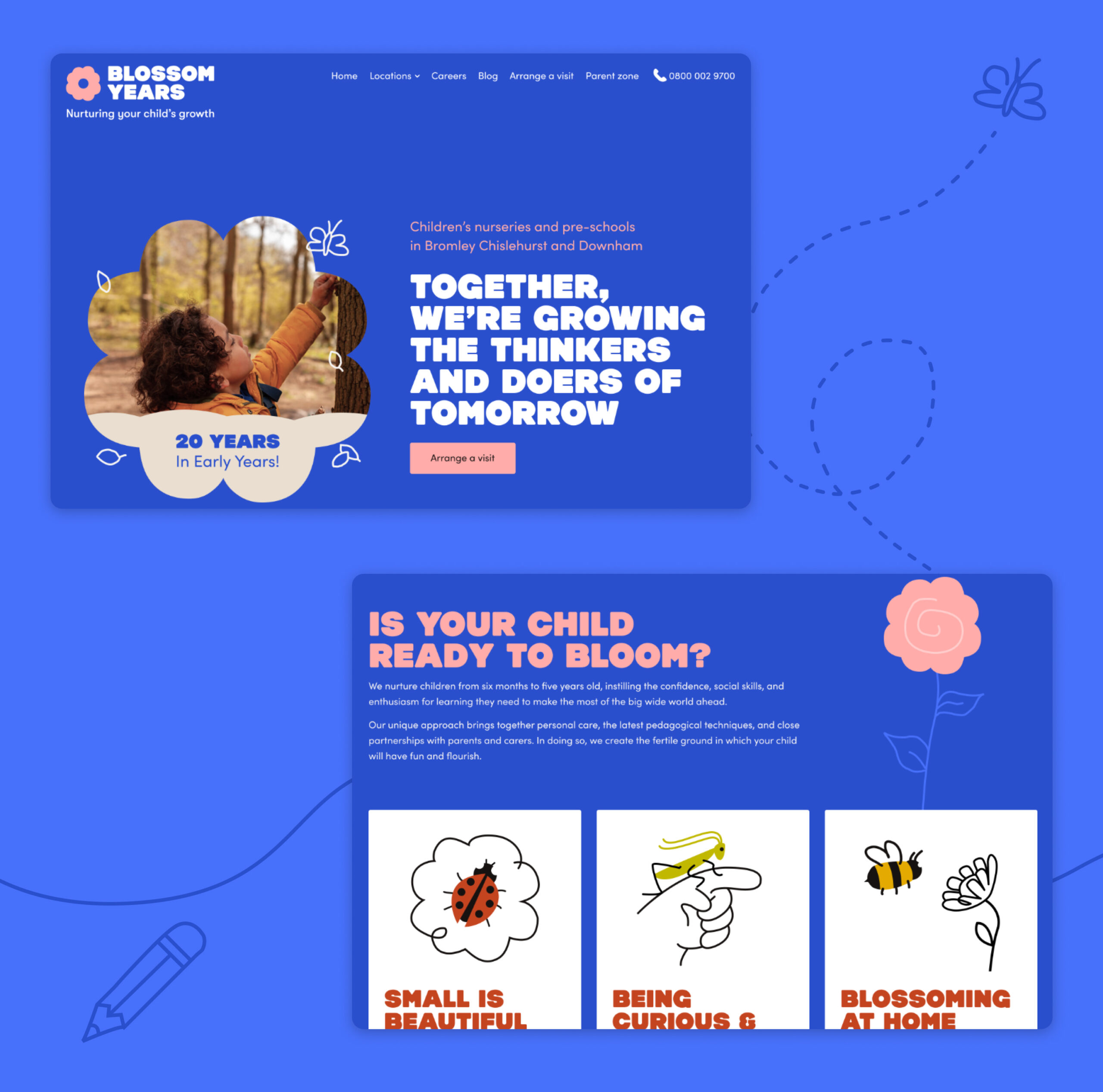
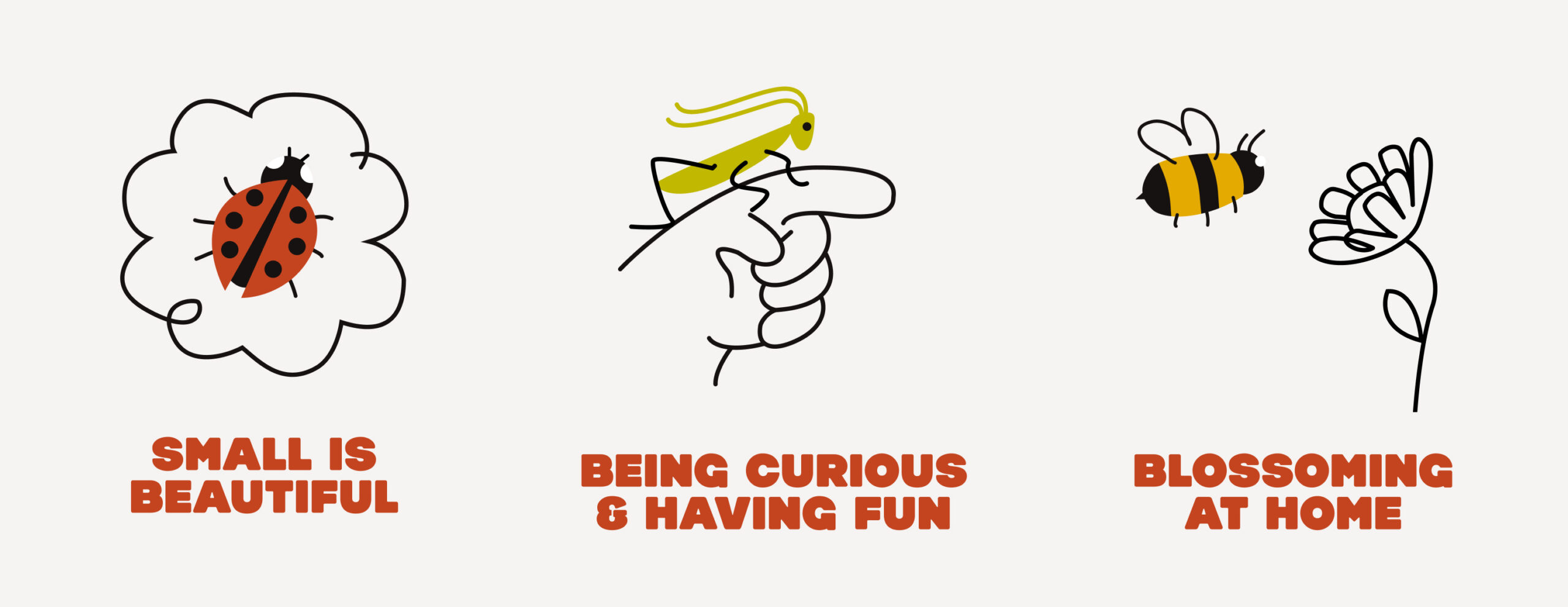
Studiomade designed a visual identity that is visually engaging and resonates with parents and staff alike. We incorporated bright, playful, and warm elements – choosing color and typography that reflects an environment focused on growth and fun. This aesthetic was carefully crafted to reflect Blossom Years’ high standards, while still capturing the youthful energy of a nursery setting.
Website and user experience
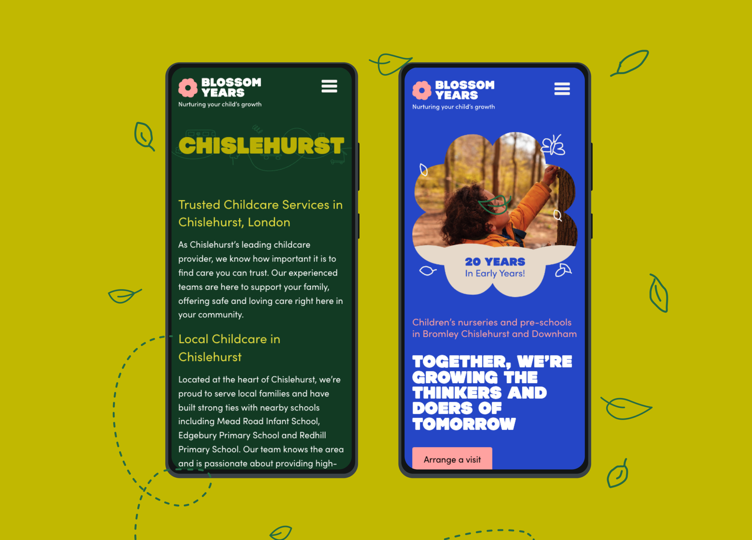
The website was designed as a central hub where parents could easily access information on Blossom Years’ curriculum, site locations, and values. Simplified navigation was key, allowing parents to find answers quickly and seamlessly be able to schedule on-site visits. Prominent calls-to-action, such as ‘Arrange a visit’, ensured a user-friendly experience, and thoughtful touches like a visible contact number fostered direct interaction. We also included content segments for curriculum details, news posts, and nursery updates, reflecting Blossom Years’ commitment to transparency and communication.
Brand collateral and communication
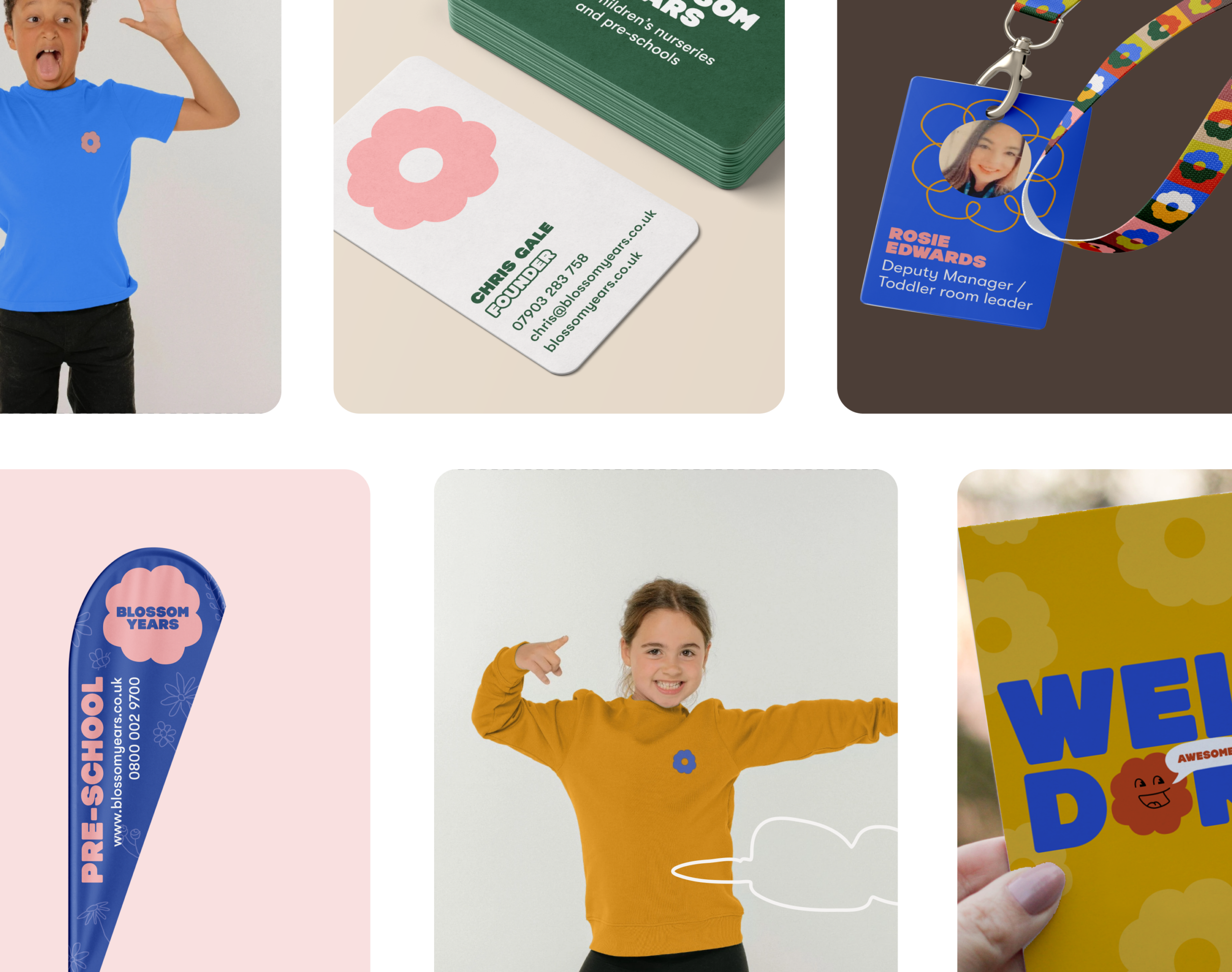
Physical and digital brand collateral was designed to align with the brand’s updated voice and visual identity. From printed materials to digital assets, we ensured that all communication reinforced Blossom Years’ promise of a nurturing educational experience. Brand templates were created with simplicity and consistency in mind, making it easy for parents to understand the benefits of choosing Blossom Years and for internal staff to build communications quickly as required.
Impact
The brand process led to a refined, cohesive identity that captures Blossom Years’ dedication to early childhood education. Parents now connect with the brand on multiple levels: presented with a suite of early-school and nursery environments designed to support their child’s development in a stimulating manner. The website and thoughtful brand messaging help Blossom Years stand out in a competitive landscape, emphasising trust, care, and quality in every interaction.
Reporting performance
TLA Worldwide are one of the world’s leading sports marketing agencies responsible for representing world class sports talent. We have worked closely with them for five years having developed their brand, handling it’s positioning as part of M&A and creating business-focused digital products alongside reporting business performance.
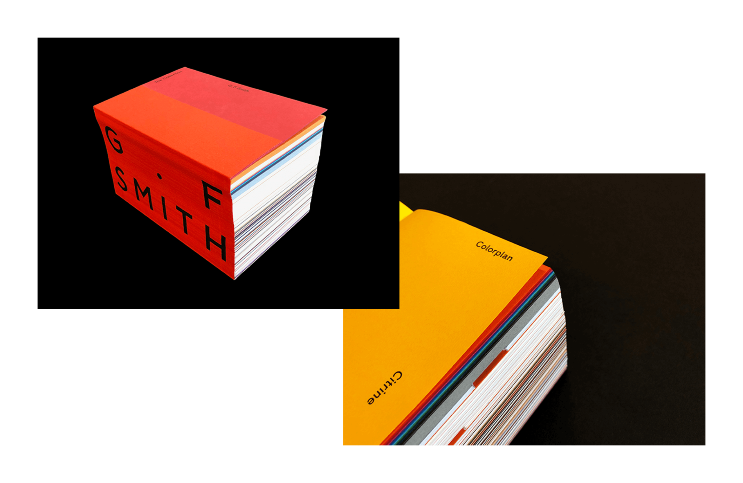
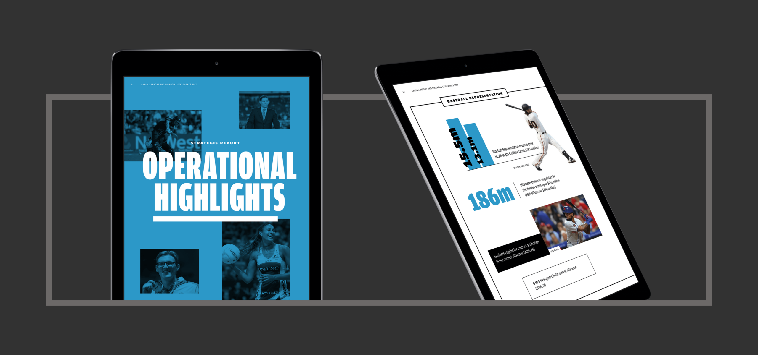
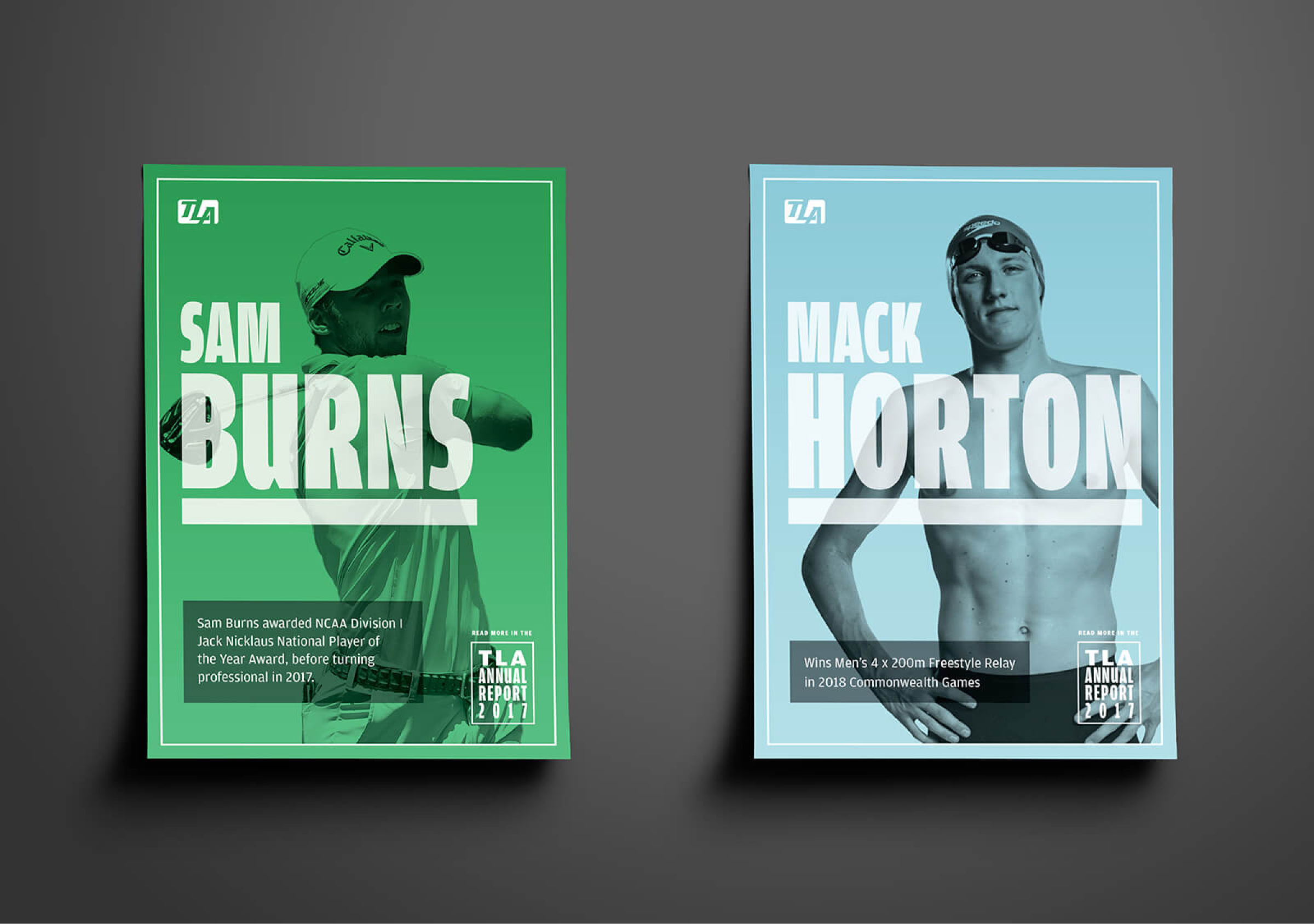
To reflect the growth and impact of TLA within the industry and as part of their listed reporting, this year we developed a bold, confident and high impact aesthetic. This came through by both the physical and digital report – high impact colour, monotone photography and strong typography combining to create an assertive look and feel.
A tactile physical report
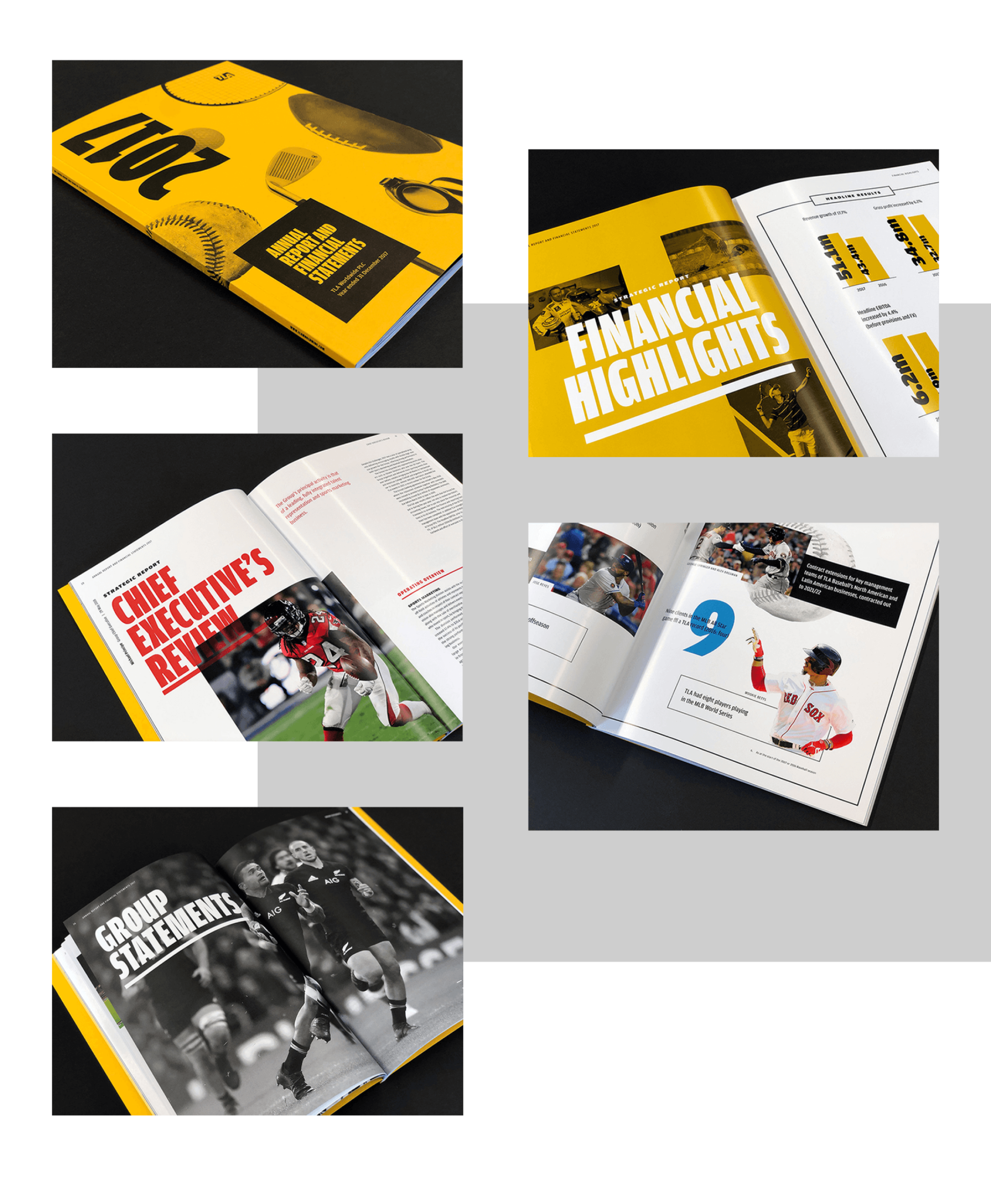
The physical report was an opportunity for the client to explore tactile stock options that best reflected the design vision. G.F. Smith Colorplan in citrine lent incredible impact to the cover with the texture creating an elevated, luxury brand experience. The sense of touch was again reinforced within the report to help define opening, editorial sections alongside more detailed financial information. Full gloss for editorial highlights with large, bold imagery and an offset, finer weight finish for all important financial statements helped identify both areas of the report for the reader.
A digital experience
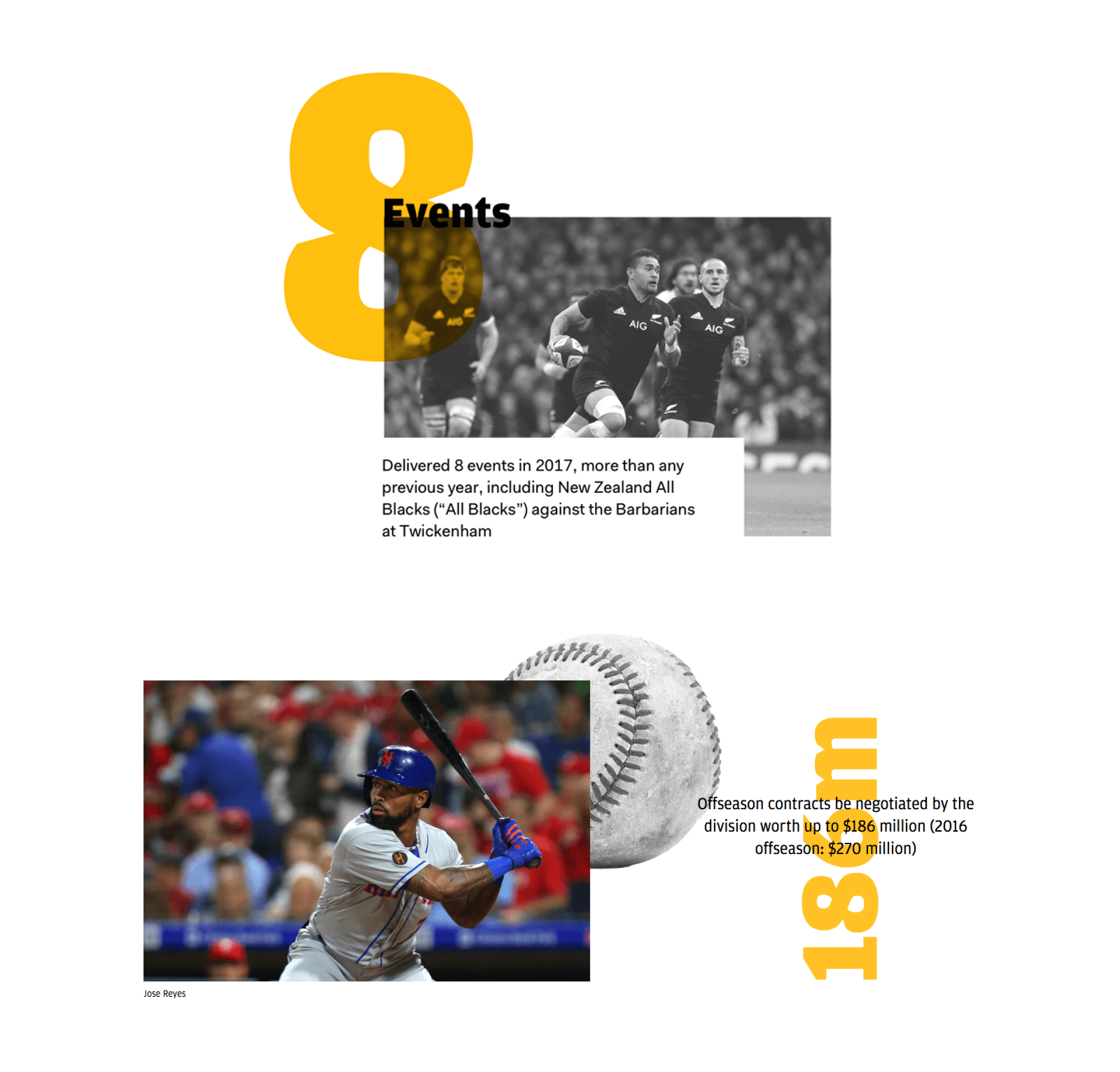
We understood the need for an integrated approach and created a digital version of the report to best accompany the physical. This provided stakeholders a richer, streamlined experience with highlight and overview information quickly accessible. Statistics utilised subtle animations and embedding video provided brand exposure and context whilst also allowing us to showcase TLA talent.

Results
The combination of digital and physical allows for wider audience engagement and presents the report as a unified brand piece. Design and production combined to help reinforce the TLA brand ethos of bold industry leadership – representing this to shareholders across the UK, USA and Australia.

Building the brand
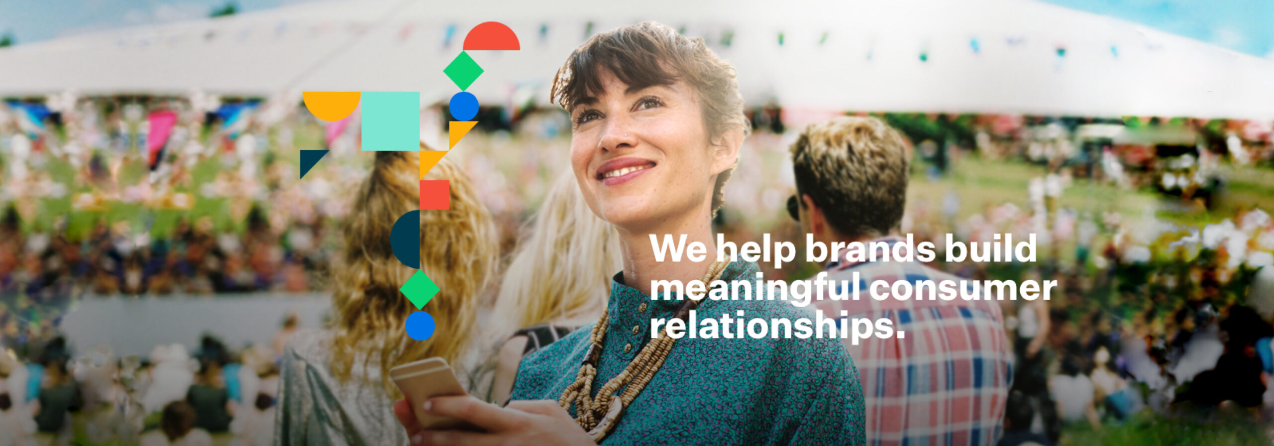
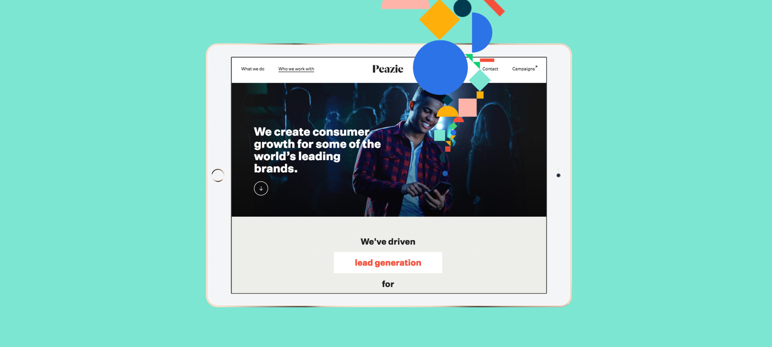
When Peazie approached us with a desire to revitalise their online presence, we soon got into a discussion about their brand and how it was a crucial ingredient in directing their way forward – not only their digital marketing assets, but their steps as a company toward achieving their goals as a business. Branching out from a small startup in Australia to an international player with an office in London as well, we helped clarify their brand messaging so they could confidently establish a successful base of operations in the UK.

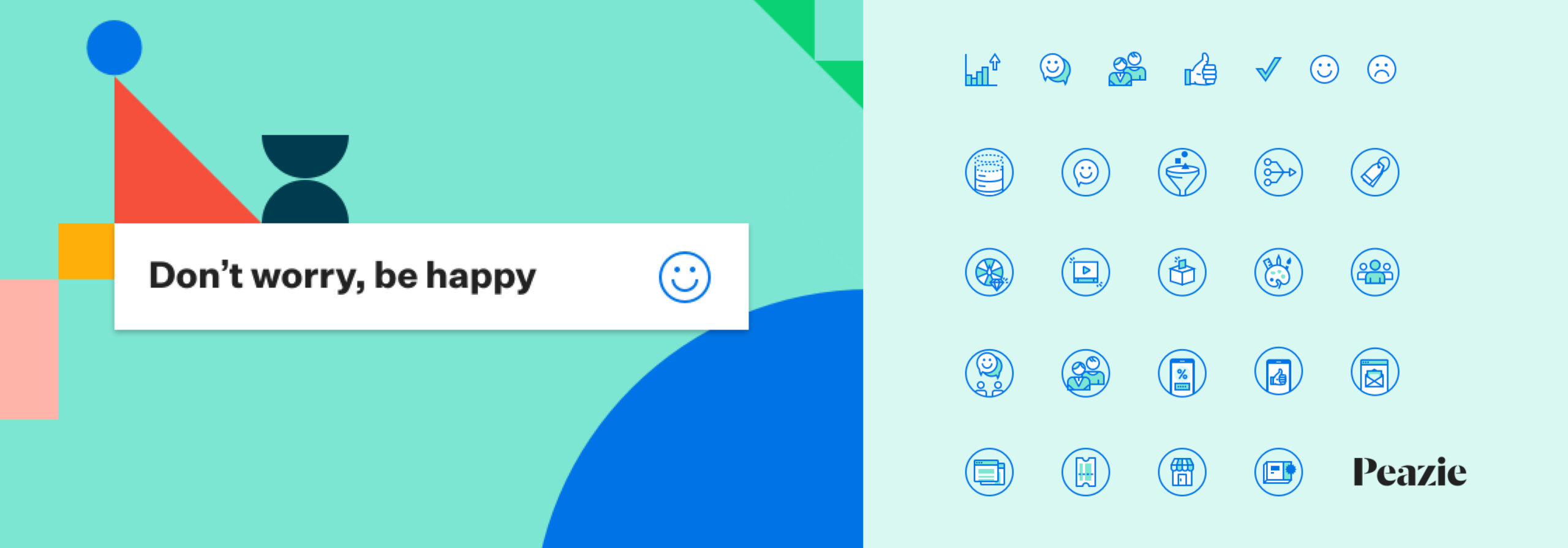
Peazie are a company with deep insight into the brands they work with from the history of campaigns and promotions they’ve run. Listening to them discuss their ability to quickly and efficiently build unique campaigns for their clients that generate tangible results, we wanted to create a brand that expressed these traits. We visualised their process using simple geometric building blocks, created a palette of bright colours, and brought everything to life using subtle touches of animation.
Expressive icons
To represent the different aspects of their core operations and support their communication efforts as a brand, we developed a set of icons they could use on the site and in branded presentations and collateral.

The challenge
JAC is a global medicines management company providing bespoke solutions for hospitals and care providers, to increase patient safety and aid patient care. But with a disparate approach to discussing each of its products, there was a commercial need to create a single tone of voice and concept around its proposition, with nuances for individual products.
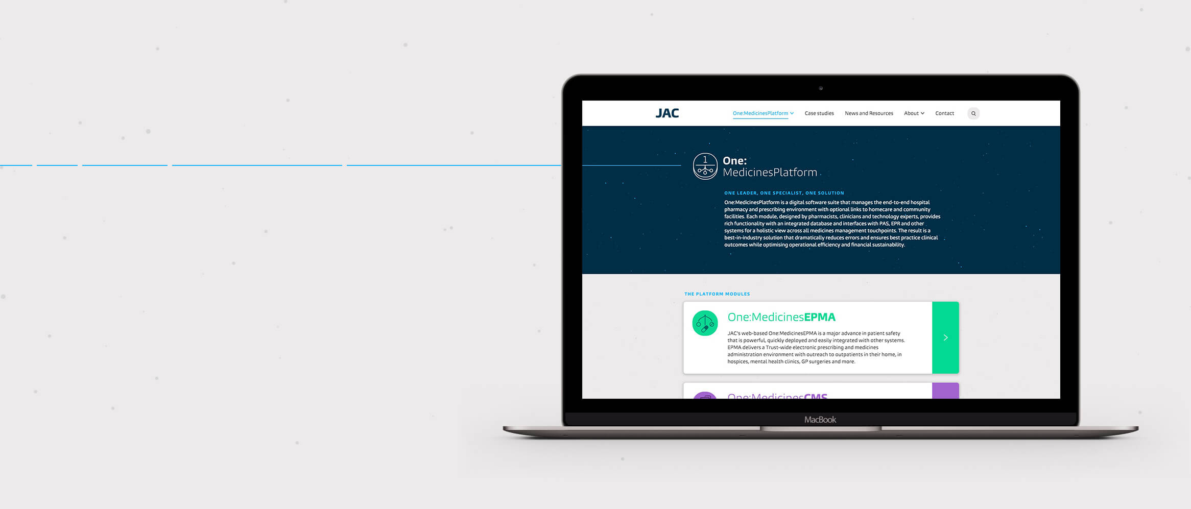
We were selected to update JAC’s brand and create a cohesive digital presence that would be a stronger showcase for its unique and life-saving products.
Rebranding
JAC defines itself by offering the most advanced solutions within its marketplace and furthering patient care. Our branding process included a number of workshops to gain stakeholder insights from the JAC team.
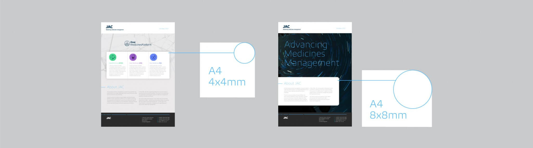
The personality and positioning for the brand had to centre around its scientific nature and the focus on precision. To visually communicate the idea of advancing, progression and motion we used a moving line for digital and a broken line, to suggest movement, for printed materials.
Our new approach elevates the insightful work and services that JAC provides, underlined by the mantra of “advancing medicines management”.

Iconography
To represent different aspects of the core offering we created two icon sets for the product suite and other aspects such as interoperability, to better communicate JAC’s offer. We used the Burlingame typeface, as its curvature and personality counterbalances the clinical aspects of the site. We harnessed the curves of the letters to create icons which, like the font, are not perfect circles.


Consistency
To maintain consistency across all platforms we helped to direct the brand implementation, setting the tone and best practice for how the visual style and system works. We documented the stylistic details, such as corner radius on brand elements, type sizing, line weight and other dos and don’ts.
Photography
We chose two photographic directions: inspirational star images that include a sense of motion alongside location, or real-world scientific photography. These reflect the personality and aim of patient care at the heart of the JAC brand. This equipped JAC with all the elements needed to effectively communicate the brand across all platforms and mediums, physical and digital.

Outcome
The new identity gave JAC a stronger positioning and consolidated how it presents its product range. By uniting these under the One:MedicinesPlatform, we established a narrative that can be more easily communicated to customers. Our design approach has elevated JAC’s website, with a clear structure and a strong visual style focused around user experience. This work significantly contributed to JAC’s acquisition after launch.