Measuring the pulse of the music industry worldwide
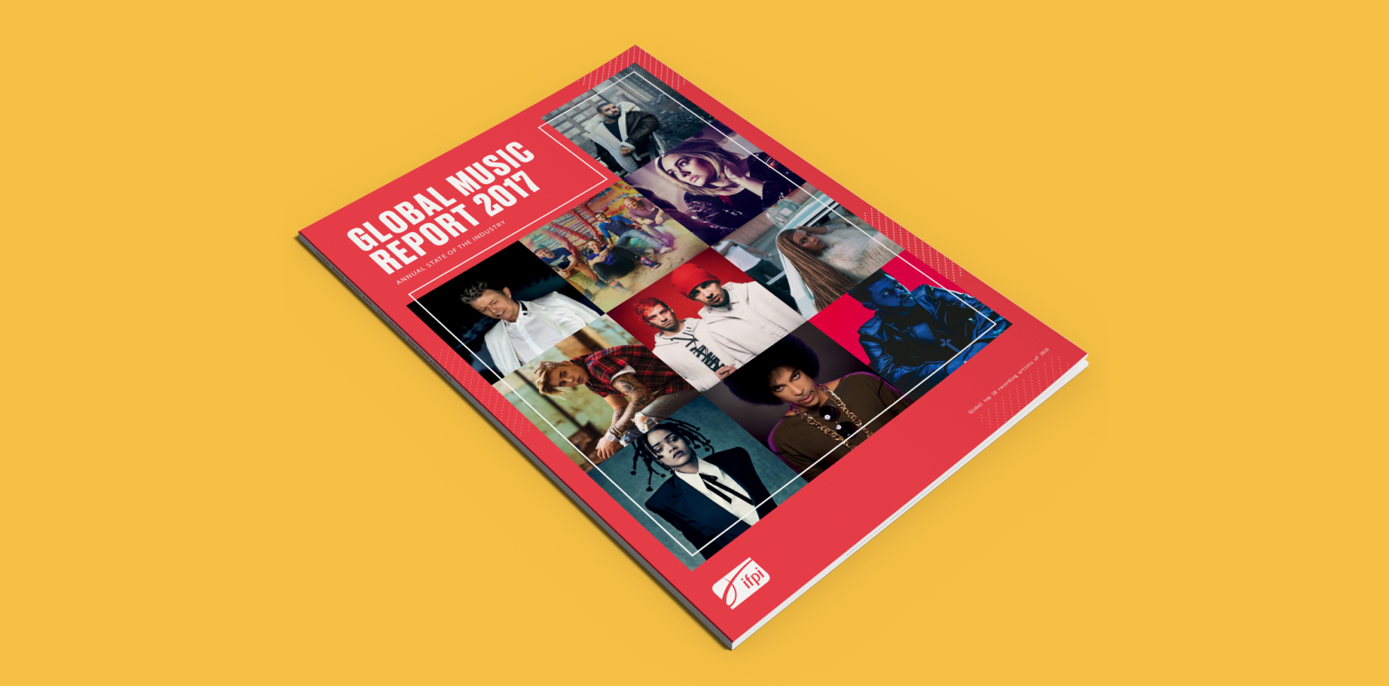
The Global Music Report contains a detailed assessment of the recorded music industry for the full year. Overall industry trends, figures, and artist case studies are featured throughout the report that serves as a valuable resource to inform IFPI’s subscribing members and partners.
The report also features extensive and authoritative data for the global industry and across more than fifty individual countries.

A functional design approach informed by the industry
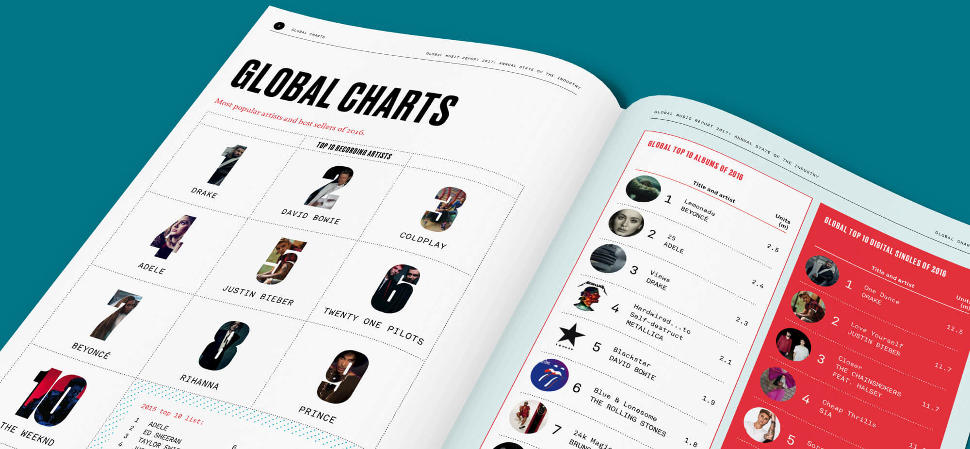
The design brief for this project centred around creating a report that is both clear and functional in its presentation of valuable industry figures, and reflective of the lively and energetic tone of the music industry it’s reporting on. With the additional value provided to subscribers of the full report, we wanted to reflect this value in our approach to the design style. We developed a bright, clean style with a bold use of type and artist photography.
Displaying complex data
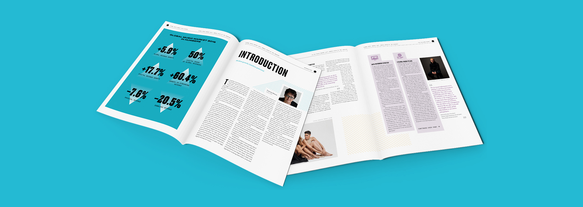
The audience for this report is made up of IFPI’s industry members and businesses that make their strategic decisions based on the numbers and findings delivered in the report. Industry numbers broken down by country are available in an appendix within the report that give insight into the consumption preferences of their markets. This operational value to their subscribers is supported through the provision of the raw data and a digital companion report site to make the content as accessible and reusable as possible.
Creating online content
Along with the printed report, we developed a digital companion that enabled IFPI to provide a premium login area where subscribers could download the accompanying datasets and access an interactive visual dashboard of the country market data. Logged in users are able to have a more customised view of the data where they’re able to quickly search and compare countries and download relevant assets.
Additionally, this digital version of the report enabled IFPI to easily share links to relevant materials and share their findings socially – a task that was difficult with the previous print-only version.
Thrive is an online journal that features interviews with and opinion from entrepreneurs, investors and industry experts. A mix of contributors from all areas of the industry is encouraged in order to spark genuine discussion about ongoing critical issues. While it showcases the effectiveness of successful ventures, it also encourages sharing lessons learned from missteps and unsuccessful projects.
Background
Funding London focus on bridging the funding gap for early-stage businesses in London. As part of their work with budding enterprises, they sensed a need for a resource for discussion and learning to illuminate the ever-evolving challenges for growing a successful business in London.As an ongoing partner with Funding London on their brand and website having won a nationwide procurement process, we were naturally excited to work with them to explore this new venture.
Together, we outlined the goals for the project and the kind of content that would be most useful to an early-stage audience. We determined that a set of interviews published each month and regularly added opinion pieces from expert contributors would be both relevant to the audience and feasible to achieve for the content creators. To maximise flexibility of content for possible contributors we set a brief for three types of assorted opinion pieces:
- Short quote/comment
- List of key points/top tips
- Extended thought piece
With a content plan in place we then worked with Funding London to create a strategy for building the brand. How would this product look and feel? How would it appeal to our intended audience and garner both readers and contributors?
Brand
We looked into what resources existed for early-stage businesses and found that what few there were didn’t focus heavily on the issues we were seeking to tackle. We sensed a space was open for establishing an intelligent brand voice to become a source of expertise on the early-stage market.
In addition to being a respected resource, we wanted to create a collaborative environment that encouraged the idea of mutual growth and participation. After going through a name selection process we chose Thrive to build on the idea of the flourishing early-stage environment that we were hoping to facilitate.
We created a custom set of illustrations of work-related paraphernalia in a hand-drawn style to bring a human touch to normally impersonal objects.

Build & launch
Shortly after establishing the core visual style we developed a brand deck to send out to Funding London’s network of contacts to build awareness and generate interest from possible contributors.
This first contact campaign to relevant contacts allowed us to gauge initial reactions to the brand and our messaging before we had launched the full site. This meant we could incorporate any relevant feedback into our ongoing development of the product before launch.
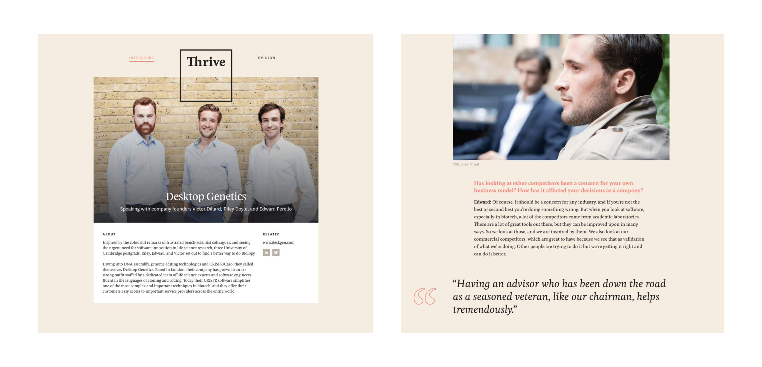
Working with Funding London, we attended interviews and editorially assisted with content production for the initial launch. We built and launched the site with content we had gathered both from internal writers at Funding London as well as pieces we had received from several outside contributors.
We supported the launch of the full site with the creation of a Mailchimp email marketing campaign – that could be customised directly by Funding London moving forward – with key messages and highlight content from the site to maximise exposure.
Printed publication
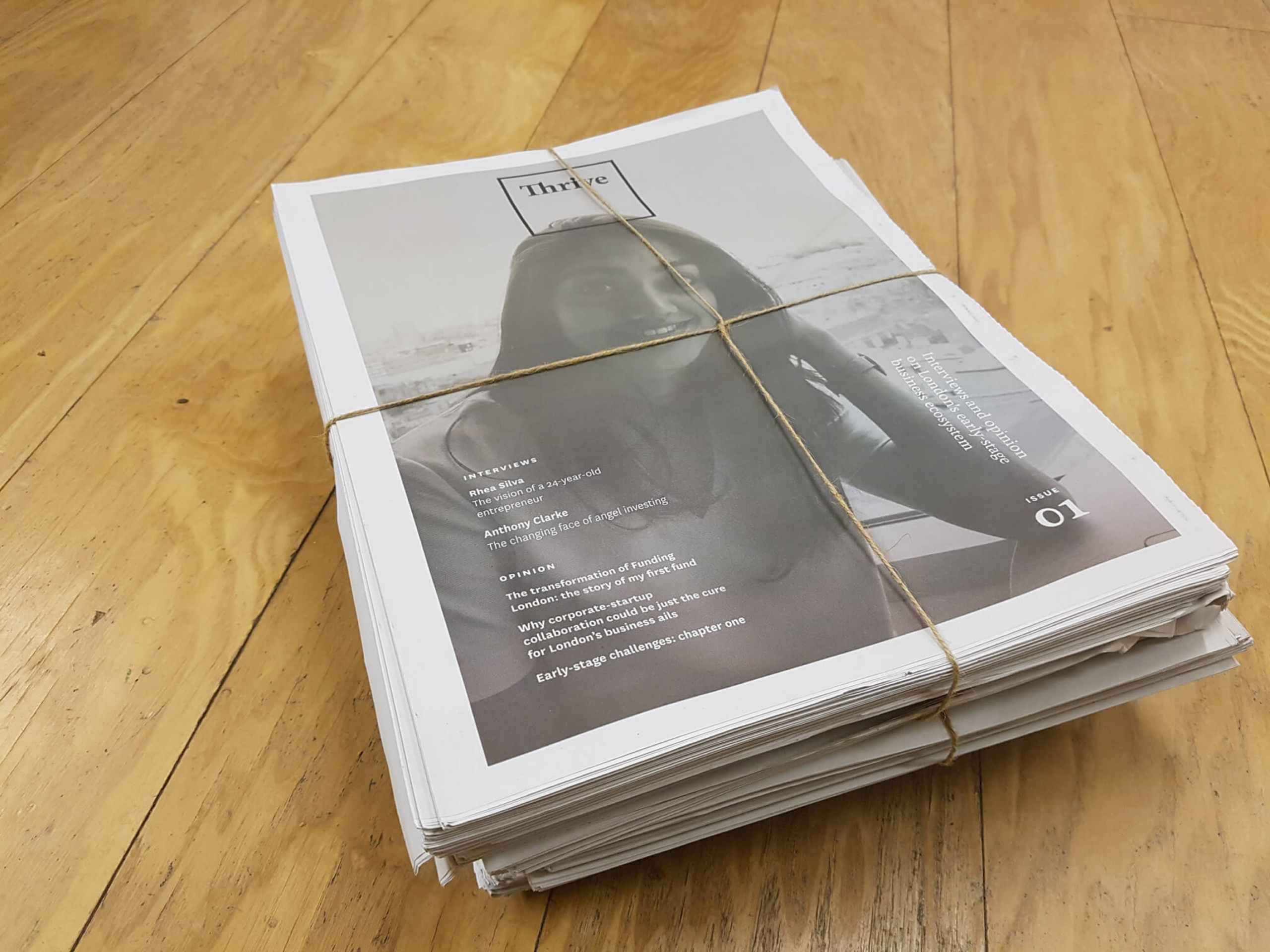
After a warm reception to the launch of the site and a steady flow of interested contributors we wanted to look at how we could continue to grow Thrive’s readership. With this in mind, we decided to create a physical publication using content from the site and distribute it at co-working spaces and early-stage incubator campuses across London. A printed product conceived and funded by Studiomade.
Creating a brand for a new restaurant experience in Rye
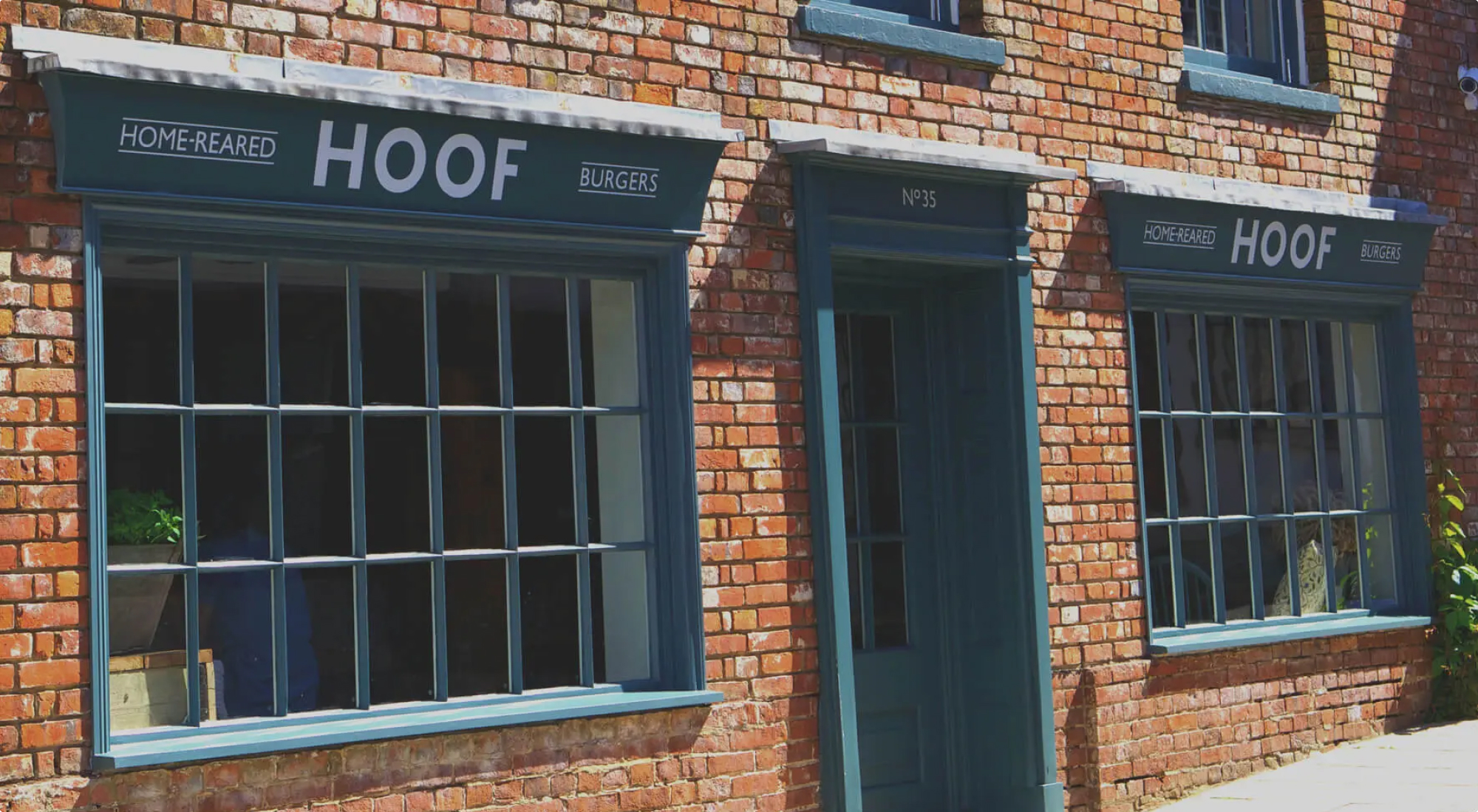
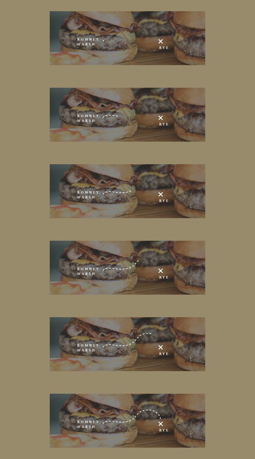
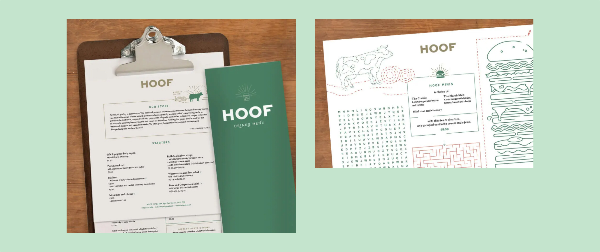
Hoof was a concept born of wanting to share good beef from the family farm in Romney Marsh. Working across both the signage and menus we wanted to create something that was both fresh and respectful of the heritage feel of the Rye high street. We enlisted an earthy, premium palette of forest green, drawing room blue with a golden potato-esque accent reflecting the high-end quality of the food and architecture.
Establishing an identity that can scale
The clientele in the area are primarily families and so we wanted to share the sense of relaxed fun that the restaurant offers. We created unique illustrations to be shown on the children’s menus that focussed around the food and produce. These were also developed to ensure flexibility and that they translated well across both physical and social outputs, helping the brand to really come alive.
Check out the Hoof Instagram


An international charity
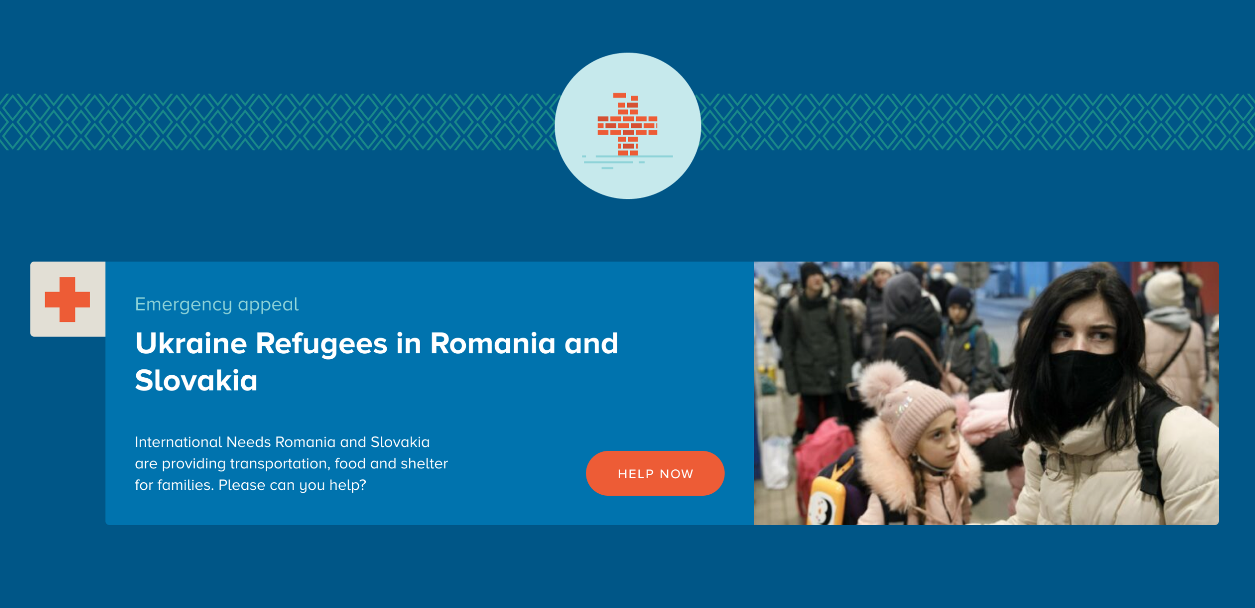
International Needs have supported children across the world through sponsorship for the past 40 years. They also provide aid to communities through projects that address their fundamental needs such as improving access to clean water, schooling, medical care and improved livelihoods for the reduction of suffering for people in need all over the world.
Brand positioning
The charity’s main challenge has been how to define the way they provide aid, to specifically target supporters with their use of messaging over such a wide landscape.
We needed to create a new brand for International Needs:
- With a revised visual style
- Consistent brand communications
- With brand positioning that empowers their team and members
- Alongside messaging that better structures what the charity does
Family focus
We worked closely with the charity through a series of workshops to develop a new defining perspective to tell the story of their work: helping communities, children and people in need through the supportive idea of a family. This took the focus away from traditional child sponsorship and better described the wider scope to the great work that the charity undertakes. It also helps educate a wider audience to what the ‘makeup’ of a family truly is. For many people connected to International Needs a family changes through disease or famine; for example a sister, brother, aunt or uncle may take on the role of becoming a key parent within the family model. This naturally has its own challenges, and we wanted to ensure that through the brand’s communications, audiences heard the International Needs story whilst keeping in mind the importance of family, and the need for a firm foundation and basic access to resources which should always remain the same.
Families:
- are a supporting block of any community
- mean putting sharing first
- come in surprising combinations
- create stability
- are a place of care for life
The International Needs supporters pack
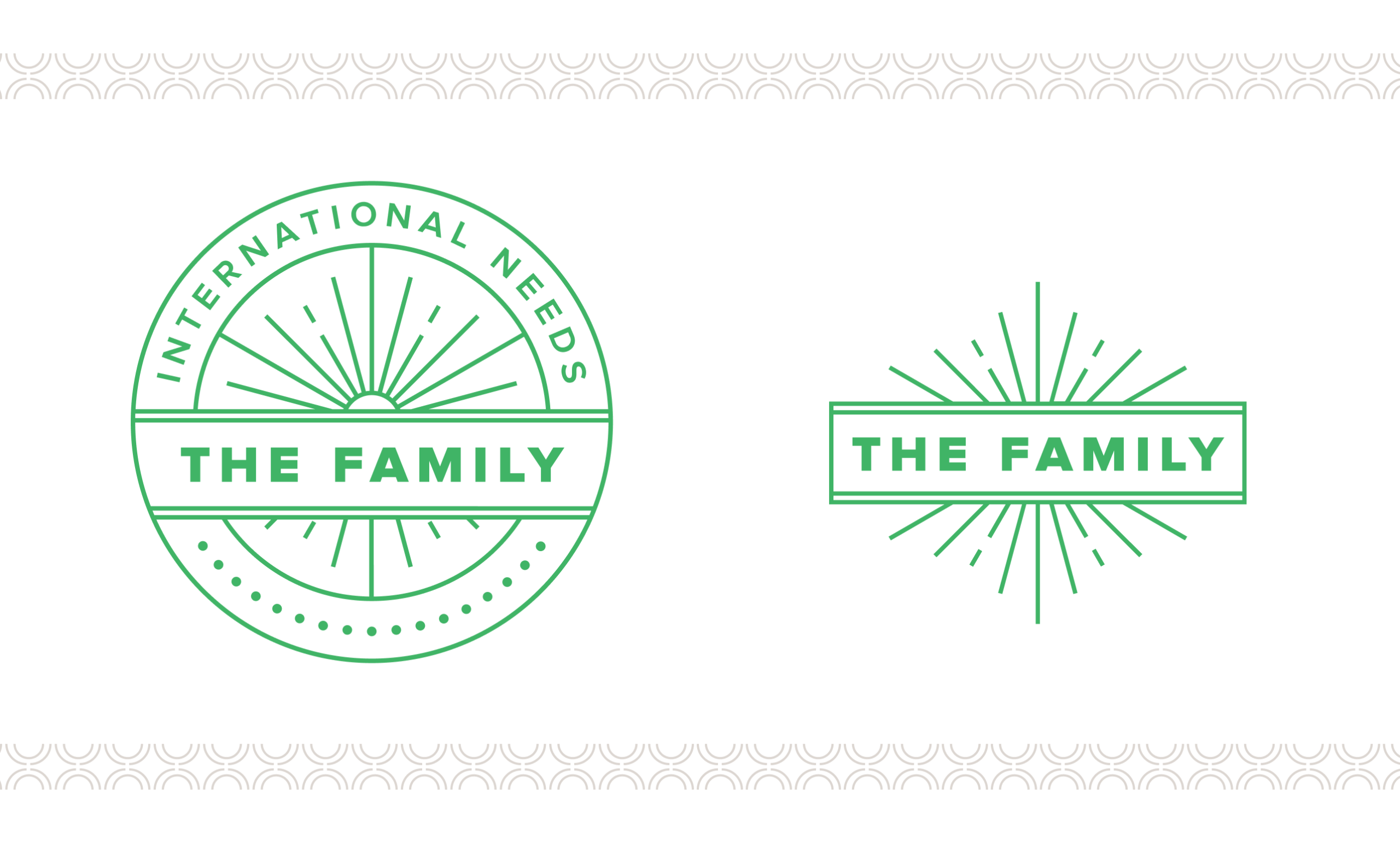
As part of this initiative we wanted to engage with existing donors and transition towards the notion of a the family focus, employing the use of The Family logomark which we created to help empower current and new donators with a ‘sense of belonging’ to both a collective but also to the vision and values of the charity. Being part of ‘The Family’ aids the promotion of the vision, and also that of membership and donation both inside and outside of International Needs.
Areas of engagement
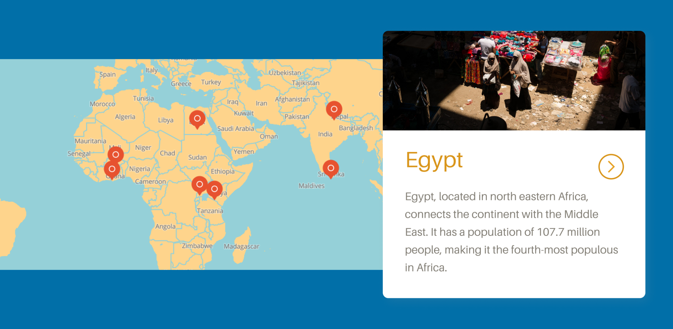
Donations are focused into six areas which cover project types. This allows for flexibility for the charity to enable them to improve the impact of where they invest and also give donors a concrete idea of how they can help improve lives.
The six areas also serve to organise the world map of areas you can support on the Projects page of the website.
Building a brand
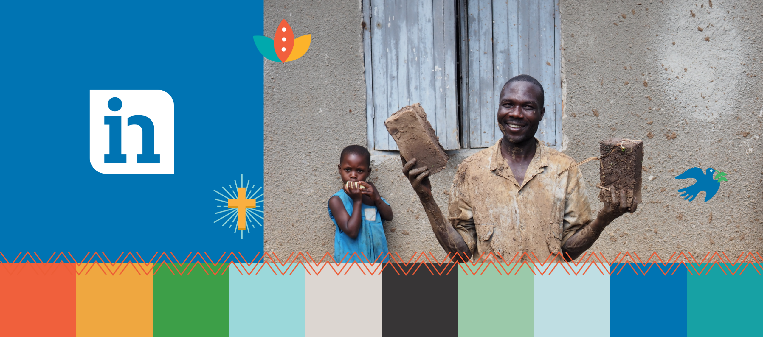
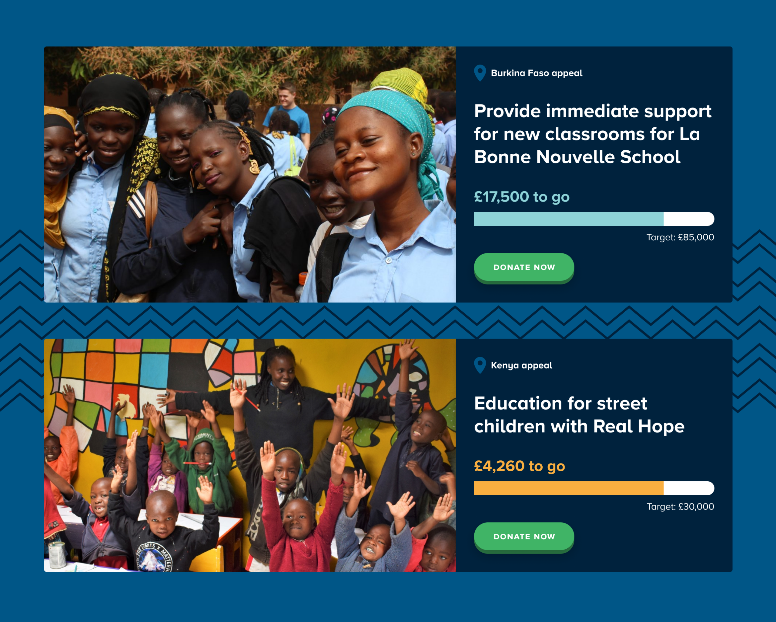
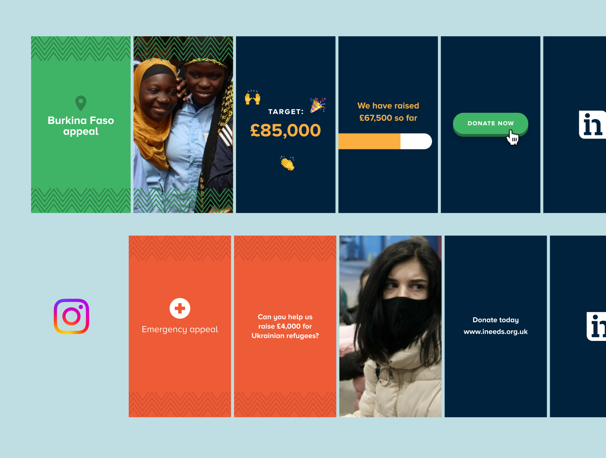
The brand fits the charity’s fresh focus with a refined logo and better targeted strapline, energetic positive imagery, an earthy bright colour palette and a handmade illustration style which forms a major part of the identity. There is a pattern and colour to identify each of the countries where International Needs work. The Family mark is used in relation to donation activities and ties together creating a sense of belonging towards the charity. Both print and web materials encourage an accessible feeling.
Results
Our work with International Needs has helped craft and position a brand identity that connects to a growing audience and donation-base. Integrating their digital presence into backroom administration functionality has helped business process, whilst the site itself (built by our team with a concise and bespoke Content Management System) allows consistent and wide-reaching messaging and charity activity to be better communicated with both existing members and the wider public.
Global Insight is Universal Music Group’s internal data team. They empower their international workforce with the ability to easily gain access to vital data about the music industry and Universal’s work.
A familiar problem for many established companies, this dedicated business division needed to unite under a common vision, with an identity that helped signpost their involvement and presence throughout the wider company and across global regions.
Our team were commissioned to help with this brand activity, creating a presence that fitted within Universal’s brand guidelines whilst allowing for a more engaging approach that created greater recognition.

User-friendly brand style
As part of this positioning piece, we wanted to create a visual identity that could easily be adopted by the team. Our design ensured that a systematic style was created with a Microsoft-friendly approach considered for assets, colour overlays and consistent typographic treatment.
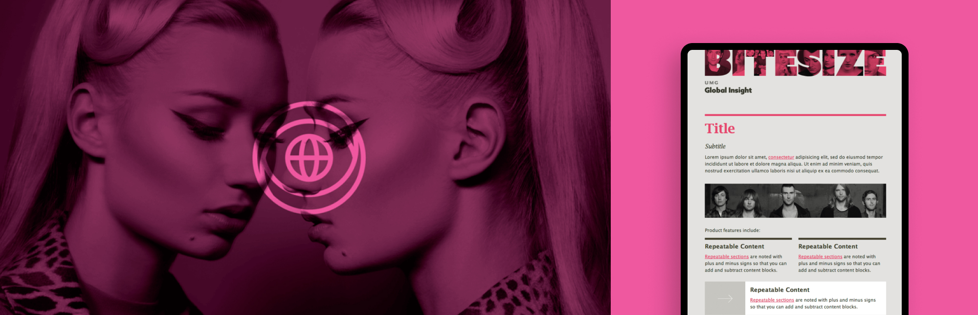
Assets and templates
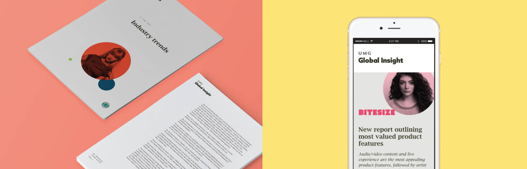
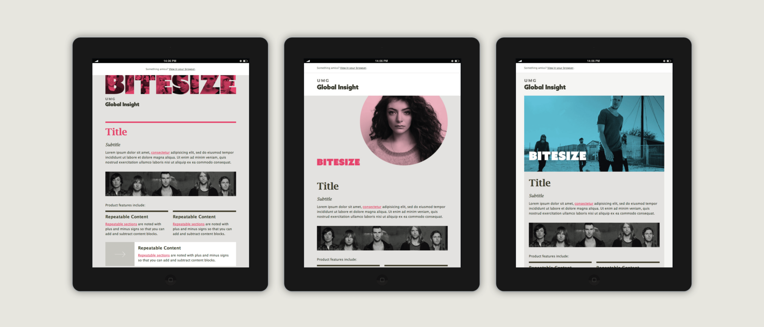
Our input within this project involved the design of a new logotype and avatar, colour palette, icons, photographic styling, and the creation of brand guidelines for educating internal teams on how to make use of all these assets. Once the brand direction was agreed we then helped roll out the new approach with the creation of Microsoft Office templates and HTML email campaigns built in Mailchimp.
We created several responsive Mailchimp emailer templates for the team which allowed their team to easily create well-designed internal update newsletters based on their department’s wide range of topics in the music industry.
Brand iconography
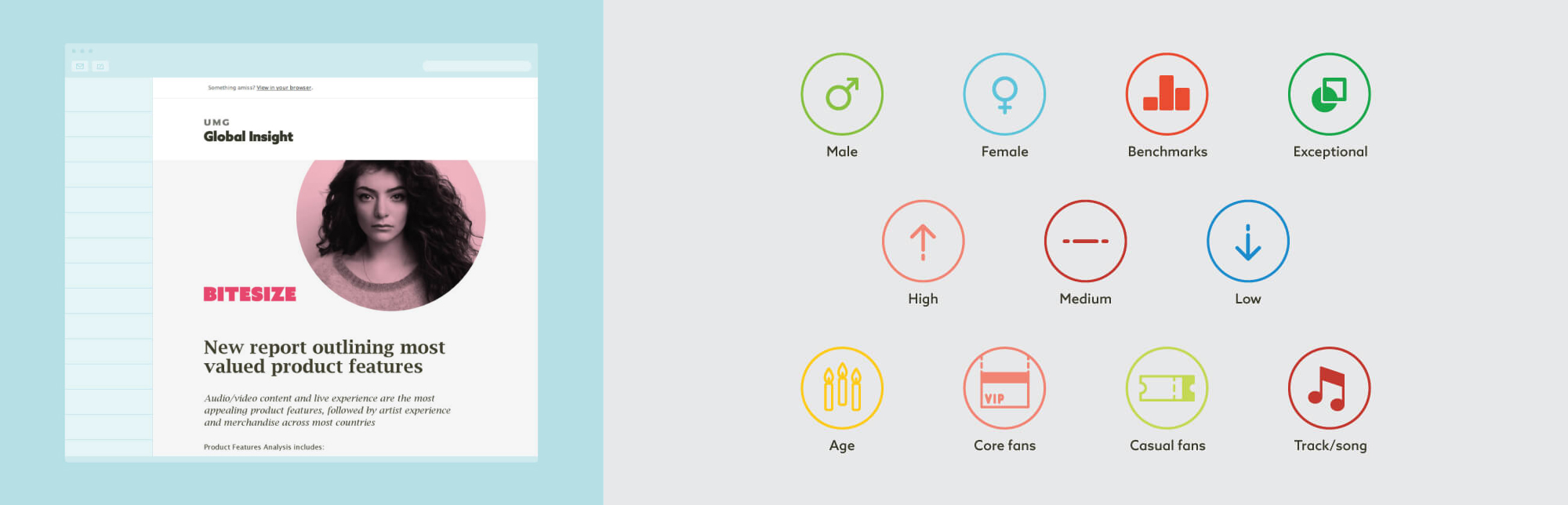
An extensive icon suite that could be used across all communications was created to support the overall brand direction. Designed specifically for the themes and topics of interest within the division, the icons built an identifiable brand language that helped the pieces they created feel owned by the Global Insights team.
A new fintech concept
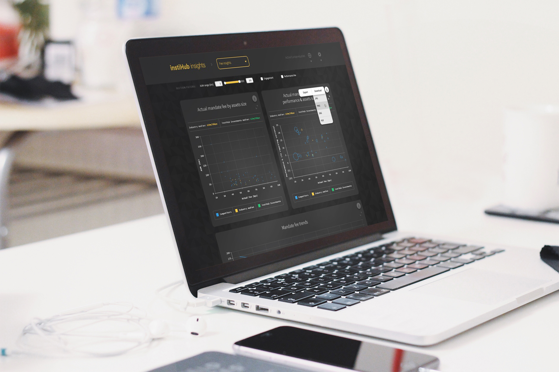
We were approached by instiHub’s founder to help develop the concept for a fintech product and build a viable, revenue-generating platform. We helped to map the blueprint, planning and validating how the product would work, as well as establishing the brand and tone for how the business would look and feel. Working closely with the founding team, we designed, tested and developed a ready-to-launch digital insight product for the asset management industry.
Our product creation was based on an entirely new technology infrastructure for the client. By reporting data derived from the values of actual mandates, we helped calculate performance comparators and forecasting functionality based on true market values as opposed to speculation based on aggregated performance data.

Refining the brief
From the beginning, we worked with instiHub to answer rigorous questions that would ensure we were all moving in the right direction. Who was this for, why would they use it, how would it be marketed, what were the future growth plans based on success, what kinds of visualisations and user flows did it need to tackle, and what is the value-add for the user?
Our questioning and the validation phase of work meant that both our team and instiHub’s team understood the reasoning behind each decision made, so that the end result was measured and tangible.

A data-led product
Our experience working with expansive datasets and architectures across finance, healthcare and technology has given us a robust and wide-reaching knowledge of data structure, visualisation and management. Sector-specific experience helped our team to quickly understand and interpret the needs of this project. The way we managed the data delivered the best result for the design and functionality of the product.
We designed a system infrastructure that could manage and deliver the data securely. Developing and implementing our own API logic, we helped devise the product schema and worked with instiHub’s technical leads to query their vast data library through efficient and scalable calls.
The result was an entirely new technology infrastructure for instiHub that positioned them with a digital platform that they can continue to build on.

Creating the brand’s look and feel
The branding had to be easily identifiable, to stand out in the market, but also flexible in how it can be used for data visualisation and user interface design. We built a clear specification that met the brand’s needs then crafted an approach that caters for bespoke charting, intricate data display, responsive digital environments, print advertising and online marketing.
Testing and launch
Data consistency was a vital part of this project’s success. Working through an iterative development and testing cycle, we stress tested various use scenarios. We ensured that shrouded data presentation and cross-brand comparisons were working correctly, the product was both stable and secure, all elements worked across different browsers and devices, and would continue to as the product grows.
We broke the testing into sprints, covering data validation, interrogating and manipulating the data filter system and the range of data presentations. Then in the launch phase, we supported instHub with marketing collateral to raise brand and product awareness.

Building for tomorrow
We helped instiHub take an idea from concept to full product and brand build and launch. Supporting their team with the following services, we co-created a revenue-generating platform in the asset management space:
- Strategic brand positioning
- Brand creative
- Digital product UI, UX design
- Database architecture, API creation and prototyping
- Digital development and build
- Product launch
instiHub has continued to expand on what our team built, and was acquired by AllFunds in 2022.
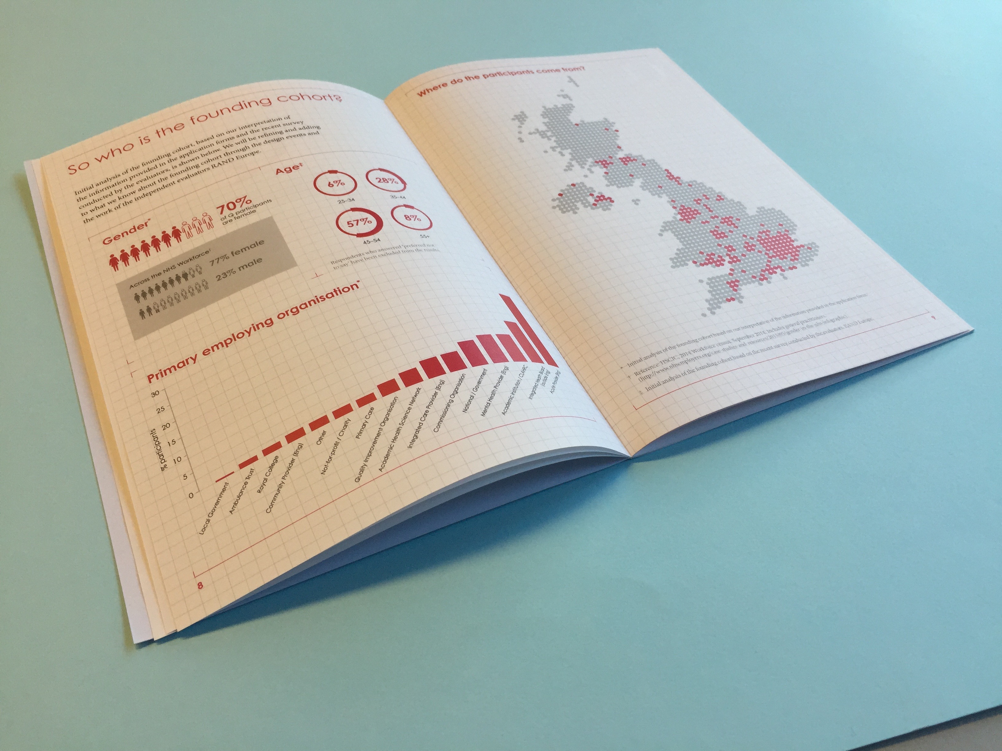
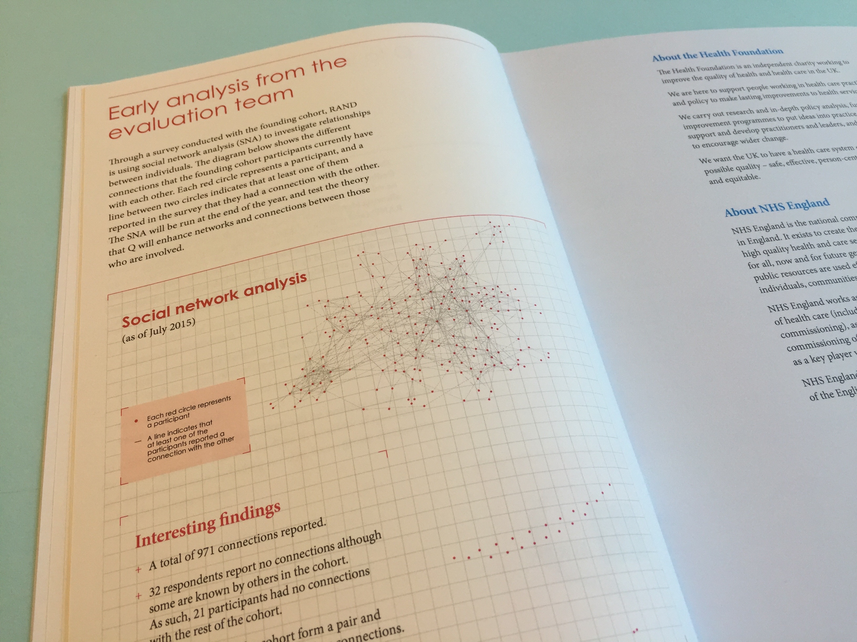
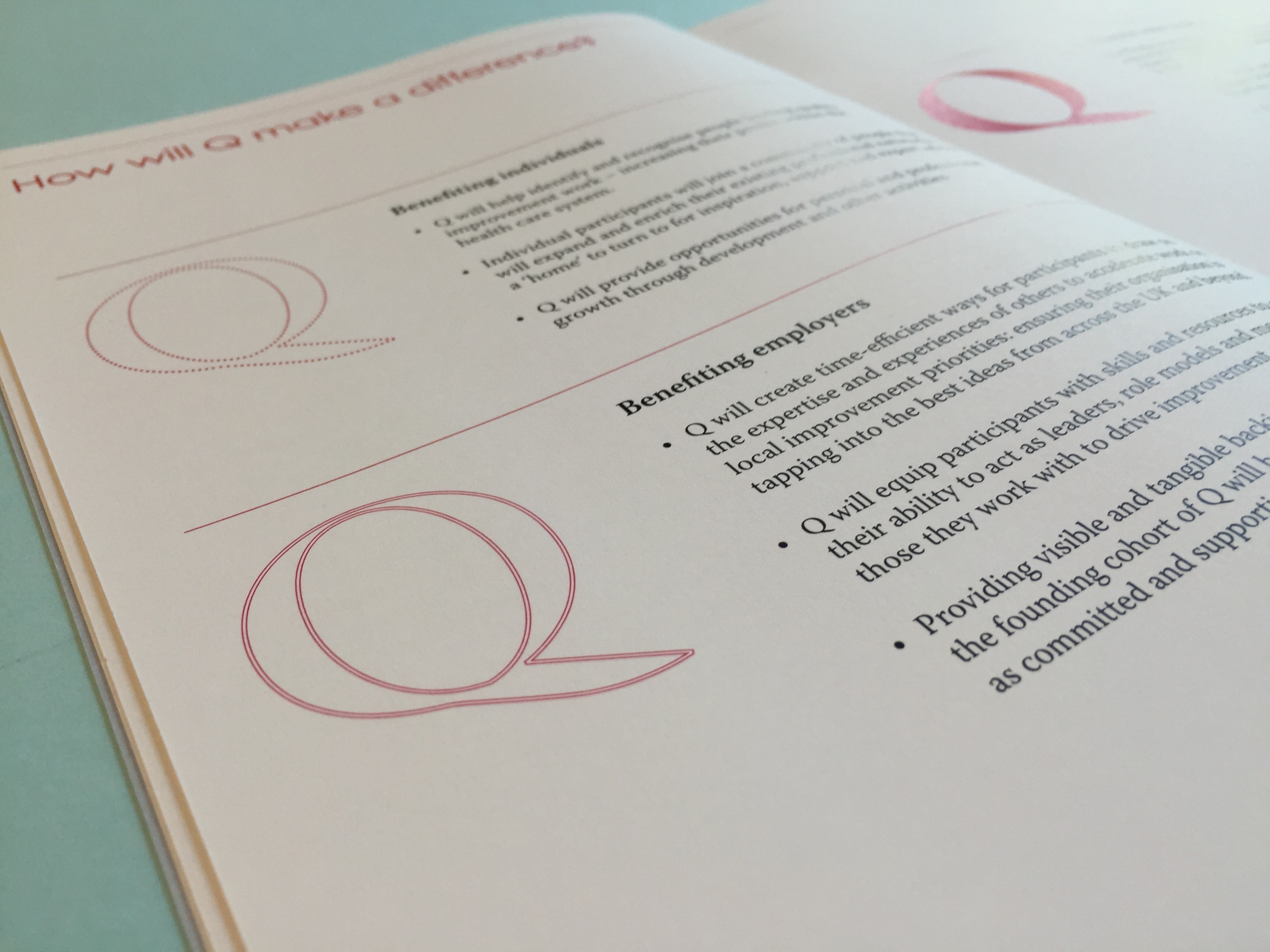
Q is an initiative from The Health Foundation, designed with 231 founding members. This helps to ensure it is genuinely useful to the diverse range of people leading improvement. Q will continue to evolve, being shaped with and by the community as it grows. The community has recently reached 4,000 members across the UK and Ireland.
Q is a long-term initiative aiming to support individuals and their improvement work. Through this, Q benefits member organisations and the populations they serve. It has been designed to complement and enhance other initiatives and networks. People in the community pool together their knowledge, insights and connections – encouraging collaborative ways of making improvements.
The community is made up of a diverse range of people including those at the frontline of health and social care, patient leaders, managers, researchers, commissioners, policymakers and others. This boosts the power of Q as a source of innovation and practical problem solving by including a wide range of perspectives.
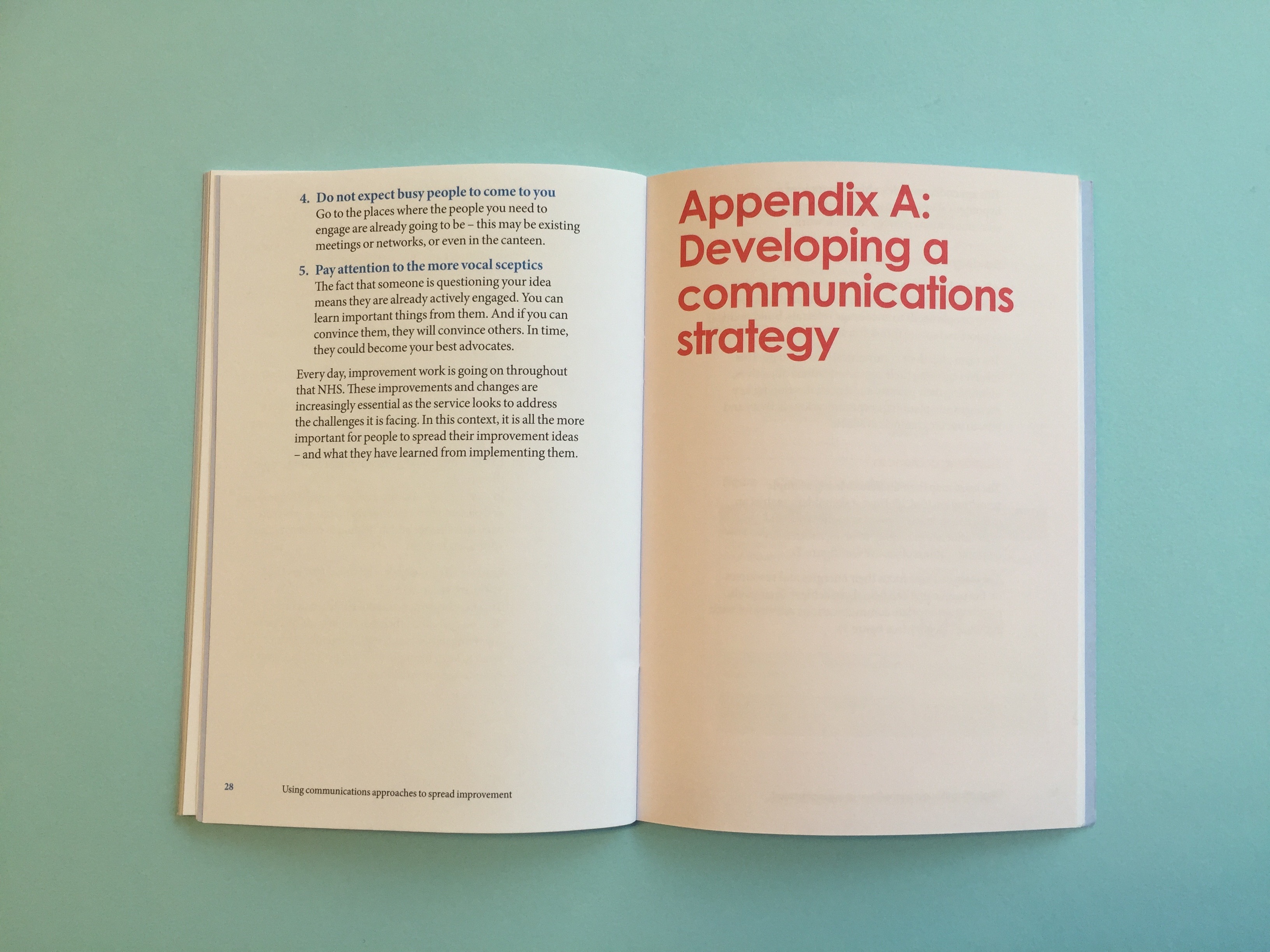
We worked with the Health Foundation to create an identity for the group that sat within the Health Foundation brand. This was then translated across their first report.
A world leader
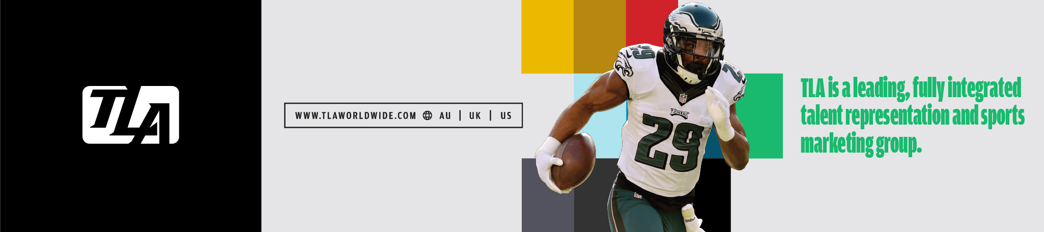
TLA Worldwide have grown to become one of the world’s leading sports marketing agencies. Representing talented individuals from Olympians Sir Chris Hoy and Rebecca Adlington to leading NFL stars Jameis Winston and Dion Dawkins alongside Australian AFL Talent including Taylor Walker, TLA are responsible for some of the globes greatest sporting individuals, brands and events.

TLA’s consultancy and management teams have created impressive spectacles at the Australian Grand Prix, new sports propositions for football exposure at the MCG in Melbourne including both heavyweights of Brazil and Argentina, as well as staging major one-off events such as Wayne Gretzky’s Ice Hockey Classic. TLA count global players such as Adidas, Toyota and Formula One as clients and continue to grow with their reach in the market.
This growth has required a brand presence that, under our guardianship for over five years, has evolved and now encompasses a single, global digital presence, an integrated approach to investor and stakeholder reporting and the ongoing innovation of digital products that will help both TLA’s internal team and also their clients in continuing to grow.
Here’s how we’ve worked together.

Brand building
From the outset of working with TLA our work has seen activity across the following areas:
- Establishing a brand vision: defining a direction of travel and identifying key areas of focus
- Engaging with investors and stakeholders on a global scale, across both physical and digital corporate reporting
- Establishing a logic to a global brand presence enabling regional reference with a view to global integration
- The cultivation and growth of a single brand alongside a period of business acquisition
- Creating a core brand guidelines directive with a foundation of brand templates and assets
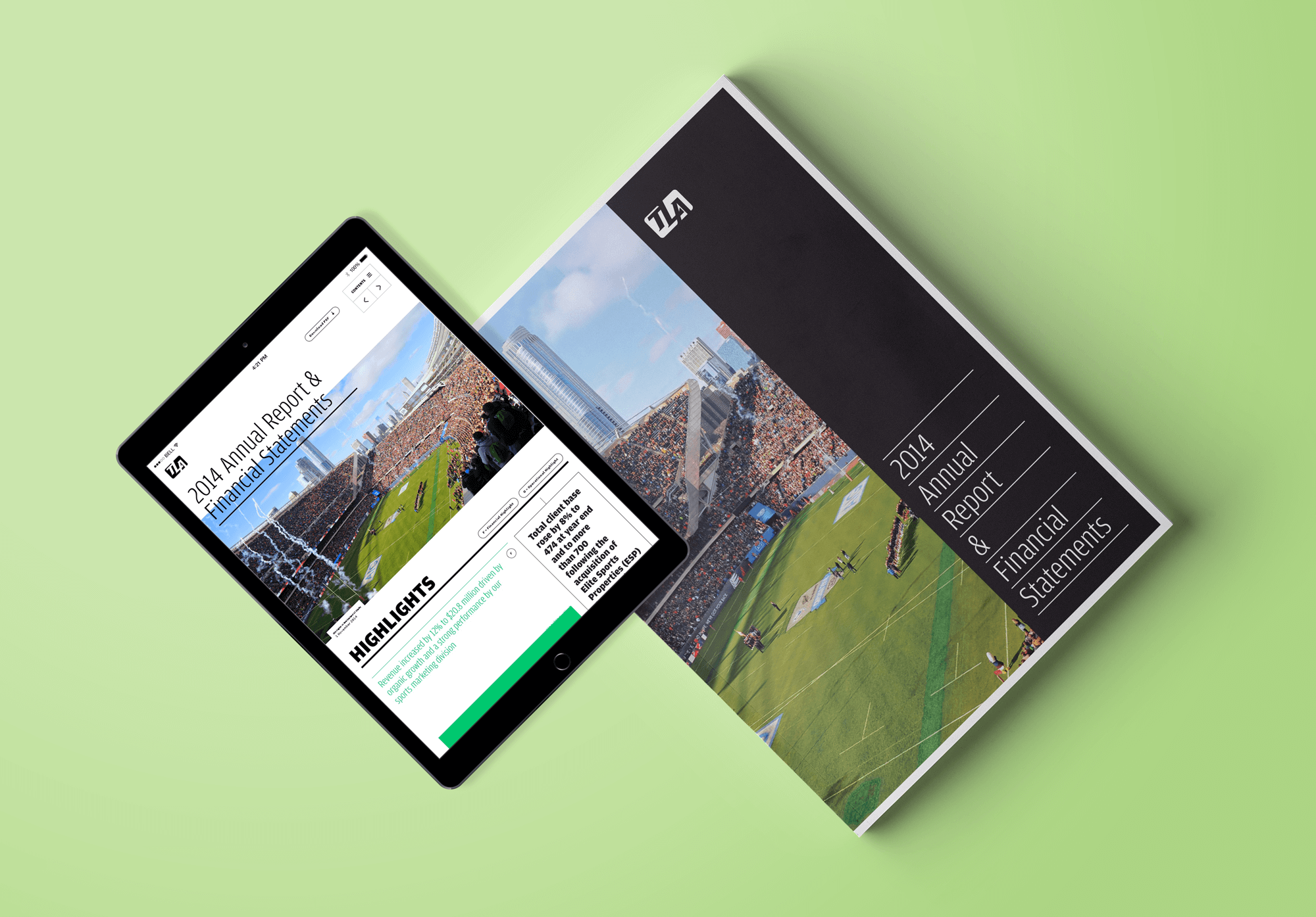
In producing a range of brand outputs including corporate reporting we have established an ownable style and creative direction that resonates with TLA’s core values. Our reporting, including both physical reports and digital companions have provided profiling opportunities for talent as well as highlighting other areas of focus from a stakeholder’s perspective.

Our approach to corporate reporting
As an integrated agency, we believe strongly in providing accessibility to all stakeholders. Naturally this means an increasing digital presence, coordinated to AIM Rule 26 compliance, but it also means that tangible, physical communications should not be ignored.
Our work across the corporate reporting landscape within other sectors corroborates this. In our opinion a physical report continues to maintain a role within the Boardroom and within reach of investors. Our team ensure that from a messaging and brand consistency perspective, digital and physical outputs compliment one another and take advantage of the unique benefits that each platform provides, designing for purpose. This could mean encouraging the use of interactive charting within the digital report – allowing investors to truly interrogate data year-on-year, or it could mean the addition of a data narrative to reporting figures.
A core, global website
TLA (The Legacy Agency) maintained a US-led digital presence when our relationship began. With business acquisition and growth however it became clear that a single, revised site presence was required that would aptly showcase everything that TLA represented on a global scale. With their expanded brand reach, we helped their team identify their key offerings, and in-turn design and build a site that would respond to their needs, and their clients’ needs.
Our iterative process:
As an agency, our digital workflow follows a modular, content-first approach where we:
- Iterate through an idea and discovery phase of work, identifying user and client needs alongside business objectives
- Establish a core specification (often formed in a shareable Google Doc) that aids direction of the project
- Map content and user requirements to core site functionality, plotting site structure and needs
- Quickly iterate through idea generation, formalised in wireframe and prototype form for feedback and testing
- Encourage early technical engagement with our clients, ensuring quick and confident understanding to both underpinning technology decisions but also future client input (CMS learning in this instance)
- Design in a modular and responsive manner with flexibility and repurposing in mind, all aligned to a brand vision
- Utilising Trello we establish a test and review routine, with all parties feeding into this process with commentary
- Integrate data-led metrics that link back to the brief and the business objectives – often including event-based analytics, KPI recording and other forms of effectiveness review
- Support the complete launch and deployment process, and if requested, continue this relationship with an ongoing SLA where we maintain hosting and infrastructure management and monitoring.
Cultivating a digital vision for TLA
In the design and development of the TLA website, our team:
- Crafted a site structure that represented TLA’s core business verticals of Talent, Consultancy, Events and Merchandise
- Produced a digital platform that could be easily updated by their internal team, showcasing the great work that TLA have undertaken and providing a profile for each of their talent
- Established a clear, AIM Rule 26 compliant, investor section within the site, integrating with the digital reporting approach that we had also put in place
- Provided geo-location functionality where regional content across the core service areas was segmented for ease of use
- Integrated a regionalised brand social presence that span site-wide
- Helped cultivate a news area within the site that encouraged active content creation, highlighting recent work by TLA that was easily accessible.
Results
Our work with TLA over the years has seen:
- A brand vision develop that has supported an organisation which in 2015 saw its revenue grow to £44.4 million
- The formation of a brand guidelines approach alongside business acquisition, which now forms a boilerplate to ongoing creative work and new projects
- The creation of a single digital site presence that attracts ~10k visitors per month
- Engagement with stakeholders in the UK, Europe, the US and Australia with an integrated approach to corporate reporting
- Innovation with digital products assisting business objectives.
‘Studiomade worked seamlessly as part of our team throughout this rebrand process.’ Dwight Mighty, COO.
Before 2015, new music was released on all different days around the world: Mondays in the UK, Tuesdays in the US and on other days in other countries. Illegal downloads were rife as people didn’t want to wait. IFPI, which represents the recording industry worldwide, wanted a global release day where countries all released new music on the same day of the week: Friday.
Following a competitive pitch, IFPI commissioned us to create a brand and strategic campaign. Our brief for the New Music Fridays initiative was to build a brand and visual style to build awareness and engagement among both consumers and the industry alike. It wanted to “boost consumer and brand awareness, building anticipation tied to the release of new music – on a global scale”.

Creating a brand style
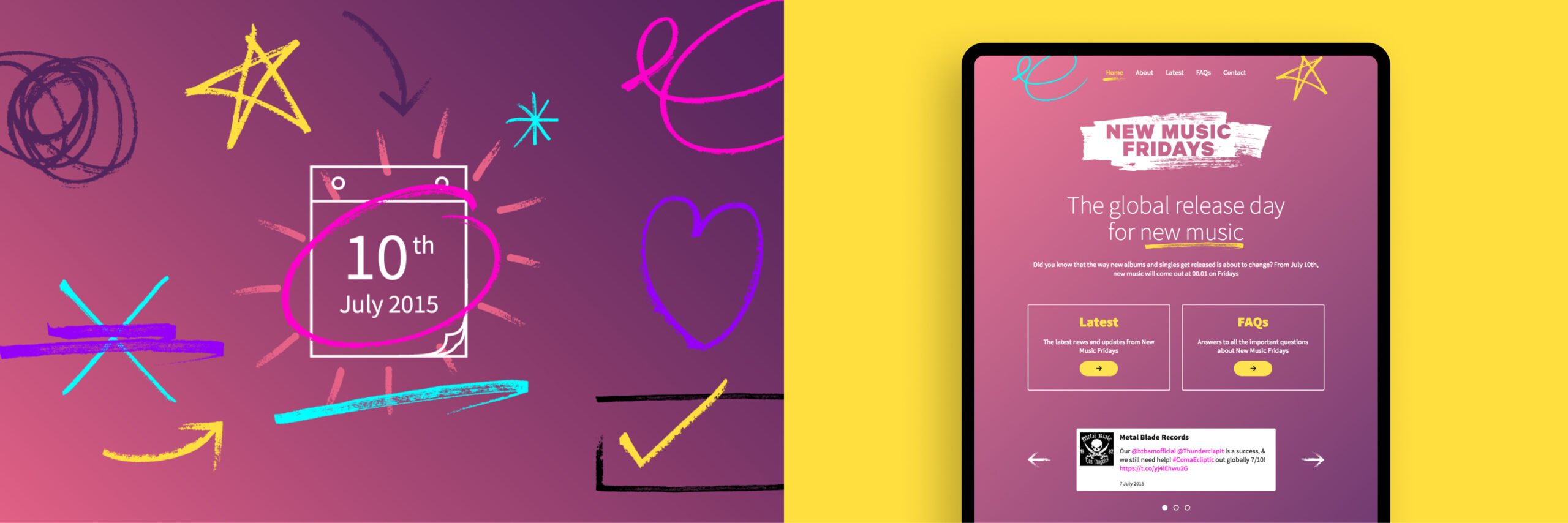
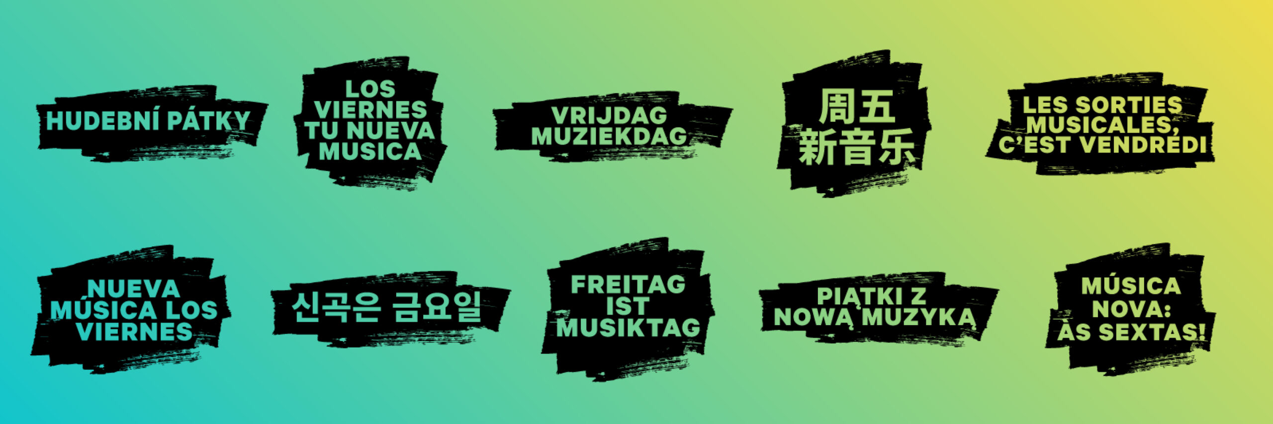
We wanted to create style that was assertive and inspiring. We created a modular brand platform comprised of creative elements and assets that could be used in different ways. Building this inventory meant that third parties could expand their own communications and campaigns locally, adopting the New Music Fridays concept with a sense of ownership and purpose.
Global strategy and application
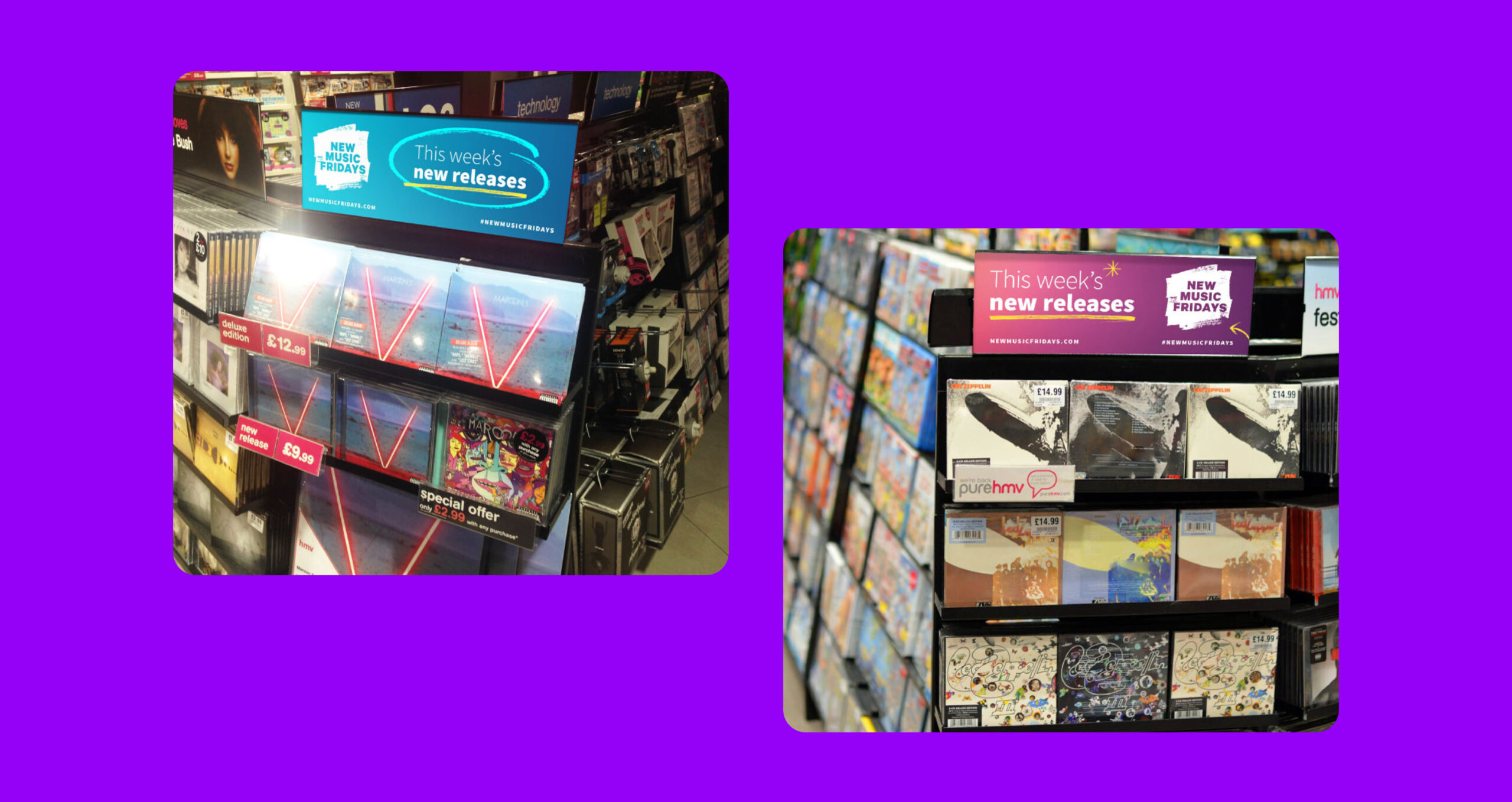
Because this was a global campaign, our core identifier and brand mark needed to be translated for all required languages. All our assets were produced and made available for localised advertising and industry use. Our creative was adopted by third-party distributors and used commercially in stores and online.
Consistent implementation
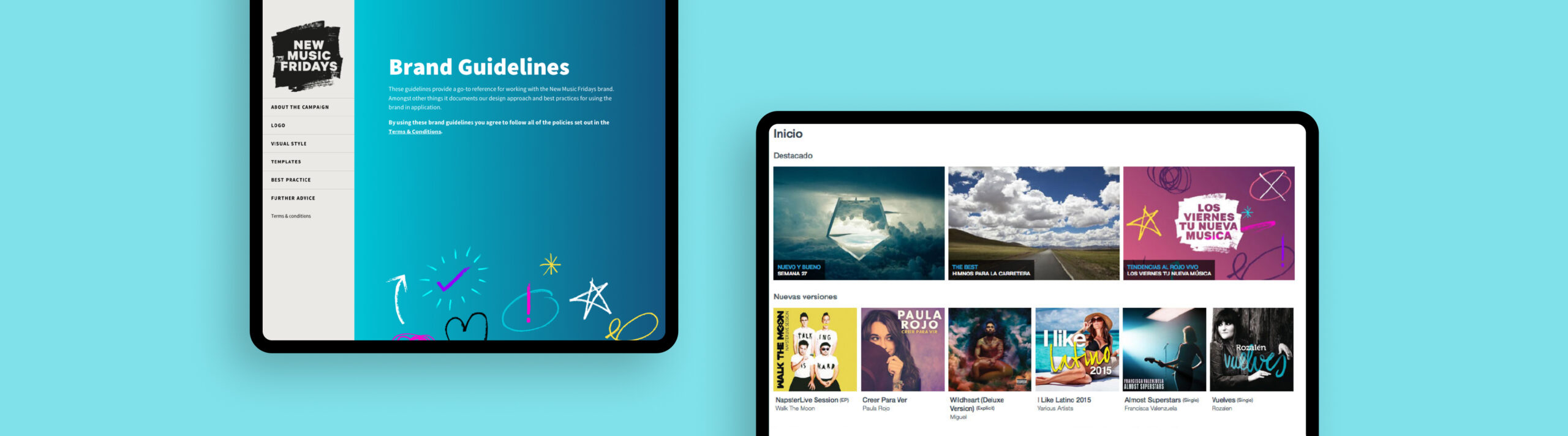
A key challenge for the campaign was the coordinated delivery of assets and brand guidance to music organisations, record labels and retailers around the world leading up to, and after, the launch. Our solution was to create a brand portal where all assets could be accessed, alongside brand usage guidelines and a simple, coherent website.
The outcome
Our work helped to create a global campaign that gave an effective and consistent voice across physical and digital campaigns. With our brand guidelines platform and new website, the campaign was able to be rolled out and used at scale. New Music Fridays was a success, becoming the standard global release day, and music piracy plummeted.
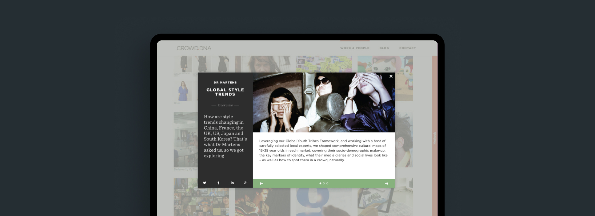
Crowd DNA are a cultural insights and strategy consultancy with offices in London, Amsterdam, New York, Singapore, Sydney and Stockholm. Formed in 2008, operating across 60+ markets, they bring together trends specialists, researchers, strategists, data analysts, designers, writers and film-makers for the world’s most exciting brands.
The client wanted a brand update and website design and build that would allow them to continue to growWe wanted to ensure that the brand referenced culture and people and so we ensured that photography used that portrayed a sense of humanity, life and energy to communicate the end result of their work.
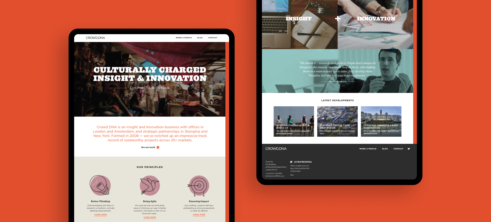
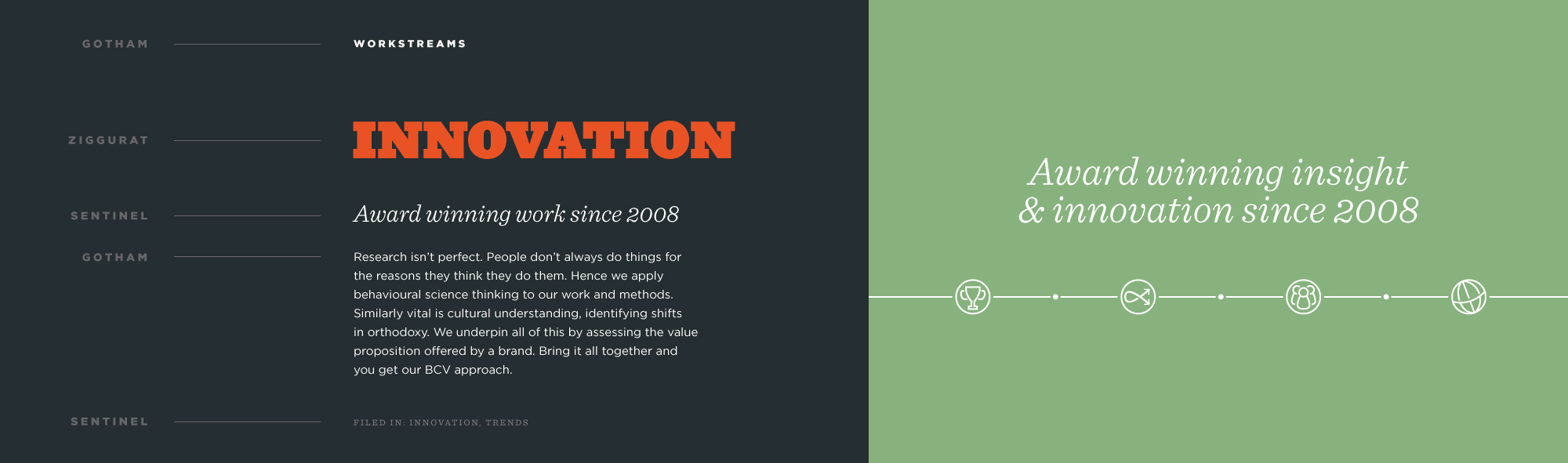
We used a number of fonts so that the brand had enough hierarchy at each level of volume required and brought in unique illustrative elements so that we could signpost content for users and give the client pieces of creative that they could use across wider materials such as social.