Building London’s early-stage creator
Funding London, originally SME Wholesale Finance, required a revised brand position and presence. Capturing the Early-Stage Market, and helping to grow emerging and exciting companies in London, the organisation required support to change.
Brand positioning
After meeting with key stakeholders, we set about tackling the brand positioning challenge of this project. By understanding the organisations principle role, we identified the term ‘Funding London’ as an active description that best reflected them. From there, we built out a brand approach with the breadth to operate in all required environments.
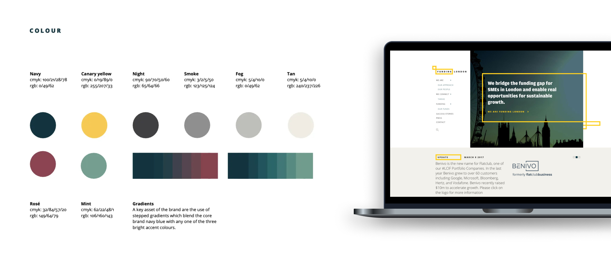
We wanted the brand to be clean, making communication the focus and so built an identity that could flex – supported by a colour palette that was both bold and striking. The bold yellow stroke within the new logomark operated as a frame for important information as well as user signposting throughout our design language.
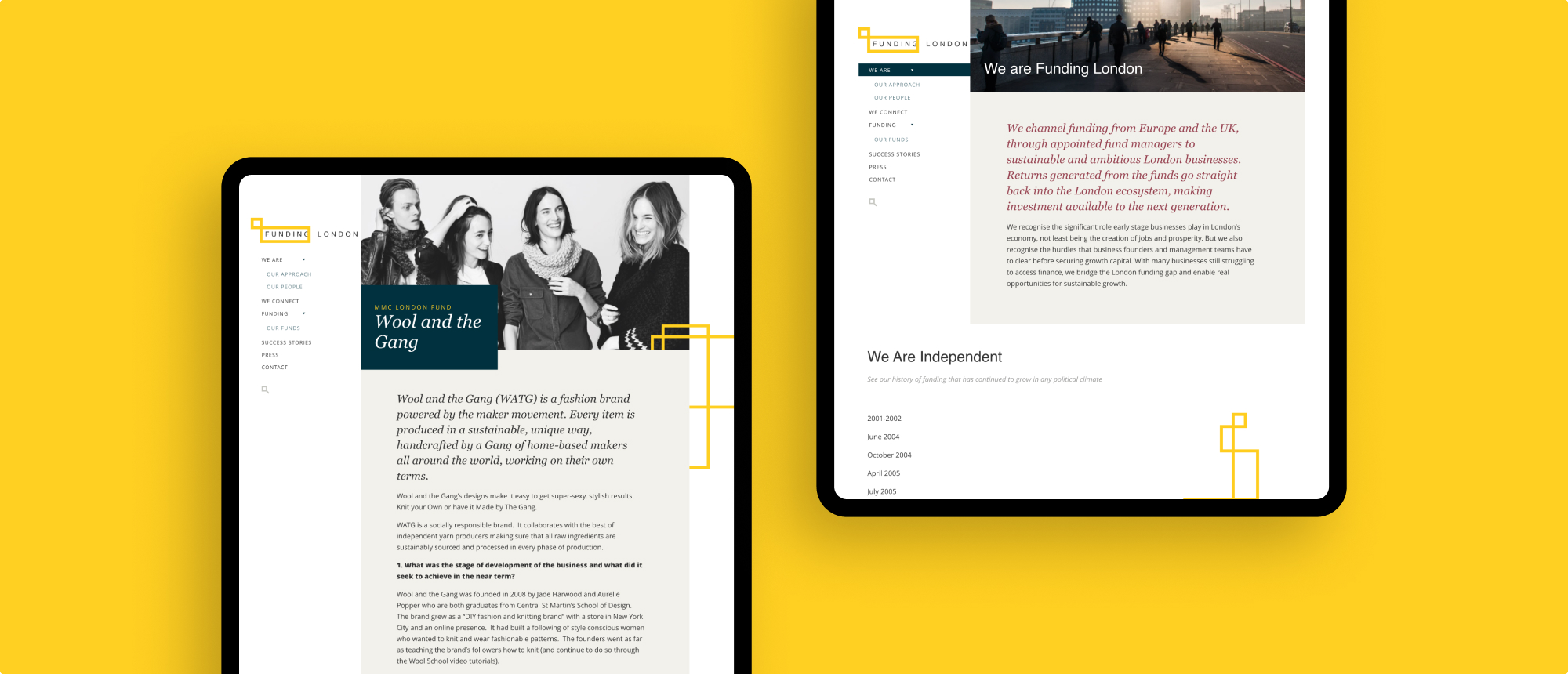
Digital transformation
Our input into repositioning Funding London saw our team plan, design and develop a WordPress-powered website that remains in active use today. We later produced a brand and digital presence for sister publication and concept Thrive: an online journal featuring interviews and opinion on London’s early-stage business ecosystem.
The pre-acquisition challenge
Dr Foster is a market-leading healthcare analytics company (now owned by Telstra). Our team’s role within this project was to help shape and position the brand in the build-up to what was a successful commercial acquisition. Dr Foster required support in how to leverage its experience and expertise and present its digitally led proposition to market, with a tone of voice that reflected the true insight it provides.

What we did
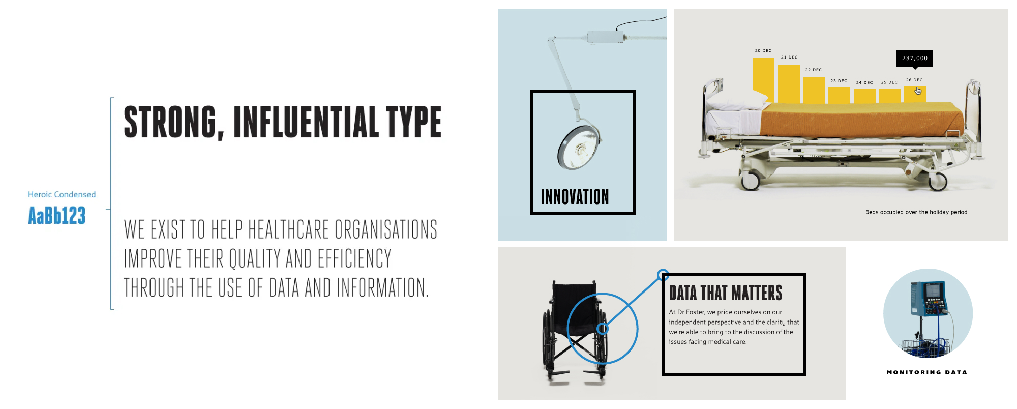
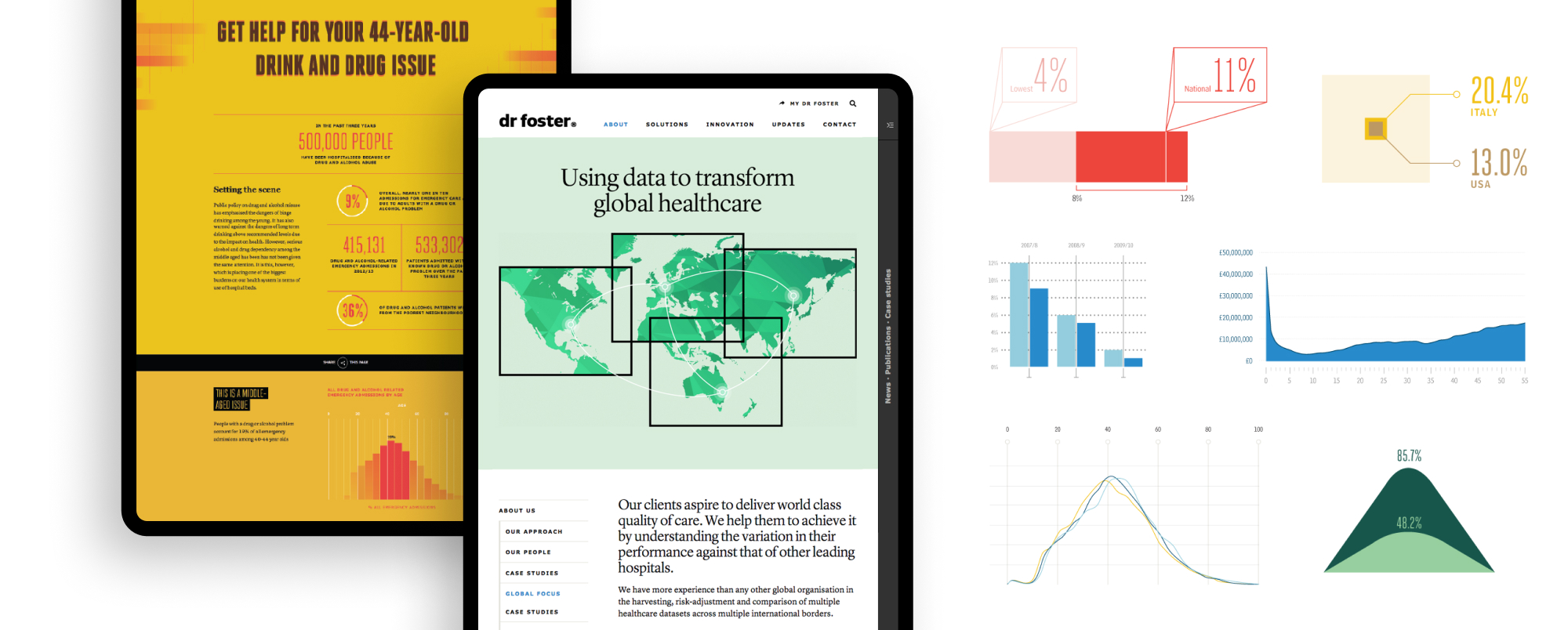
We establishing a bold, typographical brand direction that paid homage to the organisation’s journalistic roots. We provided a design platform that support the creation of the varied data insight that they required.
The stark approach to photography created a distinct personality that resonated with the realistic view of the healthcare industry Dr Foster wanted to portray. The brand was rolled out across a range of digital and printed applications by our design and development team.