Studiomade were selected to design Beacon, a new digital platform launching this year that lets healthcare organisations measure how they truly perform against global peers, and, just as importantly, act on what they find. The challenge was to design a product experience that turns benchmarking data into shared understanding, confident decision-making and lasting organisational improvement that ultimately improves patient care.
The challenge
Healthcare leaders rarely struggle for data. The real challenge is to decide what is worth acting on, how to action it and how to sustain it. In discussions with Hunter we found the same recurring barriers across every C-suite role (CEO, CMO and CFO): a different read of the same numbers, uncertainty about whether weak performance was real or a misalignment in how similar organisations compare and improvement that faded once other priorities were taken on.
Beacon needed to:
- Provide a transparent and trustworthy read on organisational performance
- Help teams reach a single, shared understanding of what their data is saying
- Highlight key opportunities, helping leaders to know where to focus
- Turn insight into coordinated action rather than another report
- Help organisations sustain improvement through peers, programmes and tracking.
Our approach
We tackled the project with evidence-led design thinking, beginning with audit and strategy. Working with the Beacon product team to set out the personas and core use cases, we extracted the real goals and pain points behind each role, defined the user tiers, and established the brief around shared understanding, networking and action.
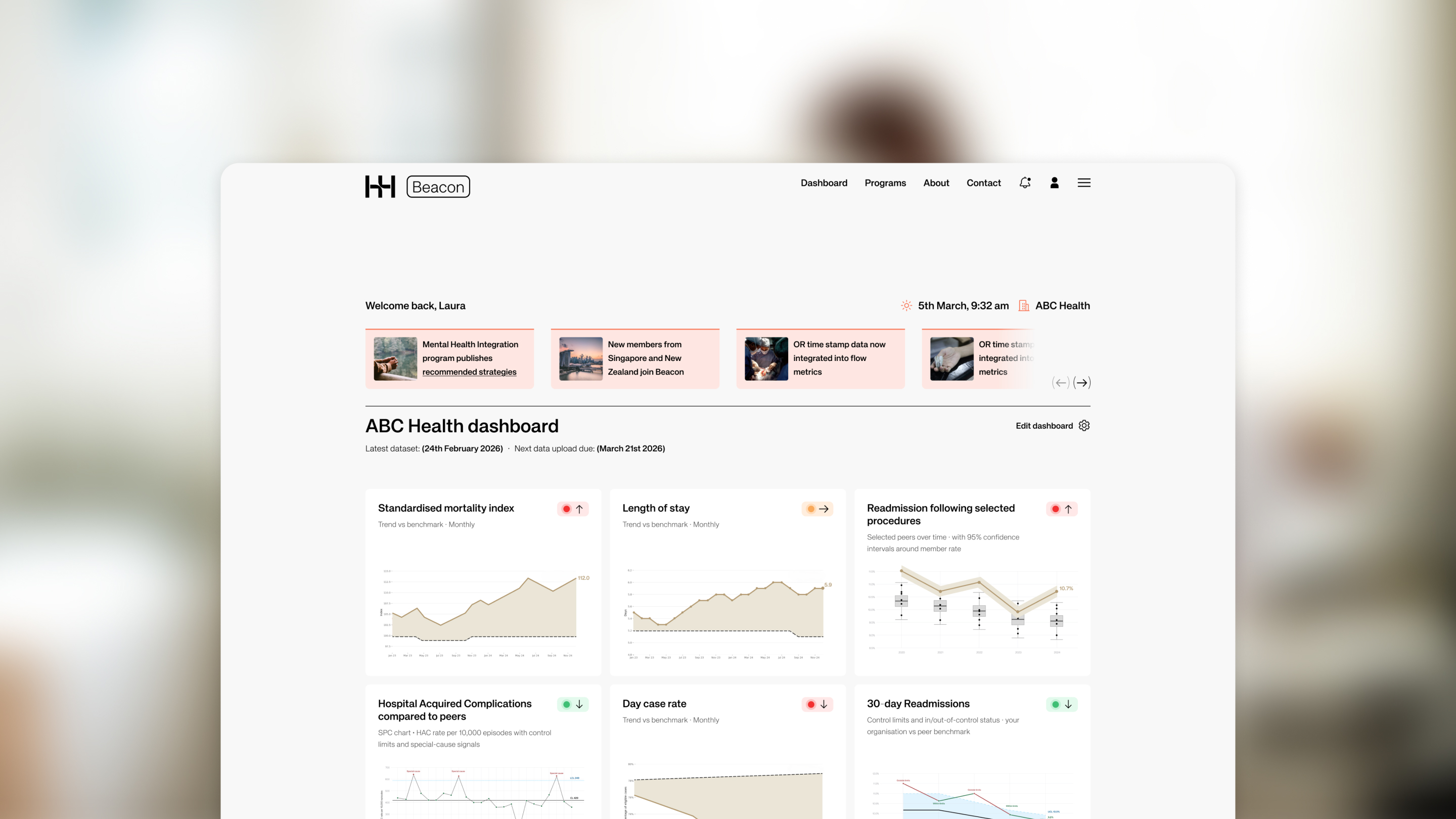
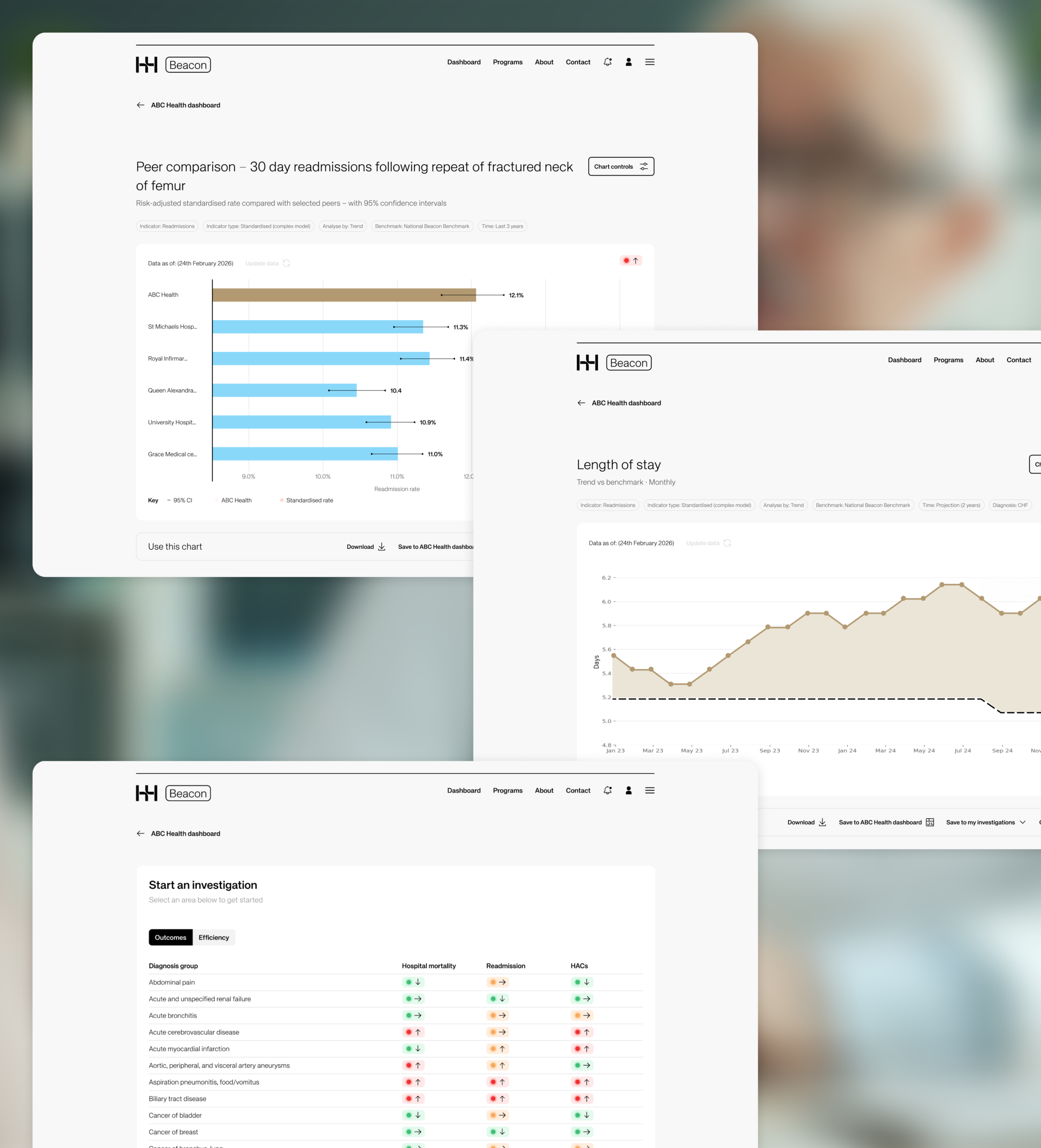
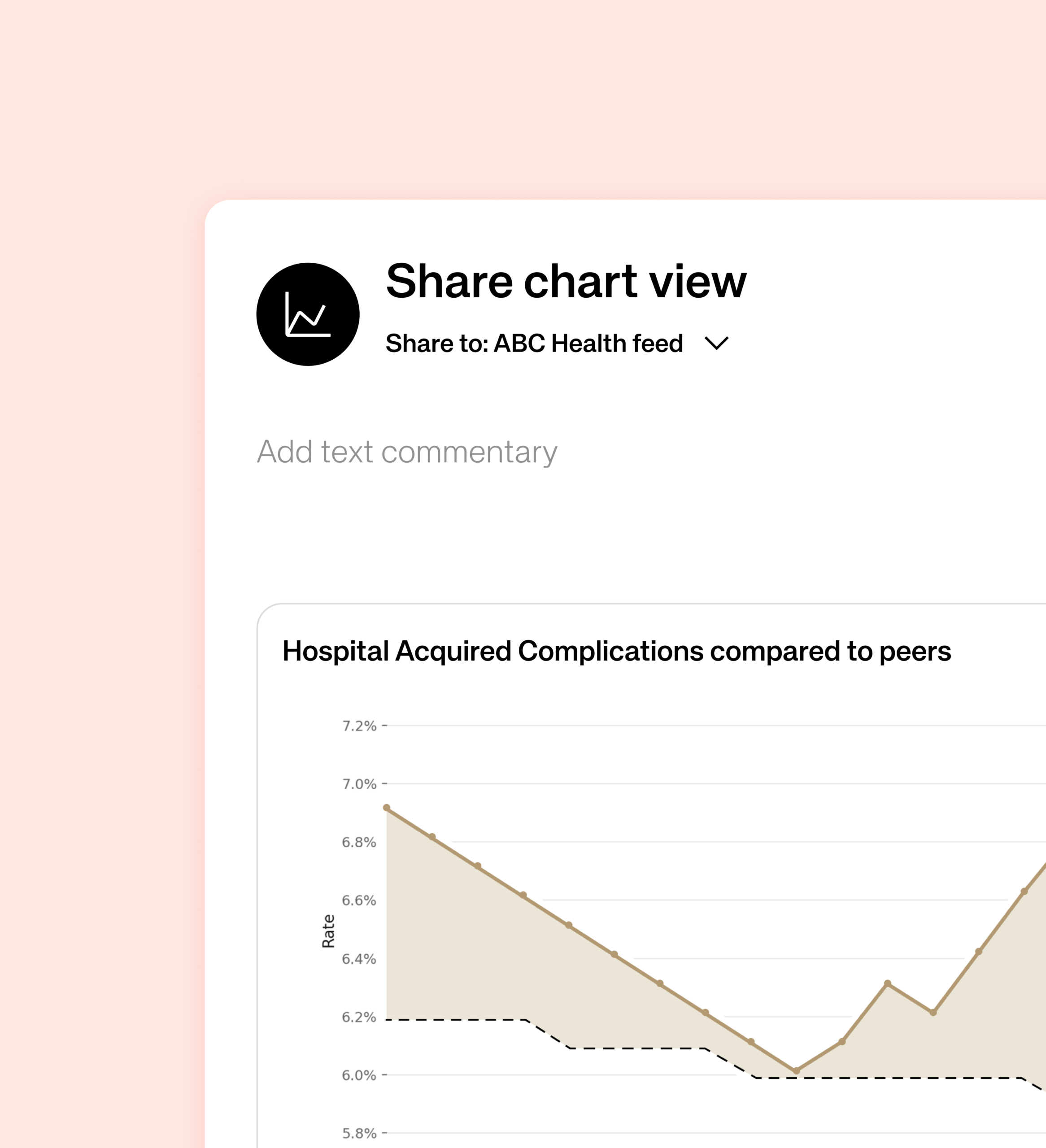
From there we moved into UX and information architecture, shaping the user journeys that mattered most: building an organisation dashboard, investigating an opportunity by drilling down from a headline metric to its underlying drivers, defining peer groups, and sharing a chart with colleagues. We designed Beacon’s data language around SPC charts with control limits, peer comparisons and clear trend signals. Our UI and prototyping phase then brought the direction to life as a quiet, consistent visual design system and an interactive prototype of the core flow, with ongoing feedback loops keeping every decision balanced against user needs, clinical credibility and technical feasibility. Everything is cleanly displayed, reducing visual noise and citing Beacon as a functional tool.
That direction is now in early development stages. We are validating the flows and the data narratives with real users, refining the points where meaning, navigation or trust break down before the product continues to be built at scale.
The outcome
The Studiomade team delivered a designed product experience and UI design library for Beacon, using the existing Hunter Healthcare brand style as a starting point and extending it into a clearer digital product framework.
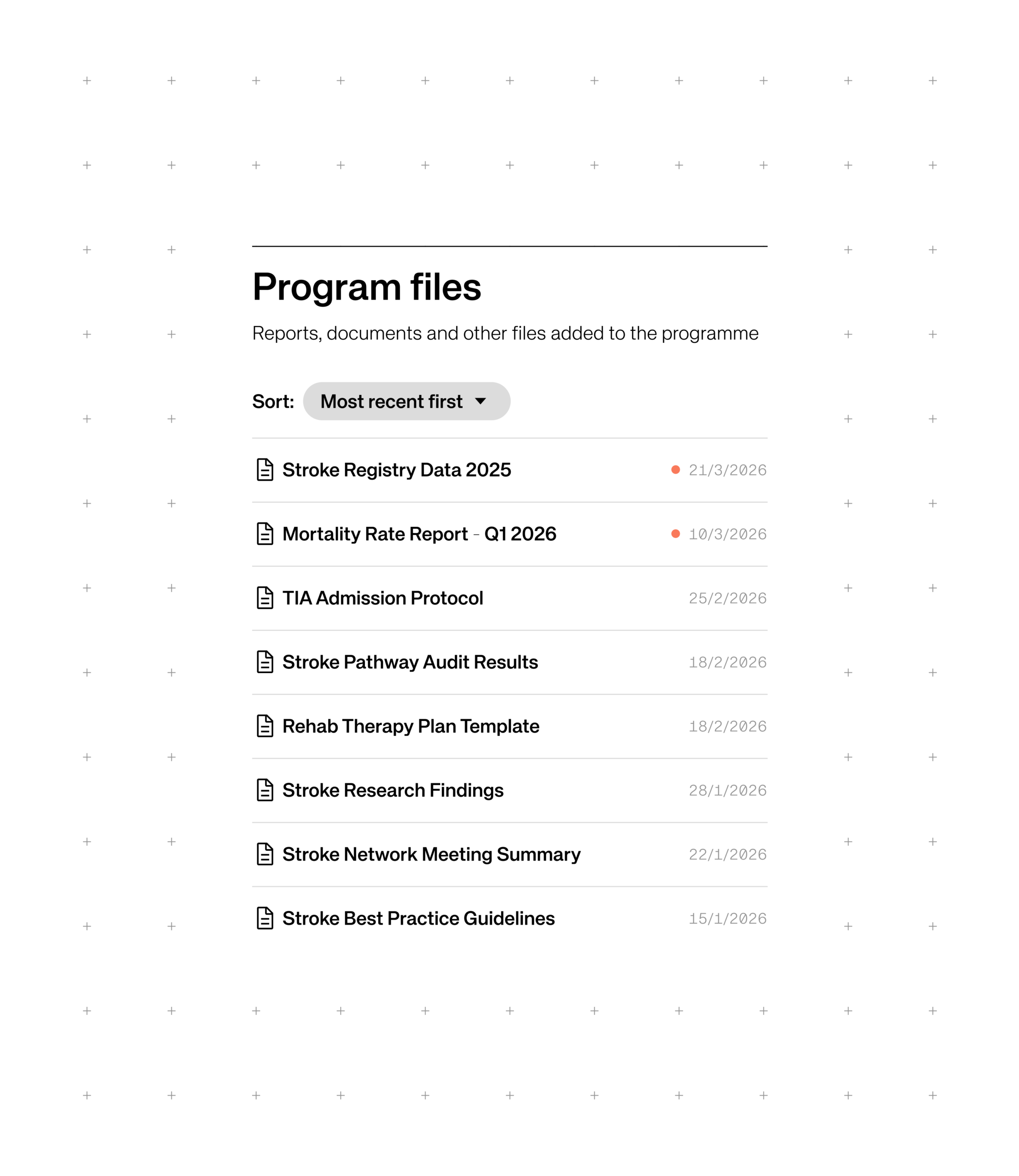
The prototype was shaped around three connected ideas. First, members can benchmark with confidence against global peers, using standardised models, clear caveats and the ability to move from a headline metric into the drivers behind it. Second, they can compare and connect, finding organisations performing well on the measures that matter to them and learning how progress was achieved through member pages, peer comparison and in-organisation sharing. Third, they can join funded, multi-year improvement programmes, such as High Value Stroke Care, where members pool data, research and implementation around a single topic, supported by shared analyses, an activity feed and a calendar of events.
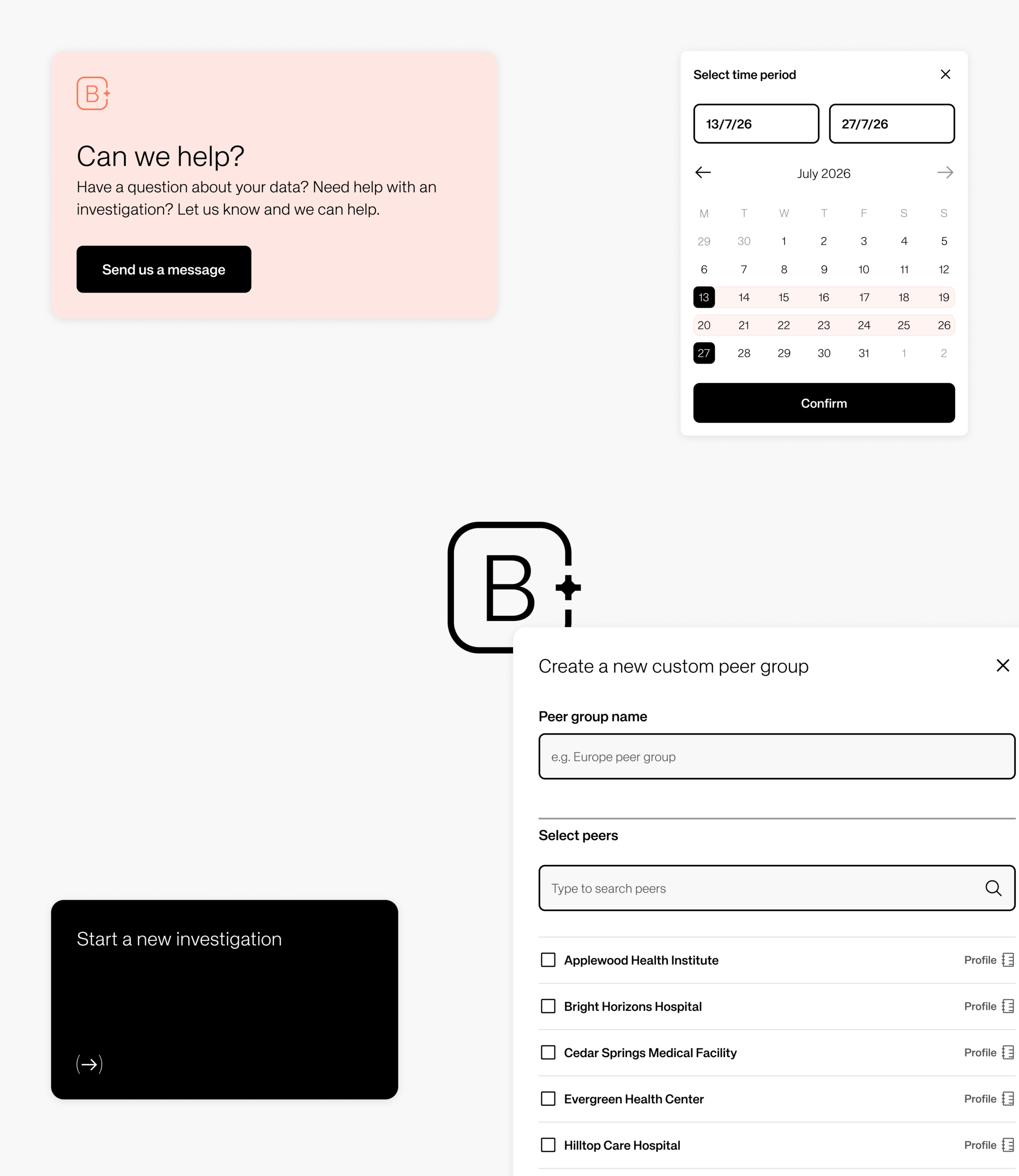
All product designs and the underlying interface were delivered as a structured Figma component library – a system that not only enables swift development of Beacon, but can direct future digital product creation across Hunter Healthcare, applying the same validated approach to whatever comes next.
Impact
The result is a benchmarking experience that reads at a glance and earns user’s trust, with a clear route from a single metric through to peer comparison, drill-down and action. Peer connection and funded programmes help improvement stick over time, while a scalable design system and component library provides Hunter Healthcare a foundation both for the product build and for future development.

First DataBank (FDB) partnered with Studiomade to rethink how prescribing guidance is delivered within clinical workflows through their leading clinical decision support solution, OptimiseRx. The challenge was not simply visual redesign, but a fundamental reworking of how critical information appears, behaves, and supports decision-making in real time for the nation’s GPs.
Our team focused on creating an improved user experience for OptimiseRx that balances clinical safety, speed of action, and cognitive load – ensuring guidance is visible, actionable, and trusted without interrupting the prescribing flow.
The challenge
Prescribing environments are complex, with high-pressure systems where even small interruptions can have significant impact and consequences.
FDB needed OptimiseRx to:
- Surface critical safety information at the right moment
- Reduce alert fatigue and message overload
- Support fast, confident decision-making
- Maintain alignment with evolving platform constraints and workflows
- Create a scalable design system for multiple message types and severities
Ultimately, our recommendations and product changes needed to make a meaningful difference to the way clinicians work. The focus was on improving everyday conditions and real scenarios of use, helping clinicians work more efficiently, understand the information presented clearly, and feel greater confidence in the product.
Our approach
We approached this 6-month project with evidence-led design thinking, beginning with a clear idea of where OptimiseRx needed to go: a non-disruptive, integrated experience that fits naturally within clinical workflows.
From there, we moved into deep research and audit. Through one-to-one sessions with GPs, clinicians, and support staff, we surfaced the real challenges people faced day-to-day including alert fatigue, message overload, and interruptions to prescribing flow that eroded trust in the system. This research grounded everything that followed.
With those insights defined, we moved into feature design and flow creation – exploring multiple interaction models including modal interruptions, inline messaging, floating components, and sidebar-based behaviours. Translating these into product prototypes allowed us to test ideas against real prescribing scenarios rather than rely on assumptions alone.
Our UI/UX prototyping phase brought the most promising direction to life, with refined hierarchy, content tone, and interaction patterns built around the sidebar-first model that had emerged as most preferred from our research. We undertook two formal phases of user testing with GPs, clinicians, and support staff. Round one compared the core interaction models, generating findings that drove a decisive shift in design direction. A focused iteration phase followed before a second round of testing validated the solution in realistic prescribing scenarios.
Throughout the project ongoing feedback loops with clinical experts and FDB stakeholders ensured every decision balanced user needs, patient safety, and technical feasibility culminating in a final proposition delivery that gave FDB a comprehensive, validated vision ready for development.
The outcome
We delivered a comprehensive and validated direction to how the next generation of OptimiseRx as a product experience could both look and function. We did this by creating a scalable design system for in-solution messages, introducing standardised components across safety warnings, best-practice guidance, cost-saving suggestions, and alternative treatments. These UI and UX changes were underpinned by a sidebar-first interaction model that supports continuous workflow, alongside a clear, priority-based visual language to help users quickly assess message importance and act with confidence. The system also integrates direct actions such as accept, reject, modify, and order tests, transforming messages from passive alerts into actionable decision-support tools for prescribers.
All design components and the UI/UX approach developed throughout the project were shared as a Figma library enabling swift development as well as a system that would direct further digital tool creation within the organisation enabling the same validated approach to be applied to future product creation.
Impact
- An improved product experience that reduces disruption within the workflow
- Improved clarity and usability of prescribing guidance for GPs
- Increased confidence in acting on guidance and recommendations
- A scalable design foundation for future FDB products
An evolved OptimiseRx is now being developed for rollout and serves as a benchmark for how decision support can be delivered across FDB’s wider product portfolio.
Overview
City & Guilds has long been recognised for its trusted qualifications and strong relationships with training centres and employers. Recent shifts in the skills landscape, including renewed investment in training, growing demand for trade certifications and rising learner expectations, highlighted a clear opportunity for the organisation to rethink how it supports people throughout their career journeys.
We partnered with City & Guilds to shape a new proposition that brings the organisation closer to learners in a more direct and meaningful way. This work builds on their established strengths while opening up new avenues for guidance, progression and long-term learner support.
Shaping a direction for the product
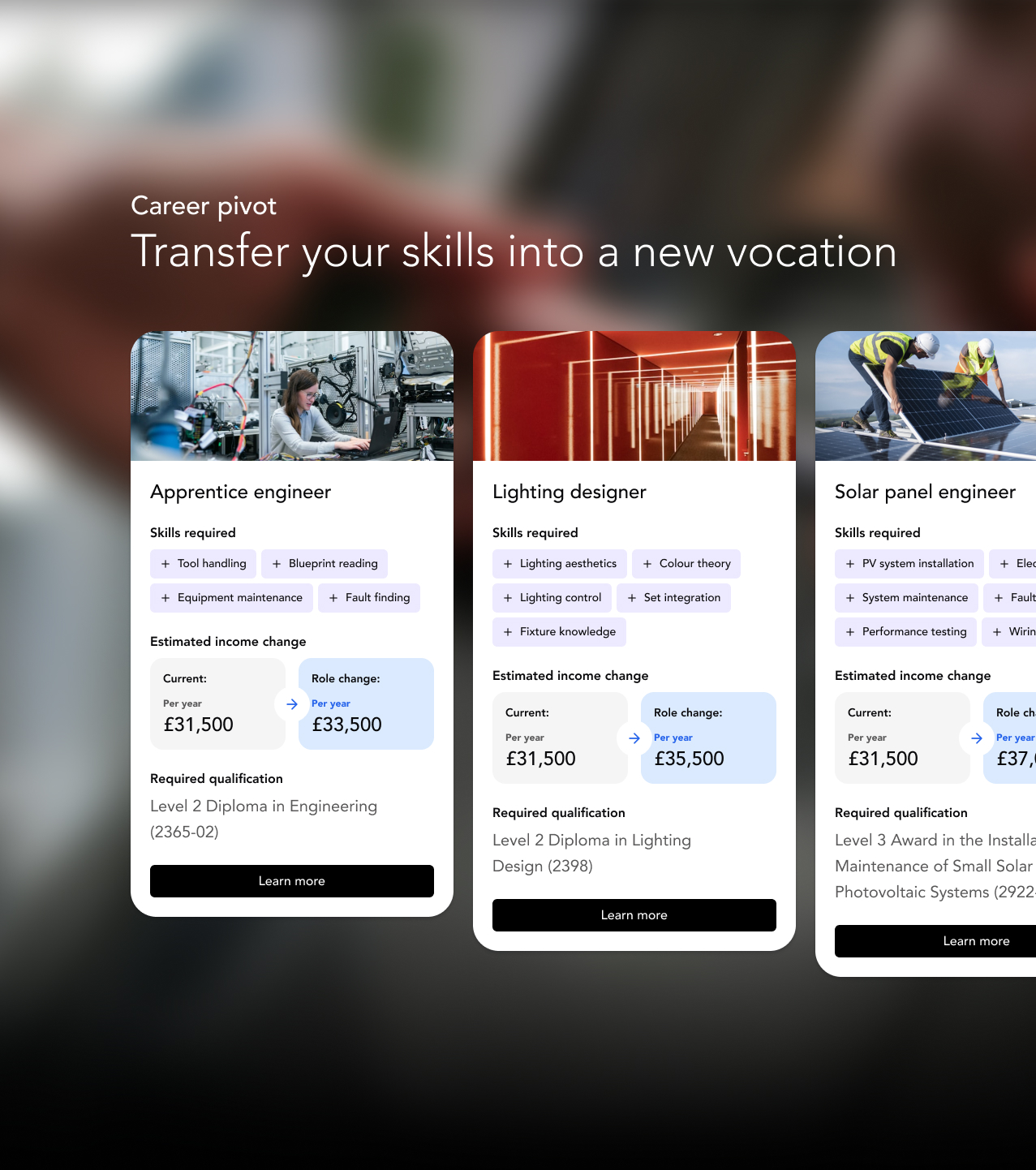
Through three project phases, we worked closely with City & Guilds to consolidate existing research, test early concept directions and refine the proposition into a clear, evidence-backed prototype. This work established a confident direction for what the experience should be called, why it matters, how the product should function, feel and grow.
Designing for real learner needs
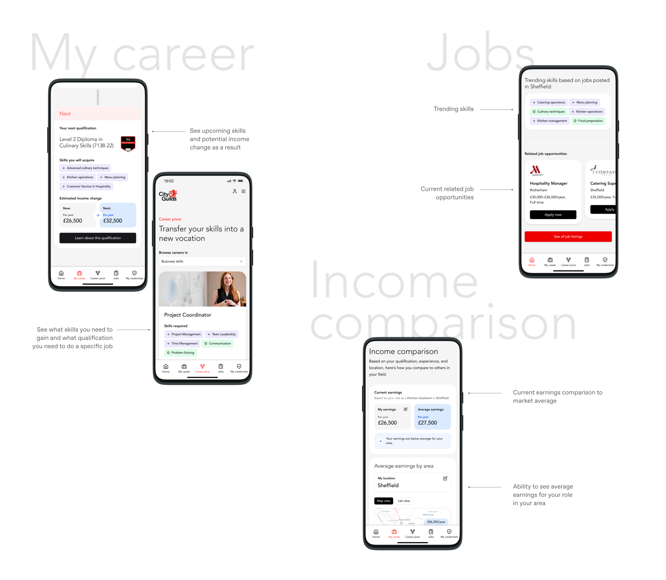
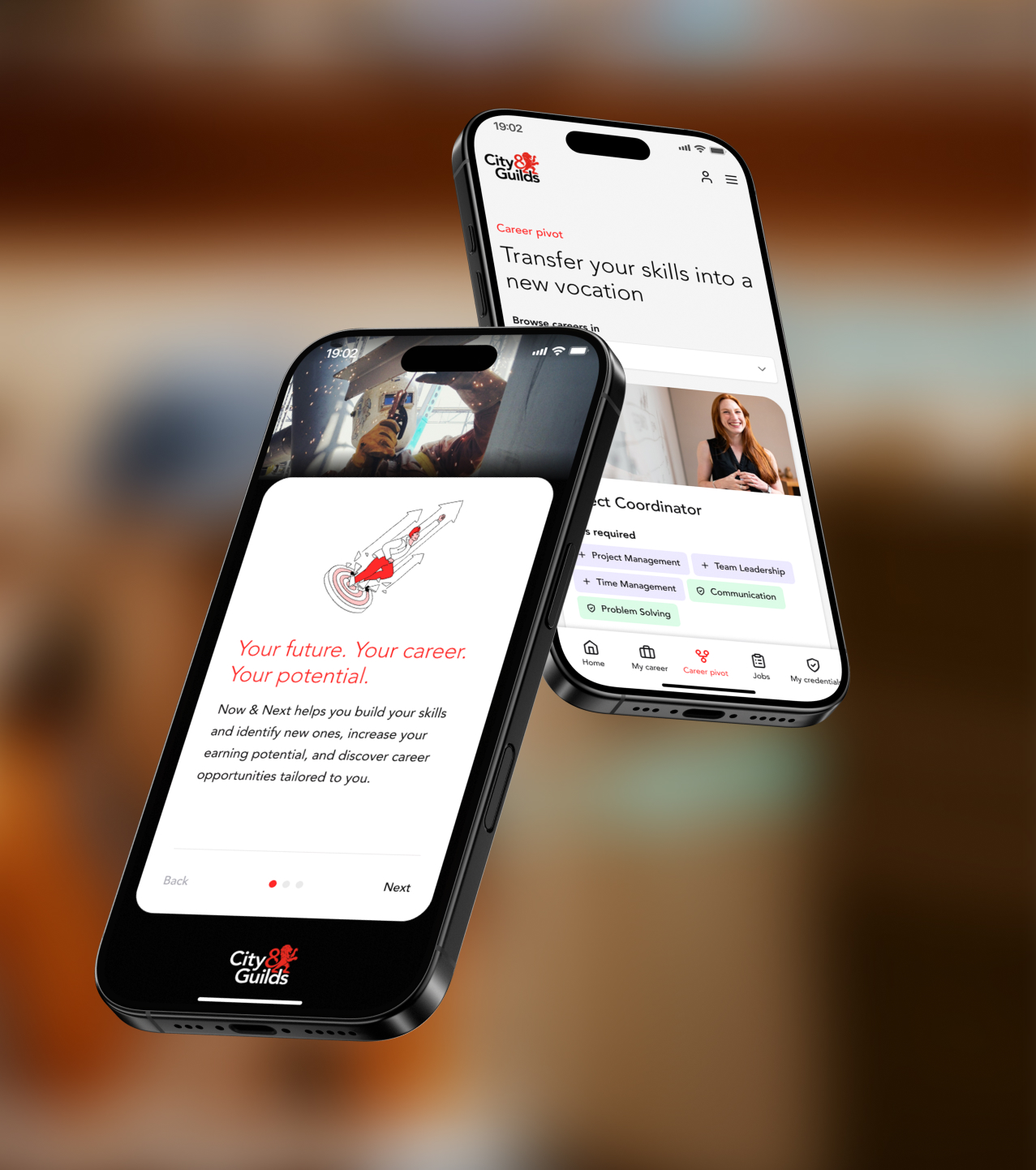
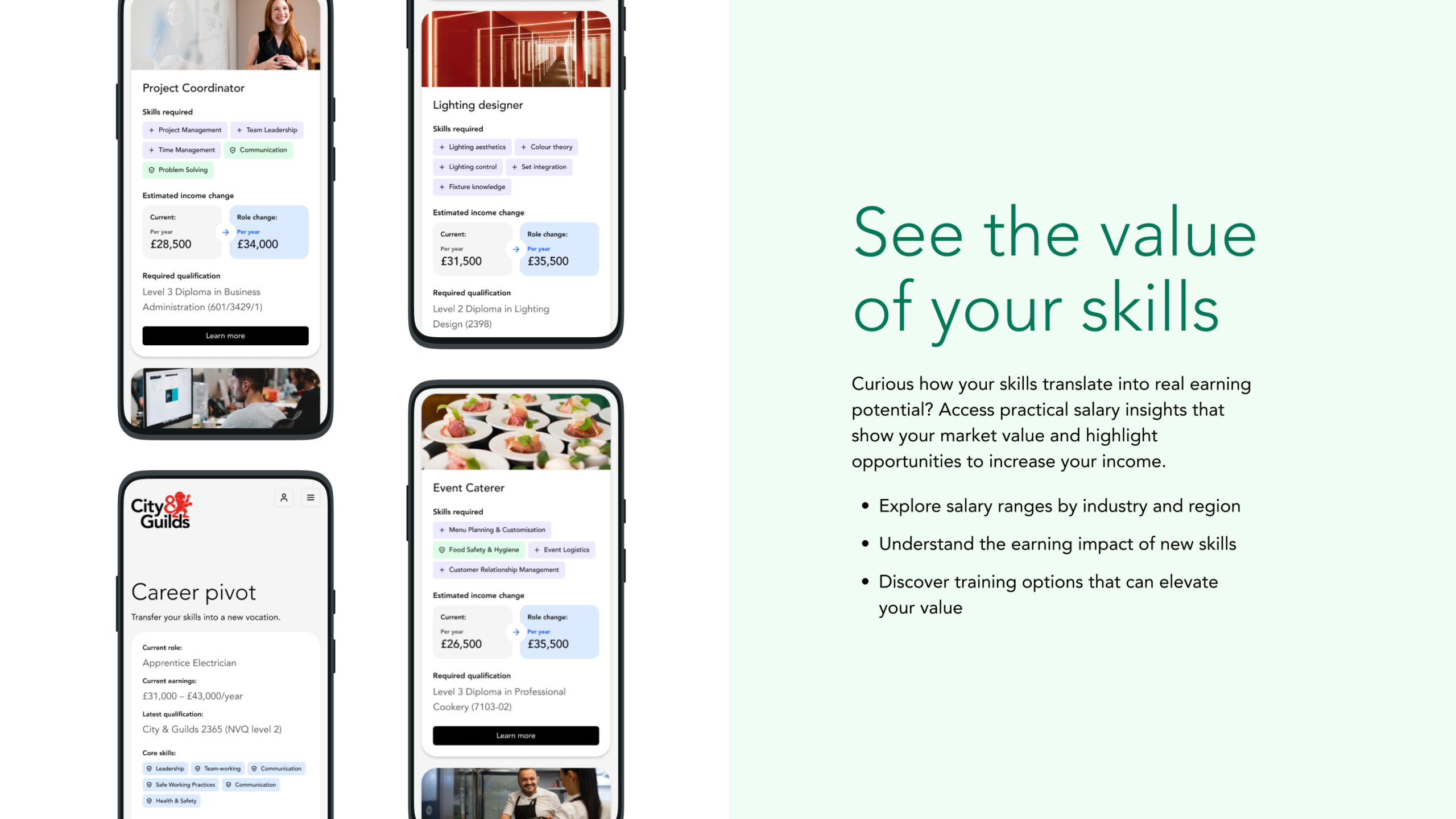
We evolved the experience across three key qualification and career segments. We built content and user flows around skills, earnings insights, job relevance and personalised recommendations. The resulting prototype helps learners understand their strengths, compare income potential, explore job roles and identify the qualifications that can move them forward.
Testing and feedback
User testing showed strong engagement with core features such as personalised job listings, skills mapping and income comparison, which learners saw as directly relevant to their real-world decisions. Several spoke about how the platform helped them feel a sense of progress, with one noting, “I like how you can stack your qualifications. It makes you more proud of yourself.” Others highlighted the importance of earnings insight when making career choices: “everyone wants to know how much money they’re going to earn.”
These insights shaped the final refinements to the interface, content and positioning, ensuring the proposition stayed closely aligned with what learners find motivating and genuinely useful.
Commercial decision-making
As a business, undertaking any new initiative requires sound reasoning and modelling. We helped City and Guilds define what realistic commercial outcomes could be for the proposition. In doing this, our team held interview sessions with potential commercial and brand partners to help us better understand their motivations for involvement, what success could like through their eyes and, ultimately, how the proposition should be best positioned to grow. Similar to other phases of the project, all our findings and recommendations were refined and presented in a report, shared with the board.
A foundation for growth
The final deliverables give City & Guilds a confident sense of direction, a story that resonates, and a clear set of practical next steps across data, content, technology and phased launch planning. This proposition now sits at the heart of their learner growth strategy, ready to be developed and invested in as it moves forward.

Overview
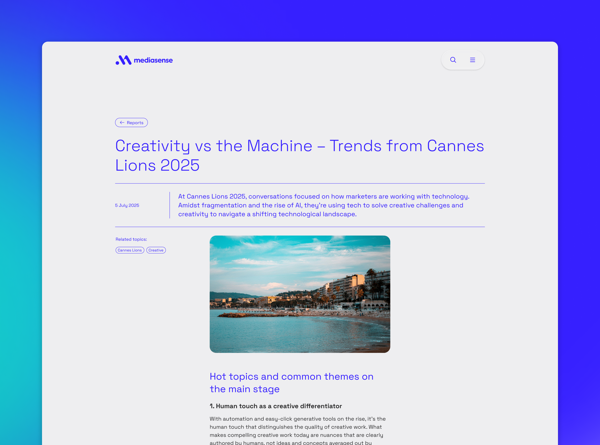
mediasense has been on a period of significant transformation and growth. Following their acquisition by PwC and the subsequent purchase of R3 (adding more than 50 additional specialists to the team) the business needed a website that reflected its expanded scale, breadth of services and deep expertise. We partnered with mediasense to translate a new brand expression (created by The Yard Creative) into a compelling and scalable digital experience.
Having worked with mediasense for many years, we brought a clear understanding of the organisation and its direction of growth to this project. Through focused, collaborative sessions we aligned on what was most important to project success and shaped the website and design system around specific commercial needs and positioning. This approach allowed us to deliver a phased programme of work, with phase one now live and laying strong foundations for phase two to deepen product narratives and tell more of the mediasense story.
Challenges
When creating the website, we needed to solve some important challenges. It needed to reflect mediasense’s new scale and confidence following major acquisitions, while also bringing The Yard Creative’s refreshed brand to life in a clear and consistent digital presence. At the same time, it was important to simplify the offer so that varied audiences could quickly understand the service range, strengths and what set them apart. To achieve this, we planned a launch that prioritised getting to market quickly with a solid first phase, and creating space for richer, more layered storytelling in the phases of work that follow.
Our approach
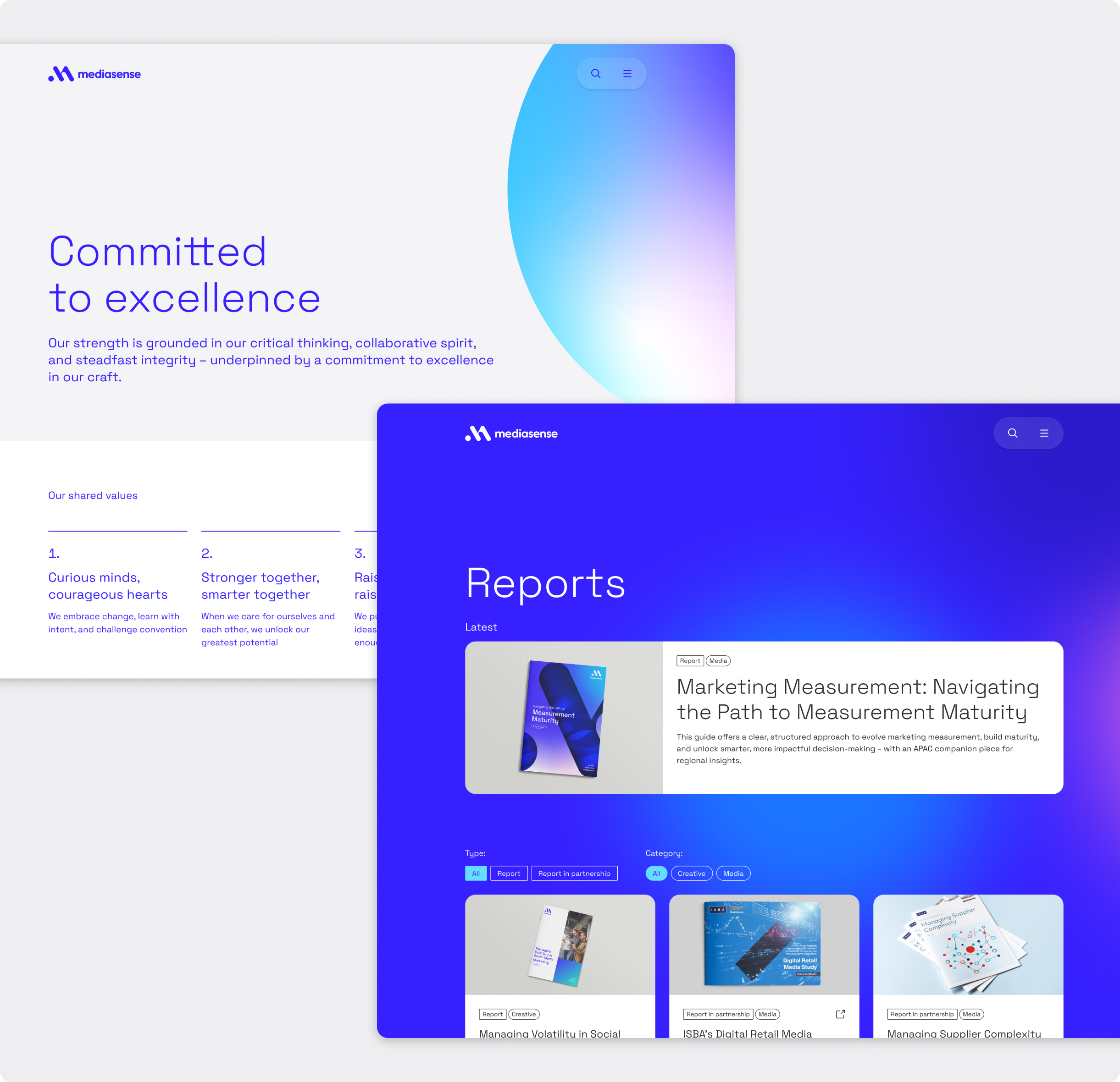
We worked closely with the mediasense team to craft a clear audience-led digital structure that makes it easy for users to see who mediasense are, what they do, and the impact they deliver. Clear service overviews and signposting help visitors find relevant content quickly.
We translated The Yard Creative’s brand work into a responsive digital system, designed to perform as well as it looks. We built out a reusable pattern library grounded in clear design principles and flexible components that can scale as the website grows. Motion and interaction were applied with intent, enhancing clarity and reinforcing the brand experience without adding noise.
What we delivered (in phase one)
- A website that communicates mediasense’s scale and proposition
- A modular design library for efficient content creation
- Editorial models to support ongoing content creation
- Guidance to help internal teams maintain content and design quality as the website grows
Phase one set the foundation: clear navigation, modular design, and scalable structure. Phase two will build on this with deeper product messaging, richer case studies and expanded storytelling.
Together with mediasense and The Yard Creative, we’ve created a website that will continue to grow with the brand and speaks confidently to a global market.
The Challenge
There are around ten million voluntary caregivers in the UK, looking after a relative or friend in their home, and it’s increasing by thousands every week. There is a huge lack of practical and emotional support for them, and many feel stressed and alone. Often, due to a fragile social care system, they have no choice but to give their time and energy to care for someone who can no longer look after themselves, significantly impacting their own lives.
Carers often take on practical care (such as getting the person dressed or giving medication) as well as emotional, household and administrative tasks. Most are aged 45 to 65, looking after someone over 65. They have to develop an extensive and changing skill set.
They need help understanding tasks such as feeding, washing, grooming and bathroom functions but this is often not quick or easy to find, especially when dealing with an urgent care situation. The care sector is decentralised and information provided by charities and other organisations is fragmented, not personalised and insufficient to cover all carers’ needs.
This leaves them without guidance and support, and adds to the stress they’re under. For some people, this stress becomes a health risk, both for themselves and the person they care for.
The vision
Dr Caroline Green saw a need for a digital product that gives carers the fast and easy support they can’t get from a decentralised system. Her research showed that carers want reliable, highly accessible round-the-clock information that is personalised, practical, easy to use, includes emotional support – and that they can trust. Her vision is to give carers the confidence to handle caring tasks, whenever and wherever they need help.
Dr Green is a post-doctoral fellow at King’s College London’s National Institute for Health & Care Research as well as Research Fellow at Reuben College, University of Oxford. Her work focuses on AI and its potential to support older people and family carers, as well as the human rights and ethical implications of AI on caregiving.
She wanted this new product concept to connect carers with advice and knowledge from trusted organisations, use AI to provide tailored answers, and help to fill the gap in out-of-hours support. Dedicate will help carers feel calm and hopeful about their current situation, give them help and support in the moment, and show that there are people and organisations who can help them further.
Dr Green received part funding through UKRI’s Healthy Ageing Accelerator and engaged with Studiomade to design and build the digital product for beta launch based on our expertise within healthcare, and new venture creation.
What we did
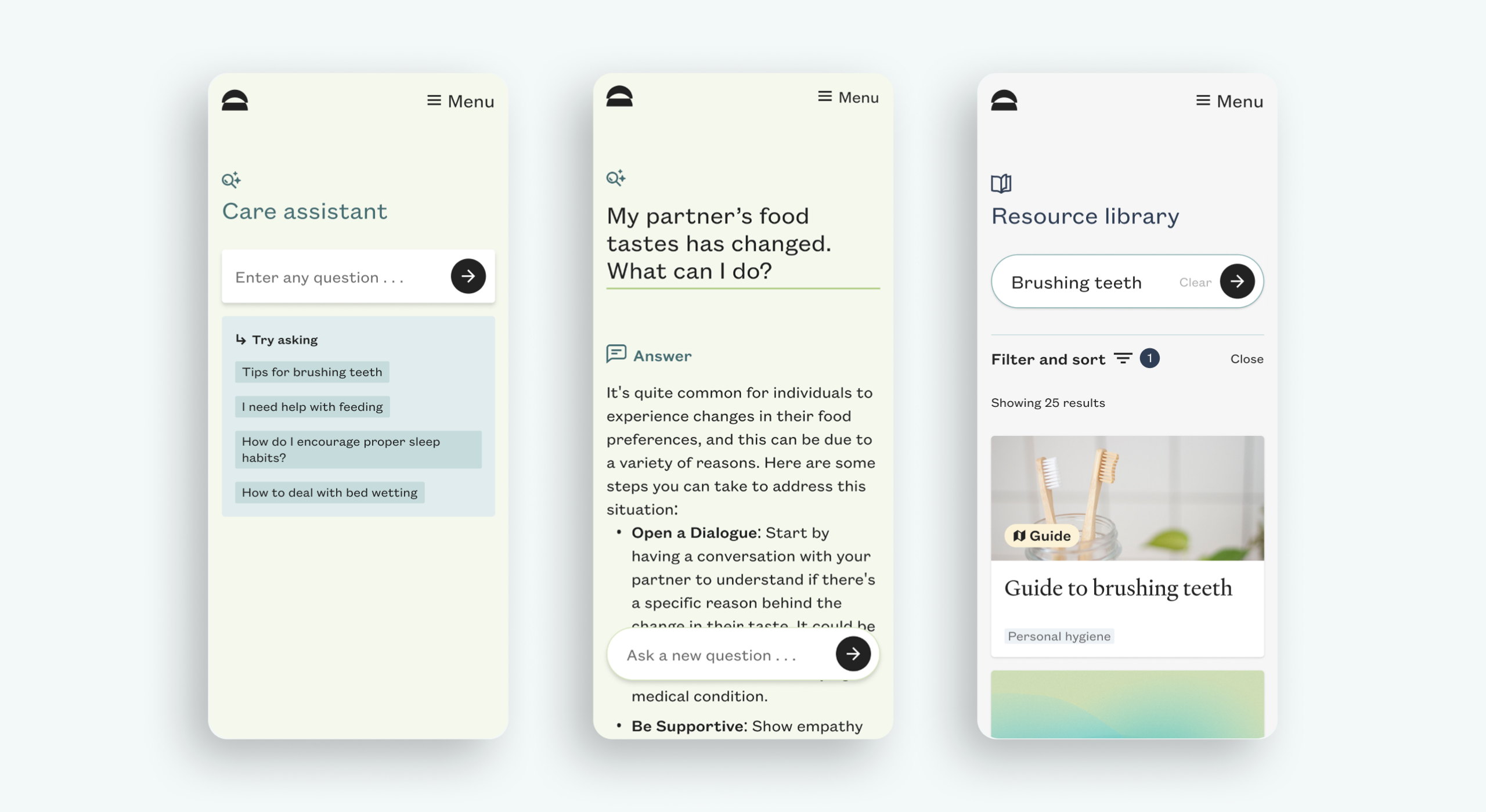
We created a product MVP for an AI-powered 24/7 virtual care partner platform. We were conscious throughout the design and build process of two primary considerations. One was flexible and dynamic content, using an AI chatbot to provide carers immediate help and guidance that is as practical and personalised to them as possible. The second was designing an empathetic, safe space where users arrive and instantly feel reassured, understood and supported.

UI and UX
Our design team’s main objectives were that the digital experience feels like a calm and safe place, where it’s easy to get help with specific problems.
We esthablished a brand approach for this venture and product that used warm and calming colours and gradients, to evoke the core values of care and empathy. Subtly moving shapes in orange, pink and yellow suggest the feeling of a beautiful sunset, transitioning to a calming, complementary palette.
We knew from Dr Green that some users were sceptical about an AI chatbot experience and that if this was the main focus it would put them off. We designed the UI and product flow so that the qeury did not feel like ‘chat bot and robotic interaction’. Principally, it’s easy to search and view results from across the Dedicate content library.
The technology
We built the product utilising React deployed on Netlify, leveraging Contentful as a headless CMS that allows the Dedicate team to create, manage and distribute content across multiple devices and channels. Search is powered through an Algolia whilst data is housed in Google Firebase with analytics by Google Analytics.
AI integration
We integrated AI within this product in a seamless manner utilising Botsonic. Our main consideration was to ensure that our AI model only utilised content specifically vetted by Dedicate. Our system (Chat GPT 4) learns only from content we’ve trained it on, sourced from the Dedicate team and their content partners.
Within the user experience, we have included suggestions for prompts and other key language that supports the user. This is to show carers that rather than just typing in a general term such as ‘better sleep’, as in a search bar, they can ask questions about their own situation (e.g. ‘How can I help my father with demential to sleep better?) and get personalised answers.
Specialist content
Specialist, authoritative content for Dedicate has been created by expert healthcare providers including Sage House dementia support services, Dr Kellyn Lee from the Dementia Care Hub, and video content from HCI Digital, a producer of health and social care videos. As the knowledge base expands and the team see which topics matter most to users, they will create further content with care professionals and researchers.
Accessibility
Accessibility was a primary consideration and is why we have been rostered by the Design Age Institute as a specialist creative agency. For Dedicate, we have utilised Chakra UI as a basis for our front-end system as it’s built with accessibility in mind. All authored components are compliant with WAI-ARIA accessible navigation standards (a set of HTML attributes that can be applied to elements to improve accessibility).
The outcome
We created an empathetic brand approach for Dedicate, and designed and built a Beta MVP that has been launched to a community of first adopters. This testing phase will give Dr Green and her team an audience base, and show them where carers most need support and what they find informative and useful.
As data on usage patterns and content engagement builds up, the team will use this to iterate on the product and build the case for further expansion, refinement and product building. With an expanded knowledge base, and demonstration that Dedicate can continue to evolve and build traction across multiple business models including individual carers and care organisation support we hope that Dedicate as a University of Oxford spin-out company can secure VC funding to help it scale.
Unit 29 Ventures launched its first enterprise in 2020: The Cove, a luxury florist and concept store in Royal Tunbridge Wells. It has built up a loyal and discerning customer base of people with a taste for premium products made by local independent makers and distillers.
After two years, investor Phil Reid – who is the founder and Strategic Director of Studiomade – decided it was time for Unit 29’s next venture: a unique, small batch rum.

The concept and name
Unit 29 Ventures recognised an opportunity to launch a rum brand centred on sustainable packaging, the concept of reuse, and supporting a sustainability charity.
The vision was for a rum inspired by the ocean, locally made in Kent, and led by its values: distinctive quality in the ingredients and materials, clean efficiency (reduced waste and efficient production methods), and growth and rejuvenation of natural resources (contributing to a cause and enjoying life while doing it).
Based on a love of the sea and surf, and reflecting this new venture and its first step into the drinks industry, we named it Turtle Roll. Before you can line up a wave when surfing, you have to get out past the ones that are breaking all around you. The turtle roll technique helps you get past barriers, jump over hurdles and achieve greatness. Unit 29 hoped to do the same with Turtle Roll Rum – taking beginner steps with an ethically produced rum, hoping to effect positive change in our oceans.

The taste
Unit 29 Ventures and Studiomade worked together to craft the brand story and narrative of Turtle Roll Rum, which in turn helped brief the ingredients and taste. We worked with a talented expert, Callum Giblett, Managing Director at The Custom Spirit Co. He and his team defined different taste directions and, during a rigorous six-month phase of tasting, exploration and user testing, whittled down multiple recipes and ideas into the winning formula.
Turtle Roll Rum has been imagined and produced locally to Tunbridge Wells in Kent. It is distilled with Venezuelan, Dominican and Jamaican sugar cane, using a clean, high-quality and sustainable production process that runs fully on renewable energy. The concept, ingredients and commitment to sustainability all emerged from appreciation for the sea and ocean-side living.
In the final produced recipe, Turtle Roll Rum blends notes of pomegranate, lapsang, vanilla, black cardamom and sea salt with oceanic botanicals samphire and sugar kelp. These intriguing layers of sweet and salt create a rich and smooth flavour profile.
As part of Turtle Roll’s sustainability commitment, 10% of profits are donated to Project Seagrass, a charity working to restore and protect seagrass, a wonder plant that’s crucial to the health of our oceans.

Brand positioning and identity
Turtle Roll Rum is positioned as a challenger, independent brand with a premium feel, priced in line with the small-batch market. We were inspired by product brands that are driven by a mission beyond the product itself; companies with sustainable, ethical values at their core.
Our design director Angelo Iannelli wanted typography with a feeling of the sea so crafted loose, hand-drawn lettering, paired with the Söhne Breitt font as a contemporary counterpart. The illustrations, all hand-drawn by the Studiomade team, emulate typography distorted as if looking through water. The aqua tones and grainy texture of some of the photography were inspired by vintage surf photos e.g. 80s Miami.

Brand messaging
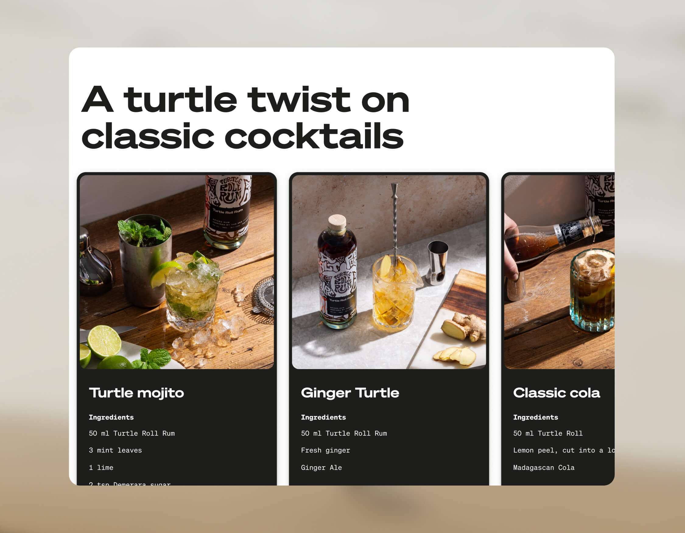
We use language that suits a modern, challenger brand, giving it a distinctive voice, casual rather than polished, yet with a premium feel. We use enticing flavour and ingredients descriptions to appeal to an audience of taste makers who are on top of trends and like to discover new experiences. To keep it relatable, we sprinkle in light-hearted, ocean-inspired phrases, particularly on social media.
Product photography
The images were shot by the wonderful team at Névé Studios. After creating mood boards to drive our creative direction, we decided that product photography should be bright and spacious, playing with light, shadow and interesting angles, and reflecting the fresh ingredients that give Turtle Roll its taste. The images feel realistic rather than glossy e.g. cocktails being made and drinks being poured. This is interspersed with imagery of oceans and waves, evoking the open feeling of the sea.

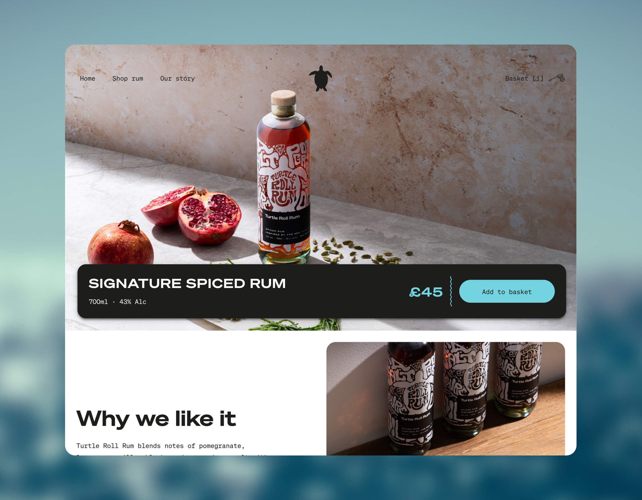
E-commerce
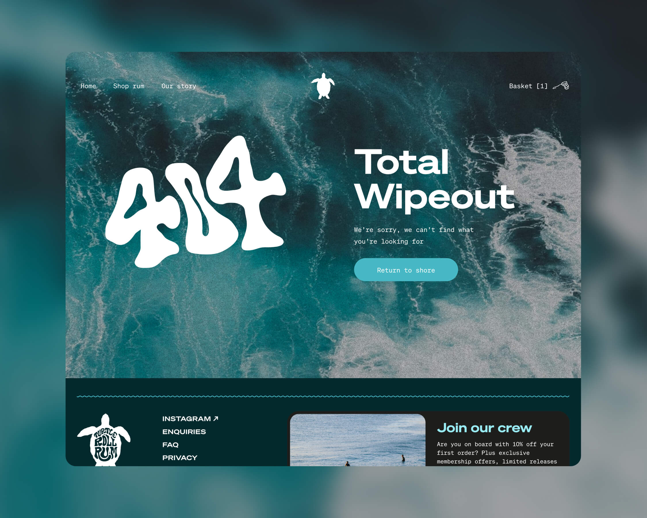
Turtle Roll Rum was conceived to be predominantly sold direct to consumer. This means that the customer experience and how the brand is presented online are paramount. We wanted to best present the personality of Turtle Roll Rum and establish a brand connection with customers, rather than it being a sales push.
To this end, we built a custom e-commerce experience, with every aspect individually designed. We applied the visual identity and brand voice across the website, and created a user journey that includes purchase. We opted for Gatsby hosted on Netlify, for good performance and speed. We integrated Stripe for payments and set up a bespoke webhook to promptly relay order details to our fulfilment company whenever there’s a successful transaction. We added Mailchimp integration for automated emails to complete our loop.
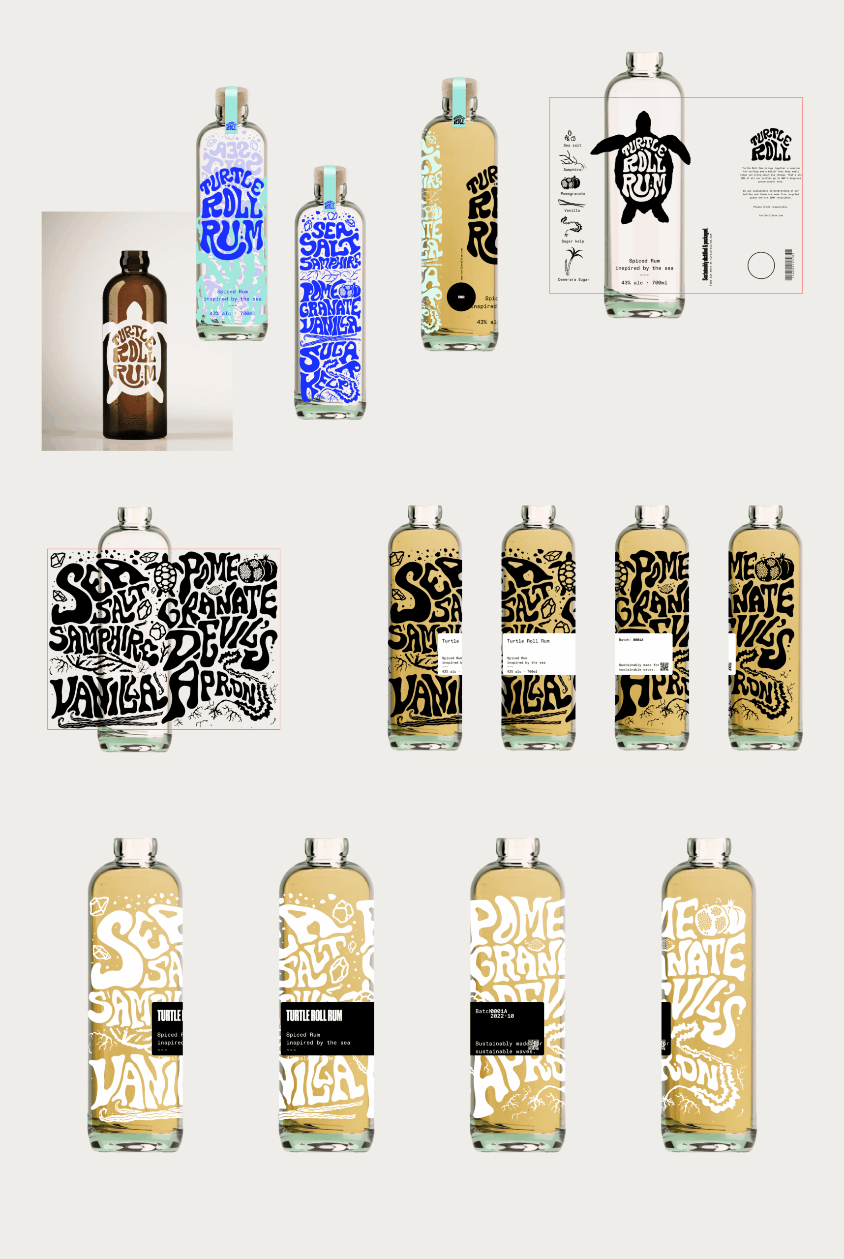
Bottle and packaging
We researched, trialled and tested multiple bottle manufacturers and product variants, to find the most sustainable options possible.
Each bottle is made from 100% recycled glass and screen printed (using sustainable ink), with custom-drawn artwork and lettering that highlights the ingredients. It’s overlaid with a 100% recycled ECF paper label, printed with soy inks and the cork is sealed with a fully compostable, plant-based shrink wrap.
The cork stopper is made with activated charcoal, as this removes the need for additional chemicals and industrial processes. Packaging for shipment is made from bamboo pulp, a more abundant, renewable resource than cardboard.
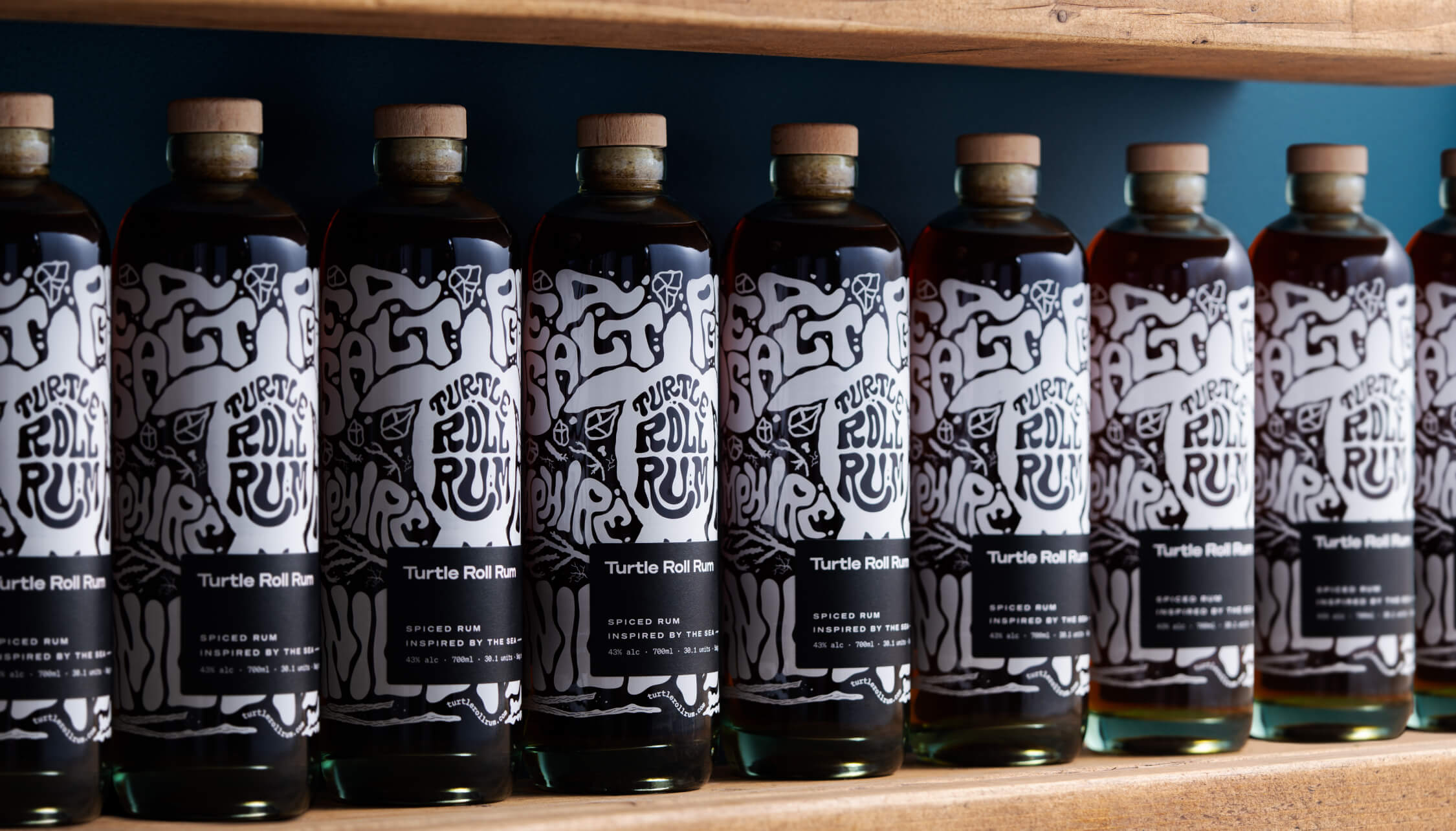
A focus on re-use
After enjoying the rum, we encourage people to reuse the bottle as many times as possible before they put it into recycling. Our intention was to create a product that sparks conversation and brings a bit of fun to kitchens and dining tables when used as a pitcher for water or vase for flowers.

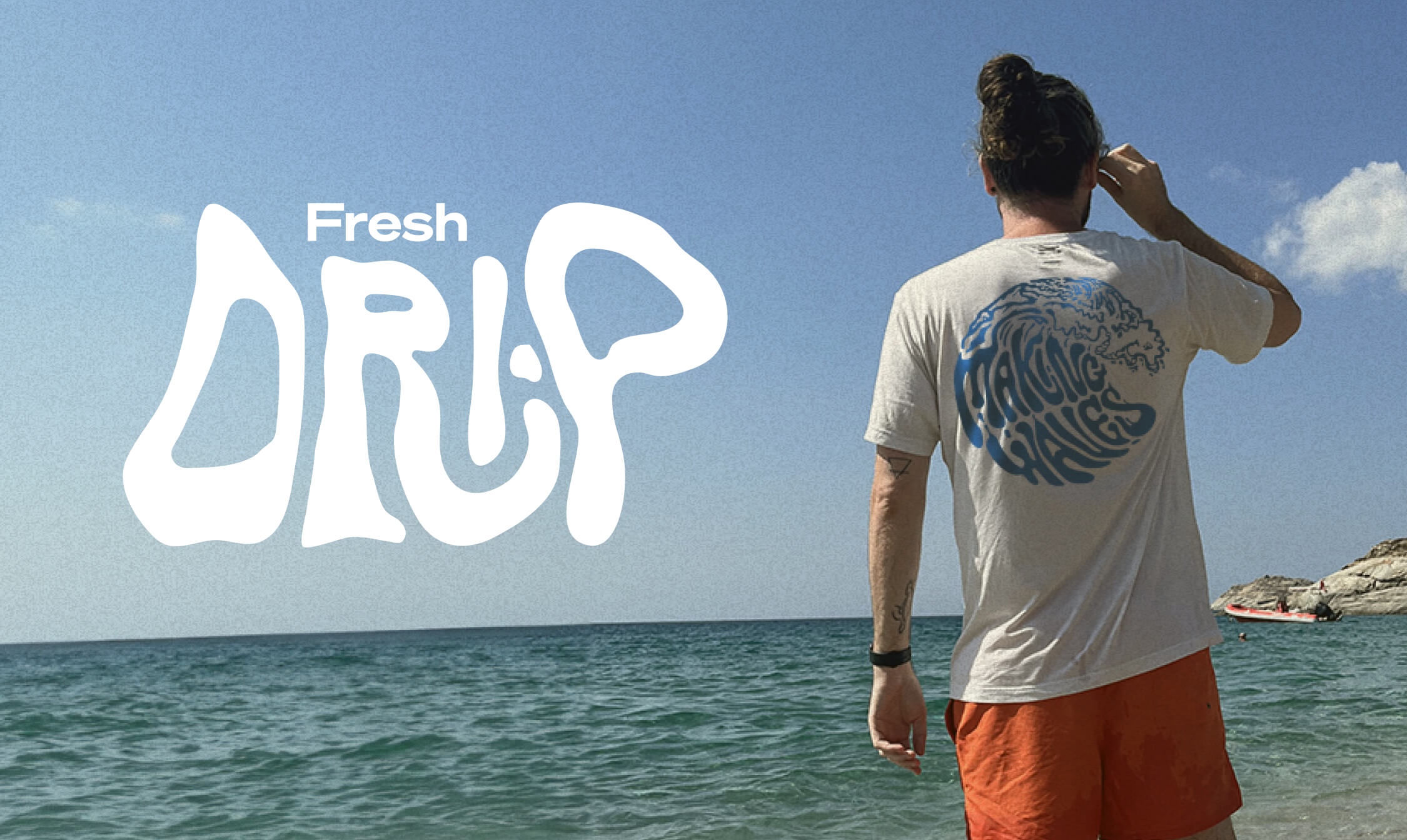
Merchandise
Unit 29 Ventures also wanted branded merchandise so we teamed up with Teemill. We chose them for two reasons. First, their t-shirts and hoodies are made from organic cotton, and they can be returned to be remade into something else once they’re worn out, creating a circular economy, which aligns with Turtle Roll’s value of sustainability. Second, customer purchases are printed and shipped to order, rather than us having to buy and hold stock. From a commercial perspective, as a new venture, this allows us to test users’ buying intent and decide where to focus on growing the range.
The outcome
With commercial strategy and investment from Unit 29 Ventures, and creative, brand and digital activation from Studiomade, we partnered to create a unique, small-batch, premium spiced rum, with sustainability at its heart. The initial limited run of 1,200 is now available at The Cove in Tunbridge Wells, at turtlerollrum.com and proudly stocked at a growing number of bars and restaurants (ideally close to the sea!) in Kent and the South East.
Are you thinking of creating and launching a new product? To discuss how Unit 29 Ventures and/or Studiomade can help you, contact our Founder & Strategic Director, Phil Reid, on phil@studiomade.co
Broadridge sought to enhance the way investors, asset managers, press and industry professionals engage with their annual Investor Trends Report. Traditionally delivered as a static document, the report provides highly valuable insight into investor behaviour, preferences, and market trends with the United States. To maximise its impact, Broadridge partnered with Studiomade to transform this report into an interactive digital tool that allows users to absorb and interrogate data dynamically.
Our teams collaborated together to help conceive, design and visualise a user-friendly, data-rich digital experience that brings the Investor Trends Report to life, not just once a year but for regular engagement and reference. Our proposition empowers users to engage with data in meaningful ways, featuring dynamic visualisations such as interactive charts and graphs that illustrate investor trends over time. Customisable filtering allows users to refine insight based on specific investment sectors, geographies, and investor profiles, while benchmarking tools provide comparative analysis across different demographics and market segments. Personalised insights tailor content recommendations to individual user preferences, ensuring a more relevant experience.
Asset managers, wealth managers, and advisors can now leverage this powerful tool to enable real-time trend identification, helping them uncover shifts, themes, and emerging opportunities. It supports strategic decision-making across product development and business lines while enhancing client engagement through insightful educational content. Additionally, its seamless integration into proprietary datasets enhances internal analytics, ensuring a more data-driven approach to portfolio and business growth.
The intuitive, interactive nature of the tool has driven increased engagement from key audience groups, making complex data more accessible and actionable. Users can now extract insights that directly influence product development and market strategies, leading to better-informed decision-making. By delivering a cutting-edge investor insights experience, Broadridge has strengthened its position as an industry thought-leader and innovator in US investor behaviour analysis.
For more details, visit: Broadridge Investor Trends Report
The DB pensions landscape
There are more than 5,000 defined benefit (DB) pension schemes in the UK (schemes which pay pension benefits based on salary and length of service) with £1.4tn in assets. Around 9.6 million members are relying on them for their expected retirement income. However, private sector DB schemes are in decline and an estimated £400bn worth of trustees and sponsors are seeking full settlement of member benefits by transferring their assets and liabilities.
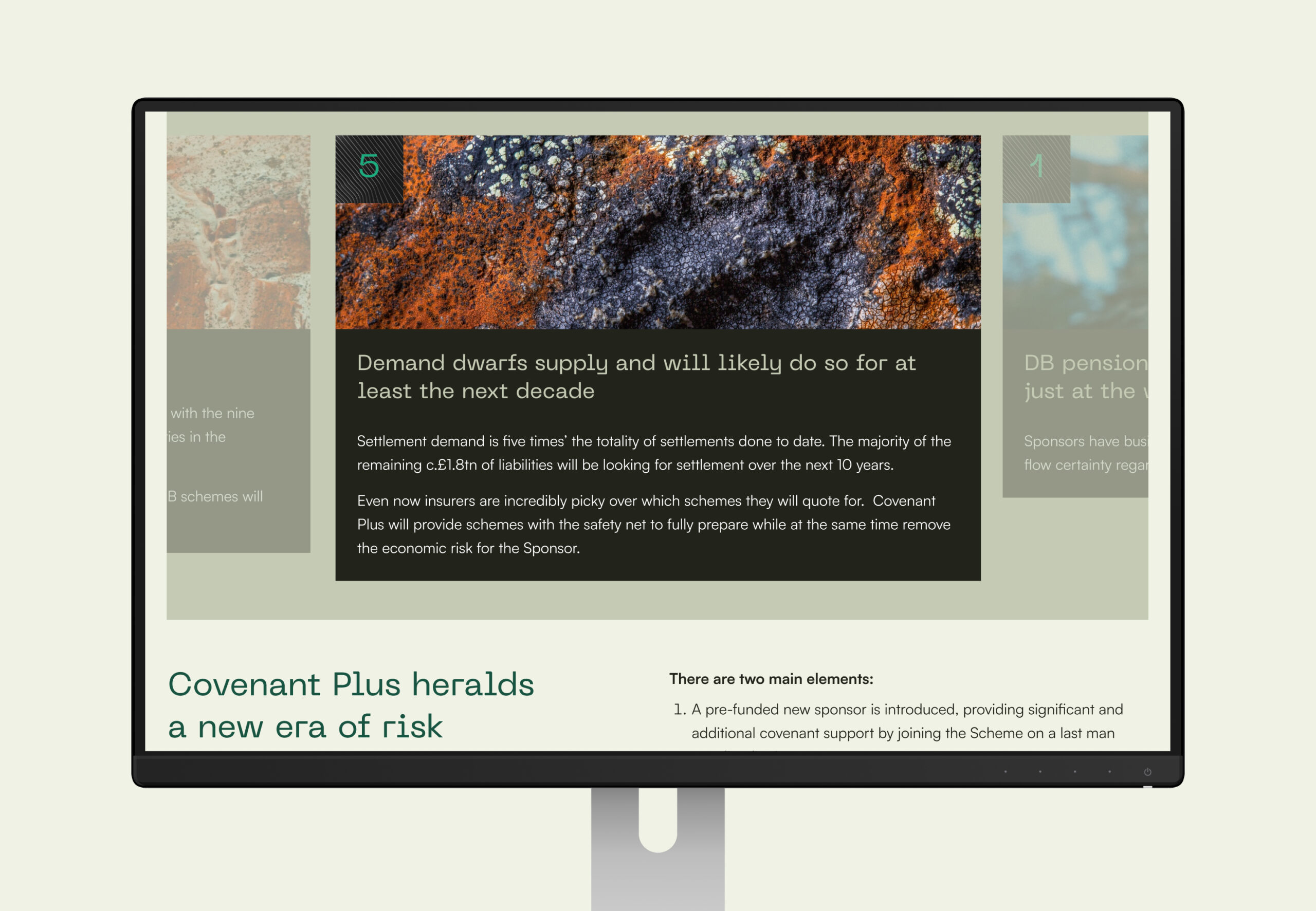
But there are challenges in the marketplace. Demand for settlement is surpassing supply. Sponsors (usually the employer), who may be under financial stress, need enough money to fulfil their pension commitments to employees and are looking to remove their financial risk. Trustees, who oversee pension funds’ management, have to safeguard members’ interests even if it means sponsor insolvency. Stakeholders need strategies to navigate this.
PSF Capital’s solution
PSF Capital has launched a new solution to the market, CovenantPlus. This Capital-Backed Funding Arrangement (CBFA) gives DB schemes access to external capital to help them meet their funding and investment objectives, using an agreed strategy and timeframe. It gives sponsors cash-flow certainty and removes risk. It gives trustees a strong covenant, protection from scheme failure and greater security in protecting member’s pension benefits, supporting their end-game strategy.
Our role
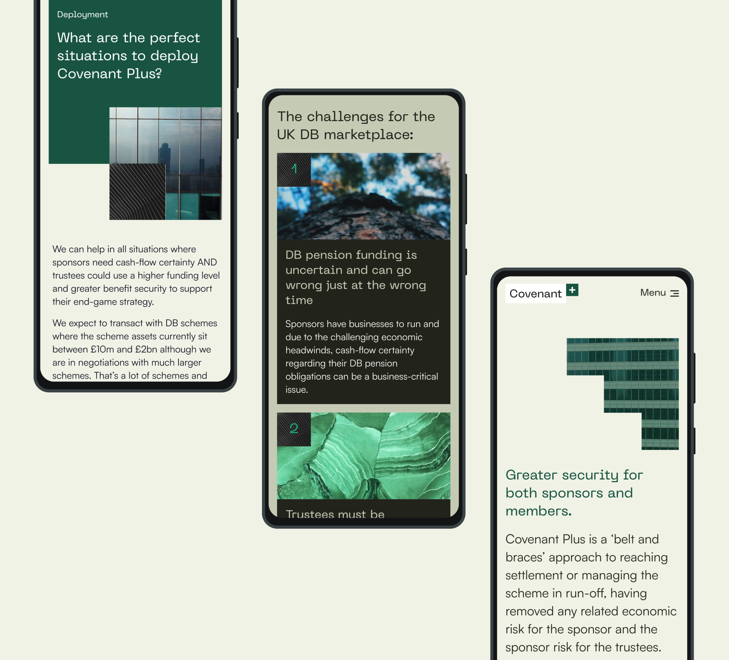
We helped craft and position this new venture including building the brand, establishing a look and feel that best suited the B2B marketplace and crafting a digital presence that would talk to all stakeholders. Our input included client engagement and lead generation through the delivery of a seamless digital experience and gated content.
Working within the finance sector often involves short timeframes were opportunities need to be seized quickly. Our work with Covenant Plus allowed for a 3-month timeframe, where all ideation, content planning, design and development was tackled – allowing for the concept to be realised and released to market quickly.
We created areas of open access content along with locked content to encourage registration and lead gen. Once registered, users were provided access to a data room and case studies showing details of solutions PSF has provided to other schemes.
Brand creation
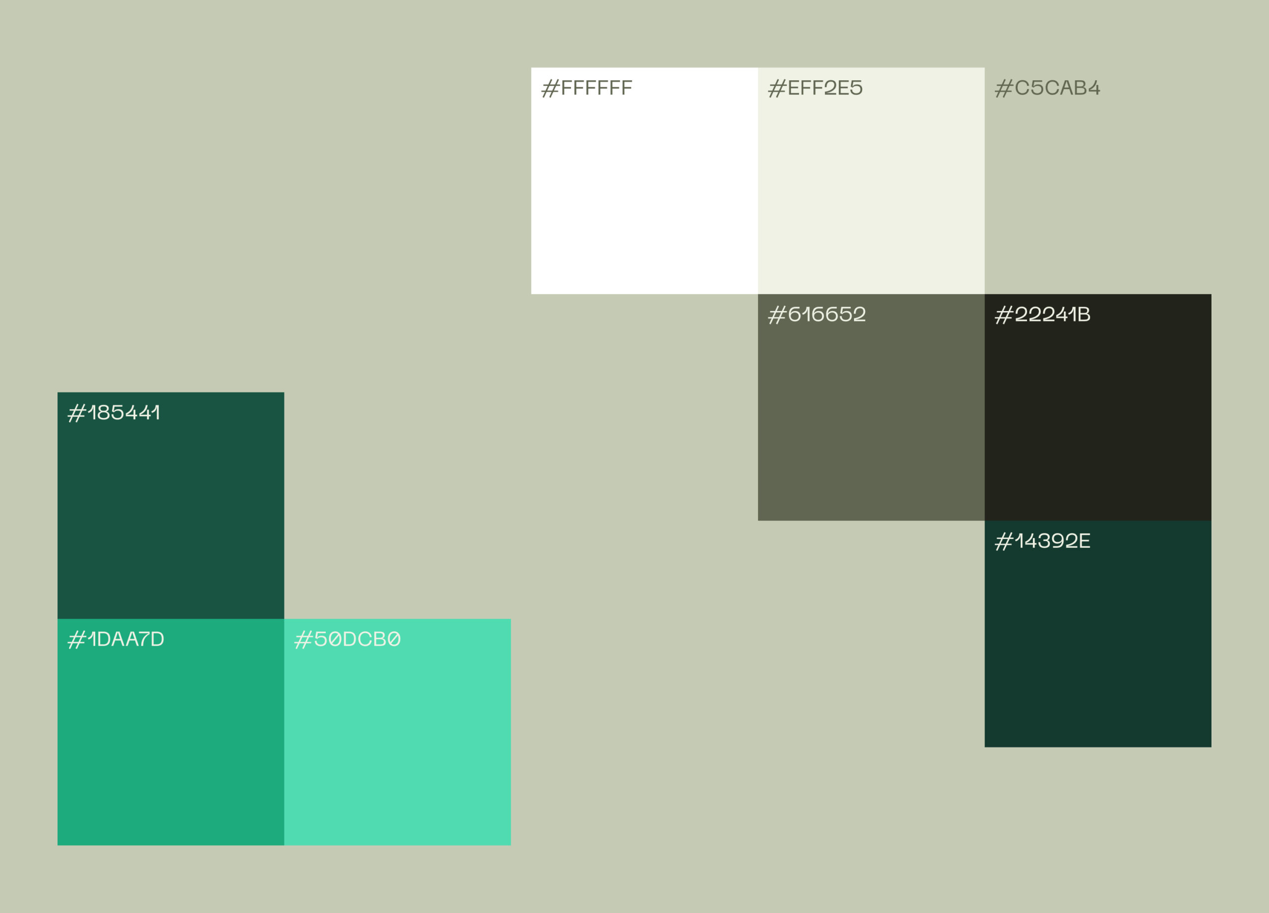
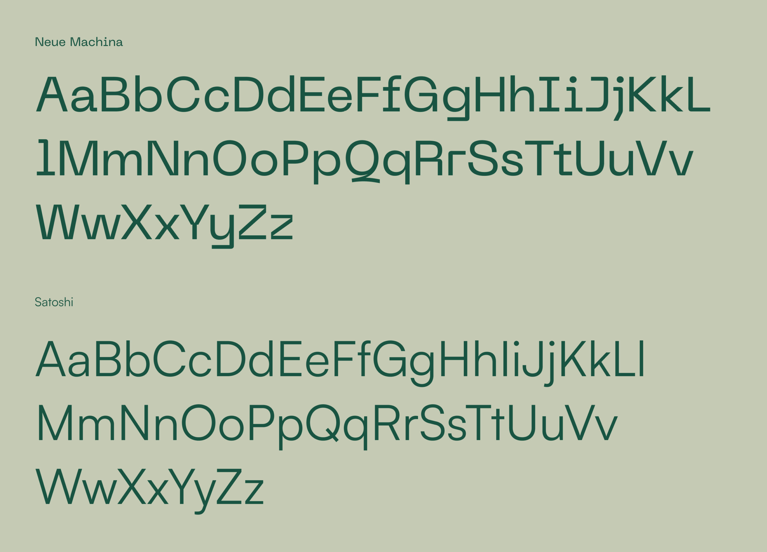
Our visual identity for the brand centres around safety, trust and certainty about the future. To invoke these feelings we’ve used strong architectural images with 90° angles and encased the logo and brand motif in robust holding device. PP Neue Machina is the typeface, chosen for its personality, echoing the straight edges and secure nature of other brand components. We particularly like the detail of the inktraps (where some corners are removed from letterforms) as this gives character to the typeface and is very distinctive for this ‘secure’ brand.
The outcome
CovenantPlus is a belt-and-braces approach to reaching a settlement or managing a scheme in a run-off period, removing related economic risk for the sponsor and removing the sponsor risk for the trustees. As PSF’s chosen creative partner we helped to launch a venture that manages risk, gives sponsors and trustees more security, and supports a better future for employers and their pension scheme members.
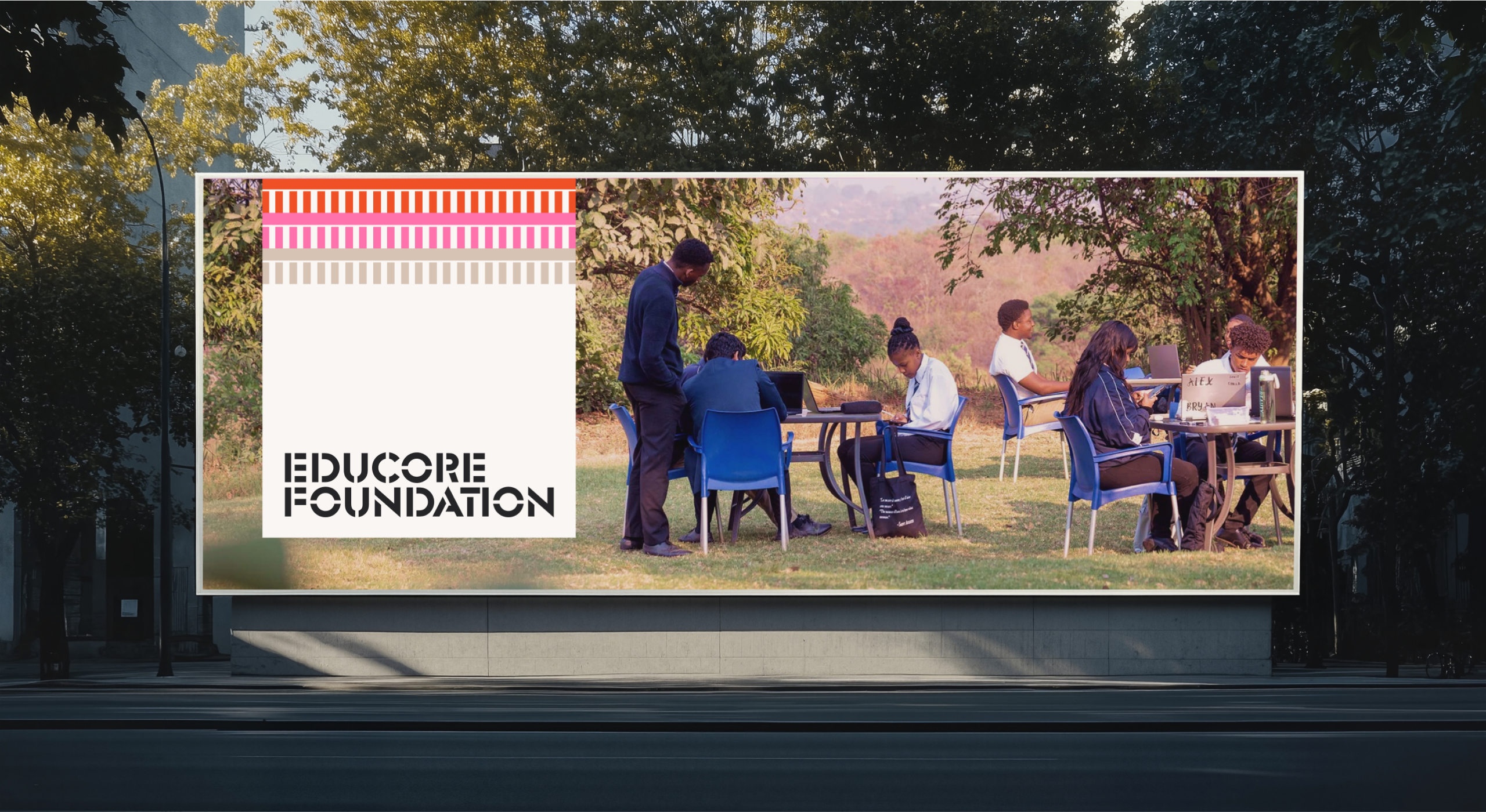
Educore initially approached us to design and build a website for the Educore Foundation. However, as we explored their needs, it became clear that their three linked organisations – Educore Services, Educore Foundation and Educore Academy each had distinct purposes and audiences and needed to renew their overall creative brand vision. This project therefore evolved beyond a single website into a strategic transformation, helping Educore better articulate its educational mission, unlock new funding opportunities, and craft a more unified brand presence.
Goals included:
- Moving beyond the “school-only” perception
- Creating an umbrella brand that supported sub-entities
- Establishing a digital presence that could better attract partnerships and funding
- Reflecting core values of innovation, care, and educational excellence.
Brand Identity System
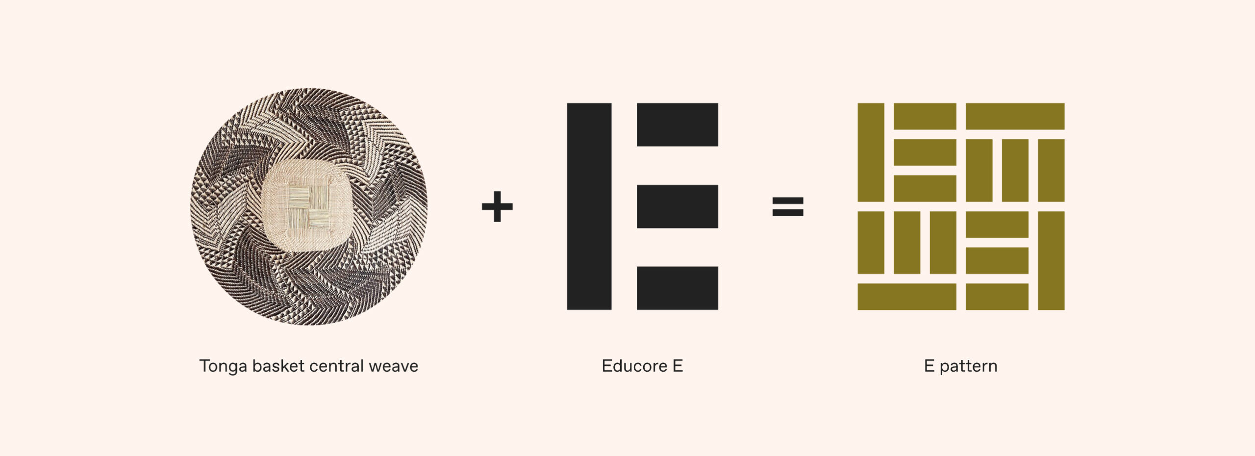
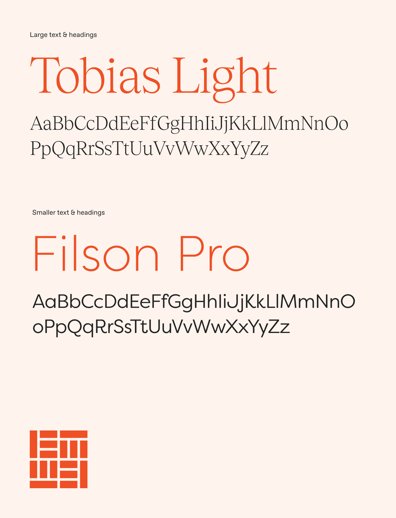
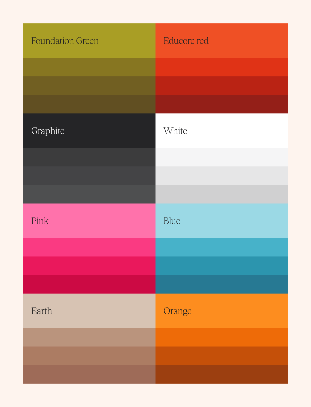
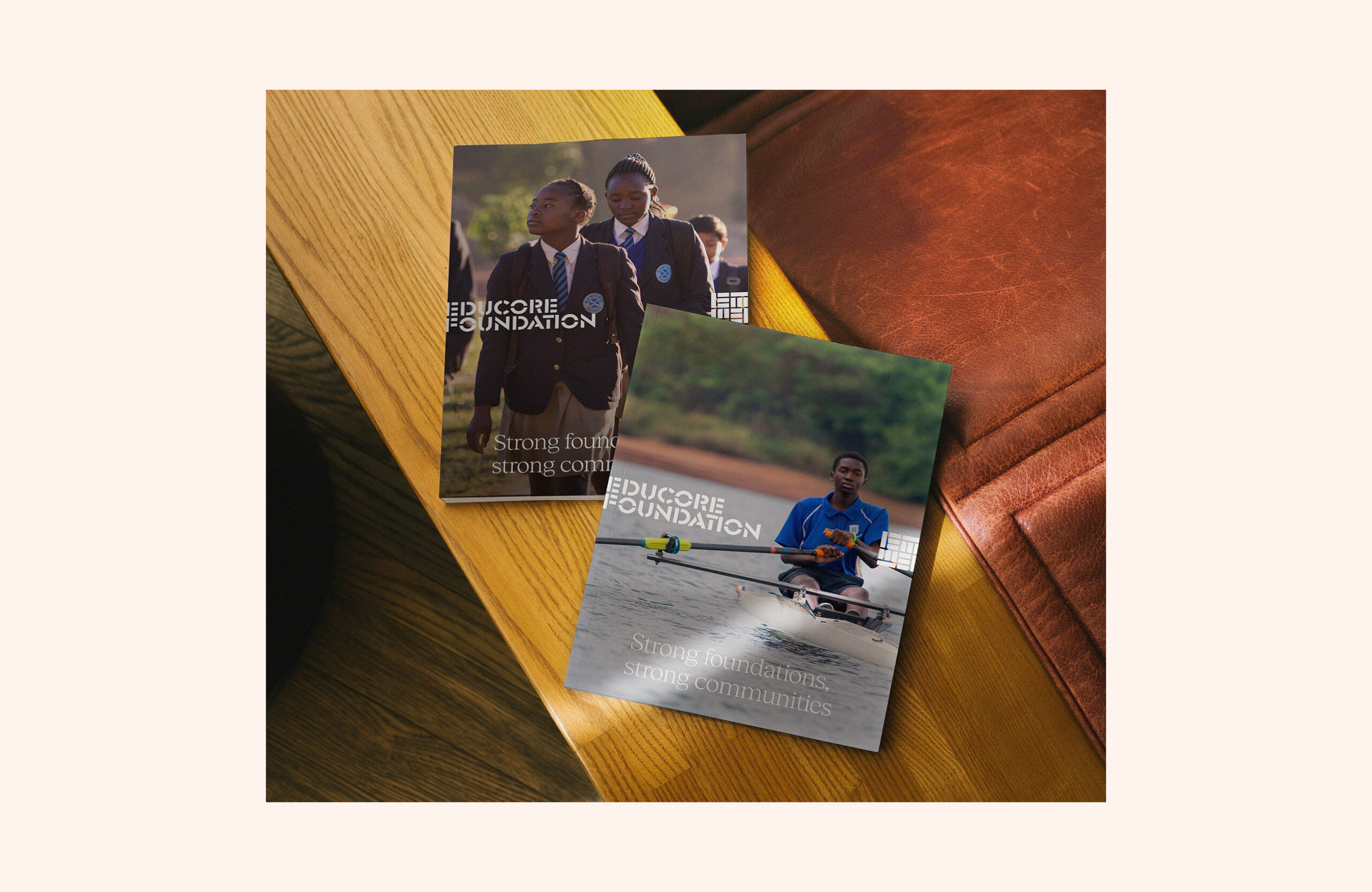
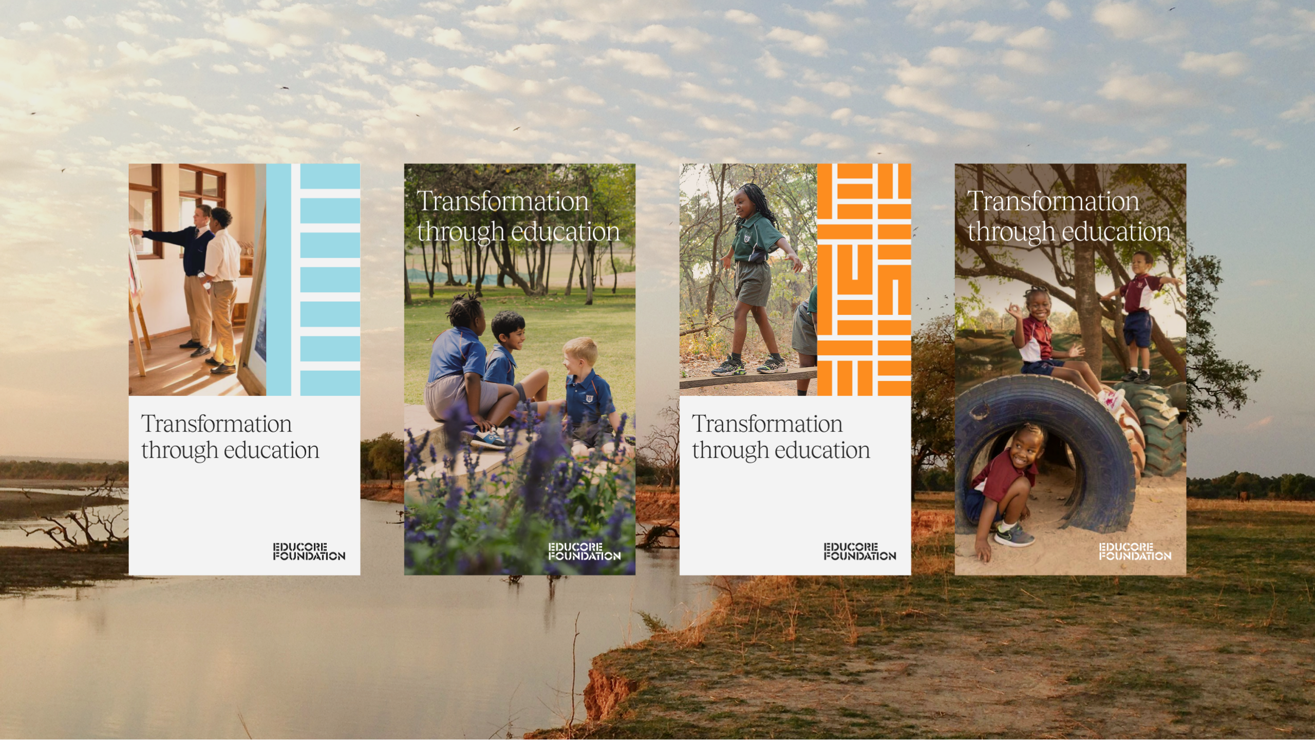
The presence of the existing Educore sub-brands meant that we needed to provide points of difference while still ensuring everything felt unified. We evolved the colour palette, typography, and iconography to bring warmth, clarity, and credibility to the Educaore brand. While maintaining echoes of the original identity through the logo, the new brand added depth and energy suitable for diverse audiences – from funders to educators. We utilised large amounts of the amazing photography that they had throughout the organisation, putting this front and centre throughout to show their work and real results. Through this strategic rebranding, Educore positions itself as a unified, purpose-driven organisation committed to educational excellence and community impact.
Website Redesign
We developed a new website for the Educore Foundation, working with the team to streamline messaging and create content with purpose allowing them to communicate the Foundation’s story and mission clearly.
Key features include:
- Modular design to scale as required
- Dedicated sections for mission, impact, and donor engagement
- Narrative-led content structure to resonate with partners and funders
- A bespoke WordPress build that was easy to administer for the team post launch.
Outcome
Educore now presents a confident, purpose-led brand that reflects its broad vision for educational impact. The Foundation is positioned to engage donors, partners and communities with clarity and purpose helping unlock greater opportunities for funding and collaboration.
The project also sets a framework for scalable growth across other brand areas, with the Academy and Services identities ready to be rolled out utilising their own distinct takes on this cohesive brand system.

What’s next?
With the Foundation website launched, we’re continuing to work with Educore to develop their brand system across their partner organisations to support their long-term growth.
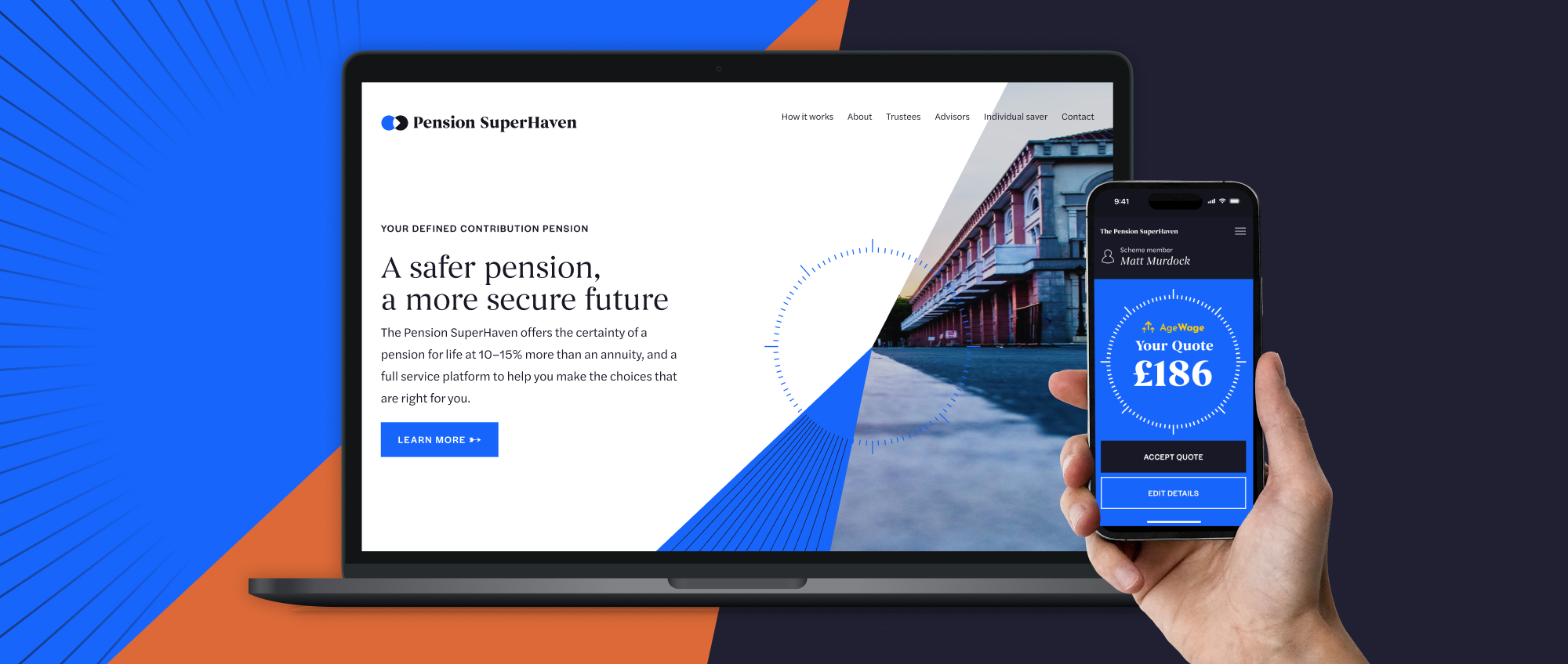
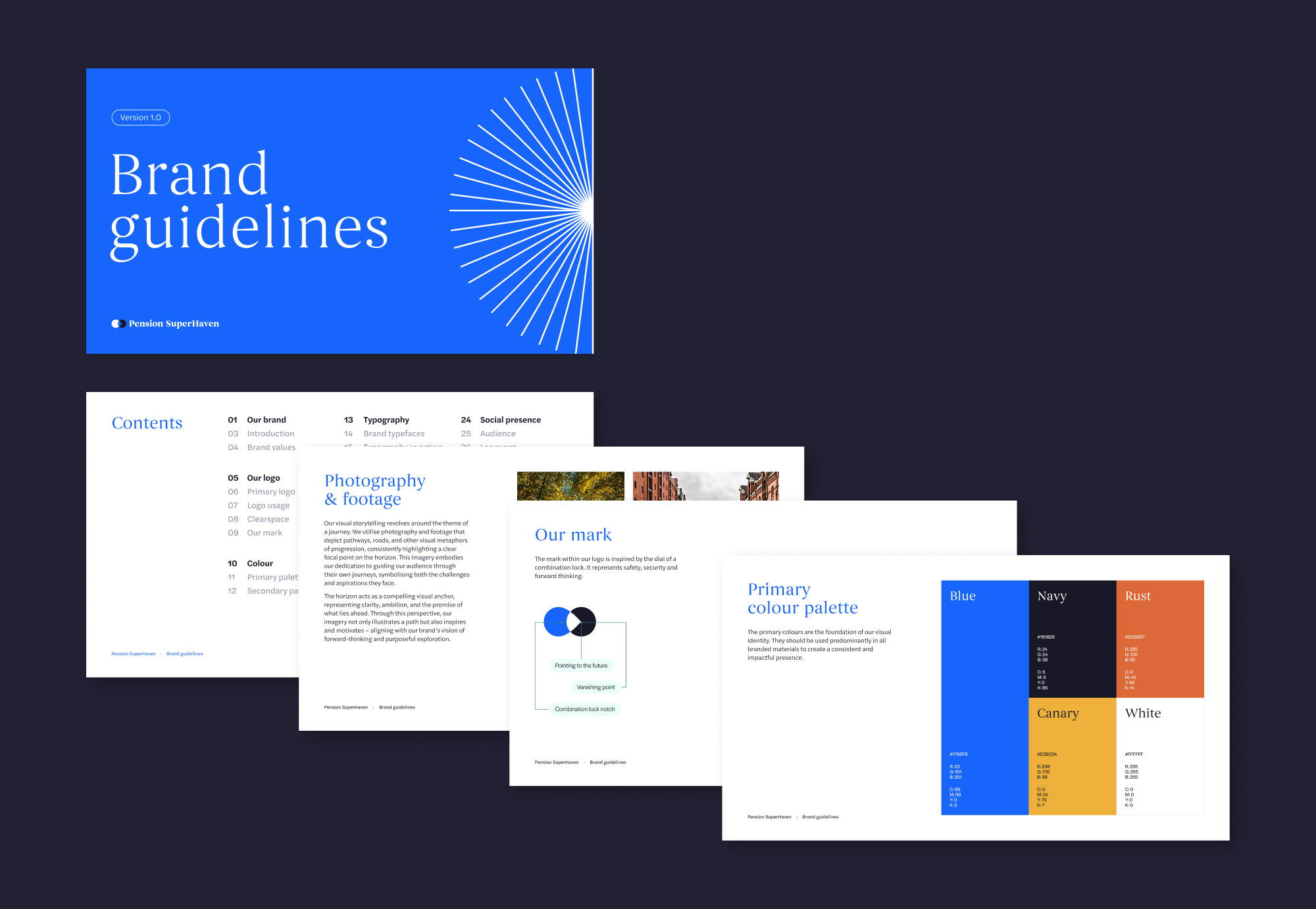
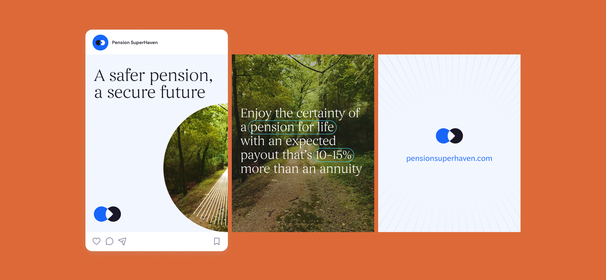
Pension SuperHaven were a new company created in order to sell Pension Products in partnership with Age Wage, primarily defined benefit. The challenge was to position PSH as a trustworthy new company within the financial services sector as well as bringing a sense of humanity and transparency to the brand. They needed a brand that would allow them to communicate across all physical and digital platforms consistently.
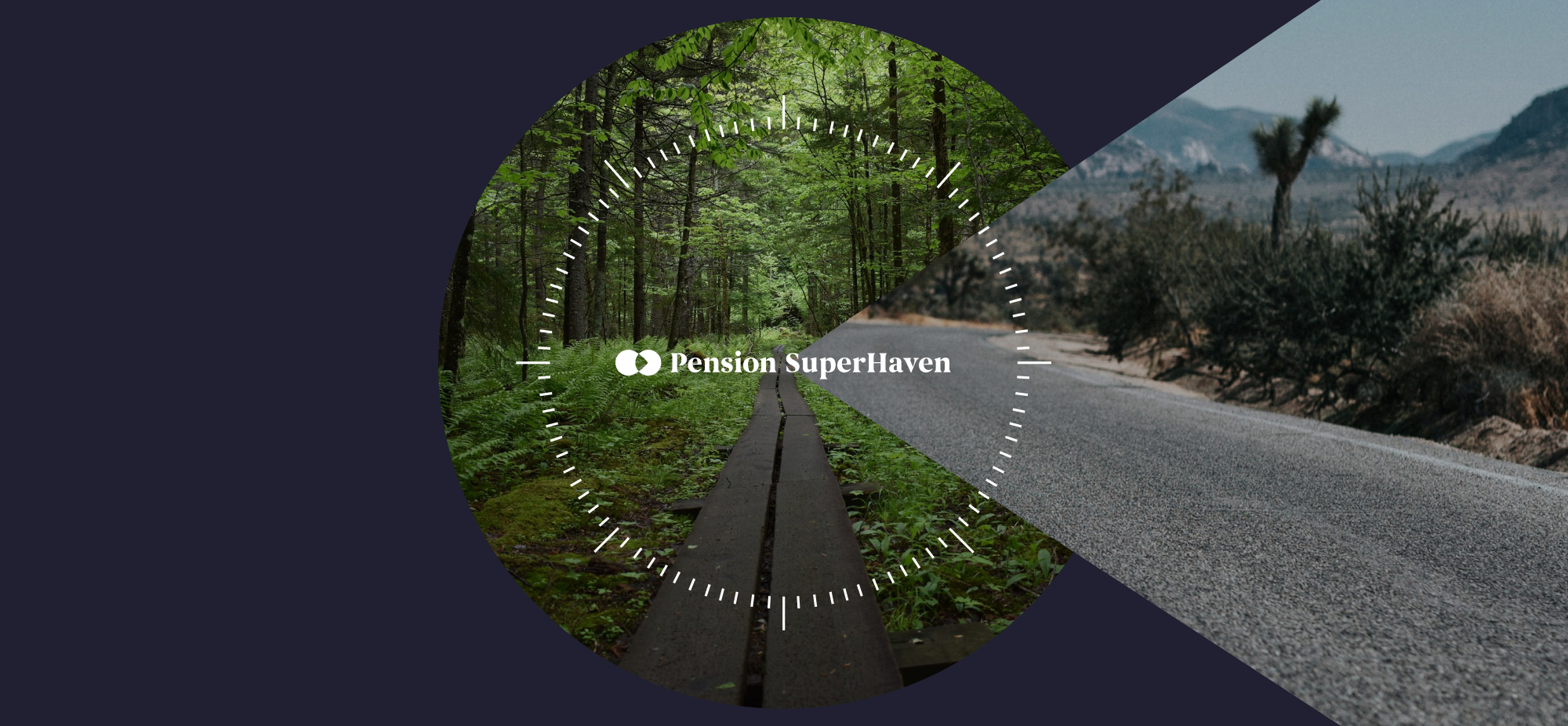
We crafted a compelling brand and website, ensuring clarity in financial guidance. From strategy to execution, we designed a seamless digital experience, making pensions accessible and engaging. Our work reflects trust, simplicity, and innovation, empowering users to navigate their financial future with confidence