In response to the UK’s rapidly ageing population and the social care sector’s struggles with recruitment and retention, BelleVie is taking a new approach to at-home caring.
Their approach is inspired by the Dutch ‘Buurtzorg’ community-based model of care where small teams of local carers provide support. The BelleVie model is formed of 10-person self-managing teams underpinned by the Wellbeing Operating System (OS), a bespoke technology platform, which is effective, efficient and scalable, cutting down on unnecessary admin so that carers can focus on caring, providing continuity of high-quality care built on trusted relationships.
After receiving funding from The Design Age Institute, they came to us to help review their processes and systems for recruitment. They needed UI and UX review of the custom software platform that they had built as well as user testing carried out with applicants and internal staff members to see where positive change and efficiencies could be made.
What we did
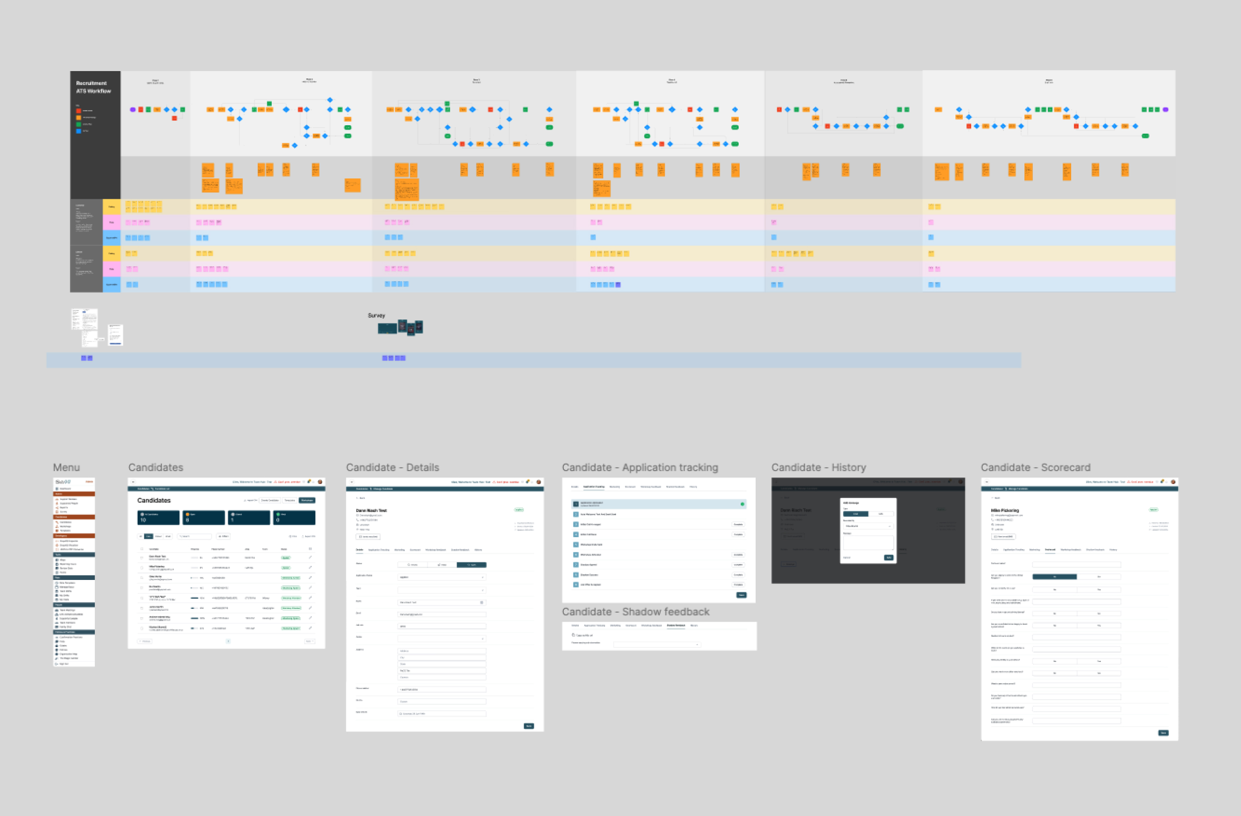
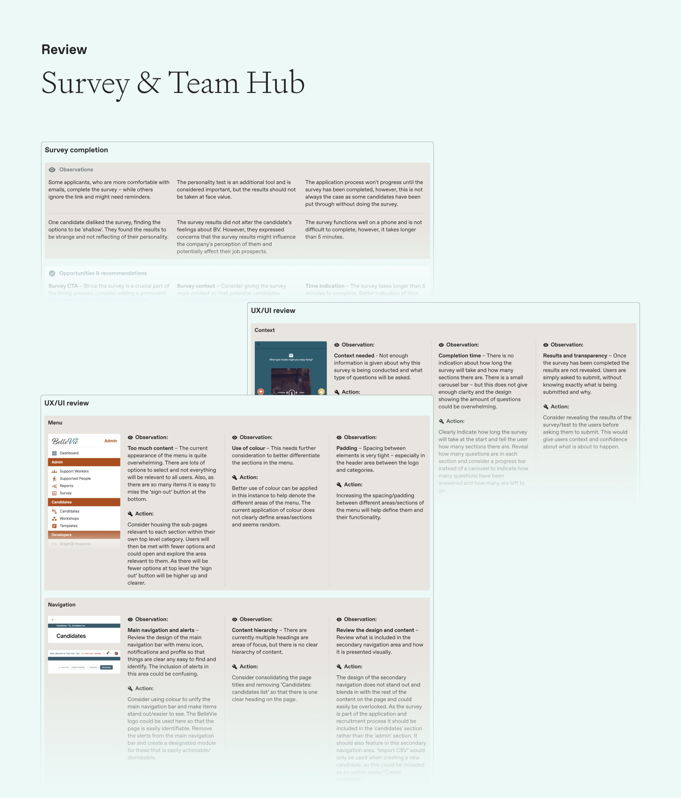
We carried out a full UI and UX review of the existing custom software platform in line with best practice, providing key observations and actions. The intention was that these could be shared with the BelleVie internal development team to action the improvements over the short-term, with these carried through to future additions of the platform.
We planned and activated interviews with all key stakeholders internally within the recruitment team as well as new employees who had been through the recruitment process – totalling eight in depth one-to-one interviews.
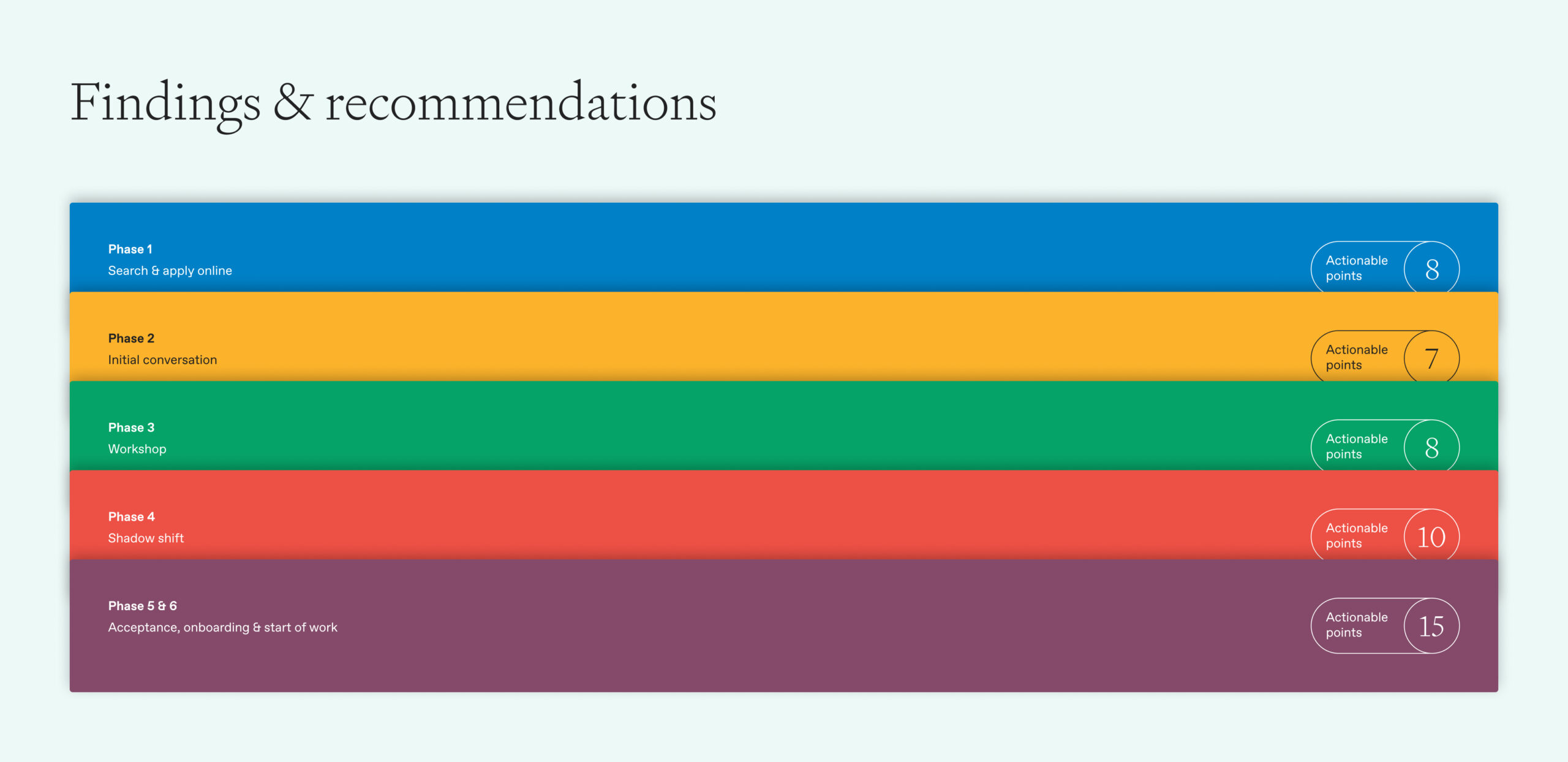
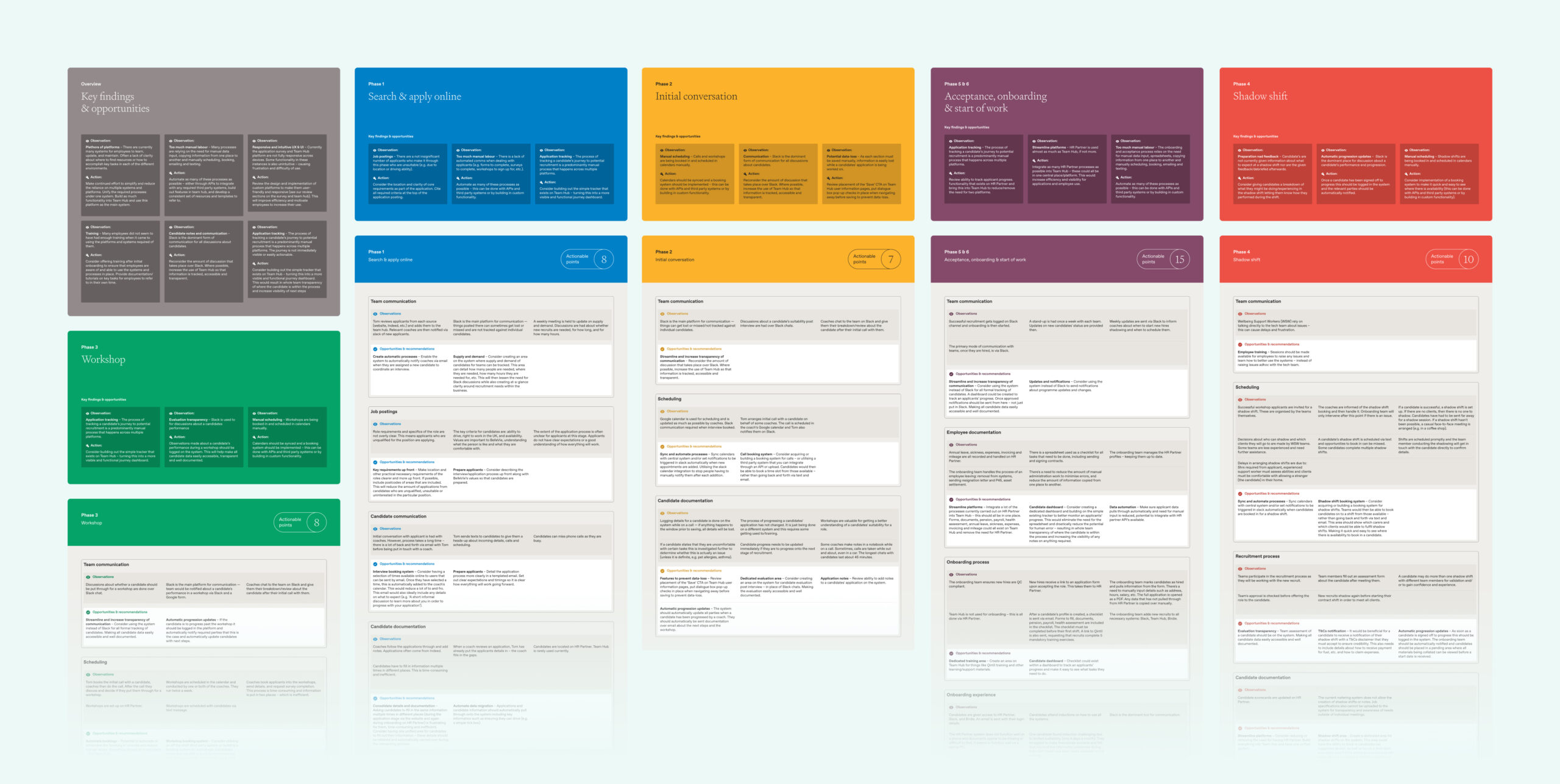
We structured these conversations around the different phases of the recruitment process, for example; search and apply online, a workshop that was carried out with applicants, a shadow shift and more.
Outcome
We collated our findings into one report that presented key findings and opportunities for each phase of the recruitment process and then broke these down further into different areas within each e.g team communication and job postings etc. These findings contained points such as clear communication and expectation to applicants prior to each stage to ensure that they knew exactly what was coming up and within what timeframe to make sure that they stayed engaged and committed to the application process. We also made recommendations based on our insight working with various third party software packages such as slack and google forms where we could see that utilising these in a better way and creating integrations using pre-existing API’s would help deliver a smoother process for all involved. This report has provided the basis for a brief for the company to take forward and action as they see fit in line with commercial objectives.
Indoor wayfinding company Briteyellow had created an early prototype for a navigation app, Briteway, for Transport for Wales. Briteway helps people with reduced mobility or disabilities find their way around train stations. After winning funding from the Design Age Institute (with whom we are rostered as a creative agency), Briteyellow wanted us to help develop the full product for a beta launch.
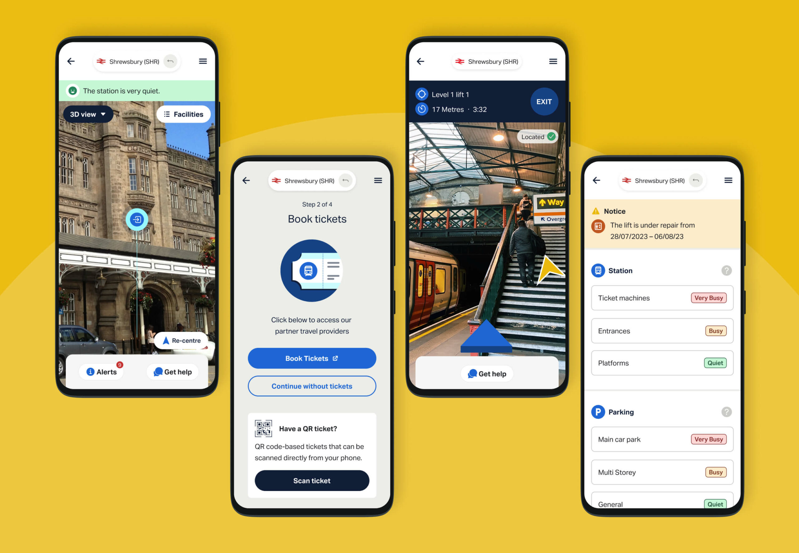
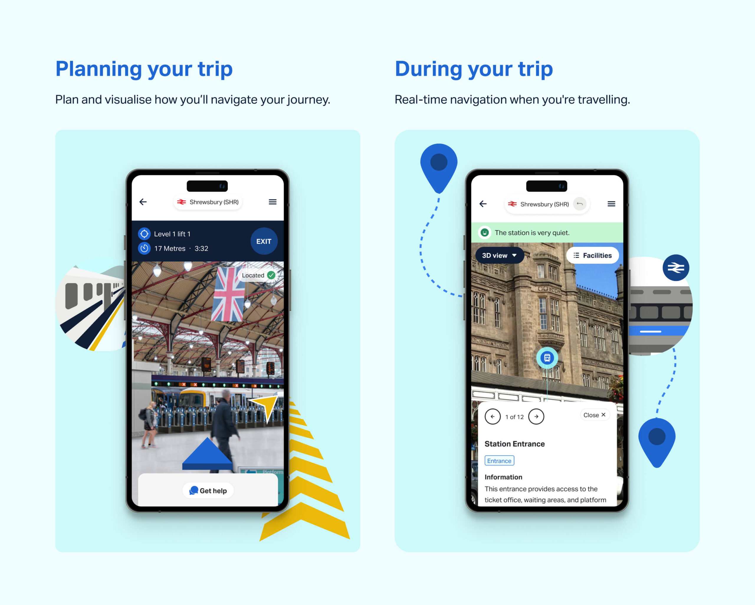
Using live 3D images, Briteway helps people avoid obstacles, stairs and disruption by showing accessible routes, lifts and station facilities. Travellers can also plan in advance by seeing what the facilities are, such as ticket offices, cafés, shops and toilets. It’s like Google Maps for train stations.
What we did
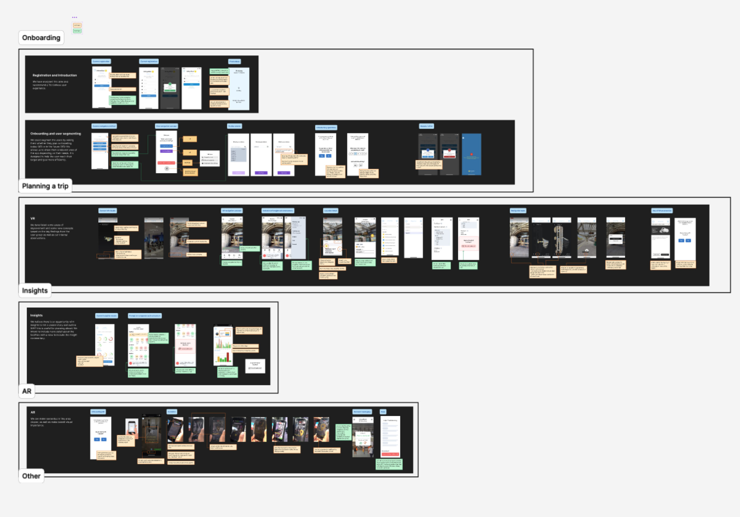
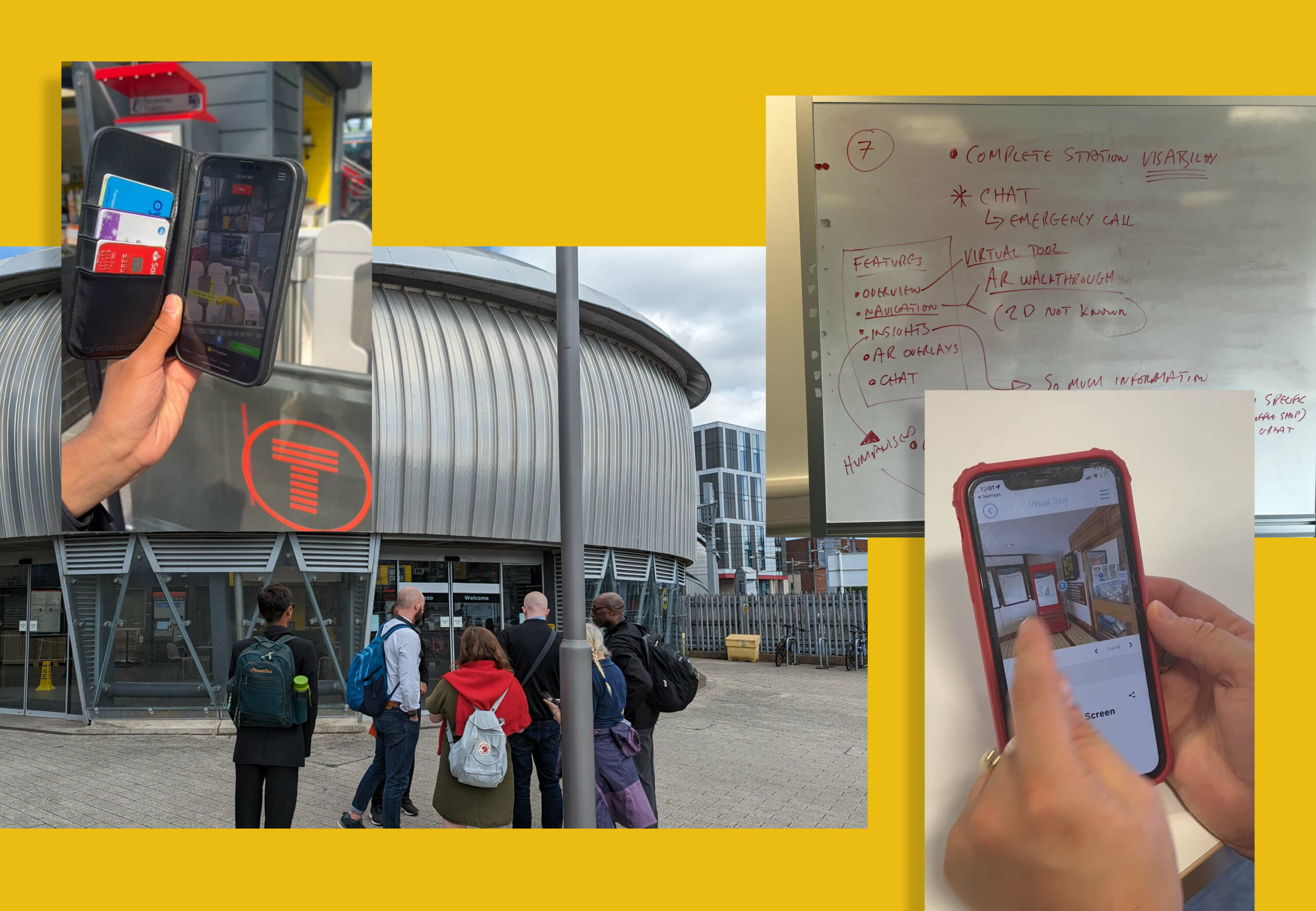
We did a full UI and UX review and update of the app, including user testing (some online and some live at Newport train station) and created a report of our findings. We used these findings to design a new user journey, make structural amends, and redesign functions and screens that needed improvement. We then retested these with the same cohort of users to validate and iterate our changes, so that the app is easy to understand and use.
UI and UX
The product uses 2D aerial views (satellite images) for journey planning and 3D real-time images for live navigation inside stations. We improved the UI and UX for these and made them easier to access, and created a suite of icons for facilities such as lifts and escalators, so that users can find them faster.
We improved existing navigation aspects, such as images overlaid with arrows that people can follow to get around, and included ways for train passengers to call for help in stations if they need it.
Accessibility
Accessibility was our primary consideration, as we were designing for elderly and other people with mobility and access needs. We created a UI and UX that works for people with low vision, blindness, hearing impairments, cognitive impairments, motor impairments or situational disabilities. At the same time, we wanted the product to appeal to everyone. We created a user experience, including the language, that also works for their carers and for all train travellers who want to plan ahead and navigate more easily around train stations.
The product has to look simple, clear and accessible, so that all the focus is on the functions, images and navigation. We kept to the brand colours of blue and yellow and used them on a plain, light background, so that nothing detracts from the user experience.
Our typography had to be suitable for different screen sizes and meet accessibility guidelines so we chose Activ Grotesk, as it’s very functional with lots of weights and legible at small sizes across different devices and browsers.
Product positioning
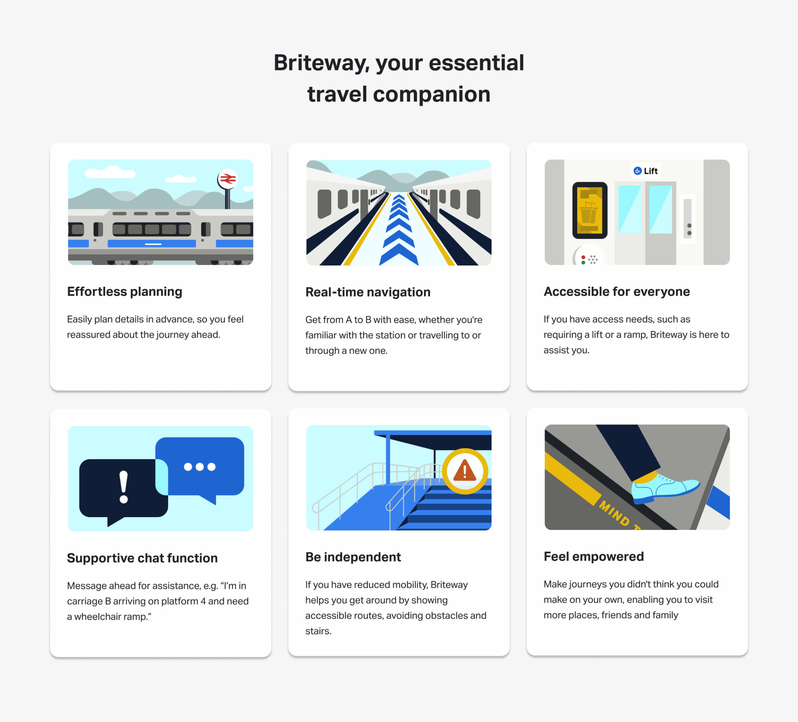
We repositioned the product with new messaging, a reason to believe for potential partners, and a narrative consumers can connect with. This messaging focuses on empowering people with mobility needs to get out, be independent, visit friends and family and enjoy life. It connects with people’s emotions, taking them from where they are – feeling unable to travel on their own, because they don’t know what obstacles or access to expect at train stations – to feeling confident and reassured about travelling.
Funding
Briteway has been partly funded by The Design Age Institute, which brings together designers, businesses, researchers and communities to help address the challenges and opportunities of an ageing society. This project was part of DAI’s Transport & Mobility Pathfinder Innovation Programme, supported by the UK Research and Innovation (UKRI) Healthy Ageing Challenge delivered by Innovate UK, the UK’s national innovation agency.
The outcome
Briteway is now a clearly defined proposition, putting Briteyellow in a strong position to secure partnerships with more train stations around England and Wales. The app is currently in beta, being tested by train travellers in six stations in Wales: Cardiff Central, Cardiff Queen Street, Newport, Pontypridd, Chester and Shrewsbury. As more stations are added, Briteyellow will improve the app based on user feedback, to help thousands more people feel confident about travelling by train.
Unit 29 Ventures launched its first enterprise in 2020: The Cove, a luxury florist and concept store in Royal Tunbridge Wells. It has built up a loyal and discerning customer base of people with a taste for premium products made by local independent makers and distillers.
After two years, investor Phil Reid – who is the founder and Strategic Director of Studiomade – decided it was time for Unit 29’s next venture: a unique, small batch rum.

The concept and name
Unit 29 Ventures recognised an opportunity to launch a rum brand centred on sustainable packaging, the concept of reuse, and supporting a sustainability charity.
The vision was for a rum inspired by the ocean, locally made in Kent, and led by its values: distinctive quality in the ingredients and materials, clean efficiency (reduced waste and efficient production methods), and growth and rejuvenation of natural resources (contributing to a cause and enjoying life while doing it).
Based on a love of the sea and surf, and reflecting this new venture and its first step into the drinks industry, we named it Turtle Roll. Before you can line up a wave when surfing, you have to get out past the ones that are breaking all around you. The turtle roll technique helps you get past barriers, jump over hurdles and achieve greatness. Unit 29 hoped to do the same with Turtle Roll Rum – taking beginner steps with an ethically produced rum, hoping to effect positive change in our oceans.

The taste
Unit 29 Ventures and Studiomade worked together to craft the brand story and narrative of Turtle Roll Rum, which in turn helped brief the ingredients and taste. We worked with a talented expert, Callum Giblett, Managing Director at The Custom Spirit Co. He and his team defined different taste directions and, during a rigorous six-month phase of tasting, exploration and user testing, whittled down multiple recipes and ideas into the winning formula.
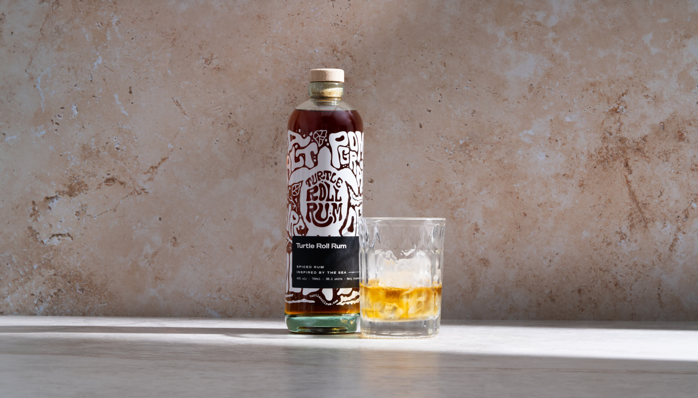
Turtle Roll Rum has been imagined and produced locally to Tunbridge Wells in Kent. It is distilled with Venezuelan, Dominican and Jamaican sugar cane, using a clean, high-quality and sustainable production process that runs fully on renewable energy. The concept, ingredients and commitment to sustainability all emerged from appreciation for the sea and ocean-side living.
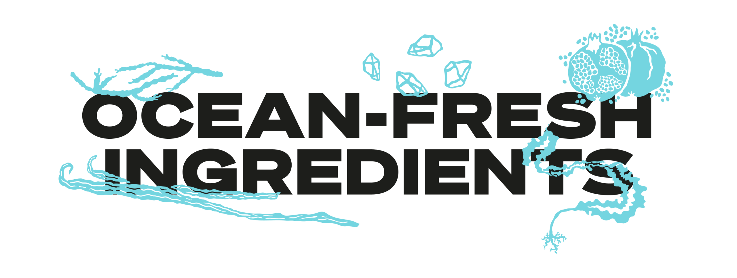
In the final produced recipe, Turtle Roll Rum blends notes of pomegranate, lapsang, vanilla, black cardamom and sea salt with oceanic botanicals samphire and sugar kelp. These intriguing layers of sweet and salt create a rich and smooth flavour profile.
As part of Turtle Roll’s sustainability commitment, 10% of profits are donated to Project Seagrass, a charity working to restore and protect seagrass, a wonder plant that’s crucial to the health of our oceans.
Brand positioning and identity
Turtle Roll Rum is positioned as a challenger, independent brand with a premium feel, priced in line with the small-batch market. We were inspired by product brands that are driven by a mission beyond the product itself; companies with sustainable, ethical values at their core.
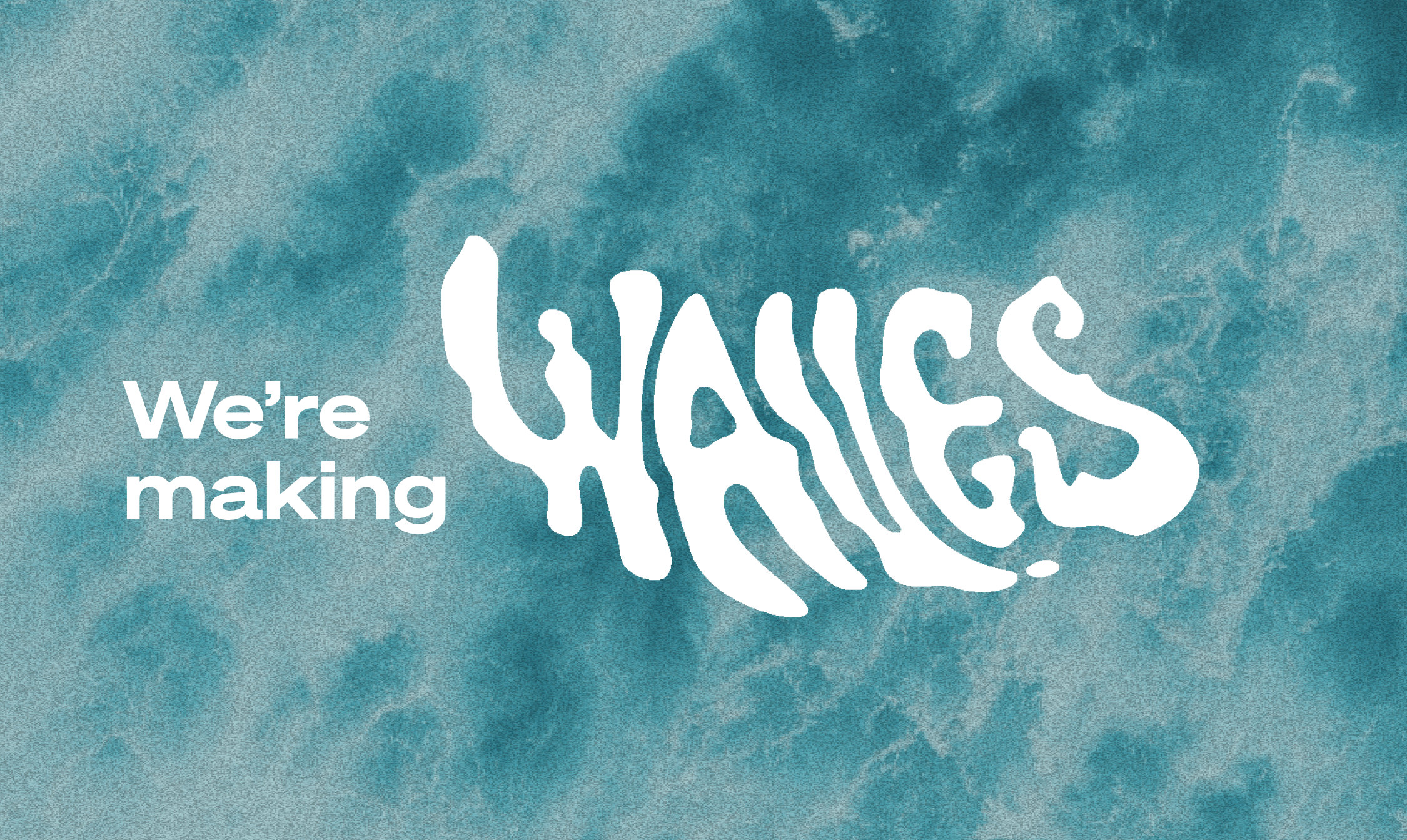
Our design director Angelo Iannelli wanted typography with a feeling of the sea so crafted loose, hand-drawn lettering, paired with the Söhne Breitt font as a contemporary counterpart. The illustrations, all hand-drawn by the Studiomade team, emulate typography distorted as if looking through water. The aqua tones and grainy texture of some of the photography were inspired by vintage surf photos e.g. 80s Miami.

Brand messaging
We use language that suits a modern, challenger brand, giving it a distinctive voice, casual rather than polished, yet with a premium feel. We use enticing flavour and ingredients descriptions to appeal to an audience of taste makers who are on top of trends and like to discover new experiences. To keep it relatable, we sprinkle in light-hearted, ocean-inspired phrases, particularly on social media.
Product photography
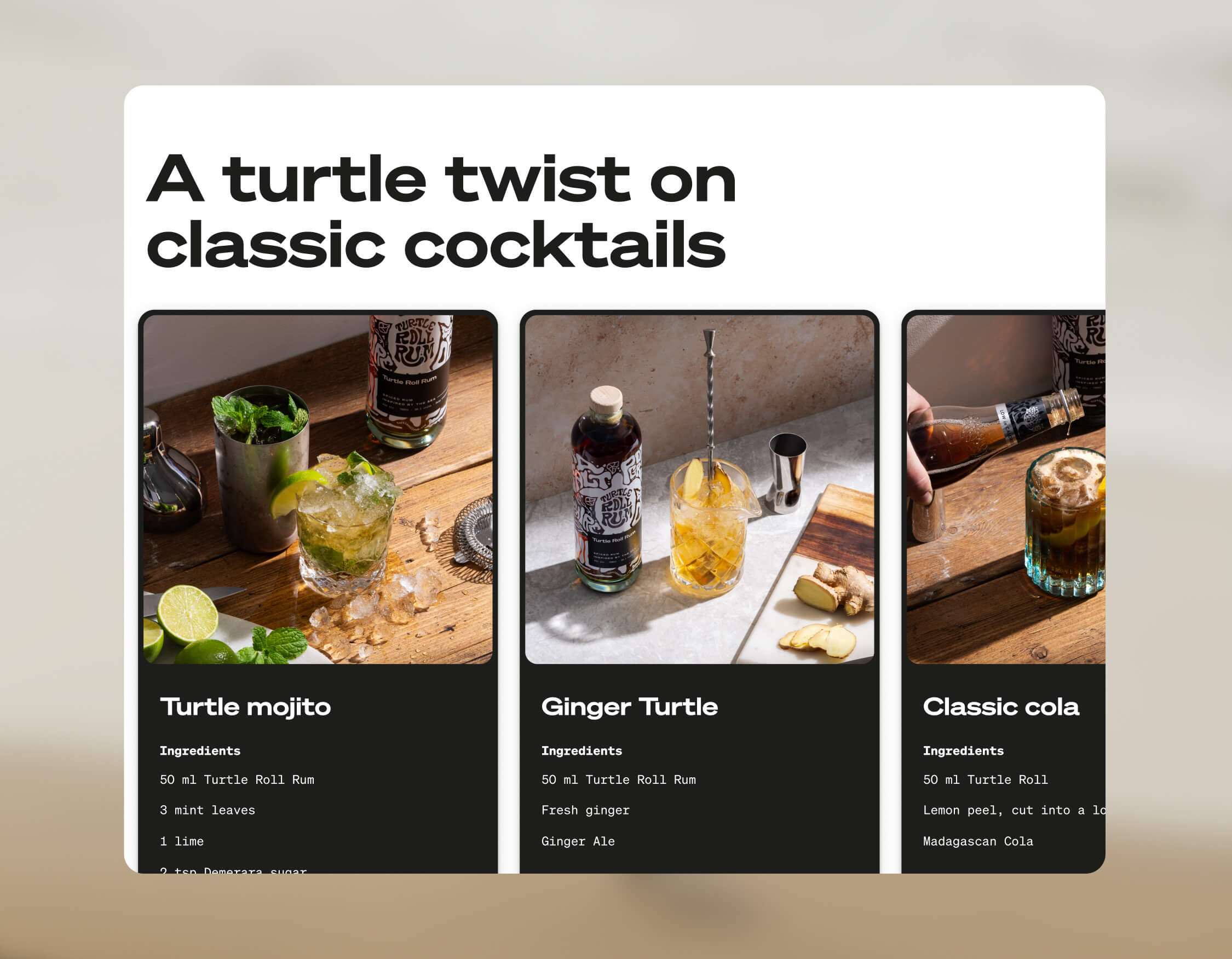
The images were shot by the wonderful team at Névé Studios. After creating mood boards to drive our creative direction, we decided that product photography should be bright and spacious, playing with light, shadow and interesting angles, and reflecting the fresh ingredients that give Turtle Roll its taste. The images feel realistic rather than glossy e.g. cocktails being made and drinks being poured. This is interspersed with imagery of oceans and waves, evoking the open feeling of the sea.

E-commerce
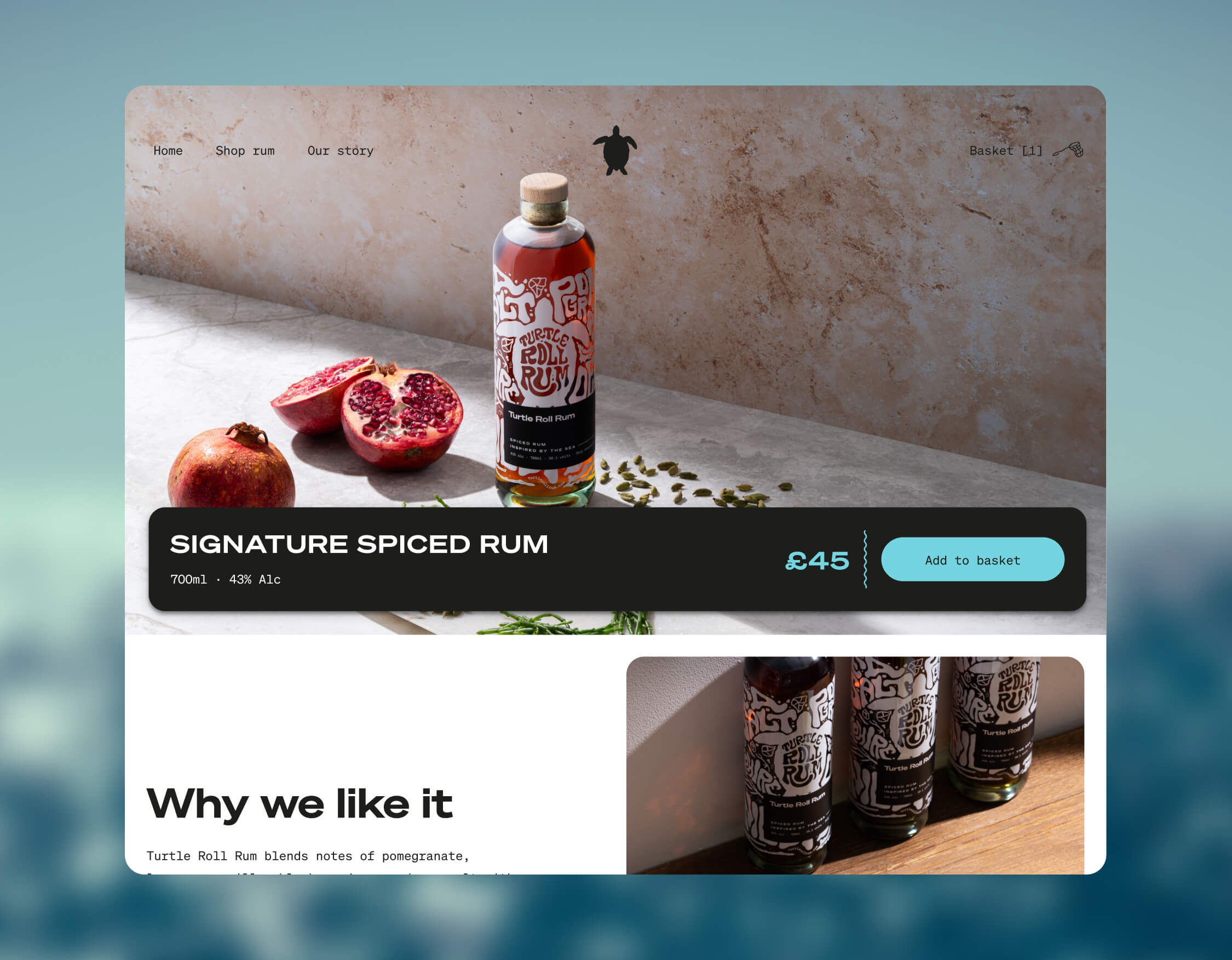
Turtle Roll Rum was conceived to be predominantly sold direct to consumer. This means that the customer experience and how the brand is presented online are paramount. We wanted to best present the personality of Turtle Roll Rum and establish a brand connection with customers, rather than it being a sales push.
To this end, we built a custom e-commerce experience, with every aspect individually designed. We applied the visual identity and brand voice across the website, and created a user journey that includes purchase. We opted for Gatsby hosted on Netlify, for good performance and speed. We integrated Stripe for payments and set up a bespoke webhook to promptly relay order details to our fulfilment company whenever there’s a successful transaction. We added Mailchimp integration for automated emails to complete our loop.
Bottle and packaging
We researched, trialled and tested multiple bottle manufacturers and product variants, to find the most sustainable options possible.
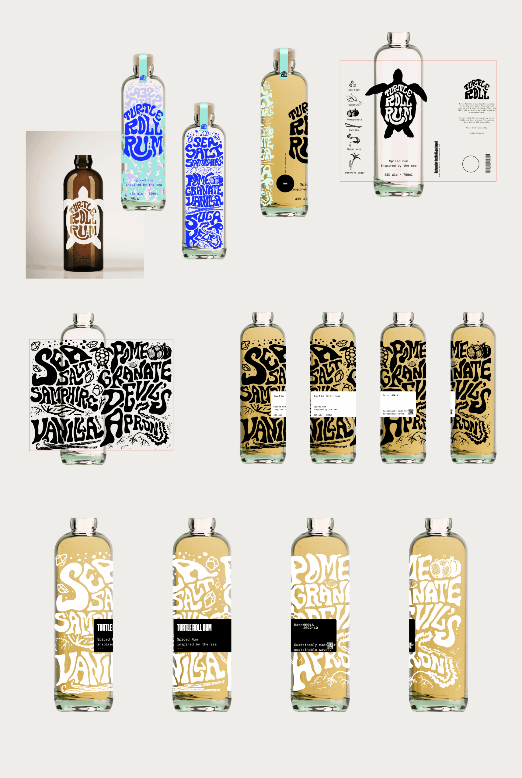
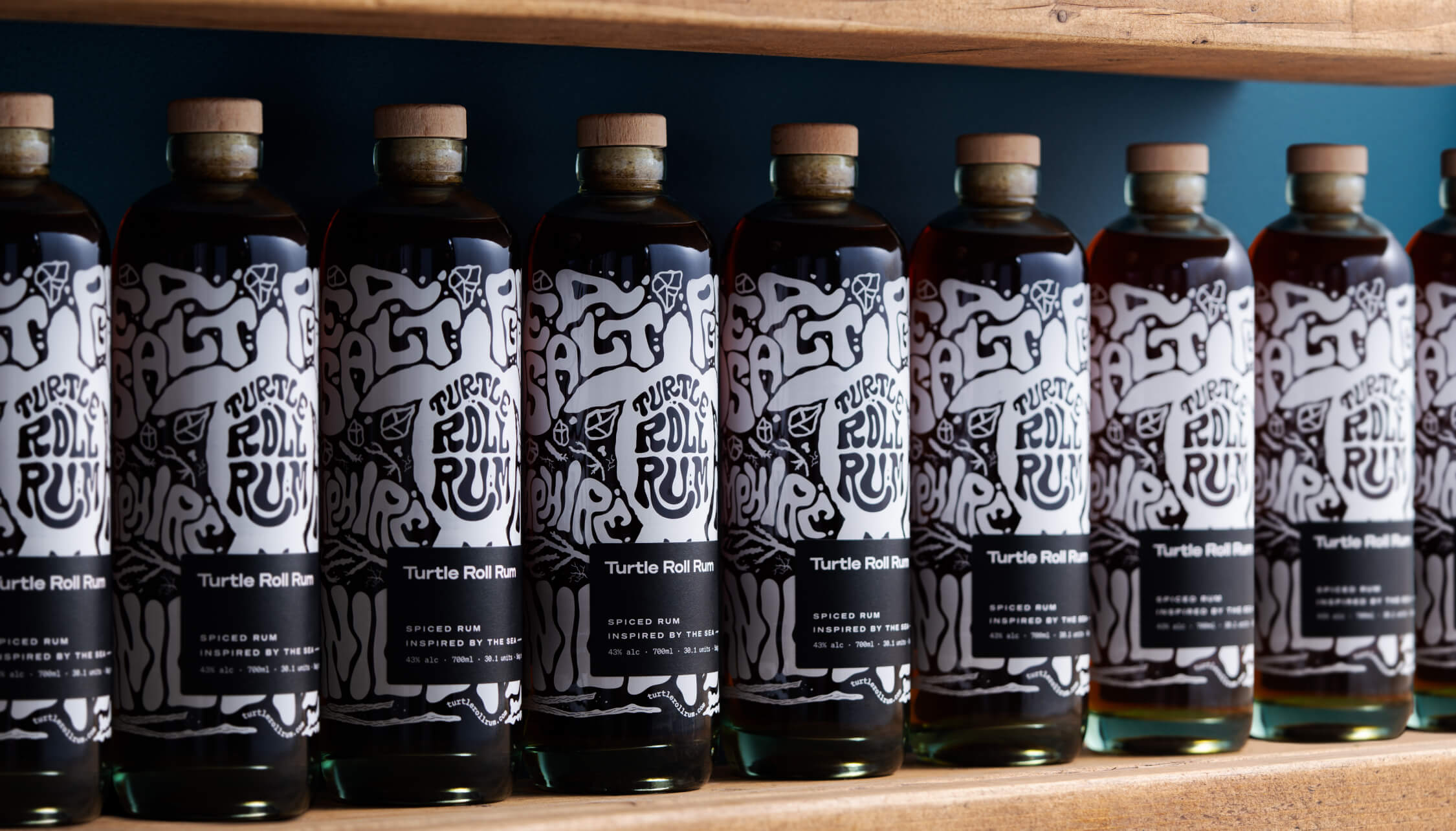
Each bottle is made from 100% recycled glass and screen printed (using sustainable ink), with custom-drawn artwork and lettering that highlights the ingredients. It’s overlaid with a 100% recycled ECF paper label, printed with soy inks and the cork is sealed with a fully compostable, plant-based shrink wrap.
The cork stopper is made with activated charcoal, as this removes the need for additional chemicals and industrial processes. Packaging for shipment is made from bamboo pulp, a more abundant, renewable resource than cardboard.
A focus on re-use
After enjoying the rum, we encourage people to reuse the bottle as many times as possible before they put it into recycling. Our intention was to create a product that sparks conversation and brings a bit of fun to kitchens and dining tables when used as a pitcher for water or vase for flowers.

Merchandise
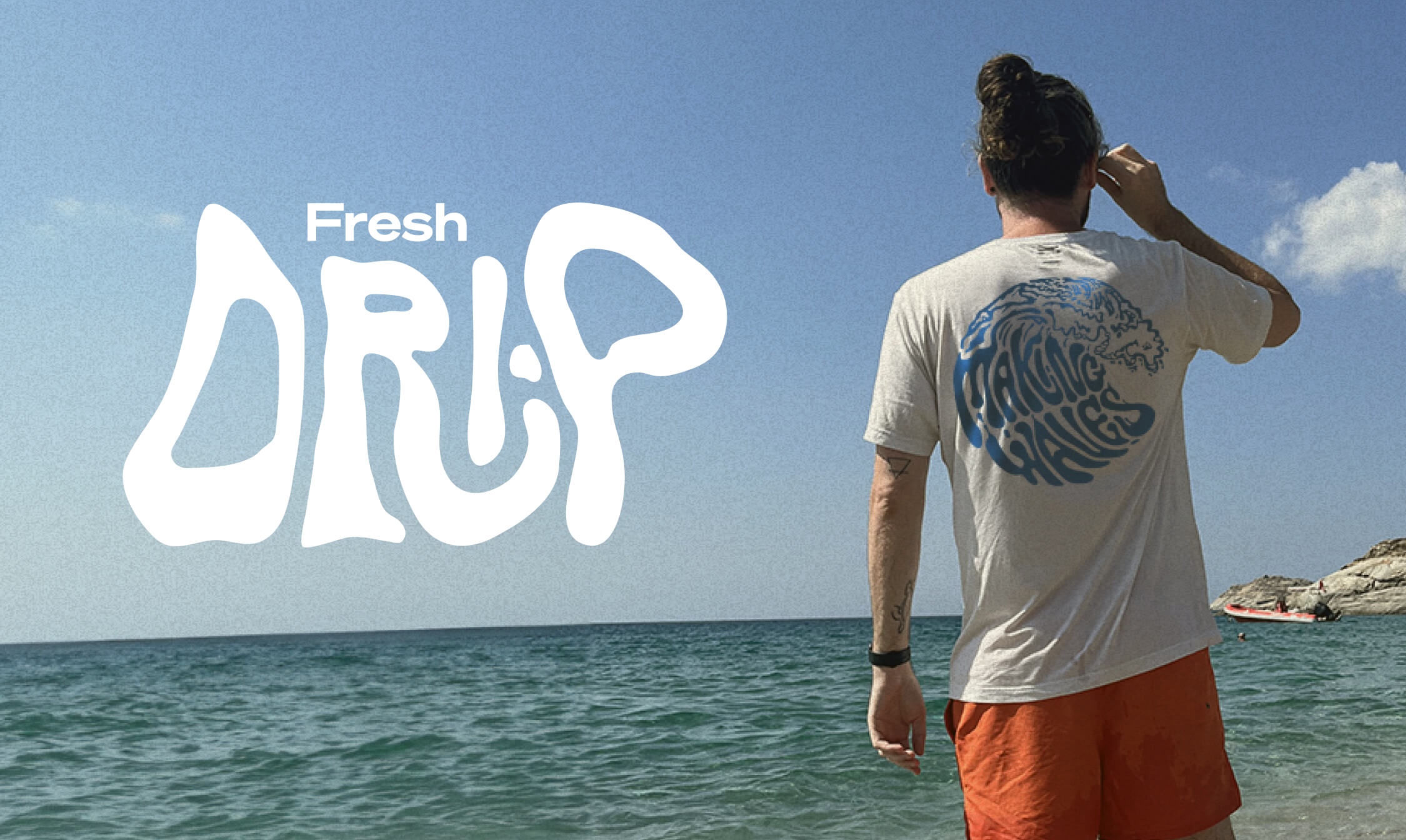
Unit 29 Ventures also wanted branded merchandise so we teamed up with Teemill. We chose them for two reasons. First, their t-shirts and hoodies are made from organic cotton, and they can be returned to be remade into something else once they’re worn out, creating a circular economy, which aligns with Turtle Roll’s value of sustainability. Second, customer purchases are printed and shipped to order, rather than us having to buy and hold stock. From a commercial perspective, as a new venture, this allows us to test users’ buying intent and decide where to focus on growing the range.
The outcome
With commercial strategy and investment from Unit 29 Ventures, and creative, brand and digital activation from Studiomade, we partnered to create a unique, small-batch, premium spiced rum, with sustainability at its heart. The initial limited run of 1,200 is now available at The Cove in Tunbridge Wells, at turtlerollrum.com and proudly stocked at a growing number of bars and restaurants (ideally close to the sea!) in Kent and the South East.
Are you thinking of creating and launching a new product? To discuss how Unit 29 Ventures and/or Studiomade can help you, contact our Founder & Strategic Director, Phil Reid, on phil@studiomade.co
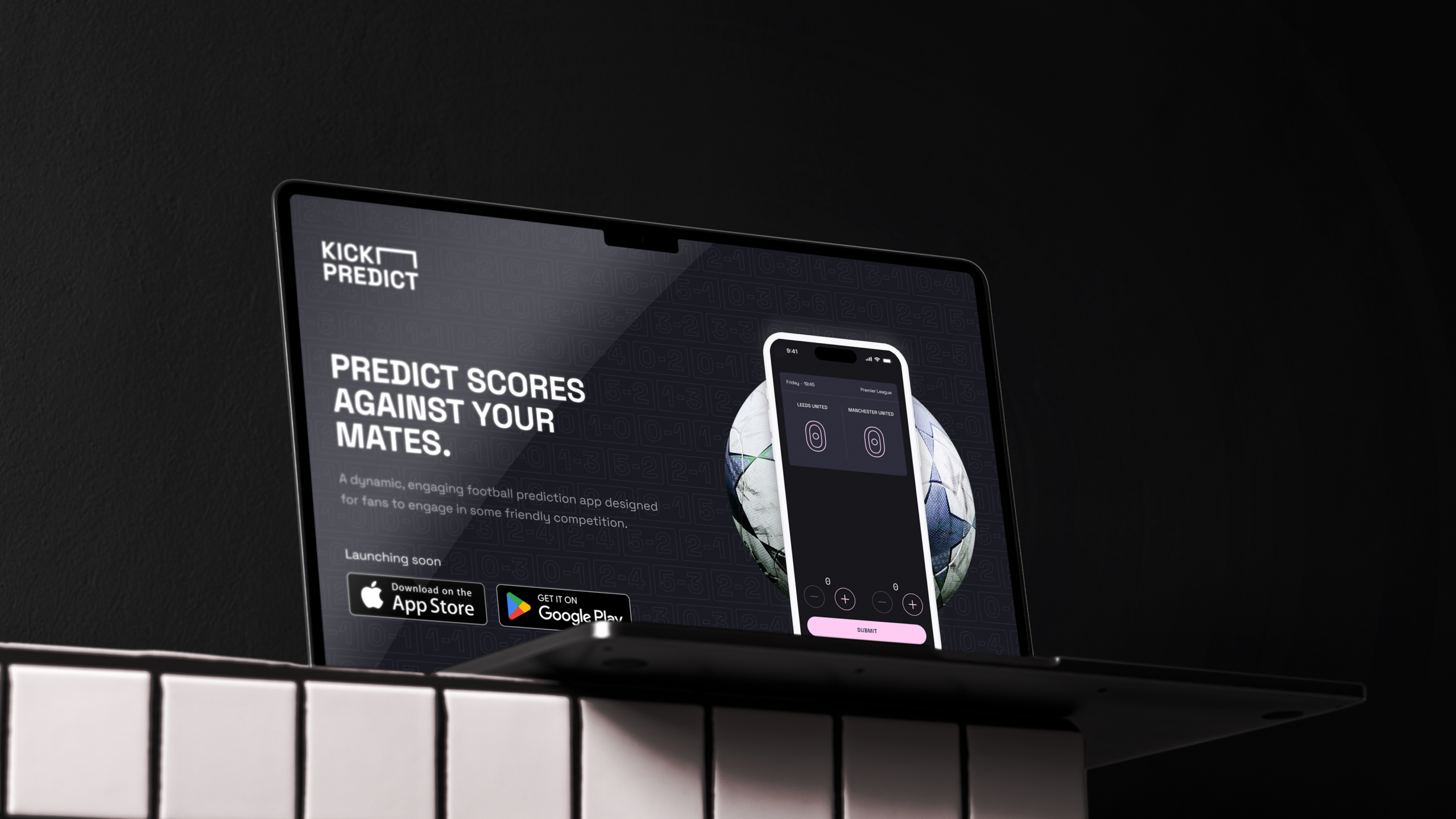
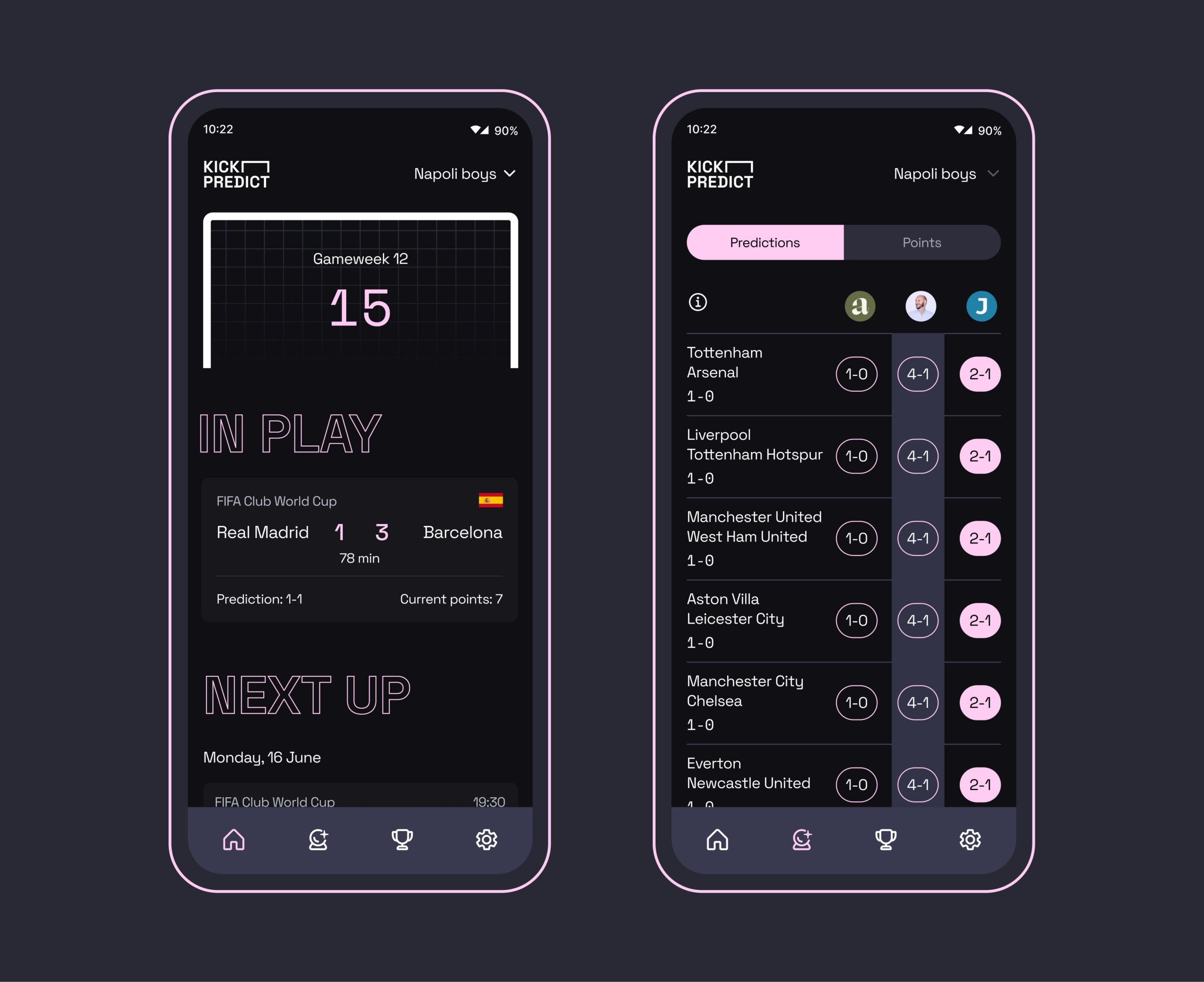
Traditional prediction games can feel cluttered, overly complex, or simply put, take the fun out of football. Working with venture creation partner Unit 29, we were brought in to deliver a brand new product to market. Kick Predict lets fans lock in their scores, form leagues with friends and brings that healthy bit of competition as you wait and see where you end up in the results with every goal.
We helped formulate our own brief – to make a lightweight, exciting product experience that captured a sense of fun. We worked to define the proposition, creating a brand experience alongside a seamless UI and UX interface that enabled a fast, enjoyable and shareable gameplay. Leveraging a unique scoring system built by Co-Founder Ben Uher, Kick Predict is able to provide a compelling experience where real-time results minute-by-minute affect your standing in the league.
Building a brand that captures sports audiences
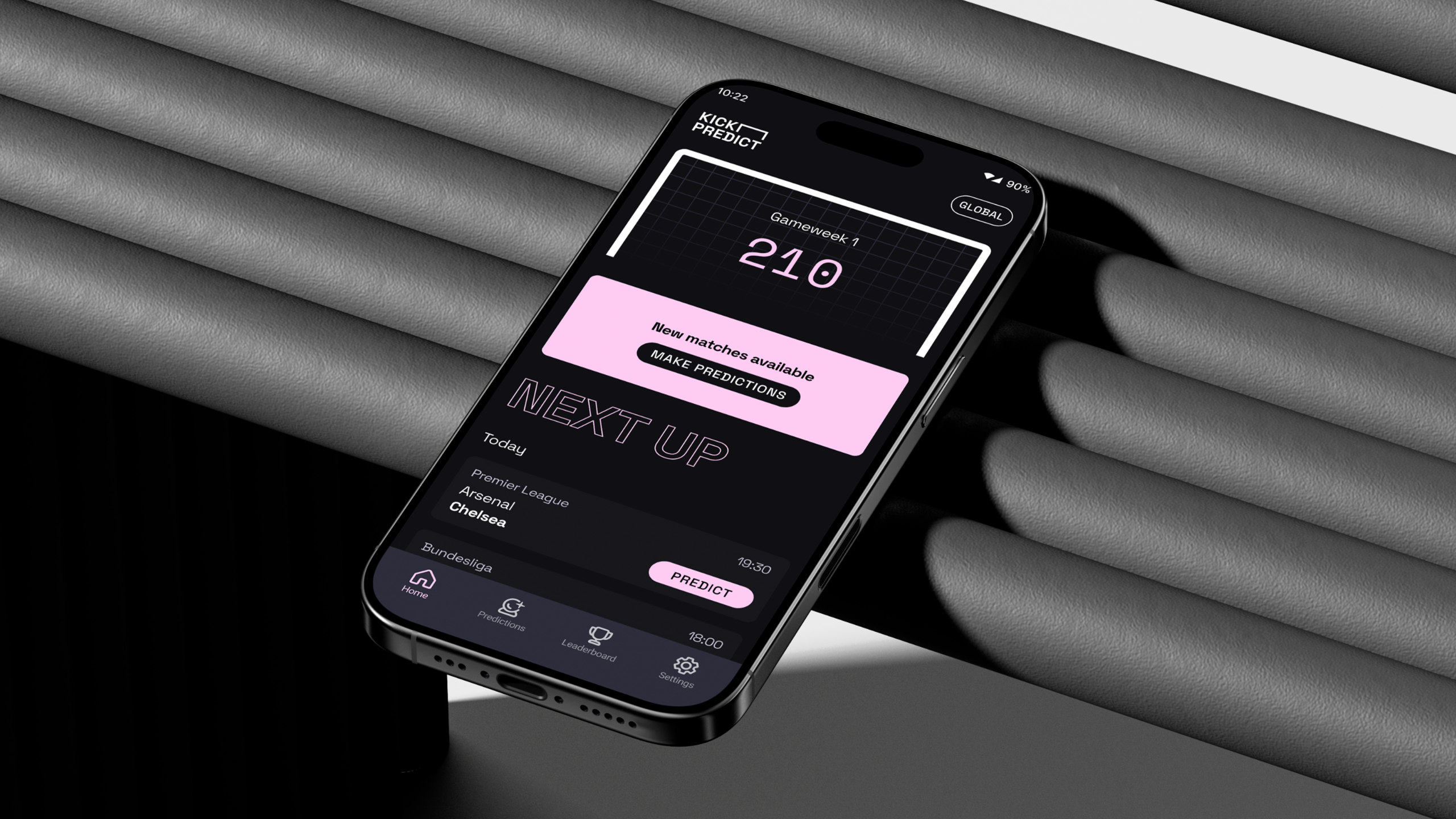
In order to create something that was bold and clean the Studiomade UI + UX team headed up by Angelo Iannelli chose an energetic typeface and contrasting colour palette which created an interface that felt fresh and familiar. We built in animations throughout Kick Predict to help ensure everything had a playfulness with small rewards to the user throughout. The live league table itself went through rigorous design processes and testing to ensure that we were surfacing only what matters and that it was intuitive to understand. This resulted in big scorelines, data points and carefully selected terminology on dropdowns. Push notifications, weekly drops, visible progress, and reward mechanics keep players returning without feeling demanding.
Smart functionality
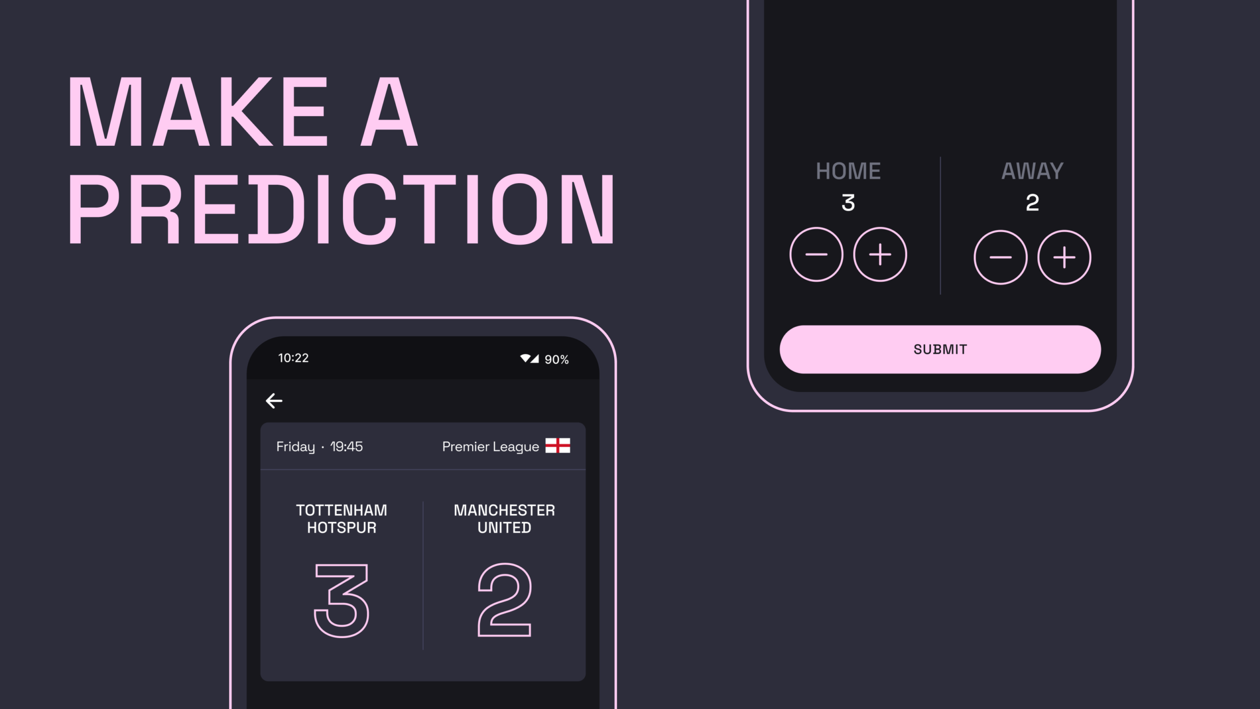
A detailed backend architecture to how Kick Predict has been built enables scheduling of fixture creations via integrated data APIs, sampling 10 matches from supported competitions (Premier League, Championship, Champions League, La Liga, Ligue 1, Bundesliga, Serie A and more). Results flow back into Kick Predict in real-time, with calculations posted live to league tables updating daily and weekly points – constantly recalculated per user.
Our development team led by Jono Gold developed a Firebase database that stores users data, leagues, predictions and league membership; alongside additional information such as match status. We allow users to create or join private leagues with a simple shareable code.
Revenue creation
Throughout the design and creation of Kick Predict, all members of the team researched and explored different mechanisms for revenue creation within the product experience. Led by Strategic Director Phil Reid, we opted to create a feature-set model where Kick Predict is available for free to all users – but with the option of upgrading to a ‘Pro’ version for a set monthly or annual fee that unlocks certain features. These include the ability to view a competitor’s prediction pre-game, being able to create multiple leagues to compete in and other feature includes.
Why it works
Kick Predict blends the simplicity fans love with an intriguing points scoring concept, all wrapped in an excellent gaming experience. Weekly cadence and live scoring creates a habit whilst private leagues and social comparison fuel engagement. A scalable technology stack (API‑driven ingestion, realtime updates, push messaging) keeps everything fast and dependable. The result: a compact, joyful game and new venture that has the foundation to grow: from small friendship groups to large brand endorsement and engagement.
The challenge
Broadridge is one of the world’s biggest fintech companies, with more than $6bn in revenues, providing technology infrastructure and solutions to some of the world’s leading financial institutions. In 2023, it knew that asset managers were facing a wide and complex range of challenges, from fee pressures to evolving client expectations.
These challenges also present opportunities for asset managers to meet unmet client needs, stand out from competitors and fuel engagement. To capitalise on these opportunities, they need cutting-edge tools with data, to define and measure a firm’s competitive advantages, and strategy, to deploy them effectively. Broadridge decided to build the world’s first custom-generated AI for asset managers.
As an ongoing creative partner, we were asked to design the UI and UX, support with logic and customer journey definition, create a visual approach that could scale, and craft marketing assets including an explainer video.
How it works
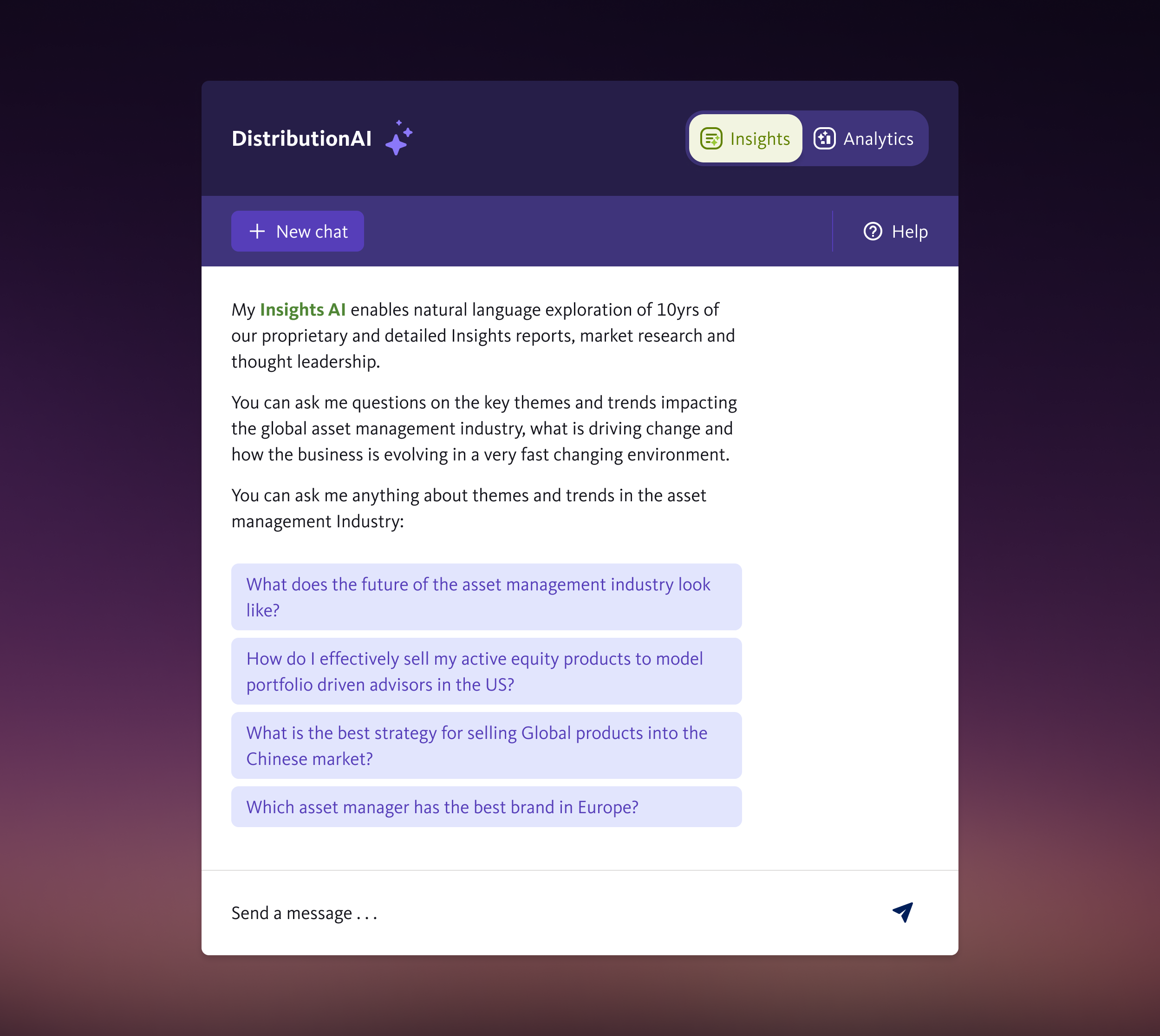
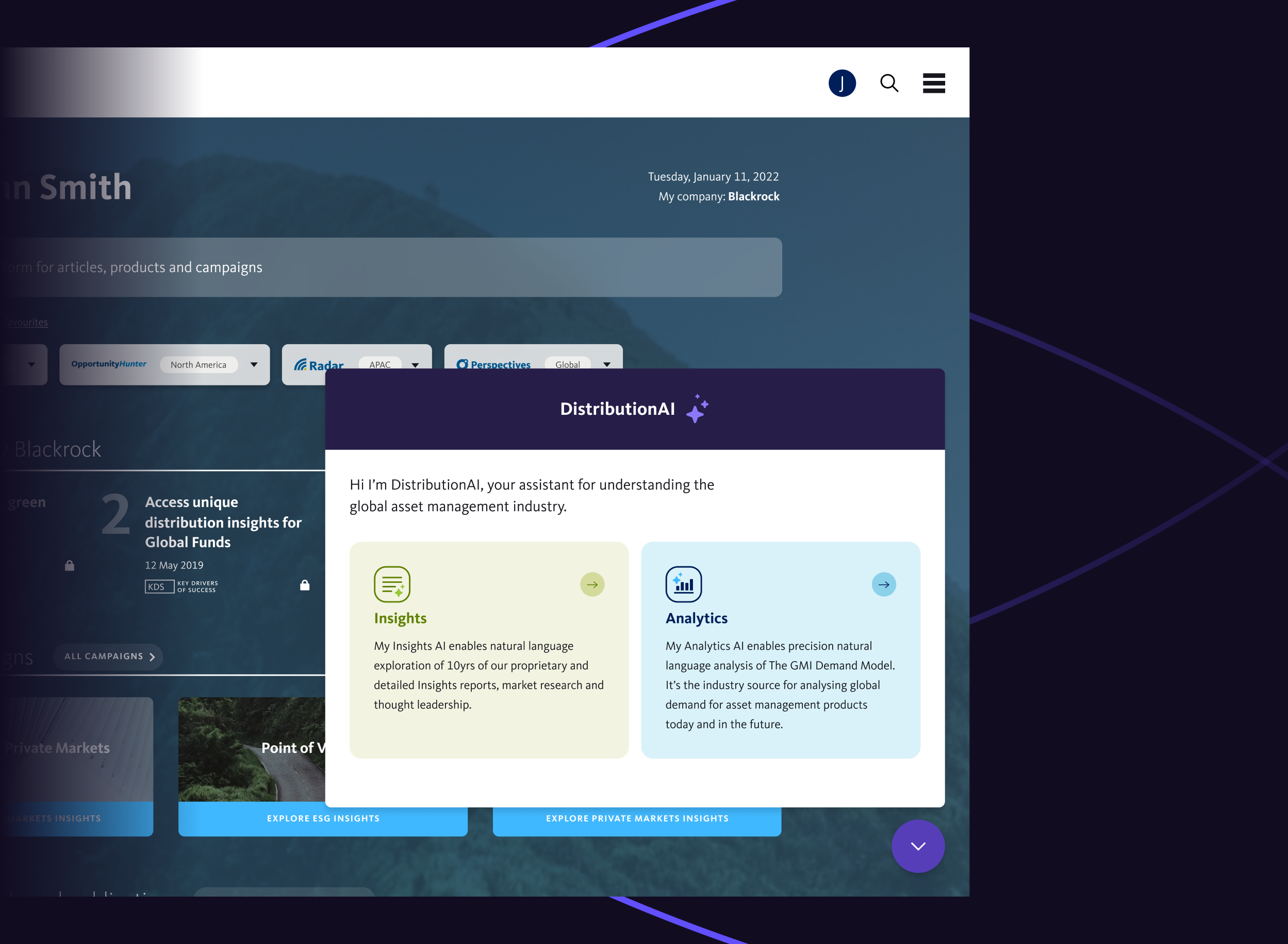
DistributionAI has two areas: Insights and Analytics. Insights is trained on ten years of Broadridge’s proprietary research, insight reports and expert thought leadership. Users can explore themes and trends and get thematic answers to questions impacting the global asset management industry.
Analytics, when launched, will provide precision analytics, quantitative answers and forecasts about current and future demand for global asset management products.
The product uses natural language generation techniques to allow users to explore and interrogate Broadridge’s distribution knowledge base.
AI UI and UX
We designed the look and feel of this product to fit with Broadridge’s existing brand guidelines including an ident and avatar that is instantly recognisable as an AI tool.
We had to make the UX simple yet compelling. This had its challenges, such as two separate areas, each using different data sets. Some of the solutions we addressed were clearly signposting the two core functions; question depth of each chat (how much a user can ask in one chat before resetting the query); how they can interrogate its answers; source identification; when to start a new chat; and the presentation of parsed data.
Like publicly available AI, DistributionAI uses natural language generation techniques, but unlike ChatGPT and others it’s trained on specialist asset management research and data that’s not publicly available. Unlike public GPT models, sources are included at the bottom of its responses, so these can be verified to validate response.
We also created an explainer video to introduce DistributionAI to Broadridge’s existing and potential clients. Watch our 30-second version:
The outcome
DistributionAI is an intelligent virtual analyst, using AI to give asset managers fast access to ten years of proprietary research, global market insights and thought leadership, plus unique data and analytics from Broadridge’s market-leading products.
Leadership, strategy, product, marketing and sales teams can now access knowledge and analysis at a speed they couldn’t previously, and respond to industry dynamics with decisions based on evidence. It is empowering them with the intelligence and insights they need to compete in a fast-paced, changing environment.
We’re working on a number of AI projects. If you’d like to discuss yours, contact Phil Reid, our Strategic Director, at phil@studiomade.co
The UK is a global leader and innovator in healthcare. It’s home to one of the largest medtech industries in the world. It’s a global hub for life sciences (second only to the US), with a unique and collaborative ecosystem across government, business, academia and the NHS, and has the strongest biomedical pipeline in Europe.
It leads in its research capabilities and has a rich history of innovation, developing new drugs, devices and therapies. There are opportunities for investors and businesses across all these areas.
It is the role of Healthcare UK (part of the DHSC) to promote the sector to overseas markets and increase the UK’s share of healthcare services exports. It helps companies do more business abroad and helps overseas healthcare organisations find a UK provider with the expertise and services they need.
To this end, as a marketing tool, it had a listing of all UK healthcare organisations who are ready to partner with overseas markets and export their unique and innovative products and services. The problem was, it was on a PDF.
This had to be manually updated every time a company detail changed, which was time consuming, expensive and prone to human error. The data base was often out of date, and wasn’t searchable by interested procurement parties.
It was time to go digital.
What we did
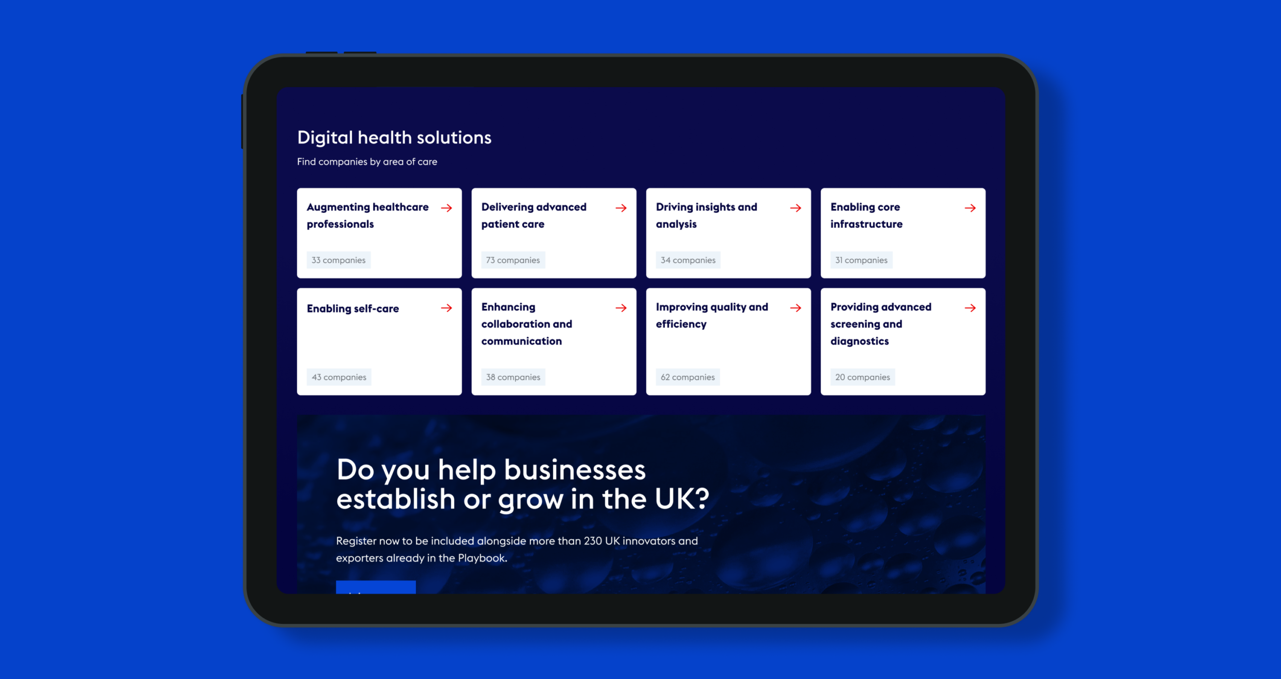
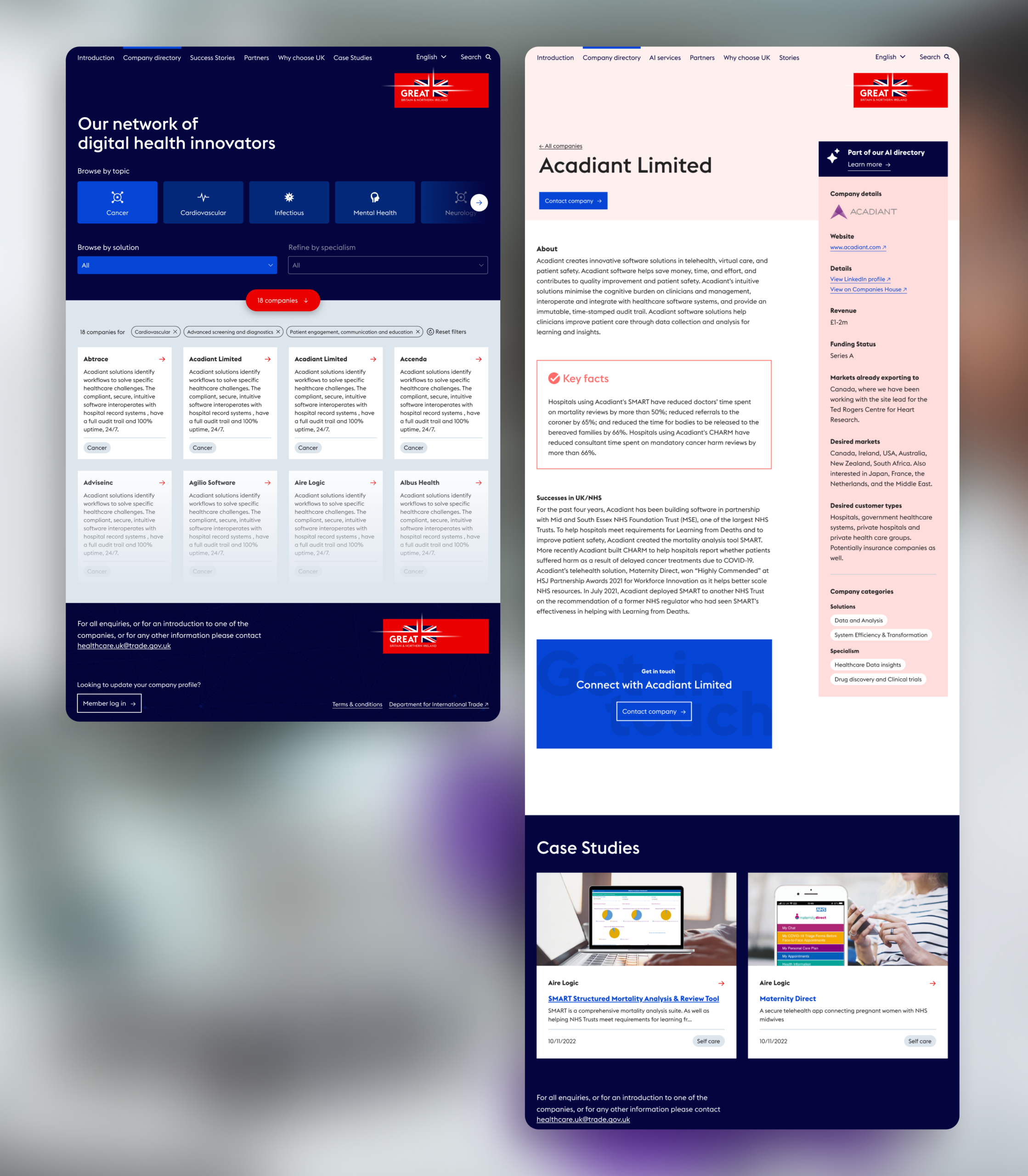
Our mission was to create a unique, custom-built digital tool containing all the companies Healthcare UK (HCUK) wants to promote. It had to be easily searchable across categories and companies had be able to edit their own information.
User Experience and development
We designed a completely bespoke UI and UX, with a fully customised front-end, developed with WordPress. We chose WordPress for its ability to control content, and its easy-to-use dashboard.
Our main concern was the process for companies to update their details, with 100+ users who had varying levels of digital experience. We built publishing capabilities to assign users different levels of access to edit their information, and to notify both parties at each step of the submission, sign-off and publishing process.
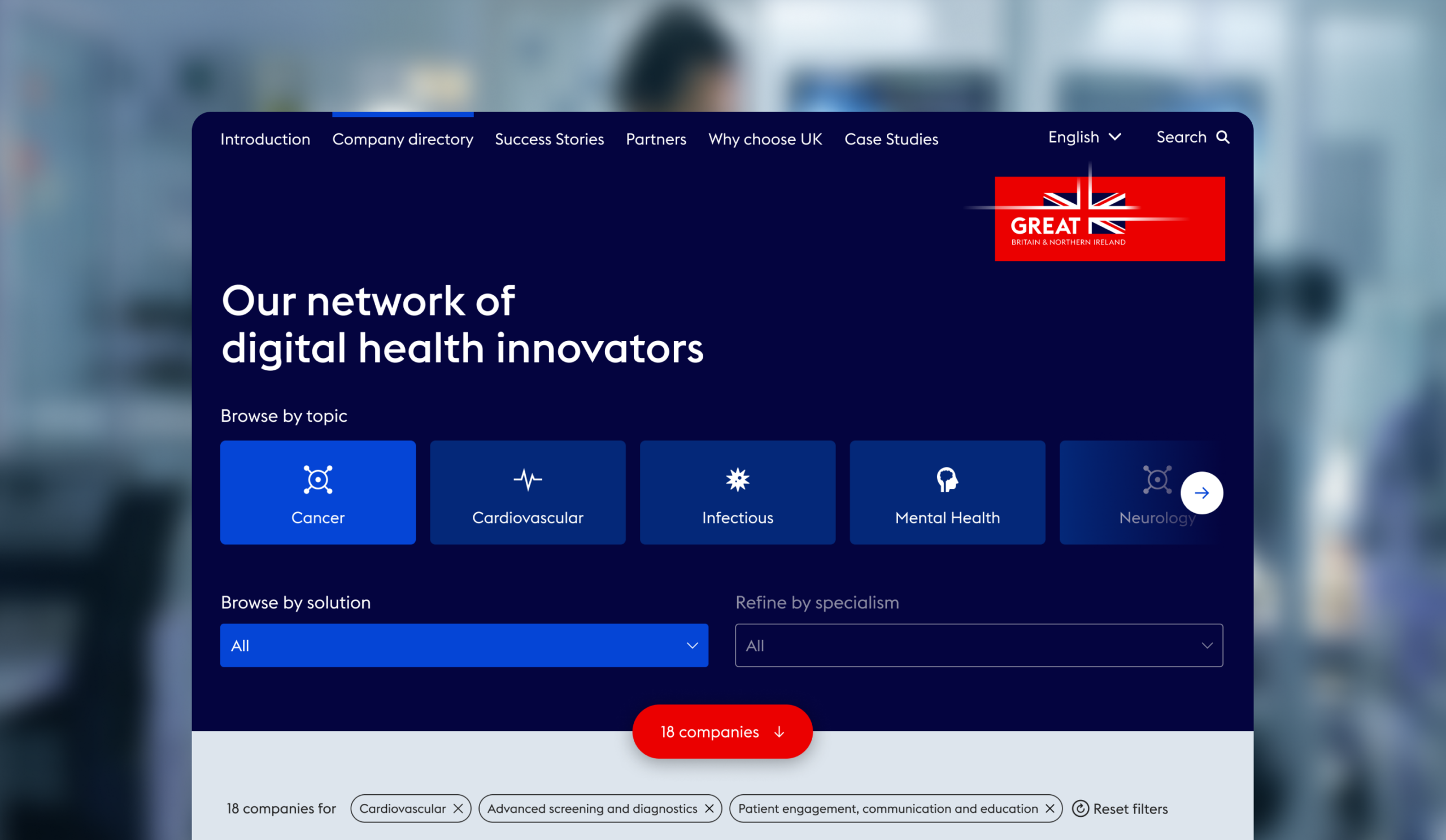
Through testing and iterating, we tailored the process and built a frictionless experience for users, and created a training document for all stakeholders. We custom built the database that houses all of the different company admins to be provide flexibility specific client requirements. We also custom built the search functionality, so that visitors looking for UK partners and talent can search by category, subcategory and company name.
User Interface
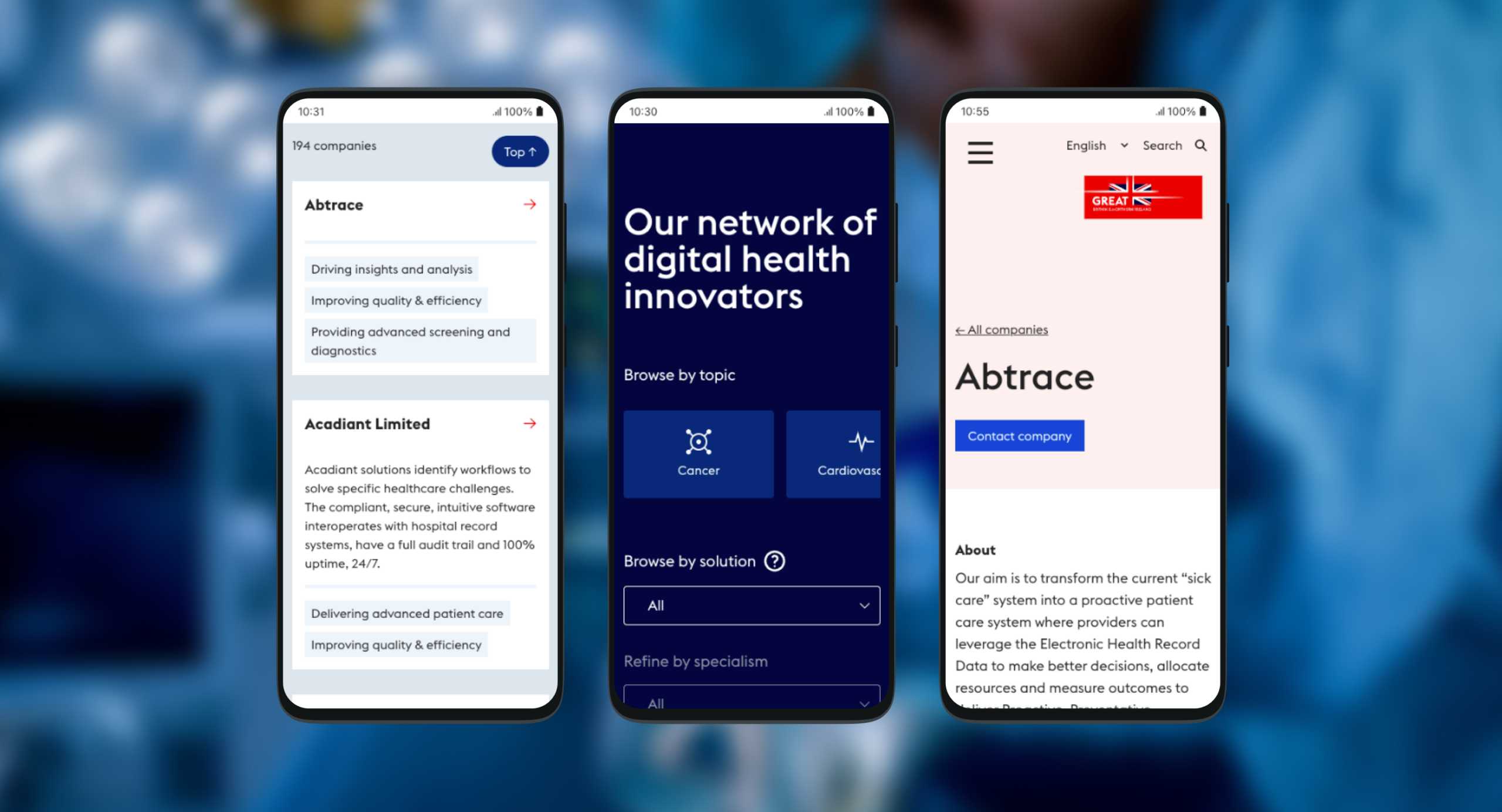
Our look and feel followed HCUK’s existing branding guidelines. We focused on designing a digital experience that looks good and is easy to navigate on a tablet, as these are often used to display information at HCUK events. We made it easily searchable so that potential partners and commissioning bodies can find providers offering what they need.
Outcome
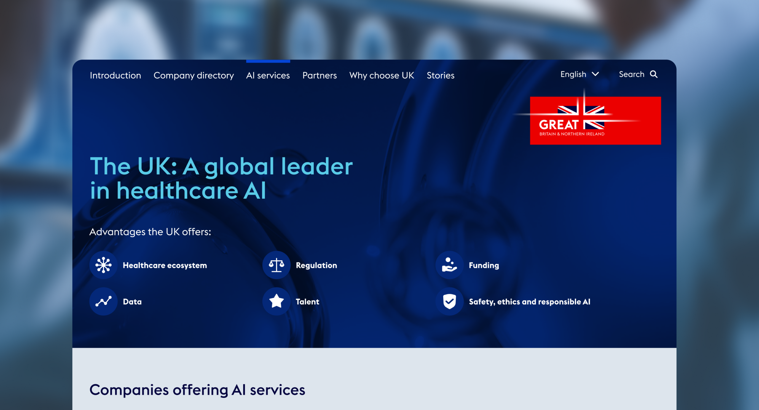
The Digital Health Playbook, launched in January 2024, features 180+ selected healthcare companies, each offering something unique and who are committed to innovation, collaboration and international expansion. Categories include clinical care, out-of-hospital care, insights and analysis, core infrastructure, quality and efficiency, screening and diagnostics and more. It’s a significant marketing and engagement tool for HCUK, helping to promote UK businesses and boosting the growth of companies, the sector and the UK economy.
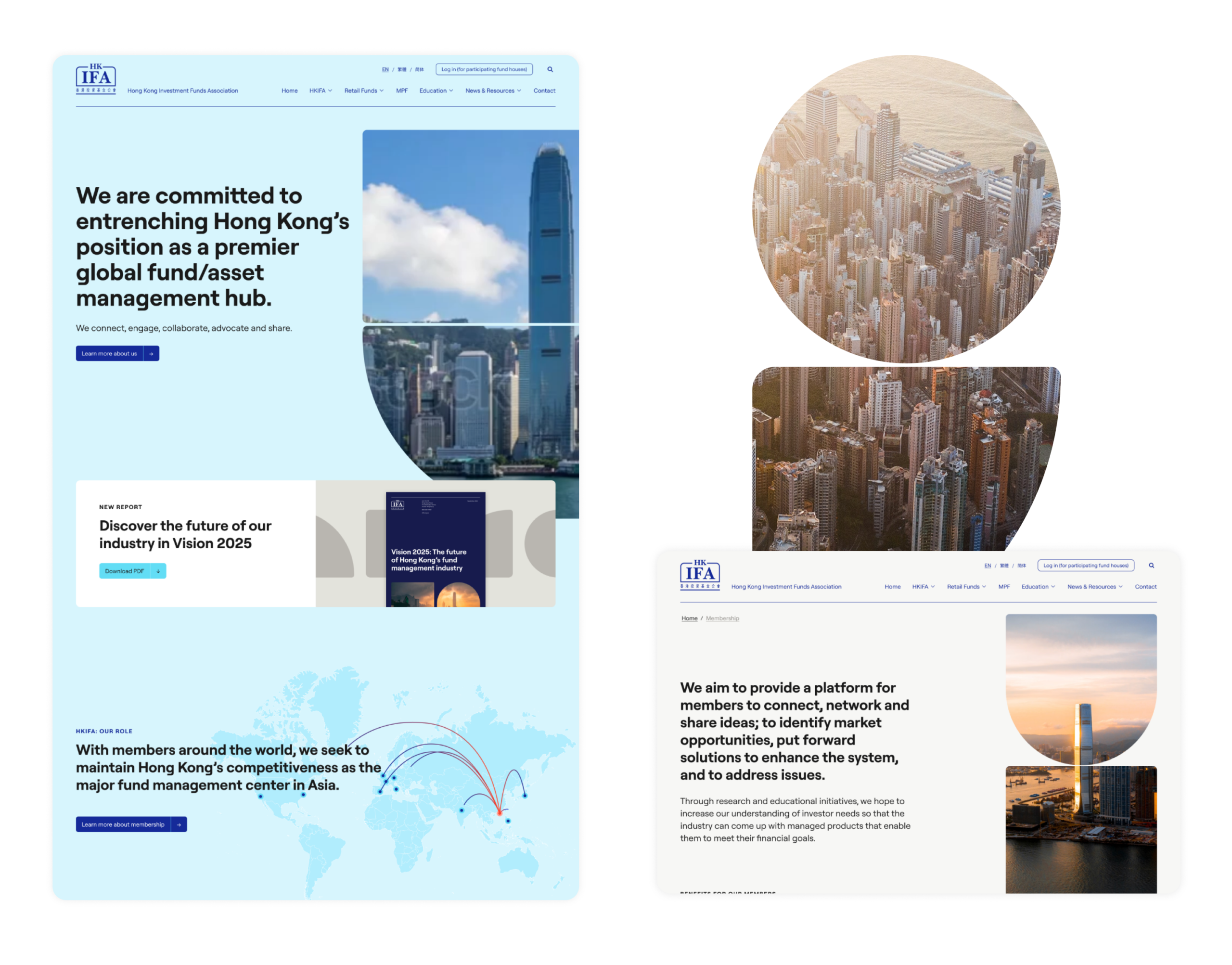
The Hong Kong Investment Funds Association (HKIFA) is a non-profit organisation representing the fund management industry. It exists to cultivate the development of the fund industry in Hong Kong; enhance the industry’s professional standards, in line with international best practices; and maintain the region’s status as the major fund management centre in Asia.
Its website no longer reflected its position in the industry. The organisation wanted a bespoke new digital presence that better presents the expertise, services and knowledge base it offers to its members. It had to be brought up to date in how it looks and how it functions, have an easy-to-access resource library for members, talk to broad audience groups and be a tool for communication within the organisation.
What we did
We built an improved, user-led digital environment using our proven steps, from initial strategy through to design, prototyping, user journey and website build that functioned across multiple languages. We began by refining the messaging, and crafted a core narrative that presents HKIFA’s market advantage and positions it as an authoritative knowledge base, with an easy-to-access resource library for members.
With the client located in Hong Kong, we ran remote, interactive workshops to manage and lead product development from concept through the development process. This will continue with review and performance monitoring post-launch.
Design and build
We redefined the digital structure, considering how content will sit and how each audience will navigate around it. We designed a creative look and feel – with a clear UI and UX – to uplift the brand, with a user-focused and human-led approach (as we do for all digital product creation).
There were a number of specific requirements. It had to be secure, GDPR compliant, scalable, follow W3C content accessibility guidelines, integrate with existing data, have multi-language functionality, be easy for HKIFA’s teams to use and update, and able to manage CRM database integrations and future portal additions. It also had to offer English, Formal and Simplified Chinese translations.
Crafting a bespoke WordPress environment allowed us to meet all these requirements. The platform is a safe GDPR-compliant infrastructure that accommodates existing information and can integrate with any other existing data that HKIFA holds. We built in rich, organic-focused SEO as well as data analytics and reporting, so that results can be easily measured. We employed WPML translations allowing HKIFA complete control over all language input.
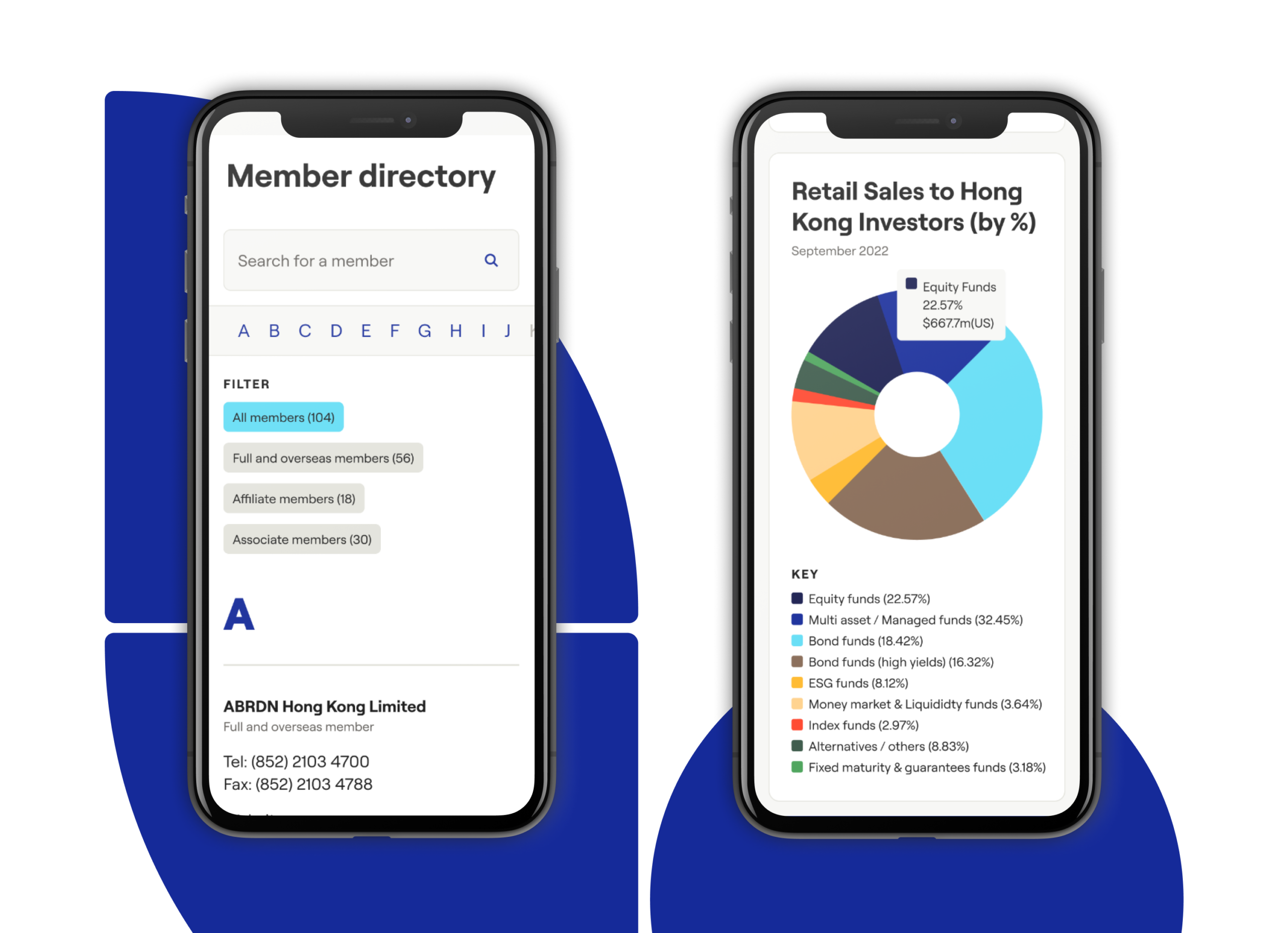
Automated display of data
A unique element of our digital delivery is the automation and display of data pulled directly from third-party vendors linked to HKIFA. This includes organisations such as Morningstar, FTSE Group and Lipper. Our team wrote a number of individual automation scripts, which run at set times to retrieve new data from multiple sources, and adds latest versions directly to the HKIFA website.
For daily MPF figures (Hong Kong’s mandatory provident fund for retirement savings) we retrieve an updated file every morning, extracting figures and adding these to our own database, which is then displayed on the HKIFA website. This has removed significant manual input that previously had to be done by the HKIFA team, and gives visitors a lot of added value through real-time data.
Digital infrastructure
The website is hosted on Kinsta, a Google Cloud hosting environment that utilises a tech stack optimised for WordPress. It can handle high traffic spikes easily and is secure, with two-factor authentication, GeoIP blocking, hardware firewalls, many advanced features and active and passive security measures. In the future we can plan and develop prioritised integrations where necessary with custom APIs as required.
Content management system
To empower HKIFA’s internal team we developed a digital platform that they can independently control and manage, with a WordPress CMS that’s simple, functional and easy to use at launch and in future. It’s able to handle the future content additions and database integrations that have been part of our project requirement planning.
The outcome
We built a bespoke, strong, scalable digital platform and brand presence that meets multiple client needs around functionality, data automation, language translations and accessibility. It positions HKIFA as the authority it is, improves the way members can engage and access knowledge and insights, and is set up to easily adapt to data-led future needs.
Hearing loss is an unaddressed issue for millions of people. It can make conversations and social interaction harder, increase isolation and is linked to cognitive decline and increased risk of dementia. More than 40% of over-50s have some level of hearing decline. At work it can stop people fulfilling their potential or force them to leave or retire early. Yet most of us don’t go for hearing checks. There is social stigma and fear attached, not helped by a mechanical clinical process.
Kennedy Woods – a social impact architecture and design practice – wanted to change this. Addressing hearing loss is a huge untapped opportunity for long-term cognitive health, productive extended lifespans and improved quality of life. Co-founder Tom Woods came up with the idea of Hearing Birdsong, a new way for people to explore and monitor their hearing that revolutionises the current clinical process. It humanises screening by using pleasant, familiar sounds of nature and birdsong and it’s done in the comfort of home, so that people can assess and protect their hearing health and long-term wellbeing.
The concept was awarded a grant by the Design Age Institute to develop it into a working digital prototype. Studiomade won the competitive tender to partner for both the design and development build of this innovative and pioneering product.
The result is a collaboration between Studiomade, researchers, engineers, designers, developers, clinical practitioners, volunteers, experts from UCL, Imperial College and the Dyson School of Engineering and people with hearing loss. Hearing Birdsong was exhibited as part of the Design Museum’s Future of Ageing exhibition in 2022.
What we did
Audio soundscape
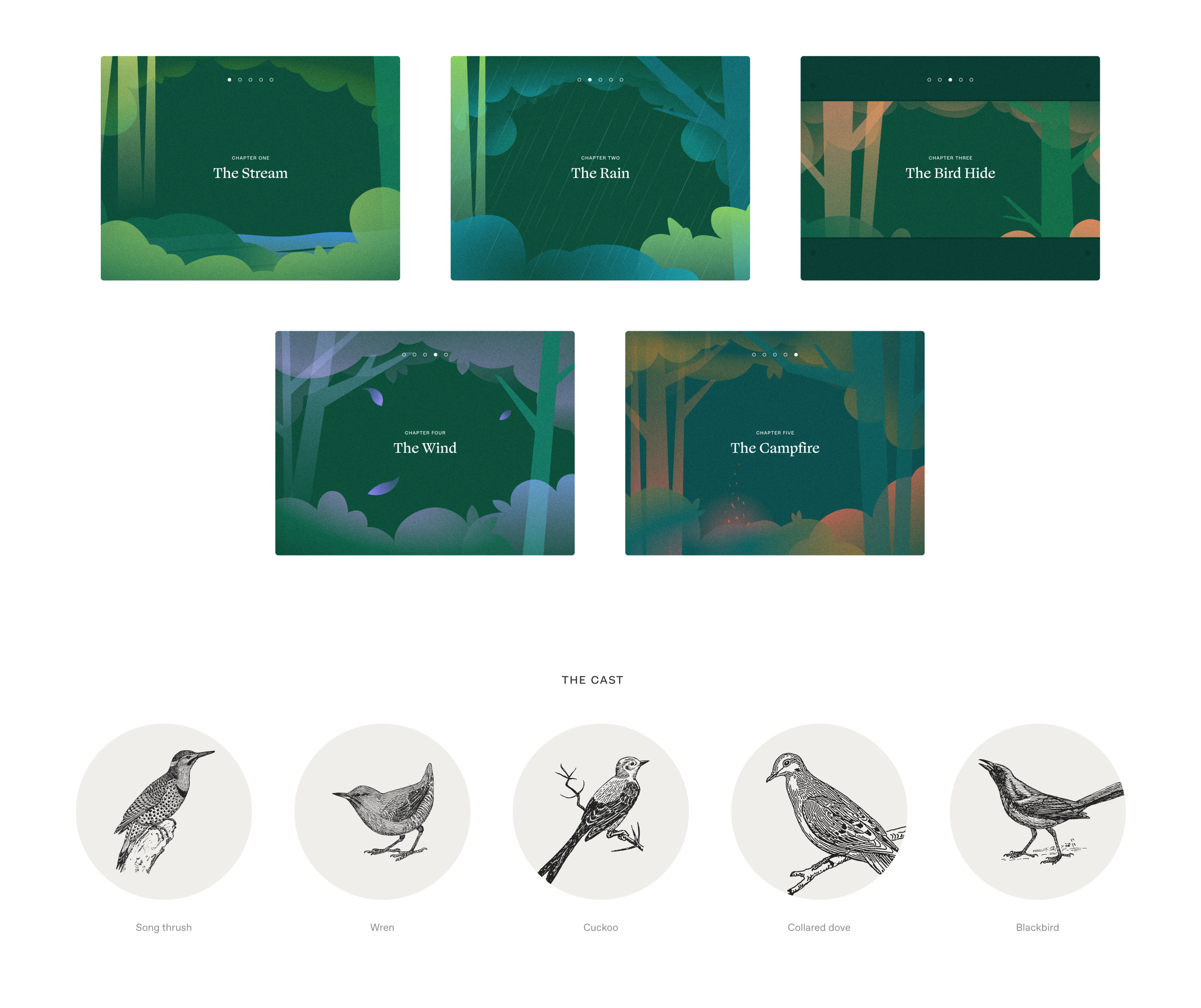
We replaced the mechanical, abrasive sounds of a pure tone hearing test with a richly detailed forest soundscape: the songs of five familiar British birds alongside successive sounds including a flowing stream, rain and wind. These were engineered to blend into a dynamic yet calming audio experience. It uses bird calls that occupy a narrow band of frequencies, the same frequencies examined in a traditional hearing test. This gives users performance indicators across their entire hearing range.
We worked with Professor Adrian Davis OBE, a scientist specialising in the public health aspects of hearing. He helped us define the logic and select which type of hearing test to use within this format. We also consulted with prominent consultant otorhinolaryngologist Taran Tatla. The audio was created and output by Oscar Jones, a PhD student at Imperial College London.
Language and safeguarding
This experience was intended to provide a less abrasive option than the traditional hearing test, so we didn’t want people to feel isolated or scared by potential issues. The product had to be supportive as people did the test and received their results.
The language we used in the script had to be accessible and feel natural to as many people as possible. Based on interviews with key stakeholders, we made decisions throughout the process to adapt the language to resonate with the intended audience. For example, we used the word woods instead of forest as it was felt that forest can conjure up images of a dark and intimidating setting.
Design, development and user testing
We developed a journey through woodland, deciding what scenes the user would go through, and what sounds they would hear at each stage. We designed screens, buttons and language.
Throughout the project, a control group tested our design and development iterations. What elements were visually distracting? What language was inaccessible or off-putting? How would users with hearing aids interact with the tool? We also worked with people in one-on-one sessions to test elements including logic, timings, the visual look and overall feeling.
This gave us many insightful observations. We brought all of these into our work as we progressed and built a refined experience that would meet our audience’s needs.
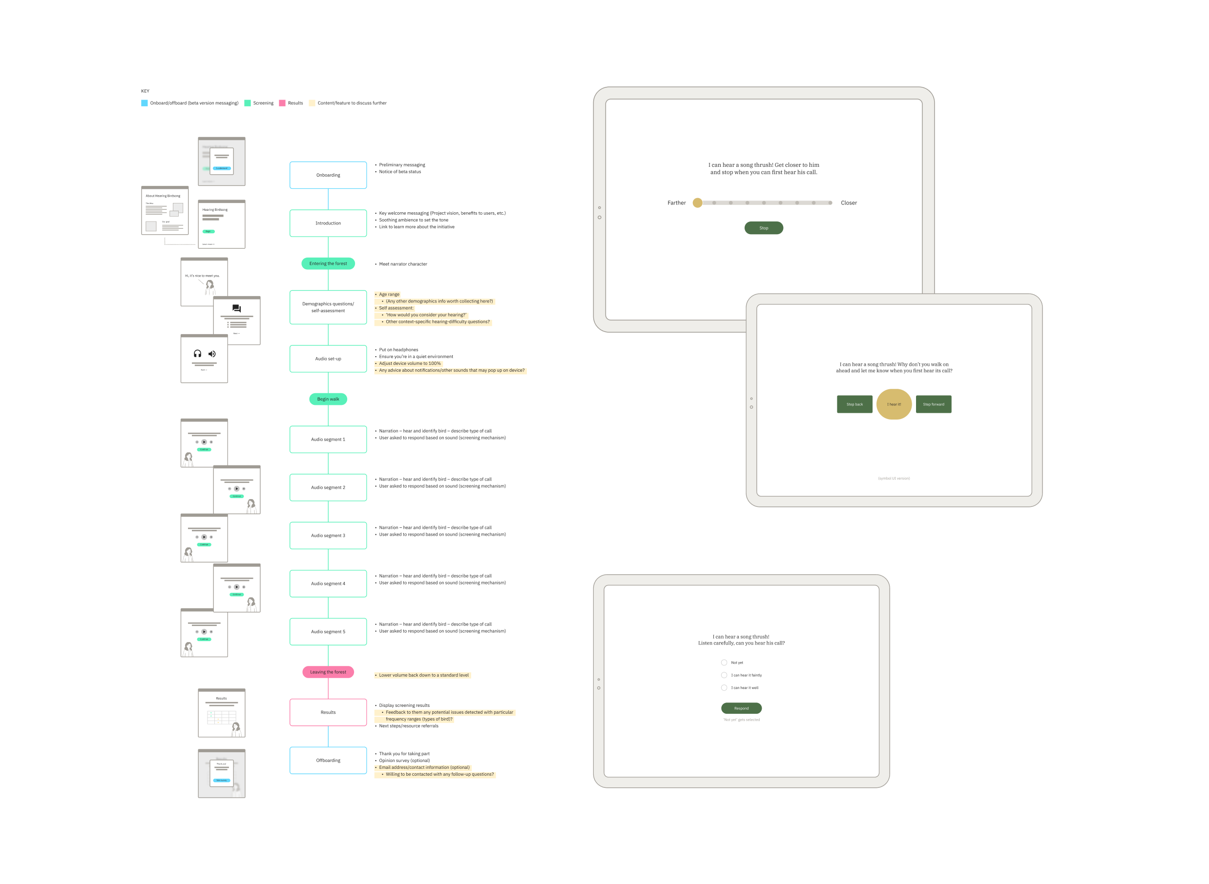
Approach to UX and UI
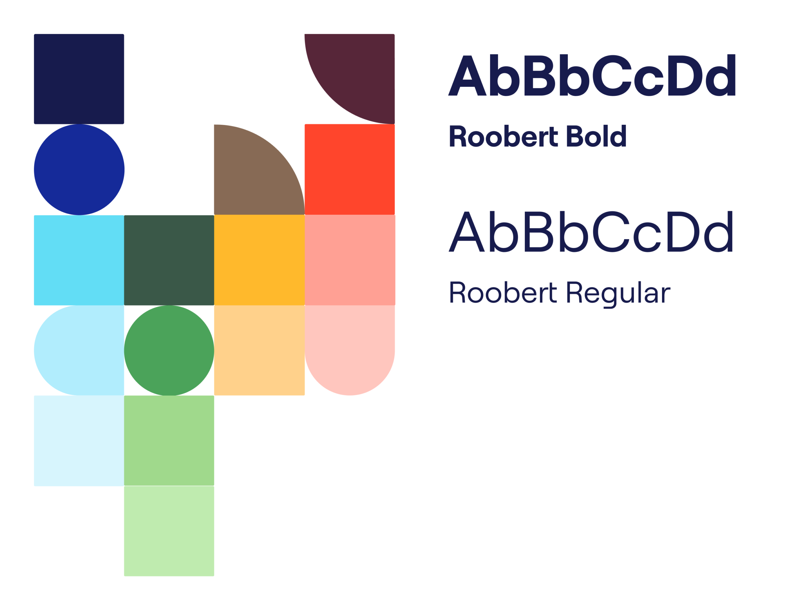
Design accessibility was essential. We looked closely at typographic choices, colour (contrast accessibility and legibility), illustrations, and the size, clarity and consistency of interactions. We wanted this online woodland to feel immersive and calm, so we used soft colour transitions, simple shapes and movement to create a playful world inspired by children’s storybook illustrations.
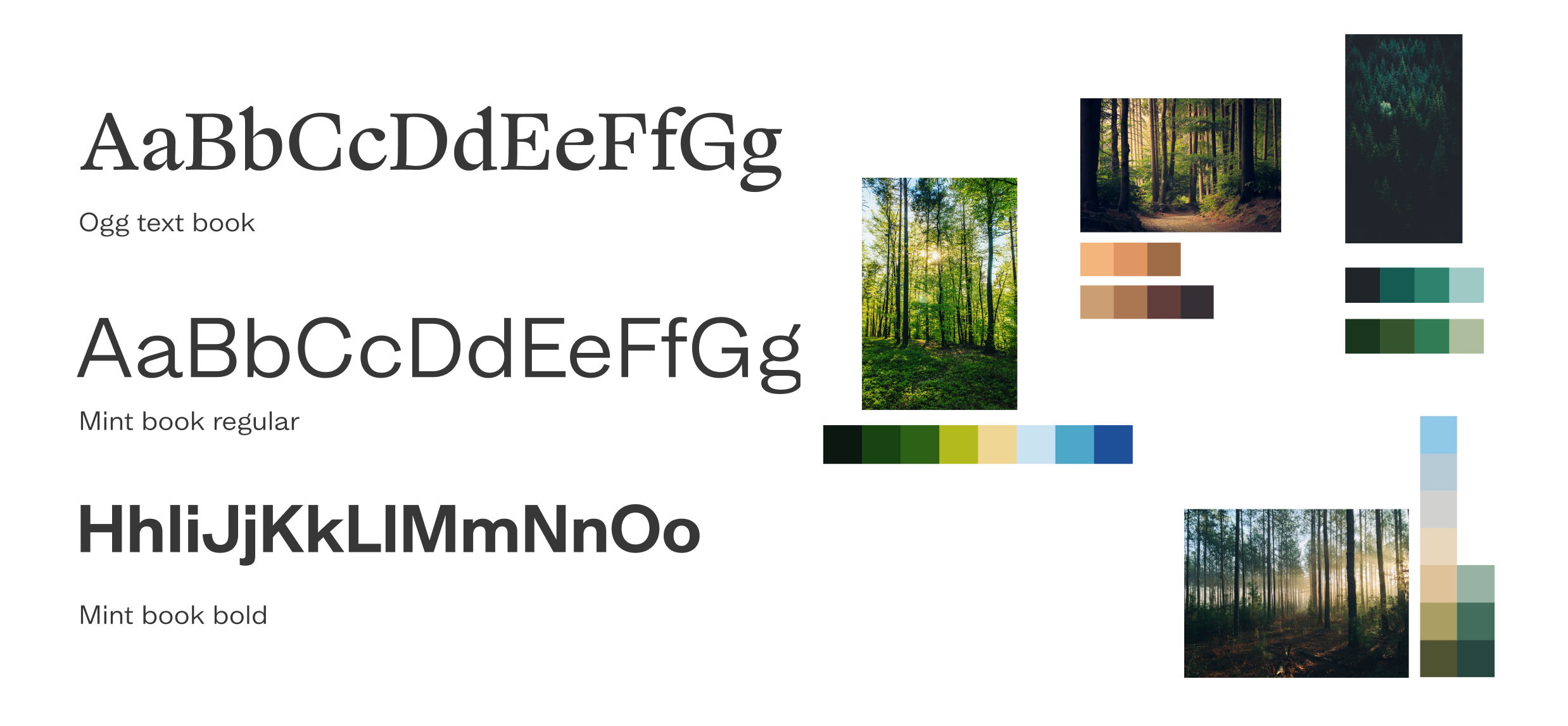
Pairing visual design and audio
The audio soundscape required a visual and illustrative approach that enhanced the user’s experience but kept the focus on the sound. We drew all the illustrations, crafting a series of options before arriving at the final selection used in the beta product. At points when users are asked what they hear, we softly blurred the background illustration in order to keep the focus on the sound, not the scenery. We decided not to show birds, so that people wouldn’t be prompted to say they could hear them and could use their imagination.
The results screen
It was important to get the results screen right. The explanatory language has to be clear and concise, and graded results can’t be confrontational or judgemental. We give a clear result for each stage of the test and link to external helpful resources where users can go for expert advice. Over time, as the product is used and feedback is gathered, we’ll gain further insight and be able to tailor it to effectively support people who need help.
The outcome
Consumer appetite for digital health support is growing. Digital health solutions are creating a hospital-without-walls approach that blends in-patient care with alternative models including community and home support.
We successfully designed and built a working digital prototype and took Hearing Birdsong into its beta phase.
Through media coverage, online and social media campaigns and the Design Age Institute, thousands of people in 100+ countries used it. Multiple contributors have all helped to get it to this point as a working digital product. The project is now ready for funding and future expansion and development, with the hope that it could become an NHS screening tool.
For people with opioid dependence, being on the correct (optimal) dose of methadone and buprenorphine is an important factor in treatment efficacy. Underdosing Opioid Agonist Therapy (OAT) leaves people at risk of use and overdose. But many people receiving OAT have poor understanding of how treatment works, including issues relating to dose and effect, and this limits the efficacy of treatment.
To help patients get the most out of their treatment they need a clear understanding of how treatment works, the benefit of higher dosing and, most importantly, what the right dose is for them – rather than being tied to a magic number or focusing on the fact that higher doses will result in a longer period of dose reduction to abstain. SODA helps patients identify for themselves, through a simple questionnaire, what the right (optimal) dose is for them.
Being on the right dose is crucial. The right dose for you will be different to someone else. It’s not a magic number. SODA provides that crucial support to inform individuals and help make positive change.
The optimal dose is the one that leaves people free from withdrawal between doses (preferably for at least 28 hours), so for people on supervised dosing, getting it doesn’t become a preoccupation or cause of distress if other activities need to be attended to or they’re unable to pick their dose up at their usual time. This can reduce craving, cessation or provide a significant reduction in regular on-top use and does not cause sedation.
SODA has been developed in conjunction with user organisations and treatment service providers as well as focus group tested with a number of patients with Professor Adam Winstock.
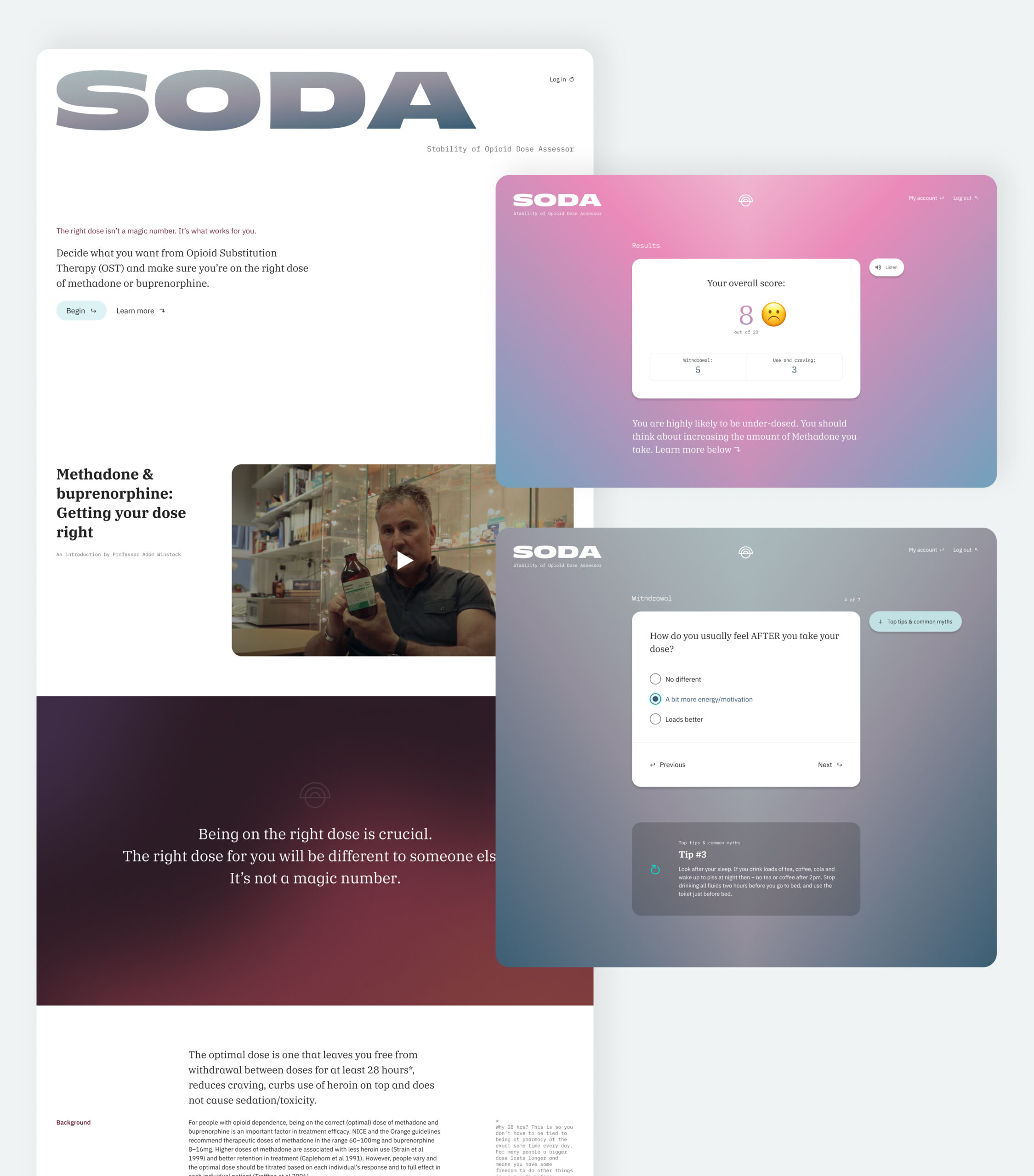
Digital product design
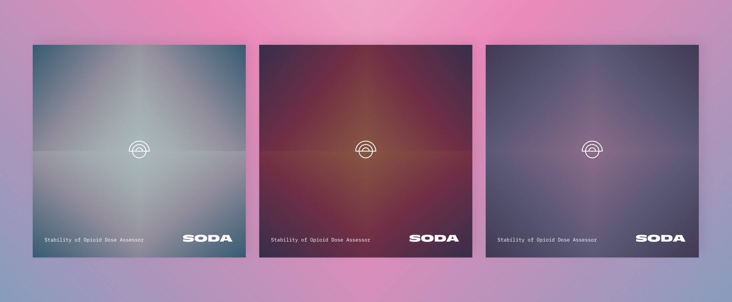
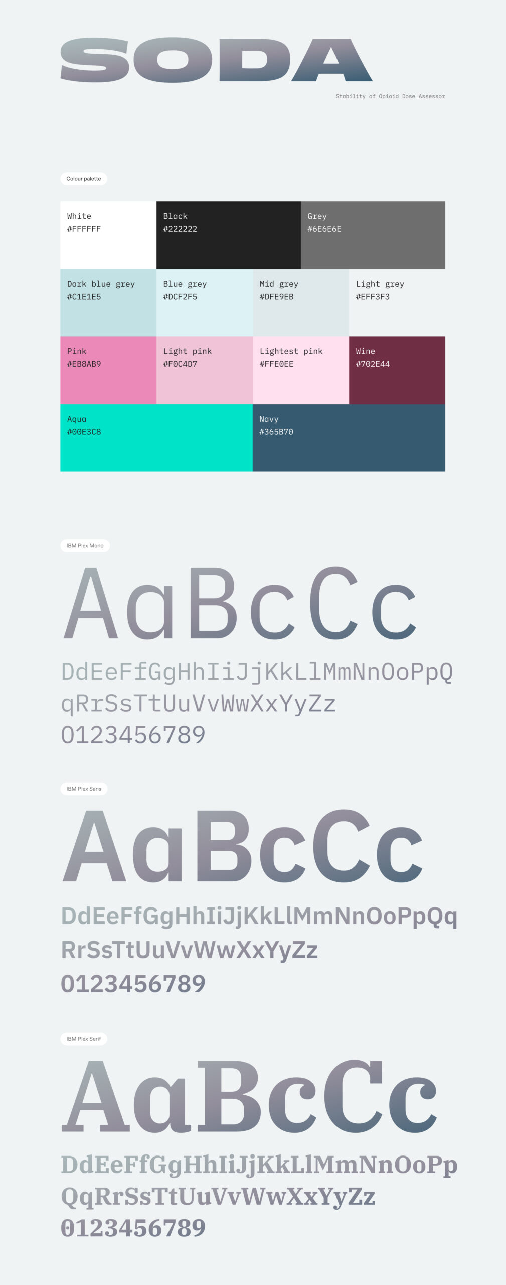
We wanted to build an accessible product design framework that wouldn’t intimidate or frustrate audiences. At the same time it needed to be clear and concise, to underpin the clinical topic that it was addressing. We implemented a soft colour palette of gradients alongside a clinical and accessible font choice that alludes to the pharmaceutical nature of the product. We used emojis in the results table to help remove any potential stigma from the tone of wording and hopefully provide comfort to people seeking out further assistance.
Database architecture
We had to build a robust database architecture to underpin the product. It would need to scale to handle an exponential amount of data with anonymous users potentially using a randomly generated login based on an ID generated within the app. We had to develop this to produce results quickly and be scalable. We adopted a React framework combined with a Google Firebase realtime database. This was prototyped and user tested through all phases of product development, right up to its release.
Creating a healthcare product?
We assist entrepreneurs and business taking new digital products to market. This can involve initial concept planning, commercial and investment conversations, and brand positioning alongside the scoping and design of the product itself. We achieve this through workshops, design sprints, conceptual storyboarding, user testing and prototype testing. Speak to our team about how we can support you.
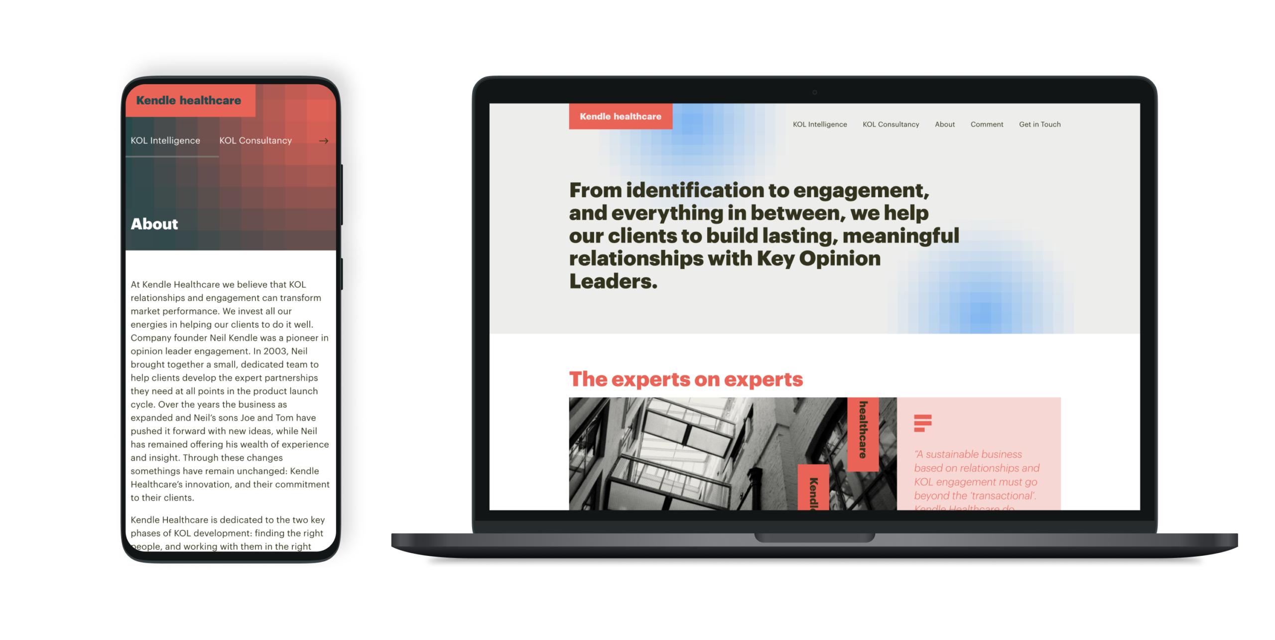
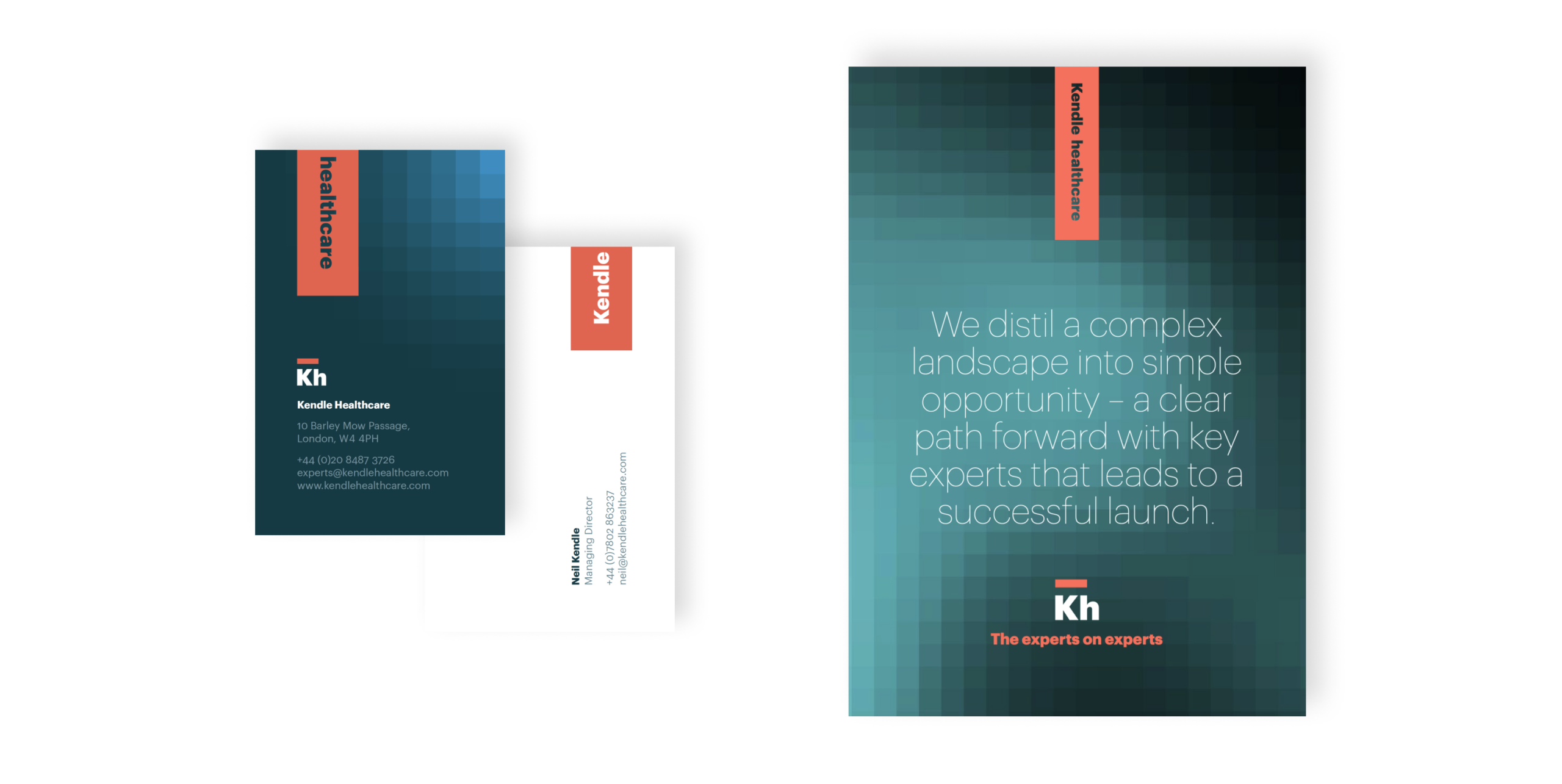
A bold new identity that worked across print and digital and would position them as leaders in the marketplace. The new brand was modern and fresh while giving them the appropriate authority to work in more formal spaces with key opinion leaders – integral to their business.