Arab Health is the largest healthcare event in the Middle East and North Africa (MENA) region and generated business worth US $778 million between medical manufacturers and visitors last year. We were approached by Healthcare UK to help deliver the brand style, event graphics, digital sales tool and associated printed materials for its Arab Health exhibition stand in the Dubai World Trade Centre.
Healthcare UK is part of the Department of Health and Social Care and Department for International Trade and exists to help UK healthcare providers expand their business offering overseas. They promote the UK healthcare sector to overseas markets and support healthcare partnerships between UK and overseas healthcare providers.
Project goals
The intent of the event presence in Dubai was to promote UK healthcare experience and knowledge, displaying the world-leading technology, building and infrastructures and supplier network that puts the UK at the forefront of the healthcare market. This experience would be showcased to prospective market clients looking to utilise and implement this experience within their region.
The challenge
The strategic proposition, Hospital of the Future, presented UK companies capabilities to create world-leading hospitals – through architecture, technology, data, medical and infrastructure advancements – and showcased UK suppliers who can work globally.
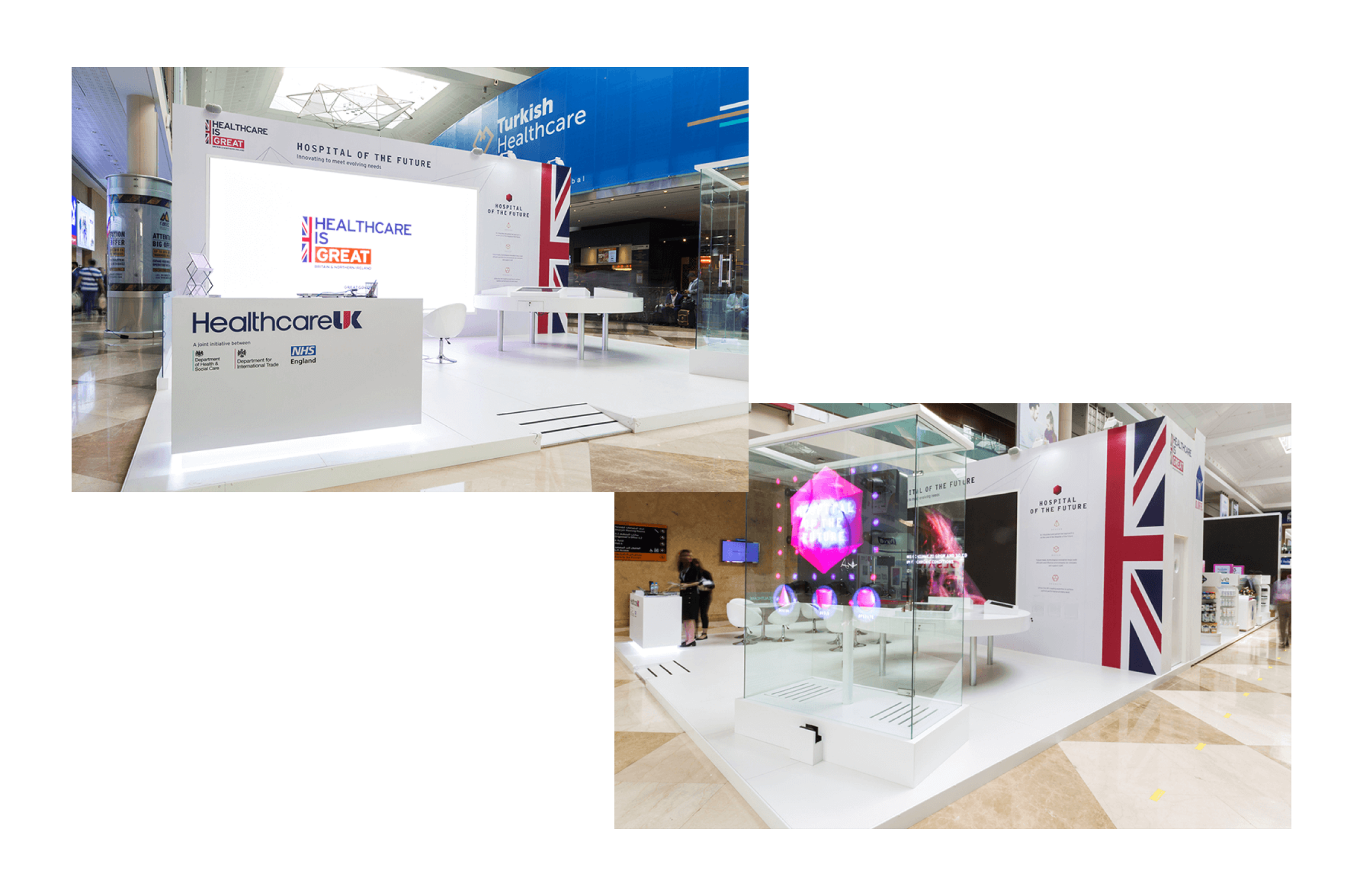
We created a visual style and tone of voice that gave consistency across all media and event elements, representing the innovative vision in a consistent form and suitable for the localised market. The stand had a number of elements: an eight-metre screen showing a video, four touchscreens in an interactive engagement area, a hologram and a number of printed materials.
So that the stand looked unified we created a brand style aligned to the GREAT branding from the UK government and with an aspirational tone. This was applied to all materials and products that we produced, and shared with third-party creators such as Engage Works who produced the Hypervsn Hologram featured at the event.
Messaging and digital tool
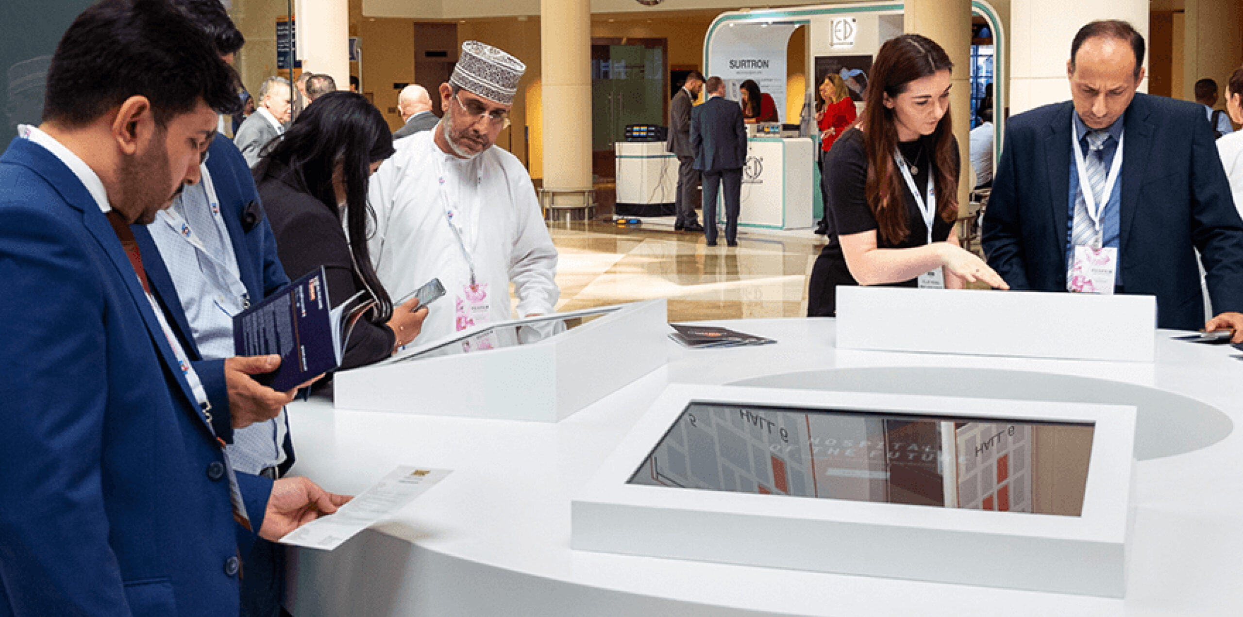
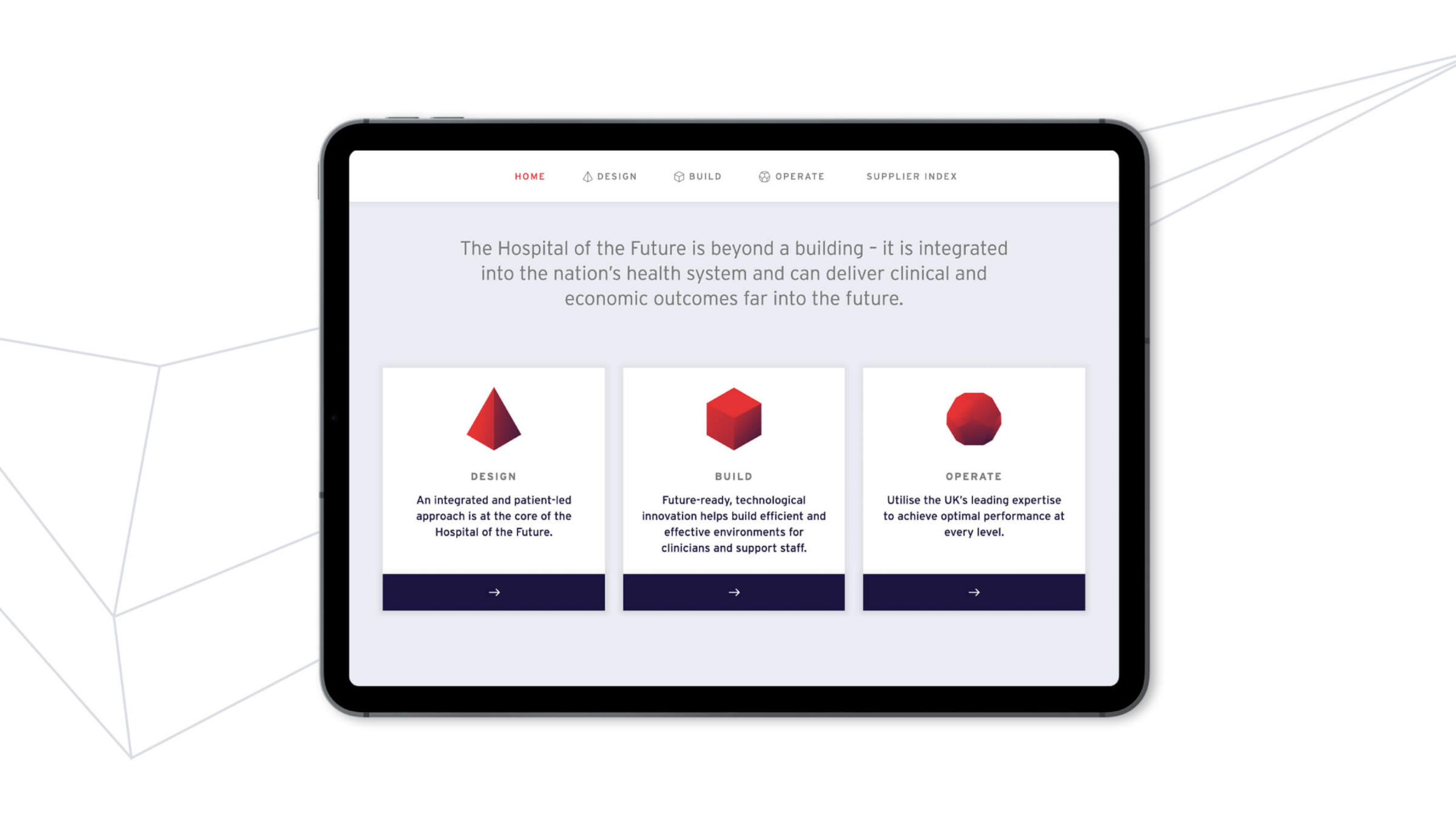
To connect potential clients to UK suppliers, visitors had to be able to quickly access relevant supplier information. For the four touchscreens, we created a digital tool that could be accessed both within the event and externally from all devices. It gave an overview of the concept of Hospital of the Future and showcased each supplier. The tool provoked visitor interest across three categories: design, build and operate.
Our visual system representing these three areas of interest was applied across the stand, hologram and printed materials. The audience learnt about the benefits to each area of experience and used the tool to request direct information and contact from suppliers who could help in each given area.
Visual identity
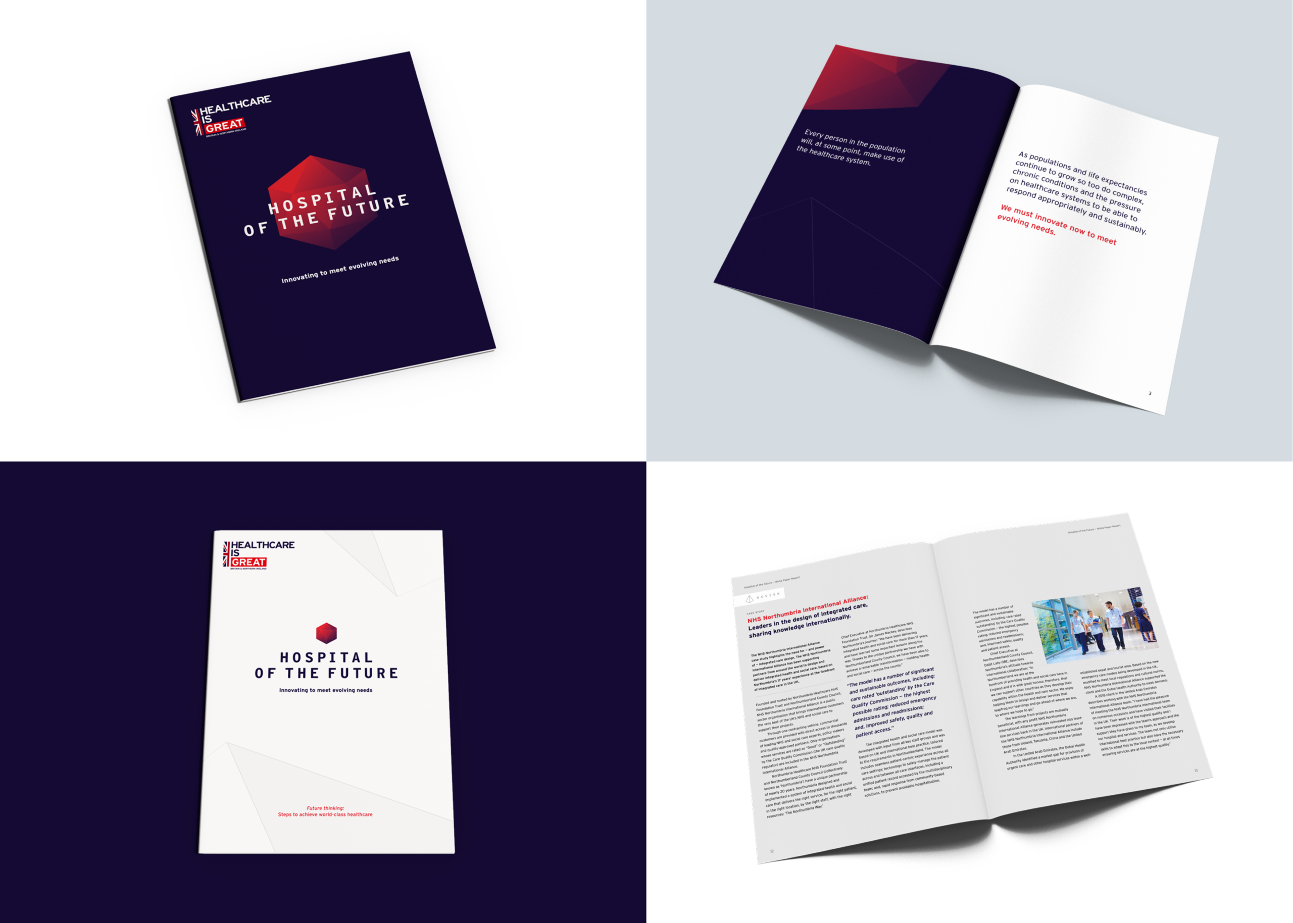
Within our creative style, abstract thin grey lines referenced technology and architecture as well as having a sense of movement and flow to the overall approach. This also gave a strong backdrop to the more attention-grabbing elements – the video and hologram. Centralised around a core visual mark, we applied this style through all collateral.
An engaging event experience
The Arab Health event was very successful for Healthcare UK, promoting the vision of Hospital of the Future and establishing a digital tool that can grow and flex, with scope for wider global launches and rollout. The show had 51,985 visitors from 159 countries, with suppliers receiving validated interest and lead generation from the tool.
An architecture design practice established in 1985, PRC currently operate with three UK offices (in London, Milton Keynes and Woking). Shortly after moving in next door to us (hi neighbours!) they knocked on our door asking to borrow a cup of design & development expertise. We happily obliged and have enjoyed working with their team for the past few months building a new online portfolio and revitalising the approach to their brand.
Brand review
Our work on their site began with an examination of their current brand presence. As an established practice with years of history, they had a trove of past work and had accrued many different ways of referring to it internally and putting it on display for potential clients. We worked closely together to find the right foot to put forward and what traits were paramount to their vision for the company.
As this was not a full-fledged brand overhaul, we were aware that our new design work would need to sit well alongside some of their current branded collateral. We decided to take cues from their logo and current brand style to inform our approach and build out a refreshing visual tone that didn’t make anything they were continuing to use look out of place.
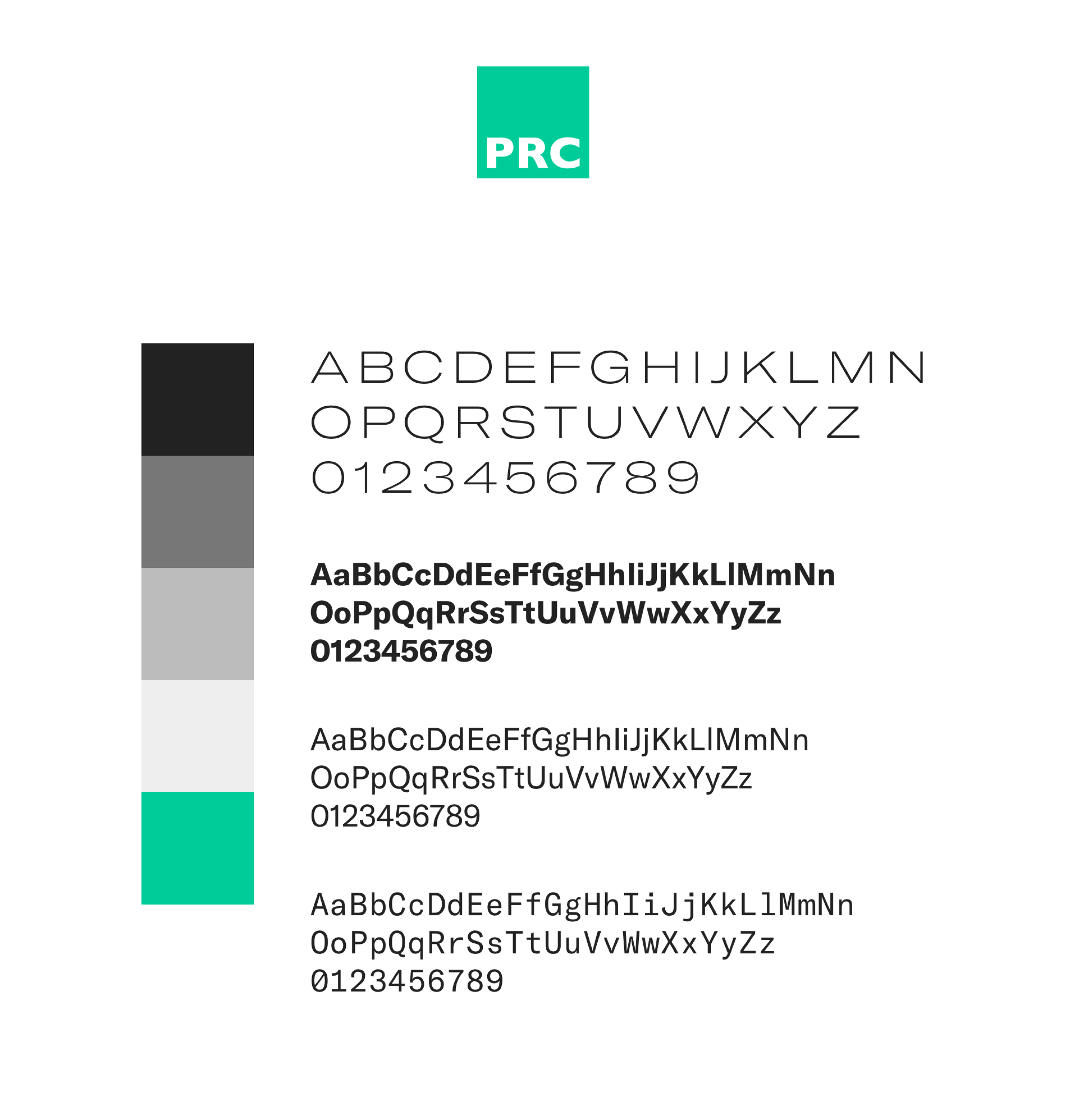
We continued to use their logo and made a decision to clarify their colour palette to a core charcoal, white, and vibrant green. We selected a type family with a range of styles and weights that would enable us to create a distinct personality while preserving a clean, clear overall presence.
We knew that photography would also be a key ingredient to the success of their portfolio. We worked together to identify key project styles and photography that embodied the work they wanted to be showing more of, and are continuing to work together to establish a plan for building a strong portfolio of project photography in the future.
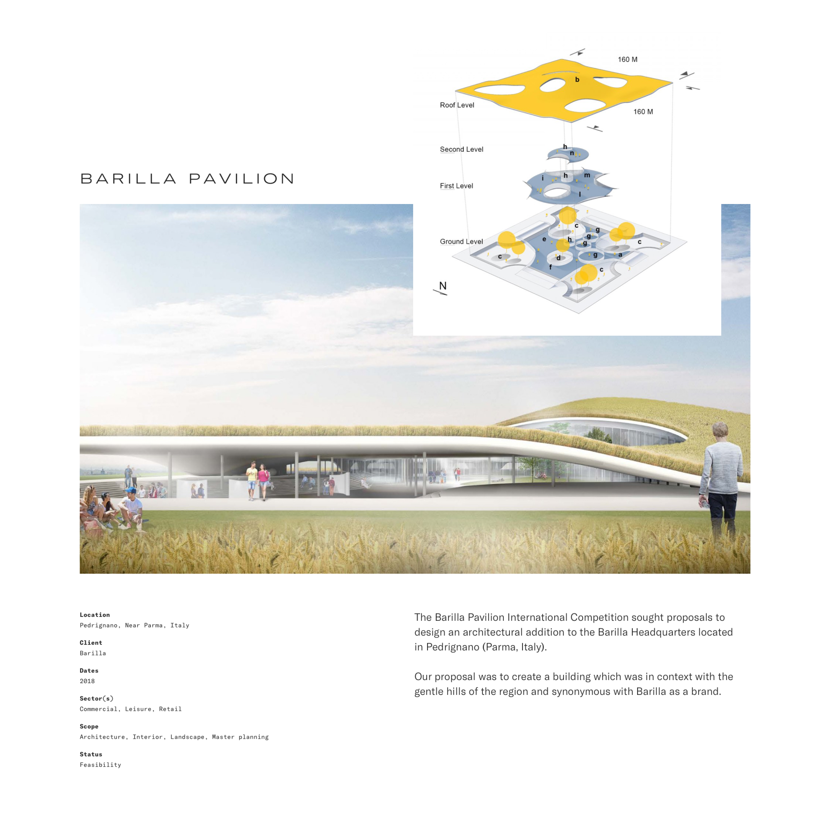
Content
When we set out to begin work on the site, we began by putting together a plan for the content, and describing each area to make sure generating this content would be both reasonable to achieve and relevant to the overall vision to the project. We worked with their team to identify methods for content production and how we could structure the content management system to meet their team’s needs.
For their portfolio, we divided their work into two categories: Projects and Case Studies. Projects are shorter in length and are included on the site to show the broad range of skills and experience the PRC team have. These include brief summaries of the project and an image gallery showing the work undertaken. Case Studies are in-depth examinations of a select few projects they want to spotlight from their portfolio. We created a modular system that enabled their own team members to create long-form pieces with a range of layout and content options.
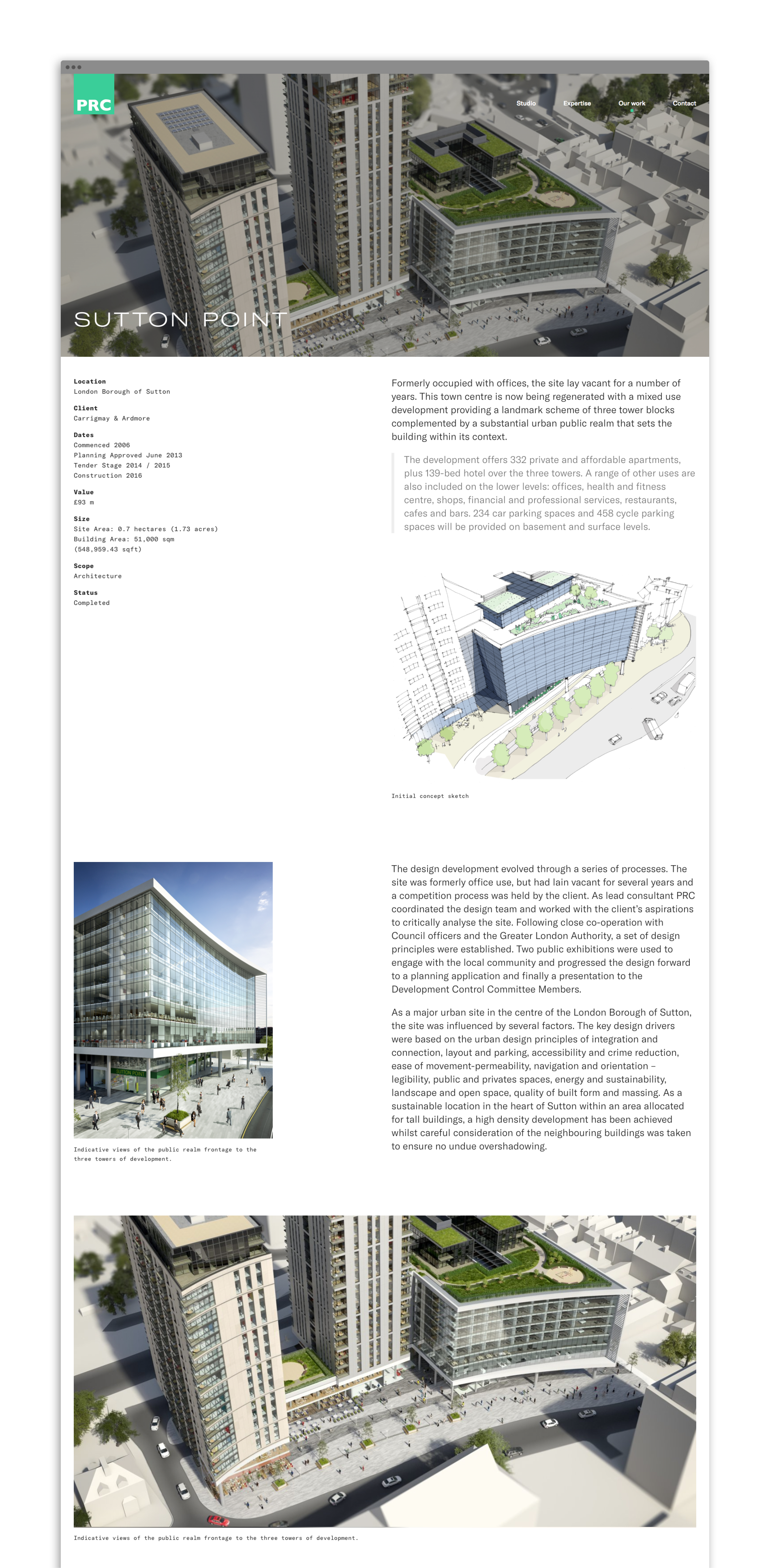
Project Gallery
In putting together our plan for the content on the site, PRC realised the potential value in creating a full company portfolio of their projects that was browsable and searchable. We are working with their team to build an internal tool that will enable their own staff to browse through all projects added to the site, create and internally share custom project image sets, and use as a resource to show off their work to clients.
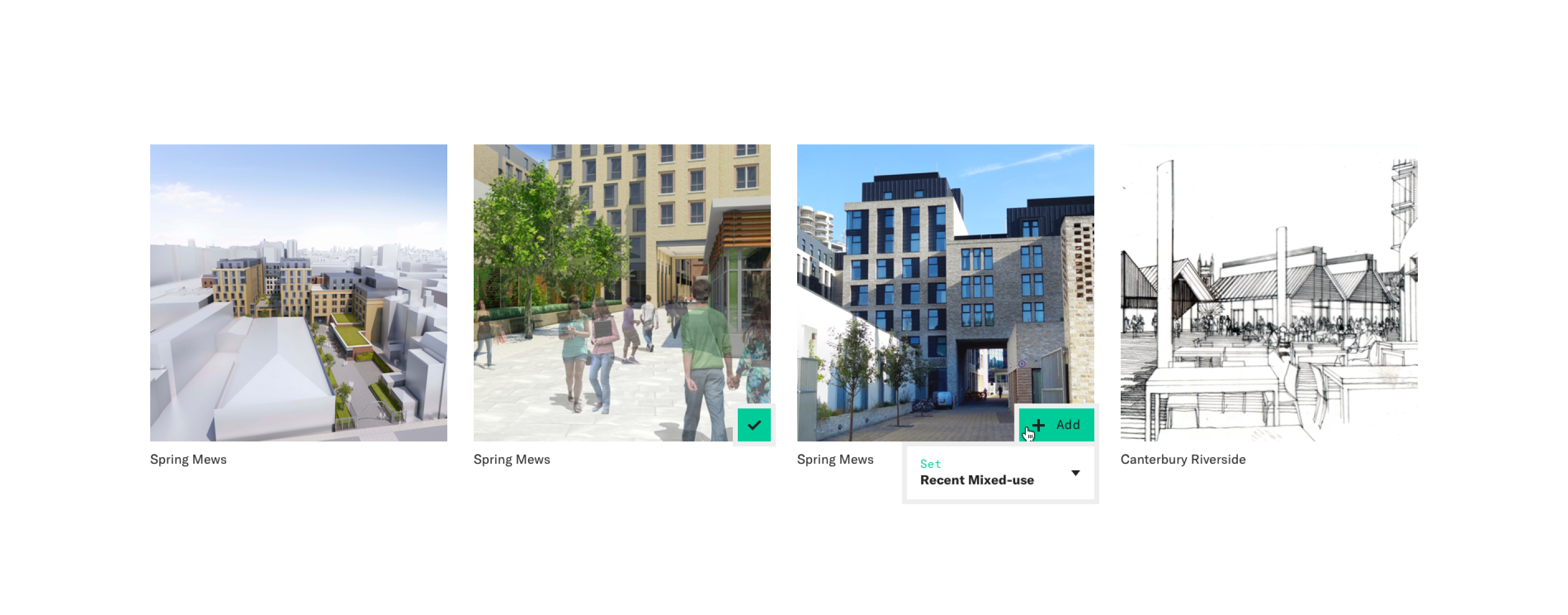
Dr Foster are a healthtech company who work with clients to deliver solutions and actionable insights that drive decisions on the quality and value of connected healthcare.
The Dr Foster brand became part of Telstra Health, a business unit of Telstra Corporation (Australia’s leading technology and telecommunications company) in 2015.
We worked closely with Dr Foster and Telstra Health to help with the co-branding, strengthening the brand and reinforcing Dr Fosters position as a leading healthcare solution provider and data insight expert.

An updated look
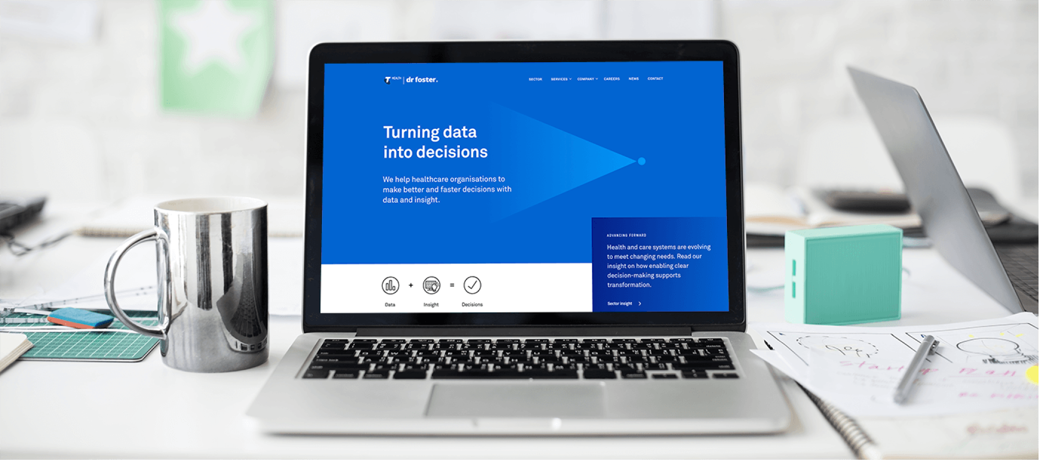
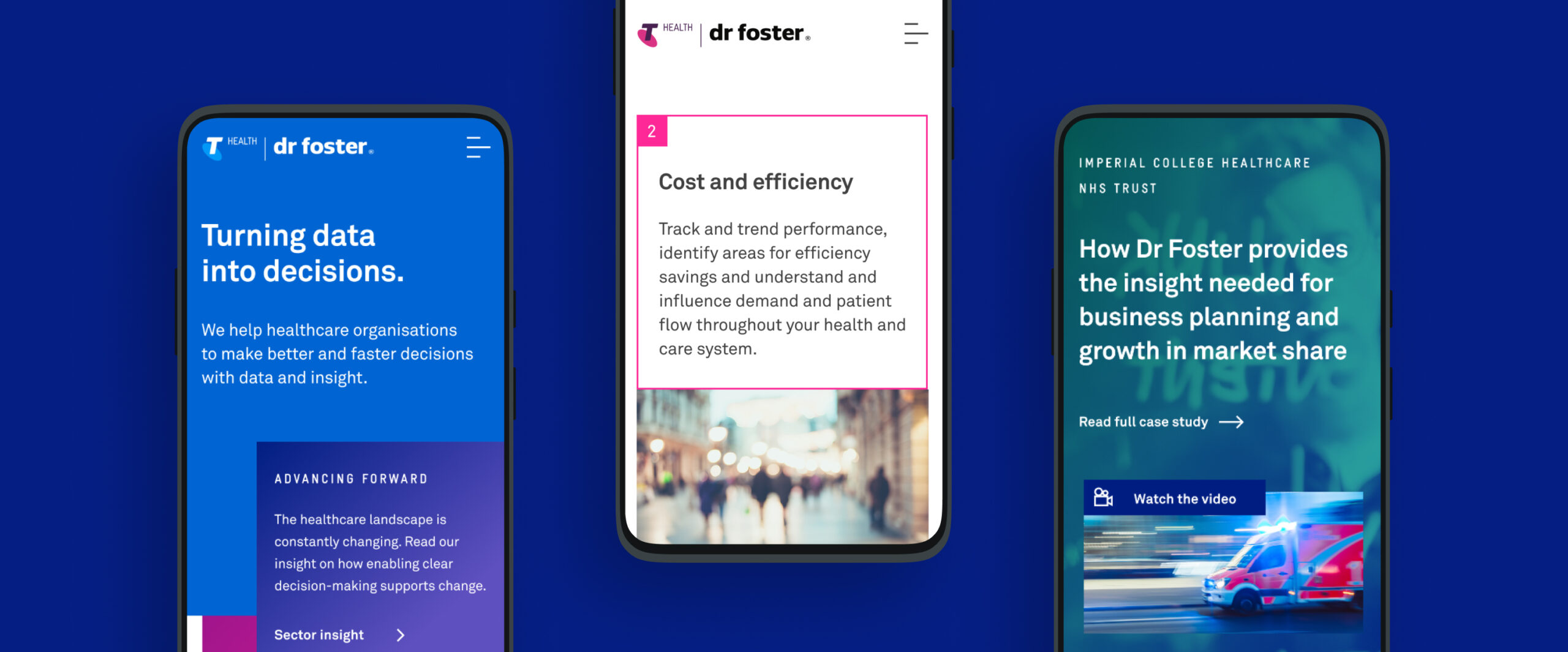
With the newly refreshed and re-energised positioning of Dr Foster an updated visual style was required to reflect this. While maintaining the connection with Telstra Health, the opportunity arose to create a new look for the brand. A bold visual style was developed that would introduce new energy and vitality into the brand. A more dominant use of typography and strong colour was created along with simple geometric forms to aid in brand messaging.
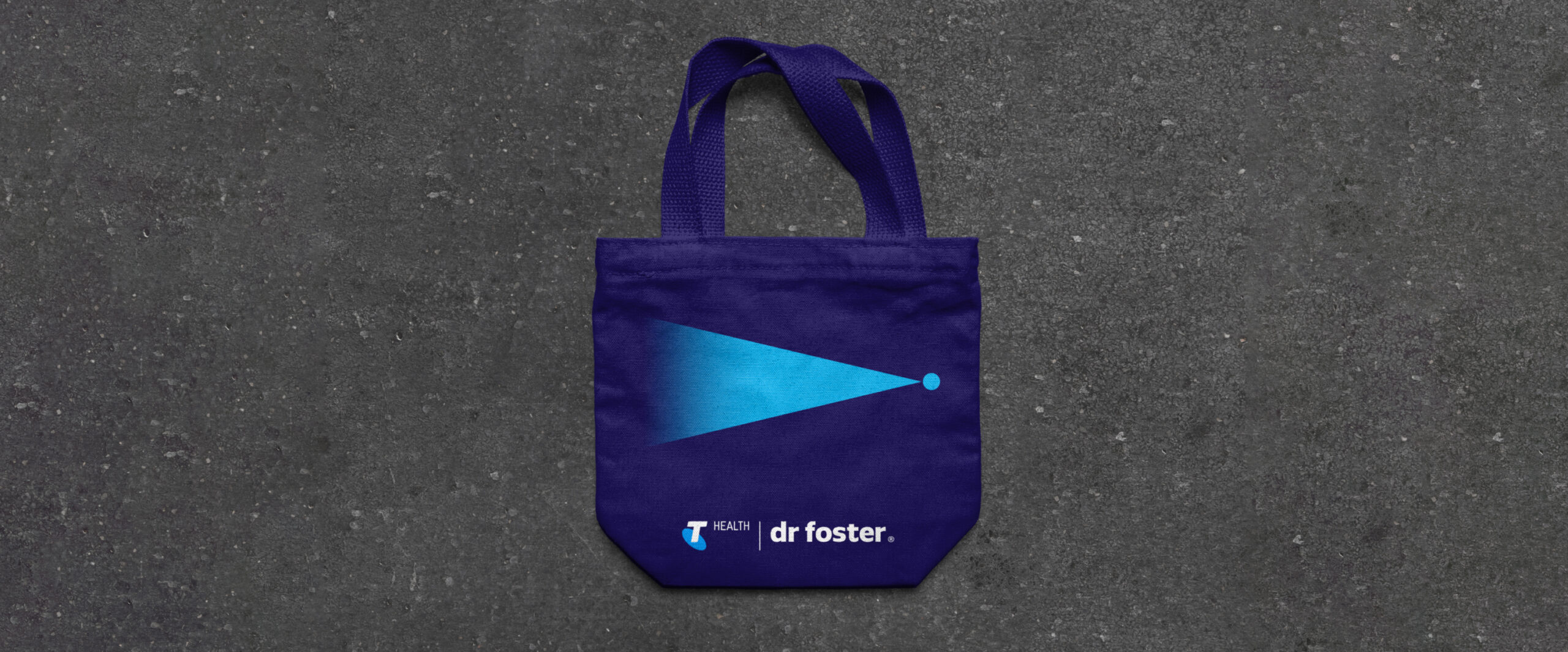
The concept of Turning data into decisions was introduced as a tagline and is visually represented by the shape of the triangle, open on one end and flowing into a single point. This helps to signify the vast array of data insight that help enable a decision and positive change to occur for the end client.
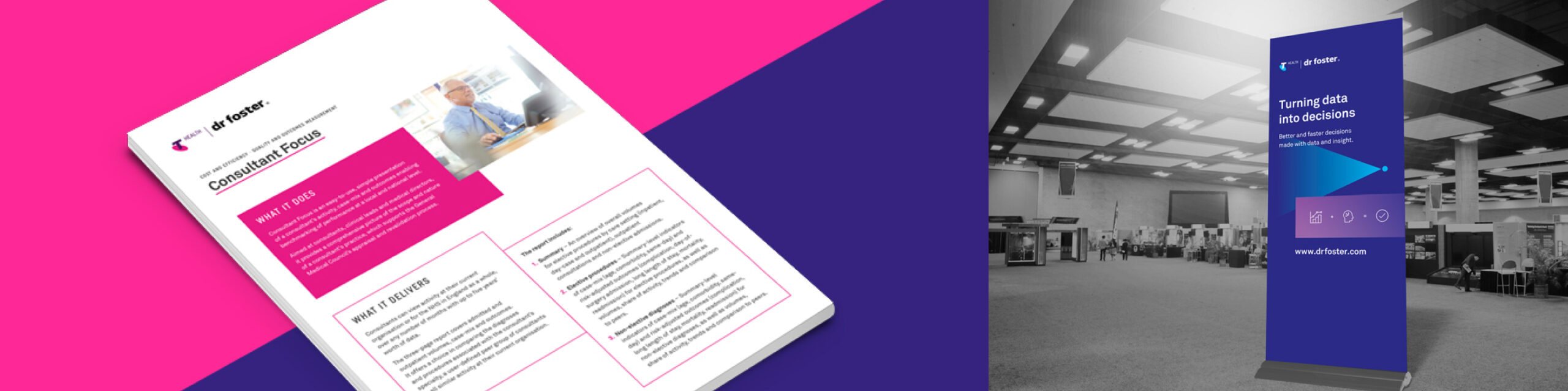
A refreshed website, powered by WordPress
Our approach to the redesign of the Dr Foster website was to strip away unnecessary content and help to clarify the core messaging and brand presence. The previous website had become outdated and required a complete audit. Extensive site mapping and wireframing led to a clear structure and systematic approach throughout. The site was designed using a modular approach with the reuse of a group of key components across the whole site. This helped enable a simple user CMS where the client is confident and free to make modifications to, or to add new content, to the site.
Brand application
In addition to the new website the brand has been rolled out across a range of media and applications. This includes an updated stationery set, infographics, banners, wall graphics and various brand collateral. A consistent approach to the brand styling has been carried throughout all applications of the brand. A Brand Book to be used internally was created to showcase the new brand along with the updated positioning, mission and values. This helps to incapsulate how the brand has developed and moved forward.
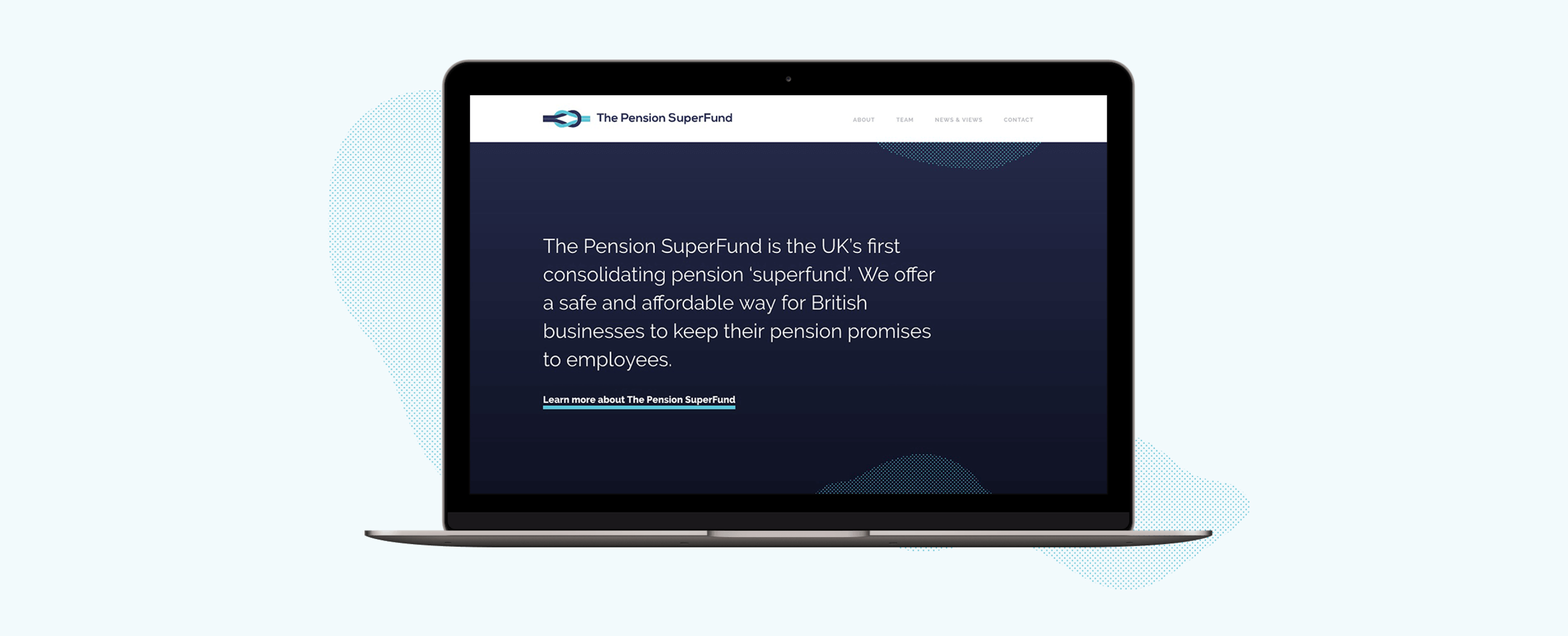
The Pension Superfund is the UK’s first consolidating pension ‘superfund’. Their product was entirely new to the market and so we wanted to create a clean and concise brand presence that visually presented the messaging and benefits in a simple and clear manner.

Appropriate design
Our design team introduced a streamlined colour palette and a monotone illustration style to ensure that the messaging was not overwhelmed. The site’s main purpose is to provide information to potential stakeholders, validating the Superfund’s existence and clarifying their proposition. We created a ‘news and views’ area to promote opinion and insight, to capture interested parties and motivate engagement of getting in touch. Utilising subtle animations and abstract textures to add visual interest and create a stylised design approach, the brand can flex as necessary.
A brand to build on
The brand base that has been created will support The Pension Superfund as it grows. The textured elements used within the design are flexible allowing them to be used effectively across a wide range of campaign materials whilst keeping brand consistency. The illustrations also serve as the beginning of a visual library that The Pension Superfund have ownership over going forwards.
A unified brand
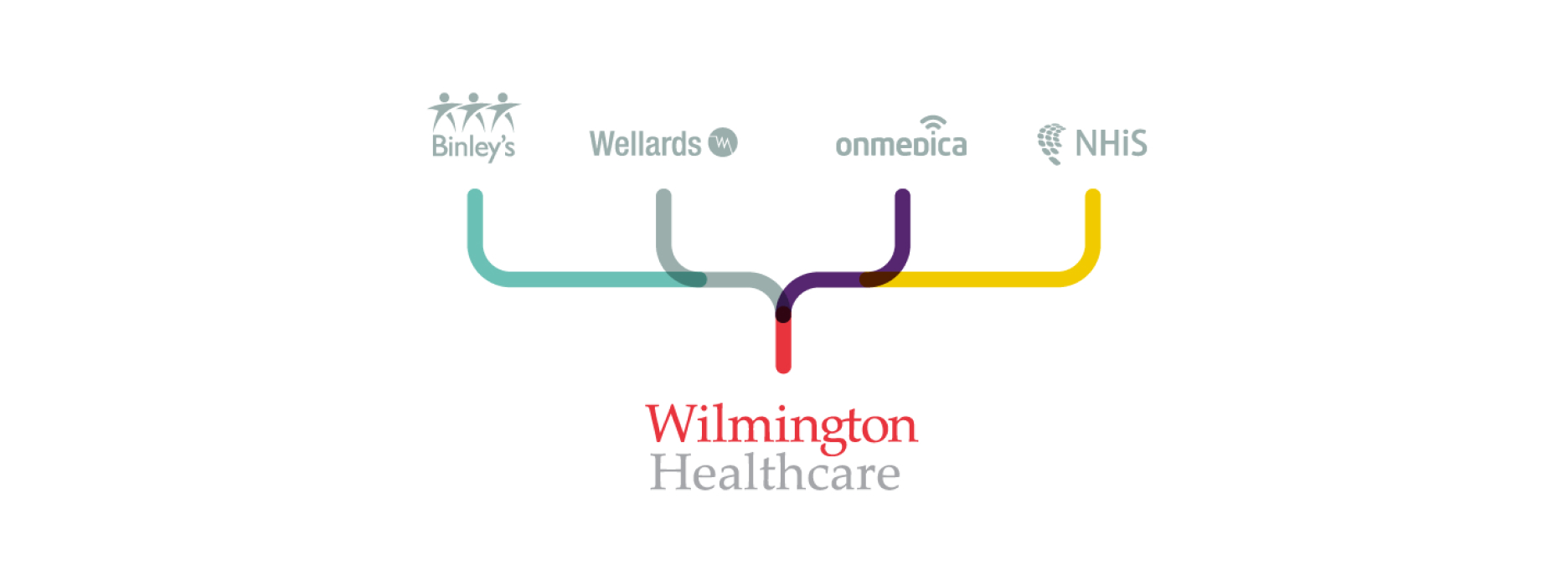
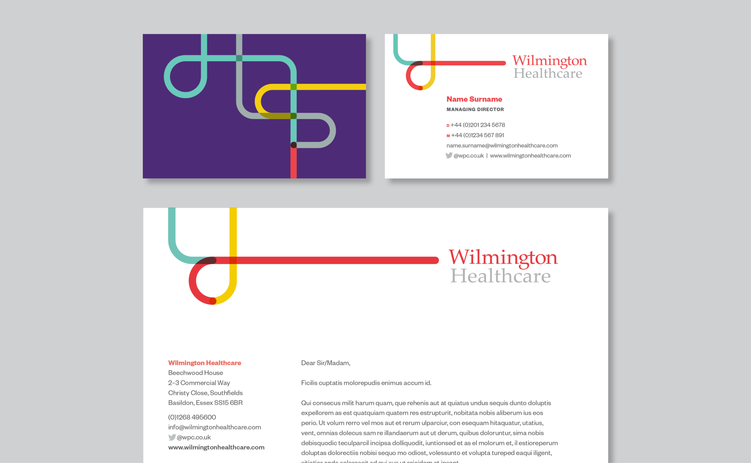
Working with our long-time collaborators and friends at ZPB Associates, we were appointed by Wilmington PLC to create a unified brand that presented a new business proposition within healthcare. The vision and brief was to bring together several different healthcare brands, including Binleys and Wellards, and create a single, parent brand for Wilmington Healthcare. It had to present a new platform for the healthcare division.
Creating a vision for the brand
Working within Wilmington’s existing brand framework, we identified a need to create a flexible brand platform and visual approach that the internal team, including designers, could work with, adopt and expand with a view to retaining a sense of ownership and authenticity in the ongoing creative work and campaigns that they produce.
A strategic concept
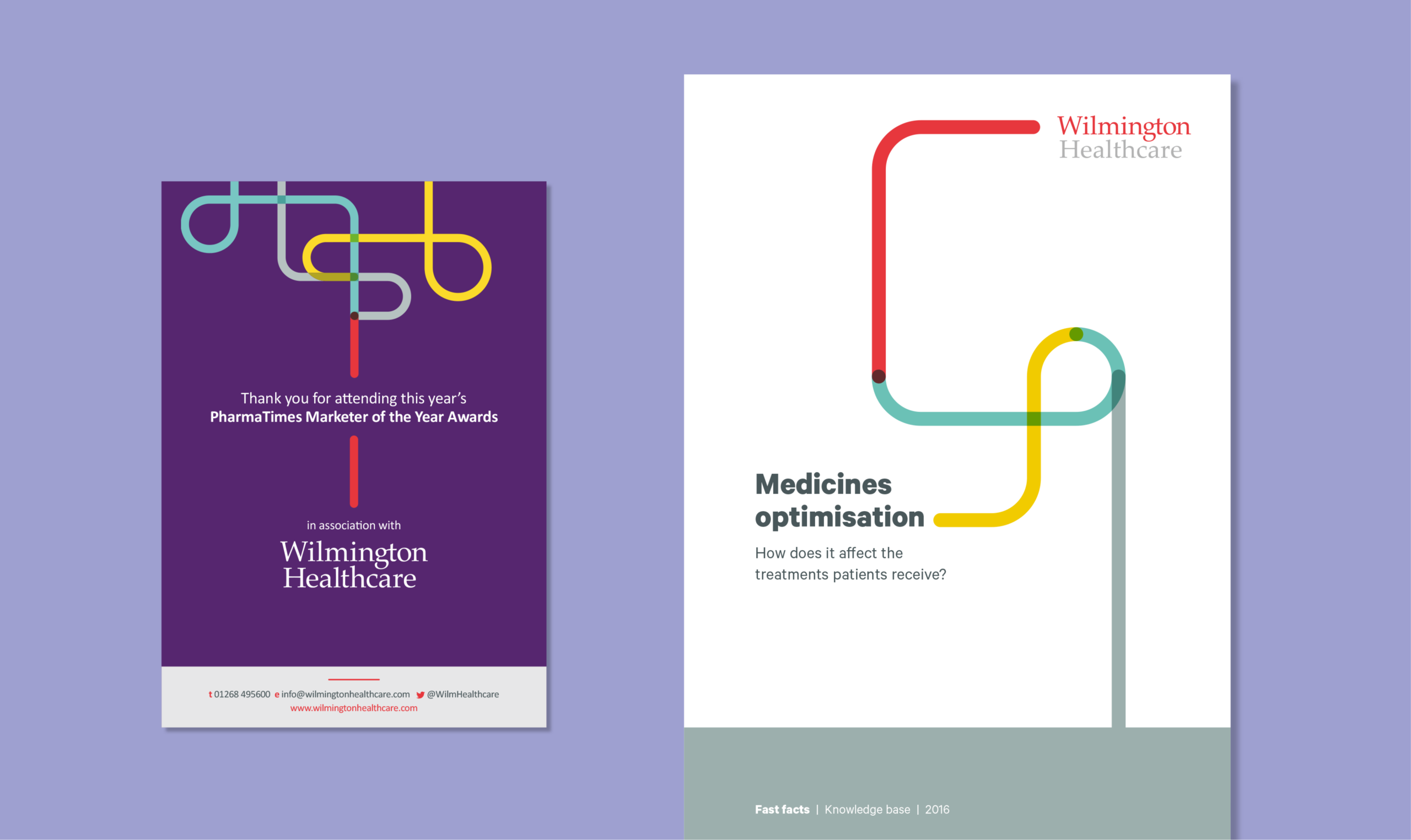
Introducing brand positioning that centred around a clear, articulated concept of Wilmington Healthcare meant translating complex intelligence into actionable insights and sustainable outcomes. We used illustration to help represent this messaging. The use of line work and focus of a single-line output forms part of the Wilmington Healthcare brand, and is used in different ways to visually support brand statements and messaging. The concept reflects the core value traits of Intelligence, Expertise and Collaboration. It’s used with purpose, to help tell a story or to guide a reader visually through a narrative.
A visual tool
The line can be utilised to create bespoke iconography and illustrations within the brand. This gives flexibility while retaining a recognisable brand style and treatment. We created our customary brand guidelines and toolkit, containing guidance on how to work with the new branding and design within it. This was supported by holding internal workshops at our studio with Wilmington Healthcare’s designers.
“By connecting and collaborating with healthcare communities, Wilmington Healthcare translates complex intelligence into actionable insights and sustainable outcomes.”

The new branding was tested across multiple environments, assets and physical experiences.
Building a digital presence, powered by WordPress
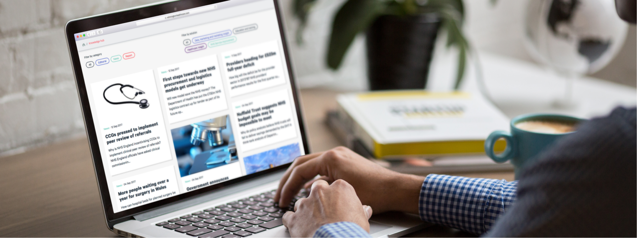
Once we were happy with how the modules performed, we built up each area and page of the site using these core modules as building blocks. The benefit of this was that we could test the modules at the start, all at once, so that we could catch, review and iterate on our discoveries and challenges early on, during development.
Working this way enabled the design and development team to work together and create a superior product with a leaner design and build.
The charity sector has faced incredible challenges throughout the pandemic. The events and campaigns that are invaluable to bringing in income needed to support charities and help them carry out their invaluable work were shut down while simultaneously the demand for their services rose exponentially as people from all walks of life were challeneged. Services provided by charities that provide support and connection are vital to the recovery of our communities.
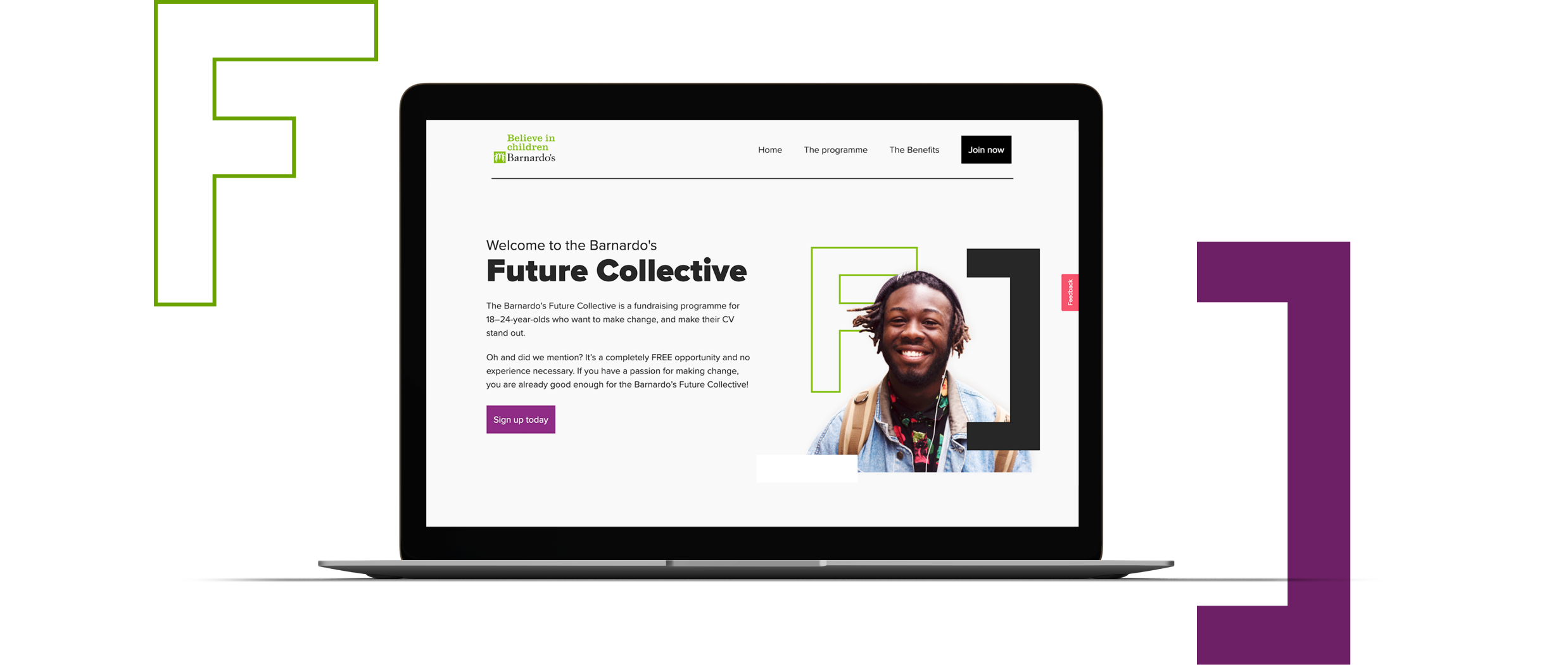
This is why we were so excited to work with Barnardo’s to deliver a new website and digital presence for their Future Collectives programme. Established for 18–24-year-olds who are interested and have ambitions in forging a career in the charity sector, the programme looks to build confidence and knowledge within this user group by providing mentorship and sector education.
Conducting our research as part of this project
We were lucky enough to have access to the current cohort that were enrolled in the programme. Working alongside the Barnardo’s team we were able to undertake user research – questioning individuals on why the programme appealed to them, what they looked to achieve from it, why they signed up and more.
We discovered that by a significant margin the largest driver behind conversion and registration for the programme was actually speaking to a person from the Barnardo’s team. This human interaction had been invaluable for almost all attendees, having the benefits of the programme shared and being directly provided an understanding as to how their career could benefit from participation was a large positive.
This user research coupled with our insight and experience both from working with Barnardo’s and our UI and UX experience meant that we could build a really strong brief for the project ensuring that all these nuances were captured, resulting in the best uptake possible for the programme.
The importance of video
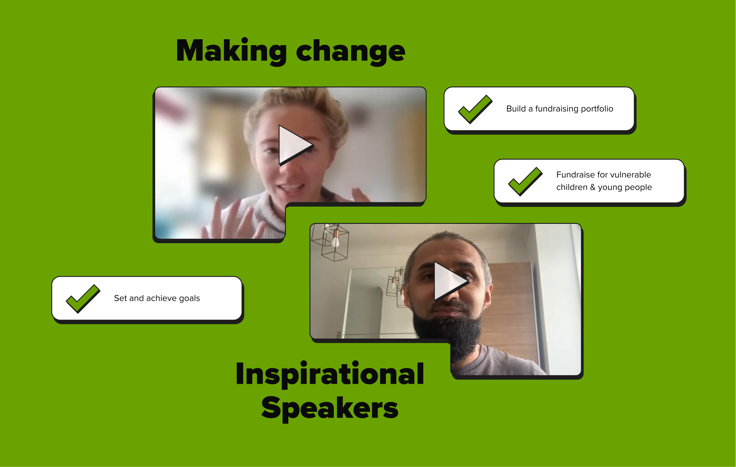
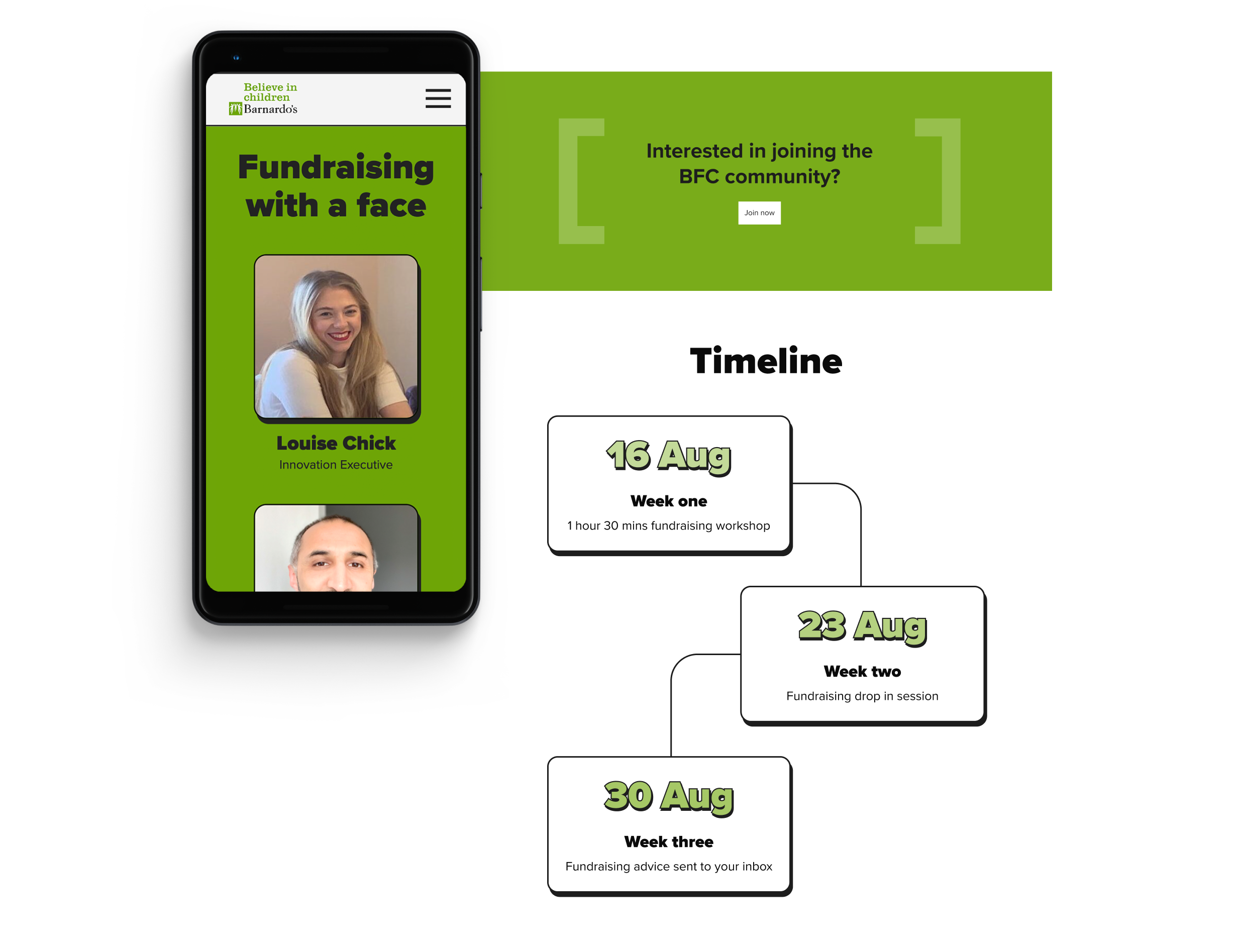
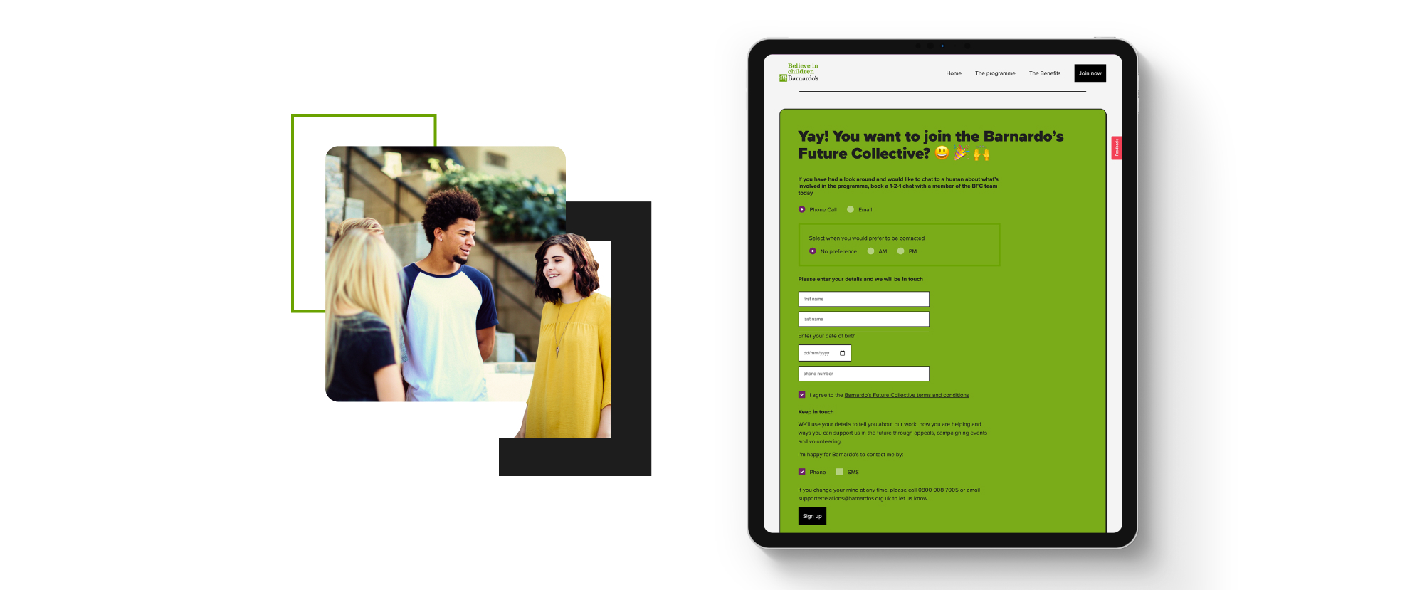
Armed with the insight that conversions to sign up were driven largely by human interaction we wanted to ensure that this was kept within the website experience. By integrating talking head videos from the team rather than reams of written content we could provide potential participants with that engaging, friendly face as well as first hand information on the details of the programme. We also opted to integrate the video content from Barnardo’s YouTube channel so that there was maximum accessibility as well as being searchable on the wider internet, making the content work harder for the brand. By directing all enquiries to a simple booking form that allowed interested users to book in a personal call or video chat with one of the team from Barnardo’s, we helped to retain that human touch and make initial engagement as easy as possible.
A creative approach unique for the programme
Barnardo’s have an extremely recognisable brand, their vibrant green synonymous with the charity since its inception. A distinct digital presence didn’t exist for the programme and so we wanted to ensure that we took the opportunity to really reflect what it stood for. As we had such a specific audience we could be tailored with our design decisions.
We wanted the site to feel bold and fresh and so we chose large text and big shapes with heavy strokes and 3D elements. We wanted the programme to have something recognisable that they could own and so we took the F and C, of Future Collectives enlarging them to be used as brackets, framing photography and important information such as call-to-actions. We brought these to life throughout the site with animation and replicated this across social elements that we built to be shared following launch.

Some stories are immediate classics, taken straight to the hearts of those that hear them. Noel Coward’s Blithe Spirit is one of these tales, resurfacing every decade, reincarnated to entertain a different generation with its comically dark characters. The play was first seen in the West End in 1941, creating a new long-run record for non-musical British plays of 1,997 performances. The public’s love for the tale propelled it to appear on the airwaves, the silver screen and later onto television.
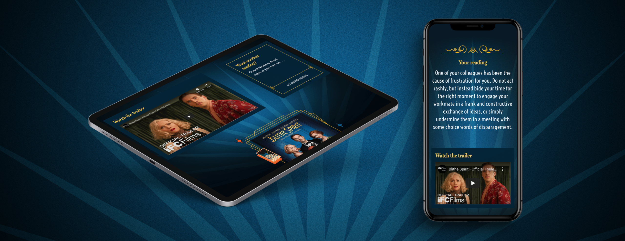
Explore the digital experience at https://blithetarot.co.uk/
Digital engagement
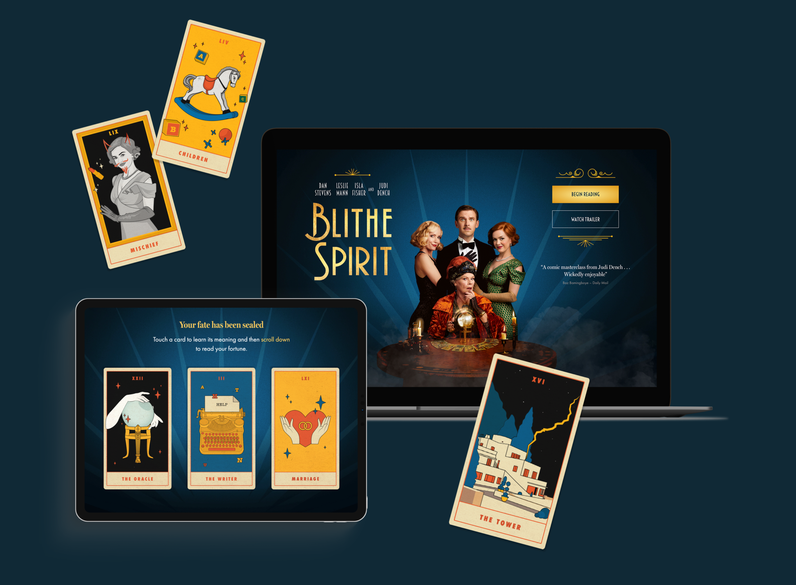
This year, Dame Judi Dench leads an all-star cast in the latest film adaptation (shown exclusively on Sky Cinema). The heady mix of Dench and a theatre pedigree is perfectly pitched to capture the hearts of any audience. Inspired by the tale and the studio’s love of cinema from working with clients such as Studio Canal and DCM, we have created a hilarious and beautiful experience that takes the narrative of the film and turns it into a shareable digital destination. Users are invited into the mystical world of Madame Arcati (played by Judi Dench) to have their fortunes read, drawing them into the dark and playful world of Blithe Spirit.
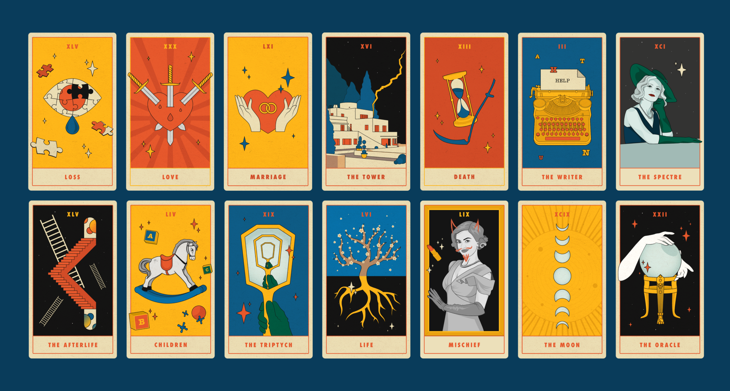
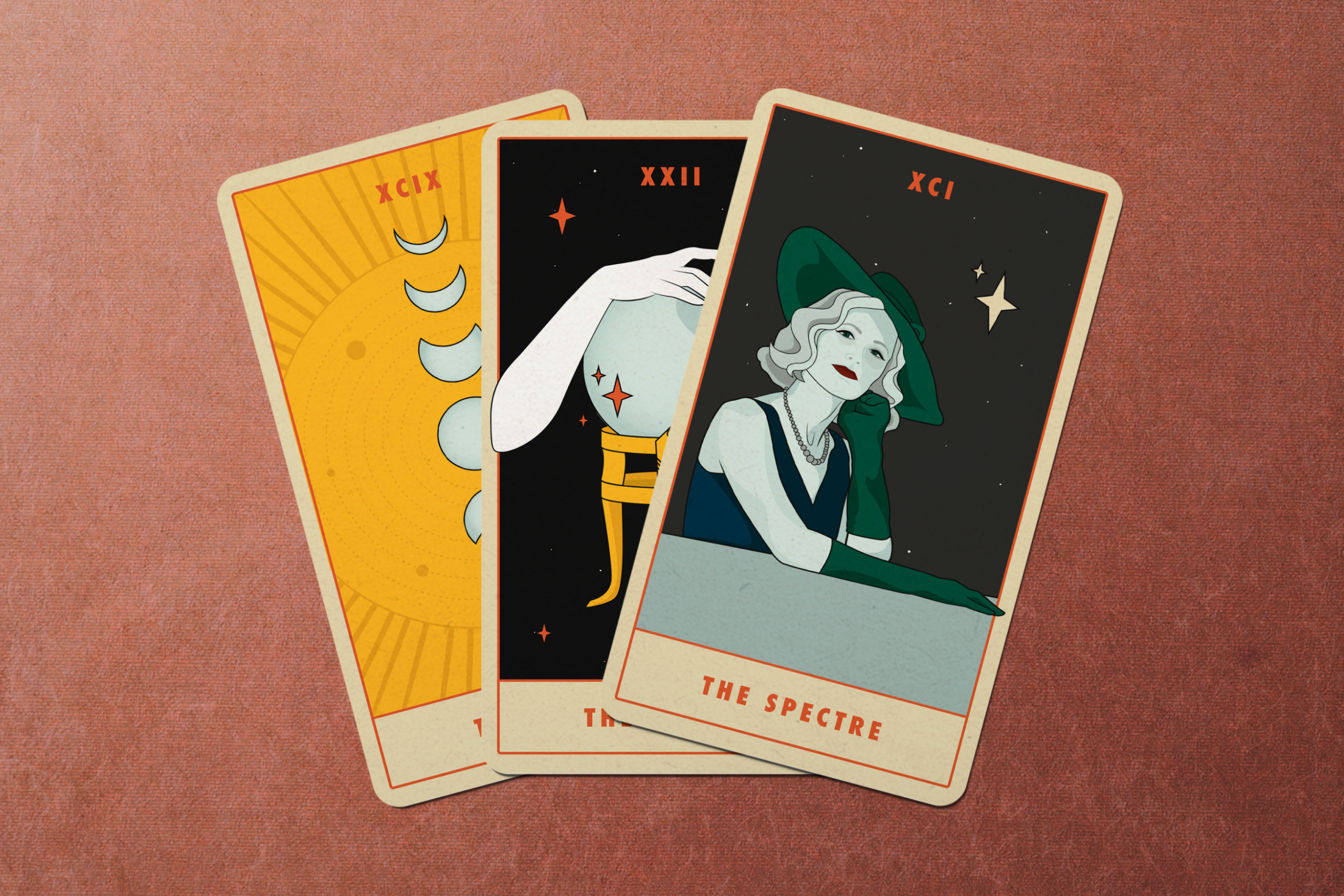
Tarot has a long and rich history, the pantomime characters and layered symbolism have always drawn in creatives. Salvador Dali created his own surrealist deck in 1970 and more recently illustrators like Olivia Healy and Sophy Hillington have all put their own twist on the cards. Here, our bold designs draw from the 30s film styling and bring both the characters and architecture into the digital world with a comic twist.
Creating a mystical approach
“I’ve always had an interest in the mystical so this project really excited me. I wanted to find a balance between the traditional and my own illustrative style. The restricted colour palette and border gives that nod to the history of the practice while the elements from the film bring a different freedom to the designs. Hopefully the cards bring happiness and maybe some guidance to people searching for it. . . “ Louisa Hadjipetrou, Studiomade designer
The world of competitive sport is one associated with excitement, passion, hard work and the unique ability to bring all types of people together. When working on other sites such as global sports marketing brands TLA Worldwide and GSE these were all values that we tried to portray through design and user experience. With this site we wanted to add a deeper sense of personal experience.
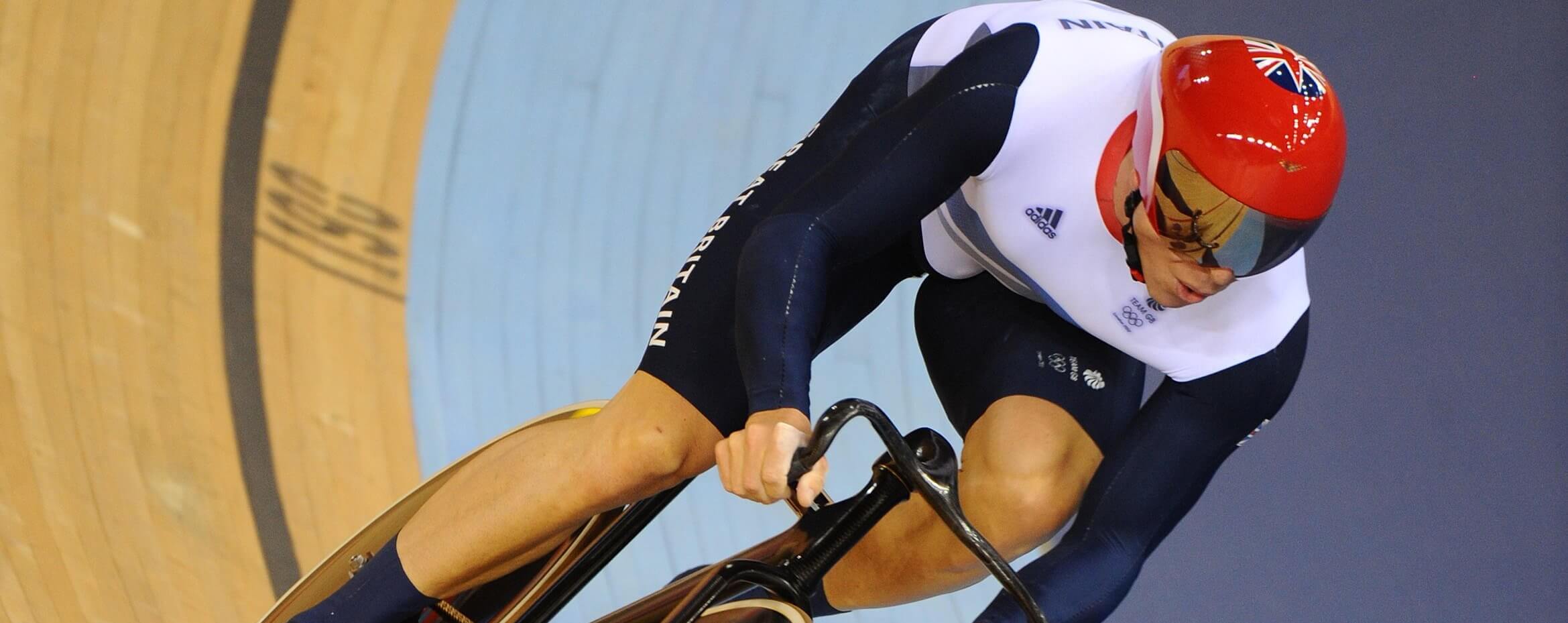
The website needed to reflect Sir Chris Hoy’s brand of ‘everyday greatness’, taking people on a journey with Sir Chris from his childhood to where he is now. We were fortunate in that the team were able to provide incredible photography that we could make integral to the design aesthetic. As a subtle reference to cycling, we created a visual device of vertical lines to be used as a texture that worked with the existing brand, helping to frame photography and to form subtle animations helping pace the content of the site.

Showcasing all dimensions to the brand
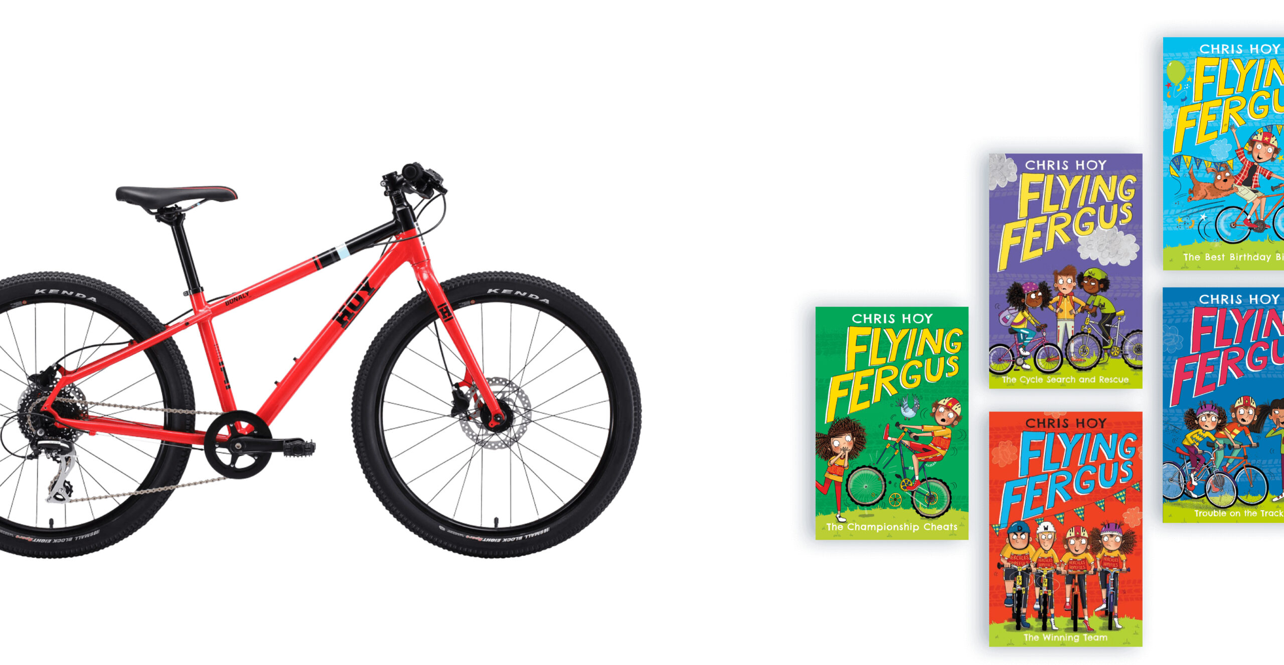
Sir Chris wanted to bring people up to date on his career and showcase the varied work that he now does through public speaking, crafting his own HOY Bikes as well as his hugely successful Flying Fergus children’s book series. We created a simple navigation system to break down each of these areas, ensuring that users had all the information they needed to make contact, ensuring the site operates as a useful business tool for him and his team.
A look behind the curtain
The site includes personal stories and photography that simply can’t be found anywhere else. This provides a real sense of personality and enables Sir Chris ownership of this digital brand space – something increasingly important across both social and digital platforms today. We included a gallery for the site so that journalists and enthusiasts could find a range of photography which spanned all aspects of Sir Chris’s career, again making sure the site functioned as a useful tool.
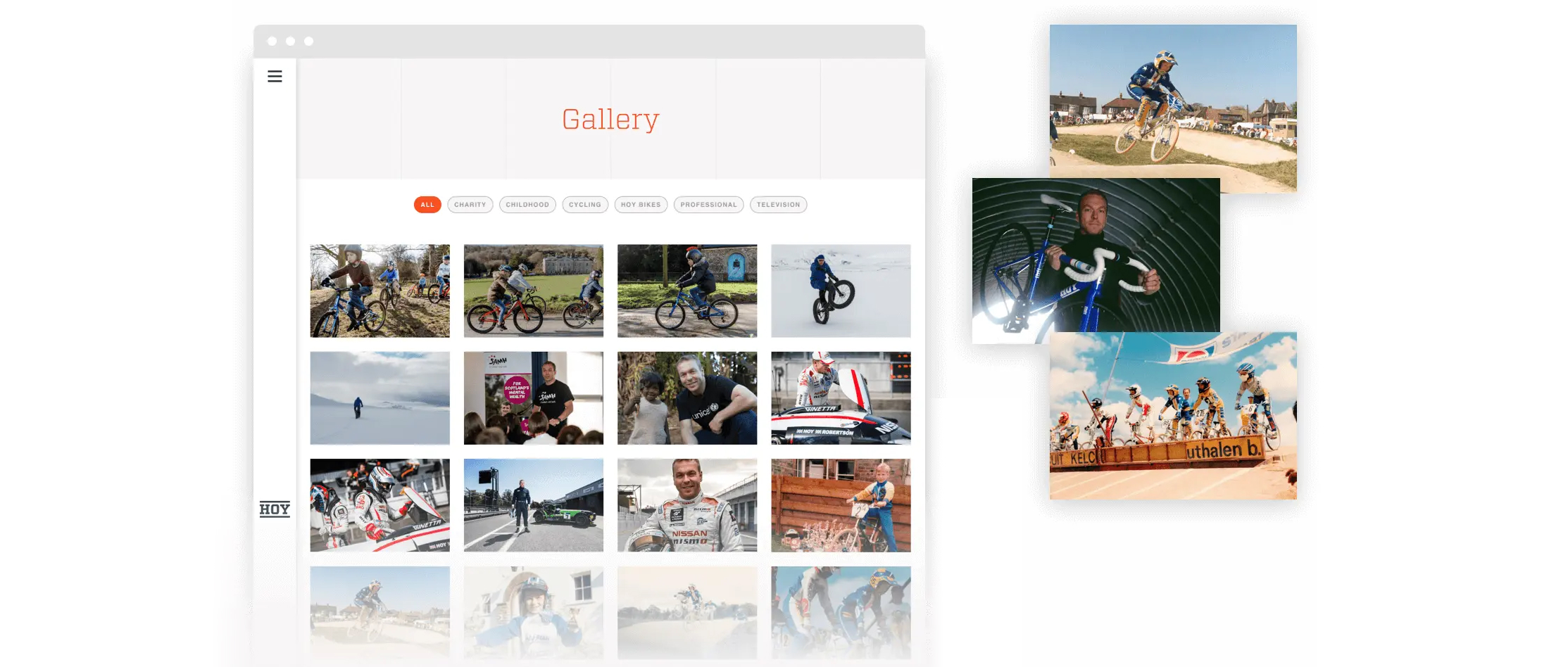
Everyday greatness, in one place
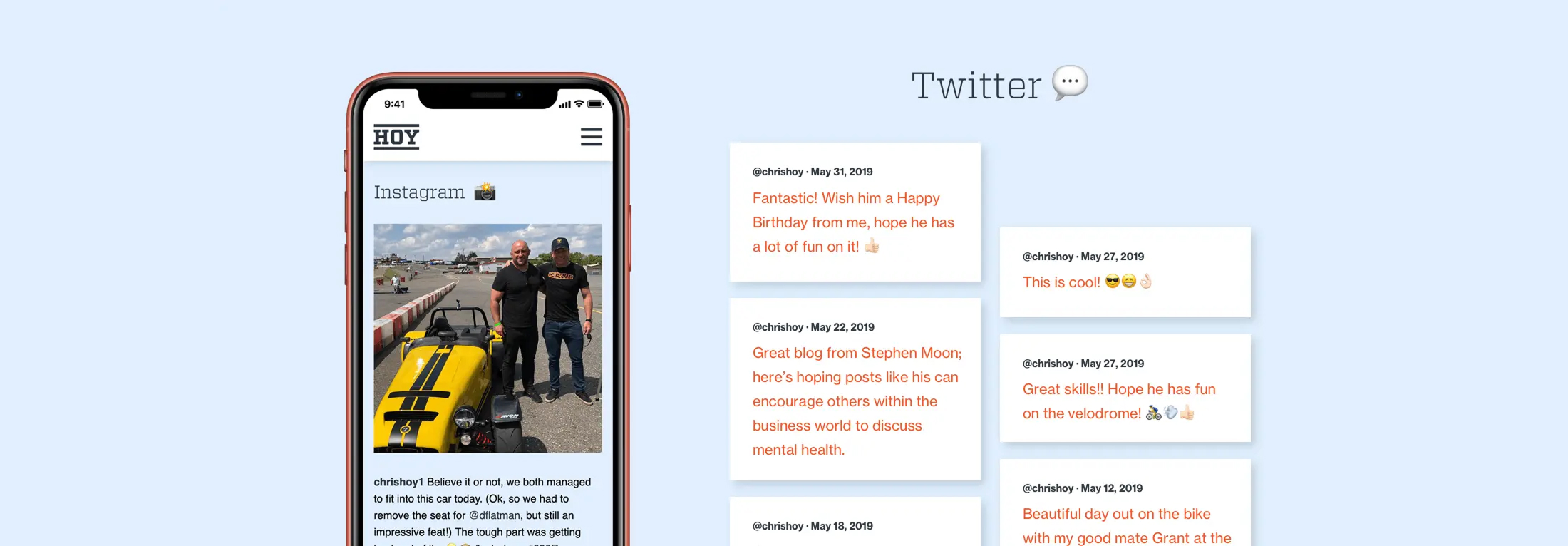
The site really captures the excitement and care behind everything that Sir Chris takes on. Aggregating his social feeds combines various content sources into one place, leading those interested in both him and his brand to a single destination where you can really see his personality at the fore.
Your website is a window for the world into your business, and perhaps your most valuable sales tool. Therefore it’s imperative that it performs as a conversion tool, aiding you in securing new business. In today’s digitally focussed climate it’s imperative that your site continues to be measured and perform. Your site should be delivering on structure, design and SEO. A website that delivers on all of these things, will mean more sales and greater brand recognition.
Project context
We were approached by Mazars, Europe’s 8th largest accountancy firm to help them measure and understand their site performance across key departments so that they could better optimise their content and design to help with customer conversions and lead generation.
We broke up the areas of analysis into three sections:
1. Data
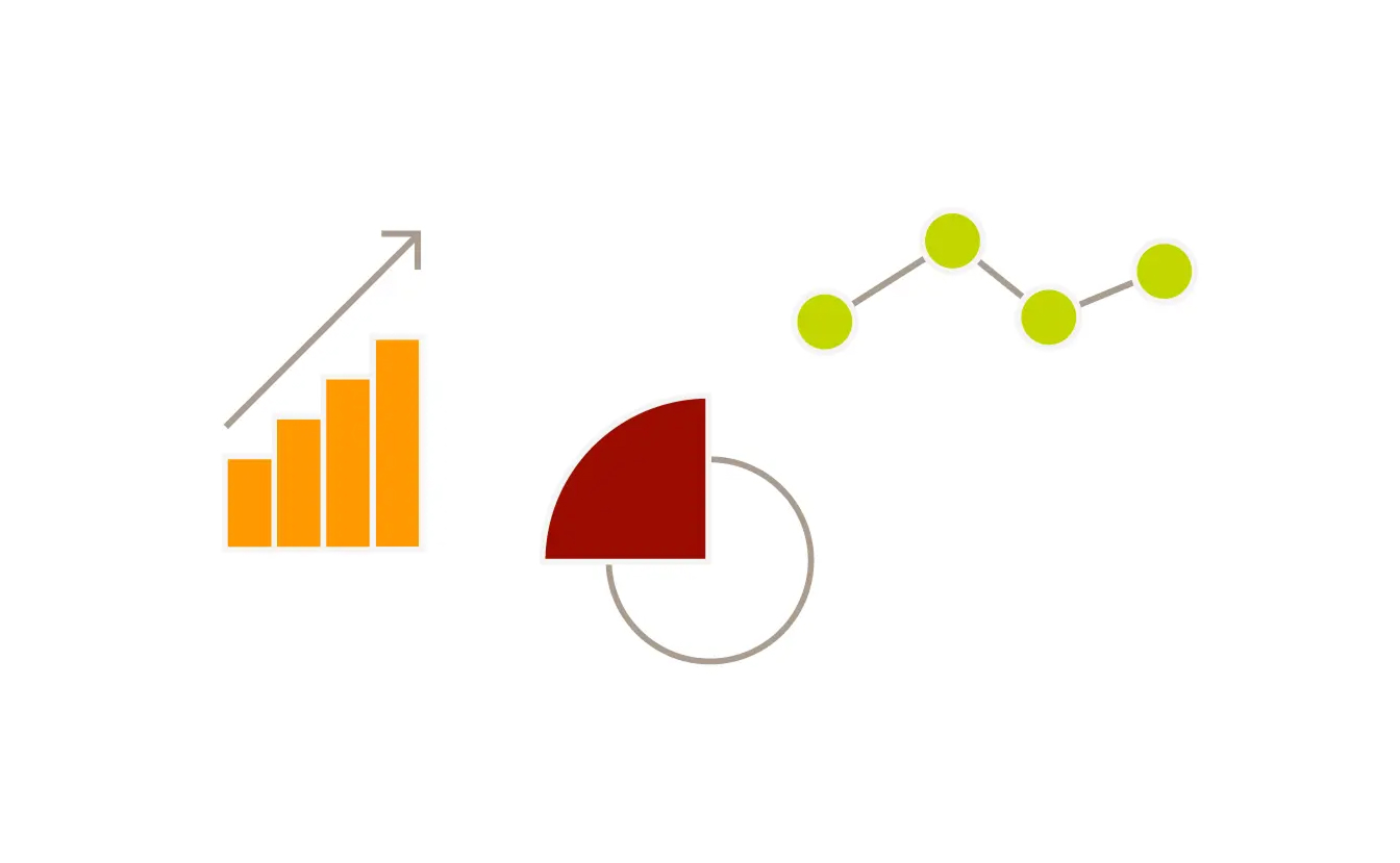
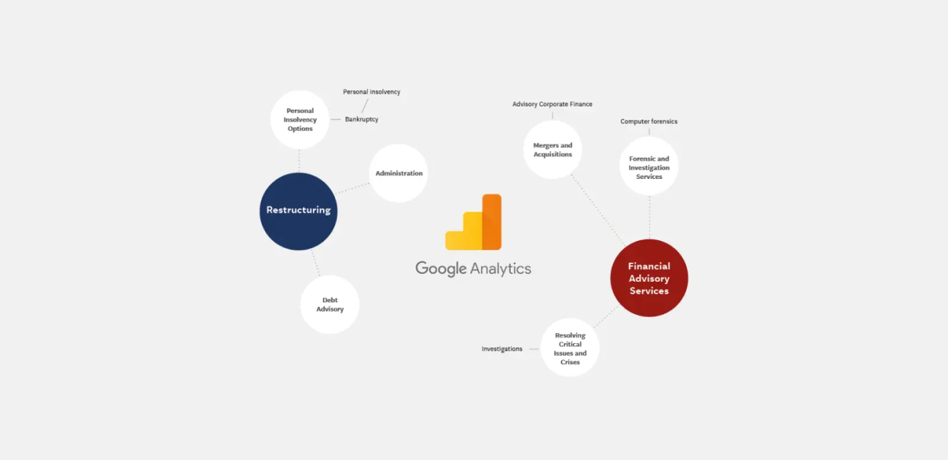
Marketing used to be somewhat of a mystical art as it was often hard to measure your efforts and show data-driven results. This is no longer true, Google Analytics among other paid for services ensure that your website can be completely accountable and measurable.
In order to get a useful set of data to analyse, we worked with three years of data which ensured that all anomalies weren’t going to skew information, and that patterns could be identified if present. Firstly we looked site wide at user numbers, content popularity, entrance and exit pages. We then broke the data down into relevant departments to evaluate their performance in comparison to the wider site as well as their specific content popularity. This allowed us to see user consistencies, make recommendations to amend the design to content access and create relevant call-to-actions to keep users on the site providing them with more engaging content.
As well as helping inform decision-making, having an archive of data also ensures that a client can establish a status quo, understanding what one may expect to see across the site moving forwards so that measurable goals can be established.
2. Terminology
The financial services industry has a wide range of specialised language which can often mean that it’s hard to deliver clear and simple messaging. Audiences can vary from industry professionals to potential clients that have no knowledge of what service they even need. When a user comes to your site without knowing your offer or your brand the business goal is to provide them with a solution. Too many things to focus on will mean that they can’t focus on any of them. Your company value will be lost.
In order to provide our client with the full picture of exactly how their terminology was performing we actioned the below:
- A comprehensive breakdown of Mazars department terminology alongside their key competitors so they could see exactly how the industry was communicating in comparison to themselves.
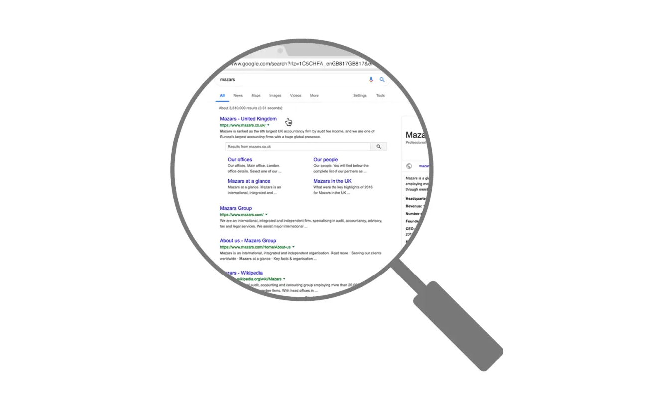
- Demonstration to how their current SEO was ranking for each of their specific service terms e.g if they were featured on page 1, page 2 etc.
- Creation of a detailed keyword forecast generated by AdWords for each of their potential Google search terms and their competitors comparative terms. This allowed the client to see what their potential audiences were searching for and then ensure that their site content included it.
This information was extremely valuable to the client as it allowed them to have a really clear understanding to how their terminology was performing. Unless content meets user intent, it’s very unlikely to rank highly on Google (meaning you could be missing out on valuable potential clients). We made recommendations on what changes could be made as well as creating an estimated budget for a marketing campaign around key search terms and competing ones.
3. Design
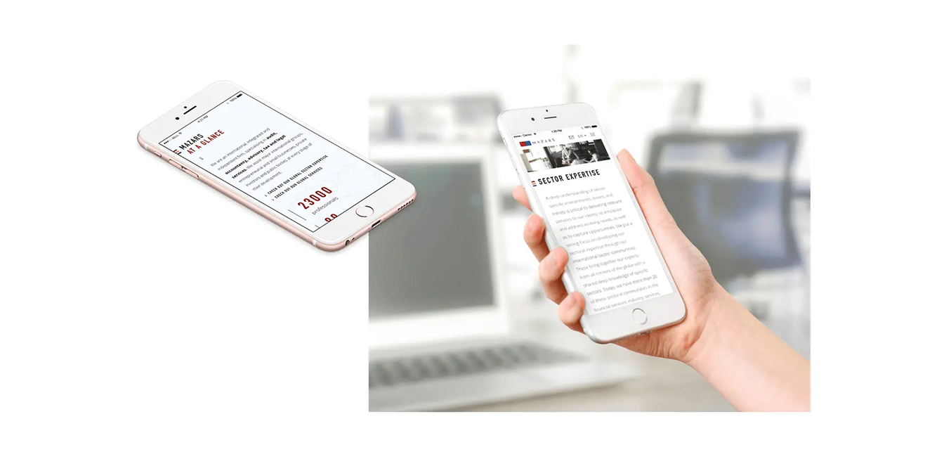
The design of your site is just as critical as the terminology. Creating a visual approach that supports your messaging helps users understand and engage with your brand. The design should support your user’s journey through the site, using clear call-to-actions to aide conversion rate optimisation. Responsive behaviour is also a must, according to eMarketer, 55% of survey respondents in the U.S. said they wouldn’t buy from a brand if its website or mobile experience was poorly designed.
In order to review the design for the client we pulled screenshots from key pages on their site and the comparative pages for competitors. This gave a visual overview of the marketplace and the visual language/style used within it, particularly focussing on how effectively the company demonstrated their process.
Results
Since completing this work our client has requested further analysis across different organisational departments. Understanding user behaviour is the most valuable tool in your digital arsenal; capturing users through search, presenting them with a clear offer, and supporting this with a strong and logical journey flow will lead to conversions, which ultimately means more business. Building a historical picture of your website performance means that you can build goals going forward and help develop your offering and increase your conversion rate. Get in touch today if this is something that you think can help your business and brand growth.
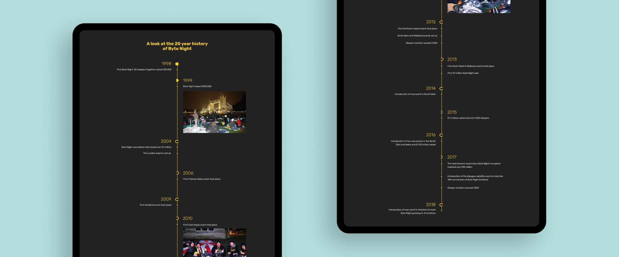
Byte Night is an annual event put on by Action for Children with individuals and teams from technology and business services to raise funds to prevent youth homelessness. It has been running since 1998 and now takes place at 12 locations across the country, with more than 1500 participants taking part last year.
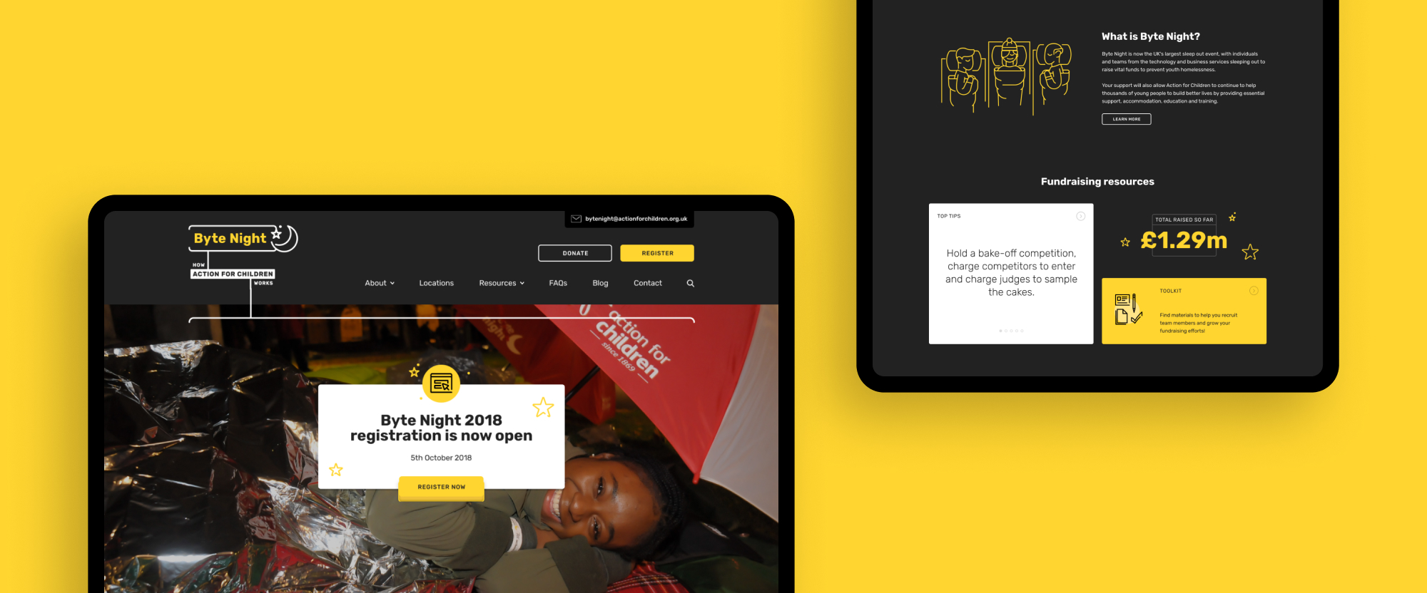
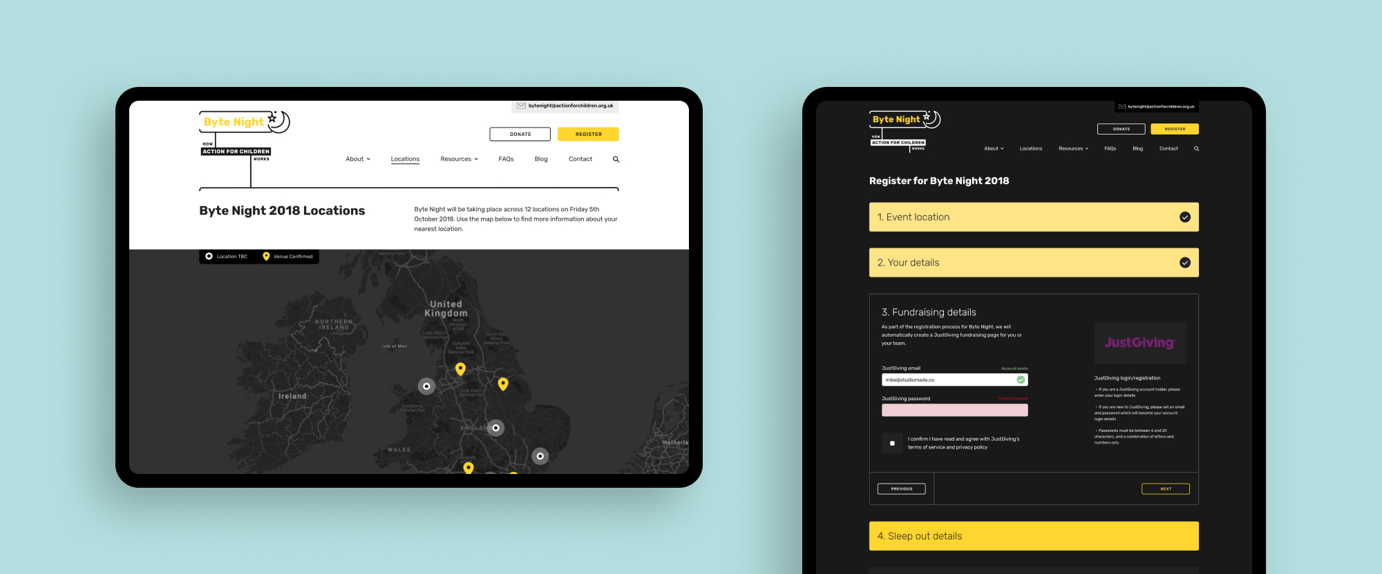
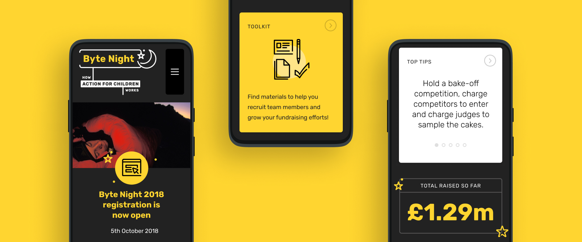
We worked with Action for Children crafting a new digital experience that included planning the ideal flow for registering for the event and all the different functionality requirements that needed to be in place. We created a flexible mapping system to clearly show where each event was taking place and have a spotlight on the details specific to each location. As part of this process we worked with JustGiving to develop a registration process that integrated their fundraising page manipulation API enabling us to automatically create pages on their behalf and update its fundraising details as more team members join.
Understanding user need
For the main content on the website, fundraising resources and inspiration were both a core need that users had which we sought to meet. We created a bespoke WordPress solution and flexible system that enabled Action for Children’s internal staff to add and update content as they found inspiring stories and tips to write.
Delivering to brand
We used Action for Children’s newly established brand guidelines to inform our design approach for the website. Additionally, we designed a suite of custom illustrations to help bring a lighter tone to the content.

Results
Action for Children were provided a robust and flexible environment that grew with the Byte Night event, successfully being used for multiple years. A fully integrated JustGiving fundraising page creation API meant that users could dive straight into fundraising as soon as they were ready.