Before 2015, new music was released on all different days around the world: Mondays in the UK, Tuesdays in the US and on other days in other countries. Illegal downloads were rife as people didn’t want to wait. IFPI, which represents the recording industry worldwide, wanted a global release day where countries all released new music on the same day of the week: Friday.
Following a competitive pitch, IFPI commissioned us to create a brand and strategic campaign. Our brief for the New Music Fridays initiative was to build a brand and visual style to build awareness and engagement among both consumers and the industry alike. It wanted to “boost consumer and brand awareness, building anticipation tied to the release of new music – on a global scale”.

Creating a brand style
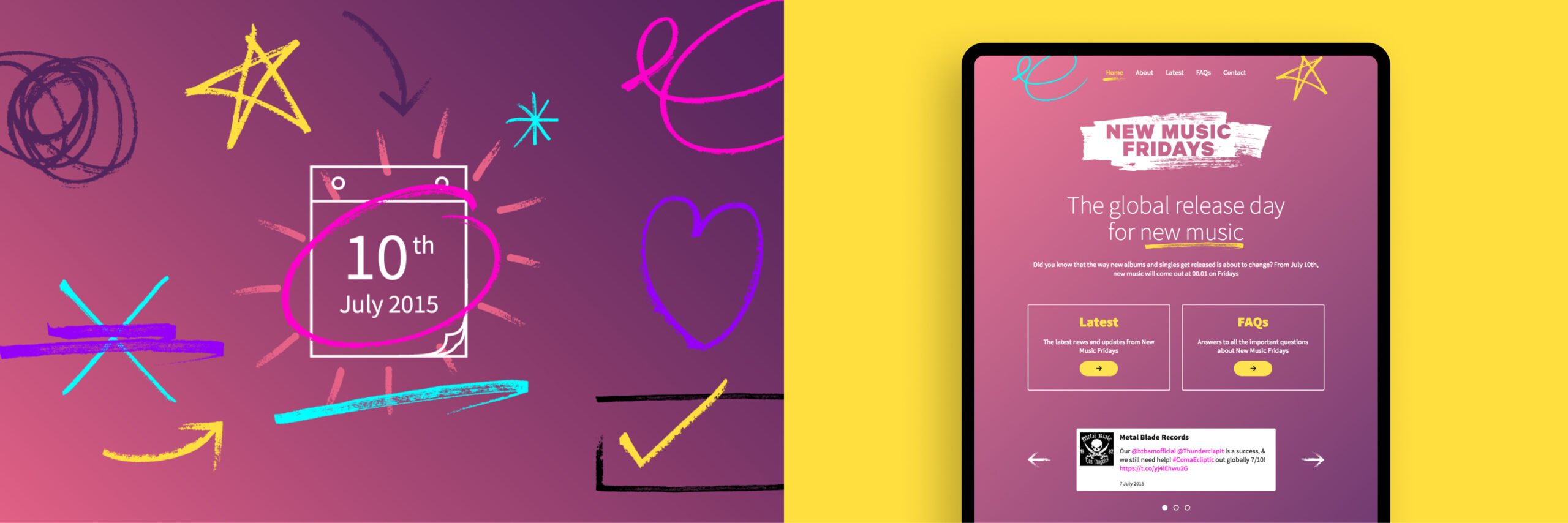
We wanted to create style that was assertive and inspiring. We created a modular brand platform comprised of creative elements and assets that could be used in different ways. Building this inventory meant that third parties could expand their own communications and campaigns locally, adopting the New Music Fridays concept with a sense of ownership and purpose.

Global strategy and application
Because this was a global campaign, our core identifier and brand mark needed to be translated for all required languages. All our assets were produced and made available for localised advertising and industry use. Our creative was adopted by third-party distributors and used commercially in stores and online.
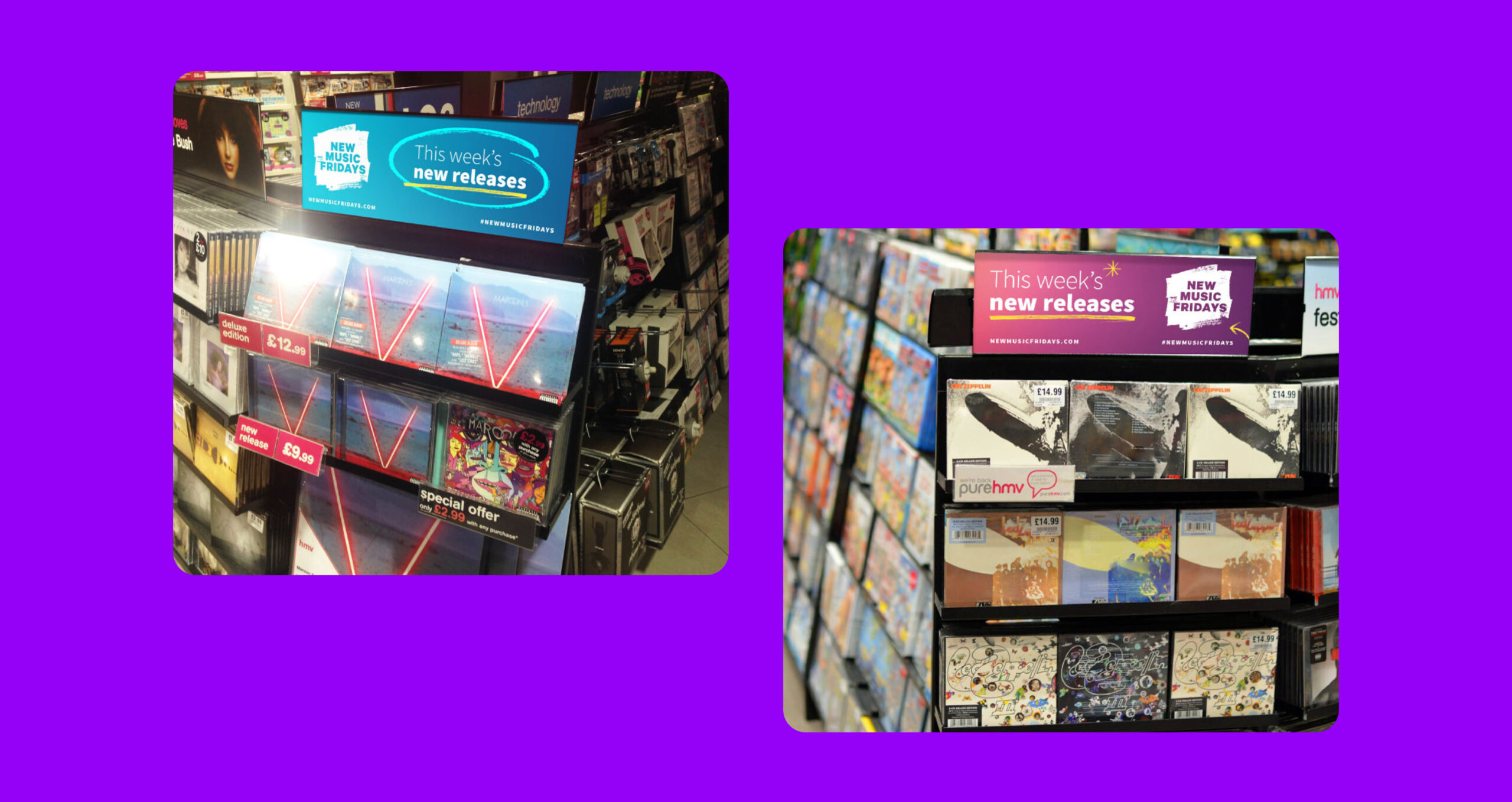
Consistent implementation
A key challenge for the campaign was the coordinated delivery of assets and brand guidance to music organisations, record labels and retailers around the world leading up to, and after, the launch. Our solution was to create a brand portal where all assets could be accessed, alongside brand usage guidelines and a simple, coherent website.
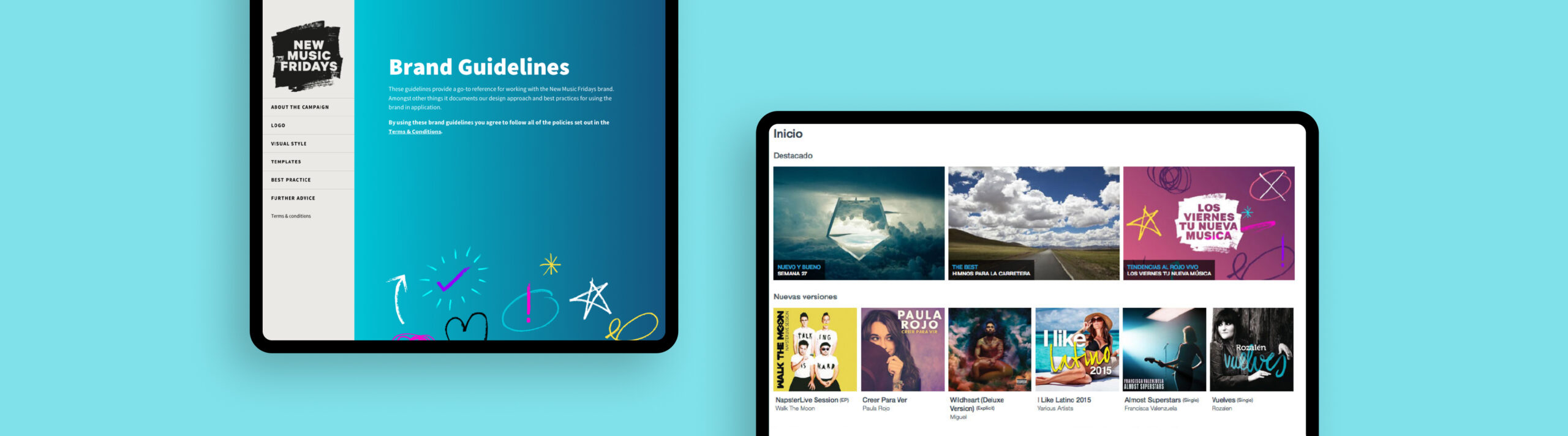
The outcome
Our work helped to create a global campaign that gave an effective and consistent voice across physical and digital campaigns. With our brand guidelines platform and new website, the campaign was able to be rolled out and used at scale. New Music Fridays was a success, becoming the standard global release day, and music piracy plummeted.
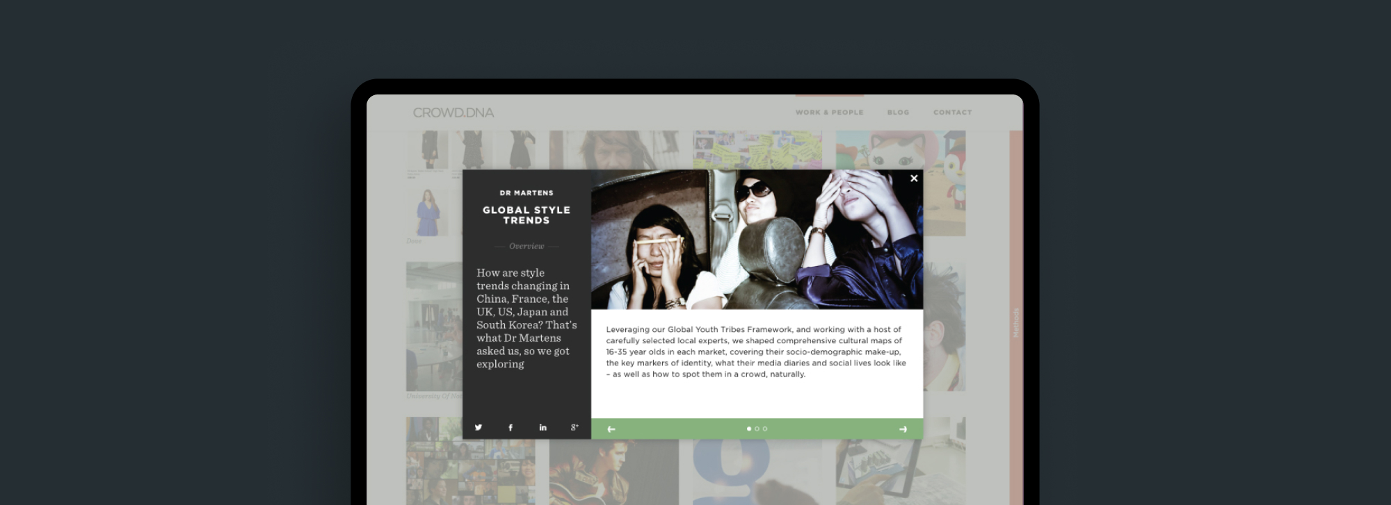
Crowd DNA are a cultural insights and strategy consultancy with offices in London, Amsterdam, New York, Singapore, Sydney and Stockholm. Formed in 2008, operating across 60+ markets, they bring together trends specialists, researchers, strategists, data analysts, designers, writers and film-makers for the world’s most exciting brands.
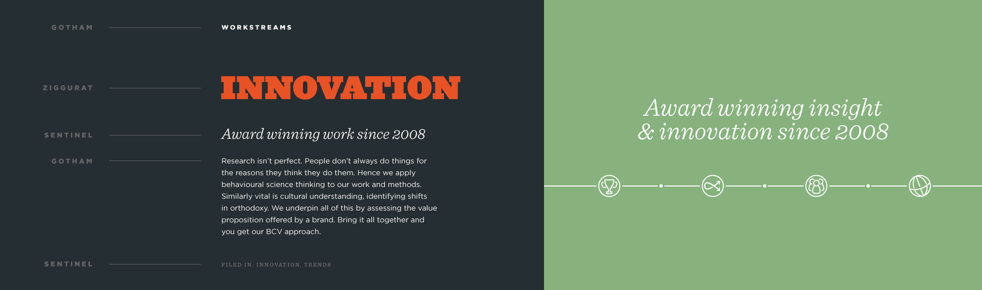
The client wanted a brand update and website design and build that would allow them to continue to growWe wanted to ensure that the brand referenced culture and people and so we ensured that photography used that portrayed a sense of humanity, life and energy to communicate the end result of their work.
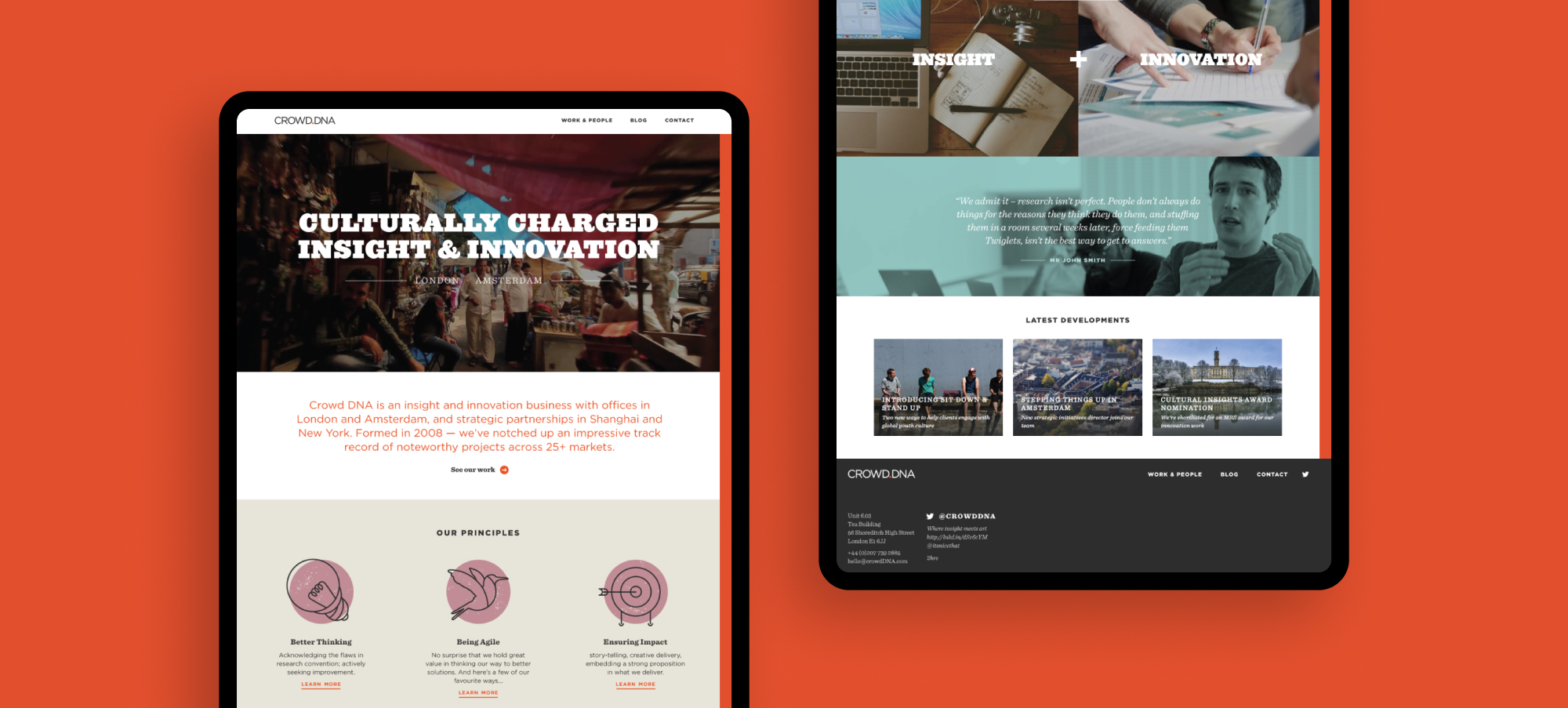
We used a number of fonts so that the brand had enough hierarchy at each level of volume required and brought in unique illustrative elements so that we could signpost content for users and give the client pieces of creative that they could use across wider materials such as social.
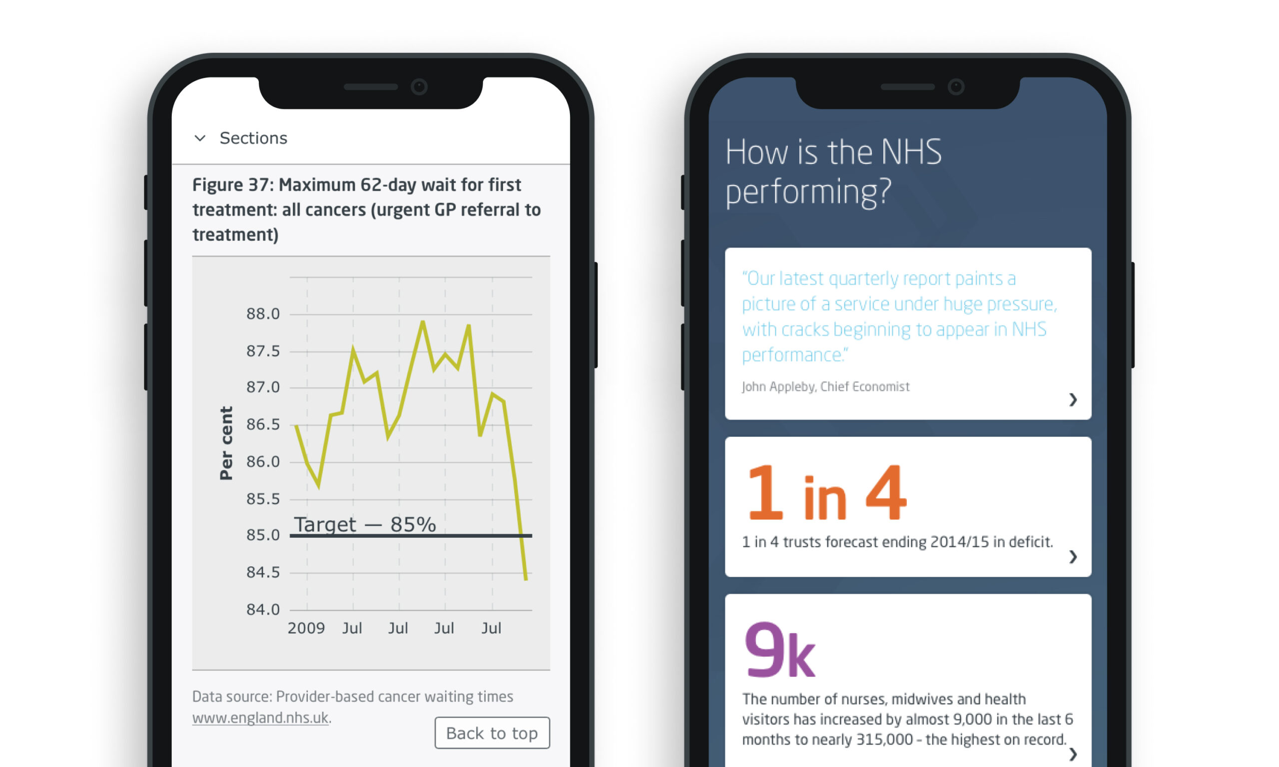
The King’s Fund is an independent charitable organisation working to improve health and care in England. They produce a Quarterly Monitoring Report (QMR) to provide a regular update on how the NHS in England is coping as it grapples with the evolving reform agenda and the more significant challenge of making radical improvements in productivity.
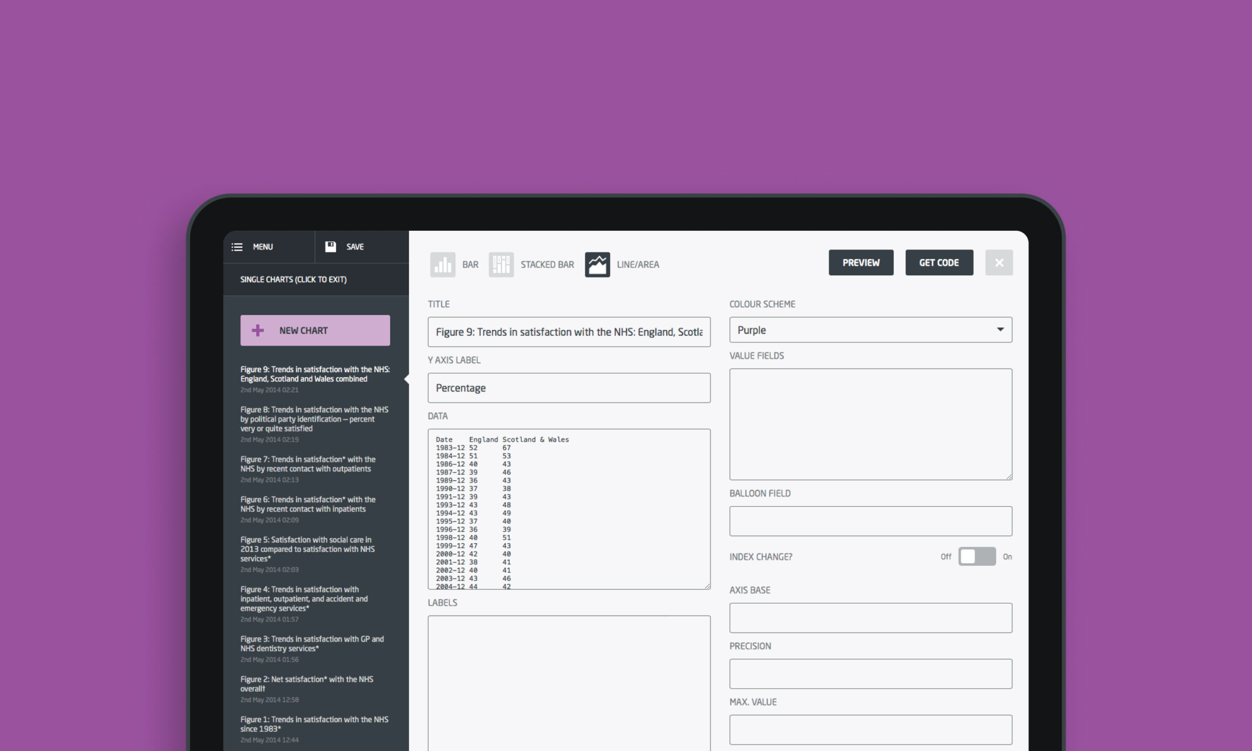
We were commissioned to produce a digital site that could be updated moving forward. The charting had to be able to be interrogated by users and so we produced a system for the King’s Fund to upload the data in the back end that would then translate the data into the various designs we had coded. We worked with the team to select the correct charting type and presentation for the data visuals to ensure that the correct stories were told in a visually engaging way.
Building London’s early-stage creator
Funding London, originally SME Wholesale Finance, required a revised brand position and presence. Capturing the Early-Stage Market, and helping to grow emerging and exciting companies in London, the organisation required support to change.
Brand positioning
After meeting with key stakeholders, we set about tackling the brand positioning challenge of this project. By understanding the organisations principle role, we identified the term ‘Funding London’ as an active description that best reflected them. From there, we built out a brand approach with the breadth to operate in all required environments.
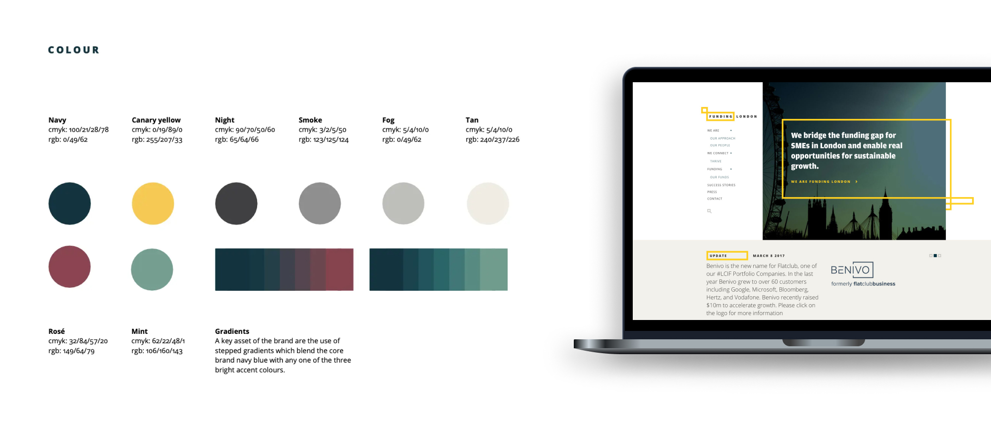
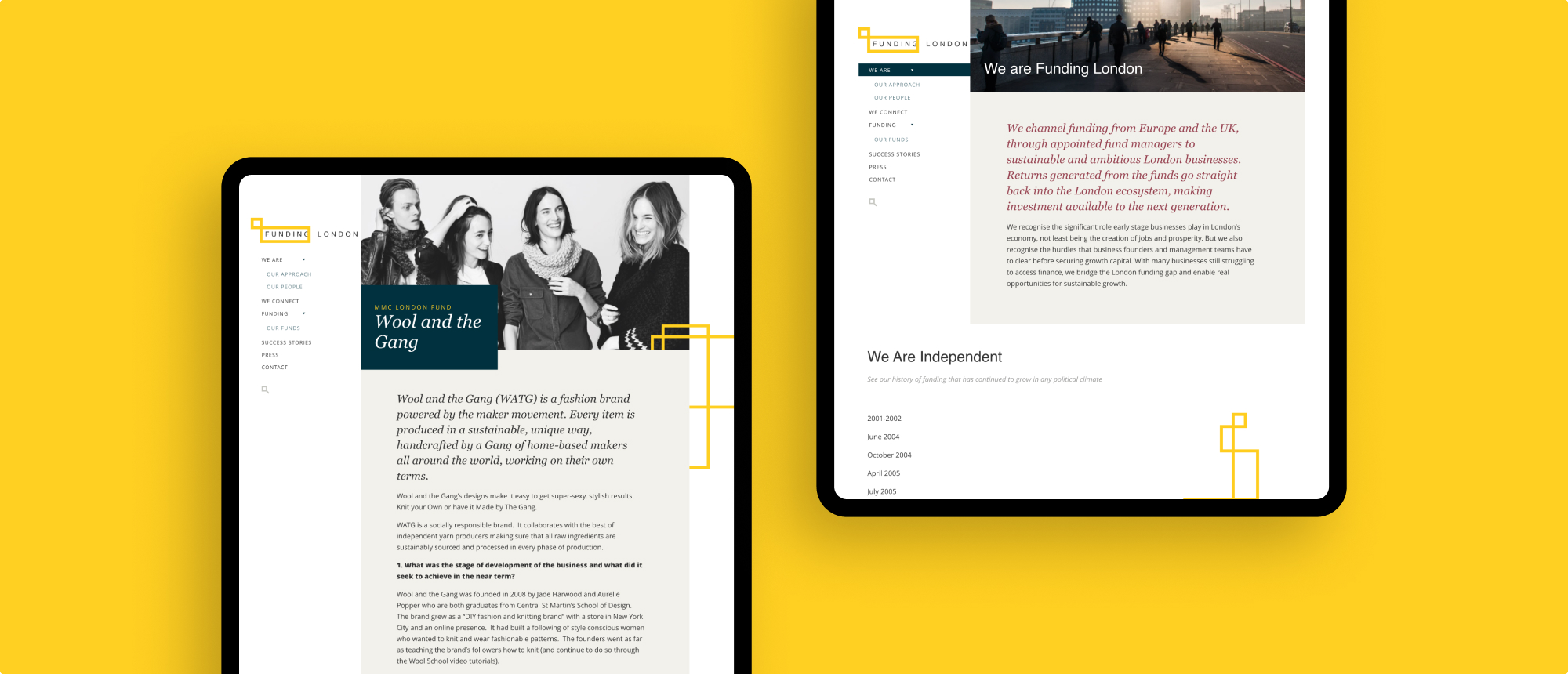
We wanted the brand to be clean, making communication the focus and so built an identity that could flex – supported by a colour palette that was both bold and striking. The bold yellow stroke within the new logomark operated as a frame for important information as well as user signposting throughout our design language.
Digital transformation
Our input into repositioning Funding London saw our team plan, design and develop a WordPress-powered website that remains in active use today. We later produced a brand and digital presence for sister publication and concept Thrive: an online journal featuring interviews and opinion on London’s early-stage business ecosystem.
Mortality reporting: good and bad
Often referred to as the report that made their name, the ‘Good Hospital Guide’ caused a large media stir when Dr Foster first released it in the press. As the government and the public demanded greater transparency from the medical profession, particularly in response to things such as the Bristol Royal Infirmary inquiry, Dr Foster seemed blessed with the right socio-political climate for launching its data-led material. The Good Hospital Guide is subtitled: “The definitive guide to getting the best service from the NHS and private hospitals. First independent assessment of every major hospital in the UK.”
Integrated reporting: based on data
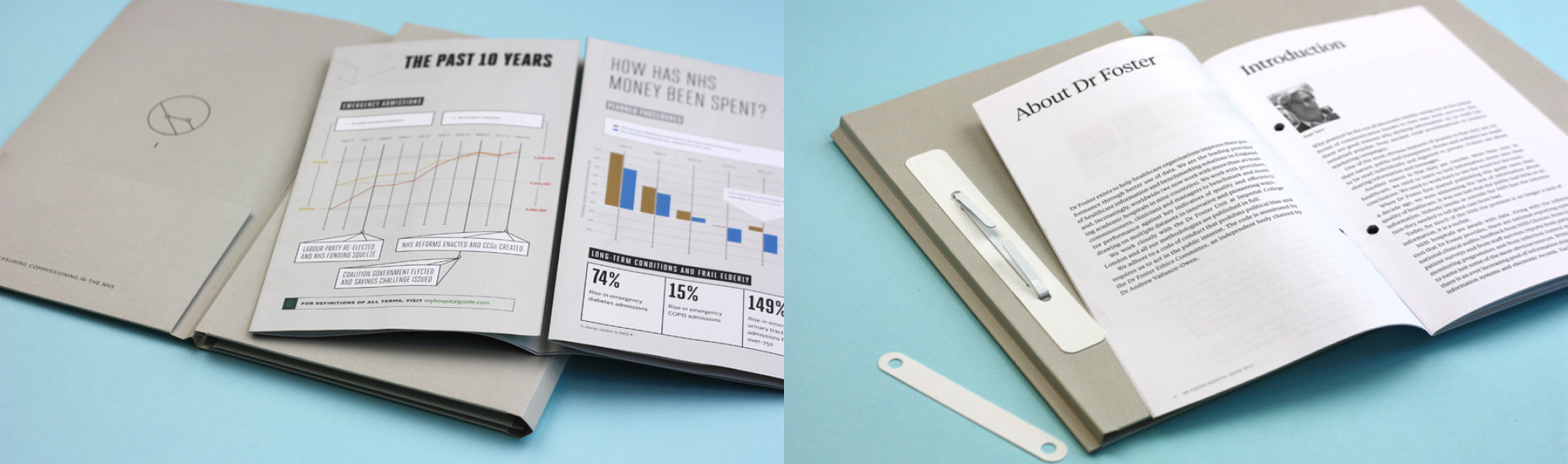
The Dr Foster Intelligence Hospital Guide as it became termed, was a perfect chance to employ all the aspects of the brand creative that we had put in place for Dr Foster in our relationship with them.
For this report, where we are proud to have supported the team at Dr Foster across a number of years, saw a manifestation across both a print-based activation campaign and a digitally-led project drawing interest from press, public-and-private health institutions, the NHS, government bodies and the general public.
The pre-acquisition challenge
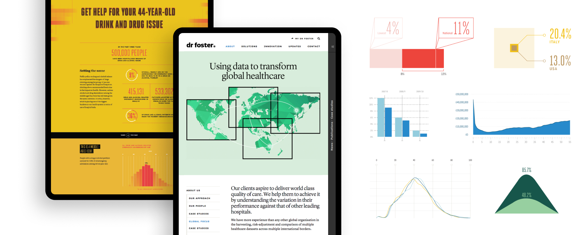
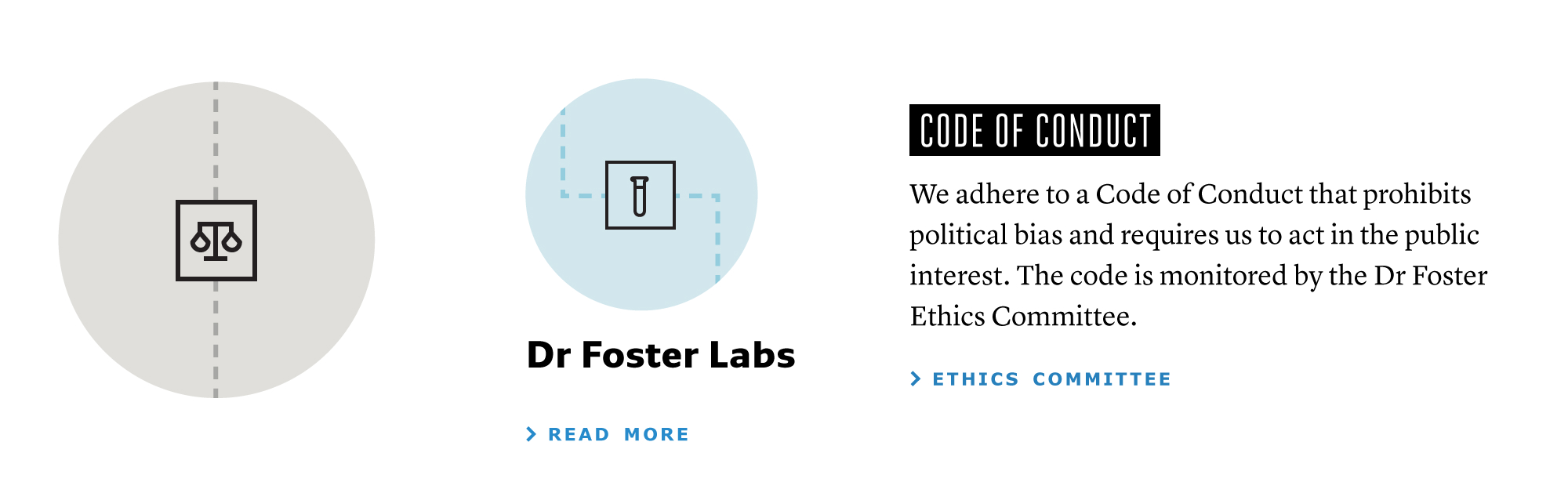
Dr Foster is a market-leading healthcare analytics company (now owned by Telstra). Our team’s role within this project was to help shape and position the brand in the build-up to what was a successful commercial acquisition. Dr Foster required support in how to leverage its experience and expertise and present its digitally led proposition to market, with a tone of voice that reflected the true insight it provides.
What we did
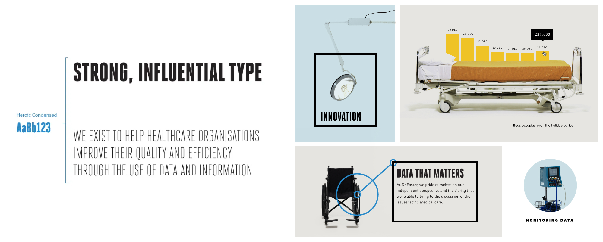
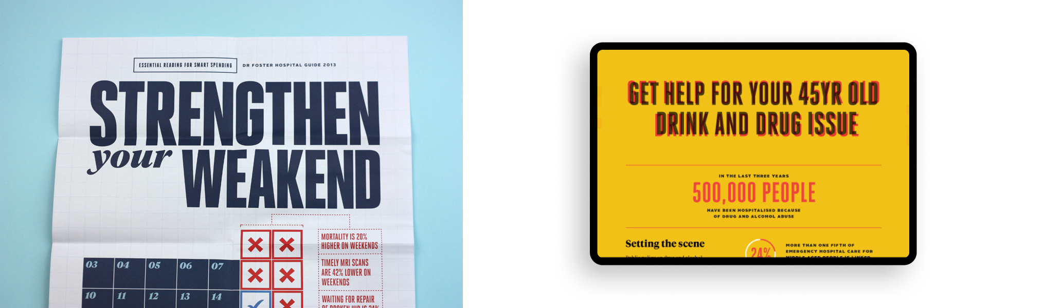
We establishing a bold, typographical brand direction that paid homage to the organisation’s journalistic roots. We provided a design platform that support the creation of the varied data insight that they required.
The stark approach to photography created a distinct personality that resonated with the realistic view of the healthcare industry Dr Foster wanted to portray. The brand was rolled out across a range of digital and printed applications by our design and development team.