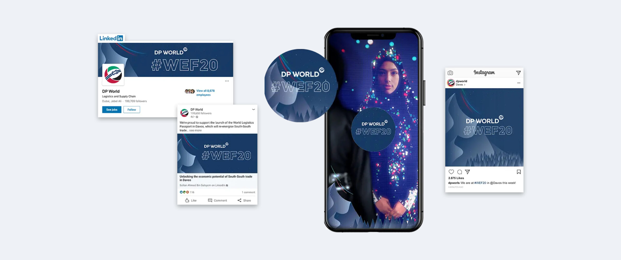
Unit 29 Ventures launched its first enterprise in 2020: The Cove, a luxury florist and concept store in Royal Tunbridge Wells. It has built up a loyal and discerning customer base of people with a taste for premium products made by local independent makers and distillers.
After two years, investor Phil Reid – who is the founder and Strategic Director of Studiomade – decided it was time for Unit 29’s next venture: a unique, small batch rum.
The concept and name
Unit 29 Ventures recognised an opportunity to launch a rum brand centred on sustainable packaging, the concept of reuse, and supporting a sustainability charity.
The vision was for a rum inspired by the ocean, locally made in Kent, and led by its values: distinctive quality in the ingredients and materials, clean efficiency (reduced waste and efficient production methods), and growth and rejuvenation of natural resources (contributing to a cause and enjoying life while doing it).
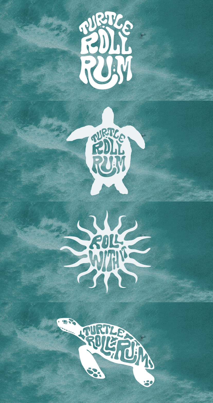
Based on a love of the sea and surf, and reflecting this new venture and its first step into the drinks industry, we named it Turtle Roll. Before you can line up a wave when surfing, you have to get out past the ones that are breaking all around you. The turtle roll technique helps you get past barriers, jump over hurdles and achieve greatness. Unit 29 hoped to do the same with Turtle Roll Rum – taking beginner steps with an ethically produced rum, hoping to effect positive change in our oceans.
The taste
Unit 29 Ventures and Studiomade worked together to craft the brand story and narrative of Turtle Roll Rum, which in turn helped brief the ingredients and taste. We worked with a talented expert, Callum Giblett, Managing Director at The Custom Spirit Co. He and his team defined different taste directions and, during a rigorous six-month phase of tasting, exploration and user testing, whittled down multiple recipes and ideas into the winning formula.
Turtle Roll Rum has been imagined and produced locally to Tunbridge Wells in Kent. It is distilled with Venezuelan, Dominican and Jamaican sugar cane, using a clean, high-quality and sustainable production process that runs fully on renewable energy. The concept, ingredients and commitment to sustainability all emerged from appreciation for the sea and ocean-side living.
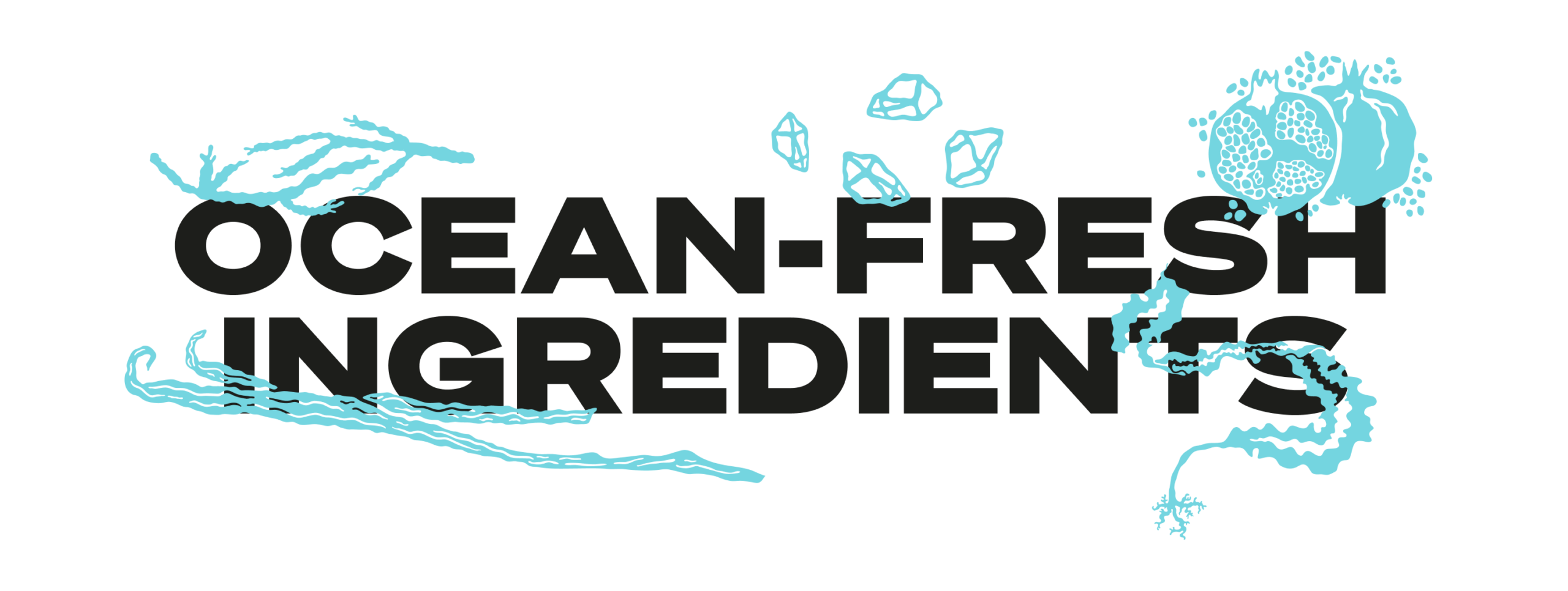
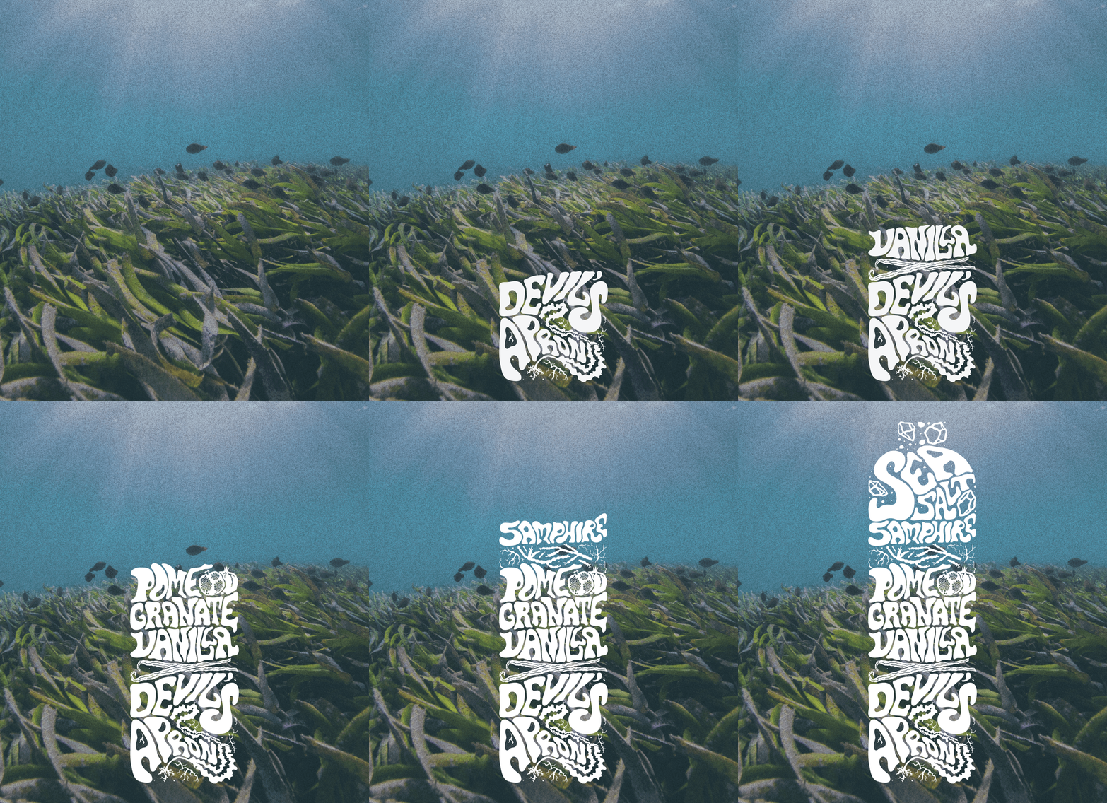
In the final produced recipe, Turtle Roll Rum blends notes of pomegranate, lapsang, vanilla, black cardamom and sea salt with oceanic botanicals samphire and sugar kelp. These intriguing layers of sweet and salt create a rich and smooth flavour profile.
As part of Turtle Roll’s sustainability commitment, 10% of profits are donated to Project Seagrass, a charity working to restore and protect seagrass, a wonder plant that’s crucial to the health of our oceans.
Brand positioning and identity
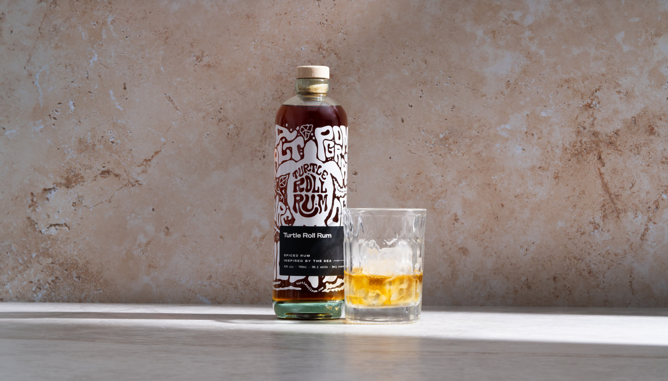
Turtle Roll Rum is positioned as a challenger, independent brand with a premium feel, priced in line with the small-batch market. We were inspired by product brands that are driven by a mission beyond the product itself; companies with sustainable, ethical values at their core.
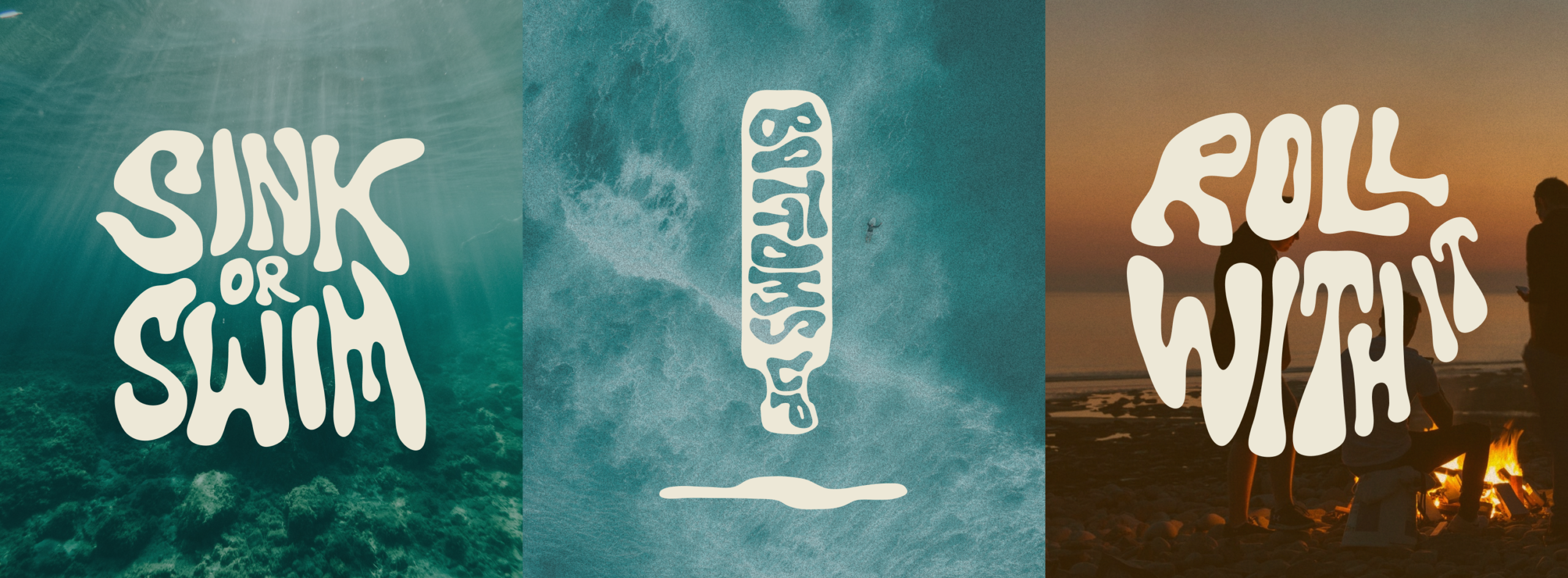
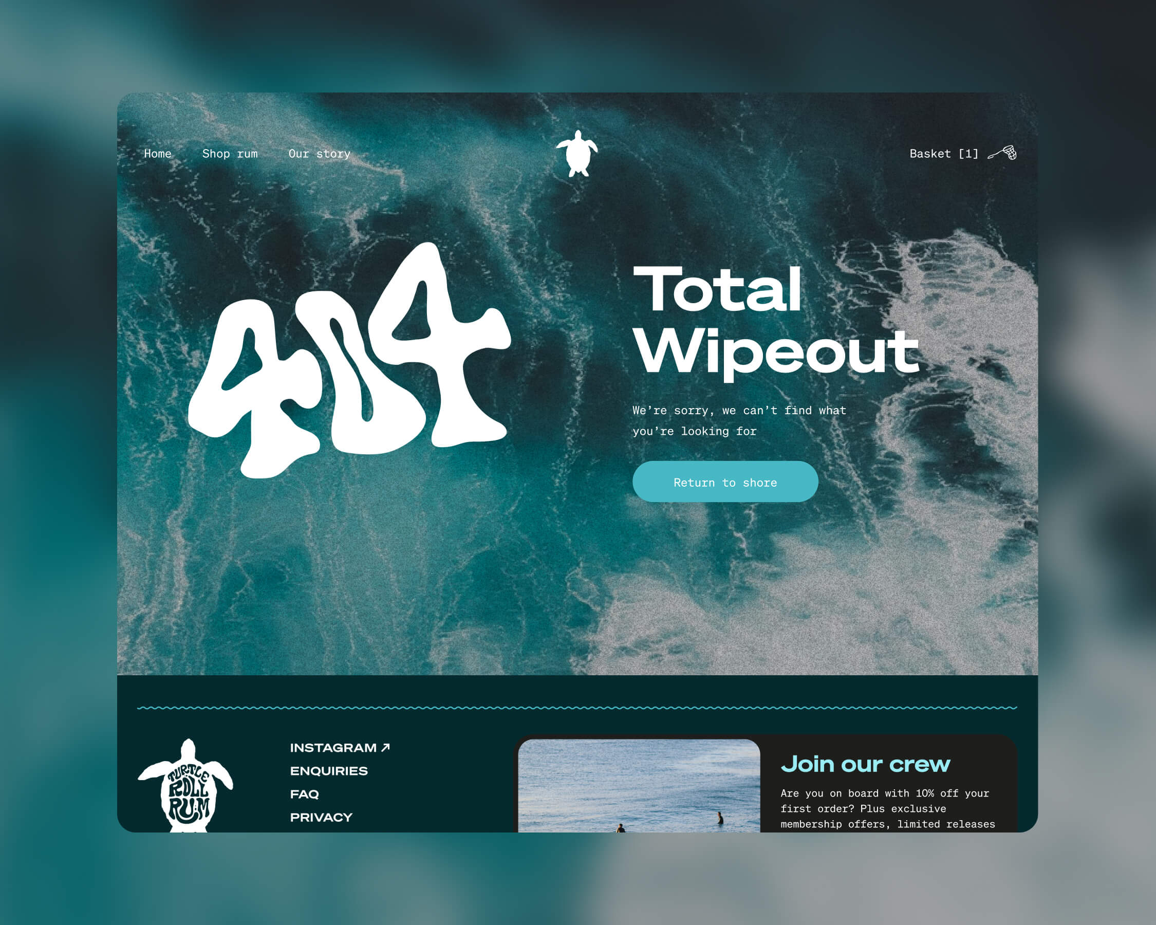
Our design director Angelo Iannelli wanted typography with a feeling of the sea so crafted loose, hand-drawn lettering, paired with the Söhne Breitt font as a contemporary counterpart. The illustrations, all hand-drawn by the Studiomade team, emulate typography distorted as if looking through water. The aqua tones and grainy texture of some of the photography were inspired by vintage surf photos e.g. 80s Miami.
Brand messaging
We use language that suits a modern, challenger brand, giving it a distinctive voice, casual rather than polished, yet with a premium feel. We use enticing flavour and ingredients descriptions to appeal to an audience of taste makers who are on top of trends and like to discover new experiences. To keep it relatable, we sprinkle in light-hearted, ocean-inspired phrases, particularly on social media.
Product photography
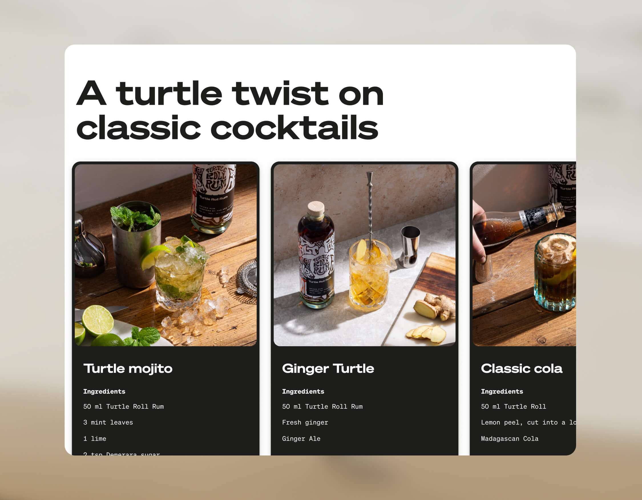
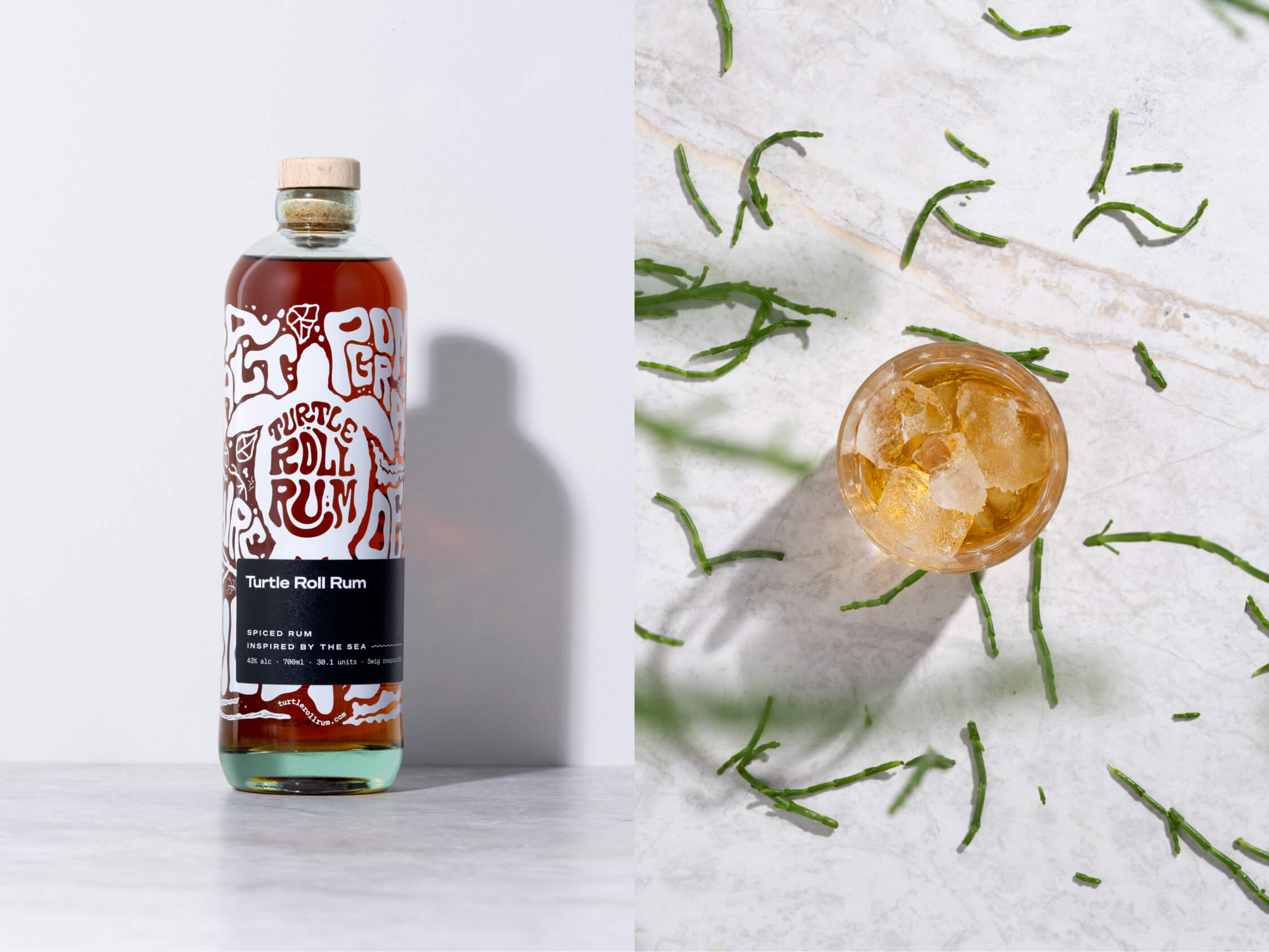
The images were shot by the wonderful team at Névé Studios. After creating mood boards to drive our creative direction, we decided that product photography should be bright and spacious, playing with light, shadow and interesting angles, and reflecting the fresh ingredients that give Turtle Roll its taste. The images feel realistic rather than glossy e.g. cocktails being made and drinks being poured. This is interspersed with imagery of oceans and waves, evoking the open feeling of the sea.
E-commerce
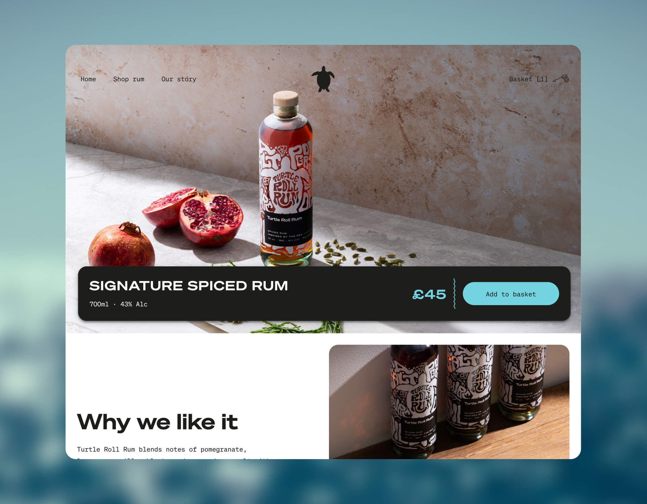
Turtle Roll Rum was conceived to be predominantly sold direct to consumer. This means that the customer experience and how the brand is presented online are paramount. We wanted to best present the personality of Turtle Roll Rum and establish a brand connection with customers, rather than it being a sales push.
To this end, we built a custom e-commerce experience, with every aspect individually designed. We applied the visual identity and brand voice across the website, and created a user journey that includes purchase. We opted for Gatsby hosted on Netlify, for good performance and speed. We integrated Stripe for payments and set up a bespoke webhook to promptly relay order details to our fulfilment company whenever there’s a successful transaction. We added Mailchimp integration for automated emails to complete our loop.
Bottle and packaging
We researched, trialled and tested multiple bottle manufacturers and product variants, to find the most sustainable options possible.
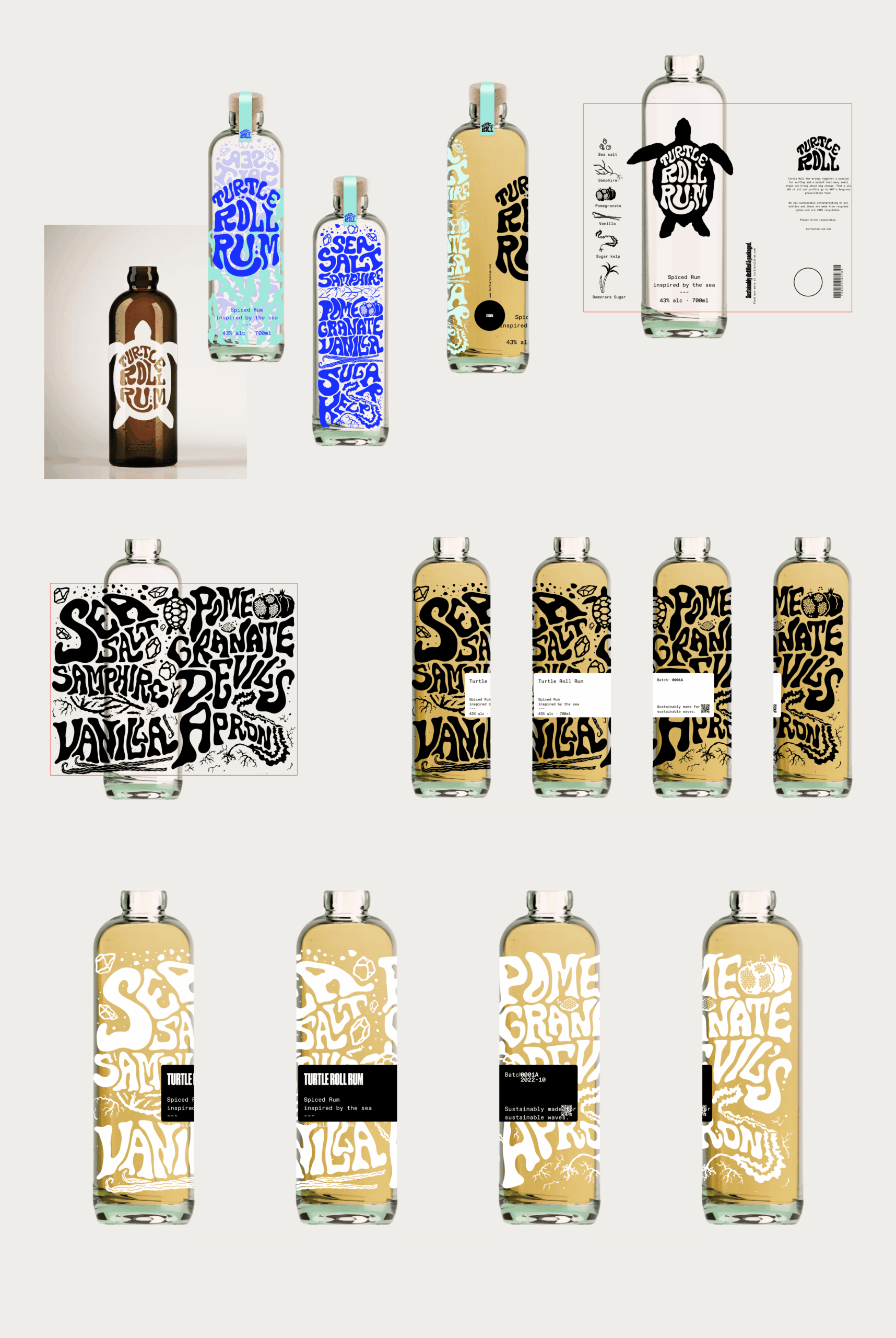
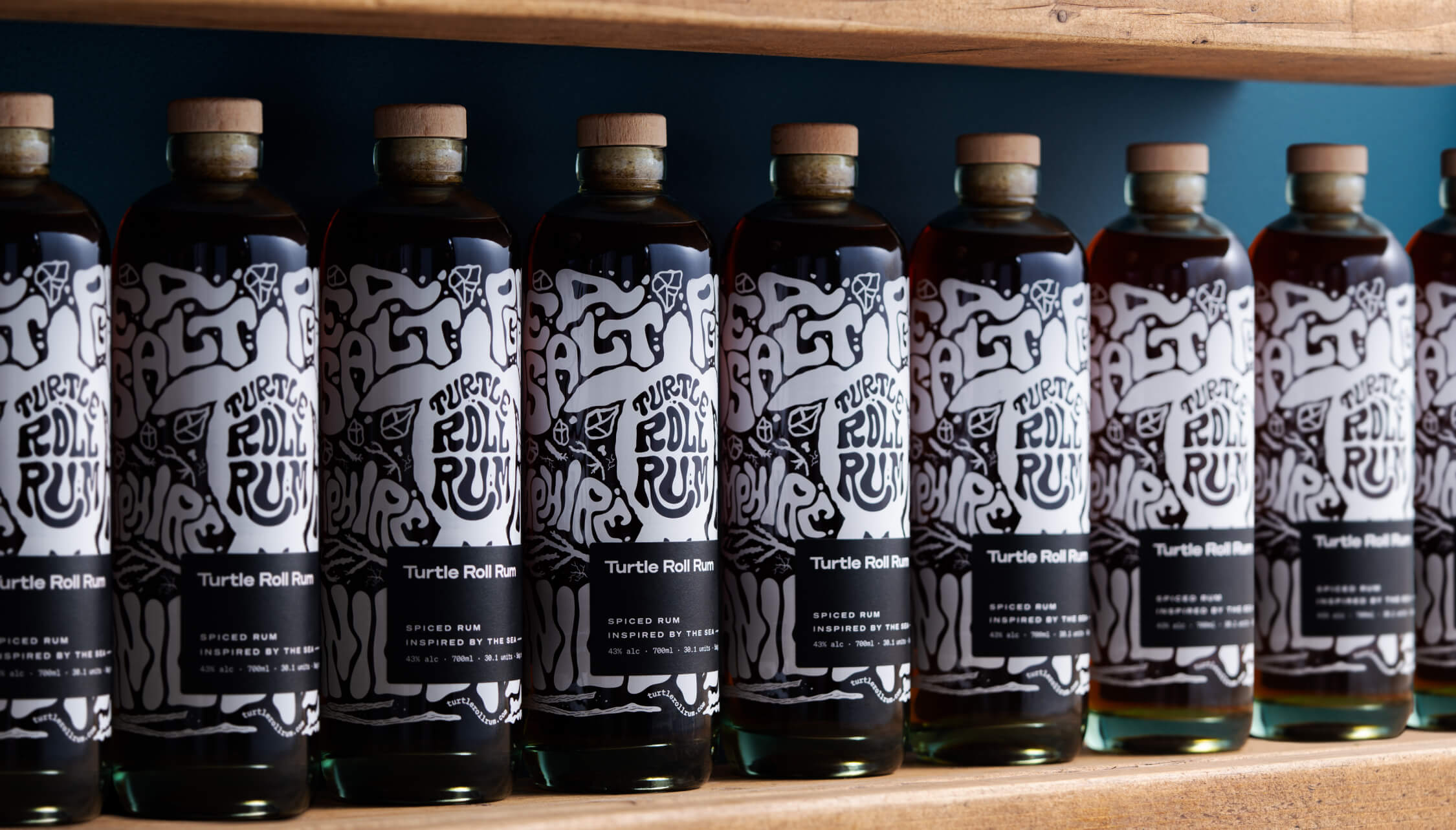
Each bottle is made from 100% recycled glass and screen printed (using sustainable ink), with custom-drawn artwork and lettering that highlights the ingredients. It’s overlaid with a 100% recycled ECF paper label, printed with soy inks and the cork is sealed with a fully compostable, plant-based shrink wrap.
The cork stopper is made with activated charcoal, as this removes the need for additional chemicals and industrial processes. Packaging for shipment is made from bamboo pulp, a more abundant, renewable resource than cardboard.
A focus on re-use
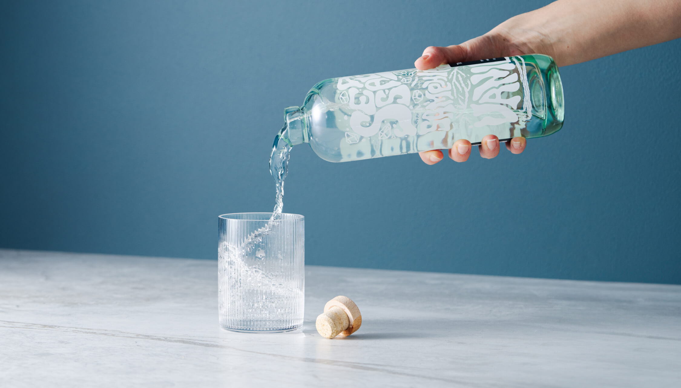
After enjoying the rum, we encourage people to reuse the bottle as many times as possible before they put it into recycling. Our intention was to create a product that sparks conversation and brings a bit of fun to kitchens and dining tables when used as a pitcher for water or vase for flowers.
Merchandise
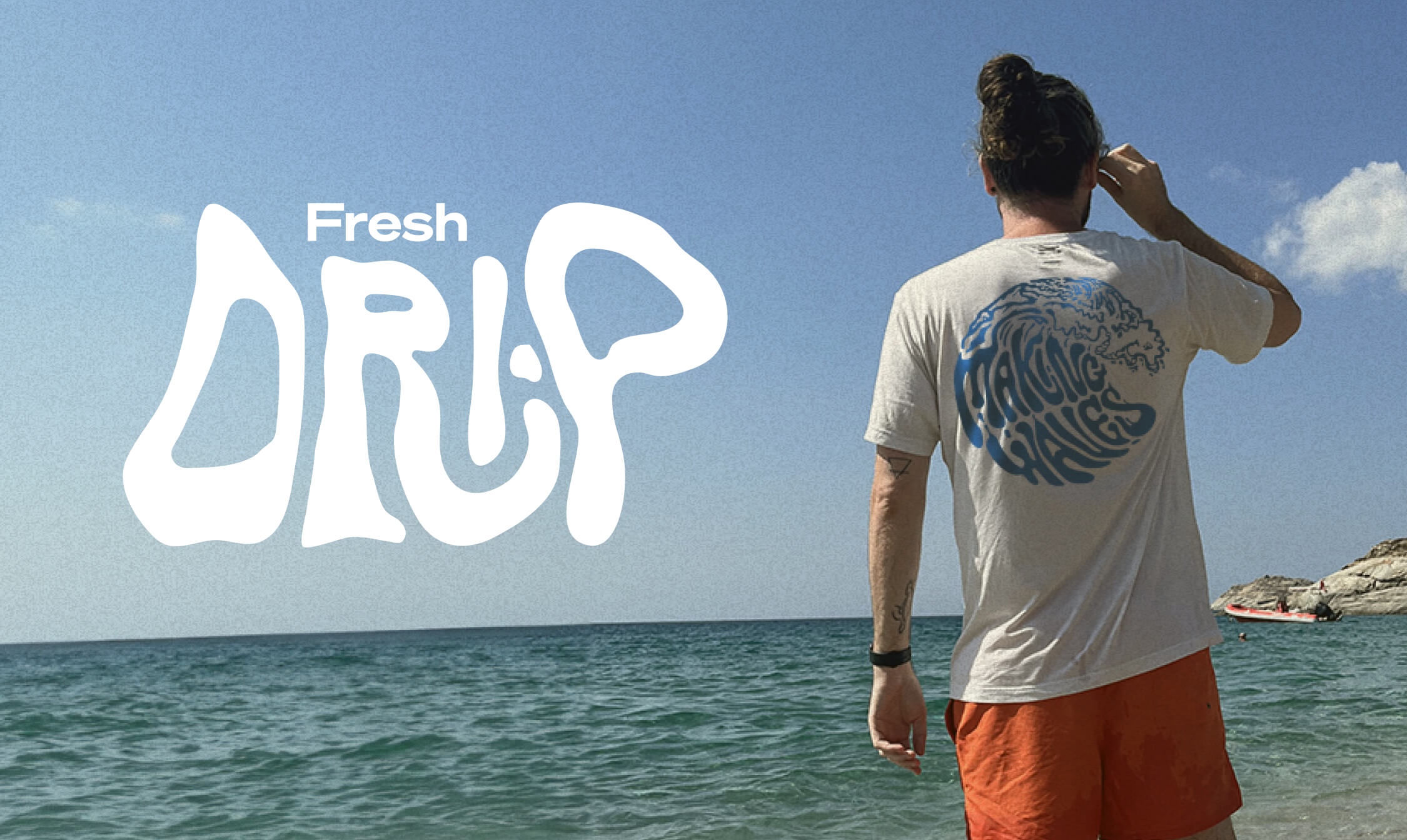
Unit 29 Ventures also wanted branded merchandise so we teamed up with Teemill. We chose them for two reasons. First, their t-shirts and hoodies are made from organic cotton, and they can be returned to be remade into something else once they’re worn out, creating a circular economy, which aligns with Turtle Roll’s value of sustainability. Second, customer purchases are printed and shipped to order, rather than us having to buy and hold stock. From a commercial perspective, as a new venture, this allows us to test users’ buying intent and decide where to focus on growing the range.
The outcome
With commercial strategy and investment from Unit 29 Ventures, and creative, brand and digital activation from Studiomade, we partnered to create a unique, small-batch, premium spiced rum, with sustainability at its heart. The initial limited run of 1,200 is now available at The Cove in Tunbridge Wells, at turtlerollrum.com and proudly stocked at a growing number of bars and restaurants (ideally close to the sea!) in Kent and the South East.
Are you thinking of creating and launching a new product? To discuss how Unit 29 Ventures and/or Studiomade can help you, contact our Founder & Strategic Director, Phil Reid, on phil@studiomade.co
Unit 29 Ventures launched its first enterprise in 2020: The Cove, a luxury florist and concept store in Royal Tunbridge Wells. It has built up a loyal and discerning customer base of people with a taste for premium products made by local independent makers and distillers.
After two years, investor Phil Reid – who is the founder and Strategic Director of Studiomade – decided it was time for Unit 29’s next venture: a unique, small batch rum.
The concept and name
Unit 29 Ventures recognised an opportunity to launch a rum brand centred on sustainable packaging, the concept of reuse, and supporting a sustainability charity.
The vision was for a rum inspired by the ocean, locally made in Kent, and led by its values: distinctive quality in the ingredients and materials, clean efficiency (reduced waste and efficient production methods), and growth and rejuvenation of natural resources (contributing to a cause and enjoying life while doing it).
Based on a love of the sea and surf, and reflecting this new venture and its first step into the drinks industry, we named it Turtle Roll. Before you can line up a wave when surfing, you have to get out past the ones that are breaking all around you. The turtle roll technique helps you get past barriers, jump over hurdles and achieve greatness. Unit 29 hoped to do the same with Turtle Roll Rum – taking beginner steps with an ethically produced rum, hoping to effect positive change in our oceans.
The taste
Unit 29 Ventures and Studiomade worked together to craft the brand story and narrative of Turtle Roll Rum, which in turn helped brief the ingredients and taste. We worked with a talented expert, Callum Giblett, Managing Director at The Custom Spirit Co. He and his team defined different taste directions and, during a rigorous six-month phase of tasting, exploration and user testing, whittled down multiple recipes and ideas into the winning formula.
Turtle Roll Rum has been imagined and produced locally to Tunbridge Wells in Kent. It is distilled with Venezuelan, Dominican and Jamaican sugar cane, using a clean, high-quality and sustainable production process that runs fully on renewable energy. The concept, ingredients and commitment to sustainability all emerged from appreciation for the sea and ocean-side living.
In the final produced recipe, Turtle Roll Rum blends notes of pomegranate, lapsang, vanilla, black cardamom and sea salt with oceanic botanicals samphire and sugar kelp. These intriguing layers of sweet and salt create a rich and smooth flavour profile.
As part of Turtle Roll’s sustainability commitment, 10% of profits are donated to Project Seagrass, a charity working to restore and protect seagrass, a wonder plant that’s crucial to the health of our oceans.
Brand positioning and identity
Turtle Roll Rum is positioned as a challenger, independent brand with a premium feel, priced in line with the small-batch market. We were inspired by product brands that are driven by a mission beyond the product itself; companies with sustainable, ethical values at their core.
Our design director Angelo Iannelli wanted typography with a feeling of the sea so crafted loose, hand-drawn lettering, paired with the Söhne Breitt font as a contemporary counterpart. The illustrations, all hand-drawn by the Studiomade team, emulate typography distorted as if looking through water. The aqua tones and grainy texture of some of the photography were inspired by vintage surf photos e.g. 80s Miami.
Brand messaging
We use language that suits a modern, challenger brand, giving it a distinctive voice, casual rather than polished, yet with a premium feel. We use enticing flavour and ingredients descriptions to appeal to an audience of taste makers who are on top of trends and like to discover new experiences. To keep it relatable, we sprinkle in light-hearted, ocean-inspired phrases, particularly on social media.
Product photography
The images were shot by the wonderful team at Névé Studios. After creating mood boards to drive our creative direction, we decided that product photography should be bright and spacious, playing with light, shadow and interesting angles, and reflecting the fresh ingredients that give Turtle Roll its taste. The images feel realistic rather than glossy e.g. cocktails being made and drinks being poured. This is interspersed with imagery of oceans and waves, evoking the open feeling of the sea.
E-commerce
Turtle Roll Rum was conceived to be predominantly sold direct to consumer. This means that the customer experience and how the brand is presented online are paramount. We wanted to best present the personality of Turtle Roll Rum and establish a brand connection with customers, rather than it being a sales push.
To this end, we built a custom e-commerce experience, with every aspect individually designed. We applied the visual identity and brand voice across the website, and created a user journey that includes purchase. We opted for Gatsby hosted on Netlify, for good performance and speed. We integrated Stripe for payments and set up a bespoke webhook to promptly relay order details to our fulfilment company whenever there’s a successful transaction. We added Mailchimp integration for automated emails to complete our loop.
Bottle and packaging
We researched, trialled and tested multiple bottle manufacturers and product variants, to find the most sustainable options possible.
Each bottle is made from 100% recycled glass and screen printed (using sustainable ink), with custom-drawn artwork and lettering that highlights the ingredients. It’s overlaid with a 100% recycled ECF paper label, printed with soy inks and the cork is sealed with a fully compostable, plant-based shrink wrap.
The cork stopper is made with activated charcoal, as this removes the need for additional chemicals and industrial processes. Packaging for shipment is made from bamboo pulp, a more abundant, renewable resource than cardboard.
A focus on re-use
After enjoying the rum, we encourage people to reuse the bottle as many times as possible before they put it into recycling. Our intention was to create a product that sparks conversation and brings a bit of fun to kitchens and dining tables when used as a pitcher for water or vase for flowers.
Merchandise
Unit 29 Ventures also wanted branded merchandise so we teamed up with Teemill. We chose them for two reasons. First, their t-shirts and hoodies are made from organic cotton, and they can be returned to be remade into something else once they’re worn out, creating a circular economy, which aligns with Turtle Roll’s value of sustainability. Second, customer purchases are printed and shipped to order, rather than us having to buy and hold stock. From a commercial perspective, as a new venture, this allows us to test users’ buying intent and decide where to focus on growing the range.
The outcome
With commercial strategy and investment from Unit 29 Ventures, and creative, brand and digital activation from Studiomade, we partnered to create a unique, small-batch, premium spiced rum, with sustainability at its heart. The initial limited run of 1,200 is now available at The Cove in Tunbridge Wells, at turtlerollrum.com and proudly stocked at a growing number of bars and restaurants (ideally close to the sea!) in Kent and the South East.
Are you thinking of creating and launching a new product? To discuss how Unit 29 Ventures and/or Studiomade can help you, contact our Founder & Strategic Director, Phil Reid, on phil@studiomade.co
The Hong Kong Investment Funds Association (HKIFA) is a non-profit organisation representing the fund management industry. It exists to cultivate the development of the fund industry in Hong Kong; enhance the industry’s professional standards, in line with international best practices; and maintain the region’s status as the major fund management centre in Asia.
Its website no longer reflected its position in the industry. The organisation wanted a bespoke new digital presence that better presents the expertise, services and knowledge base it offers to its members. It had to be brought up to date in how it looks and how it functions, have an easy-to-access resource library for members, talk to broad audience groups and be a tool for communication within the organisation.
What we did
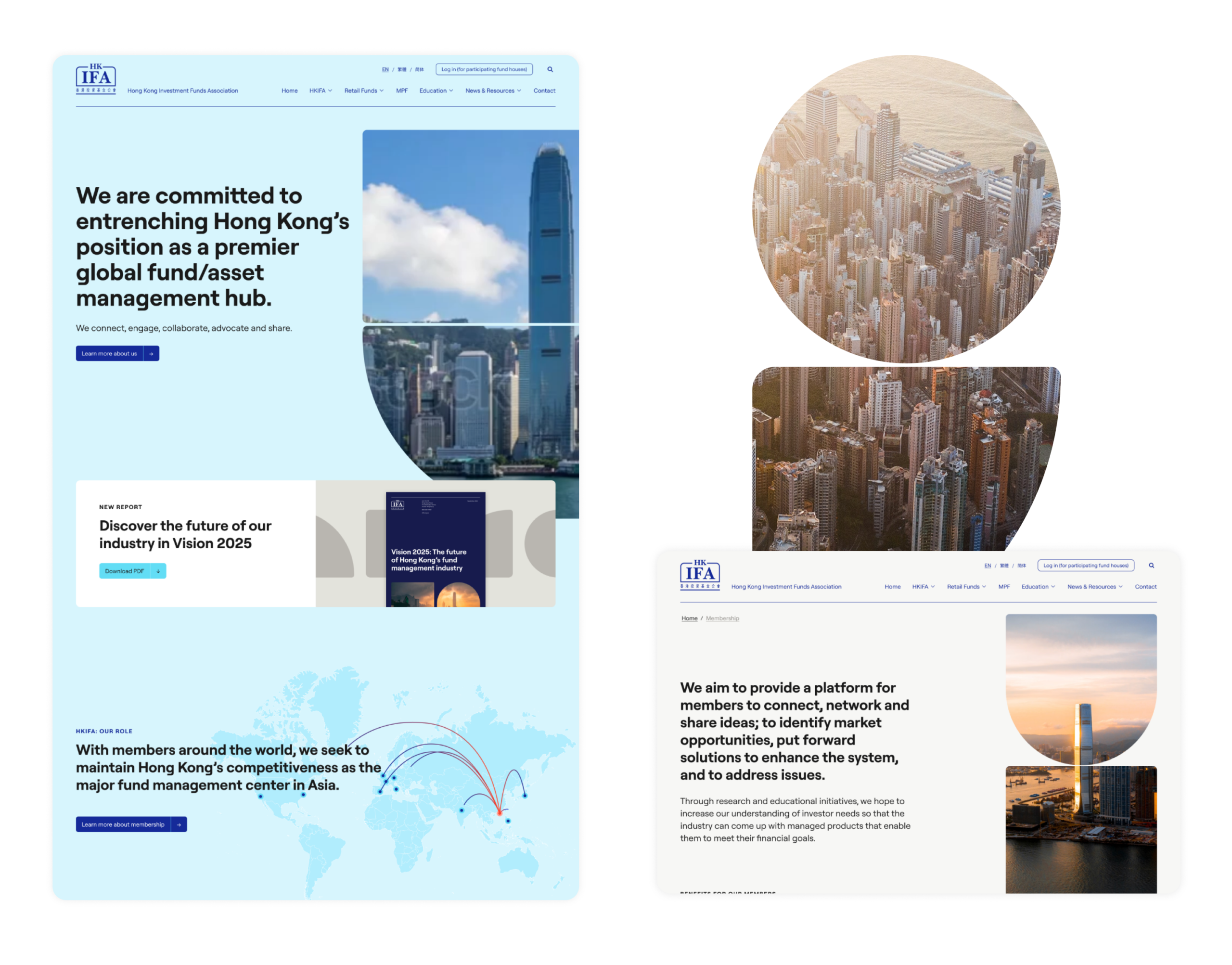
We built an improved, user-led digital environment using our proven steps, from initial strategy through to design, prototyping, user journey and website build that functioned across multiple languages. We began by refining the messaging, and crafted a core narrative that presents HKIFA’s market advantage and positions it as an authoritative knowledge base, with an easy-to-access resource library for members.
With the client located in Hong Kong, we ran remote, interactive workshops to manage and lead product development from concept through the development process. This will continue with review and performance monitoring post-launch.
Design and build
We redefined the digital structure, considering how content will sit and how each audience will navigate around it. We designed a creative look and feel – with a clear UI and UX – to uplift the brand, with a user-focused and human-led approach (as we do for all digital product creation).
There were a number of specific requirements. It had to be secure, GDPR compliant, scalable, follow W3C content accessibility guidelines, integrate with existing data, have multi-language functionality, be easy for HKIFA’s teams to use and update, and able to manage CRM database integrations and future portal additions. It also had to offer English, Formal and Simplified Chinese translations.
Crafting a bespoke WordPress environment allowed us to meet all these requirements. The platform is a safe GDPR-compliant infrastructure that accommodates existing information and can integrate with any other existing data that HKIFA holds. We built in rich, organic-focused SEO as well as data analytics and reporting, so that results can be easily measured. We employed WPML translations allowing HKIFA complete control over all language input.
Automated display of data
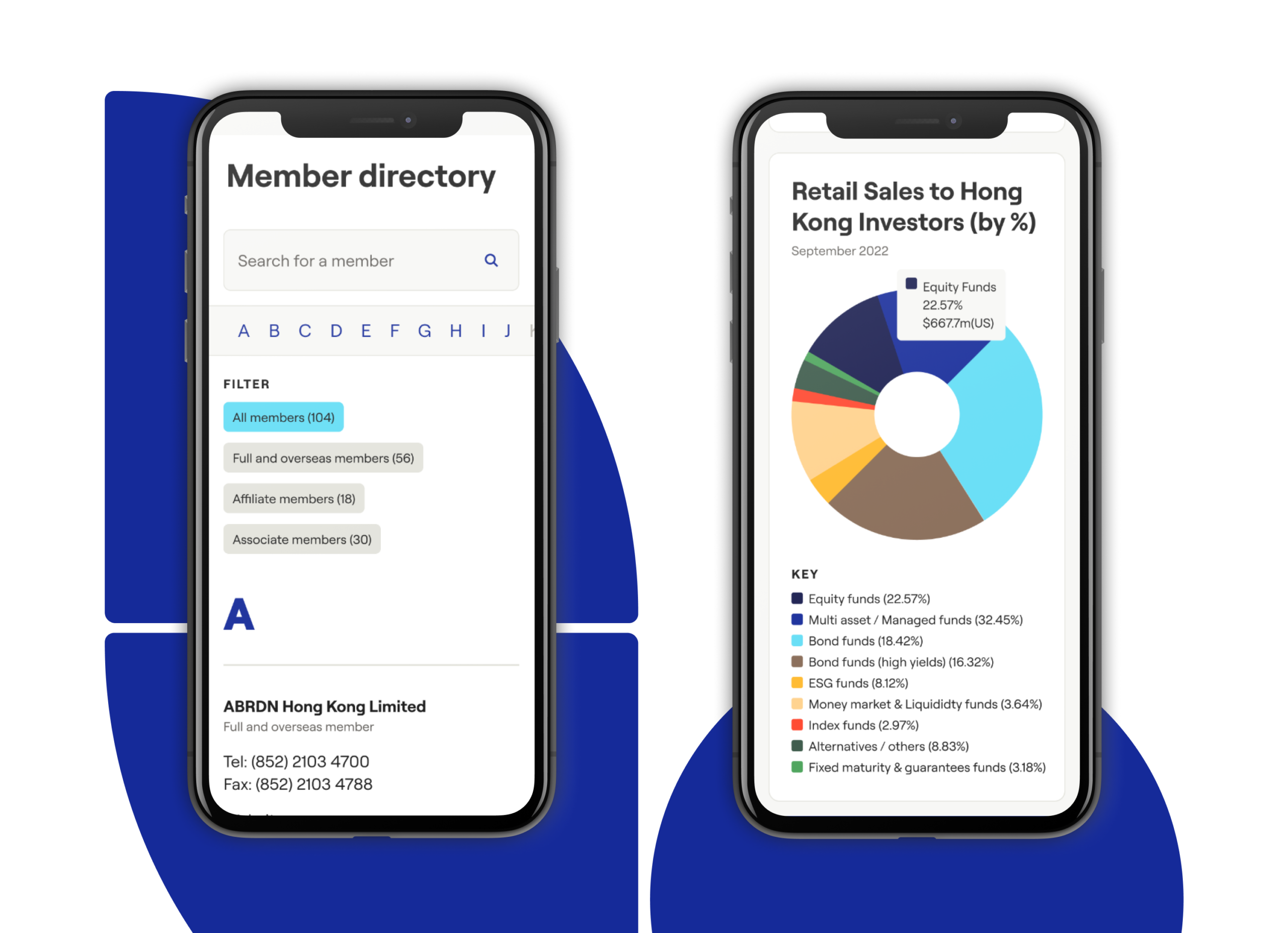
A unique element of our digital delivery is the automation and display of data pulled directly from third-party vendors linked to HKIFA. This includes organisations such as Morningstar, FTSE Group and Lipper. Our team wrote a number of individual automation scripts, which run at set times to retrieve new data from multiple sources, and adds latest versions directly to the HKIFA website.
For daily MPF figures (Hong Kong’s mandatory provident fund for retirement savings) we retrieve an updated file every morning, extracting figures and adding these to our own database, which is then displayed on the HKIFA website. This has removed significant manual input that previously had to be done by the HKIFA team, and gives visitors a lot of added value through real-time data.
Digital infrastructure
The website is hosted on Kinsta, a Google Cloud hosting environment that utilises a tech stack optimised for WordPress. It can handle high traffic spikes easily and is secure, with two-factor authentication, GeoIP blocking, hardware firewalls, many advanced features and active and passive security measures. In the future we can plan and develop prioritised integrations where necessary with custom APIs as required.
Content management system
To empower HKIFA’s internal team we developed a digital platform that they can independently control and manage, with a WordPress CMS that’s simple, functional and easy to use at launch and in future. It’s able to handle the future content additions and database integrations that have been part of our project requirement planning.
The outcome
We built a bespoke, strong, scalable digital platform and brand presence that meets multiple client needs around functionality, data automation, language translations and accessibility. It positions HKIFA as the authority it is, improves the way members can engage and access knowledge and insights, and is set up to easily adapt to data-led future needs.
Healthcare UK is a longstanding client who we’ve worked with across a number of projects. Life Sciences Innovators (LSI) was a new initiative, to select and then showcase 50 innovative companies working at the cutting edge of life sciences in the UK. There were six defined categories, across medical technology, therapeutics, drug delivery, digital solutions, diagnostics and precision medicine plus other UK specialisms.
The showcase is sponsored by the Department for Business and Trade (DBT), helping overseas companies set up and invest in the UK and assisting UK companies to succeed in global trade.
The client wanted a visual style that would be distinctive yet sit under the UK’s GREAT branding. Our team supported with the design and production of all materials needed to launch the initiative, as well as grow it each year from a social perspective.
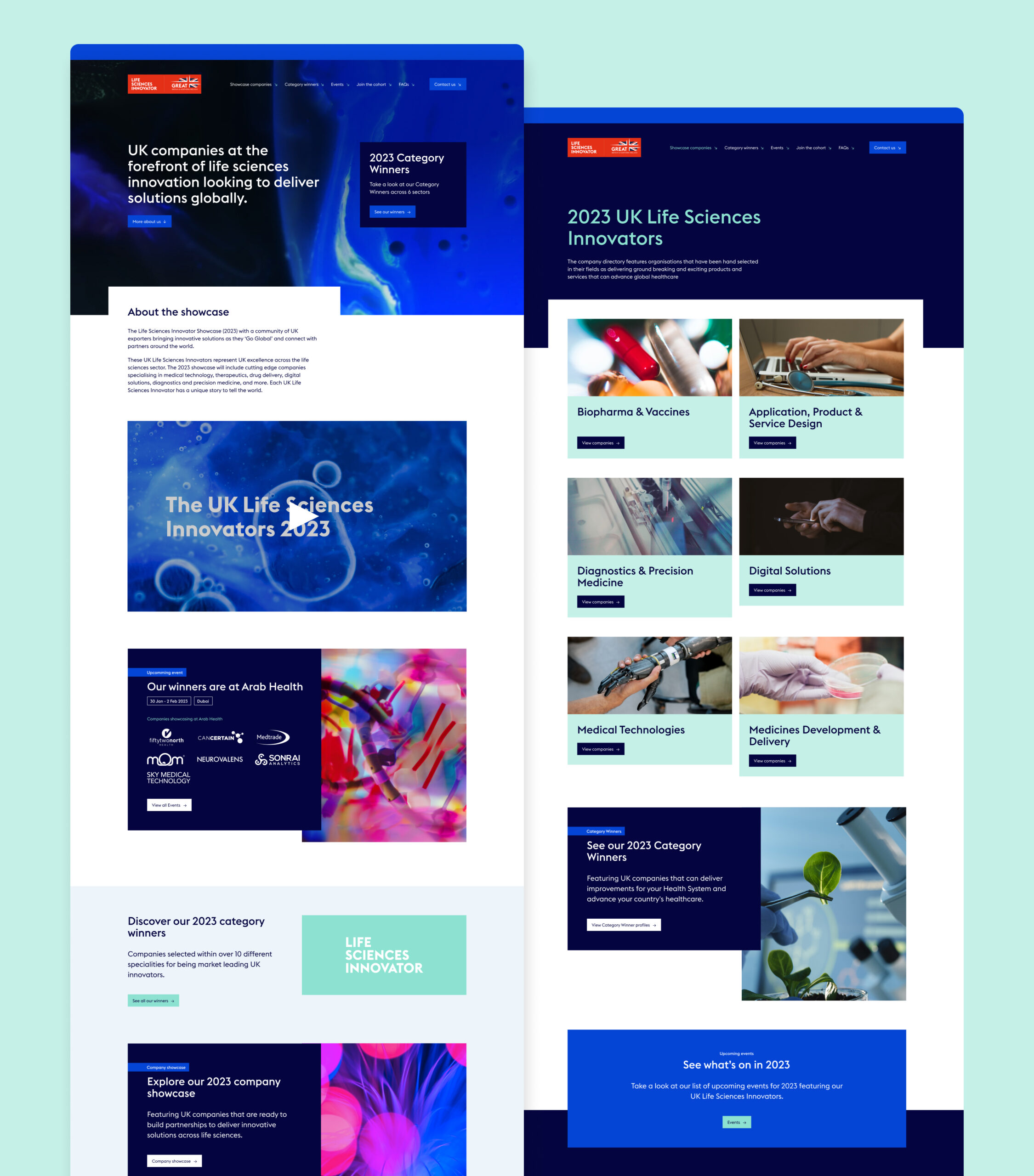
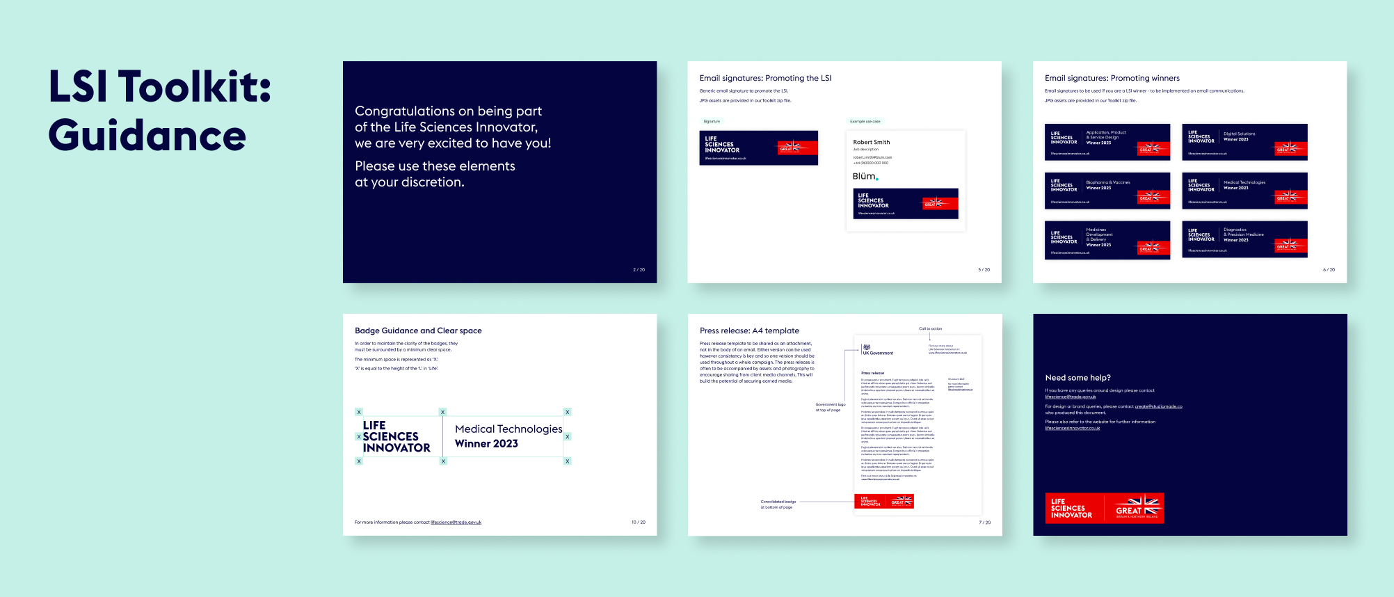
We delivered a website, overview video, printed elements, social posts and a toolkit that could be shared with campaign winners to access assets that they could use for their own promotion.
Innovation badges
One of the most important parts of the design was creating the badge for the initiative and the badges that the winners would receive for each category. We worked closely with the GREAT brand team, so that we were aligned to their guidelines while still providing a distinct look and feel for LSI.
Bringing the initiative to life through video
We made a short video to be used in presentations and promotion for LSI, and to get better engagement on social media. The video is a quick, engaging way to communicate key information and sits on the website as a project overview.
A digital experience
For the website design and build we had to work within an existing development platform, Aventri, which places some restrictions on how design elements can be executed, when compared with a fully independent build. However, so that the website felt dynamic, we worked with GREAT branded photography and animation to inject a unique style.
Social activation
Aware that this initiative would need internal and external promotion to encourage the most innovative companies to apply each year, we created a series of social posts that can be used to promote key goals and generate interest. These were predominantly animated, to ensure the highest engagement, and included:
- General awareness
- Encouraging applications
- Congratulating winners
- Event promotion, when the winners appeared at sector events
The toolkit
With a breadth of materials produced for this project, we wanted to tie everything together for our client and their winners so that they could use all of the assets correctly and build awareness of and engagement with their brands. We created an internal toolkit for the Department of Life and Sciences, so that whichever team member was working on them could do so consistently. We also built an external toolkit for participants and winners so that they could promote the initiative across their own social presence, email footers and other forms of engagement.
DP World Cargospeed, the first initiative of its kind, was created through a partnership between DP World and Virgin Hyperloop. The intent is to provide hyperloop-enabled cargo systems that will enable fast, sustainable and efficient delivery of palletised cargo around the world.
A Hyperloop is a proposed high-speed transportation system for both passenger and freight transport. The term was coined by Elon Musk to describe the modern open-source project originally conceived in 1799. Hyperloop designs employ three essential components: tubes, pods, and terminals. The tube is a large sealed, low-pressure system (usually a long tunnel). The pod is a coach pressurised at atmospheric pressure that runs substantially free of air resistance or friction inside this tube, using aerodynamic or magnetic propulsion. The terminal handles pod arrivals and departures.
DP World were the first company to launch a human passenger test of the technology and it generated huge global media attention.
Studiomade motion
Our team, working closely with Edelman, produced a video to highlight the incredible coverage of this historic occasion.
The global demand for energy is at an unwavering high. With rapid changes in the industry, expectations around efficiency have amplified tremendously. Some of the greatest challenges around the energy industry lie in global supply chain management.
DP World are the leading provider of smart logistics solutions, enabling the flow of trade across the globe and so have a large responsibility to ensure sustainable practices. In their pursuit to make trade smarter, faster, safer and more sustainable– they’ve developed highly customised supply solutions for the energy industry, that are more transparent, controllable and cost-efficient.
Studiomade creation
We produced a video to promote their new sustainable enterprises which included their 18,000 tonnes HDVC converter platform, BorWin Gamma Topside, which transmits electricity from connected offshore wind farms in the North Sea to mainland German providing enough renewable energy to supply the electricity consumption of 1 million German homes a year.
We blended a DP World animation style including approachable illustration and real-life photography to support contextual facts as part of the overall narrative. Outputs were used across social and within direct-to-consumer engagement.
Vast numbers of reports are created by financial insight firms every day and so inboxes are full with subject lines promising unique intel, a new angle on a subject or large volumes of data to interrogate. In all this noise, how do you get your clients to read what is pertinent? How do you elevate your insight, putting it front and centre into the eyes of your desired audience? This is where great data visualisation and storytelling comes in.
Planning the story
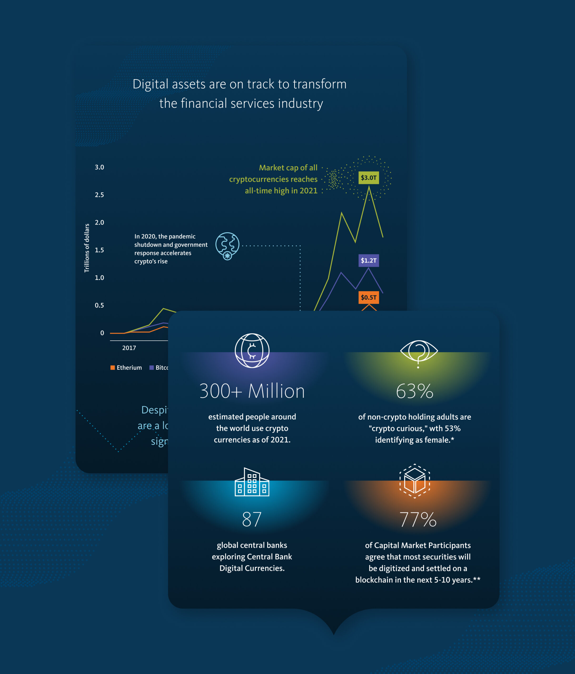
Broadridge approached our team to create a digital infographic that would tell the major story in their new report The Digital Asset Revolution: Preparing for the Next Generation of Financial Markets. We worked with their editorial team to determine which elements would be of most value to their readers and which data points we could showcase, putting together a script of what this infographic would look like including charts, icons and wider content blocks.
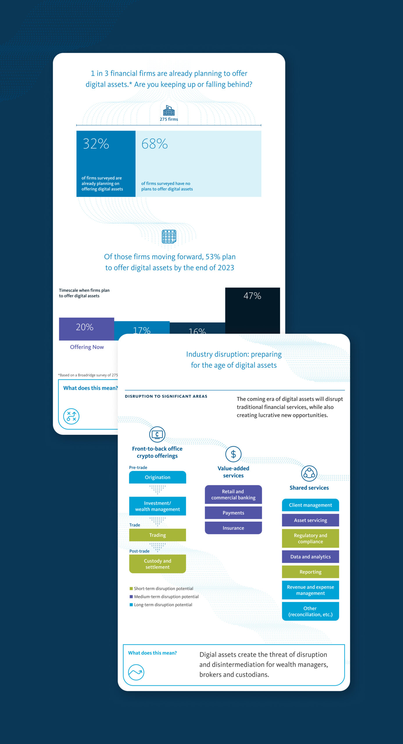
Social content and video
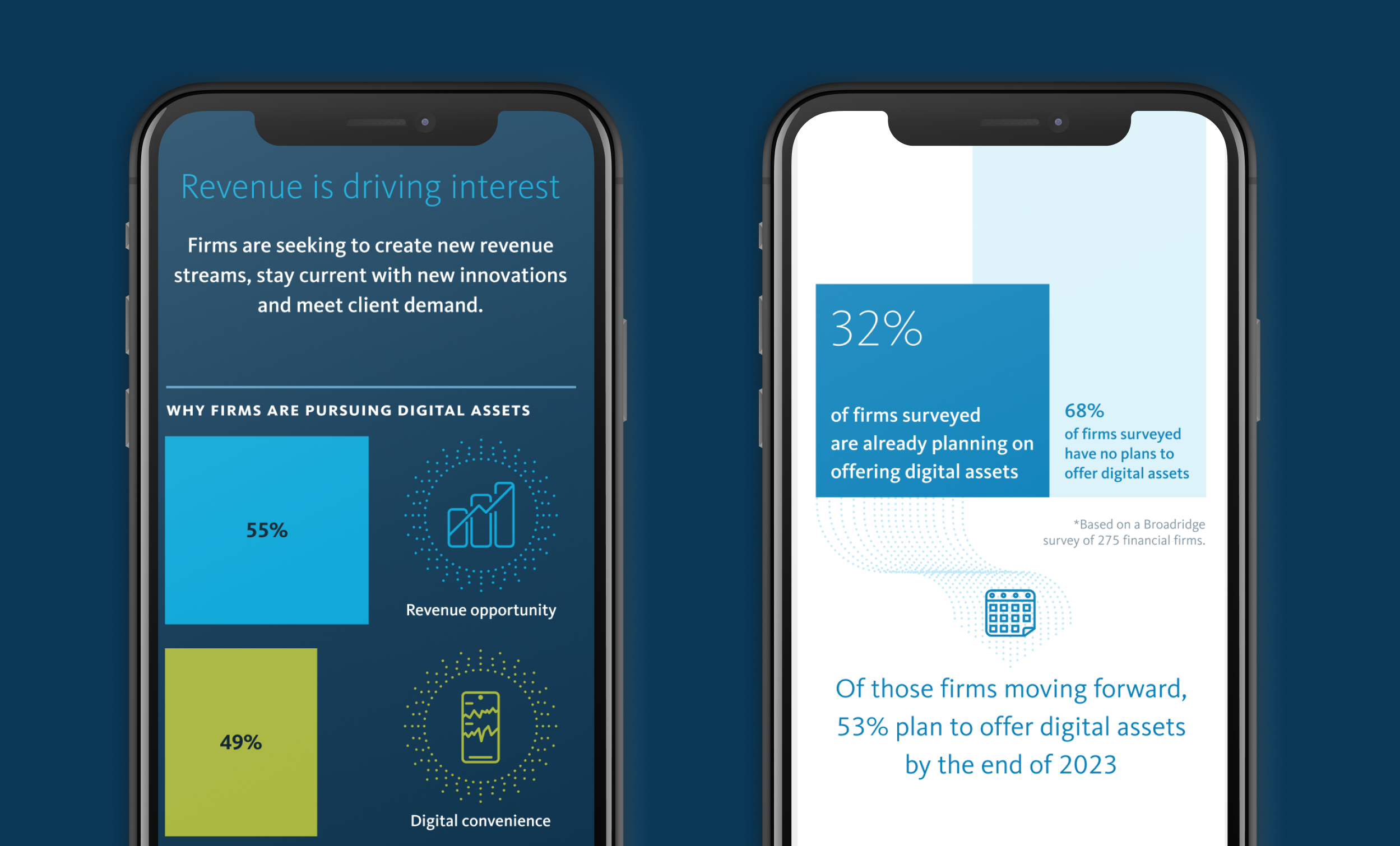
Our creative approach was applied to social content and video, used to drive traffic and interest to landing pages on the core Broadridge website.
Campaign look and feel
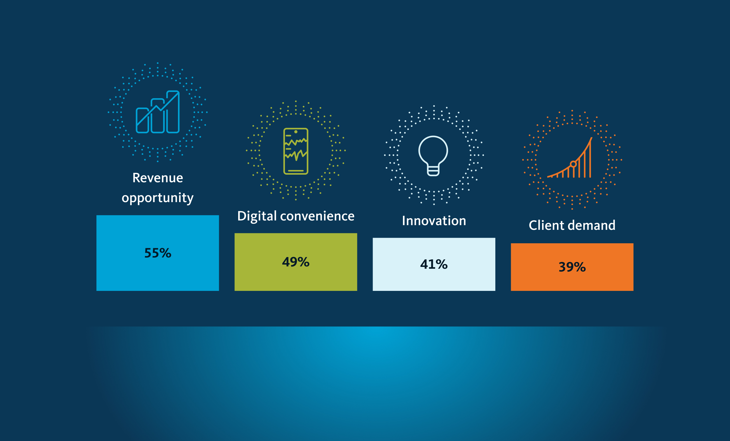
With the story defined, we then created a visual language that sat within the Broadridge brand but also brought something new and exciting to this campaign, referencing the topic. We used the Broadridge colour palette, adding bright accent colours to reflect the digital nature of cryptocurrency and crafting an ownable campaign style.
Delivery
Working with the Broadridge digital team we supplied assets to populate the campaign destination within their given digital template. We also produced a downloadable pdf that could be shared via email to form part of the wider report promotion.
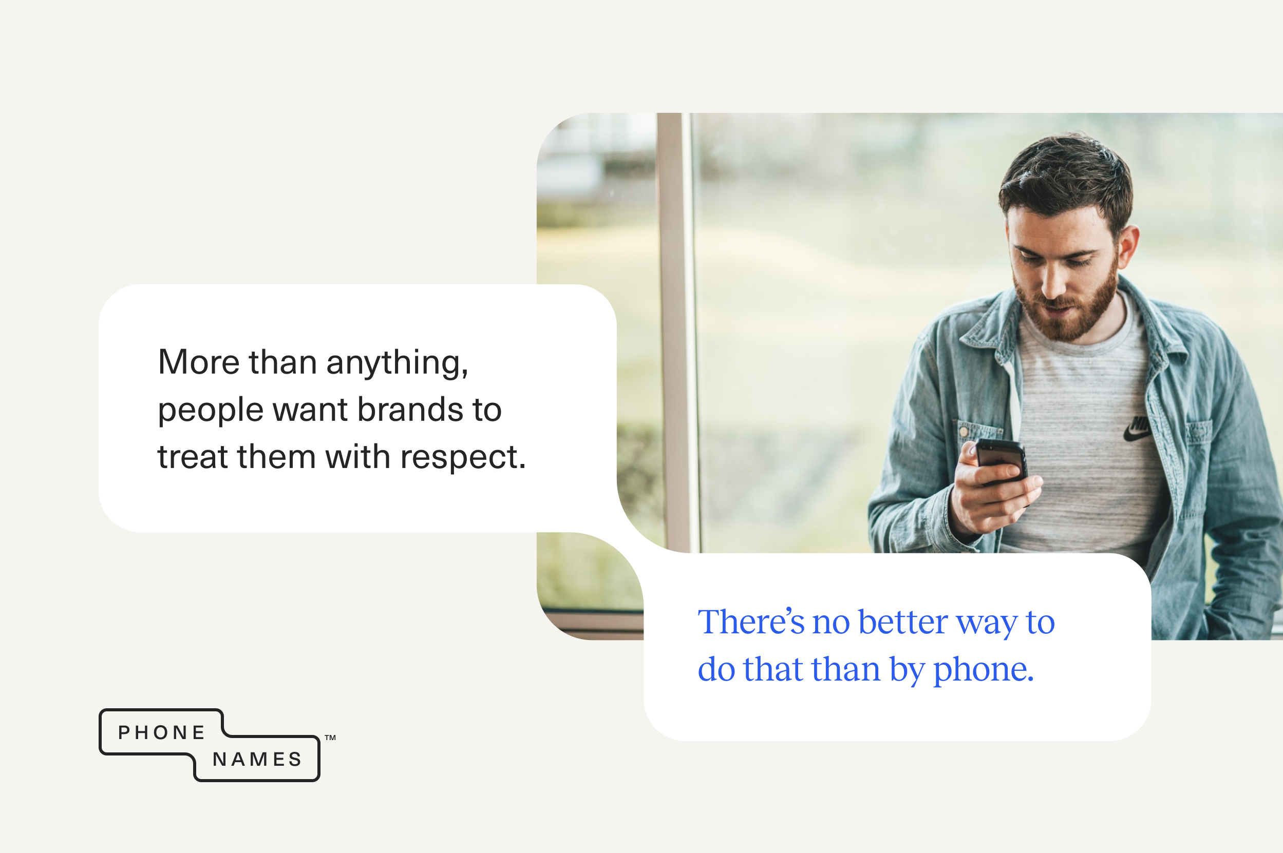
How many times have you shouted at a screen with the words ‘I just want to talk to a person’? The online world has many perks but what happens when ‘computer says no’? You’re not alone. 78% of UK consumers say they’ll want to interact with a real person more as technology improves.¹ 69% of UK consumers use the phone for customer service, making it an essential part of an omni-channel approach.²
- PwC, Future of customer experience survey, 2017/18
- Microsoft, State Of Global Customer Service Report, 2017
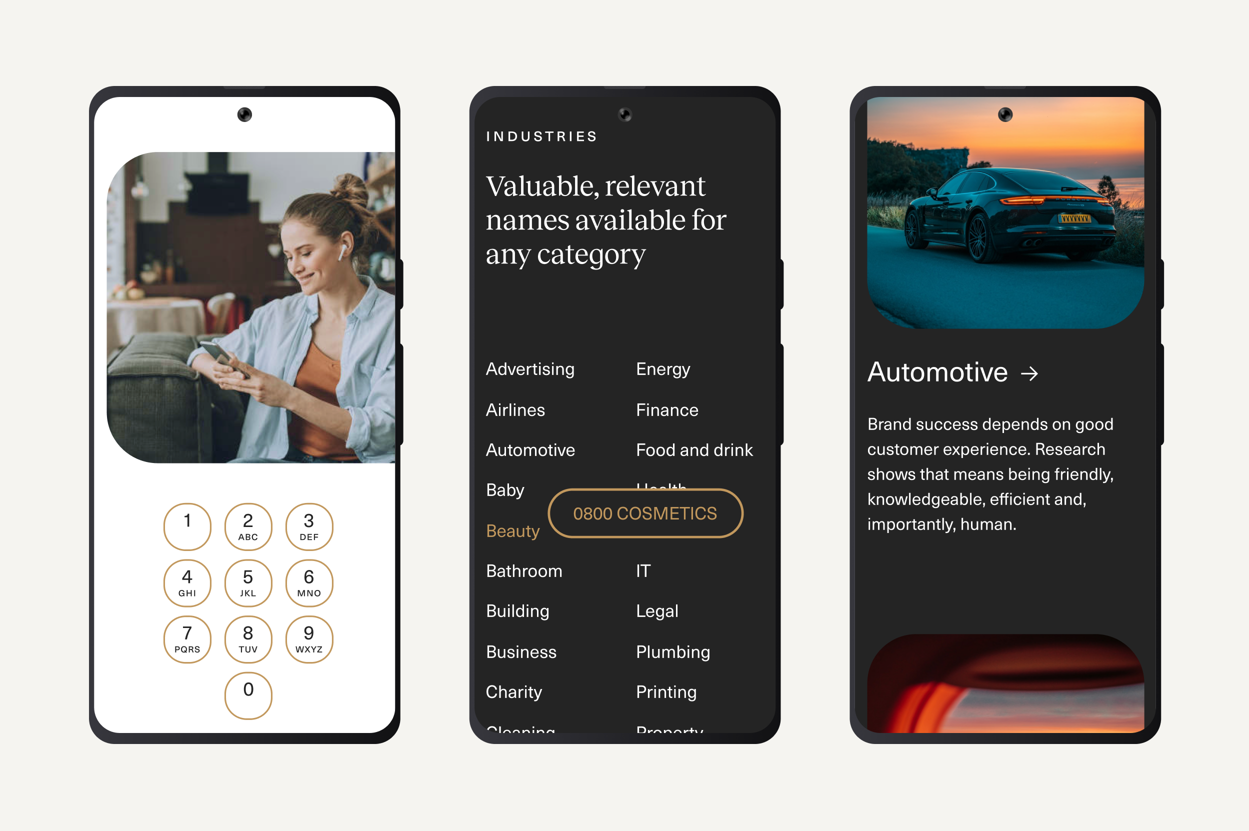
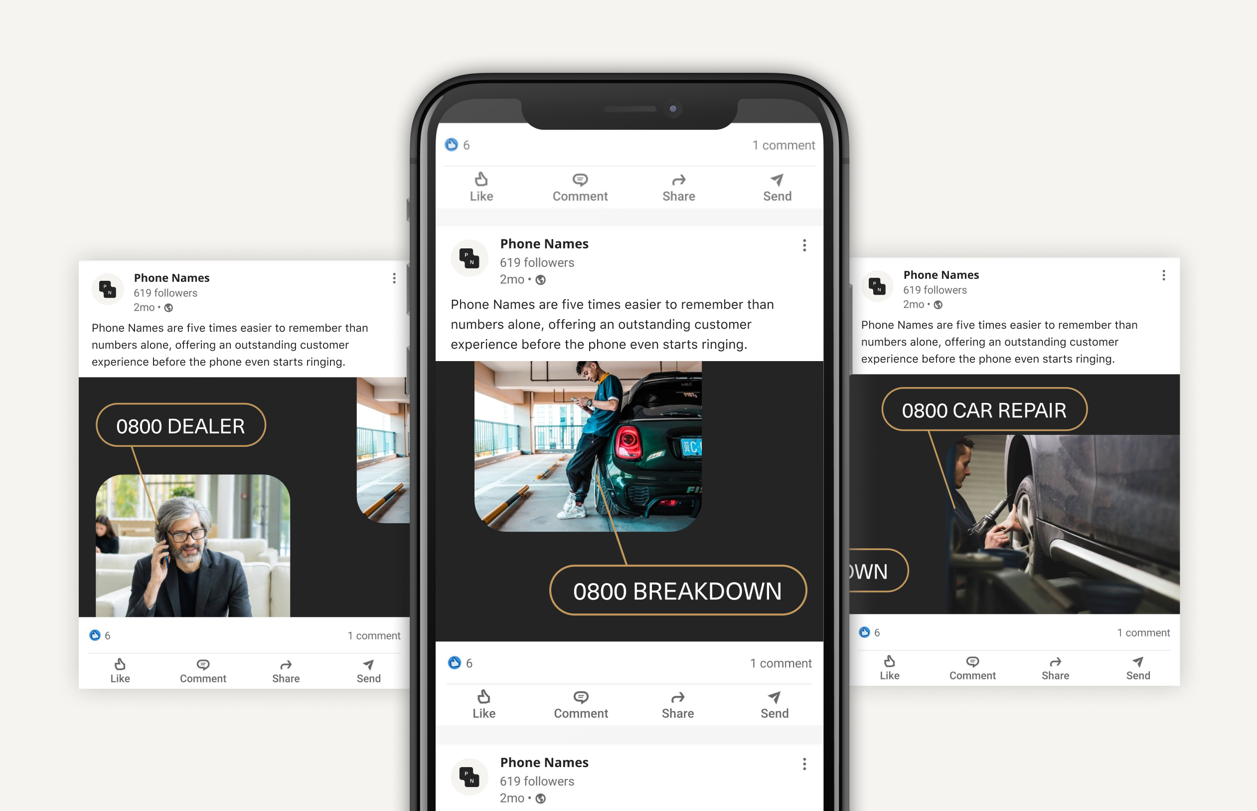
Phone Names have the solution for you. Simply dial in the phone code (e.g. 0800), then spell the name, product or service you want to reach using the letters on the telephone keypad.
0800 REPAIR
0800 TRAVEL
0800 BENTLEY
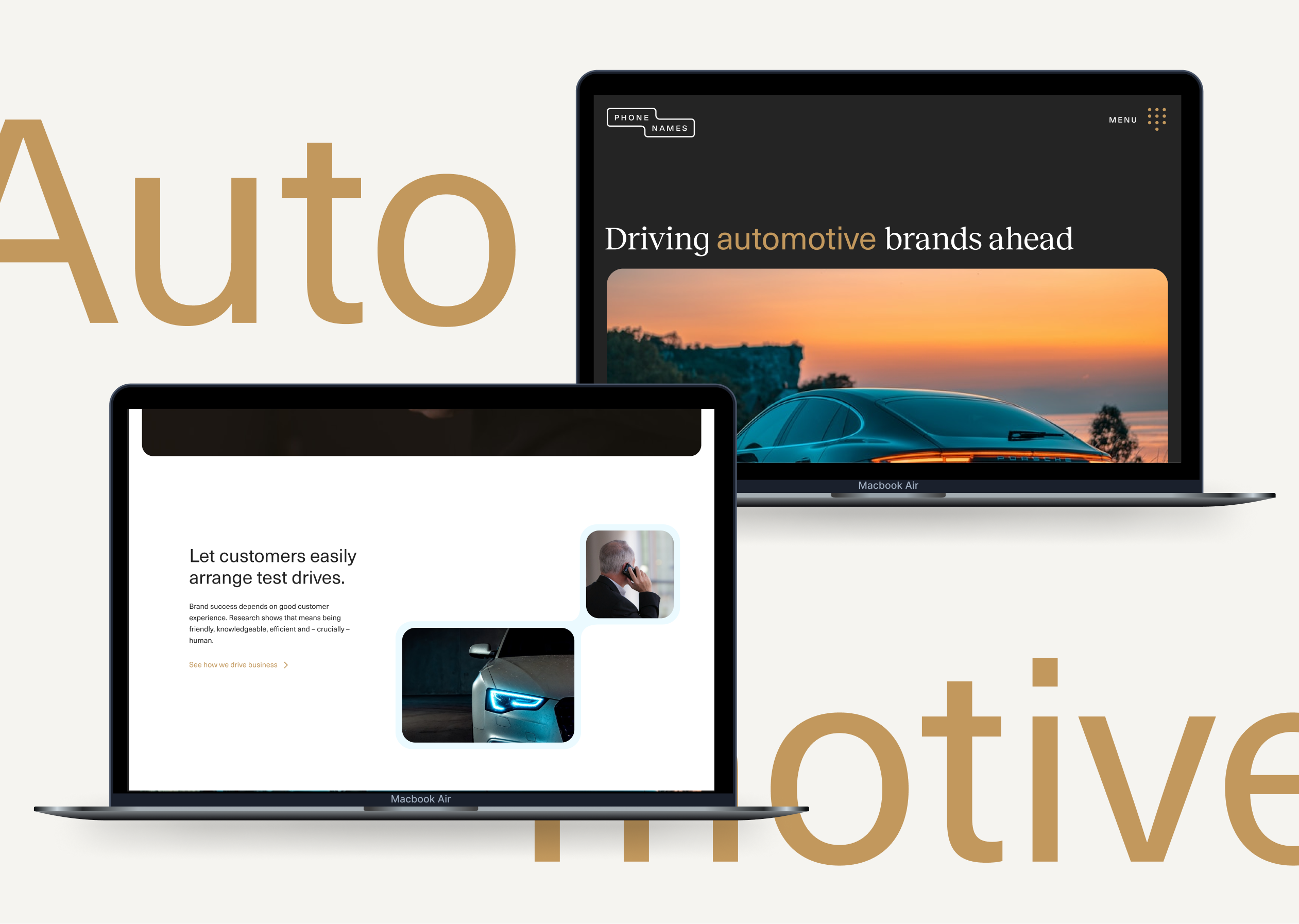
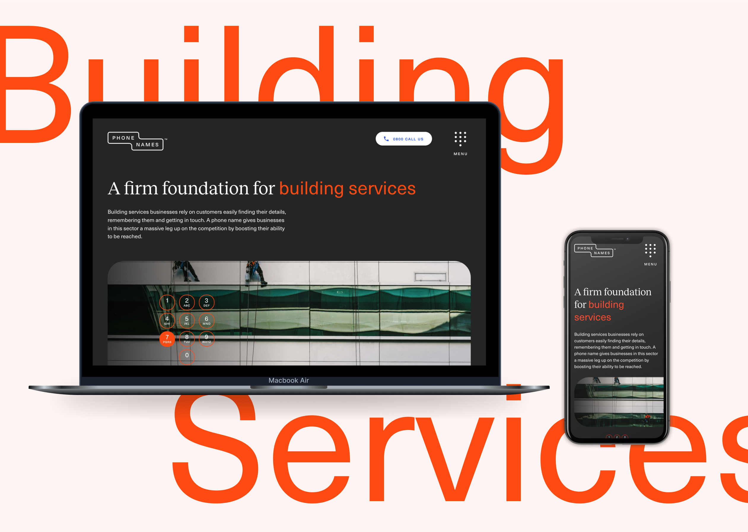
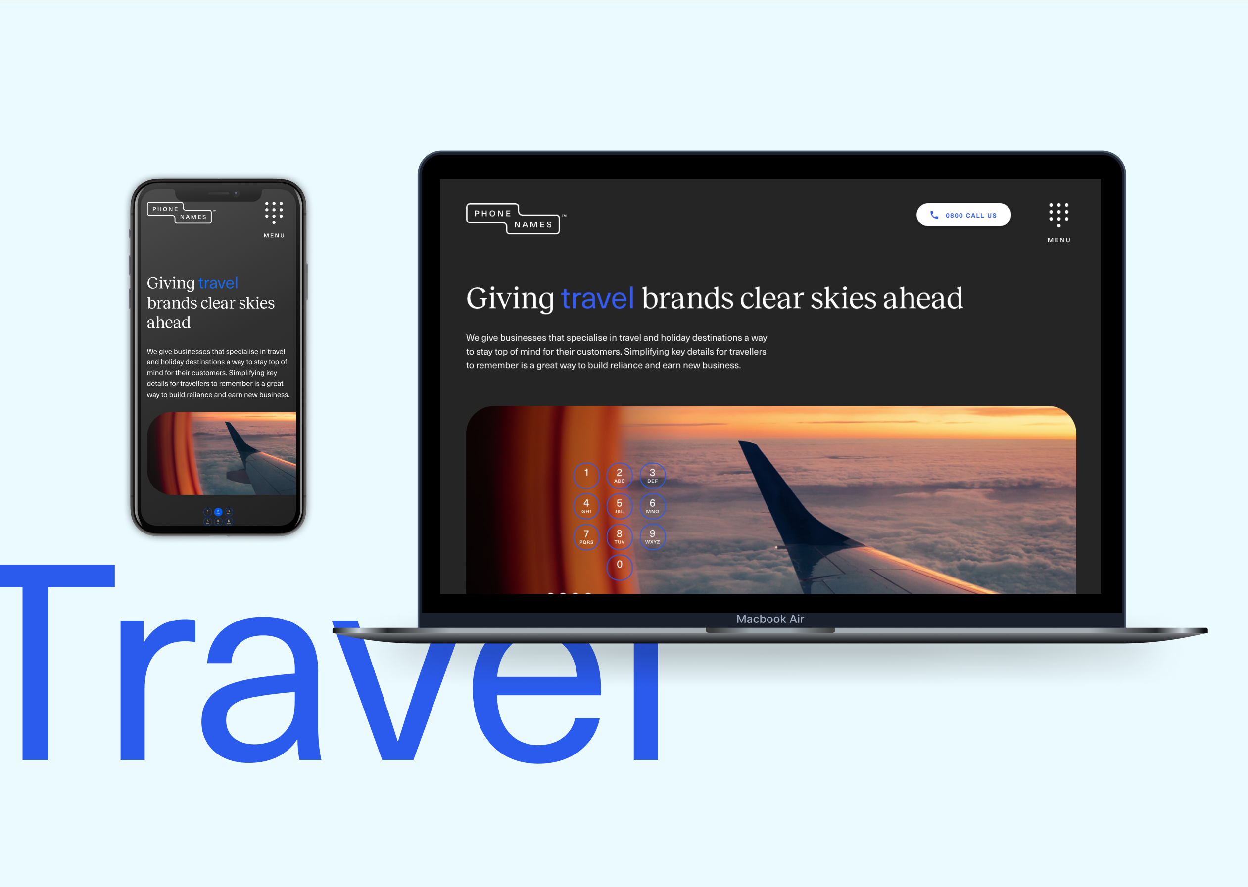
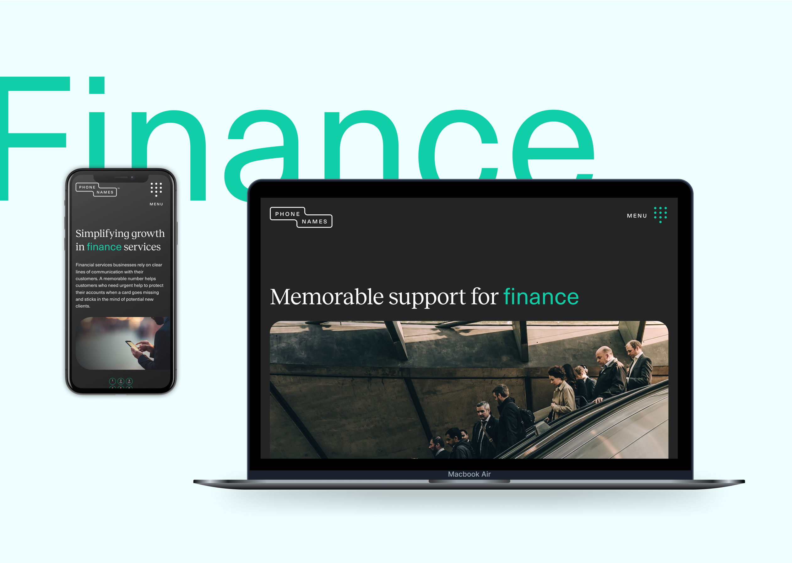
We wanted to create a sense of simplicity and clarity in the design work for the Phone Names brand. We developed a streamlined core colour palette with accents to be able to clearly highlight calls to action or key pieces of information for the brand’s audience.
We wanted to use photography within the brand look and feel as we thought this would translate well on social advertising as well as pairing with custom animations that we’d built to reference the phone names. We used quite dark tonal photography showing detailed elements so that we could create an approach that related to the full service luxury experience we wanted brands to create for themselves.
The result is a new digital presence and engagement campaign that is as effective as it is simple. Just like the business.

We were approached by Nissan – through our trusted partners at global communications company Edelman – to promote its electric vehicles with a unique digital activation campaign. The multinational manufacturer is a pioneer in electric vehicles. It has accelerated electrification and technological innovation, invested in charging infrastructure and made EVs more affordable.
The brief was to tap into the consumer trend for more sustainable travel and target an audience that shares the brand’s core value of sustainability and low-carbon-footprint transport. We were tasked with creating an interactive travel guide, promoting travel adventures by electric vehicle. Nissan wanted it to be exciting, digitally led, easily shareable and measurable.
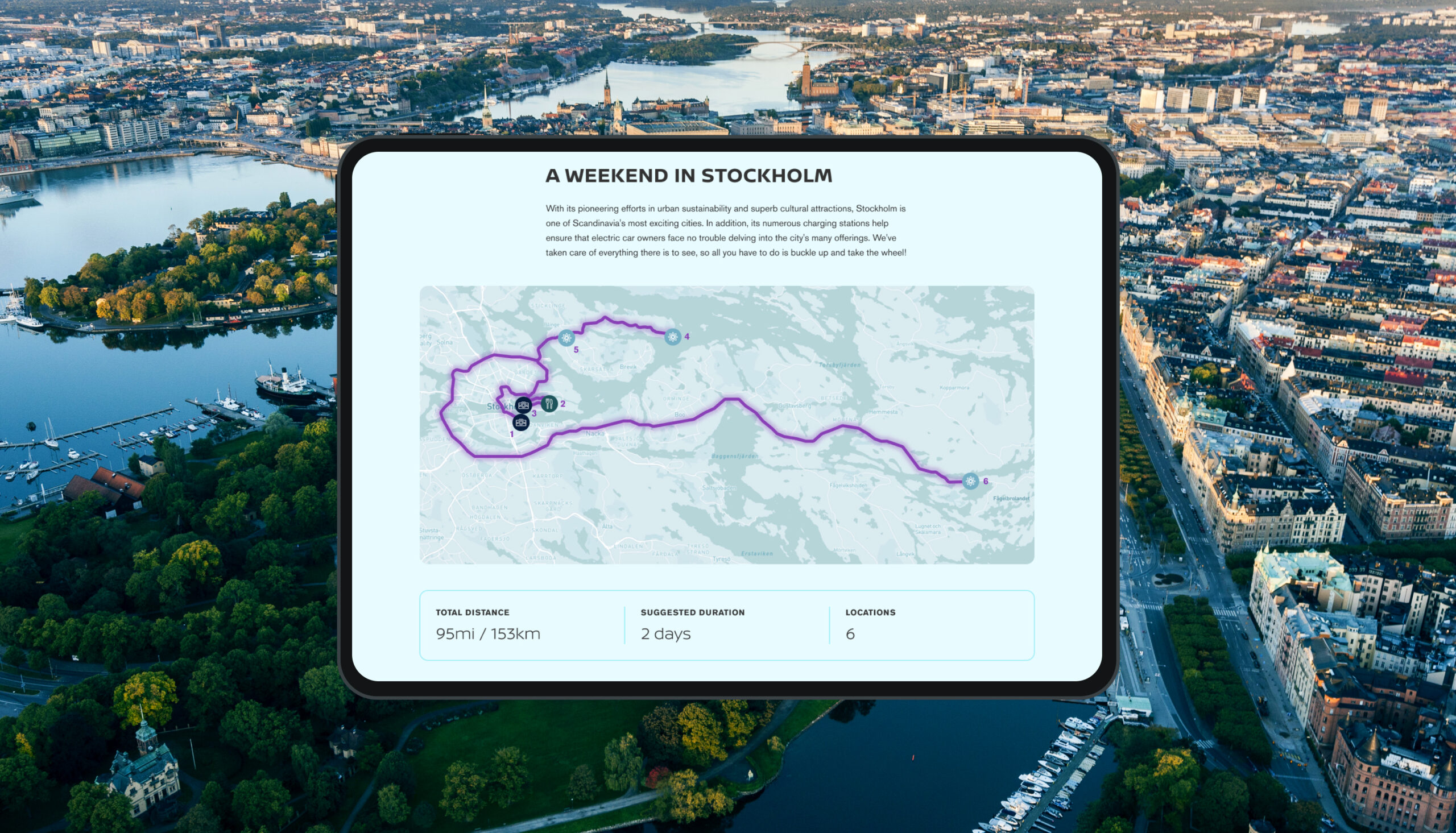
The first destination would be Stockholm, one of Scandinavia’s most exciting cities. Stockholm not only has superb cultural attractions but has made pioneering efforts in urban sustainability, with plenty of charging stations to make it easy for electric car owners to explore the city.
The electric travel guide would launch exclusively to influencers at an event in Stockholm
What we did
An interactive map
To make the guide as interactive as possible we chose to have an interactive map as the focus, which would show selected sustainable destinations and recommended routes.
We needed a mapping system with advanced functionality and styling capabilities so we used Mapbox, a platform we were already experienced with. It has a lot of flexibility in its infrastructure and we could implement it within the Nissan brand without making visual compromises. Unlike some other map providers it also doesn’t charge every time a user interacts with it.
We created categories for the destinations, such as restaurants, hotels, points of interest or areas of natural beauty, so that users can select what they’re interested in. Each destination then expands to show details plus links to TripAdvisor reviews and Google Maps to quickly and easily get more information.
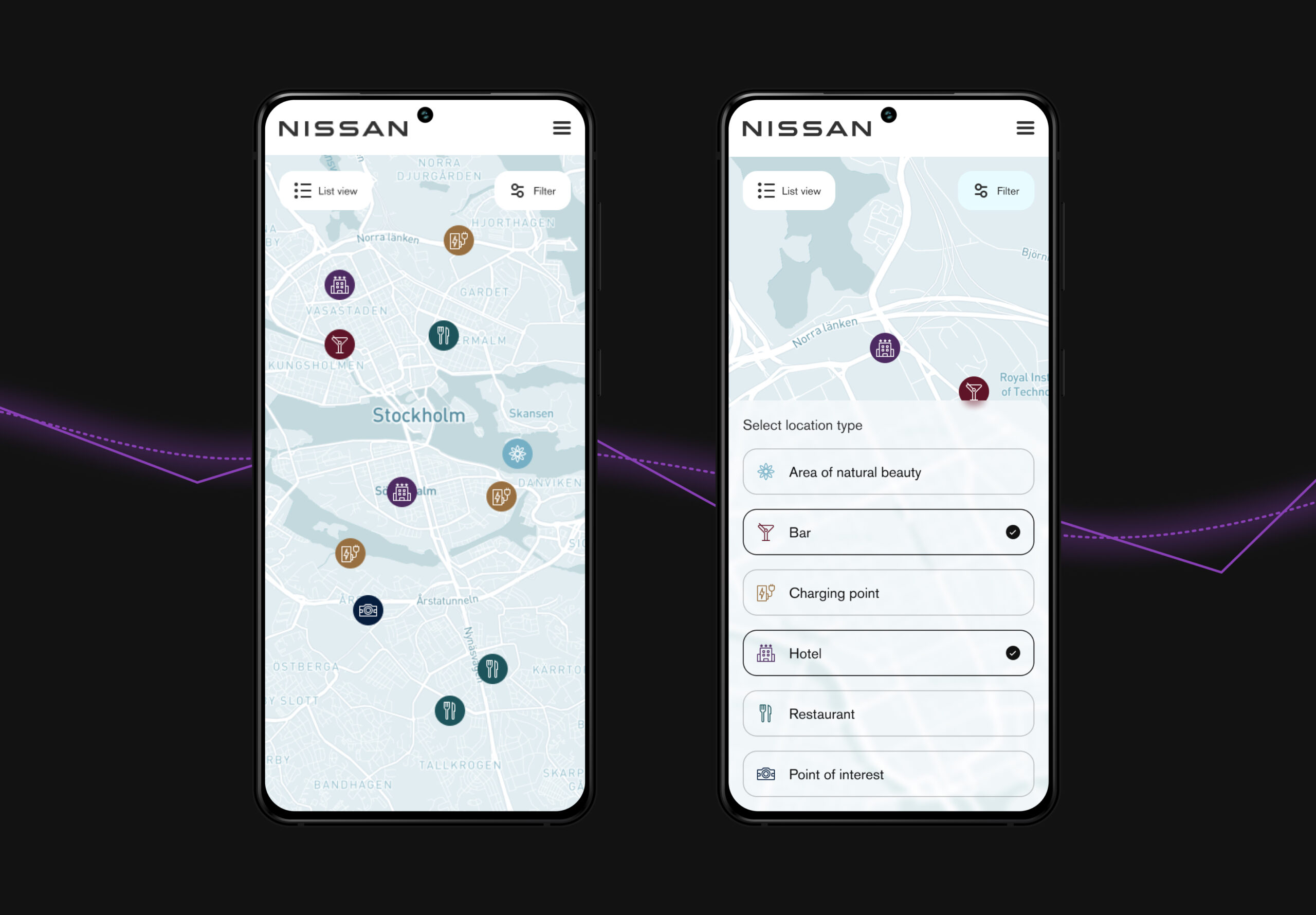
User experience
We designed the user journey, using Stockholm locations and descriptions provided by Edelman.
Nissan wanted the experience to be accessible to as many people as possible so we developed multilingual functionality, with five languages including English. Further languages can be added in future as the guides expand.
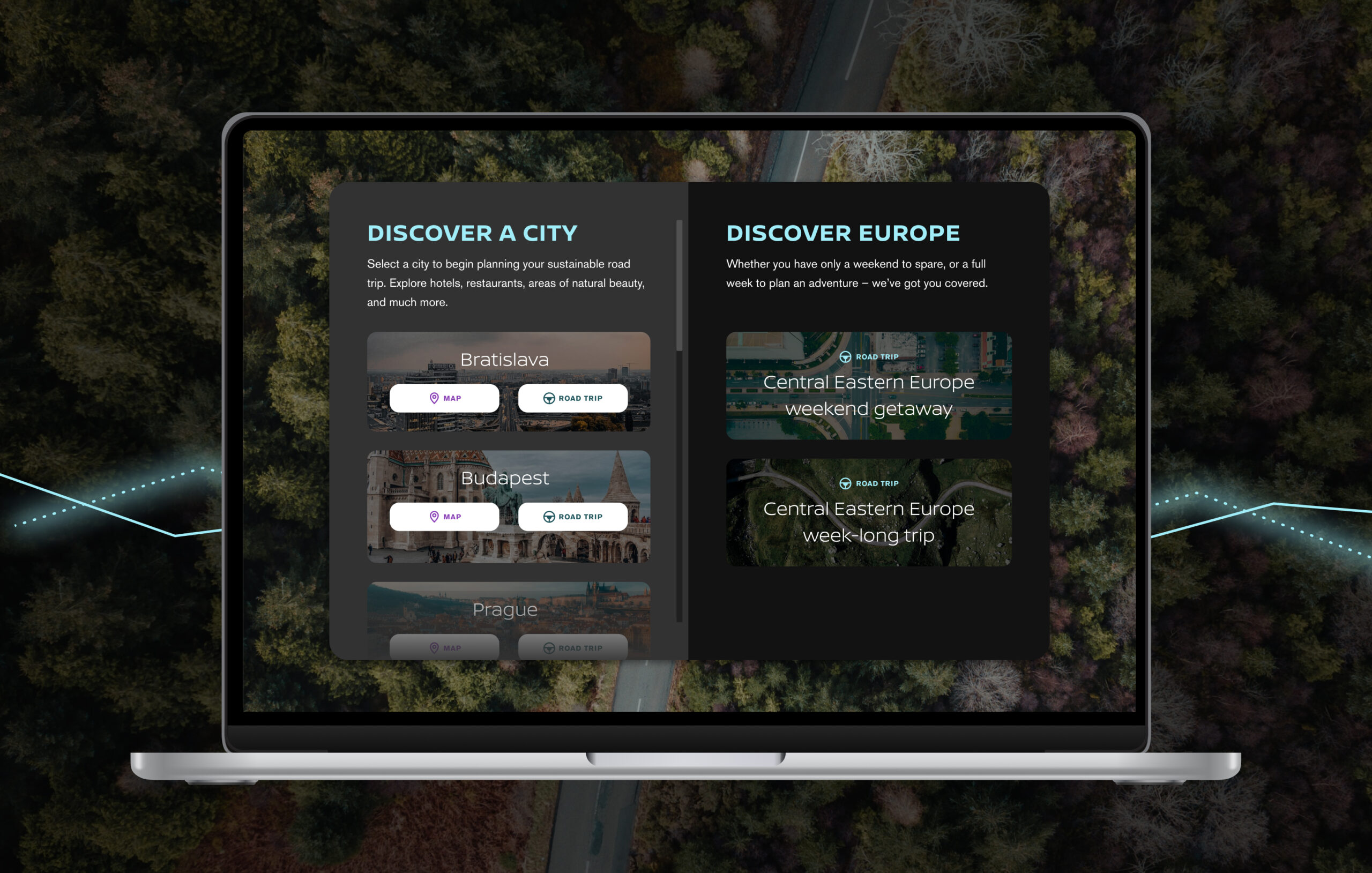
Following the successful launch of the Stockholm guide, we later built a second and bigger iteration of the product, adding four more cities – Budapest, Bratislava, Vienna and Prague – with maps and roadtrips for each one plus a bigger European roadtrip.
Focus on the car
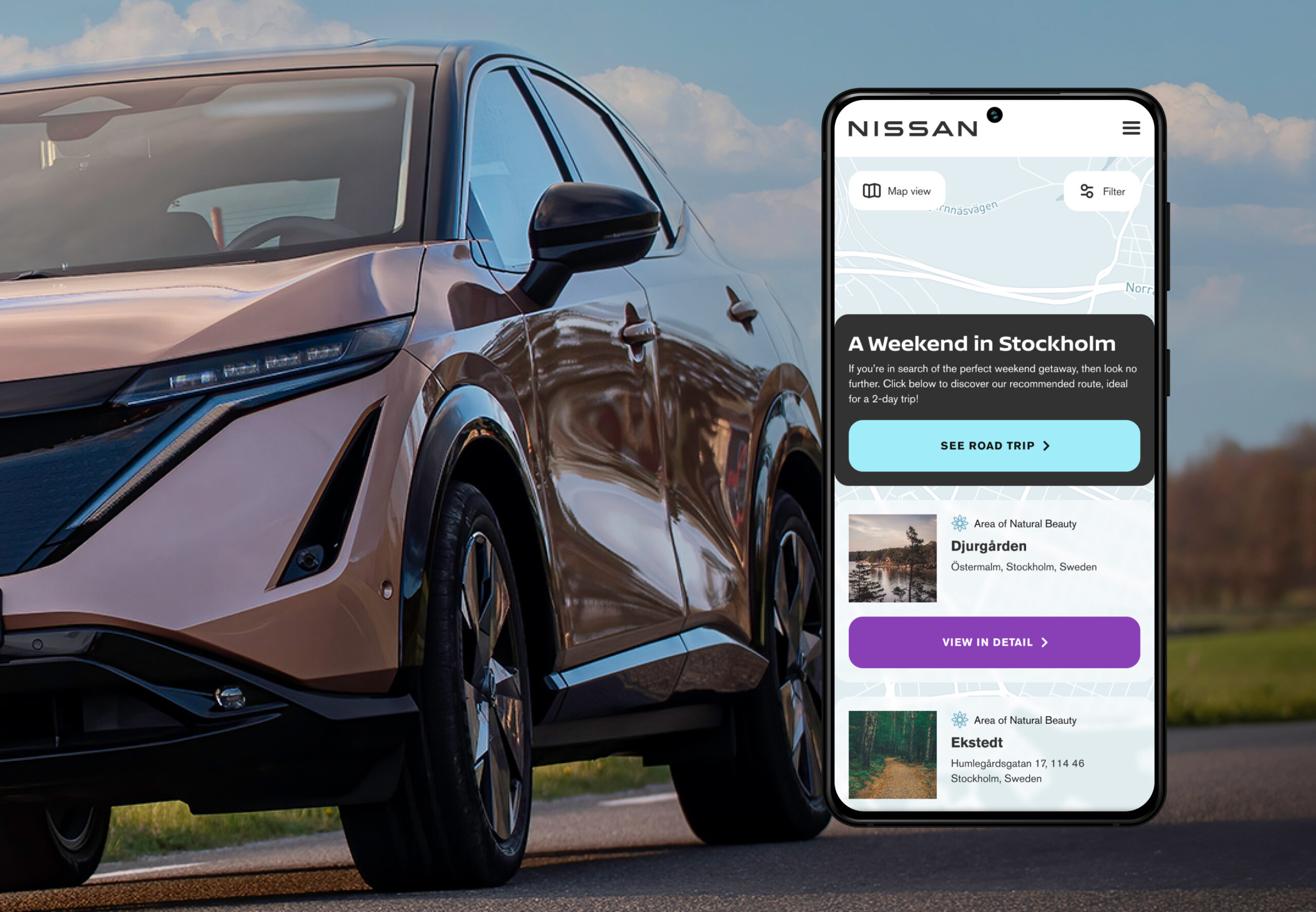
The underlying focus of the travel guide is Nissan’s innovation in electrification so we created an About page with content on the fully electric Nissan Ariya and information on charging, to reinforce how Nissan is helping drivers to make more conscious lifestyle choices. This also links to Nissan’s Ariya sales page, where people can find out everything about the car.
Built-in analytics
The guide has integrated performance and analytics reporting, using Google Analytics, providing the client with data on areas of interest, usage patterns, most popular locations across each language and more.
After launch, we analysed how people were using the guide and worked with Nissan and Edelman to continue improving the UX, for example adding the roadtrip to the home page and segregating location types for easier browsing.
Future-proofing
We deliberately took into account the future life of the product, building the infrastructure in a modular way that can be added to, to give the product adaptability and longevity. Having built the framework, it’s easy to add further destinations and categories. Users will get new content and travel ideas and Nissan can potentially reach a wider audience with every new destination.
Further functionality could also be added to help build a community around the product and increase sharing and engagement e.g. users could add photos of their journeys, submit destination requests and more.
Outcome
So far (spring 2023), 9.3k people in 106 countries have visited the guide.
Senior leaders at Nissan have enthusiastically supported it. The Senior VP of Sustainability, Corporate Affairs and Governance said: “As we continue driving a fundamental shift in how sustainability can – and should – be at the forefront of our lifestyles in the move to an electrified future, the Nissan Electric Travel Guide demonstrates that it is possible to continue travelling while having a kinder impact on our planet.”
DP World are a logistics company operating a diverse network of trade on a global scale. They provide access to some of the world’s busiest production centres, as well as its largest consumer markets, in mature and emerging economies. Their operations include ports and terminals, but also industrial parks, logistics and economic zones, maritime services and marinas. DP World pride themselves for being at the forefront of exciting technology such as their pioneering work on the Hyperloop system.
The brief
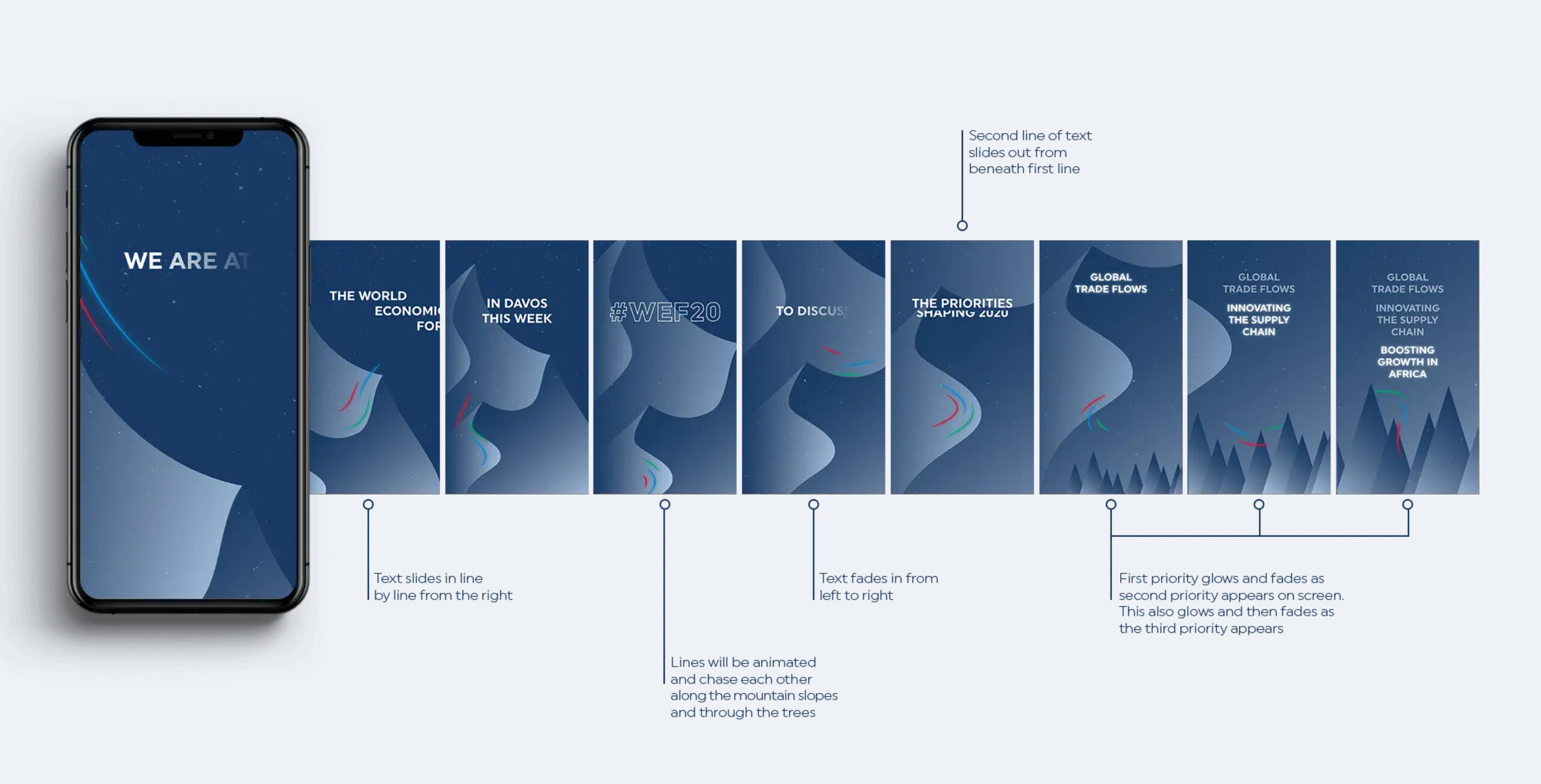
DP World needed an exciting campaign concept for their social presence for the World Economic Forum in Davos. The campaign had to be cohesive across all social including Instagram, Twitter and Linkedin. We wanted to reference Davos as well as incorporating an exciting use of the DP Brand within digital. The final direction selected included a really nice sense of depth created through the use of gradients and softly styled the mountain ranges of Davos incorporating the coloured brand lines that swooped and played around the shapes.
Social delivery
We delivered Linkedin header templates, Instagram frames, Instagram story stickers and Twitter assets. The use of all of these elements across every facet of the DP World brand created a ‘take over’ of their media really drawing attention to their presence at the World Economic Forum (WEF). The animation style as well as the gifs used throughout social gave their marketing team really exciting tools that brought their messaging to life and gave their social presence a real sense of energy.