Looking back on the heritage of the Nissan brand
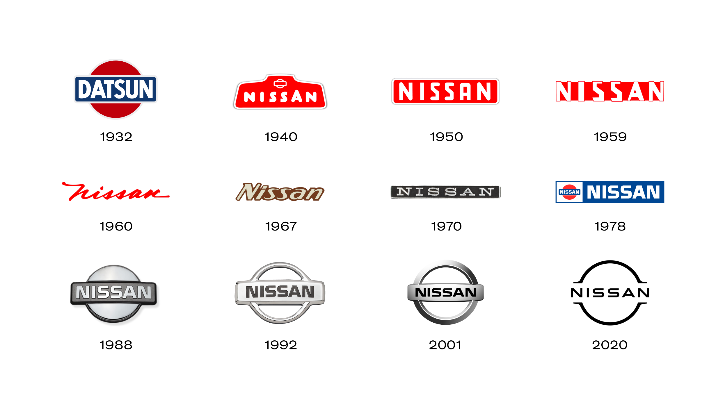
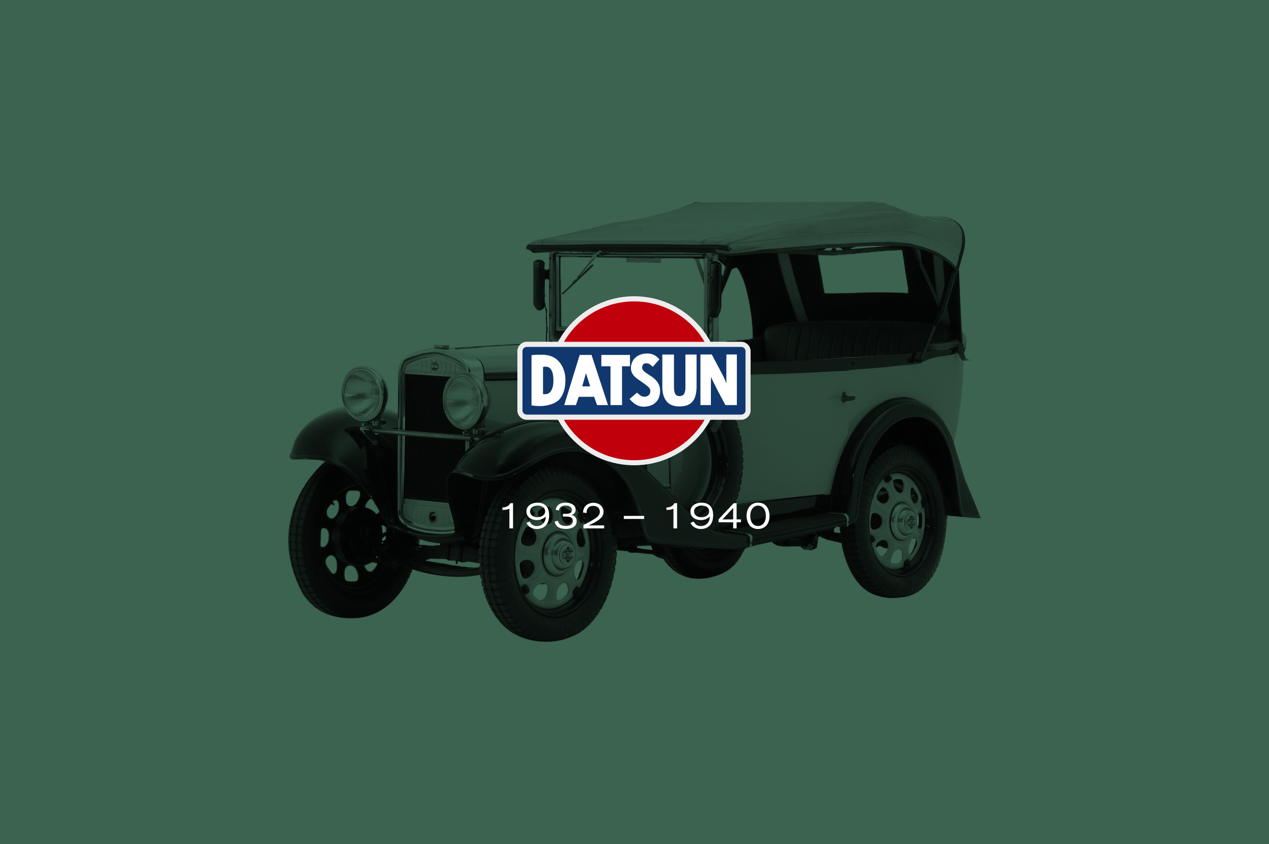
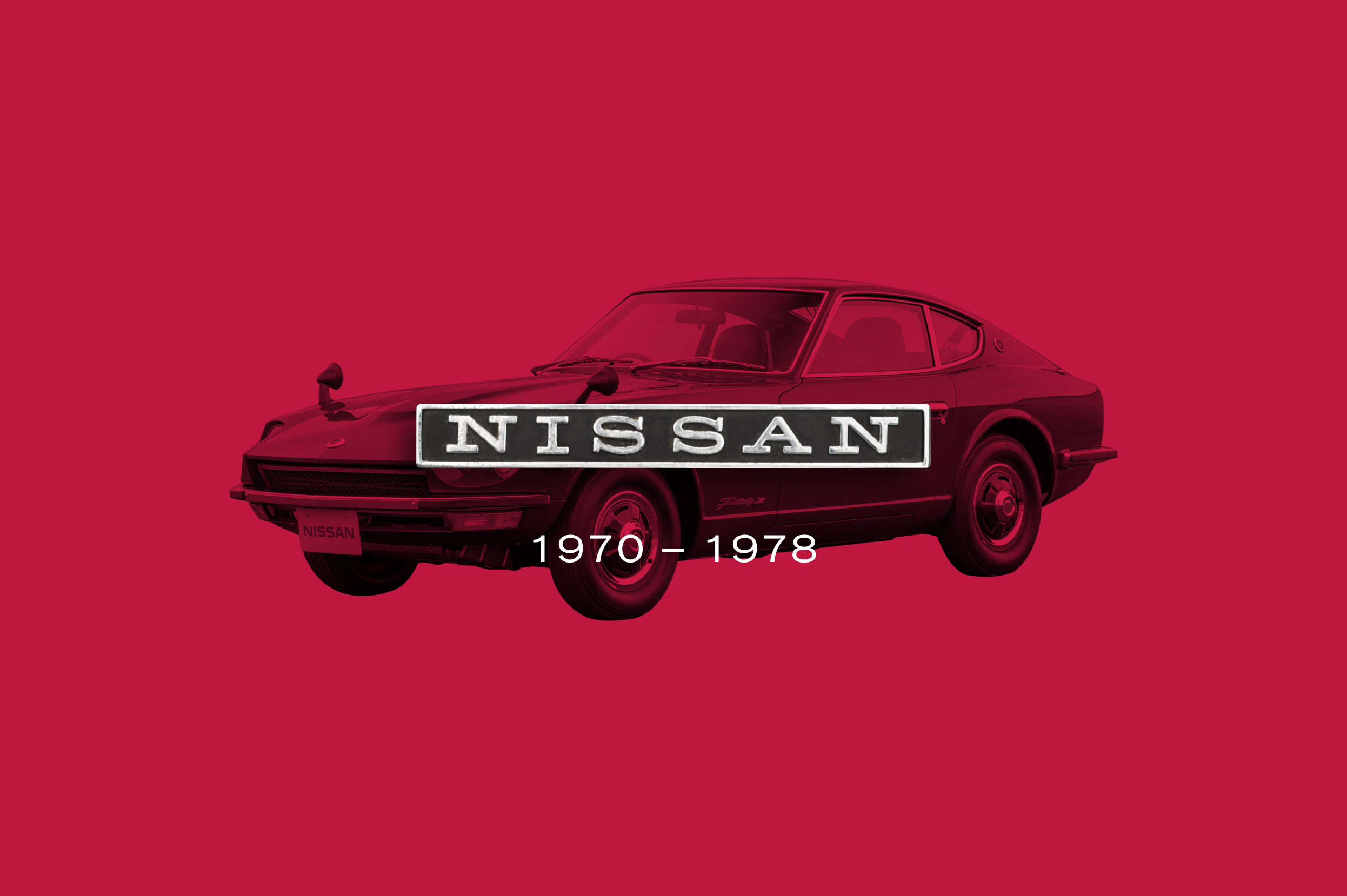
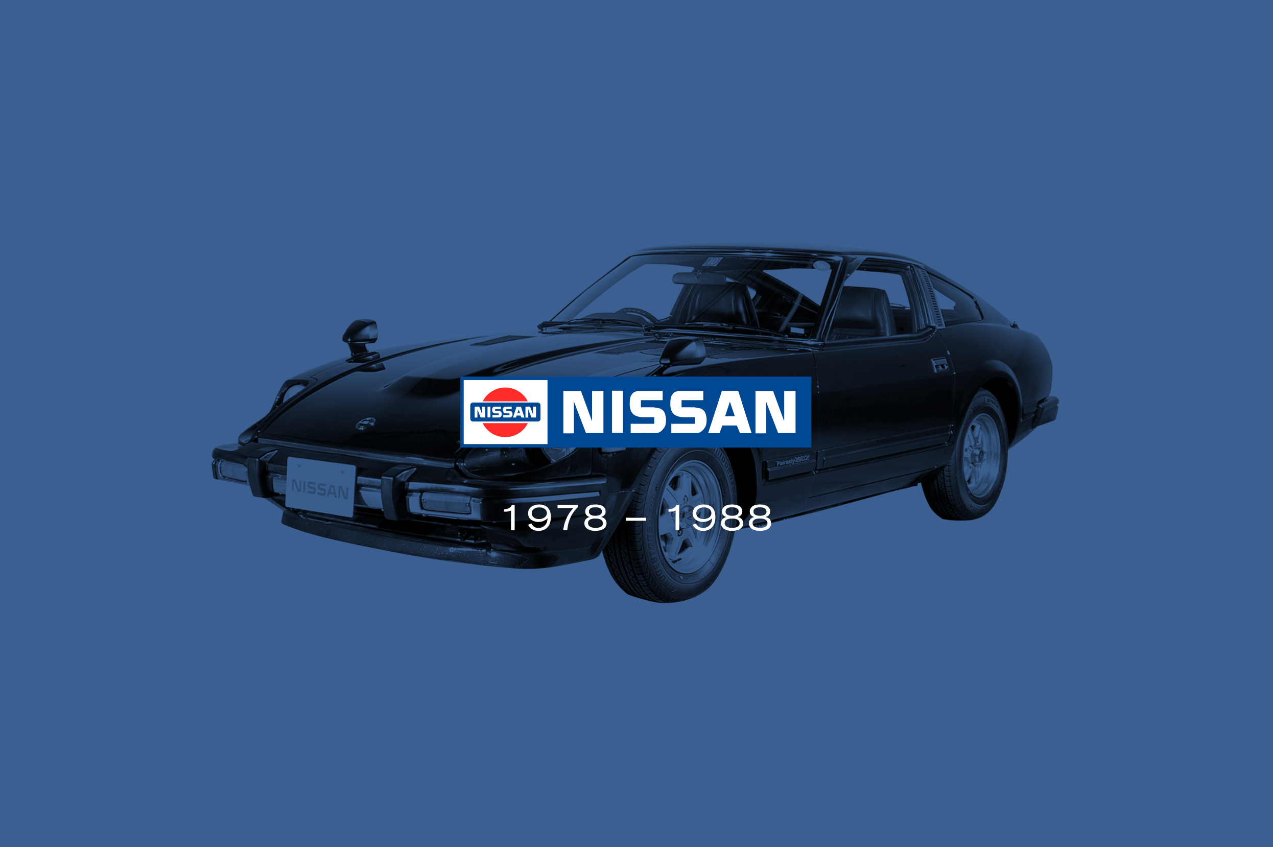
Nissan’s brand identity has always reflected the meaning of the company name. Indeed, in Japanese characters, “Nissan” can translate as “sun product” or “birth of the sun” – giving rise to the now-famous brand logo that boasts more than 80 years of automotive history. But how did it evolve from its humble origins into the globally-recognised motif seen today?
Simple, digital interaction
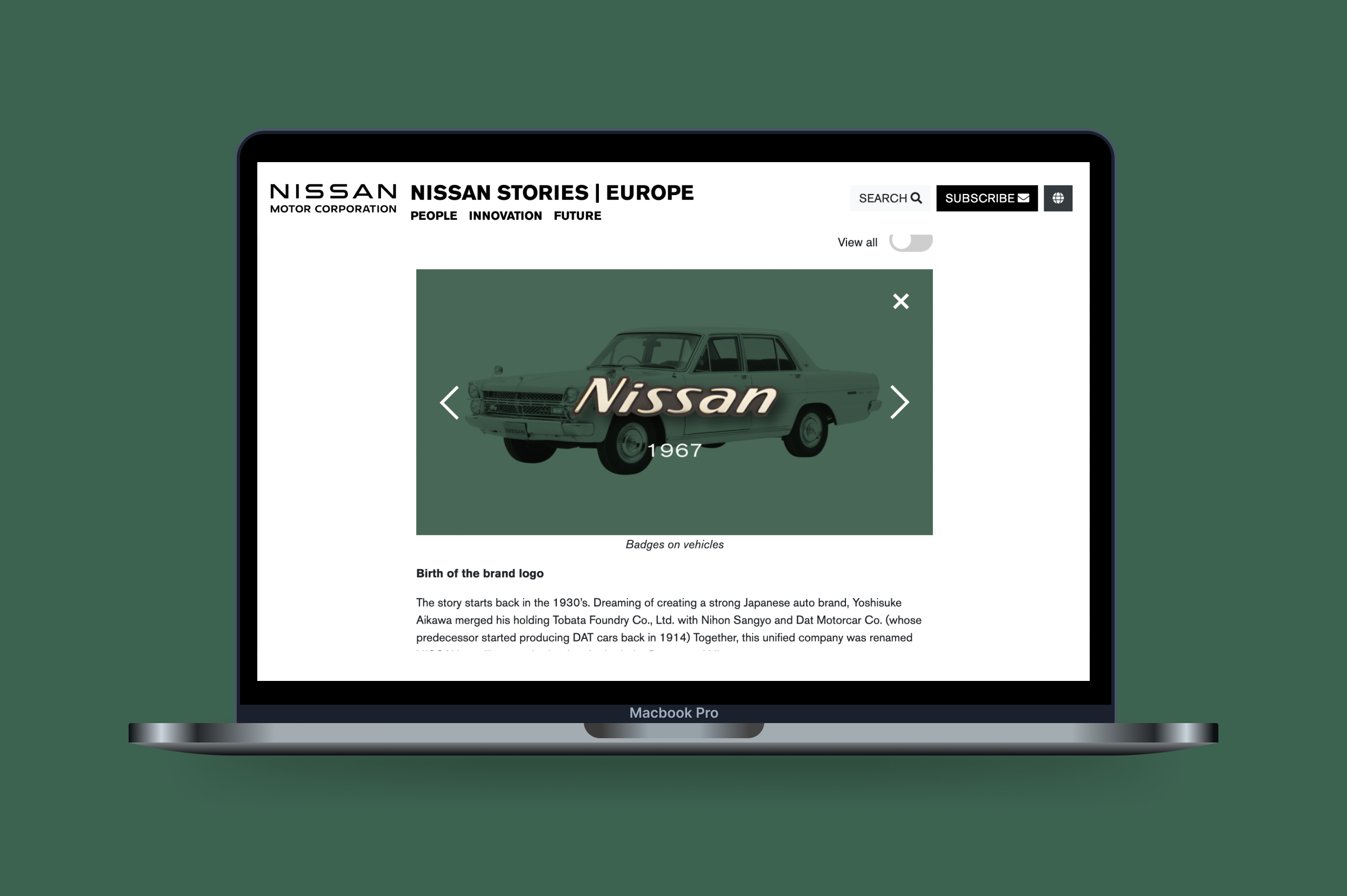
Nissan, and Edelman, wanted to explore a way to share this incredible heritage while also detailing to audiences some of their more notable cars from across the years. Our brief was to provide a digital component that could be embedded into an existing webpage.
We wanted to keep a sense of fun to the digital piece and so we created a collage using different elements from each historical vehicle that, when a user clicked, took them through to reveal the logo from that year of manufacture. We built the coded element for the piece, providing source-code direct to the Nissan team to activation within their ‘Nissan Stories’ site.
Together with its logistics business, P&O Ferrymasters also operates integrated road and rail to countries across the continent including Italy, Poland, Germany, Spain and Romania, Turkey and facilitates the onward movement of goods to Britain from Asian countries via the Silk Road.P&O Ferries is part of DP World, the leading provider of smart logistics solutions, enabling the flow of trade across the globe. They required an animated video to support the announcement of their long-awaited advanced track and trace service for its container customers, making it the first major logistics business in Europe to introduce the technology.
Storyboarding
The service allowed customers to receive real-time updates on the precise location of their goods as they are transported by rail, road and sea. The innovation improves efficiency, reduces costs and increases the speed of information exchange. Our team needed to correctly plot the narrative to the video, identifying key topics of interest and highlighting specific points in a succinct manner that sat within the P&O Ferrymasters brand. Our approach to clear messaging throughout the video was supported by custom illustration and photography that brought a sense of real-life context to the piece.
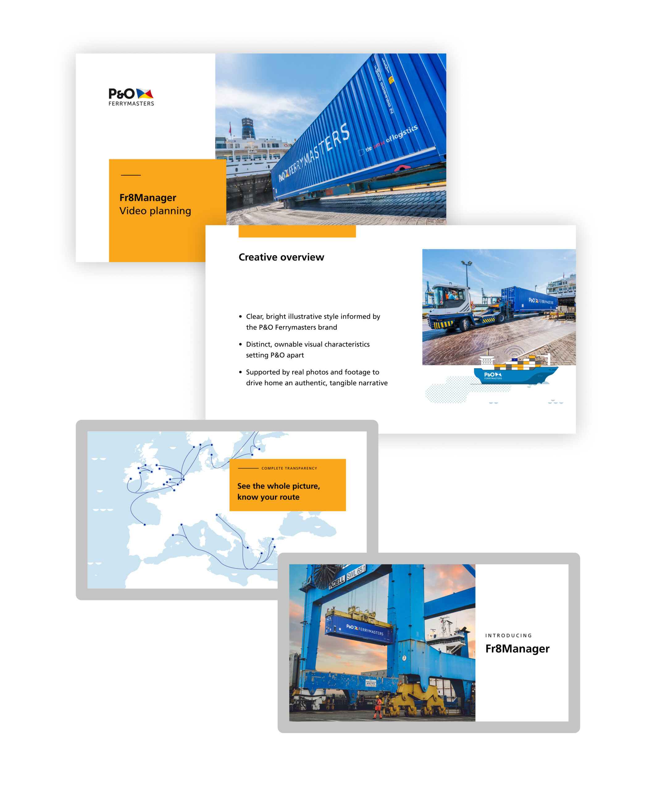
Conceptual planning through to production and launch
In working with the client, we supported the entire creative process culminating in a piece of motion content that was used widely across social media, live events and online through the P&O Ferrymasters digital presence.
Knife crime is a crisis. London recorded the highest rate of 169 offences involving a knife per 100,000 population in 2018/19, an increase of 1 offence per 100,000 population from 2017/18. When we were approached by Digital Cinema Media in partnership with the Mayor of London as part of their London Needs you Alive campaign to share an opportunity that could really make a difference, we were without question on board.
The London Needs You Alive campaign aims to alter the narrative surrounding how young people are represented and give value to how they see themselves and their role in the capital. LDN Filmmakers is an initiative to help young Londoners share their stories on the big screen – a free week-long fast-track film course designed to shake up the industry and help young Londoners realise their creative potential regardless of their background.
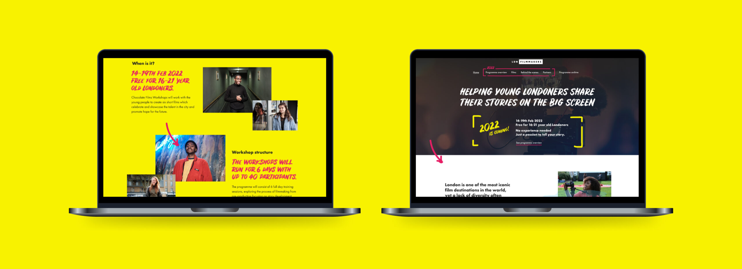
We worked together to create a website that portrayed the energy, excitement, and talent of the participants to share a more hopeful picture of the opportunities available in London. The digital experience needed to consistently carry through the visual style and emotion of the campaign, and showcase the six films produced during each of the week-long workshops.
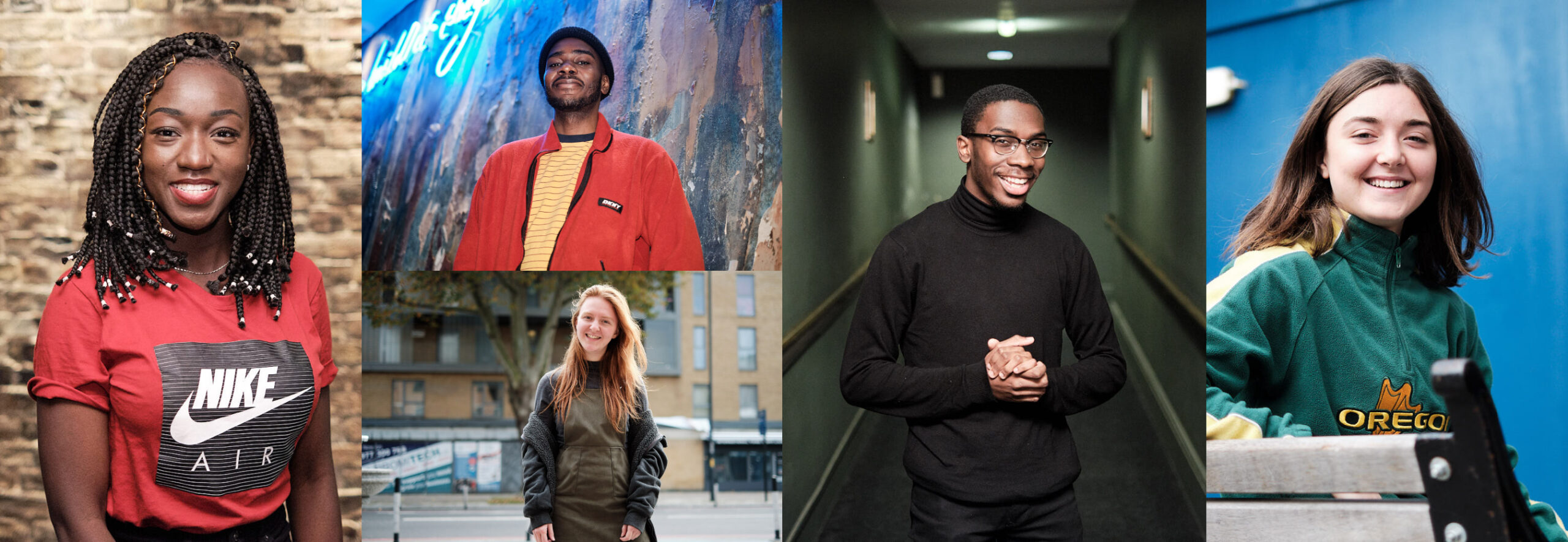
The films tell some amazing stories. ‘The silent path’ touches on issues of friendship, morality and selflessness. ‘Submit’ talks about how to balance the pressure to blend in with society norms and maintain a sense of authenticity. There’s nothing young, shy or quiet about the subject matter.
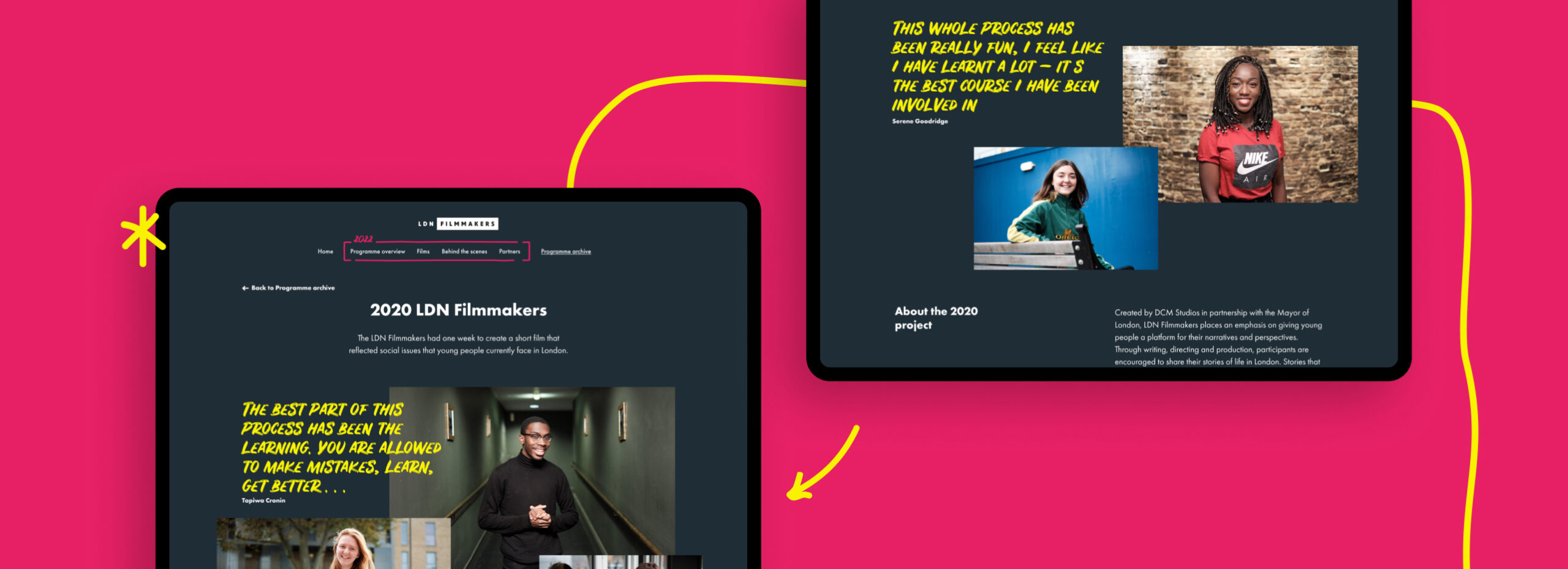
We’re all amazed by the talent shown in the films and are grateful that we were able to take part in this project. It shows what’s possible when there are opportunities for young people to be able to follow their passions and express themselves.
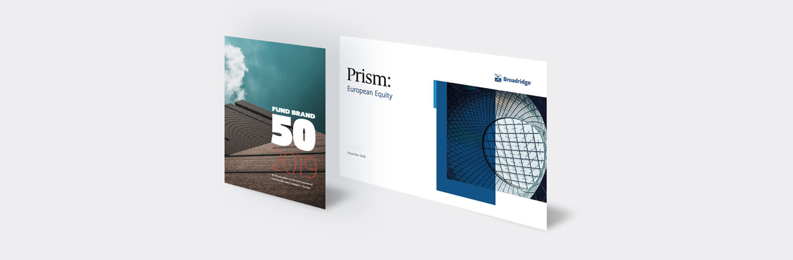
Broadridge Financial Solutions, Inc. (BR), a global Fintech leader and part of the S&P 500® Index partner with some of the world’s leading companies and financial institutions. They help drive business transformation for their clients by delivering products across technology and operations, communications, data and analytics. Working with their Distribution Insights team, we were tasked to digitally showcase the products that they provide global clients.

Context and Challenge
We were approached by the Distribution Insights team to create a digital tool for the Fund Forum event in Copenhagen. It needed to show the global reach of Broadridge products and demonstrate the power of the insight they were able to offer. Simultaneously it had to be a data collection tool; recording user interest and registering people for a competition to win a Google home device. The brief was that it needed to play on a loop through the television screen on the stand as well as having users interact with it on iPad, requiring the development of two parallel versions.
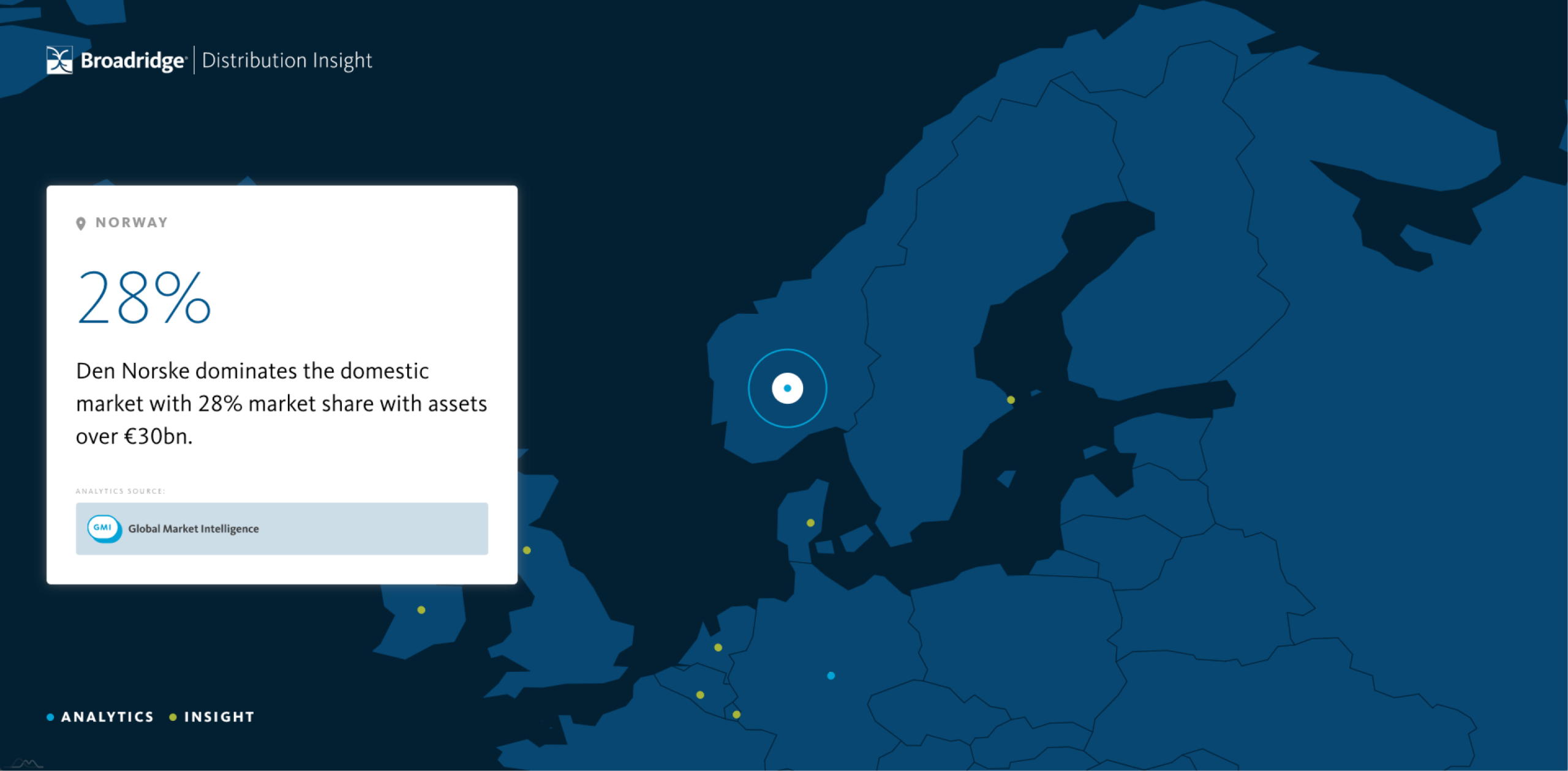
A global presence
Providing a sense of scale and a global overview to how product insight fits together was very important. We developed a system that allowed a locational point to animate from one element on a sphere to another. We then adapted this to display a stylised globe using the Broadridge branding, allowing us to demonstrate the company presence across each country. We also wanted users on an iPad to be able to target specific destinations if they so wanted, and added a country selector drop down to the homepage.
Arab Health is the largest healthcare event in the Middle East and North Africa (MENA) region and generated business worth US $778 million between medical manufacturers and visitors last year. We were approached by Healthcare UK to help deliver the brand style, event graphics, digital sales tool and associated printed materials for its Arab Health exhibition stand in the Dubai World Trade Centre.
Healthcare UK is part of the Department of Health and Social Care and Department for International Trade and exists to help UK healthcare providers expand their business offering overseas. They promote the UK healthcare sector to overseas markets and support healthcare partnerships between UK and overseas healthcare providers.
Project goals
The intent of the event presence in Dubai was to promote UK healthcare experience and knowledge, displaying the world-leading technology, building and infrastructures and supplier network that puts the UK at the forefront of the healthcare market. This experience would be showcased to prospective market clients looking to utilise and implement this experience within their region.
The challenge
The strategic proposition, Hospital of the Future, presented UK companies capabilities to create world-leading hospitals – through architecture, technology, data, medical and infrastructure advancements – and showcased UK suppliers who can work globally.
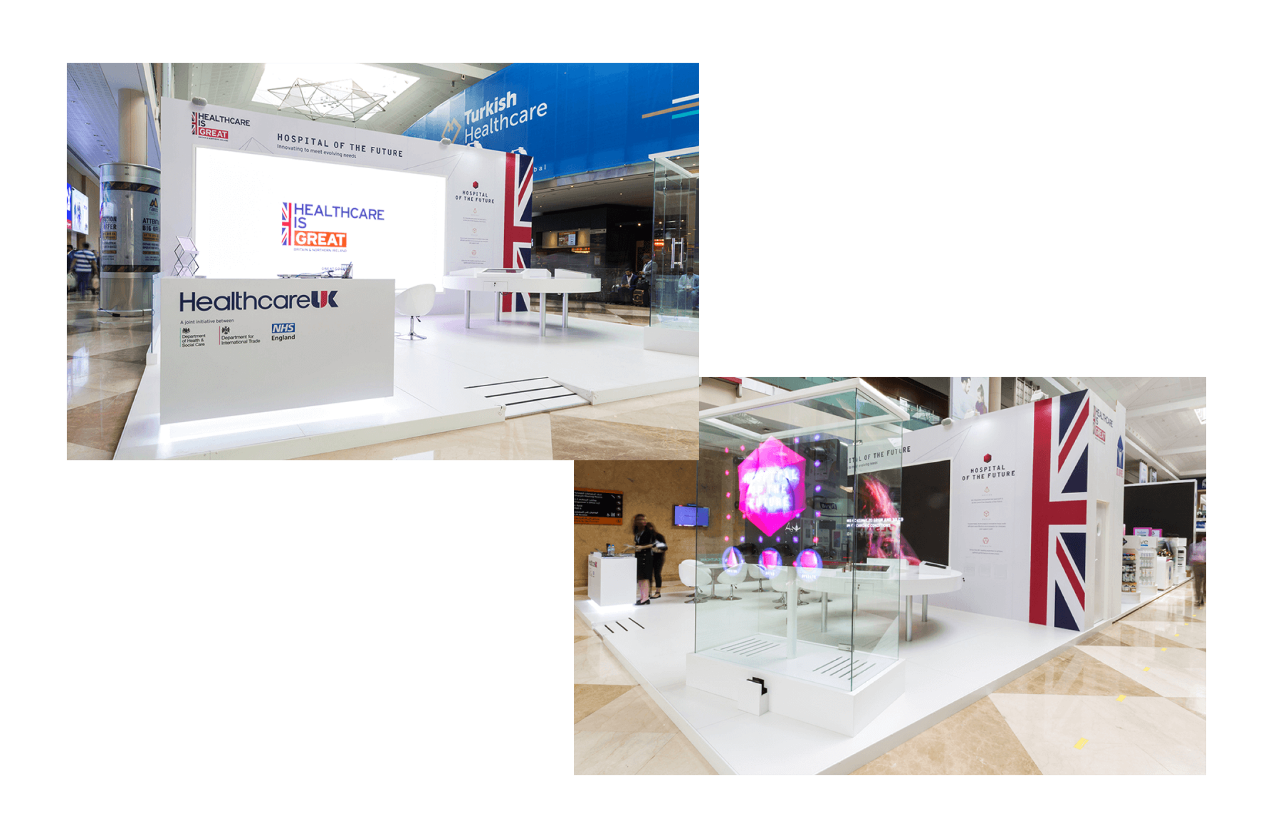
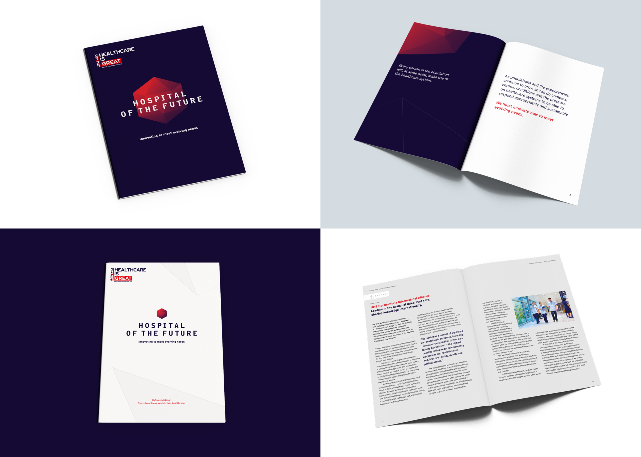
We created a visual style and tone of voice that gave consistency across all media and event elements, representing the innovative vision in a consistent form and suitable for the localised market. The stand had a number of elements: an eight-metre screen showing a video, four touchscreens in an interactive engagement area, a hologram and a number of printed materials.
So that the stand looked unified we created a brand style aligned to the GREAT branding from the UK government and with an aspirational tone. This was applied to all materials and products that we produced, and shared with third-party creators such as Engage Works who produced the Hypervsn Hologram featured at the event.
Messaging and digital tool
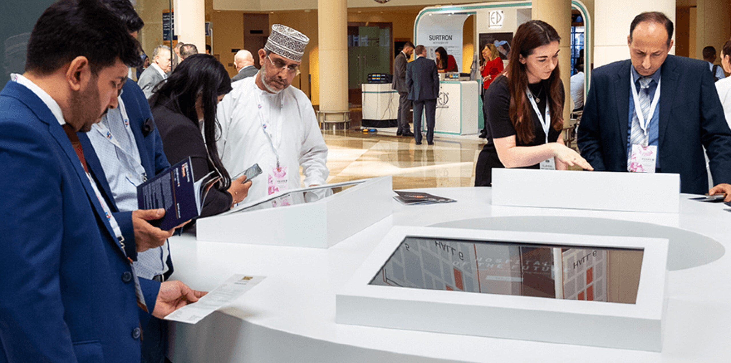
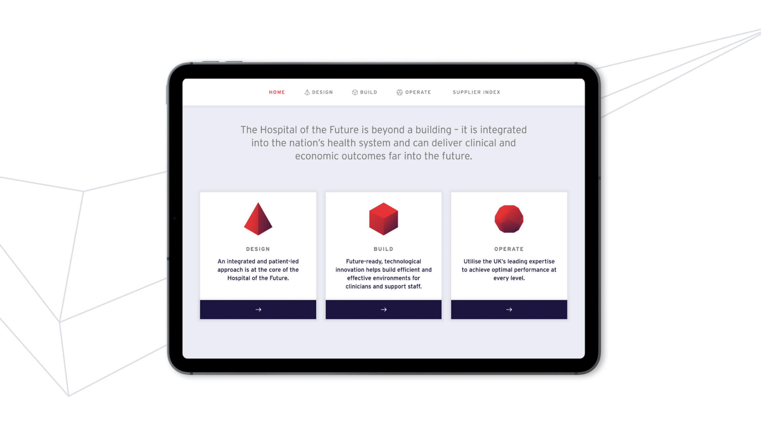
To connect potential clients to UK suppliers, visitors had to be able to quickly access relevant supplier information. For the four touchscreens, we created a digital tool that could be accessed both within the event and externally from all devices. It gave an overview of the concept of Hospital of the Future and showcased each supplier. The tool provoked visitor interest across three categories: design, build and operate.
Our visual system representing these three areas of interest was applied across the stand, hologram and printed materials. The audience learnt about the benefits to each area of experience and used the tool to request direct information and contact from suppliers who could help in each given area.
Visual identity
Within our creative style, abstract thin grey lines referenced technology and architecture as well as having a sense of movement and flow to the overall approach. This also gave a strong backdrop to the more attention-grabbing elements – the video and hologram. Centralised around a core visual mark, we applied this style through all collateral.
An engaging event experience
The Arab Health event was very successful for Healthcare UK, promoting the vision of Hospital of the Future and establishing a digital tool that can grow and flex, with scope for wider global launches and rollout. The show had 51,985 visitors from 159 countries, with suppliers receiving validated interest and lead generation from the tool.
Reporting performance
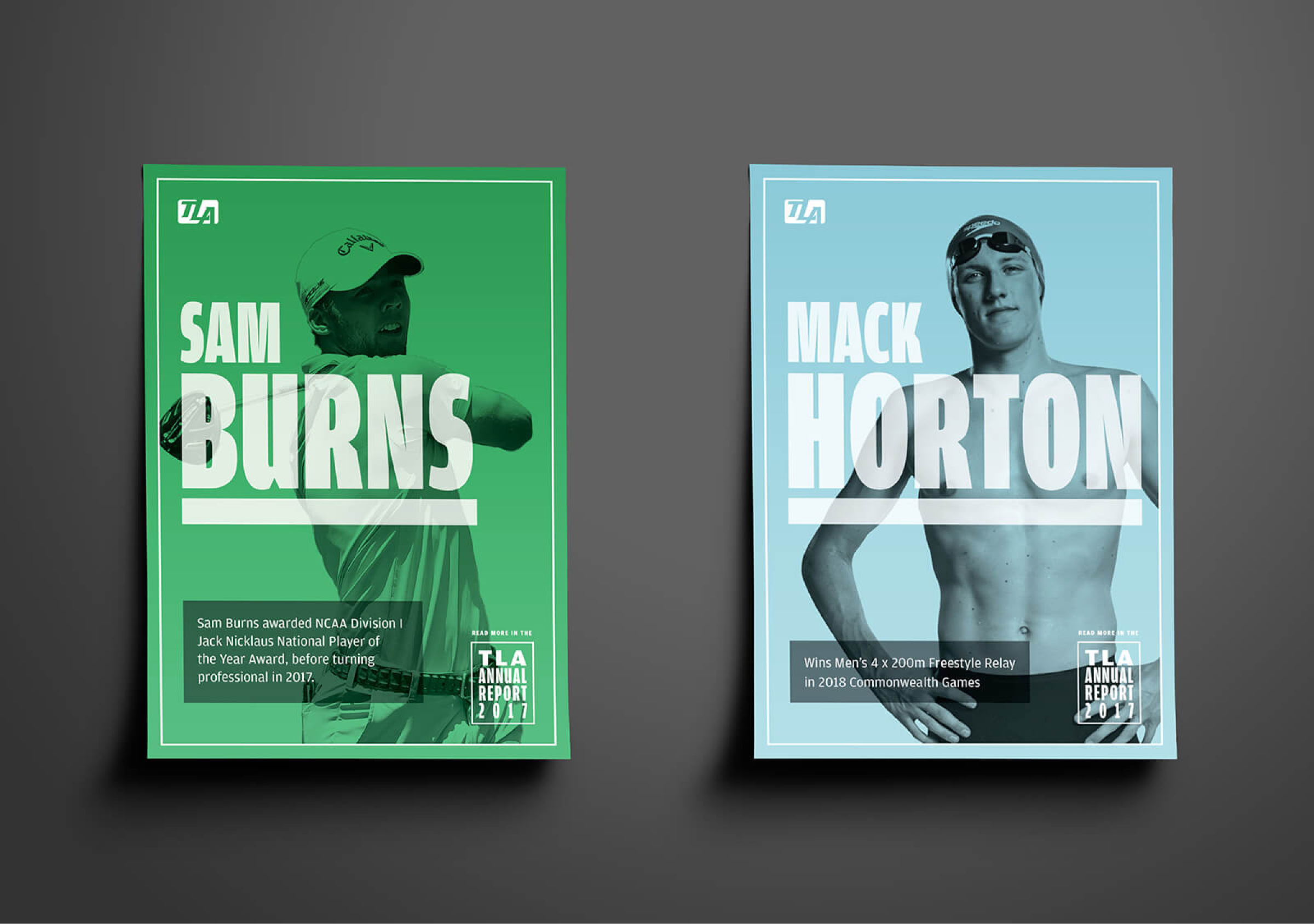
TLA Worldwide are one of the world’s leading sports marketing agencies responsible for representing world class sports talent. We have worked closely with them for five years having developed their brand, handling it’s positioning as part of M&A and creating business-focused digital products alongside reporting business performance.
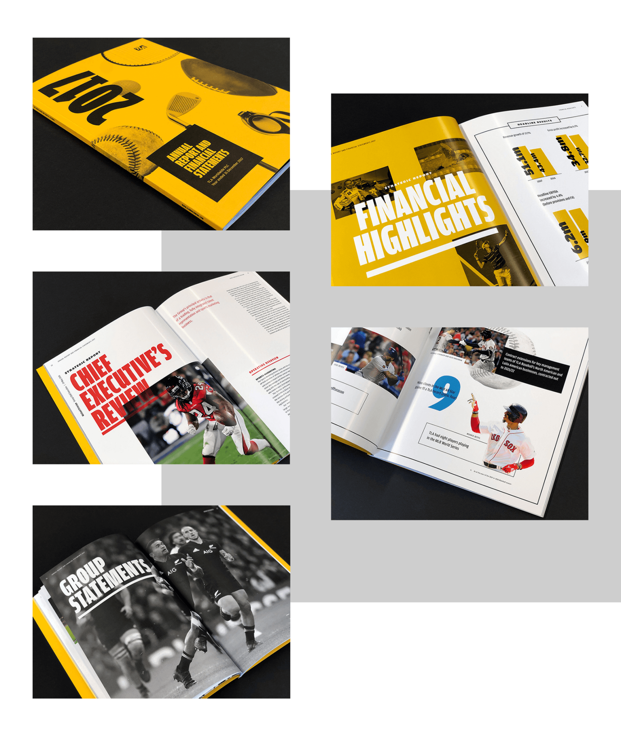
To reflect the growth and impact of TLA within the industry and as part of their listed reporting, this year we developed a bold, confident and high impact aesthetic. This came through by both the physical and digital report – high impact colour, monotone photography and strong typography combining to create an assertive look and feel.
A tactile physical report
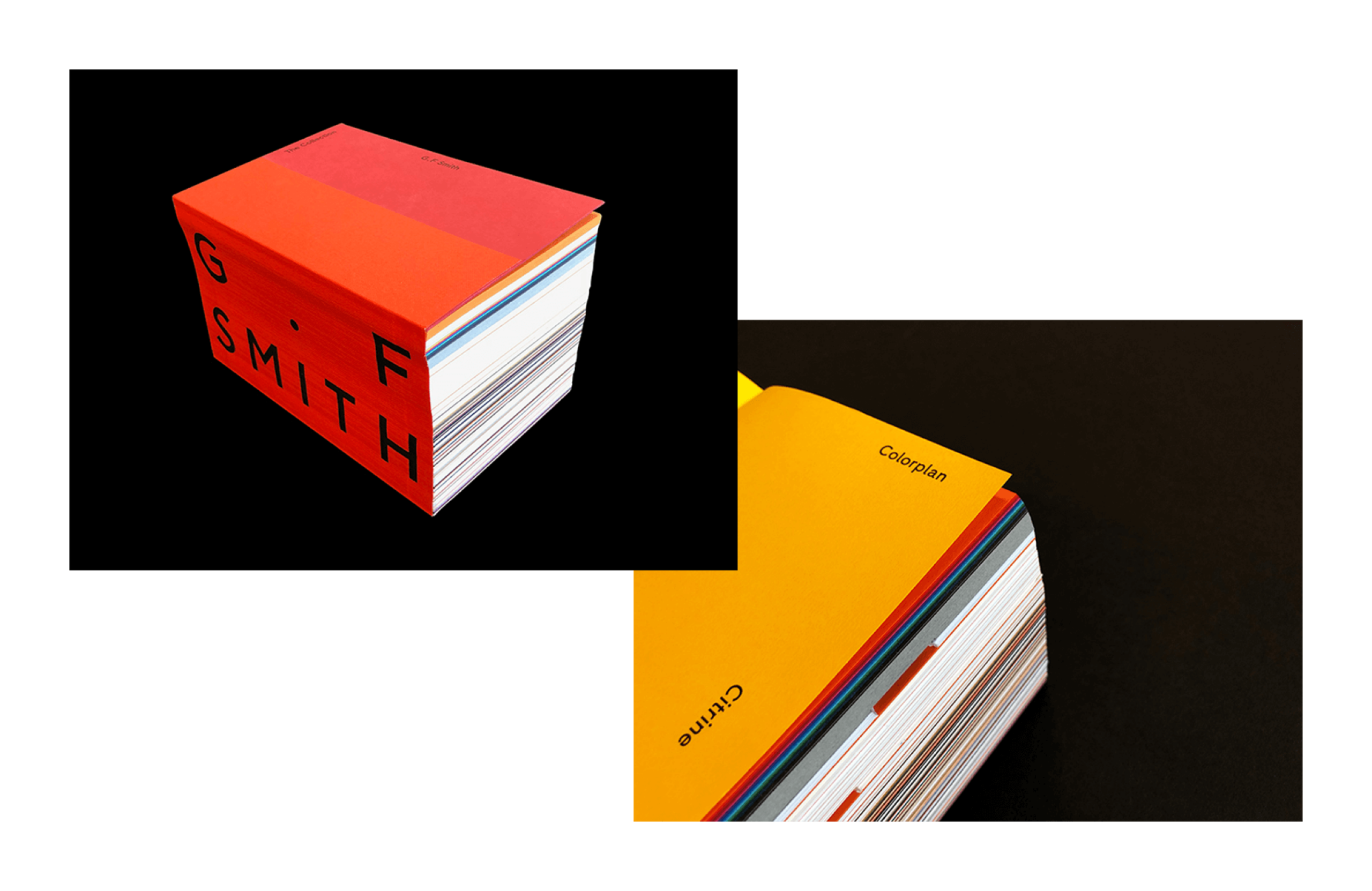
The physical report was an opportunity for the client to explore tactile stock options that best reflected the design vision. G.F. Smith Colorplan in citrine lent incredible impact to the cover with the texture creating an elevated, luxury brand experience. The sense of touch was again reinforced within the report to help define opening, editorial sections alongside more detailed financial information. Full gloss for editorial highlights with large, bold imagery and an offset, finer weight finish for all important financial statements helped identify both areas of the report for the reader.
A digital experience
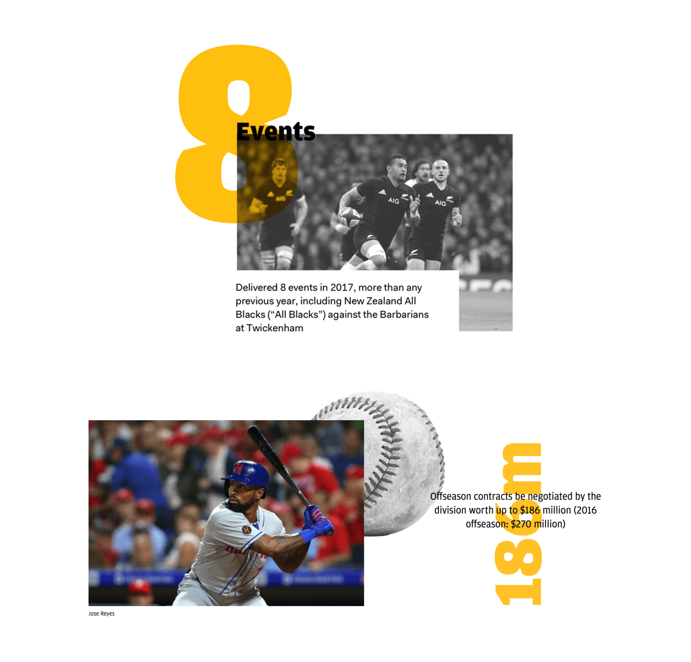
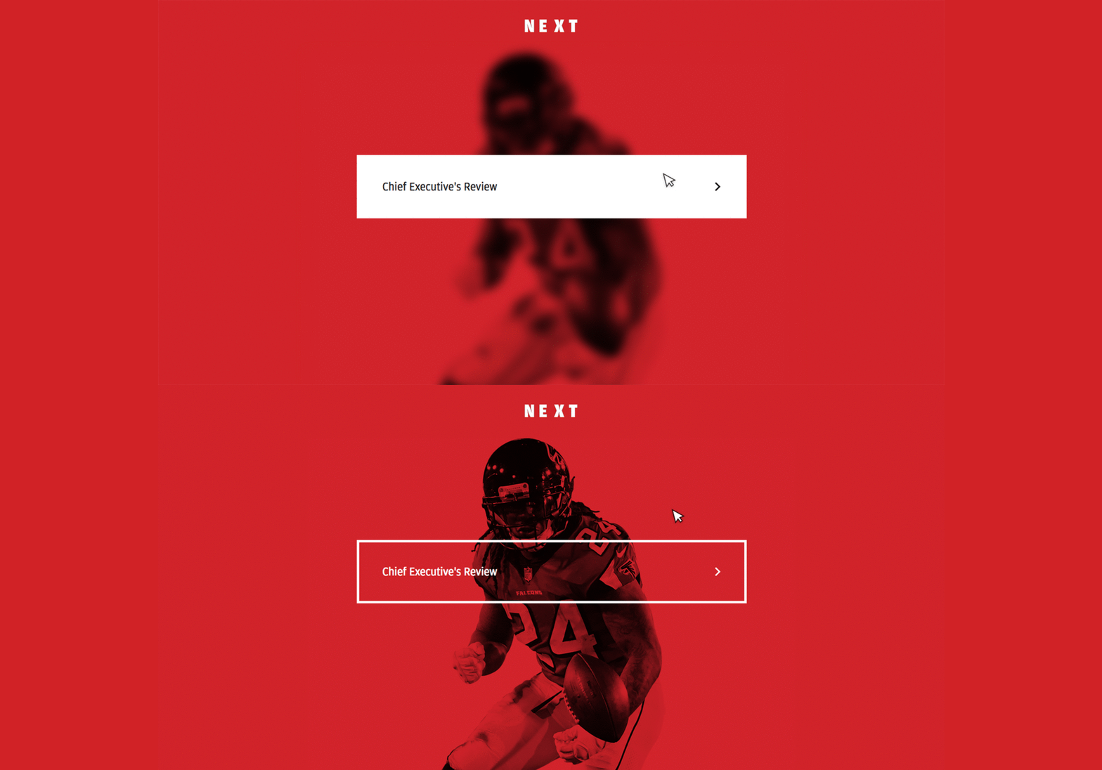
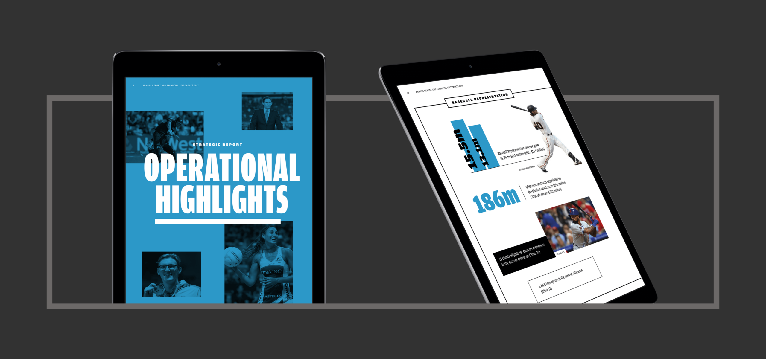
We understood the need for an integrated approach and created a digital version of the report to best accompany the physical. This provided stakeholders a richer, streamlined experience with highlight and overview information quickly accessible. Statistics utilised subtle animations and embedding video provided brand exposure and context whilst also allowing us to showcase TLA talent.
Results
The combination of digital and physical allows for wider audience engagement and presents the report as a unified brand piece. Design and production combined to help reinforce the TLA brand ethos of bold industry leadership – representing this to shareholders across the UK, USA and Australia.
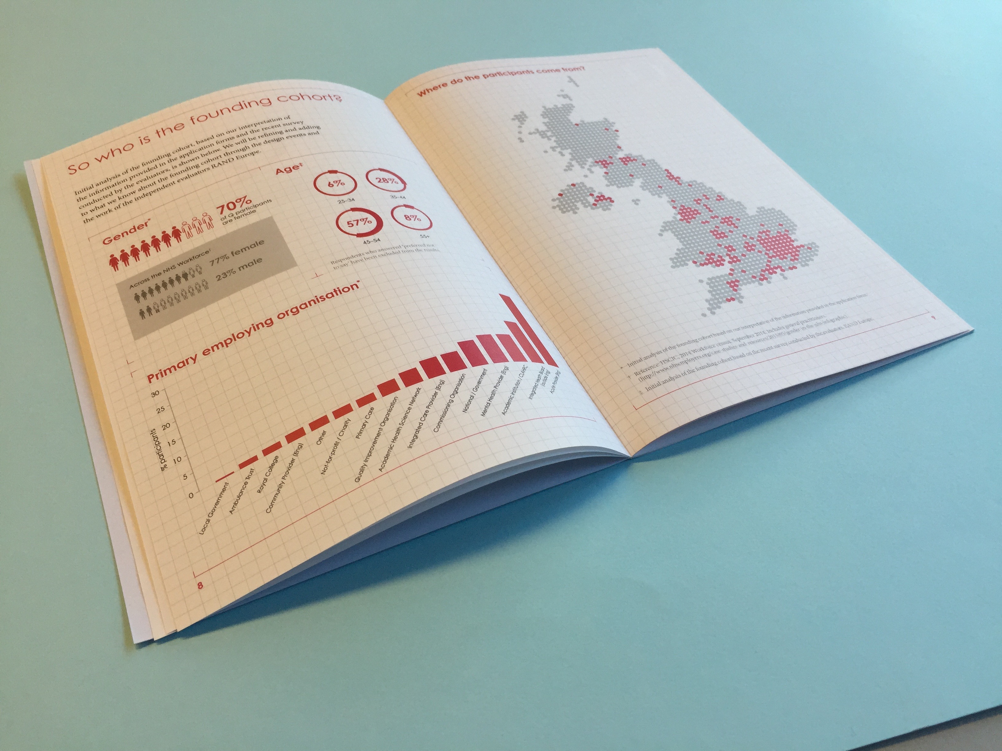
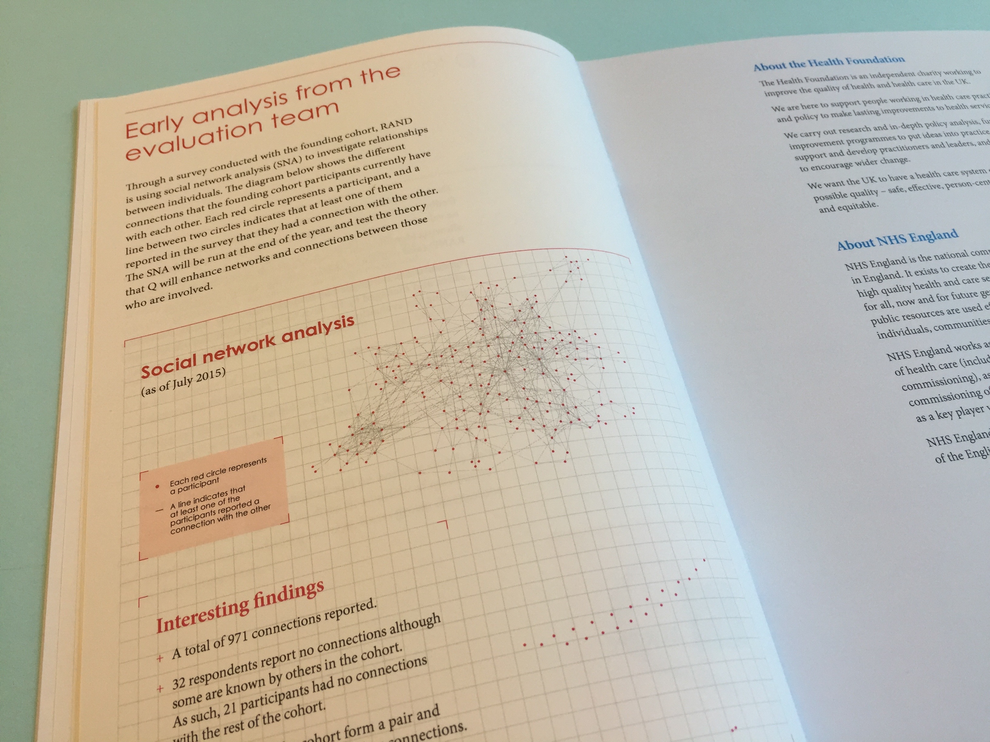
Q is an initiative from The Health Foundation, designed with 231 founding members. This helps to ensure it is genuinely useful to the diverse range of people leading improvement. Q will continue to evolve, being shaped with and by the community as it grows. The community has recently reached 4,000 members across the UK and Ireland.
Q is a long-term initiative aiming to support individuals and their improvement work. Through this, Q benefits member organisations and the populations they serve. It has been designed to complement and enhance other initiatives and networks. People in the community pool together their knowledge, insights and connections – encouraging collaborative ways of making improvements.
The community is made up of a diverse range of people including those at the frontline of health and social care, patient leaders, managers, researchers, commissioners, policymakers and others. This boosts the power of Q as a source of innovation and practical problem solving by including a wide range of perspectives.
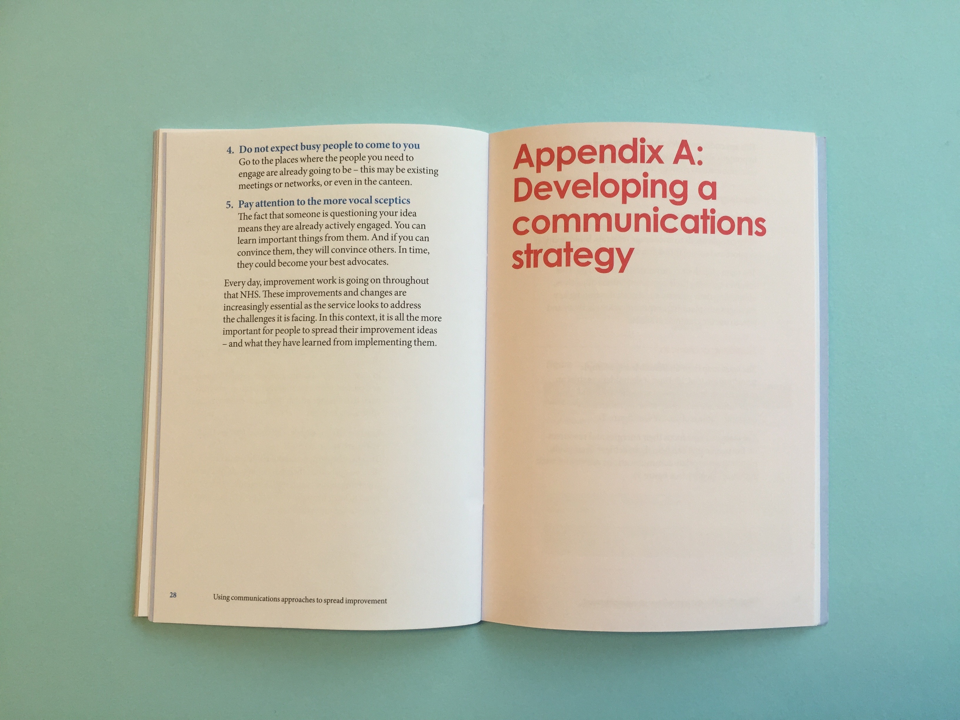
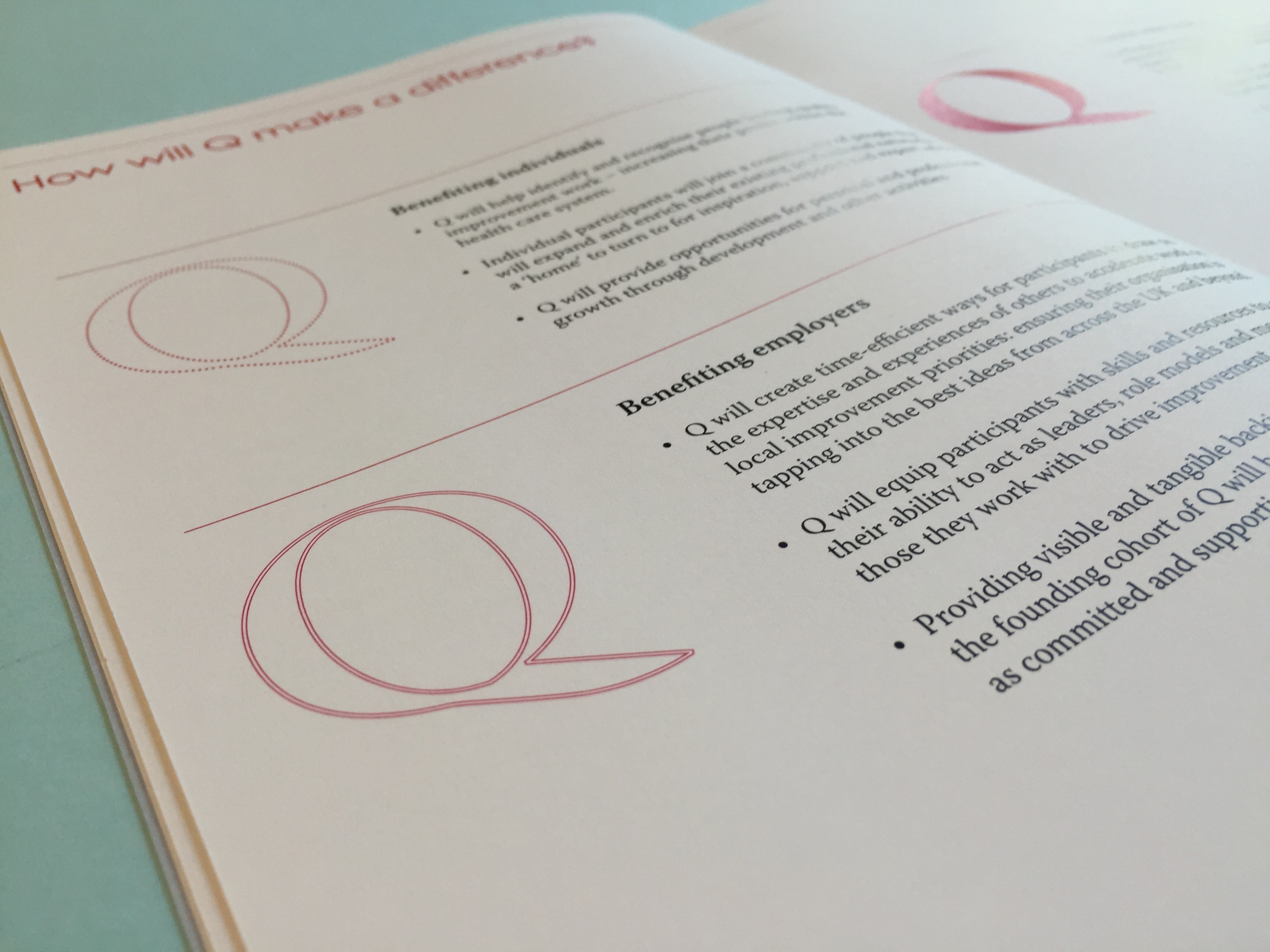
We worked with the Health Foundation to create an identity for the group that sat within the Health Foundation brand. This was then translated across their first report.
Mortality reporting: good and bad
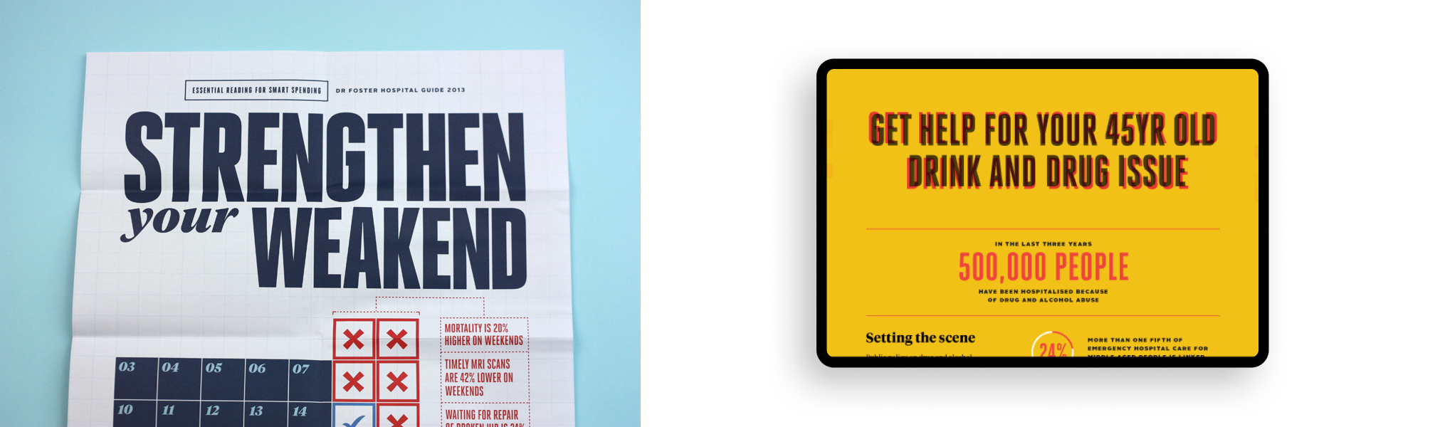
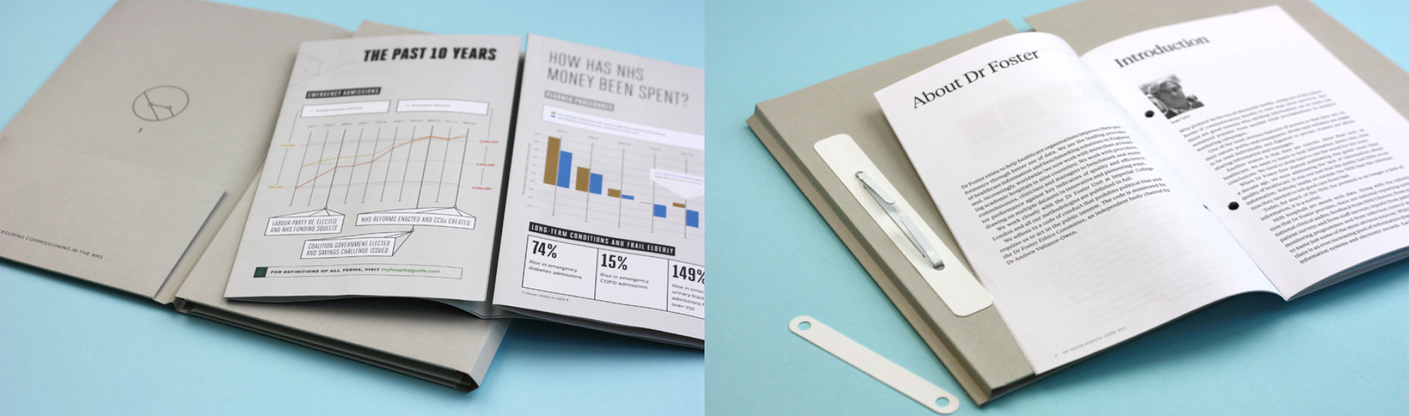
Often referred to as the report that made their name, the ‘Good Hospital Guide’ caused a large media stir when Dr Foster first released it in the press. As the government and the public demanded greater transparency from the medical profession, particularly in response to things such as the Bristol Royal Infirmary inquiry, Dr Foster seemed blessed with the right socio-political climate for launching its data-led material. The Good Hospital Guide is subtitled: “The definitive guide to getting the best service from the NHS and private hospitals. First independent assessment of every major hospital in the UK.”
Integrated reporting: based on data
The Dr Foster Intelligence Hospital Guide as it became termed, was a perfect chance to employ all the aspects of the brand creative that we had put in place for Dr Foster in our relationship with them.
For this report, where we are proud to have supported the team at Dr Foster across a number of years, saw a manifestation across both a print-based activation campaign and a digitally-led project drawing interest from press, public-and-private health institutions, the NHS, government bodies and the general public.