Studiomade were selected to design Beacon, a new digital platform launching this year that lets healthcare organisations measure how they truly perform against global peers, and, just as importantly, act on what they find. The challenge was to design a product experience that turns benchmarking data into shared understanding, confident decision-making and lasting organisational improvement that ultimately improves patient care.
The challenge
Healthcare leaders rarely struggle for data. The real challenge is to decide what is worth acting on, how to action it and how to sustain it. In discussions with Hunter we found the same recurring barriers across every C-suite role (CEO, CMO and CFO): a different read of the same numbers, uncertainty about whether weak performance was real or a misalignment in how similar organisations compare and improvement that faded once other priorities were taken on.
Beacon needed to:
- Provide a transparent and trustworthy read on organisational performance
- Help teams reach a single, shared understanding of what their data is saying
- Highlight key opportunities, helping leaders to know where to focus
- Turn insight into coordinated action rather than another report
- Help organisations sustain improvement through peers, programmes and tracking.
Our approach
We tackled the project with evidence-led design thinking, beginning with audit and strategy. Working with the Beacon product team to set out the personas and core use cases, we extracted the real goals and pain points behind each role, defined the user tiers, and established the brief around shared understanding, networking and action.
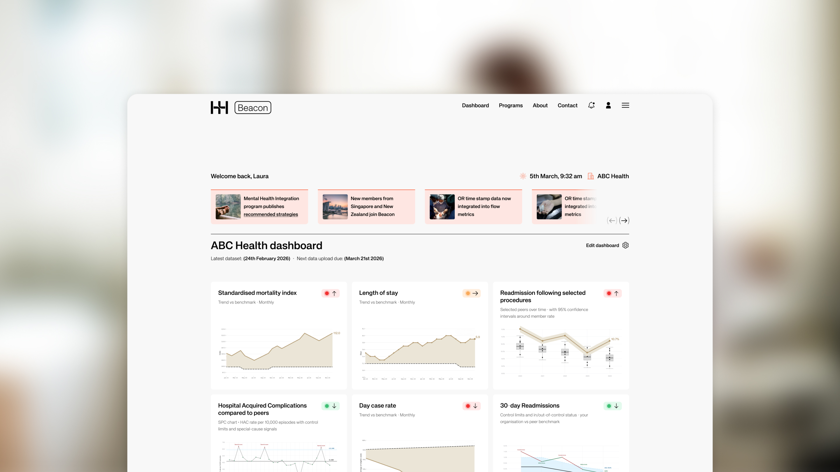
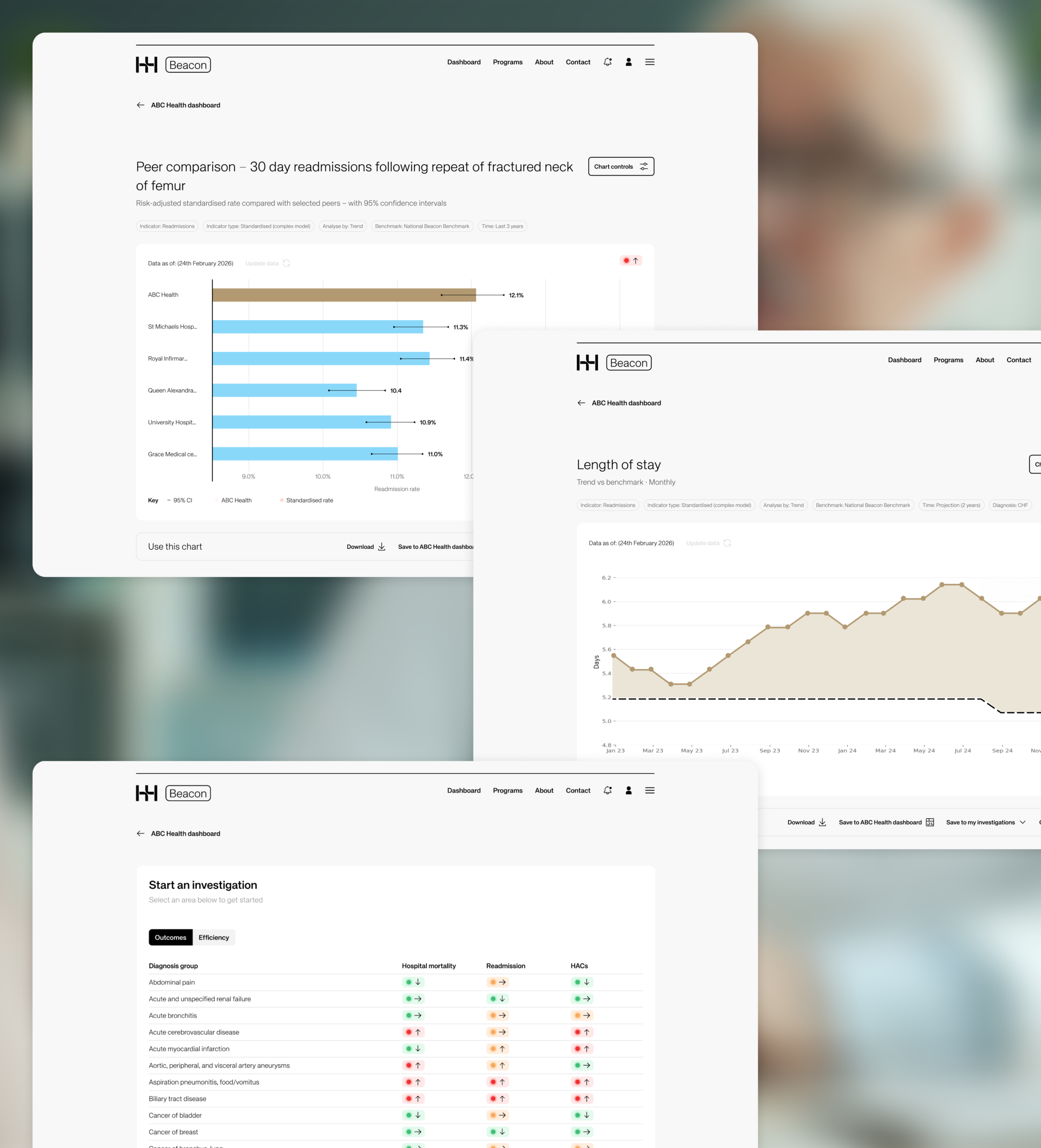
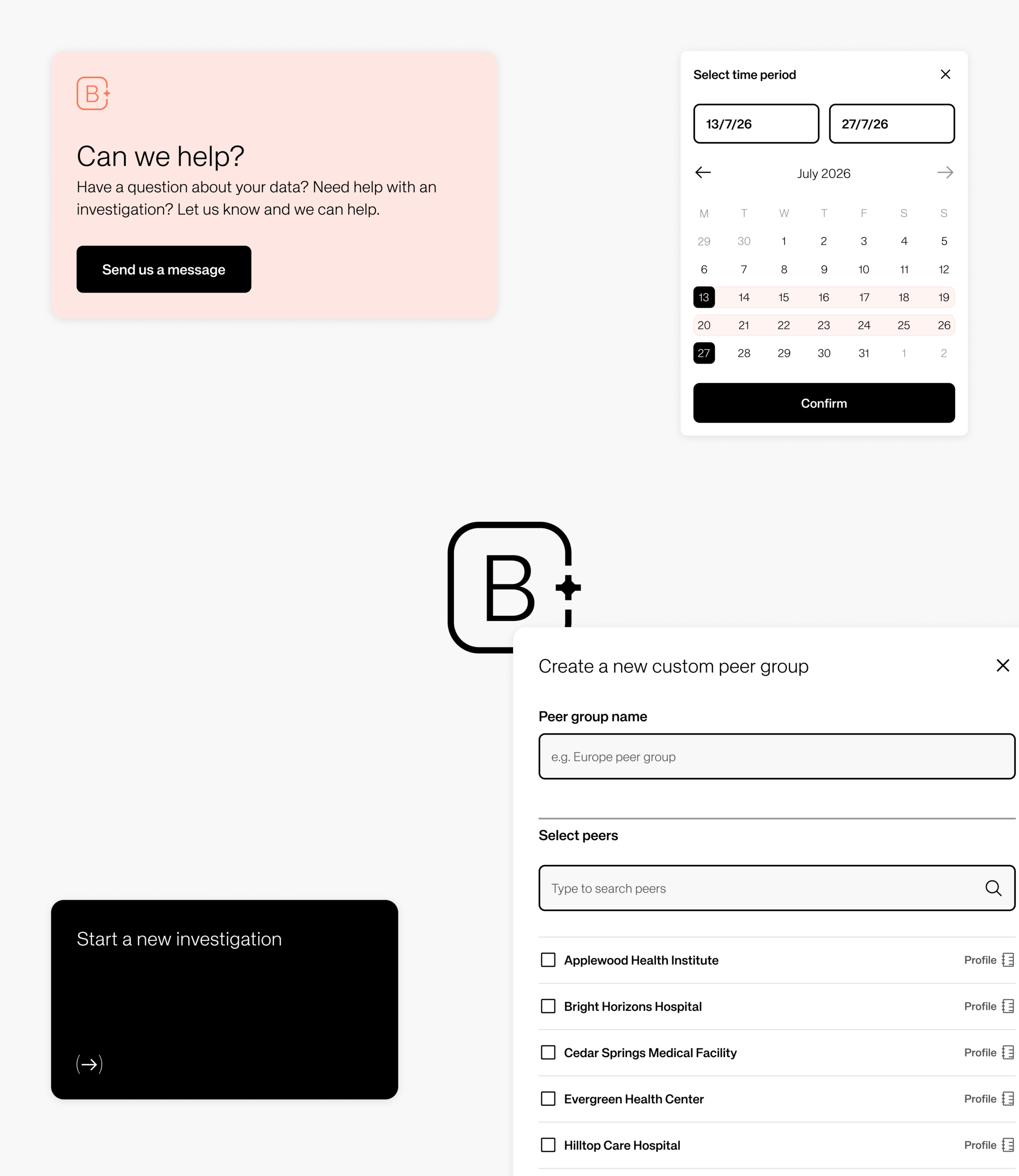
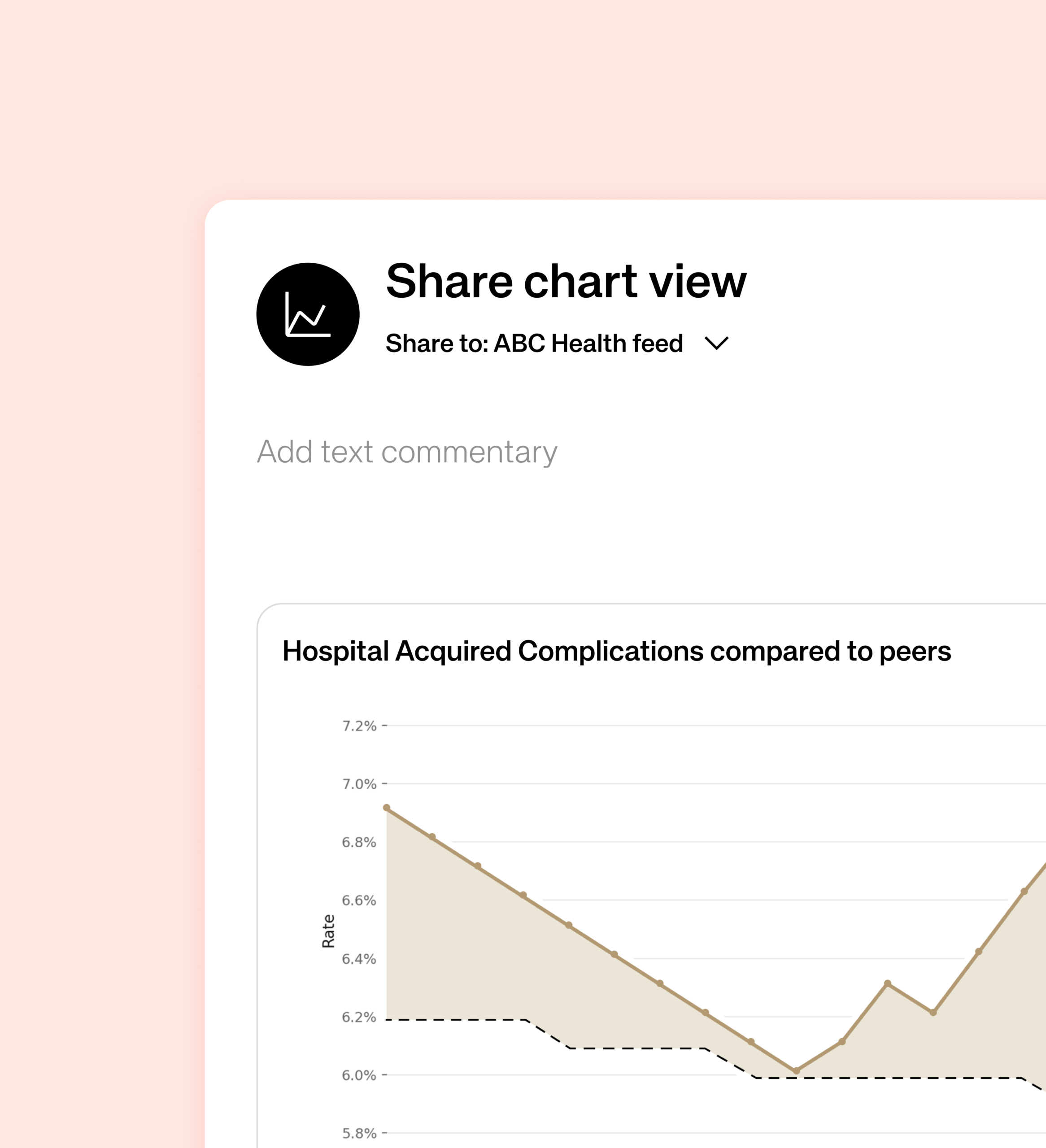
From there we moved into UX and information architecture, shaping the user journeys that mattered most: building an organisation dashboard, investigating an opportunity by drilling down from a headline metric to its underlying drivers, defining peer groups, and sharing a chart with colleagues. We designed Beacon’s data language around SPC charts with control limits, peer comparisons and clear trend signals. Our UI and prototyping phase then brought the direction to life as a quiet, consistent visual design system and an interactive prototype of the core flow, with ongoing feedback loops keeping every decision balanced against user needs, clinical credibility and technical feasibility. Everything is cleanly displayed, reducing visual noise and citing Beacon as a functional tool.
That direction is now in early development stages. We are validating the flows and the data narratives with real users, refining the points where meaning, navigation or trust break down before the product continues to be built at scale.
The outcome
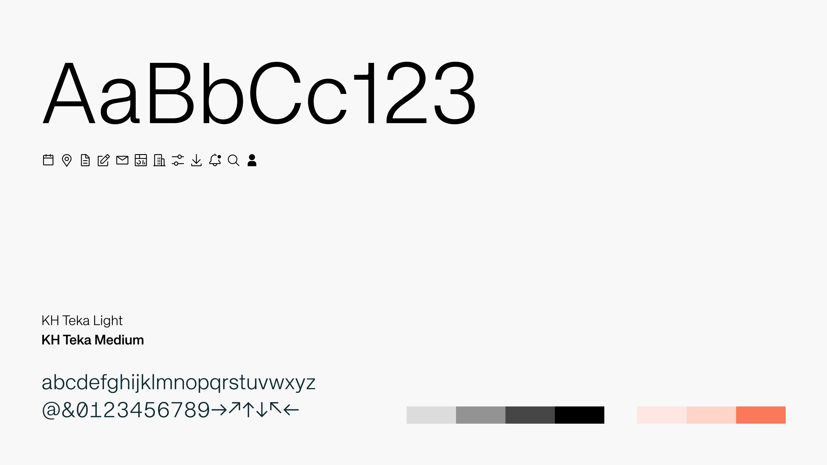
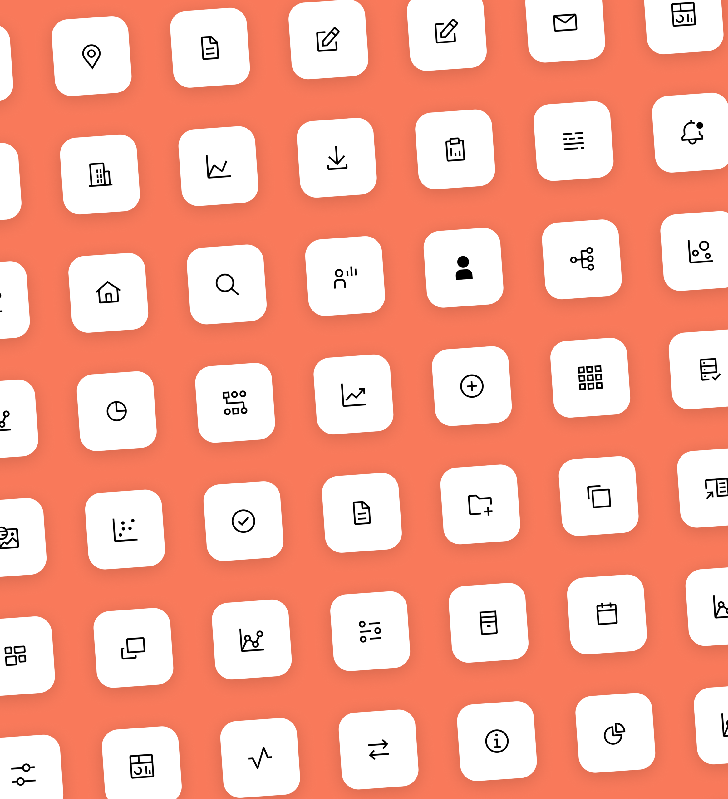
The Studiomade team delivered a designed product experience and UI design library for Beacon, using the existing Hunter Healthcare brand style as a starting point and extending it into a clearer digital product framework.
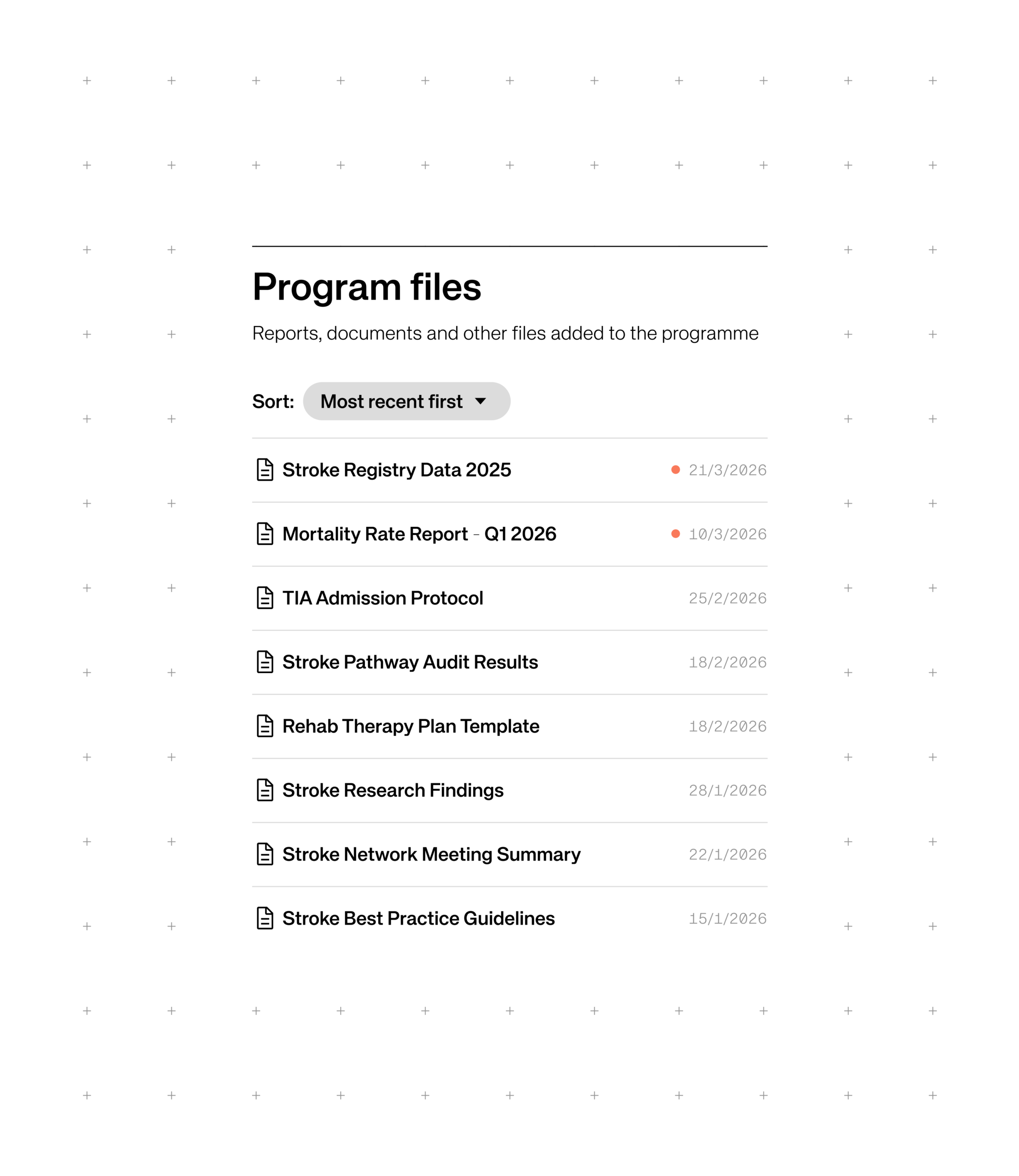
The prototype was shaped around three connected ideas. First, members can benchmark with confidence against global peers, using standardised models, clear caveats and the ability to move from a headline metric into the drivers behind it. Second, they can compare and connect, finding organisations performing well on the measures that matter to them and learning how progress was achieved through member pages, peer comparison and in-organisation sharing. Third, they can join funded, multi-year improvement programmes, such as High Value Stroke Care, where members pool data, research and implementation around a single topic, supported by shared analyses, an activity feed and a calendar of events.
All product designs and the underlying interface were delivered as a structured Figma component library – a system that not only enables swift development of Beacon, but can direct future digital product creation across Hunter Healthcare, applying the same validated approach to whatever comes next.
Impact
The result is a benchmarking experience that reads at a glance and earns user’s trust, with a clear route from a single metric through to peer comparison, drill-down and action. Peer connection and funded programmes help improvement stick over time, while a scalable design system and component library provides Hunter Healthcare a foundation both for the product build and for future development.
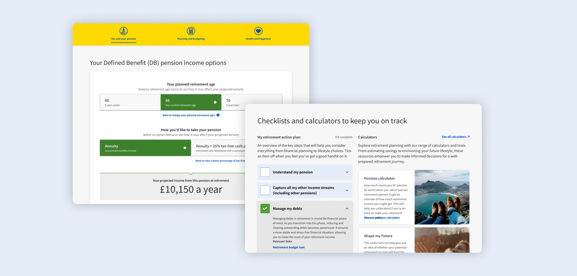
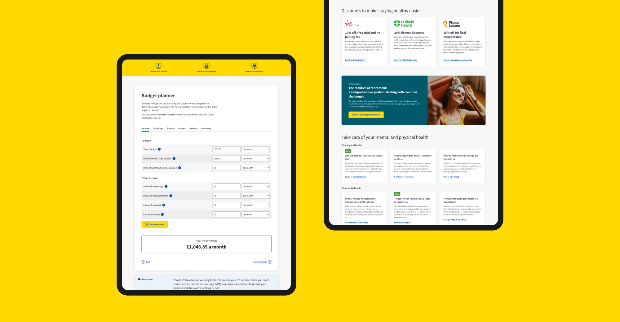
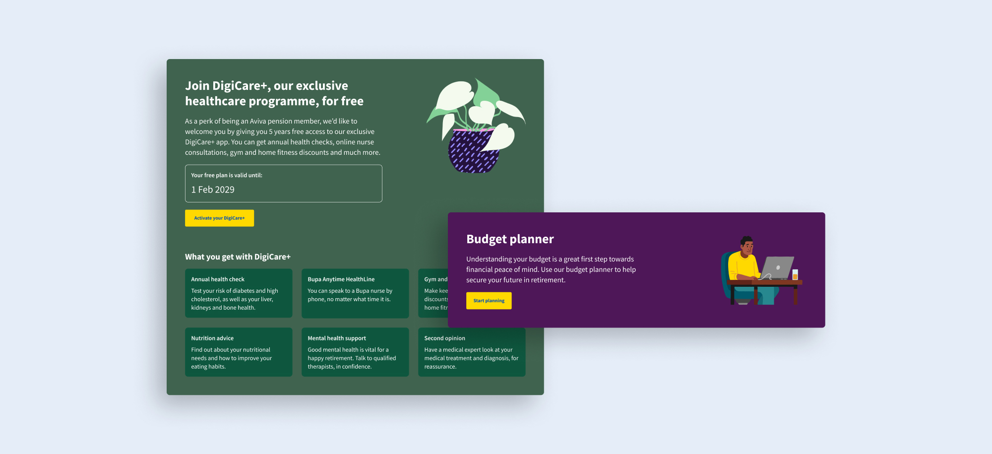
Most people don’t understand their pension and Aviva wanted to do more to give scheme members clarity. In a changing market, it also wanted scheme trustees to purchase Aviva annuities with confidence that their members will be supported.
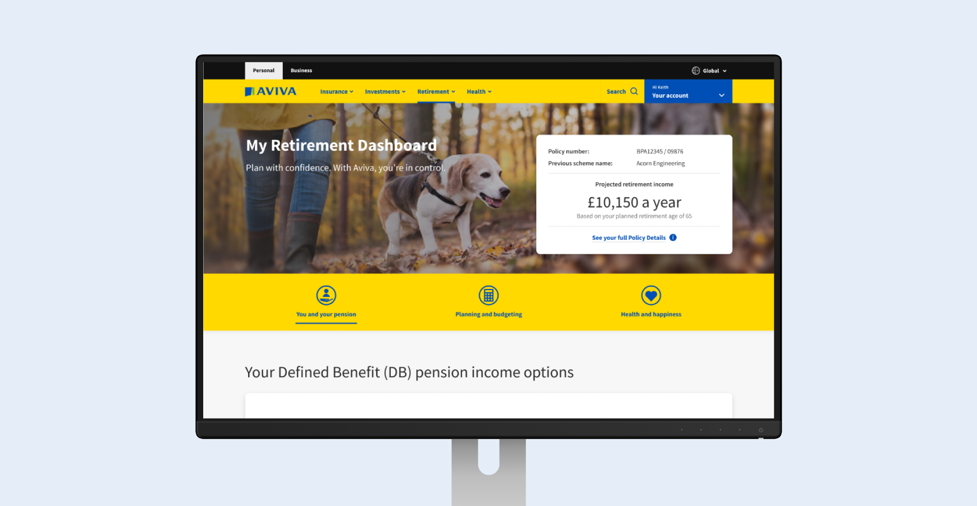

We undertook three cycles of design, testing and iteration, with intensive design sprints, agile working and rapid turnaround of user testing reports. We discovered what real customers need and the language that resonates with them, and defined features that we tested and validated. We delivered a product that has gone into development and will transform the way members interact with their Aviva pensions.
The senior stakeholder said:
“Studiomade has a collaborative, engaging way of working and the entire team is positive, expert and outcome focused. Their delivery has made a massive impact in our ability to galvanise senior internal stakeholders and external audiences.”
Overview
City & Guilds has long been recognised for its trusted qualifications and strong relationships with training centres and employers. Recent shifts in the skills landscape, including renewed investment in training, growing demand for trade certifications and rising learner expectations, highlighted a clear opportunity for the organisation to rethink how it supports people throughout their career journeys.
We partnered with City & Guilds to shape a new proposition that brings the organisation closer to learners in a more direct and meaningful way. This work builds on their established strengths while opening up new avenues for guidance, progression and long-term learner support.
Shaping a direction for the product
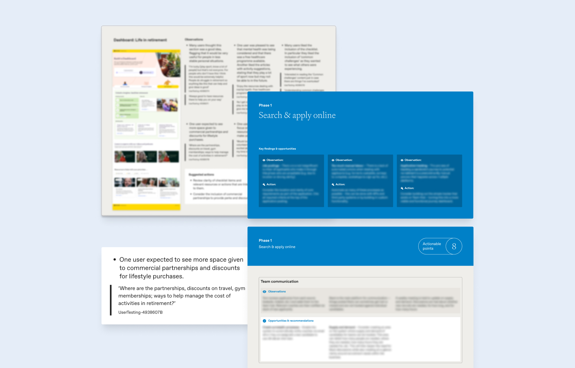
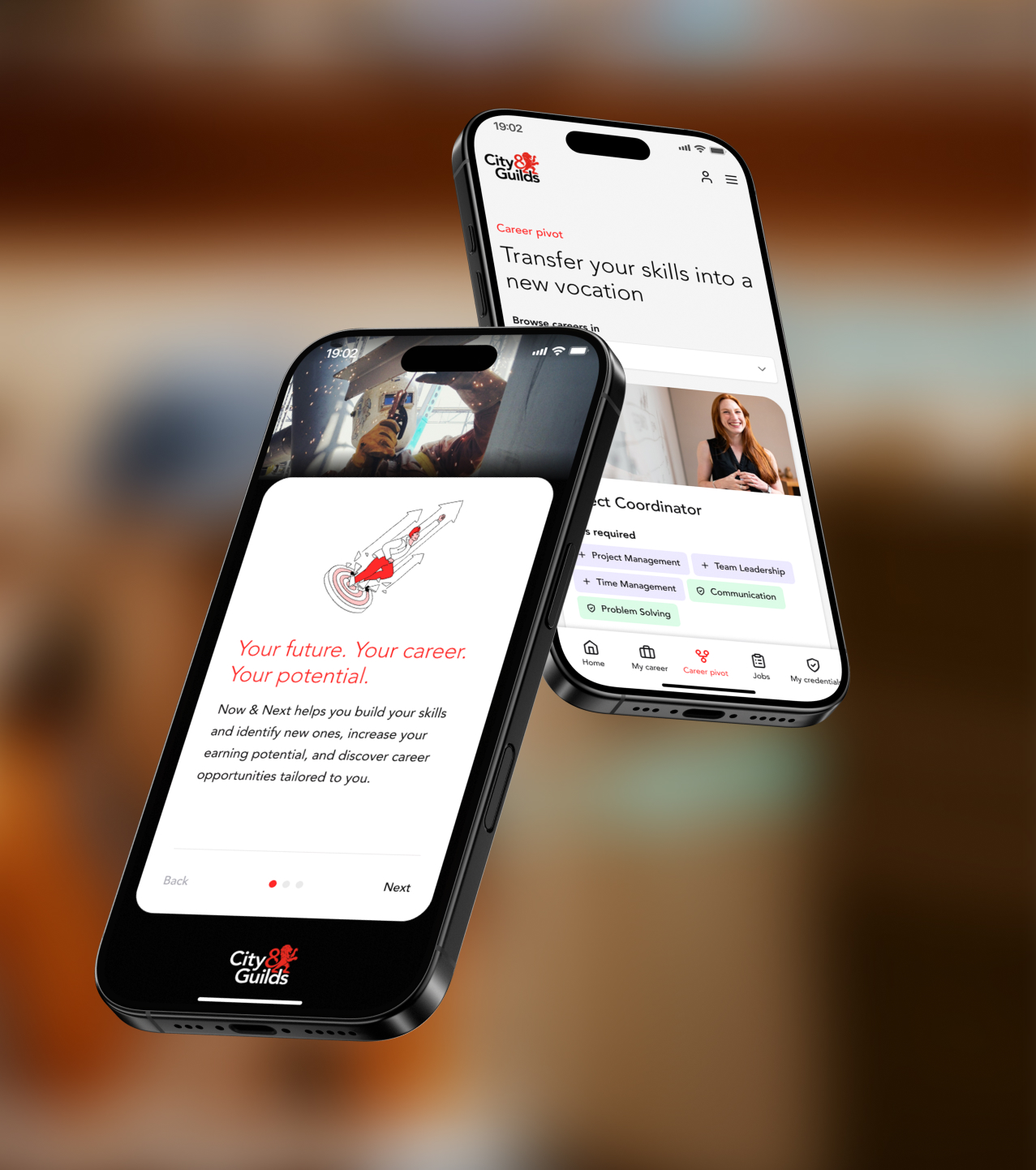
Through three project phases, we worked closely with City & Guilds to consolidate existing research, test early concept directions and refine the proposition into a clear, evidence-backed prototype. This work established a confident direction for what the experience should be called, why it matters, how the product should function, feel and grow.
Designing for real learner needs
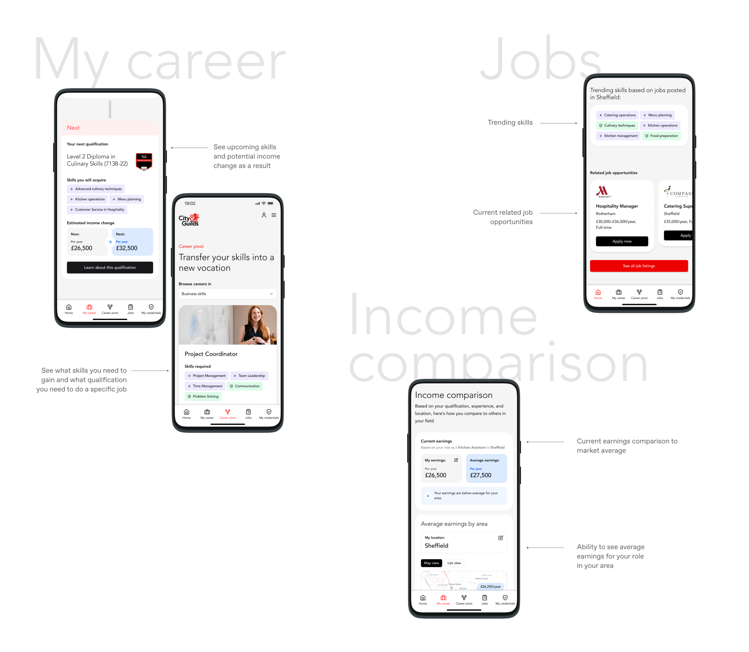
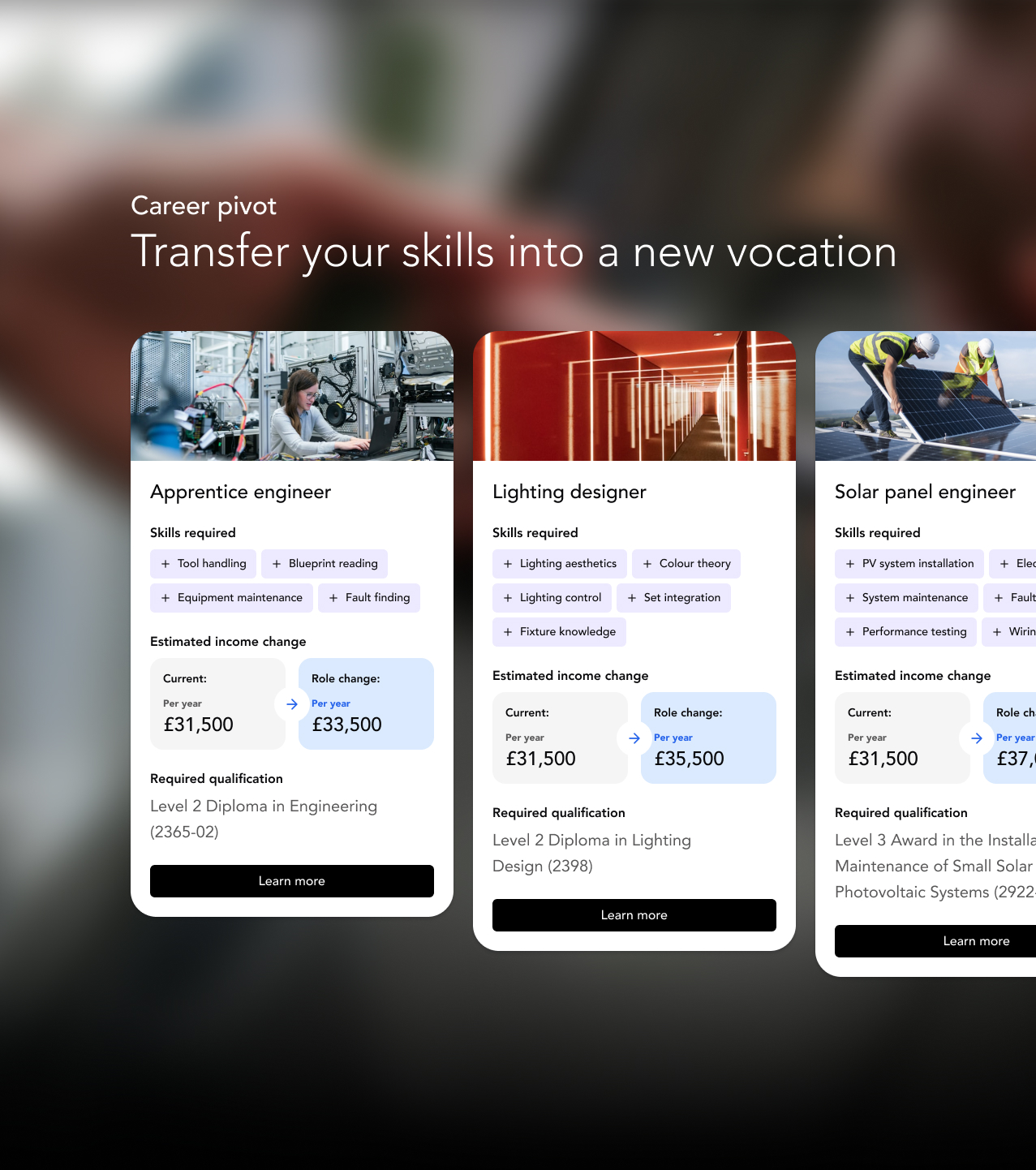
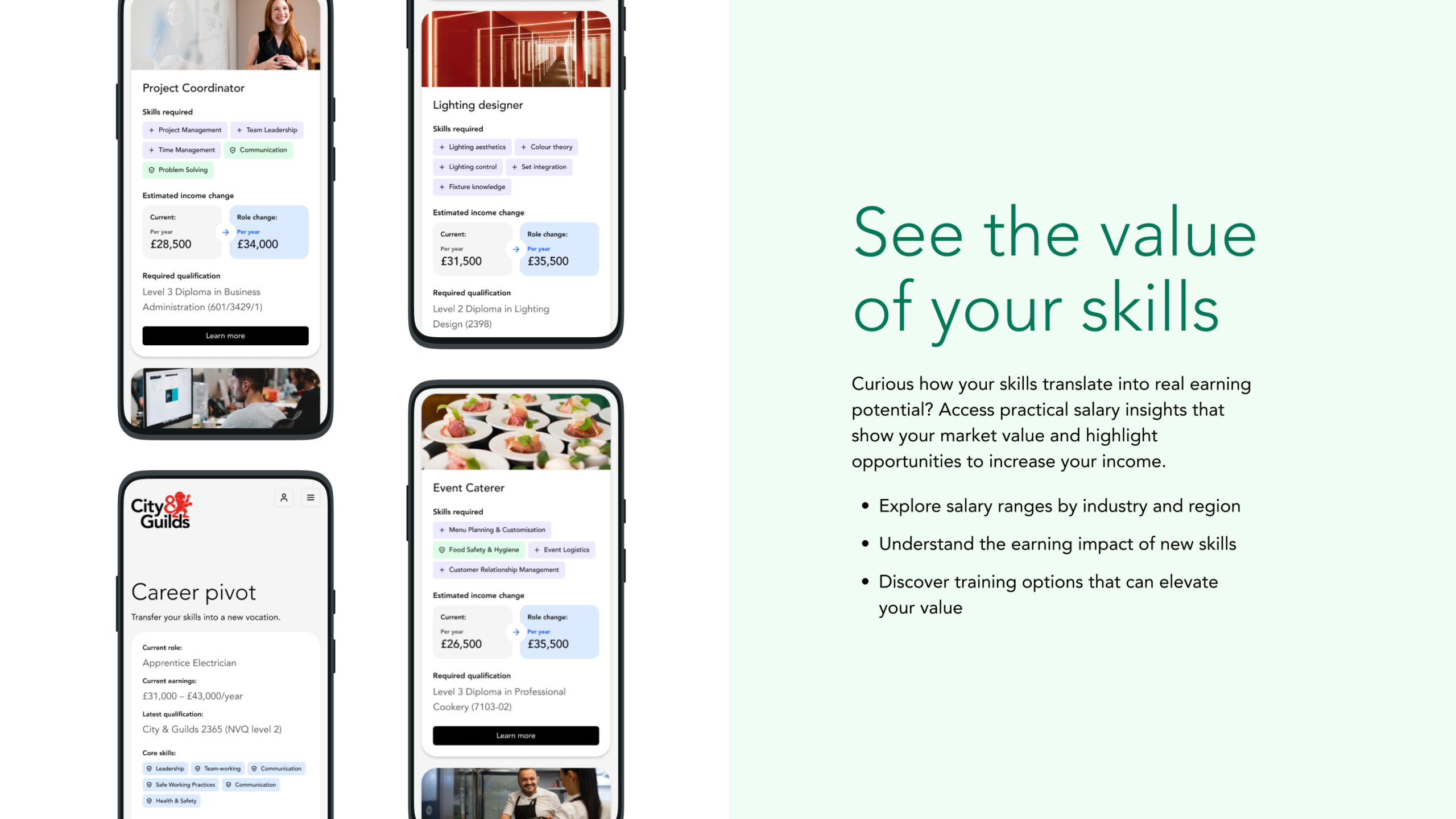
We evolved the experience across three key qualification and career segments. We built content and user flows around skills, earnings insights, job relevance and personalised recommendations. The resulting prototype helps learners understand their strengths, compare income potential, explore job roles and identify the qualifications that can move them forward.
Testing and feedback
User testing showed strong engagement with core features such as personalised job listings, skills mapping and income comparison, which learners saw as directly relevant to their real-world decisions. Several spoke about how the platform helped them feel a sense of progress, with one noting, “I like how you can stack your qualifications. It makes you more proud of yourself.” Others highlighted the importance of earnings insight when making career choices: “everyone wants to know how much money they’re going to earn.”
These insights shaped the final refinements to the interface, content and positioning, ensuring the proposition stayed closely aligned with what learners find motivating and genuinely useful.
Commercial decision-making
As a business, undertaking any new initiative requires sound reasoning and modelling. We helped City and Guilds define what realistic commercial outcomes could be for the proposition. In doing this, our team held interview sessions with potential commercial and brand partners to help us better understand their motivations for involvement, what success could like through their eyes and, ultimately, how the proposition should be best positioned to grow. Similar to other phases of the project, all our findings and recommendations were refined and presented in a report, shared with the board.
A foundation for growth
The final deliverables give City & Guilds a confident sense of direction, a story that resonates, and a clear set of practical next steps across data, content, technology and phased launch planning. This proposition now sits at the heart of their learner growth strategy, ready to be developed and invested in as it moves forward.

Broadridge sought to enhance the way investors, asset managers, press and industry professionals engage with their annual Investor Trends Report. Traditionally delivered as a static document, the report provides highly valuable insight into investor behaviour, preferences, and market trends with the United States. To maximise its impact, Broadridge partnered with Studiomade to transform this report into an interactive digital tool that allows users to absorb and interrogate data dynamically.
Our teams collaborated together to help conceive, design and visualise a user-friendly, data-rich digital experience that brings the Investor Trends Report to life, not just once a year but for regular engagement and reference. Our proposition empowers users to engage with data in meaningful ways, featuring dynamic visualisations such as interactive charts and graphs that illustrate investor trends over time. Customisable filtering allows users to refine insight based on specific investment sectors, geographies, and investor profiles, while benchmarking tools provide comparative analysis across different demographics and market segments. Personalised insights tailor content recommendations to individual user preferences, ensuring a more relevant experience.
Asset managers, wealth managers, and advisors can now leverage this powerful tool to enable real-time trend identification, helping them uncover shifts, themes, and emerging opportunities. It supports strategic decision-making across product development and business lines while enhancing client engagement through insightful educational content. Additionally, its seamless integration into proprietary datasets enhances internal analytics, ensuring a more data-driven approach to portfolio and business growth.
The intuitive, interactive nature of the tool has driven increased engagement from key audience groups, making complex data more accessible and actionable. Users can now extract insights that directly influence product development and market strategies, leading to better-informed decision-making. By delivering a cutting-edge investor insights experience, Broadridge has strengthened its position as an industry thought-leader and innovator in US investor behaviour analysis.
For more details, visit: Broadridge Investor Trends Report
Empowering people to take control of their health
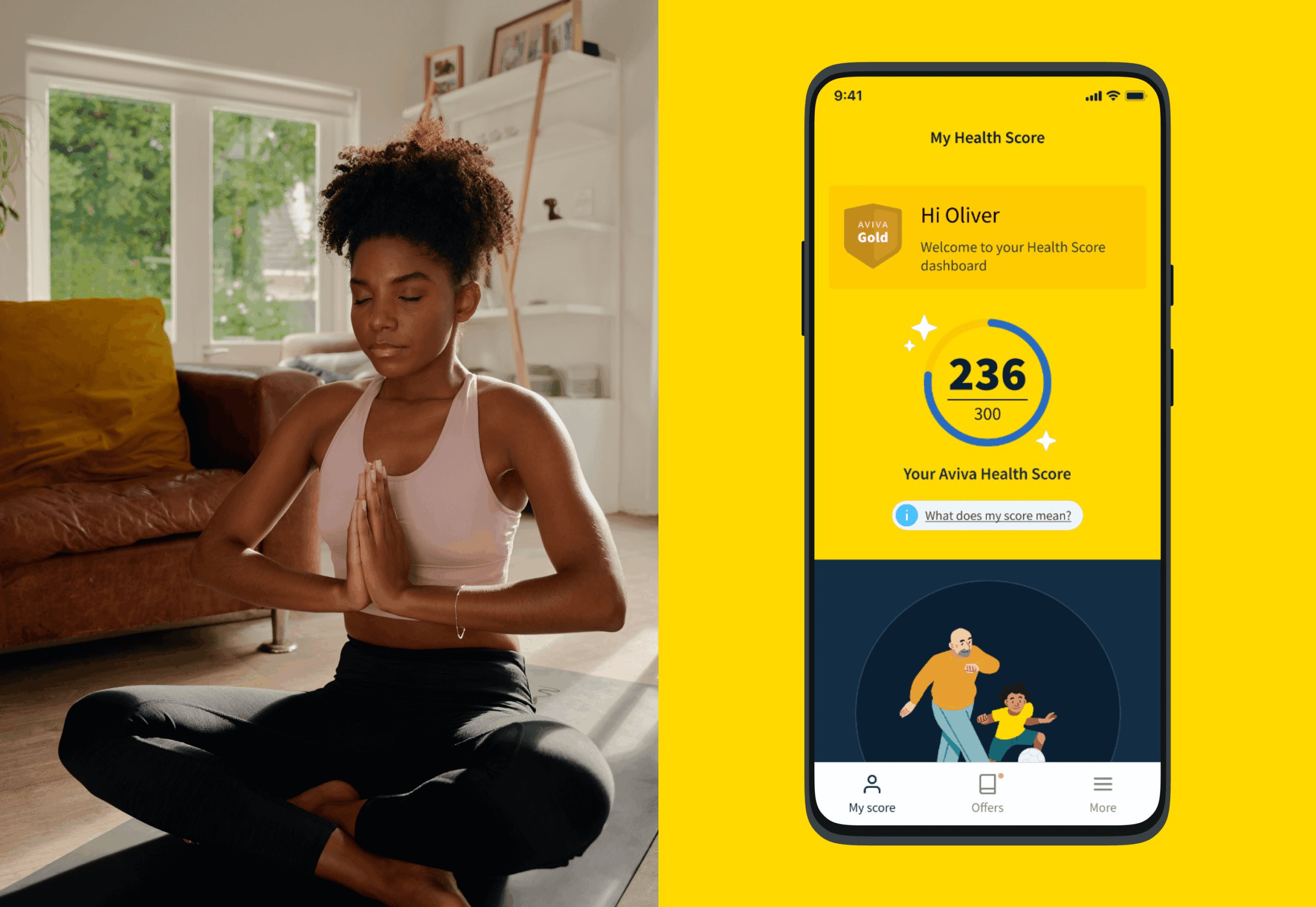
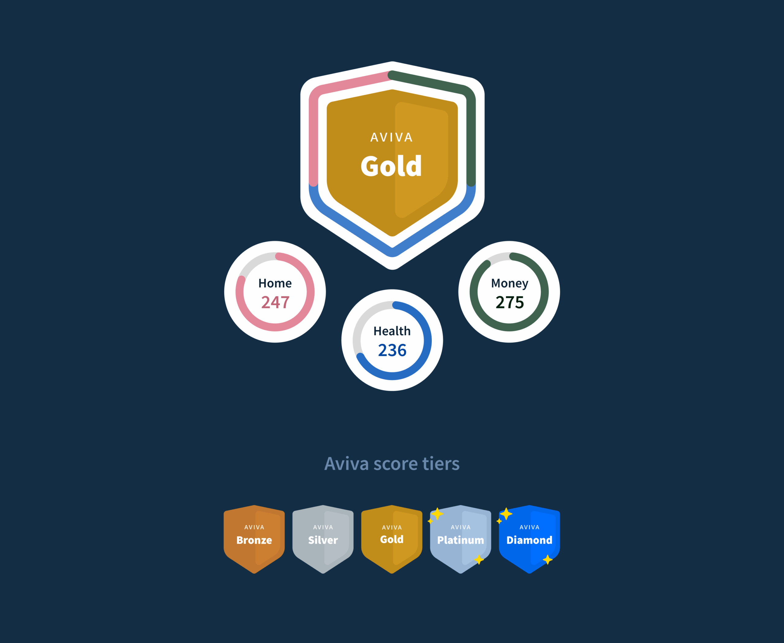
We were recruited to deliver a validated proposition for Health Score, a groundbreaking digital product designed to be at the heart of Aviva’s mission to improve the nation’s health. As a personalised tool, it offers users actionable insights to understand, improve, and optimise their wellbeing. Backed by medical expertise, Health Score transforms Aviva’s relationship with customers—going beyond insurance to become a trusted source of health and wellbeing advice.
A research-led approach to design and development
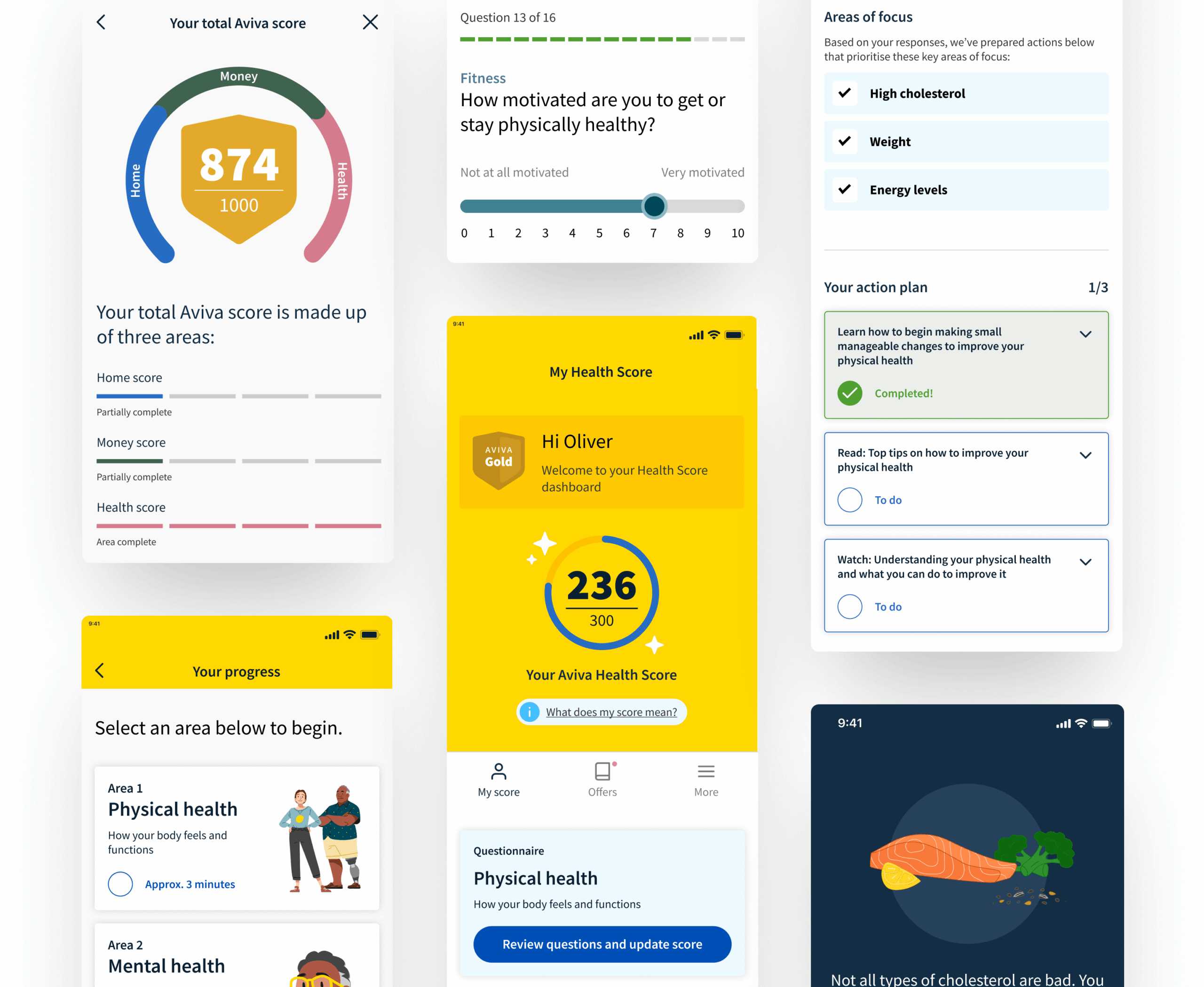
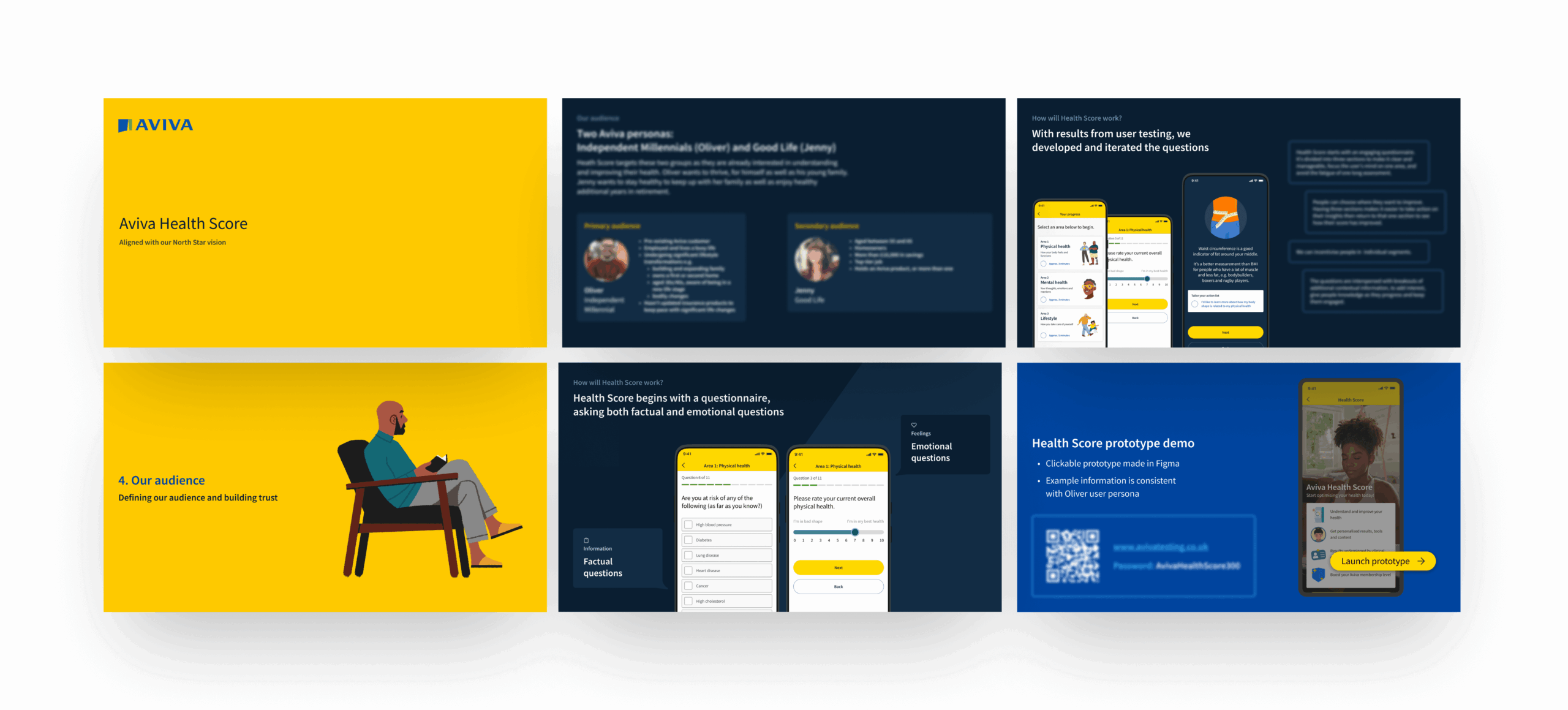
To ensure a seamless user experience, we worked through an extensive research and discovery phase. User research and testing played a critical role, helping us understand user expectations, optimal engagement points, and the value they saw in Health Score. We utilised existing analysis that had identified primary and secondary audiences, tested scoring concepts, and refined content needs through three rounds of test, validation and refinement.
The UX and UI design process aligned with Aviva’s brand identity, ensuring the questionnaire structure was engaging, intuitive, and insightful.
Driving engagement through personalisation
Our insights revealed that users needed both factual and emotional touchpoints to stay engaged. By crafting a warm yet informative tone of voice, we balanced education with relatability—making health information understandable, actionable, and quantifiable. Iterative review and feedback loops further refined the product, ensuring that users felt personally connected and motivated to complete their journey. The result? A people-first digital experience that not only informs but also empowers users to take meaningful steps towards better health.

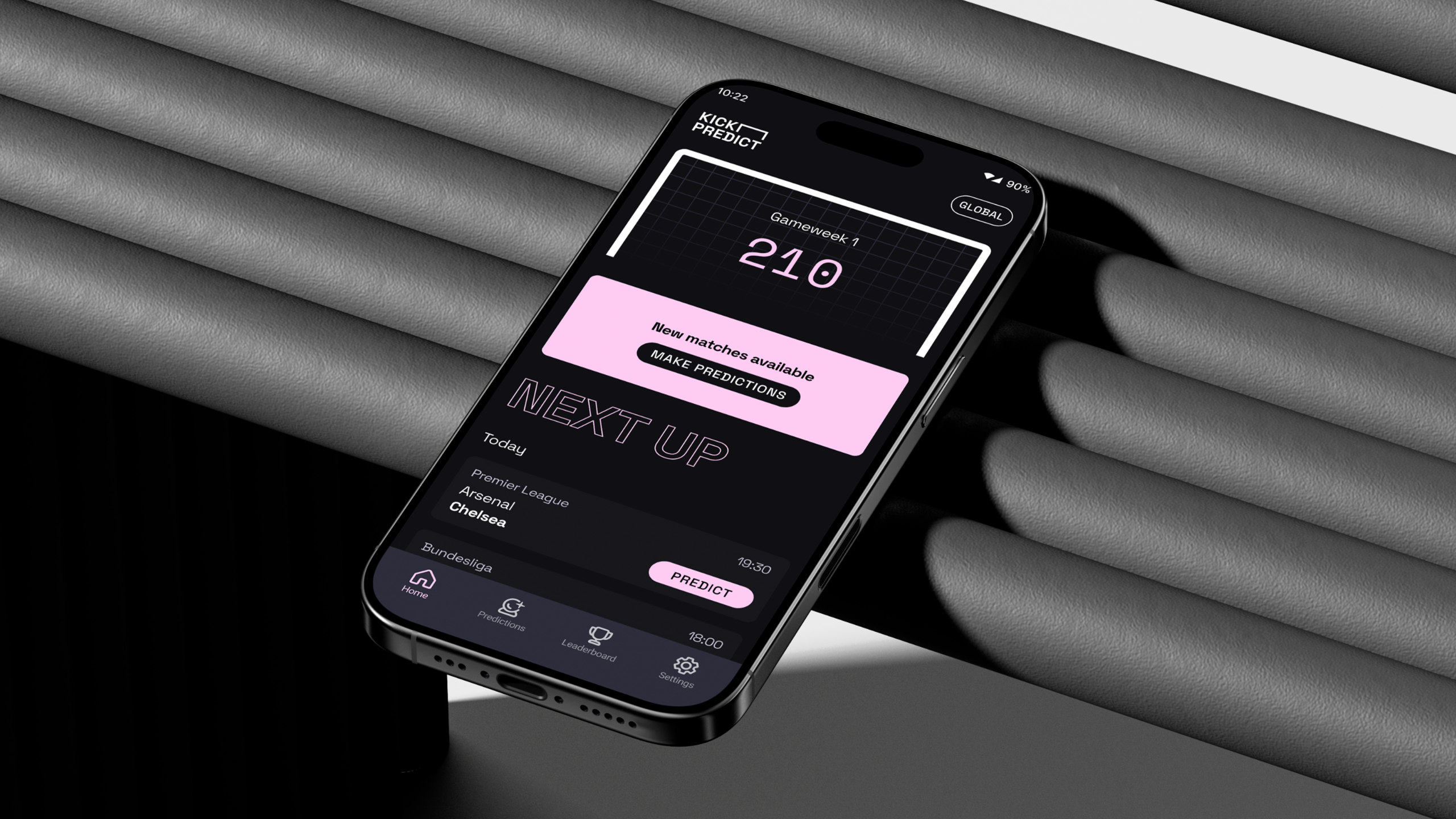
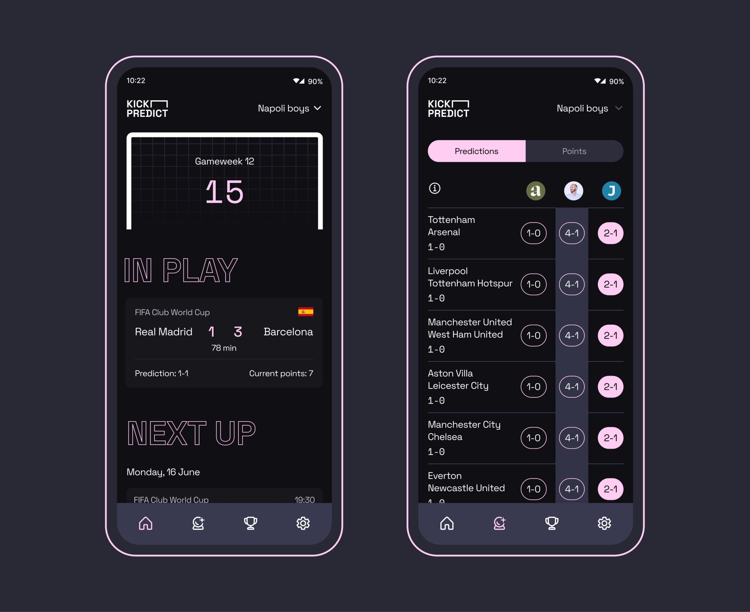
Traditional prediction games can feel cluttered, overly complex, or simply put, take the fun out of football. Working with venture creation partner Unit 29, we were brought in to deliver a brand new product to market. Kick Predict lets fans lock in their scores, form leagues with friends and brings that healthy bit of competition as you wait and see where you end up in the results with every goal.
We helped formulate our own brief – to make a lightweight, exciting product experience that captured a sense of fun. We worked to define the proposition, creating a brand experience alongside a seamless UI and UX interface that enabled a fast, enjoyable and shareable gameplay. Leveraging a unique scoring system built by Co-Founder Ben Uher, Kick Predict is able to provide a compelling experience where real-time results minute-by-minute affect your standing in the league.
Building a brand that captures sports audiences
In order to create something that was bold and clean the Studiomade UI + UX team headed up by Angelo Iannelli chose an energetic typeface and contrasting colour palette which created an interface that felt fresh and familiar. We built in animations throughout Kick Predict to help ensure everything had a playfulness with small rewards to the user throughout. The live league table itself went through rigorous design processes and testing to ensure that we were surfacing only what matters and that it was intuitive to understand. This resulted in big scorelines, data points and carefully selected terminology on dropdowns. Push notifications, weekly drops, visible progress, and reward mechanics keep players returning without feeling demanding.
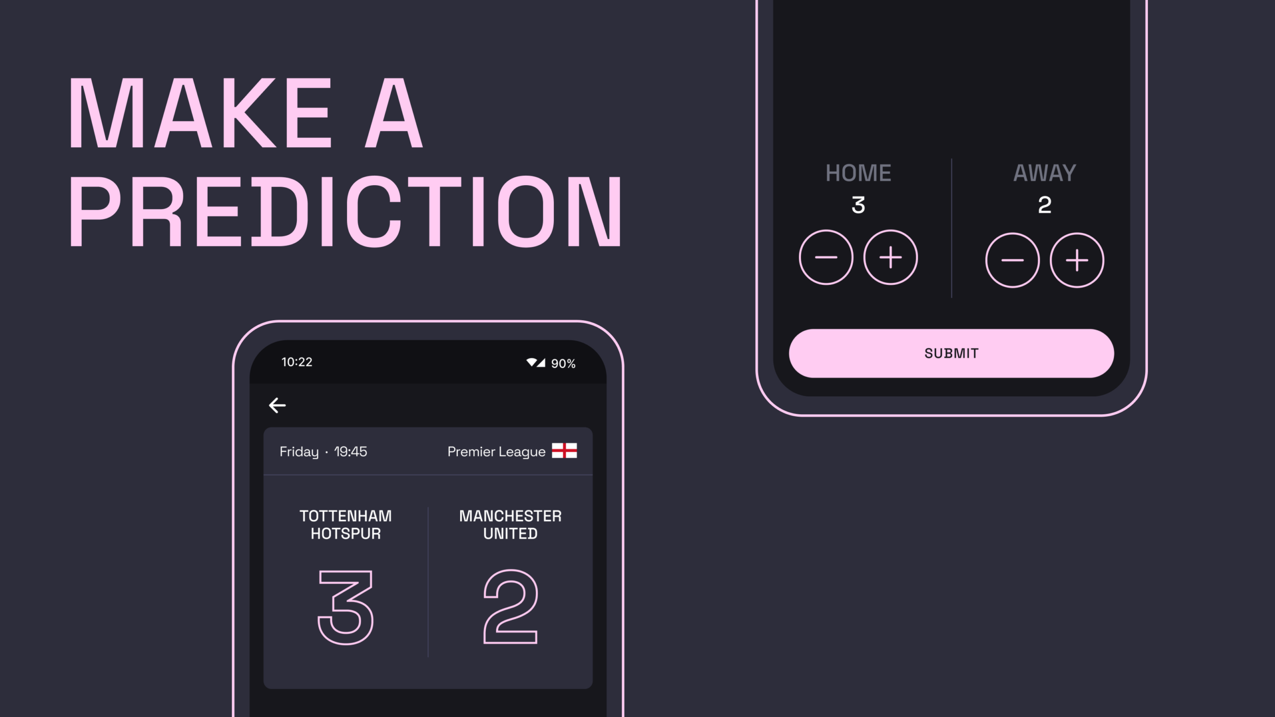
Smart functionality
A detailed backend architecture to how Kick Predict has been built enables scheduling of fixture creations via integrated data APIs, sampling 10 matches from supported competitions (Premier League, Championship, Champions League, La Liga, Ligue 1, Bundesliga, Serie A and more). Results flow back into Kick Predict in real-time, with calculations posted live to league tables updating daily and weekly points – constantly recalculated per user.
Our development team led by Jono Gold developed a Firebase database that stores users data, leagues, predictions and league membership; alongside additional information such as match status. We allow users to create or join private leagues with a simple shareable code.
Revenue creation
Throughout the design and creation of Kick Predict, all members of the team researched and explored different mechanisms for revenue creation within the product experience. Led by Strategic Director Phil Reid, we opted to create a feature-set model where Kick Predict is available for free to all users – but with the option of upgrading to a ‘Pro’ version for a set monthly or annual fee that unlocks certain features. These include the ability to view a competitor’s prediction pre-game, being able to create multiple leagues to compete in and other feature includes.
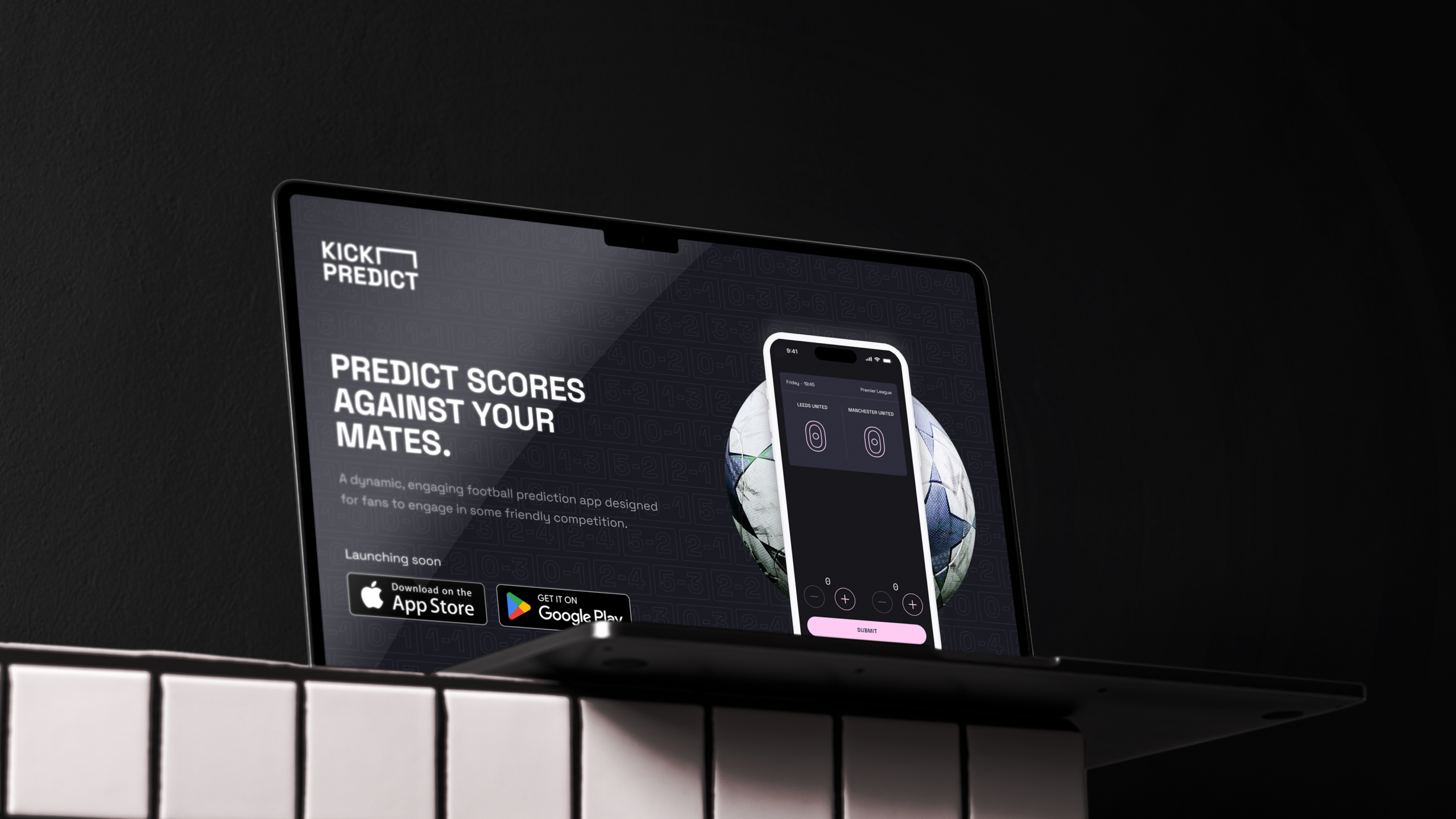
Why it works
Kick Predict blends the simplicity fans love with an intriguing points scoring concept, all wrapped in an excellent gaming experience. Weekly cadence and live scoring creates a habit whilst private leagues and social comparison fuel engagement. A scalable technology stack (API‑driven ingestion, realtime updates, push messaging) keeps everything fast and dependable. The result: a compact, joyful game and new venture that has the foundation to grow: from small friendship groups to large brand endorsement and engagement.
The challenge
Broadridge is one of the world’s biggest fintech companies, with more than $6bn in revenues, providing technology infrastructure and solutions to some of the world’s leading financial institutions. In 2023, it knew that asset managers were facing a wide and complex range of challenges, from fee pressures to evolving client expectations.
These challenges also present opportunities for asset managers to meet unmet client needs, stand out from competitors and fuel engagement. To capitalise on these opportunities, they need cutting-edge tools with data, to define and measure a firm’s competitive advantages, and strategy, to deploy them effectively. Broadridge decided to build the world’s first custom-generated AI for asset managers.
As an ongoing creative partner, we were asked to design the UI and UX, support with logic and customer journey definition, create a visual approach that could scale, and craft marketing assets including an explainer video.
How it works
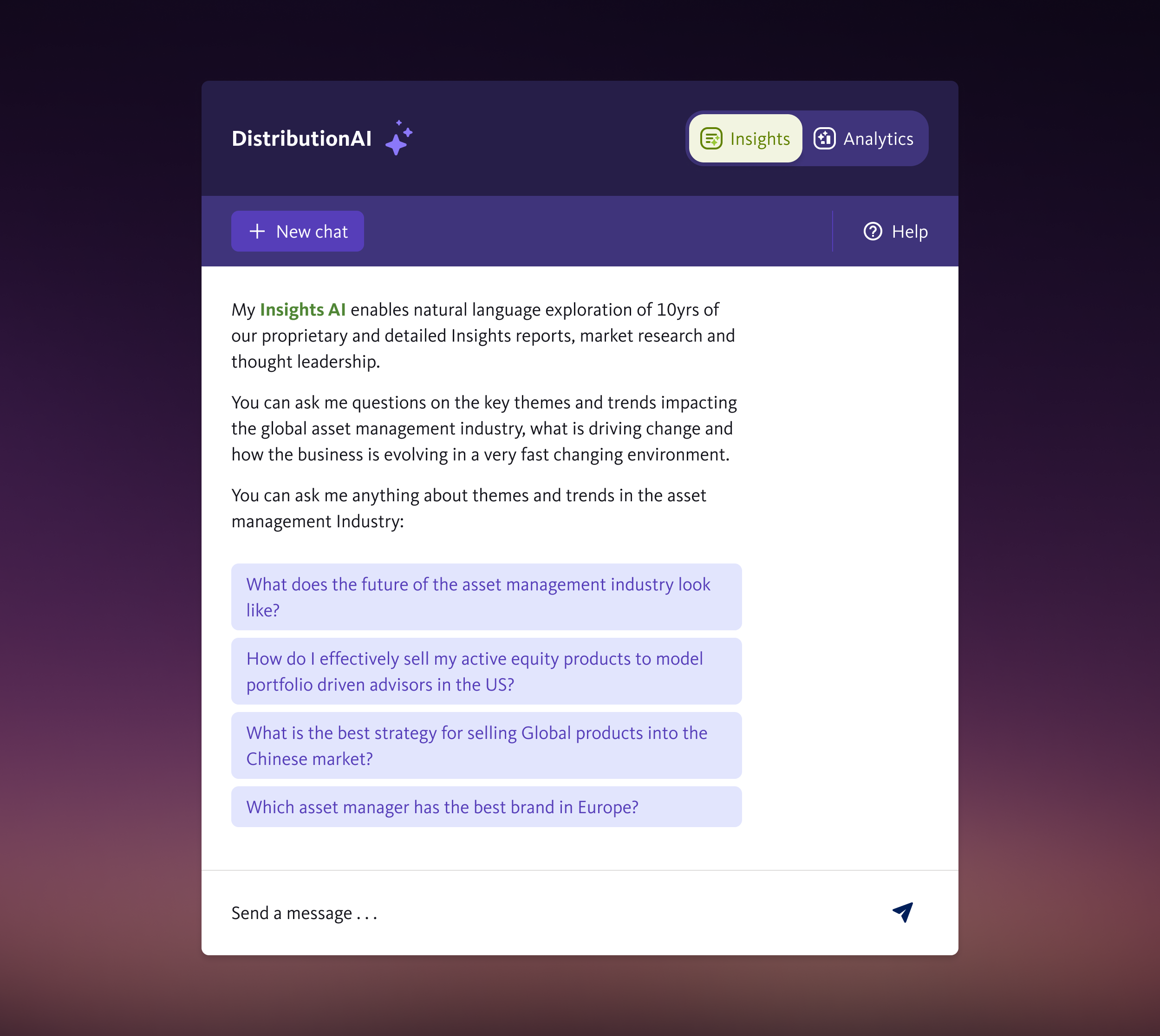
DistributionAI has two areas: Insights and Analytics. Insights is trained on ten years of Broadridge’s proprietary research, insight reports and expert thought leadership. Users can explore themes and trends and get thematic answers to questions impacting the global asset management industry.
Analytics, when launched, will provide precision analytics, quantitative answers and forecasts about current and future demand for global asset management products.
The product uses natural language generation techniques to allow users to explore and interrogate Broadridge’s distribution knowledge base.
AI UI and UX
We designed the look and feel of this product to fit with Broadridge’s existing brand guidelines including an ident and avatar that is instantly recognisable as an AI tool.
We had to make the UX simple yet compelling. This had its challenges, such as two separate areas, each using different data sets. Some of the solutions we addressed were clearly signposting the two core functions; question depth of each chat (how much a user can ask in one chat before resetting the query); how they can interrogate its answers; source identification; when to start a new chat; and the presentation of parsed data.
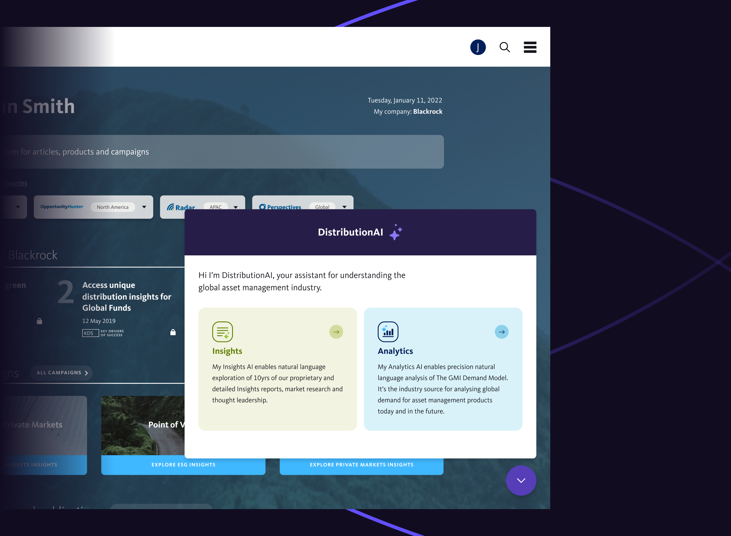
Like publicly available AI, DistributionAI uses natural language generation techniques, but unlike ChatGPT and others it’s trained on specialist asset management research and data that’s not publicly available. Unlike public GPT models, sources are included at the bottom of its responses, so these can be verified to validate response.
We also created an explainer video to introduce DistributionAI to Broadridge’s existing and potential clients. Watch our 30-second version:
The outcome
DistributionAI is an intelligent virtual analyst, using AI to give asset managers fast access to ten years of proprietary research, global market insights and thought leadership, plus unique data and analytics from Broadridge’s market-leading products.
Leadership, strategy, product, marketing and sales teams can now access knowledge and analysis at a speed they couldn’t previously, and respond to industry dynamics with decisions based on evidence. It is empowering them with the intelligence and insights they need to compete in a fast-paced, changing environment.
We’re working on a number of AI projects. If you’d like to discuss yours, contact Phil Reid, our Strategic Director, at phil@studiomade.co
Hearing loss is an unaddressed issue for millions of people. It can make conversations and social interaction harder, increase isolation and is linked to cognitive decline and increased risk of dementia. More than 40% of over-50s have some level of hearing decline. At work it can stop people fulfilling their potential or force them to leave or retire early. Yet most of us don’t go for hearing checks. There is social stigma and fear attached, not helped by a mechanical clinical process.
Kennedy Woods – a social impact architecture and design practice – wanted to change this. Addressing hearing loss is a huge untapped opportunity for long-term cognitive health, productive extended lifespans and improved quality of life. Co-founder Tom Woods came up with the idea of Hearing Birdsong, a new way for people to explore and monitor their hearing that revolutionises the current clinical process. It humanises screening by using pleasant, familiar sounds of nature and birdsong and it’s done in the comfort of home, so that people can assess and protect their hearing health and long-term wellbeing.
The concept was awarded a grant by the Design Age Institute to develop it into a working digital prototype. Studiomade won the competitive tender to partner for both the design and development build of this innovative and pioneering product.
The result is a collaboration between Studiomade, researchers, engineers, designers, developers, clinical practitioners, volunteers, experts from UCL, Imperial College and the Dyson School of Engineering and people with hearing loss. Hearing Birdsong was exhibited as part of the Design Museum’s Future of Ageing exhibition in 2022.
What we did
Audio soundscape
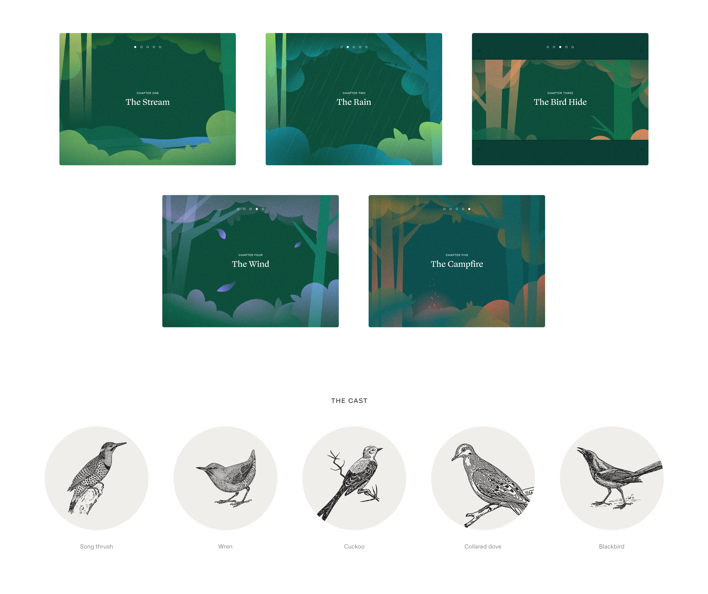
We replaced the mechanical, abrasive sounds of a pure tone hearing test with a richly detailed forest soundscape: the songs of five familiar British birds alongside successive sounds including a flowing stream, rain and wind. These were engineered to blend into a dynamic yet calming audio experience. It uses bird calls that occupy a narrow band of frequencies, the same frequencies examined in a traditional hearing test. This gives users performance indicators across their entire hearing range.
We worked with Professor Adrian Davis OBE, a scientist specialising in the public health aspects of hearing. He helped us define the logic and select which type of hearing test to use within this format. We also consulted with prominent consultant otorhinolaryngologist Taran Tatla. The audio was created and output by Oscar Jones, a PhD student at Imperial College London.
Language and safeguarding
This experience was intended to provide a less abrasive option than the traditional hearing test, so we didn’t want people to feel isolated or scared by potential issues. The product had to be supportive as people did the test and received their results.
The language we used in the script had to be accessible and feel natural to as many people as possible. Based on interviews with key stakeholders, we made decisions throughout the process to adapt the language to resonate with the intended audience. For example, we used the word woods instead of forest as it was felt that forest can conjure up images of a dark and intimidating setting.
Design, development and user testing
We developed a journey through woodland, deciding what scenes the user would go through, and what sounds they would hear at each stage. We designed screens, buttons and language.
Throughout the project, a control group tested our design and development iterations. What elements were visually distracting? What language was inaccessible or off-putting? How would users with hearing aids interact with the tool? We also worked with people in one-on-one sessions to test elements including logic, timings, the visual look and overall feeling.
This gave us many insightful observations. We brought all of these into our work as we progressed and built a refined experience that would meet our audience’s needs.
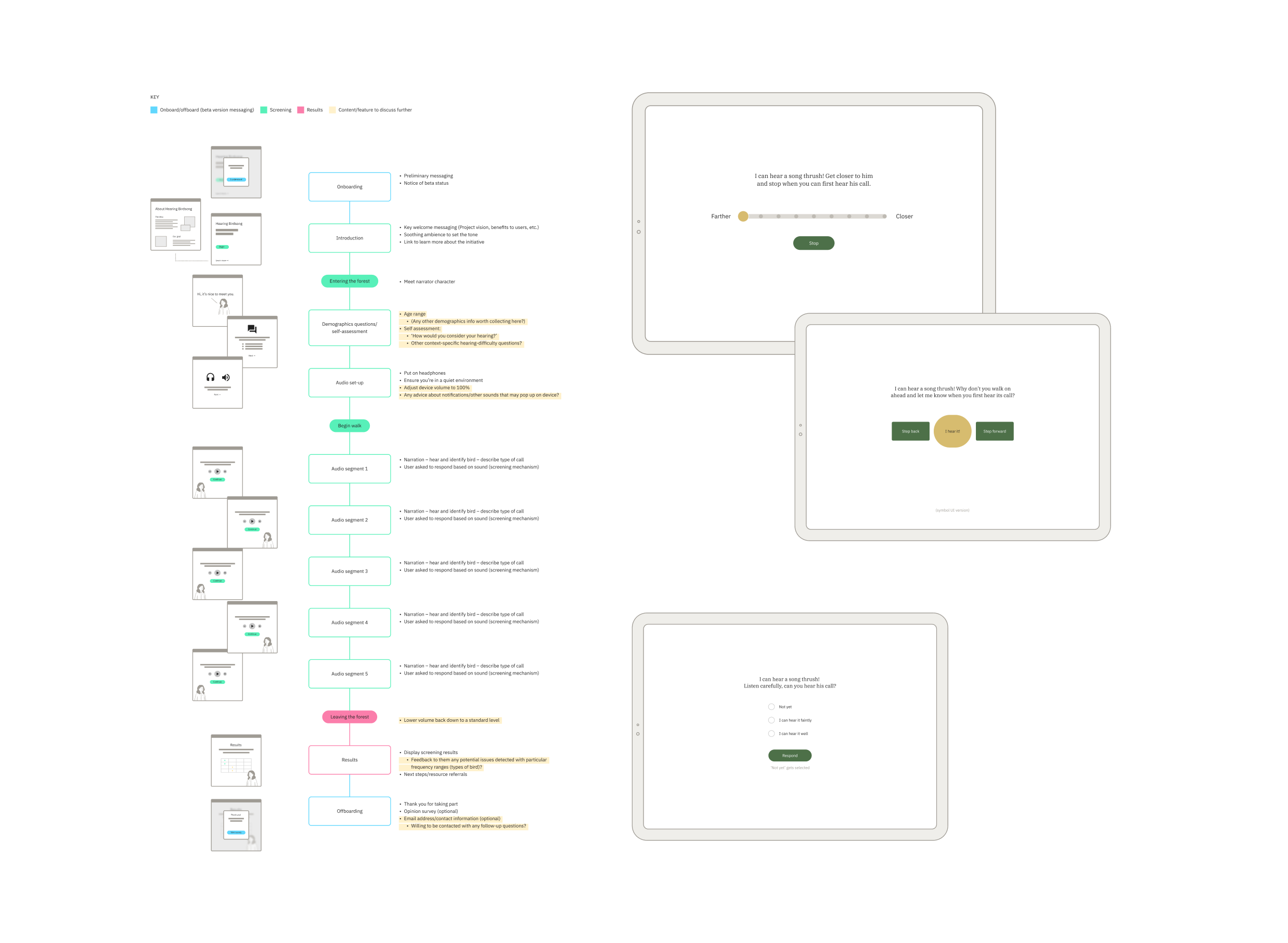
Approach to UX and UI
Design accessibility was essential. We looked closely at typographic choices, colour (contrast accessibility and legibility), illustrations, and the size, clarity and consistency of interactions. We wanted this online woodland to feel immersive and calm, so we used soft colour transitions, simple shapes and movement to create a playful world inspired by children’s storybook illustrations.
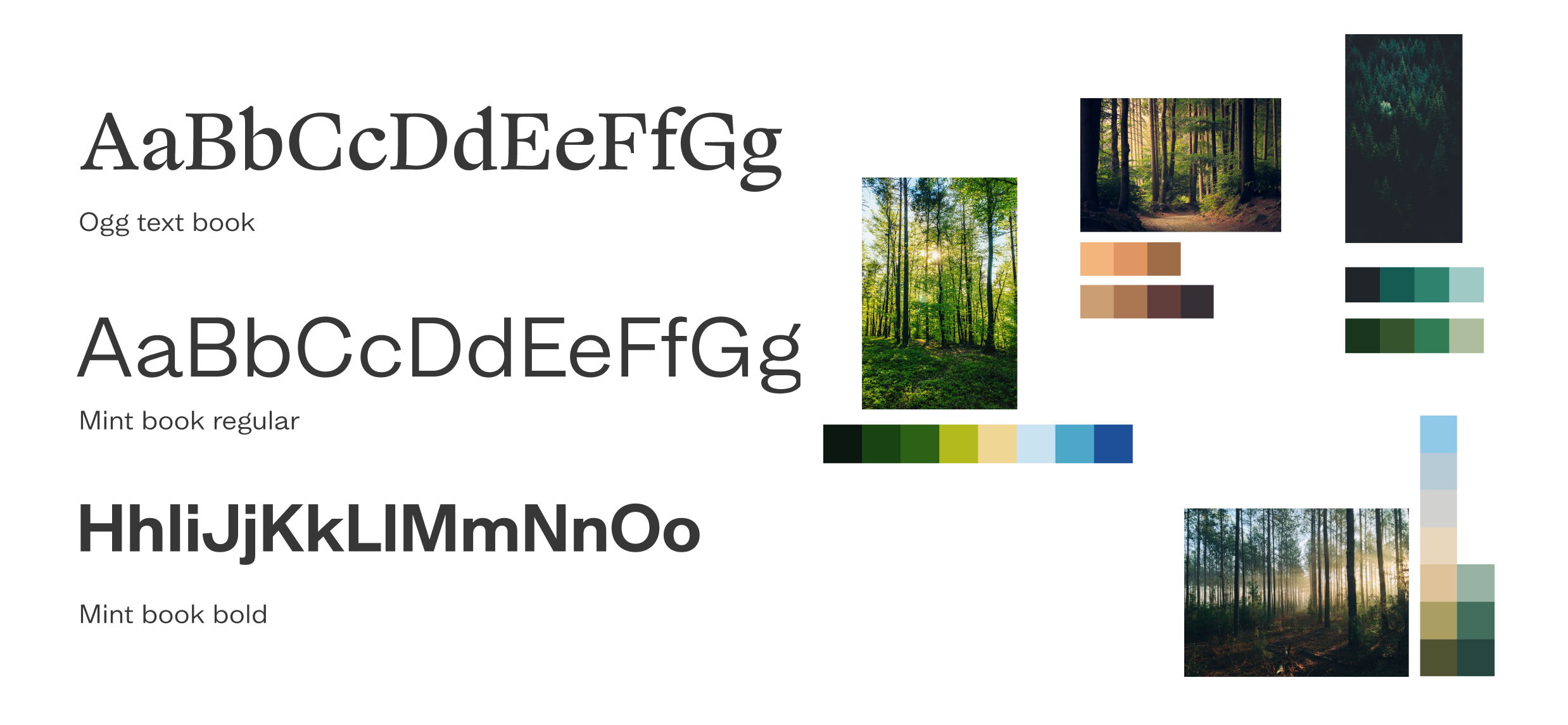
Pairing visual design and audio
The audio soundscape required a visual and illustrative approach that enhanced the user’s experience but kept the focus on the sound. We drew all the illustrations, crafting a series of options before arriving at the final selection used in the beta product. At points when users are asked what they hear, we softly blurred the background illustration in order to keep the focus on the sound, not the scenery. We decided not to show birds, so that people wouldn’t be prompted to say they could hear them and could use their imagination.
The results screen
It was important to get the results screen right. The explanatory language has to be clear and concise, and graded results can’t be confrontational or judgemental. We give a clear result for each stage of the test and link to external helpful resources where users can go for expert advice. Over time, as the product is used and feedback is gathered, we’ll gain further insight and be able to tailor it to effectively support people who need help.
The outcome
Consumer appetite for digital health support is growing. Digital health solutions are creating a hospital-without-walls approach that blends in-patient care with alternative models including community and home support.
We successfully designed and built a working digital prototype and took Hearing Birdsong into its beta phase.
Through media coverage, online and social media campaigns and the Design Age Institute, thousands of people in 100+ countries used it. Multiple contributors have all helped to get it to this point as a working digital product. The project is now ready for funding and future expansion and development, with the hope that it could become an NHS screening tool.