Overview
City & Guilds has long been recognised for its trusted qualifications and strong relationships with training centres and employers. Recent shifts in the skills landscape, including renewed investment in training, growing demand for trade certifications and rising learner expectations, highlighted a clear opportunity for the organisation to rethink how it supports people throughout their career journeys.
We partnered with City & Guilds to shape a new proposition that brings the organisation closer to learners in a more direct and meaningful way. This work builds on their established strengths while opening up new avenues for guidance, progression and long-term learner support.
Shaping a direction for the product
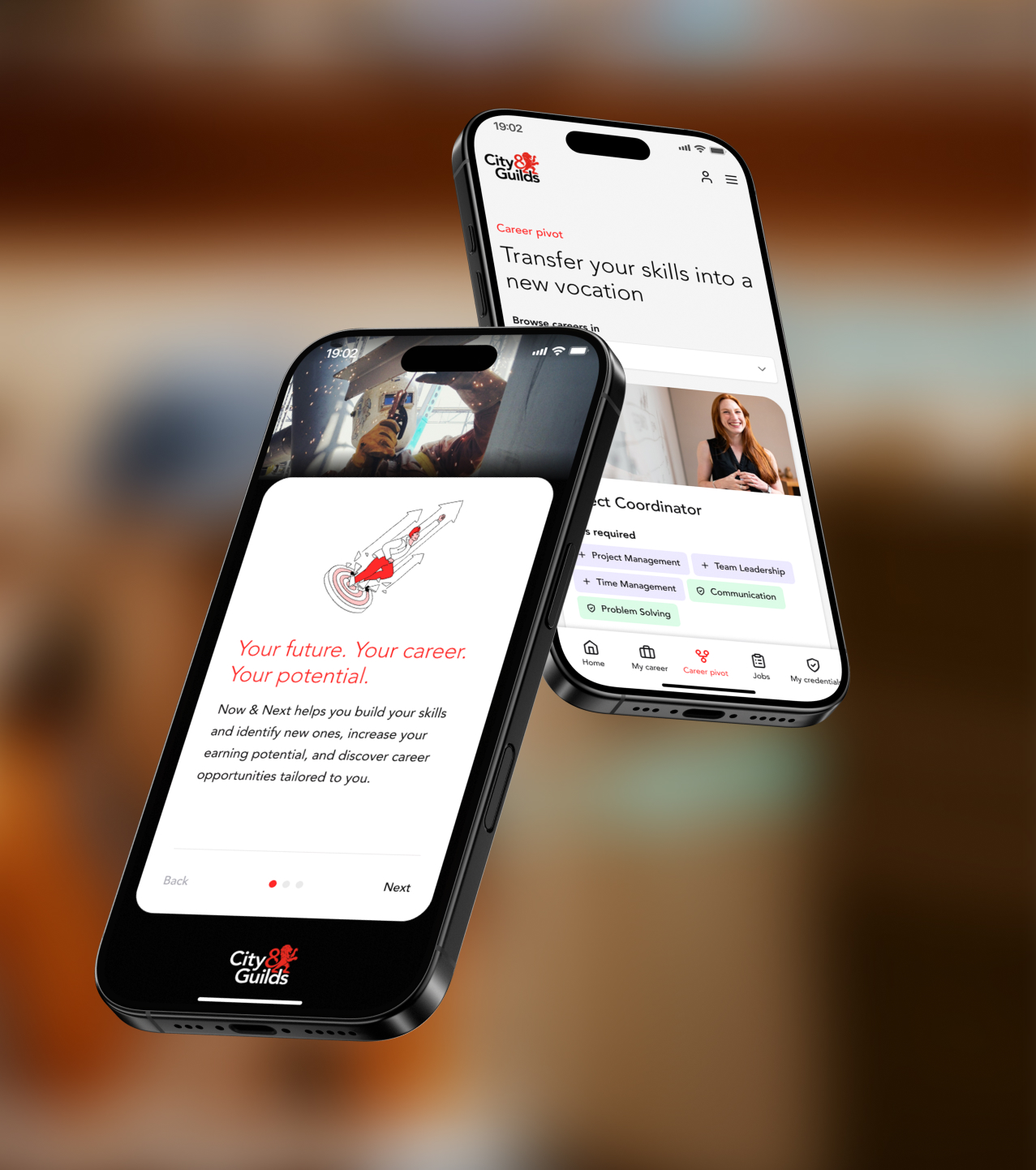
Through three project phases, we worked closely with City & Guilds to consolidate existing research, test early concept directions and refine the proposition into a clear, evidence-backed prototype. This work established a confident direction for what the experience should be called, why it matters, how the product should function, feel and grow.
Designing for real learner needs
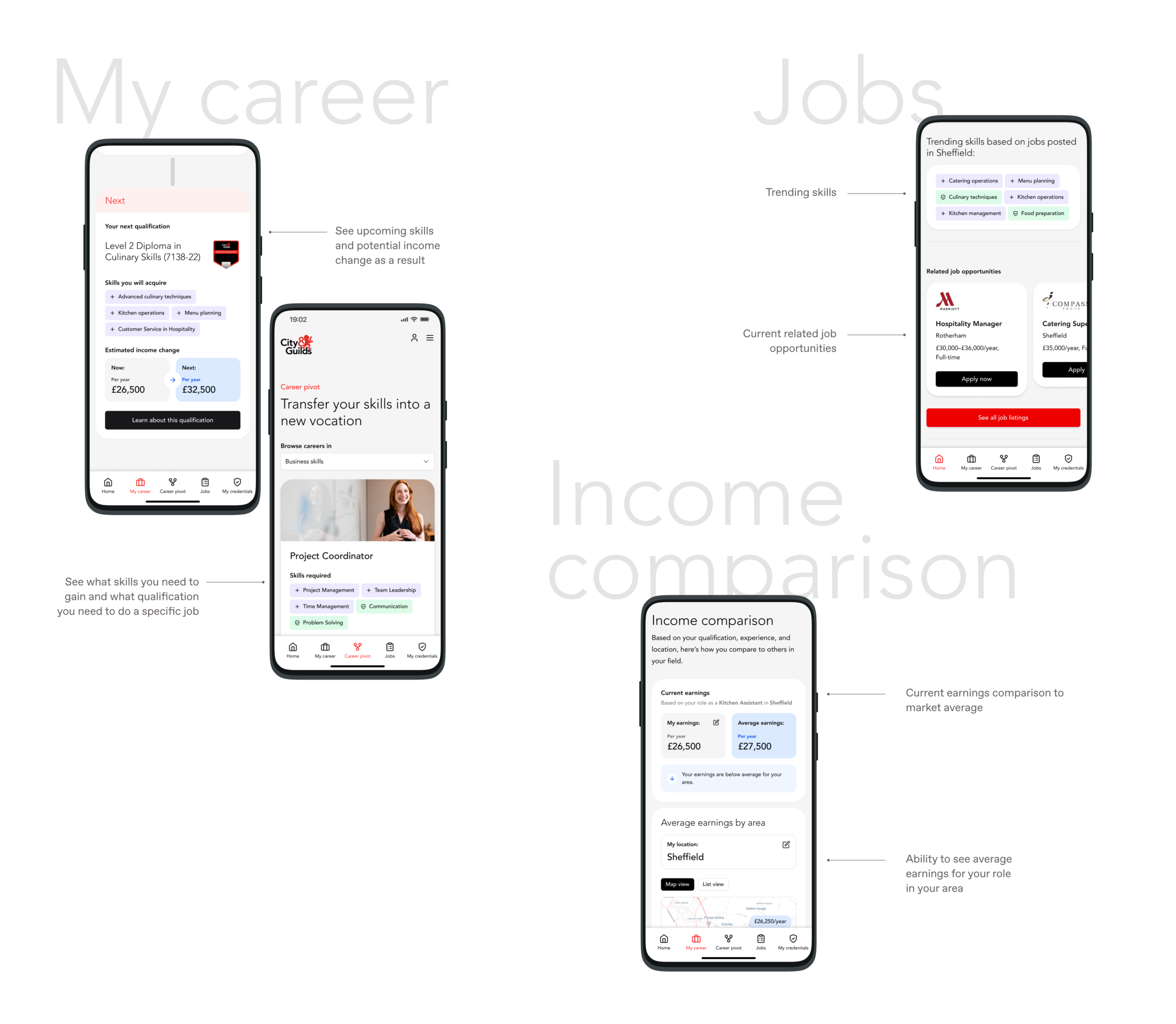
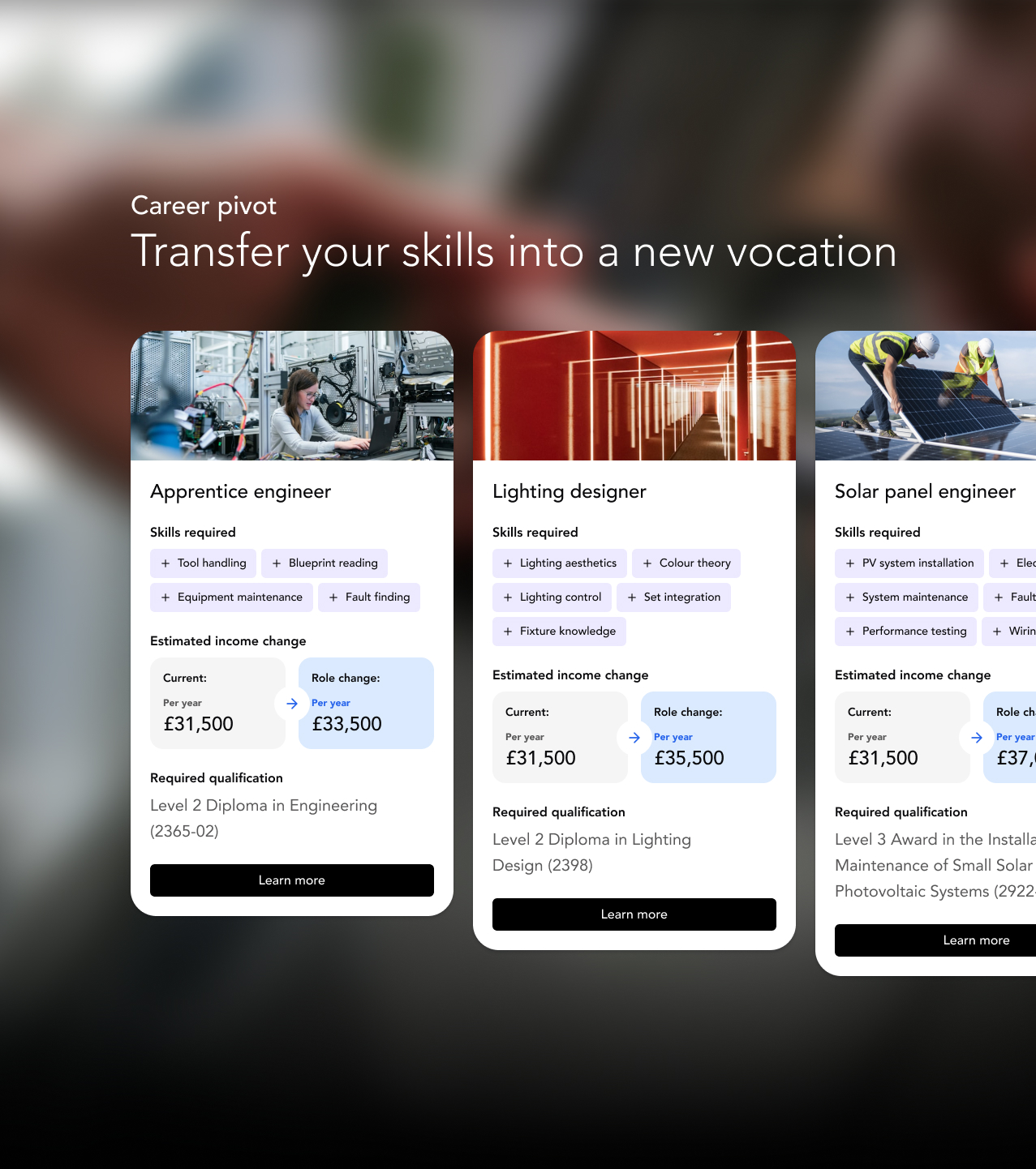
We evolved the experience across three key qualification and career segments. We built content and user flows around skills, earnings insights, job relevance and personalised recommendations. The resulting prototype helps learners understand their strengths, compare income potential, explore job roles and identify the qualifications that can move them forward.
Testing and feedback
User testing showed strong engagement with core features such as personalised job listings, skills mapping and income comparison, which learners saw as directly relevant to their real-world decisions. Several spoke about how the platform helped them feel a sense of progress, with one noting, “I like how you can stack your qualifications. It makes you more proud of yourself.” Others highlighted the importance of earnings insight when making career choices: “everyone wants to know how much money they’re going to earn.”
These insights shaped the final refinements to the interface, content and positioning, ensuring the proposition stayed closely aligned with what learners find motivating and genuinely useful.
Commercial decision-making
As a business, undertaking any new initiative requires sound reasoning and modelling. We helped City and Guilds define what realistic commercial outcomes could be for the proposition. In doing this, our team held interview sessions with potential commercial and brand partners to help us better understand their motivations for involvement, what success could like through their eyes and, ultimately, how the proposition should be best positioned to grow. Similar to other phases of the project, all our findings and recommendations were refined and presented in a report, shared with the board.
A foundation for growth
The final deliverables give City & Guilds a confident sense of direction, a story that resonates, and a clear set of practical next steps across data, content, technology and phased launch planning. This proposition now sits at the heart of their learner growth strategy, ready to be developed and invested in as it moves forward.
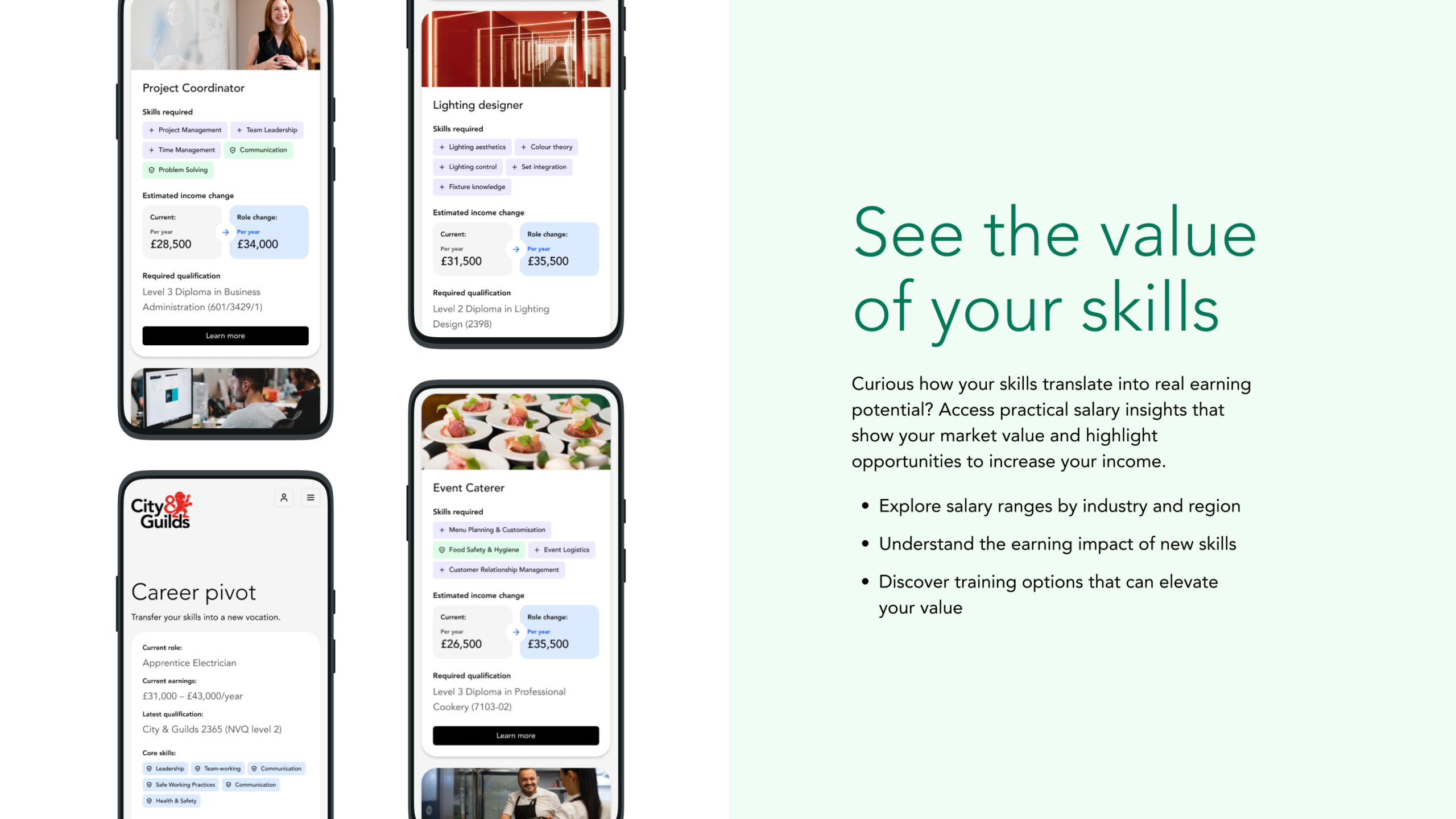

Educore initially approached us to design and build a website for the Educore Foundation. However, as we explored their needs, it became clear that their three linked organisations – Educore Services, Educore Foundation and Educore Academy each had distinct purposes and audiences and needed to renew their overall creative brand vision. This project therefore evolved beyond a single website into a strategic transformation, helping Educore better articulate its educational mission, unlock new funding opportunities, and craft a more unified brand presence.
Goals included:
- Moving beyond the “school-only” perception
- Creating an umbrella brand that supported sub-entities
- Establishing a digital presence that could better attract partnerships and funding
- Reflecting core values of innovation, care, and educational excellence.
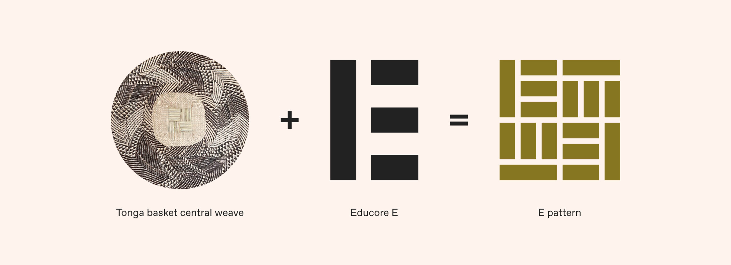
Brand Identity System
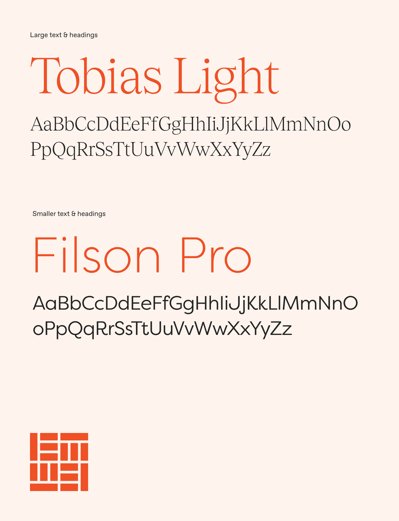
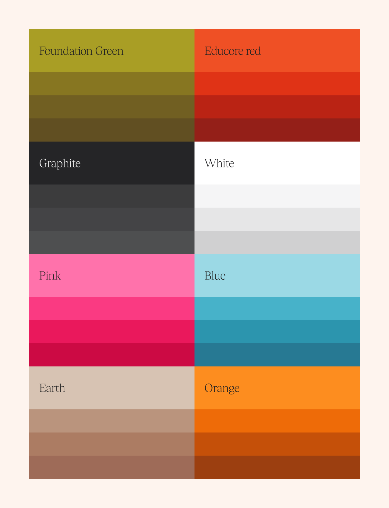
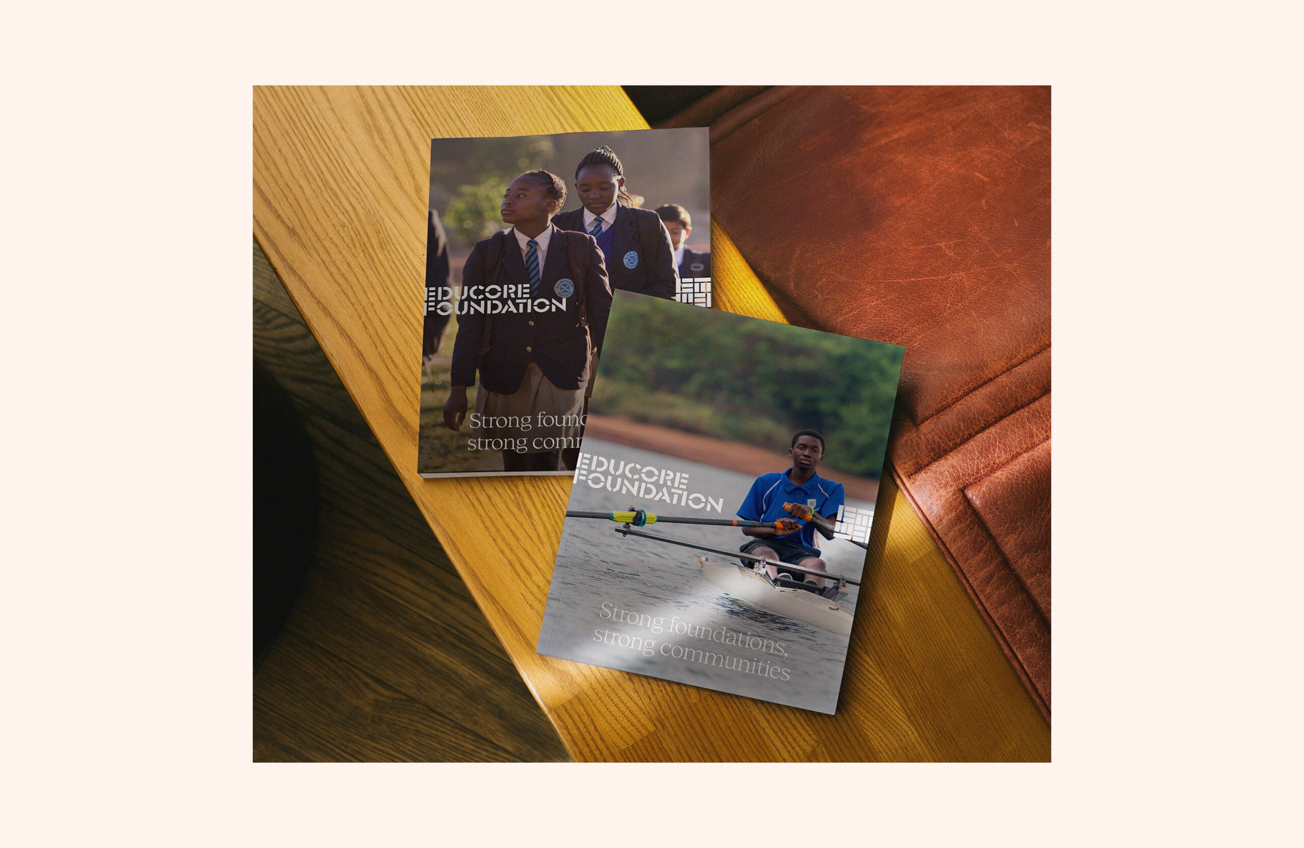
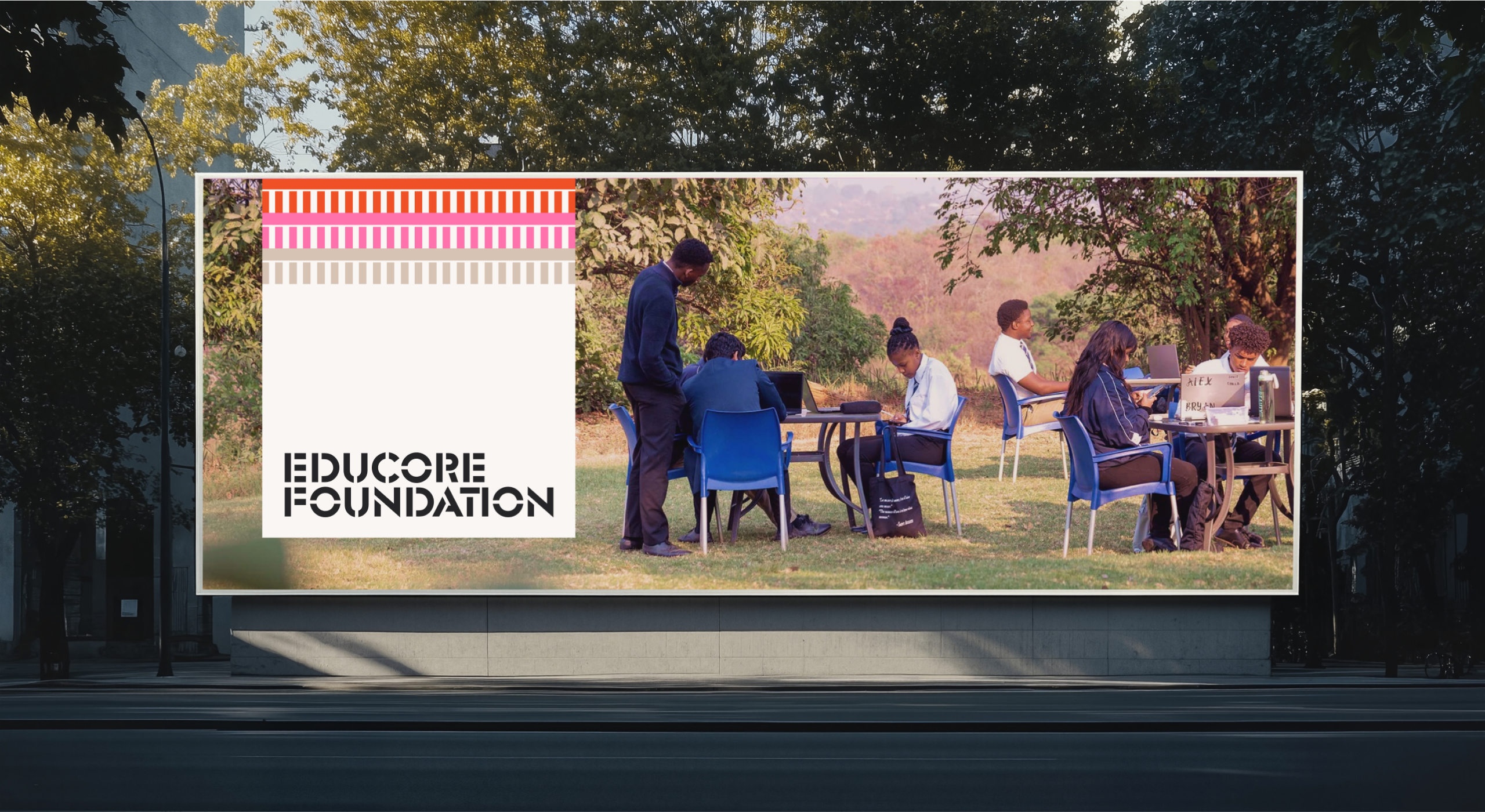
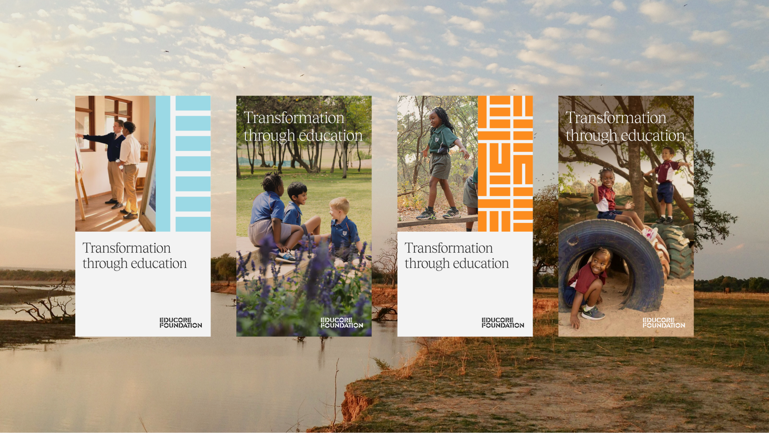
The presence of the existing Educore sub-brands meant that we needed to provide points of difference while still ensuring everything felt unified. We evolved the colour palette, typography, and iconography to bring warmth, clarity, and credibility to the Educaore brand. While maintaining echoes of the original identity through the logo, the new brand added depth and energy suitable for diverse audiences – from funders to educators. We utilised large amounts of the amazing photography that they had throughout the organisation, putting this front and centre throughout to show their work and real results. Through this strategic rebranding, Educore positions itself as a unified, purpose-driven organisation committed to educational excellence and community impact.
Website Redesign
We developed a new website for the Educore Foundation, working with the team to streamline messaging and create content with purpose allowing them to communicate the Foundation’s story and mission clearly.
Key features include:
- Modular design to scale as required
- Dedicated sections for mission, impact, and donor engagement
- Narrative-led content structure to resonate with partners and funders
- A bespoke WordPress build that was easy to administer for the team post launch.
Outcome
Educore now presents a confident, purpose-led brand that reflects its broad vision for educational impact. The Foundation is positioned to engage donors, partners and communities with clarity and purpose helping unlock greater opportunities for funding and collaboration.
The project also sets a framework for scalable growth across other brand areas, with the Academy and Services identities ready to be rolled out utilising their own distinct takes on this cohesive brand system.
What’s next?
With the Foundation website launched, we’re continuing to work with Educore to develop their brand system across their partner organisations to support their long-term growth.
Unit 29 Ventures launched its first enterprise in 2020: The Cove, a luxury florist and concept store in Royal Tunbridge Wells. It has built up a loyal and discerning customer base of people with a taste for premium products made by local independent makers and distillers.
After two years, investor Phil Reid – who is the founder and Strategic Director of Studiomade – decided it was time for Unit 29’s next venture: a unique, small batch rum.
The concept and name
Unit 29 Ventures recognised an opportunity to launch a rum brand centred on sustainable packaging, the concept of reuse, and supporting a sustainability charity.
The vision was for a rum inspired by the ocean, locally made in Kent, and led by its values: distinctive quality in the ingredients and materials, clean efficiency (reduced waste and efficient production methods), and growth and rejuvenation of natural resources (contributing to a cause and enjoying life while doing it).
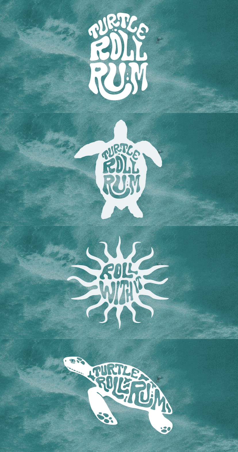
Based on a love of the sea and surf, and reflecting this new venture and its first step into the drinks industry, we named it Turtle Roll. Before you can line up a wave when surfing, you have to get out past the ones that are breaking all around you. The turtle roll technique helps you get past barriers, jump over hurdles and achieve greatness. Unit 29 hoped to do the same with Turtle Roll Rum – taking beginner steps with an ethically produced rum, hoping to effect positive change in our oceans.
The taste
Unit 29 Ventures and Studiomade worked together to craft the brand story and narrative of Turtle Roll Rum, which in turn helped brief the ingredients and taste. We worked with a talented expert, Callum Giblett, Managing Director at The Custom Spirit Co. He and his team defined different taste directions and, during a rigorous six-month phase of tasting, exploration and user testing, whittled down multiple recipes and ideas into the winning formula.
Turtle Roll Rum has been imagined and produced locally to Tunbridge Wells in Kent. It is distilled with Venezuelan, Dominican and Jamaican sugar cane, using a clean, high-quality and sustainable production process that runs fully on renewable energy. The concept, ingredients and commitment to sustainability all emerged from appreciation for the sea and ocean-side living.
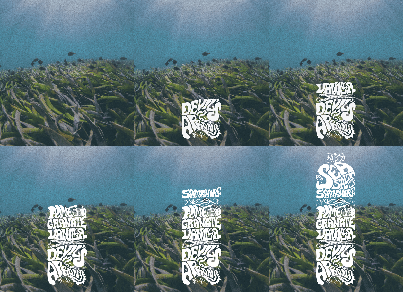
In the final produced recipe, Turtle Roll Rum blends notes of pomegranate, lapsang, vanilla, black cardamom and sea salt with oceanic botanicals samphire and sugar kelp. These intriguing layers of sweet and salt create a rich and smooth flavour profile.
As part of Turtle Roll’s sustainability commitment, 10% of profits are donated to Project Seagrass, a charity working to restore and protect seagrass, a wonder plant that’s crucial to the health of our oceans.
Brand positioning and identity
Turtle Roll Rum is positioned as a challenger, independent brand with a premium feel, priced in line with the small-batch market. We were inspired by product brands that are driven by a mission beyond the product itself; companies with sustainable, ethical values at their core.
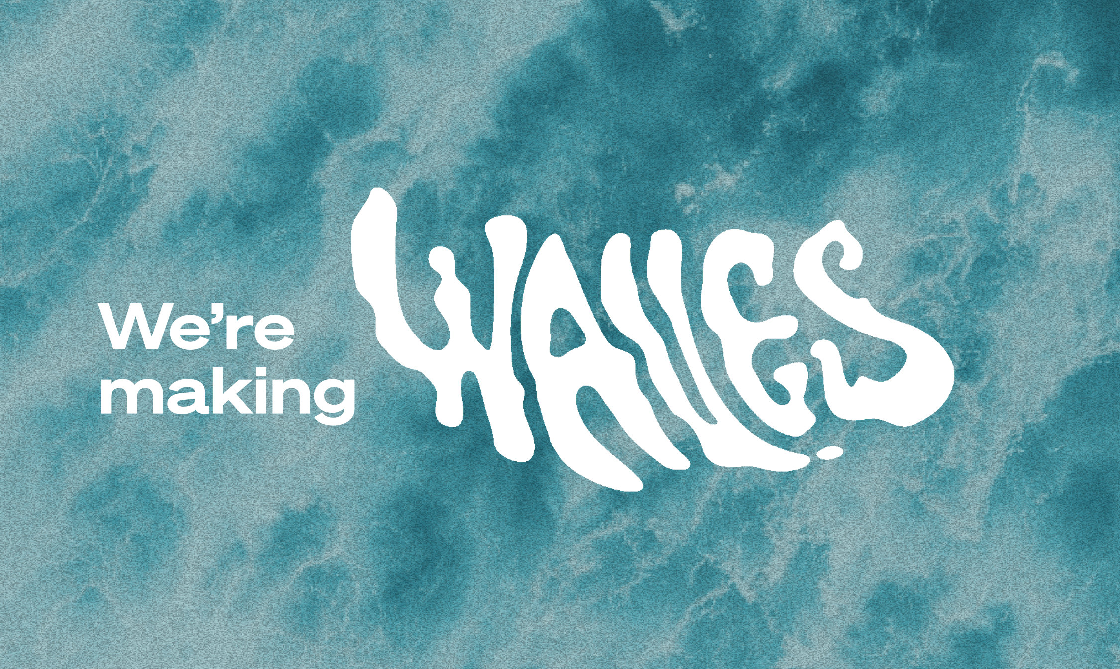
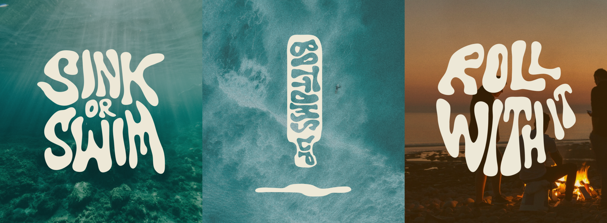
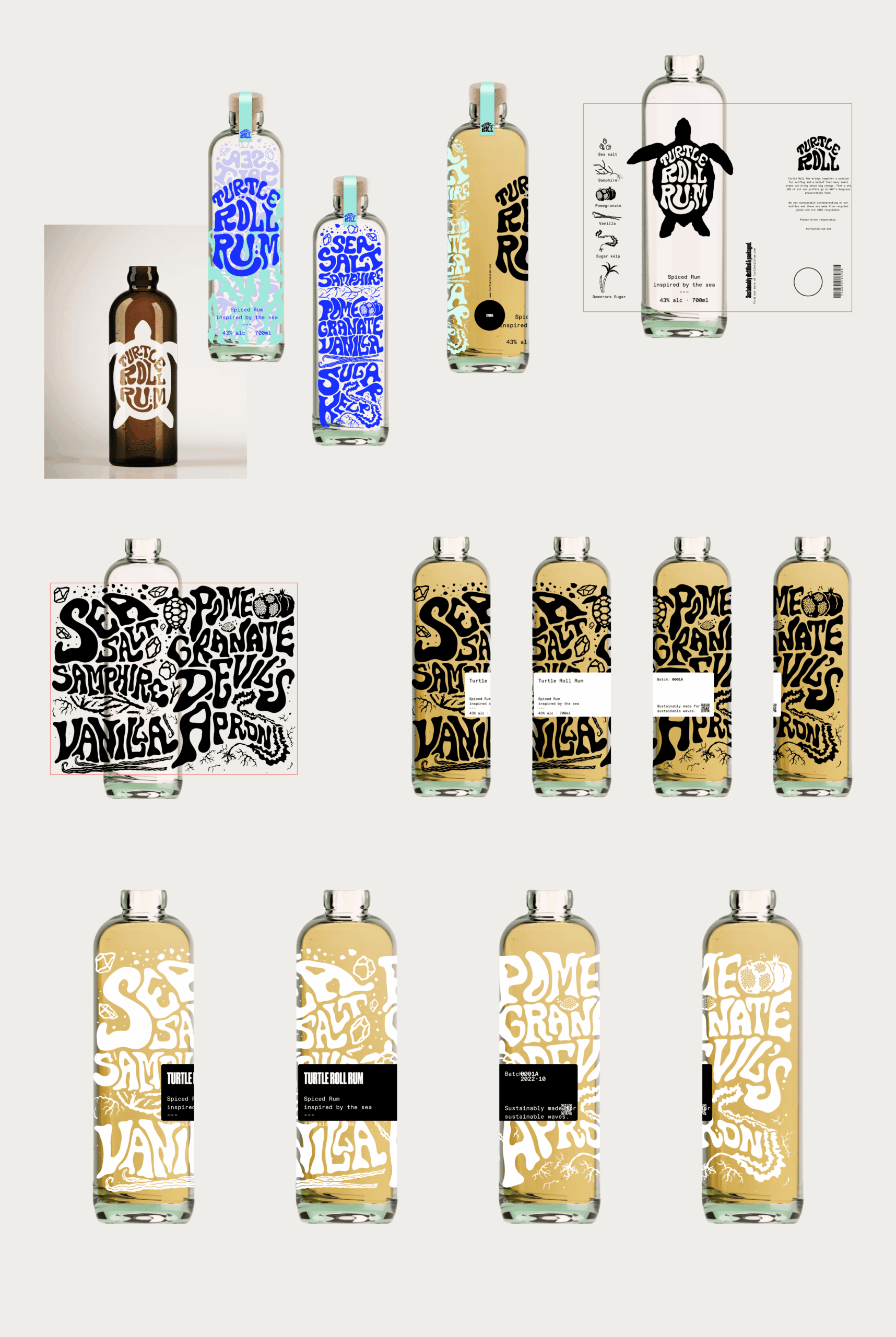
Our design director Angelo Iannelli wanted typography with a feeling of the sea so crafted loose, hand-drawn lettering, paired with the Söhne Breitt font as a contemporary counterpart. The illustrations, all hand-drawn by the Studiomade team, emulate typography distorted as if looking through water. The aqua tones and grainy texture of some of the photography were inspired by vintage surf photos e.g. 80s Miami.
Brand messaging
We use language that suits a modern, challenger brand, giving it a distinctive voice, casual rather than polished, yet with a premium feel. We use enticing flavour and ingredients descriptions to appeal to an audience of taste makers who are on top of trends and like to discover new experiences. To keep it relatable, we sprinkle in light-hearted, ocean-inspired phrases, particularly on social media.
Product photography
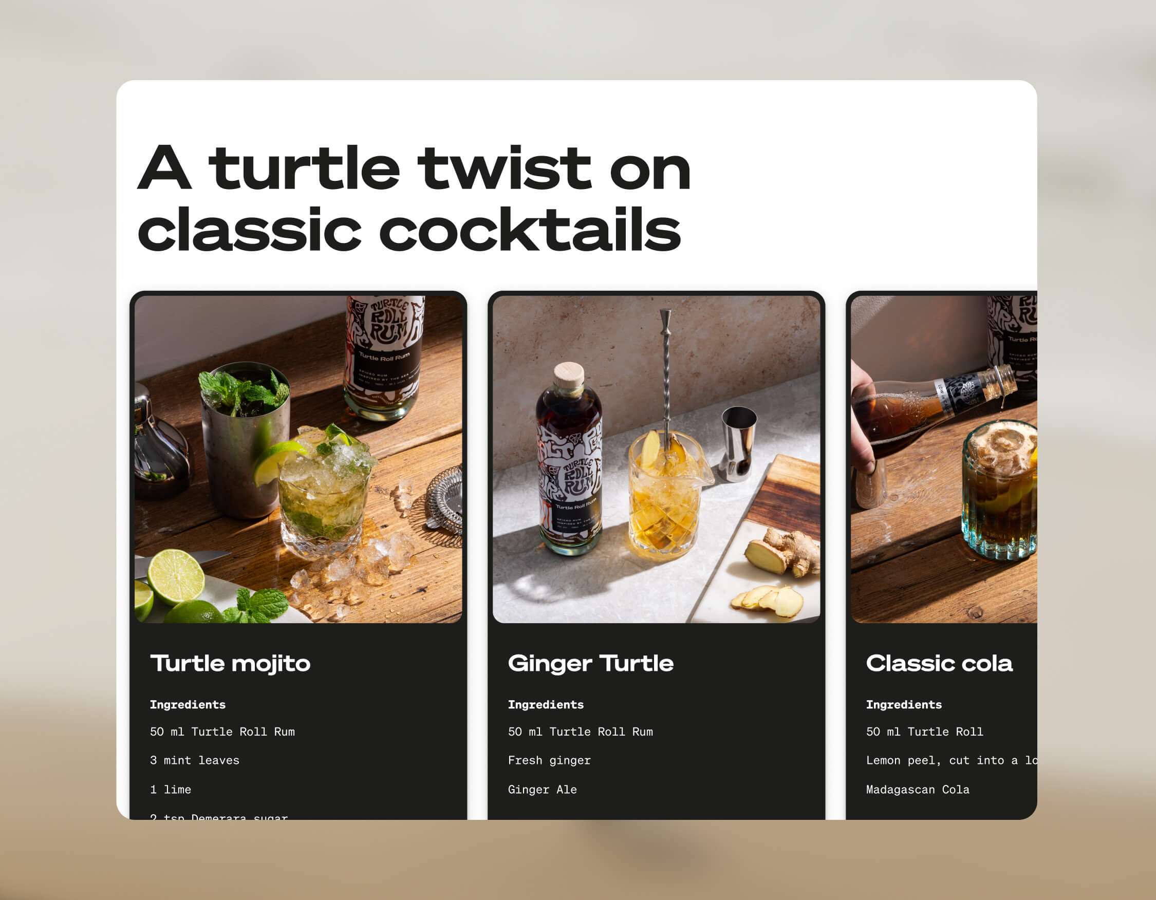
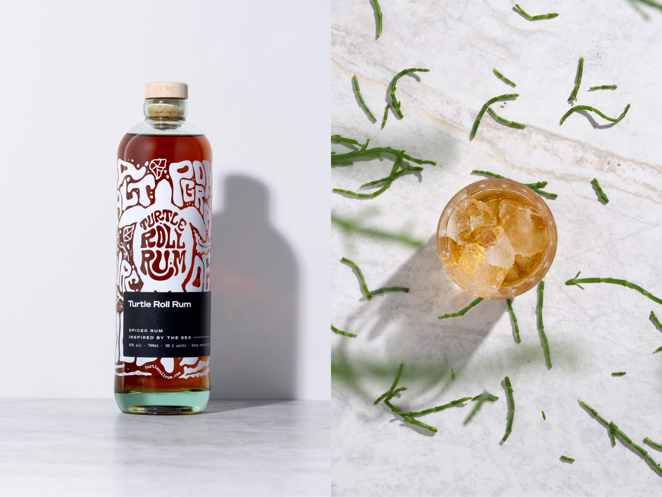
The images were shot by the wonderful team at Névé Studios. After creating mood boards to drive our creative direction, we decided that product photography should be bright and spacious, playing with light, shadow and interesting angles, and reflecting the fresh ingredients that give Turtle Roll its taste. The images feel realistic rather than glossy e.g. cocktails being made and drinks being poured. This is interspersed with imagery of oceans and waves, evoking the open feeling of the sea.
E-commerce
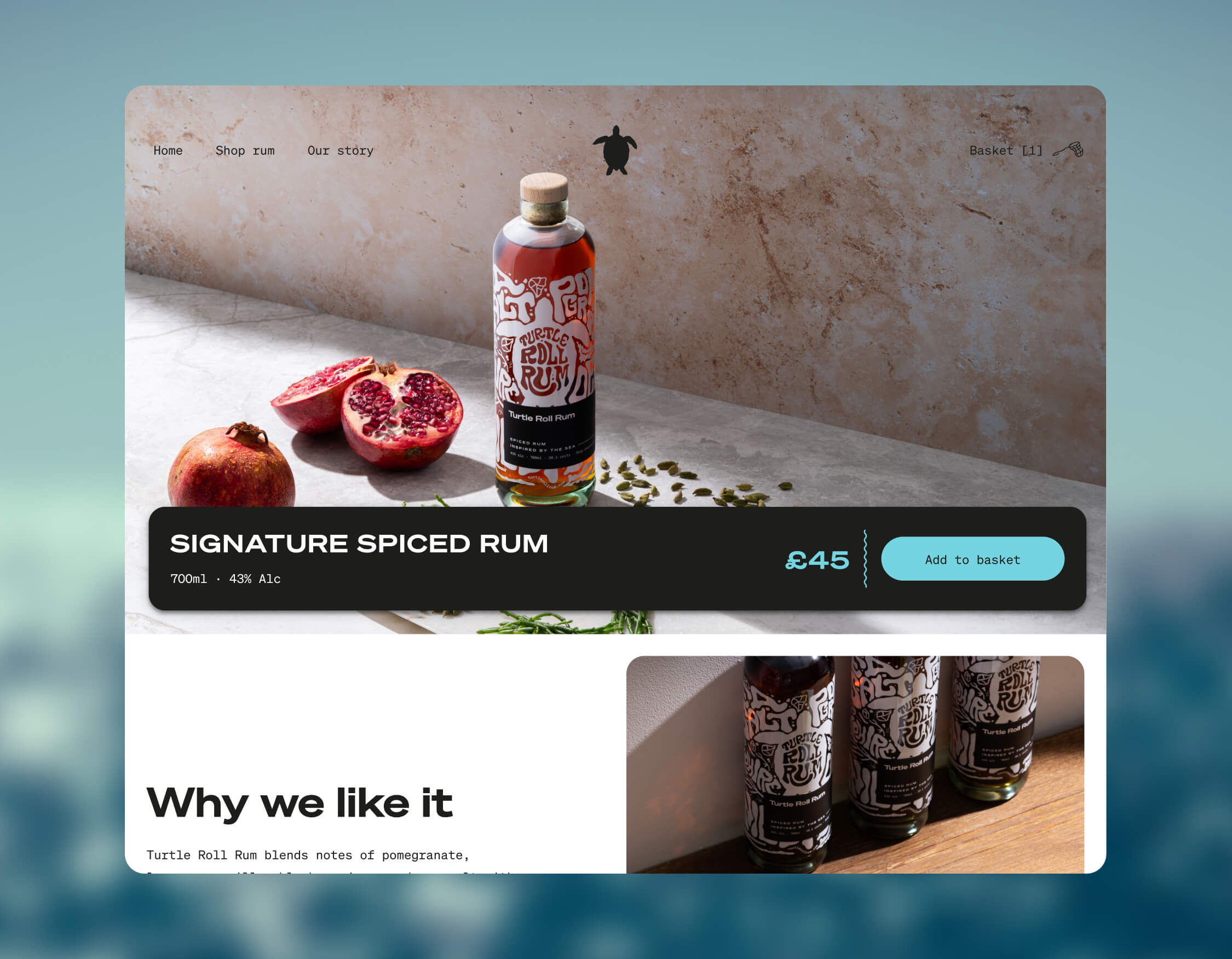
Turtle Roll Rum was conceived to be predominantly sold direct to consumer. This means that the customer experience and how the brand is presented online are paramount. We wanted to best present the personality of Turtle Roll Rum and establish a brand connection with customers, rather than it being a sales push.
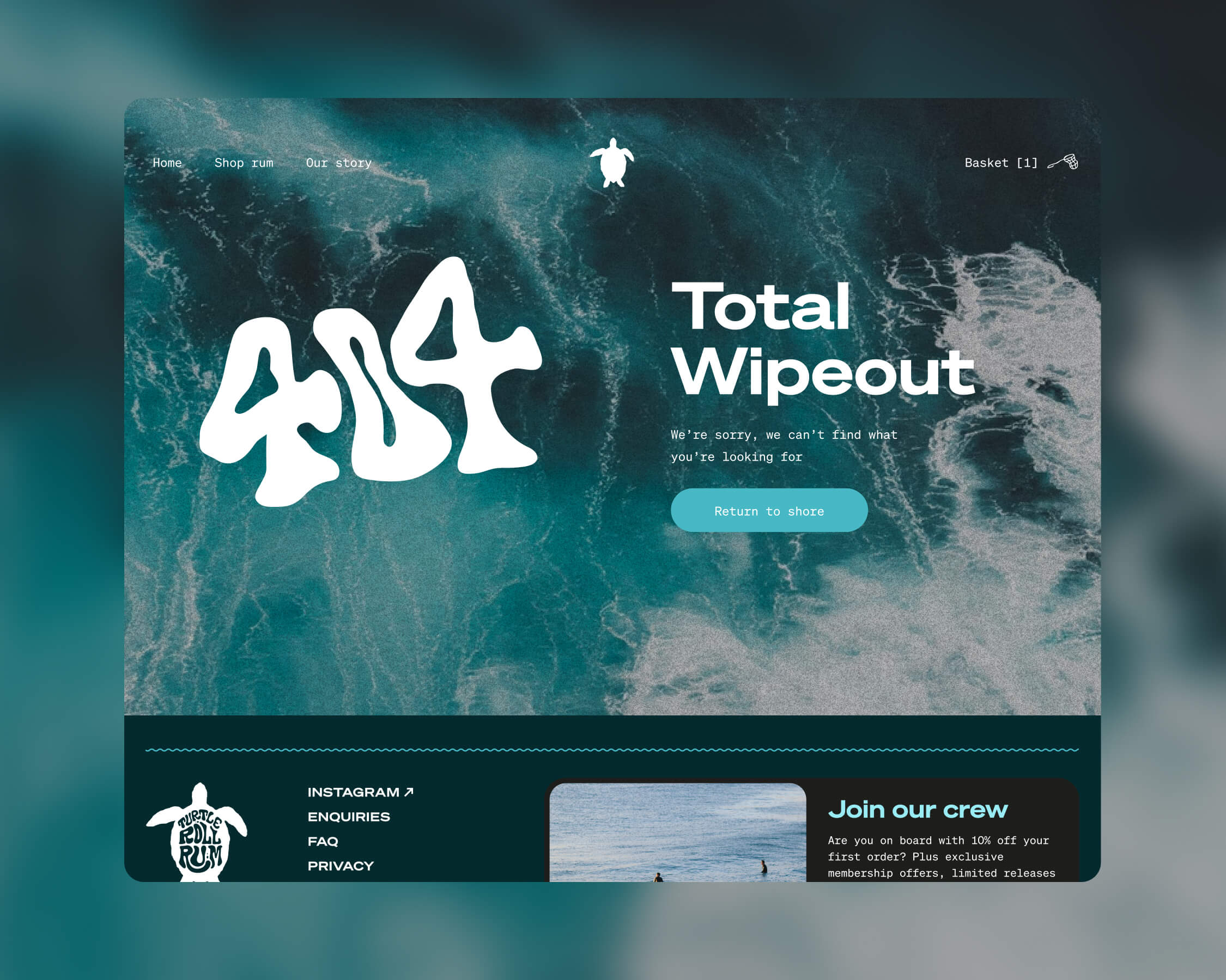
To this end, we built a custom e-commerce experience, with every aspect individually designed. We applied the visual identity and brand voice across the website, and created a user journey that includes purchase. We opted for Gatsby hosted on Netlify, for good performance and speed. We integrated Stripe for payments and set up a bespoke webhook to promptly relay order details to our fulfilment company whenever there’s a successful transaction. We added Mailchimp integration for automated emails to complete our loop.
Bottle and packaging
We researched, trialled and tested multiple bottle manufacturers and product variants, to find the most sustainable options possible.
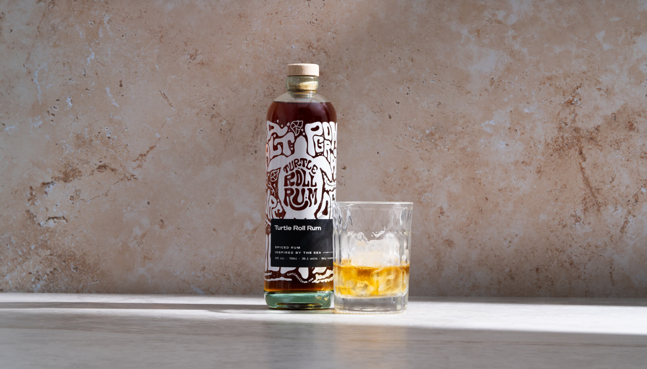
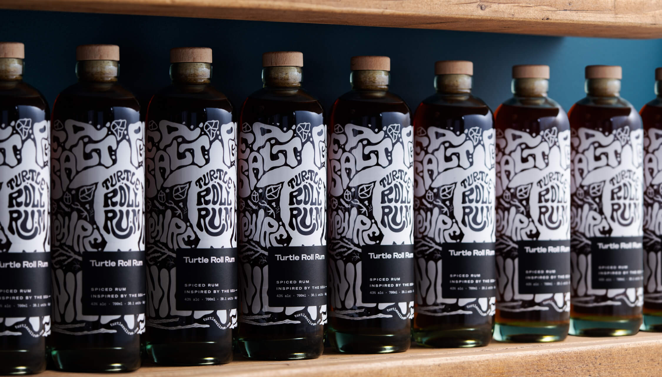
Each bottle is made from 100% recycled glass and screen printed (using sustainable ink), with custom-drawn artwork and lettering that highlights the ingredients. It’s overlaid with a 100% recycled ECF paper label, printed with soy inks and the cork is sealed with a fully compostable, plant-based shrink wrap.
The cork stopper is made with activated charcoal, as this removes the need for additional chemicals and industrial processes. Packaging for shipment is made from bamboo pulp, a more abundant, renewable resource than cardboard.
A focus on re-use
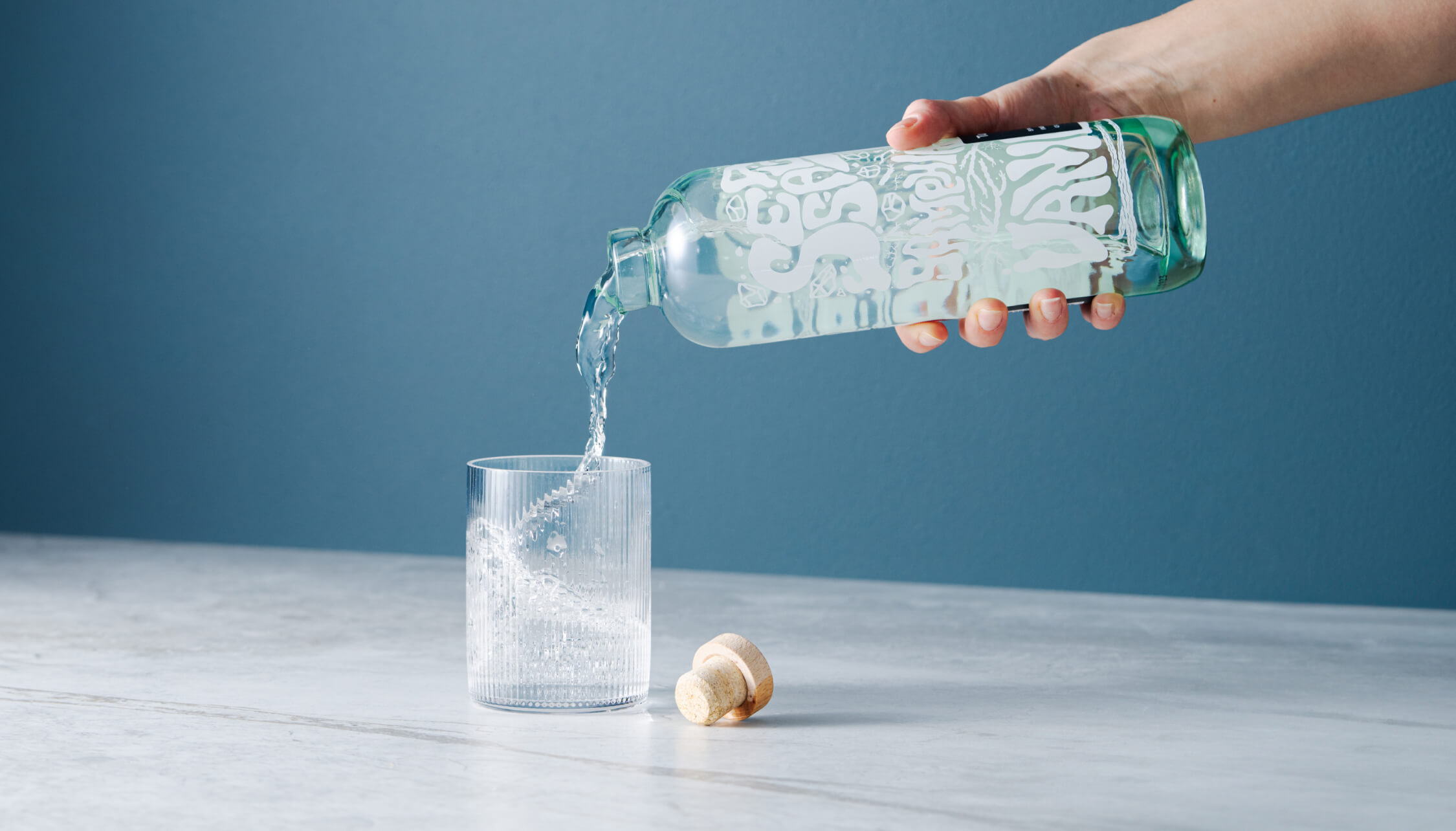
After enjoying the rum, we encourage people to reuse the bottle as many times as possible before they put it into recycling. Our intention was to create a product that sparks conversation and brings a bit of fun to kitchens and dining tables when used as a pitcher for water or vase for flowers.
Merchandise
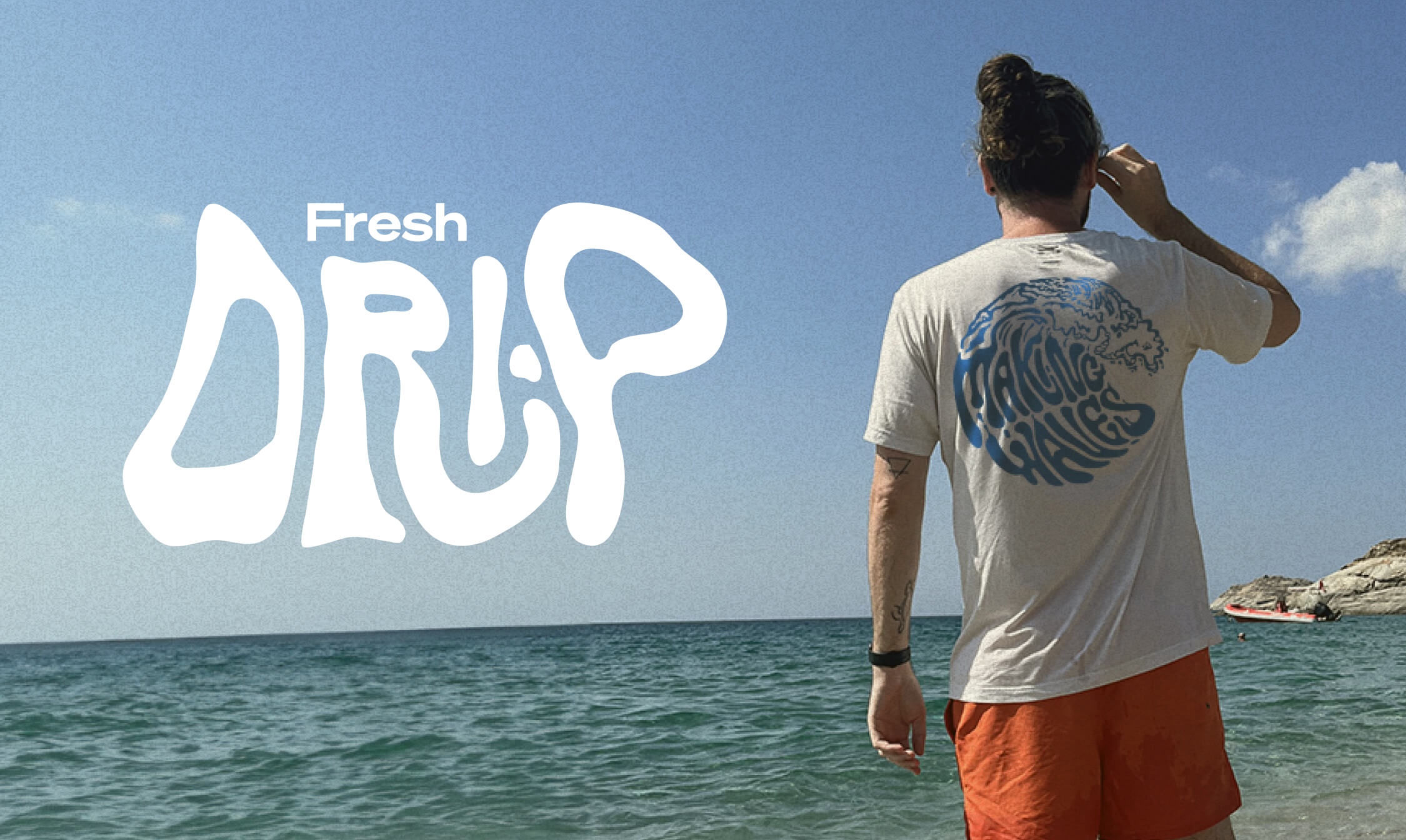
Unit 29 Ventures also wanted branded merchandise so we teamed up with Teemill. We chose them for two reasons. First, their t-shirts and hoodies are made from organic cotton, and they can be returned to be remade into something else once they’re worn out, creating a circular economy, which aligns with Turtle Roll’s value of sustainability. Second, customer purchases are printed and shipped to order, rather than us having to buy and hold stock. From a commercial perspective, as a new venture, this allows us to test users’ buying intent and decide where to focus on growing the range.
The outcome
With commercial strategy and investment from Unit 29 Ventures, and creative, brand and digital activation from Studiomade, we partnered to create a unique, small-batch, premium spiced rum, with sustainability at its heart. The initial limited run of 1,200 is now available at The Cove in Tunbridge Wells, at turtlerollrum.com and proudly stocked at a growing number of bars and restaurants (ideally close to the sea!) in Kent and the South East.
Are you thinking of creating and launching a new product? To discuss how Unit 29 Ventures and/or Studiomade can help you, contact our Founder & Strategic Director, Phil Reid, on phil@studiomade.co
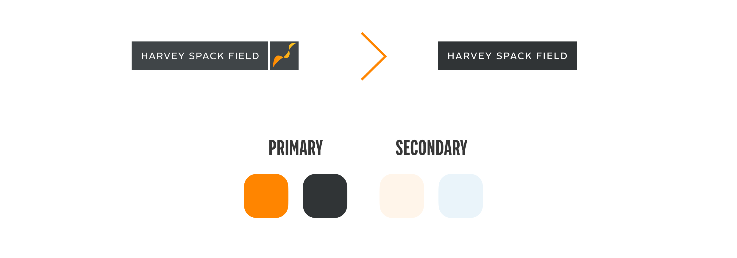
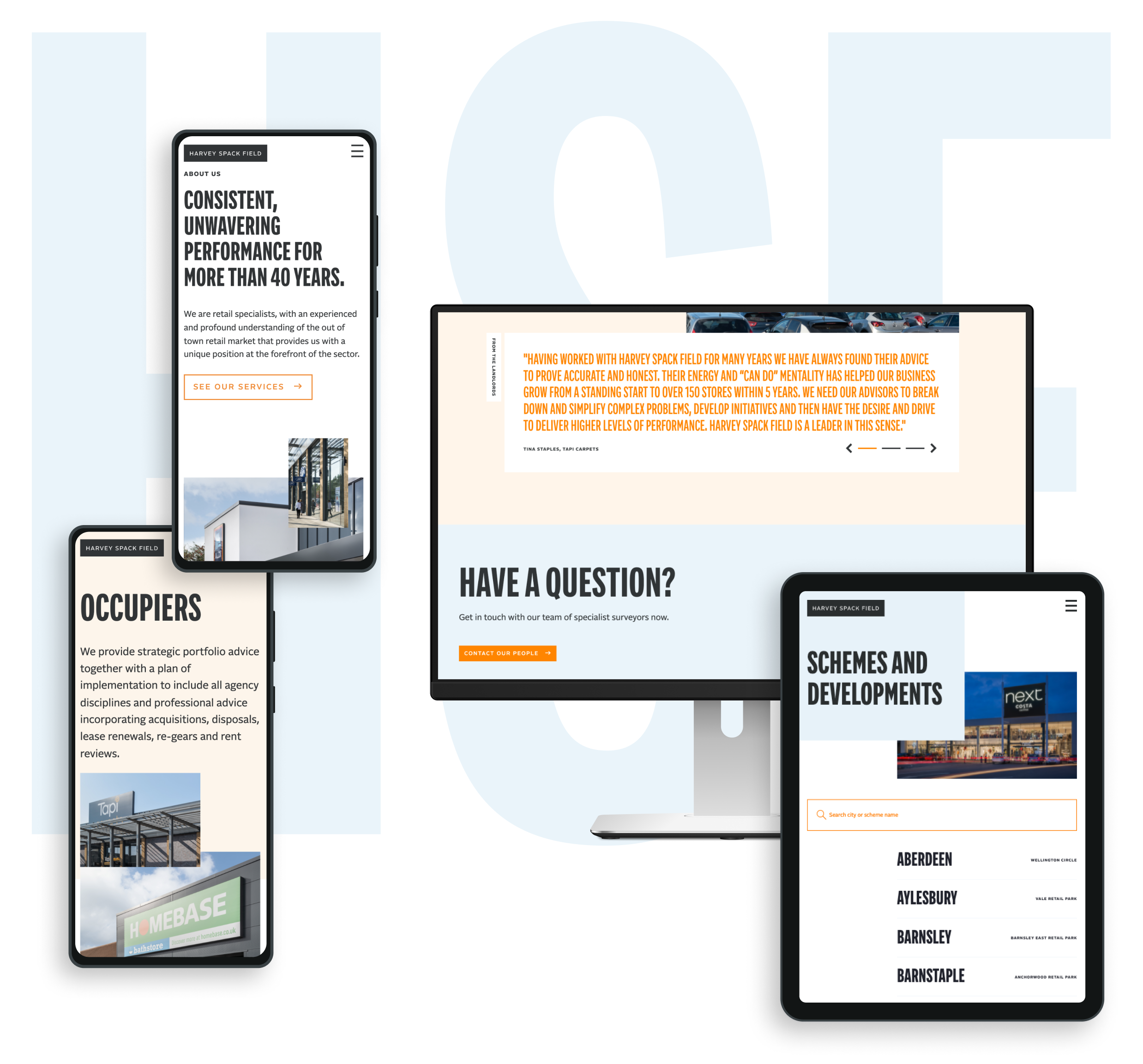
A long-standing client, Harvey Spack Field approached our team with the request of delivering a fresh, clean and direct digital presence that helped best tell the story of their market knowledge and expertise.
For this updated approach, we wanted a bold first impression that then takes the user on a tour of HSF’s overall service offering in a streamlined yet intuitive manner.
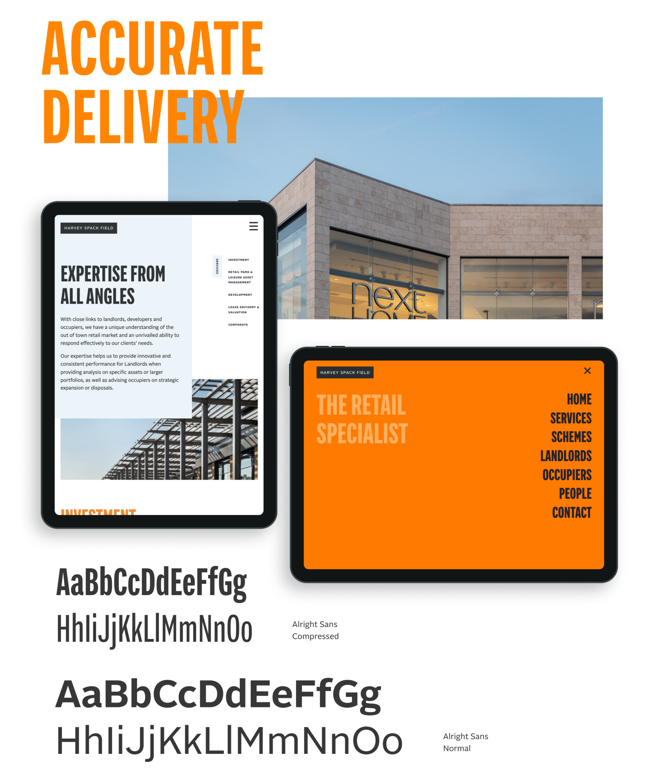
Direct approach
Our design intent was to create a site experience that would immediately engage a user. The messaging had to exist alongside the visual presentation of the brand and help lead users to understand how the Harvey Spack Field personality and mindset can help them in their objectives. We kept the navigation surrounding the work simple enough that the viewer is compelled to continue their investigation throughout the site.
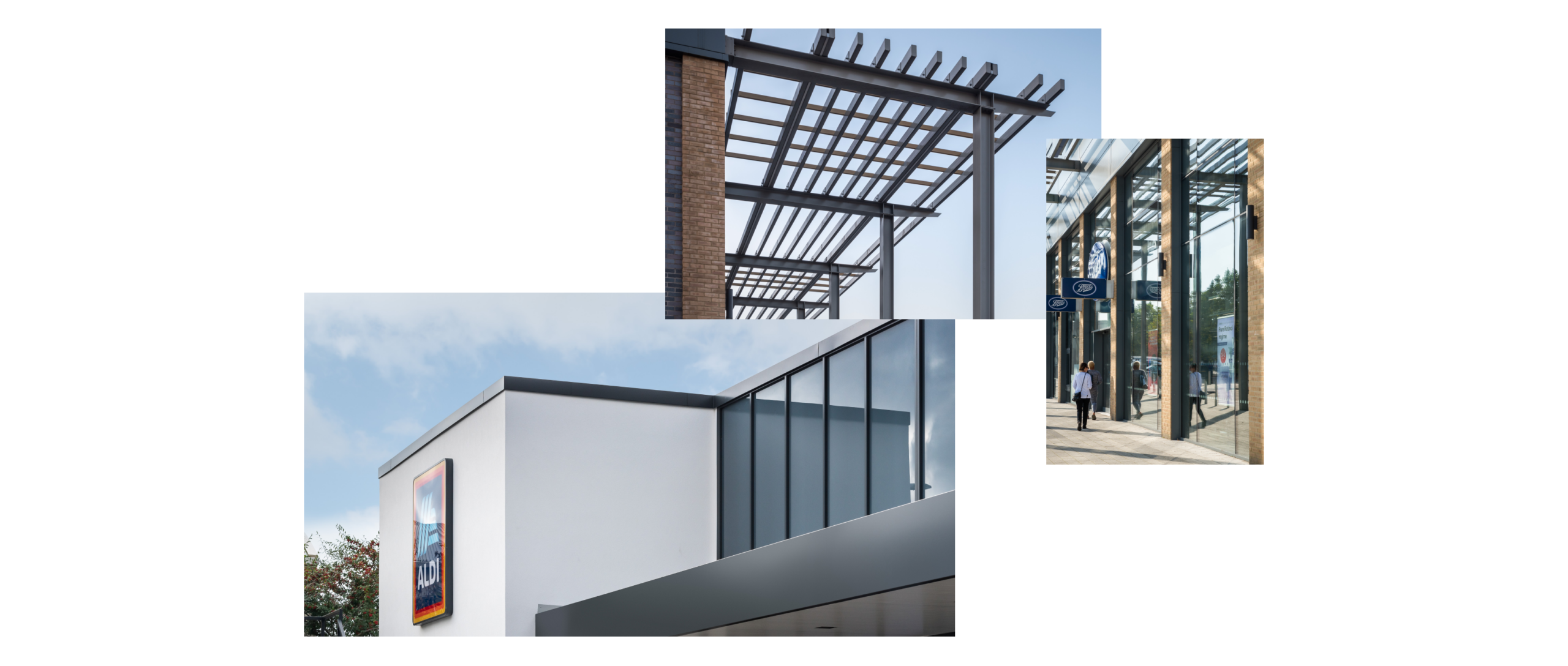
Our design process began mobile-first, fluidly responding to other device sizes. Commissioning photography that really brought forward the architectural details of the HSF schemes, this visual approach brings an elegant simplicity to the site presentation helping draw the user’s eye to the schemes and the services that HSF provide.
Spring Nurseries is partly owned by the charity Action for Children and offer award-winning, affordable early years education and childcare, with all their nurseries rated 100% Good or Outstanding by Ofsted, or equivalent standards in Scotland and Wales. Earlier this year, Spring purchased Oscars childcare, primarily offering holiday clubs and operating out-of-school care in Edinburgh and the Lothians since 1992.
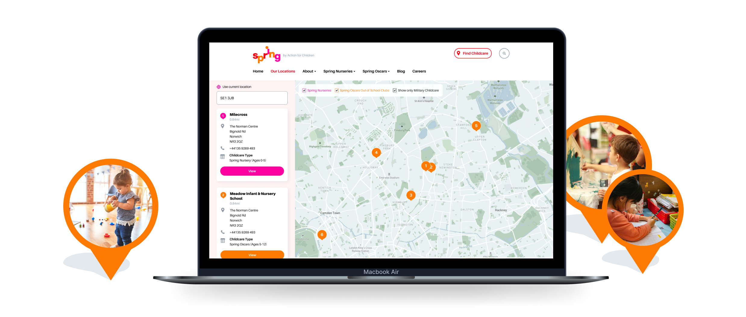
As an organisation they faced a challenge; to deliver a website and digital experience that demonstrated their brand as part of the Action for Children family as well as bringing in the existing Oscars brand under their umbrella without confusing prospective clients.
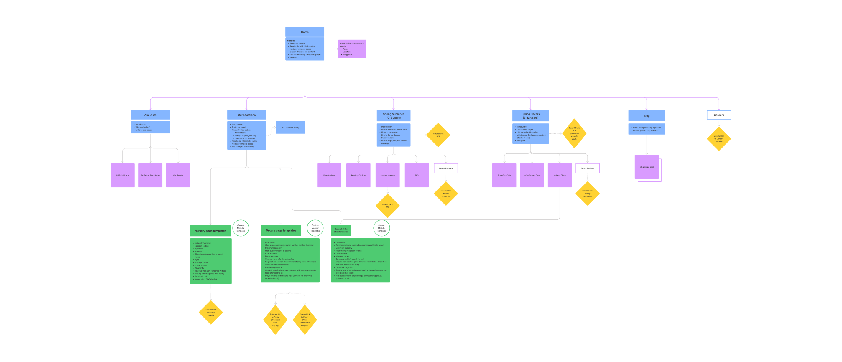
Setting a structure
Although the final resolution appears quite simple, the website content is wide-reaching and specific. There are Spring childcare nurseries that run during the day, each for a specific age group and there are nurseries that cater primarily to the military such as the RAF. With Oscars seasonal holiday clubs and Oscars breakfast and after-school clubs for specific age groups, our Studiomade team had to build a controllable Content-Mangement-System that could tackle all needs and be super flexible.
Our key concern was making this depth of content quick and easy to navigate without being overwhelming. This made the wireframing and CX stage imperative so that we could ensure that all content was catered for including anything seasonal. This was also valuable for ensuring that all functionality such as integrations with Daynurseries.co.uk were included.
Managing the brand
We have worked with Action for Children for a number of years across other projects such as their successful Secret Santa campaign and Byte Night. From this client experience, we have a really good understanding of their core brand which positively helped when tackling this project. A lot of the ideas such as bold bright colours and patterning had been replicated throughout and adapted in a manner that best suited overall brand consistency.
Although this bright and primary colour palette really works well for young children, reflecting a bit of their sense of life and excitement, it did bring some design challenges. When dealing with intense saturated colours it can sometimes appear overwhelming to users and doesn’t necessarily allow for different ‘volumes’ of call-to-action. To tackle this, we made additions to the palette which provided the UI a breadth needed to craft an effective digital design language.
We wanted to keep the playful nature throughout and so used the patterns of hands and feet around key modules as a sort of colourful frame and created small illustrations for key facts such as the Ofsted rating and the day nurseries figure. We also softened all the edges to keep that approachable feeling, giving large photography modules rounded corners and bringing in the brand font ‘Baloo’ with its nod to bubble writing within all headings.
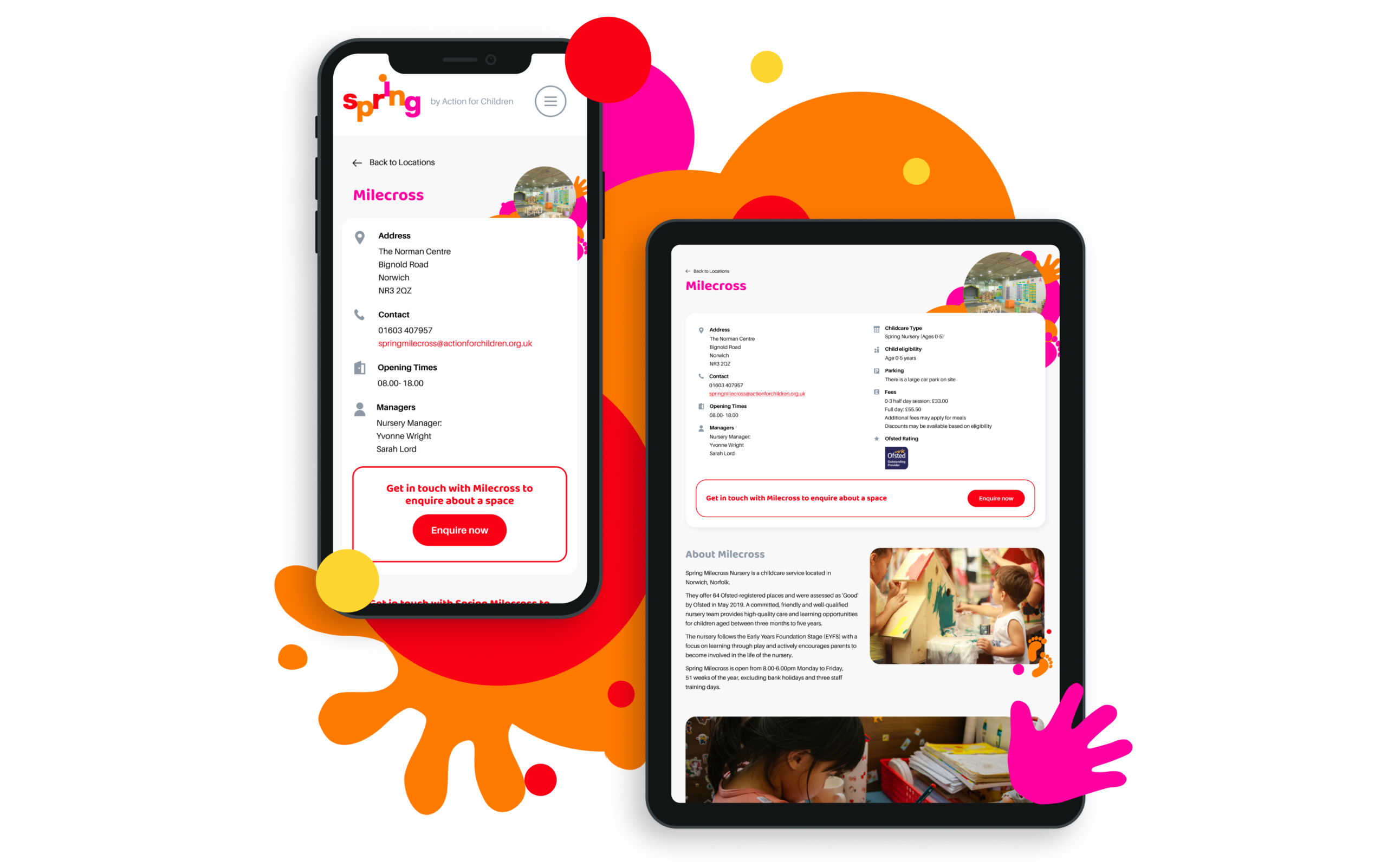
Providing the client ownership
A really common issue that clients share with our team as part of briefing a digital project is previous experience of how hard it is to edit or update their website. The existing Spring website which we were replacing had very little built into it’s Content Management System and the way it had been built meant that it wasn’t modular meaning things wouldn’t repeat throughout the site. We ensured that all content points could be controlled within the CMS in a clearly set out way so that the website really worked as a business tool. This allows the client to easily make a wide range of content changes including but not limited to the addition in new nurseries (which would then automatically add them to the map), updating of holiday club pages, adding new after-school clubs and promoting any element they liked within the main header.
We also wanted to give the client the tools to ensure that they could promote the website well socially and so built a series of animations for them that they could use across each of their Nursery Instagram profiles aiding announcements and promoting particular events. Their fun, playful brand being brought to life within these small idents.
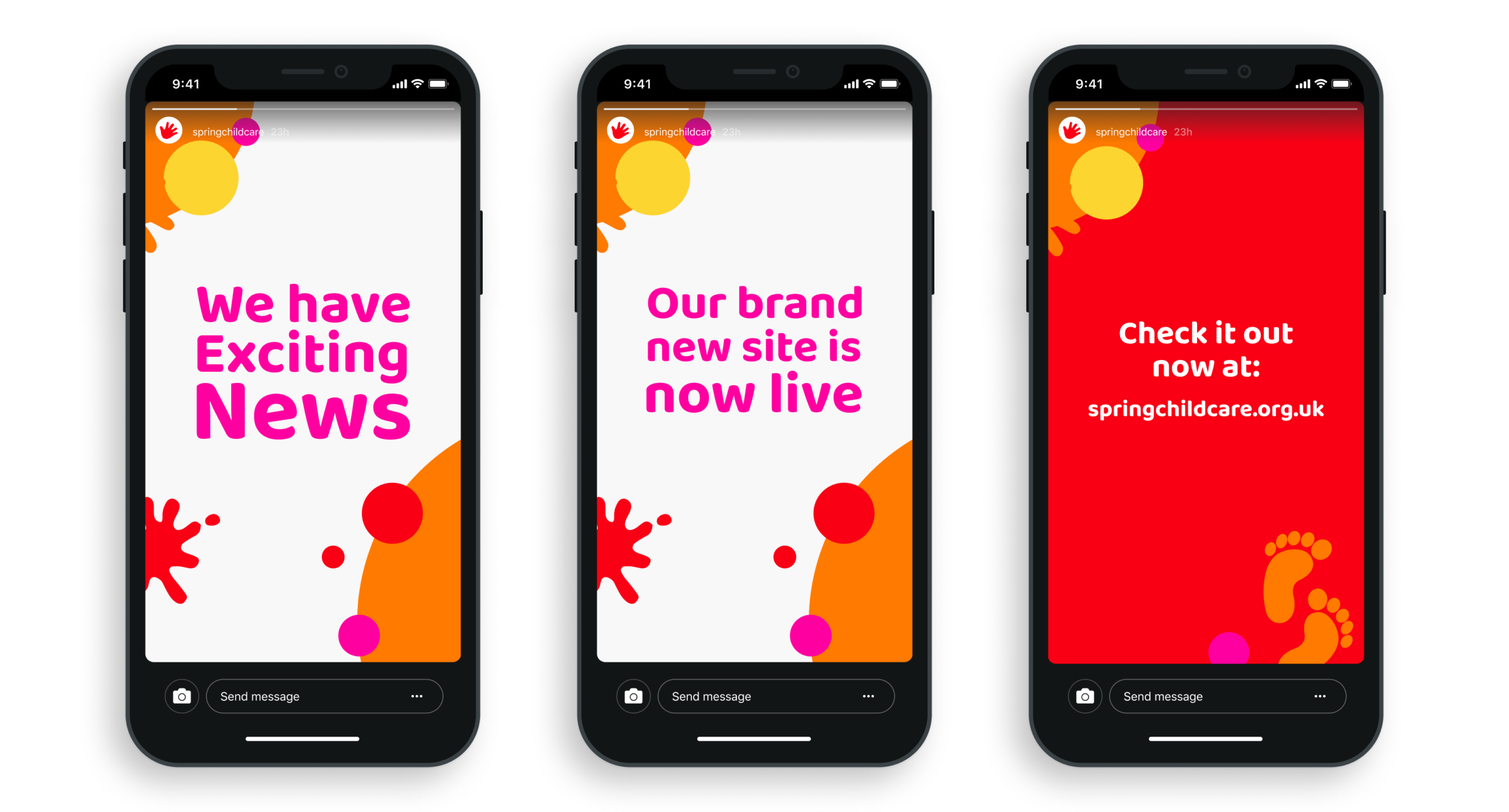
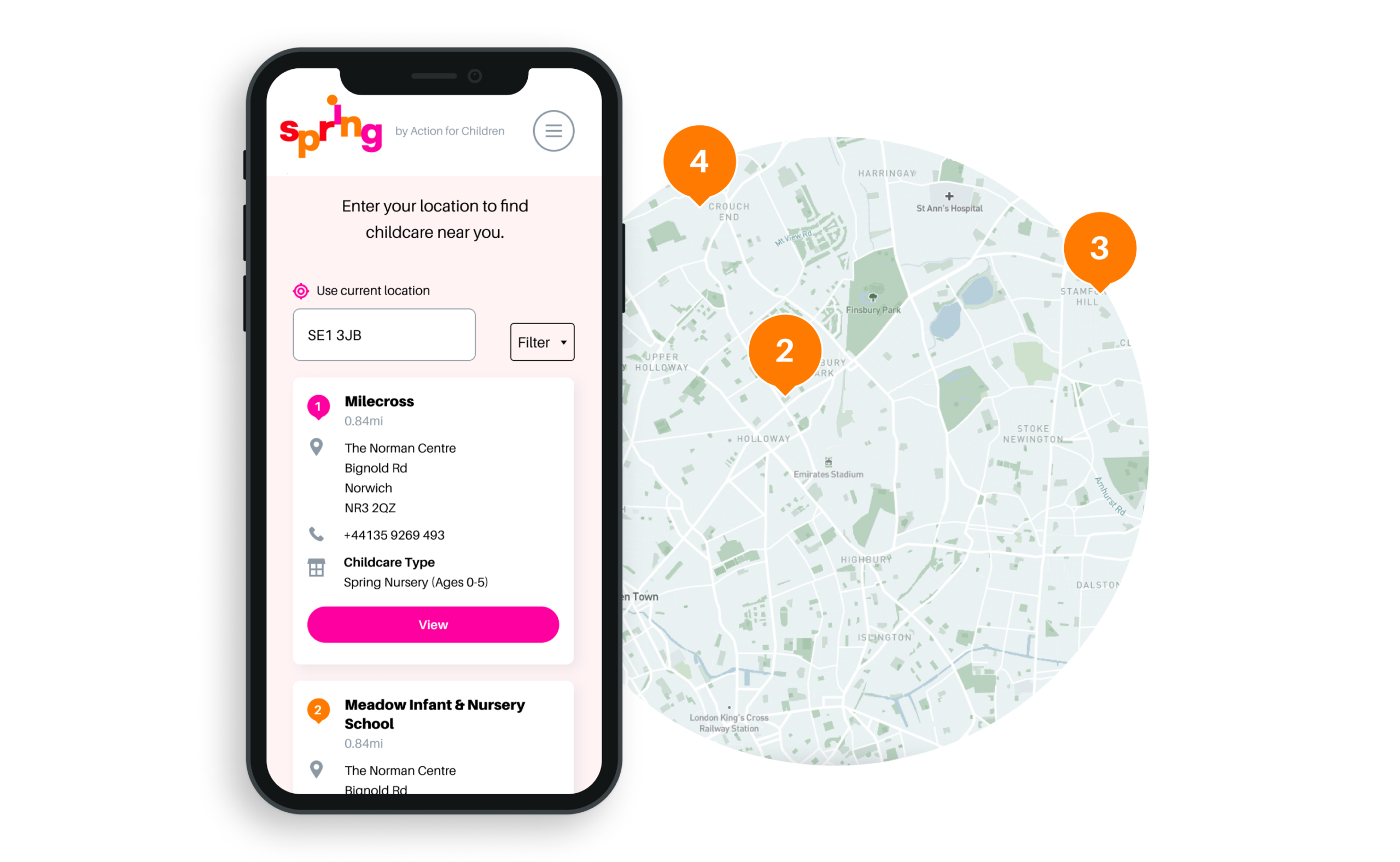
The result
We have established a united digital presence for the merged business. With a newly defined and completely customisable Content Management System, the client continues to receive excellent customer feedback on website performance, communication functionality and overall effectiveness.
A brand with purpose
There are now so many consumer brands vying for our attention across so many platforms that only a few transcend the noise and become bywords for their values. Aesop, Monmouth and Patagonia, for example, are synonymous with quality, care and environmentally conscious. It’s not just their products that have helped them reach the pinnacle in public perception; their branding and carefully crafted design has given them the bedrock needed to expand from.
The idea for The Cove began in lockdown, believing in the importance of the high street to local communities, particularly small businesses. Phil Reid, the founder of Studiomade, and florist Amy Lethbridge wanted to bring a personal touch to shopping in Royal Tunbridge Wells, through a premium retail experience. Next to a luxury, seasonal floristry service, The Cove stocks a curated product list that alternates throughout the year – with one key principle:
“We wanted to support aspiring product designers and distillers, championing the growing demand for high-quality, small-batch created goods with a purposefully slim product range that is not found in traditional supermarkets or outlets.”
Concept and approach
The driving thought behind The Cove was to help people discover exciting and unique products that aren’t mass produced and are created by really passionate people – independent makers and creators. These thoughts were what led to the name ‘the cove’. Something that reflects intrigue, curiosity, safety, protection, cosiness – and above all a sense of discovery. Think back to smuggling times and a cove often yielded lost treasures, provided a cornerstone for new opportunities and safe-guarded those brave enough to venture forth.
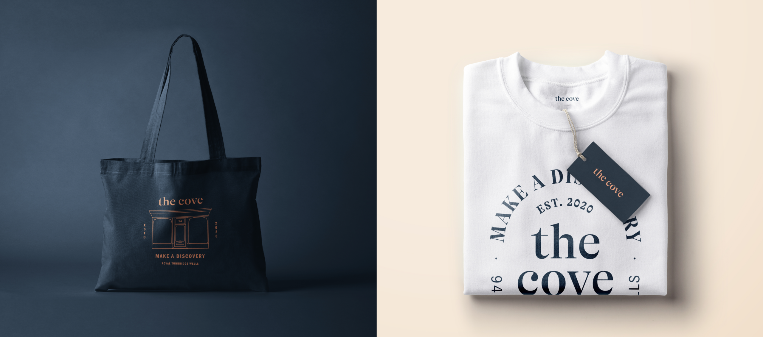
Today, smart brands reflect their surroundings and work with a local, cultural and modern verbal and visual vocabulary. We wanted the brand to echo the timeless architectural elements on the physical listed building, ensuring that the brand had a quiet sophistication. Creating emotional connections with customers can be difficult to master but in curating an experience that is unique and intimate plus distinct the brand and overall proposition is able to set itself apart.
The Cove brand like any other had to translate across all platforms. So rather than entirely focussing on the digital we could communicate through unique environmental designs and sensory experiences our purpose and intent, to really help people enjoy the High Street again and connect to aspiring, lesser-known brands and products.
This restrained branding is designed to allow people time to make their own discoveries, the store and digital presence providing environments where consumers can take their time with nothing shouting at them on where to go and what to do.
Providing a platform for the creators
In the store these stories can be shared by The Cove team, spreading the individual origin about each product. By sharing their real value and point of difference, people have the opportunity to discover something new that they would never normally consider.
Bringing the brand alive through Shopify
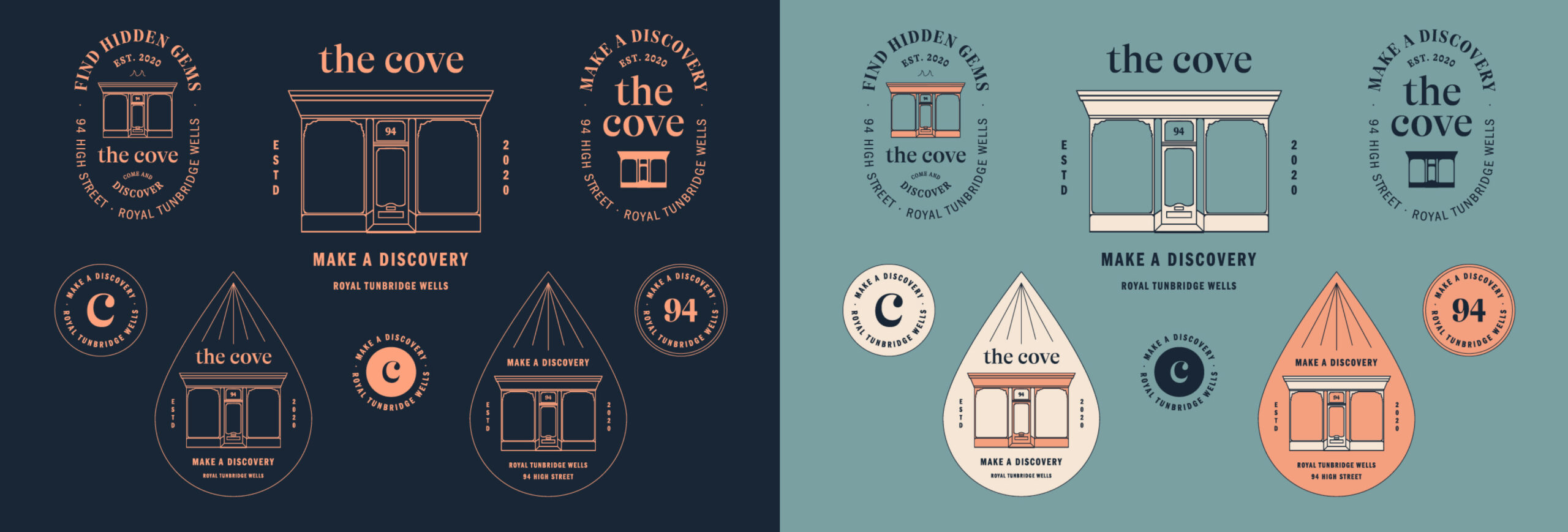
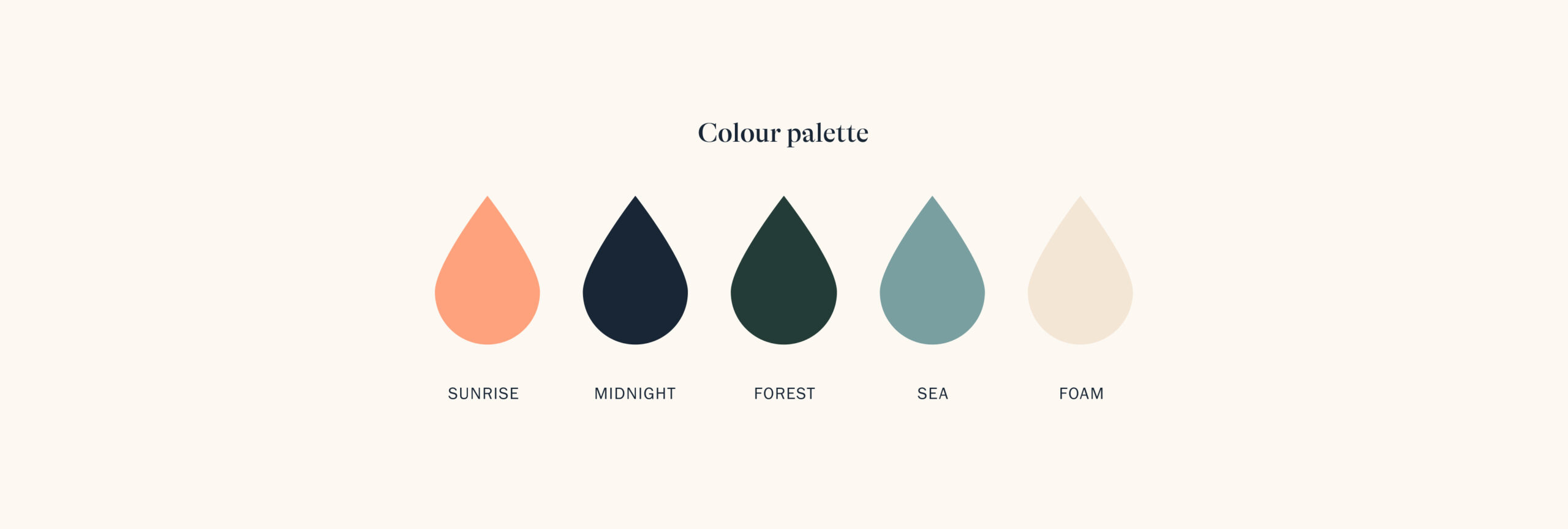
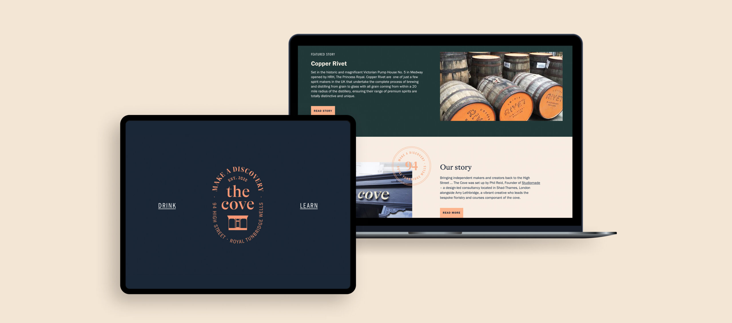
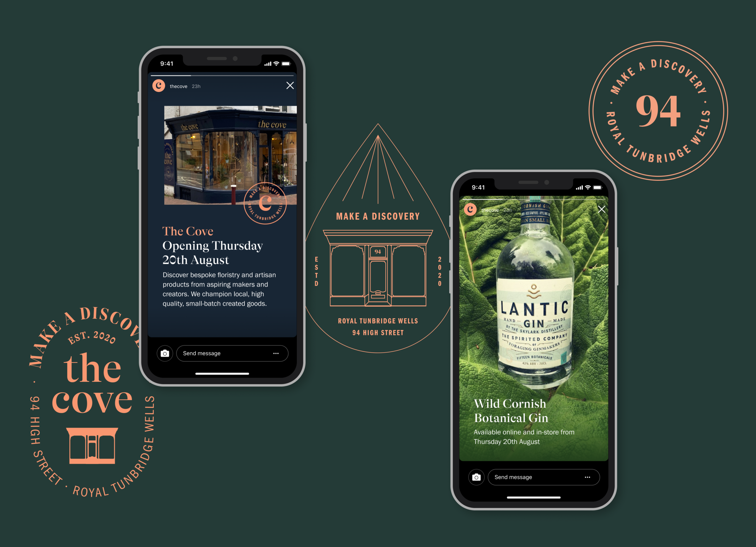
The calming colour palette was selected by sampling a breadth of nature photos from sunsets and natural coves in the UK. The font GT Alpina was selected due to it’s high contrast and fluidity, the terminals reflecting water around a geographical cove. We also added messaging that peaked the curiosity of passing foot traffic on the windows, inspired by vintage apothecary styling – reinforcing that sense of discovery and curiosity.
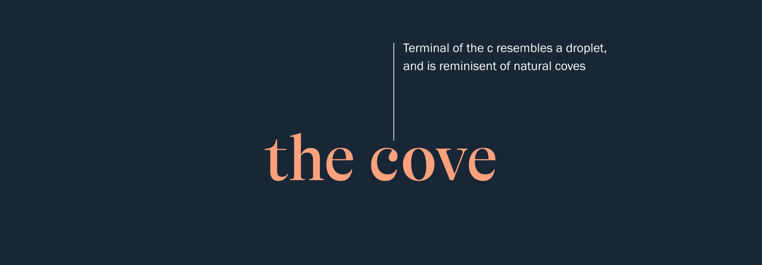
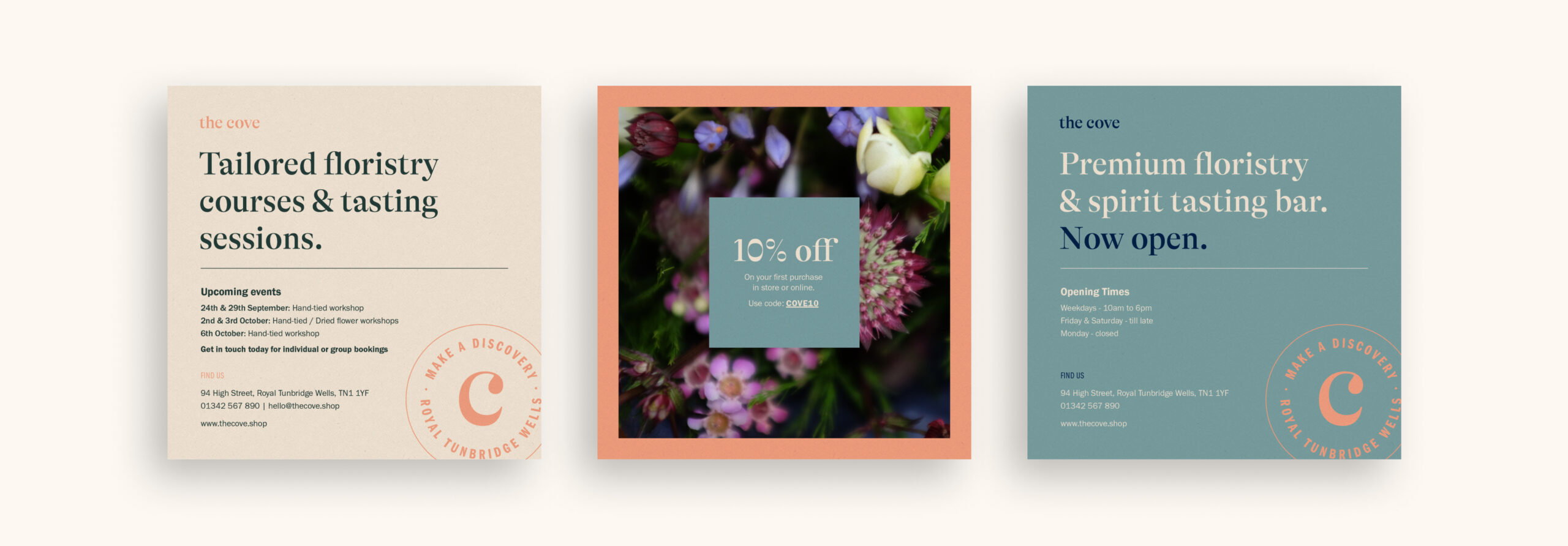
The digital presence (built on Shopify) gave us a bit more space to be playful with the brand. Using the GT Alpina in a large weight to focus users on key statements we brought in a round stamp element that could be animated to bring interest, also used throughout physical materials such as loyalty cards. We created a teardrop monogram in the footer inspired by the droplet in the letter ‘c’ to bring some illustration to the brand that would also work well across larger promotional materials such as email campaigns.
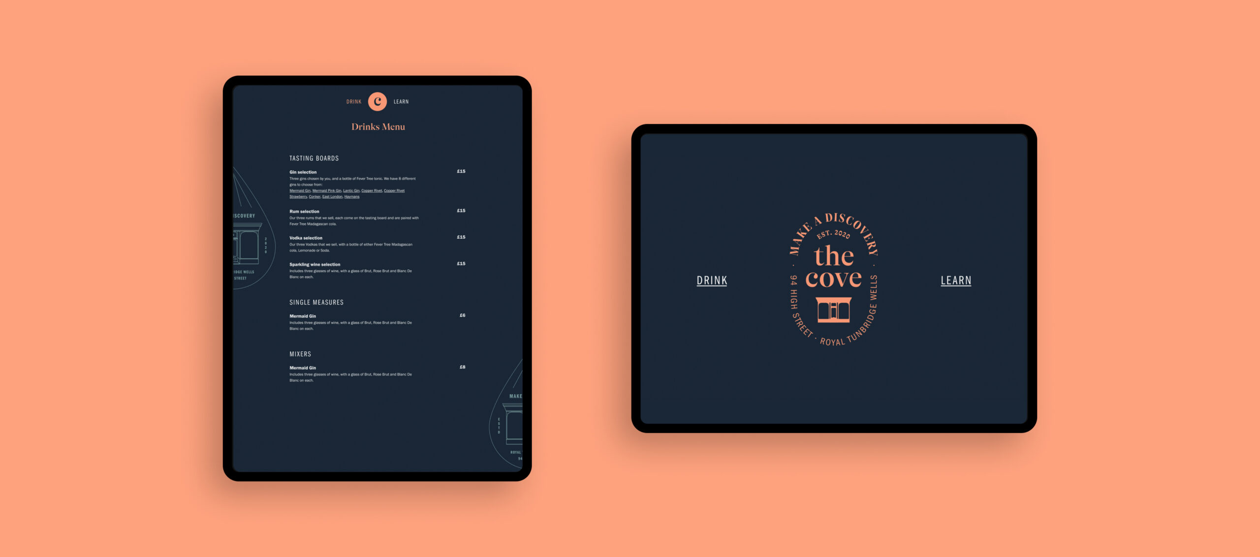
Our digital input didn’t end with the Shopify experience, by creating an app for customers we have helped them safely peruse our drinks menu and view tasting notes for all products stocked. We wanted this to reinforce the storytelling and the care and passion that had been put into making each item The Cove stocked.
Power of photography
We needed amazing photography to tie the design elements and the products together, while reinforcing the sense of calm and personal discovery we wanted to cultivate. Our design team created a best practice document that will allow everything to be cohesive and communicate one unified story. Every element and item associated with The Cove supports its brand look, feel and values.
A positive story
The Cove has launched as an entirely new retail concept within a challenging time. Observing possible commercial opportunities, the business and brand look to bring something special back to the High Street. The public response to the concept and overall proposition has been extremely positive, with a social presence actively growing and learning courses booking up!
Visit The Cove website or find them on Facebook and Instagram. Close to Tunbridge Wells? Stop in and say hello at 94 High Street, Royal Tunbridge Wells, Kent, TN1 1YF.
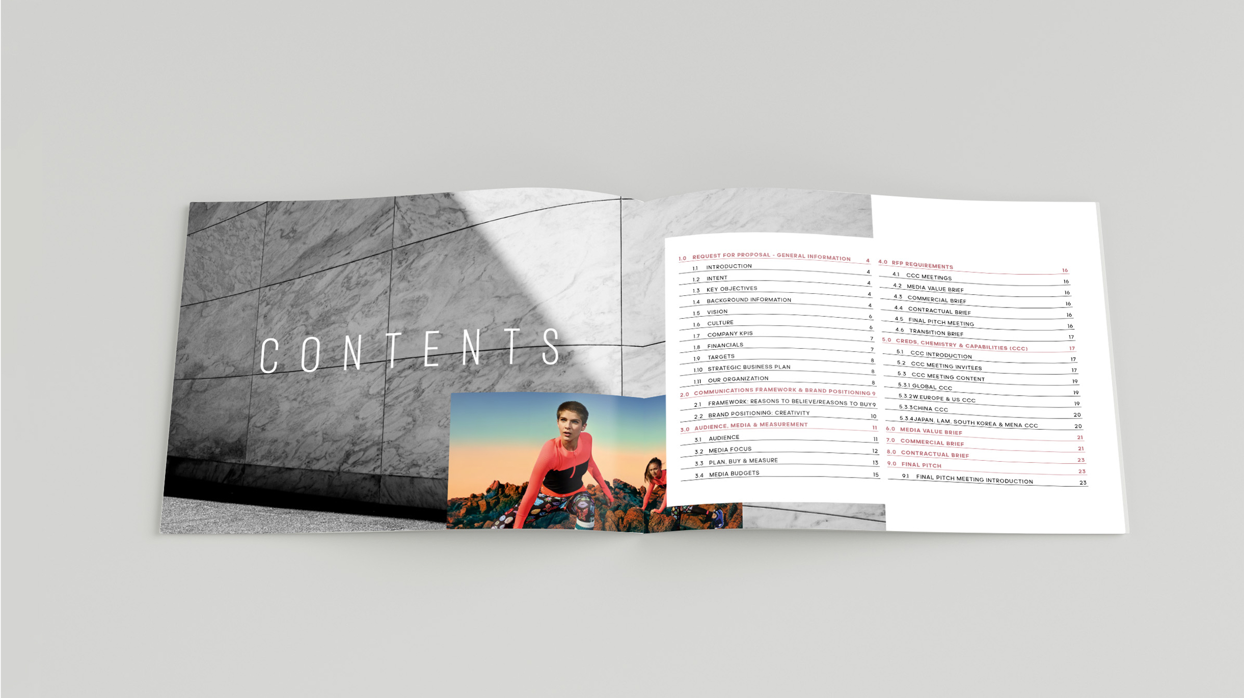
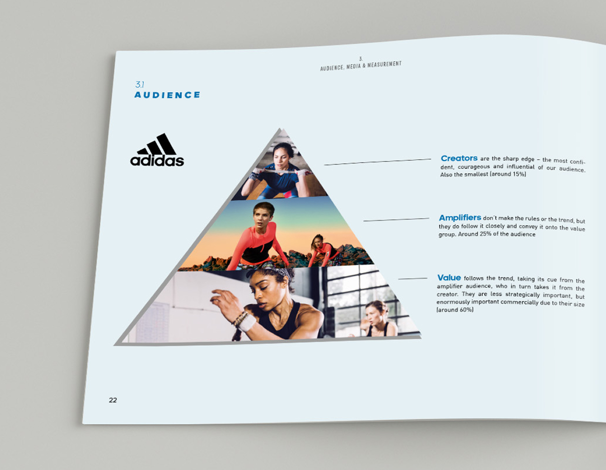
We have worked with MediaSense as a client for a number of years, delivering a number of iterations of their site and continued brand work therefore when they landed the contract to deliver the request for proposal for Adidas Global Marketing Services it seemed the perfect way to join forces.
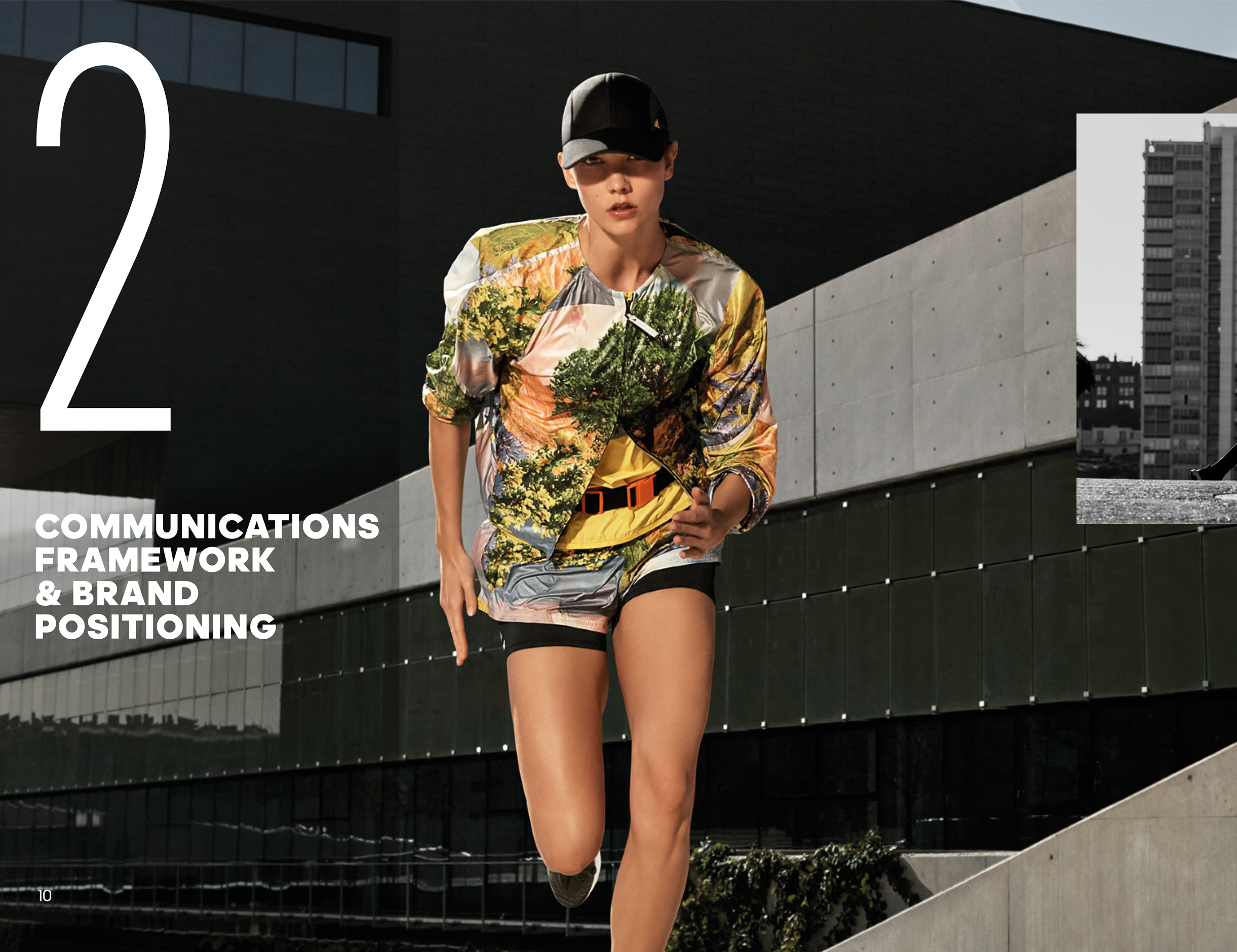
This document needed to represent the Adidas brand core values as well as detailing the pitch requirements and scope. We created a unique look and feel to the document that sat within the parameters of the Adidas brand look and feel. We made use of the incredible photography library, bringing a sense of dynamism, movement and energy to the document.

Knife crime is a crisis. London recorded the highest rate of 169 offences involving a knife per 100,000 population in 2018/19, an increase of 1 offence per 100,000 population from 2017/18. When we were approached by Digital Cinema Media in partnership with the Mayor of London as part of their London Needs you Alive campaign to share an opportunity that could really make a difference, we were without question on board.
The London Needs You Alive campaign aims to alter the narrative surrounding how young people are represented and give value to how they see themselves and their role in the capital. LDN Filmmakers is an initiative to help young Londoners share their stories on the big screen – a free week-long fast-track film course designed to shake up the industry and help young Londoners realise their creative potential regardless of their background.
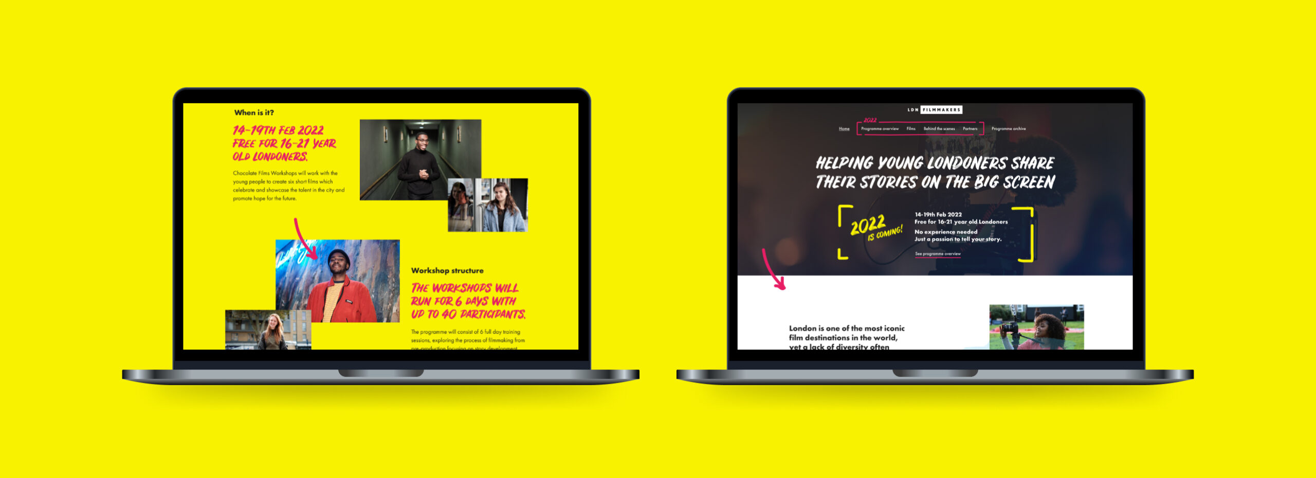
We worked together to create a website that portrayed the energy, excitement, and talent of the participants to share a more hopeful picture of the opportunities available in London. The digital experience needed to consistently carry through the visual style and emotion of the campaign, and showcase the six films produced during each of the week-long workshops.
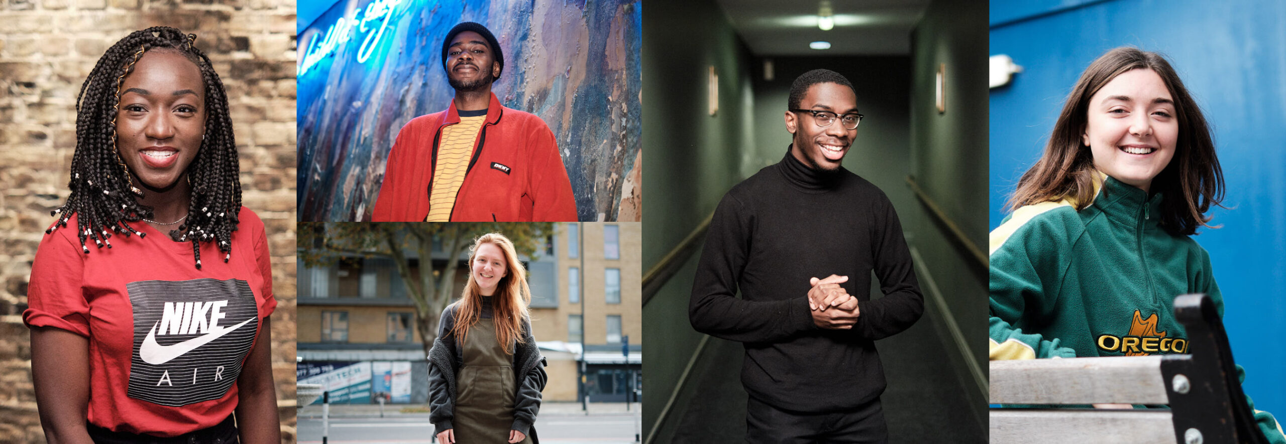
The films tell some amazing stories. ‘The silent path’ touches on issues of friendship, morality and selflessness. ‘Submit’ talks about how to balance the pressure to blend in with society norms and maintain a sense of authenticity. There’s nothing young, shy or quiet about the subject matter.
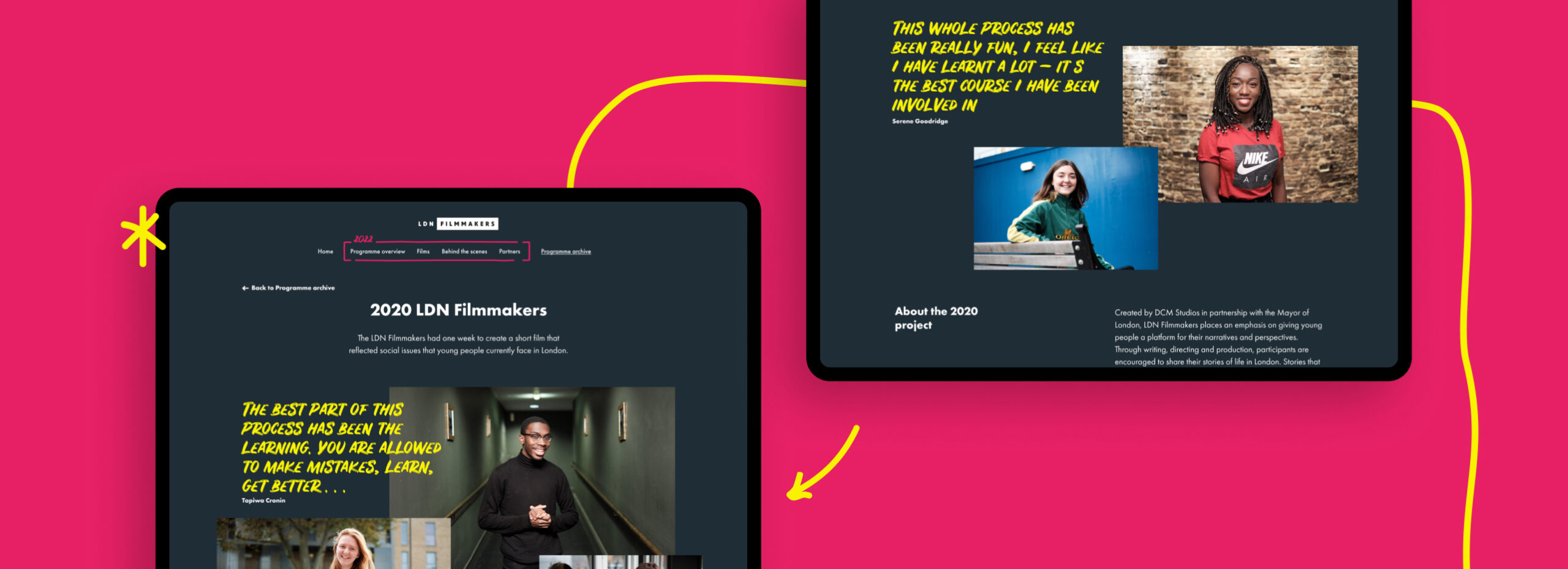
We’re all amazed by the talent shown in the films and are grateful that we were able to take part in this project. It shows what’s possible when there are opportunities for young people to be able to follow their passions and express themselves.
Some stories are immediate classics, taken straight to the hearts of those that hear them. Noel Coward’s Blithe Spirit is one of these tales, resurfacing every decade, reincarnated to entertain a different generation with its comically dark characters. The play was first seen in the West End in 1941, creating a new long-run record for non-musical British plays of 1,997 performances. The public’s love for the tale propelled it to appear on the airwaves, the silver screen and later onto television.
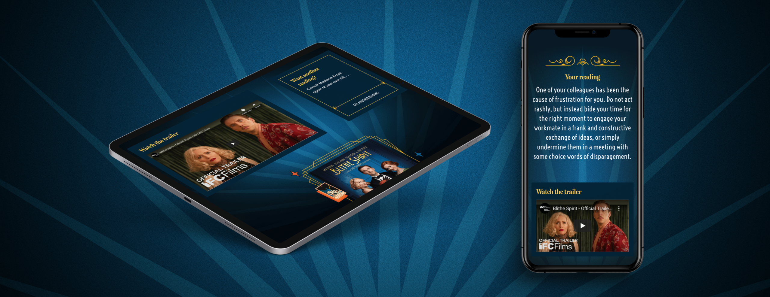
Explore the digital experience at https://blithetarot.co.uk/
Digital engagement
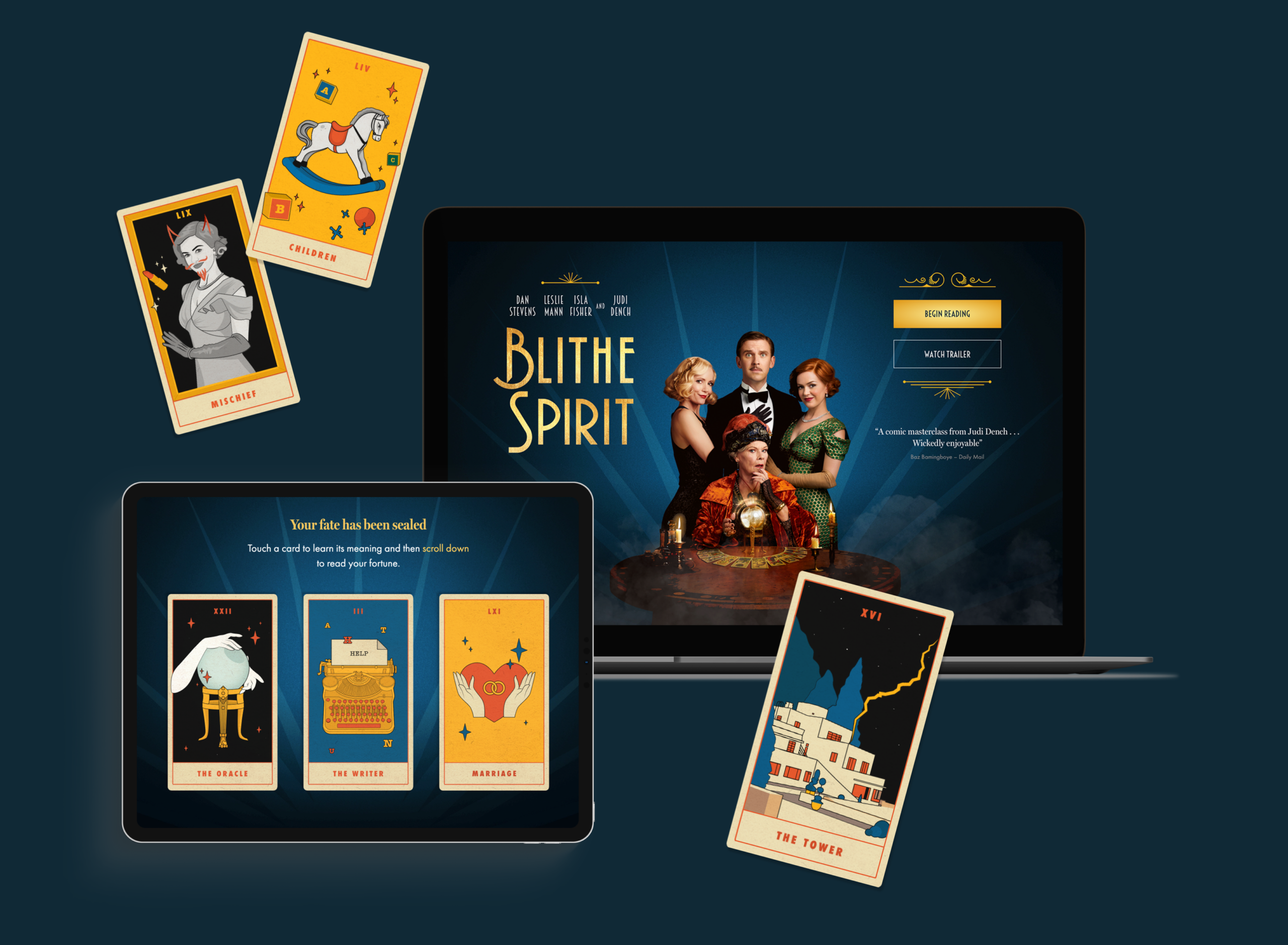
This year, Dame Judi Dench leads an all-star cast in the latest film adaptation (shown exclusively on Sky Cinema). The heady mix of Dench and a theatre pedigree is perfectly pitched to capture the hearts of any audience. Inspired by the tale and the studio’s love of cinema from working with clients such as Studio Canal and DCM, we have created a hilarious and beautiful experience that takes the narrative of the film and turns it into a shareable digital destination. Users are invited into the mystical world of Madame Arcati (played by Judi Dench) to have their fortunes read, drawing them into the dark and playful world of Blithe Spirit.
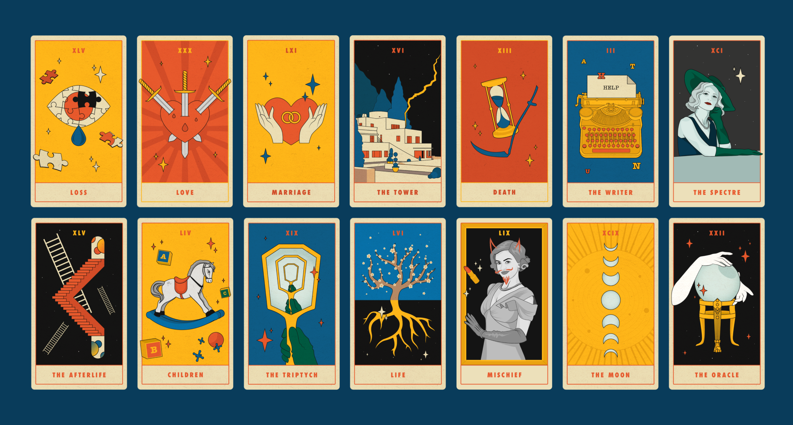
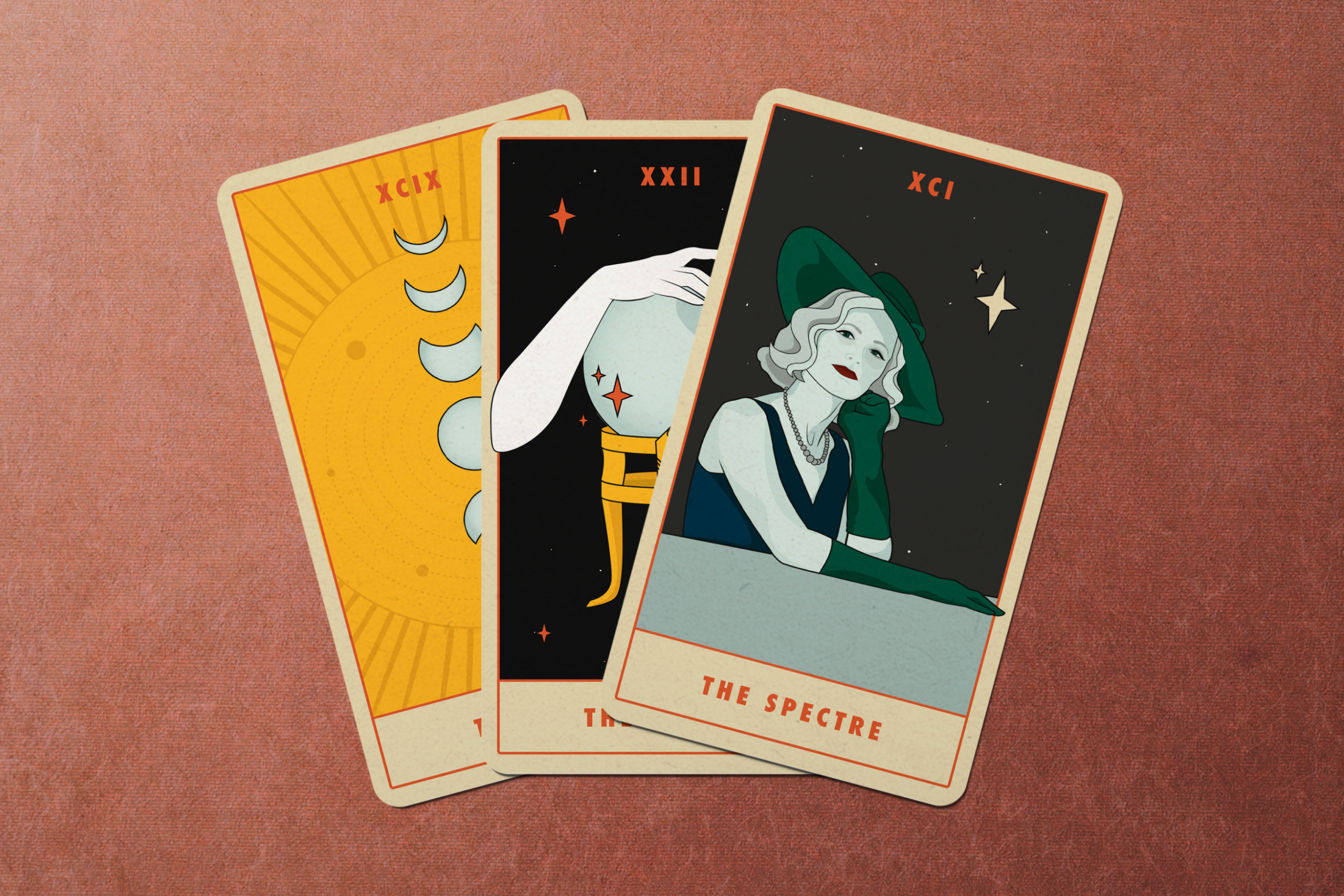
Tarot has a long and rich history, the pantomime characters and layered symbolism have always drawn in creatives. Salvador Dali created his own surrealist deck in 1970 and more recently illustrators like Olivia Healy and Sophy Hillington have all put their own twist on the cards. Here, our bold designs draw from the 30s film styling and bring both the characters and architecture into the digital world with a comic twist.
Creating a mystical approach
“I’ve always had an interest in the mystical so this project really excited me. I wanted to find a balance between the traditional and my own illustrative style. The restricted colour palette and border gives that nod to the history of the practice while the elements from the film bring a different freedom to the designs. Hopefully the cards bring happiness and maybe some guidance to people searching for it. . . “ Louisa Hadjipetrou, Studiomade designer
The world of competitive sport is one associated with excitement, passion, hard work and the unique ability to bring all types of people together. When working on other sites such as global sports marketing brands TLA Worldwide and GSE these were all values that we tried to portray through design and user experience. With this site we wanted to add a deeper sense of personal experience.
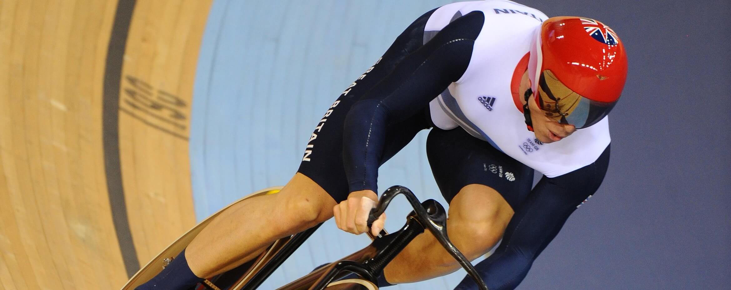
The website needed to reflect Sir Chris Hoy’s brand of ‘everyday greatness’, taking people on a journey with Sir Chris from his childhood to where he is now. We were fortunate in that the team were able to provide incredible photography that we could make integral to the design aesthetic. As a subtle reference to cycling, we created a visual device of vertical lines to be used as a texture that worked with the existing brand, helping to frame photography and to form subtle animations helping pace the content of the site.

Showcasing all dimensions to the brand
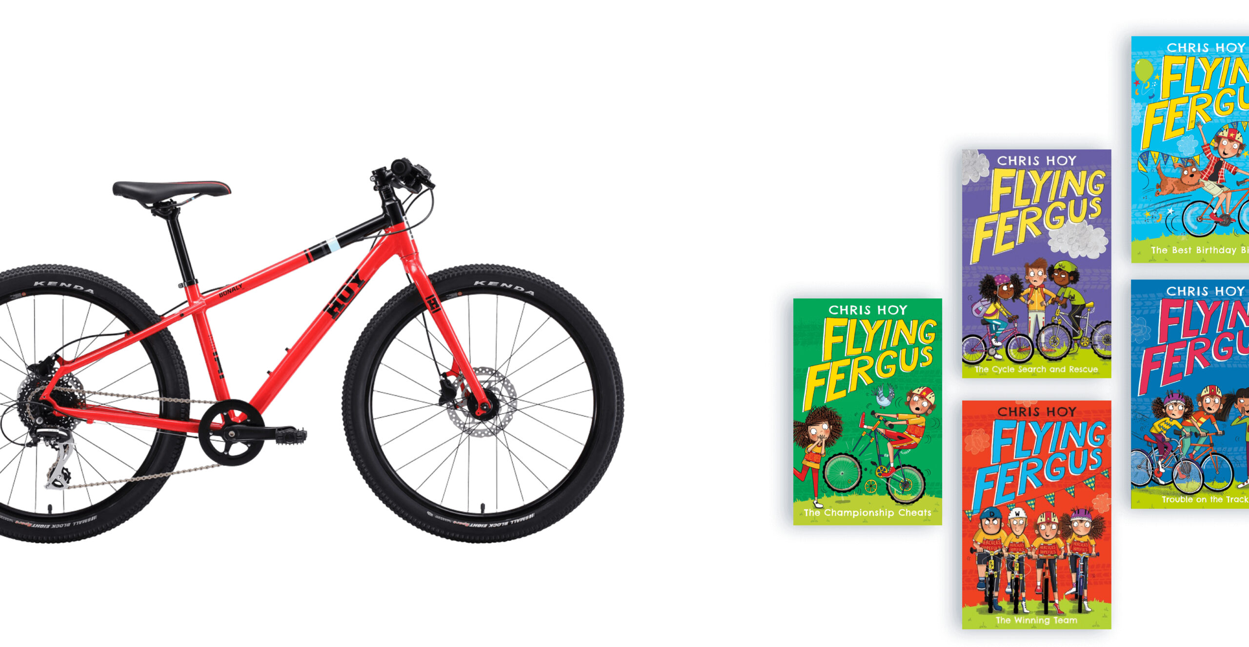
Sir Chris wanted to bring people up to date on his career and showcase the varied work that he now does through public speaking, crafting his own HOY Bikes as well as his hugely successful Flying Fergus children’s book series. We created a simple navigation system to break down each of these areas, ensuring that users had all the information they needed to make contact, ensuring the site operates as a useful business tool for him and his team.
A look behind the curtain
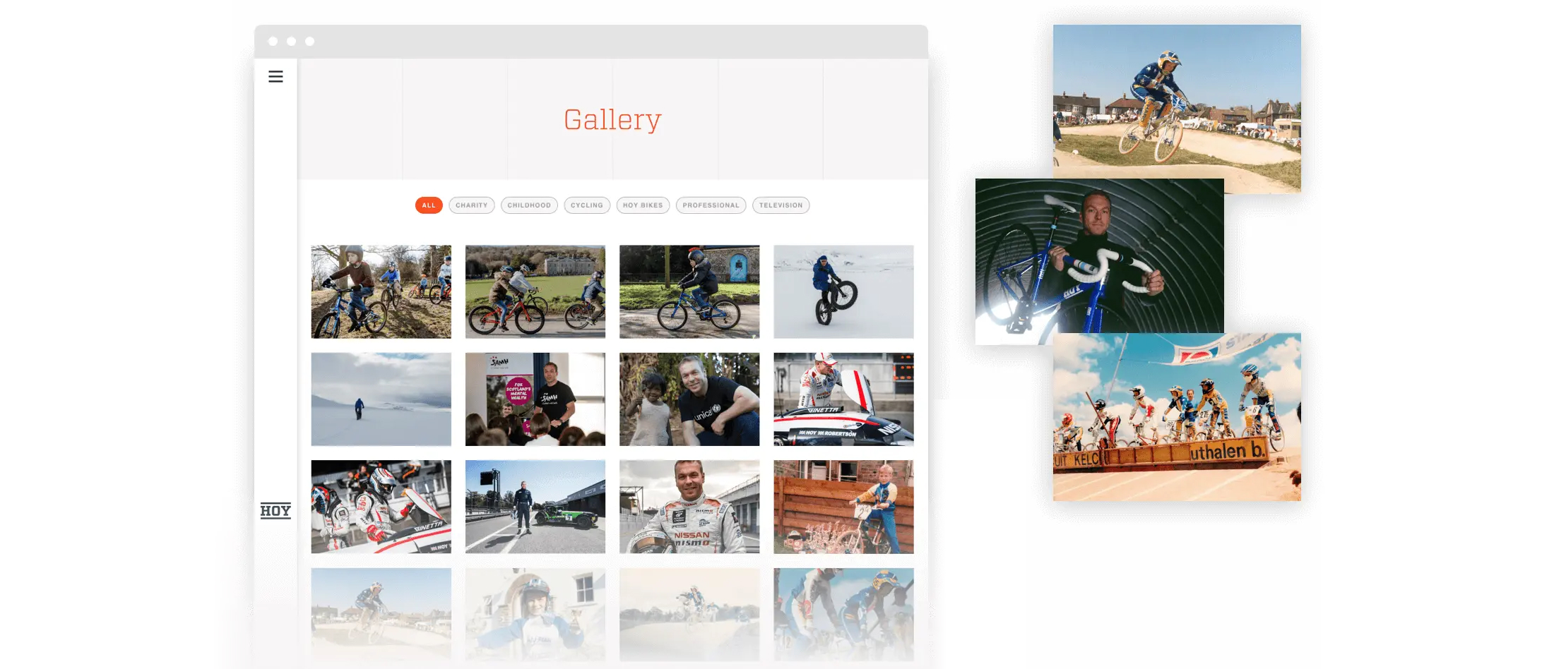
The site includes personal stories and photography that simply can’t be found anywhere else. This provides a real sense of personality and enables Sir Chris ownership of this digital brand space – something increasingly important across both social and digital platforms today. We included a gallery for the site so that journalists and enthusiasts could find a range of photography which spanned all aspects of Sir Chris’s career, again making sure the site functioned as a useful tool.
Everyday greatness, in one place
The site really captures the excitement and care behind everything that Sir Chris takes on. Aggregating his social feeds combines various content sources into one place, leading those interested in both him and his brand to a single destination where you can really see his personality at the fore.