Client background
Blossom Years is a trusted provider of nursery education with multiple sites across South East London. Known for delivering high-quality early childhood education, their commitment to creating safe, stimulating, and nurturing environments for children underpins their success. With a strong reputation already in place, Blossom Years approached Studiomade to develop a brand identity that would encapsulate their values while appealing to both parents and caregivers seeking a reliable, engaging educational experience for children.

Project objectives
The goal was to craft a brand that resonates with parents, communicating Blossom Years’ dedication to excellence in early education, and creating a memorable, inviting brand impression. Key objectives included:
- Defining a brand voice that balanced warmth and professionalism.
- Developing visual elements that would appeal to both parents and staff.
- Creating a digital destination that is easy to navigate, informative, and reflective of the Blossom Year’s ethos.
- Refine the user journey to encourage lead generation and enquiries.
Voice and messaging
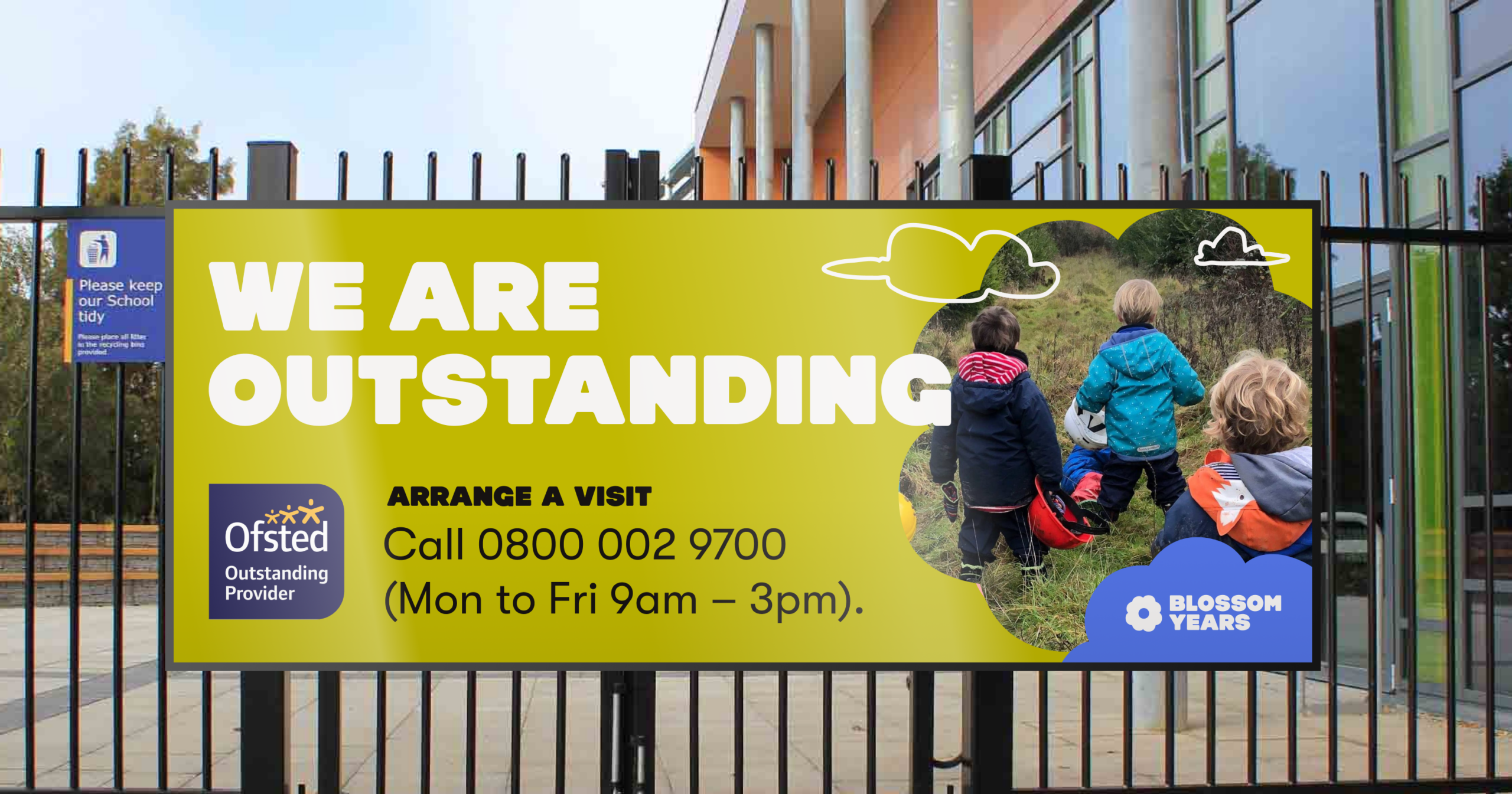
We began by shaping the brand voice around the values of care, educational excellence and a positive learning environment. Emphasis was placed on a visual approach that felt friendly yet authoritative, conveying trustworthiness and a passion for nurturing young minds. Core messaging, such as ‘a safe, stimulating, and caring environment for children’ was integrated across all brand touchpoints, reinforcing the idea of a welcoming and professional nursery setting. Taglines like ‘We are outstanding’ and ‘Arrange a visit’ directly encouraged parental engagement, adding to the approachable and proactive tone.
Visual Identity
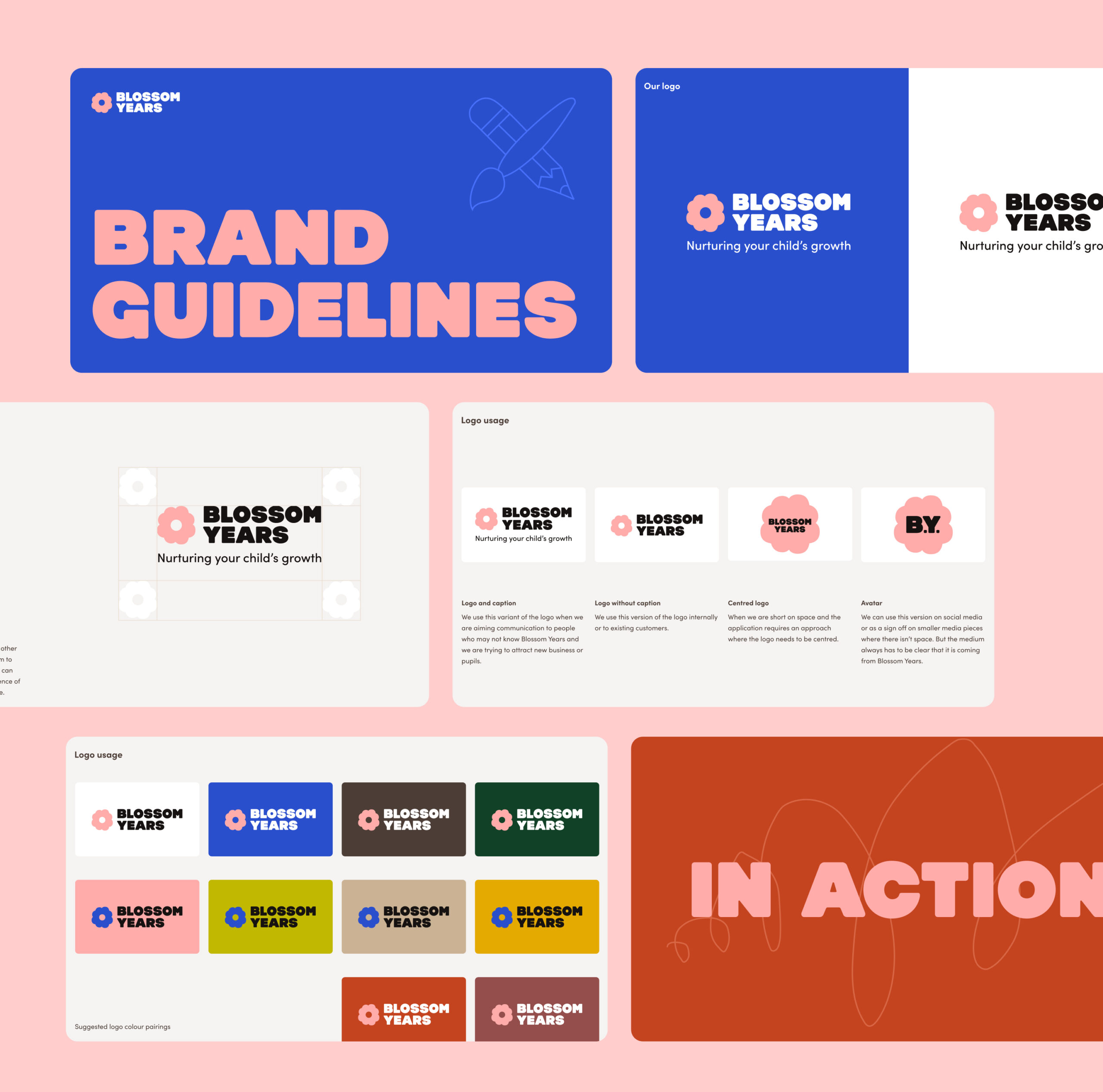
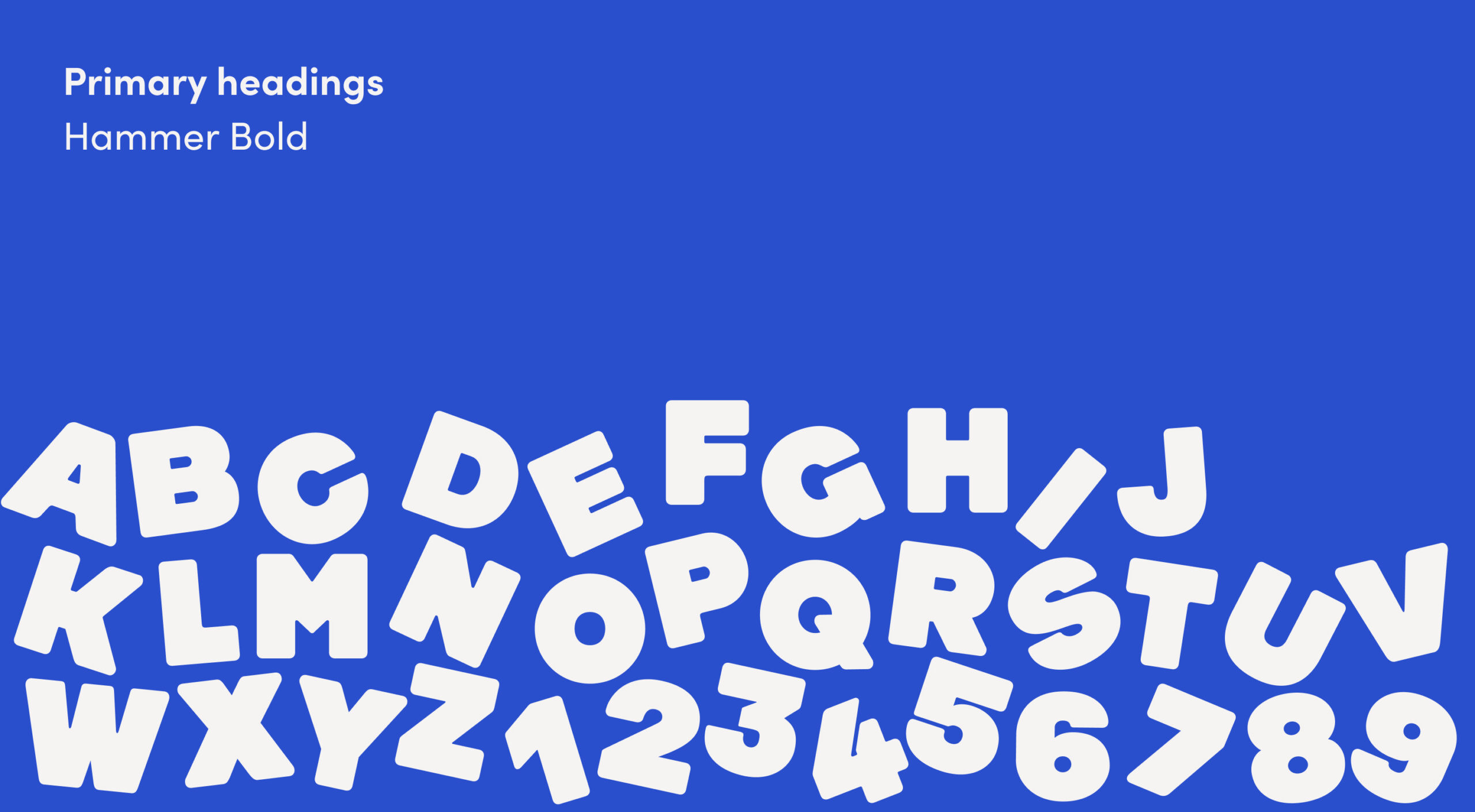
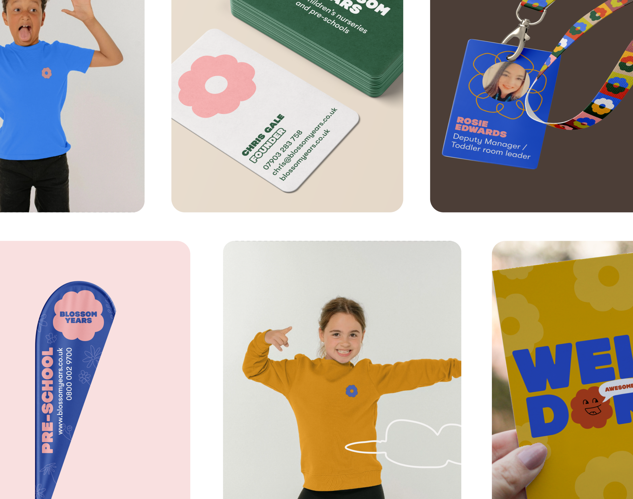
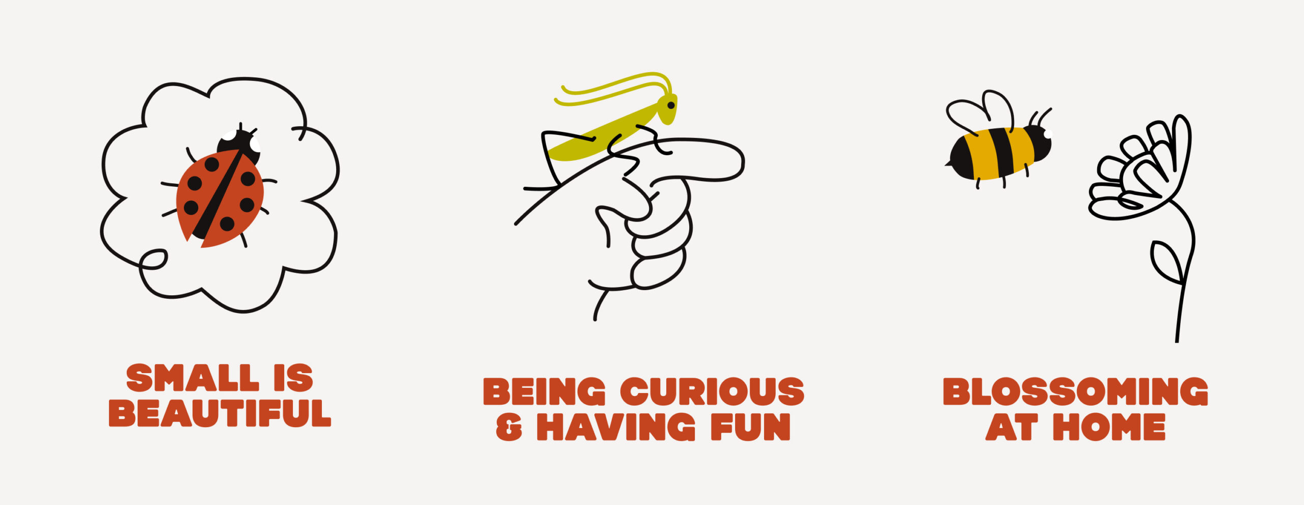
Studiomade designed a visual identity that is visually engaging and resonates with parents and staff alike. We incorporated bright, playful, and warm elements – choosing color and typography that reflects an environment focused on growth and fun. This aesthetic was carefully crafted to reflect Blossom Years’ high standards, while still capturing the youthful energy of a nursery setting.
Website and user experience
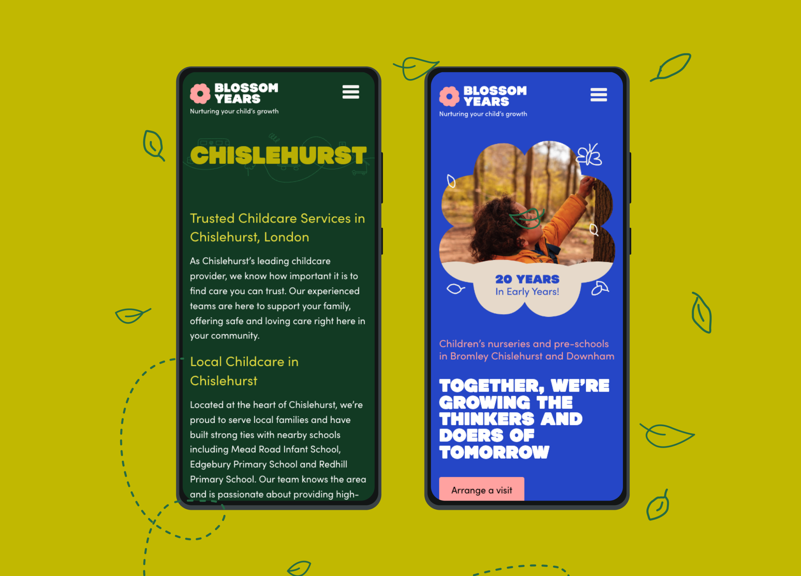
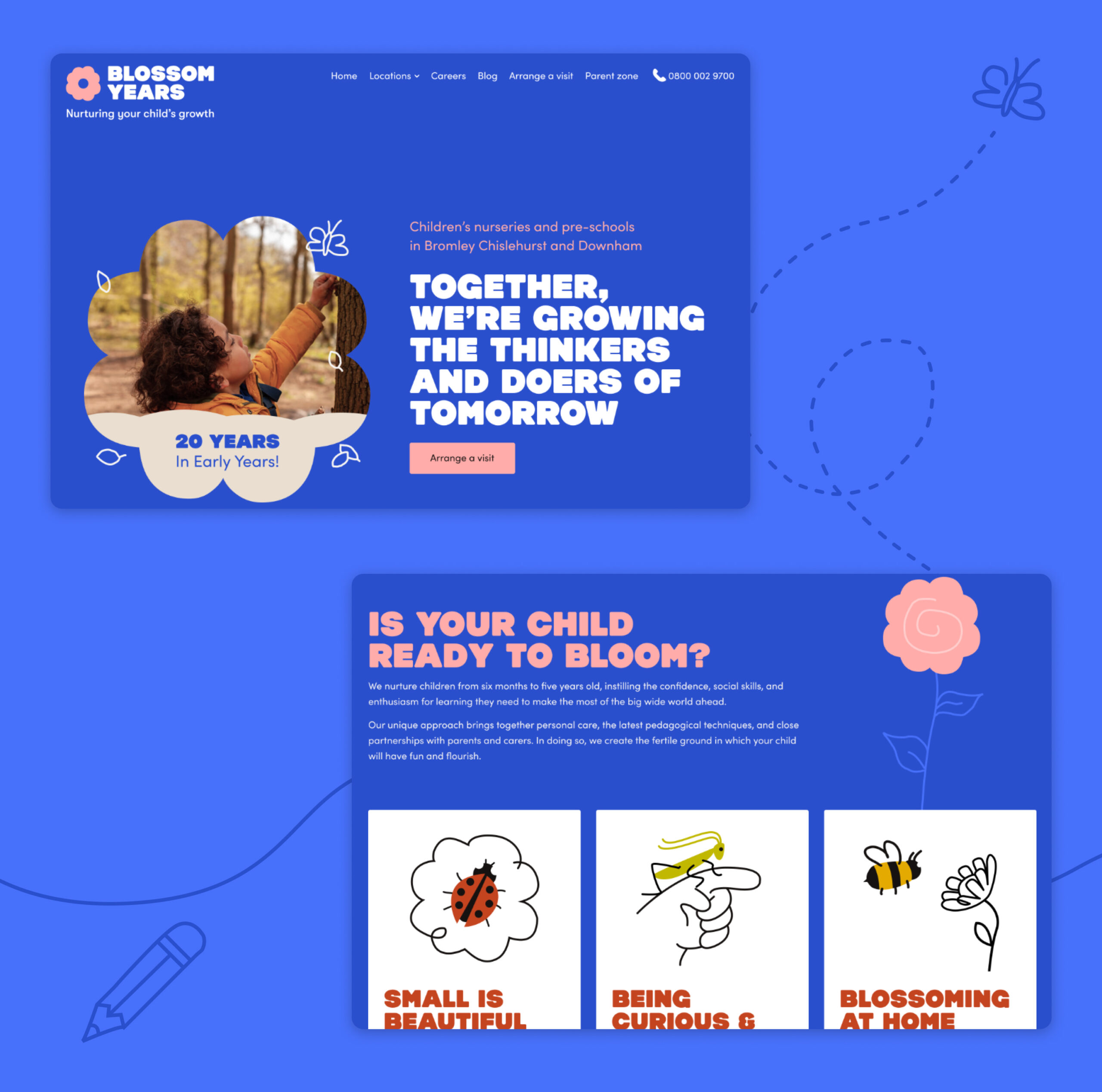
The website was designed as a central hub where parents could easily access information on Blossom Years’ curriculum, site locations, and values. Simplified navigation was key, allowing parents to find answers quickly and seamlessly be able to schedule on-site visits. Prominent calls-to-action, such as ‘Arrange a visit’, ensured a user-friendly experience, and thoughtful touches like a visible contact number fostered direct interaction. We also included content segments for curriculum details, news posts, and nursery updates, reflecting Blossom Years’ commitment to transparency and communication.
Brand collateral and communication
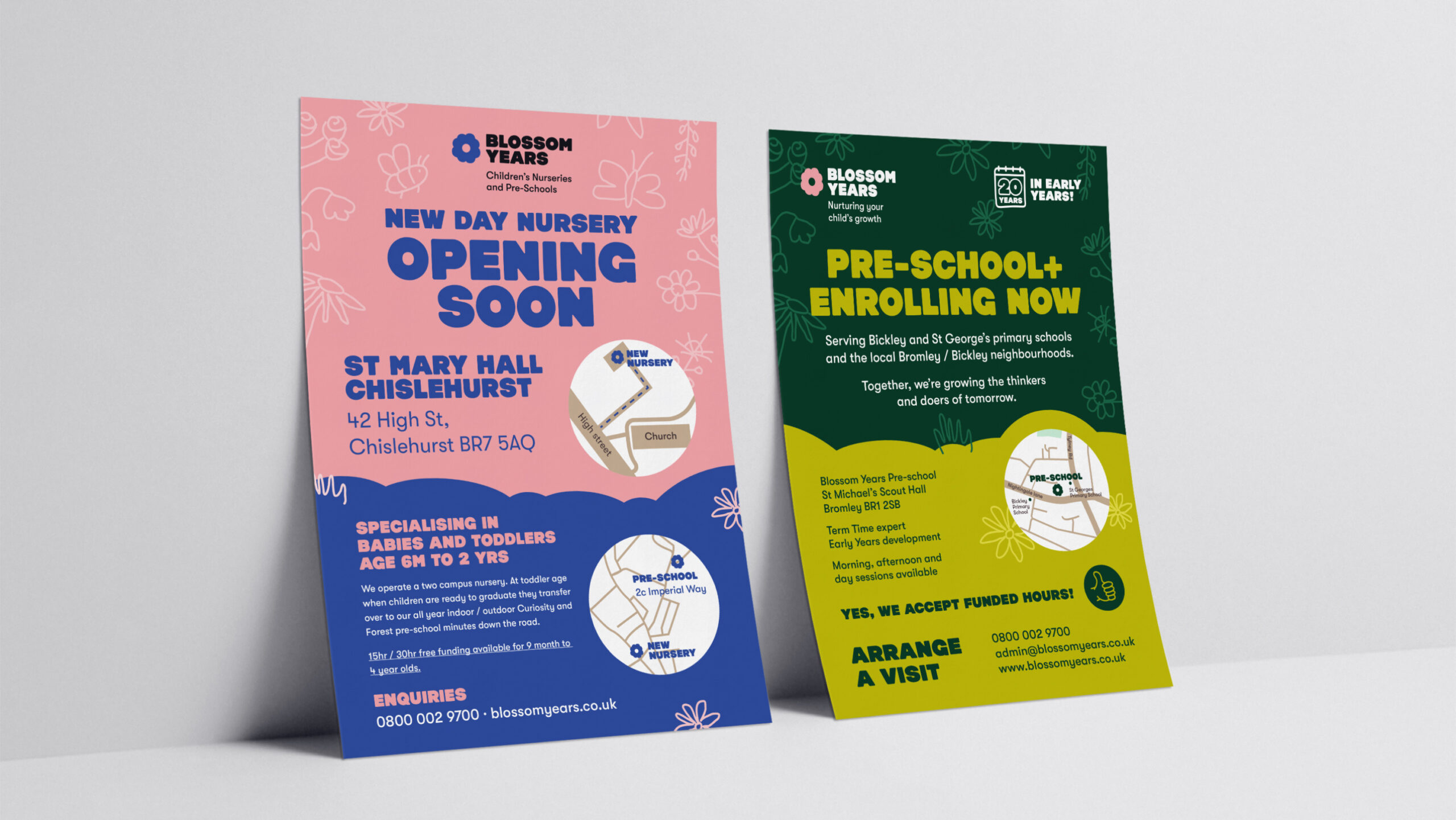
Physical and digital brand collateral was designed to align with the brand’s updated voice and visual identity. From printed materials to digital assets, we ensured that all communication reinforced Blossom Years’ promise of a nurturing educational experience. Brand templates were created with simplicity and consistency in mind, making it easy for parents to understand the benefits of choosing Blossom Years and for internal staff to build communications quickly as required.
Impact
The brand process led to a refined, cohesive identity that captures Blossom Years’ dedication to early childhood education. Parents now connect with the brand on multiple levels: presented with a suite of early-school and nursery environments designed to support their child’s development in a stimulating manner. The website and thoughtful brand messaging help Blossom Years stand out in a competitive landscape, emphasising trust, care, and quality in every interaction.
Reporting performance
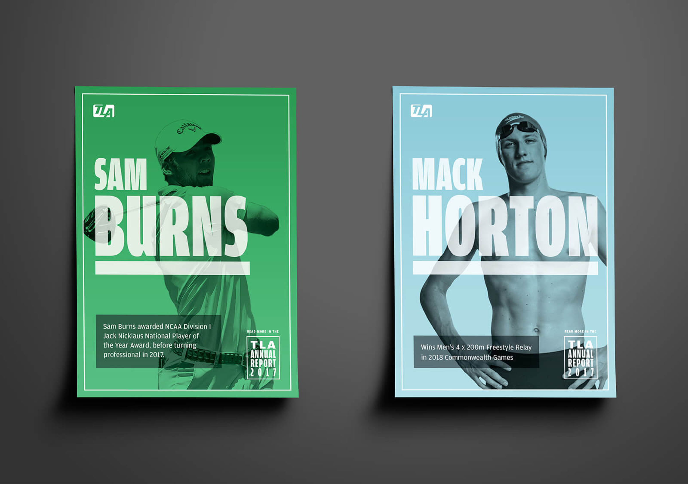
TLA Worldwide are one of the world’s leading sports marketing agencies responsible for representing world class sports talent. We have worked closely with them for five years having developed their brand, handling it’s positioning as part of M&A and creating business-focused digital products alongside reporting business performance.
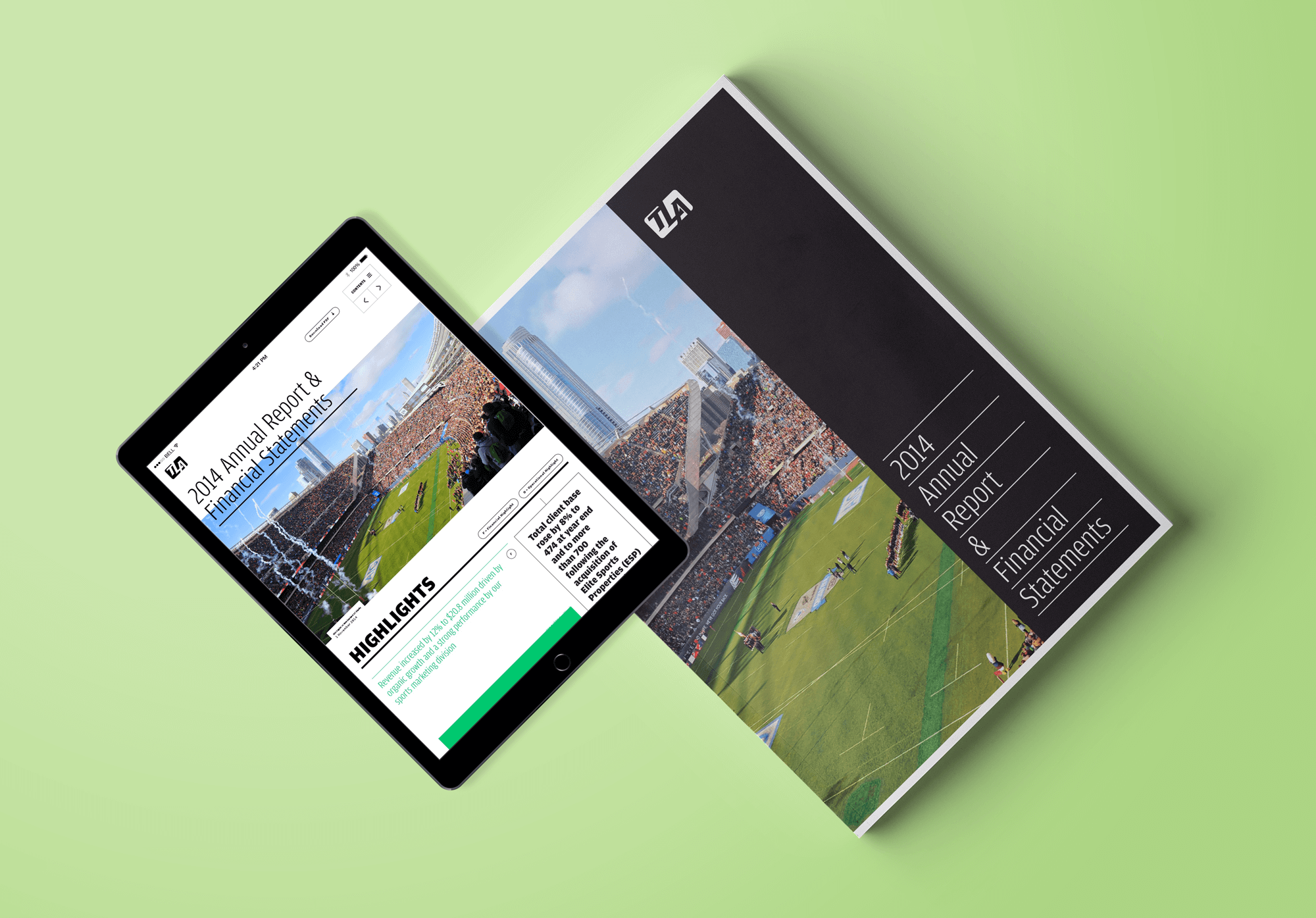
To reflect the growth and impact of TLA within the industry and as part of their listed reporting, this year we developed a bold, confident and high impact aesthetic. This came through by both the physical and digital report – high impact colour, monotone photography and strong typography combining to create an assertive look and feel.
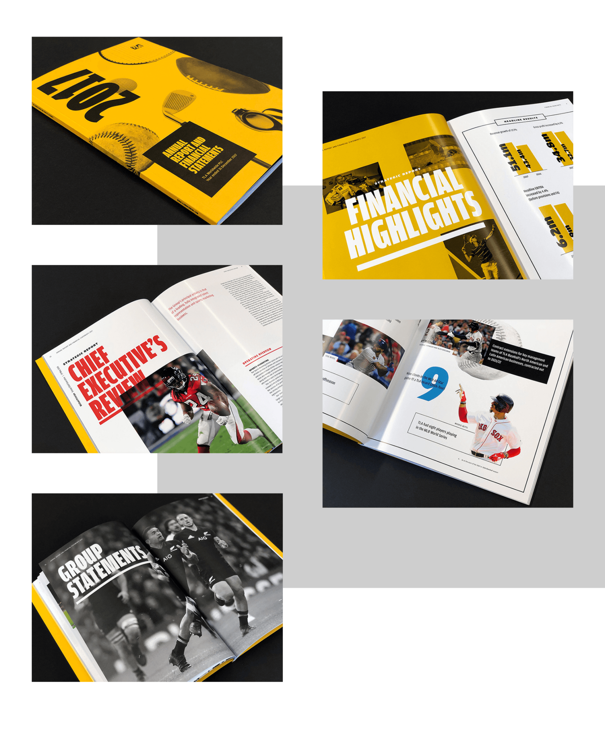
A tactile physical report
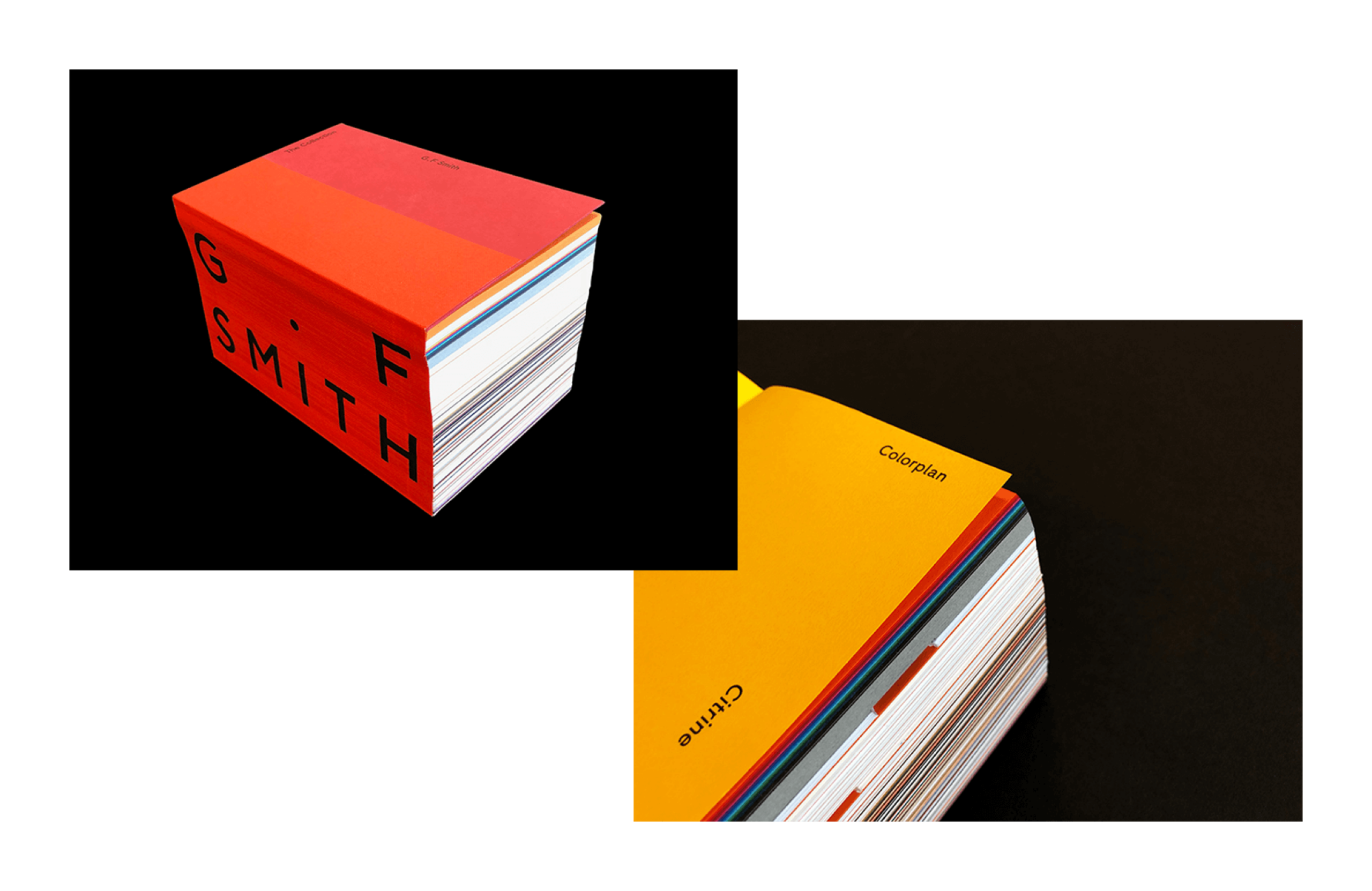
The physical report was an opportunity for the client to explore tactile stock options that best reflected the design vision. G.F. Smith Colorplan in citrine lent incredible impact to the cover with the texture creating an elevated, luxury brand experience. The sense of touch was again reinforced within the report to help define opening, editorial sections alongside more detailed financial information. Full gloss for editorial highlights with large, bold imagery and an offset, finer weight finish for all important financial statements helped identify both areas of the report for the reader.
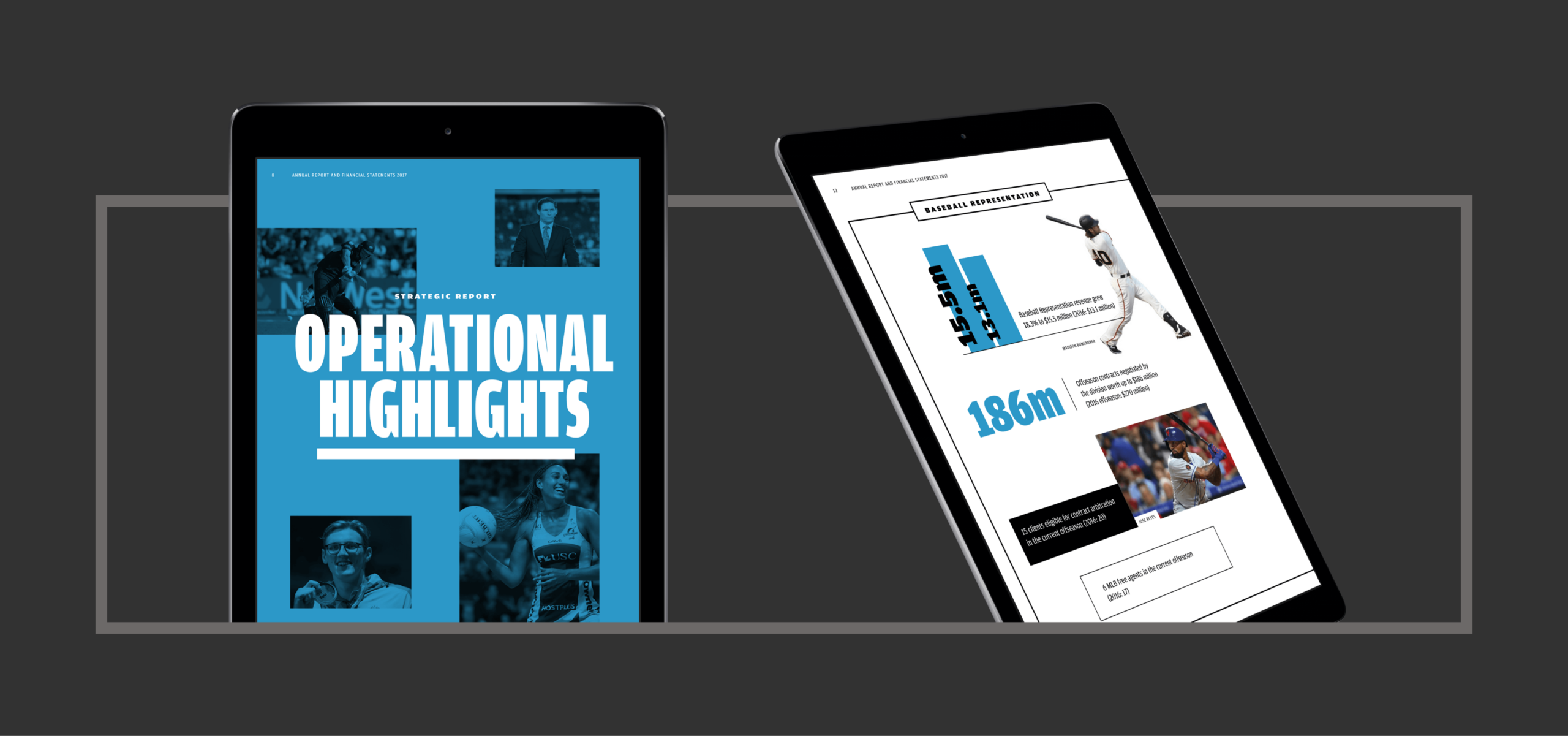
A digital experience
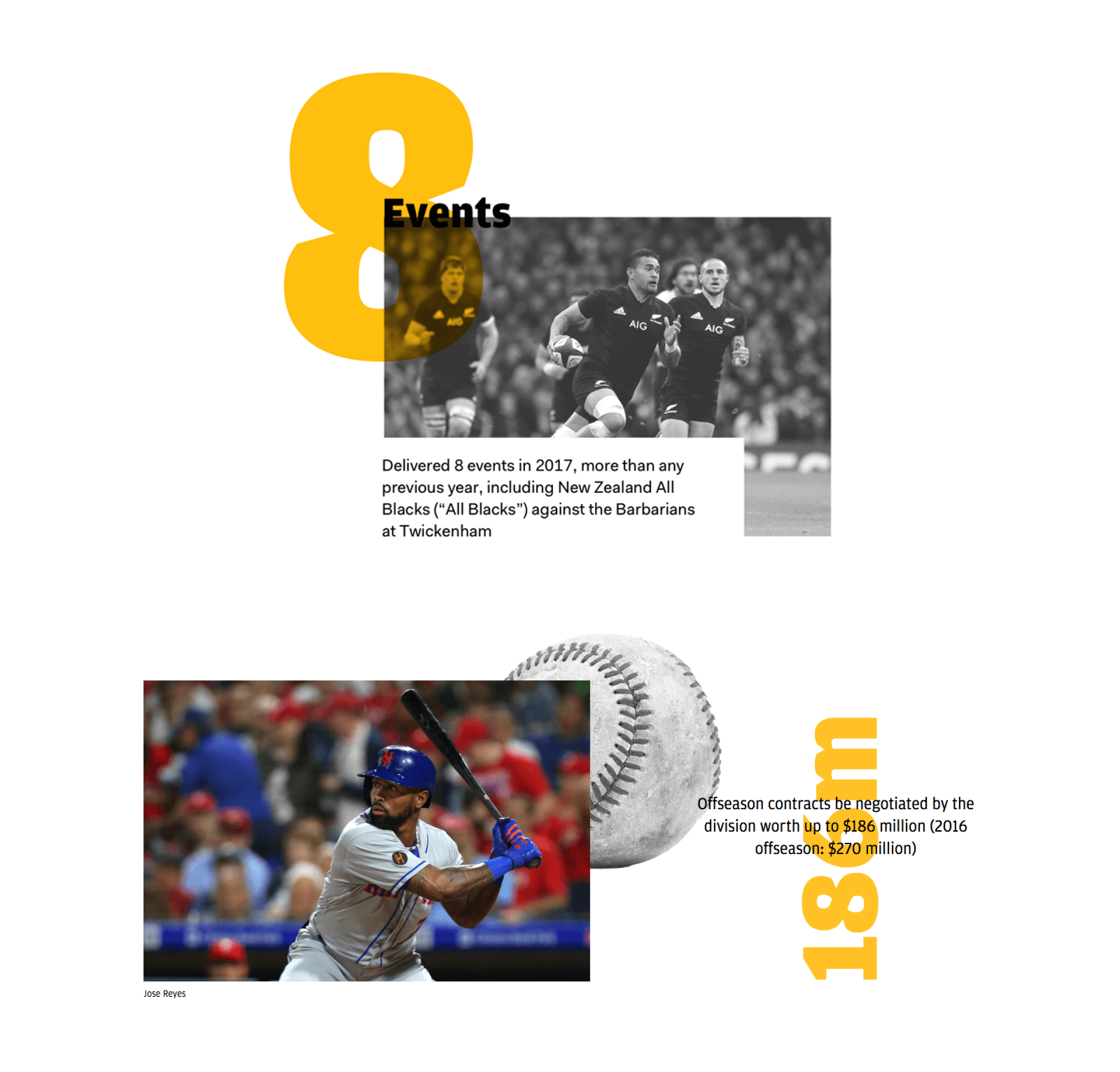
We understood the need for an integrated approach and created a digital version of the report to best accompany the physical. This provided stakeholders a richer, streamlined experience with highlight and overview information quickly accessible. Statistics utilised subtle animations and embedding video provided brand exposure and context whilst also allowing us to showcase TLA talent.

Results
The combination of digital and physical allows for wider audience engagement and presents the report as a unified brand piece. Design and production combined to help reinforce the TLA brand ethos of bold industry leadership – representing this to shareholders across the UK, USA and Australia.

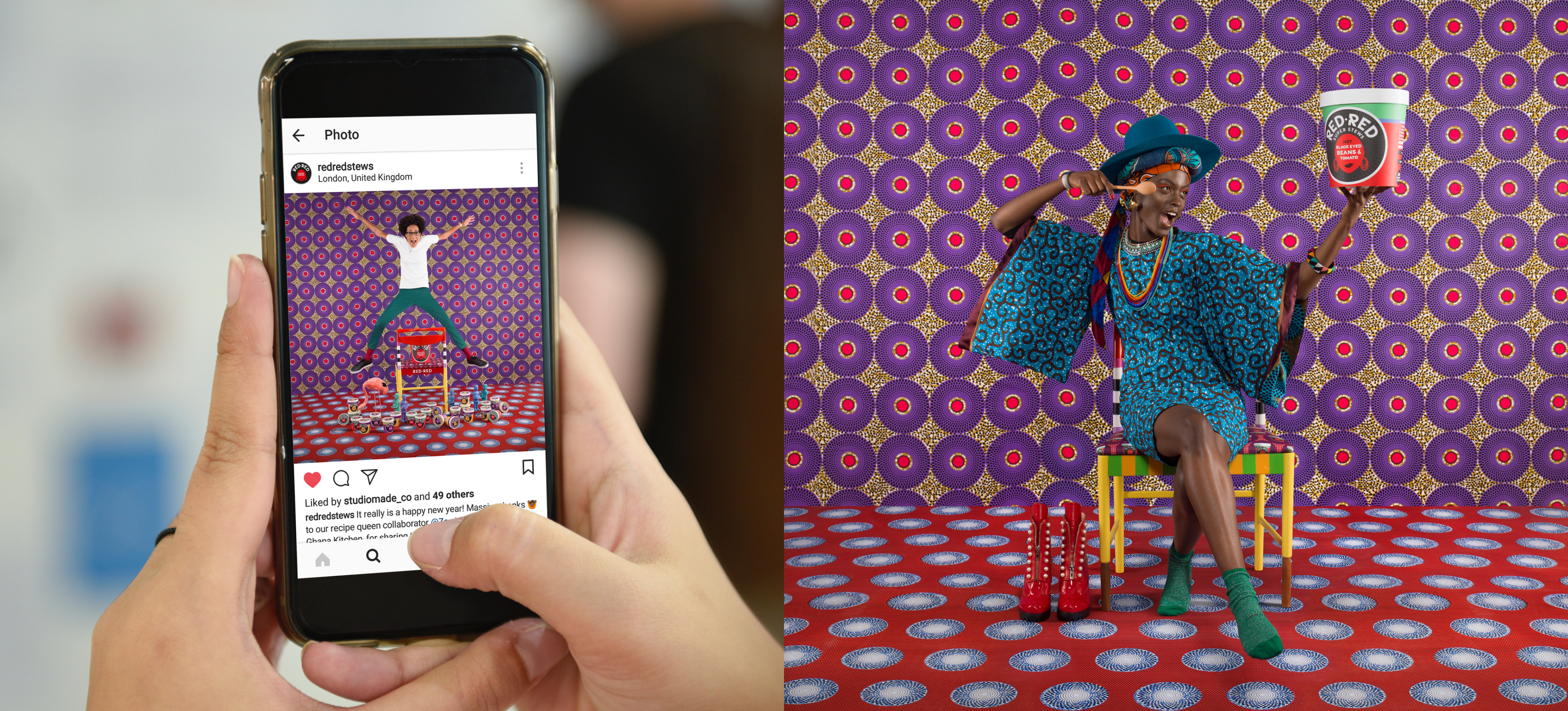
Our brief was to create a cohesive digital experience for a unique new vegan dry food product launching in the UK all within a short timeframe of just six weeks. The brand was exciting featuring bold colours, unique photography and collaborations from creatives within food, fashion and lifestyle. Everything about the project was high energy.
The site needed to be just one page, keeping it simple with maximum impact. We exploited the size and simplicity by creating fun interactions through hover states and animated elements, giving it a real sense of life. We also had the luxury of great images and so we gave them the space they deserved making a number of full width.

Digital presence
The scrolling and interplay of the site needed consideration, ensuring that it worked perfectly across both mobile and desktop. The result required multiple breakpoints that allowed for a phased scrolling environment on desktop and continued scrolling for mobile. The impact meant that creative distributed socially felt united and supported the website presentation.

Within the digital presence, ensuring that typographic choices reflected what was intended for print was important. The brand font, Wildfire, shouted personality, however it needed care to best reflect it digitally. The font wasn’t optimised for digital viewing and so we had to kern each individual character to make for a truly natural reading experience… lots of pixel adjustment!
Measuring the pulse of the music industry worldwide
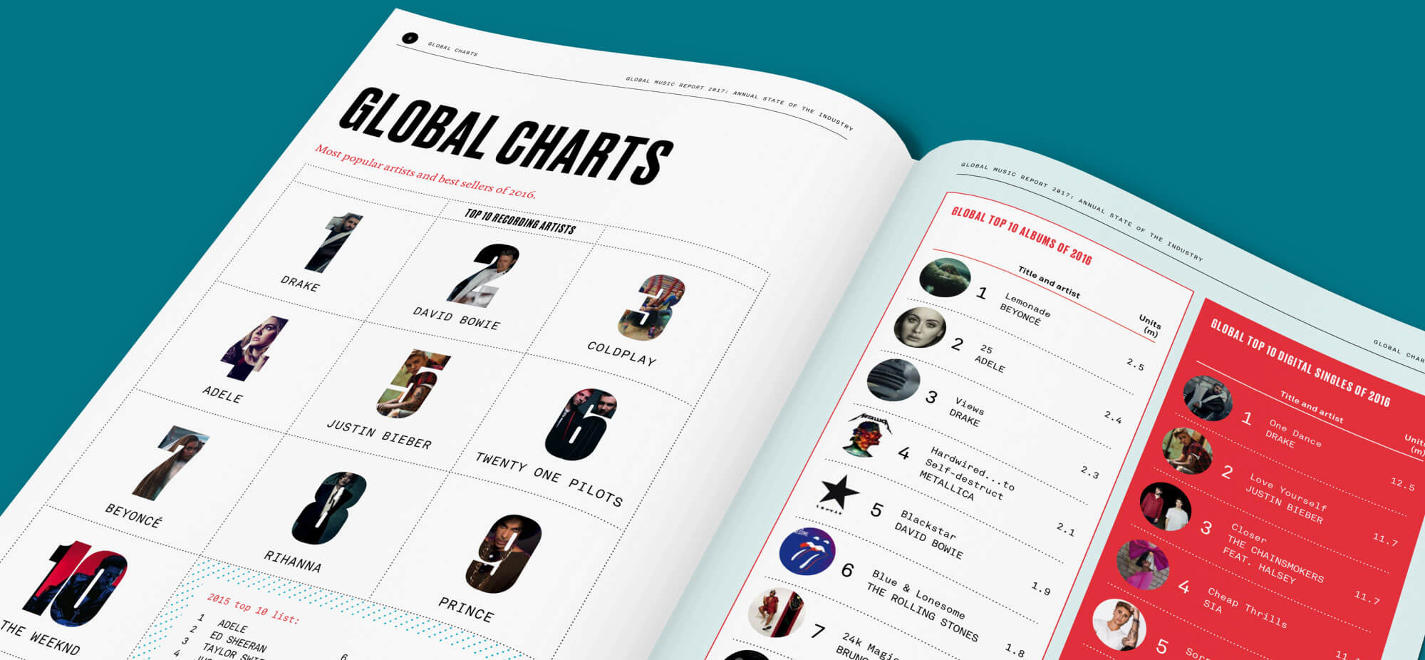
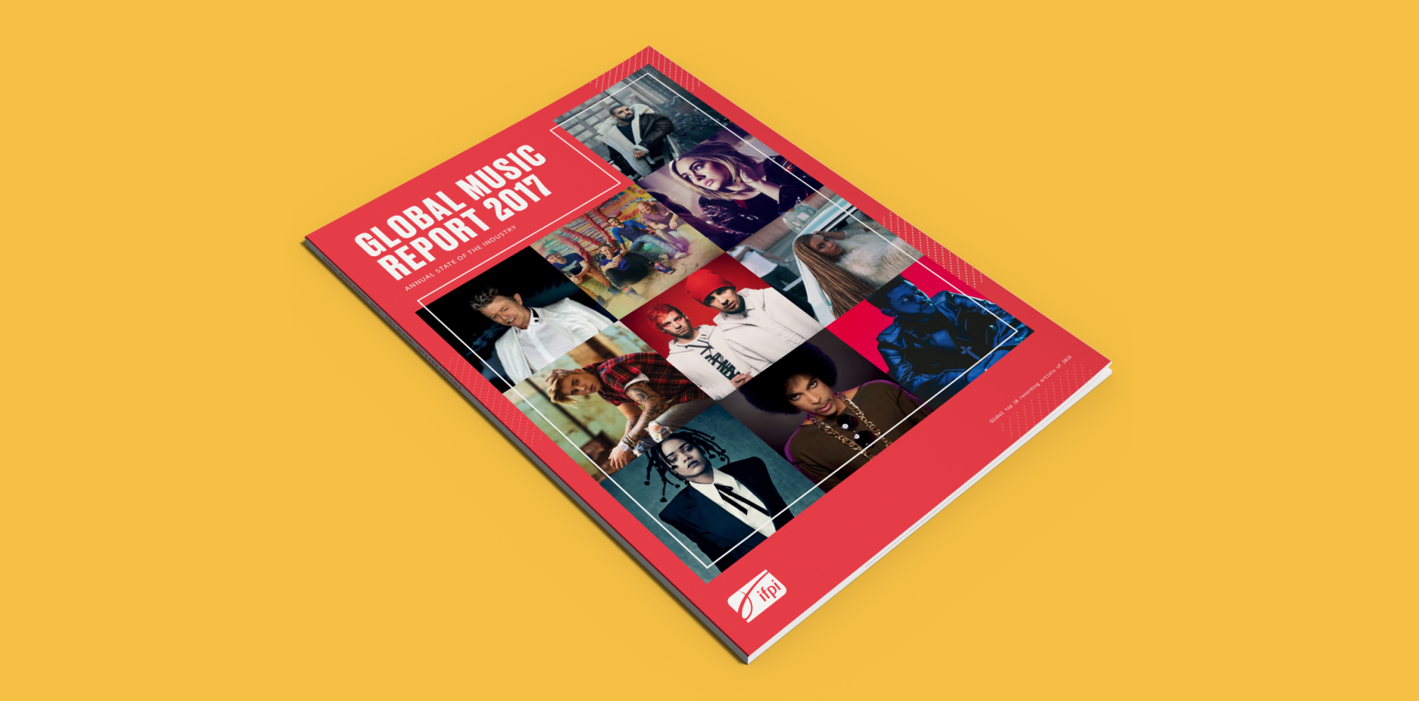
The Global Music Report contains a detailed assessment of the recorded music industry for the full year. Overall industry trends, figures, and artist case studies are featured throughout the report that serves as a valuable resource to inform IFPI’s subscribing members and partners.
The report also features extensive and authoritative data for the global industry and across more than fifty individual countries.

A functional design approach informed by the industry
The design brief for this project centred around creating a report that is both clear and functional in its presentation of valuable industry figures, and reflective of the lively and energetic tone of the music industry it’s reporting on. With the additional value provided to subscribers of the full report, we wanted to reflect this value in our approach to the design style. We developed a bright, clean style with a bold use of type and artist photography.
Displaying complex data
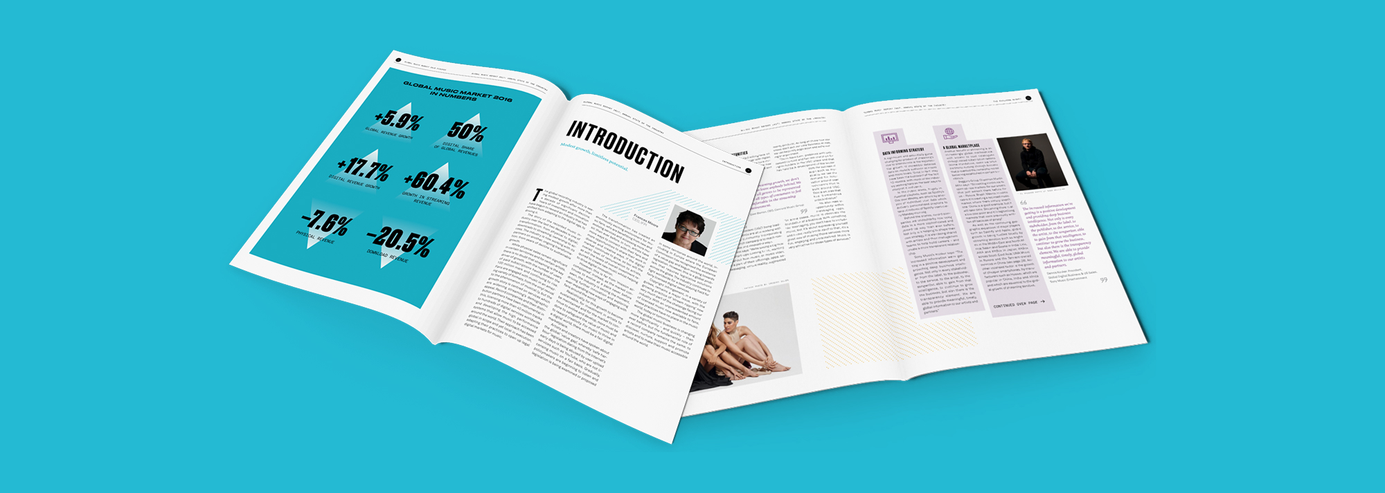
The audience for this report is made up of IFPI’s industry members and businesses that make their strategic decisions based on the numbers and findings delivered in the report. Industry numbers broken down by country are available in an appendix within the report that give insight into the consumption preferences of their markets. This operational value to their subscribers is supported through the provision of the raw data and a digital companion report site to make the content as accessible and reusable as possible.
Creating online content
Along with the printed report, we developed a digital companion that enabled IFPI to provide a premium login area where subscribers could download the accompanying datasets and access an interactive visual dashboard of the country market data. Logged in users are able to have a more customised view of the data where they’re able to quickly search and compare countries and download relevant assets.
Additionally, this digital version of the report enabled IFPI to easily share links to relevant materials and share their findings socially – a task that was difficult with the previous print-only version.
The whisk(e)y portfolio of Pernod Ricard is wide ranging, containing over 75 whisk(e)y brands. These cater for different audiences, tastes, drinking cultures and aspirations – the brands all have their own unique nuances and sophistications.
Pernod Ricard places huge importance on internal sharing and engagement to enable authentic brand storytelling. Faced with the prospect of sharing information in a traditional format (InDesign styled factsheets combined with structured Excel sheets) the insight team felt a need to create something that could do this as well as engage varying brand teams located across different regions and continents, quickly and efficiently.
Creating a specification
Following a client recommendation, we were appointed to consult with Pernod Ricard and look at potential methods of delivering this important content to a diverse audience. Through our process of workshopping and modelling we worked alongside the Pernod Ricard team to help conceive a brief and specification for a digital tool that covered key points of use, including:
- Producing a simple digital tool that made modifying individual brand details and information quick, easy and economical
- A secure configuration with Pernod Ricard restricted access and user management
- The ability to present various details across the whisk(e)y product line
- Enabling a method that allows users to ‘favourite’ and create their own unique portfolio of whisk(e)y brands that they were interested in
- A concise overview of core brand positioning and statistics
Building an MVP
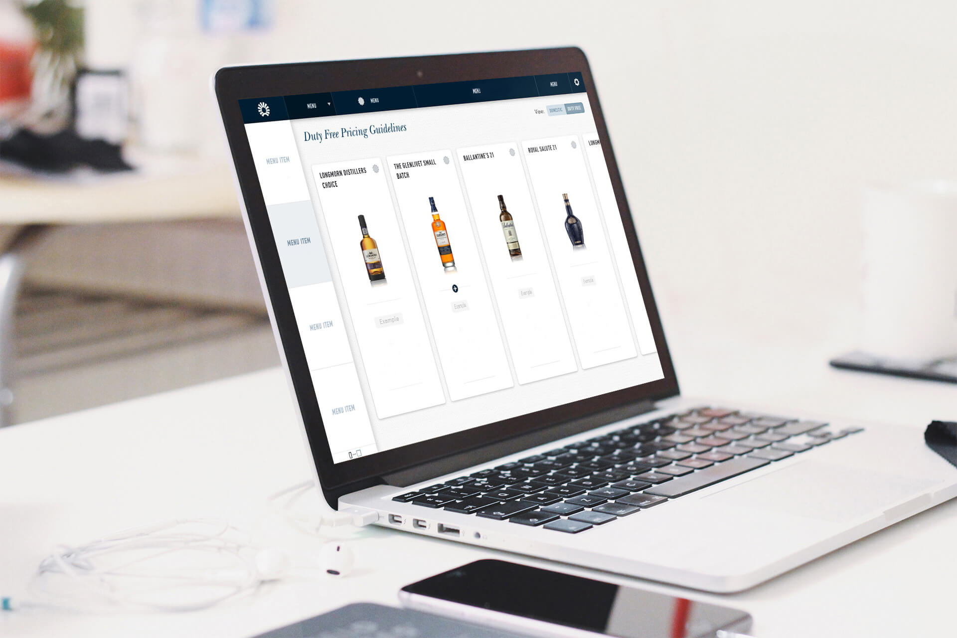
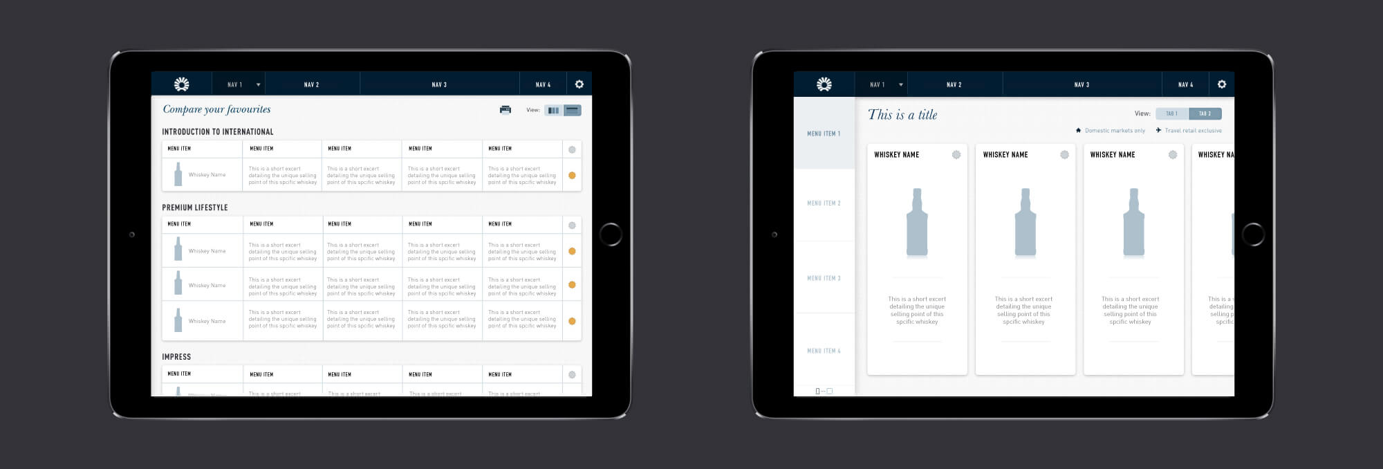
With a business-objective led specification created and utilised as a reference throughout the project, we began wireframing and prototyping the different areas of the tool, touching on each of the core points of use and planning out how the tool would perform best for users and administrators. It was decided that understanding user metrics was an important administrator requirement, whilst the content structure and relationships between whisk(e)y products within the tool and their associated pools of content needed to be planned and agreed. Different content matrix exist for presenting information which meant our Content Management System had be agile enough to allow changes to be made quickly.
Working through the prototype phase, we incorporated UI design and digital styling that supported Pernod Ricard’s brand. With a modular approach, our designers previewed design iterations gaining feedback from potential users allowing us to test various aspects of the tool.
WordPress expertise
Our specialism as a dedicated open-source technology agency, with particular experience in utilising WordPress as a content management system and api engine, proved essential within the creation of this tool. It enabled us to rapidly iterate through content revisions and produce a delivery architecture for the tool that was robust and flexible, without the financial overhead of a licensed solution.
Enabling engagement
Our tool has been in operation for several years and has gathered an active user base of over 600 differing brand and insight managers from across Pernod Ricard. In creating this digital product we have provided a means with which individual brand managers, often siloed in their own immediate brand concern, can actively explore and learn about the strategic positioning of other whisk(e)y brands both inside, and outside, of their market.
Results
In creating this digital product for the Pernod Ricard insights team we have accelerated their digital innovation – a key business goal – which in turn has allowed better integration and knowledge share within the business.
By empowering brand managers to have quick, easy-to-use access to cross segmentation information, this tool aids internal engagement and information update on key brand changes.
The tool supports:
- Over 600 brand users
- Engagement across a global organisation
- A comprehensive portfolio of over 75 whiskeys/whiskies
Creating a brand for a new restaurant experience in Rye
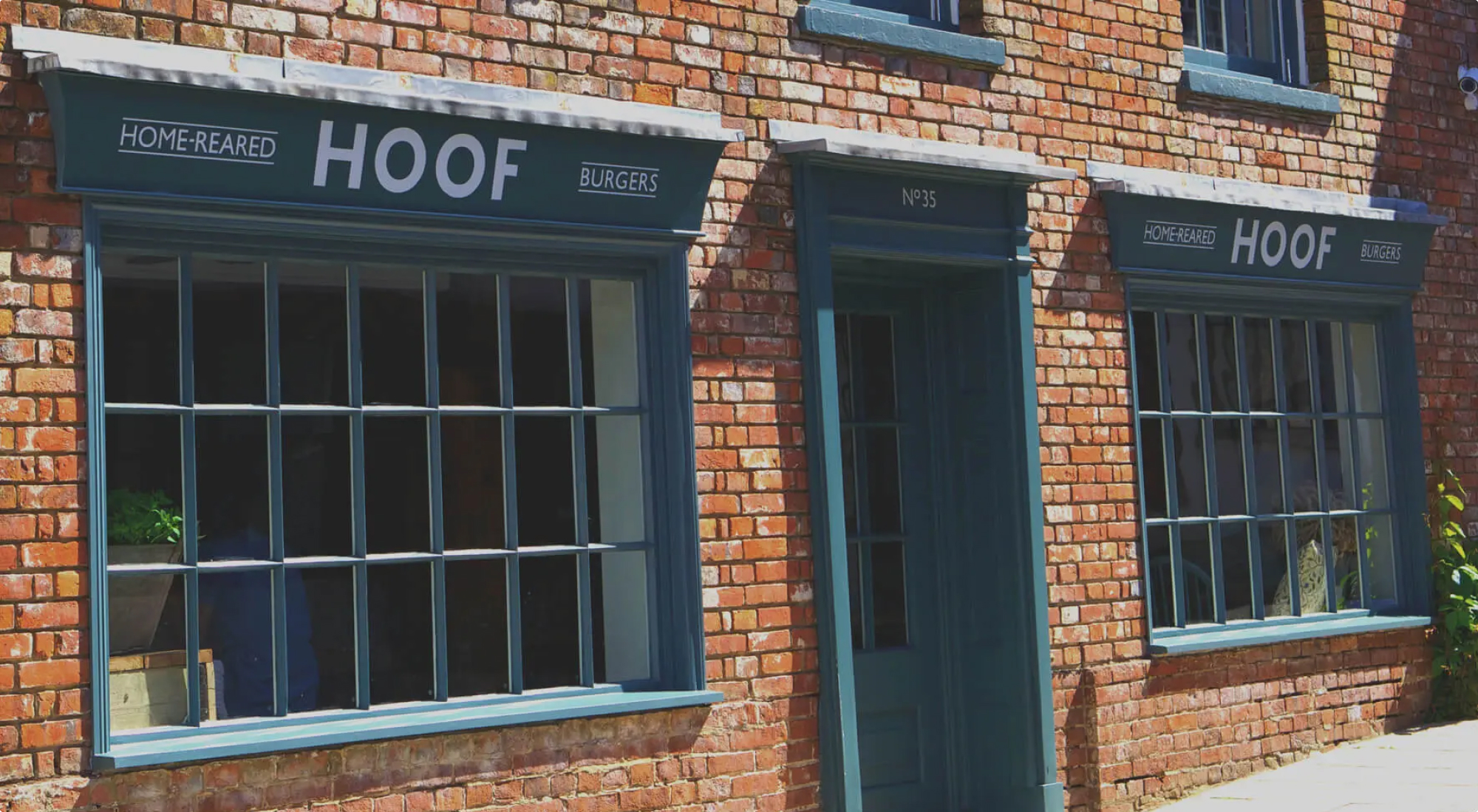
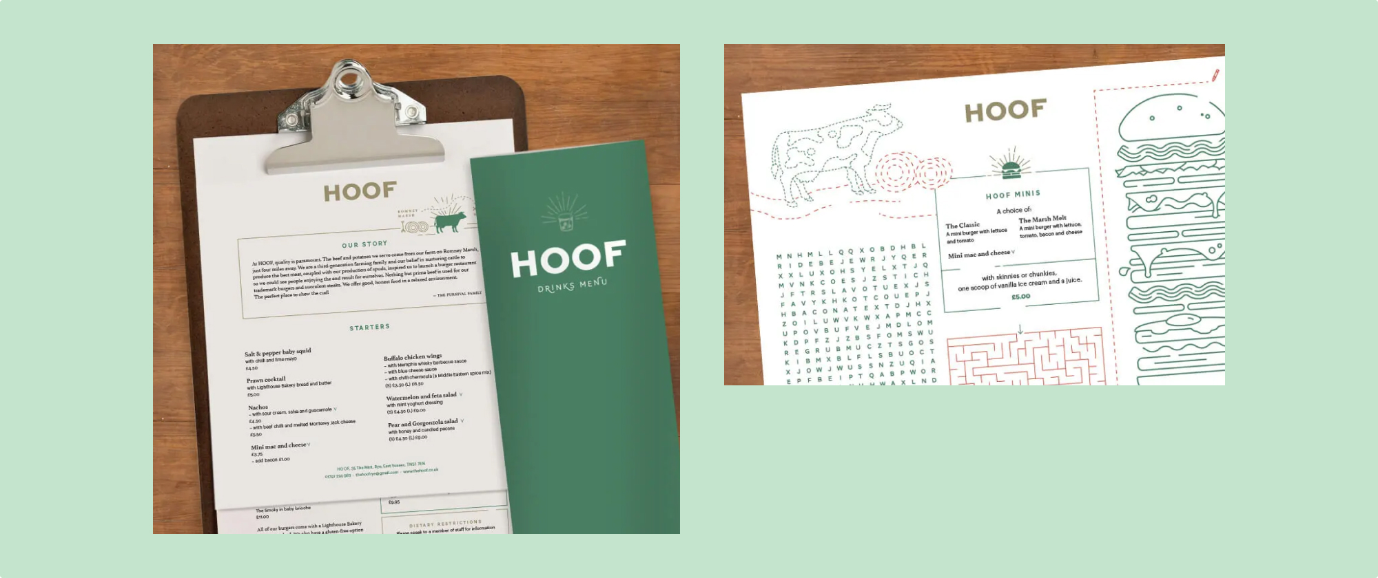
Hoof was a concept born of wanting to share good beef from the family farm in Romney Marsh. Working across both the signage and menus we wanted to create something that was both fresh and respectful of the heritage feel of the Rye high street. We enlisted an earthy, premium palette of forest green, drawing room blue with a golden potato-esque accent reflecting the high-end quality of the food and architecture.

Establishing an identity that can scale
The clientele in the area are primarily families and so we wanted to share the sense of relaxed fun that the restaurant offers. We created unique illustrations to be shown on the children’s menus that focussed around the food and produce. These were also developed to ensure flexibility and that they translated well across both physical and social outputs, helping the brand to really come alive.
Check out the Hoof Instagram

Global Insight is Universal Music Group’s internal data team. They empower their international workforce with the ability to easily gain access to vital data about the music industry and Universal’s work.
A familiar problem for many established companies, this dedicated business division needed to unite under a common vision, with an identity that helped signpost their involvement and presence throughout the wider company and across global regions.
Our team were commissioned to help with this brand activity, creating a presence that fitted within Universal’s brand guidelines whilst allowing for a more engaging approach that created greater recognition.

User-friendly brand style
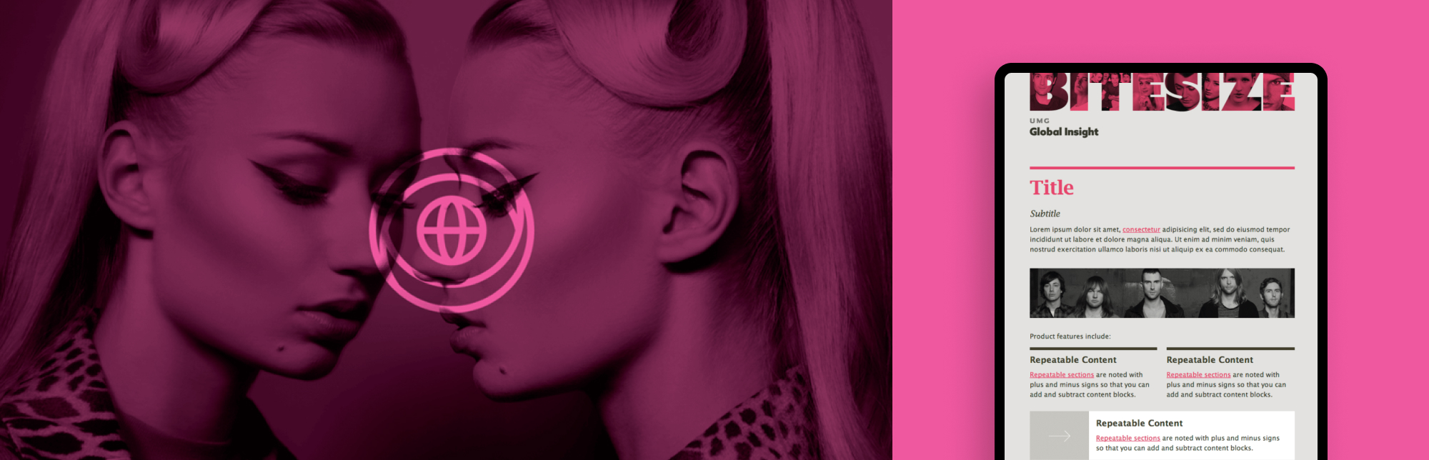
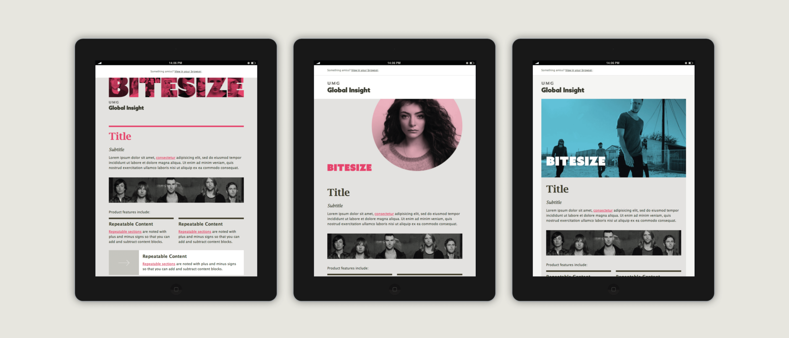
As part of this positioning piece, we wanted to create a visual identity that could easily be adopted by the team. Our design ensured that a systematic style was created with a Microsoft-friendly approach considered for assets, colour overlays and consistent typographic treatment.
Assets and templates
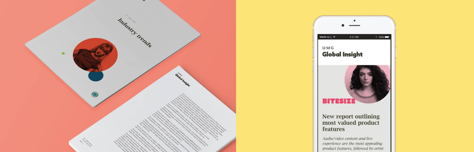
Our input within this project involved the design of a new logotype and avatar, colour palette, icons, photographic styling, and the creation of brand guidelines for educating internal teams on how to make use of all these assets. Once the brand direction was agreed we then helped roll out the new approach with the creation of Microsoft Office templates and HTML email campaigns built in Mailchimp.
We created several responsive Mailchimp emailer templates for the team which allowed their team to easily create well-designed internal update newsletters based on their department’s wide range of topics in the music industry.
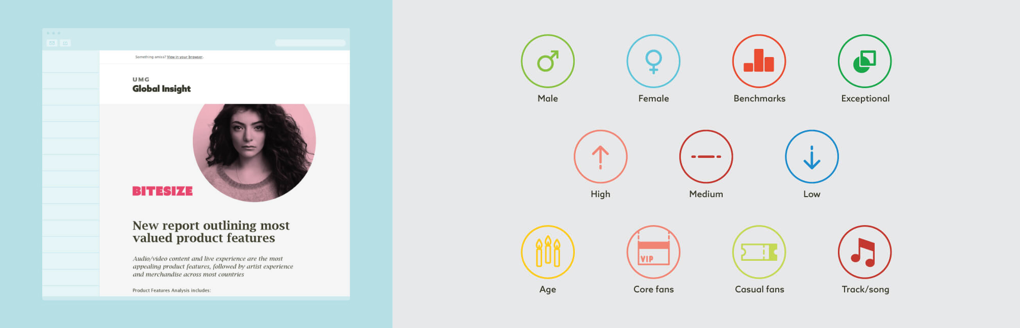
Brand iconography
An extensive icon suite that could be used across all communications was created to support the overall brand direction. Designed specifically for the themes and topics of interest within the division, the icons built an identifiable brand language that helped the pieces they created feel owned by the Global Insights team.
A world leader
TLA Worldwide have grown to become one of the world’s leading sports marketing agencies. Representing talented individuals from Olympians Sir Chris Hoy and Rebecca Adlington to leading NFL stars Jameis Winston and Dion Dawkins alongside Australian AFL Talent including Taylor Walker, TLA are responsible for some of the globes greatest sporting individuals, brands and events.

TLA’s consultancy and management teams have created impressive spectacles at the Australian Grand Prix, new sports propositions for football exposure at the MCG in Melbourne including both heavyweights of Brazil and Argentina, as well as staging major one-off events such as Wayne Gretzky’s Ice Hockey Classic. TLA count global players such as Adidas, Toyota and Formula One as clients and continue to grow with their reach in the market.
This growth has required a brand presence that, under our guardianship for over five years, has evolved and now encompasses a single, global digital presence, an integrated approach to investor and stakeholder reporting and the ongoing innovation of digital products that will help both TLA’s internal team and also their clients in continuing to grow.
Here’s how we’ve worked together.

Brand building
From the outset of working with TLA our work has seen activity across the following areas:
- Establishing a brand vision: defining a direction of travel and identifying key areas of focus
- Engaging with investors and stakeholders on a global scale, across both physical and digital corporate reporting
- Establishing a logic to a global brand presence enabling regional reference with a view to global integration
- The cultivation and growth of a single brand alongside a period of business acquisition
- Creating a core brand guidelines directive with a foundation of brand templates and assets
In producing a range of brand outputs including corporate reporting we have established an ownable style and creative direction that resonates with TLA’s core values. Our reporting, including both physical reports and digital companions have provided profiling opportunities for talent as well as highlighting other areas of focus from a stakeholder’s perspective.

Our approach to corporate reporting
As an integrated agency, we believe strongly in providing accessibility to all stakeholders. Naturally this means an increasing digital presence, coordinated to AIM Rule 26 compliance, but it also means that tangible, physical communications should not be ignored.
Our work across the corporate reporting landscape within other sectors corroborates this. In our opinion a physical report continues to maintain a role within the Boardroom and within reach of investors. Our team ensure that from a messaging and brand consistency perspective, digital and physical outputs compliment one another and take advantage of the unique benefits that each platform provides, designing for purpose. This could mean encouraging the use of interactive charting within the digital report – allowing investors to truly interrogate data year-on-year, or it could mean the addition of a data narrative to reporting figures.
A core, global website
TLA (The Legacy Agency) maintained a US-led digital presence when our relationship began. With business acquisition and growth however it became clear that a single, revised site presence was required that would aptly showcase everything that TLA represented on a global scale. With their expanded brand reach, we helped their team identify their key offerings, and in-turn design and build a site that would respond to their needs, and their clients’ needs.
Our iterative process:
As an agency, our digital workflow follows a modular, content-first approach where we:
- Iterate through an idea and discovery phase of work, identifying user and client needs alongside business objectives
- Establish a core specification (often formed in a shareable Google Doc) that aids direction of the project
- Map content and user requirements to core site functionality, plotting site structure and needs
- Quickly iterate through idea generation, formalised in wireframe and prototype form for feedback and testing
- Encourage early technical engagement with our clients, ensuring quick and confident understanding to both underpinning technology decisions but also future client input (CMS learning in this instance)
- Design in a modular and responsive manner with flexibility and repurposing in mind, all aligned to a brand vision
- Utilising Trello we establish a test and review routine, with all parties feeding into this process with commentary
- Integrate data-led metrics that link back to the brief and the business objectives – often including event-based analytics, KPI recording and other forms of effectiveness review
- Support the complete launch and deployment process, and if requested, continue this relationship with an ongoing SLA where we maintain hosting and infrastructure management and monitoring.
Cultivating a digital vision for TLA
In the design and development of the TLA website, our team:
- Crafted a site structure that represented TLA’s core business verticals of Talent, Consultancy, Events and Merchandise
- Produced a digital platform that could be easily updated by their internal team, showcasing the great work that TLA have undertaken and providing a profile for each of their talent
- Established a clear, AIM Rule 26 compliant, investor section within the site, integrating with the digital reporting approach that we had also put in place
- Provided geo-location functionality where regional content across the core service areas was segmented for ease of use
- Integrated a regionalised brand social presence that span site-wide
- Helped cultivate a news area within the site that encouraged active content creation, highlighting recent work by TLA that was easily accessible.
Results
Our work with TLA over the years has seen:
- A brand vision develop that has supported an organisation which in 2015 saw its revenue grow to £44.4 million
- The formation of a brand guidelines approach alongside business acquisition, which now forms a boilerplate to ongoing creative work and new projects
- The creation of a single digital site presence that attracts ~10k visitors per month
- Engagement with stakeholders in the UK, Europe, the US and Australia with an integrated approach to corporate reporting
- Innovation with digital products assisting business objectives.
‘Studiomade worked seamlessly as part of our team throughout this rebrand process.’ Dwight Mighty, COO.
Before 2015, new music was released on all different days around the world: Mondays in the UK, Tuesdays in the US and on other days in other countries. Illegal downloads were rife as people didn’t want to wait. IFPI, which represents the recording industry worldwide, wanted a global release day where countries all released new music on the same day of the week: Friday.
Following a competitive pitch, IFPI commissioned us to create a brand and strategic campaign. Our brief for the New Music Fridays initiative was to build a brand and visual style to build awareness and engagement among both consumers and the industry alike. It wanted to “boost consumer and brand awareness, building anticipation tied to the release of new music – on a global scale”.

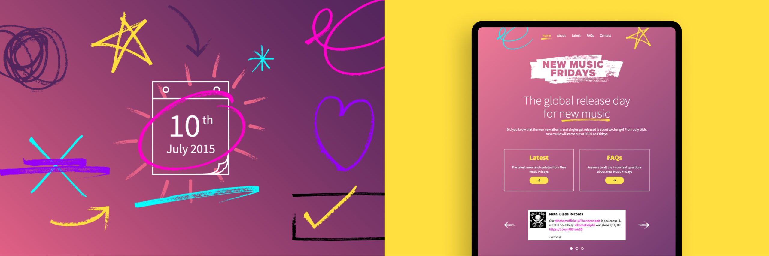
Creating a brand style
We wanted to create style that was assertive and inspiring. We created a modular brand platform comprised of creative elements and assets that could be used in different ways. Building this inventory meant that third parties could expand their own communications and campaigns locally, adopting the New Music Fridays concept with a sense of ownership and purpose.

Global strategy and application
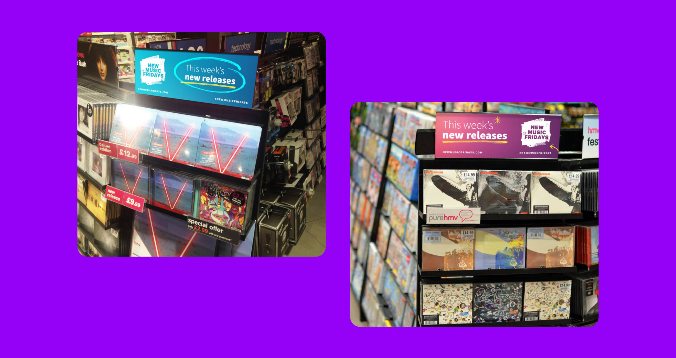
Because this was a global campaign, our core identifier and brand mark needed to be translated for all required languages. All our assets were produced and made available for localised advertising and industry use. Our creative was adopted by third-party distributors and used commercially in stores and online.
Consistent implementation
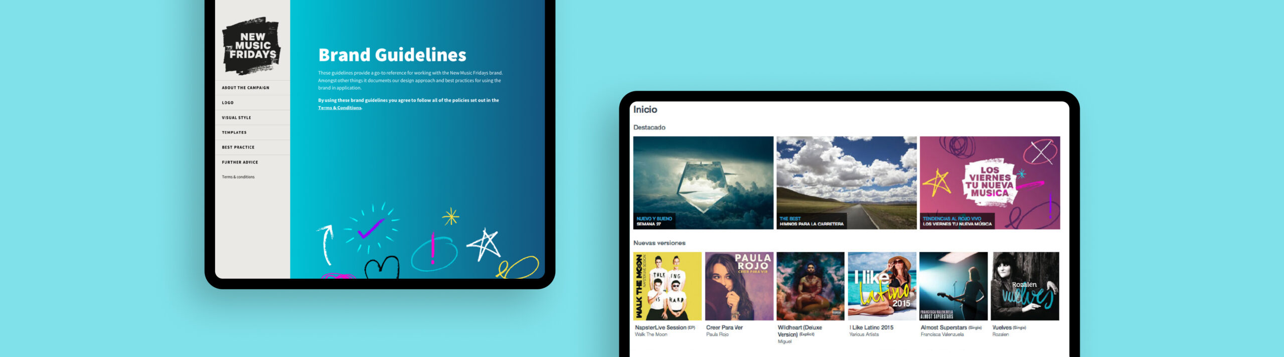
A key challenge for the campaign was the coordinated delivery of assets and brand guidance to music organisations, record labels and retailers around the world leading up to, and after, the launch. Our solution was to create a brand portal where all assets could be accessed, alongside brand usage guidelines and a simple, coherent website.
The outcome
Our work helped to create a global campaign that gave an effective and consistent voice across physical and digital campaigns. With our brand guidelines platform and new website, the campaign was able to be rolled out and used at scale. New Music Fridays was a success, becoming the standard global release day, and music piracy plummeted.