Studiomade were selected to design Beacon, a new digital platform launching this year that lets healthcare organisations measure how they truly perform against global peers, and, just as importantly, act on what they find. The challenge was to design a product experience that turns benchmarking data into shared understanding, confident decision-making and lasting organisational improvement that ultimately improves patient care.
The challenge
Healthcare leaders rarely struggle for data. The real challenge is to decide what is worth acting on, how to action it and how to sustain it. In discussions with Hunter we found the same recurring barriers across every C-suite role (CEO, CMO and CFO): a different read of the same numbers, uncertainty about whether weak performance was real or a misalignment in how similar organisations compare and improvement that faded once other priorities were taken on.
Beacon needed to:
- Provide a transparent and trustworthy read on organisational performance
- Help teams reach a single, shared understanding of what their data is saying
- Highlight key opportunities, helping leaders to know where to focus
- Turn insight into coordinated action rather than another report
- Help organisations sustain improvement through peers, programmes and tracking.
Our approach
We tackled the project with evidence-led design thinking, beginning with audit and strategy. Working with the Beacon product team to set out the personas and core use cases, we extracted the real goals and pain points behind each role, defined the user tiers, and established the brief around shared understanding, networking and action.
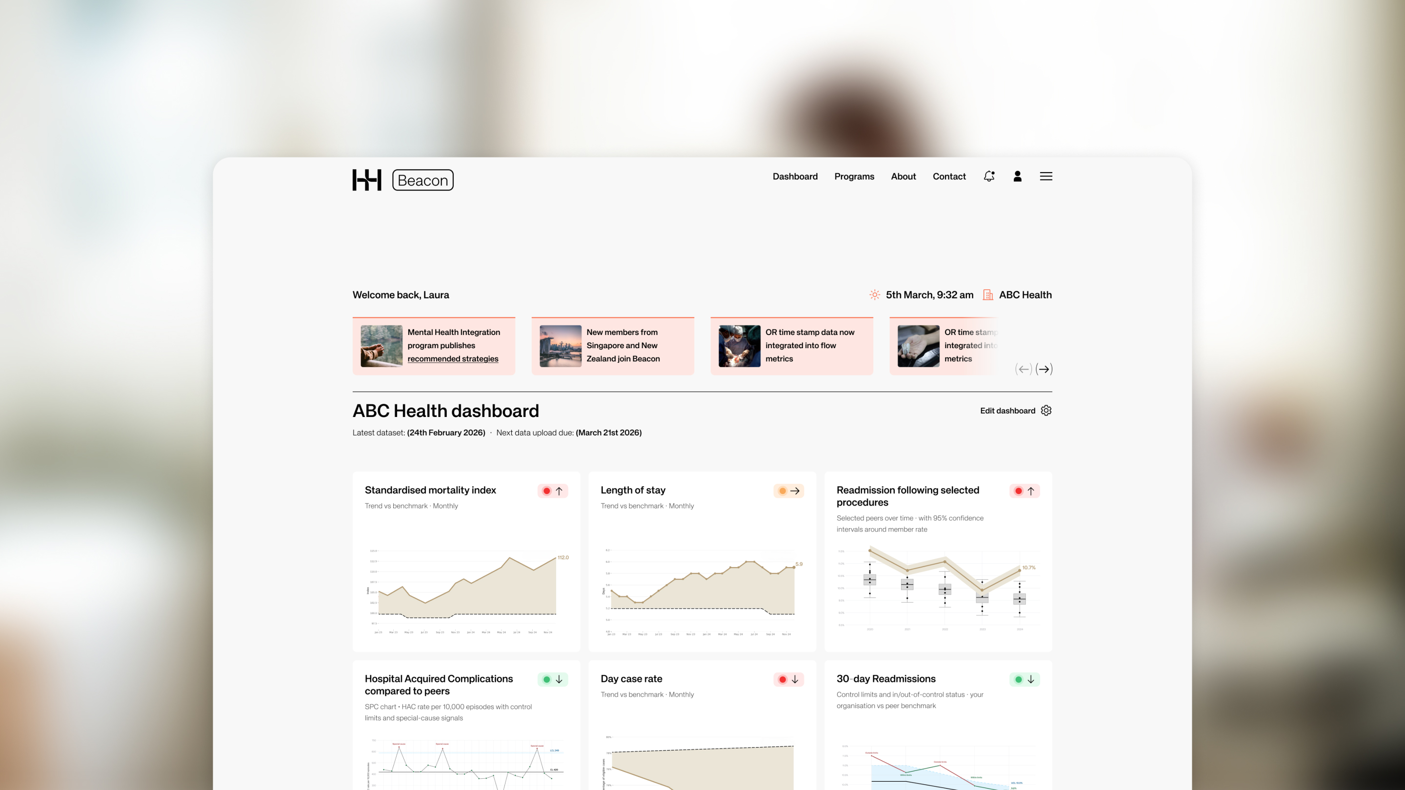
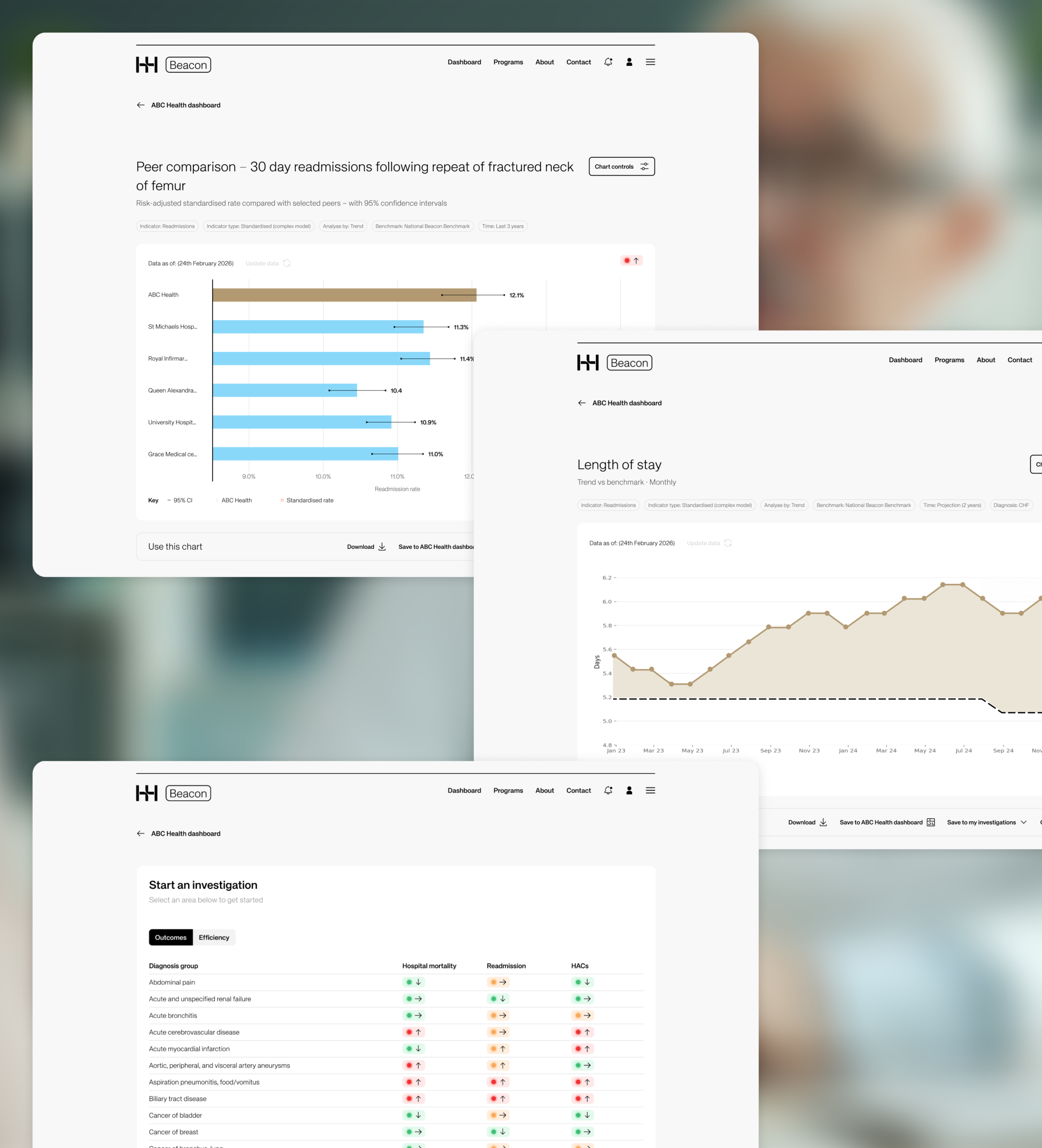
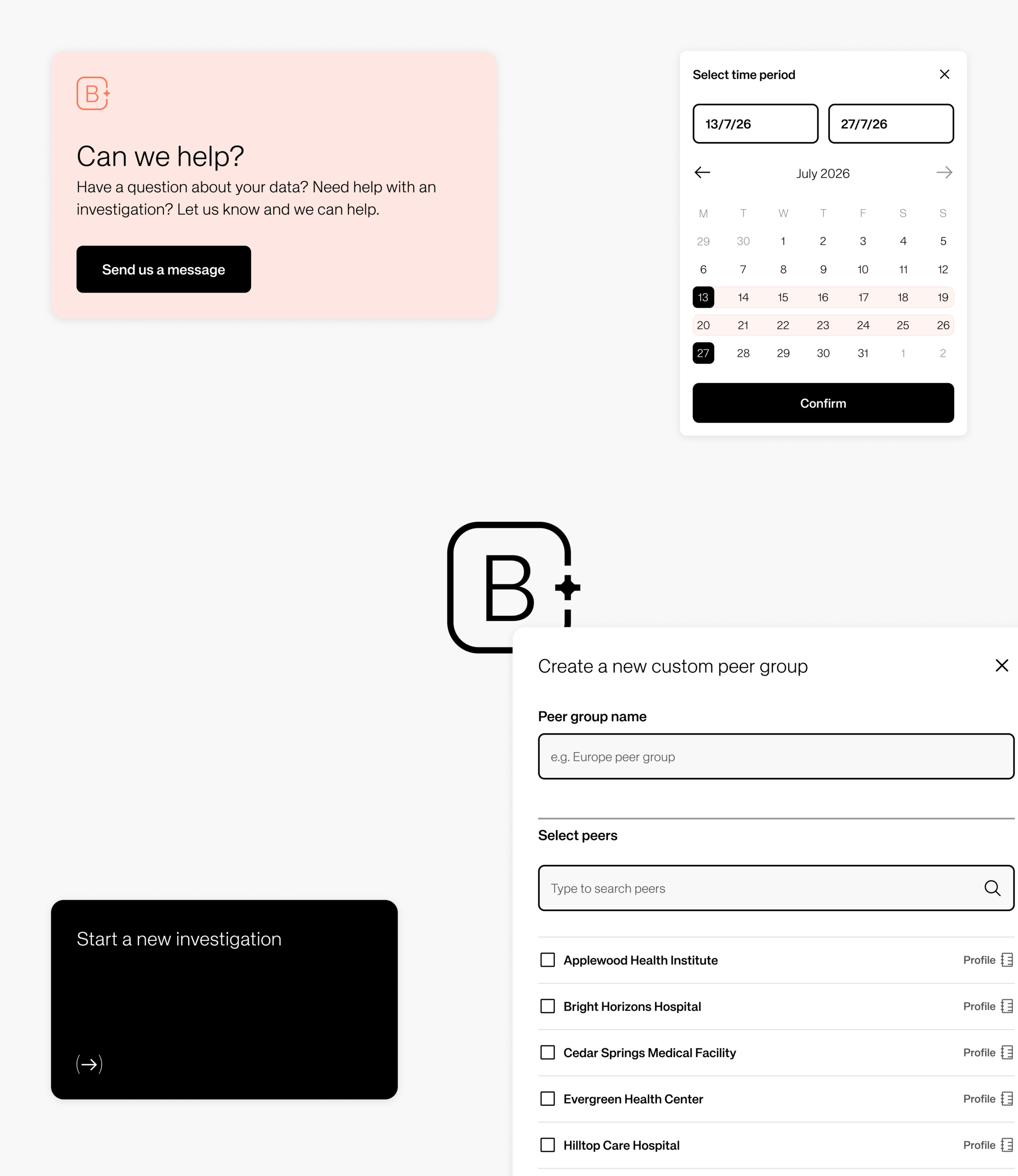
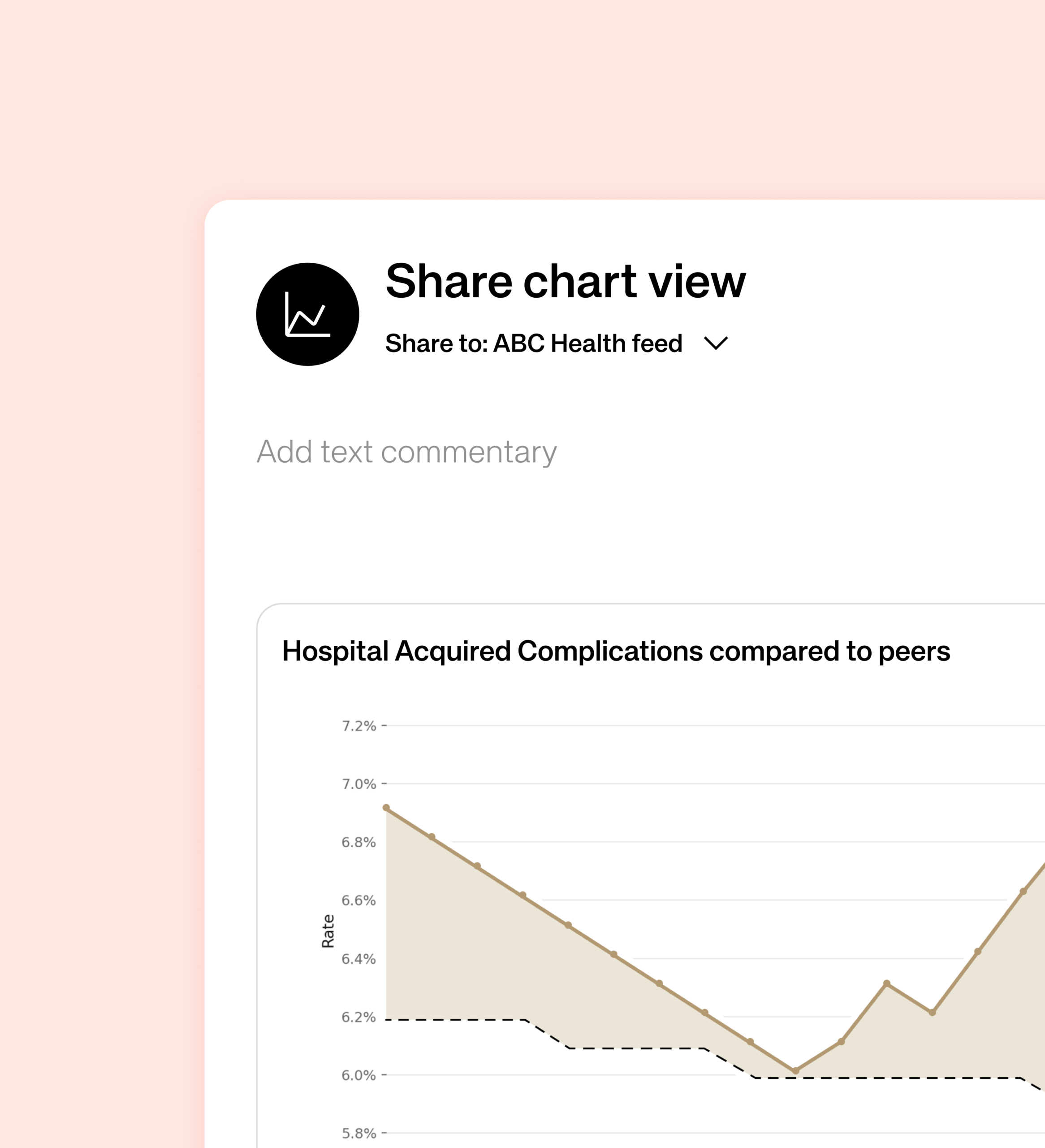
From there we moved into UX and information architecture, shaping the user journeys that mattered most: building an organisation dashboard, investigating an opportunity by drilling down from a headline metric to its underlying drivers, defining peer groups, and sharing a chart with colleagues. We designed Beacon’s data language around SPC charts with control limits, peer comparisons and clear trend signals. Our UI and prototyping phase then brought the direction to life as a quiet, consistent visual design system and an interactive prototype of the core flow, with ongoing feedback loops keeping every decision balanced against user needs, clinical credibility and technical feasibility. Everything is cleanly displayed, reducing visual noise and citing Beacon as a functional tool.
That direction is now in early development stages. We are validating the flows and the data narratives with real users, refining the points where meaning, navigation or trust break down before the product continues to be built at scale.
The outcome
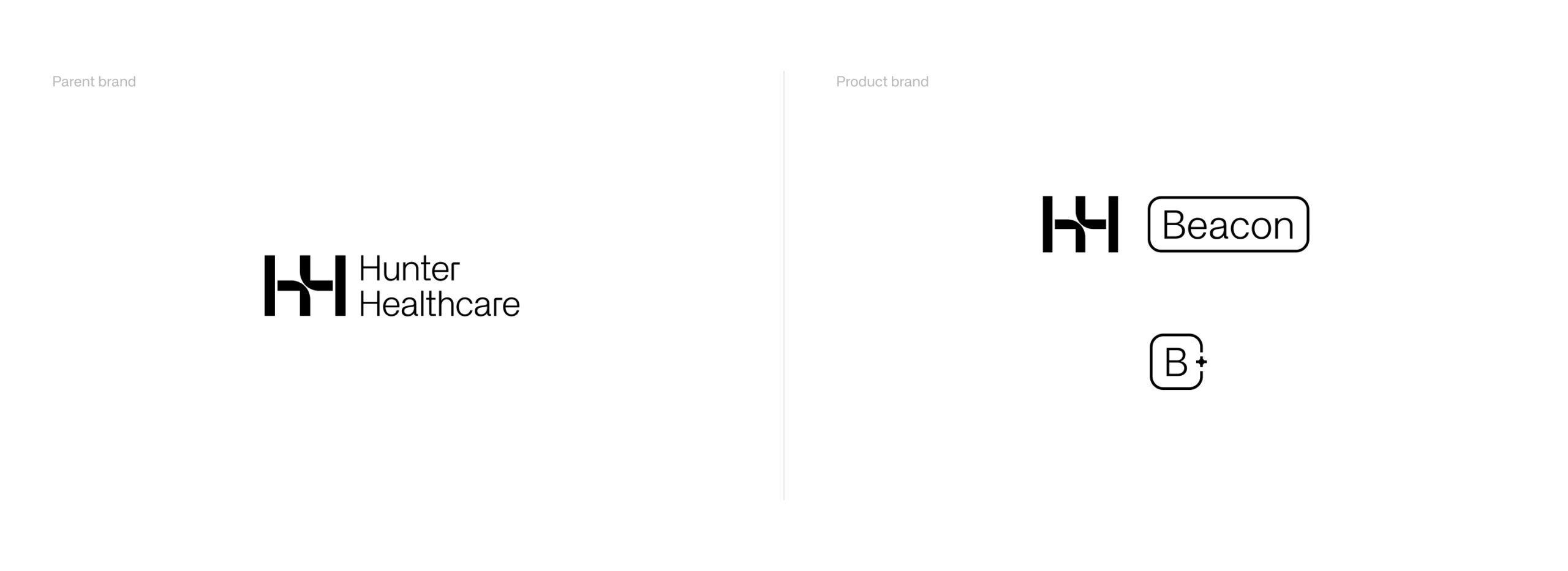
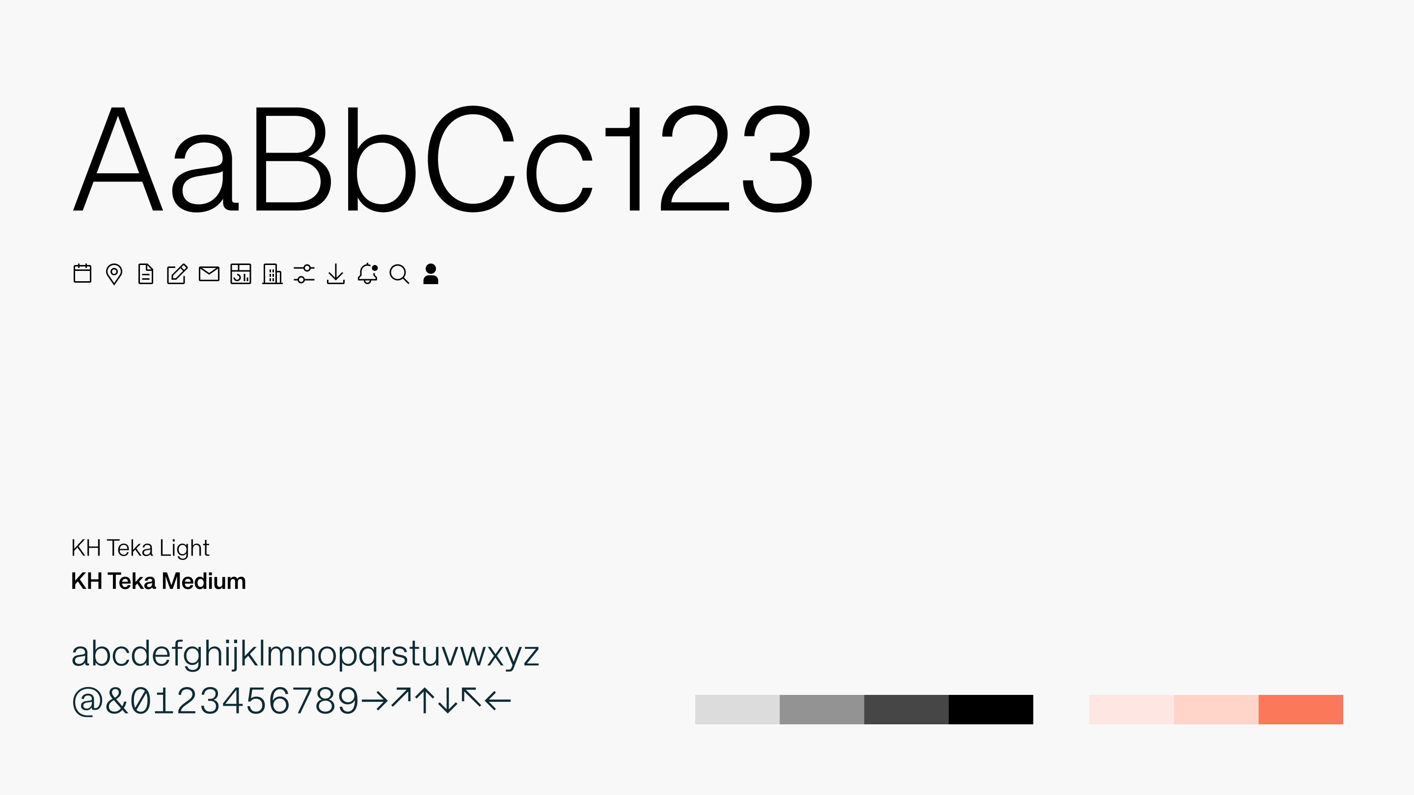
The Studiomade team delivered a designed product experience and UI design library for Beacon, using the existing Hunter Healthcare brand style as a starting point and extending it into a clearer digital product framework.
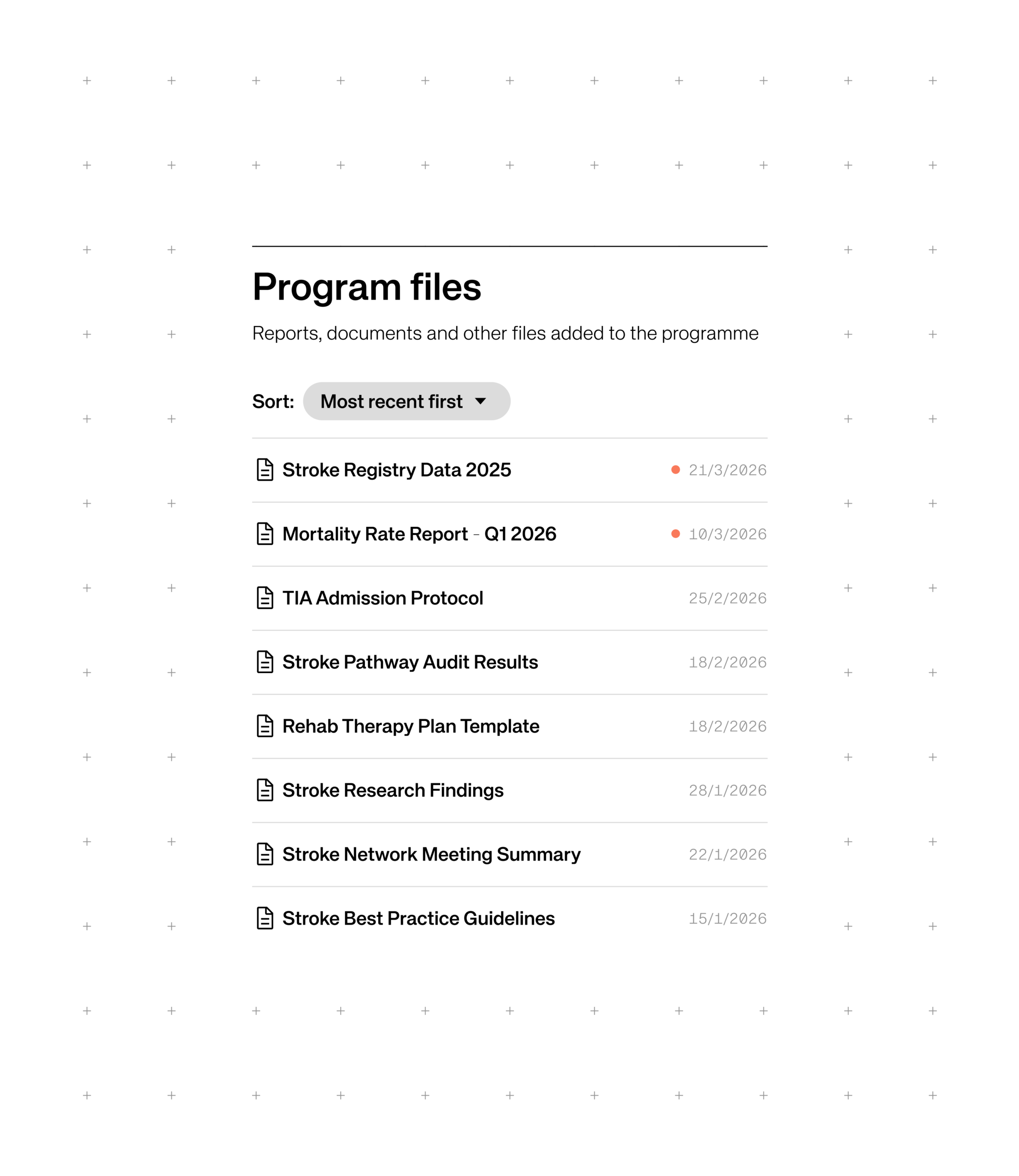
The prototype was shaped around three connected ideas. First, members can benchmark with confidence against global peers, using standardised models, clear caveats and the ability to move from a headline metric into the drivers behind it. Second, they can compare and connect, finding organisations performing well on the measures that matter to them and learning how progress was achieved through member pages, peer comparison and in-organisation sharing. Third, they can join funded, multi-year improvement programmes, such as High Value Stroke Care, where members pool data, research and implementation around a single topic, supported by shared analyses, an activity feed and a calendar of events.
All product designs and the underlying interface were delivered as a structured Figma component library – a system that not only enables swift development of Beacon, but can direct future digital product creation across Hunter Healthcare, applying the same validated approach to whatever comes next.
Impact
The result is a benchmarking experience that reads at a glance and earns user’s trust, with a clear route from a single metric through to peer comparison, drill-down and action. Peer connection and funded programmes help improvement stick over time, while a scalable design system and component library provides Hunter Healthcare a foundation both for the product build and for future development.
First DataBank (FDB) partnered with Studiomade to rethink how prescribing guidance is delivered within clinical workflows through their leading clinical decision support solution, OptimiseRx. The challenge was not simply visual redesign, but a fundamental reworking of how critical information appears, behaves, and supports decision-making in real time for the nation’s GPs.
Our team focused on creating an improved user experience for OptimiseRx that balances clinical safety, speed of action, and cognitive load – ensuring guidance is visible, actionable, and trusted without interrupting the prescribing flow.
The challenge
Prescribing environments are complex, with high-pressure systems where even small interruptions can have significant impact and consequences.
FDB needed OptimiseRx to:
- Surface critical safety information at the right moment
- Reduce alert fatigue and message overload
- Support fast, confident decision-making
- Maintain alignment with evolving platform constraints and workflows
- Create a scalable design system for multiple message types and severities
Ultimately, our recommendations and product changes needed to make a meaningful difference to the way clinicians work. The focus was on improving everyday conditions and real scenarios of use, helping clinicians work more efficiently, understand the information presented clearly, and feel greater confidence in the product.
Our approach
We approached this 6-month project with evidence-led design thinking, beginning with a clear idea of where OptimiseRx needed to go: a non-disruptive, integrated experience that fits naturally within clinical workflows.
From there, we moved into deep research and audit. Through one-to-one sessions with GPs, clinicians, and support staff, we surfaced the real challenges people faced day-to-day including alert fatigue, message overload, and interruptions to prescribing flow that eroded trust in the system. This research grounded everything that followed.
With those insights defined, we moved into feature design and flow creation – exploring multiple interaction models including modal interruptions, inline messaging, floating components, and sidebar-based behaviours. Translating these into product prototypes allowed us to test ideas against real prescribing scenarios rather than rely on assumptions alone.
Our UI/UX prototyping phase brought the most promising direction to life, with refined hierarchy, content tone, and interaction patterns built around the sidebar-first model that had emerged as most preferred from our research. We undertook two formal phases of user testing with GPs, clinicians, and support staff. Round one compared the core interaction models, generating findings that drove a decisive shift in design direction. A focused iteration phase followed before a second round of testing validated the solution in realistic prescribing scenarios.
Throughout the project ongoing feedback loops with clinical experts and FDB stakeholders ensured every decision balanced user needs, patient safety, and technical feasibility culminating in a final proposition delivery that gave FDB a comprehensive, validated vision ready for development.
The outcome
We delivered a comprehensive and validated direction to how the next generation of OptimiseRx as a product experience could both look and function. We did this by creating a scalable design system for in-solution messages, introducing standardised components across safety warnings, best-practice guidance, cost-saving suggestions, and alternative treatments. These UI and UX changes were underpinned by a sidebar-first interaction model that supports continuous workflow, alongside a clear, priority-based visual language to help users quickly assess message importance and act with confidence. The system also integrates direct actions such as accept, reject, modify, and order tests, transforming messages from passive alerts into actionable decision-support tools for prescribers.
All design components and the UI/UX approach developed throughout the project were shared as a Figma library enabling swift development as well as a system that would direct further digital tool creation within the organisation enabling the same validated approach to be applied to future product creation.
Impact
- An improved product experience that reduces disruption within the workflow
- Improved clarity and usability of prescribing guidance for GPs
- Increased confidence in acting on guidance and recommendations
- A scalable design foundation for future FDB products
An evolved OptimiseRx is now being developed for rollout and serves as a benchmark for how decision support can be delivered across FDB’s wider product portfolio.
The Challenge
There are around ten million voluntary caregivers in the UK, looking after a relative or friend in their home, and it’s increasing by thousands every week. There is a huge lack of practical and emotional support for them, and many feel stressed and alone. Often, due to a fragile social care system, they have no choice but to give their time and energy to care for someone who can no longer look after themselves, significantly impacting their own lives.
Carers often take on practical care (such as getting the person dressed or giving medication) as well as emotional, household and administrative tasks. Most are aged 45 to 65, looking after someone over 65. They have to develop an extensive and changing skill set.
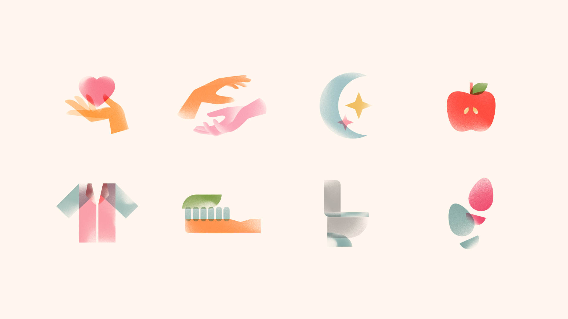
They need help understanding tasks such as feeding, washing, grooming and bathroom functions but this is often not quick or easy to find, especially when dealing with an urgent care situation. The care sector is decentralised and information provided by charities and other organisations is fragmented, not personalised and insufficient to cover all carers’ needs.
This leaves them without guidance and support, and adds to the stress they’re under. For some people, this stress becomes a health risk, both for themselves and the person they care for.
The vision
Dr Caroline Green saw a need for a digital product that gives carers the fast and easy support they can’t get from a decentralised system. Her research showed that carers want reliable, highly accessible round-the-clock information that is personalised, practical, easy to use, includes emotional support – and that they can trust. Her vision is to give carers the confidence to handle caring tasks, whenever and wherever they need help.
Dr Green is a post-doctoral fellow at King’s College London’s National Institute for Health & Care Research as well as Research Fellow at Reuben College, University of Oxford. Her work focuses on AI and its potential to support older people and family carers, as well as the human rights and ethical implications of AI on caregiving.
She wanted this new product concept to connect carers with advice and knowledge from trusted organisations, use AI to provide tailored answers, and help to fill the gap in out-of-hours support. Dedicate will help carers feel calm and hopeful about their current situation, give them help and support in the moment, and show that there are people and organisations who can help them further.
Dr Green received part funding through UKRI’s Healthy Ageing Accelerator and engaged with Studiomade to design and build the digital product for beta launch based on our expertise within healthcare, and new venture creation.
What we did
We created a product MVP for an AI-powered 24/7 virtual care partner platform. We were conscious throughout the design and build process of two primary considerations. One was flexible and dynamic content, using an AI chatbot to provide carers immediate help and guidance that is as practical and personalised to them as possible. The second was designing an empathetic, safe space where users arrive and instantly feel reassured, understood and supported.
UI and UX
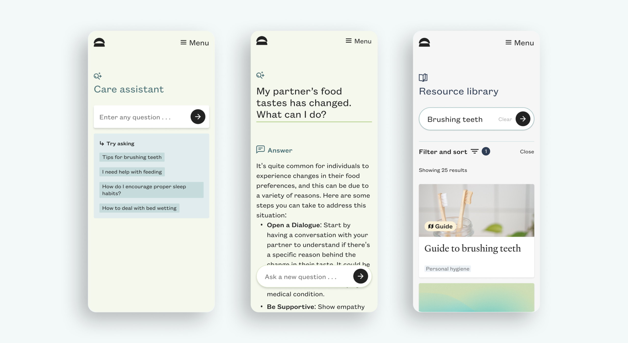
Our design team’s main objectives were that the digital experience feels like a calm and safe place, where it’s easy to get help with specific problems.
We esthablished a brand approach for this venture and product that used warm and calming colours and gradients, to evoke the core values of care and empathy. Subtly moving shapes in orange, pink and yellow suggest the feeling of a beautiful sunset, transitioning to a calming, complementary palette.
We knew from Dr Green that some users were sceptical about an AI chatbot experience and that if this was the main focus it would put them off. We designed the UI and product flow so that the qeury did not feel like ‘chat bot and robotic interaction’. Principally, it’s easy to search and view results from across the Dedicate content library.
The technology
We built the product utilising React deployed on Netlify, leveraging Contentful as a headless CMS that allows the Dedicate team to create, manage and distribute content across multiple devices and channels. Search is powered through an Algolia whilst data is housed in Google Firebase with analytics by Google Analytics.
AI integration
We integrated AI within this product in a seamless manner utilising Botsonic. Our main consideration was to ensure that our AI model only utilised content specifically vetted by Dedicate. Our system (Chat GPT 4) learns only from content we’ve trained it on, sourced from the Dedicate team and their content partners.
Within the user experience, we have included suggestions for prompts and other key language that supports the user. This is to show carers that rather than just typing in a general term such as ‘better sleep’, as in a search bar, they can ask questions about their own situation (e.g. ‘How can I help my father with demential to sleep better?) and get personalised answers.
Specialist content
Specialist, authoritative content for Dedicate has been created by expert healthcare providers including Sage House dementia support services, Dr Kellyn Lee from the Dementia Care Hub, and video content from HCI Digital, a producer of health and social care videos. As the knowledge base expands and the team see which topics matter most to users, they will create further content with care professionals and researchers.
Accessibility
Accessibility was a primary consideration and is why we have been rostered by the Design Age Institute as a specialist creative agency. For Dedicate, we have utilised Chakra UI as a basis for our front-end system as it’s built with accessibility in mind. All authored components are compliant with WAI-ARIA accessible navigation standards (a set of HTML attributes that can be applied to elements to improve accessibility).
The outcome
We created an empathetic brand approach for Dedicate, and designed and built a Beta MVP that has been launched to a community of first adopters. This testing phase will give Dr Green and her team an audience base, and show them where carers most need support and what they find informative and useful.
As data on usage patterns and content engagement builds up, the team will use this to iterate on the product and build the case for further expansion, refinement and product building. With an expanded knowledge base, and demonstration that Dedicate can continue to evolve and build traction across multiple business models including individual carers and care organisation support we hope that Dedicate as a University of Oxford spin-out company can secure VC funding to help it scale.
A new direction for an inspiring AI-led health startup
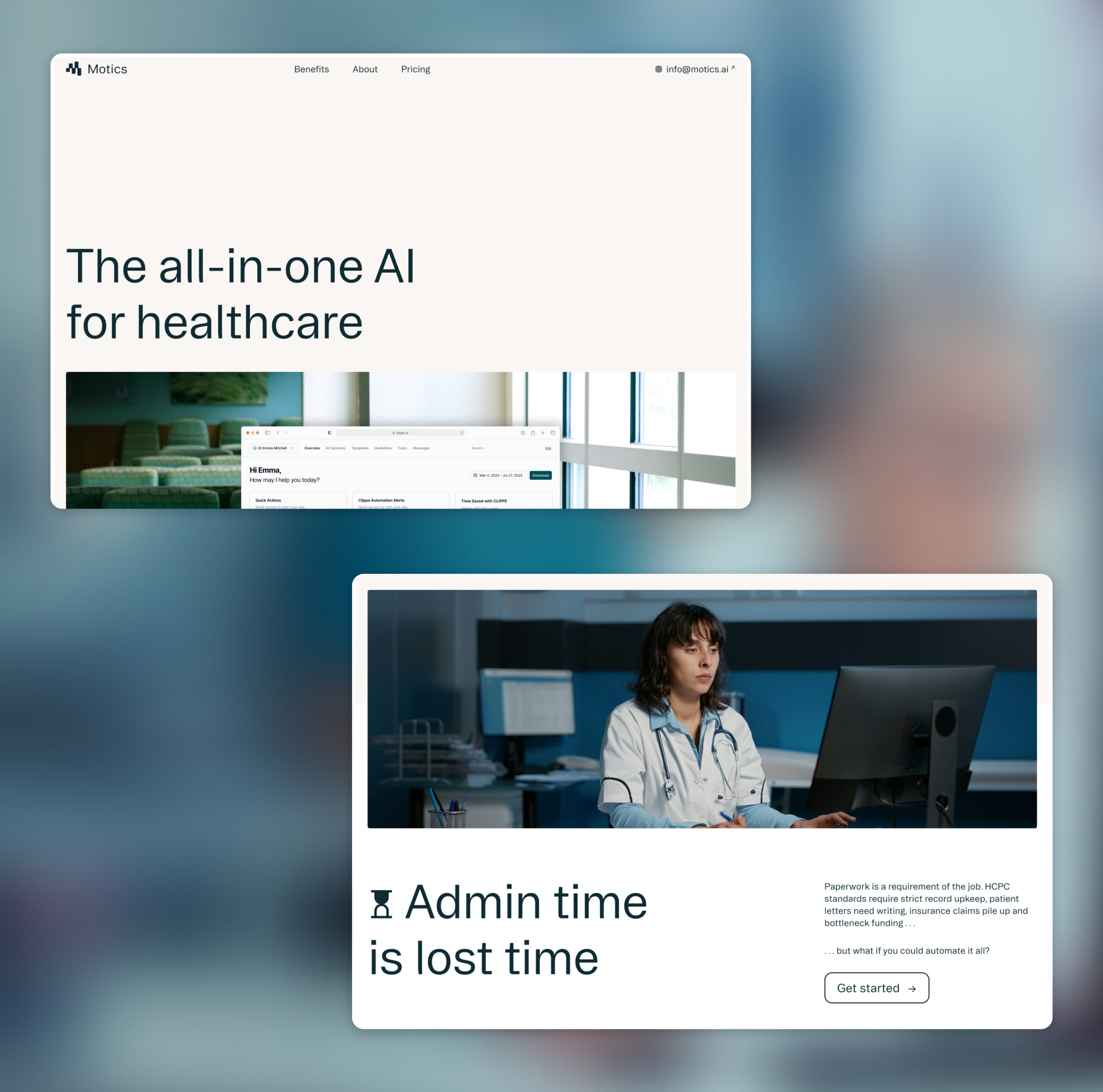
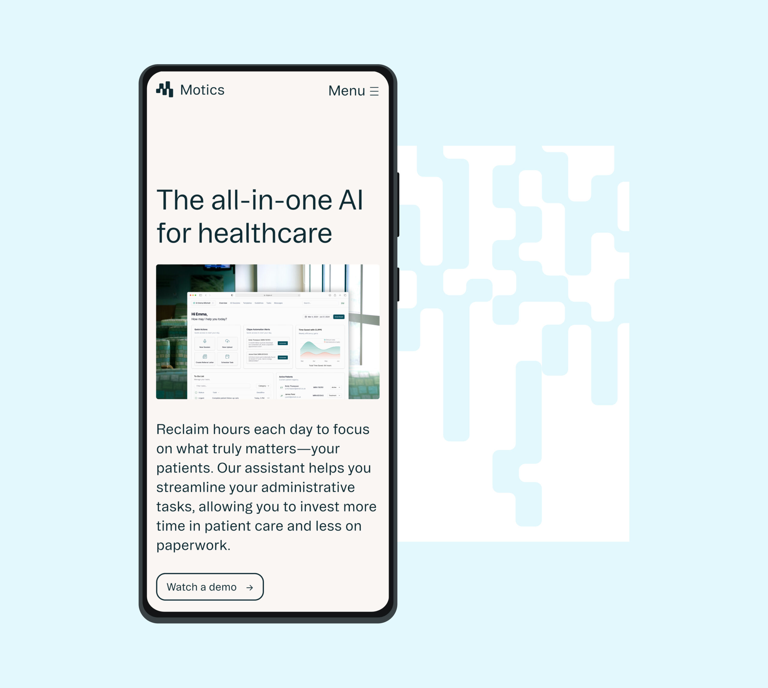
The market for AI in healthcare is booming with the opportunity to make real improvements in patient safety and efficiencies. With so much noise, how can an independent change-maker stand out? Motics automates clinical note taking, referral letters, and more to save hours a day, enabling clinicians and hospitals to spend time doing the things that really matter. The tool helps to improve patient safety, flag errors and deliver a much more efficient method to manage compliance. It delivers a complete AI strategy with full compliance, adhering to NHS and HCPC standards, minimising errors and improving documentation quality.
Understanding their position
Working with startups often means keeping pace with rapidly evolving products and ambitions. This demands a flexible, iterative approach to achieving clearly defined goals and objectives.
This project centred on clarifying the client’s unique positioning and creating a versatile creative platform that would empower them to clearly communicate their distinct value. We ensured the brand was adaptable enough to scale fluidly and evolve seamlessly alongside their ongoing growth and aspirations.
In guided workshops, we explored why they exist, the value they offer to clients, and – crucially – got to know the people behind the business. We learned their story, the path they’d travelled, and their vision for the future. From these sessions, we defined their core values as ‘adaptability’, ‘tenacity’, ‘precision’, ‘resilience’, and ‘responsibility’ providing a clear tonal framework to inform creative decisions and authentically reflect their ethos and ambition.
Ethical, responsible AI
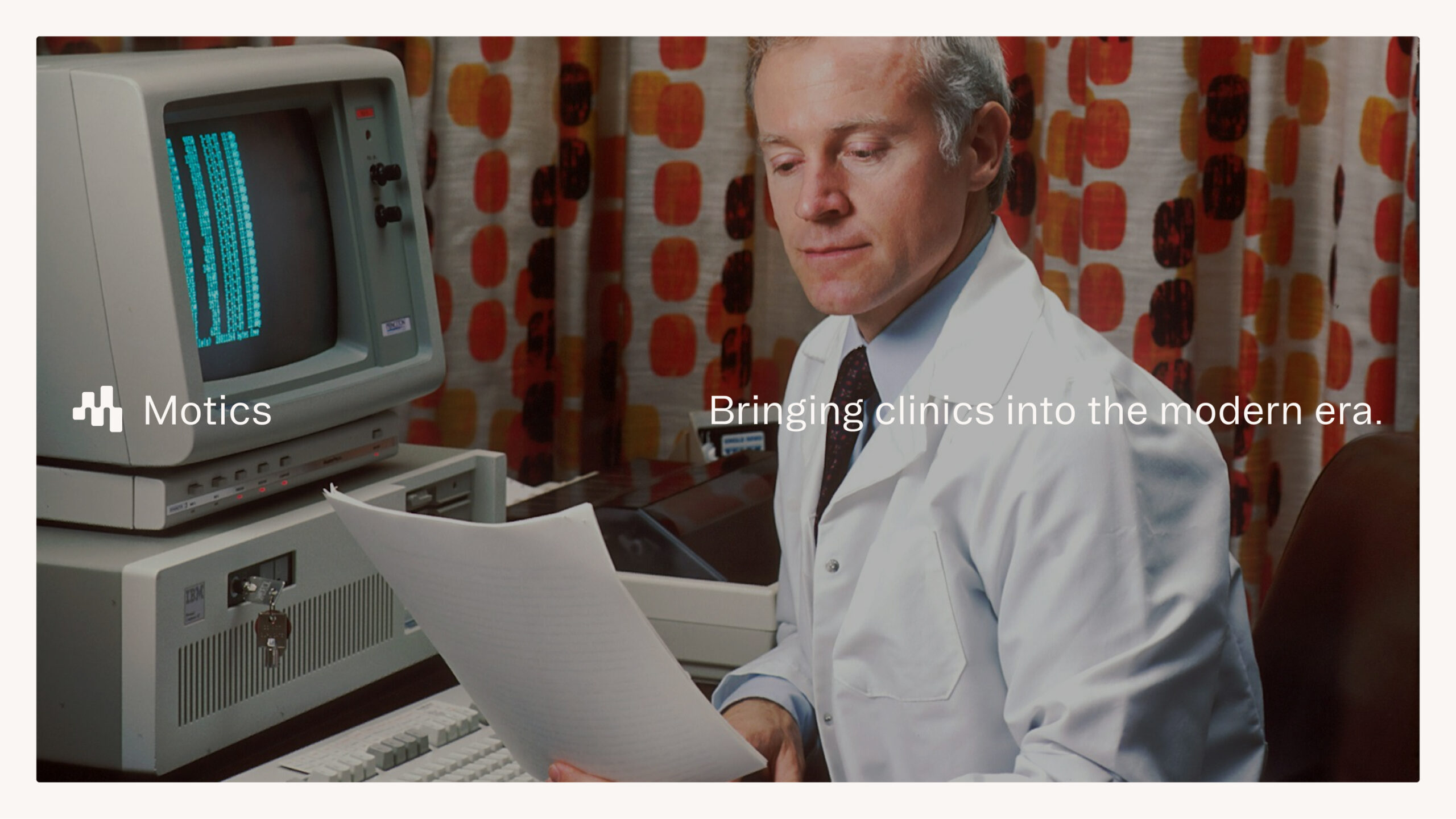
Healthcare is a notoriously crowded market – one that is scary to stand out in. Being safe and trustworthy is often more powerful than being a disruptor. A key goal for the project was to create a brand that helped Motics stand out from the crowd, but also reflected their commitment to compliance and ethical use of AI as a tool.
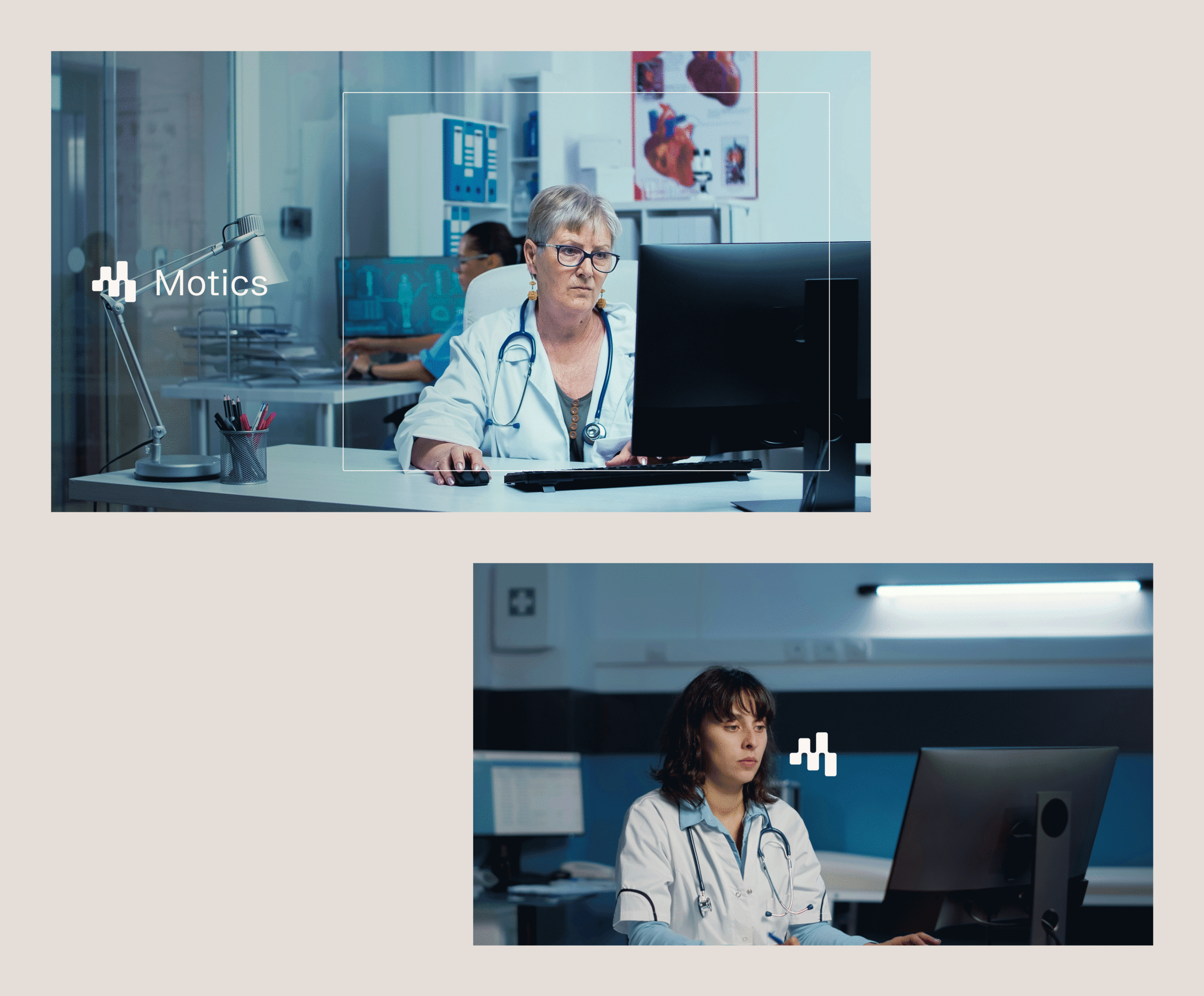
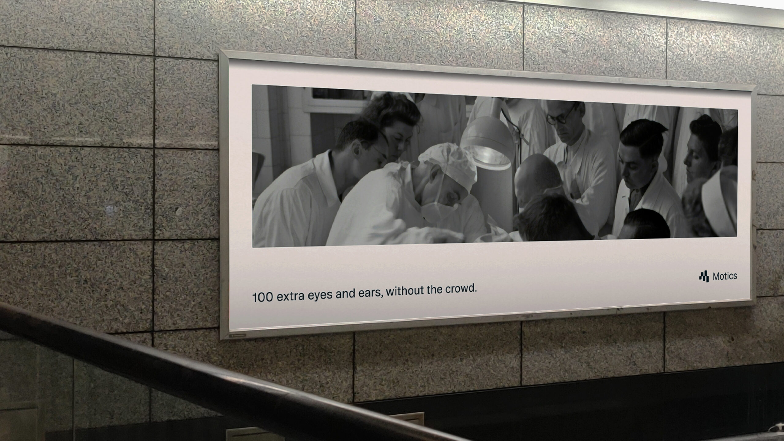
We developed a creative approach for the brand that prioritised clarity and simplicity in the presentation of information. Similarly, we chose an approach to photography that was informed by Motics’ focus on functionality over form. They’re creating real innovation that help real doctors and clinicians, not science fiction for futuristic labs that don’t exist. The occasional use of older photography also serves as a nod to how far healthcare and technology have progressed.
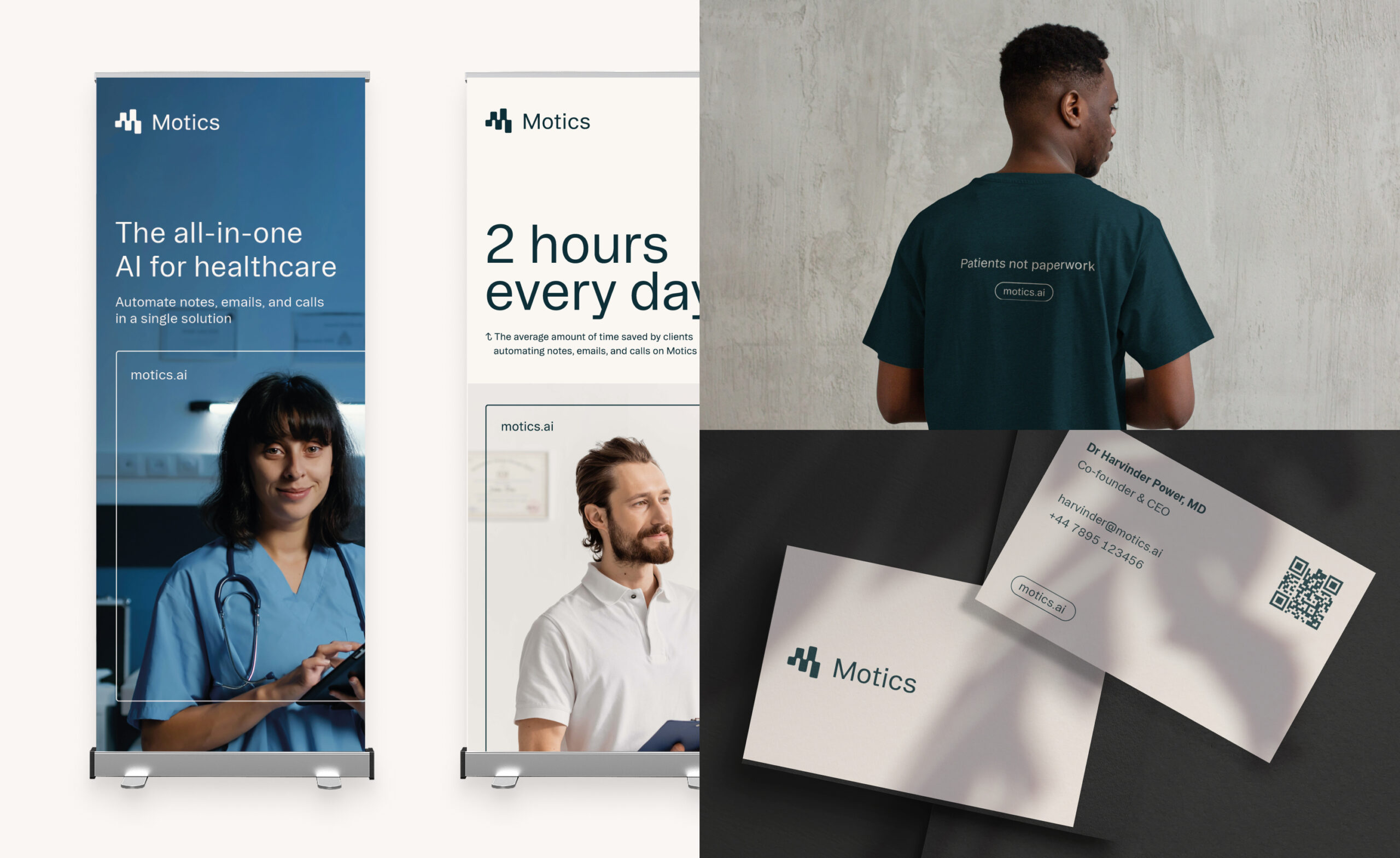
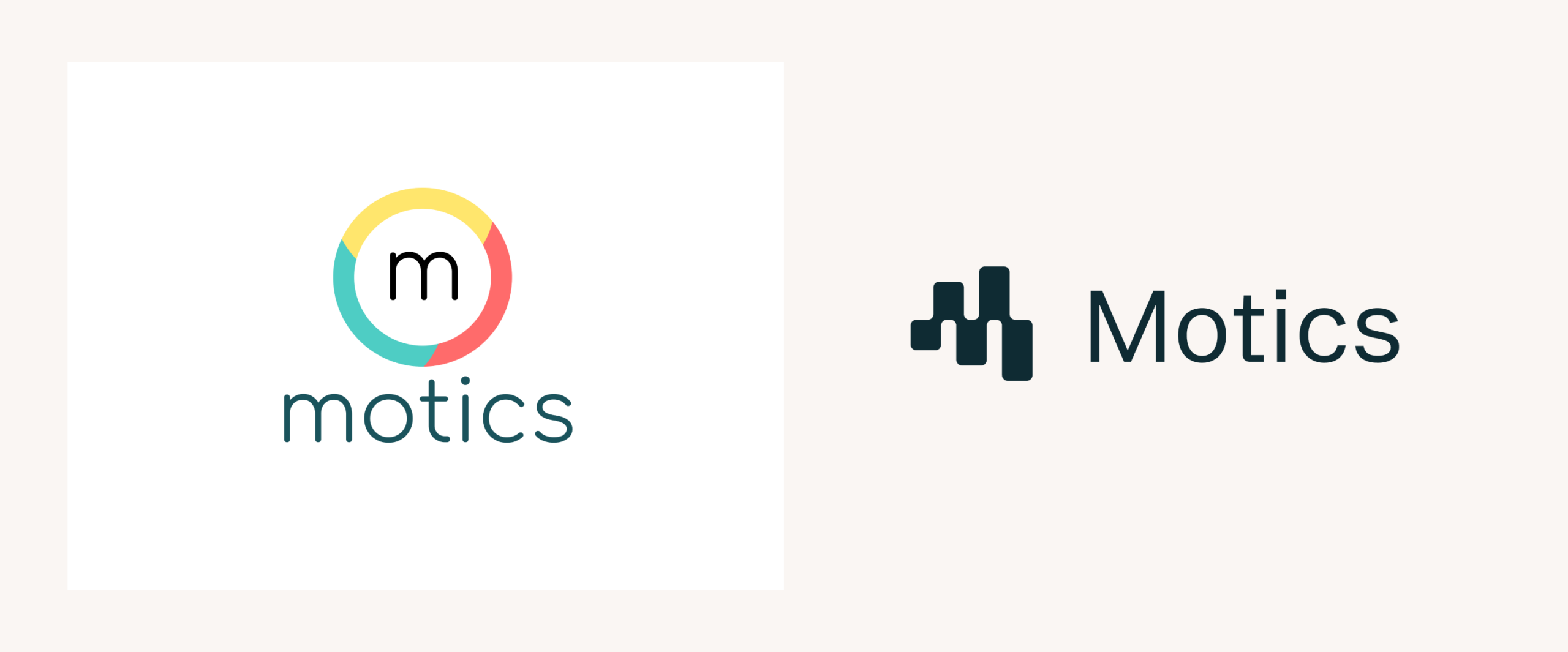
More than a mark
The Motics logomark needed to reflect the continual development and evolving knowledge that underpins their operations as a business. We designed an abstract ‘M’ that is both fluid and calculated in its movement. Through its motion, the mark suggests loading and thinking, bringing an added sense of personality and becoming a living and breathing representation of the brand.
Developing a design system
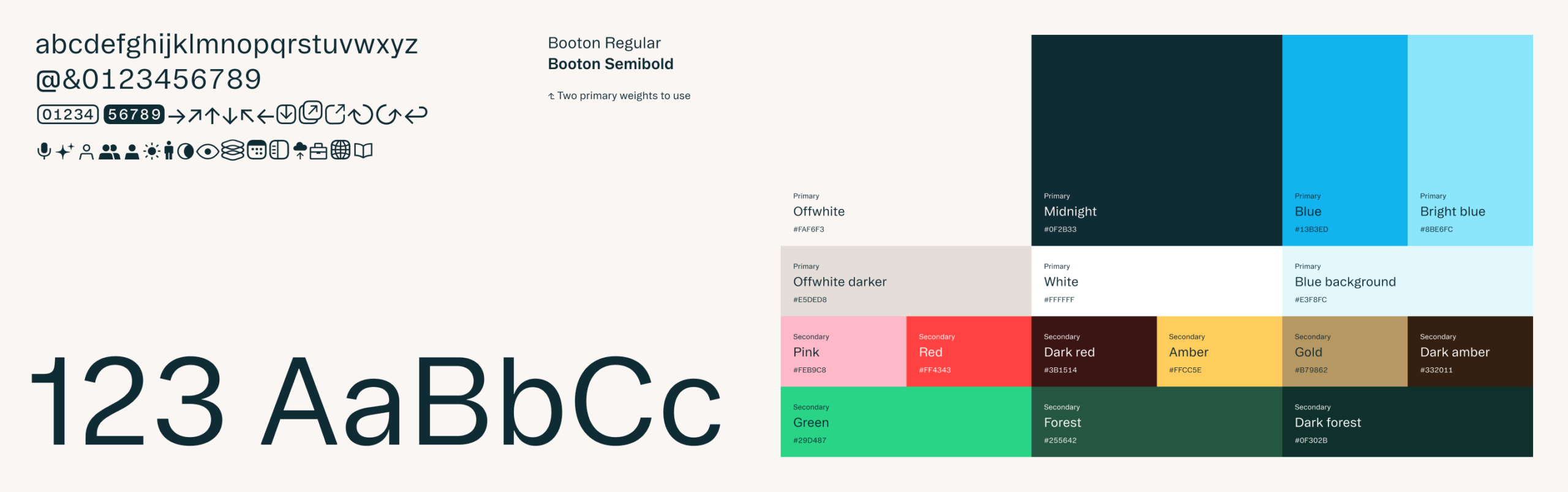
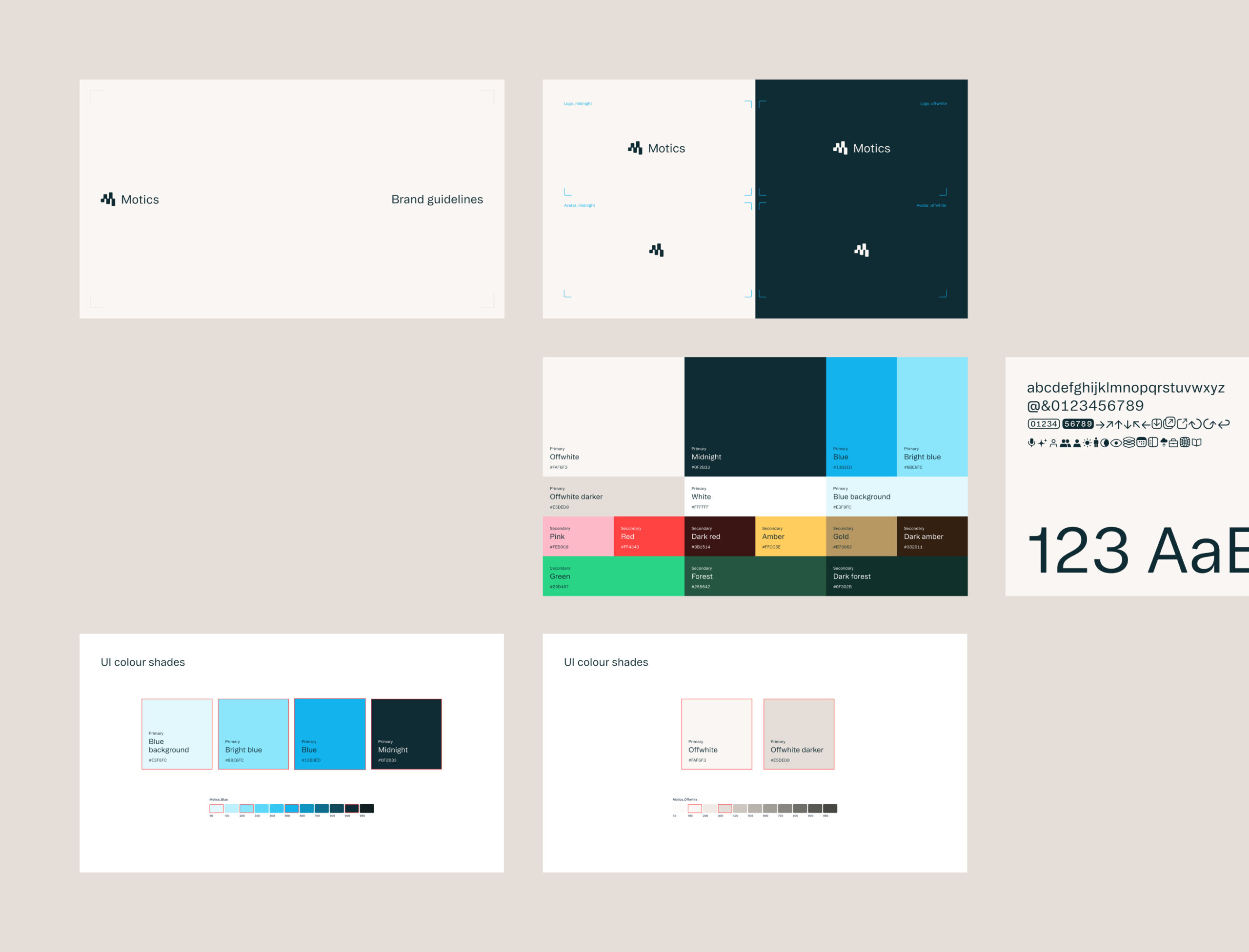
To enable the Motics brand to grow and evolve in a cohesive way we created a foundational set of guides on colour, type, and photography. We worked directly with them in a shared Figma environment which made sharing assets and thoughts on the design process incredibly efficient. We provided insight on their current product UX and UI and worked to update their use of their existing product design library. The components that we have provided equips the Motics team with tools to consistently implement the brand themselves while allowing room for growth and adaptability as they grow.
The next stage
We are now working with Motics to develop their digital presence across their web and product experience, taking insight from audience input and needs with those that have already interacted with the new brand.
Today & Tomorrow
Motics was the first company to benefit from our Today & Tomorrow initiative, designed to support transformative startups in different market sectors. This program provides emerging businesses with tailored brand strategies and creative solutions that align with their long-term ambition. For Motics, this meant crafting a forward-thinking brand identity and toolkit that supported their innovative AI-driven healthcare solution while ensuring scalability as they grow.
By participating in the initiative, Motics received a dedicated strategic delivery that balances immediate needs with future-proof design principles, reinforcing their position as a trailblazer in the healthcare sector.
If you want to register your interest in Today & Tomorrow’s 2025 Healthcare cohort, please visit: https://studiomade.co/today-tomorrow-healthtech/
Empowering people to take control of their health
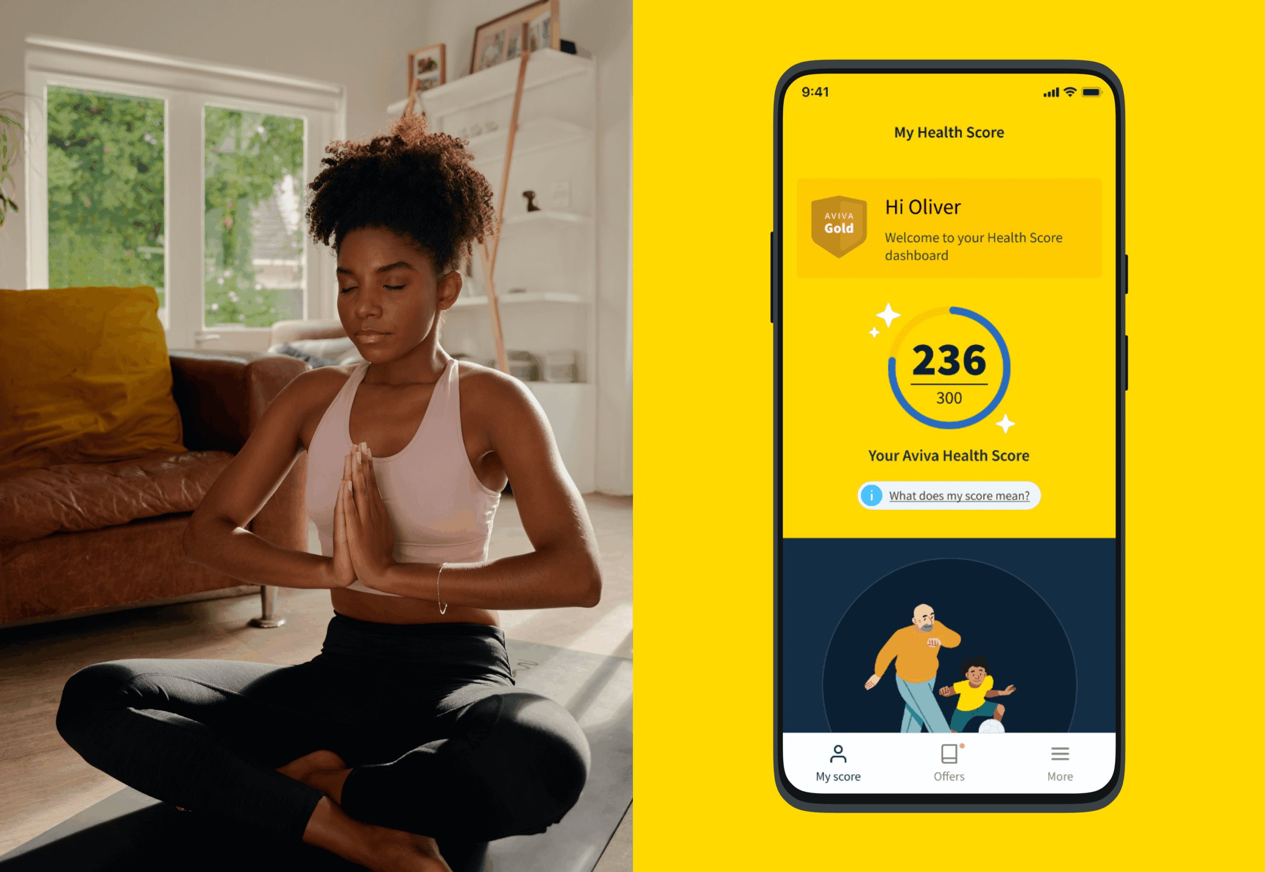
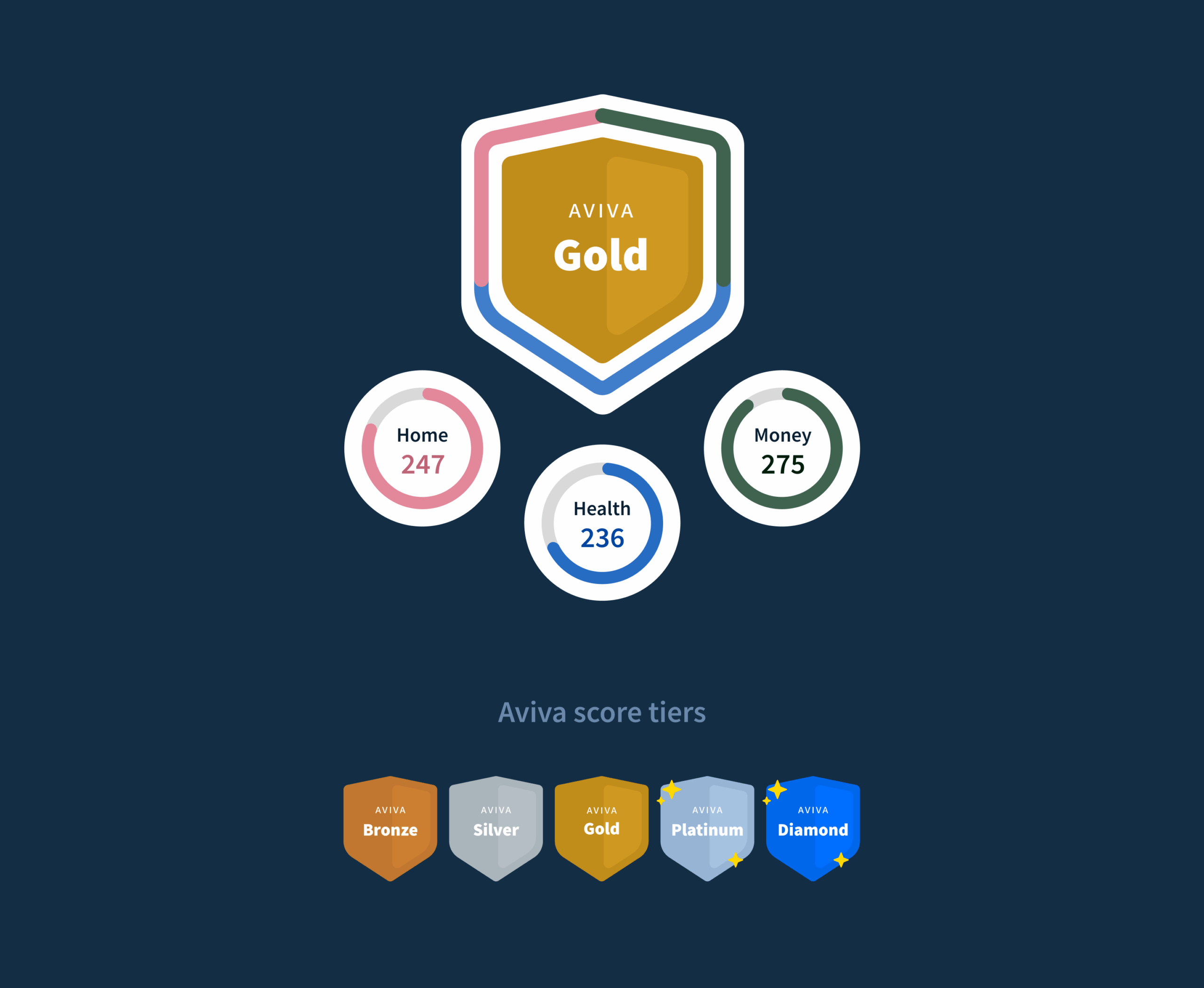
We were recruited to deliver a validated proposition for Health Score, a groundbreaking digital product designed to be at the heart of Aviva’s mission to improve the nation’s health. As a personalised tool, it offers users actionable insights to understand, improve, and optimise their wellbeing. Backed by medical expertise, Health Score transforms Aviva’s relationship with customers—going beyond insurance to become a trusted source of health and wellbeing advice.
A research-led approach to design and development
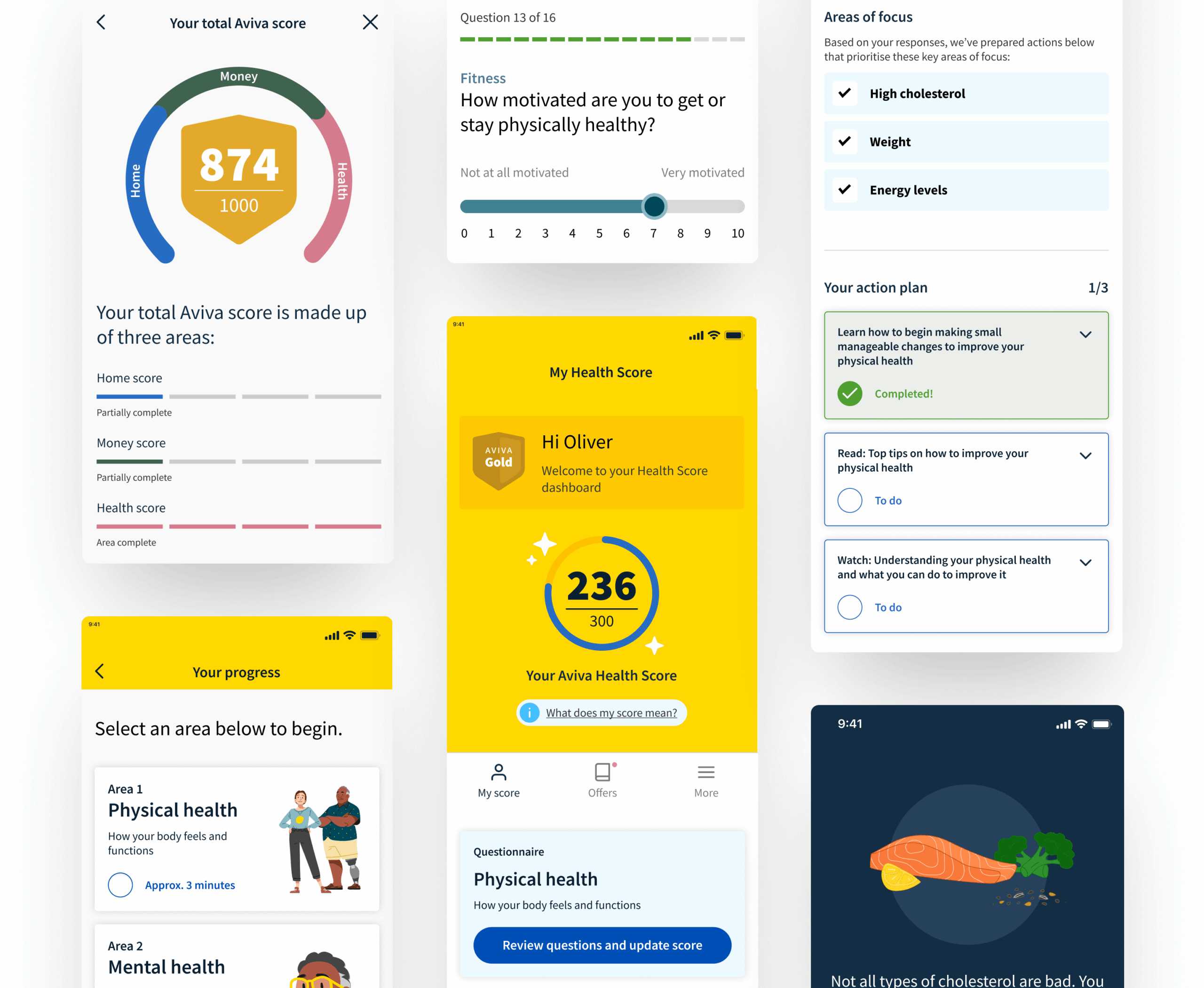
To ensure a seamless user experience, we worked through an extensive research and discovery phase. User research and testing played a critical role, helping us understand user expectations, optimal engagement points, and the value they saw in Health Score. We utilised existing analysis that had identified primary and secondary audiences, tested scoring concepts, and refined content needs through three rounds of test, validation and refinement.
The UX and UI design process aligned with Aviva’s brand identity, ensuring the questionnaire structure was engaging, intuitive, and insightful.
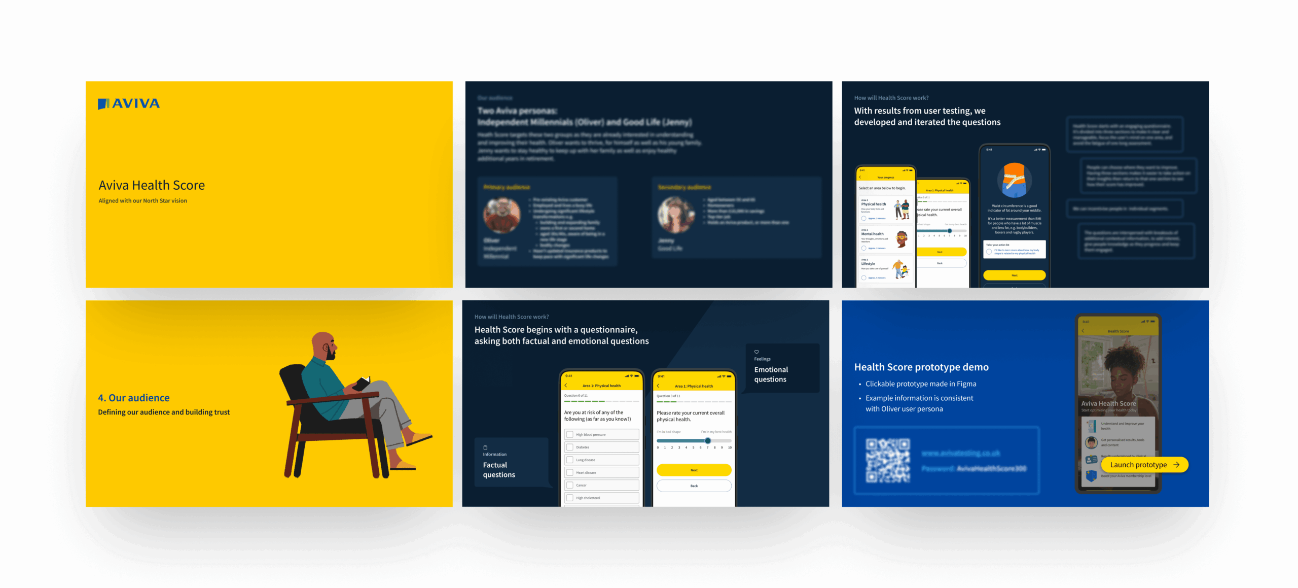
Driving engagement through personalisation
Our insights revealed that users needed both factual and emotional touchpoints to stay engaged. By crafting a warm yet informative tone of voice, we balanced education with relatability—making health information understandable, actionable, and quantifiable. Iterative review and feedback loops further refined the product, ensuring that users felt personally connected and motivated to complete their journey. The result? A people-first digital experience that not only informs but also empowers users to take meaningful steps towards better health.

In response to the UK’s rapidly ageing population and the social care sector’s struggles with recruitment and retention, BelleVie is taking a new approach to at-home caring.
Their approach is inspired by the Dutch ‘Buurtzorg’ community-based model of care where small teams of local carers provide support. The BelleVie model is formed of 10-person self-managing teams underpinned by the Wellbeing Operating System (OS), a bespoke technology platform, which is effective, efficient and scalable, cutting down on unnecessary admin so that carers can focus on caring, providing continuity of high-quality care built on trusted relationships.
After receiving funding from The Design Age Institute, they came to us to help review their processes and systems for recruitment. They needed UI and UX review of the custom software platform that they had built as well as user testing carried out with applicants and internal staff members to see where positive change and efficiencies could be made.
What we did
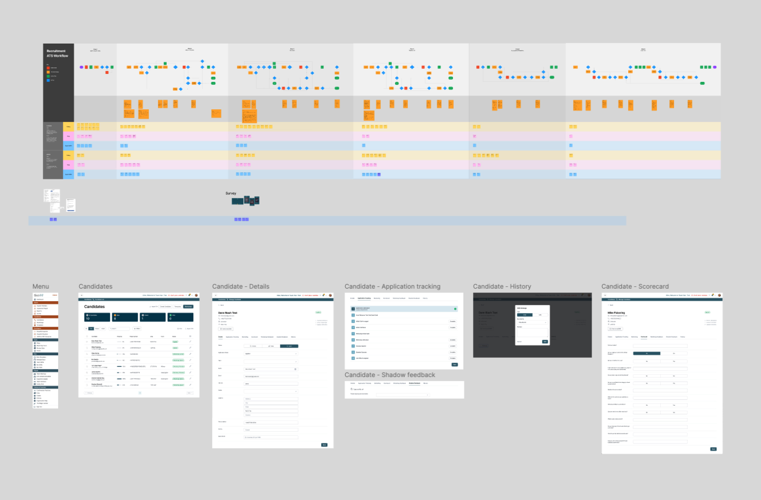
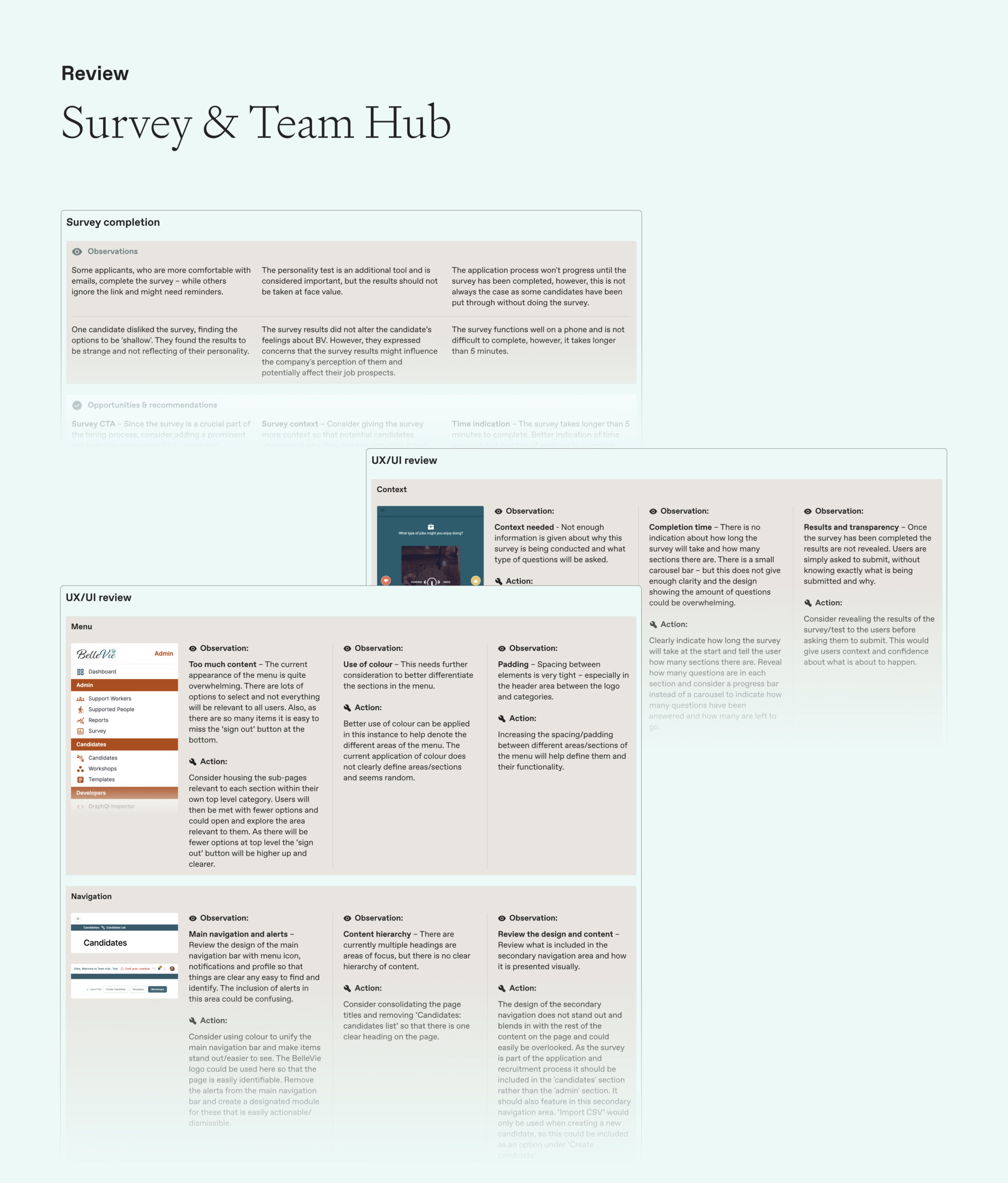
We carried out a full UI and UX review of the existing custom software platform in line with best practice, providing key observations and actions. The intention was that these could be shared with the BelleVie internal development team to action the improvements over the short-term, with these carried through to future additions of the platform.
We planned and activated interviews with all key stakeholders internally within the recruitment team as well as new employees who had been through the recruitment process – totalling eight in depth one-to-one interviews.
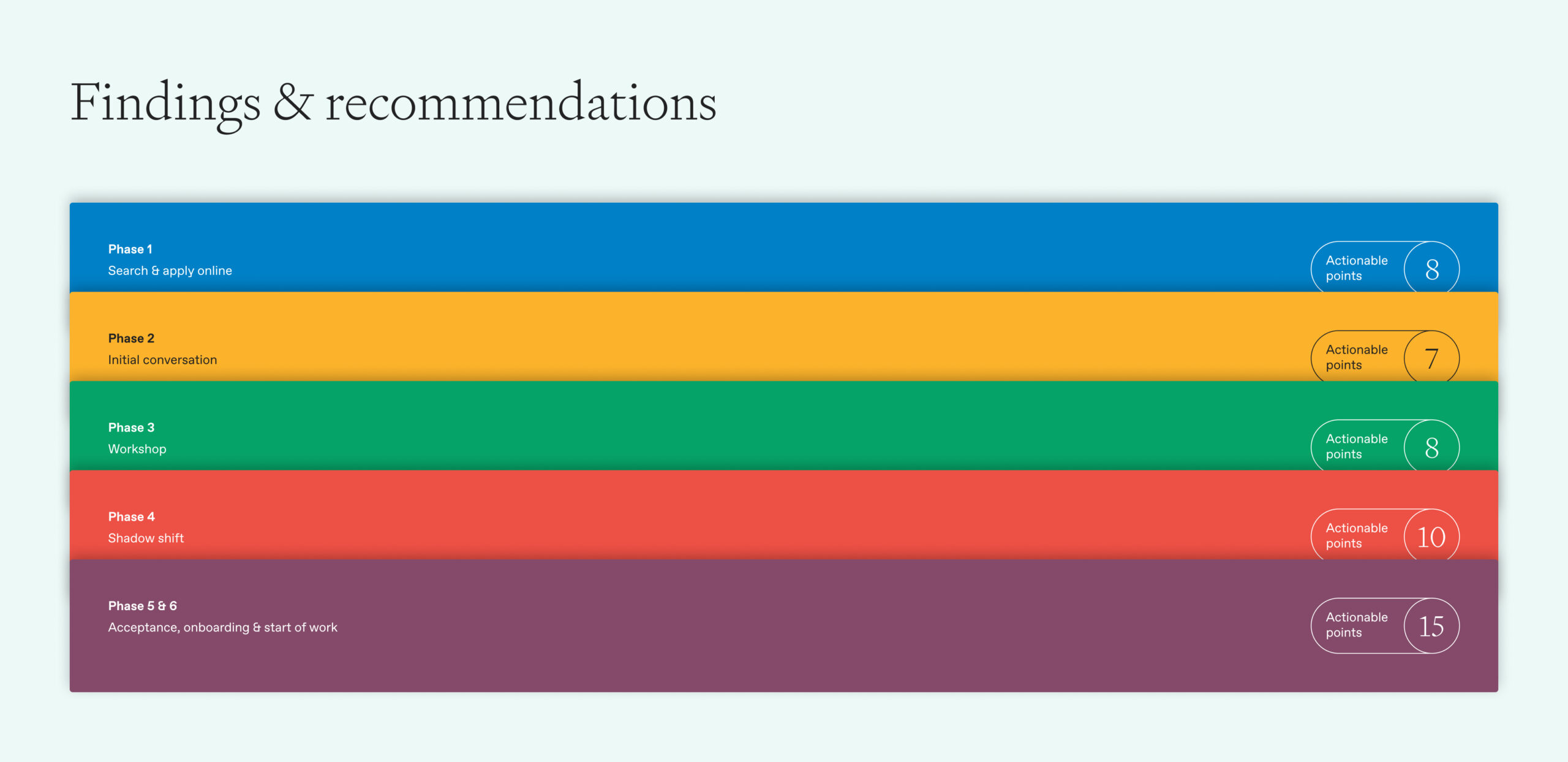
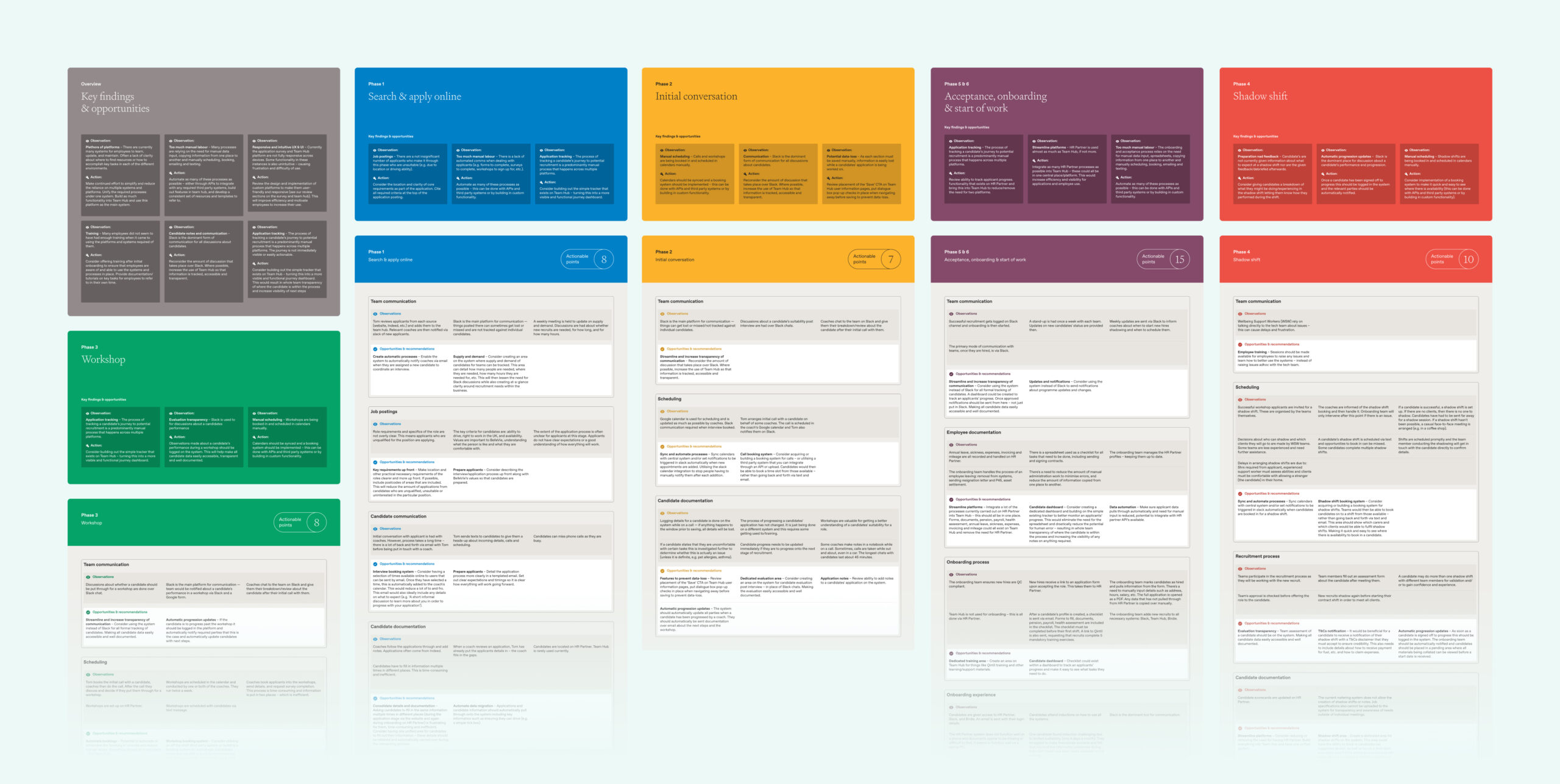
We structured these conversations around the different phases of the recruitment process, for example; search and apply online, a workshop that was carried out with applicants, a shadow shift and more.
Outcome
We collated our findings into one report that presented key findings and opportunities for each phase of the recruitment process and then broke these down further into different areas within each e.g team communication and job postings etc. These findings contained points such as clear communication and expectation to applicants prior to each stage to ensure that they knew exactly what was coming up and within what timeframe to make sure that they stayed engaged and committed to the application process. We also made recommendations based on our insight working with various third party software packages such as slack and google forms where we could see that utilising these in a better way and creating integrations using pre-existing API’s would help deliver a smoother process for all involved. This report has provided the basis for a brief for the company to take forward and action as they see fit in line with commercial objectives.
The UK is a global leader and innovator in healthcare. It’s home to one of the largest medtech industries in the world. It’s a global hub for life sciences (second only to the US), with a unique and collaborative ecosystem across government, business, academia and the NHS, and has the strongest biomedical pipeline in Europe.
It leads in its research capabilities and has a rich history of innovation, developing new drugs, devices and therapies. There are opportunities for investors and businesses across all these areas.
It is the role of Healthcare UK (part of the DHSC) to promote the sector to overseas markets and increase the UK’s share of healthcare services exports. It helps companies do more business abroad and helps overseas healthcare organisations find a UK provider with the expertise and services they need.
To this end, as a marketing tool, it had a listing of all UK healthcare organisations who are ready to partner with overseas markets and export their unique and innovative products and services. The problem was, it was on a PDF.
This had to be manually updated every time a company detail changed, which was time consuming, expensive and prone to human error. The data base was often out of date, and wasn’t searchable by interested procurement parties.
It was time to go digital.
What we did
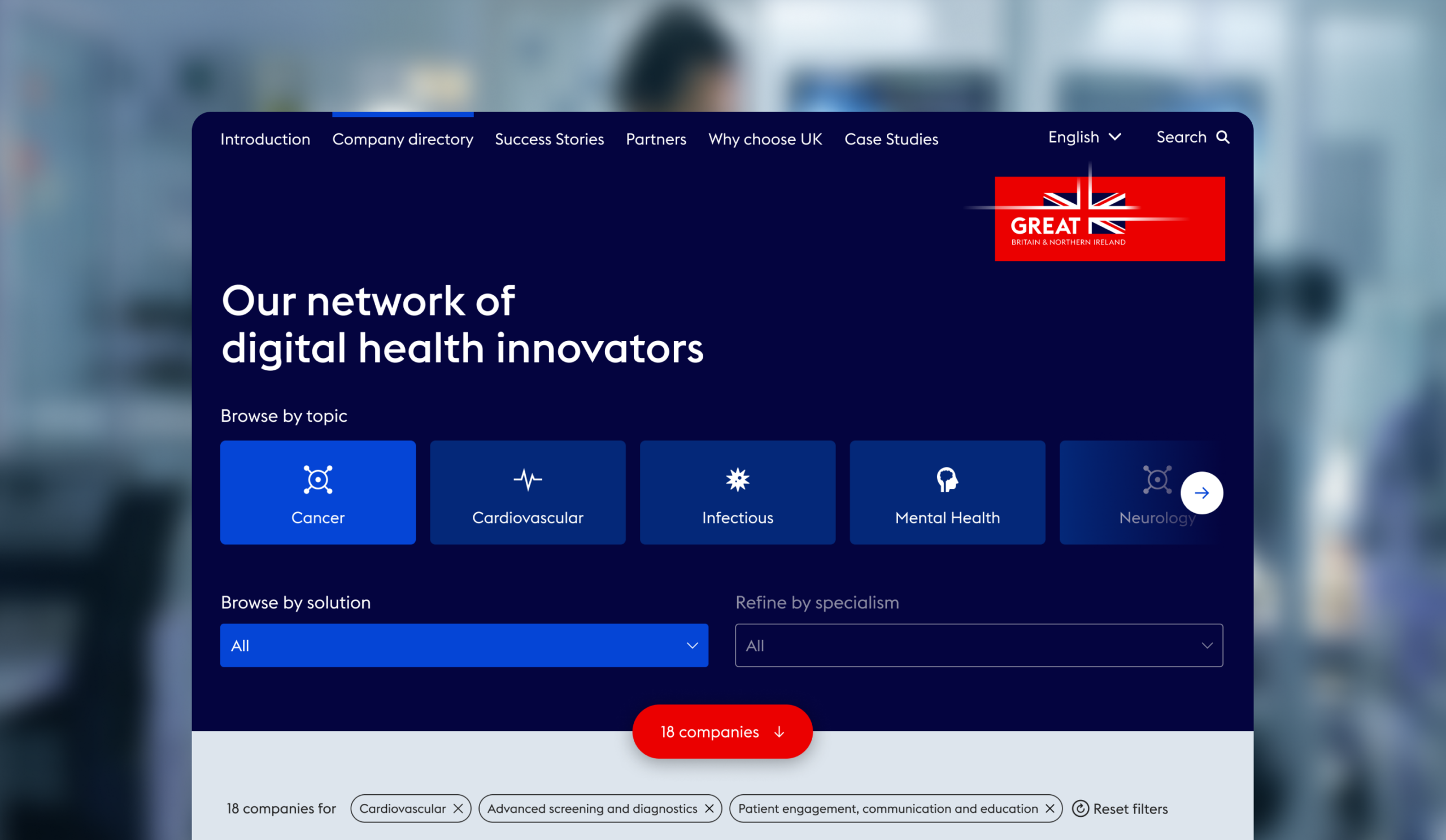
Our mission was to create a unique, custom-built digital tool containing all the companies Healthcare UK (HCUK) wants to promote. It had to be easily searchable across categories and companies had be able to edit their own information.
User Experience and development
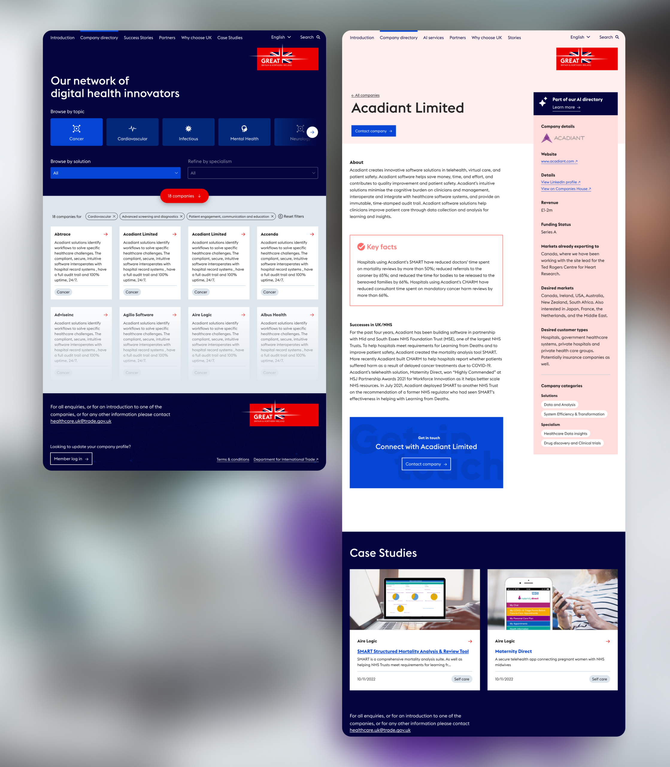
We designed a completely bespoke UI and UX, with a fully customised front-end, developed with WordPress. We chose WordPress for its ability to control content, and its easy-to-use dashboard.
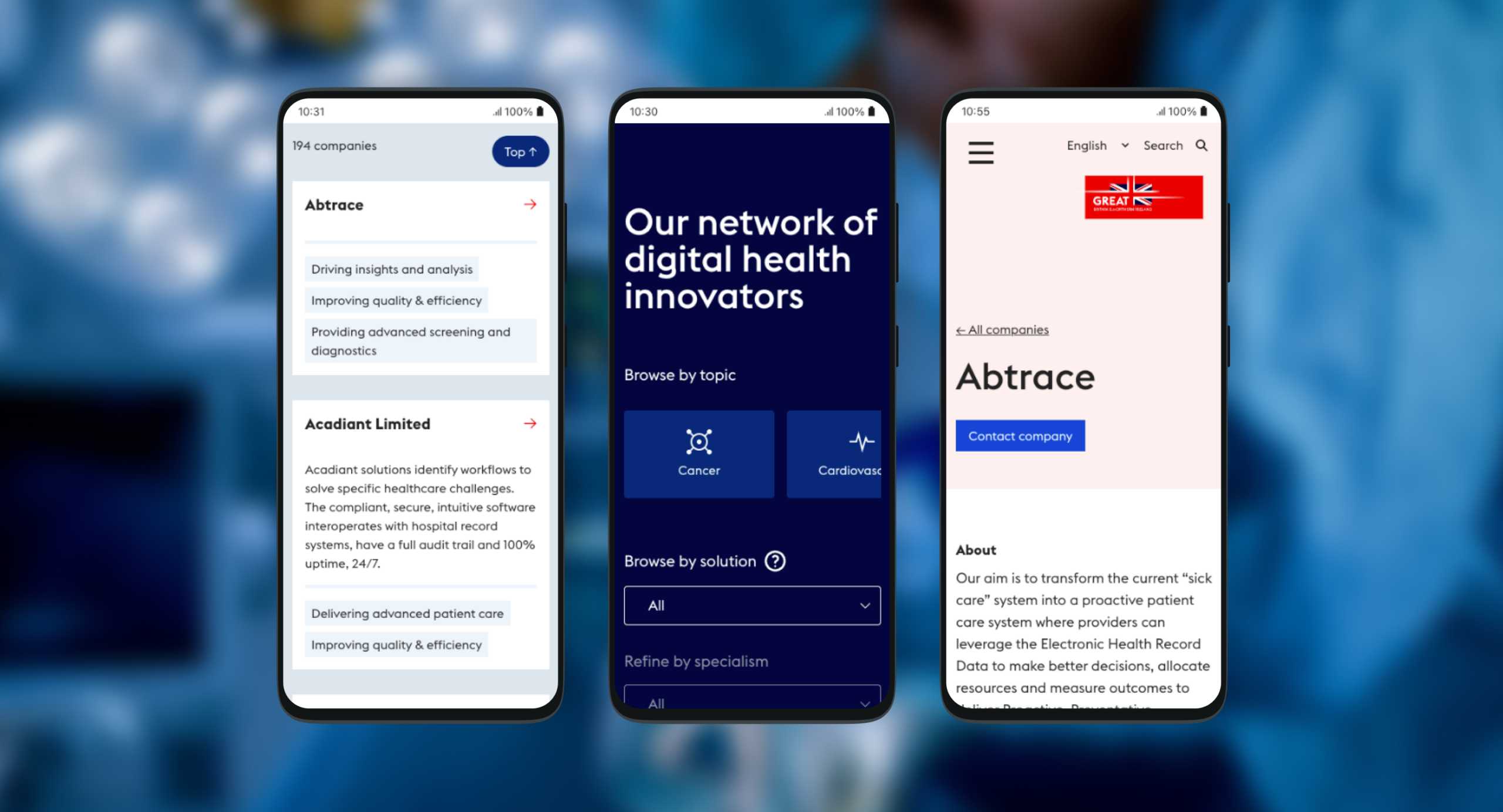
Our main concern was the process for companies to update their details, with 100+ users who had varying levels of digital experience. We built publishing capabilities to assign users different levels of access to edit their information, and to notify both parties at each step of the submission, sign-off and publishing process.
Through testing and iterating, we tailored the process and built a frictionless experience for users, and created a training document for all stakeholders. We custom built the database that houses all of the different company admins to be provide flexibility specific client requirements. We also custom built the search functionality, so that visitors looking for UK partners and talent can search by category, subcategory and company name.
User Interface
Our look and feel followed HCUK’s existing branding guidelines. We focused on designing a digital experience that looks good and is easy to navigate on a tablet, as these are often used to display information at HCUK events. We made it easily searchable so that potential partners and commissioning bodies can find providers offering what they need.
Outcome
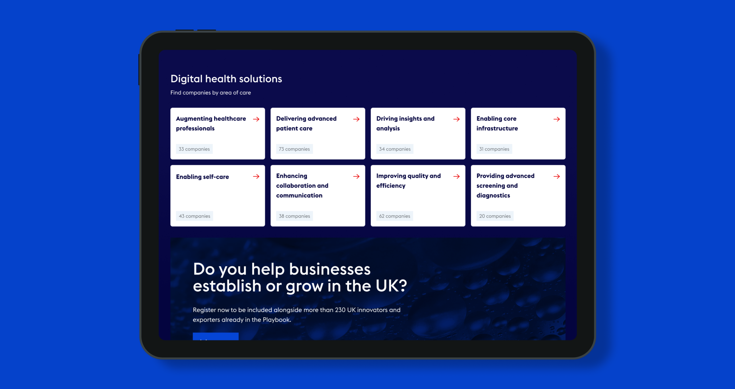
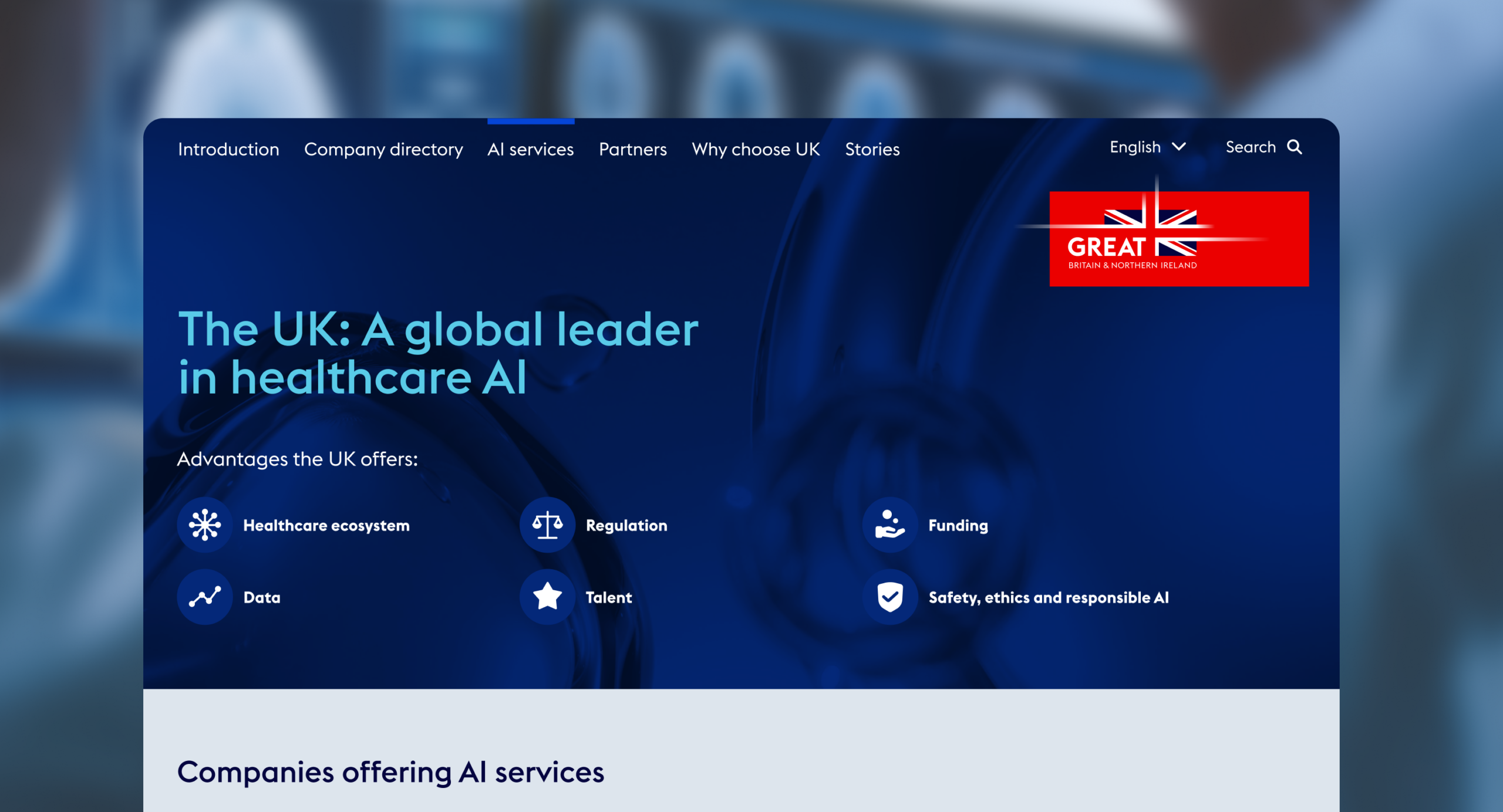
The Digital Health Playbook, launched in January 2024, features 180+ selected healthcare companies, each offering something unique and who are committed to innovation, collaboration and international expansion. Categories include clinical care, out-of-hospital care, insights and analysis, core infrastructure, quality and efficiency, screening and diagnostics and more. It’s a significant marketing and engagement tool for HCUK, helping to promote UK businesses and boosting the growth of companies, the sector and the UK economy.
Hearing loss is an unaddressed issue for millions of people. It can make conversations and social interaction harder, increase isolation and is linked to cognitive decline and increased risk of dementia. More than 40% of over-50s have some level of hearing decline. At work it can stop people fulfilling their potential or force them to leave or retire early. Yet most of us don’t go for hearing checks. There is social stigma and fear attached, not helped by a mechanical clinical process.
Kennedy Woods – a social impact architecture and design practice – wanted to change this. Addressing hearing loss is a huge untapped opportunity for long-term cognitive health, productive extended lifespans and improved quality of life. Co-founder Tom Woods came up with the idea of Hearing Birdsong, a new way for people to explore and monitor their hearing that revolutionises the current clinical process. It humanises screening by using pleasant, familiar sounds of nature and birdsong and it’s done in the comfort of home, so that people can assess and protect their hearing health and long-term wellbeing.
The concept was awarded a grant by the Design Age Institute to develop it into a working digital prototype. Studiomade won the competitive tender to partner for both the design and development build of this innovative and pioneering product.
The result is a collaboration between Studiomade, researchers, engineers, designers, developers, clinical practitioners, volunteers, experts from UCL, Imperial College and the Dyson School of Engineering and people with hearing loss. Hearing Birdsong was exhibited as part of the Design Museum’s Future of Ageing exhibition in 2022.
What we did
Audio soundscape
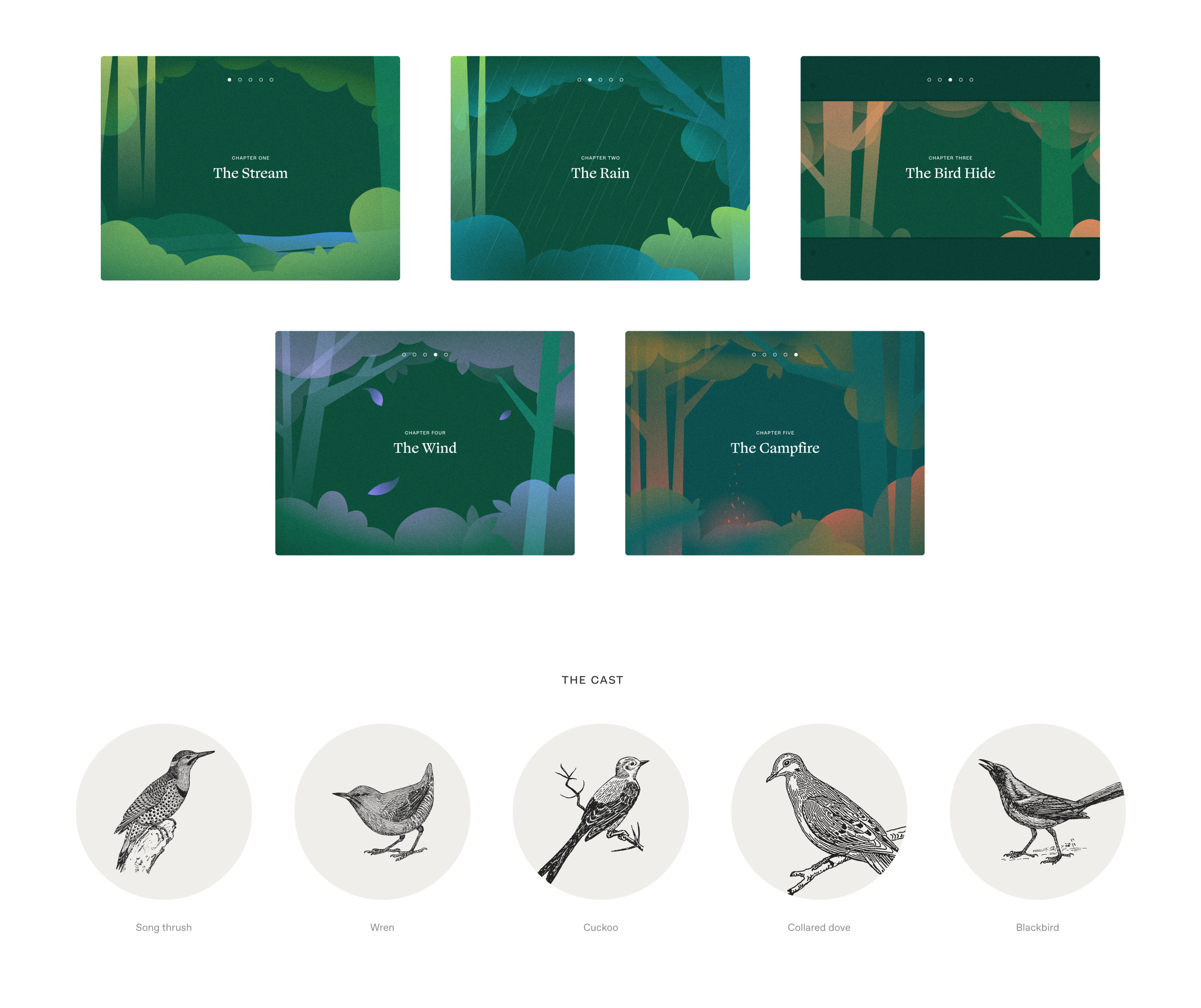
We replaced the mechanical, abrasive sounds of a pure tone hearing test with a richly detailed forest soundscape: the songs of five familiar British birds alongside successive sounds including a flowing stream, rain and wind. These were engineered to blend into a dynamic yet calming audio experience. It uses bird calls that occupy a narrow band of frequencies, the same frequencies examined in a traditional hearing test. This gives users performance indicators across their entire hearing range.
We worked with Professor Adrian Davis OBE, a scientist specialising in the public health aspects of hearing. He helped us define the logic and select which type of hearing test to use within this format. We also consulted with prominent consultant otorhinolaryngologist Taran Tatla. The audio was created and output by Oscar Jones, a PhD student at Imperial College London.
Language and safeguarding
This experience was intended to provide a less abrasive option than the traditional hearing test, so we didn’t want people to feel isolated or scared by potential issues. The product had to be supportive as people did the test and received their results.
The language we used in the script had to be accessible and feel natural to as many people as possible. Based on interviews with key stakeholders, we made decisions throughout the process to adapt the language to resonate with the intended audience. For example, we used the word woods instead of forest as it was felt that forest can conjure up images of a dark and intimidating setting.
Design, development and user testing
We developed a journey through woodland, deciding what scenes the user would go through, and what sounds they would hear at each stage. We designed screens, buttons and language.
Throughout the project, a control group tested our design and development iterations. What elements were visually distracting? What language was inaccessible or off-putting? How would users with hearing aids interact with the tool? We also worked with people in one-on-one sessions to test elements including logic, timings, the visual look and overall feeling.
This gave us many insightful observations. We brought all of these into our work as we progressed and built a refined experience that would meet our audience’s needs.
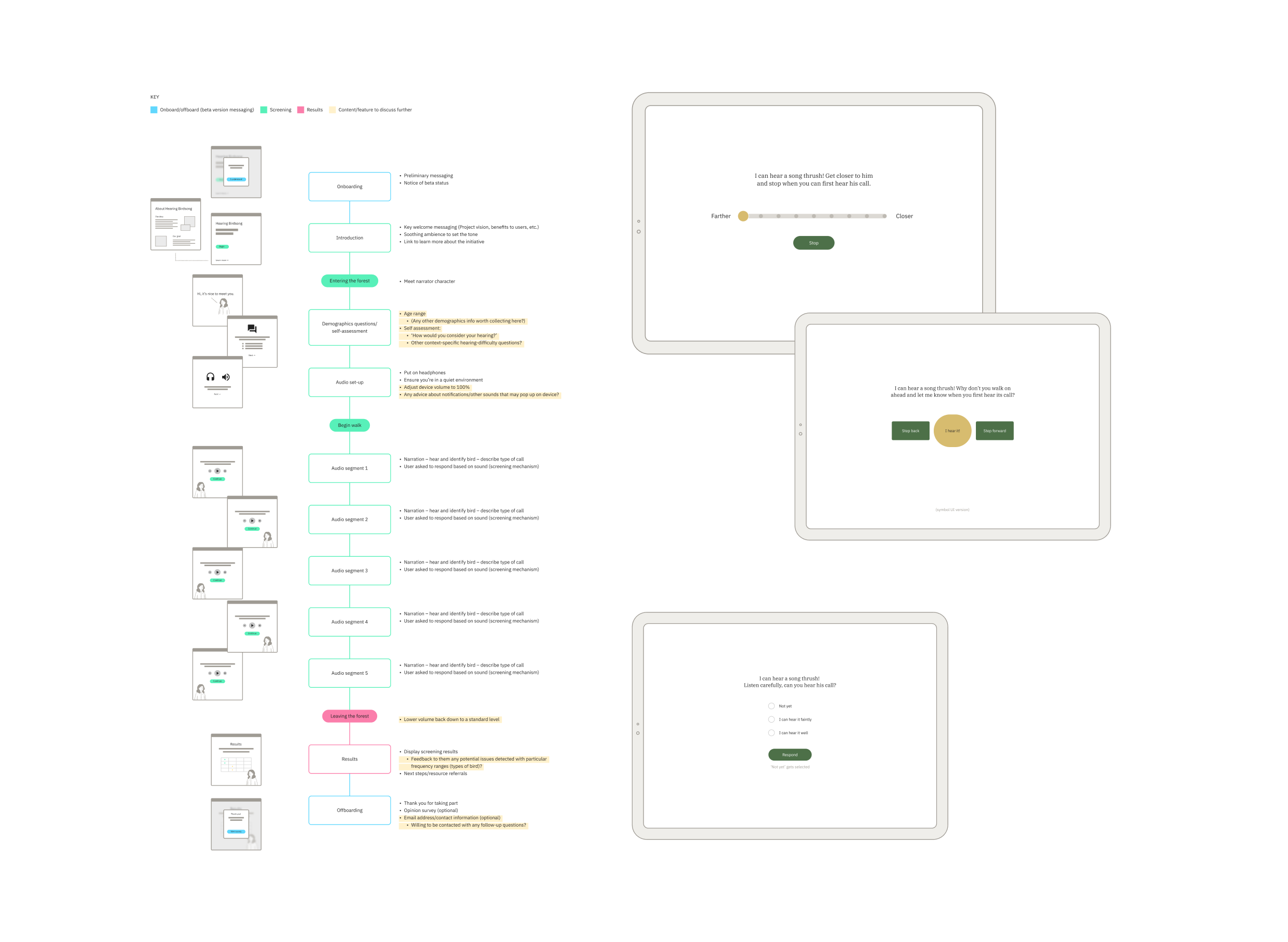
Approach to UX and UI
Design accessibility was essential. We looked closely at typographic choices, colour (contrast accessibility and legibility), illustrations, and the size, clarity and consistency of interactions. We wanted this online woodland to feel immersive and calm, so we used soft colour transitions, simple shapes and movement to create a playful world inspired by children’s storybook illustrations.
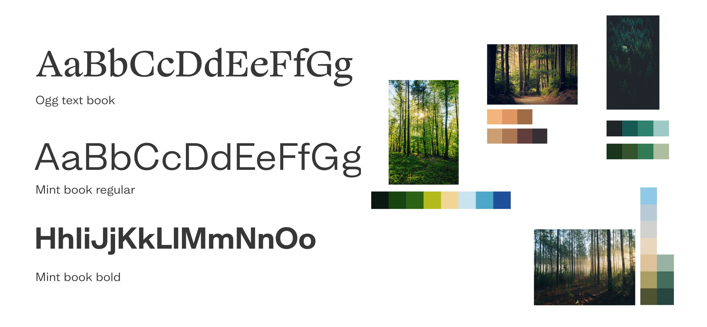
Pairing visual design and audio
The audio soundscape required a visual and illustrative approach that enhanced the user’s experience but kept the focus on the sound. We drew all the illustrations, crafting a series of options before arriving at the final selection used in the beta product. At points when users are asked what they hear, we softly blurred the background illustration in order to keep the focus on the sound, not the scenery. We decided not to show birds, so that people wouldn’t be prompted to say they could hear them and could use their imagination.
The results screen
It was important to get the results screen right. The explanatory language has to be clear and concise, and graded results can’t be confrontational or judgemental. We give a clear result for each stage of the test and link to external helpful resources where users can go for expert advice. Over time, as the product is used and feedback is gathered, we’ll gain further insight and be able to tailor it to effectively support people who need help.
The outcome
Consumer appetite for digital health support is growing. Digital health solutions are creating a hospital-without-walls approach that blends in-patient care with alternative models including community and home support.
We successfully designed and built a working digital prototype and took Hearing Birdsong into its beta phase.
Through media coverage, online and social media campaigns and the Design Age Institute, thousands of people in 100+ countries used it. Multiple contributors have all helped to get it to this point as a working digital product. The project is now ready for funding and future expansion and development, with the hope that it could become an NHS screening tool.
For people with opioid dependence, being on the correct (optimal) dose of methadone and buprenorphine is an important factor in treatment efficacy. Underdosing Opioid Agonist Therapy (OAT) leaves people at risk of use and overdose. But many people receiving OAT have poor understanding of how treatment works, including issues relating to dose and effect, and this limits the efficacy of treatment.
To help patients get the most out of their treatment they need a clear understanding of how treatment works, the benefit of higher dosing and, most importantly, what the right dose is for them – rather than being tied to a magic number or focusing on the fact that higher doses will result in a longer period of dose reduction to abstain. SODA helps patients identify for themselves, through a simple questionnaire, what the right (optimal) dose is for them.
Being on the right dose is crucial. The right dose for you will be different to someone else. It’s not a magic number. SODA provides that crucial support to inform individuals and help make positive change.
The optimal dose is the one that leaves people free from withdrawal between doses (preferably for at least 28 hours), so for people on supervised dosing, getting it doesn’t become a preoccupation or cause of distress if other activities need to be attended to or they’re unable to pick their dose up at their usual time. This can reduce craving, cessation or provide a significant reduction in regular on-top use and does not cause sedation.
SODA has been developed in conjunction with user organisations and treatment service providers as well as focus group tested with a number of patients with Professor Adam Winstock.
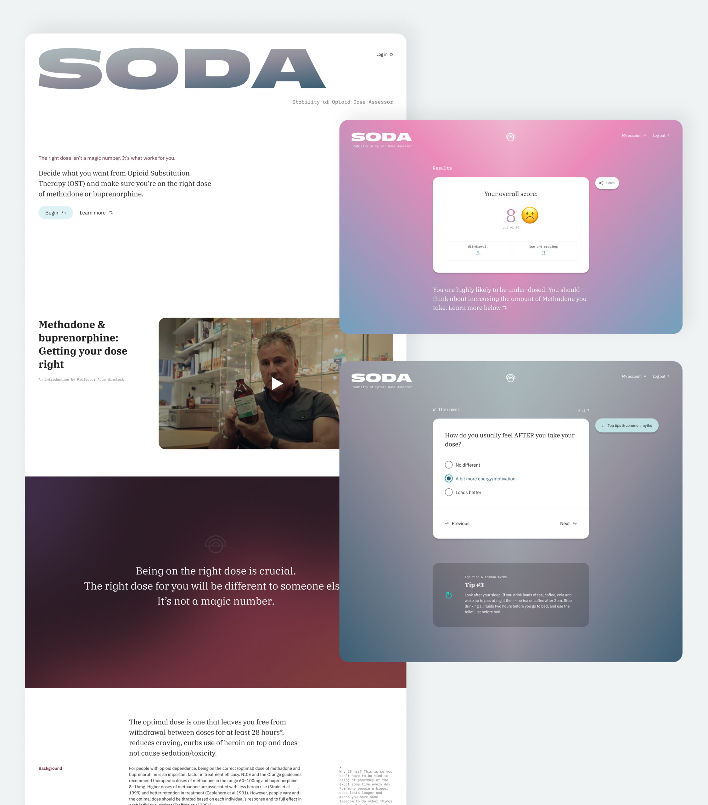
Digital product design
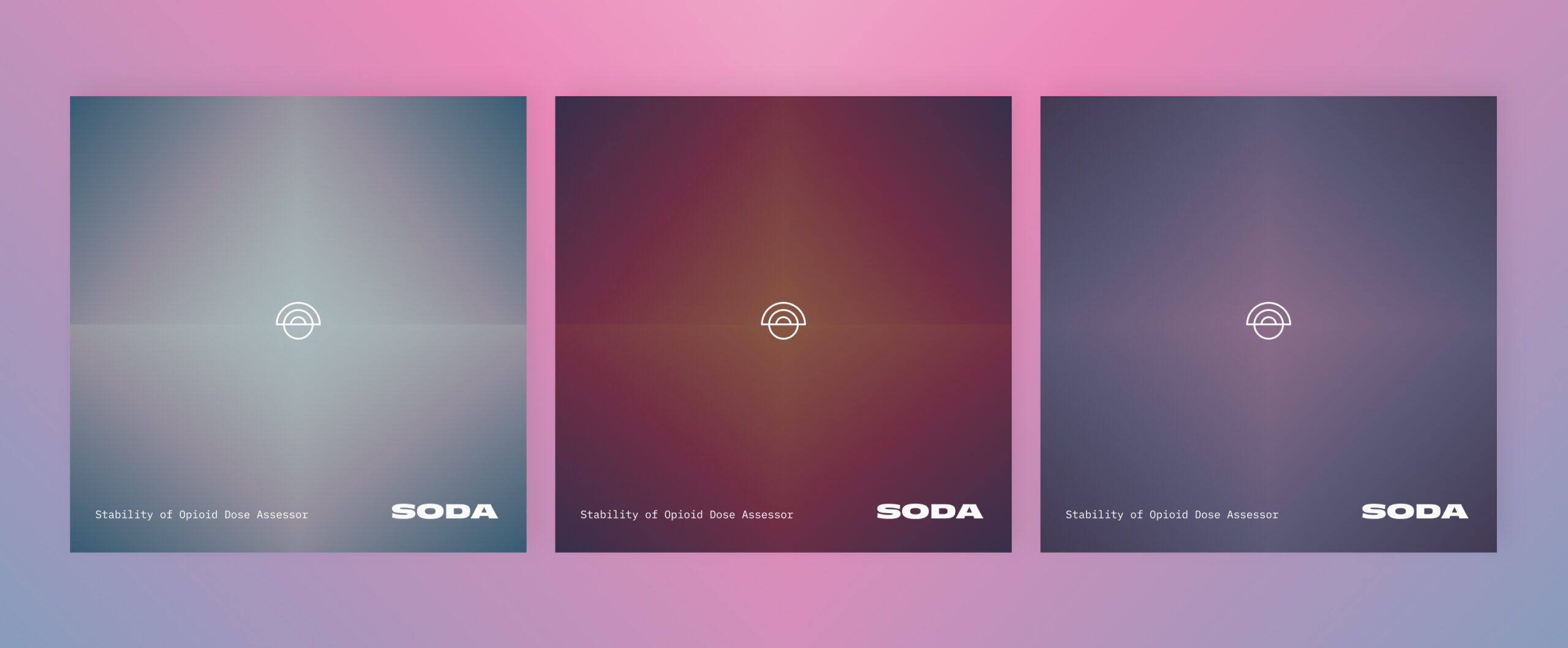
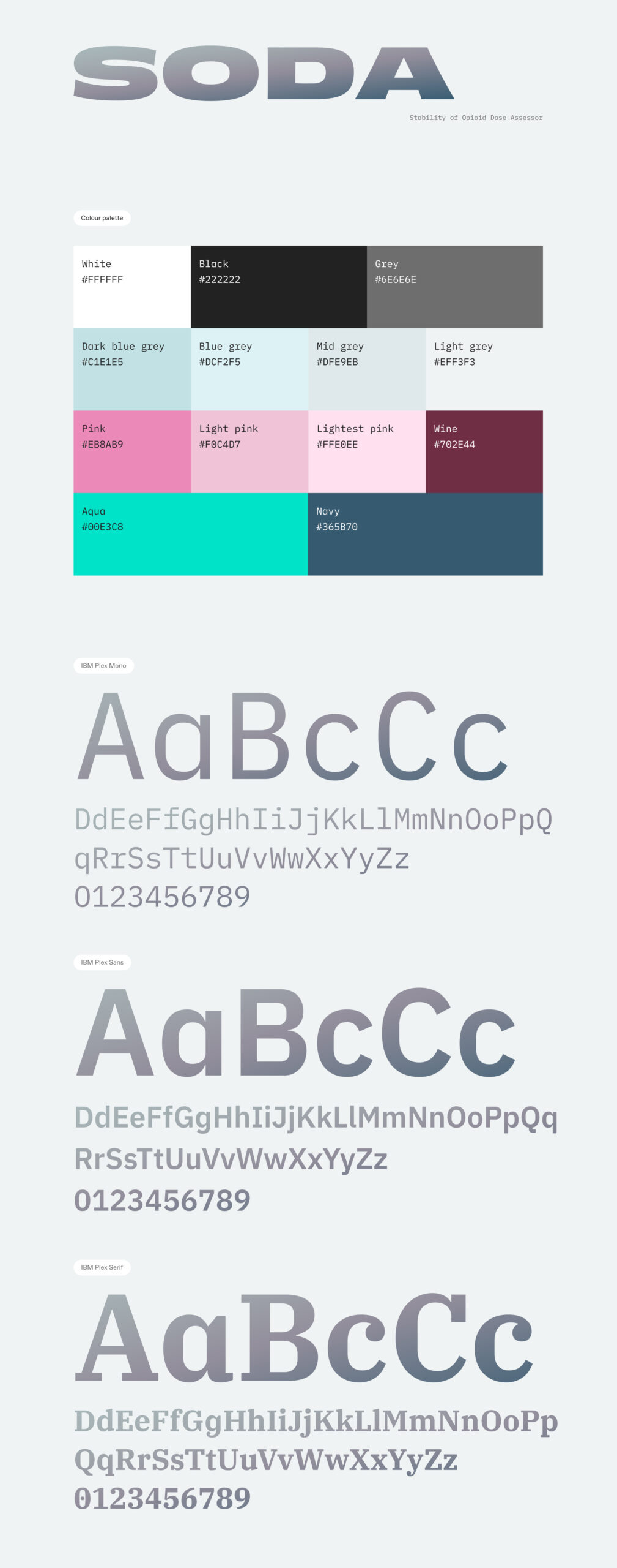
We wanted to build an accessible product design framework that wouldn’t intimidate or frustrate audiences. At the same time it needed to be clear and concise, to underpin the clinical topic that it was addressing. We implemented a soft colour palette of gradients alongside a clinical and accessible font choice that alludes to the pharmaceutical nature of the product. We used emojis in the results table to help remove any potential stigma from the tone of wording and hopefully provide comfort to people seeking out further assistance.
Database architecture
We had to build a robust database architecture to underpin the product. It would need to scale to handle an exponential amount of data with anonymous users potentially using a randomly generated login based on an ID generated within the app. We had to develop this to produce results quickly and be scalable. We adopted a React framework combined with a Google Firebase realtime database. This was prototyped and user tested through all phases of product development, right up to its release.
Creating a healthcare product?
We assist entrepreneurs and business taking new digital products to market. This can involve initial concept planning, commercial and investment conversations, and brand positioning alongside the scoping and design of the product itself. We achieve this through workshops, design sprints, conceptual storyboarding, user testing and prototype testing. Speak to our team about how we can support you.
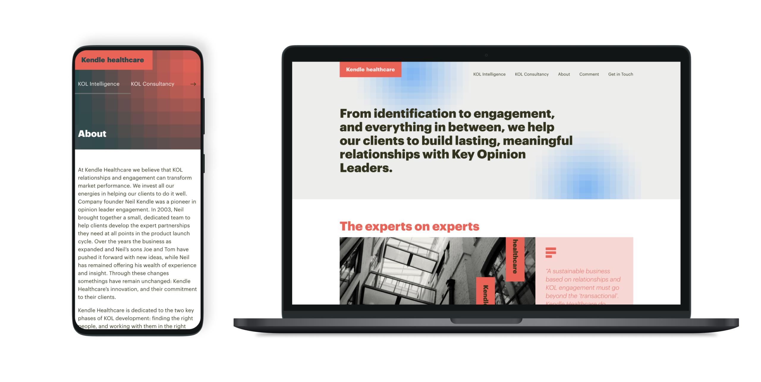
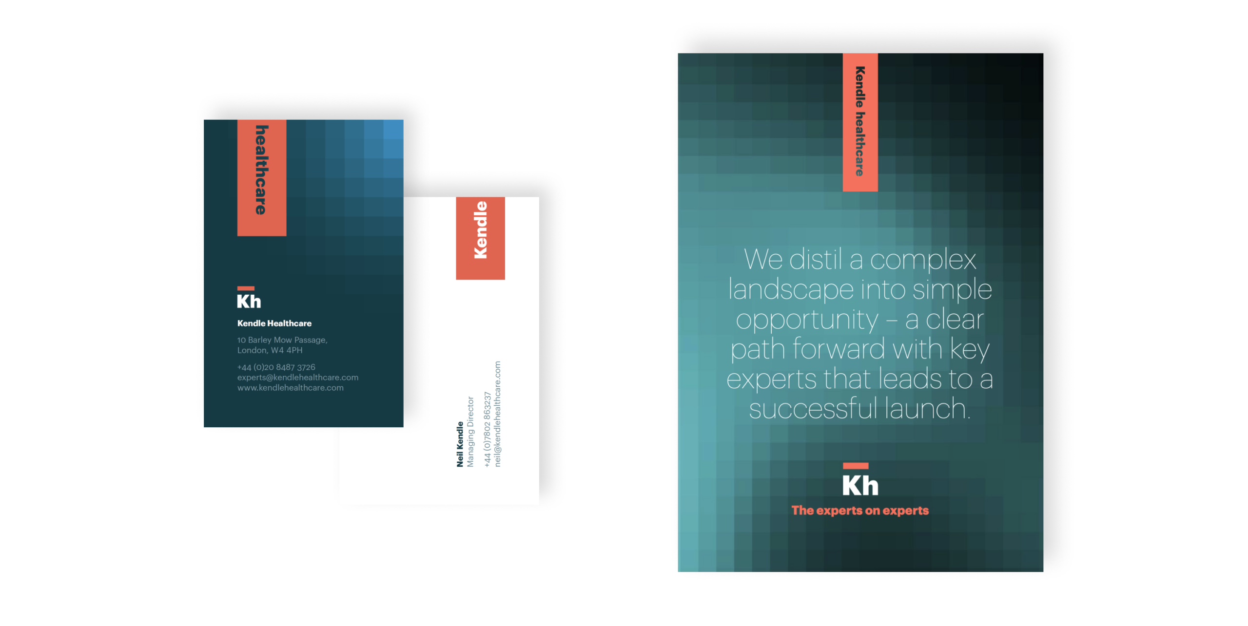
A bold new identity that worked across print and digital and would position them as leaders in the marketplace. The new brand was modern and fresh while giving them the appropriate authority to work in more formal spaces with key opinion leaders – integral to their business.