Healthcare UK is a longstanding client who we’ve worked with across a number of projects. Life Sciences Innovators (LSI) was a new initiative, to select and then showcase 50 innovative companies working at the cutting edge of life sciences in the UK. There were six defined categories, across medical technology, therapeutics, drug delivery, digital solutions, diagnostics and precision medicine plus other UK specialisms.
The showcase is sponsored by the Department for Business and Trade (DBT), helping overseas companies set up and invest in the UK and assisting UK companies to succeed in global trade.
The client wanted a visual style that would be distinctive yet sit under the UK’s GREAT branding. Our team supported with the design and production of all materials needed to launch the initiative, as well as grow it each year from a social perspective.
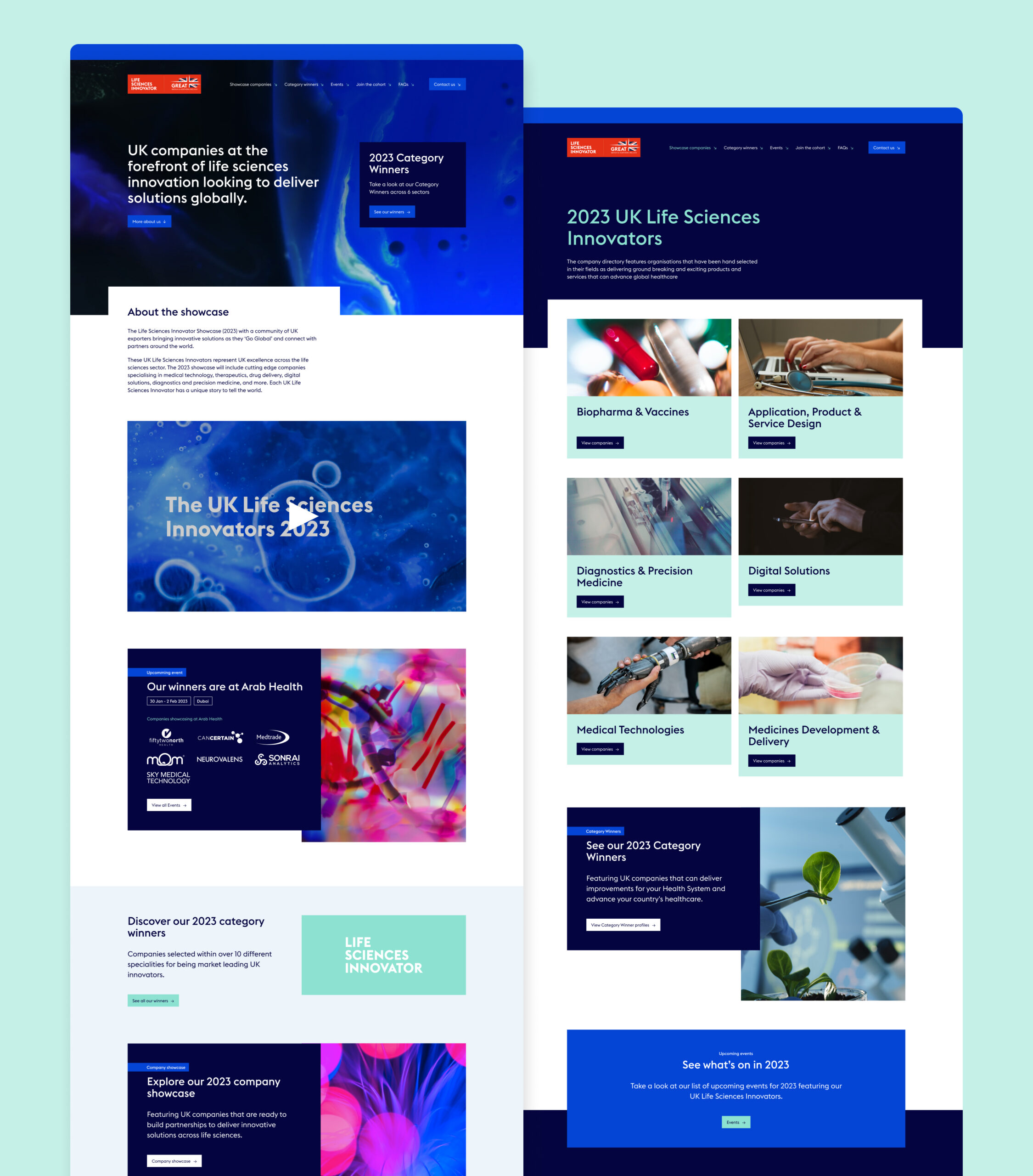
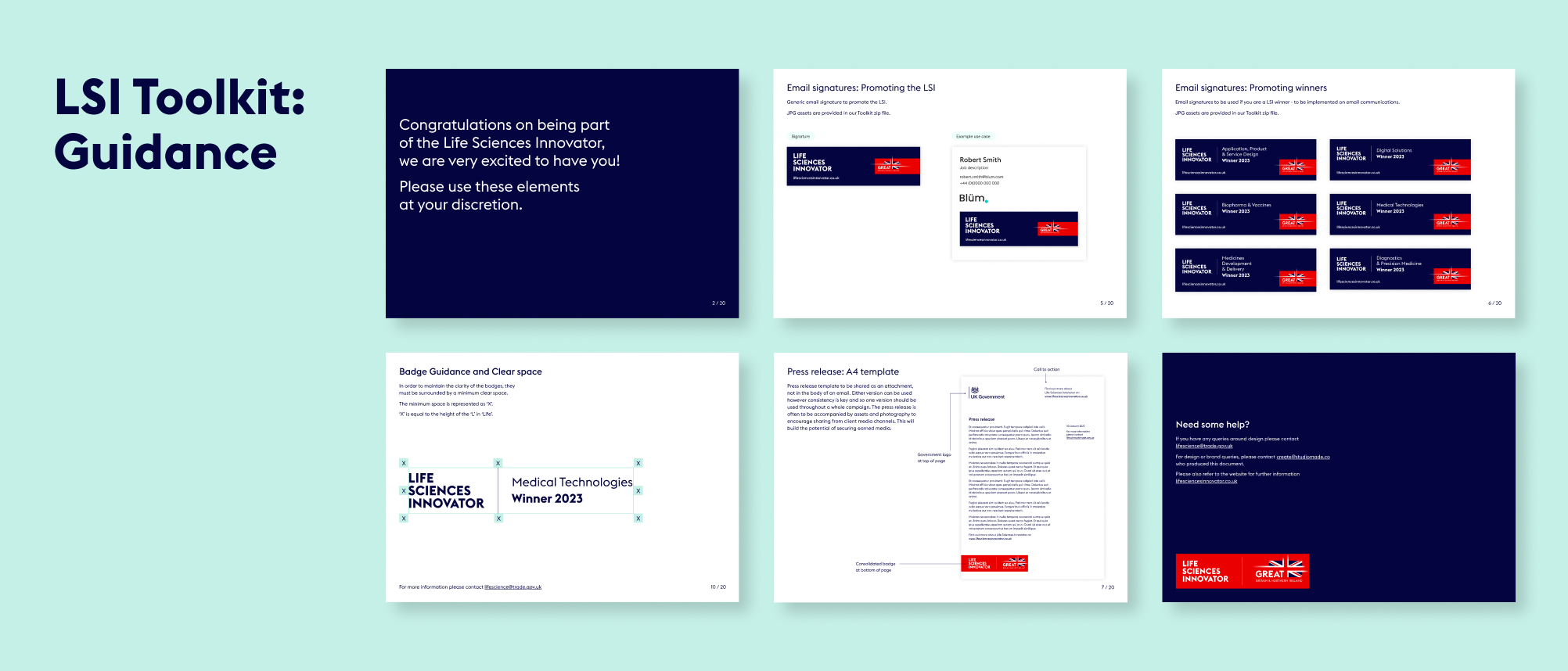
We delivered a website, overview video, printed elements, social posts and a toolkit that could be shared with campaign winners to access assets that they could use for their own promotion.
Innovation badges
One of the most important parts of the design was creating the badge for the initiative and the badges that the winners would receive for each category. We worked closely with the GREAT brand team, so that we were aligned to their guidelines while still providing a distinct look and feel for LSI.
Bringing the initiative to life through video
We made a short video to be used in presentations and promotion for LSI, and to get better engagement on social media. The video is a quick, engaging way to communicate key information and sits on the website as a project overview.
A digital experience
For the website design and build we had to work within an existing development platform, Aventri, which places some restrictions on how design elements can be executed, when compared with a fully independent build. However, so that the website felt dynamic, we worked with GREAT branded photography and animation to inject a unique style.
Social activation
Aware that this initiative would need internal and external promotion to encourage the most innovative companies to apply each year, we created a series of social posts that can be used to promote key goals and generate interest. These were predominantly animated, to ensure the highest engagement, and included:
- General awareness
- Encouraging applications
- Congratulating winners
- Event promotion, when the winners appeared at sector events
The toolkit
With a breadth of materials produced for this project, we wanted to tie everything together for our client and their winners so that they could use all of the assets correctly and build awareness of and engagement with their brands. We created an internal toolkit for the Department of Life and Sciences, so that whichever team member was working on them could do so consistently. We also built an external toolkit for participants and winners so that they could promote the initiative across their own social presence, email footers and other forms of engagement.
Background
Most people who drink alcohol won’t ever need treatment – but many are curious about how much they drink and whether it’s affecting their wellbeing. The challenge is finding information that’s relevant, reliable and non-judgemental.
Drinks Meter was designed to meet this need. It is a digital tool (web and app) that gives users instant, personalised feedback based on what they’ve shared about their drinking. Instead of offering blanket advice, it reflects back patterns using evidence-based strategies – motivating people to think, adjust, or take action if they choose. The tool is entirely anonymous, user-led, and grounded in harm reduction.
Conceived and independently funded by Professor Adam Winstock – consultant psychiatrist, honorary clinical professor, and founder of the Global Drug Survey – Drinks Meter builds on his ongoing mission to make drug and alcohol information accessible, human, and evidence-informed. Continuing our long-standing relationship with the Global Drug Survey, we were brought in to position, design, and develop the Drinks Meter brand and digital product.
Approach and Build
From the start, our aim was to create a product that felt intuitive and supportive – something people would not only use, but return to. Working in close collaboration with Professor Winstock, we began with the structure and logic of the tool. He provided the core content and functionality; our job was to shape the user experience around it.
We took an iterative, user-first approach, refining the journey step by step. The final product was built using a single responsive codebase – meaning we could deliver a seamless experience across mobile and desktop from one build.
UX and UI design
We started by mapping the tool’s logic – how users input data, how responses are calculated, and how feedback is presented. Once the flow was clear, we layered in the visual design: a clean, uncluttered UI that supports easy navigation while reinforcing trust and clarity.


Brand identity
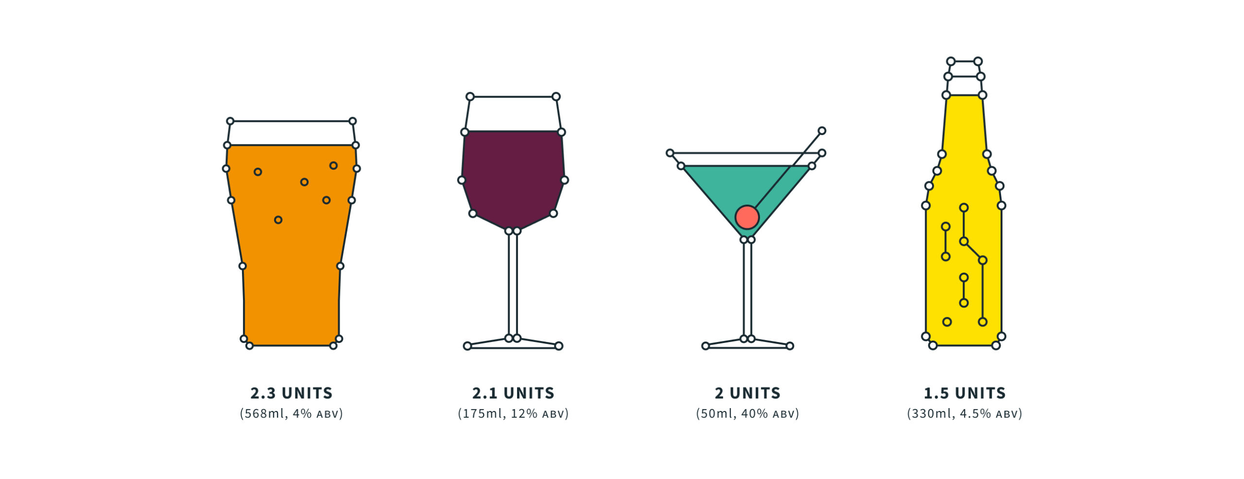
The brand needed to work across platforms – from in-app to physical print, PPC campaigns to outreach materials. We created a flexible identity with a bold, data-centric personality. The visual system combined vibrant, nightlife-inspired hues with custom illustrations to add warmth and approachability. The result is a brand that feels distinct from traditional health services – modern, motivating, and human.
We gave the product a scientific feel while also keeping it simple and friendly, pairing lightweight typography with thin line and stroke architecture. Alongside the brand colour palette we introduced neon elements, and added depth and detail with illustrations and iconography.

Technology
We used a single codebase so that we could deploy the app natively across different digital stores and platforms, including Apple, Android and as a desktop web tool. We opted for a hybrid web/app approach, wrapping our single product for deployment using Adobe’s PhoneGap. This meant that updates could be applied in one place and distributed across the device range quickly and easily. It’s available on the App Store and Google Play and as a responsive website.
Since launch, the brand and product has been extended to attract greater commercial opportunities, with new features released. Our architecture has expanded to accommodate unique localisations of the tool including offline data submission, localised content and other enriched features.
New functionality for Australia
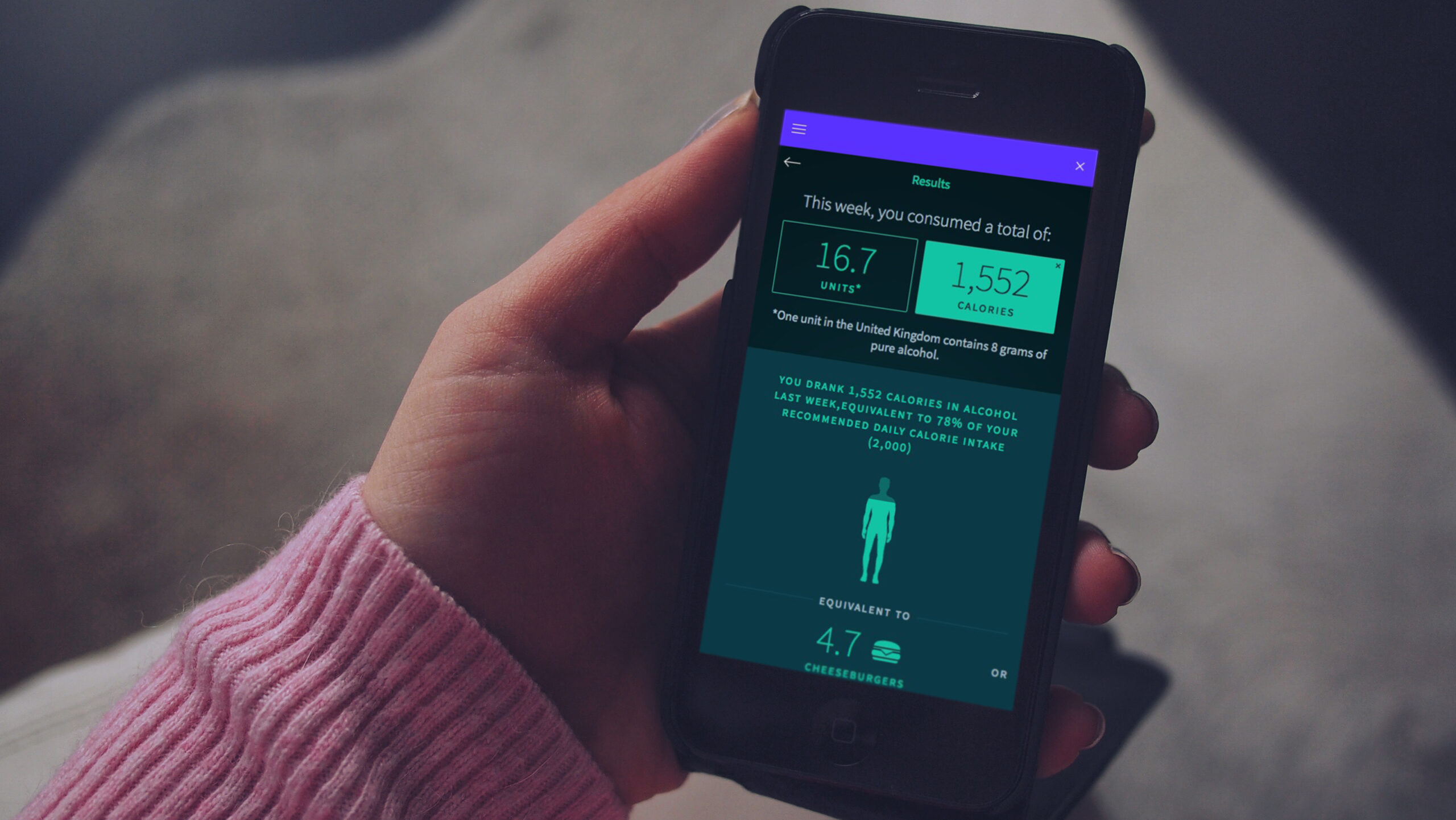
In 2018, the New South Wales government in Australia commissioned Drinks Meter to deliver new functionality to help combat severe issues with alcohol abuse in the state. We collaborated on new functionality, UI and UX, with a new diary component that attracted repeat usage of the app.
The new version led to proven behaviour change. Before using it, 32% of users agreed with the phrase “I am changing my drinking habit right now”; afterwards this increased to 44%. The number who agreed with “There is no need for me to think about changing my drinking” dropped from 52% to 45%.
The outcome
Drinks Meter has been commended by healthcare professionals, such as Professor Paul Wallace of University College London, who said: “It’s relevant, attractive, easy to use and provides useful feedback. It’s a great tool.”
In an independent peer-reviewed analysis1 of 32 eSBI apps (electronic screening and brief intervention) used by young people, Drinks Meter was the most highly rated by users, particularly for the information and feedback provided in the app.
In the first 3 years after our redesign, the app supported more than 50,000 people in 170 countries around the world.
Around the world, people are living longer. By 2030, one in six of us will be 60 or older and the number of people aged 60-plus will increase from one billion to 1.4 billion. Every country is experiencing growth in both the size and proportion of older people, and the increase in population ageing will be greatest and fastest in the developing world.
Good physical and mental health are key determinants of quality of life for older people. This shift in distribution towards older ages means all countries are facing major challenges in preparing their health and social systems. Healthy ageing is a huge topic, and a priority for countries across the globe.
Healthcare UK, which promotes UK companies overseas and supports partnerships, wanted to create a campaign promoting the UK’s capabilities in healthy ageing innovation. This could help to attract inward investment and business opportunities. Healthcare UK is a joint initiative between the Department of Health and Social Care, Department for International Trade (DIT) and NHS England and came to us as we are on the supplier list for the DIT.
It had already produced a brochure that shared inspiring case studies, with information on UK companies that can deliver solutions to healthy ageing – but it wasn’t landing. Studiomade was tasked with creating a campaign to engage its intended audience.
First, we had to go back a step. Why weren’t people engaging?
What we did
Healthcare UK’s brochure included contextual information and insight on companies that can provide technology, infrastructure and other services supporting healthy ageing. But, with it not getting the expected response, we realised we had to help Healthcare UK own the conversation around healthy ageing. What was lacking was a positional piece on why healthy ageing matters.
This would reinforce Healthcare UK as an authoritative voice in the sector. They needed to show the problem before they shared the answer. What are the reasons for focusing on healthy ageing as an agenda? Why is this topic important?
We proposed writing and creating an in-depth, thought-provoking white paper, then building a campaign around it. We wanted to bring context to the issue for different audiences, address people’s objectives, and help them understand the issues and their country’s place in the global picture.
Strategy
We identified the areas of conversation that Healthcare UK could own, and set out these objectives:
- Showcase the UK as a global leader in healthy ageing, with a focus on opportunities in the life sciences and health and social care sectors.
- Establish the UK as the preferred partner for innovation in a healthy ageing society.
- Support the global challenge of ageing societies.
- Promote trade and investment opportunities globally.
- Develop mutual prosperity through industry and healthcare partnerships, and bring innovation into the UK.
- Identify global opportunities for innovative UK companies and connect them to these opportunities.
A global network
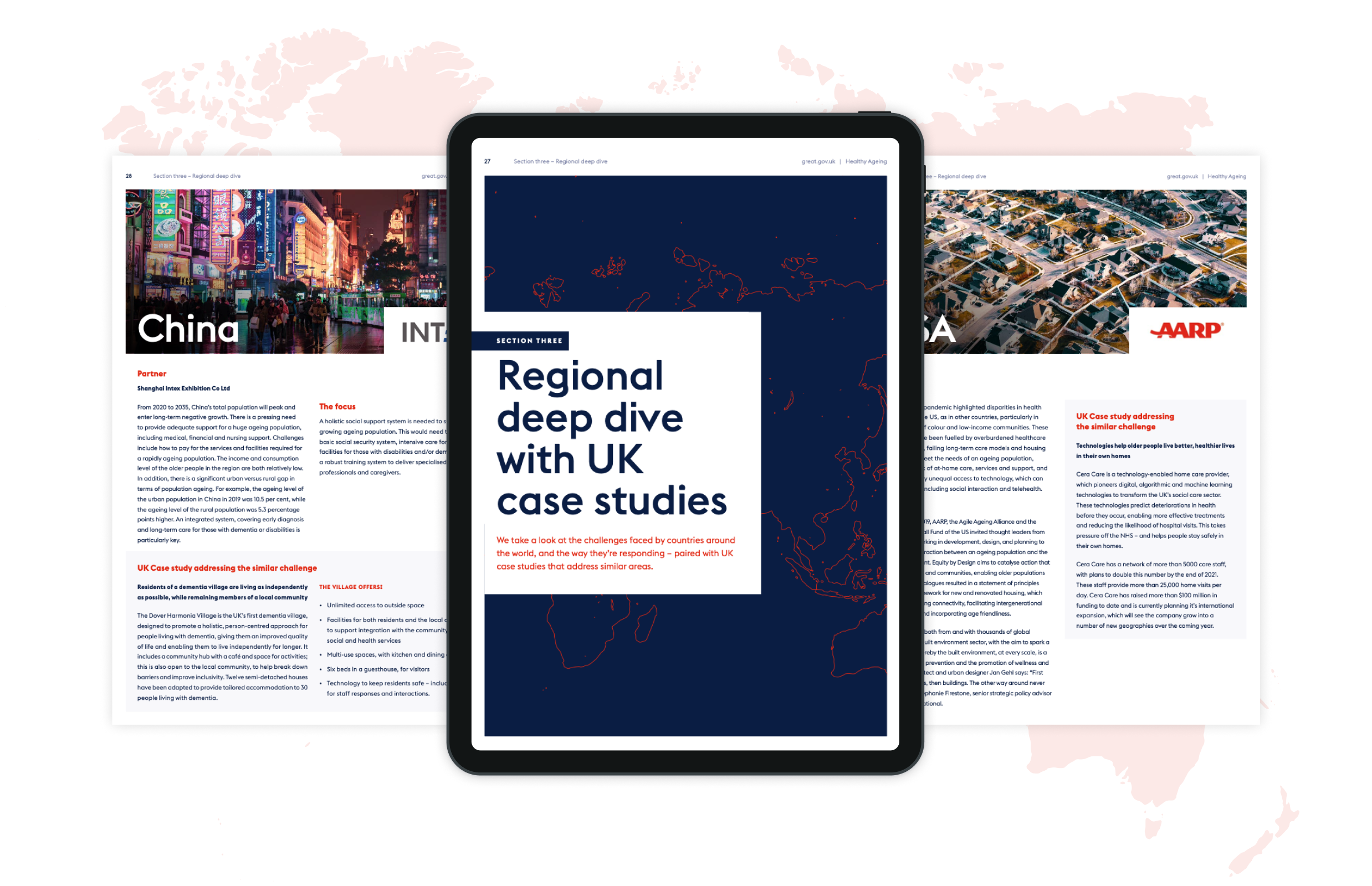
Healthcare UK has a broad reach, with an extensive network of organisations including charities, hospitals, governments and advisory boards around the world. To write a report that brings new information to the debate, we collaborated with these valuable connections and global partners, asking them to contribute insight and research to our regional deep dives. Not many organisations would be able to access such a broad pool of knowledge and this made the report unique and authoritative. It helped to frame the global issue, joining together the challenges that need addressing and the nuances that different countries face.
A pathway that joins the dots
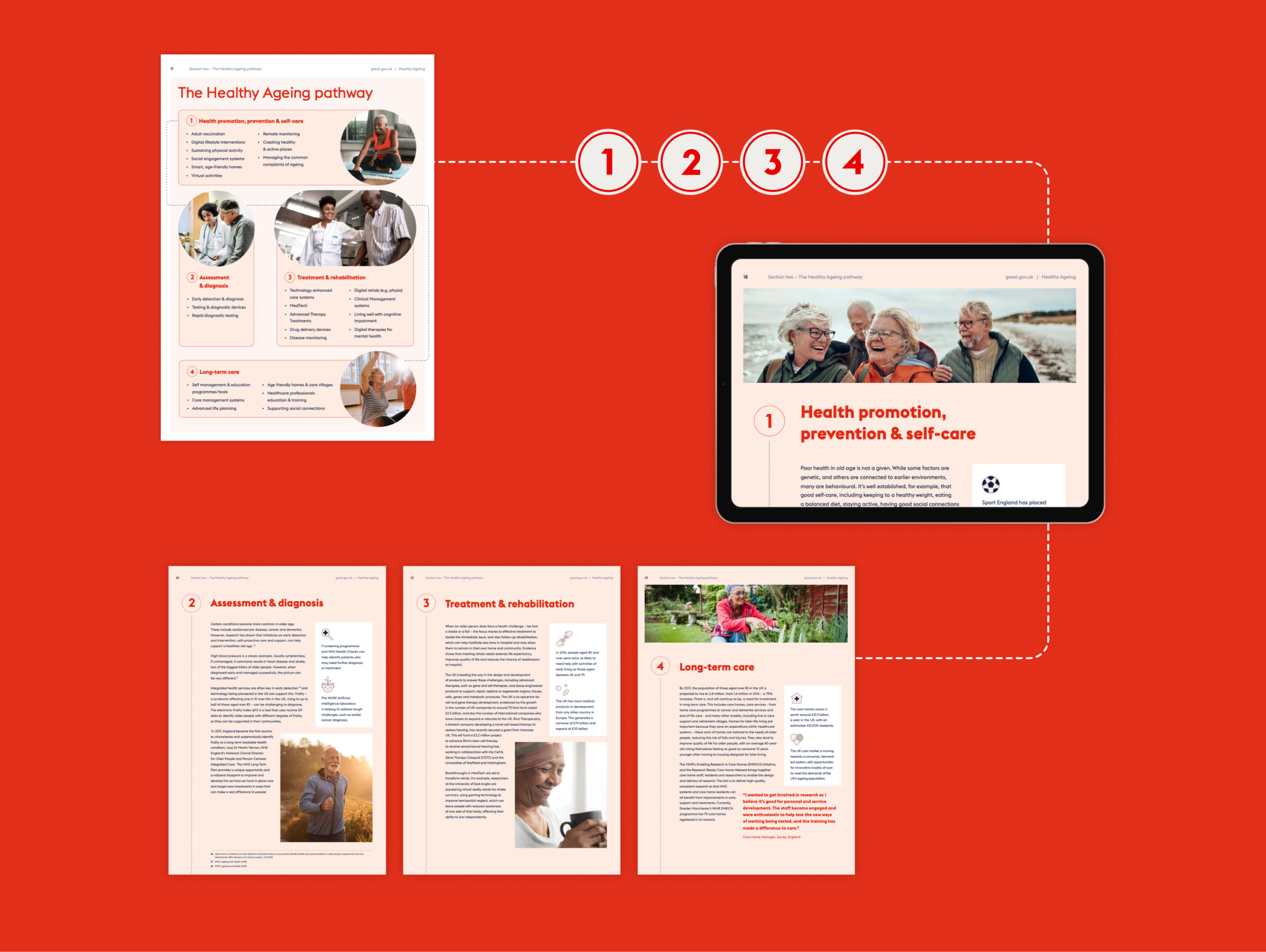
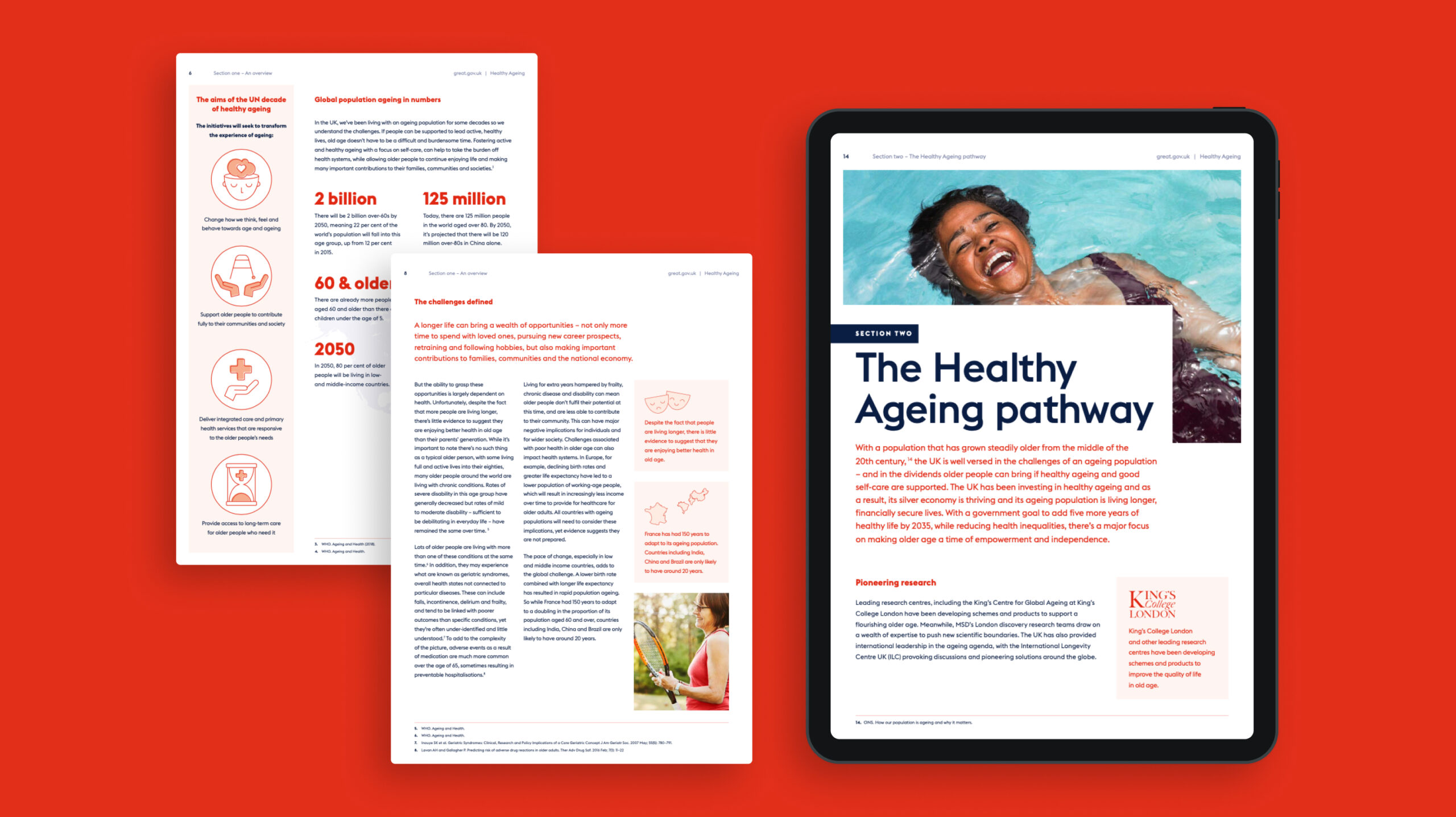
When working together to understand Healthcare UK’s historical work around the topic, they shared a healthy ageing pathway with us that they had created. It shows the steps that countries or health services should be taking towards healthy ageing. We made this a central element of the campaign.
It was shareable, it outlined the areas that needed to be tackled, it helped countries to plot their efforts, and gave the Healthcare UK team a springboard to link up to services they promote.
Design look and feel
Healthcare UK is part of the award-winning GREAT Britain and Northern Ireland campaign, the UK’s international brand marketing campaign, which works closely with UK businesses, not-for-profits and high-profile figures to promote the best of the UK abroad. Their guidelines led the overarching branding, but we brought in a lighter touch for this report and campaign.
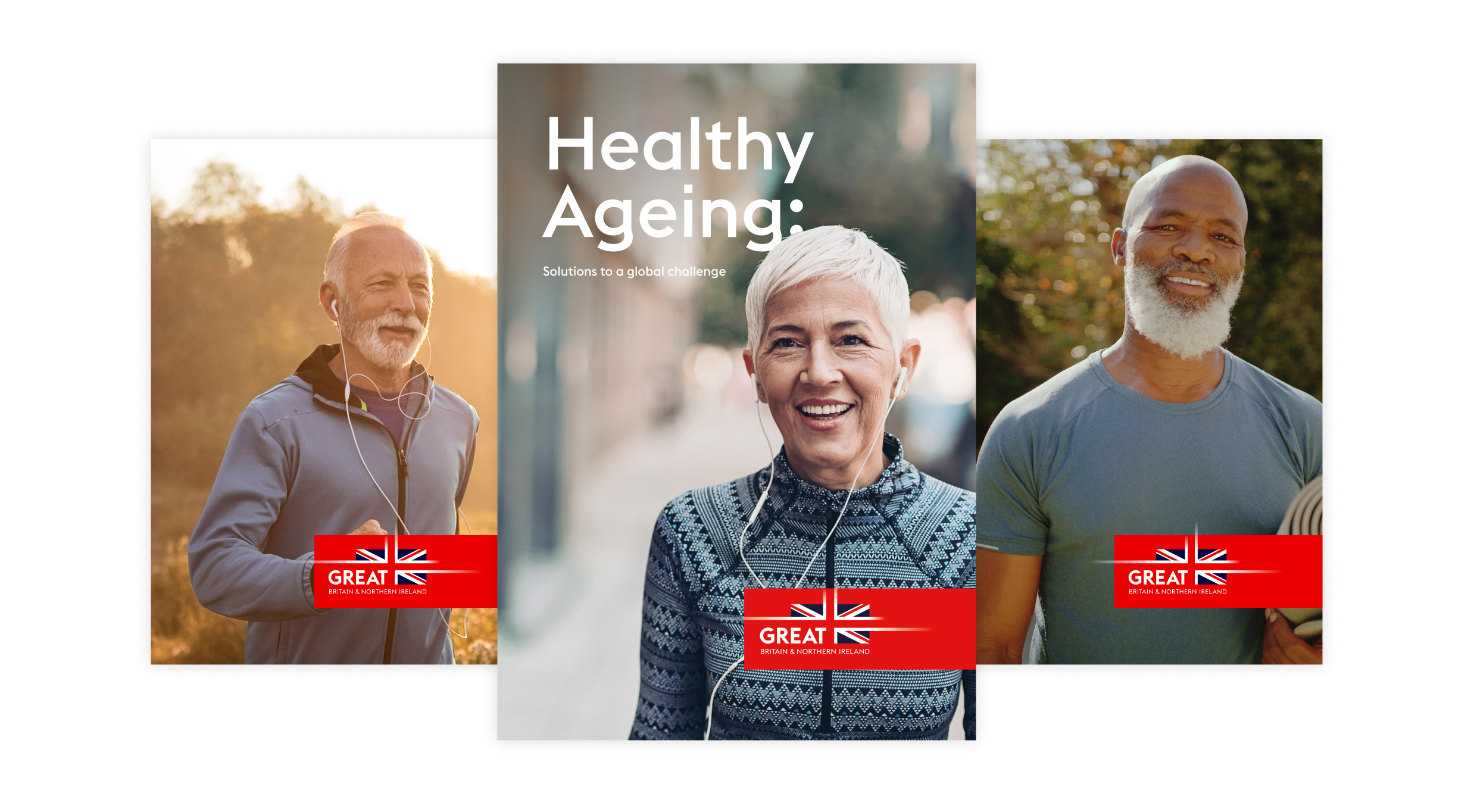
We used inspiring photography and custom illustrations that give a distinct look and a positive mood to the report. On the cover, we used images of happy, confident and healthy looking people, to set the tone for the report. We created assets for the campaign website where people would be able to download the report.

Social media campaign
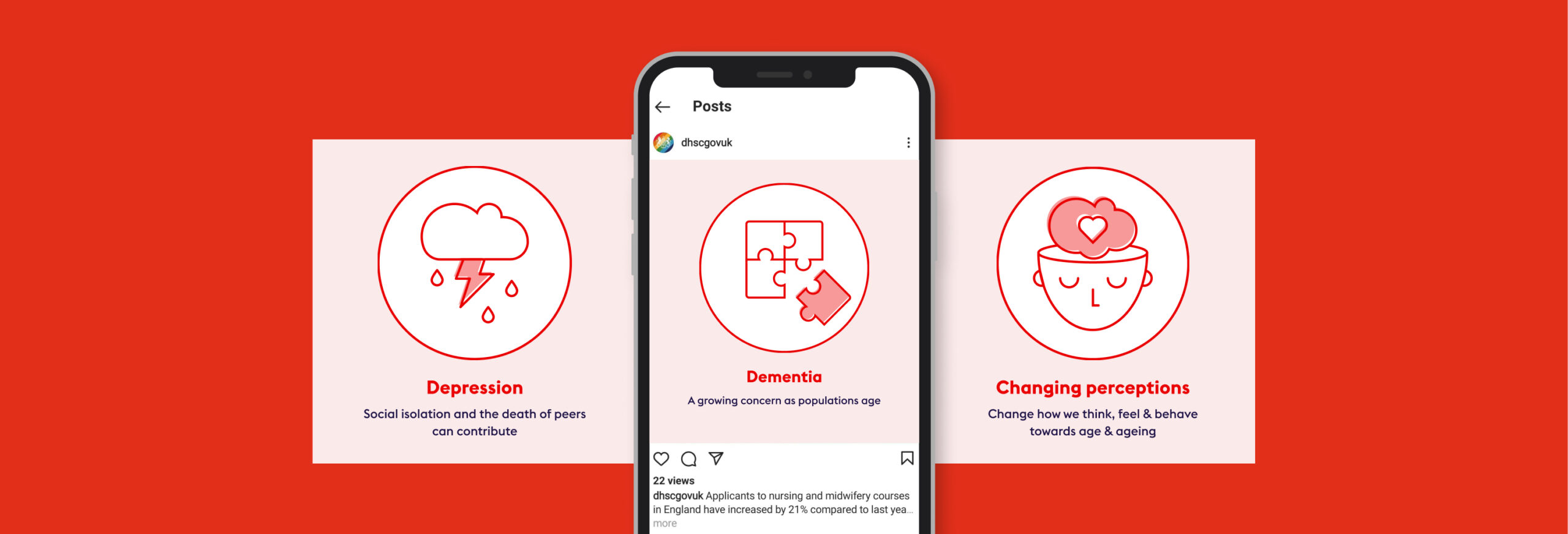
Next, we created a full social campaign around the report, to give it impact and promote it to the intended audience. We used the same creative style as the report, using illustrations to show key facts and figures and encourage people to download it. These were animated, to gain the highest engagement. We used key hashtags, to monitor sharing and engagement.
To leverage earned media, we built media packs for the contributing partners who feature in the report, with social animations they could re-post on their channels to talk about their involvement plus static assets to use anywhere across their own or other channels.
Outcome
The UK has an industrial strategy that has prioritised healthy ageing and is applying millions of pounds of funding for new research, treatments and technologies. We created an authoritative, wide-ranging, agenda-setting report that shows inward investors the value and opportunities in the UK, illustrating why it’s the place to develop healthy ageing innovations and business opportunities.
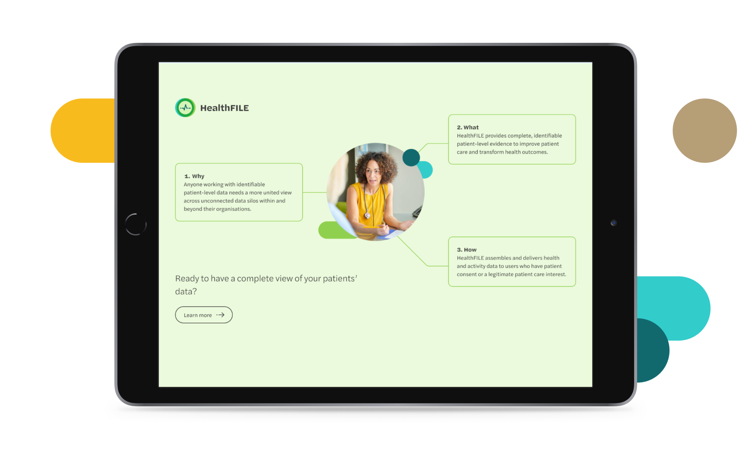
FITFILE is a health information platform for providers of therapeutics and diagnostics who need real world evidence. As an early-stage business moving quickly and growing fast, they came to us having outgrown their previous website. As an organisation, FITFILE were starting to build new partnerships with clients and needed a digital presence that more effectively communicated their value.
Strategy & language
We kicked the project off by working together to understand and streamline how they communicate their position in the market and the unique value they bring to their clients. As a healthcare technology company, there were plenty of acronyms and specific terms used to describe their operations that needed decoding. We worked with them to establish an understanding of their target audience groups and what their perspective would be when visiting the website.
Website design & development
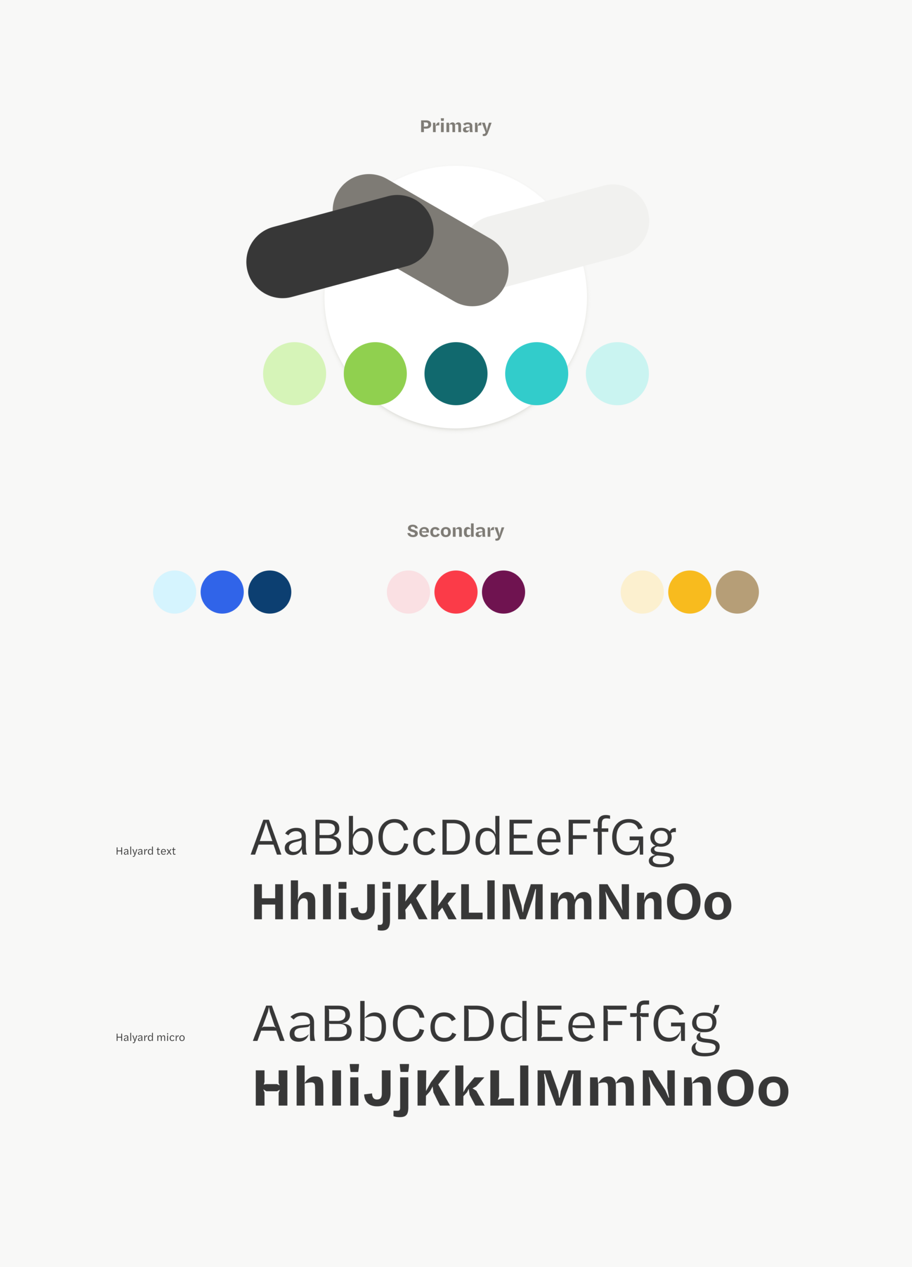
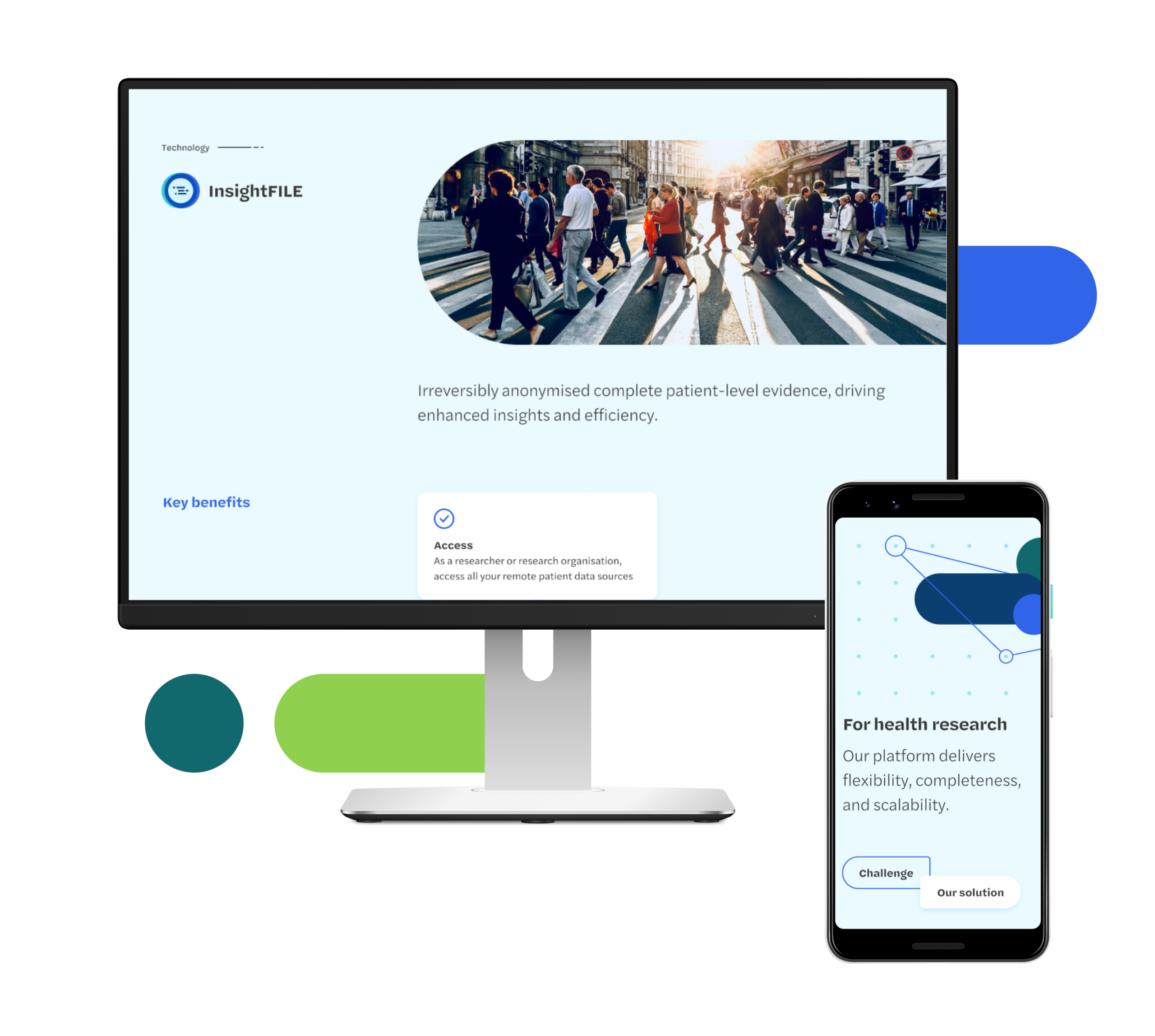
As this project did not involve a full rebrand, we knew the updated website design would need to work alongside some of their current branded materials. We took cues from their logo and current brand style to inform our approach and built out a new visual tone that built on their existing brand language and didn’t make anything they were continuing to use look out of place.We worked together to establish a content plan for the website and develop the tools they’d need to effectively publish and control their content.
The result
FITFILE are positioned with a clear messaging strategy and tone of voice that best reflects their value and brand.
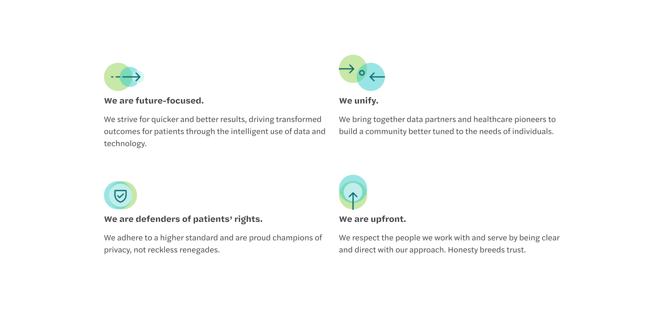
The modular digital design approach that we have created allows growth alongside the Company, with a flexible architecture established that the brand can build from. We worked directly with their in-house technology team to ensure that site hosting and ongoing management was informed, and have provided a creative direction that will shape brand assets and communications moving forwards.
Poor communication in the NHS is a big factor in poor patient care. It also has severely detrimental effects on healthcare professionals, contributes to staff burnout, and wastes public funds (an estimated £1 billion a year in England alone).
Better communication between staff and teams can save costs, improve health outcomes, improve patients’ experience – and ultimately make staff’s jobs a lot easier.
Bleepa is one of only a few communications tools accredited for clinical use in the NHS, created to resolve issues such as siloed specialist care and remote working. It’s a digital hub, holding reports, referrals, clinical-grade images and more, with an instant messaging function that enables clinicians to communicate securely to discuss cases, decisions and patient treatment. They can view and annotate clinical photos, scans and X-rays, add test results and notes to records, share comments with colleagues, manage patient referrals and get second opinions. It transforms how they work, making them more efficient, leading to better patient care – and making their jobs easier.
We were asked by parent company Feedback Medical to help grow awareness around the Bleepa product and brand. We worked with the team to establish a digital content strategy, increase Bleepa’s presence and run digital marketing campaigns.
What we did
Bleepa is an innovative health-tech product that can transform how healthcare professionals work and communicate, but its existing website didn’t reflect that. It was crammed with information and it wasn’t clear what users should understand about the product or what action they should take.
Bleepa had to have a strong website in place before we could look at driving any traffic to it. This meant giving the site a strong, clear visual identity. It needed a tone of voice that resonates with its audience of clinicians and healthcare providers, with clear messaging that effectively shows them what Bleepa does and why they need it.
We would also define a clear user journey so that people would know exactly where to go and which would generate leads.
Getting the messaging right
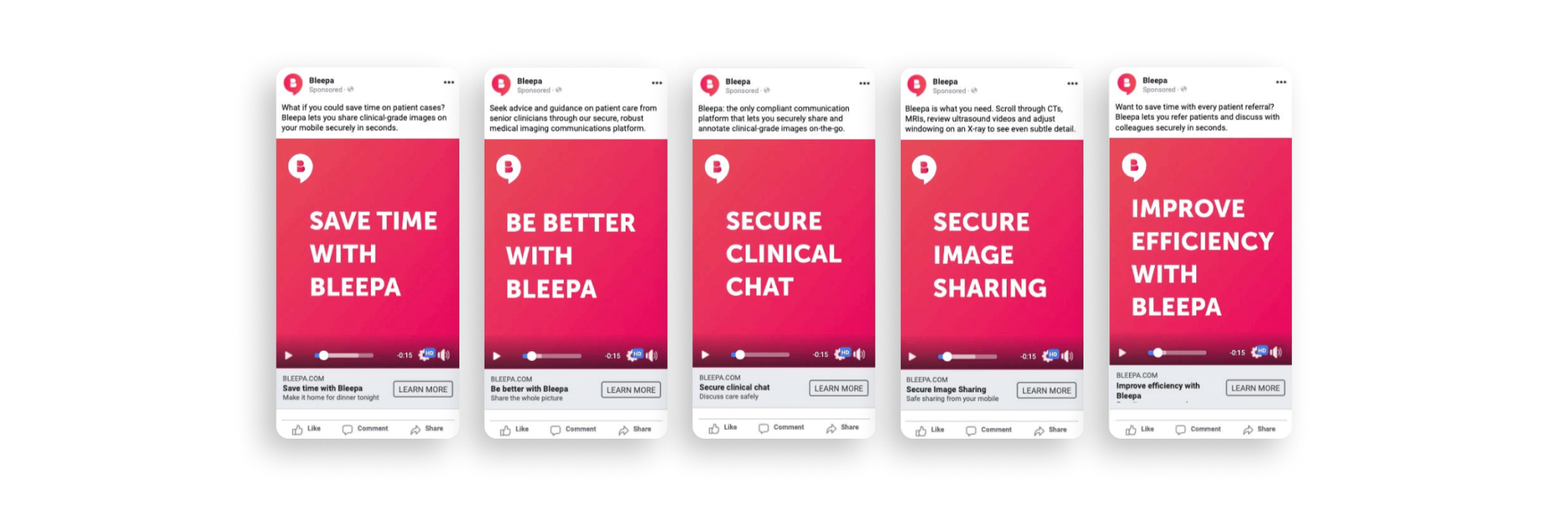
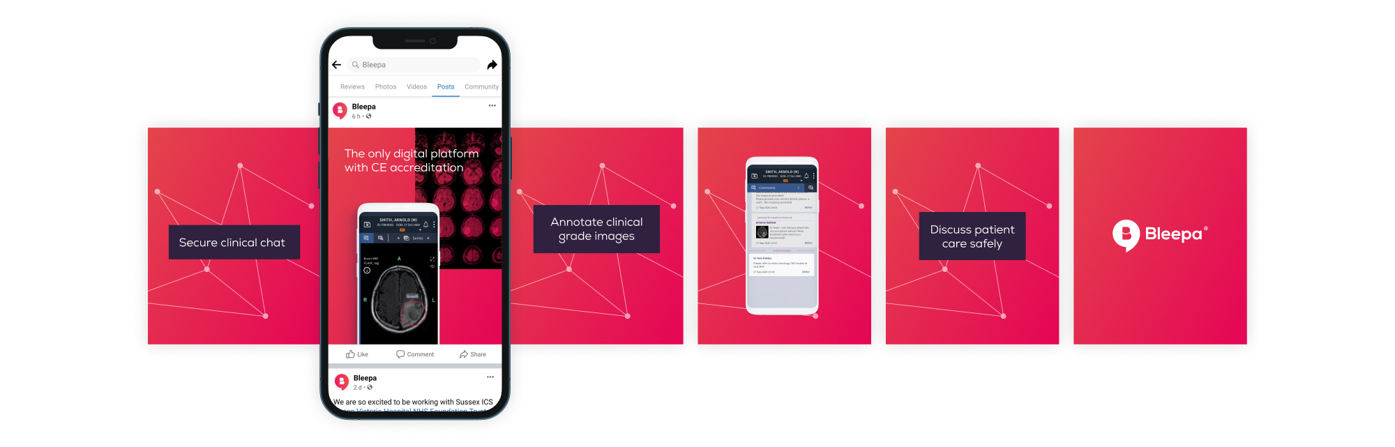
We wrote five potential key messages and tested them with users. We made simple text-based adverts and ran them on Facebook, targeting a broad, medically focused audience group. ‘Secure clinical chat’ was the clear winner. We took this into the next level of testing, around tone and creative.
Next, we considered the tone of voice. We wanted this to be based on engagement, not our assumptions, so we created three options to test: bold, clear and direct; emotive and approachable; intelligent, clever and precise. The third one got the best response.
With this research we now had a brief for the brand’s messaging. We knew that secure clinical chat was our main point of difference and that the tone of voice should be intelligent, clever and precise.
Website design and development
We carried out an audit of the existing site, reviewing the UI, UX and analytics to see how users were interacting with it. We defined what changes were needed, and prioritised the home page and the demo page, as these are integral to sales conversion.
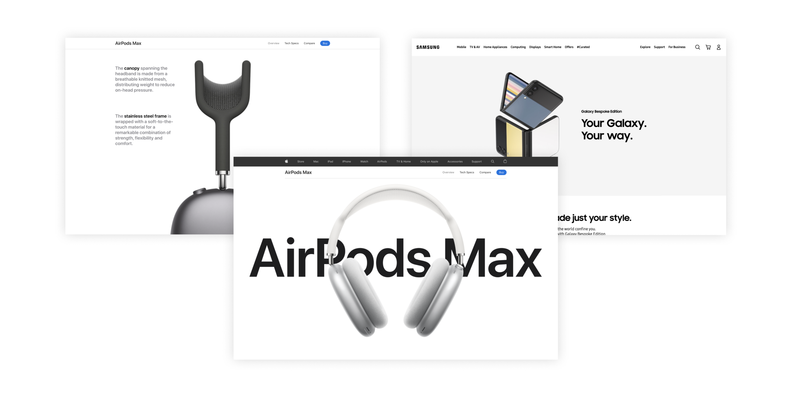
For the look and feel, rather than the traditional healthcare sector, we were inspired by strong, clean, confident consumer brands like Apple and Samsung. This would make the product feel self-assured and market leading.
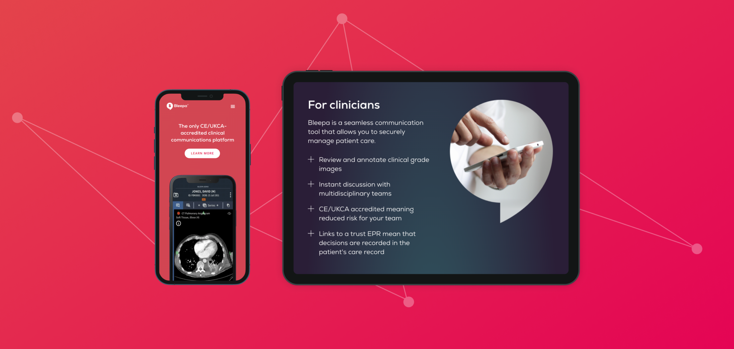
Our new design has strong, clear messaging throughout with a consistent tone of voice, in line with the results of our research. The digital product and app are the focus, with a clean presentation. CTAs are streamlined, to keep the user journey clear and purposeful and funnel users to a page with a video demonstration of the product, validating the messaging. This pushes users through to the next level of the sales funnel, and conversion rates can be tracked through analytics.
A brand awareness campaign
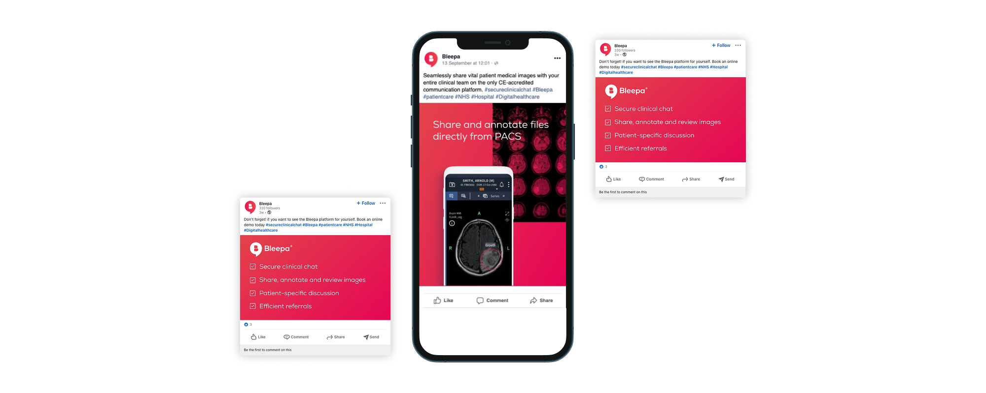
With a new website with a clear user journey and a strong presentation of the product, we could move on to driving traffic to it. We worked on an ongoing digital strategy and a number of digital and social campaigns including Facebook and LinkedIn.
The marketing campaign was consistent with the website, in visuals, messaging and tone of voice. This consistency and clarity gives authority, builds engagement, reduces bounce rates and increases ROI.
Our campaign content showed details of the app’s functions, demonstrating exactly how Bleepa benefits clinicians and medical procurement teams. One campaign included a downloadable fact sheet, creating engagement with the user while allowing the team to monitor downloads and keep users in the sales funnel.
From 2022 to 2023, website traffic and user interest in Bleepa increased by 382%.
Additional projects
We designed and built a website for Carelocker, the cloud data technology behind Bleepa. Feedback Medical was then able to take this to market as a separate product, as well as open up international opportunities, beginning with India. The website is available in English and Hindi.
Feedback Medical is also involved in supporting and delivering patient pathways for community diagnostic centres (CDCs) across England. These provide earlier diagnostic tests for millions of patients, helping to tackle the NHS’s elective care backlog. Bleepa provides the digital infrastructure that connects local care providers so that they can securely share diagnostic information and teams can communicate faster and make more informed clinical decisions. In 2021, we ran a social campaign showcasing Bleepa’s involvement in the initiative.
Outcome
Through brand strategy, content planning, website creation and ongoing creative production we have contributed to brand and business growth. We have built a collaborative relationship, supporting Bleepa’s team to improve sales, grow engagement and make Bleepa part of the conversation, and providing tools to help. Our work has helped to make Bleepa one of the leading medical communication apps on the market, with their team in a strong position for further growth and new opportunities.
Introduction
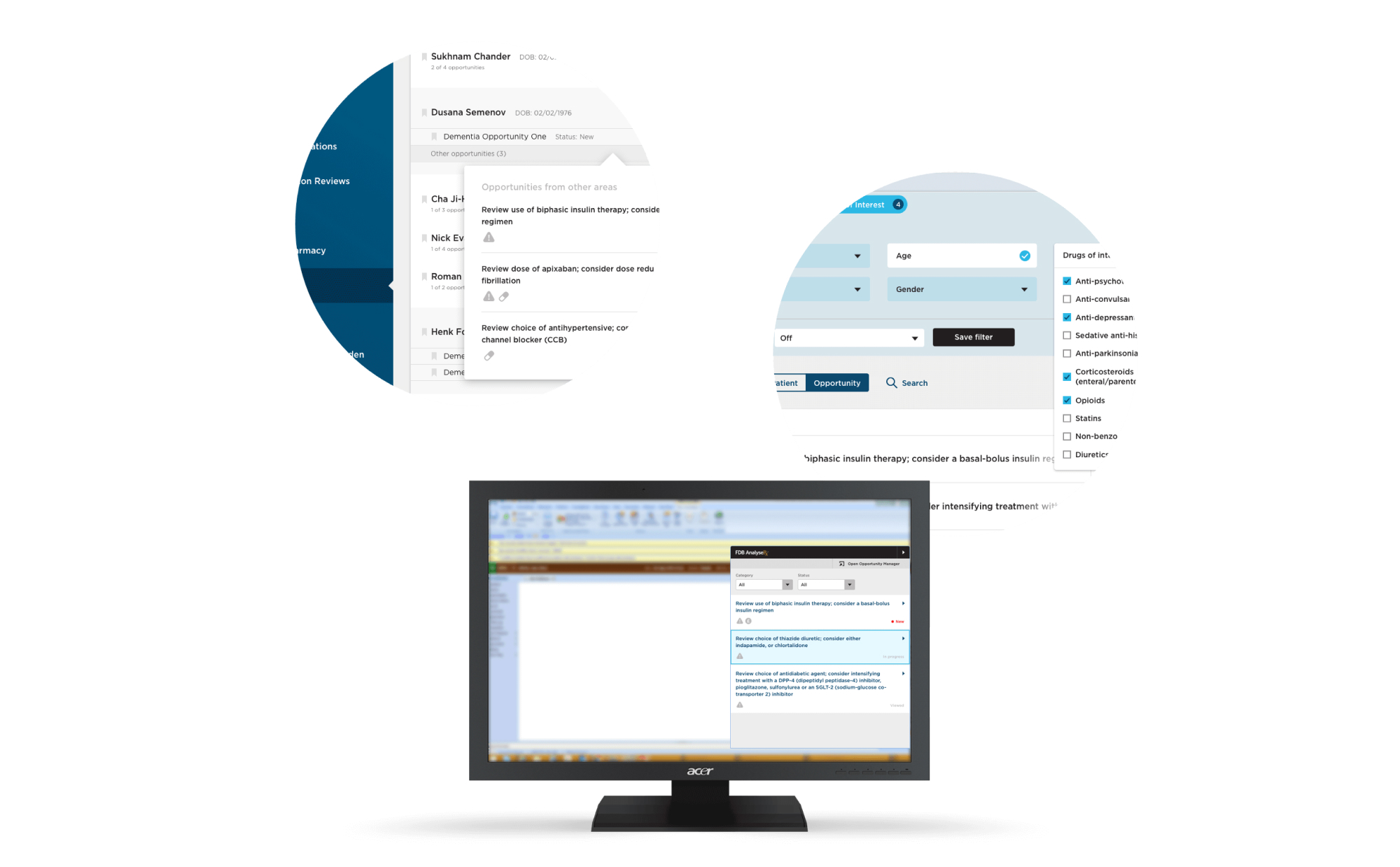
We’ve worked with FDB on a number of projects both for their marketing and product development teams. AnalyseRx was a new product that they were looking to develop for clinical pharmacists and GPs to support the accuracy and efficiency of prescriptions for their patients. Described as a tool that would augment the existing patient management software (used throughout the NHS), we knew this integration would become one of the key considerations that informed our work.
Planning
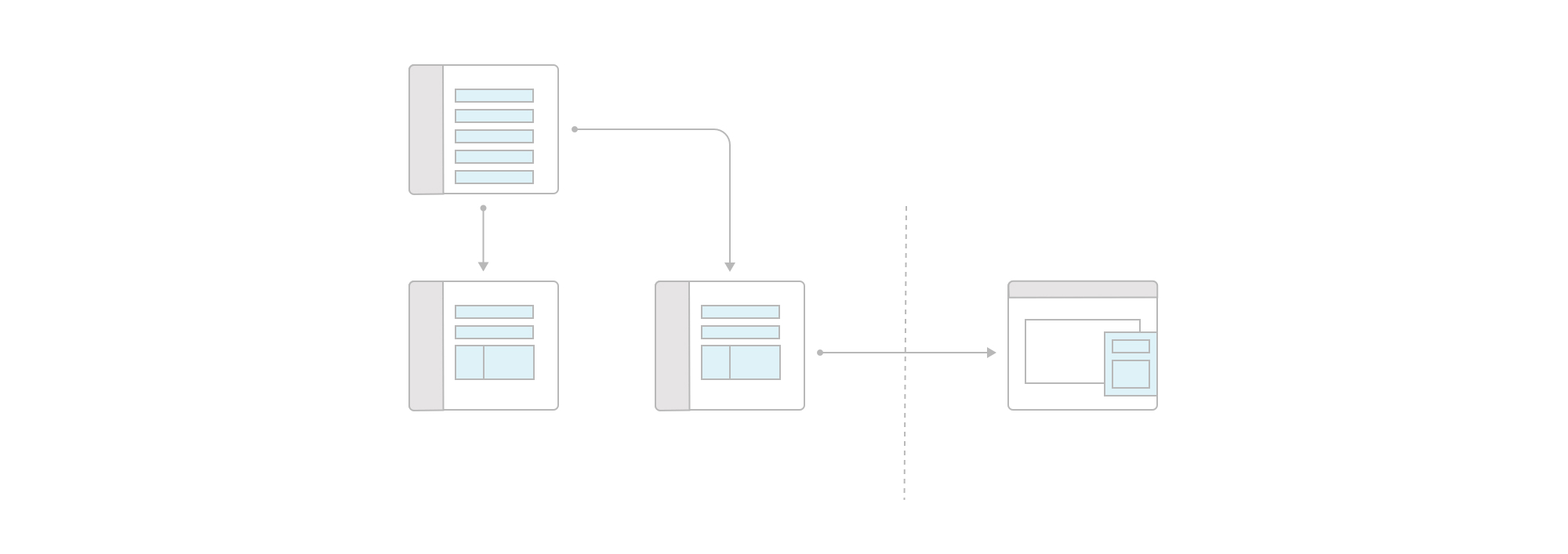
Starting post-concept, we conducted a joint workshop session to review and understand the work that had been completed to date. We needed to fully appreciate the functionality that was desired and how these matched up against the first wireframes that had been created internally. From there we worked together to create user flows that would show how the product would facilitate the core needs of its users. To aid smoother communication between our teams, we set up a slack channel where all queries could be posted and responded to as they came up.
UI Development
With a central understanding of the product in place, we worked through possible directions for the style of the UI. We clarified a direction based on internal review and presented a refined vision with example executions for the client to critique and sign-off.
We pursued a direction that was both clear in its presentation of information but also vibrant in colour. We used FDB’s brand guidelines to inform our initial decisions and always looked at things alongside the GP patient record software framework that the product would be operating within.
Iteration & Delivery
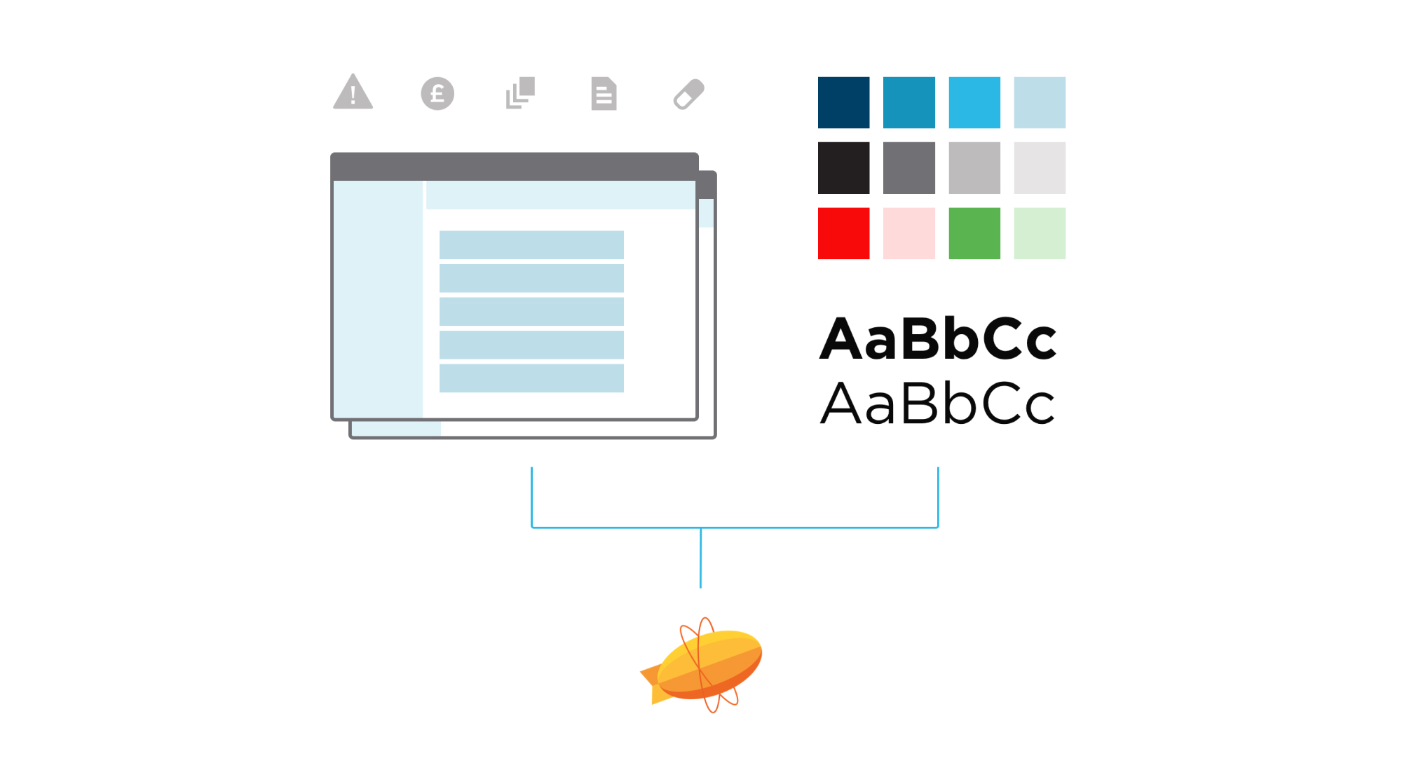
Once we had an agreed direction, we worked through each of the planned user flows and created flat designed prototypes that could be critiqued by their product development team and updated quickly. We worked through a number of pieces of functionality that hadn’t previously been considered and were able to put together designed flows that sense-checked the usability of these features.With the user flows designed and a design system created, we used Zeplin to share design assets with their development team so that they could have an organised way to access the design spec and assets that they needed as part of their build.
Project success
As an experienced and agile agency, we are able to affect change quickly for our clients. By integrating directly with FDB – we provided a much needed strategic design resource that supported their internal development team. With our own digital infrastructure and engineering capabilities, we were able to advise and extend on the creative work and methodology to build a better product.FDB AnalyseRx is a complete, end-to-end solution collaboratively designed to meet the demanding needs of a complex and time-sensitive user base.
Arab Health is the largest healthcare event in the Middle East and North Africa (MENA) region and generated business worth US $778 million between medical manufacturers and visitors last year. We were approached by Healthcare UK to help deliver the brand style, event graphics, digital sales tool and associated printed materials for its Arab Health exhibition stand in the Dubai World Trade Centre.
Healthcare UK is part of the Department of Health and Social Care and Department for International Trade and exists to help UK healthcare providers expand their business offering overseas. They promote the UK healthcare sector to overseas markets and support healthcare partnerships between UK and overseas healthcare providers.
Project goals
The intent of the event presence in Dubai was to promote UK healthcare experience and knowledge, displaying the world-leading technology, building and infrastructures and supplier network that puts the UK at the forefront of the healthcare market. This experience would be showcased to prospective market clients looking to utilise and implement this experience within their region.

The challenge
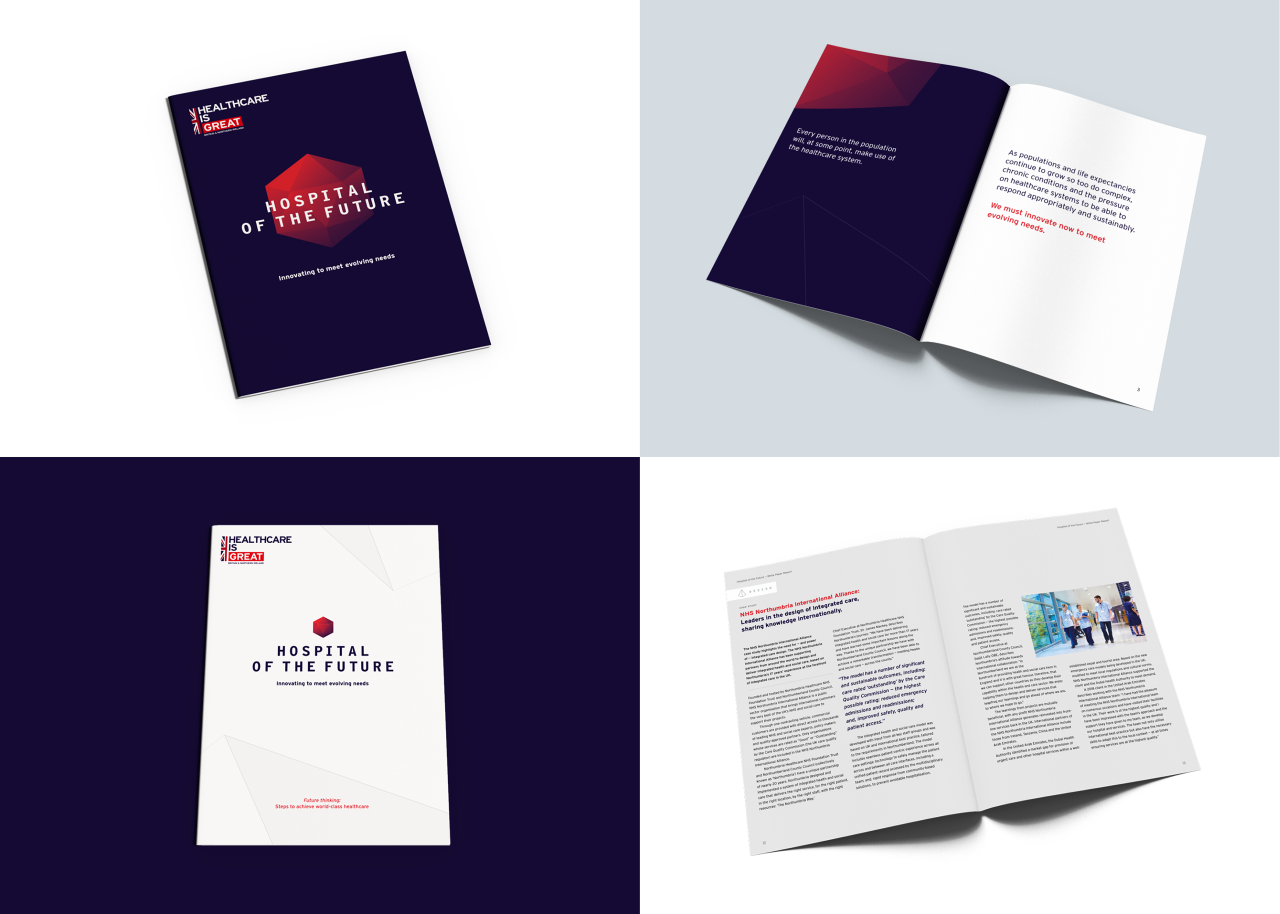
The strategic proposition, Hospital of the Future, presented UK companies capabilities to create world-leading hospitals – through architecture, technology, data, medical and infrastructure advancements – and showcased UK suppliers who can work globally.
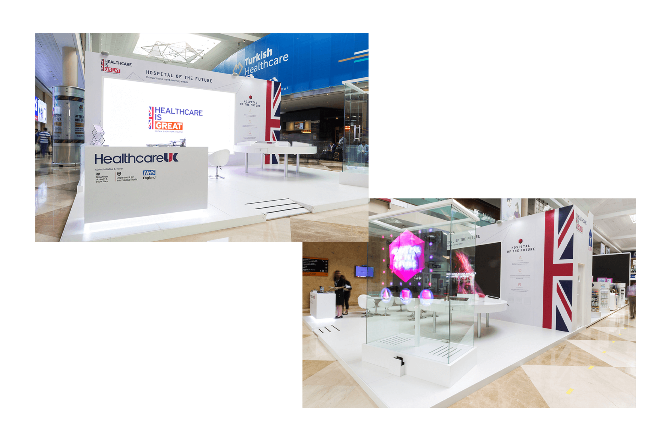
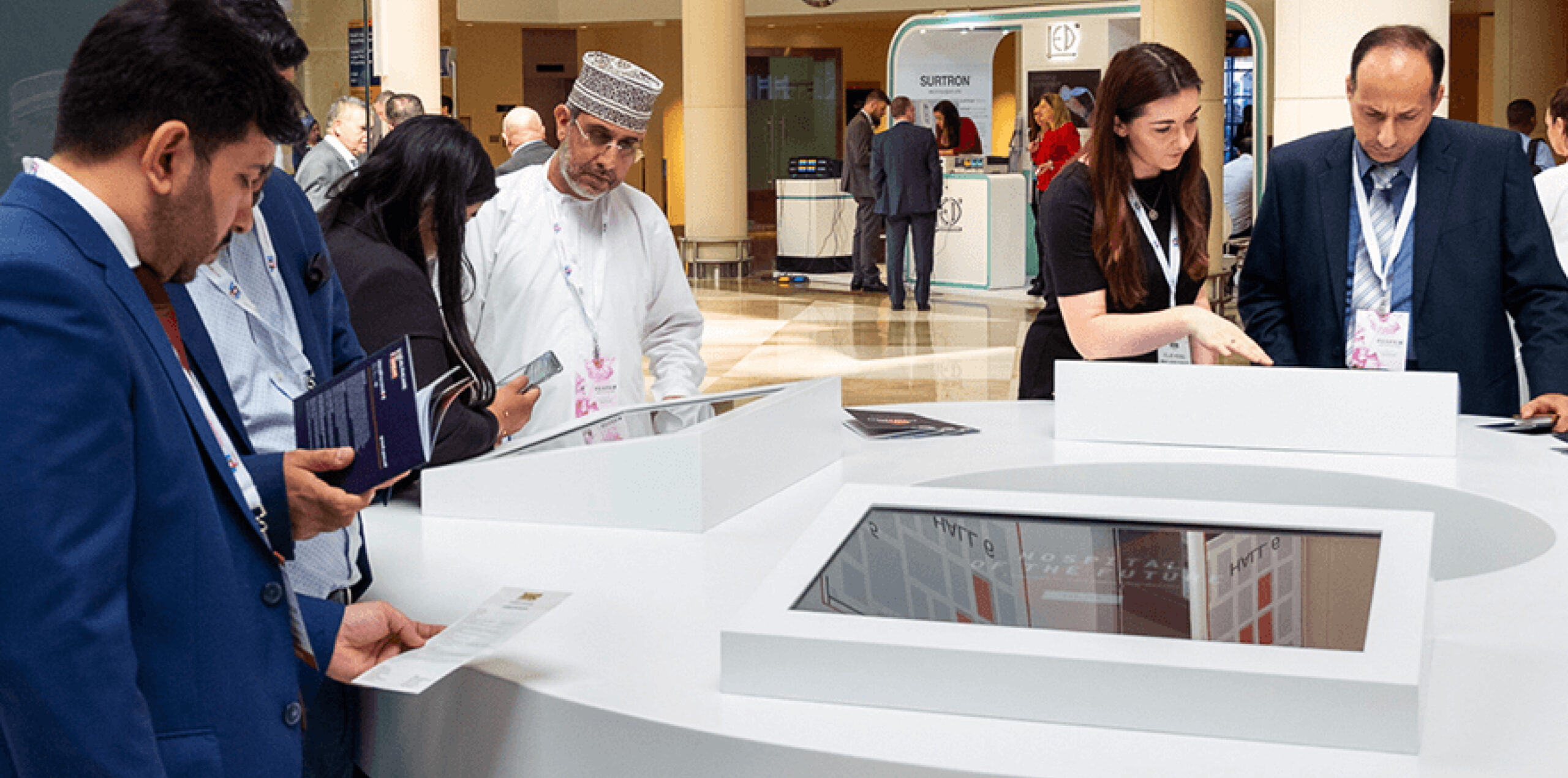
We created a visual style and tone of voice that gave consistency across all media and event elements, representing the innovative vision in a consistent form and suitable for the localised market. The stand had a number of elements: an eight-metre screen showing a video, four touchscreens in an interactive engagement area, a hologram and a number of printed materials.
So that the stand looked unified we created a brand style aligned to the GREAT branding from the UK government and with an aspirational tone. This was applied to all materials and products that we produced, and shared with third-party creators such as Engage Works who produced the Hypervsn Hologram featured at the event.
Messaging and digital tool
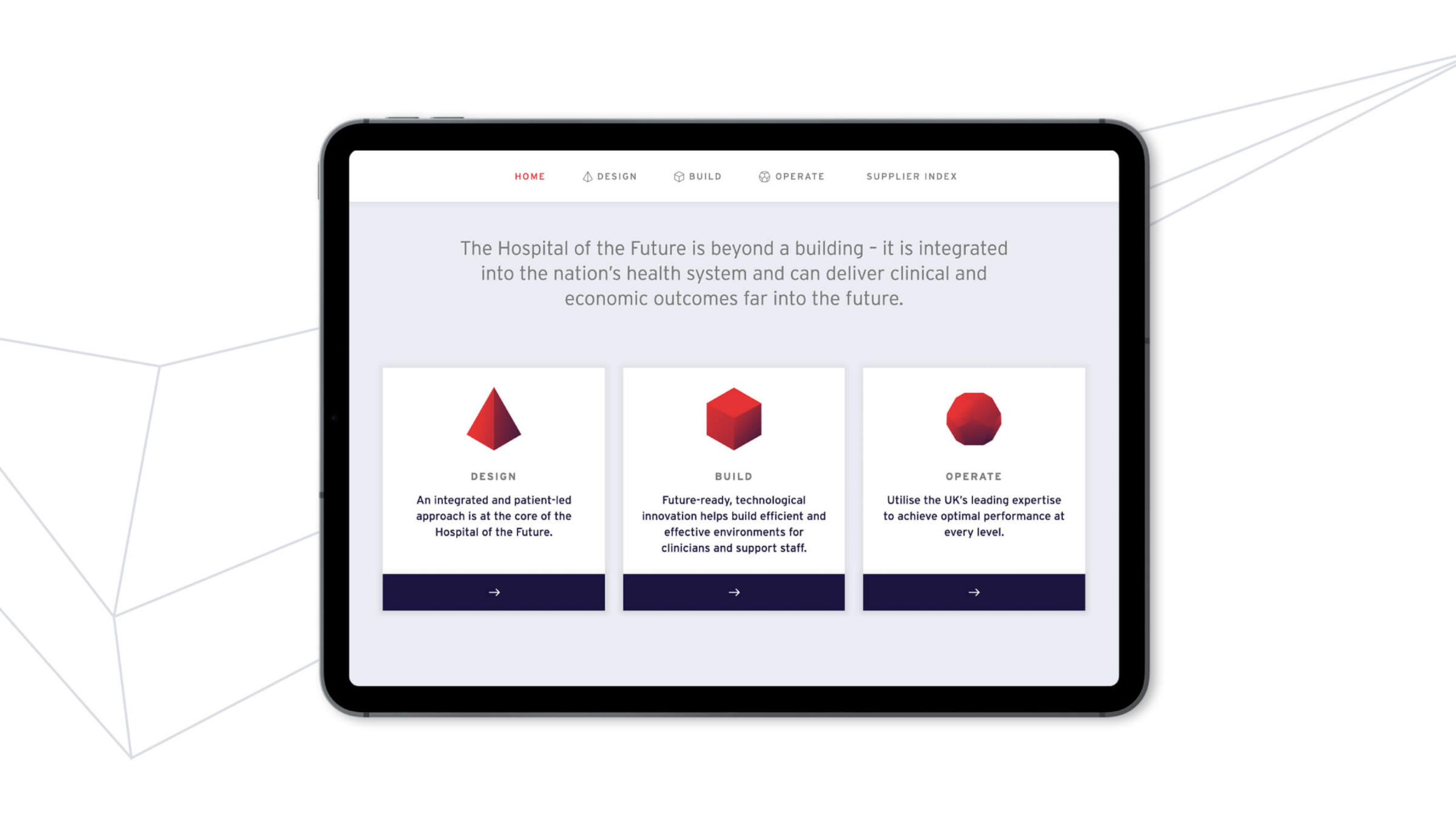
To connect potential clients to UK suppliers, visitors had to be able to quickly access relevant supplier information. For the four touchscreens, we created a digital tool that could be accessed both within the event and externally from all devices. It gave an overview of the concept of Hospital of the Future and showcased each supplier. The tool provoked visitor interest across three categories: design, build and operate.
Our visual system representing these three areas of interest was applied across the stand, hologram and printed materials. The audience learnt about the benefits to each area of experience and used the tool to request direct information and contact from suppliers who could help in each given area.
Visual identity
Within our creative style, abstract thin grey lines referenced technology and architecture as well as having a sense of movement and flow to the overall approach. This also gave a strong backdrop to the more attention-grabbing elements – the video and hologram. Centralised around a core visual mark, we applied this style through all collateral.
An engaging event experience
The Arab Health event was very successful for Healthcare UK, promoting the vision of Hospital of the Future and establishing a digital tool that can grow and flex, with scope for wider global launches and rollout. The show had 51,985 visitors from 159 countries, with suppliers receiving validated interest and lead generation from the tool.
Dr Foster are a healthtech company who work with clients to deliver solutions and actionable insights that drive decisions on the quality and value of connected healthcare.
The Dr Foster brand became part of Telstra Health, a business unit of Telstra Corporation (Australia’s leading technology and telecommunications company) in 2015.
We worked closely with Dr Foster and Telstra Health to help with the co-branding, strengthening the brand and reinforcing Dr Fosters position as a leading healthcare solution provider and data insight expert.

An updated look
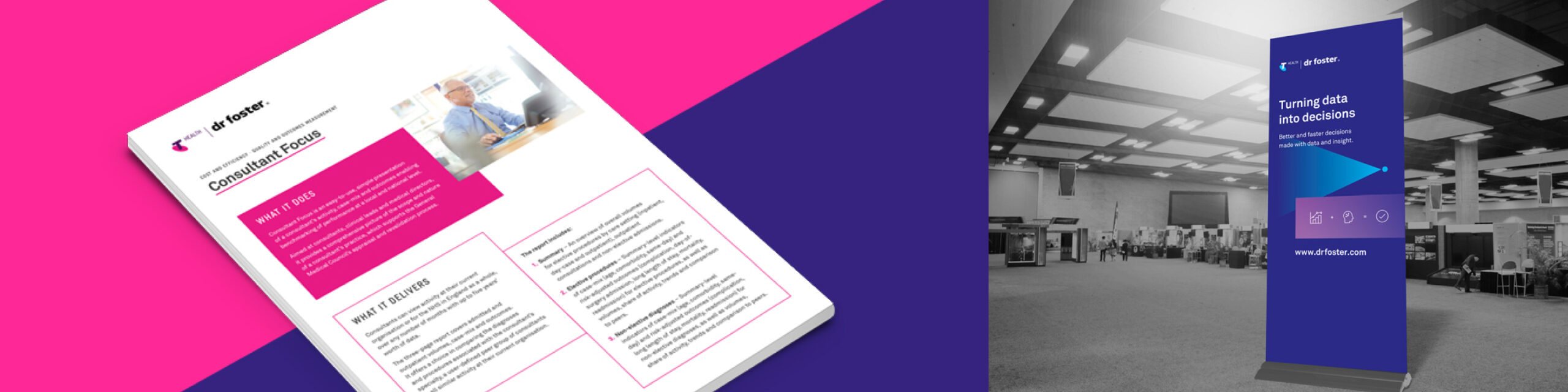
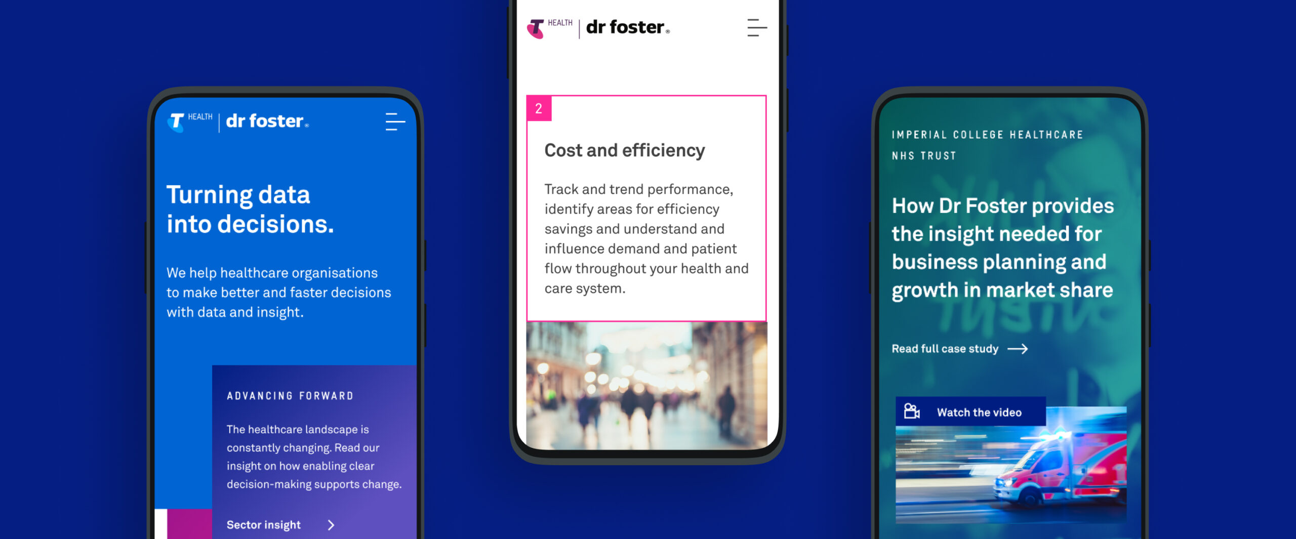
With the newly refreshed and re-energised positioning of Dr Foster an updated visual style was required to reflect this. While maintaining the connection with Telstra Health, the opportunity arose to create a new look for the brand. A bold visual style was developed that would introduce new energy and vitality into the brand. A more dominant use of typography and strong colour was created along with simple geometric forms to aid in brand messaging.
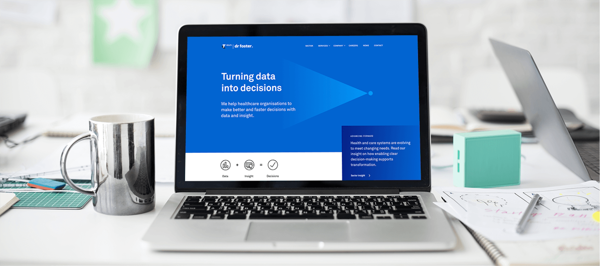
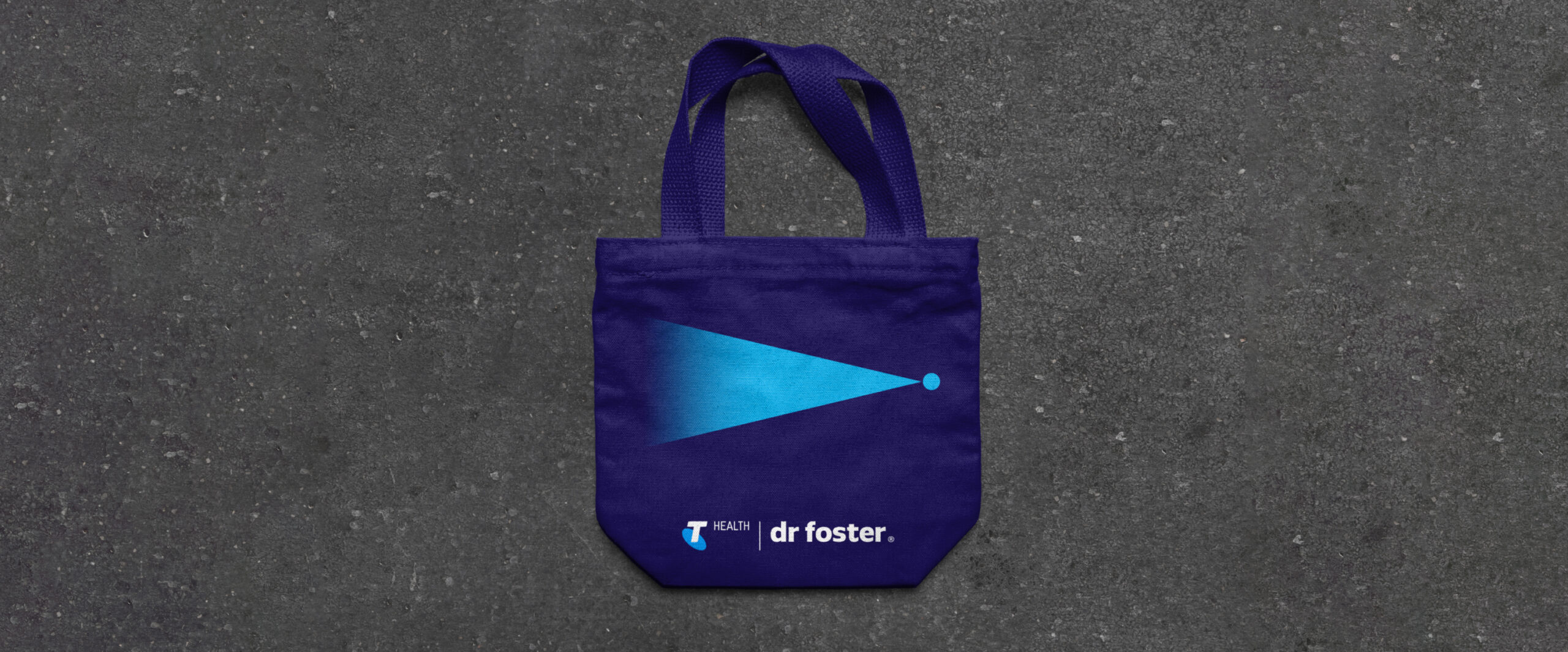
The concept of Turning data into decisions was introduced as a tagline and is visually represented by the shape of the triangle, open on one end and flowing into a single point. This helps to signify the vast array of data insight that help enable a decision and positive change to occur for the end client.
A refreshed website, powered by WordPress
Our approach to the redesign of the Dr Foster website was to strip away unnecessary content and help to clarify the core messaging and brand presence. The previous website had become outdated and required a complete audit. Extensive site mapping and wireframing led to a clear structure and systematic approach throughout. The site was designed using a modular approach with the reuse of a group of key components across the whole site. This helped enable a simple user CMS where the client is confident and free to make modifications to, or to add new content, to the site.
Brand application
In addition to the new website the brand has been rolled out across a range of media and applications. This includes an updated stationery set, infographics, banners, wall graphics and various brand collateral. A consistent approach to the brand styling has been carried throughout all applications of the brand. A Brand Book to be used internally was created to showcase the new brand along with the updated positioning, mission and values. This helps to incapsulate how the brand has developed and moved forward.
A unified brand
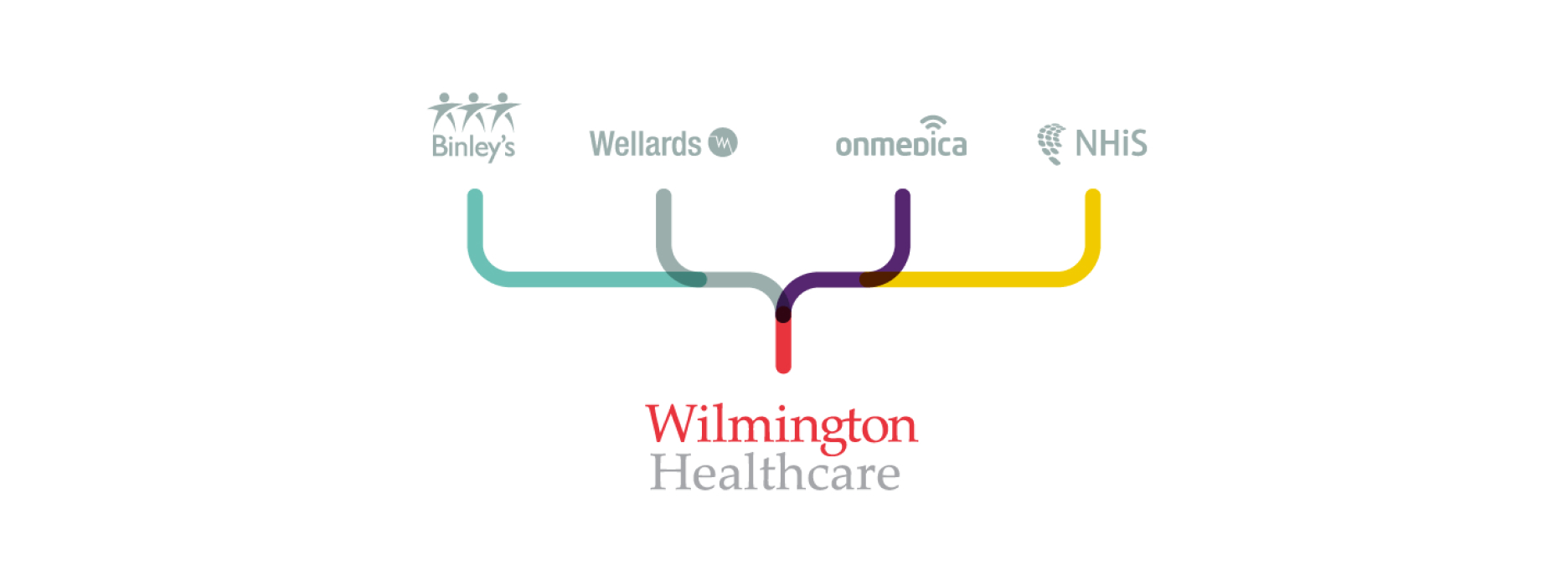
Working with our long-time collaborators and friends at ZPB Associates, we were appointed by Wilmington PLC to create a unified brand that presented a new business proposition within healthcare. The vision and brief was to bring together several different healthcare brands, including Binleys and Wellards, and create a single, parent brand for Wilmington Healthcare. It had to present a new platform for the healthcare division.
Creating a vision for the brand
Working within Wilmington’s existing brand framework, we identified a need to create a flexible brand platform and visual approach that the internal team, including designers, could work with, adopt and expand with a view to retaining a sense of ownership and authenticity in the ongoing creative work and campaigns that they produce.


A strategic concept
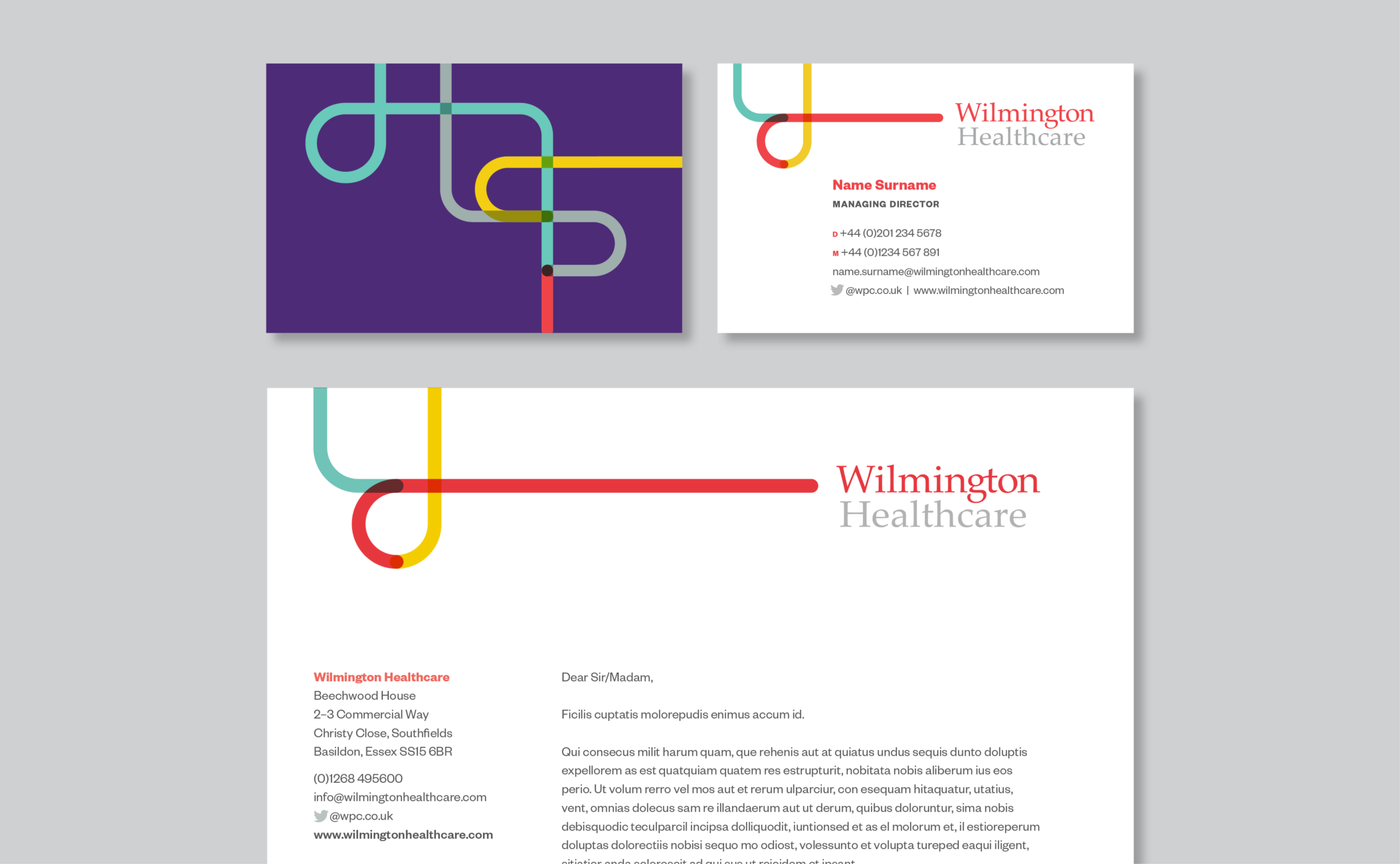
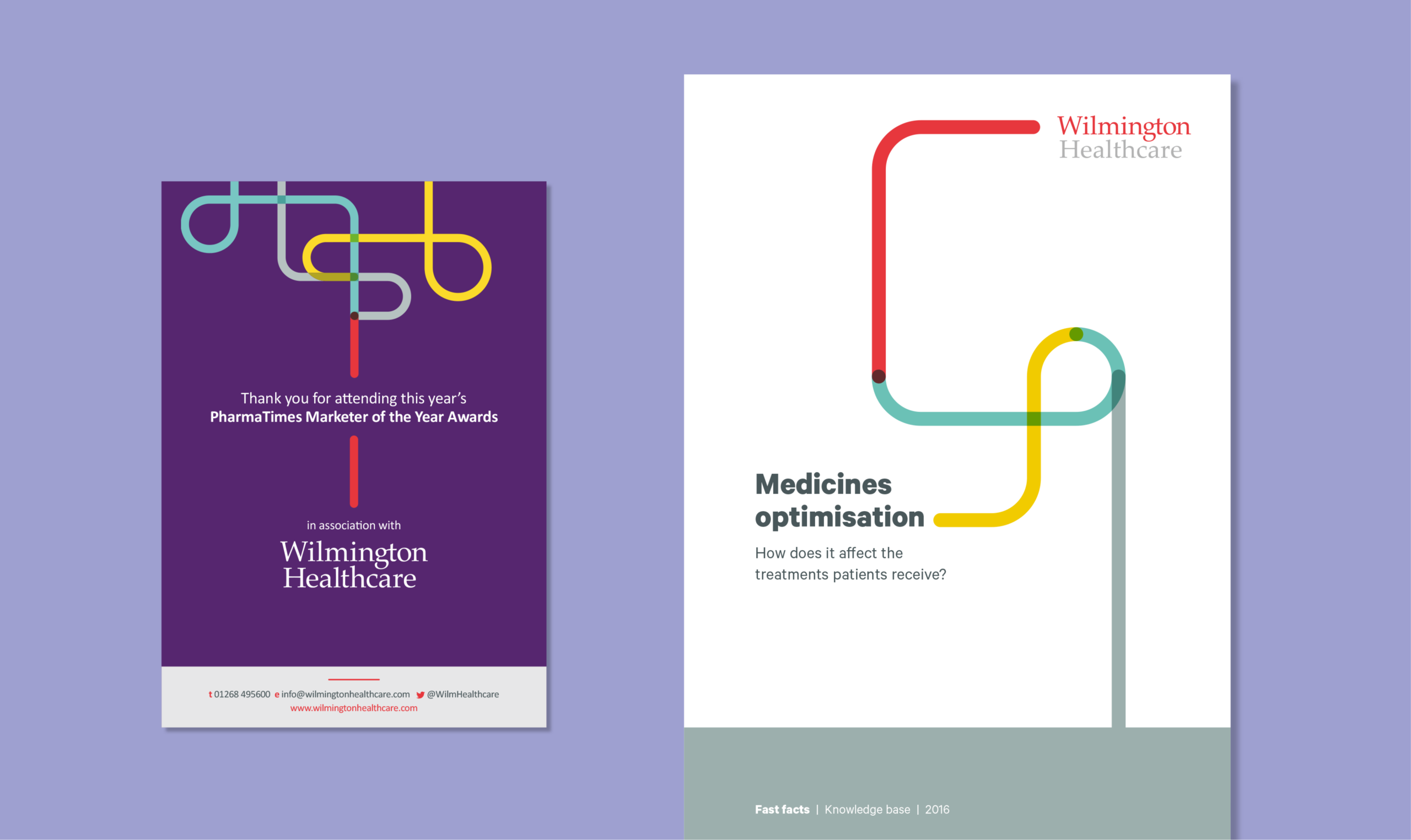
Introducing brand positioning that centred around a clear, articulated concept of Wilmington Healthcare meant translating complex intelligence into actionable insights and sustainable outcomes. We used illustration to help represent this messaging. The use of line work and focus of a single-line output forms part of the Wilmington Healthcare brand, and is used in different ways to visually support brand statements and messaging. The concept reflects the core value traits of Intelligence, Expertise and Collaboration. It’s used with purpose, to help tell a story or to guide a reader visually through a narrative.
A visual tool
The line can be utilised to create bespoke iconography and illustrations within the brand. This gives flexibility while retaining a recognisable brand style and treatment. We created our customary brand guidelines and toolkit, containing guidance on how to work with the new branding and design within it. This was supported by holding internal workshops at our studio with Wilmington Healthcare’s designers.
“By connecting and collaborating with healthcare communities, Wilmington Healthcare translates complex intelligence into actionable insights and sustainable outcomes.”

The new branding was tested across multiple environments, assets and physical experiences.
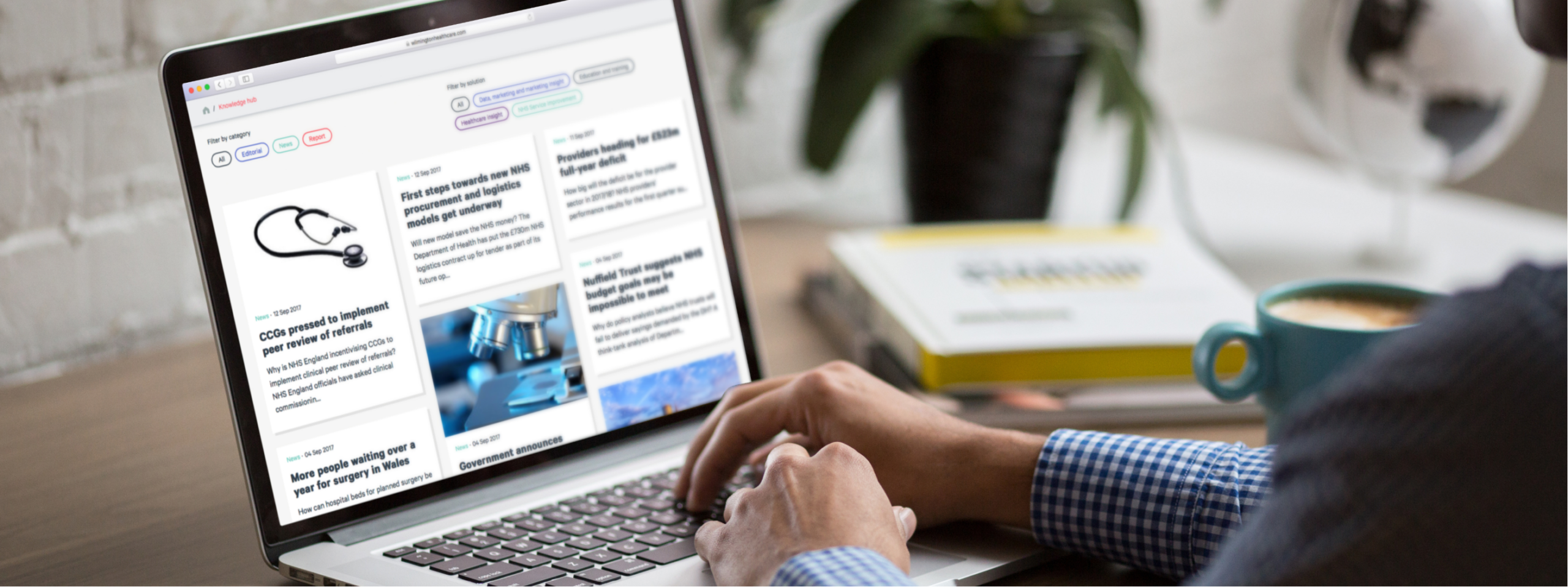
Building a digital presence, powered by WordPress
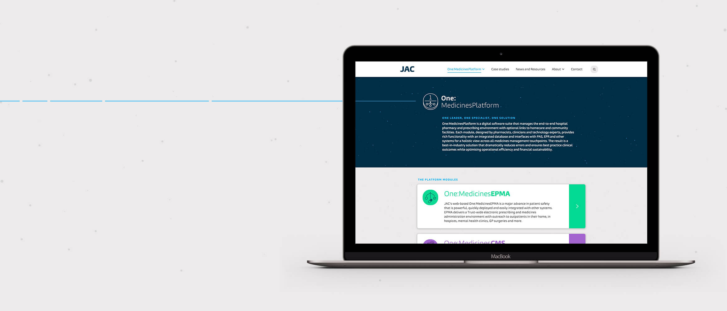
Once we were happy with how the modules performed, we built up each area and page of the site using these core modules as building blocks. The benefit of this was that we could test the modules at the start, all at once, so that we could catch, review and iterate on our discoveries and challenges early on, during development.
Working this way enabled the design and development team to work together and create a superior product with a leaner design and build.
The challenge
JAC is a global medicines management company providing bespoke solutions for hospitals and care providers, to increase patient safety and aid patient care. But with a disparate approach to discussing each of its products, there was a commercial need to create a single tone of voice and concept around its proposition, with nuances for individual products.
We were selected to update JAC’s brand and create a cohesive digital presence that would be a stronger showcase for its unique and life-saving products.
Rebranding
JAC defines itself by offering the most advanced solutions within its marketplace and furthering patient care. Our branding process included a number of workshops to gain stakeholder insights from the JAC team.
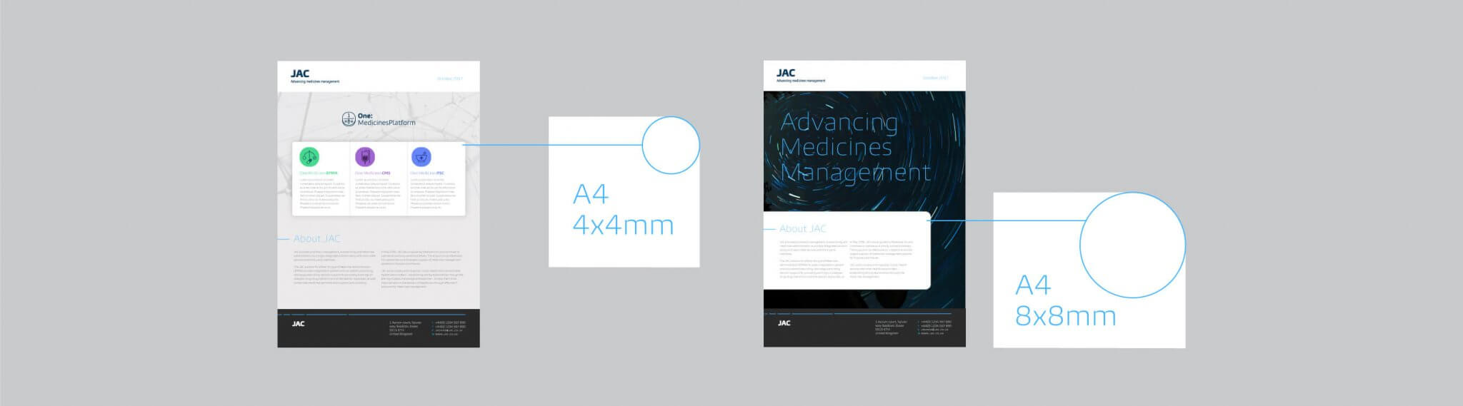
The personality and positioning for the brand had to centre around its scientific nature and the focus on precision. To visually communicate the idea of advancing, progression and motion we used a moving line for digital and a broken line, to suggest movement, for printed materials.
Our new approach elevates the insightful work and services that JAC provides, underlined by the mantra of “advancing medicines management”.

Iconography
To represent different aspects of the core offering we created two icon sets for the product suite and other aspects such as interoperability, to better communicate JAC’s offer. We used the Burlingame typeface, as its curvature and personality counterbalances the clinical aspects of the site. We harnessed the curves of the letters to create icons which, like the font, are not perfect circles.


Consistency
To maintain consistency across all platforms we helped to direct the brand implementation, setting the tone and best practice for how the visual style and system works. We documented the stylistic details, such as corner radius on brand elements, type sizing, line weight and other dos and don’ts.
Photography
We chose two photographic directions: inspirational star images that include a sense of motion alongside location, or real-world scientific photography. These reflect the personality and aim of patient care at the heart of the JAC brand. This equipped JAC with all the elements needed to effectively communicate the brand across all platforms and mediums, physical and digital.

Outcome
The new identity gave JAC a stronger positioning and consolidated how it presents its product range. By uniting these under the One:MedicinesPlatform, we established a narrative that can be more easily communicated to customers. Our design approach has elevated JAC’s website, with a clear structure and a strong visual style focused around user experience. This work significantly contributed to JAC’s acquisition after launch.