Q is an initiative from The Health Foundation, designed with 231 founding members. This helps to ensure it is genuinely useful to the diverse range of people leading improvement. Q will continue to evolve, being shaped with and by the community as it grows. The community has recently reached 4,000 members across the UK and Ireland.
Q is a long-term initiative aiming to support individuals and their improvement work. Through this, Q benefits member organisations and the populations they serve. It has been designed to complement and enhance other initiatives and networks. People in the community pool together their knowledge, insights and connections – encouraging collaborative ways of making improvements.
The community is made up of a diverse range of people including those at the frontline of health and social care, patient leaders, managers, researchers, commissioners, policymakers and others. This boosts the power of Q as a source of innovation and practical problem solving by including a wide range of perspectives.
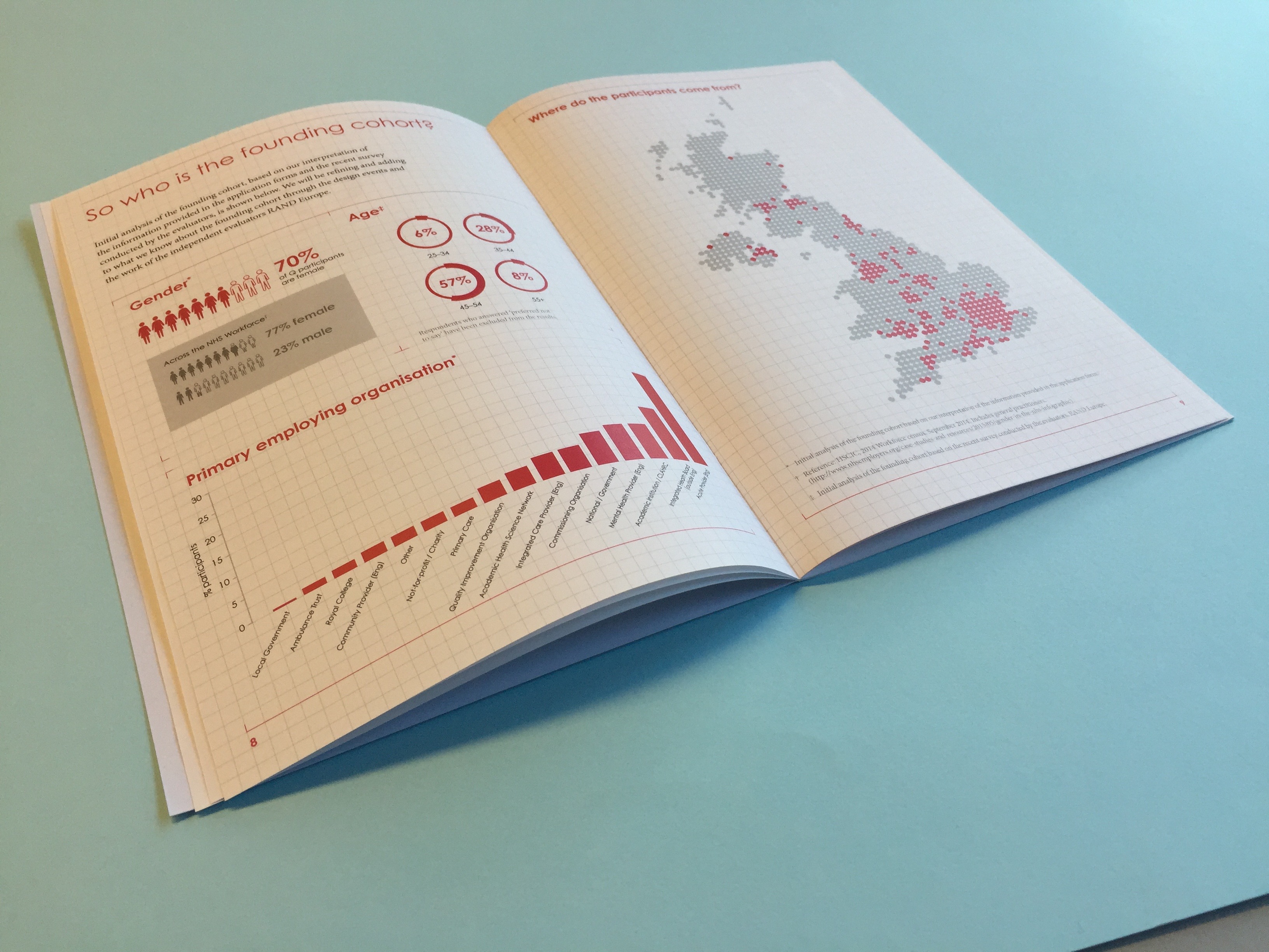
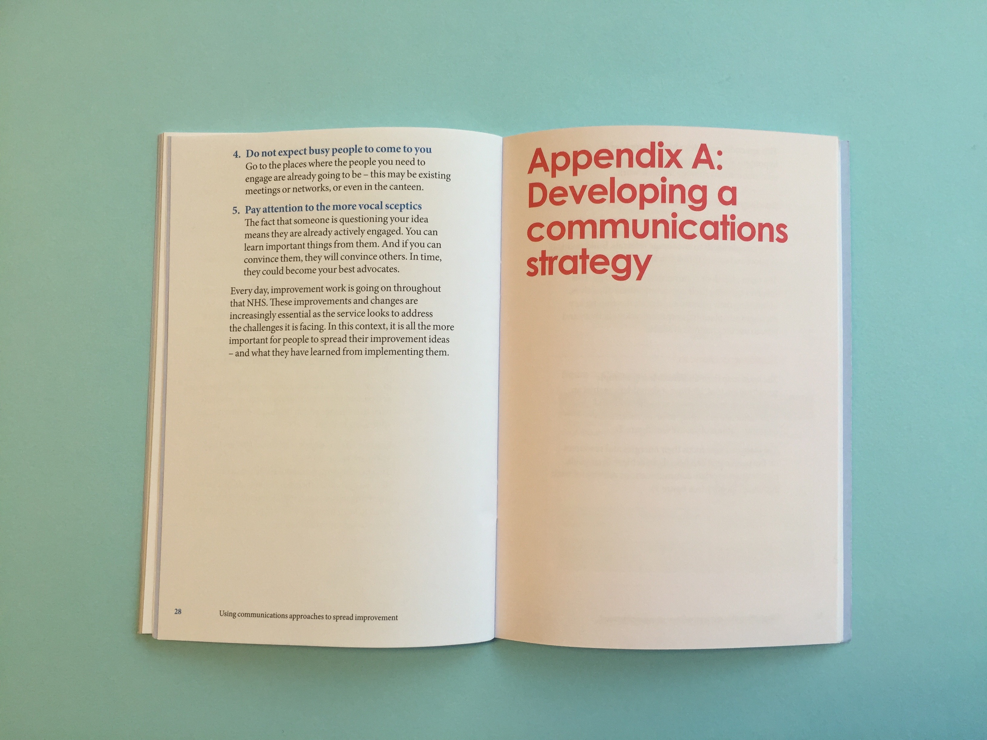
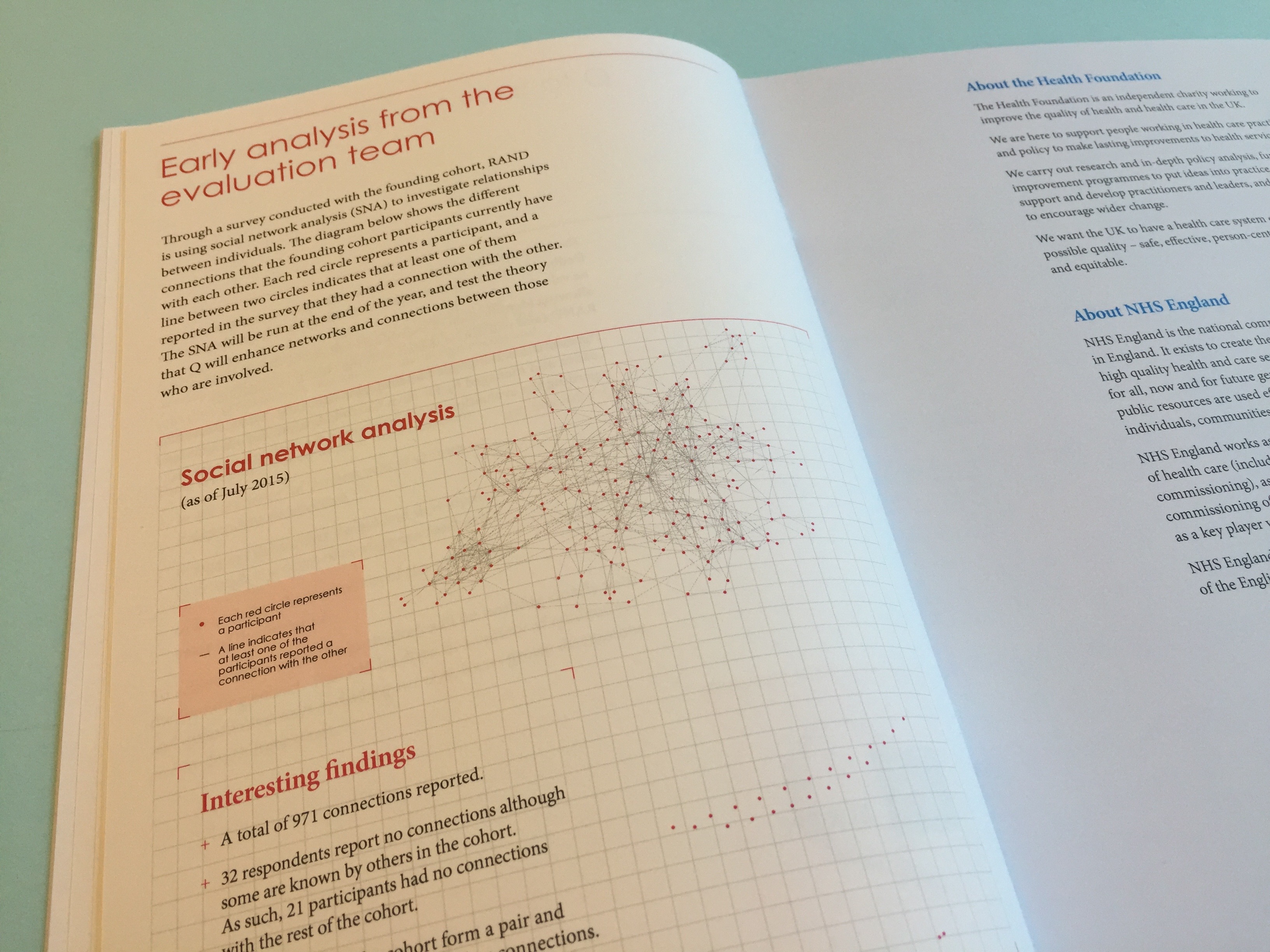
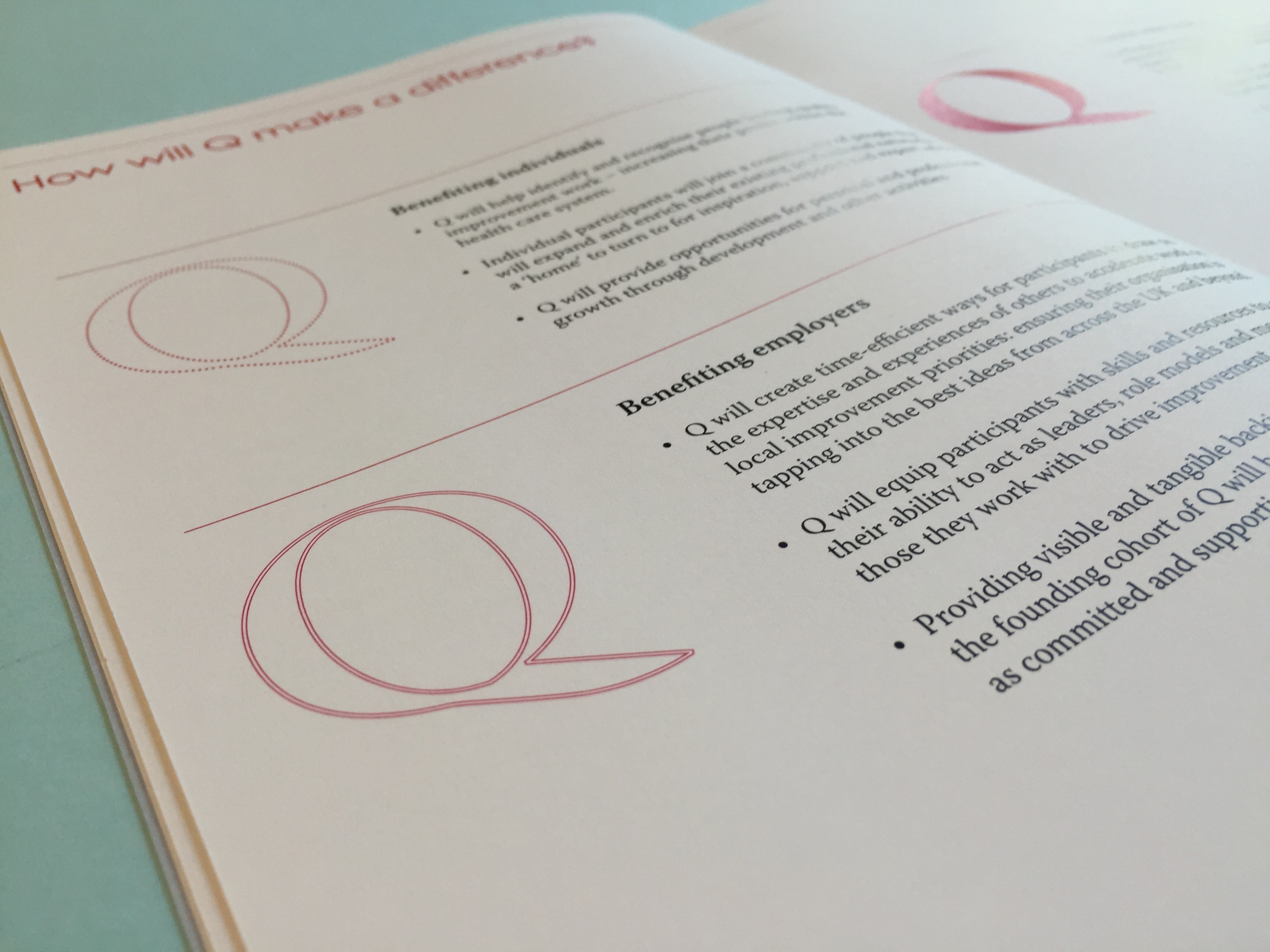
We worked with the Health Foundation to create an identity for the group that sat within the Health Foundation brand. This was then translated across their first report.
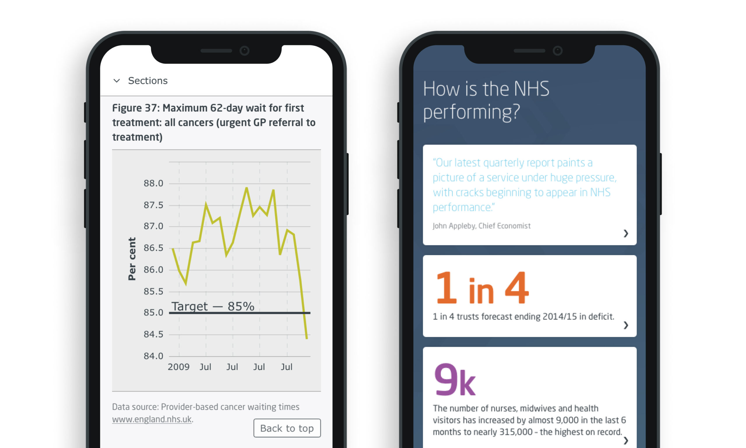
The King’s Fund is an independent charitable organisation working to improve health and care in England. They produce a Quarterly Monitoring Report (QMR) to provide a regular update on how the NHS in England is coping as it grapples with the evolving reform agenda and the more significant challenge of making radical improvements in productivity.
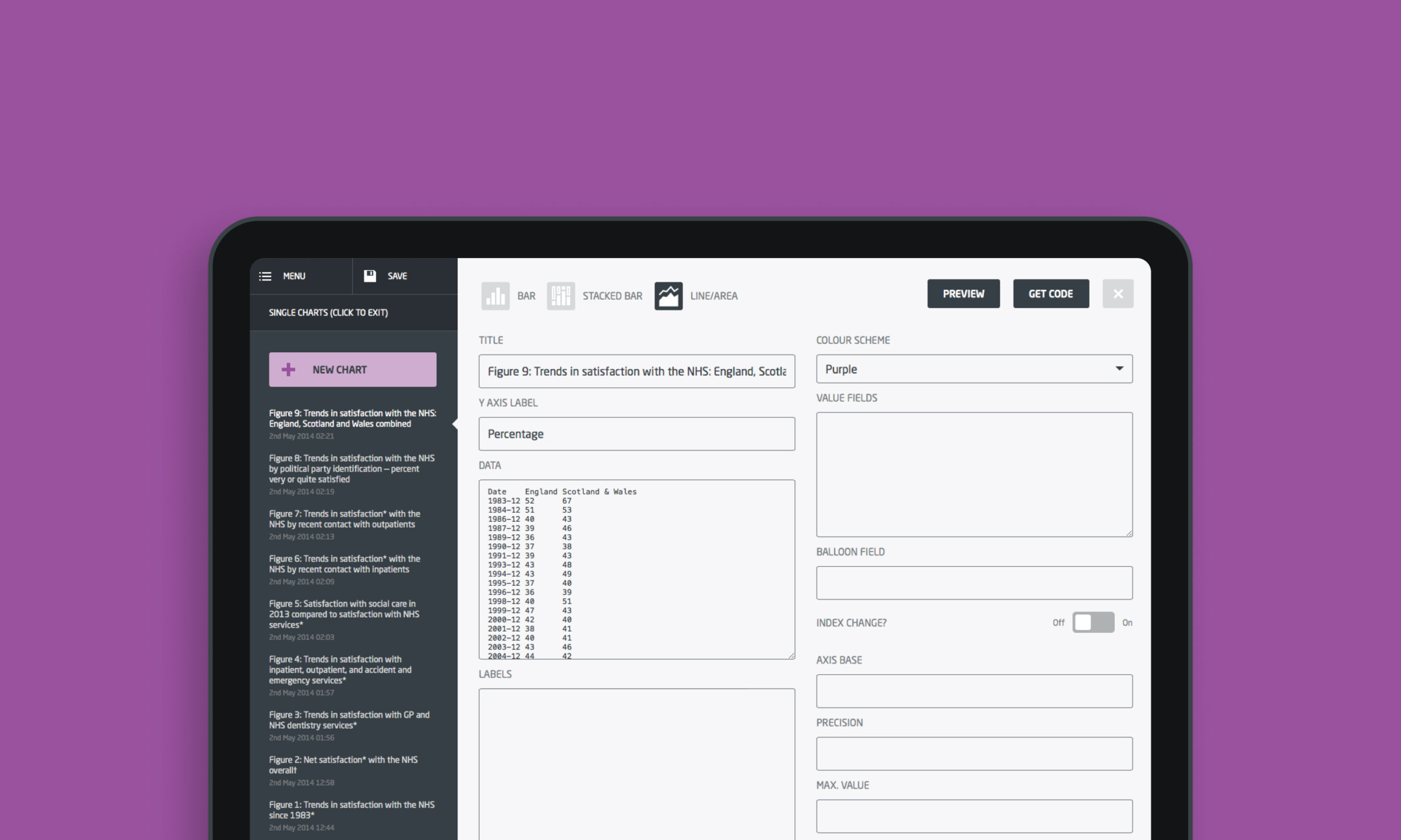
We were commissioned to produce a digital site that could be updated moving forward. The charting had to be able to be interrogated by users and so we produced a system for the King’s Fund to upload the data in the back end that would then translate the data into the various designs we had coded. We worked with the team to select the correct charting type and presentation for the data visuals to ensure that the correct stories were told in a visually engaging way.
Mortality reporting: good and bad
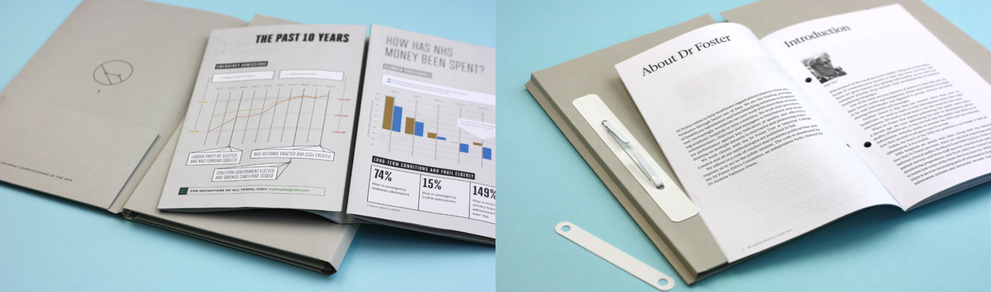
Often referred to as the report that made their name, the ‘Good Hospital Guide’ caused a large media stir when Dr Foster first released it in the press. As the government and the public demanded greater transparency from the medical profession, particularly in response to things such as the Bristol Royal Infirmary inquiry, Dr Foster seemed blessed with the right socio-political climate for launching its data-led material. The Good Hospital Guide is subtitled: “The definitive guide to getting the best service from the NHS and private hospitals. First independent assessment of every major hospital in the UK.”
Integrated reporting: based on data
The Dr Foster Intelligence Hospital Guide as it became termed, was a perfect chance to employ all the aspects of the brand creative that we had put in place for Dr Foster in our relationship with them.
For this report, where we are proud to have supported the team at Dr Foster across a number of years, saw a manifestation across both a print-based activation campaign and a digitally-led project drawing interest from press, public-and-private health institutions, the NHS, government bodies and the general public.
The pre-acquisition challenge
Dr Foster is a market-leading healthcare analytics company (now owned by Telstra). Our team’s role within this project was to help shape and position the brand in the build-up to what was a successful commercial acquisition. Dr Foster required support in how to leverage its experience and expertise and present its digitally led proposition to market, with a tone of voice that reflected the true insight it provides.
What we did
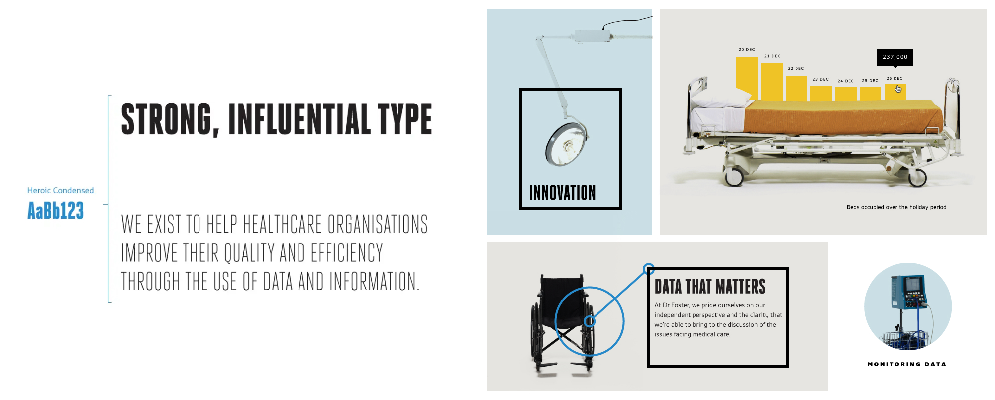
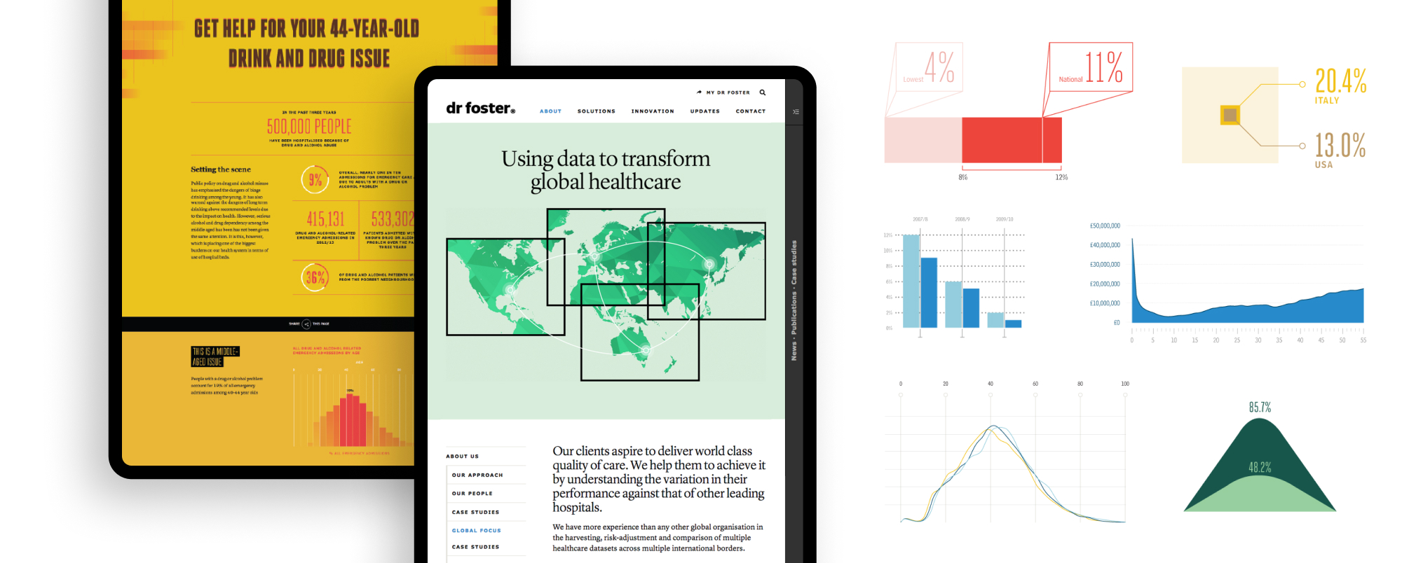
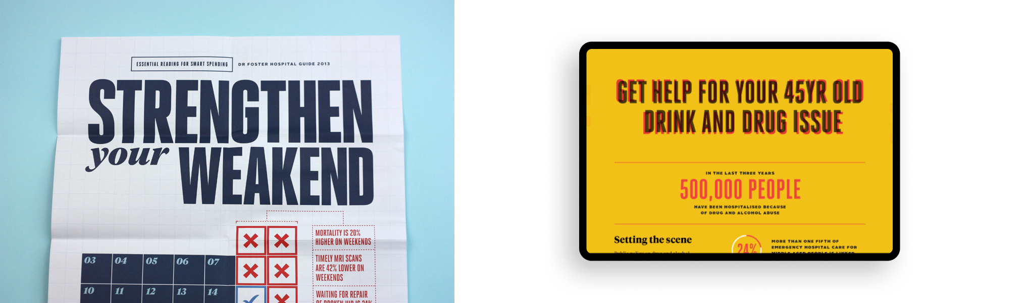
We establishing a bold, typographical brand direction that paid homage to the organisation’s journalistic roots. We provided a design platform that support the creation of the varied data insight that they required.
The stark approach to photography created a distinct personality that resonated with the realistic view of the healthcare industry Dr Foster wanted to portray. The brand was rolled out across a range of digital and printed applications by our design and development team.