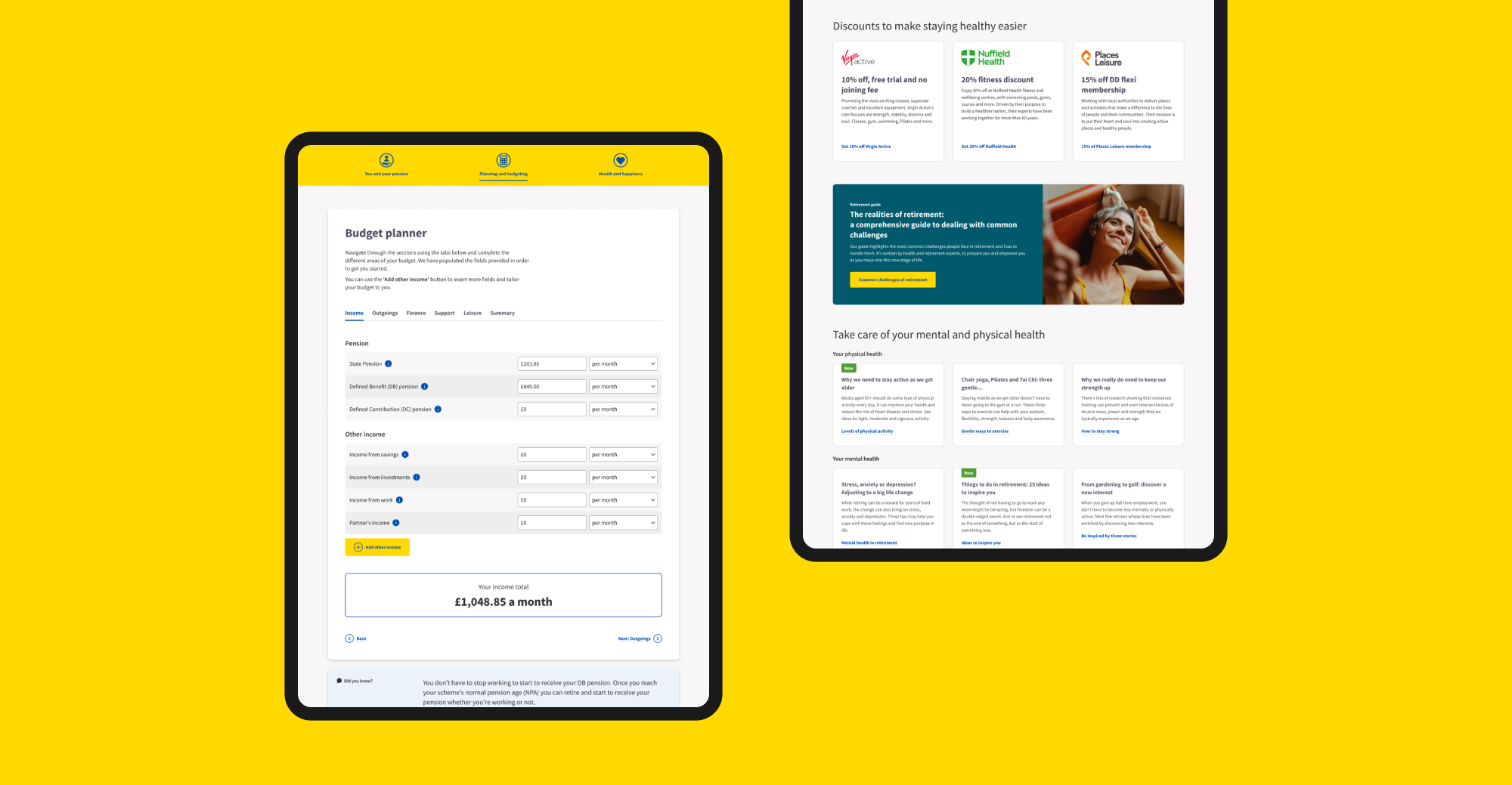
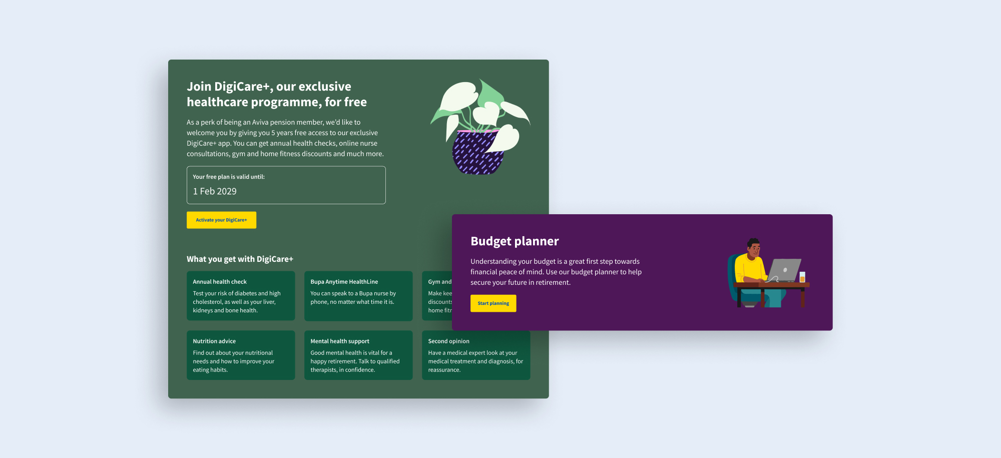
Most people don’t understand their pension and Aviva wanted to do more to give scheme members clarity. In a changing market, it also wanted scheme trustees to purchase Aviva annuities with confidence that their members will be supported.
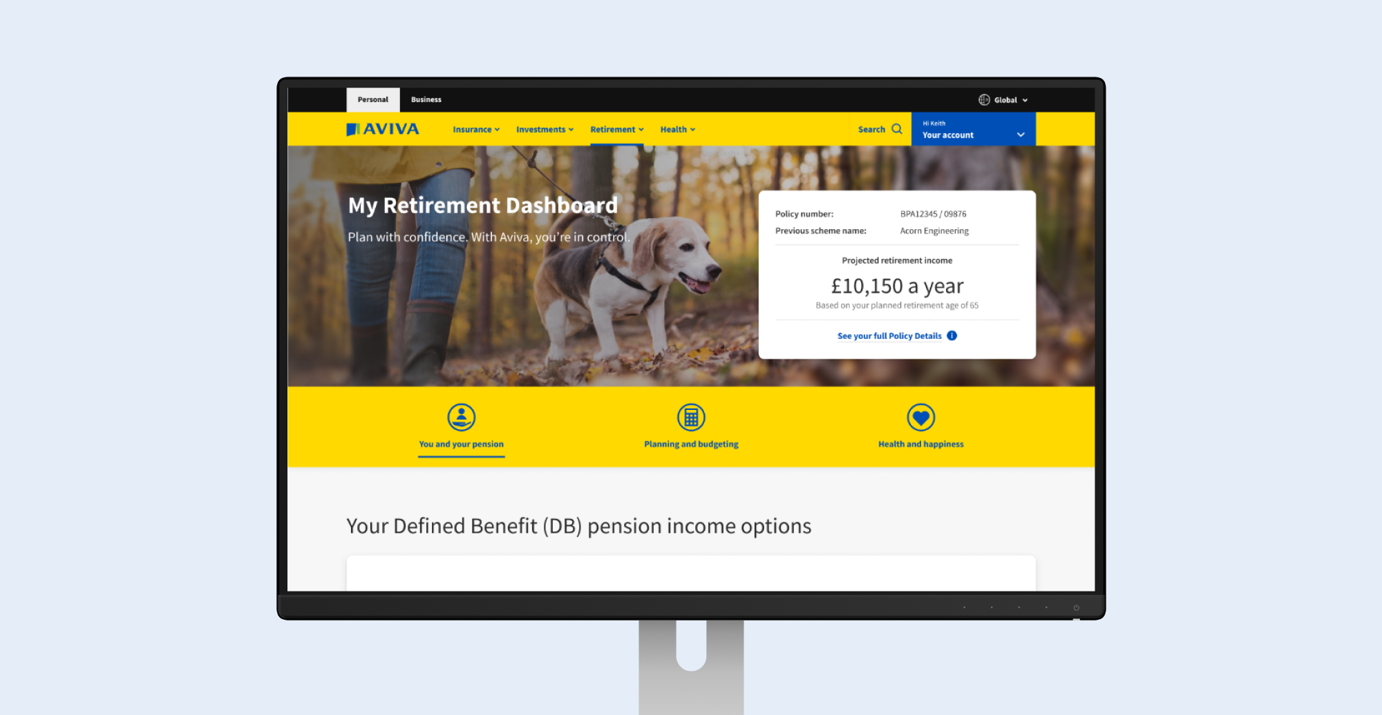
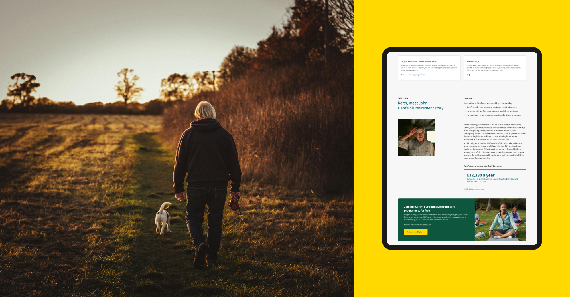
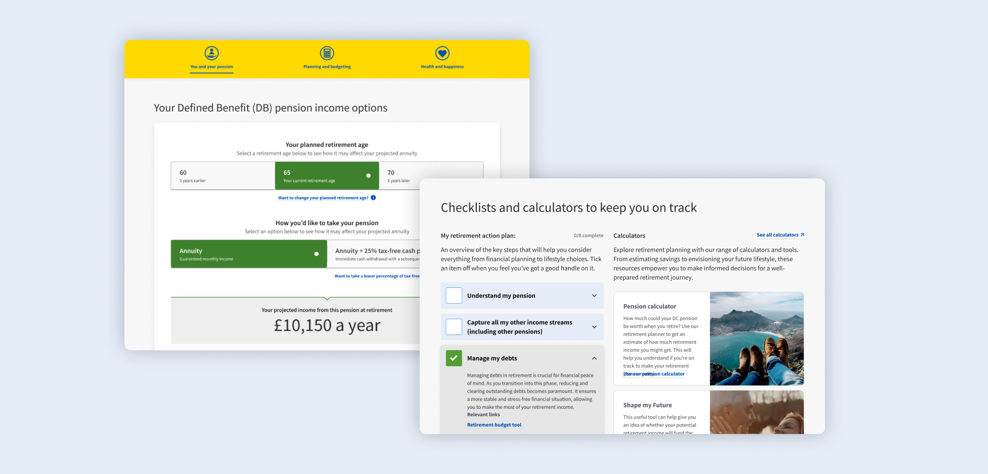
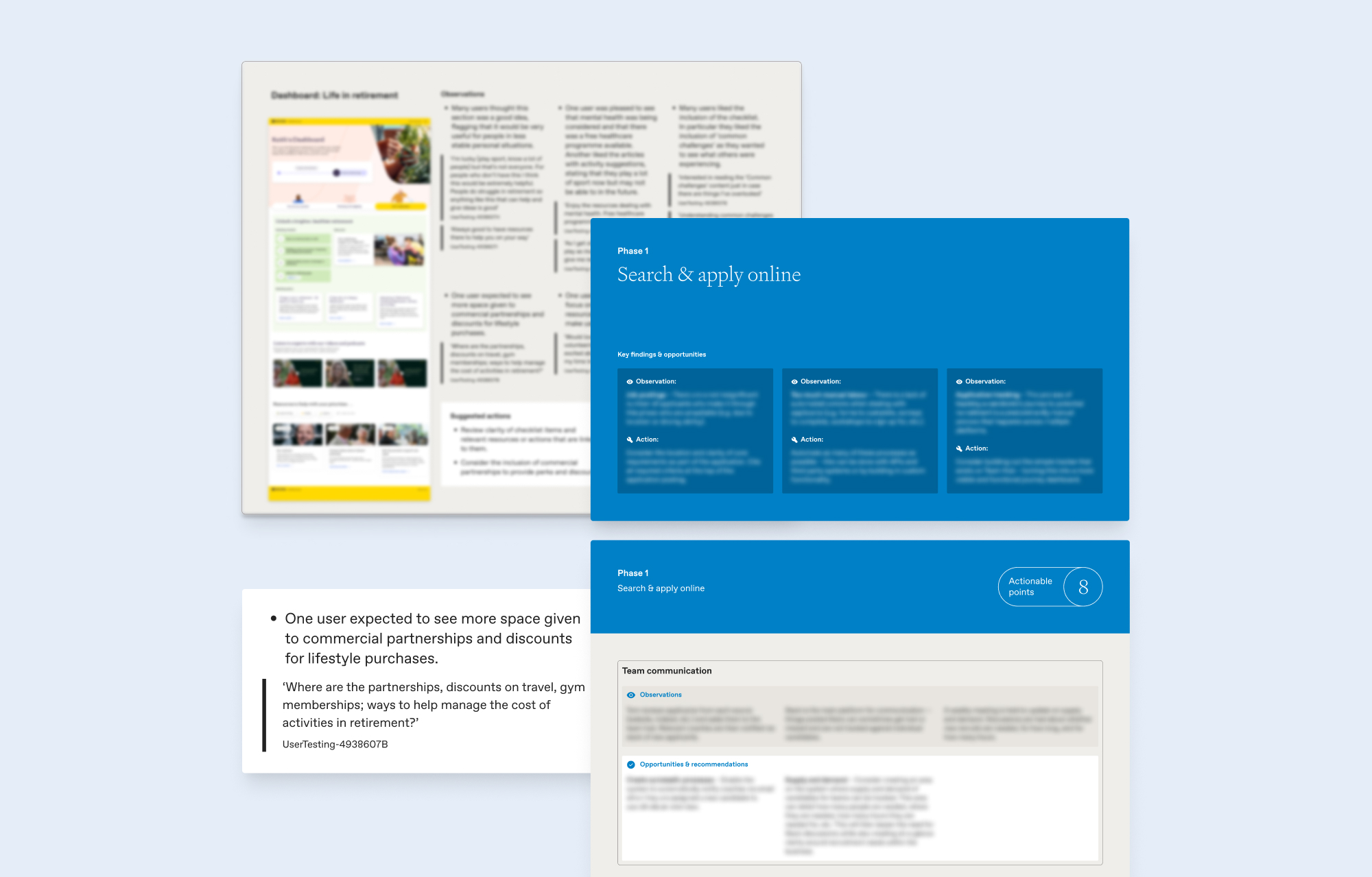
We undertook three cycles of design, testing and iteration, with intensive design sprints, agile working and rapid turnaround of user testing reports. We discovered what real customers need and the language that resonates with them, and defined features that we tested and validated. We delivered a product that has gone into development and will transform the way members interact with their Aviva pensions.
The senior stakeholder said:
“Studiomade has a collaborative, engaging way of working and the entire team is positive, expert and outcome focused. Their delivery has made a massive impact in our ability to galvanise senior internal stakeholders and external audiences.”
Project background
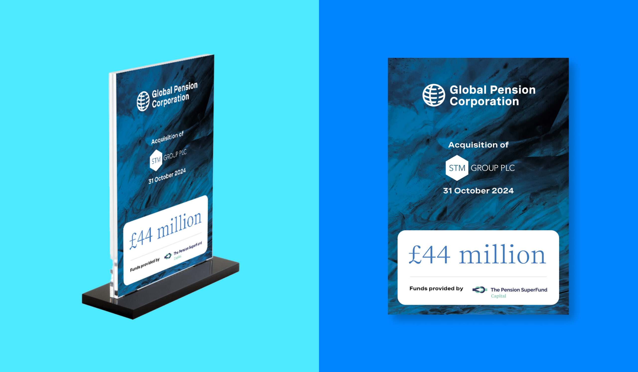
Following the acquisition of STM Group Plc, Global Pension Corporation (GPC) sought to establish itself as an innovative leader in pension management. This transition aimed to set new industry standards and establish the organisation as a trusted resource for international pensions, life assurance solutions, and more. With a clear mission to bring transparency, security, and quality to pensions and savings, GPC partnered with Studiomade to create a cohesive brand transition and digital presence that would resonate with a global audience and position it as a forward-thinking company within the financial services sector.
Our objectives
We were tasked with developing a brand identity that would:
- Reflect the organisation’s expertise and innovative approach to pension and savings solutions
- Build brand visibility while emphasising a mission to evolve the pensions landscape for the better
- Provide brand unification across multiple business units and regional entities as part of the acquisition process
- Establish a strong and scalable digital presence with an engaging, informative website ready to release at the point of purchase.
Brand Development Process
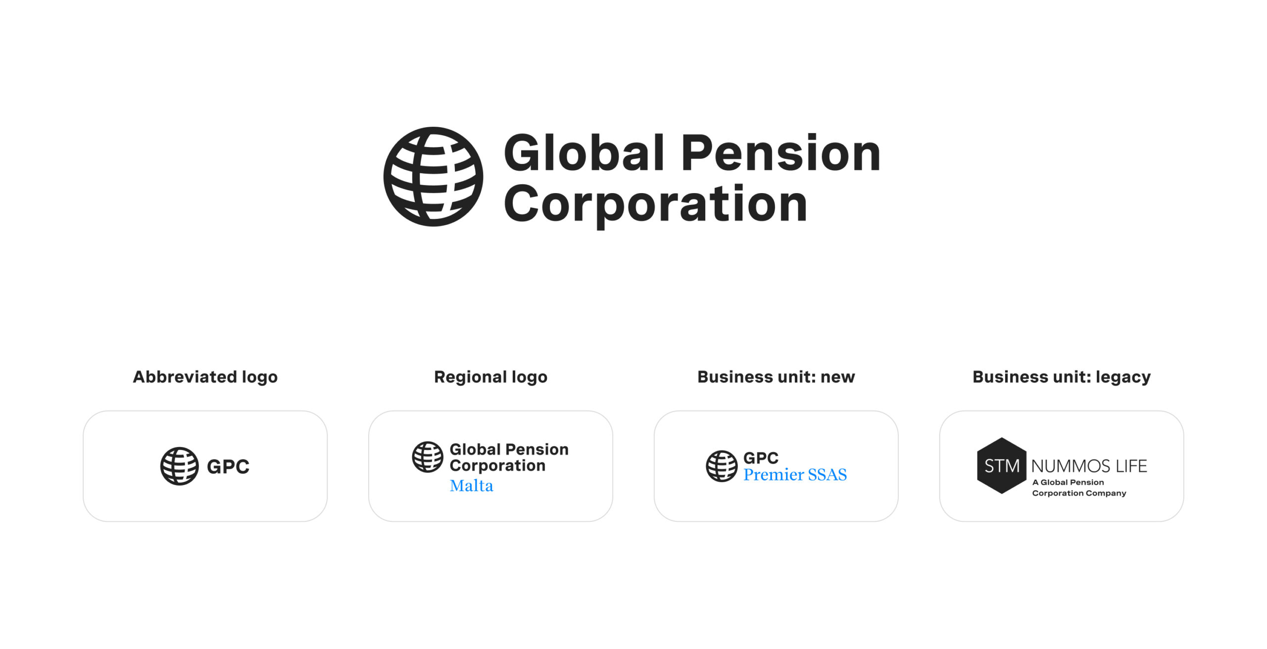
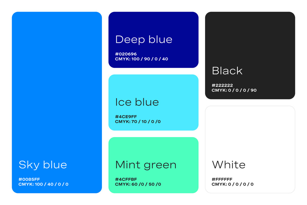
We worked closely with the client to design a brand approach and visual identity that would convey strength, trustworthiness, and modernity. A colour palette was chosen to evoke tranquility and stability, while gradients were used to add depth and sophistication. The primary brand logo features the full ‘Global Pension Corporation’ name, with a simplified ‘GPC’ variant for specific brand applications and avatar use. A clear naming hierarchy was developed to maintain consistency across the organisation’s global regions and business units to provide clarity to existing and new clients.

Tone and messaging
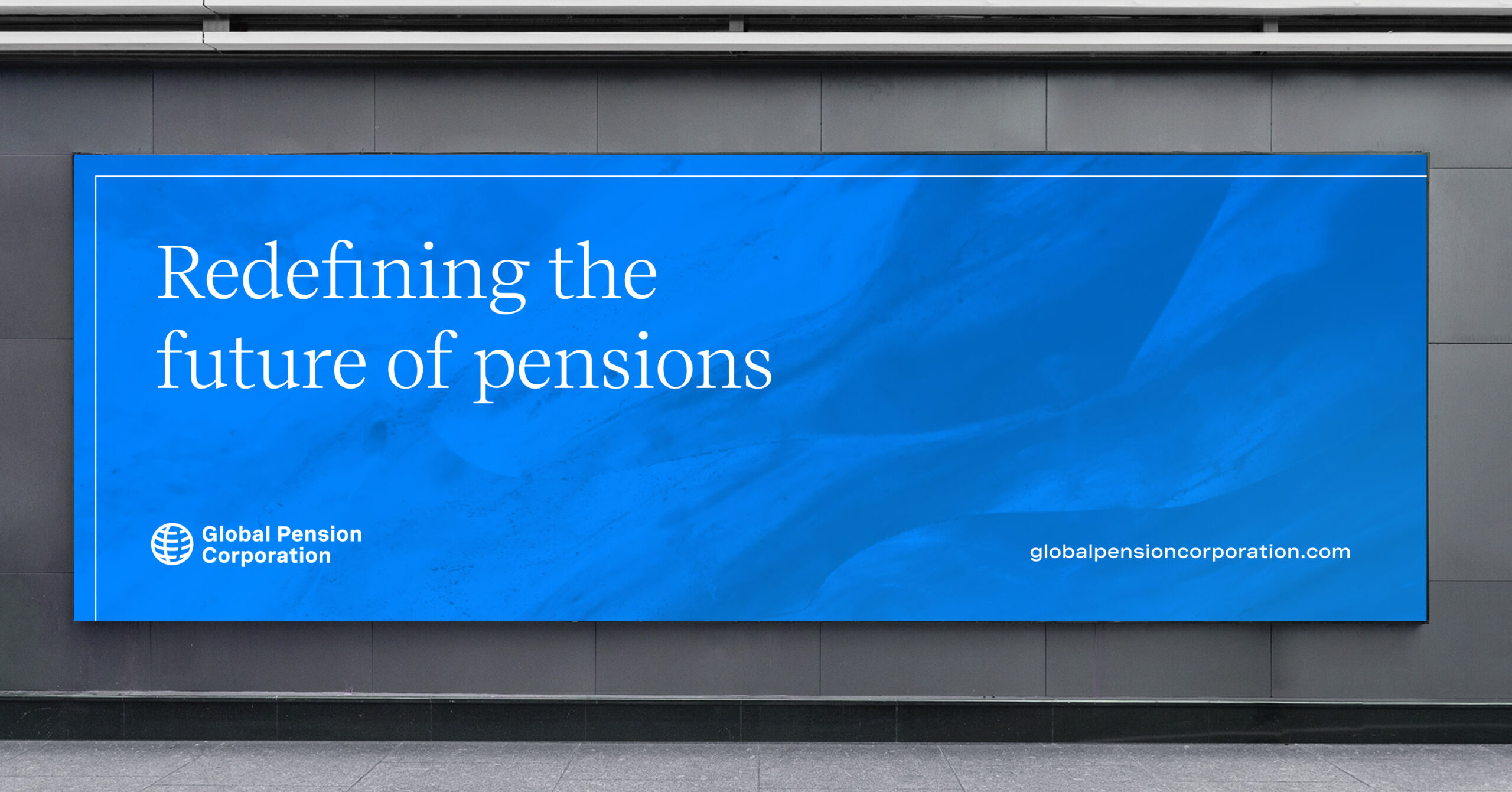
The brand voice was crafted to be both professional and accessible, resonating with corporate clients and individual policyholders. Messaging was centered on GPC’s commitment to ‘a brighter, more secure retirement for everyone’, reinforcing the company’s client-focused approach. Key phrases like ‘Redefining the future of pensions’ and ‘Unwavering support’ were used across brand materials to emphasise GPC’s dedication to excellence and client satisfaction.
Digital presence and customer experience
We developed a user-friendly website (custom-built in WordPress) that provided a showcasing of all business units acquired through the STM Group Plc purchase. The website was designed with a clean, structured layout, incorporating linework from the brand style and organised through sections that guide users to GPC’s services, expertise, and values. Emphasis was placed on easy navigation and the ability for an individual to quickly locate relevant information on pensions, trust management, and product offering. High-quality photography of natural landscapes, coupled with subtle gradients, created a visually engaging experience reflective of GPC’s values. With a siteplan that allows for simple scaling as product strategy evolves, the presence is a building block to wider customer experiences that will launch in the future.
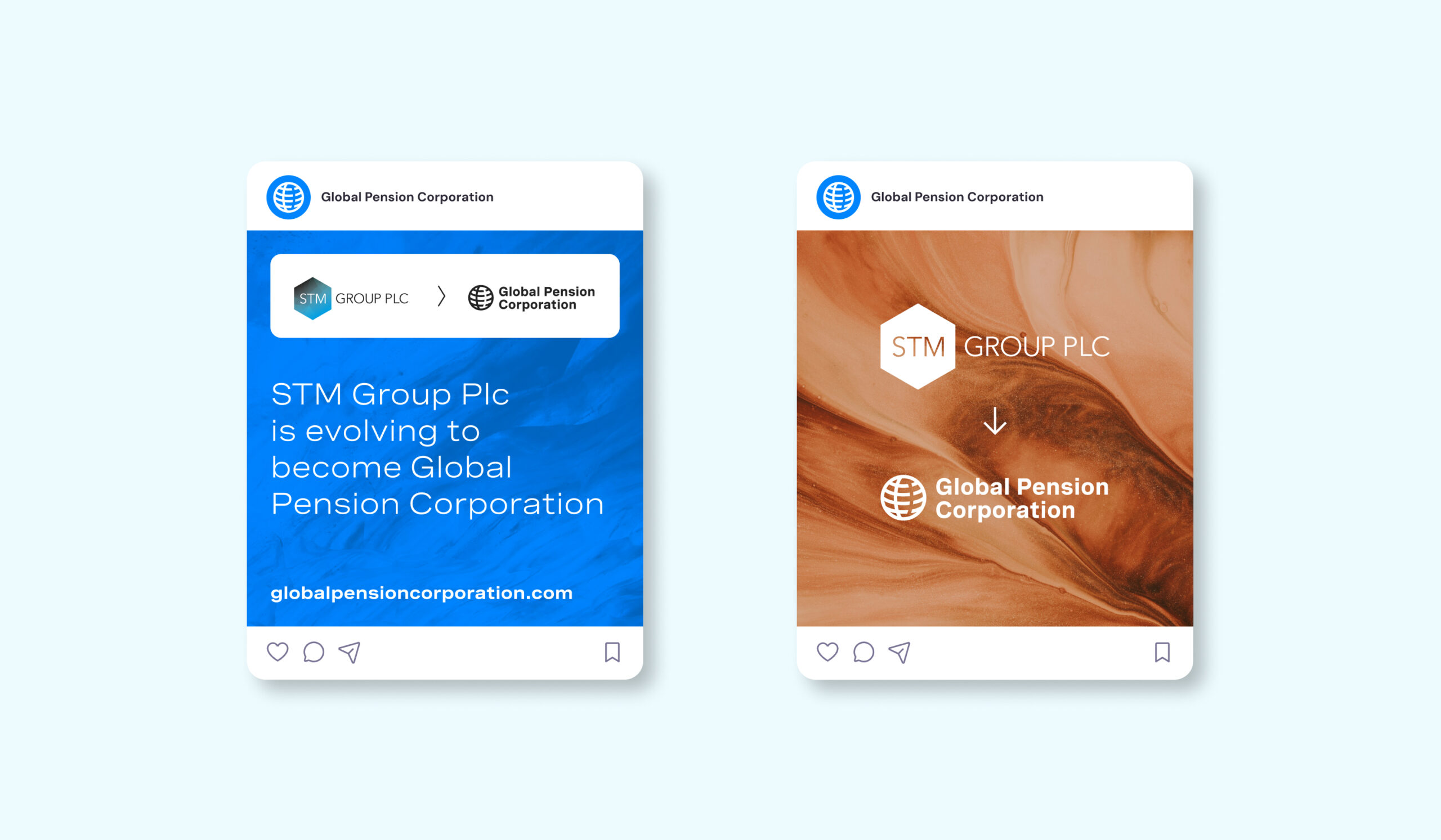
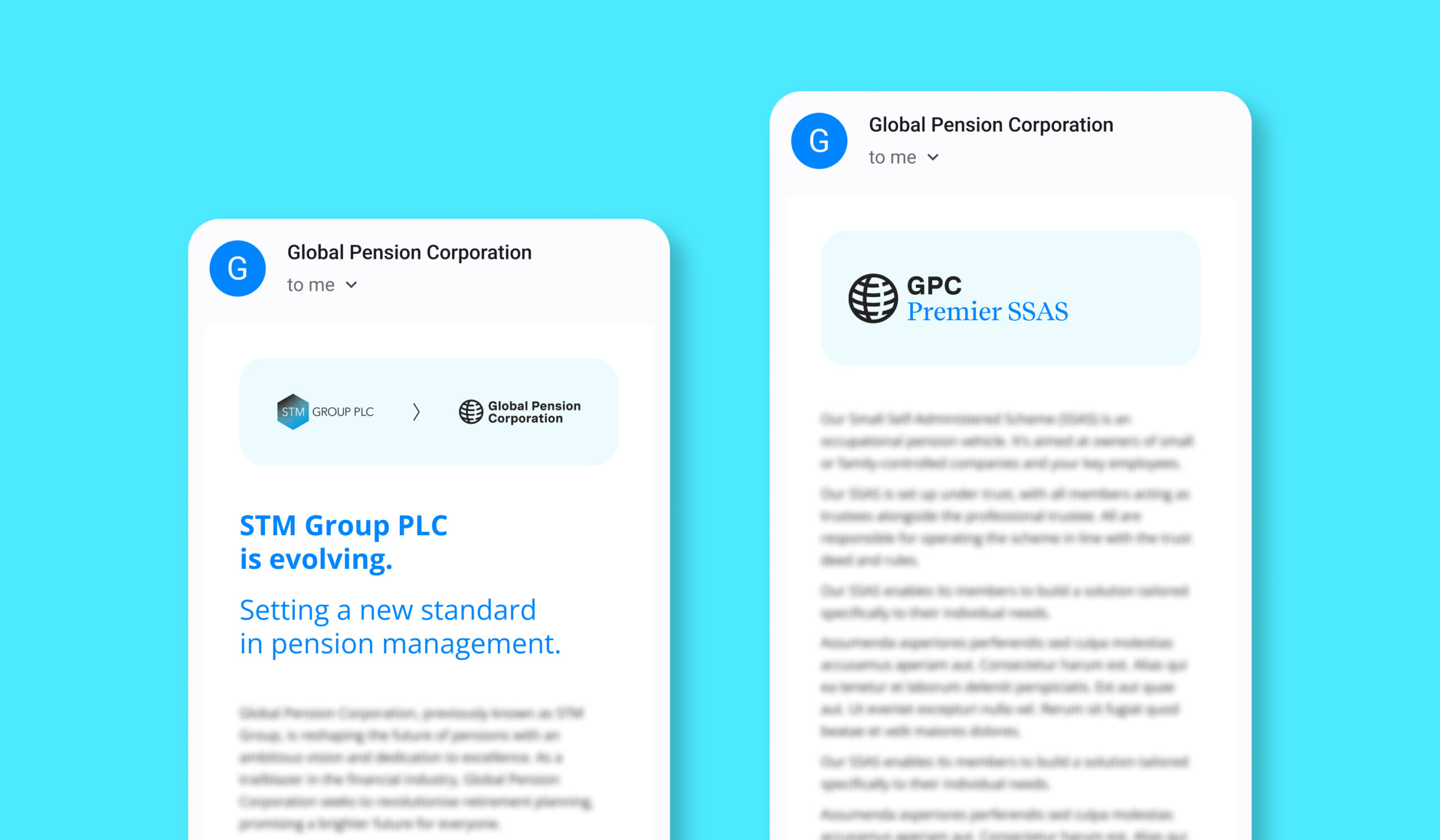
In addition, our team managed the email engagement and communications outreach that informed existing customers and IFAs to the brand change and introduction of Global Pension Corporation.

Brand guidelines and digital templates
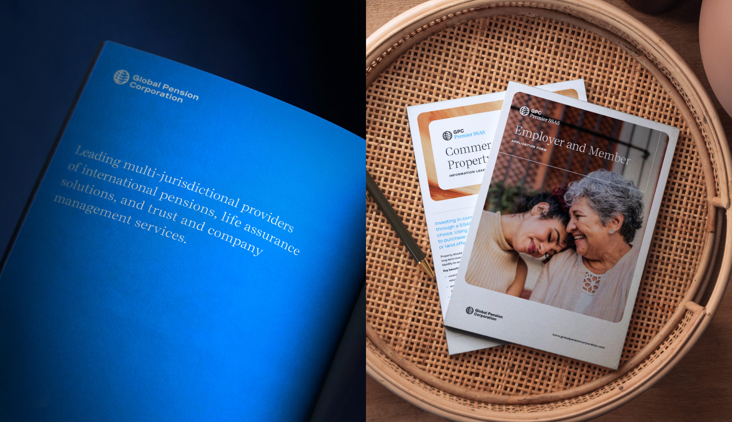
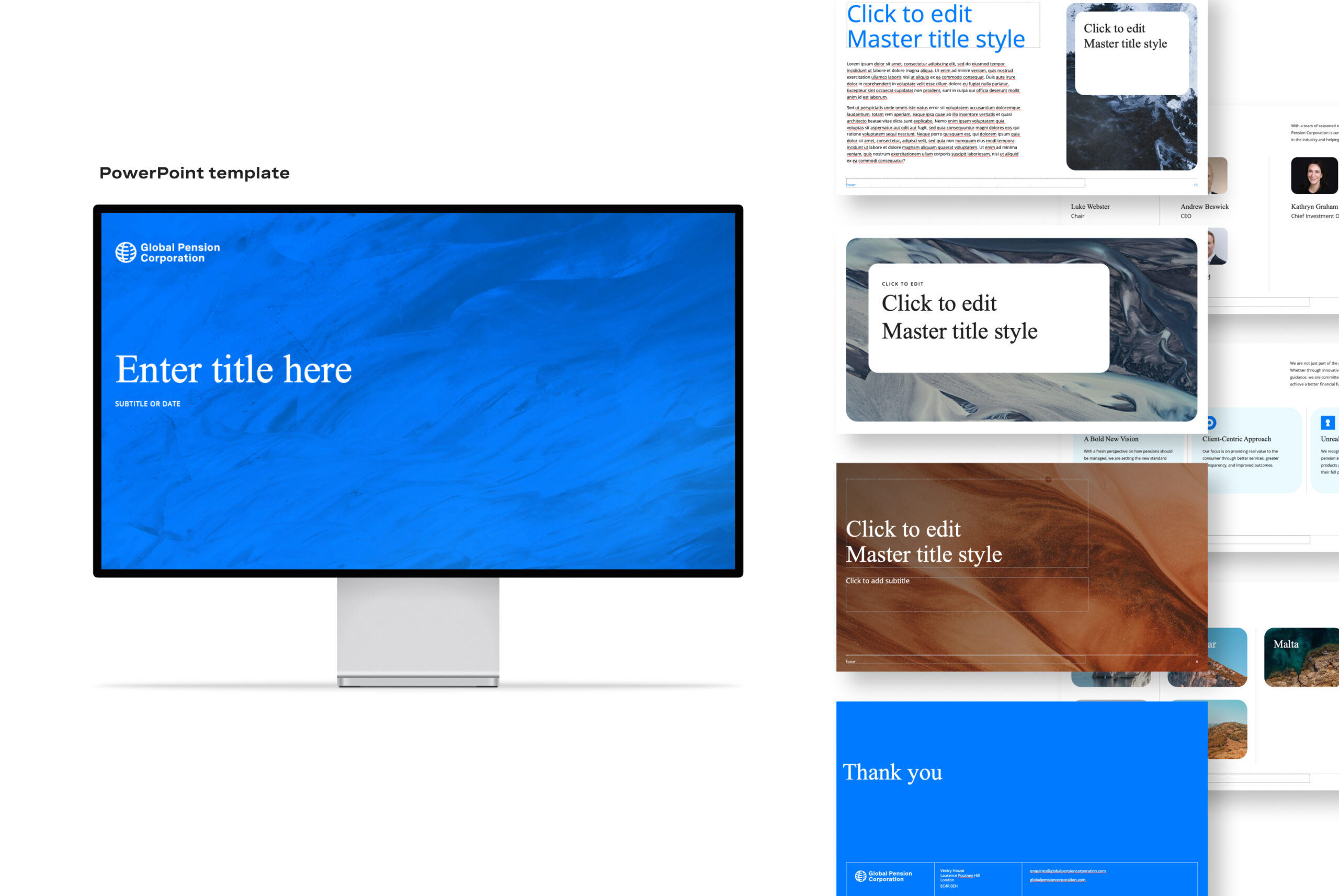
In addition to the website, we provided the existing internal team a resource library comprising of brand guidelines and templates for social media, email, presentations, and marketing materials, with live Figma and InDesign references to ease implementation. This collaborative approach helped ensure brand consistency across digital and print platforms. Our assets were designed to allow easy customisation, enabling GPC to communicate quickly and effectively with diverse audiences across its various regions and business units.
Outcomes and market impact
This cohesive brand approach, messaging, and digital presence has contributed to GPC’s growing credibility and visibility in the pension and savings marketplace. Clients can now engage with a brand that embodies trust and innovation, gaining confidence in GPC’s ability to deliver secure and forward-thinking pension solutions.
Conclusion
Our work with Global Pension Corporation exemplifies the power of strategic branding to help define a company’s market position, particularly as part of an acquisition process. By creating a visually engaging brand and cohesive guidance to implementation, we have enabled the GPC team to communicate its purpose effectively, paving the way for future growth and success within the pension and savings sector.
The DB pensions landscape
There are more than 5,000 defined benefit (DB) pension schemes in the UK (schemes which pay pension benefits based on salary and length of service) with £1.4tn in assets. Around 9.6 million members are relying on them for their expected retirement income. However, private sector DB schemes are in decline and an estimated £400bn worth of trustees and sponsors are seeking full settlement of member benefits by transferring their assets and liabilities.
But there are challenges in the marketplace. Demand for settlement is surpassing supply. Sponsors (usually the employer), who may be under financial stress, need enough money to fulfil their pension commitments to employees and are looking to remove their financial risk. Trustees, who oversee pension funds’ management, have to safeguard members’ interests even if it means sponsor insolvency. Stakeholders need strategies to navigate this.
PSF Capital’s solution
PSF Capital has launched a new solution to the market, CovenantPlus. This Capital-Backed Funding Arrangement (CBFA) gives DB schemes access to external capital to help them meet their funding and investment objectives, using an agreed strategy and timeframe. It gives sponsors cash-flow certainty and removes risk. It gives trustees a strong covenant, protection from scheme failure and greater security in protecting member’s pension benefits, supporting their end-game strategy.
Our role
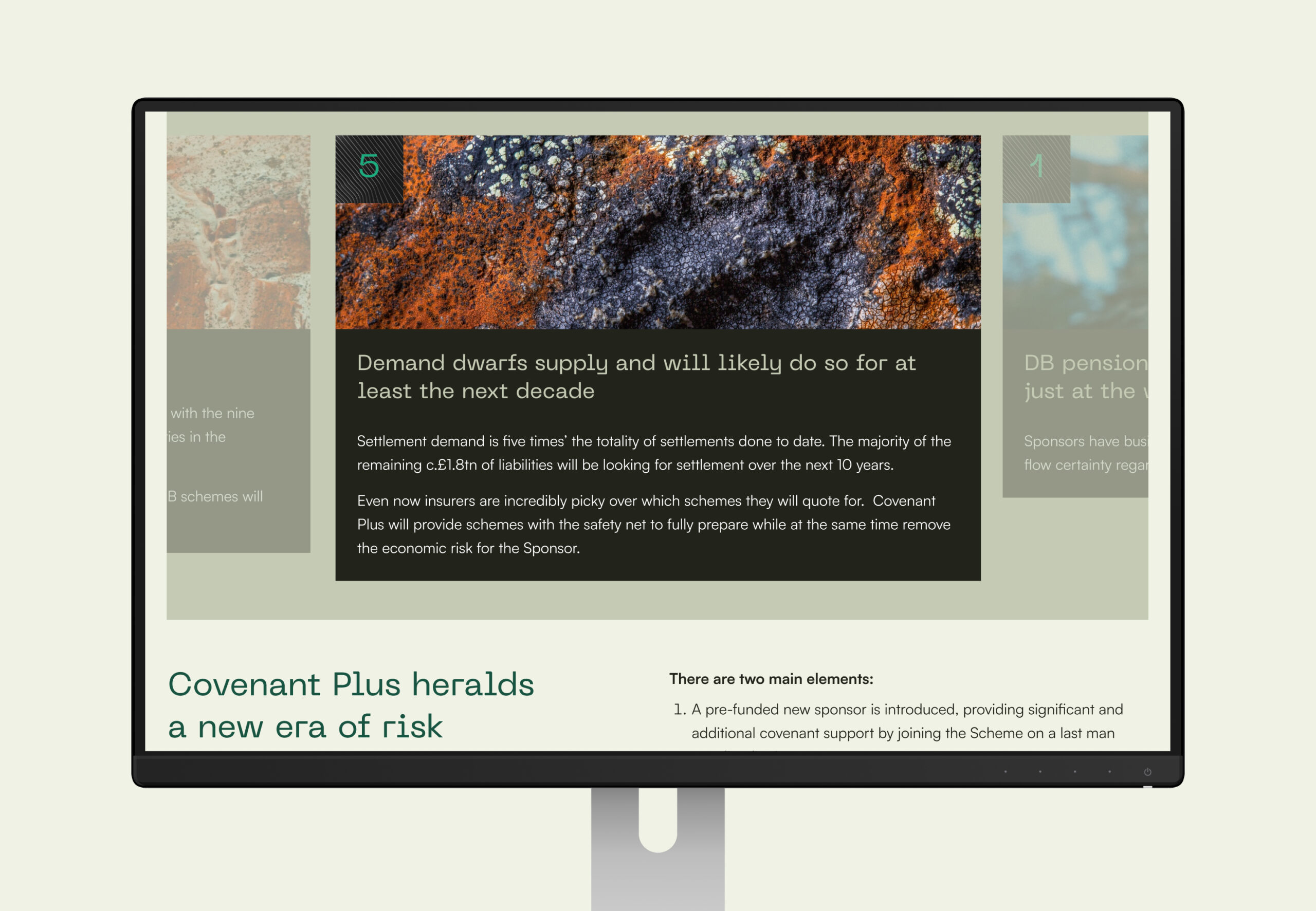
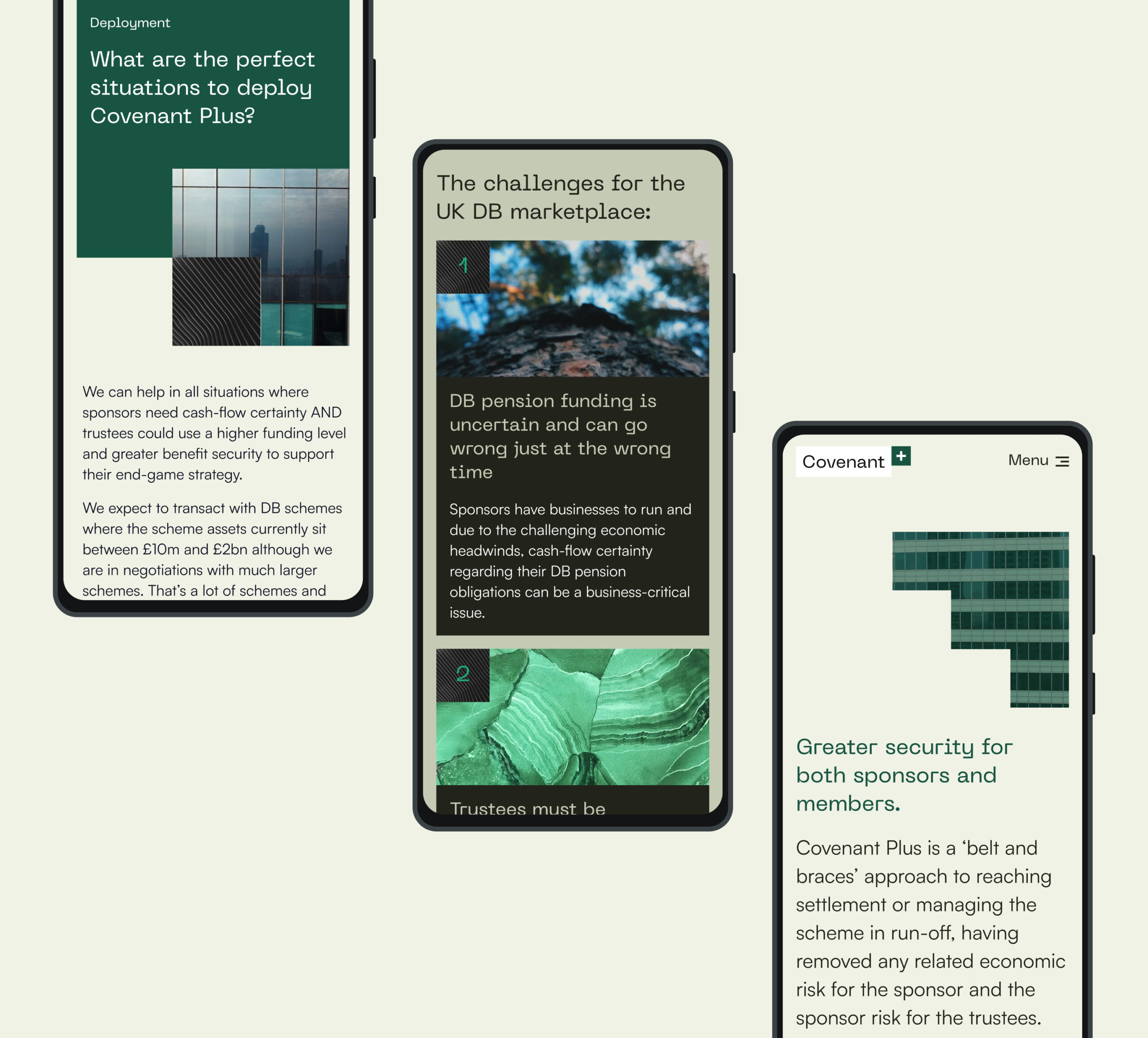
We helped craft and position this new venture including building the brand, establishing a look and feel that best suited the B2B marketplace and crafting a digital presence that would talk to all stakeholders. Our input included client engagement and lead generation through the delivery of a seamless digital experience and gated content.
Working within the finance sector often involves short timeframes were opportunities need to be seized quickly. Our work with Covenant Plus allowed for a 3-month timeframe, where all ideation, content planning, design and development was tackled – allowing for the concept to be realised and released to market quickly.
We created areas of open access content along with locked content to encourage registration and lead gen. Once registered, users were provided access to a data room and case studies showing details of solutions PSF has provided to other schemes.
Brand creation
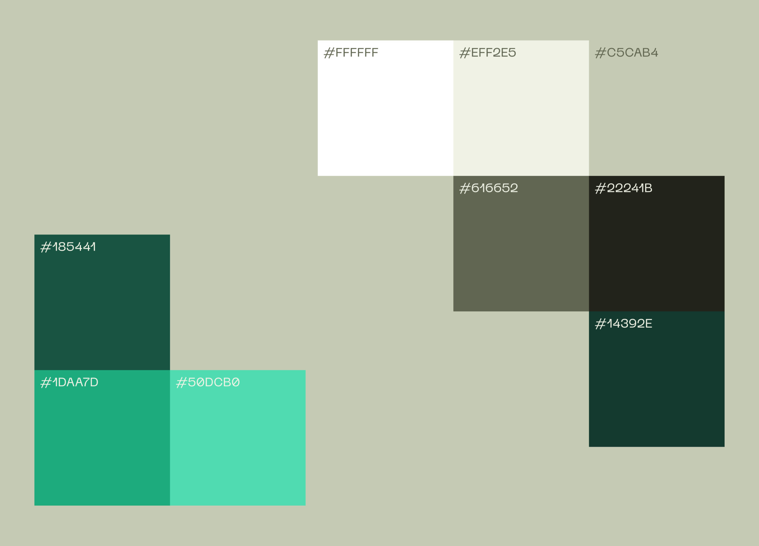
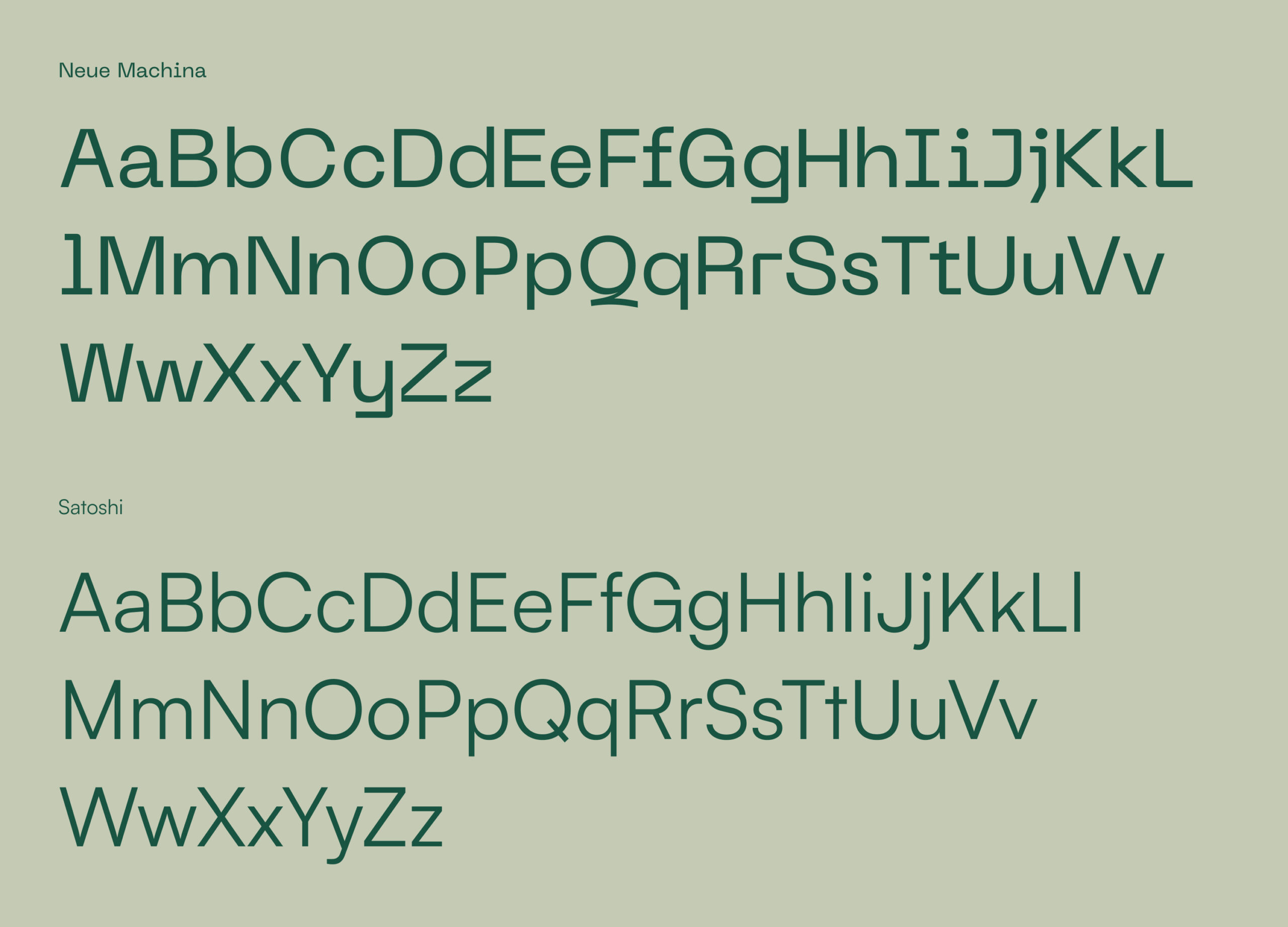
Our visual identity for the brand centres around safety, trust and certainty about the future. To invoke these feelings we’ve used strong architectural images with 90° angles and encased the logo and brand motif in robust holding device. PP Neue Machina is the typeface, chosen for its personality, echoing the straight edges and secure nature of other brand components. We particularly like the detail of the inktraps (where some corners are removed from letterforms) as this gives character to the typeface and is very distinctive for this ‘secure’ brand.
The outcome
CovenantPlus is a belt-and-braces approach to reaching a settlement or managing a scheme in a run-off period, removing related economic risk for the sponsor and removing the sponsor risk for the trustees. As PSF’s chosen creative partner we helped to launch a venture that manages risk, gives sponsors and trustees more security, and supports a better future for employers and their pension scheme members.
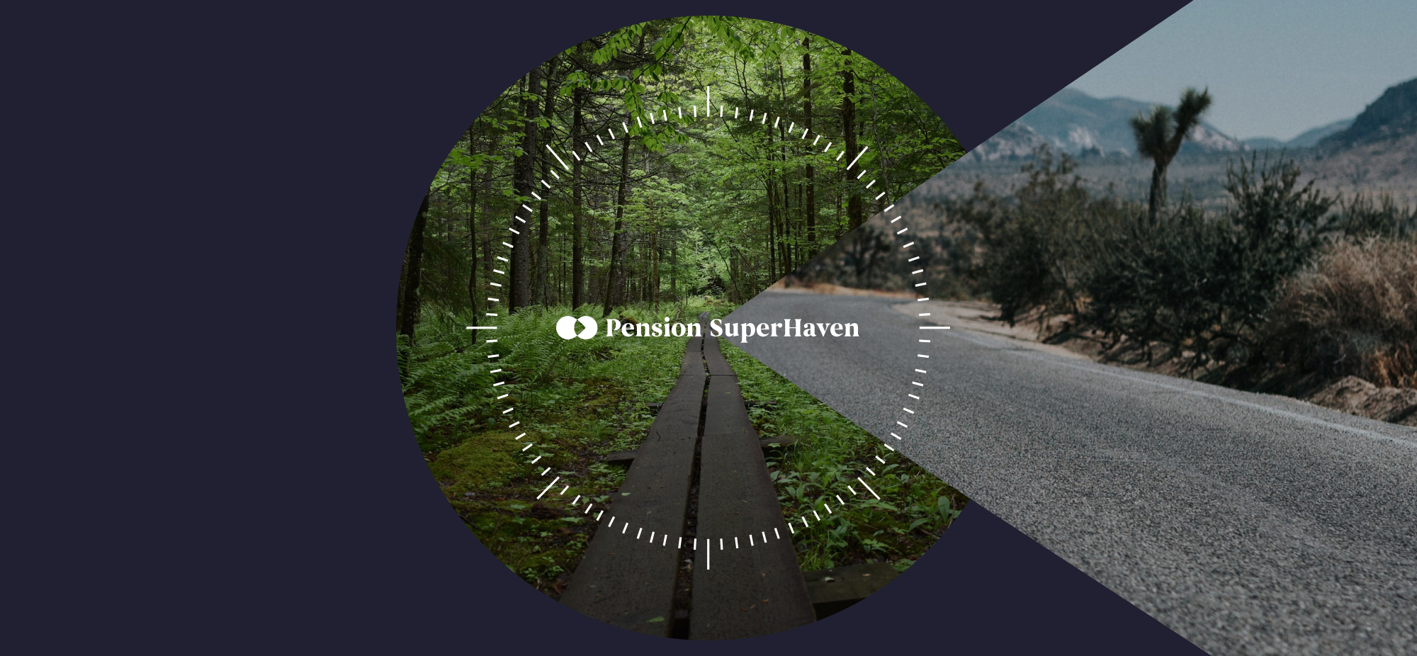
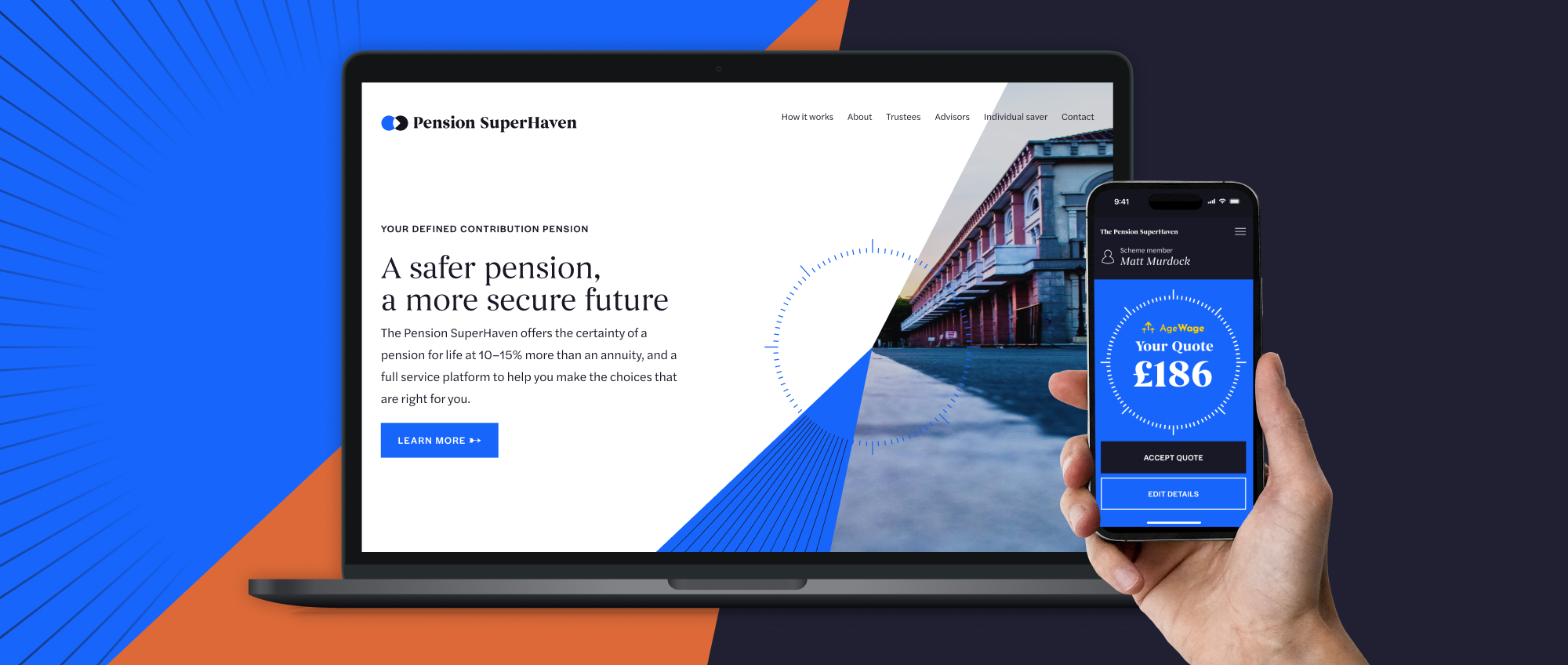
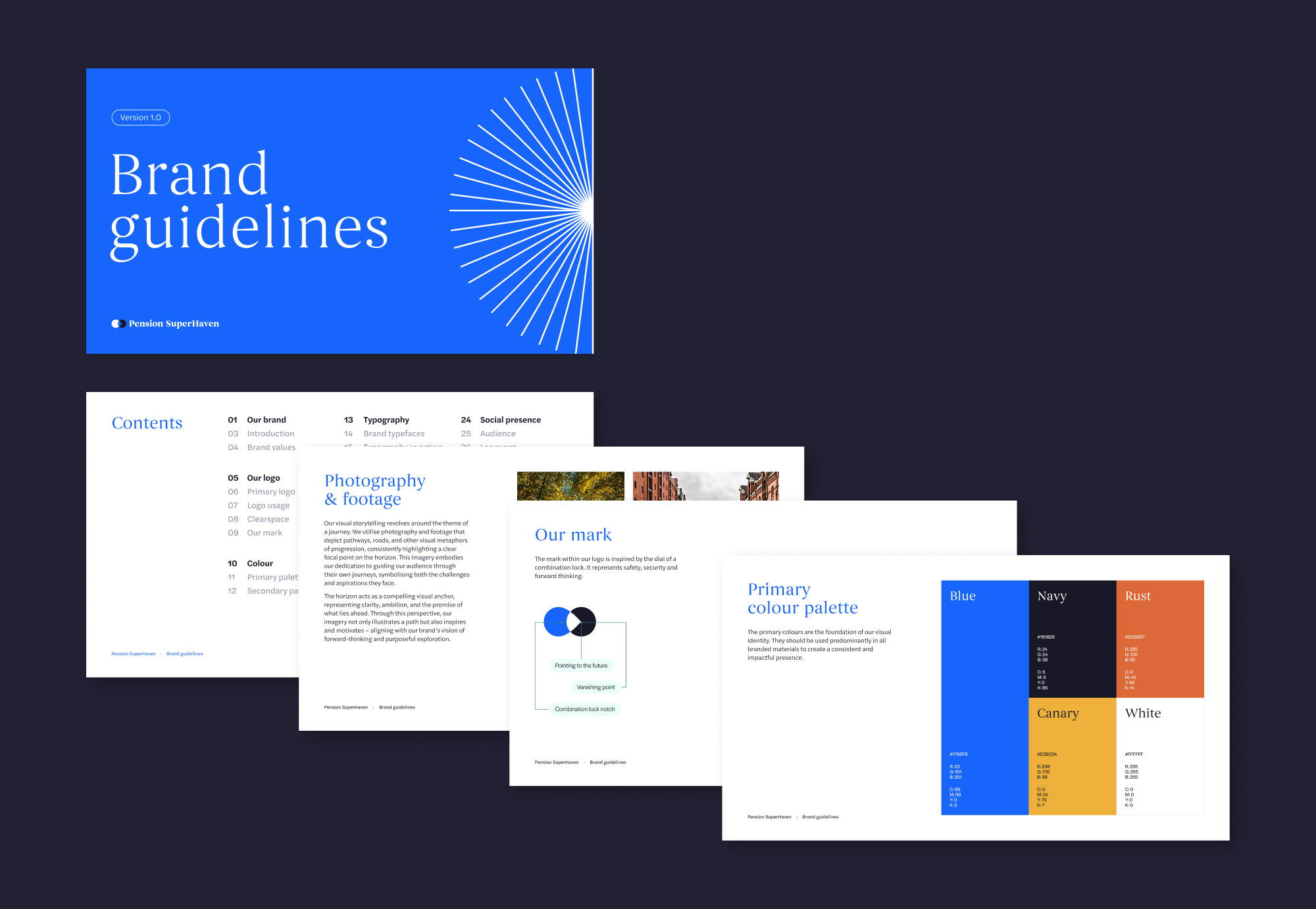
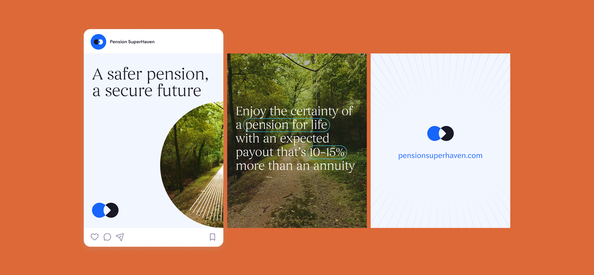
Pension SuperHaven were a new company created in order to sell Pension Products in partnership with Age Wage, primarily defined benefit. The challenge was to position PSH as a trustworthy new company within the financial services sector as well as bringing a sense of humanity and transparency to the brand. They needed a brand that would allow them to communicate across all physical and digital platforms consistently.
We crafted a compelling brand and website, ensuring clarity in financial guidance. From strategy to execution, we designed a seamless digital experience, making pensions accessible and engaging. Our work reflects trust, simplicity, and innovation, empowering users to navigate their financial future with confidence
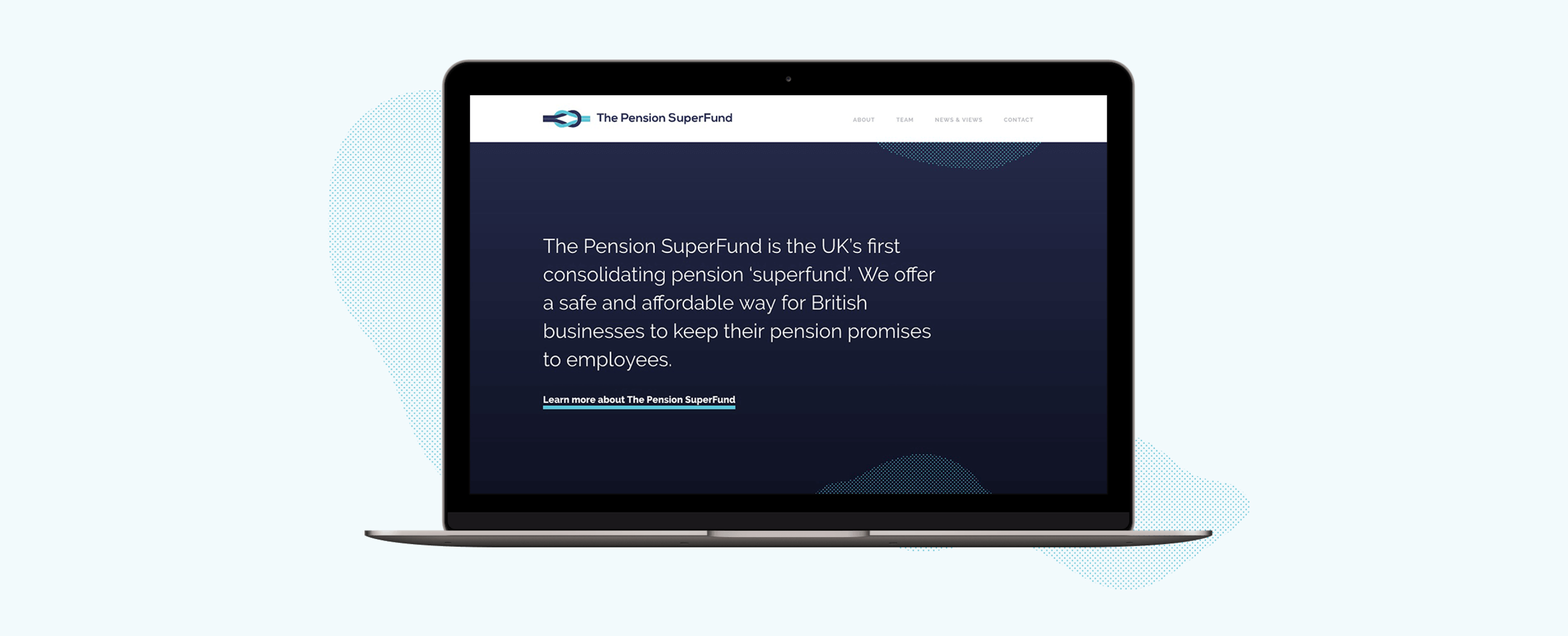
The Pension Superfund is the UK’s first consolidating pension ‘superfund’. Their product was entirely new to the market and so we wanted to create a clean and concise brand presence that visually presented the messaging and benefits in a simple and clear manner.

Appropriate design
Our design team introduced a streamlined colour palette and a monotone illustration style to ensure that the messaging was not overwhelmed. The site’s main purpose is to provide information to potential stakeholders, validating the Superfund’s existence and clarifying their proposition. We created a ‘news and views’ area to promote opinion and insight, to capture interested parties and motivate engagement of getting in touch. Utilising subtle animations and abstract textures to add visual interest and create a stylised design approach, the brand can flex as necessary.
A brand to build on
The brand base that has been created will support The Pension Superfund as it grows. The textured elements used within the design are flexible allowing them to be used effectively across a wide range of campaign materials whilst keeping brand consistency. The illustrations also serve as the beginning of a visual library that The Pension Superfund have ownership over going forwards.