A bold rebrand of a transformational tool for clinicians
We worked with Bleepa to reposition its clinical communications hub and grow the business
Sector
Discipline
Client
Bleepa
Year
2021
Poor communication in the NHS is a big factor in poor patient care. It also has severely detrimental effects on healthcare professionals, contributes to staff burnout, and wastes public funds (an estimated £1 billion a year in England alone).
Better communication between staff and teams can save costs, improve health outcomes, improve patients’ experience – and ultimately make staff’s jobs a lot easier.
Bleepa is one of only a few communications tools accredited for clinical use in the NHS, created to resolve issues such as siloed specialist care and remote working. It’s a digital hub, holding reports, referrals, clinical-grade images and more, with an instant messaging function that enables clinicians to communicate securely to discuss cases, decisions and patient treatment. They can view and annotate clinical photos, scans and X-rays, add test results and notes to records, share comments with colleagues, manage patient referrals and get second opinions. It transforms how they work, making them more efficient, leading to better patient care – and making their jobs easier.
We were asked by parent company Feedback Medical to help grow awareness around the Bleepa product and brand. We worked with the team to establish a digital content strategy, increase Bleepa’s presence and run digital marketing campaigns.
What we did
Bleepa is an innovative health-tech product that can transform how healthcare professionals work and communicate, but its existing website didn’t reflect that. It was crammed with information and it wasn’t clear what users should understand about the product or what action they should take.
Bleepa had to have a strong website in place before we could look at driving any traffic to it. This meant giving the site a strong, clear visual identity. It needed a tone of voice that resonates with its audience of clinicians and healthcare providers, with clear messaging that effectively shows them what Bleepa does and why they need it.
We would also define a clear user journey so that people would know exactly where to go and which would generate leads.

Getting the messaging right
We wrote five potential key messages and tested them with users. We made simple text-based adverts and ran them on Facebook, targeting a broad, medically focused audience group. ‘Secure clinical chat’ was the clear winner. We took this into the next level of testing, around tone and creative.
Next, we considered the tone of voice. We wanted this to be based on engagement, not our assumptions, so we created three options to test: bold, clear and direct; emotive and approachable; intelligent, clever and precise. The third one got the best response.
With this research we now had a brief for the brand’s messaging. We knew that secure clinical chat was our main point of difference and that the tone of voice should be intelligent, clever and precise.

Website design and development
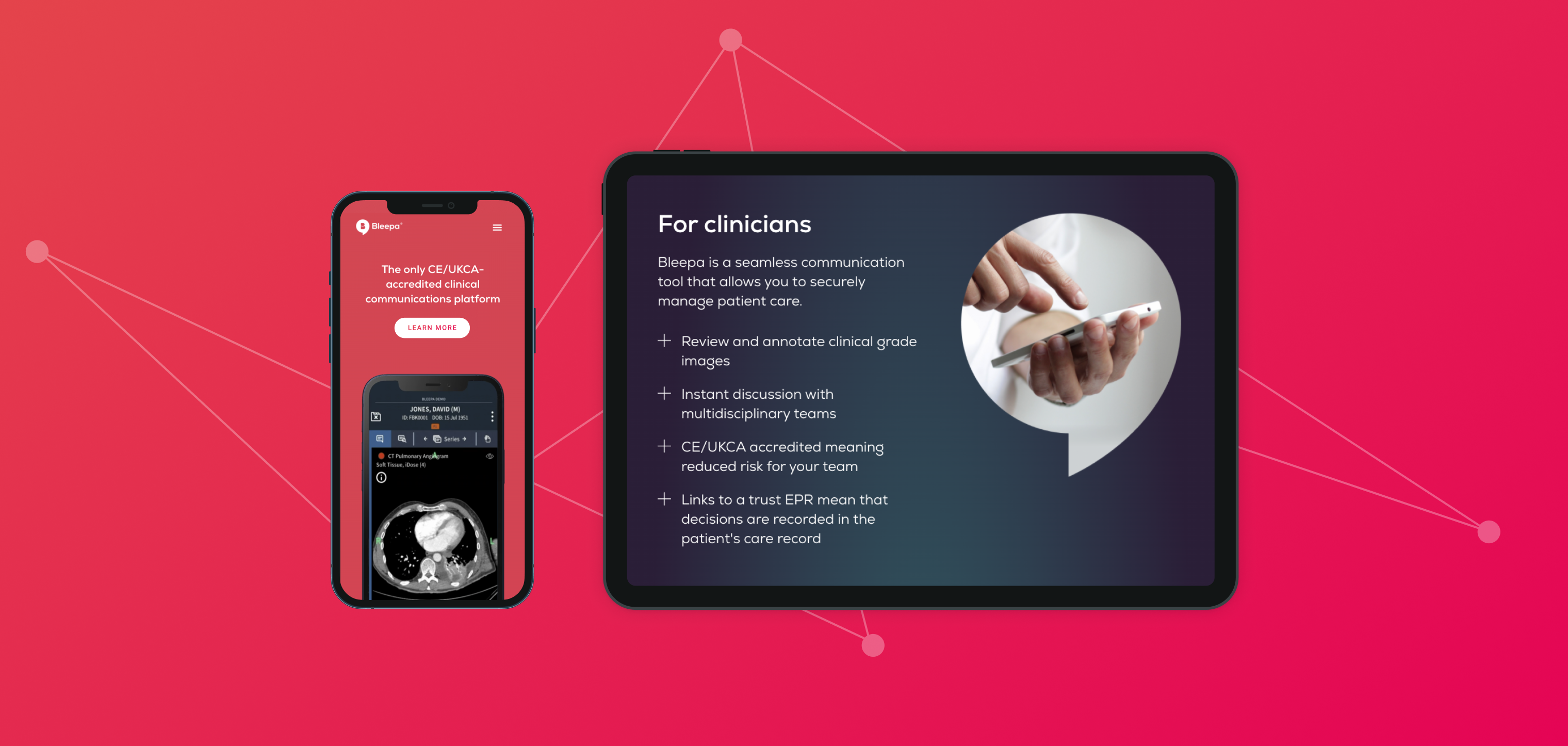
We carried out an audit of the existing site, reviewing the UI, UX and analytics to see how users were interacting with it. We defined what changes were needed, and prioritised the home page and the demo page, as these are integral to sales conversion.
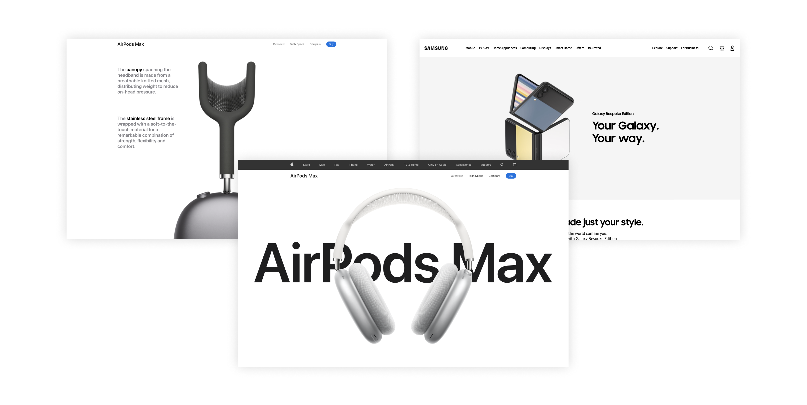
For the look and feel, rather than the traditional healthcare sector, we were inspired by strong, clean, confident consumer brands like Apple and Samsung. This would make the product feel self-assured and market leading.

Our new design has strong, clear messaging throughout with a consistent tone of voice, in line with the results of our research. The digital product and app are the focus, with a clean presentation. CTAs are streamlined, to keep the user journey clear and purposeful and funnel users to a page with a video demonstration of the product, validating the messaging. This pushes users through to the next level of the sales funnel, and conversion rates can be tracked through analytics.

A brand awareness campaign
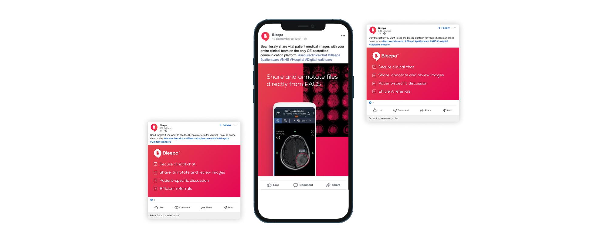
With a new website with a clear user journey and a strong presentation of the product, we could move on to driving traffic to it. We worked on an ongoing digital strategy and a number of digital and social campaigns including Facebook and LinkedIn.
The marketing campaign was consistent with the website, in visuals, messaging and tone of voice. This consistency and clarity gives authority, builds engagement, reduces bounce rates and increases ROI.
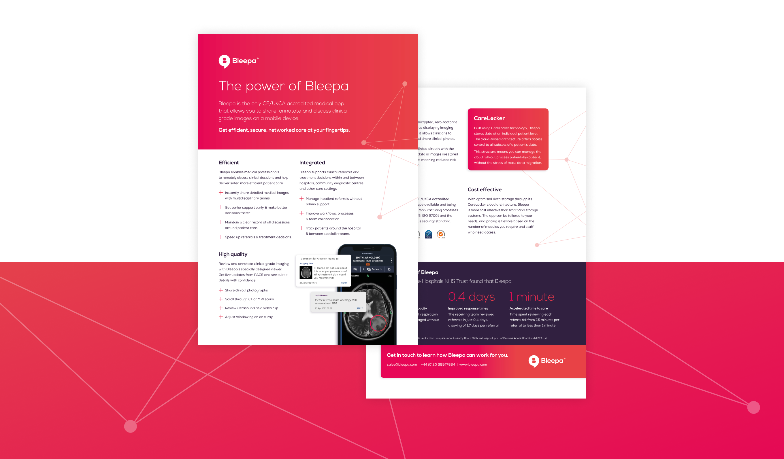
Our campaign content showed details of the app’s functions, demonstrating exactly how Bleepa benefits clinicians and medical procurement teams. One campaign included a downloadable fact sheet, creating engagement with the user while allowing the team to monitor downloads and keep users in the sales funnel.
From 2022 to 2023, website traffic and user interest in Bleepa increased by 382%.

Additional projects
We designed and built a website for Carelocker, the cloud data technology behind Bleepa. Feedback Medical was then able to take this to market as a separate product, as well as open up international opportunities, beginning with India. The website is available in English and Hindi.
Feedback Medical is also involved in supporting and delivering patient pathways for community diagnostic centres (CDCs) across England. These provide earlier diagnostic tests for millions of patients, helping to tackle the NHS’s elective care backlog. Bleepa provides the digital infrastructure that connects local care providers so that they can securely share diagnostic information and teams can communicate faster and make more informed clinical decisions. In 2021, we ran a social campaign showcasing Bleepa’s involvement in the initiative.
Outcome
Through brand strategy, content planning, website creation and ongoing creative production we have contributed to brand and business growth. We have built a collaborative relationship, supporting Bleepa’s team to improve sales, grow engagement and make Bleepa part of the conversation, and providing tools to help. Our work has helped to make Bleepa one of the leading medical communication apps on the market, with their team in a strong position for further growth and new opportunities.
The expert guidance that Studiomade has provided to help shape our digital content strategy, and test and hone our brand message with our target audiences, has been invaluable. They are a trusted extension of our marketing team, working closely with us on creative projects, driving the work forward and reflecting on successes and areas for improvement.
Marketing & Communications Lead
Feedback Medical Ltd
