Inspiring a new generation of charity fundraising experts
Crafting a new digital destination for Barnardo's Future Collective programme
Sector
Discipline
Client
Future Collective
Year
2021
The charity sector has faced incredible challenges throughout the pandemic. The events and campaigns that are invaluable to bringing in income needed to support charities and help them carry out their invaluable work were shut down while simultaneously the demand for their services rose exponentially as people from all walks of life were challeneged. Services provided by charities that provide support and connection are vital to the recovery of our communities.
This is why we were so excited to work with Barnardo’s to deliver a new website and digital presence for their Future Collectives programme. Established for 18–24-year-olds who are interested and have ambitions in forging a career in the charity sector, the programme looks to build confidence and knowledge within this user group by providing mentorship and sector education.
Conducting our research as part of this project
We were lucky enough to have access to the current cohort that were enrolled in the programme. Working alongside the Barnardo’s team we were able to undertake user research – questioning individuals on why the programme appealed to them, what they looked to achieve from it, why they signed up and more.
We discovered that by a significant margin the largest driver behind conversion and registration for the programme was actually speaking to a person from the Barnardo’s team. This human interaction had been invaluable for almost all attendees, having the benefits of the programme shared and being directly provided an understanding as to how their career could benefit from participation was a large positive.
This user research coupled with our insight and experience both from working with Barnardo’s and our UI and UX experience meant that we could build a really strong brief for the project ensuring that all these nuances were captured, resulting in the best uptake possible for the programme.
The importance of video
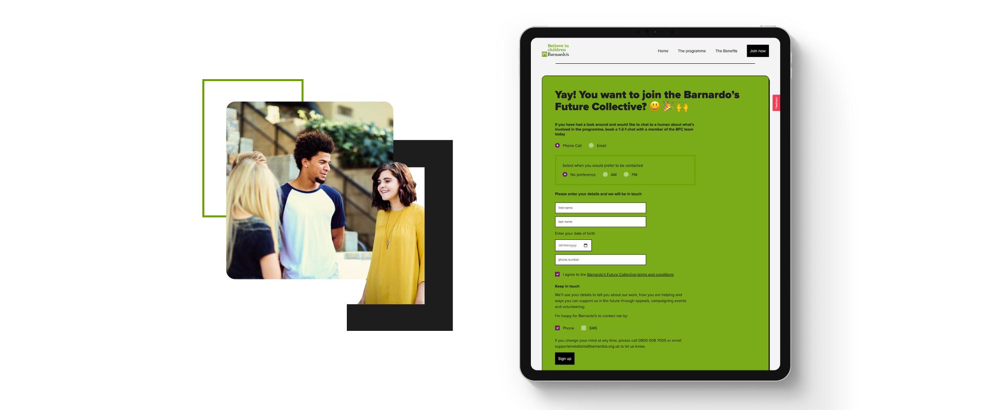
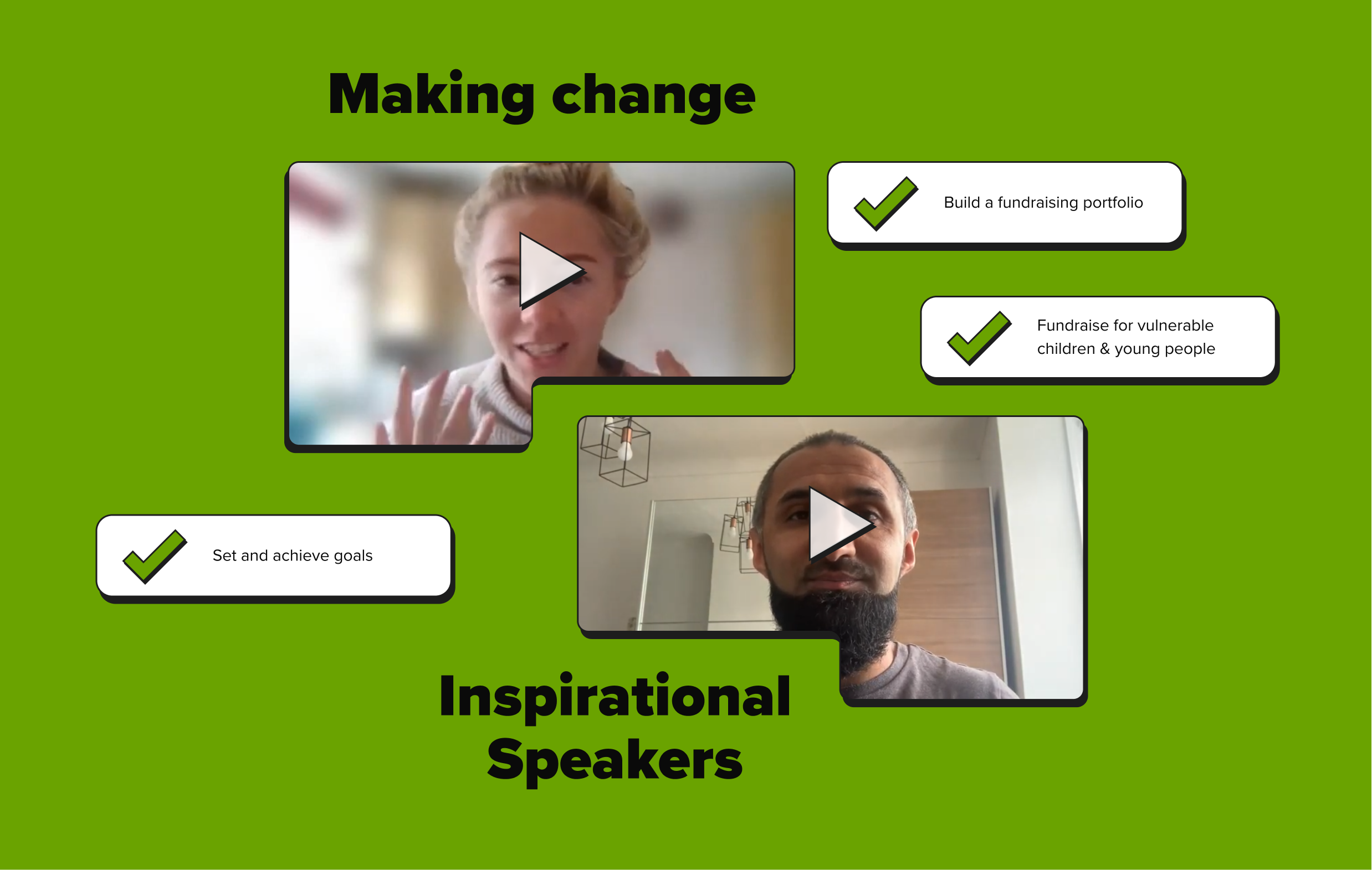
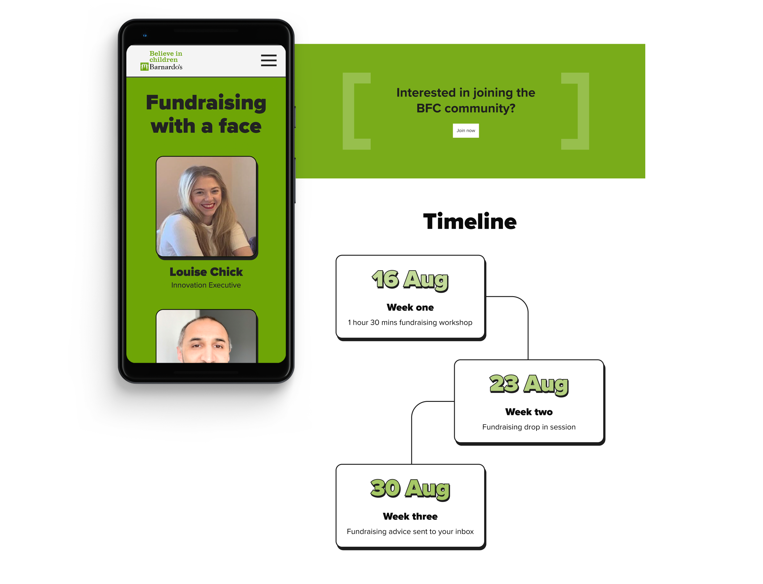
Armed with the insight that conversions to sign up were driven largely by human interaction we wanted to ensure that this was kept within the website experience. By integrating talking head videos from the team rather than reams of written content we could provide potential participants with that engaging, friendly face as well as first hand information on the details of the programme. We also opted to integrate the video content from Barnardo’s YouTube channel so that there was maximum accessibility as well as being searchable on the wider internet, making the content work harder for the brand. By directing all enquiries to a simple booking form that allowed interested users to book in a personal call or video chat with one of the team from Barnardo’s, we helped to retain that human touch and make initial engagement as easy as possible.
A creative approach unique for the programme
Barnardo’s have an extremely recognisable brand, their vibrant green synonymous with the charity since its inception. A distinct digital presence didn’t exist for the programme and so we wanted to ensure that we took the opportunity to really reflect what it stood for. As we had such a specific audience we could be tailored with our design decisions.
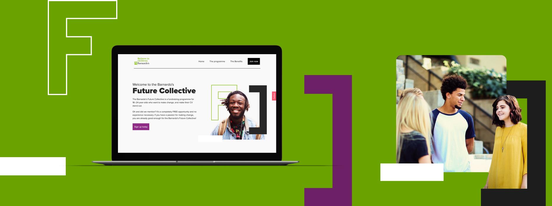
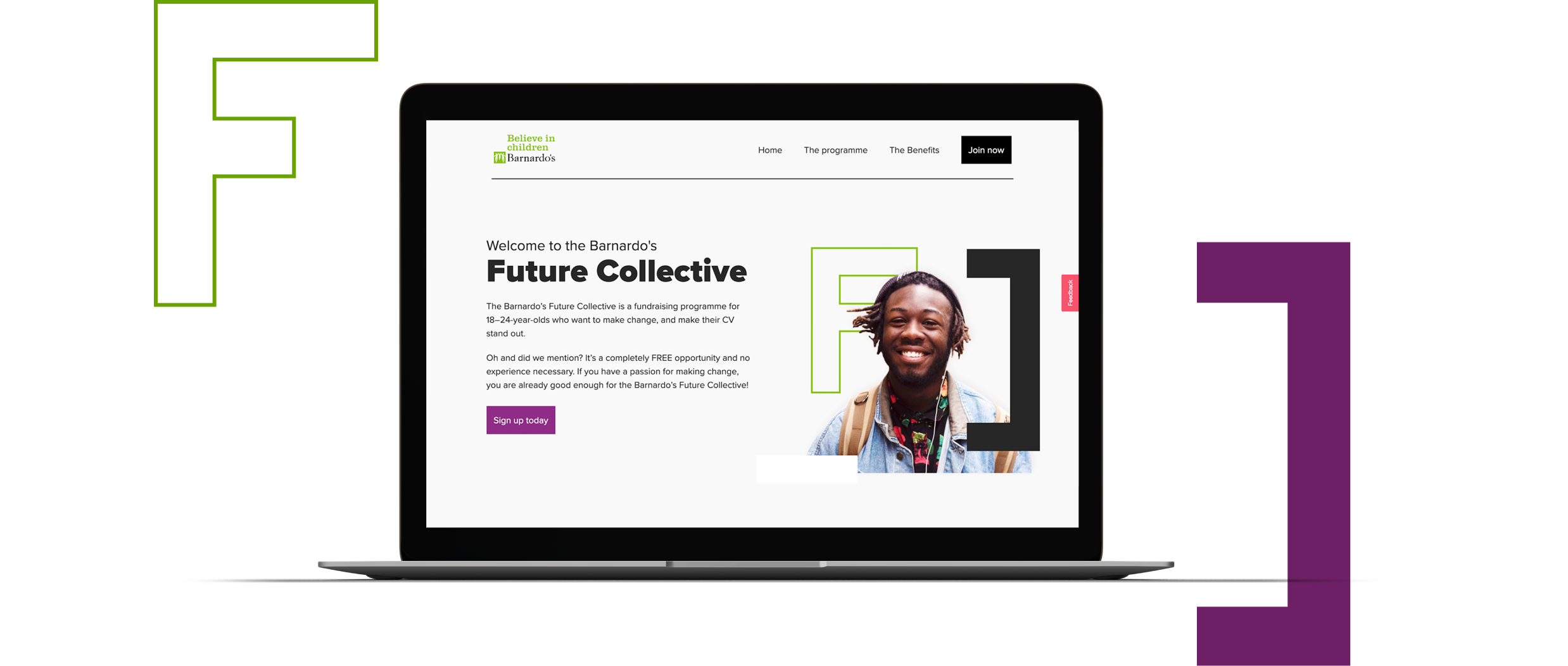
We wanted the site to feel bold and fresh and so we chose large text and big shapes with heavy strokes and 3D elements. We wanted the programme to have something recognisable that they could own and so we took the F and C, of Future Collectives enlarging them to be used as brackets, framing photography and important information such as call-to-actions. We brought these to life throughout the site with animation and replicated this across social elements that we built to be shared following launch.
