Rooted in family, built for impact
Creating a brand for International Needs UK that reflects care, connection and a global sense of belonging
Sector
Discipline
Client
International Needs
Relevant links
Year
2016
An international charity
International Needs have supported children across the world through sponsorship for the past 40 years. They also provide aid to communities through projects that address their fundamental needs such as improving access to clean water, schooling, medical care and improved livelihoods for the reduction of suffering for people in need all over the world.
Brand positioning
The charity’s main challenge has been how to define the way they provide aid, to specifically target supporters with their use of messaging over such a wide landscape.
We needed to create a new brand for International Needs:
With a revised visual style
Consistent brand communications
With brand positioning that empowers their team and members
Alongside messaging that better structures what the charity does
Family focus
We worked closely with the charity through a series of workshops to develop a new defining perspective to tell the story of their work: helping communities, children and people in need through the supportive idea of a family. This took the focus away from traditional child sponsorship and better described the wider scope to the great work that the charity undertakes. It also helps educate a wider audience to what the ‘makeup’ of a family truly is. For many people connected to International Needs a family changes through disease or famine; for example a sister, brother, aunt or uncle may take on the role of becoming a key parent within the family model. This naturally has its own challenges, and we wanted to ensure that through the brand’s communications, audiences heard the International Needs story whilst keeping in mind the importance of family, and the need for a firm foundation and basic access to resources which should always remain the same.
Families:
are a supporting block of any community
mean putting sharing first
come in surprising combinations
create stability
are a place of care for life
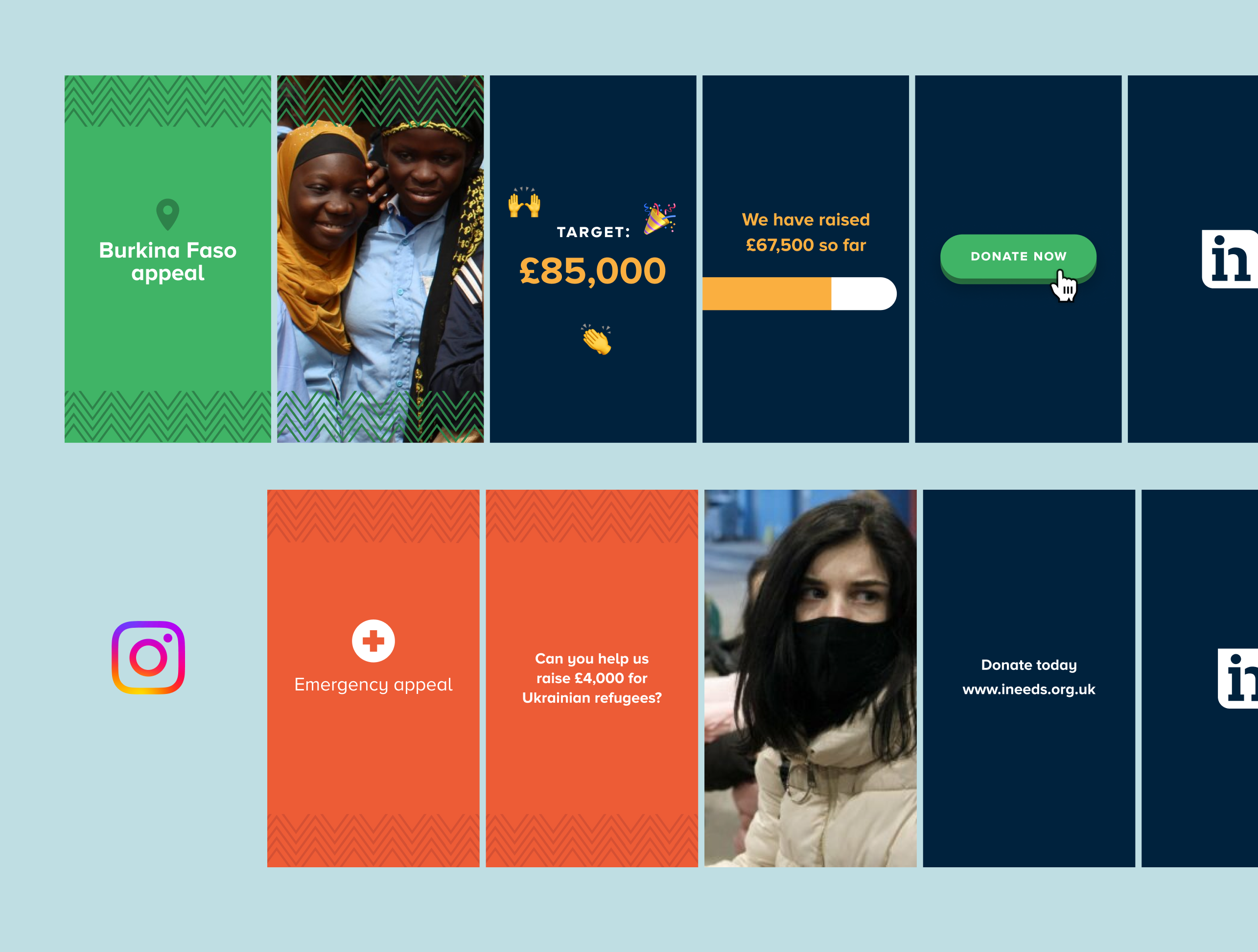
The International Needs supporters pack
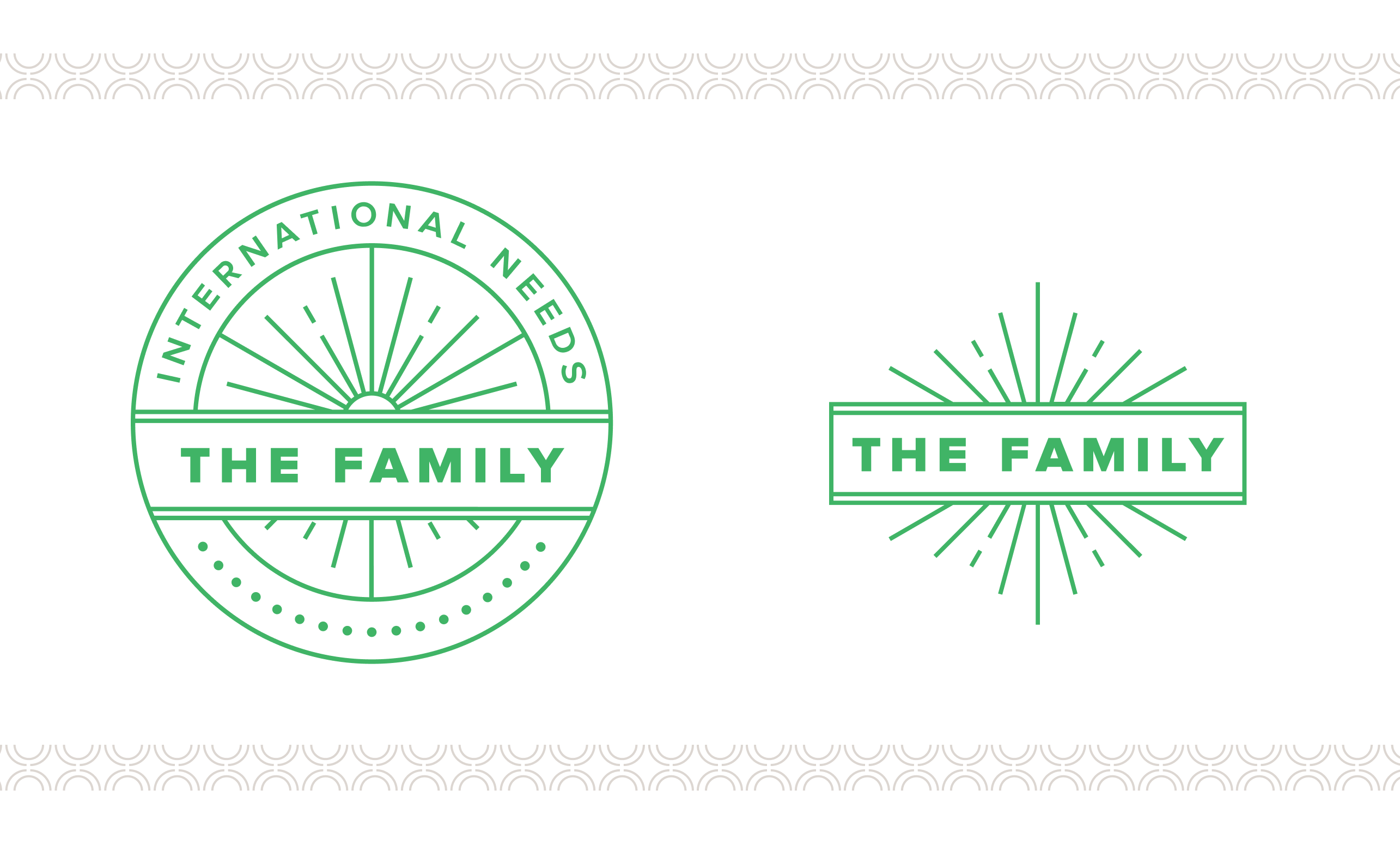
As part of this initiative we wanted to engage with existing donors and transition towards the notion of a the family focus, employing the use of The Family logomark which we created to help empower current and new donators with a ‘sense of belonging’ to both a collective but also to the vision and values of the charity. Being part of ‘The Family’ aids the promotion of the vision, and also that of membership and donation both inside and outside of International Needs.
Areas of engagement
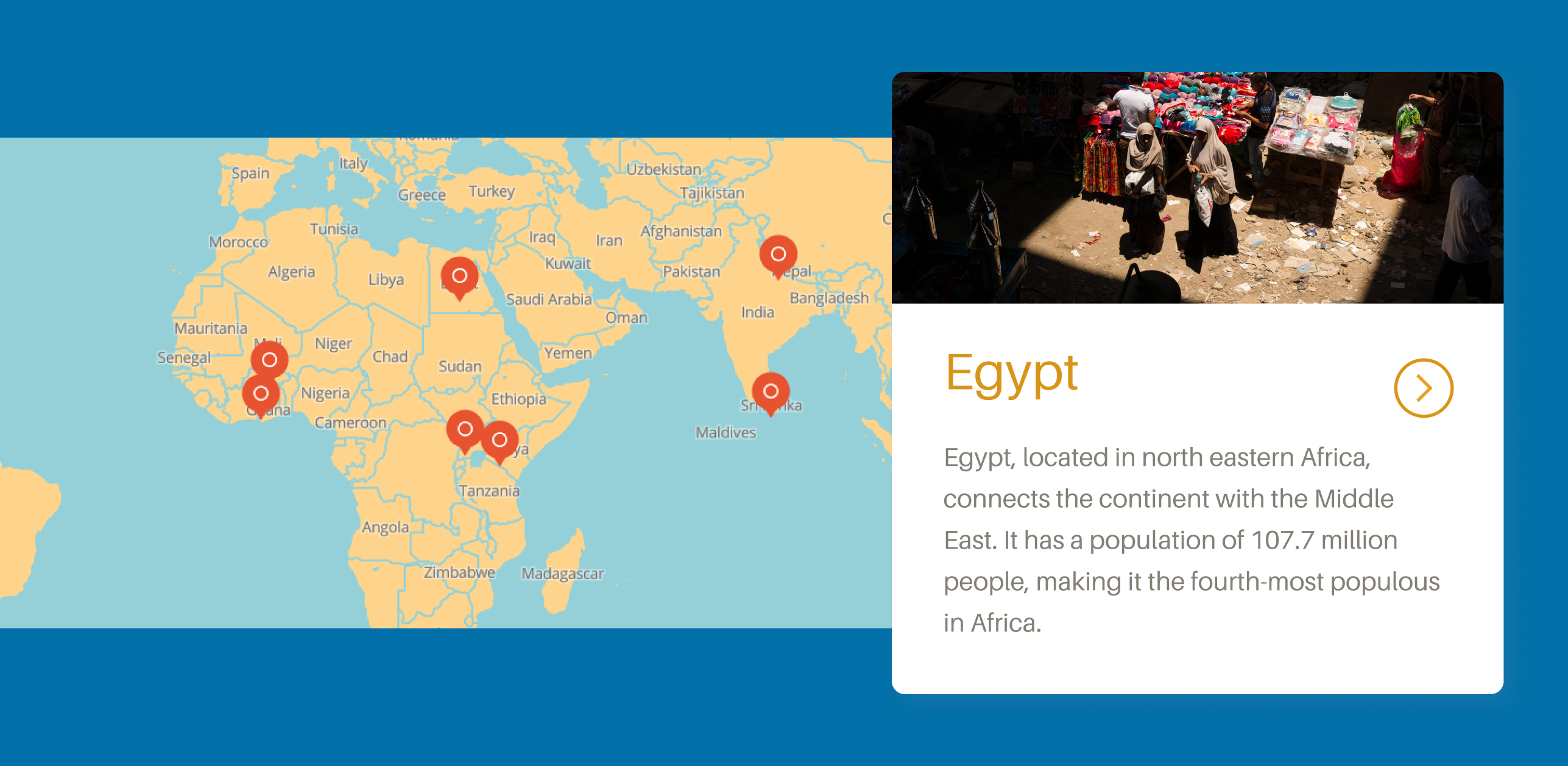
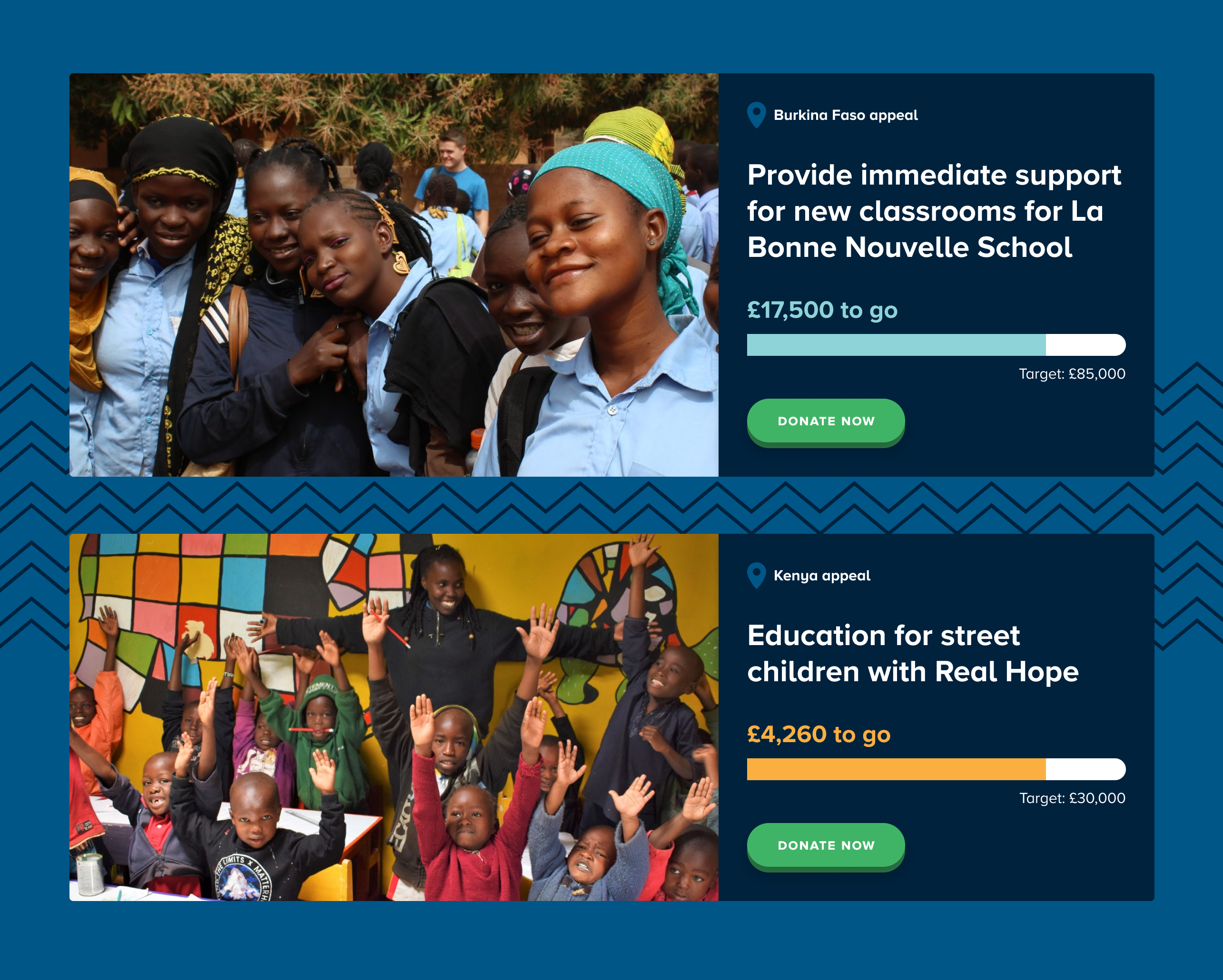
Donations are focused into six areas which cover project types. This allows for flexibility for the charity to enable them to improve the impact of where they invest and also give donors a concrete idea of how they can help improve lives.
The six areas also serve to organise the world map of areas you can support on the Projects page of the website.
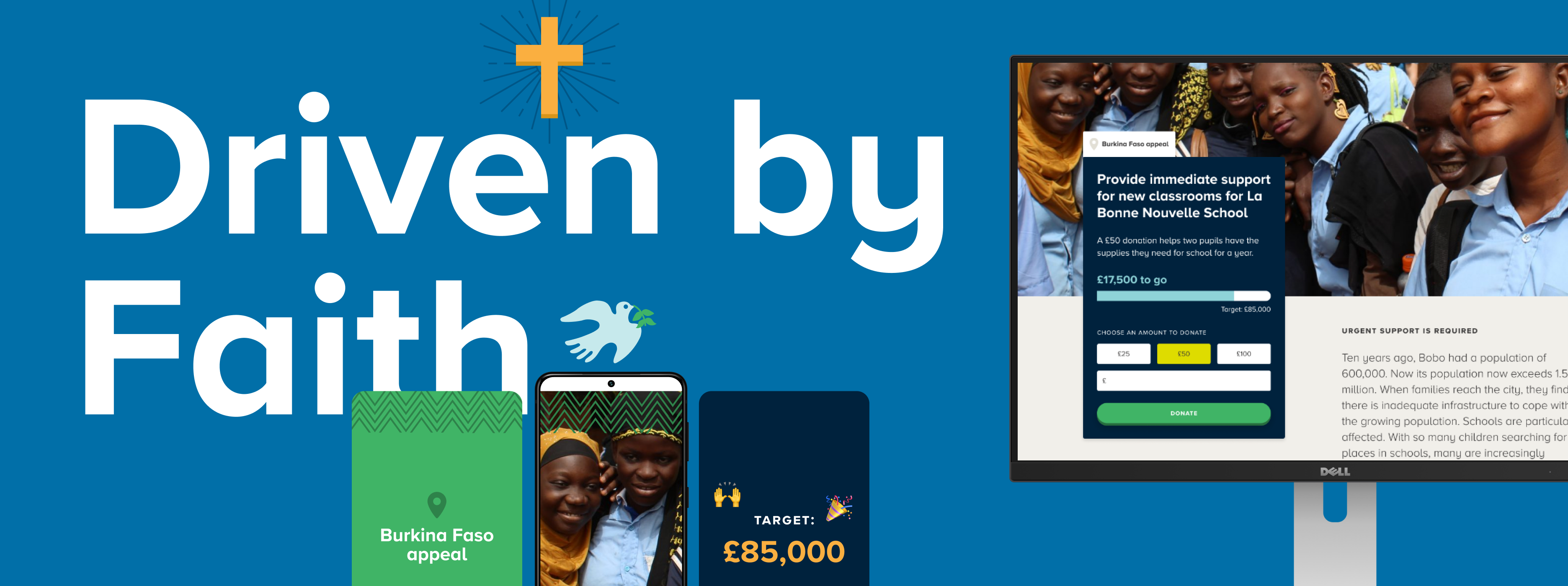
Building a brand
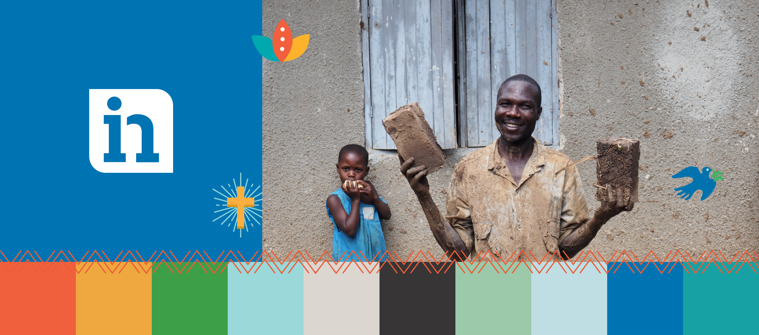
The brand fits the charity’s fresh focus with a refined logo and better targeted strapline, energetic positive imagery, an earthy bright colour palette and a handmade illustration style which forms a major part of the identity. There is a pattern and colour to identify each of the countries where International Needs work. The Family mark is used in relation to donation activities and ties together creating a sense of belonging towards the charity. Both print and web materials encourage an accessible feeling.
Results
Our work with International Needs has helped craft and position a brand identity that connects to a growing audience and donation-base. Integrating their digital presence into backroom administration functionality has helped business process, whilst the site itself (built by our team with a concise and bespoke Content Management System) allows consistent and wide-reaching messaging and charity activity to be better communicated with both existing members and the wider public.