Creating a campaign for B2B and B2C automotive audiences
Showcasing the new colours and technology for Nissan’s EV's in a dynamic video
Sector
Discipline
Client
Nissan Ariya
Relevant links
Year
2021
Helping launch a new electric car to market
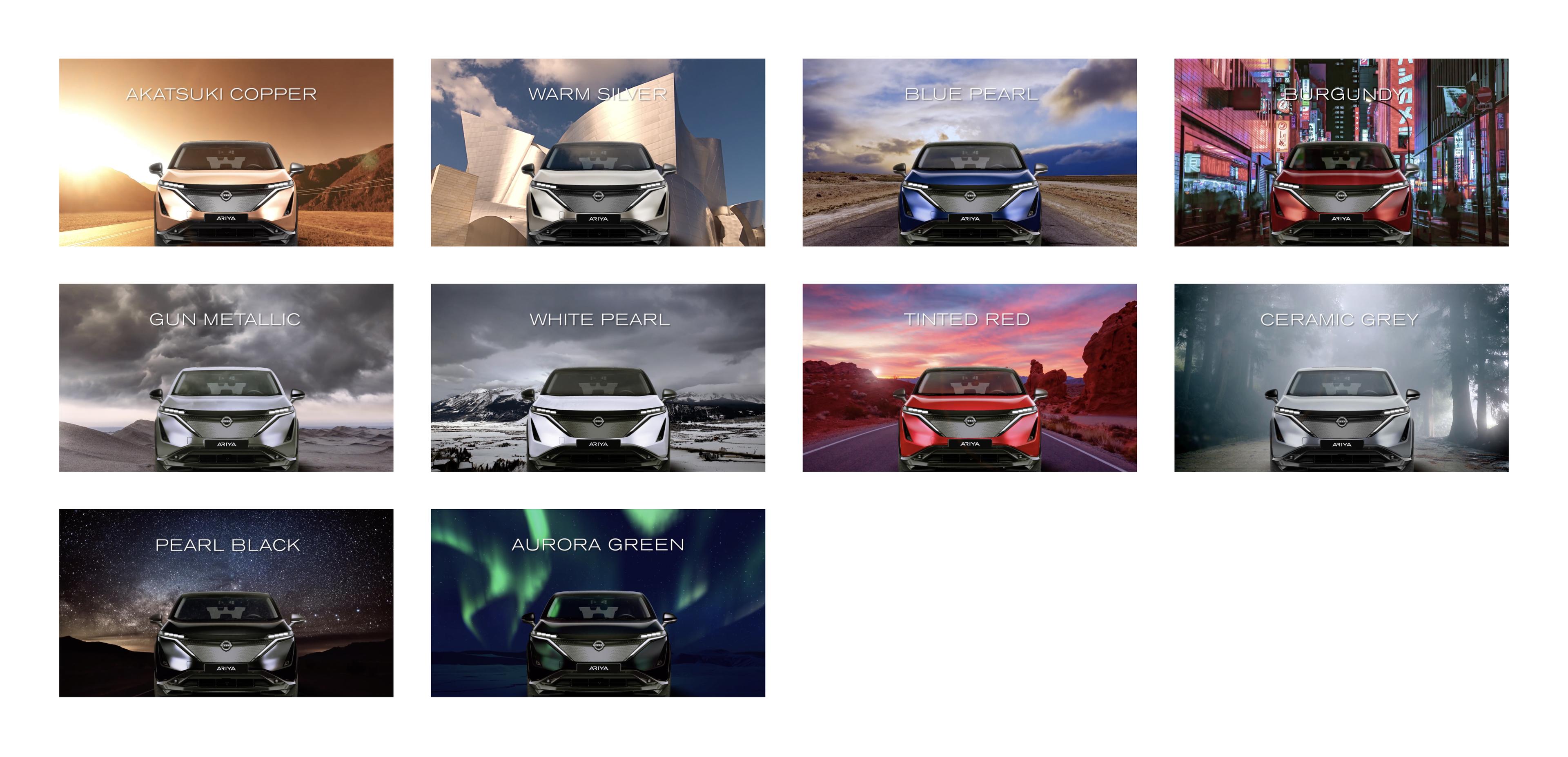
How would you go about creating an entirely new colour for an entirely new vehicle? It’s almost impossible to imagine, isn’t it? This was the brief for the designers working on the aesthetics of the new all-electric Nissan Ariya – resulting in the creation of two exclusive hues never seen before on Nissan’s lineup.
Nissan and their communications agency Edelman wanted to celebrate these colours in some form for their European markets as well as trade media. Our challenge was how to communicate the Ariya’s colour range in an innovative way that picked up on all the nuances and technology that had gone into making them. A concept that invoked the wild and wonderful colour palettes found in nature and that had inspired so much of what was developed; from vibrant neons of Tokyo, to the incredible green of the Aurora, we wanted to evoke the sense of excitement and awe that were behind colour combo.
Crafting an inspiring visual experience
We decided an animated video was the best way to generate the dynamism and excitement that we needed for viewers. We utilised each of the colours and paired it with a piece of the material world to enhance the beauty in the colour. We paired this with a dynamic flip transition where everything was reversed from one colour to the next.
Ideally, when creating a piece of animation such as this, we would have 3D renders of the vehicle however in this case we only had static elements to work with and so in order to ensure a sense of realism we played with the light and matched the reflections of the surrounding environment across the front of the car.
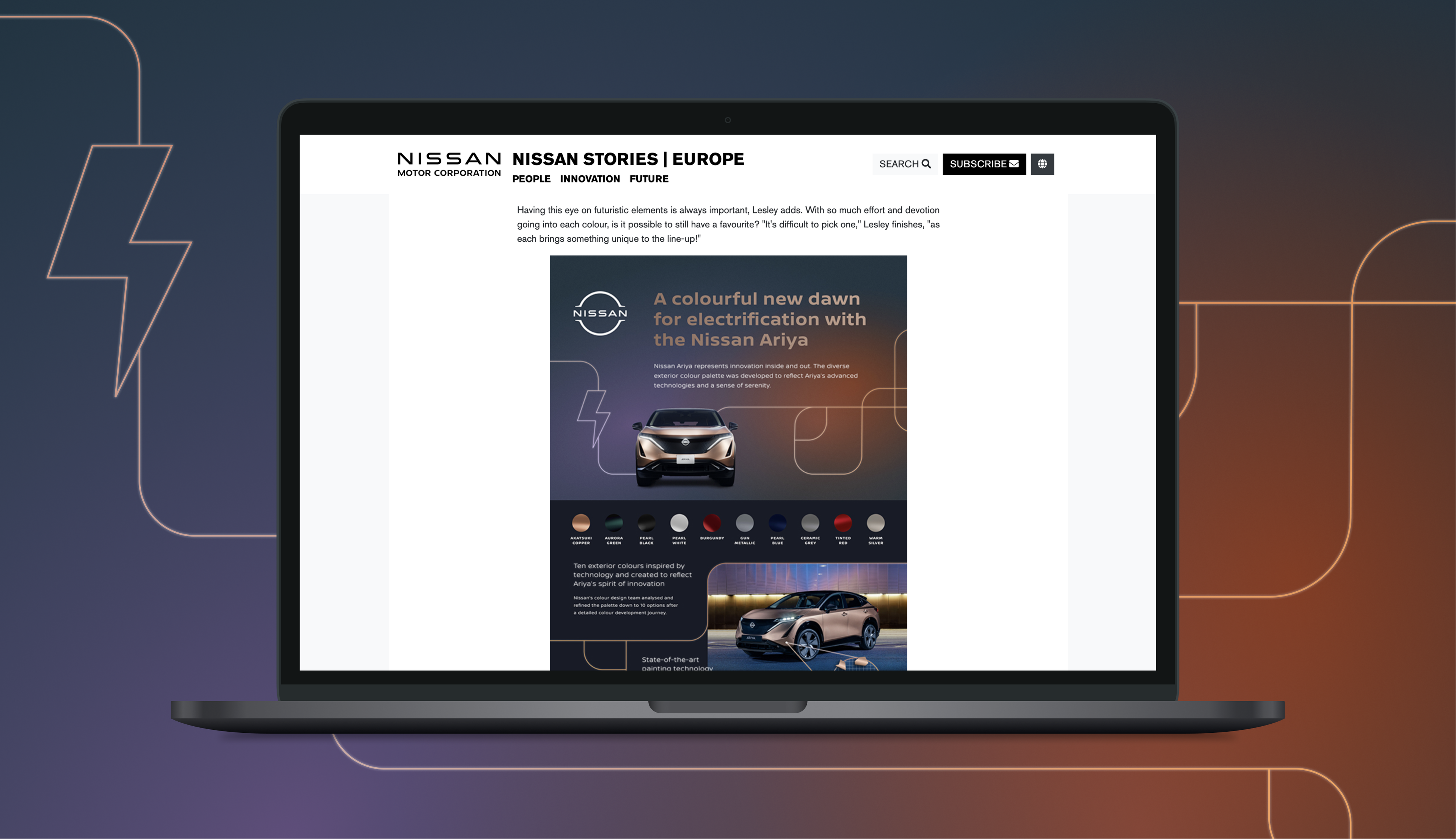
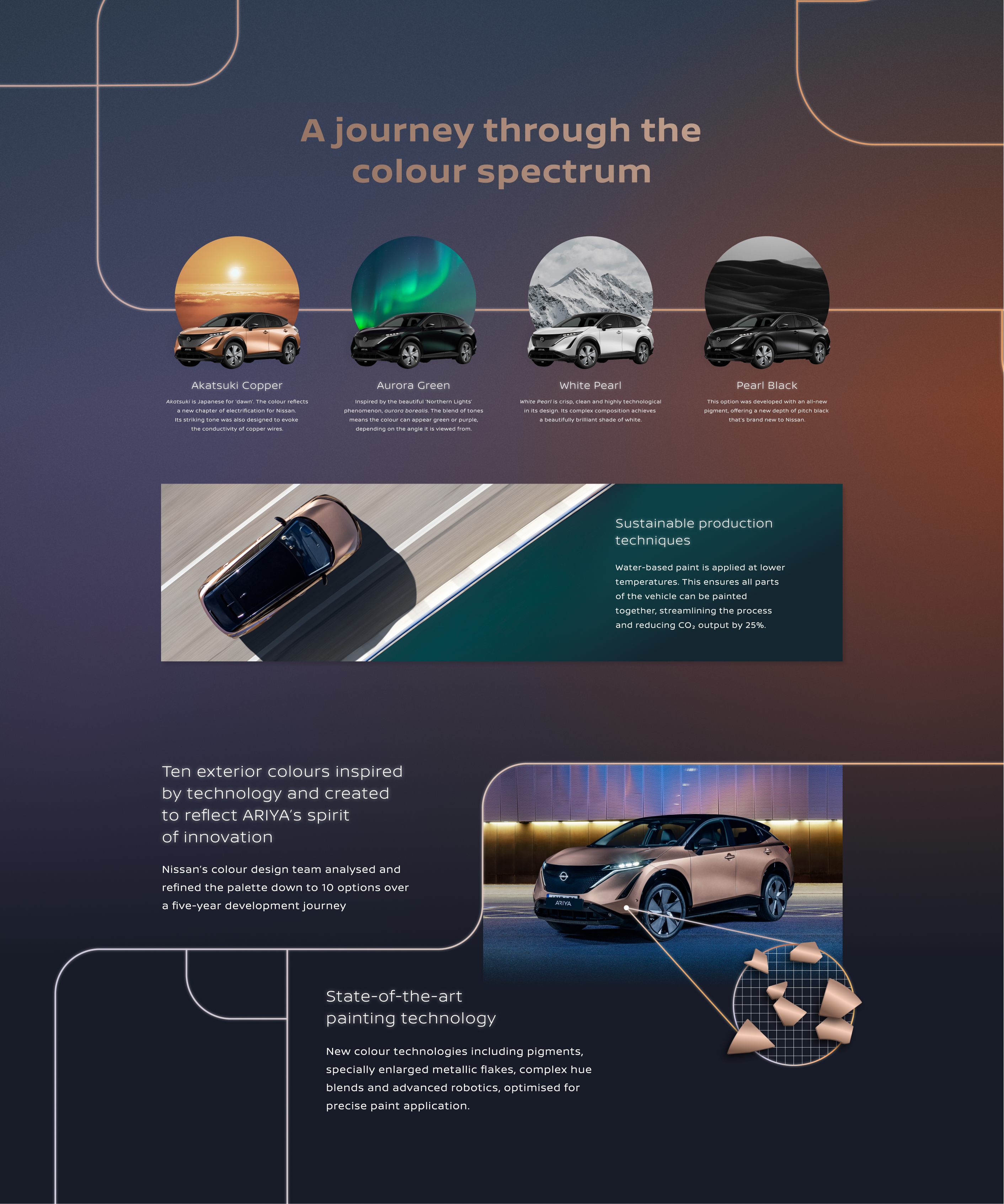
Accompanying materials
Nissan also wanted a piece of supporting literature that could really sell the elements from within the story, giving it a bit more detail and depth. To support this, we created an accompanying pdf download aimed primarily at media partners. This still maintained the sense of design dynamism and excitement, using gradients and metallic colours. We also wanted to touch on the fact that the vehicle was electric and so used linear strokes to represent cords and power flow. We also used a really condensed length so that it was quick to read and could easily be embedded in any form of online media such as the Nissan stories page.