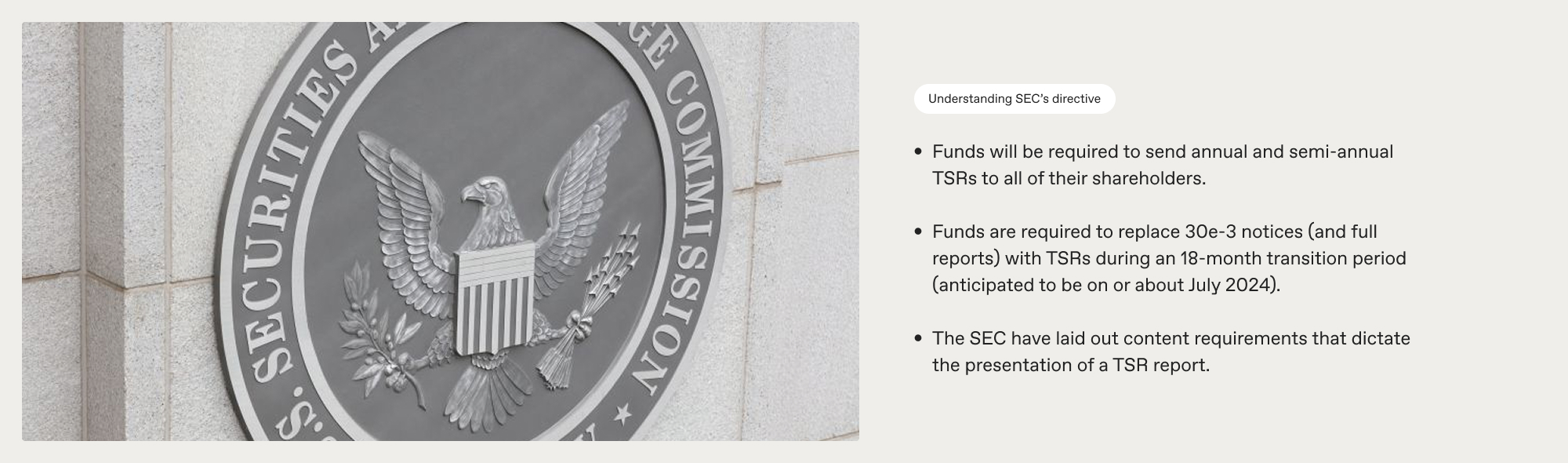
Shareholder reports are among the most important documents that investors receive. Until 2022, they were also among the longest and the hardest to decipher. In January 2023, the US Securities and Exchange Commission brought in amendments to modernise these reports.
SEC Chair Gary Gensler, announcing the change, said: “Shareholder reports are amongst the most important documents that fund investors receive. These reports, however, often are more than 100 pages in length. As a result, a retail investor looking to understand the performance, fees and other operations of a mutual fund or exchange-traded fund may need to sift through extensive financial information. Today’s final rules will require fund companies to share a concise set of materials that get to the heart of the matter.
“Further, today’s final rules are designed to promote transparent and balanced presentations of fees and expenses in investment company advertisements.
“The rule amendments will require funds to provide concise, tailored shareholder reports that highlight key information, such as fund expenses, performance, and portfolio holdings. The instructions for the revamped reports will encourage the use of graphic and text features to make them more effective.”
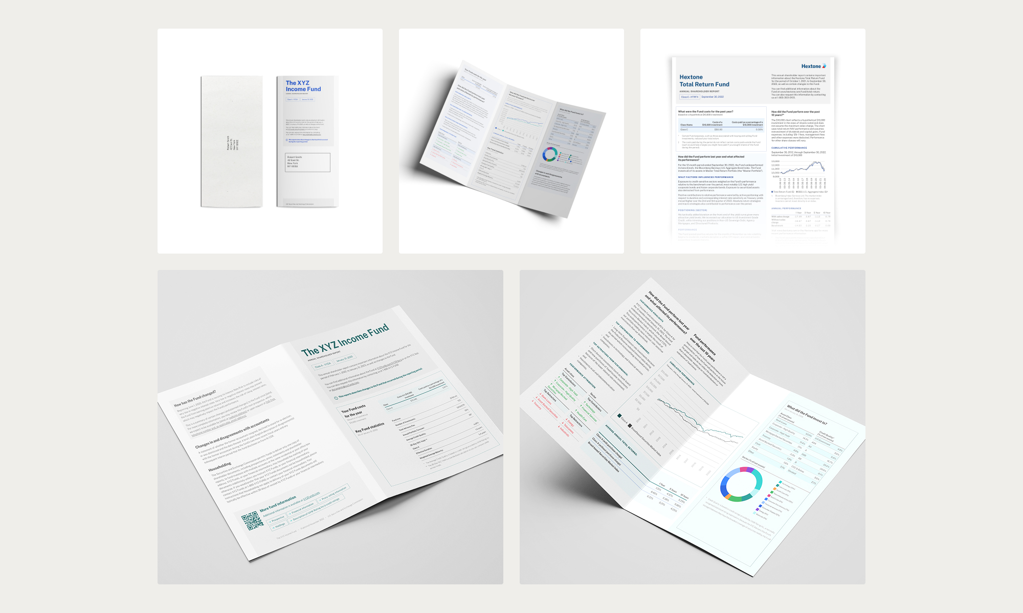
Adopting change directives and coming up with unique design solutions is something we deal with all the time at Studiomade. In this case, for Broadridge’s Tailored Shareholder Report (TSR), it took the form of information design and data visualisation. Our design had to give a refined experience for the reader as well as meeting all the SEC’s requirements.
What we did
Define the content
We had to cater to every eventuality so that our design met all requirements, particularly in this situation, where the detail of the document has legal implications and real-world application may have unique use cases. We had to design to a worst-case scenario, where the longest title, shortest chart and every type of source detail could be included within a TSR structure, with a templated approach that would work well every time.
A clear, concise structure
We needed a systematic reading flow. In a report like this, shareholders want to see at-a-glance top-line information as well as a deep dive into the data. Our team plotted all the content components so that we could present and prioritise them in the best way, with a design that leads the eye through an appropriate hierarchy of information and doesn’t frustrate the user by hiding details that they need to easily see.
This is a good stage to work with test audiences. Qualitative research informs our design decisions and helps us understand users’ needs and frustrations. We were able to check that in meeting the SEC guidance we hadn’t lost sight of the users’ requirements and their reading experience.
Typography and colour
With all the information defined, we built a design system that would work across a suite of communications, meeting accessibility guidelines and best practice.
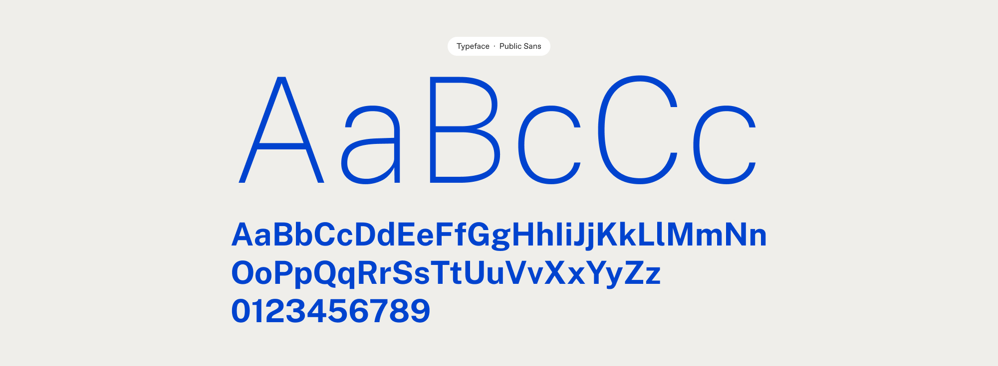
Intelligent use of typography is of primary importance with copy heavy publications. We created a strong and consistent style and hierarchy across heading styles, subheadings, tables and body text. Consistency creates familiarity for the reader, so that they instinctively understand the flow and pattern of a document and the eye quickly recognises the purpose of a content element.
The role of colour also has a large part, particularly when communications are co-branded. We built a wide-ranging colour palette that can expand and flex as required.
We also used iconography to help signpost users to key information quickly. The structural planning work that we carried out earlier in the process was particularly valuable here, so that high-priority information could be given an icon or signifier to draw attention to it.
Testing and delivery
Designs are interpreted slightly differently by every user so this was another good point to test on an audience. Working with systems such as usertesting.com we sense-checked our choices, iterating on our work to make improvements and create a design that’s both engaging and functional.
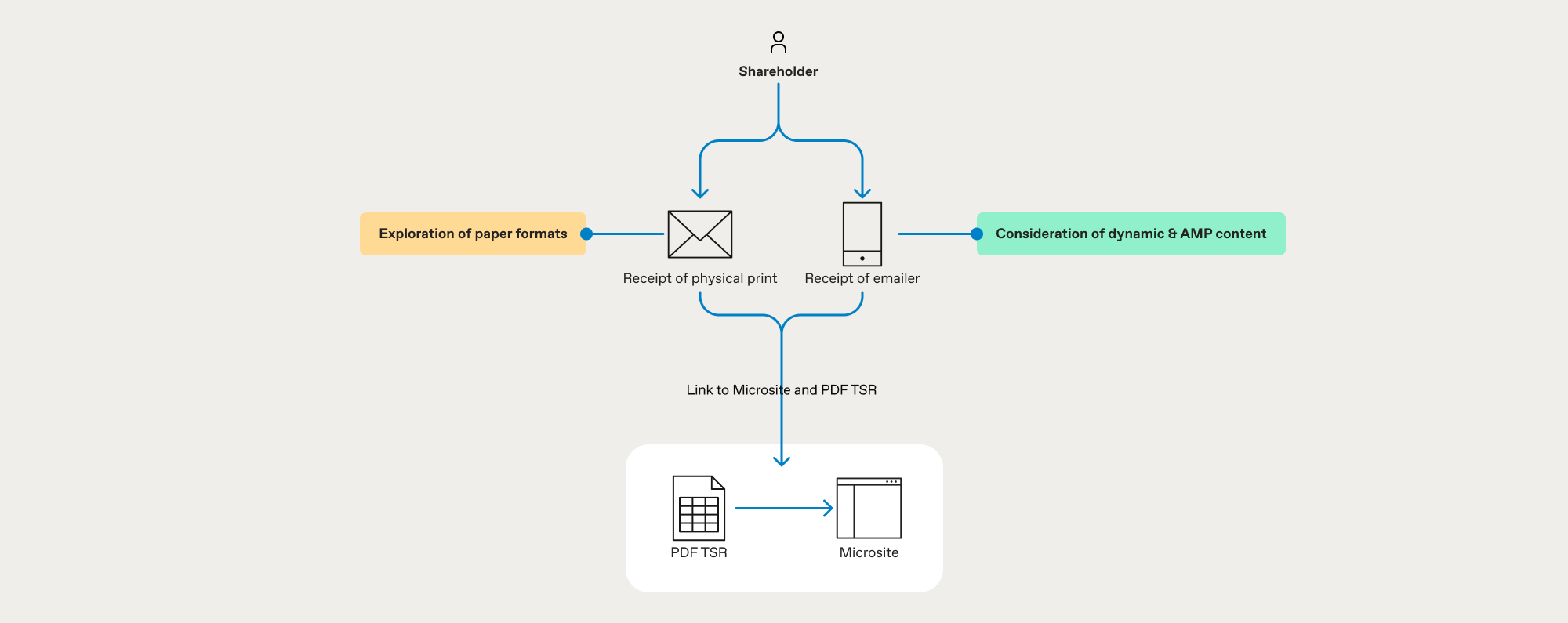
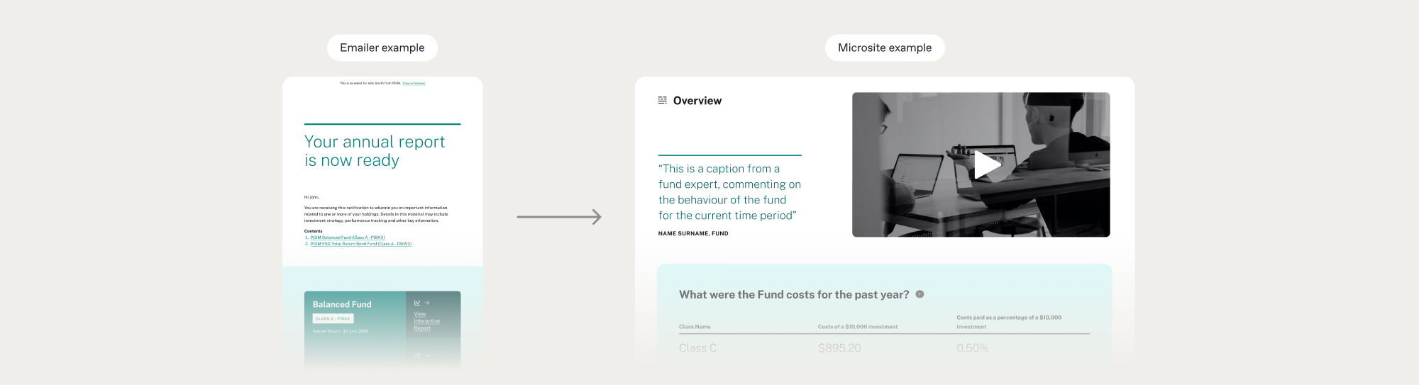
Another change in the SEC regulation was to make the process greener. Printing and sending hundreds of reports and thousands of pages to shareholders isn’t the most environmentally friendly method. Our solution altered this approach with a digital experience, designing a microsite to house the multiple reports needed by investors with multiple share classes.
This was a key part of our process review, providing efficiencies to scale and doing less harm to the environment.
The outcome
We created a tailored shareholder report that contains all the condensed, legally required information, plus a microsite housing reports for individuals and investors with multiple share classes. Investors can now quickly find essential information, both top-line and deep dive, without ploughing through a report that’s hundreds of pages long. Broadridge can be confident that it is providing investors with what they need as well as being compliant with the new SEC regulations.
Are you a fund brand or broker?
If you’re looking to tackle the SEC challenge and refine how you communicate with investors, let’s talk. Our team integrates directly with yours, supporting you with the changes you need to make. Talk to us today about how we can partner with you.
For people with opioid dependence, being on the correct (optimal) dose of methadone and buprenorphine is an important factor in treatment efficacy. Underdosing Opioid Agonist Therapy (OAT) leaves people at risk of use and overdose. But many people receiving OAT have poor understanding of how treatment works, including issues relating to dose and effect, and this limits the efficacy of treatment.
To help patients get the most out of their treatment they need a clear understanding of how treatment works, the benefit of higher dosing and, most importantly, what the right dose is for them – rather than being tied to a magic number or focusing on the fact that higher doses will result in a longer period of dose reduction to abstain. SODA helps patients identify for themselves, through a simple questionnaire, what the right (optimal) dose is for them.
Being on the right dose is crucial. The right dose for you will be different to someone else. It’s not a magic number. SODA provides that crucial support to inform individuals and help make positive change.
The optimal dose is the one that leaves people free from withdrawal between doses (preferably for at least 28 hours), so for people on supervised dosing, getting it doesn’t become a preoccupation or cause of distress if other activities need to be attended to or they’re unable to pick their dose up at their usual time. This can reduce craving, cessation or provide a significant reduction in regular on-top use and does not cause sedation.
SODA has been developed in conjunction with user organisations and treatment service providers as well as focus group tested with a number of patients with Professor Adam Winstock.
Digital product design
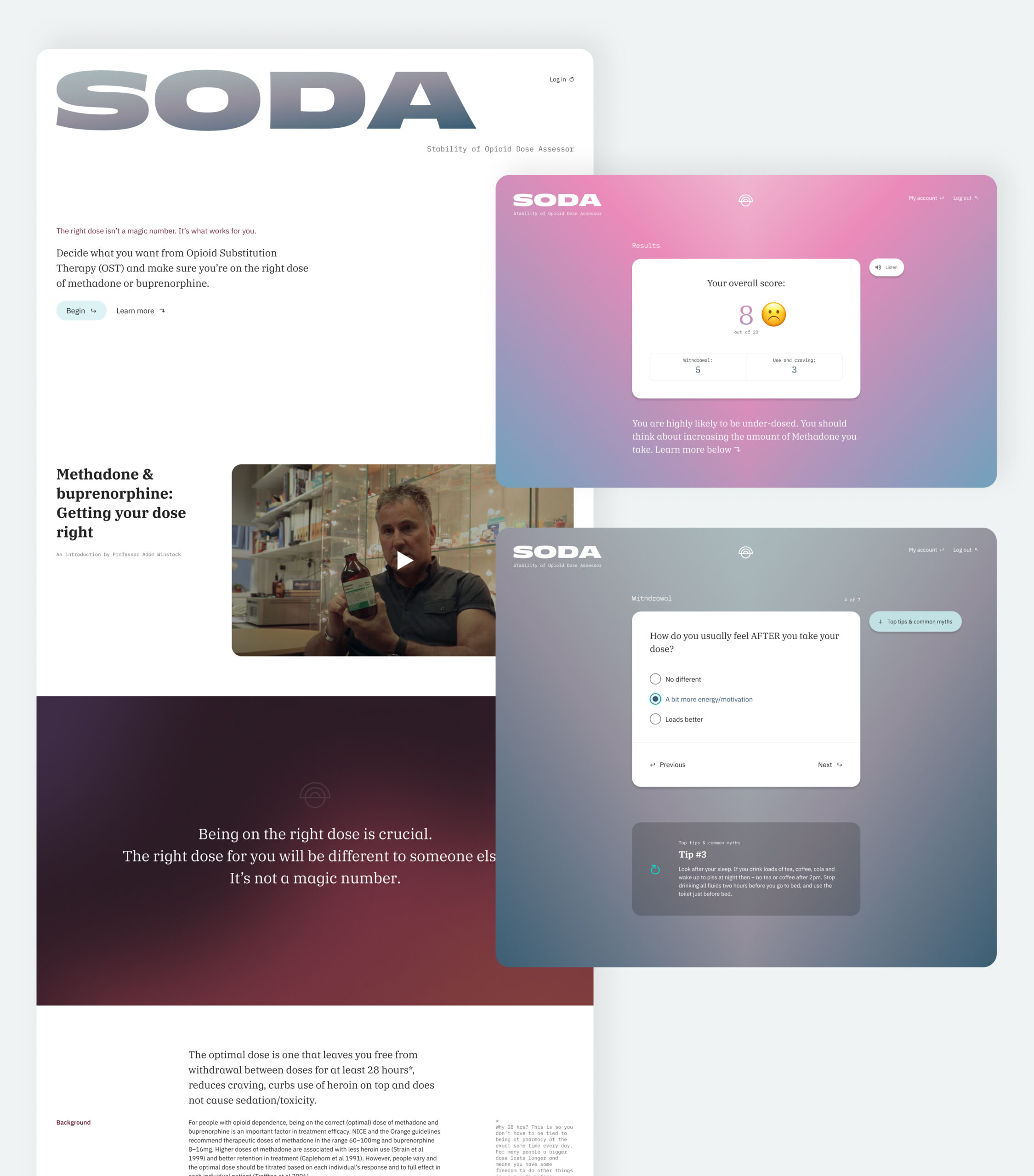
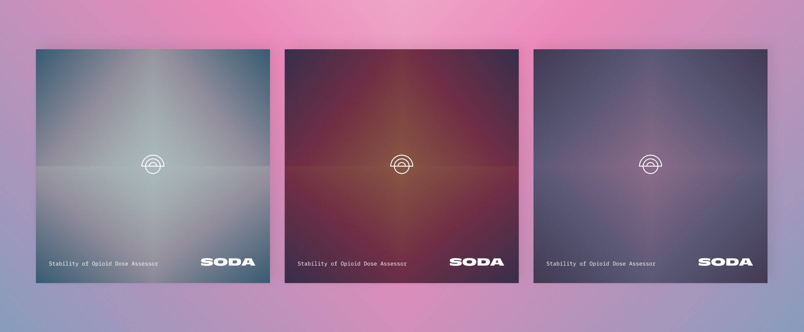
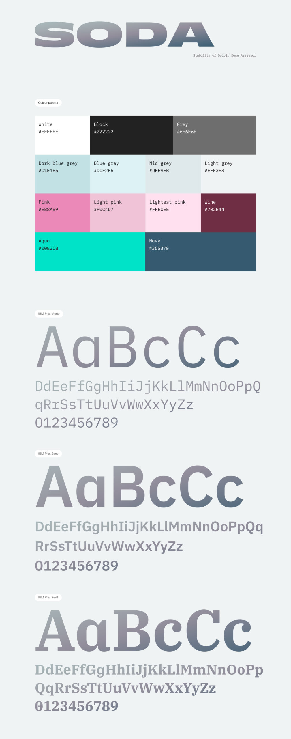
We wanted to build an accessible product design framework that wouldn’t intimidate or frustrate audiences. At the same time it needed to be clear and concise, to underpin the clinical topic that it was addressing. We implemented a soft colour palette of gradients alongside a clinical and accessible font choice that alludes to the pharmaceutical nature of the product. We used emojis in the results table to help remove any potential stigma from the tone of wording and hopefully provide comfort to people seeking out further assistance.
Database architecture
We had to build a robust database architecture to underpin the product. It would need to scale to handle an exponential amount of data with anonymous users potentially using a randomly generated login based on an ID generated within the app. We had to develop this to produce results quickly and be scalable. We adopted a React framework combined with a Google Firebase realtime database. This was prototyped and user tested through all phases of product development, right up to its release.
Creating a healthcare product?
We assist entrepreneurs and business taking new digital products to market. This can involve initial concept planning, commercial and investment conversations, and brand positioning alongside the scoping and design of the product itself. We achieve this through workshops, design sprints, conceptual storyboarding, user testing and prototype testing. Speak to our team about how we can support you.
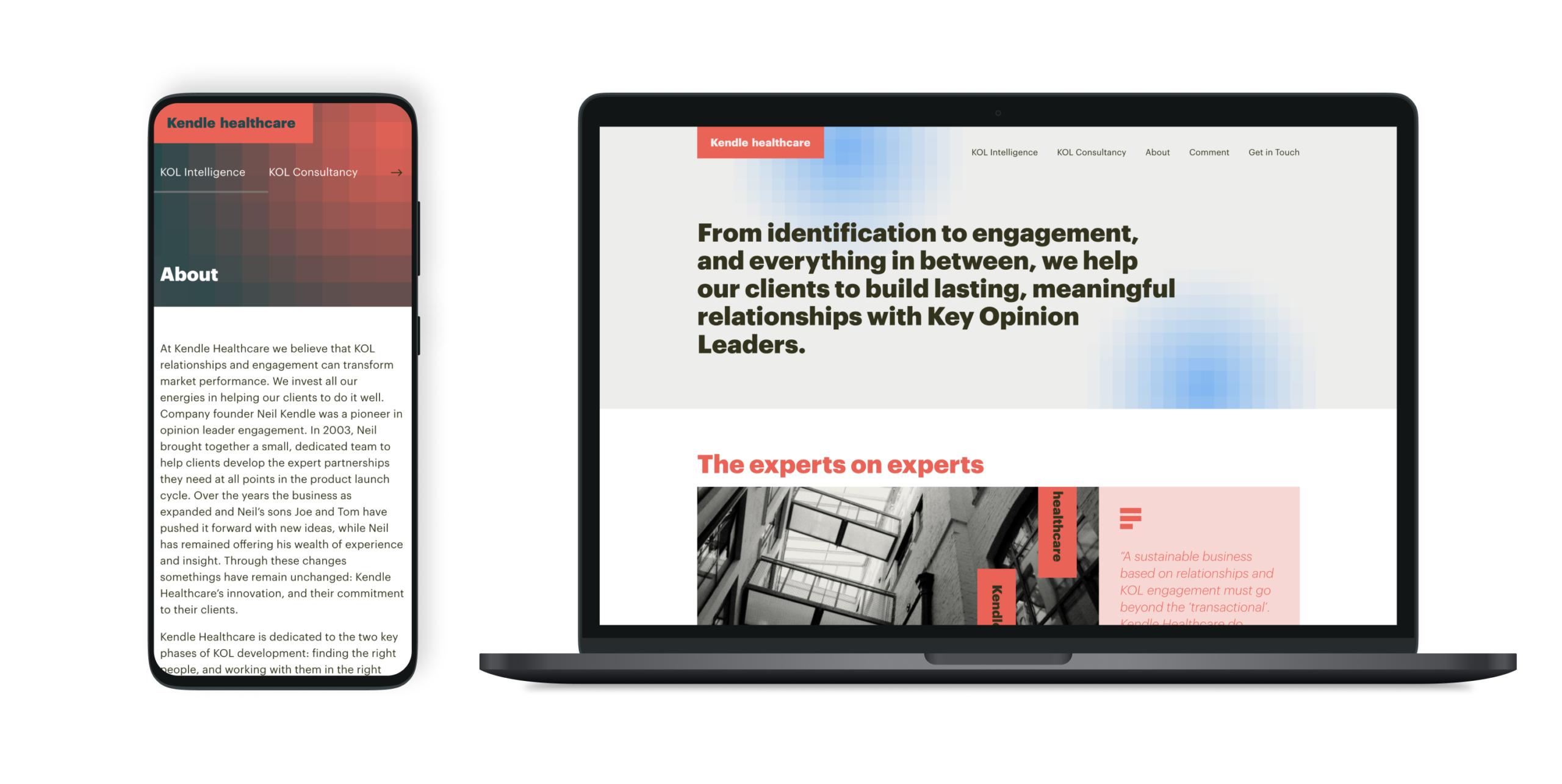
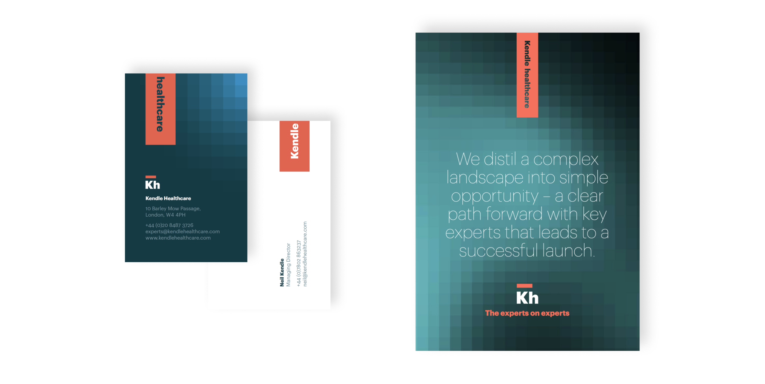
A bold new identity that worked across print and digital and would position them as leaders in the marketplace. The new brand was modern and fresh while giving them the appropriate authority to work in more formal spaces with key opinion leaders – integral to their business.


Healthcare UK is a longstanding client who we’ve worked with across a number of projects. Life Sciences Innovators (LSI) was a new initiative, to select and then showcase 50 innovative companies working at the cutting edge of life sciences in the UK. There were six defined categories, across medical technology, therapeutics, drug delivery, digital solutions, diagnostics and precision medicine plus other UK specialisms.
The showcase is sponsored by the Department for Business and Trade (DBT), helping overseas companies set up and invest in the UK and assisting UK companies to succeed in global trade.
The client wanted a visual style that would be distinctive yet sit under the UK’s GREAT branding. Our team supported with the design and production of all materials needed to launch the initiative, as well as grow it each year from a social perspective.
We delivered a website, overview video, printed elements, social posts and a toolkit that could be shared with campaign winners to access assets that they could use for their own promotion.
Innovation badges
One of the most important parts of the design was creating the badge for the initiative and the badges that the winners would receive for each category. We worked closely with the GREAT brand team, so that we were aligned to their guidelines while still providing a distinct look and feel for LSI.
Bringing the initiative to life through video
We made a short video to be used in presentations and promotion for LSI, and to get better engagement on social media. The video is a quick, engaging way to communicate key information and sits on the website as a project overview.
A digital experience
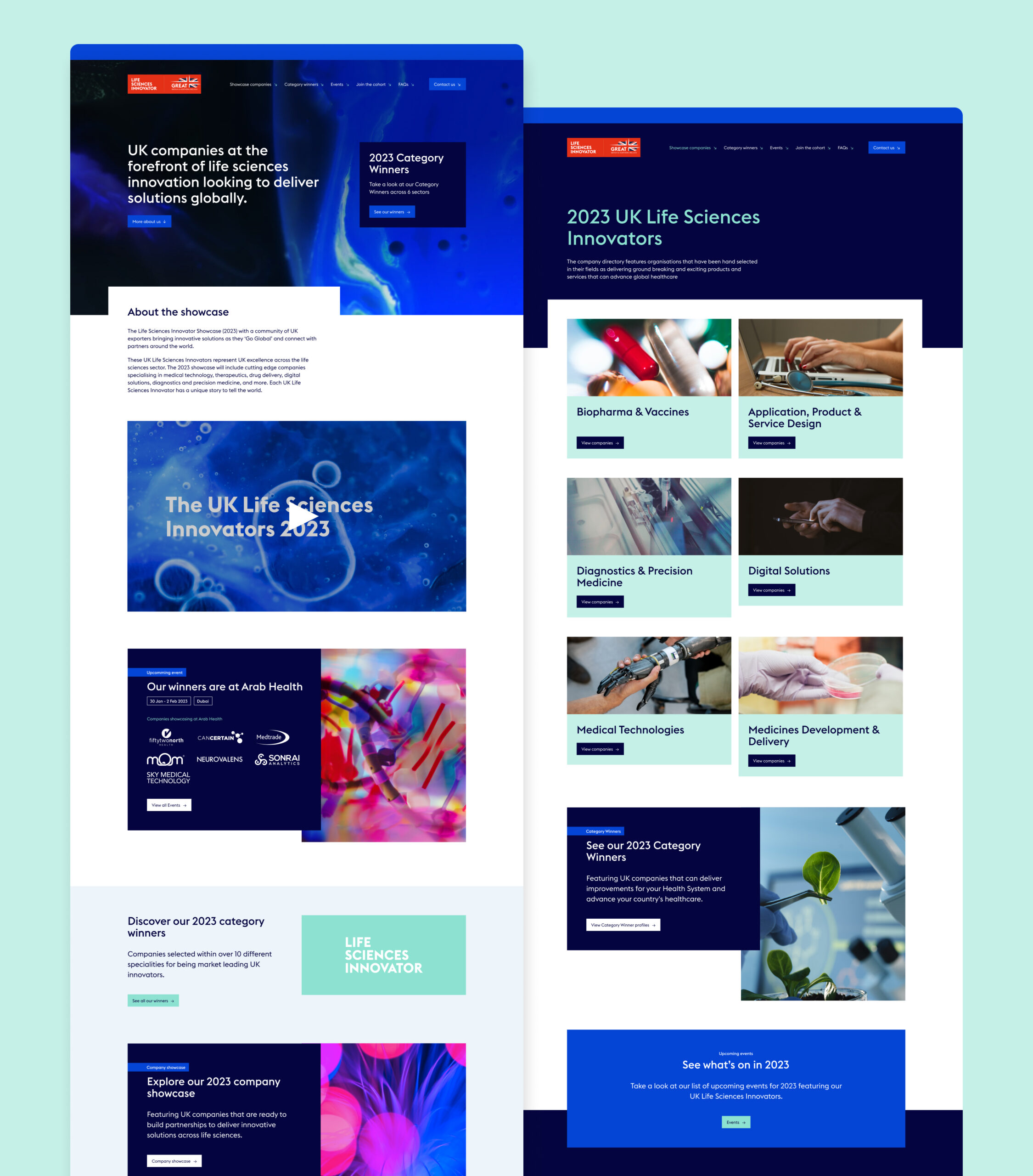
For the website design and build we had to work within an existing development platform, Aventri, which places some restrictions on how design elements can be executed, when compared with a fully independent build. However, so that the website felt dynamic, we worked with GREAT branded photography and animation to inject a unique style.
Social activation
Aware that this initiative would need internal and external promotion to encourage the most innovative companies to apply each year, we created a series of social posts that can be used to promote key goals and generate interest. These were predominantly animated, to ensure the highest engagement, and included:
- General awareness
- Encouraging applications
- Congratulating winners
- Event promotion, when the winners appeared at sector events
The toolkit
With a breadth of materials produced for this project, we wanted to tie everything together for our client and their winners so that they could use all of the assets correctly and build awareness of and engagement with their brands. We created an internal toolkit for the Department of Life and Sciences, so that whichever team member was working on them could do so consistently. We also built an external toolkit for participants and winners so that they could promote the initiative across their own social presence, email footers and other forms of engagement.
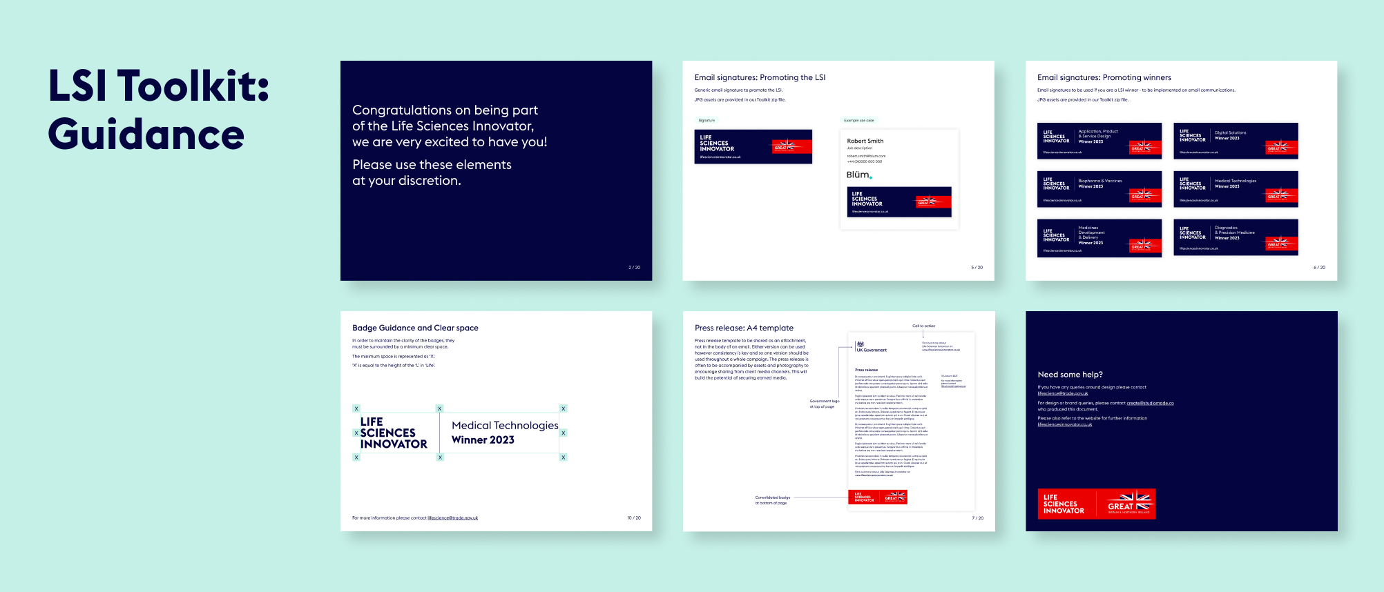
STRAT7 is a global strategic insight and customer analytics group. It helps businesses to understand, predict and act on change, through technology-powered data and insight. In 2019 it had received investment from its founders and private equity investor Horizon Capital, and since then it had made four acquisitions to build on its capabilities and expand its international footprint.
In 2022 the leadership team were ready to take the business out for a new round of funding and acquisition, to grow the group’s talent and skillsets and add to its service offering. They wanted a refined brand identity that would improve its presentation and make them a strong investment proposition – and they needed it quickly.
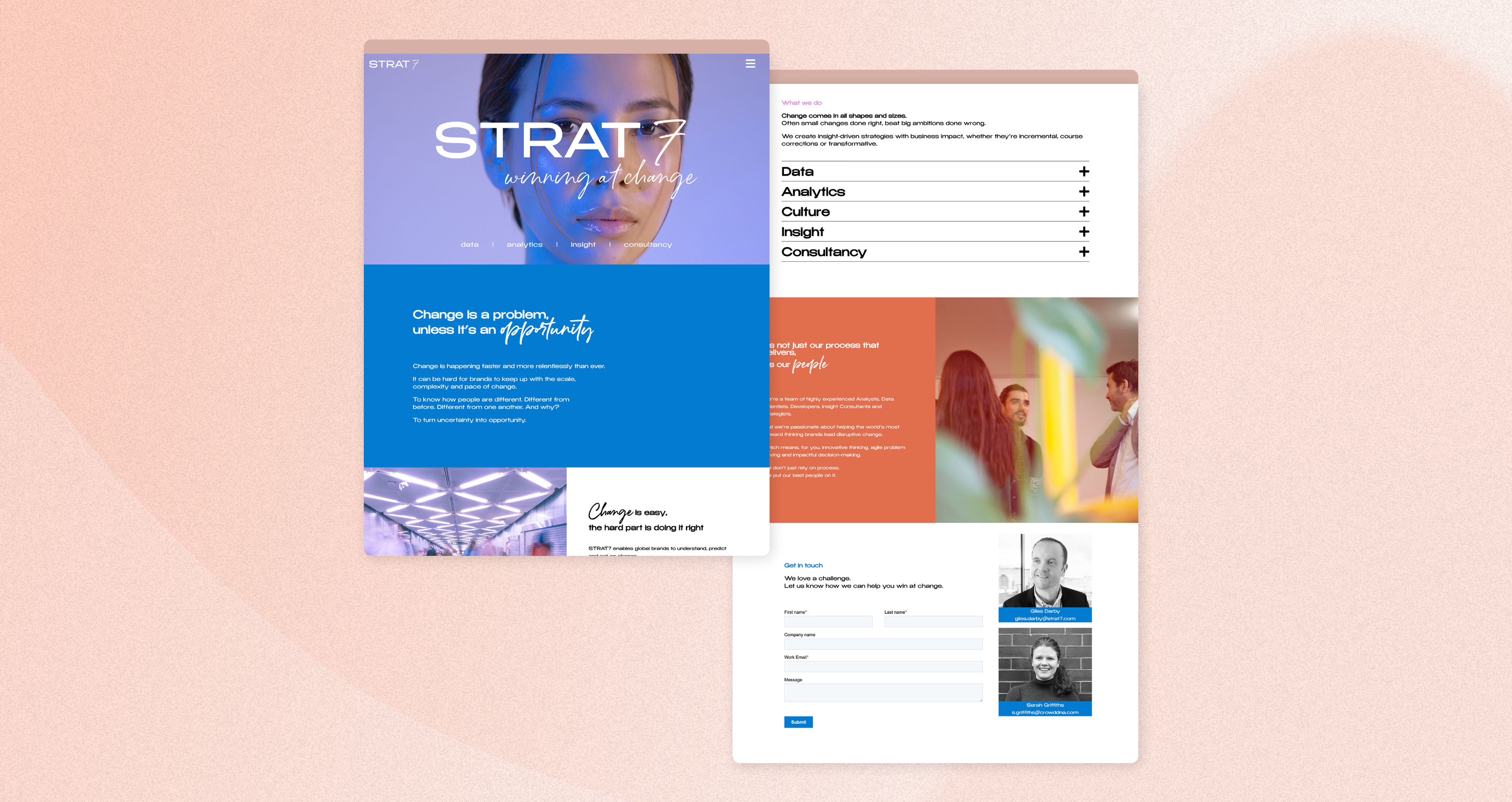
What we did
Our brief was to provide a choice of possible creative routes. We designed four directions around the concept of Change, and showed how each one could work across the website, presentations and other implementations.
We presented them for review and STRAT7 selected their favourite for final refinement and rollout.
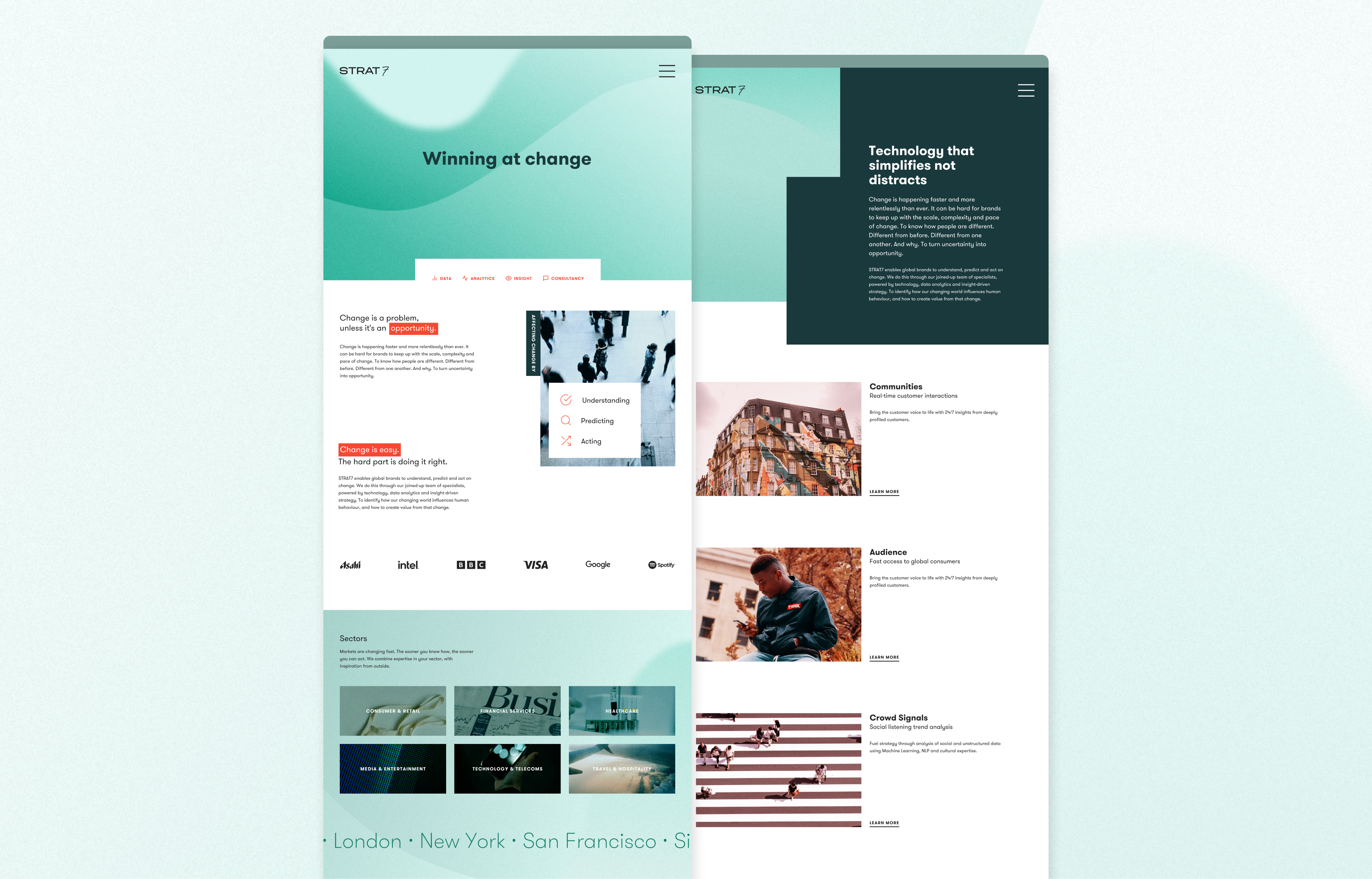
Colour palette
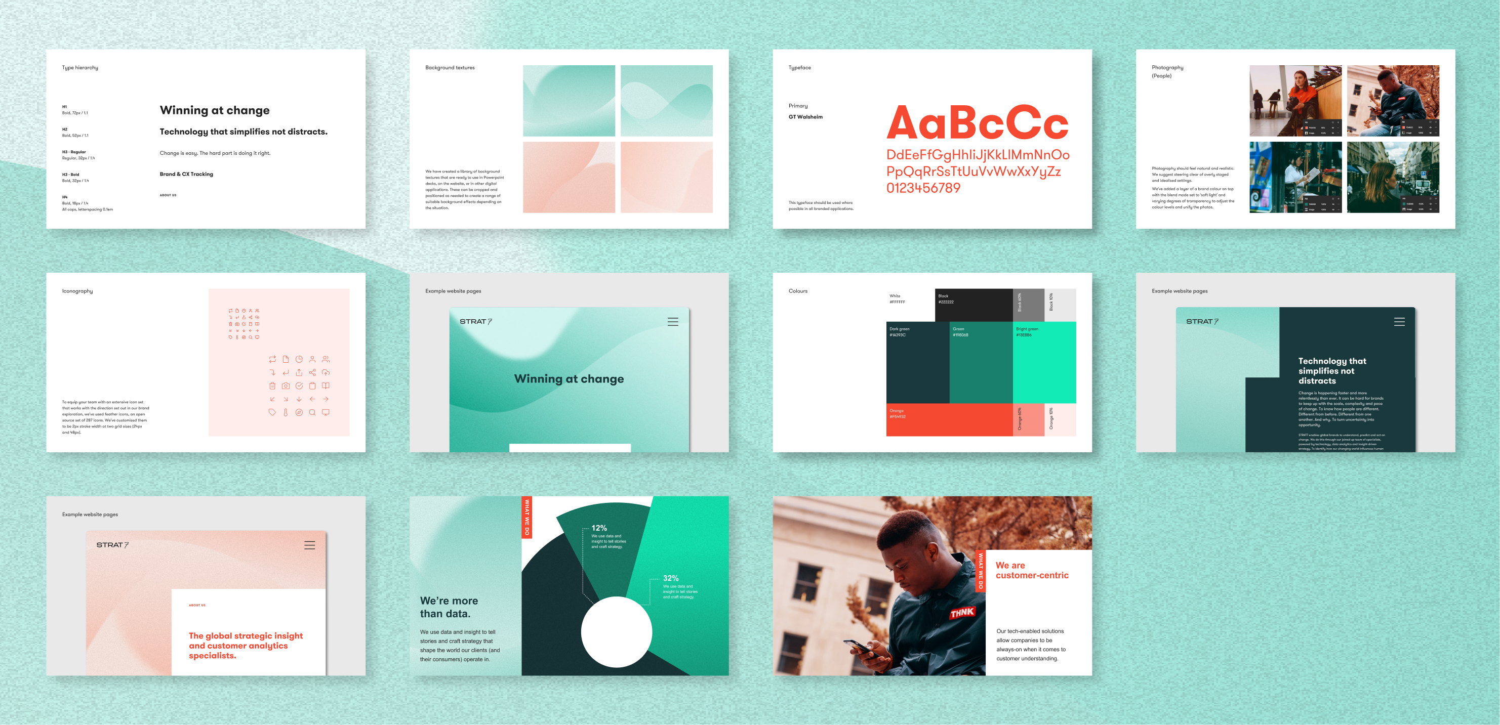
With different consultancies within the STRAT7 umbrella group, colours needed to be consolidated and streamlined, for a more unified approach. We built a new, fresh palette.
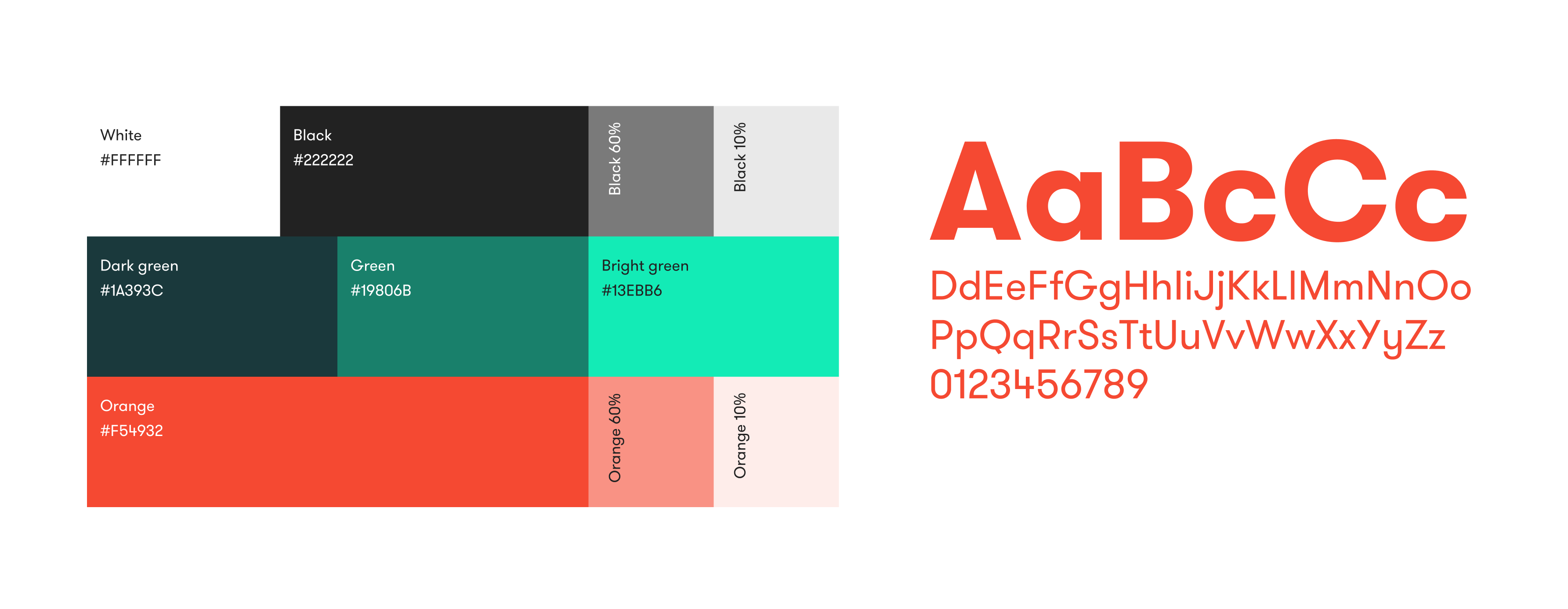
Animations
We created textural, illustrative moving backgrounds in the new colours, to reflect the idea of transition and dynamic momentum. These textures are used on the website banners and can work across different platforms and materials, and can be animated or static.
Logo
The STRAT7 logo was refined slightly for digital usage, adjusting the weight to make it more robust and legible at smaller sizes.
Photography
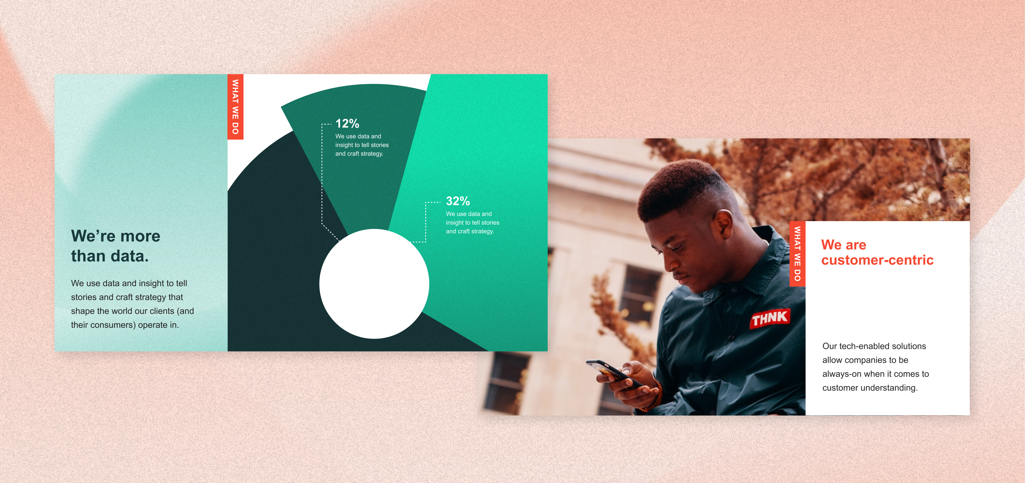
We reviewed the approach to photography and decided to use images of people looking natural and positive. We added a transparent overlay of a brand colour to help images feel consistent.
Outcome
The client wanted to implement the new designs themselves across the website and other materials. We compiled a guidance document that enables them to do this easily, quickly and consistently. Our creative approach works across uses, from social assets and animations to Powerpoint presentations, and can be easily expanded by the STRAT7 team. It’s ready to be rolled out to all the companies in the group so that they all look visually coherent but can retain their own distinct identities.

How many times have you shouted at a screen with the words ‘I just want to talk to a person’? The online world has many perks but what happens when ‘computer says no’? You’re not alone. 78% of UK consumers say they’ll want to interact with a real person more as technology improves.¹ 69% of UK consumers use the phone for customer service, making it an essential part of an omni-channel approach.²
- PwC, Future of customer experience survey, 2017/18
- Microsoft, State Of Global Customer Service Report, 2017
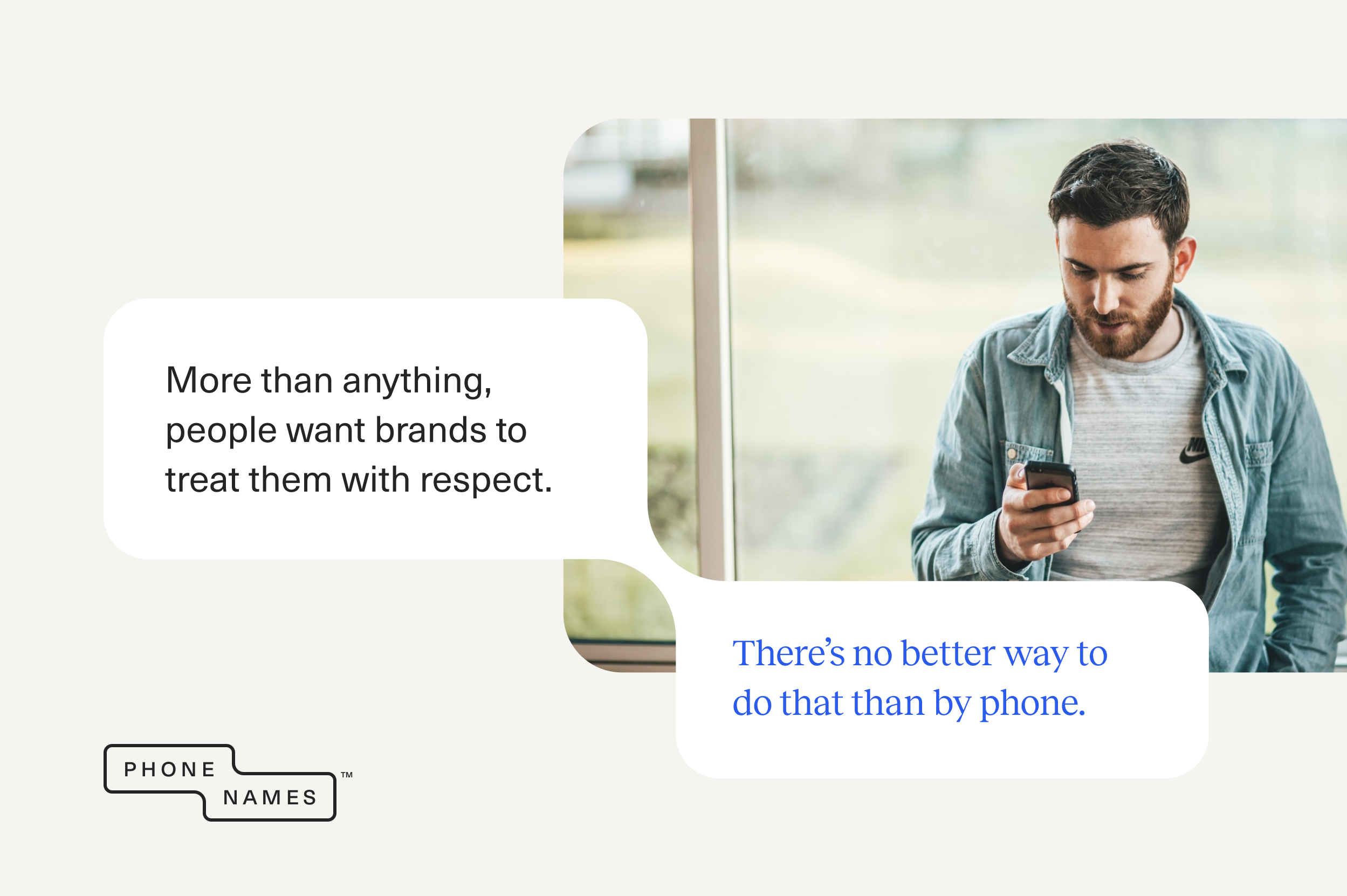
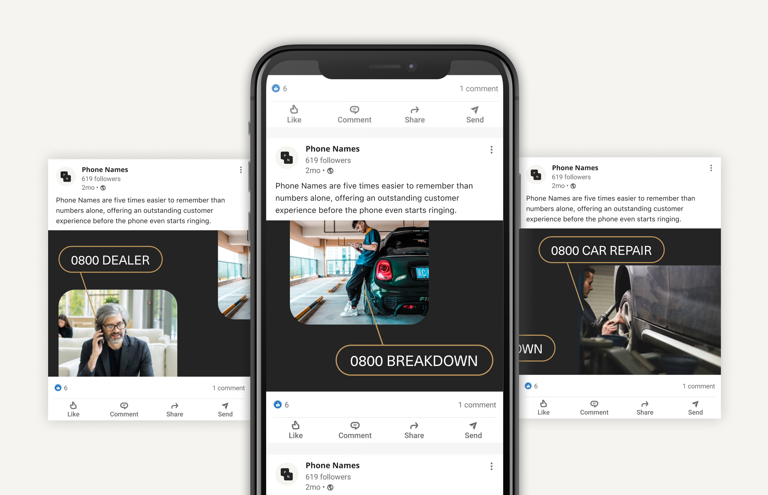
Phone Names have the solution for you. Simply dial in the phone code (e.g. 0800), then spell the name, product or service you want to reach using the letters on the telephone keypad.
0800 REPAIR
0800 TRAVEL
0800 BENTLEY
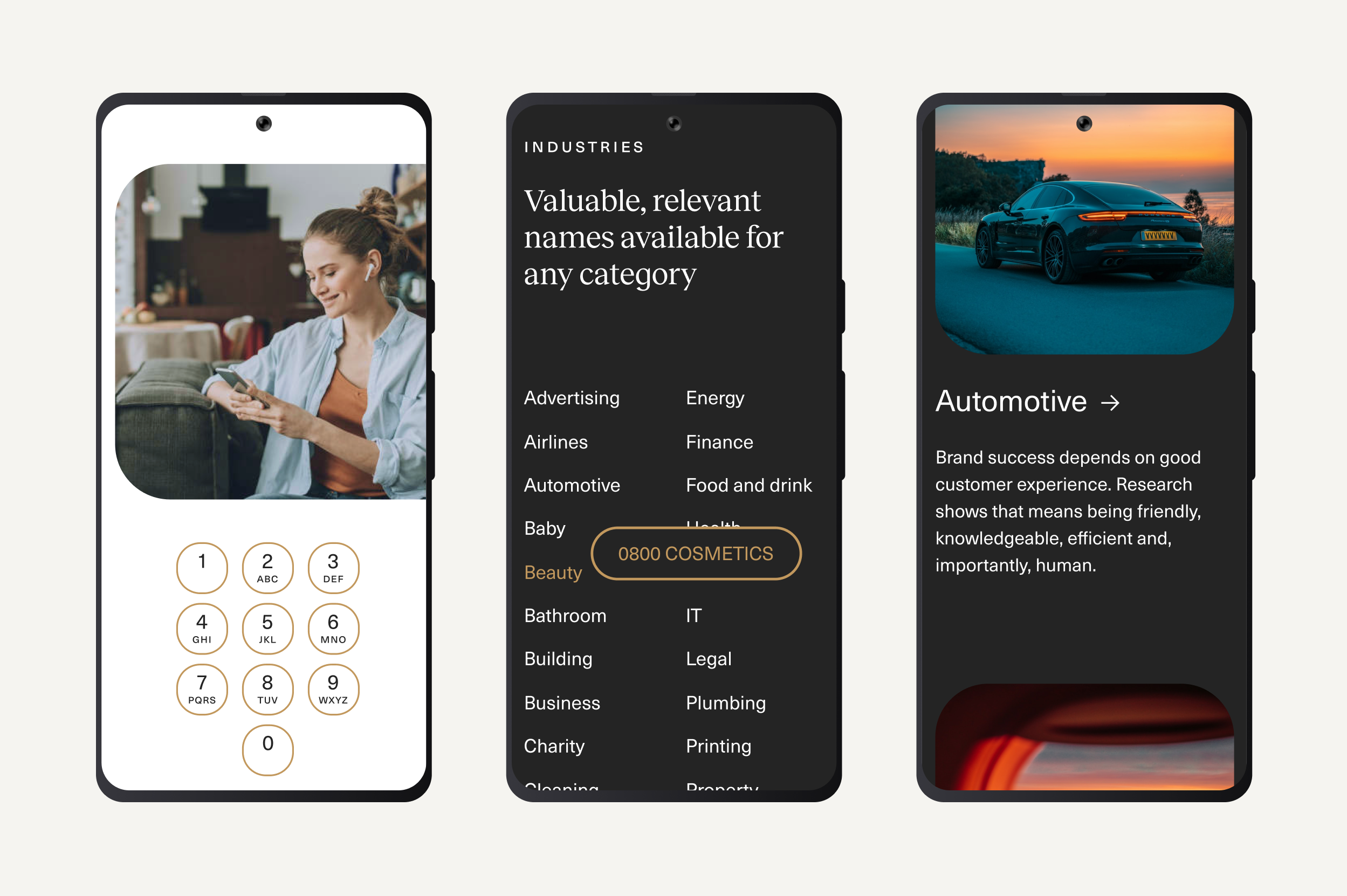
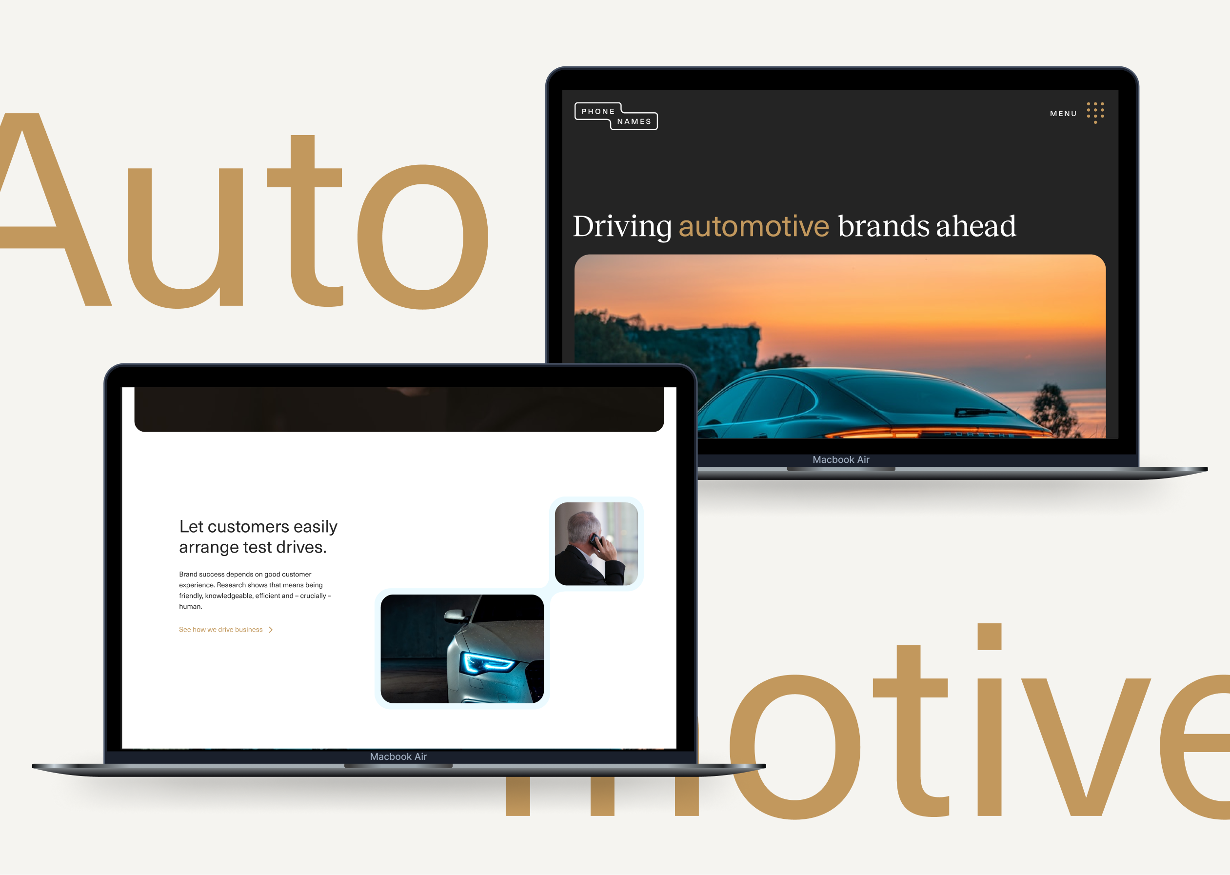
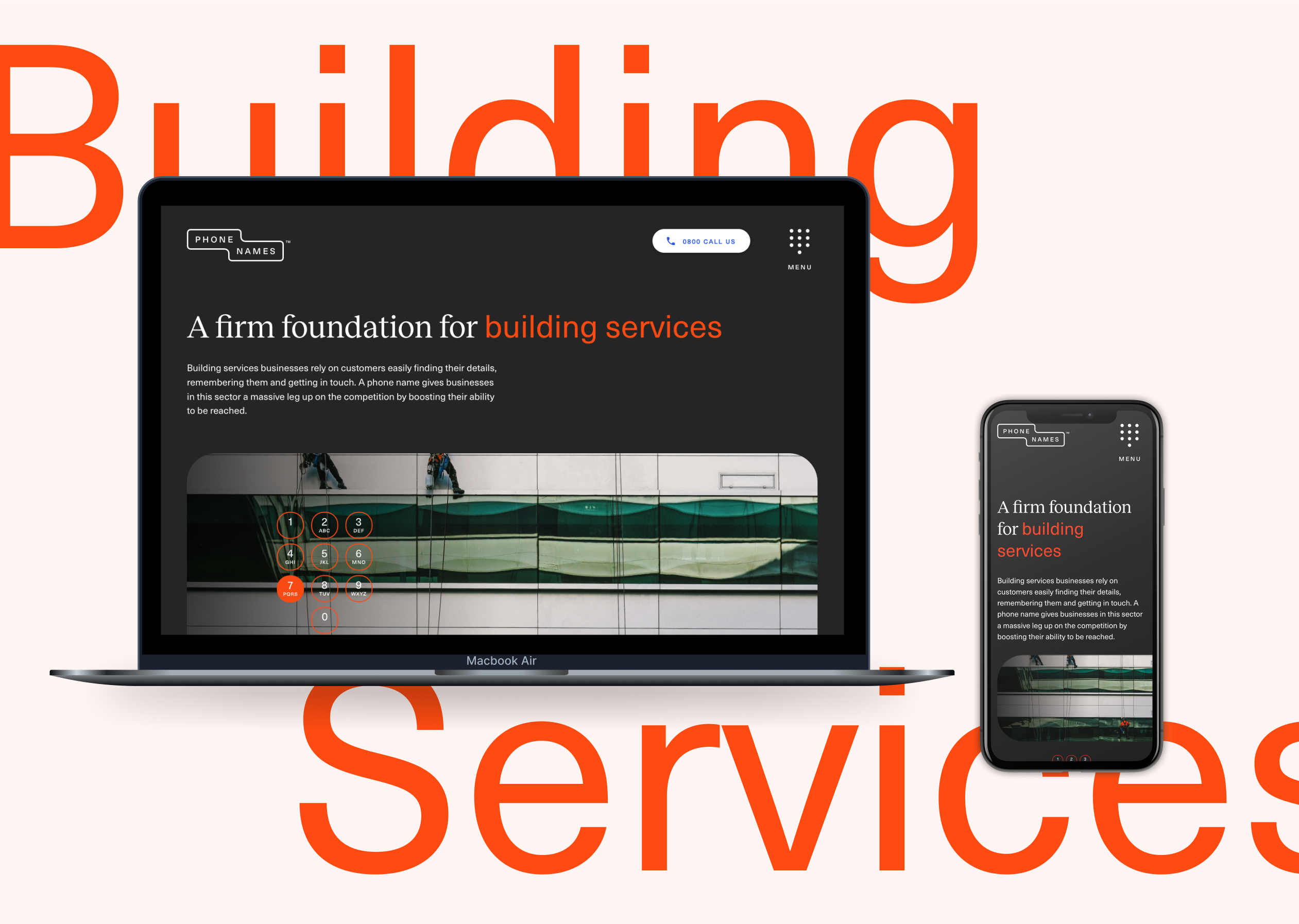
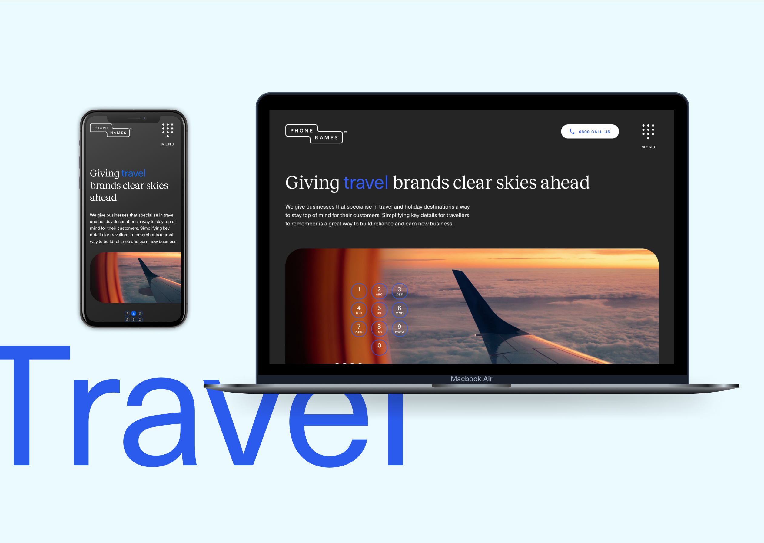
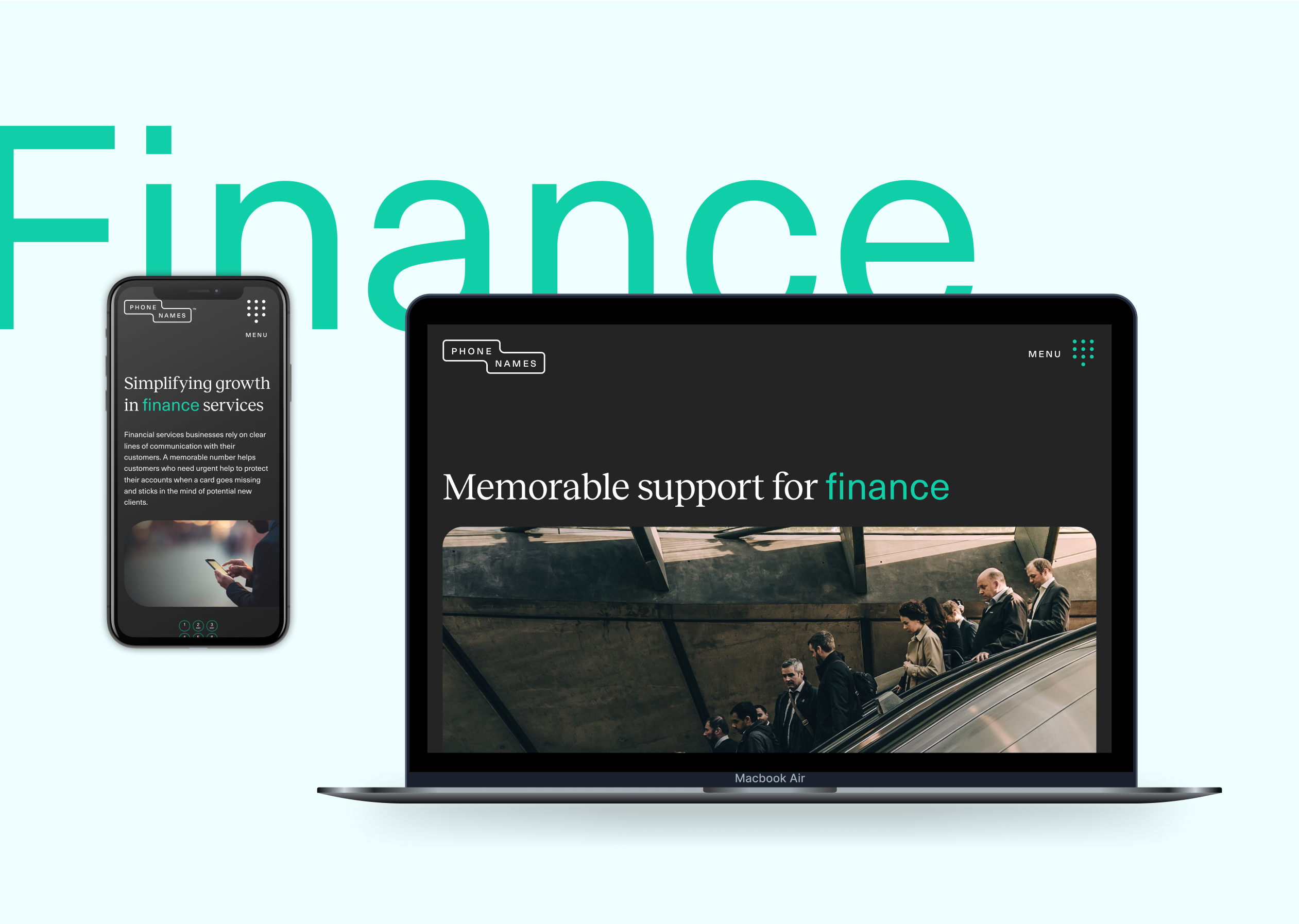
We wanted to create a sense of simplicity and clarity in the design work for the Phone Names brand. We developed a streamlined core colour palette with accents to be able to clearly highlight calls to action or key pieces of information for the brand’s audience.
We wanted to use photography within the brand look and feel as we thought this would translate well on social advertising as well as pairing with custom animations that we’d built to reference the phone names. We used quite dark tonal photography showing detailed elements so that we could create an approach that related to the full service luxury experience we wanted brands to create for themselves.
The result is a new digital presence and engagement campaign that is as effective as it is simple. Just like the business.

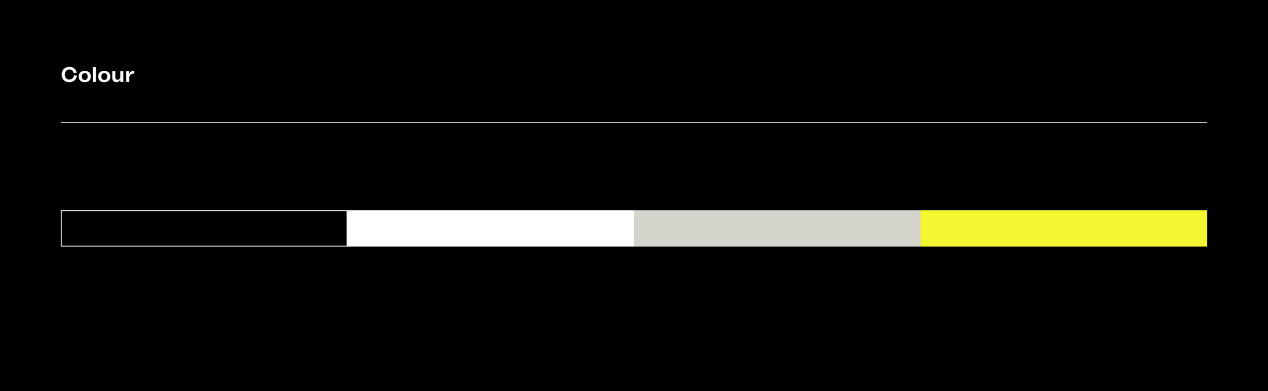
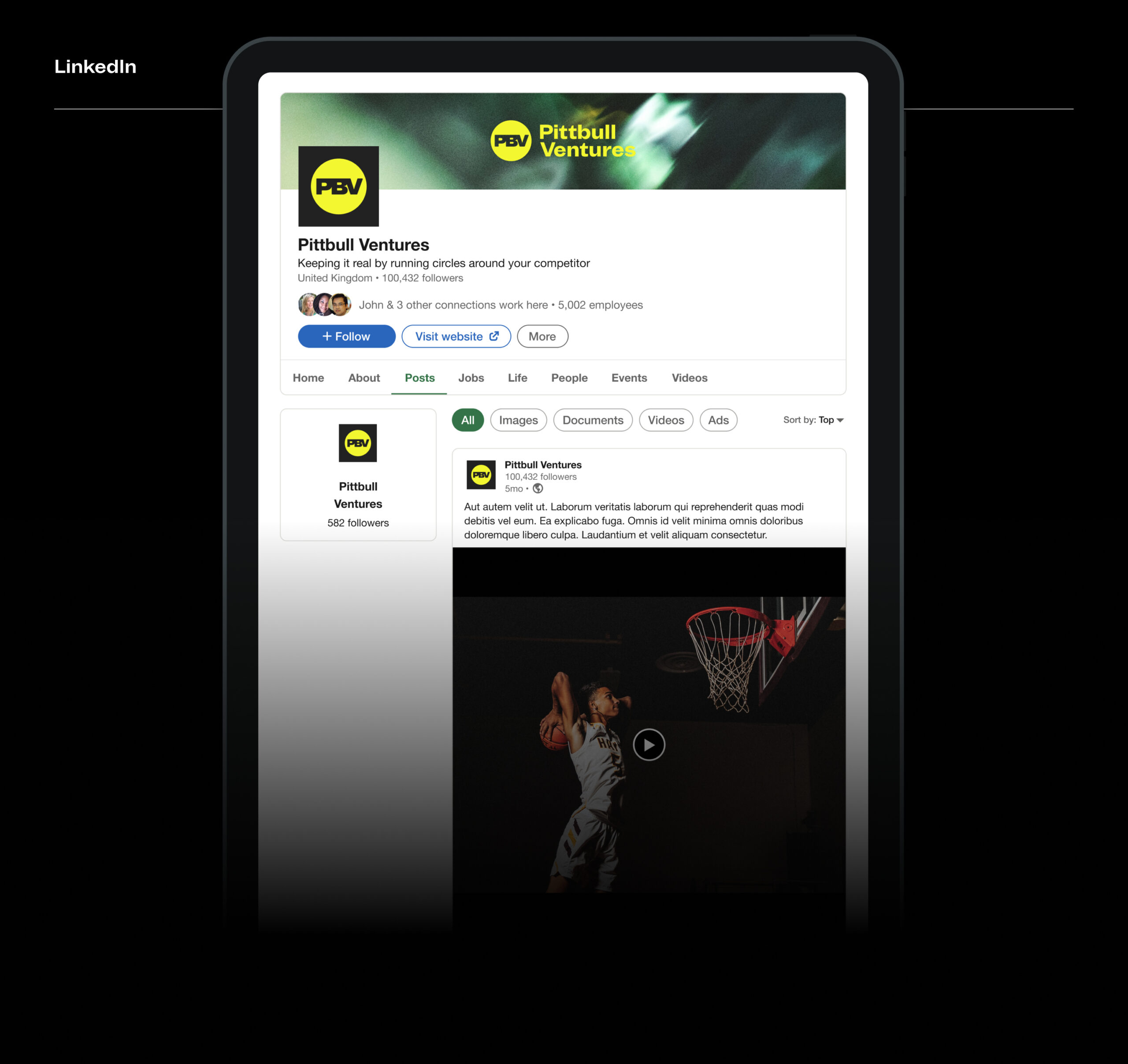
Pittbull Ventures, a startup within the investment space who focus on consumer brands required a brand identity established with a digital edge. Integrating the Sebastien Sanfilippo beautifully-designed Mint Grotesk typeface, we set about crafting a look and feel that would principally function within digital environments, but with the ability to scale for physical (and in particular live event) scenarios of use in the future.



Comprehensive fund brand analysis
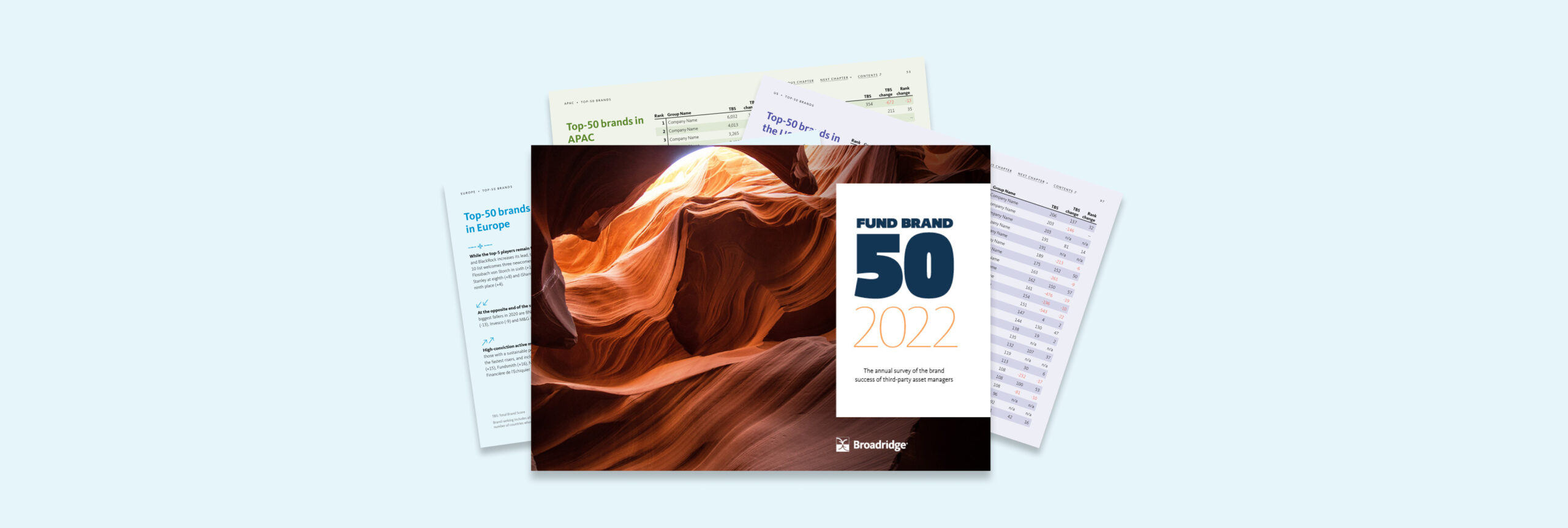
Fund Brand 50 is the most comprehensive annual study of the world’s top 50 cross-border asset management brands. We have worked since 2021 with MackayWilliams, and more recently Broadridge in producing a circa 130 page report and (in 2020) an online digital companion providing access to interrogate data and brand profile charts included in the printed report.2022 marks the third year of the report under new ownership since MackayWilliams was purchased by global fintech company Broadridge.
Changing brand ownership
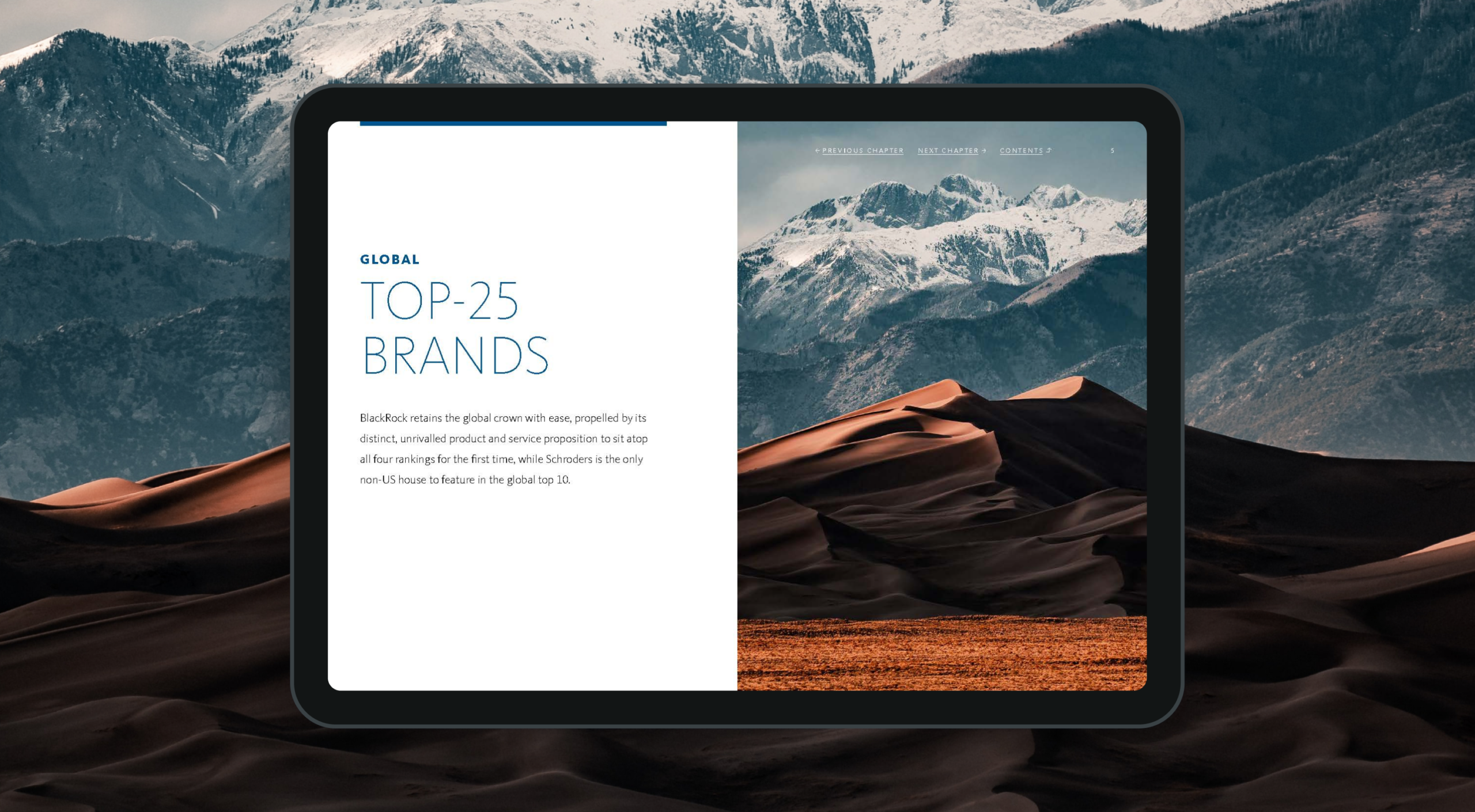
The FB50 report has achieved an ever-growing following since launch and has built a reputation and equity in its brand that we didn’t want to dilute. At the same time, in transitioning to Broadridge’s ownership we wanted to reflect their new brand voice. Type, colour, and photography were all updated based on Broadridge’s brand guidelines in a manner that made sure to preserve the distinctive qualities of the FB50 brand.
An automated workflow
To assist with the production of the printed report in 2020 (in addition to creating the InDesign templates and managing the print and delivery process) we created a digital tool to automatically output each of the brand profiles from raw Excel data sheets to individual pdfs which could then be embedded in the report.
This greatly reduced the amount of time needed to produce those pages in the report, and ensured consistency across all 150 charts and tables that were to be created in that section.

A digital companion
To accompany the 2020 release of the printed report, we created an online digital tool that allows subscribers to interrogate the raw data and analyse the success factors behind the top 50 brands discussed in the report.
Each of the top 50 brand profiles can be viewed and compared against one another to see how other brands are measuring up in each of the key reporting areas.

As part of creating this online portal, Broadridge needed a secure method of on-boarding new subscribers – giving individuals access to the digital report. We created a custom user management system that empowered their admin team to grant access to new users and automatically trigger emails to be sent out notifying those users how they can register for access.
Building brand success
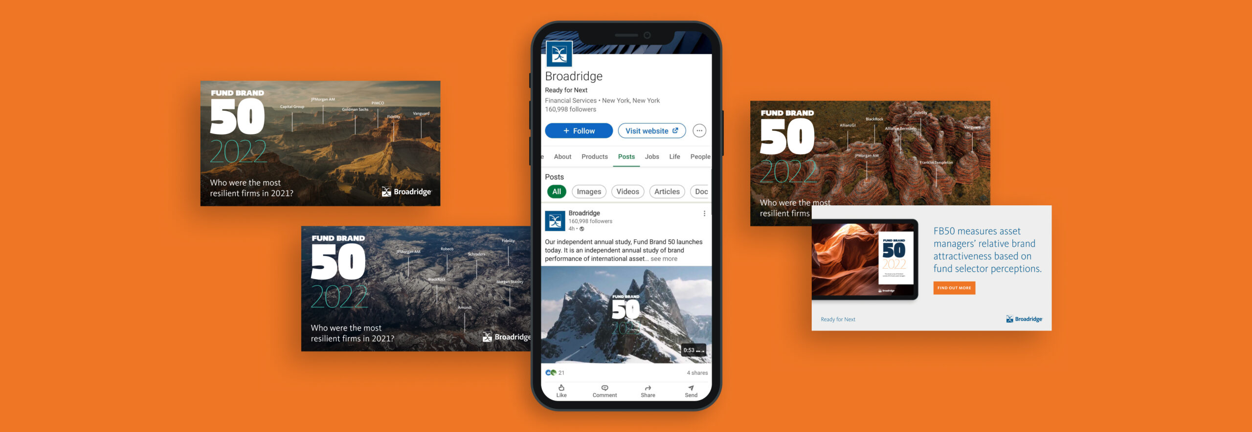
FB50 continues to grow from strength to strength. Revered within the fund industry, the report provides a transparent look at fund brand performance. In a marketplace where brand purpose and clarity are of increasing importance, this insight is helping brands better understand the drivers to success in their markets.
Broadridge is one of the world’s leading providers of financial technology and services, with $5bn+ in revenues and more than 14,000 employees in 21 countries. Its infrastructure provides a global communications hub that links thousands of companies and funds to millions of individual and institutional investors, underpinning daily trading of more than $9tn of equities, fixed income and other securities.
It has multiple products, services and insights, helping banks, broker-dealers, mutual funds, asset and wealth managers and public companies manage risk and accelerate growth. But it wasn’t presenting them well. Over time, through a combination of internal innovation and external mergers, it had accumulated multiple products. These looked inconsistent, were described differently and were not presented cohesively as a core offering.
It was time to create an accessible, consistent, progressive digital experience where clients and potential clients can easily access everything. The commercial need was for a go-to-market strategy for 20+ products and services.
What we did
Our role was to help formulate a common approach across presentation, tone of voice and brand look and feel, bringing these products to market as part of a single, consistent core product suite.
First, this required us to delve into Broadridge’s existing proprietary systems and to think strategically. Our team looked at the product range, revenue mechanism, distribution and release schedule, associated content, regional outlook and more.
Strategy and team
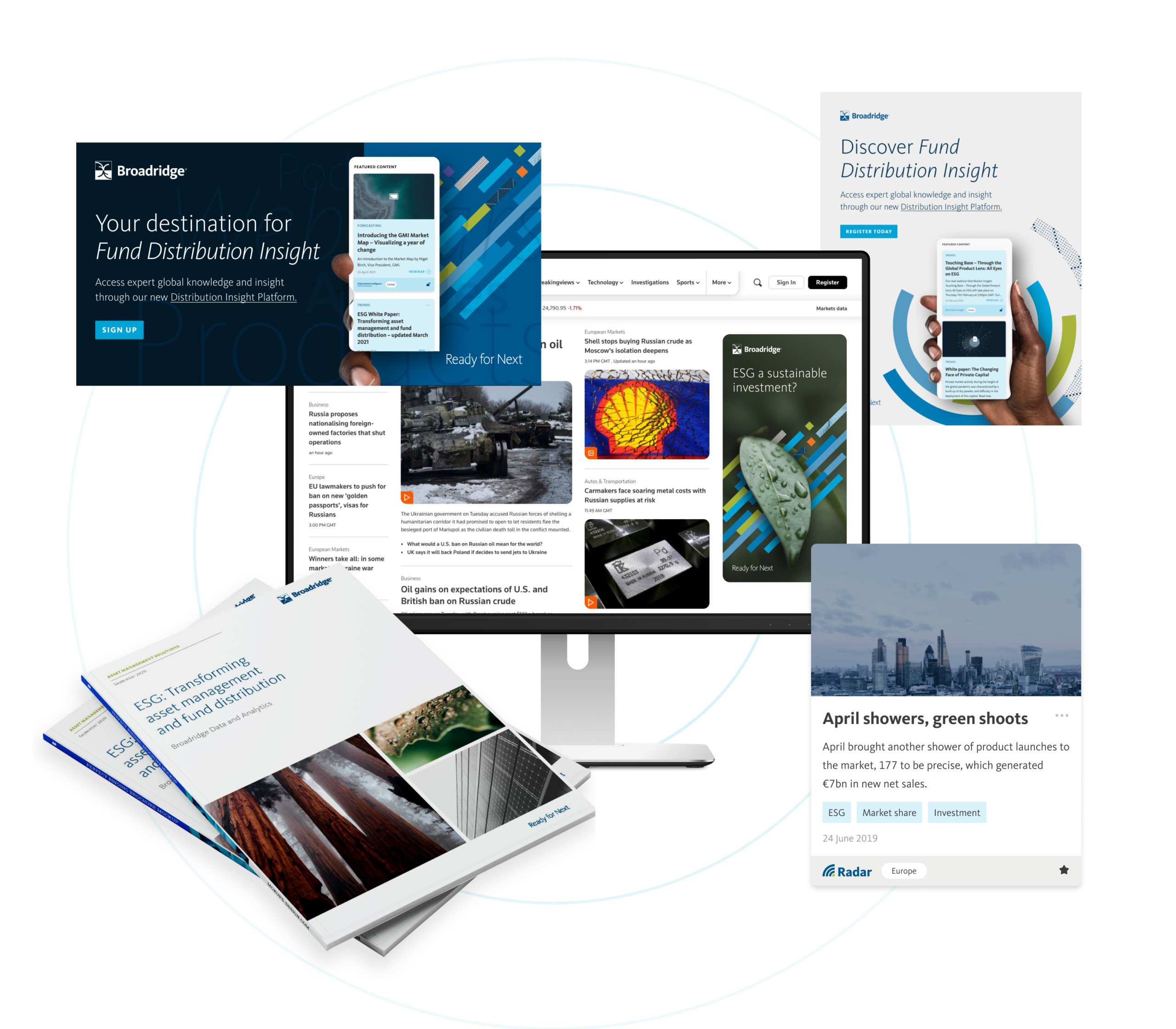
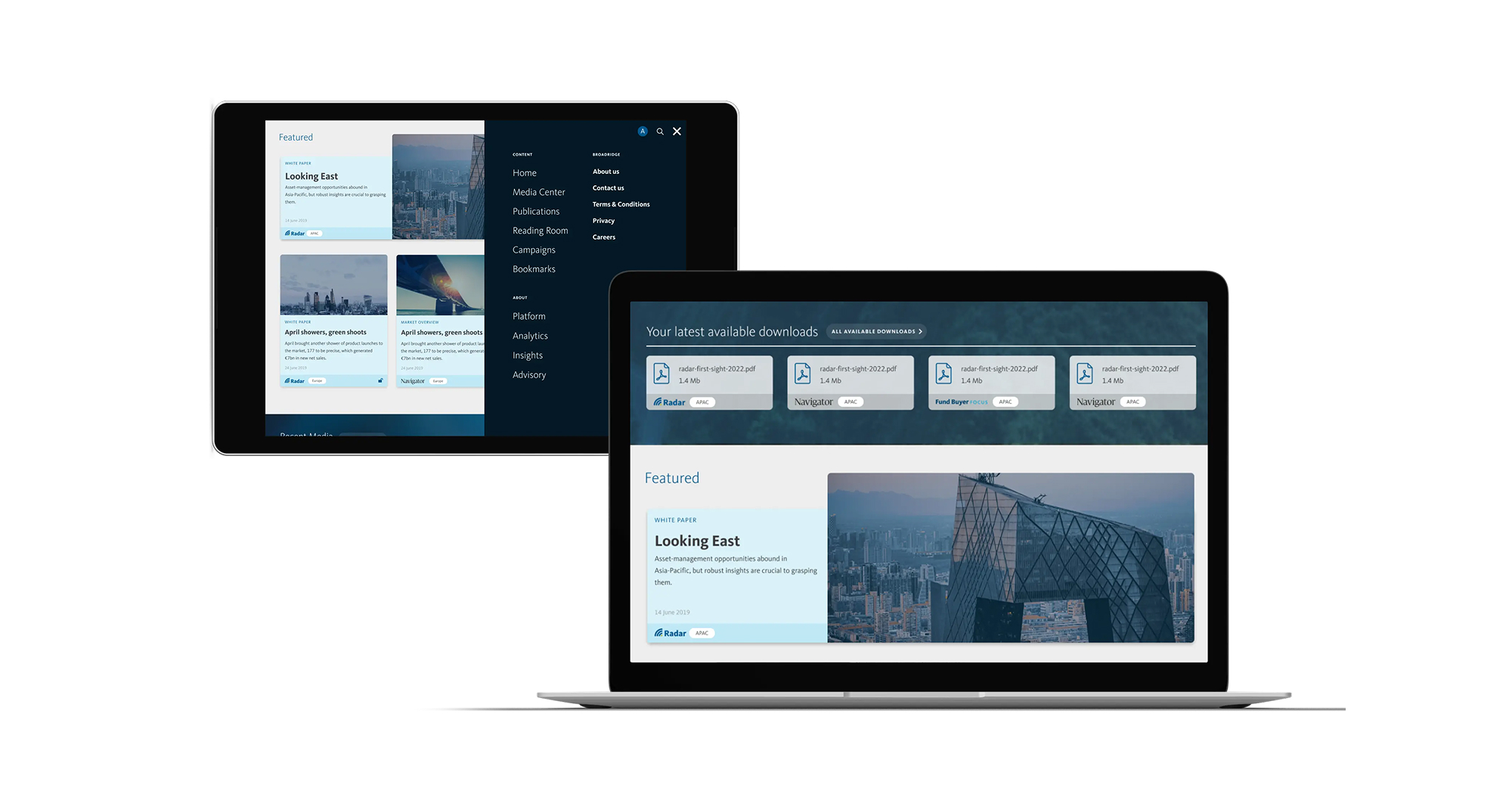
We realised we needed to build a new, single destination that would hold all of this in one place. The Distribution Insight platform would be a new future-facing website for Broadridge; its repository for everything distribution-focused.
We adopted an integrated-team approach, providing UI, UX and digital development support to the multiple internal teams building and developing different aspects of the platform. We worked closely together on technical decisions and provided rapid prototyping for key elements. This included research and development across integration and administrative logic, unique content mapping and infrastructure strategy.
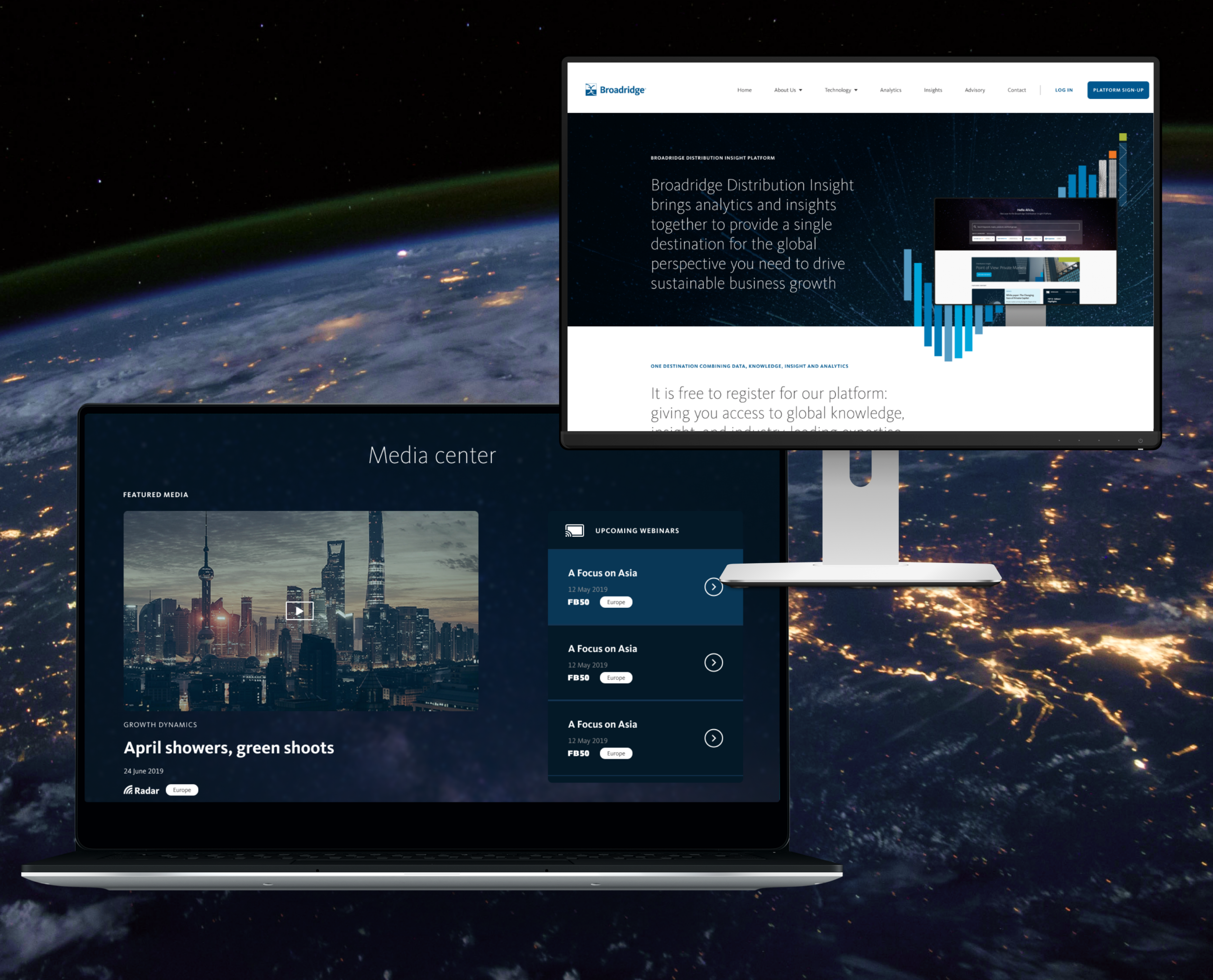
The new platform, Distribution Insight, brings Broadridge’s analytics, insights and advisory services together, giving asset managers a detailed picture of global markets and critical insights that can help them operate strategically and accelerate their growth.
Campaign activation
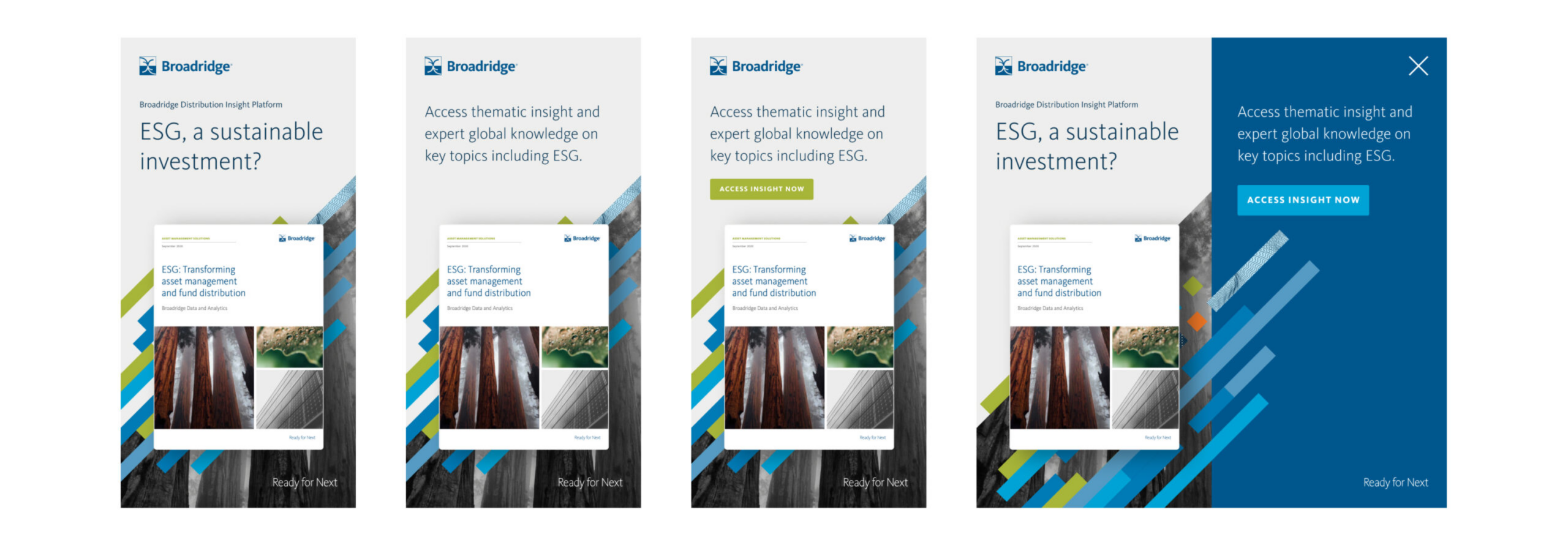
We were also asked to work on a launch campaign, and designed an activation programme for Broadridge’s teams to bring it to market. We designed creative executions across motion, interactive advertising and wider campaign creation. This work was featured in Reuters, FT’s Ignites Europe, Funds Europe and other platforms.
Outcome
Working hand in hand with Broadridge, we co-created a strategy, unified sales proposition and distinct visual approach for an entirely new digital sales concept, Distribution Insight. We conceived, planned, designed, built and launched a single digital environment with access to a suite of distribution products, both analytical and insight focused.
The system has supported multiple global teams with their product sales and growth strategies – and given their clients products and insights to inform their strategies and fuel their growth. We continue to help Broadridge maintain the system.
We now have a long-term partnership with the organisation and have become an extension of its global team, supporting multiple business units with the following services:
- Strategic brand positioning
- Product positioning and development
- Brand creative
- Digital product UI, UX and design
- Digital architecture and prototyping
- Digital development and build
- Product launch
- Campaign activation and social activity
Other projects have included AXA × Broadridge ↗ and Broadridge FundForum Digital Tool ↗
A long-standing client, Harvey Spack Field approached our team with the request of delivering a fresh, clean and direct digital presence that helped best tell the story of their market knowledge and expertise.
For this updated approach, we wanted a bold first impression that then takes the user on a tour of HSF’s overall service offering in a streamlined yet intuitive manner.
Direct approach
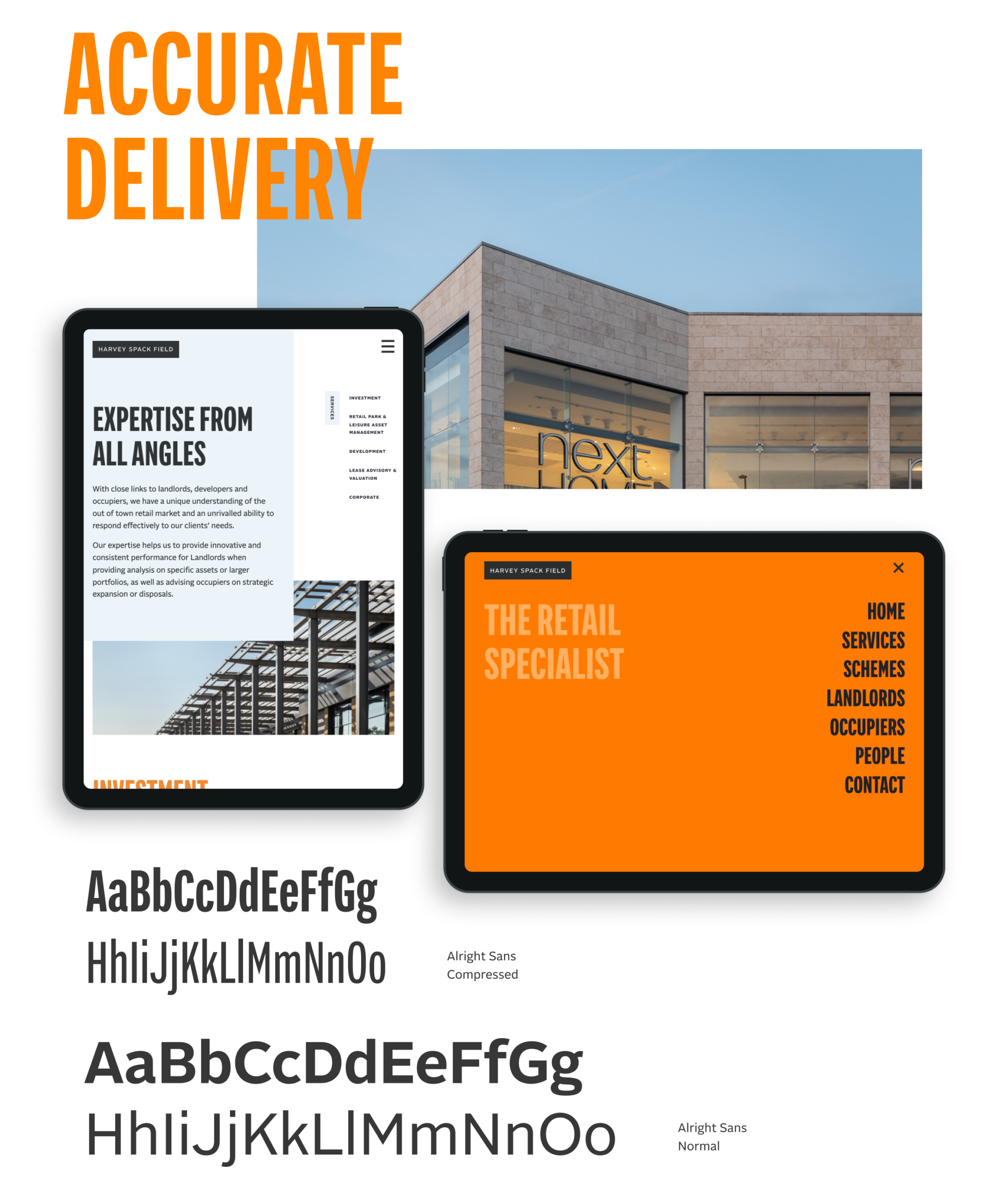
Our design intent was to create a site experience that would immediately engage a user. The messaging had to exist alongside the visual presentation of the brand and help lead users to understand how the Harvey Spack Field personality and mindset can help them in their objectives. We kept the navigation surrounding the work simple enough that the viewer is compelled to continue their investigation throughout the site.
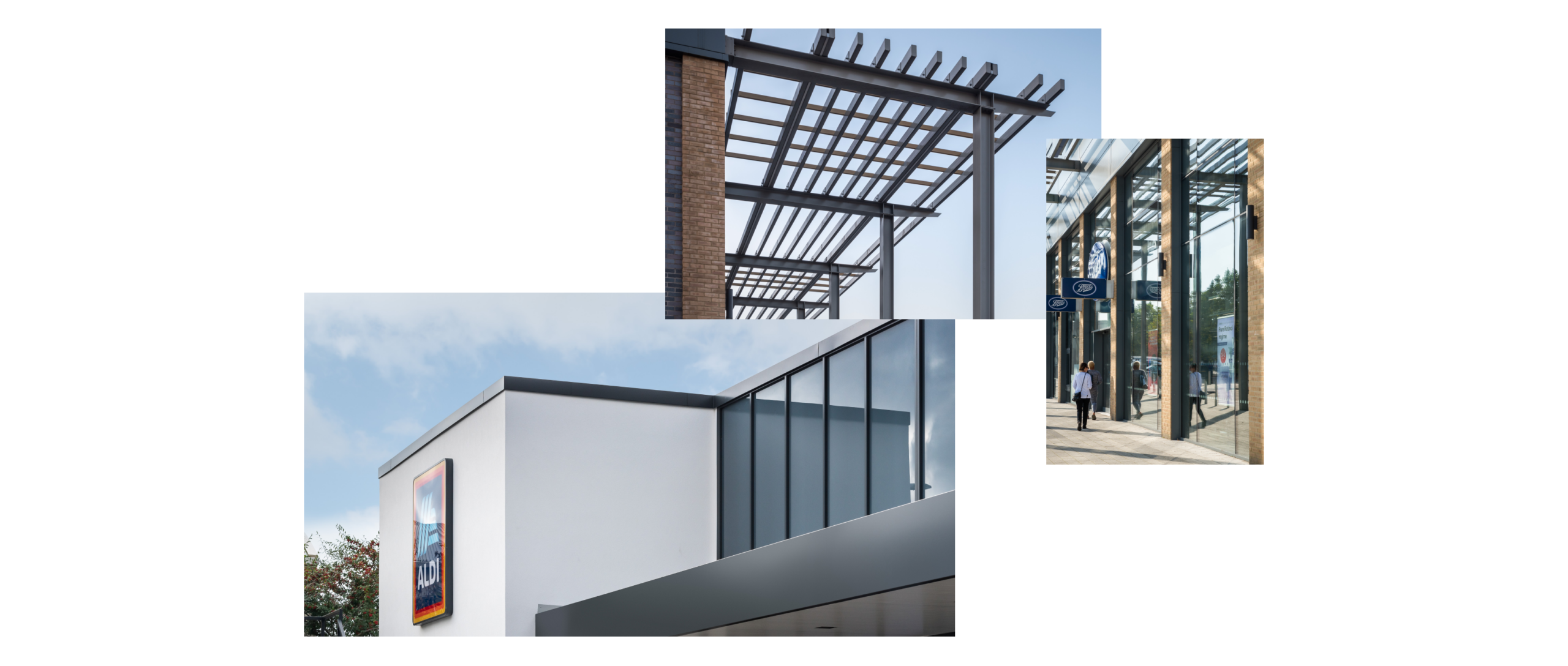
Our design process began mobile-first, fluidly responding to other device sizes. Commissioning photography that really brought forward the architectural details of the HSF schemes, this visual approach brings an elegant simplicity to the site presentation helping draw the user’s eye to the schemes and the services that HSF provide.