Healthcare UK is a longstanding client who we’ve worked with across a number of projects. Life Sciences Innovators (LSI) was a new initiative, to select and then showcase 50 innovative companies working at the cutting edge of life sciences in the UK. There were six defined categories, across medical technology, therapeutics, drug delivery, digital solutions, diagnostics and precision medicine plus other UK specialisms.
The showcase is sponsored by the Department for Business and Trade (DBT), helping overseas companies set up and invest in the UK and assisting UK companies to succeed in global trade.
The client wanted a visual style that would be distinctive yet sit under the UK’s GREAT branding. Our team supported with the design and production of all materials needed to launch the initiative, as well as grow it each year from a social perspective.
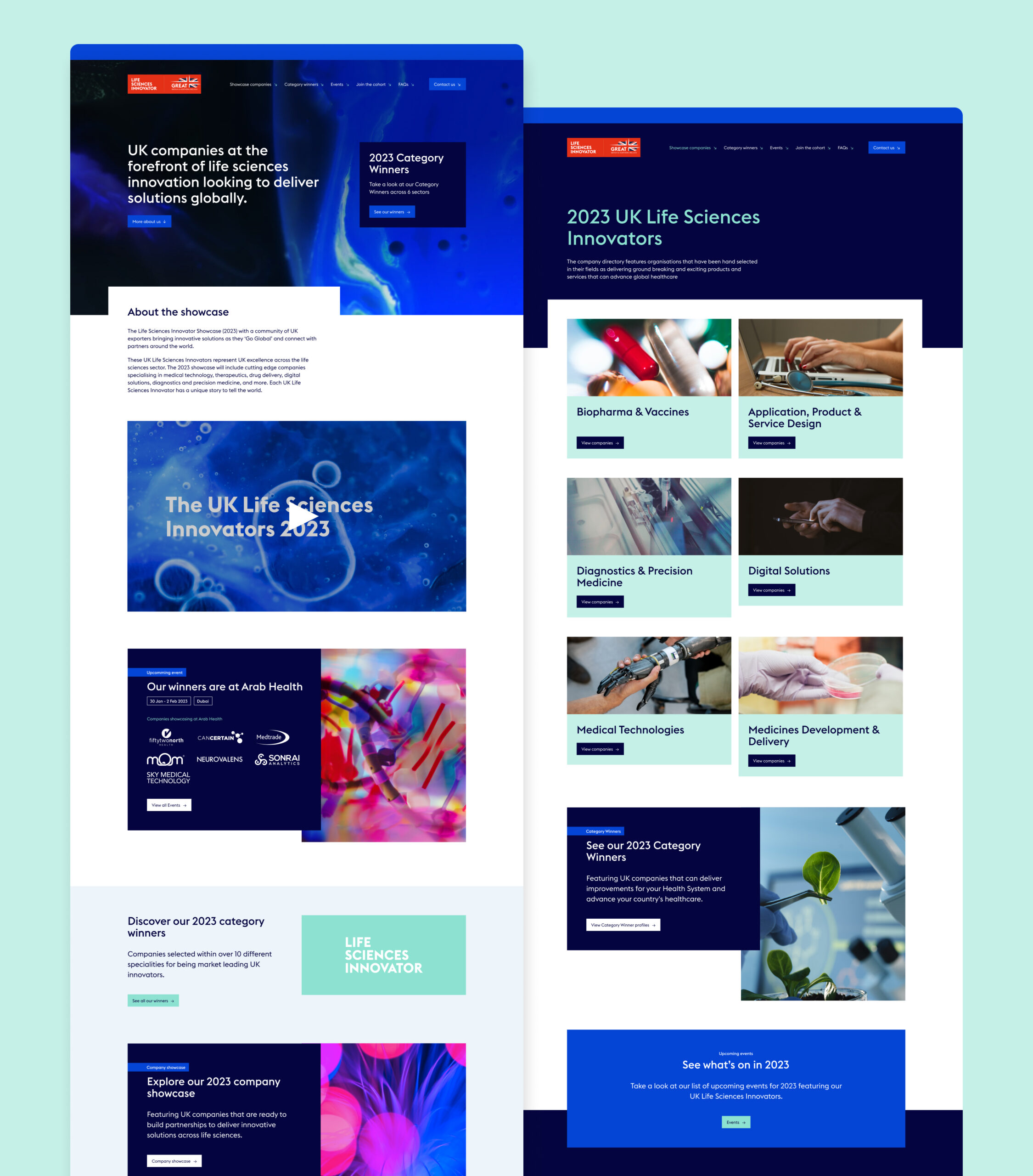
We delivered a website, overview video, printed elements, social posts and a toolkit that could be shared with campaign winners to access assets that they could use for their own promotion.
Innovation badges
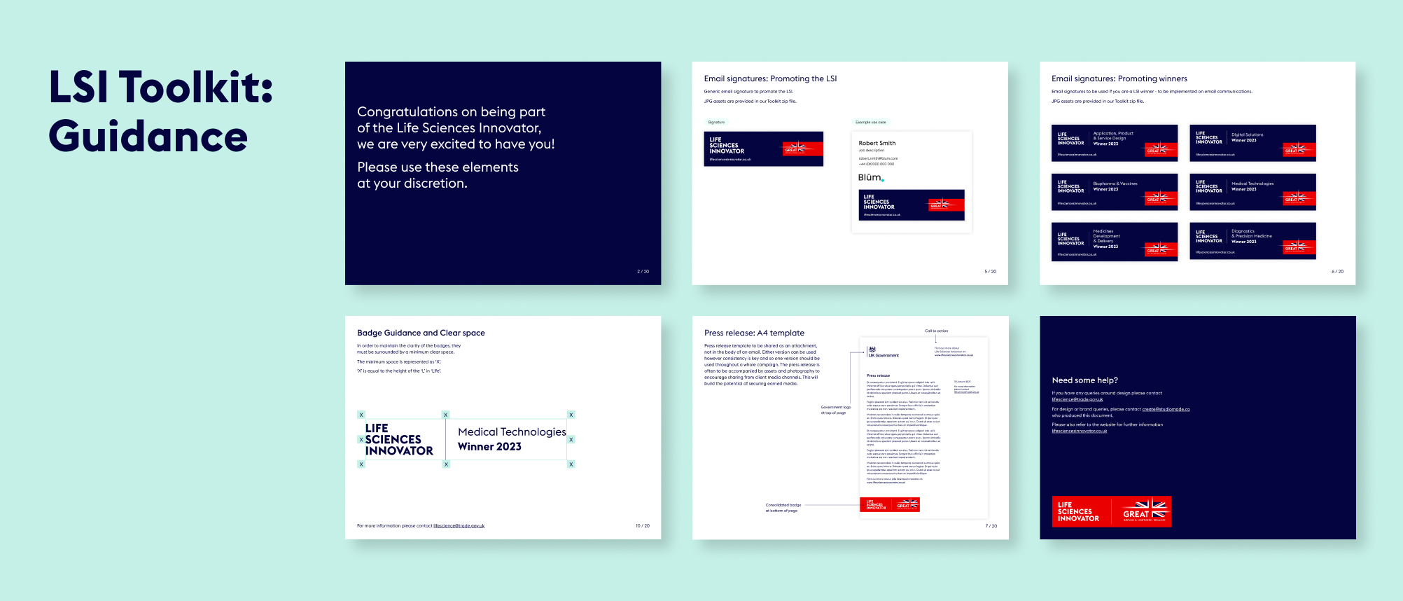
One of the most important parts of the design was creating the badge for the initiative and the badges that the winners would receive for each category. We worked closely with the GREAT brand team, so that we were aligned to their guidelines while still providing a distinct look and feel for LSI.
Bringing the initiative to life through video
We made a short video to be used in presentations and promotion for LSI, and to get better engagement on social media. The video is a quick, engaging way to communicate key information and sits on the website as a project overview.
A digital experience
For the website design and build we had to work within an existing development platform, Aventri, which places some restrictions on how design elements can be executed, when compared with a fully independent build. However, so that the website felt dynamic, we worked with GREAT branded photography and animation to inject a unique style.
Social activation
Aware that this initiative would need internal and external promotion to encourage the most innovative companies to apply each year, we created a series of social posts that can be used to promote key goals and generate interest. These were predominantly animated, to ensure the highest engagement, and included:
- General awareness
- Encouraging applications
- Congratulating winners
- Event promotion, when the winners appeared at sector events
The toolkit
With a breadth of materials produced for this project, we wanted to tie everything together for our client and their winners so that they could use all of the assets correctly and build awareness of and engagement with their brands. We created an internal toolkit for the Department of Life and Sciences, so that whichever team member was working on them could do so consistently. We also built an external toolkit for participants and winners so that they could promote the initiative across their own social presence, email footers and other forms of engagement.
Vast numbers of reports are created by financial insight firms every day and so inboxes are full with subject lines promising unique intel, a new angle on a subject or large volumes of data to interrogate. In all this noise, how do you get your clients to read what is pertinent? How do you elevate your insight, putting it front and centre into the eyes of your desired audience? This is where great data visualisation and storytelling comes in.
Planning the story
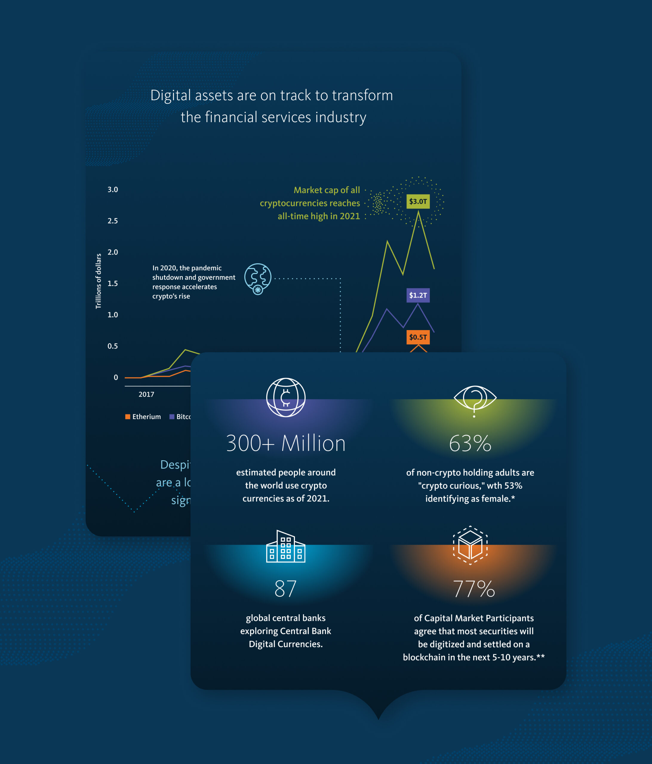
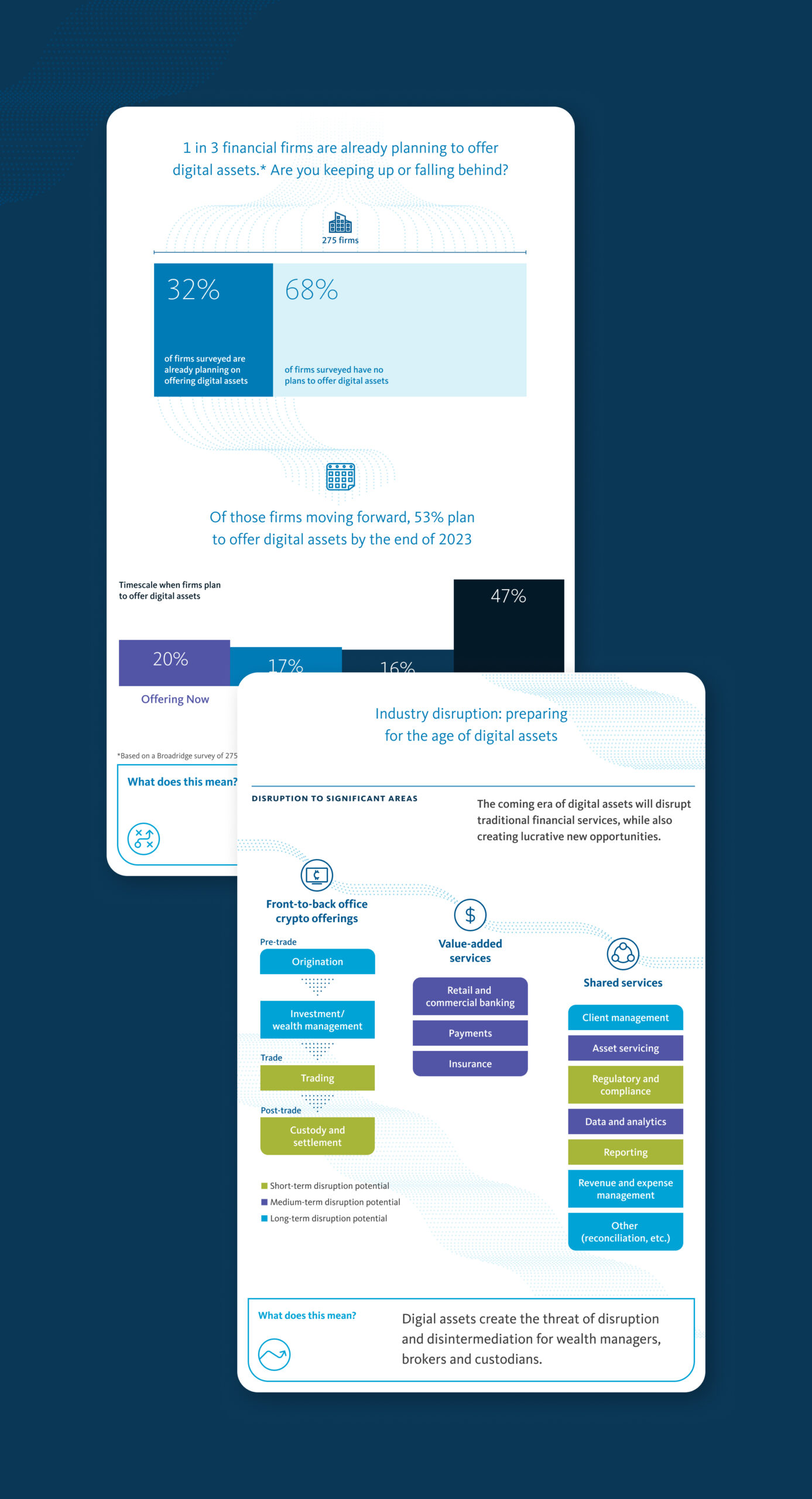
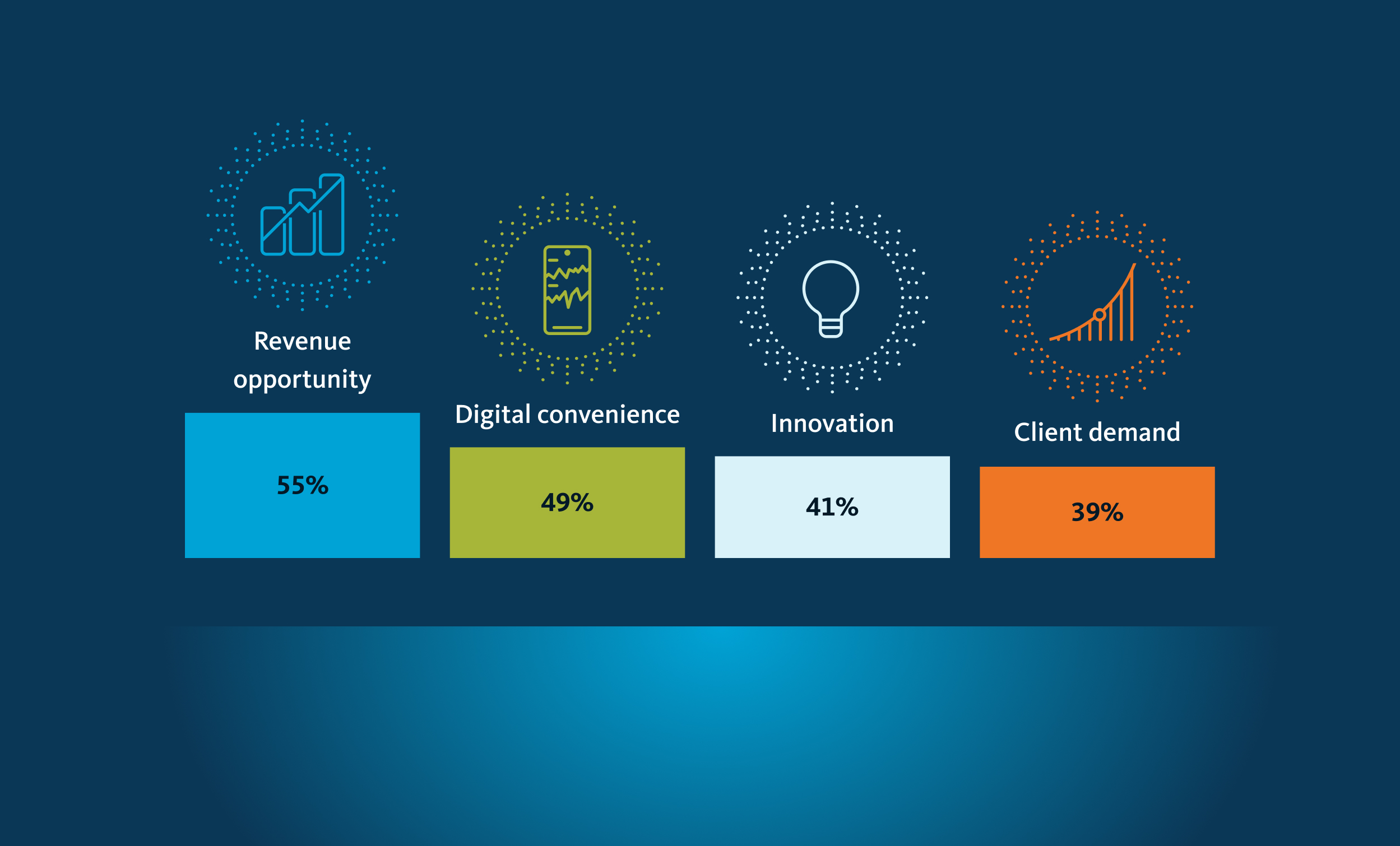
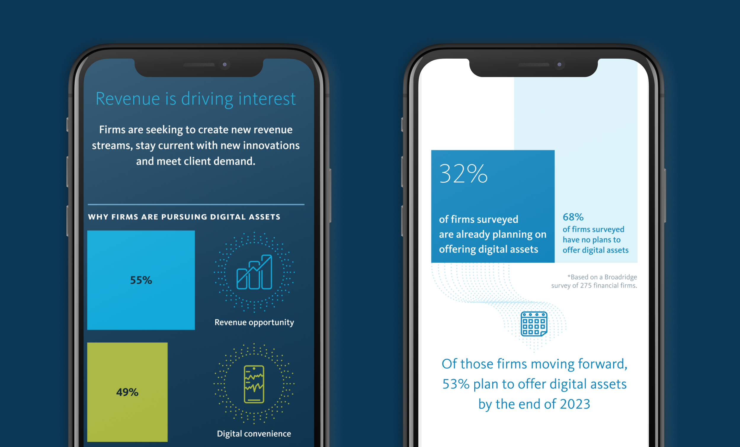
Broadridge approached our team to create a digital infographic that would tell the major story in their new report The Digital Asset Revolution: Preparing for the Next Generation of Financial Markets. We worked with their editorial team to determine which elements would be of most value to their readers and which data points we could showcase, putting together a script of what this infographic would look like including charts, icons and wider content blocks.
Social content and video
Our creative approach was applied to social content and video, used to drive traffic and interest to landing pages on the core Broadridge website.
Campaign look and feel
With the story defined, we then created a visual language that sat within the Broadridge brand but also brought something new and exciting to this campaign, referencing the topic. We used the Broadridge colour palette, adding bright accent colours to reflect the digital nature of cryptocurrency and crafting an ownable campaign style.
Delivery
Working with the Broadridge digital team we supplied assets to populate the campaign destination within their given digital template. We also produced a downloadable pdf that could be shared via email to form part of the wider report promotion.
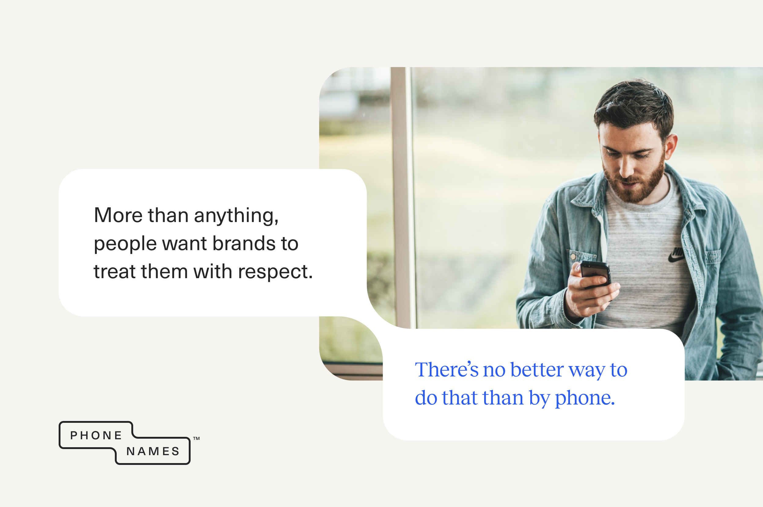
How many times have you shouted at a screen with the words ‘I just want to talk to a person’? The online world has many perks but what happens when ‘computer says no’? You’re not alone. 78% of UK consumers say they’ll want to interact with a real person more as technology improves.¹ 69% of UK consumers use the phone for customer service, making it an essential part of an omni-channel approach.²
- PwC, Future of customer experience survey, 2017/18
- Microsoft, State Of Global Customer Service Report, 2017
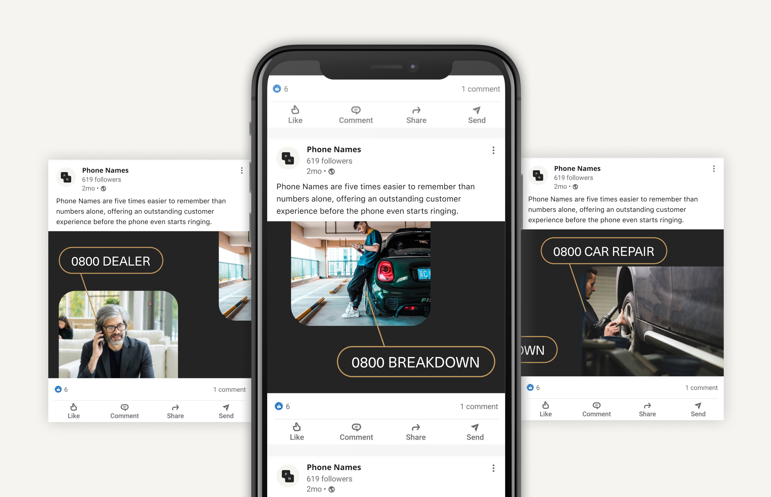
Phone Names have the solution for you. Simply dial in the phone code (e.g. 0800), then spell the name, product or service you want to reach using the letters on the telephone keypad.
0800 REPAIR
0800 TRAVEL
0800 BENTLEY
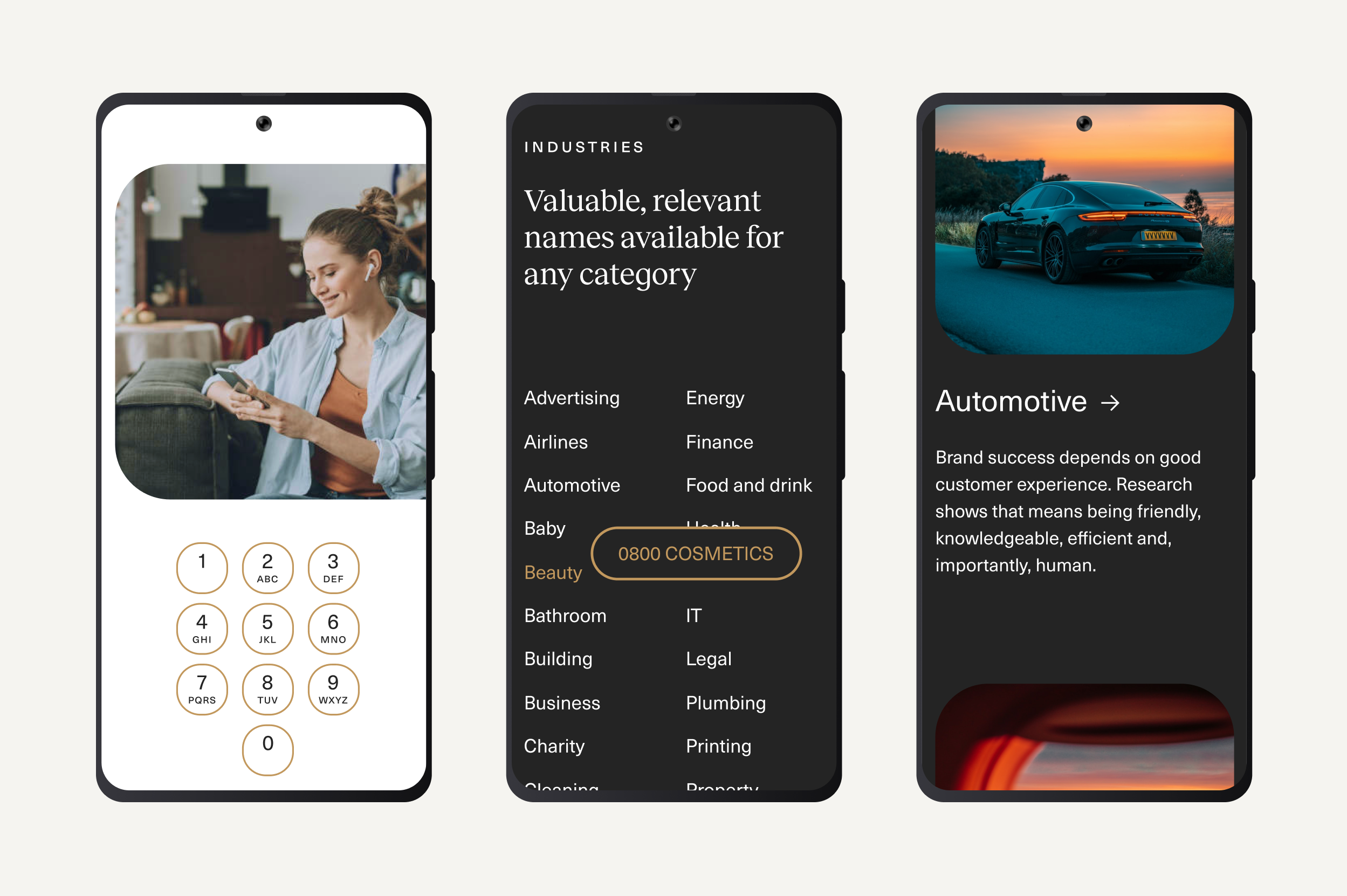
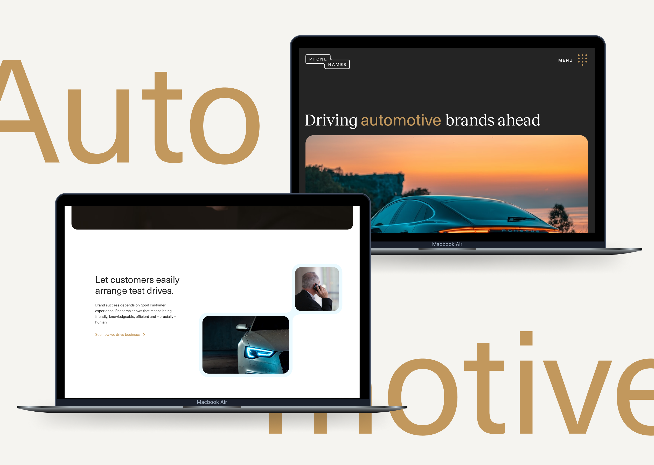
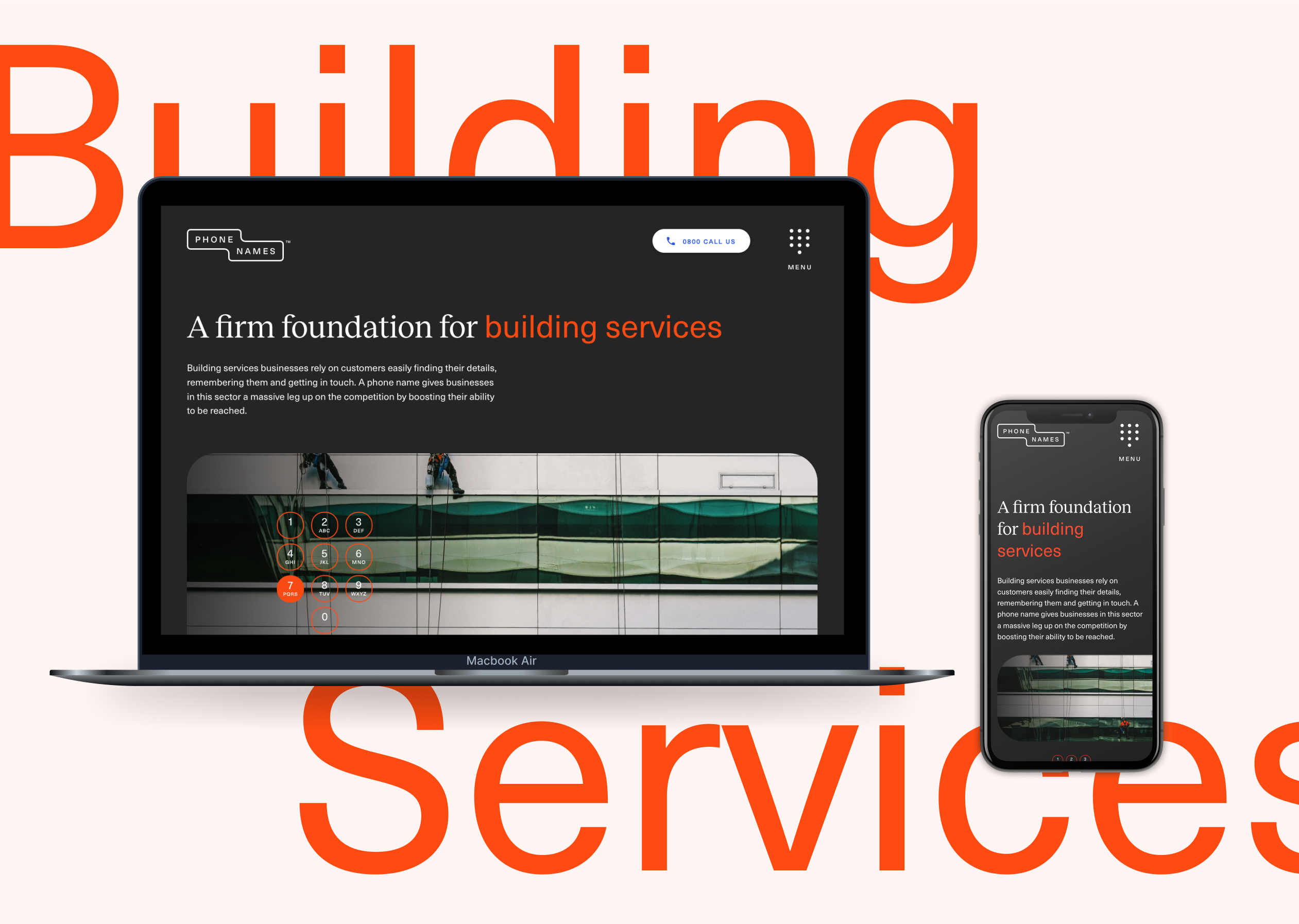
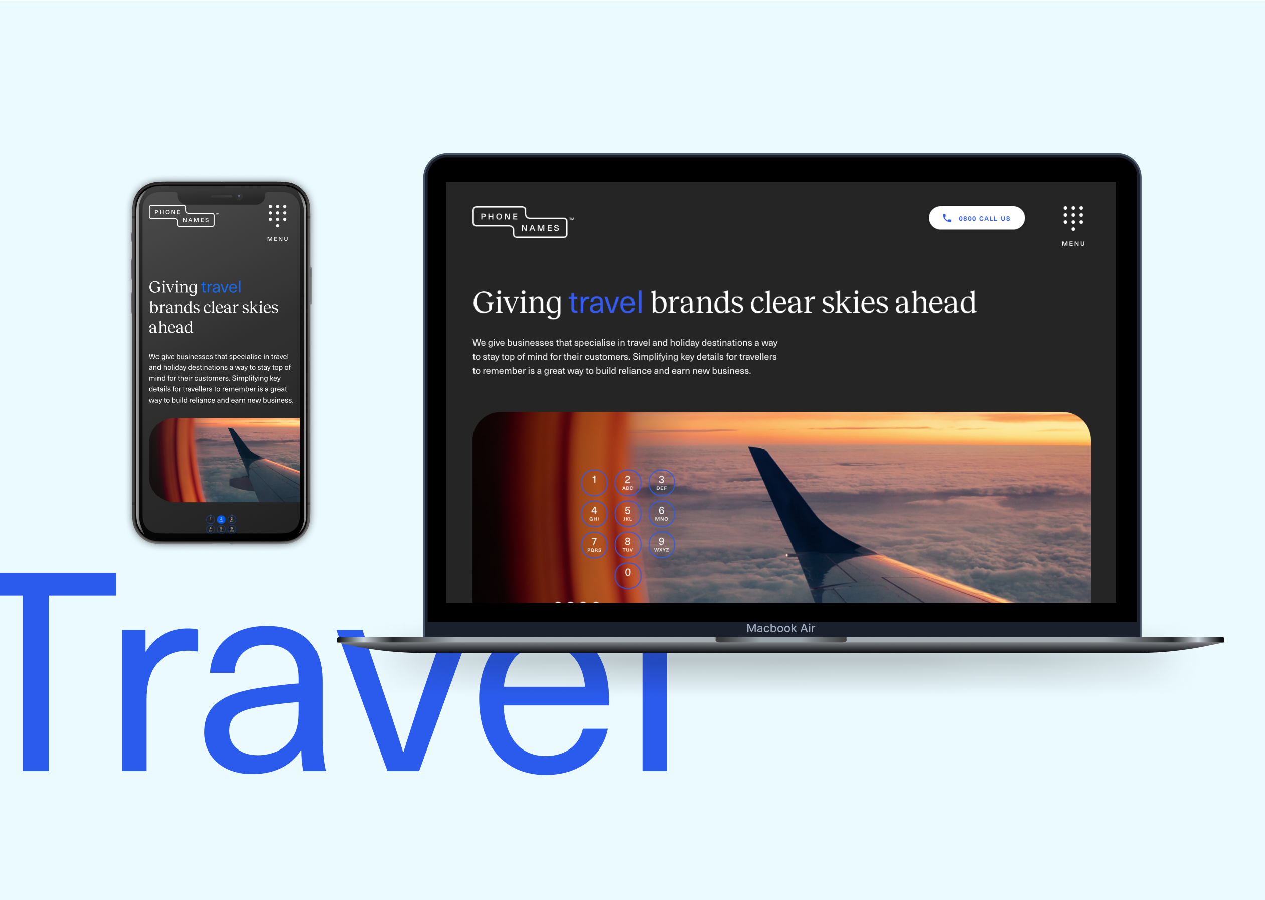
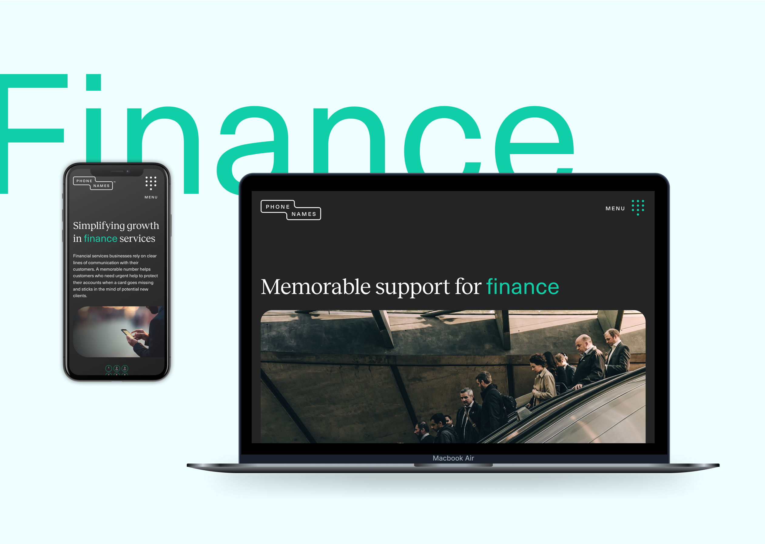
We wanted to create a sense of simplicity and clarity in the design work for the Phone Names brand. We developed a streamlined core colour palette with accents to be able to clearly highlight calls to action or key pieces of information for the brand’s audience.
We wanted to use photography within the brand look and feel as we thought this would translate well on social advertising as well as pairing with custom animations that we’d built to reference the phone names. We used quite dark tonal photography showing detailed elements so that we could create an approach that related to the full service luxury experience we wanted brands to create for themselves.
The result is a new digital presence and engagement campaign that is as effective as it is simple. Just like the business.

We were approached by Nissan – through our trusted partners at global communications company Edelman – to promote its electric vehicles with a unique digital activation campaign. The multinational manufacturer is a pioneer in electric vehicles. It has accelerated electrification and technological innovation, invested in charging infrastructure and made EVs more affordable.
The brief was to tap into the consumer trend for more sustainable travel and target an audience that shares the brand’s core value of sustainability and low-carbon-footprint transport. We were tasked with creating an interactive travel guide, promoting travel adventures by electric vehicle. Nissan wanted it to be exciting, digitally led, easily shareable and measurable.
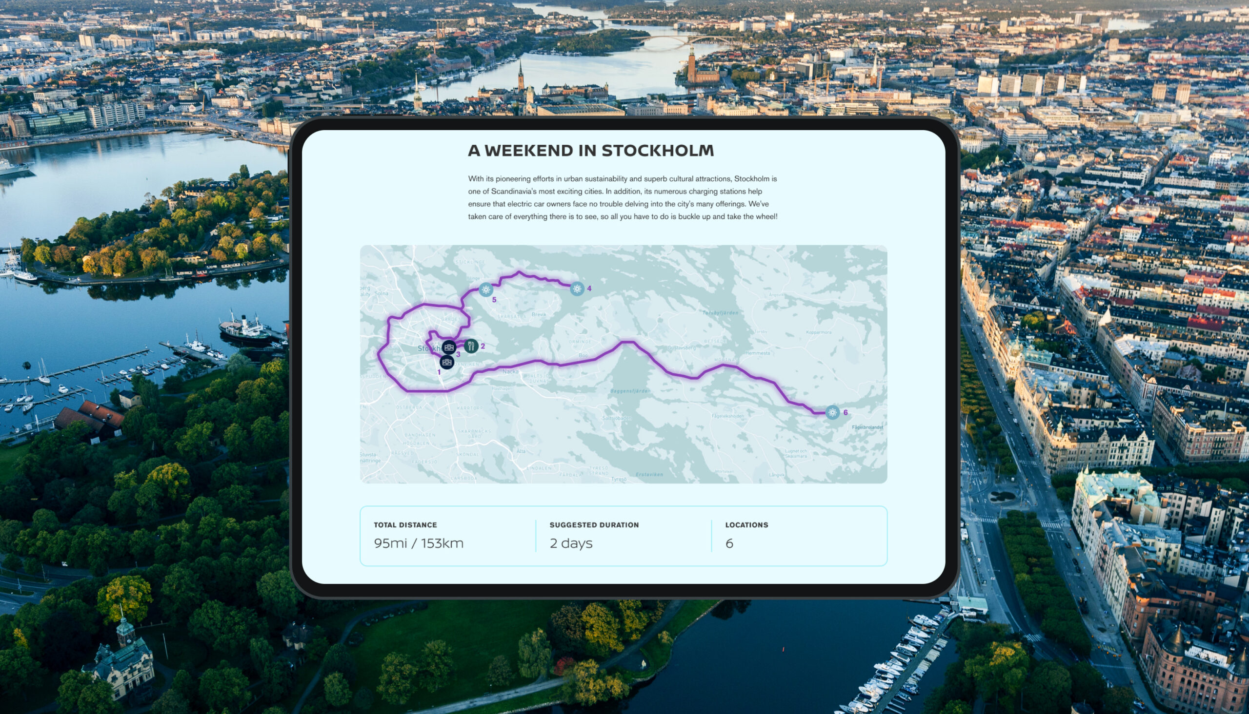
The first destination would be Stockholm, one of Scandinavia’s most exciting cities. Stockholm not only has superb cultural attractions but has made pioneering efforts in urban sustainability, with plenty of charging stations to make it easy for electric car owners to explore the city.
The electric travel guide would launch exclusively to influencers at an event in Stockholm
What we did
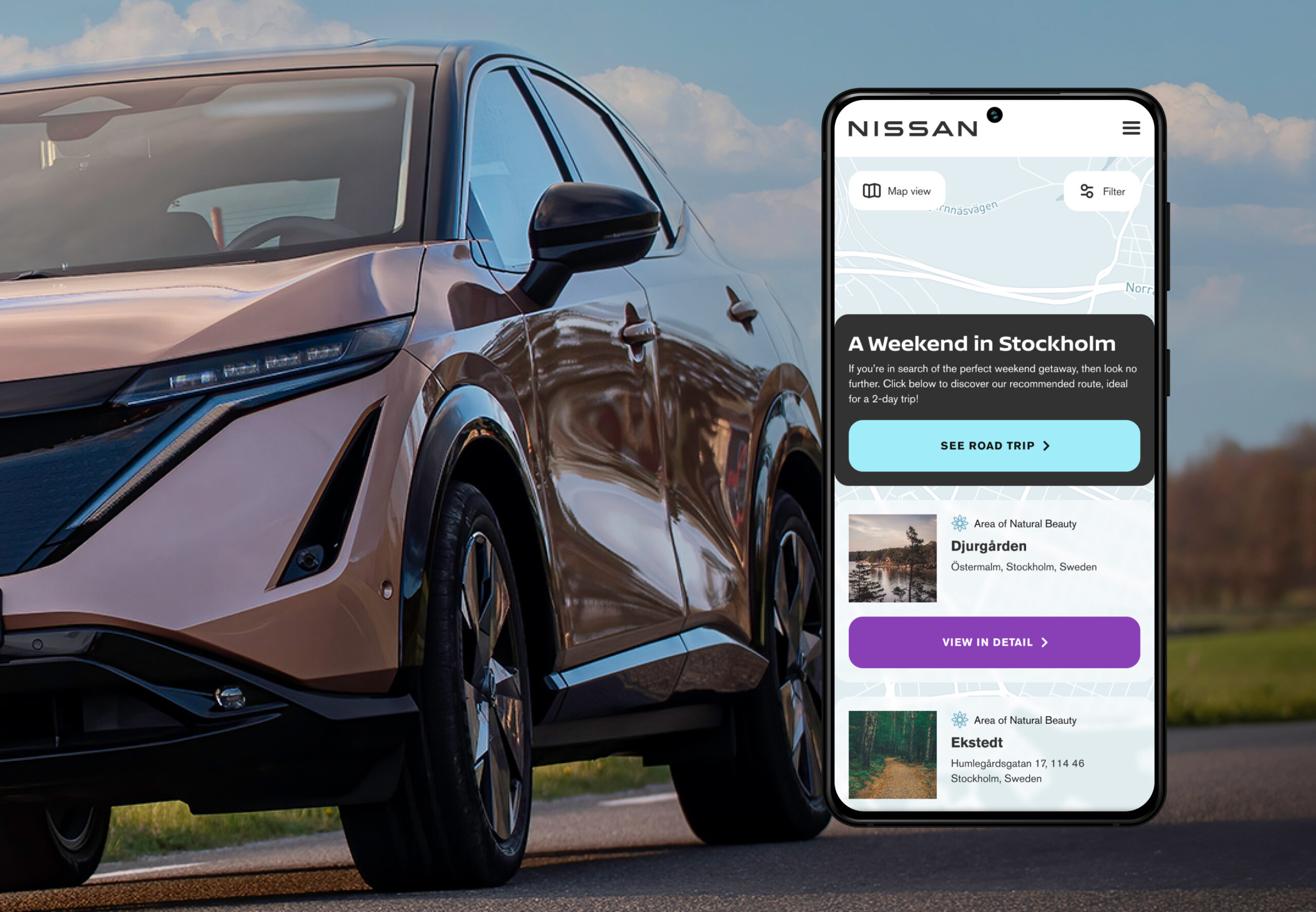
An interactive map
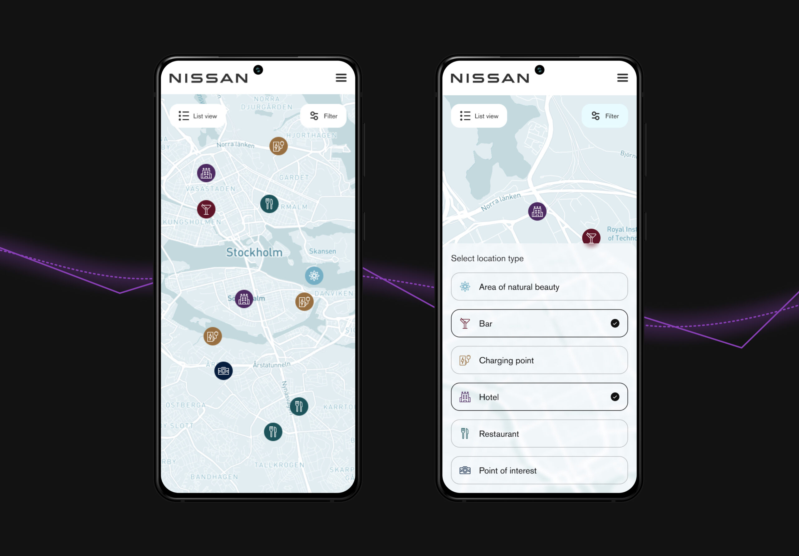
To make the guide as interactive as possible we chose to have an interactive map as the focus, which would show selected sustainable destinations and recommended routes.
We needed a mapping system with advanced functionality and styling capabilities so we used Mapbox, a platform we were already experienced with. It has a lot of flexibility in its infrastructure and we could implement it within the Nissan brand without making visual compromises. Unlike some other map providers it also doesn’t charge every time a user interacts with it.
We created categories for the destinations, such as restaurants, hotels, points of interest or areas of natural beauty, so that users can select what they’re interested in. Each destination then expands to show details plus links to TripAdvisor reviews and Google Maps to quickly and easily get more information.
User experience
We designed the user journey, using Stockholm locations and descriptions provided by Edelman.
Nissan wanted the experience to be accessible to as many people as possible so we developed multilingual functionality, with five languages including English. Further languages can be added in future as the guides expand.
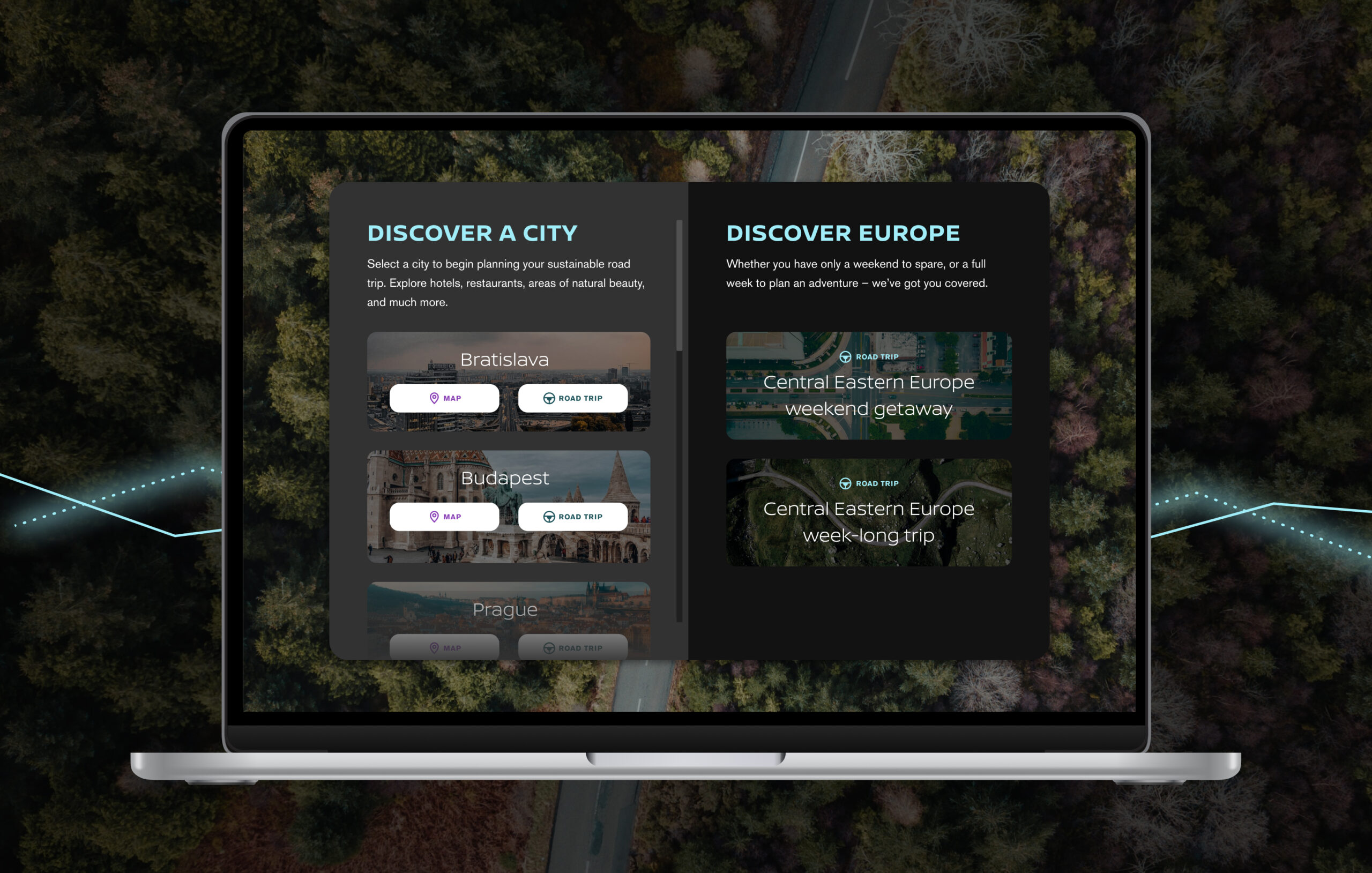
Following the successful launch of the Stockholm guide, we later built a second and bigger iteration of the product, adding four more cities – Budapest, Bratislava, Vienna and Prague – with maps and roadtrips for each one plus a bigger European roadtrip.
Focus on the car
The underlying focus of the travel guide is Nissan’s innovation in electrification so we created an About page with content on the fully electric Nissan Ariya and information on charging, to reinforce how Nissan is helping drivers to make more conscious lifestyle choices. This also links to Nissan’s Ariya sales page, where people can find out everything about the car.
Built-in analytics
The guide has integrated performance and analytics reporting, using Google Analytics, providing the client with data on areas of interest, usage patterns, most popular locations across each language and more.
After launch, we analysed how people were using the guide and worked with Nissan and Edelman to continue improving the UX, for example adding the roadtrip to the home page and segregating location types for easier browsing.
Future-proofing
We deliberately took into account the future life of the product, building the infrastructure in a modular way that can be added to, to give the product adaptability and longevity. Having built the framework, it’s easy to add further destinations and categories. Users will get new content and travel ideas and Nissan can potentially reach a wider audience with every new destination.
Further functionality could also be added to help build a community around the product and increase sharing and engagement e.g. users could add photos of their journeys, submit destination requests and more.
Outcome
So far (spring 2023), 9.3k people in 106 countries have visited the guide.
Senior leaders at Nissan have enthusiastically supported it. The Senior VP of Sustainability, Corporate Affairs and Governance said: “As we continue driving a fundamental shift in how sustainability can – and should – be at the forefront of our lifestyles in the move to an electrified future, the Nissan Electric Travel Guide demonstrates that it is possible to continue travelling while having a kinder impact on our planet.”
Challenge
The majority of UK companies are SMEs. They are a vital part of UK economic growth and job creation. But in a worsening economy, a lot of business owners’ confidence in their future depends on business loans. A 2022 survey by Funding Options showed that 88% of 1,000 SMEs expected to be looking for funding in the near future.
They need to be able to get this, and for their business to survive they often need to get it fast.
Business finance marketplace Funding Options wanted to create a new product to facilitate this lending. It had already developed and built its own technology stack, Funding Cloud(TM), which uses data analytics, open banking APIs and AI to make the process faster for SMEs, give greater transparency to lenders and make the market more efficient.
Now Funding Options wanted to make use of all the data it was accumulating to help lenders see patterns in loan applications, usage, uptake and more, giving them extensive market intelligence and insights. This would help lenders respond to SMEs in almost real time and offer them what they need, when they need it, evolve their lending propositions, make more accurate decisions about products, and create new ones.
We had already worked with the company on the launch of Funding Cloud(TM) and now it came to us again.
What we did
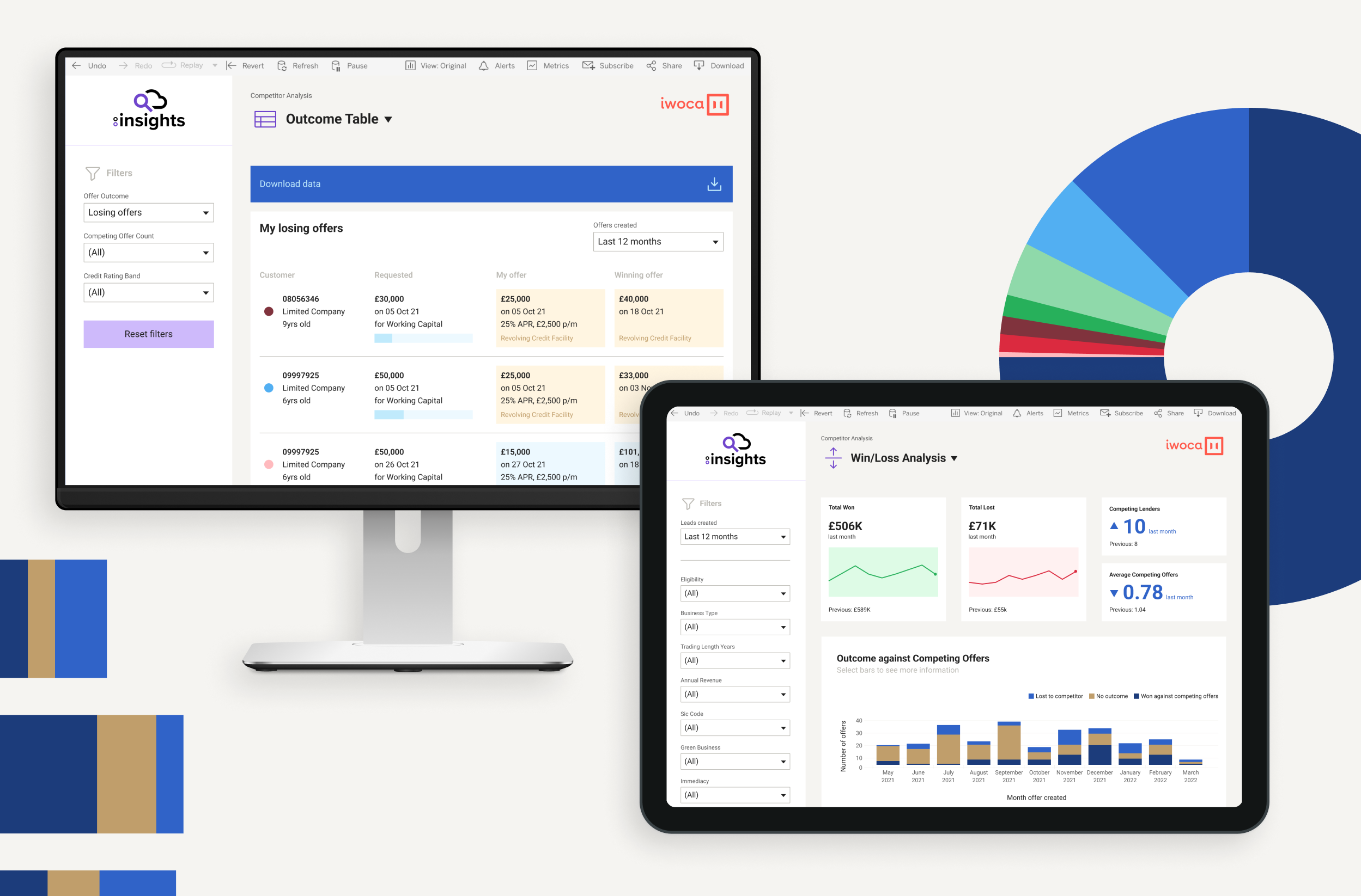
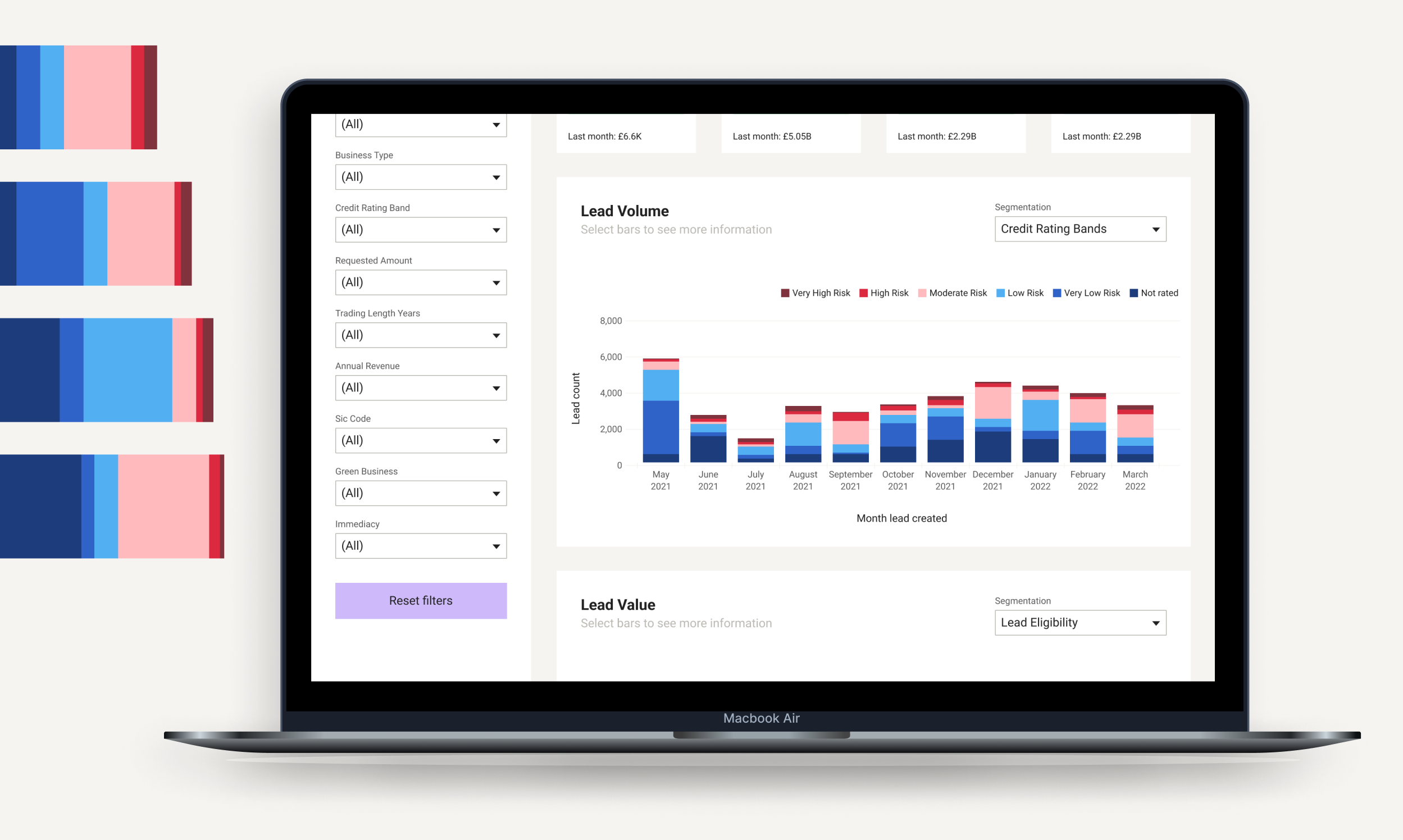
We collaborated with Funding Options to create FC:Insights, working on the UX, UI and visual design. Lenders can embed their products in the platform and through granular trend data they can understand their position relative to other lenders, adapt their products and pricing, see new opportunities and make commercial decisions.
Data visualisation
Data on its own is not enough. It has to be brought to life. When it’s presented visually in a simple, clear and attractive way, users can easily understand what it’s telling them. It can help them analyse complex data and see patterns and stories. It gives them insights that they can make informed decisions with and take action on, with confidence.
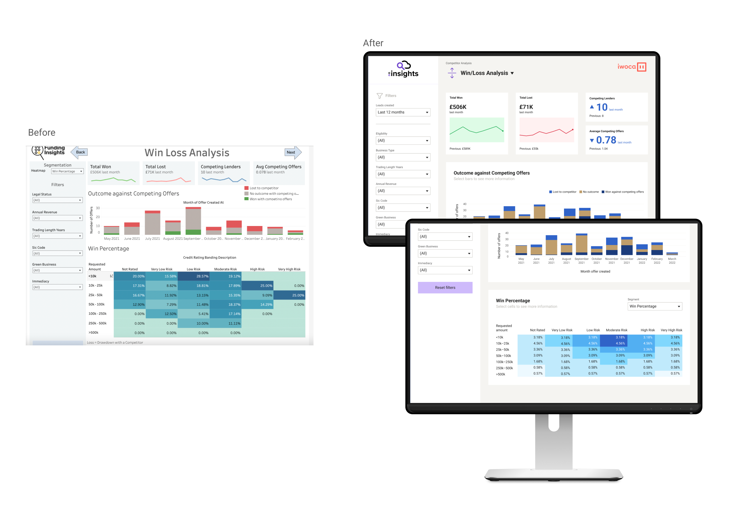
As well as its proprietary technology, Funding Options wanted to use Tableau an interactive data visualisation tool – to power this new digital product. Tableau would integrate with its own multiple data sources to create a range of dashboards for users.
We collaborated with a Tableau consultant to understand the possibilities of the system and how its use affects design choices. Working within its parameters, we decided how data would be displayed and we built all the chart types and landing pages.
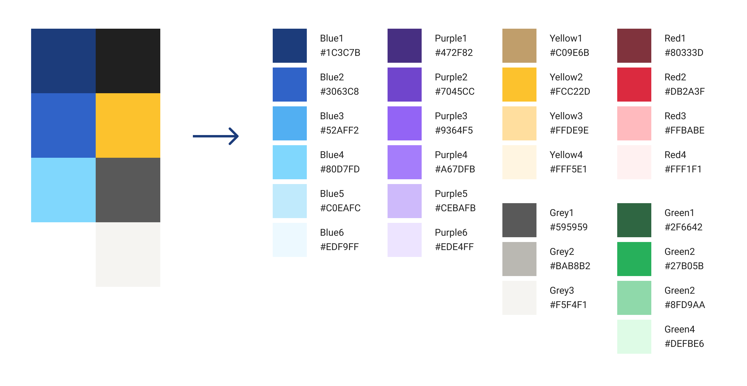
Once we had this, we created a roadmap for the product and a UX that signposts users to key data, and designed a visual style. This included colour palette, font choice and how space is used around the data for clear presentation.
Then we handed this to Funding Options’ development team to build, integrating with them to implement our design as part of the first release. This set the design foundation, ready for the product to be fully developed and launched. The project was done within a deadline of four weeks.
Outcome
We helped to create an intuitive and user-friendly platform, which – in a fragmented and highly competitive market – gives lenders near real-time knowledge and intelligence, so that they can make better lending decisions. FC:Insights is a technology milestone for Funding Options.
“During these tumultuous times, both lenders and business leaders need all the tools at their disposal to make faster, cost-effective decisions […] We are offering lenders intuitive data visualisation to place them at the forefront of innovative product development. Over time, we will aim to scale this data-rich marketplace further and improve it based on the feedback of our valued lender partners to enable the collective market to move faster than ever before.”
Malcolm Leach, CTO of Funding Options
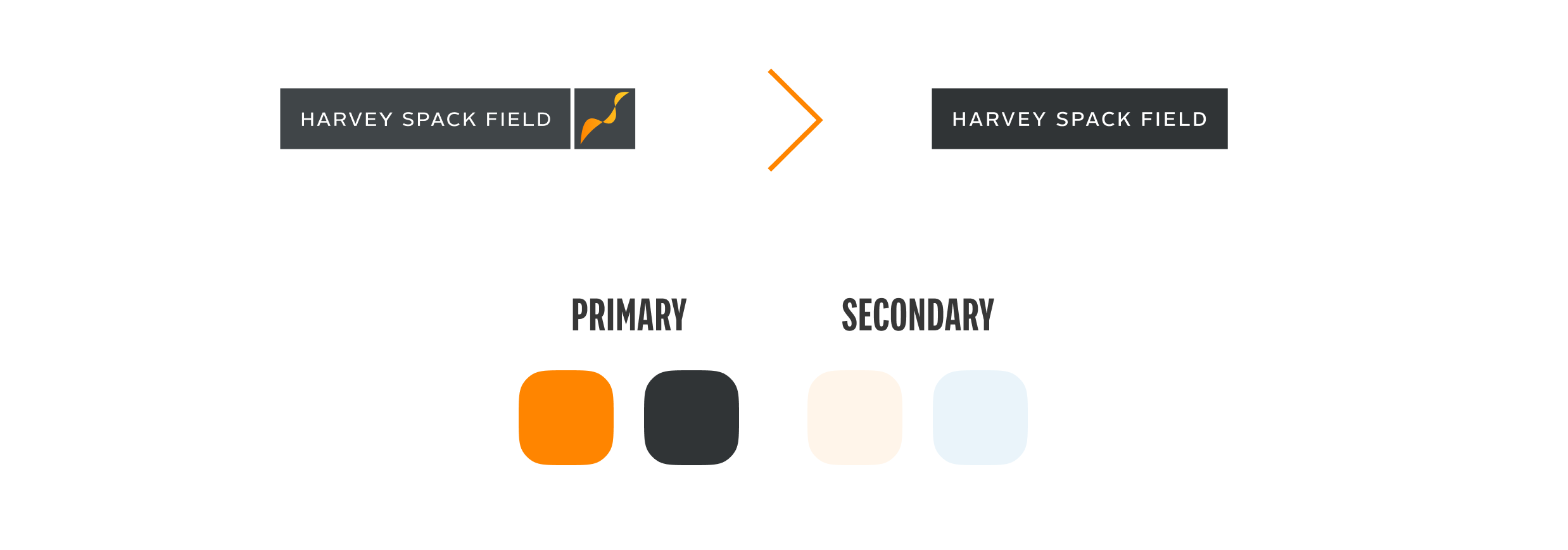
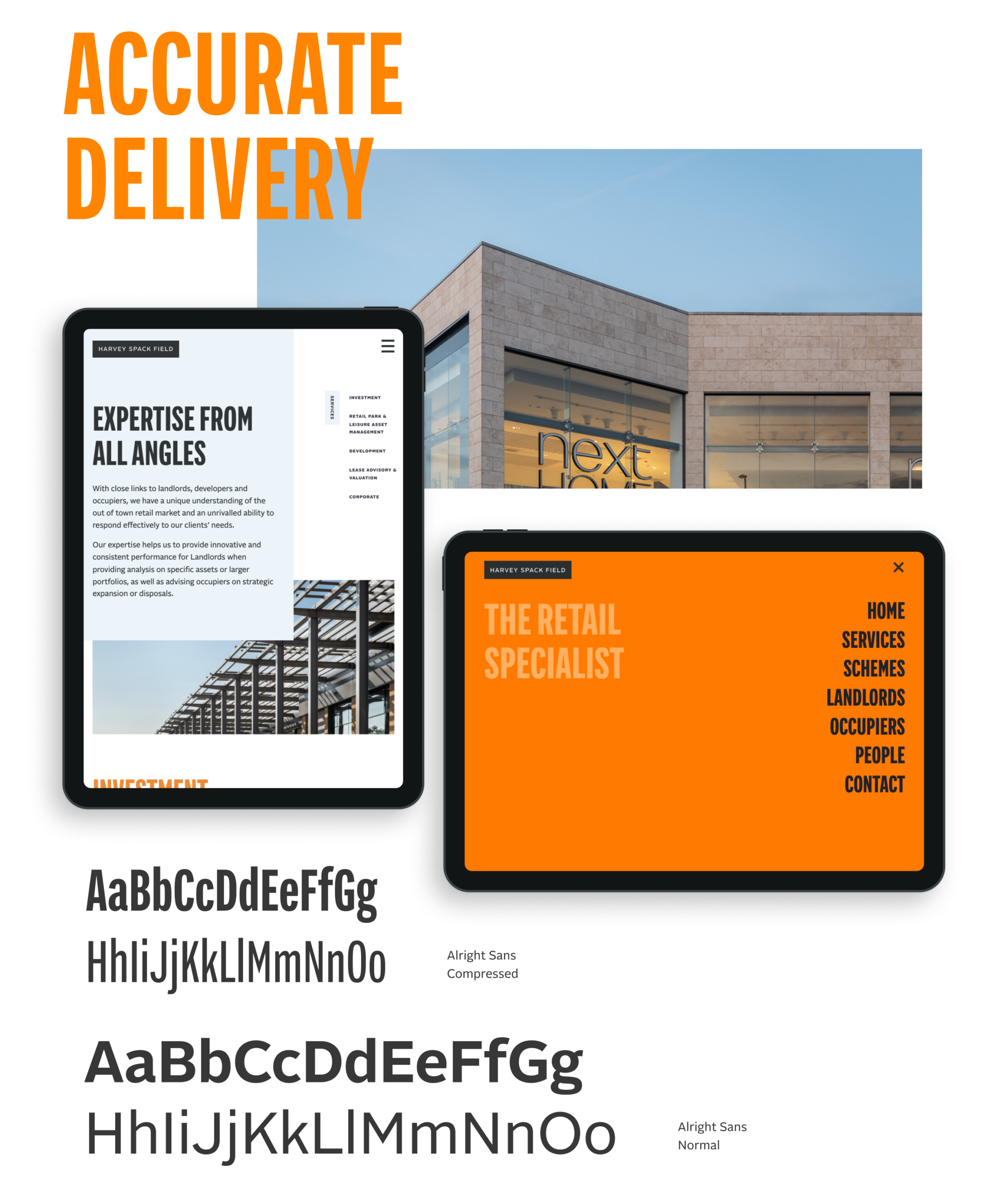
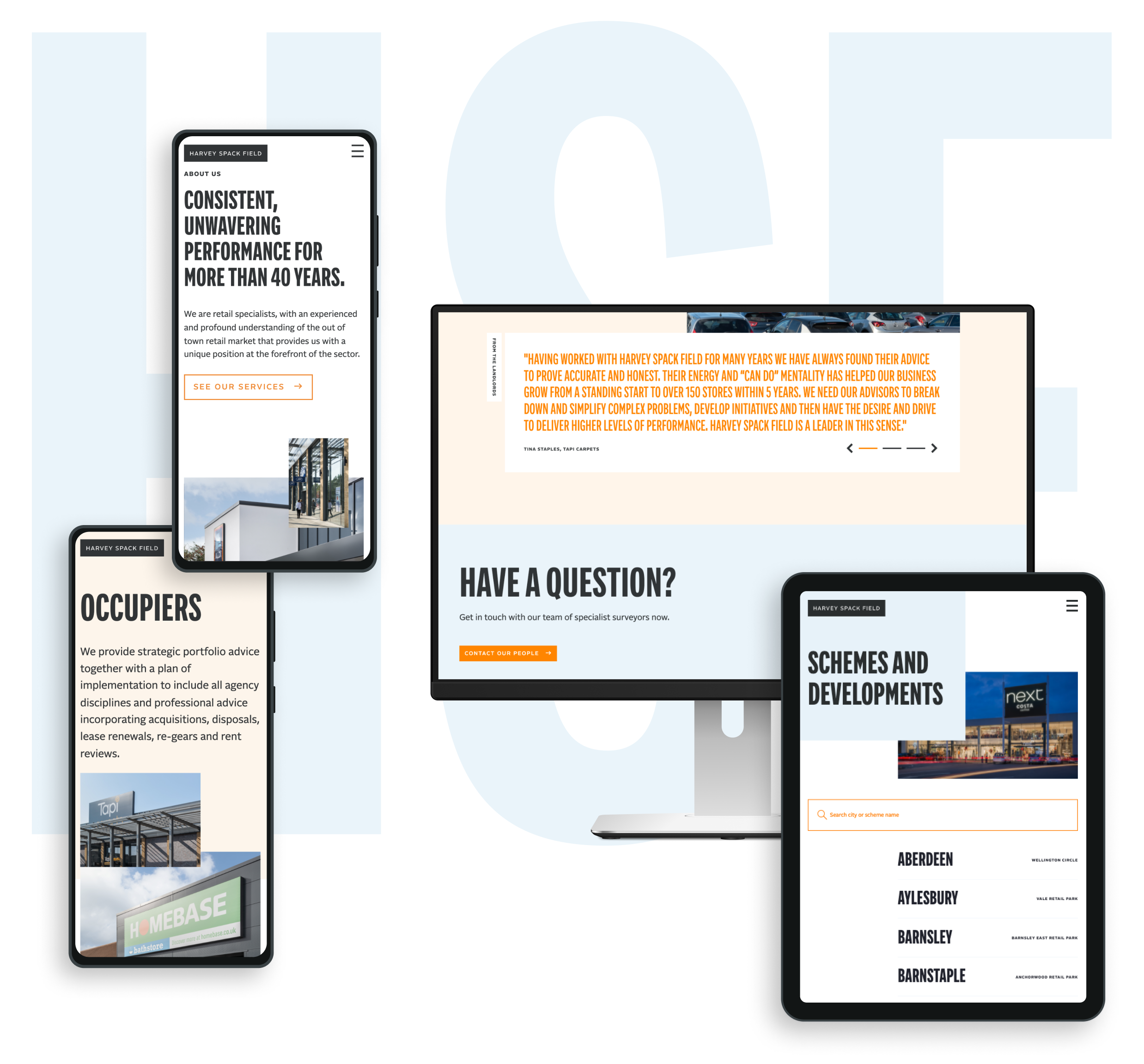
A long-standing client, Harvey Spack Field approached our team with the request of delivering a fresh, clean and direct digital presence that helped best tell the story of their market knowledge and expertise.
For this updated approach, we wanted a bold first impression that then takes the user on a tour of HSF’s overall service offering in a streamlined yet intuitive manner.
Direct approach
Our design intent was to create a site experience that would immediately engage a user. The messaging had to exist alongside the visual presentation of the brand and help lead users to understand how the Harvey Spack Field personality and mindset can help them in their objectives. We kept the navigation surrounding the work simple enough that the viewer is compelled to continue their investigation throughout the site.
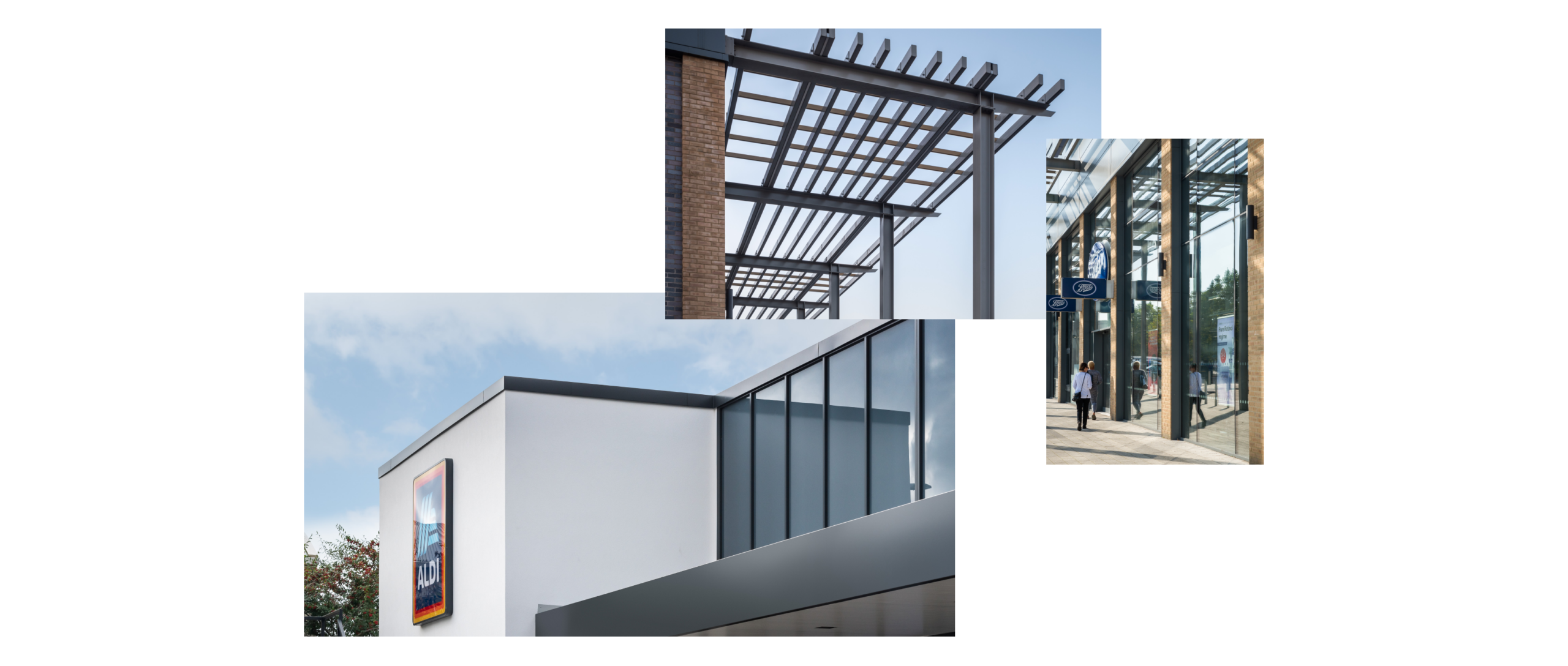
Our design process began mobile-first, fluidly responding to other device sizes. Commissioning photography that really brought forward the architectural details of the HSF schemes, this visual approach brings an elegant simplicity to the site presentation helping draw the user’s eye to the schemes and the services that HSF provide.
Broadridge is one of the world’s leading providers of financial technology and services, with $5bn+ in revenues and more than 14,000 employees in 21 countries. Its infrastructure provides a global communications hub that links thousands of companies and funds to millions of individual and institutional investors, underpinning daily trading of more than $9tn of equities, fixed income and other securities.
It has multiple products, services and insights, helping banks, broker-dealers, mutual funds, asset and wealth managers and public companies manage risk and accelerate growth. But it wasn’t presenting them well. Over time, through a combination of internal innovation and external mergers, it had accumulated multiple products. These looked inconsistent, were described differently and were not presented cohesively as a core offering.
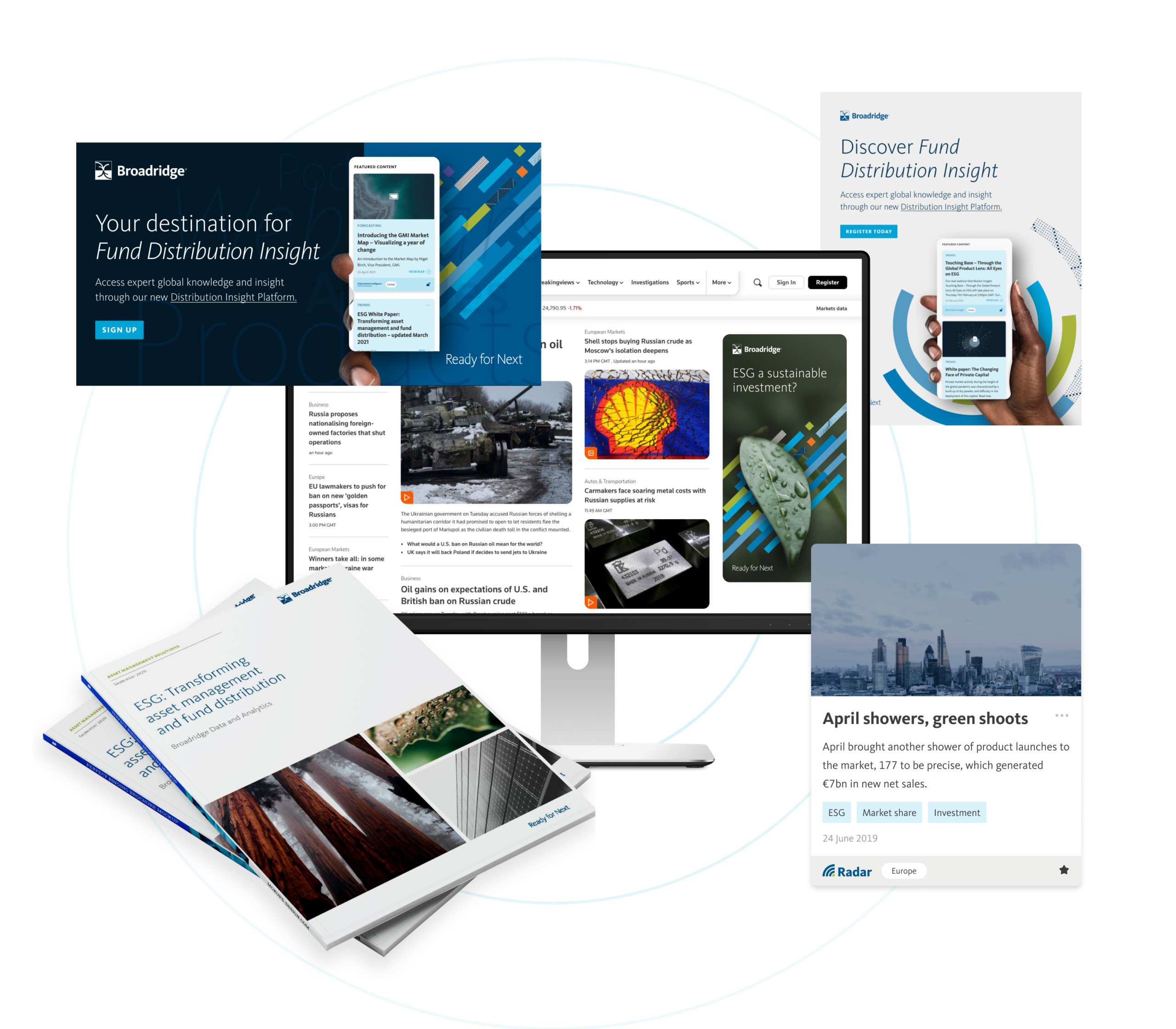
It was time to create an accessible, consistent, progressive digital experience where clients and potential clients can easily access everything. The commercial need was for a go-to-market strategy for 20+ products and services.
What we did
Our role was to help formulate a common approach across presentation, tone of voice and brand look and feel, bringing these products to market as part of a single, consistent core product suite.
First, this required us to delve into Broadridge’s existing proprietary systems and to think strategically. Our team looked at the product range, revenue mechanism, distribution and release schedule, associated content, regional outlook and more.
Strategy and team
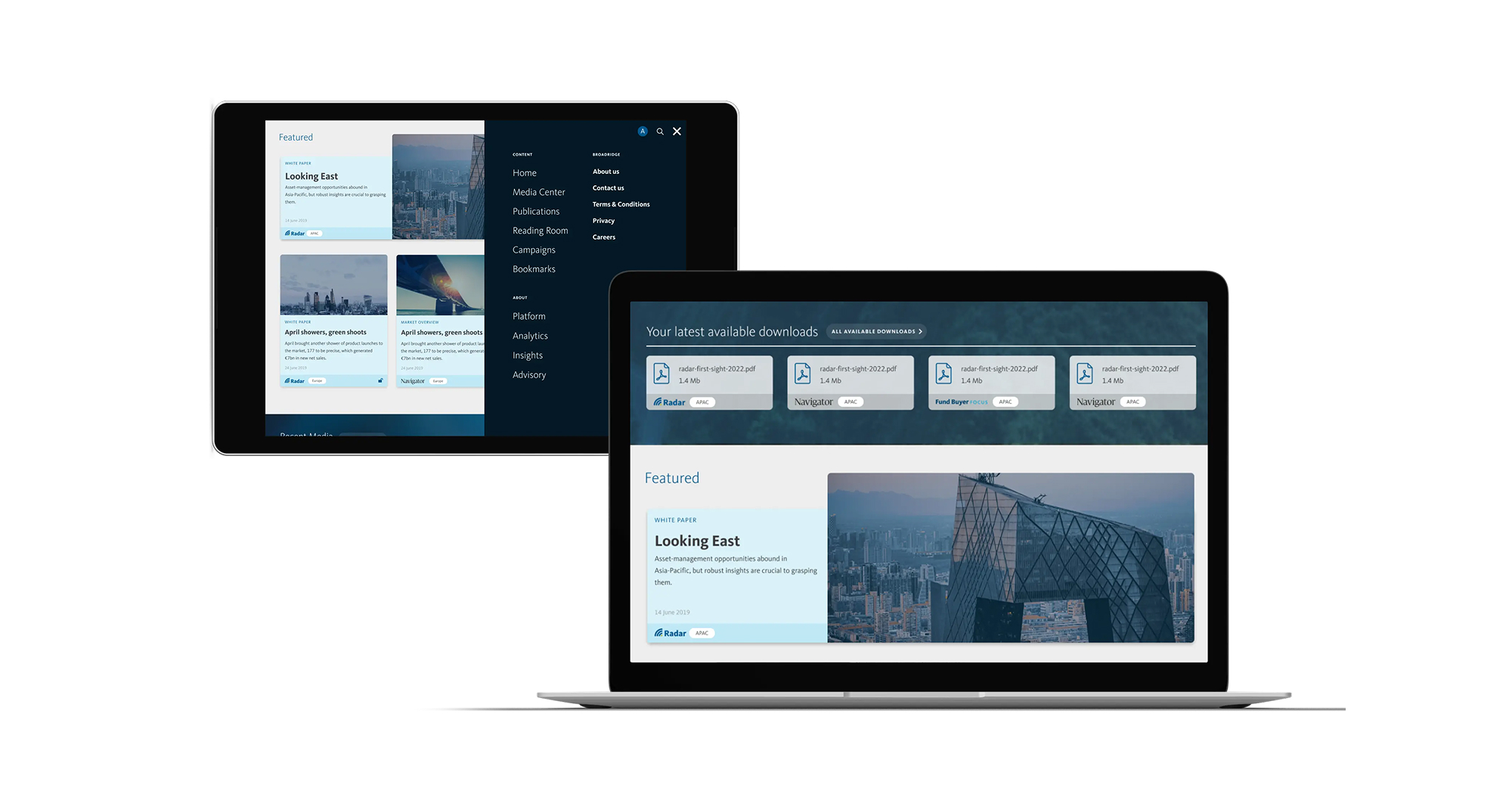
We realised we needed to build a new, single destination that would hold all of this in one place. The Distribution Insight platform would be a new future-facing website for Broadridge; its repository for everything distribution-focused.
We adopted an integrated-team approach, providing UI, UX and digital development support to the multiple internal teams building and developing different aspects of the platform. We worked closely together on technical decisions and provided rapid prototyping for key elements. This included research and development across integration and administrative logic, unique content mapping and infrastructure strategy.
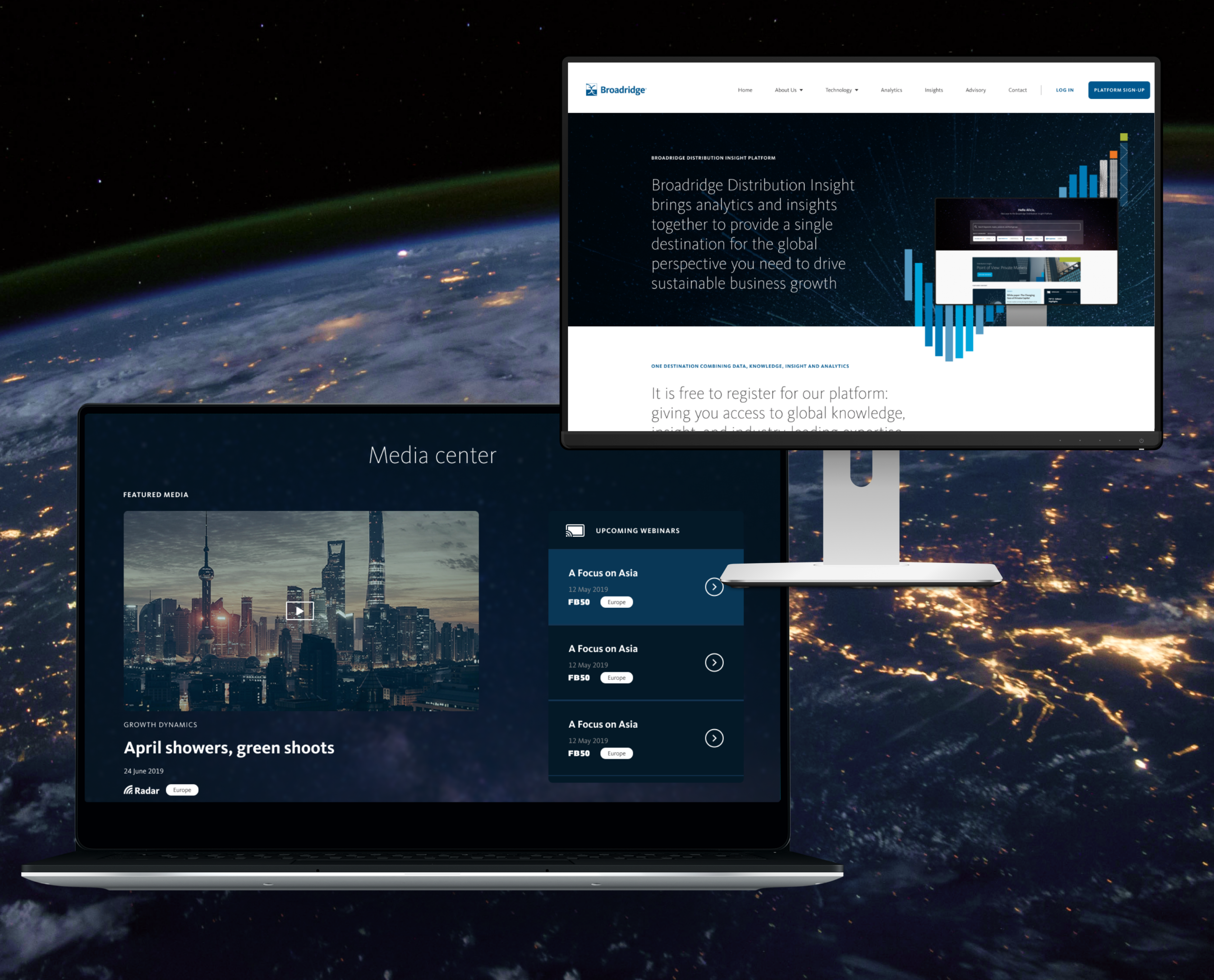
The new platform, Distribution Insight, brings Broadridge’s analytics, insights and advisory services together, giving asset managers a detailed picture of global markets and critical insights that can help them operate strategically and accelerate their growth.
Campaign activation
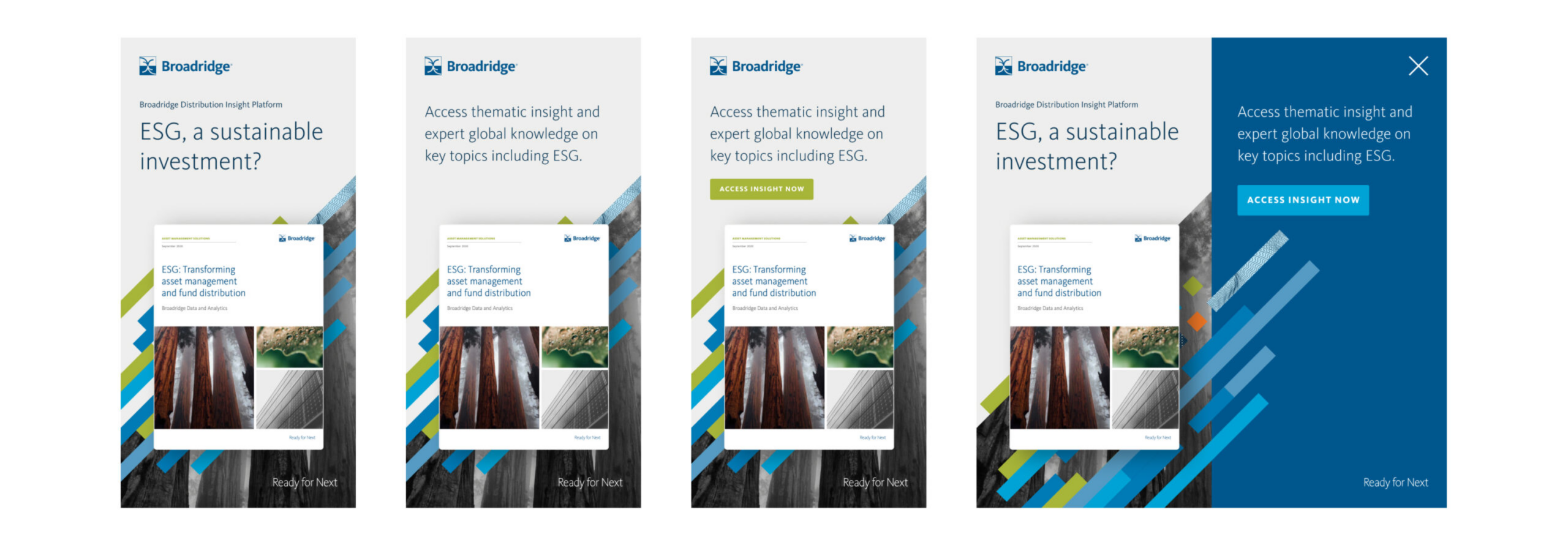
We were also asked to work on a launch campaign, and designed an activation programme for Broadridge’s teams to bring it to market. We designed creative executions across motion, interactive advertising and wider campaign creation. This work was featured in Reuters, FT’s Ignites Europe, Funds Europe and other platforms.
Outcome
Working hand in hand with Broadridge, we co-created a strategy, unified sales proposition and distinct visual approach for an entirely new digital sales concept, Distribution Insight. We conceived, planned, designed, built and launched a single digital environment with access to a suite of distribution products, both analytical and insight focused.
The system has supported multiple global teams with their product sales and growth strategies – and given their clients products and insights to inform their strategies and fuel their growth. We continue to help Broadridge maintain the system.
We now have a long-term partnership with the organisation and have become an extension of its global team, supporting multiple business units with the following services:
- Strategic brand positioning
- Product positioning and development
- Brand creative
- Digital product UI, UX and design
- Digital architecture and prototyping
- Digital development and build
- Product launch
- Campaign activation and social activity
Other projects have included AXA × Broadridge ↗ and Broadridge FundForum Digital Tool ↗
Getir is a pioneer in ultra-fast grocery delivery. Customers order through its app and deliveries can arrive as fast as 10 to 40 minutes. It operates in 48 cities across the UK, US and Europe and 81 in Turkey. After a funding round in 2022 it’s valued at $12bn.
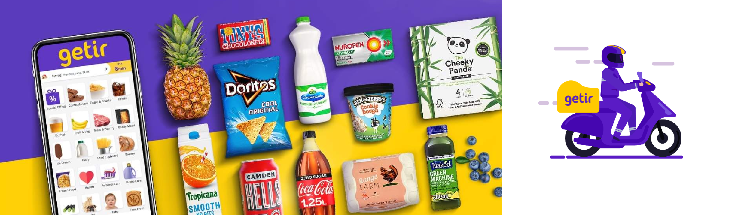
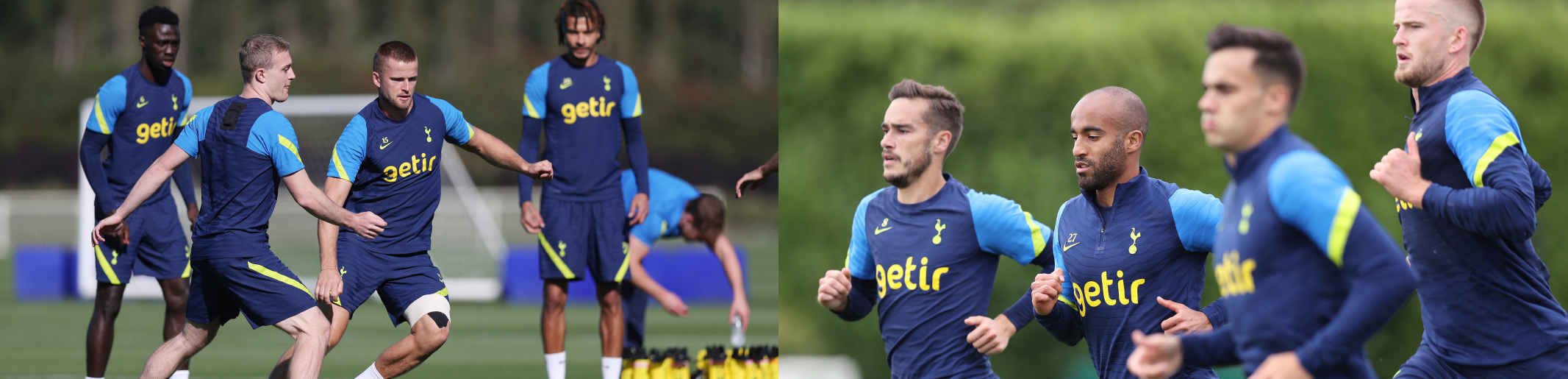
Among their global partnerships, in summer 2021 Getir became the official training wear partner of Tottenham Hotspur FC. CAA approached us to help deliver an exciting digital product to celebrate this milestone partnership. The brief was to run an online competition in the stadium, to build brand awareness, engagement and incentivise people to download the Getir app.
What we did
Getir wanted an engaging football-themed experience giving fans the chance to win a selection of prizes including stadium tours, signed shirts, £10 Getir credit and more. The experience had to be fast – around 15 seconds.
We had to consider several elements of functionality:
- The mechanic to select randomised winners
- The mechanic of the game
- The journey time from the game to the Getir app and back again
- User verification in the app and a smooth API call from our product to Getir’s database
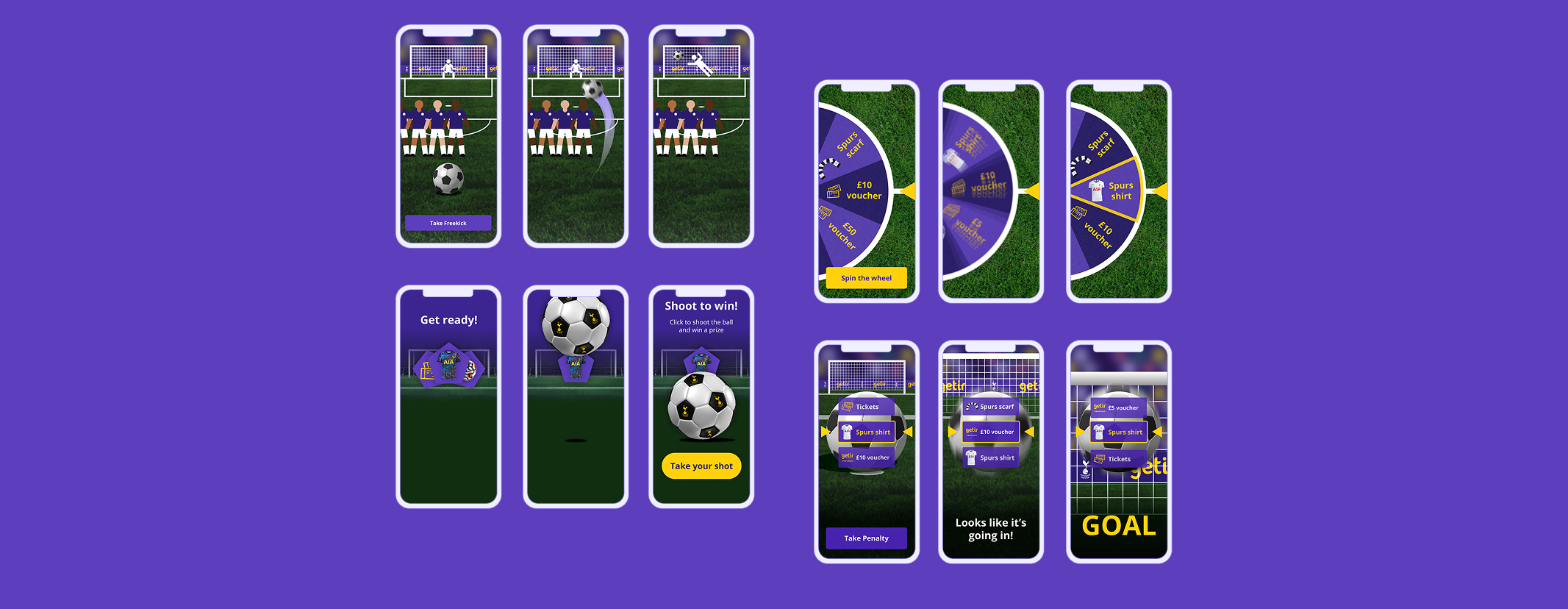
Gamification
The prizes within the product would be randomised and users wouldn’t have an impact on the outcome, but we nevertheless wanted to create a sense of gamification. Making a tool into a game appeals to people’s natural desires for learning, mastery, achievement, play or competitiveness. By creating a sense of gamification our designers could insert gameplay elements into a non-gaming setting, with fun features to satisfy people’s natural motivations so that they would enjoy the experience more.
As the use-time of the game was so short, we had to create a simple mechanic that people would instinctively know how to interact with, and with the capacity to present multiple prizes to build suspense and intrigue. This dictated the final decisions on the design.
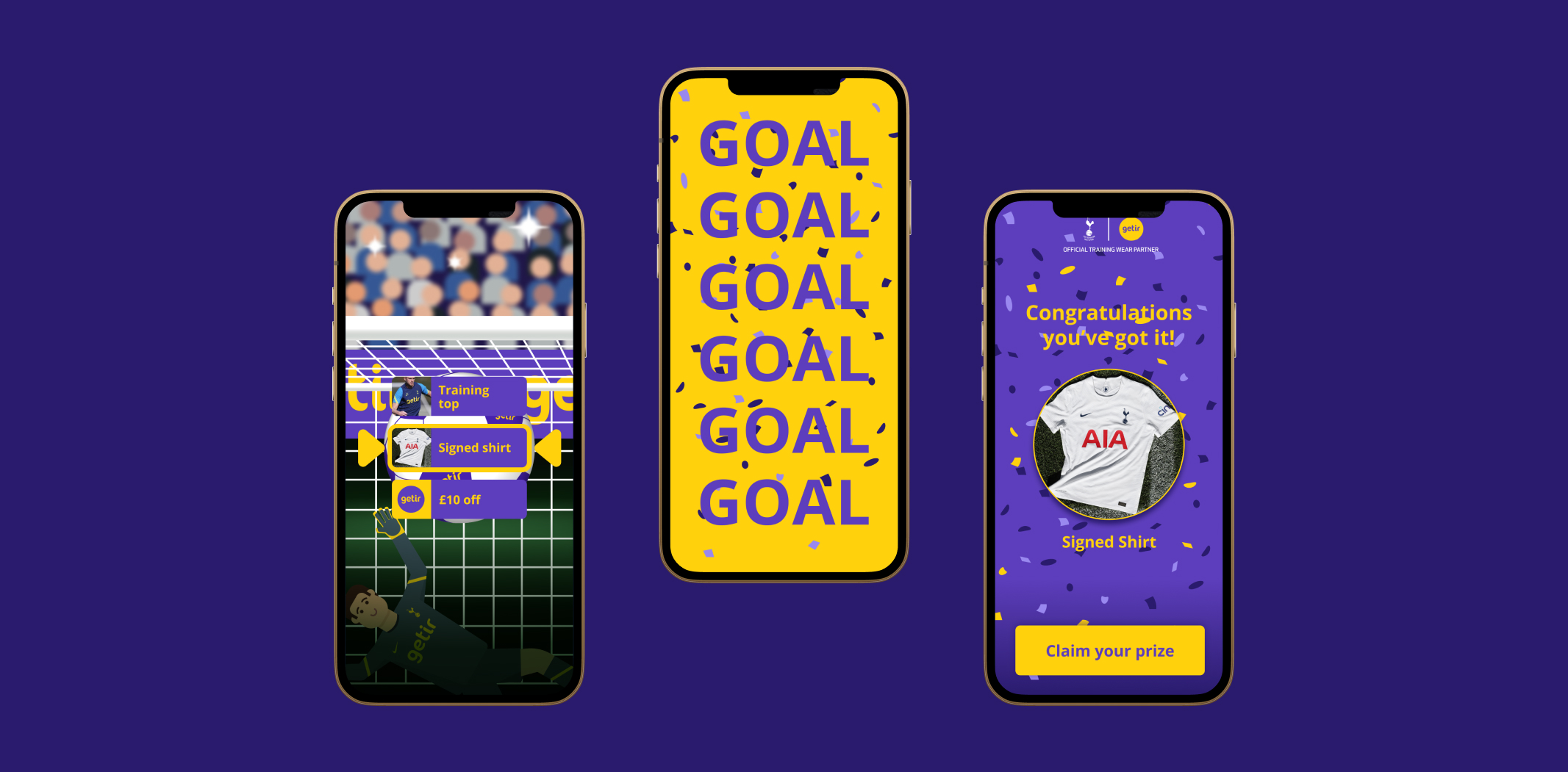
Design and UI
Getir’s branding led the look and feel of the product, using their fonts and colour palette. This was a unique product for the company, so we had to build a number of new elements. The brand is illustration-based with bright colours, so everything else within the product had to align with that. For example, we couldn’t use photo-realistic elements or animated vectors. We had to find a balance between brand consistency and bringing personality and life to the experience.
We did this in a few ways. We designed a goalie wearing the official home game kit in the same style as Getir’s distinctive scooter rider. We created a stadium crowd illustration with photography flashes and movement to suggest the buzz of a real crowd. We built a football that reflected the brand but with the depth of 3D to give a sense of realism. These felt engaging while still in line with Getir’s visual style.
This design also fed into an animated video that played behind the game mechanic.
When users won a prize, the game had to feel exciting and dynamic so we built in flashing colours and confetti for every prize. As this was a firmly mobile-first experience, we rigorously tested the design across multiple devices so that it would perform perfectly every time.

Digital development
As the product was going to be used in the Spurs stadium, which has a capacity of 62,000, it couldn’t crash if thousands of people used it at once. We utilised Getir’s existing servers and app verification flow. We ensured that the servers would be able to handle the traffic and conducted a series of tests including load testing.
We created the information flow from the product to the servers using a custom-built API. When users at the stadium scan the QR code to open the experience, information is pulled from the Getir server to define which prizes are available for that event and the dynamic prize images that the user sees on screen.
The game asks for phone verification and, to prevent multiple entries, looks up the user in the Getir database or adds them to it if they’re new. As long as they haven’t previously entered that week’s competition, they’re texted a unique ID code to enter the app and continue with the game.
Outcome
We built a unique digital product that pays homage to the great game while also building awareness of Getir among football fans and increasing downloads of its app. The product was launched in the stadium for a home game between Spurs and Manchester United and many prizes were awarded.
Background
Most people who drink alcohol won’t ever need treatment – but many are curious about how much they drink and whether it’s affecting their wellbeing. The challenge is finding information that’s relevant, reliable and non-judgemental.
Drinks Meter was designed to meet this need. It is a digital tool (web and app) that gives users instant, personalised feedback based on what they’ve shared about their drinking. Instead of offering blanket advice, it reflects back patterns using evidence-based strategies – motivating people to think, adjust, or take action if they choose. The tool is entirely anonymous, user-led, and grounded in harm reduction.
Conceived and independently funded by Professor Adam Winstock – consultant psychiatrist, honorary clinical professor, and founder of the Global Drug Survey – Drinks Meter builds on his ongoing mission to make drug and alcohol information accessible, human, and evidence-informed. Continuing our long-standing relationship with the Global Drug Survey, we were brought in to position, design, and develop the Drinks Meter brand and digital product.
Approach and Build
From the start, our aim was to create a product that felt intuitive and supportive – something people would not only use, but return to. Working in close collaboration with Professor Winstock, we began with the structure and logic of the tool. He provided the core content and functionality; our job was to shape the user experience around it.
We took an iterative, user-first approach, refining the journey step by step. The final product was built using a single responsive codebase – meaning we could deliver a seamless experience across mobile and desktop from one build.
UX and UI design
We started by mapping the tool’s logic – how users input data, how responses are calculated, and how feedback is presented. Once the flow was clear, we layered in the visual design: a clean, uncluttered UI that supports easy navigation while reinforcing trust and clarity.
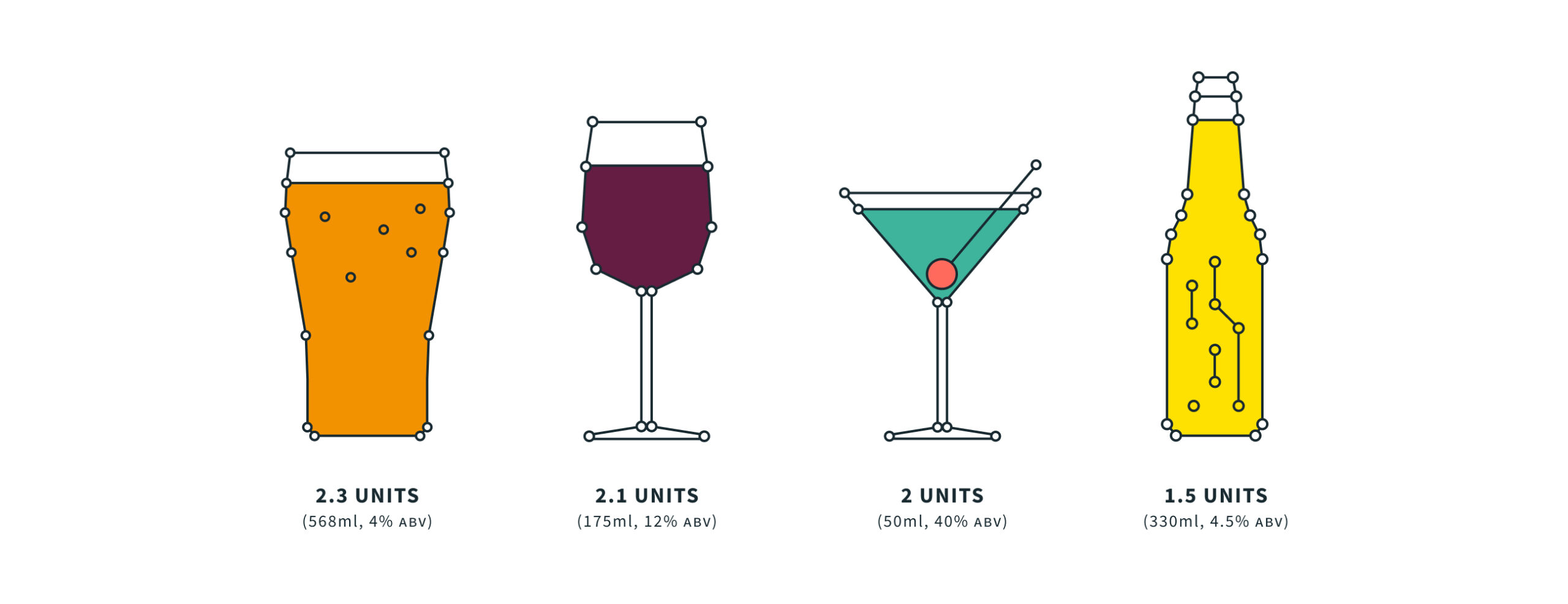


Brand identity
The brand needed to work across platforms – from in-app to physical print, PPC campaigns to outreach materials. We created a flexible identity with a bold, data-centric personality. The visual system combined vibrant, nightlife-inspired hues with custom illustrations to add warmth and approachability. The result is a brand that feels distinct from traditional health services – modern, motivating, and human.
We gave the product a scientific feel while also keeping it simple and friendly, pairing lightweight typography with thin line and stroke architecture. Alongside the brand colour palette we introduced neon elements, and added depth and detail with illustrations and iconography.

Technology
We used a single codebase so that we could deploy the app natively across different digital stores and platforms, including Apple, Android and as a desktop web tool. We opted for a hybrid web/app approach, wrapping our single product for deployment using Adobe’s PhoneGap. This meant that updates could be applied in one place and distributed across the device range quickly and easily. It’s available on the App Store and Google Play and as a responsive website.
Since launch, the brand and product has been extended to attract greater commercial opportunities, with new features released. Our architecture has expanded to accommodate unique localisations of the tool including offline data submission, localised content and other enriched features.
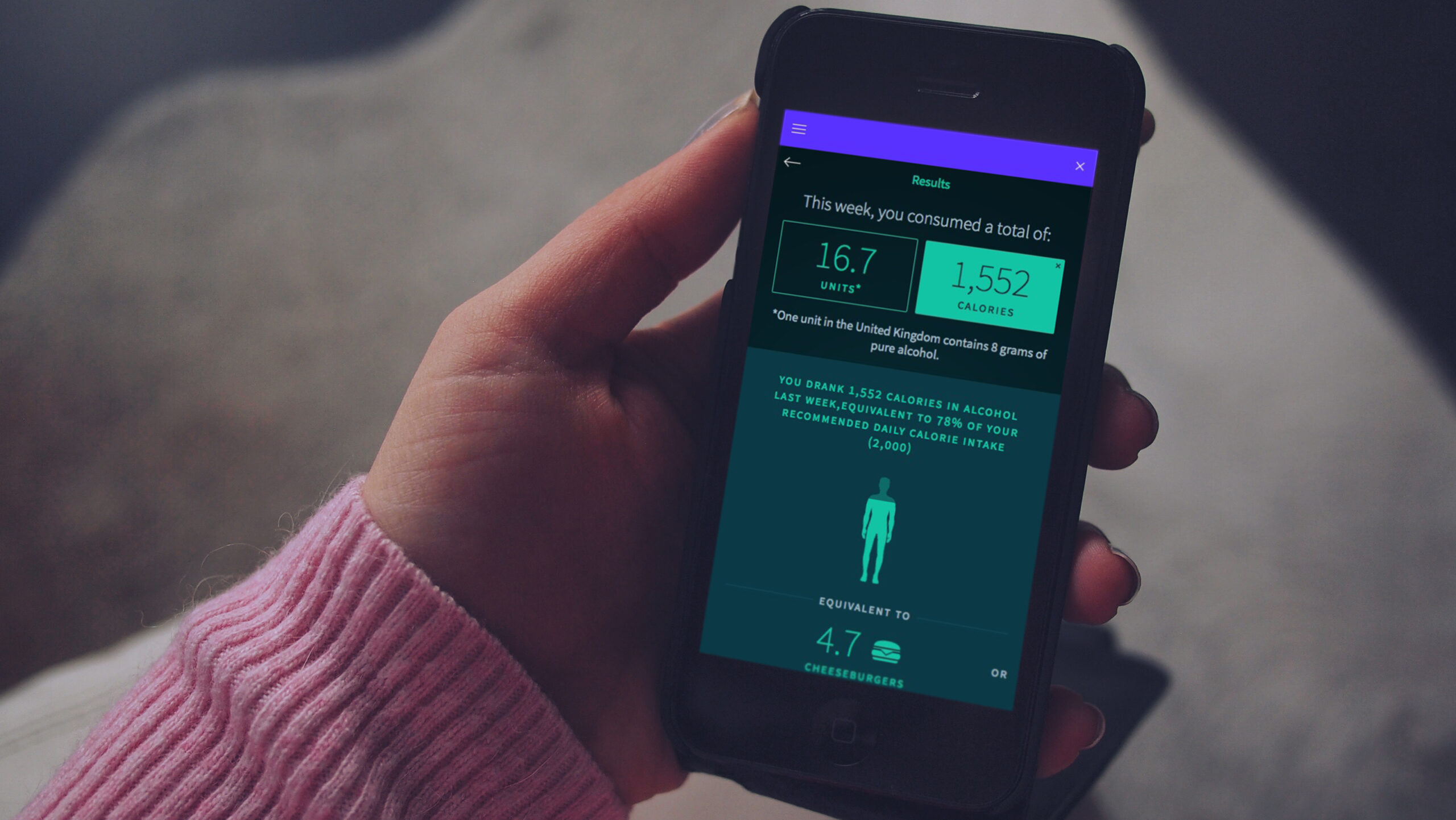
New functionality for Australia
In 2018, the New South Wales government in Australia commissioned Drinks Meter to deliver new functionality to help combat severe issues with alcohol abuse in the state. We collaborated on new functionality, UI and UX, with a new diary component that attracted repeat usage of the app.
The new version led to proven behaviour change. Before using it, 32% of users agreed with the phrase “I am changing my drinking habit right now”; afterwards this increased to 44%. The number who agreed with “There is no need for me to think about changing my drinking” dropped from 52% to 45%.
The outcome
Drinks Meter has been commended by healthcare professionals, such as Professor Paul Wallace of University College London, who said: “It’s relevant, attractive, easy to use and provides useful feedback. It’s a great tool.”
In an independent peer-reviewed analysis1 of 32 eSBI apps (electronic screening and brief intervention) used by young people, Drinks Meter was the most highly rated by users, particularly for the information and feedback provided in the app.
In the first 3 years after our redesign, the app supported more than 50,000 people in 170 countries around the world.
FITFILE is a health information platform for providers of therapeutics and diagnostics who need real world evidence. As an early-stage business moving quickly and growing fast, they came to us having outgrown their previous website. As an organisation, FITFILE were starting to build new partnerships with clients and needed a digital presence that more effectively communicated their value.
Strategy & language
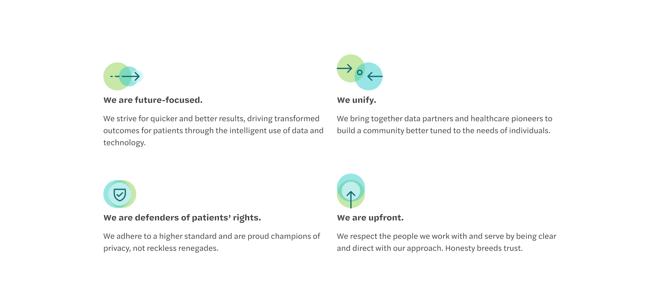
We kicked the project off by working together to understand and streamline how they communicate their position in the market and the unique value they bring to their clients. As a healthcare technology company, there were plenty of acronyms and specific terms used to describe their operations that needed decoding. We worked with them to establish an understanding of their target audience groups and what their perspective would be when visiting the website.
Website design & development
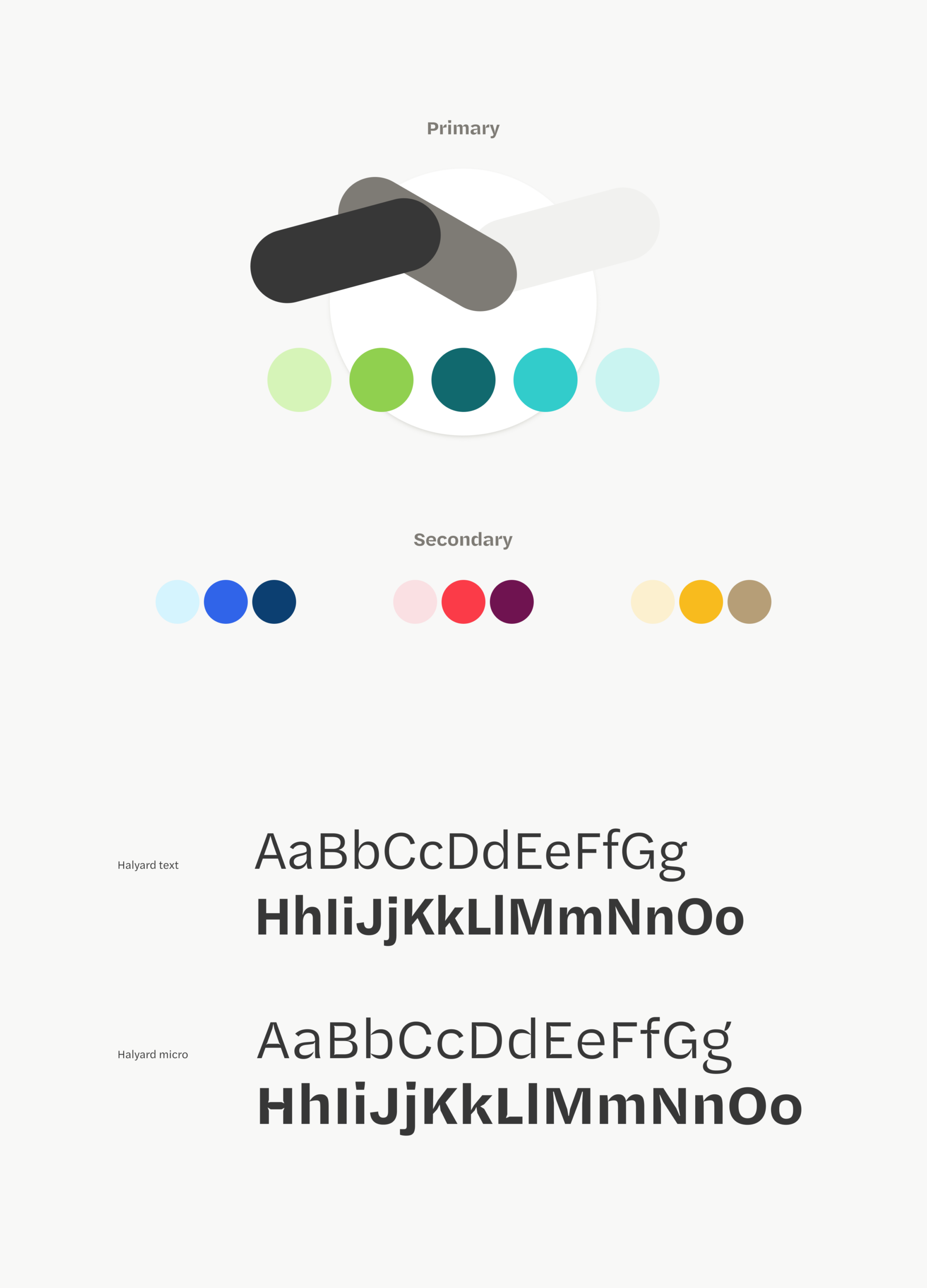
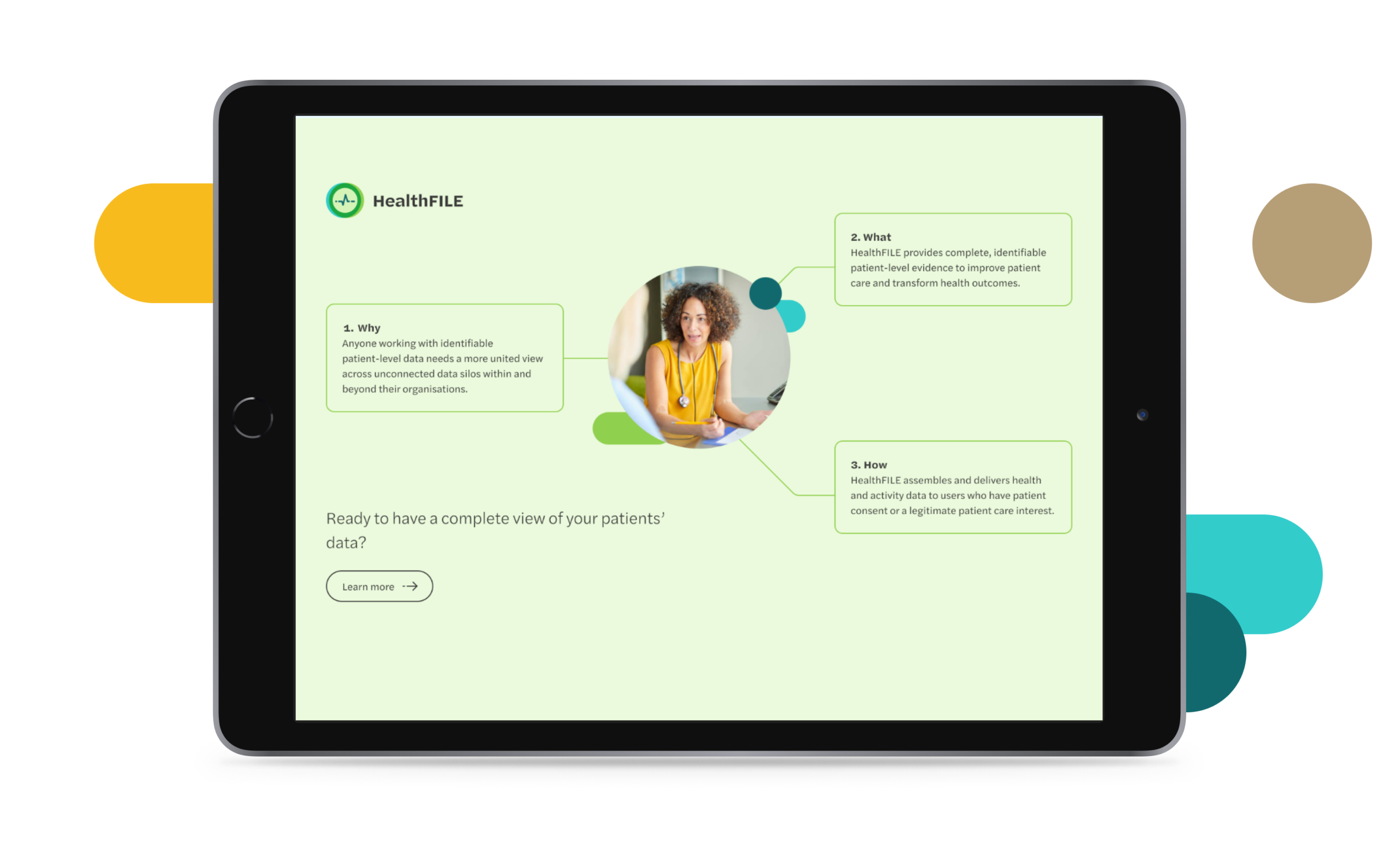
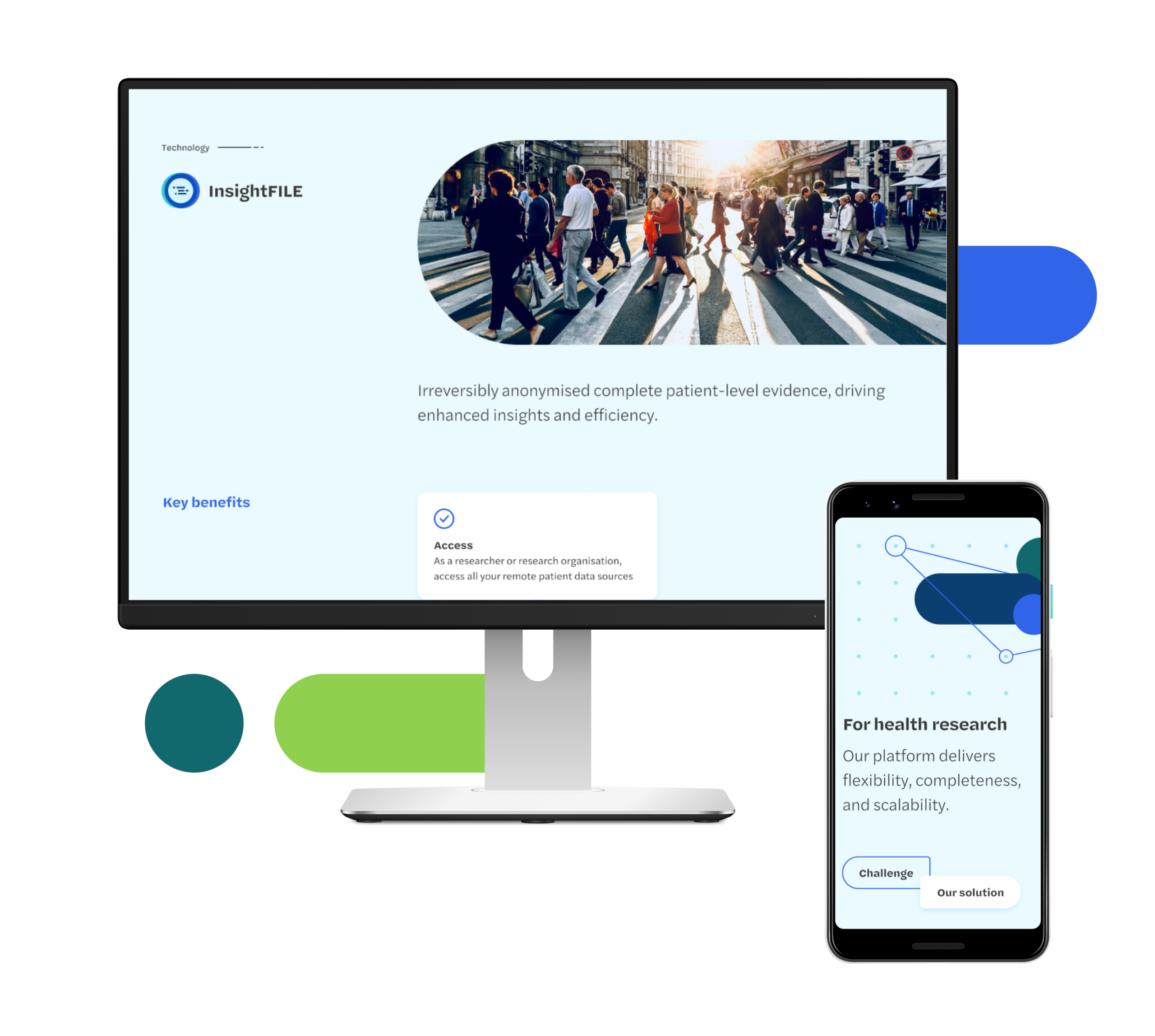
As this project did not involve a full rebrand, we knew the updated website design would need to work alongside some of their current branded materials. We took cues from their logo and current brand style to inform our approach and built out a new visual tone that built on their existing brand language and didn’t make anything they were continuing to use look out of place.We worked together to establish a content plan for the website and develop the tools they’d need to effectively publish and control their content.
The result
FITFILE are positioned with a clear messaging strategy and tone of voice that best reflects their value and brand.
The modular digital design approach that we have created allows growth alongside the Company, with a flexible architecture established that the brand can build from. We worked directly with their in-house technology team to ensure that site hosting and ongoing management was informed, and have provided a creative direction that will shape brand assets and communications moving forwards.