CNS has been providing technology products to the port and logistics community in the UK since it was established in 1985. As one of the leading providers of smart logistics solutions, DP World launched BEEMS Border Management Products, a set of easy-to-use cloud-based products aimed at helping all areas of the supply chain to take control of their border requirements, quickly and cost effectively.
We produced a video to go alongside this announcement to the market ensuring that the potentially complex nature of how to complete a crossing was communicated to the industry quickly and simply.
Comprehensive fund brand analysis
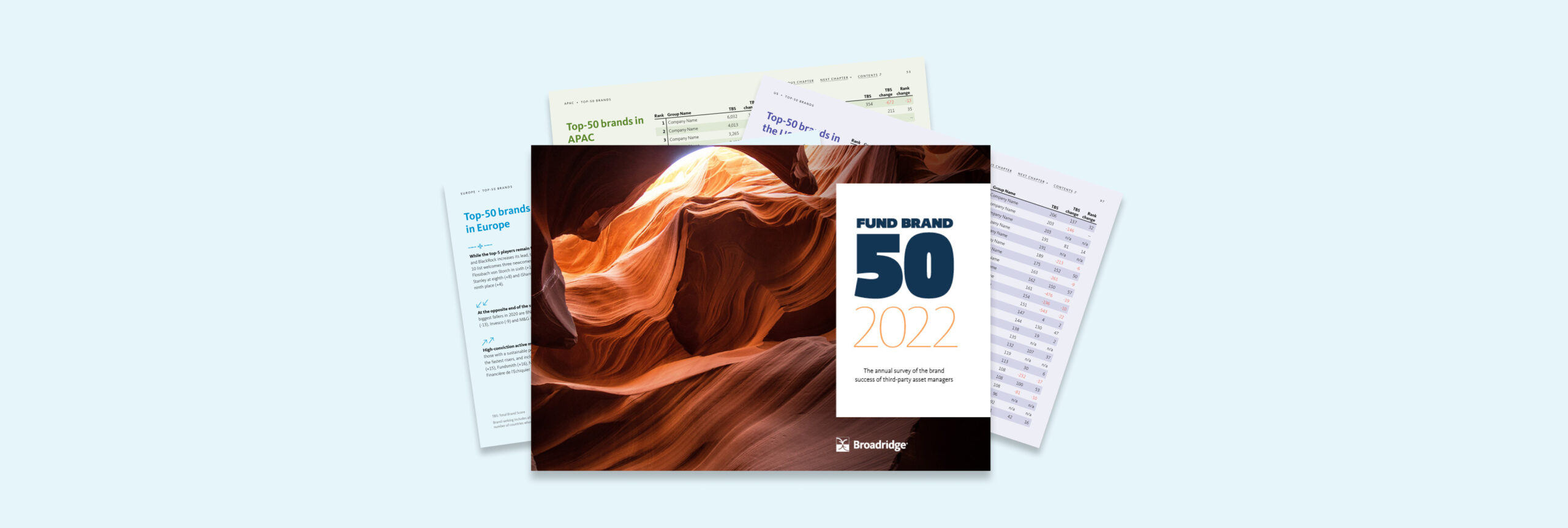
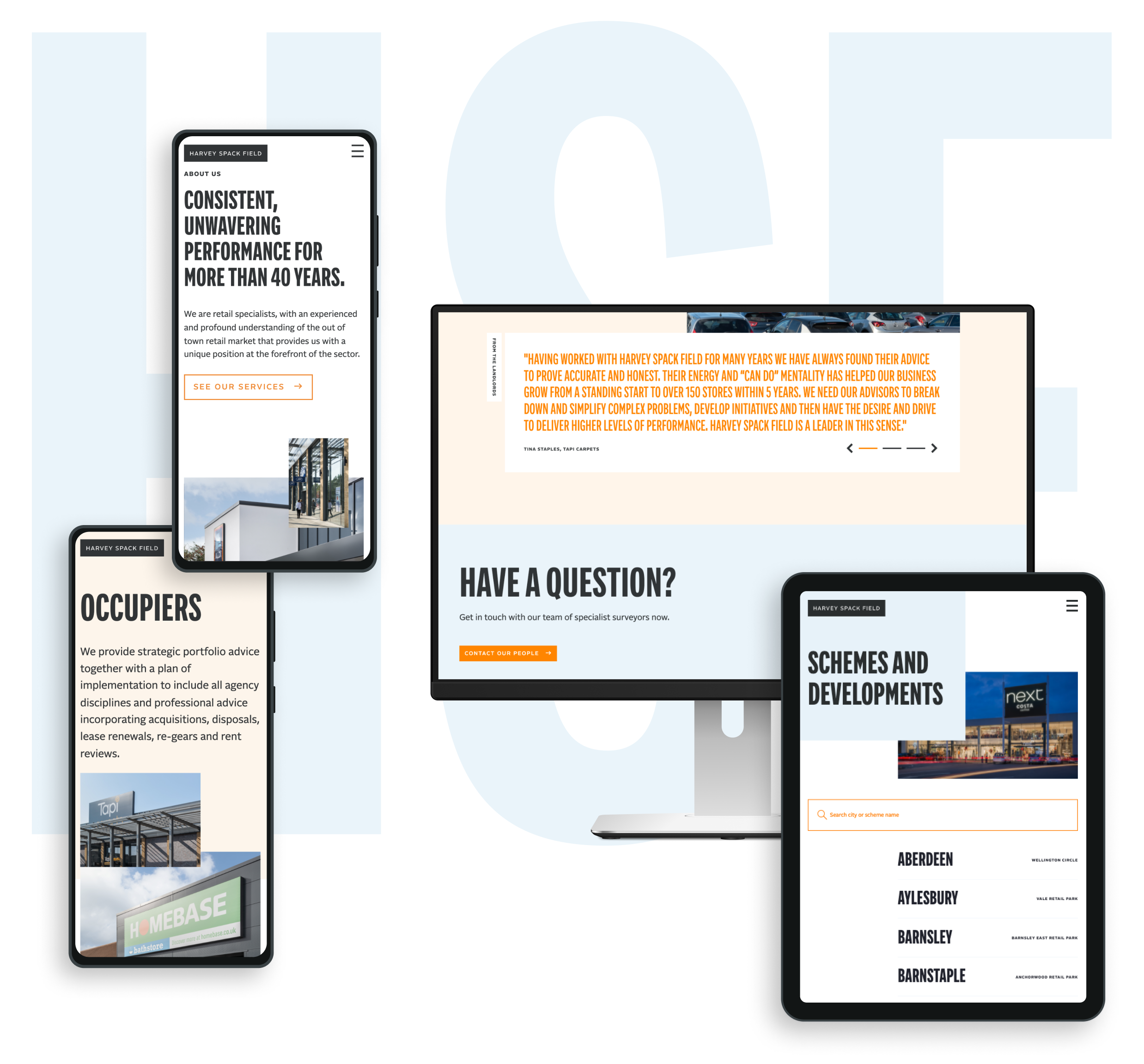
Fund Brand 50 is the most comprehensive annual study of the world’s top 50 cross-border asset management brands. We have worked since 2021 with MackayWilliams, and more recently Broadridge in producing a circa 130 page report and (in 2020) an online digital companion providing access to interrogate data and brand profile charts included in the printed report.2022 marks the third year of the report under new ownership since MackayWilliams was purchased by global fintech company Broadridge.
Changing brand ownership
The FB50 report has achieved an ever-growing following since launch and has built a reputation and equity in its brand that we didn’t want to dilute. At the same time, in transitioning to Broadridge’s ownership we wanted to reflect their new brand voice. Type, colour, and photography were all updated based on Broadridge’s brand guidelines in a manner that made sure to preserve the distinctive qualities of the FB50 brand.
An automated workflow
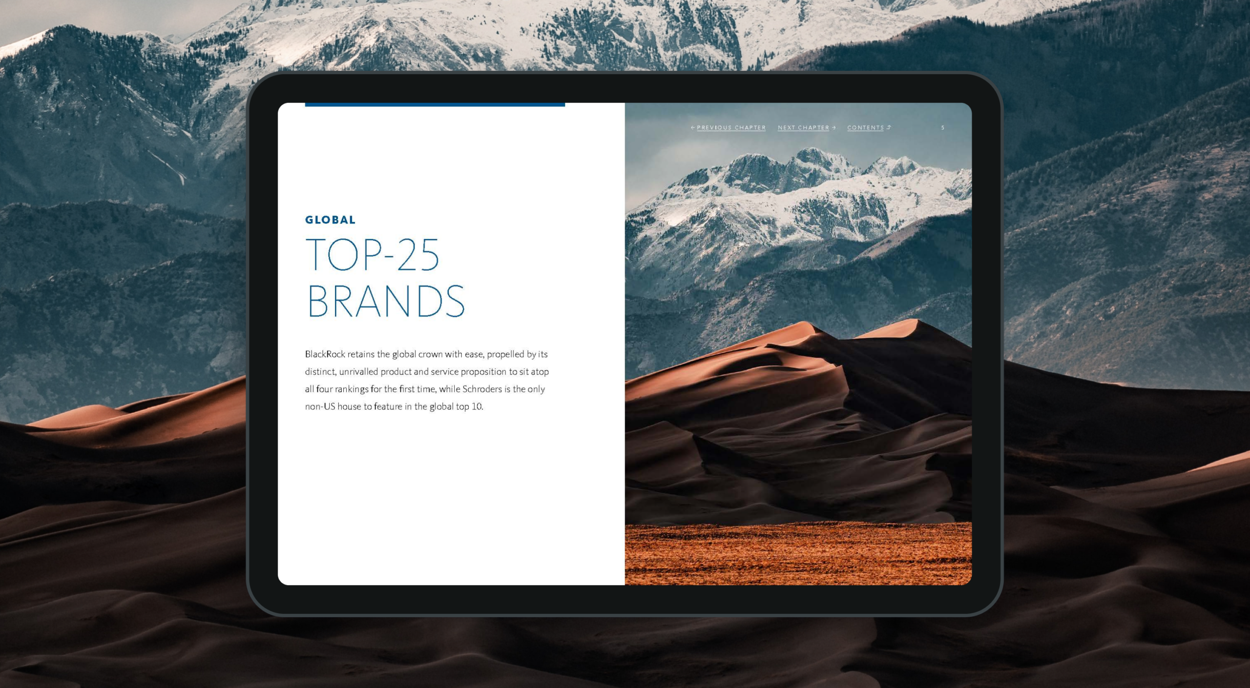
To assist with the production of the printed report in 2020 (in addition to creating the InDesign templates and managing the print and delivery process) we created a digital tool to automatically output each of the brand profiles from raw Excel data sheets to individual pdfs which could then be embedded in the report.
This greatly reduced the amount of time needed to produce those pages in the report, and ensured consistency across all 150 charts and tables that were to be created in that section.

A digital companion
To accompany the 2020 release of the printed report, we created an online digital tool that allows subscribers to interrogate the raw data and analyse the success factors behind the top 50 brands discussed in the report.
Each of the top 50 brand profiles can be viewed and compared against one another to see how other brands are measuring up in each of the key reporting areas.

As part of creating this online portal, Broadridge needed a secure method of on-boarding new subscribers – giving individuals access to the digital report. We created a custom user management system that empowered their admin team to grant access to new users and automatically trigger emails to be sent out notifying those users how they can register for access.
Building brand success
FB50 continues to grow from strength to strength. Revered within the fund industry, the report provides a transparent look at fund brand performance. In a marketplace where brand purpose and clarity are of increasing importance, this insight is helping brands better understand the drivers to success in their markets.
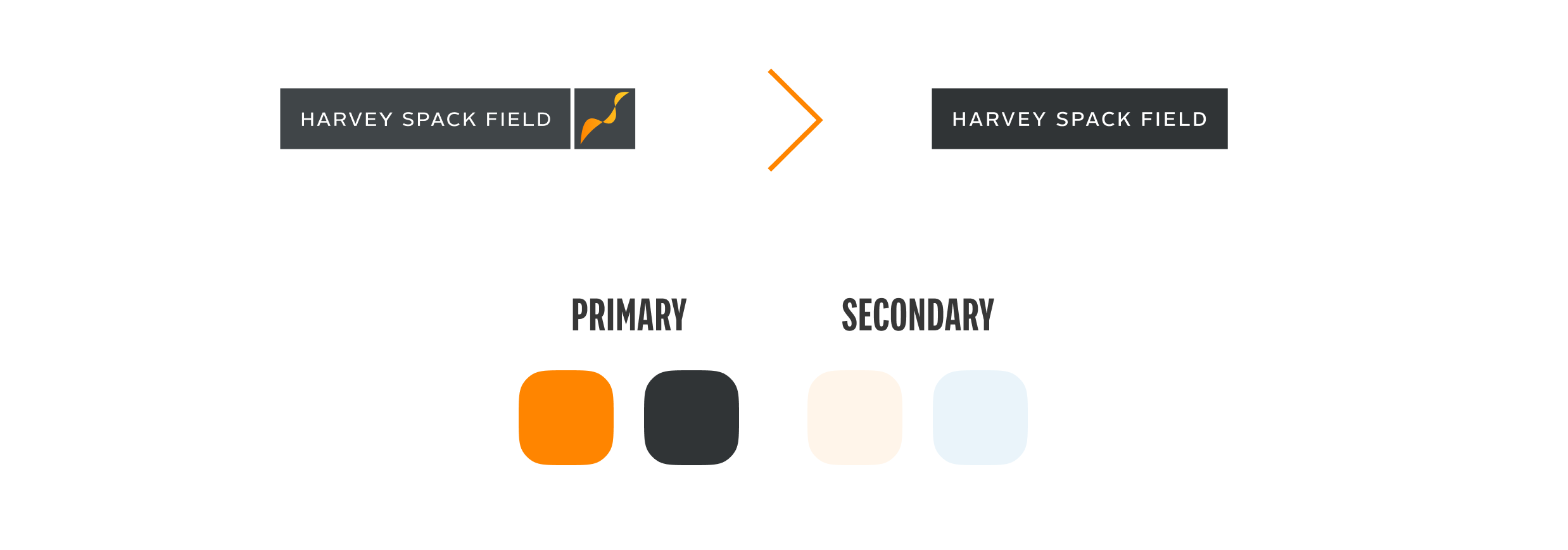
A long-standing client, Harvey Spack Field approached our team with the request of delivering a fresh, clean and direct digital presence that helped best tell the story of their market knowledge and expertise.
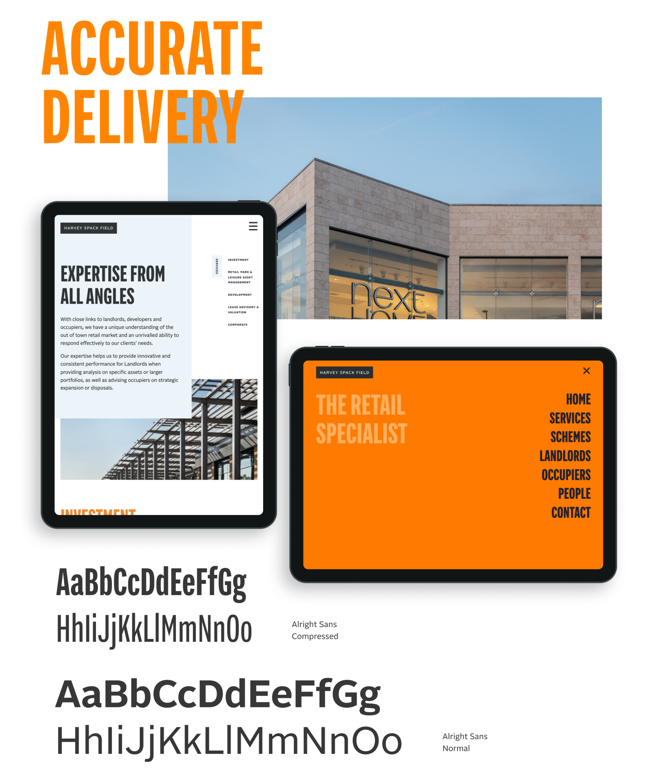
For this updated approach, we wanted a bold first impression that then takes the user on a tour of HSF’s overall service offering in a streamlined yet intuitive manner.
Direct approach
Our design intent was to create a site experience that would immediately engage a user. The messaging had to exist alongside the visual presentation of the brand and help lead users to understand how the Harvey Spack Field personality and mindset can help them in their objectives. We kept the navigation surrounding the work simple enough that the viewer is compelled to continue their investigation throughout the site.
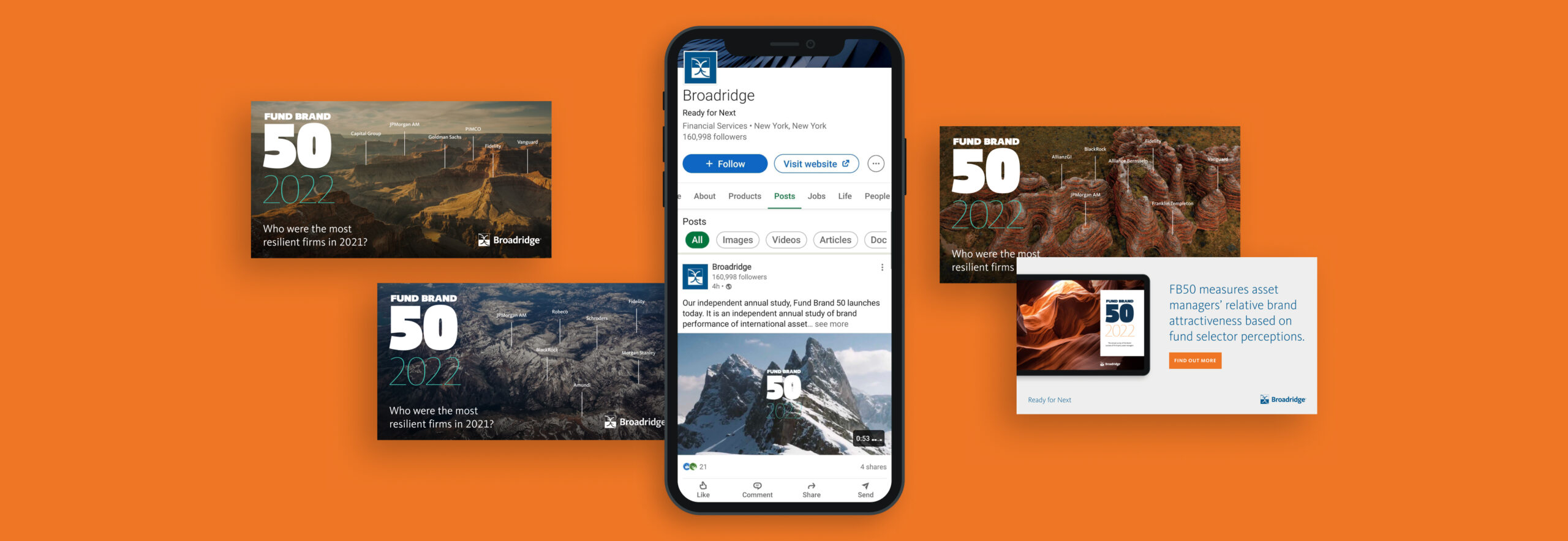
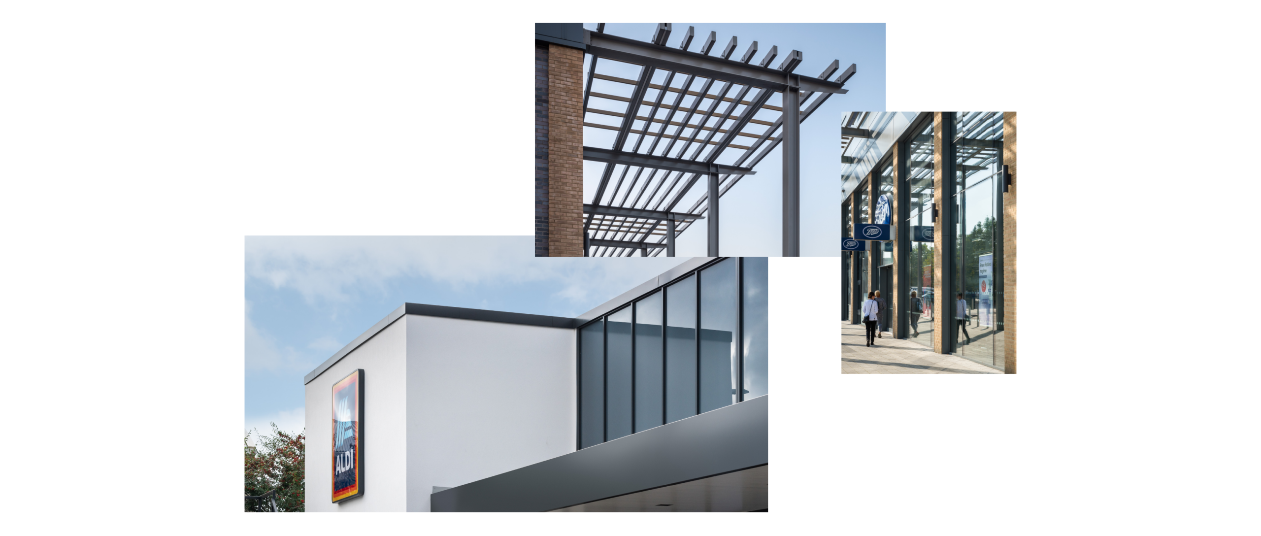
Our design process began mobile-first, fluidly responding to other device sizes. Commissioning photography that really brought forward the architectural details of the HSF schemes, this visual approach brings an elegant simplicity to the site presentation helping draw the user’s eye to the schemes and the services that HSF provide.
Broadridge is one of the world’s leading providers of financial technology and services, with $5bn+ in revenues and more than 14,000 employees in 21 countries. Its infrastructure provides a global communications hub that links thousands of companies and funds to millions of individual and institutional investors, underpinning daily trading of more than $9tn of equities, fixed income and other securities.
It has multiple products, services and insights, helping banks, broker-dealers, mutual funds, asset and wealth managers and public companies manage risk and accelerate growth. But it wasn’t presenting them well. Over time, through a combination of internal innovation and external mergers, it had accumulated multiple products. These looked inconsistent, were described differently and were not presented cohesively as a core offering.
It was time to create an accessible, consistent, progressive digital experience where clients and potential clients can easily access everything. The commercial need was for a go-to-market strategy for 20+ products and services.
What we did
Our role was to help formulate a common approach across presentation, tone of voice and brand look and feel, bringing these products to market as part of a single, consistent core product suite.
First, this required us to delve into Broadridge’s existing proprietary systems and to think strategically. Our team looked at the product range, revenue mechanism, distribution and release schedule, associated content, regional outlook and more.
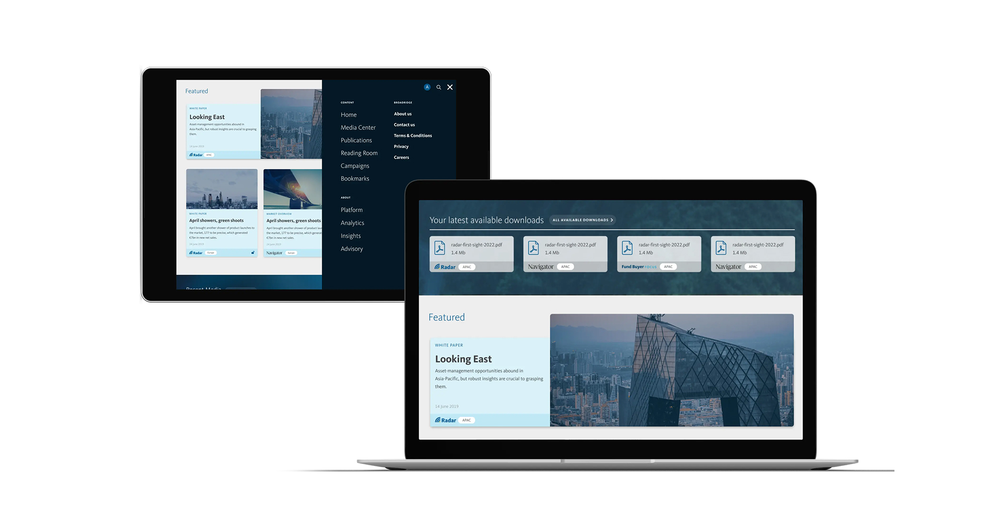
Strategy and team
We realised we needed to build a new, single destination that would hold all of this in one place. The Distribution Insight platform would be a new future-facing website for Broadridge; its repository for everything distribution-focused.
We adopted an integrated-team approach, providing UI, UX and digital development support to the multiple internal teams building and developing different aspects of the platform. We worked closely together on technical decisions and provided rapid prototyping for key elements. This included research and development across integration and administrative logic, unique content mapping and infrastructure strategy.
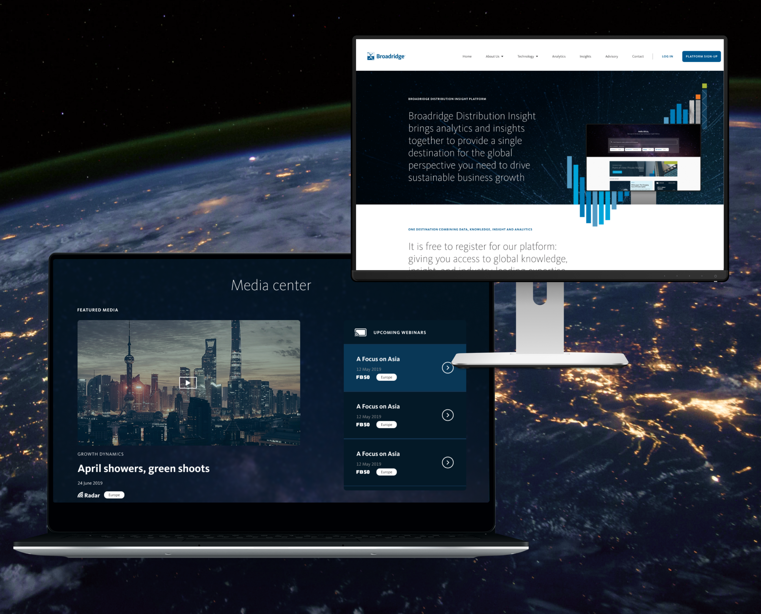
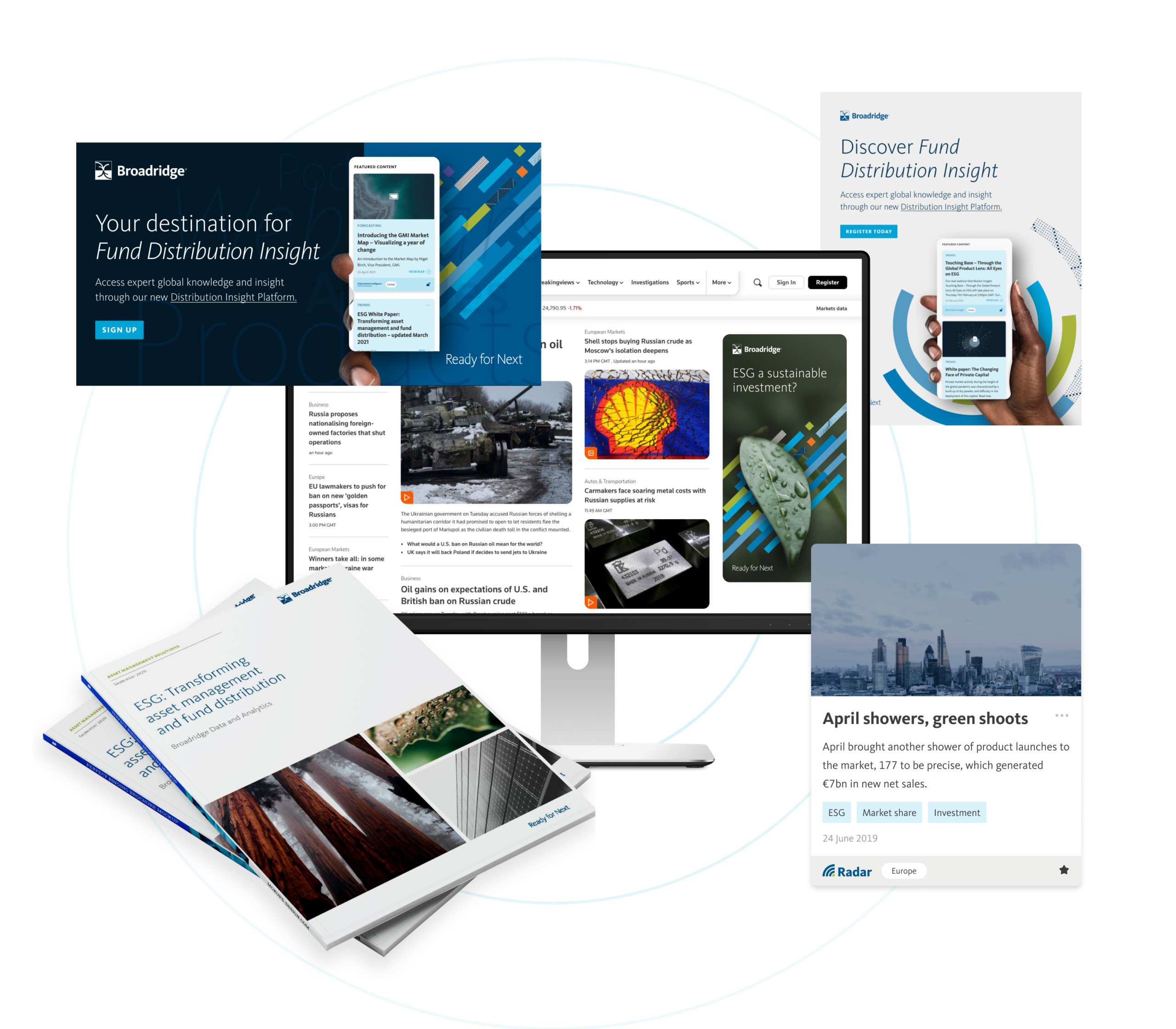
The new platform, Distribution Insight, brings Broadridge’s analytics, insights and advisory services together, giving asset managers a detailed picture of global markets and critical insights that can help them operate strategically and accelerate their growth.
Campaign activation
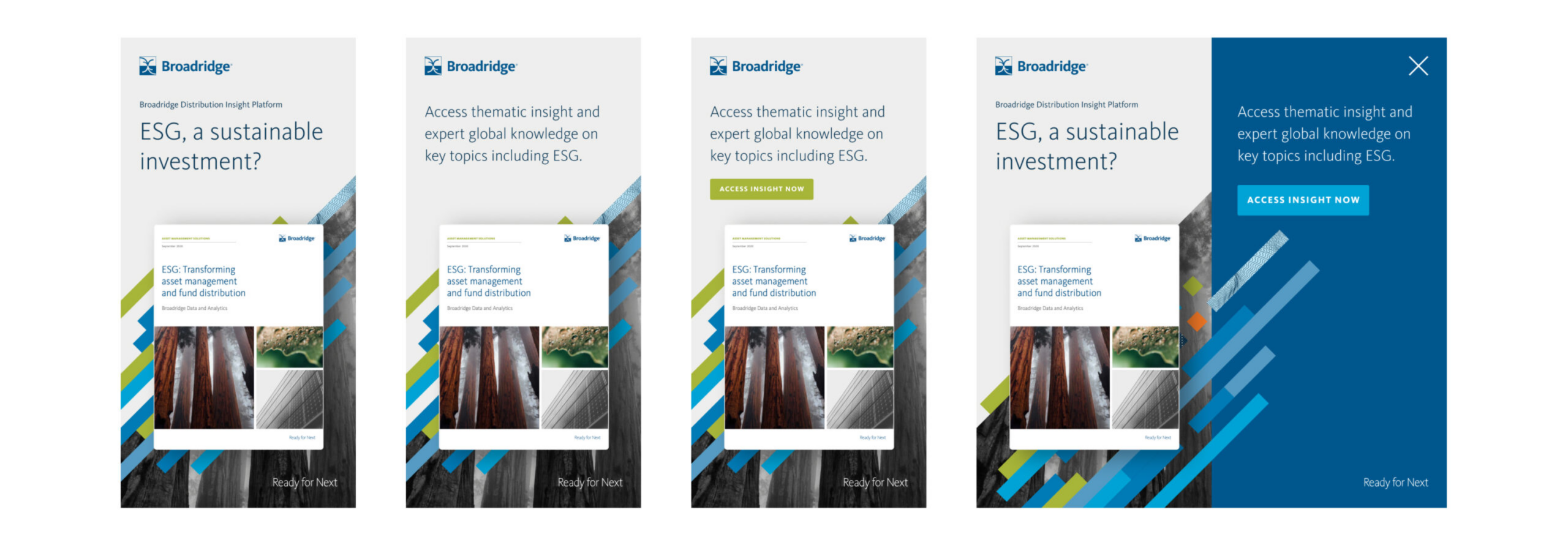
We were also asked to work on a launch campaign, and designed an activation programme for Broadridge’s teams to bring it to market. We designed creative executions across motion, interactive advertising and wider campaign creation. This work was featured in Reuters, FT’s Ignites Europe, Funds Europe and other platforms.
Outcome
Working hand in hand with Broadridge, we co-created a strategy, unified sales proposition and distinct visual approach for an entirely new digital sales concept, Distribution Insight. We conceived, planned, designed, built and launched a single digital environment with access to a suite of distribution products, both analytical and insight focused.
The system has supported multiple global teams with their product sales and growth strategies – and given their clients products and insights to inform their strategies and fuel their growth. We continue to help Broadridge maintain the system.
We now have a long-term partnership with the organisation and have become an extension of its global team, supporting multiple business units with the following services:
- Strategic brand positioning
- Product positioning and development
- Brand creative
- Digital product UI, UX and design
- Digital architecture and prototyping
- Digital development and build
- Product launch
- Campaign activation and social activity
Other projects have included AXA × Broadridge ↗ and Broadridge FundForum Digital Tool ↗
Broadridge was commissioned by global investment management firm AXA to provide knowledge and research insight on the topic of ESG investing, for a research report and campaign.
Thematic investing – building a portfolio around companies benefitting from long-term economic, political or societal structural shifts, rather than by sector or geography – is rapidly rising. With investors increasingly wanting to understand how such funds fit into a broader portfolio, AXA wanted to make the case for a thematic strategy, particularly ESG investing, to become a mainstream investment approach. AXA IM has a history of thematic investing, convinced that such a strategy can give investors superior growth potential, create new investment opportunities and help to future-proof their portfolios.
The company commissioned research from Broadridge to explore this topic.
For its analysis, Broadridge drew on its extensive global network of experts, data and research, using: interviews with 90 fund selectors in Europe, Asia Pacific and North America about their use of thematic funds; a dataset of assets, flows and other information on 91,000+ global funds; a global dataset of 1,471 thematic funds in 13 segments; plus several years of market research interviews with the 1,200 largest professional fund selector firms in Europe and Asia Pacific.
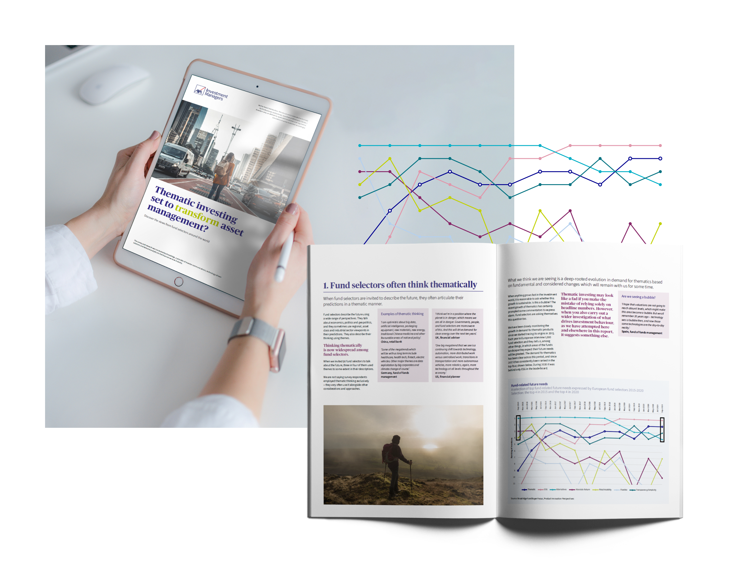
As Broadridge’s long-term creative partner, we were asked to design the report and create assets including animated videos for both companies to use on their social media.
What we did
The goal was to create a distinctive white paper and a campaign with assets that could be used across the white paper, AXA’s website and social media. We used AXA’s brand guidelines to guide the layout of the report and creation of new assets.
We had to integrate photography, and sourced images that are relevant and realistic for the content matter and match AXA’s optimistic, uplifting brand tone.
Showing the story behind data
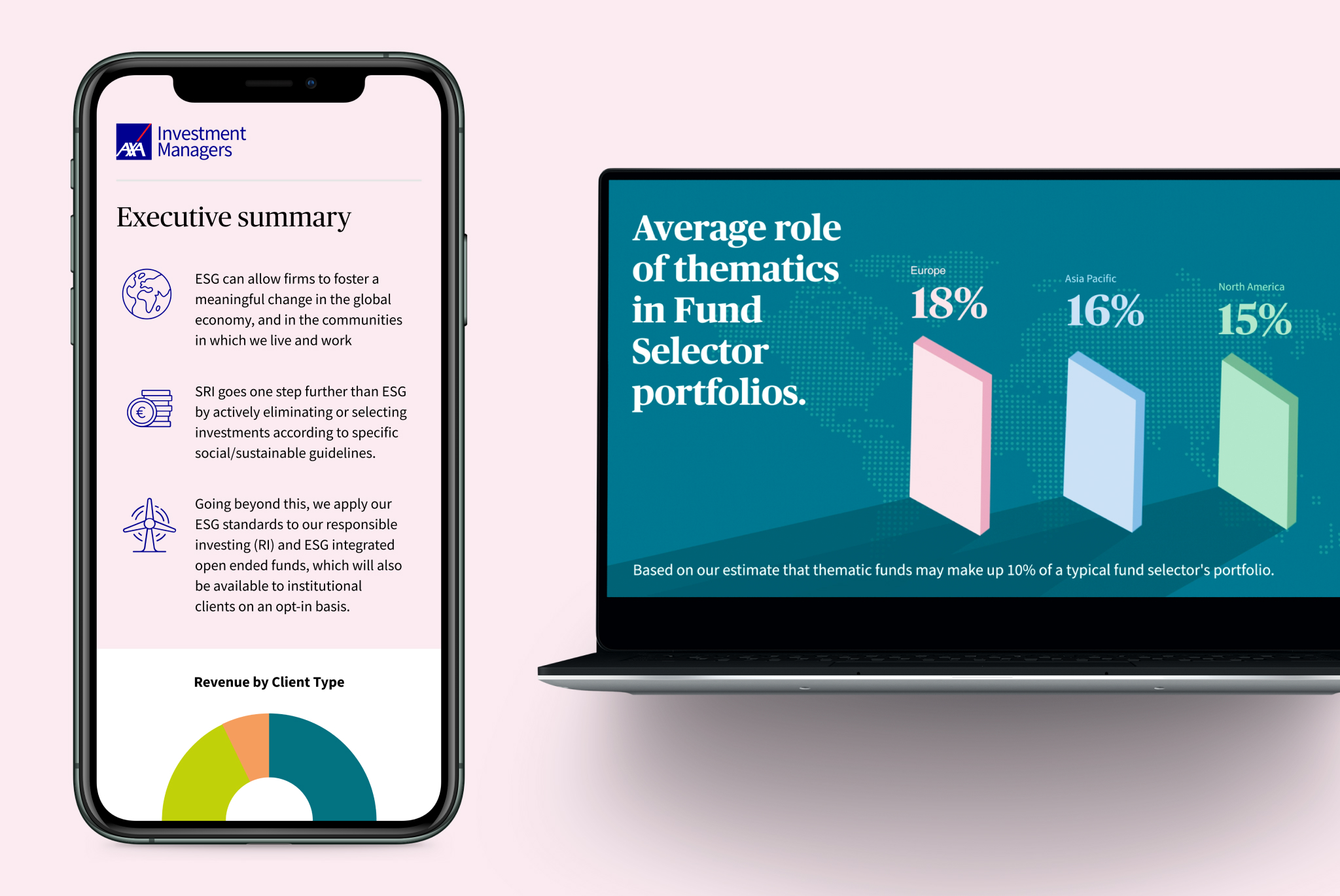
To clearly present Broadridge’s insights, we used data visualisation. For each data story, we created brand-appropriate visualisations that worked well in the PDF report and in regionalised versions (North America, Europe and Asia) as well as in summary documents and presentations. We also created a separate set for video animations to use on social media.

Collaboration
Good project management and sign-off process was essential as this was a collaborative effort between AXA and Broadridge and all our design elements had to be agreed by both. They had to approve our visual look and interpretation of the brand guidelines as well as the way we presented research findings. We worked closely with AXA’s brand team in France and the insights team at Broadridge to ensure that everyone was happy.
The outcome
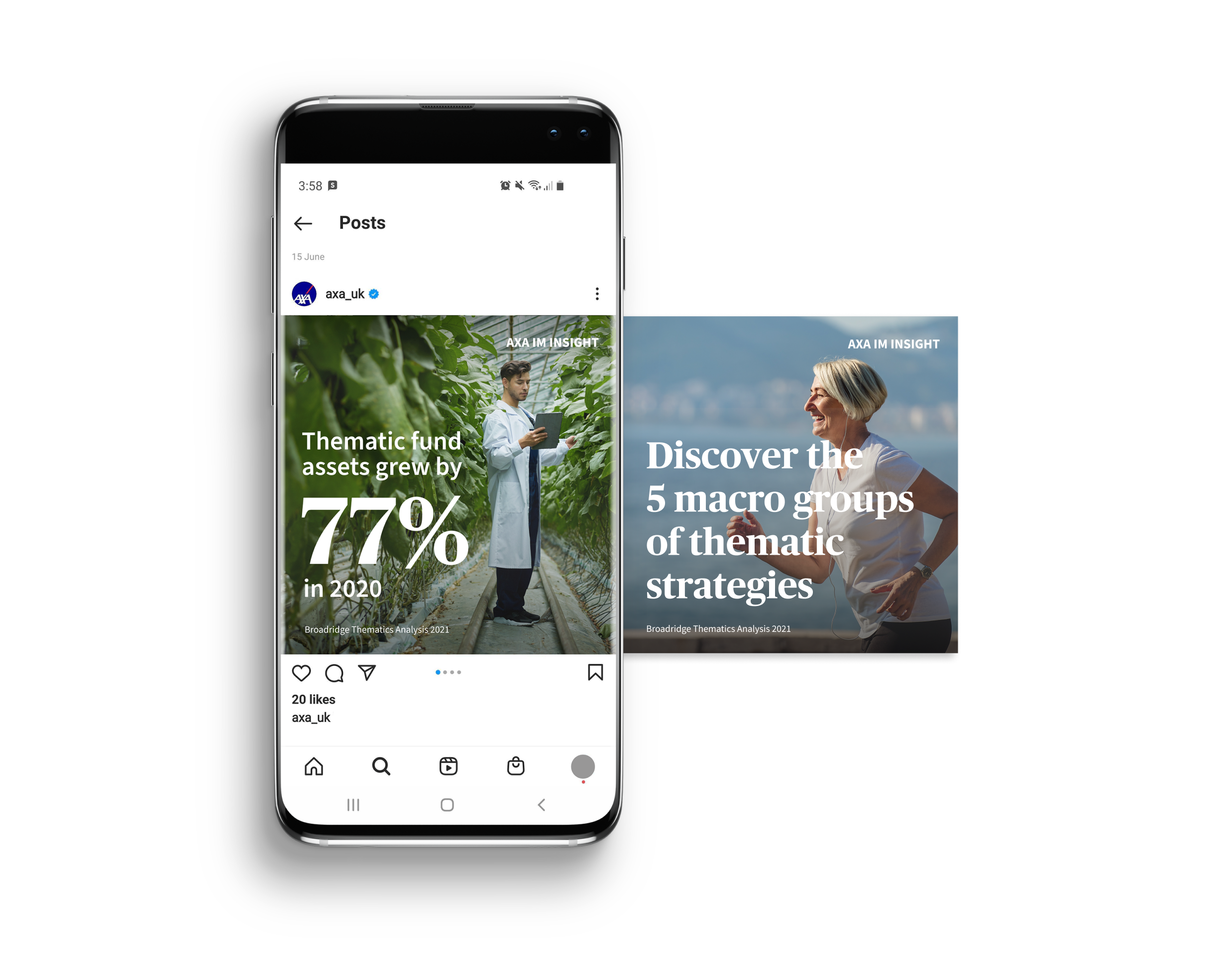
We created an engaging visual identity for an in-depth global report that showcases AXA as a leader in ESG investing, plus campaign assets for use across different platforms.
Around the world, people are living longer. By 2030, one in six of us will be 60 or older and the number of people aged 60-plus will increase from one billion to 1.4 billion. Every country is experiencing growth in both the size and proportion of older people, and the increase in population ageing will be greatest and fastest in the developing world.
Good physical and mental health are key determinants of quality of life for older people. This shift in distribution towards older ages means all countries are facing major challenges in preparing their health and social systems. Healthy ageing is a huge topic, and a priority for countries across the globe.
Healthcare UK, which promotes UK companies overseas and supports partnerships, wanted to create a campaign promoting the UK’s capabilities in healthy ageing innovation. This could help to attract inward investment and business opportunities. Healthcare UK is a joint initiative between the Department of Health and Social Care, Department for International Trade (DIT) and NHS England and came to us as we are on the supplier list for the DIT.
It had already produced a brochure that shared inspiring case studies, with information on UK companies that can deliver solutions to healthy ageing – but it wasn’t landing. Studiomade was tasked with creating a campaign to engage its intended audience.
First, we had to go back a step. Why weren’t people engaging?
What we did
Healthcare UK’s brochure included contextual information and insight on companies that can provide technology, infrastructure and other services supporting healthy ageing. But, with it not getting the expected response, we realised we had to help Healthcare UK own the conversation around healthy ageing. What was lacking was a positional piece on why healthy ageing matters.
This would reinforce Healthcare UK as an authoritative voice in the sector. They needed to show the problem before they shared the answer. What are the reasons for focusing on healthy ageing as an agenda? Why is this topic important?
We proposed writing and creating an in-depth, thought-provoking white paper, then building a campaign around it. We wanted to bring context to the issue for different audiences, address people’s objectives, and help them understand the issues and their country’s place in the global picture.

Strategy
We identified the areas of conversation that Healthcare UK could own, and set out these objectives:
- Showcase the UK as a global leader in healthy ageing, with a focus on opportunities in the life sciences and health and social care sectors.
- Establish the UK as the preferred partner for innovation in a healthy ageing society.
- Support the global challenge of ageing societies.
- Promote trade and investment opportunities globally.
- Develop mutual prosperity through industry and healthcare partnerships, and bring innovation into the UK.
- Identify global opportunities for innovative UK companies and connect them to these opportunities.
A global network
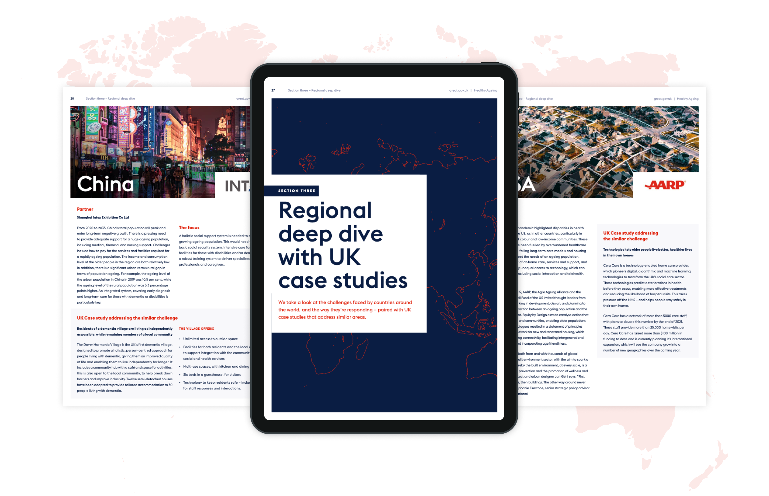
Healthcare UK has a broad reach, with an extensive network of organisations including charities, hospitals, governments and advisory boards around the world. To write a report that brings new information to the debate, we collaborated with these valuable connections and global partners, asking them to contribute insight and research to our regional deep dives. Not many organisations would be able to access such a broad pool of knowledge and this made the report unique and authoritative. It helped to frame the global issue, joining together the challenges that need addressing and the nuances that different countries face.
A pathway that joins the dots
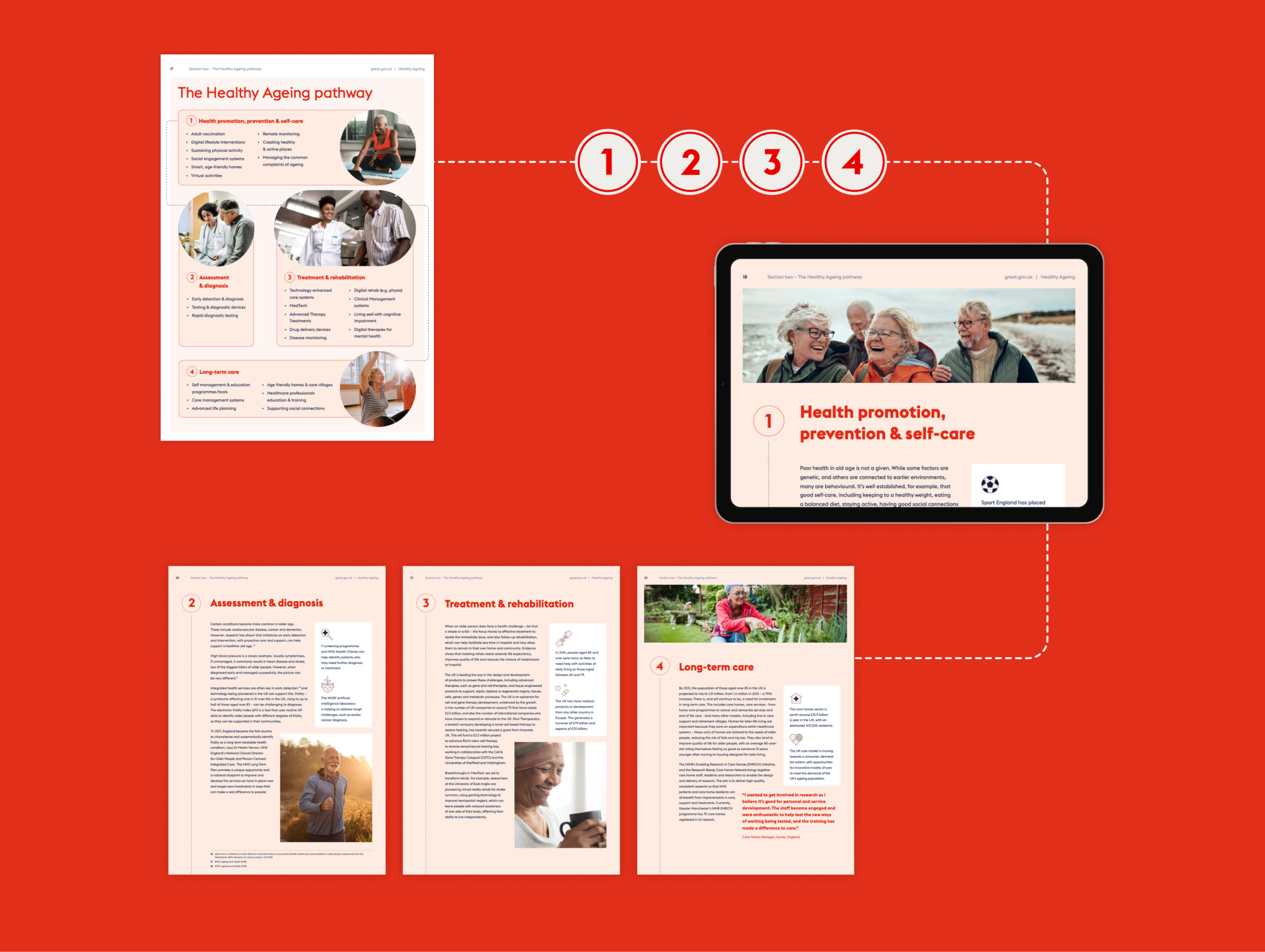
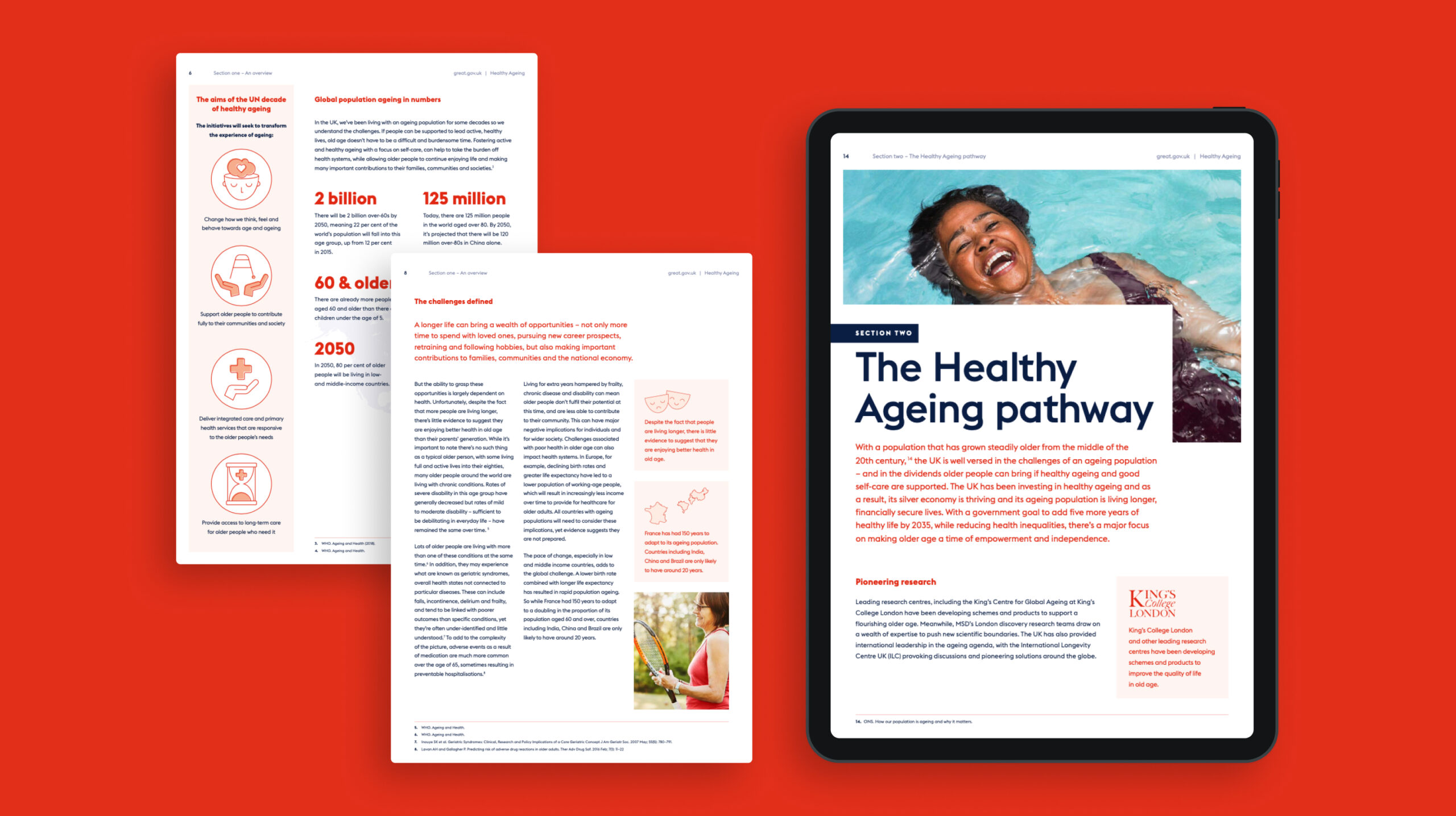
When working together to understand Healthcare UK’s historical work around the topic, they shared a healthy ageing pathway with us that they had created. It shows the steps that countries or health services should be taking towards healthy ageing. We made this a central element of the campaign.
It was shareable, it outlined the areas that needed to be tackled, it helped countries to plot their efforts, and gave the Healthcare UK team a springboard to link up to services they promote.
Design look and feel
Healthcare UK is part of the award-winning GREAT Britain and Northern Ireland campaign, the UK’s international brand marketing campaign, which works closely with UK businesses, not-for-profits and high-profile figures to promote the best of the UK abroad. Their guidelines led the overarching branding, but we brought in a lighter touch for this report and campaign.
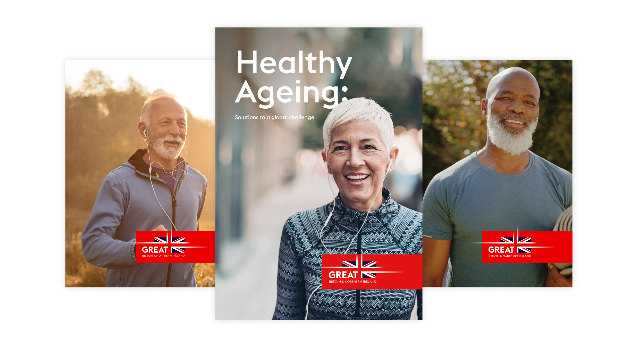
We used inspiring photography and custom illustrations that give a distinct look and a positive mood to the report. On the cover, we used images of happy, confident and healthy looking people, to set the tone for the report. We created assets for the campaign website where people would be able to download the report.

Social media campaign
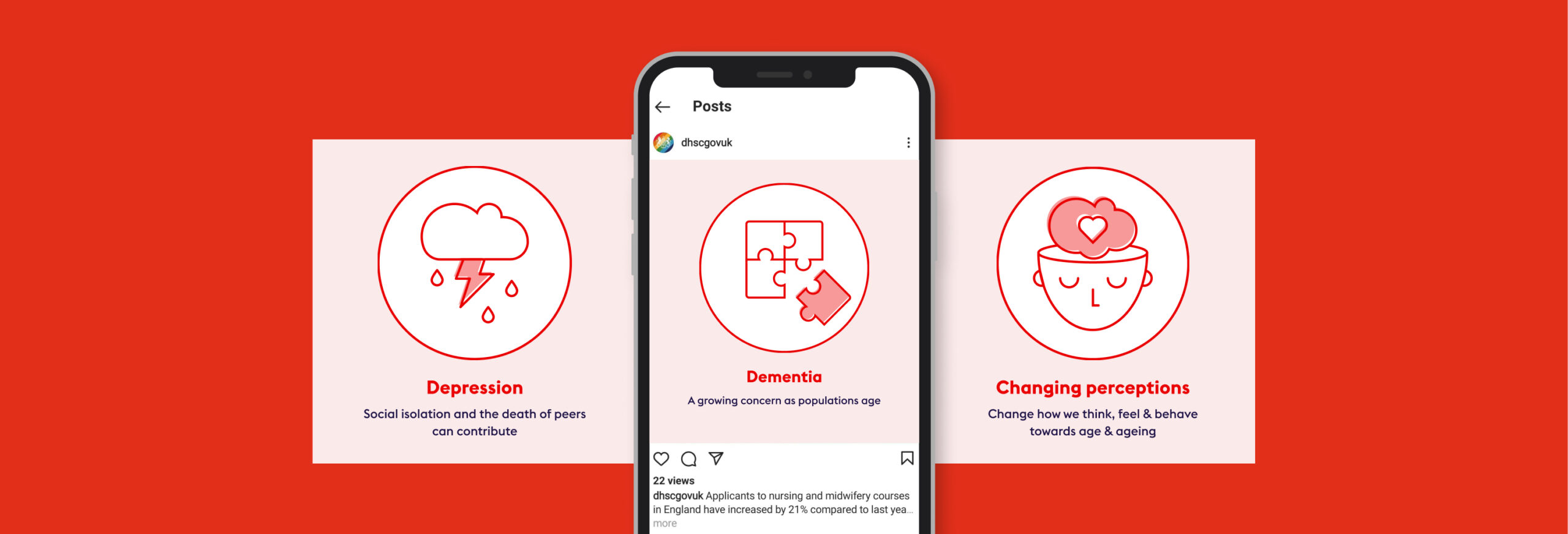
Next, we created a full social campaign around the report, to give it impact and promote it to the intended audience. We used the same creative style as the report, using illustrations to show key facts and figures and encourage people to download it. These were animated, to gain the highest engagement. We used key hashtags, to monitor sharing and engagement.
To leverage earned media, we built media packs for the contributing partners who feature in the report, with social animations they could re-post on their channels to talk about their involvement plus static assets to use anywhere across their own or other channels.
Outcome
The UK has an industrial strategy that has prioritised healthy ageing and is applying millions of pounds of funding for new research, treatments and technologies. We created an authoritative, wide-ranging, agenda-setting report that shows inward investors the value and opportunities in the UK, illustrating why it’s the place to develop healthy ageing innovations and business opportunities.
Poor communication in the NHS is a big factor in poor patient care. It also has severely detrimental effects on healthcare professionals, contributes to staff burnout, and wastes public funds (an estimated £1 billion a year in England alone).
Better communication between staff and teams can save costs, improve health outcomes, improve patients’ experience – and ultimately make staff’s jobs a lot easier.
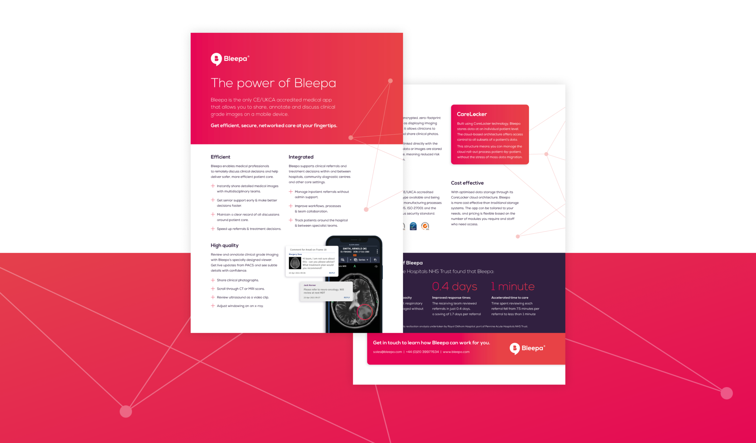
Bleepa is one of only a few communications tools accredited for clinical use in the NHS, created to resolve issues such as siloed specialist care and remote working. It’s a digital hub, holding reports, referrals, clinical-grade images and more, with an instant messaging function that enables clinicians to communicate securely to discuss cases, decisions and patient treatment. They can view and annotate clinical photos, scans and X-rays, add test results and notes to records, share comments with colleagues, manage patient referrals and get second opinions. It transforms how they work, making them more efficient, leading to better patient care – and making their jobs easier.
We were asked by parent company Feedback Medical to help grow awareness around the Bleepa product and brand. We worked with the team to establish a digital content strategy, increase Bleepa’s presence and run digital marketing campaigns.
What we did
Bleepa is an innovative health-tech product that can transform how healthcare professionals work and communicate, but its existing website didn’t reflect that. It was crammed with information and it wasn’t clear what users should understand about the product or what action they should take.
Bleepa had to have a strong website in place before we could look at driving any traffic to it. This meant giving the site a strong, clear visual identity. It needed a tone of voice that resonates with its audience of clinicians and healthcare providers, with clear messaging that effectively shows them what Bleepa does and why they need it.
We would also define a clear user journey so that people would know exactly where to go and which would generate leads.
Getting the messaging right
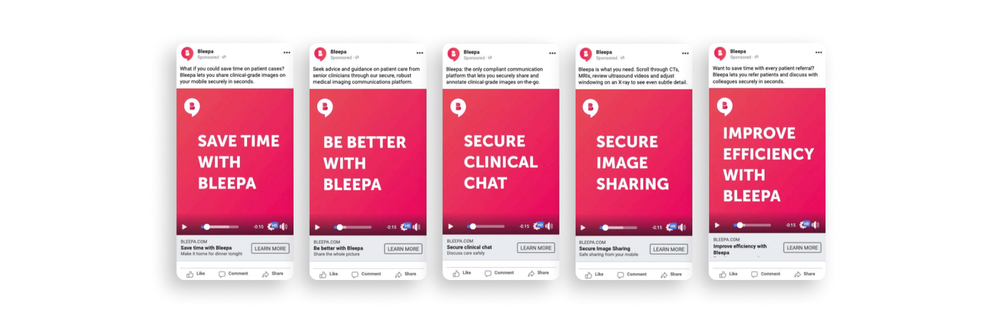
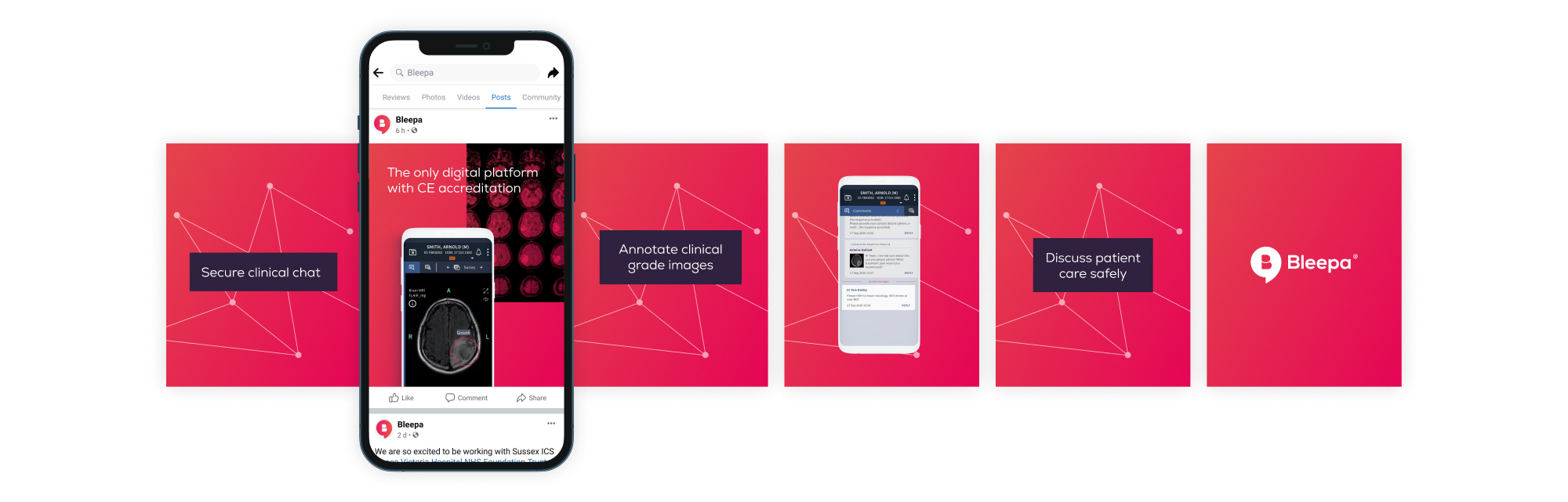
We wrote five potential key messages and tested them with users. We made simple text-based adverts and ran them on Facebook, targeting a broad, medically focused audience group. ‘Secure clinical chat’ was the clear winner. We took this into the next level of testing, around tone and creative.
Next, we considered the tone of voice. We wanted this to be based on engagement, not our assumptions, so we created three options to test: bold, clear and direct; emotive and approachable; intelligent, clever and precise. The third one got the best response.
With this research we now had a brief for the brand’s messaging. We knew that secure clinical chat was our main point of difference and that the tone of voice should be intelligent, clever and precise.
Website design and development
We carried out an audit of the existing site, reviewing the UI, UX and analytics to see how users were interacting with it. We defined what changes were needed, and prioritised the home page and the demo page, as these are integral to sales conversion.
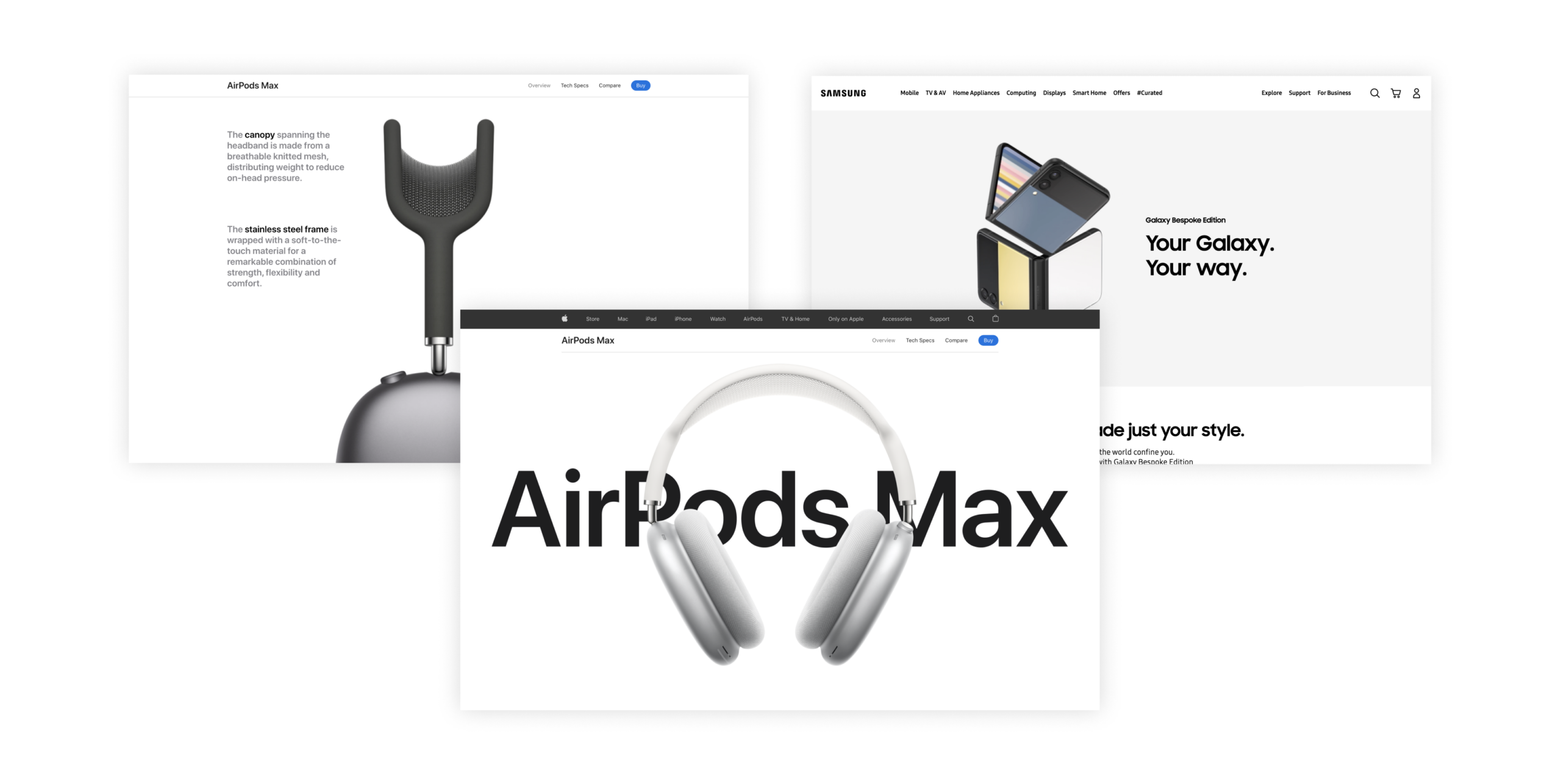
For the look and feel, rather than the traditional healthcare sector, we were inspired by strong, clean, confident consumer brands like Apple and Samsung. This would make the product feel self-assured and market leading.
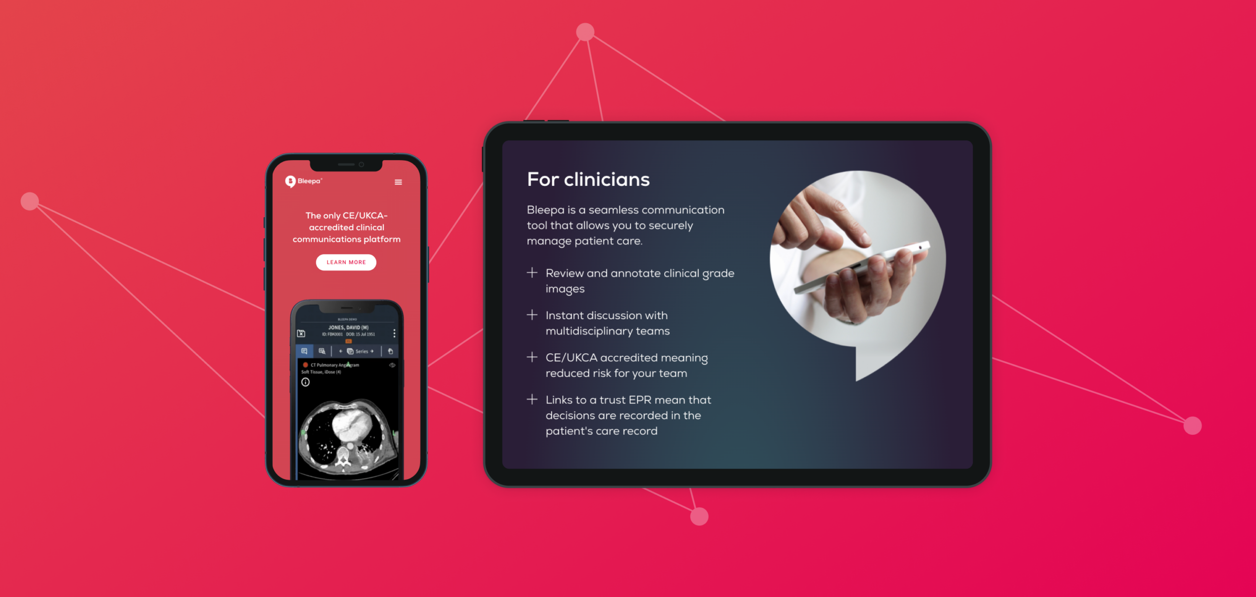
Our new design has strong, clear messaging throughout with a consistent tone of voice, in line with the results of our research. The digital product and app are the focus, with a clean presentation. CTAs are streamlined, to keep the user journey clear and purposeful and funnel users to a page with a video demonstration of the product, validating the messaging. This pushes users through to the next level of the sales funnel, and conversion rates can be tracked through analytics.
A brand awareness campaign
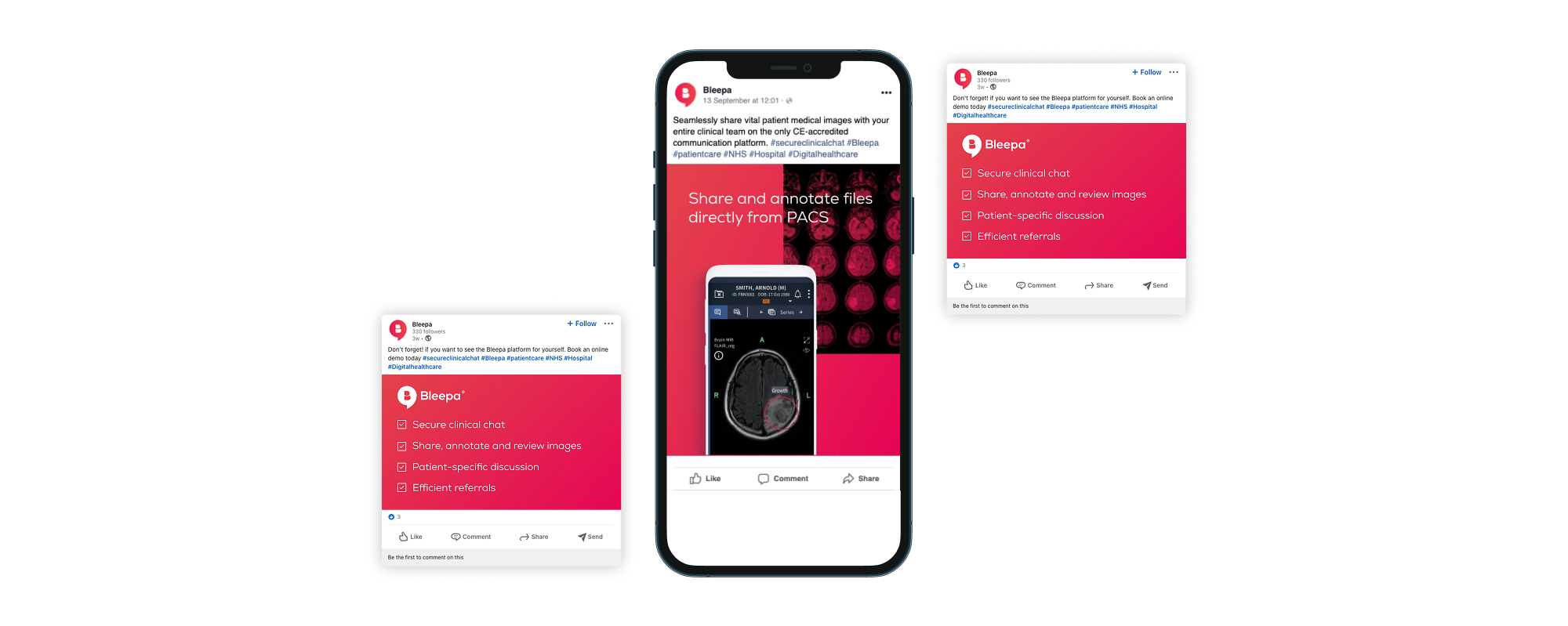
With a new website with a clear user journey and a strong presentation of the product, we could move on to driving traffic to it. We worked on an ongoing digital strategy and a number of digital and social campaigns including Facebook and LinkedIn.
The marketing campaign was consistent with the website, in visuals, messaging and tone of voice. This consistency and clarity gives authority, builds engagement, reduces bounce rates and increases ROI.
Our campaign content showed details of the app’s functions, demonstrating exactly how Bleepa benefits clinicians and medical procurement teams. One campaign included a downloadable fact sheet, creating engagement with the user while allowing the team to monitor downloads and keep users in the sales funnel.
From 2022 to 2023, website traffic and user interest in Bleepa increased by 382%.
Additional projects
We designed and built a website for Carelocker, the cloud data technology behind Bleepa. Feedback Medical was then able to take this to market as a separate product, as well as open up international opportunities, beginning with India. The website is available in English and Hindi.
Feedback Medical is also involved in supporting and delivering patient pathways for community diagnostic centres (CDCs) across England. These provide earlier diagnostic tests for millions of patients, helping to tackle the NHS’s elective care backlog. Bleepa provides the digital infrastructure that connects local care providers so that they can securely share diagnostic information and teams can communicate faster and make more informed clinical decisions. In 2021, we ran a social campaign showcasing Bleepa’s involvement in the initiative.
Outcome
Through brand strategy, content planning, website creation and ongoing creative production we have contributed to brand and business growth. We have built a collaborative relationship, supporting Bleepa’s team to improve sales, grow engagement and make Bleepa part of the conversation, and providing tools to help. Our work has helped to make Bleepa one of the leading medical communication apps on the market, with their team in a strong position for further growth and new opportunities.
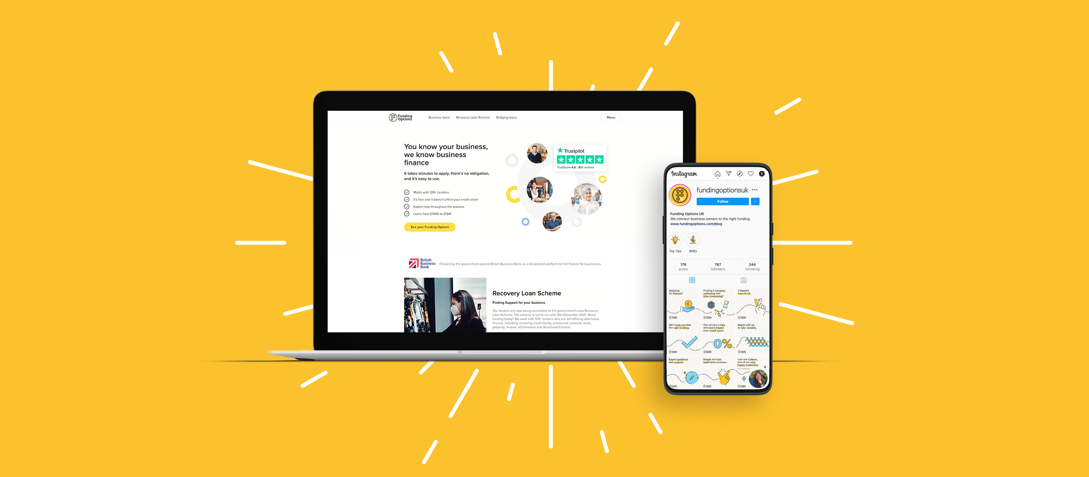
What is Funding Cloud?
Funding is the fuel that companies need to grow, adapt and survive. But all too often, businesses find it hard to secure the finance they need. There are too many confusing products, complex application forms and long waits.
When it was set up in 2011, Funding Options set about to transform the business finance market. Its aim was to make sure every business owner could make an informed choice and have access to instant funding decisions. Since then, it has helped more than 10,000 businesses get the finance they need, quickly and easily. That’s more than £0.5bn in funding for businesses across the UK and Netherlands.
In 2021, Funding Options had been developing and building its technology stack to help offer faster funding for clients and greater transparency for their partner lenders. This development was to be launched as a new platform, Funding Cloud.
What we did
We were brought in to help develop a launch campaign and positioning for the new product. Funding Options wanted to refine its message and establish how the launch would be communicated to its audiences of businesses and lenders. We were also tasked with developing a look and feel that’s consistent with the core brand but with a note of difference, and creating a product video showcasing and explaining Funding Cloud.
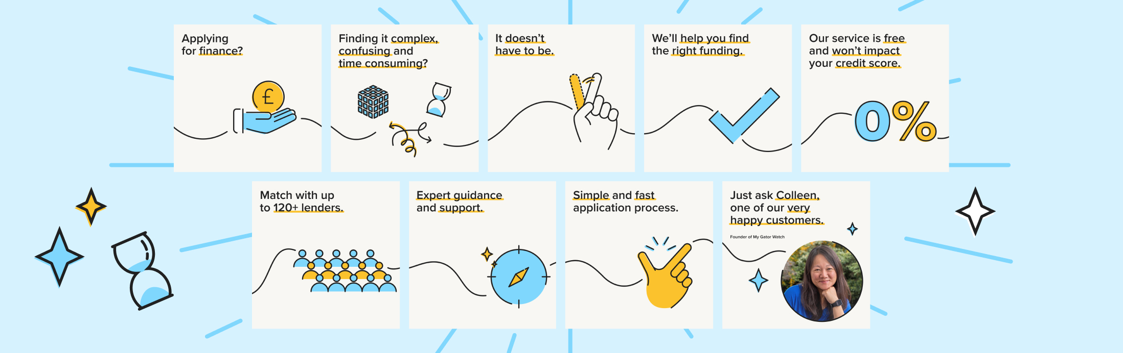
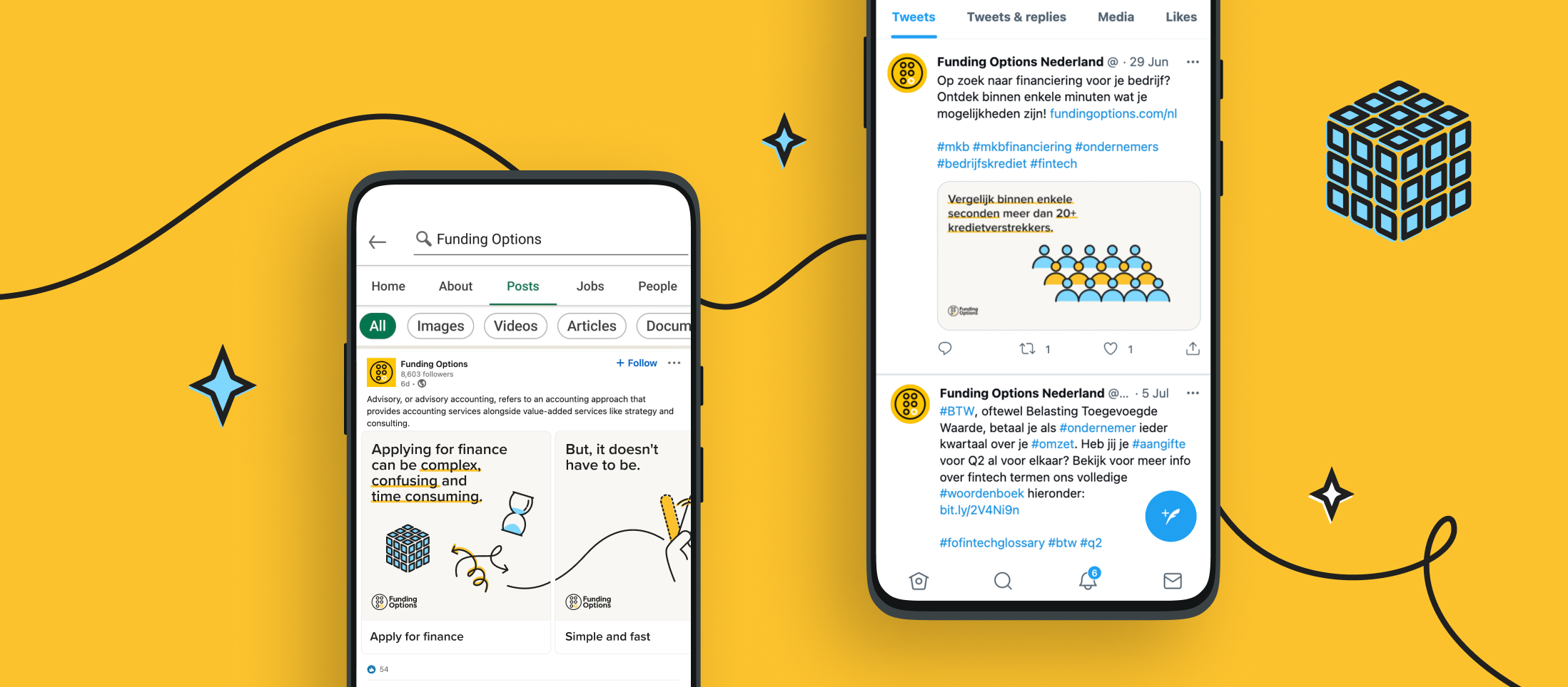
Funding Options also wanted a fresh tone and creative for its social activations, for SME and Advisory audiences. We created a number of animations to run as paid and organic social advertising for the Dutch and UK markets. We were retained for creative support for a period of three months to provide this.
Our approach
The timelines on the project were quite condensed. We quickly pinned down the messaging so that it could feed into all the other elements of the launch. Our role was to help review and refine it, with a strategic narrative and story that best reflects Funding Cloud’s position in the market and how it benefits its customers.
We began by identifying the product’s advantages of connection, speed and empowerment. For lenders, we focused on more granular concepts around transparency, customer matching and real-time views of customers. For businesses, we highlighted the lack of red tape, precise fund matching and the breadth of Funding Cloud’s lender network, using a simple tone of voice that gives confidence in Funding Cloud. Our language and strategic messaging then fed into Funding Cloud’s digital presence, as a destination for customer engagement.
Look and feel
With the messaging in place, we created a visual style for the look and feel of the campaign and product launch. Funding Options had already begun stripping back its core brand elements so that it could build a new direction. This gave our design team a degree of freedom to inject new creative elements and develop a best practice for animation and video that could be used in the future.
At the same time, our design resonated with the rest of the Funding Options brand and didn’t step so far away that it distracted from other communications. We used the core colour palette to create a soft, approachable visual style, with a printed style guide for brand consistency. We created visual motifs for businesses and lenders so that they could be easily identified in the video. These audience groups continued to be signposted within other communications as well as associated live event(s).
The result
Our work launched Funding Options’ new product in a clear, cohesive and exciting way. The messaging framework and the fresh visual look will also be used across wider communications, allowing the company to build on its brand awareness and increasing its customer base.
As the wider brand develops, we continue to work with the business to deliver further brand engagement.

Helping launch a new electric car to market
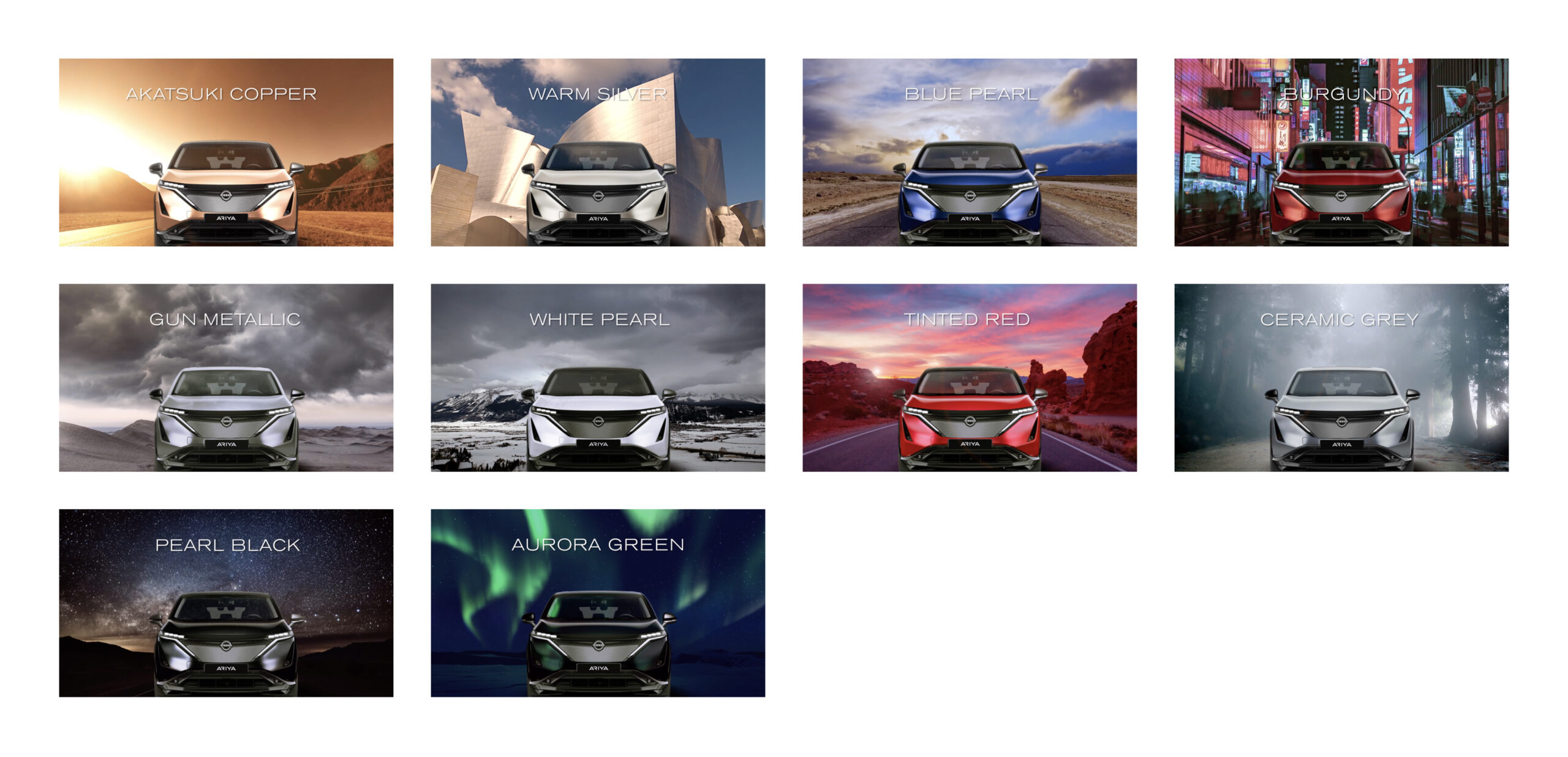
How would you go about creating an entirely new colour for an entirely new vehicle? It’s almost impossible to imagine, isn’t it? This was the brief for the designers working on the aesthetics of the new all-electric Nissan Ariya – resulting in the creation of two exclusive hues never seen before on Nissan’s lineup.
Nissan and their communications agency Edelman wanted to celebrate these colours in some form for their European markets as well as trade media. Our challenge was how to communicate the Ariya’s colour range in an innovative way that picked up on all the nuances and technology that had gone into making them. A concept that invoked the wild and wonderful colour palettes found in nature and that had inspired so much of what was developed; from vibrant neons of Tokyo, to the incredible green of the Aurora, we wanted to evoke the sense of excitement and awe that were behind colour combo.
Crafting an inspiring visual experience
We decided an animated video was the best way to generate the dynamism and excitement that we needed for viewers. We utilised each of the colours and paired it with a piece of the material world to enhance the beauty in the colour. We paired this with a dynamic flip transition where everything was reversed from one colour to the next.
Ideally, when creating a piece of animation such as this, we would have 3D renders of the vehicle however in this case we only had static elements to work with and so in order to ensure a sense of realism we played with the light and matched the reflections of the surrounding environment across the front of the car.
Accompanying materials
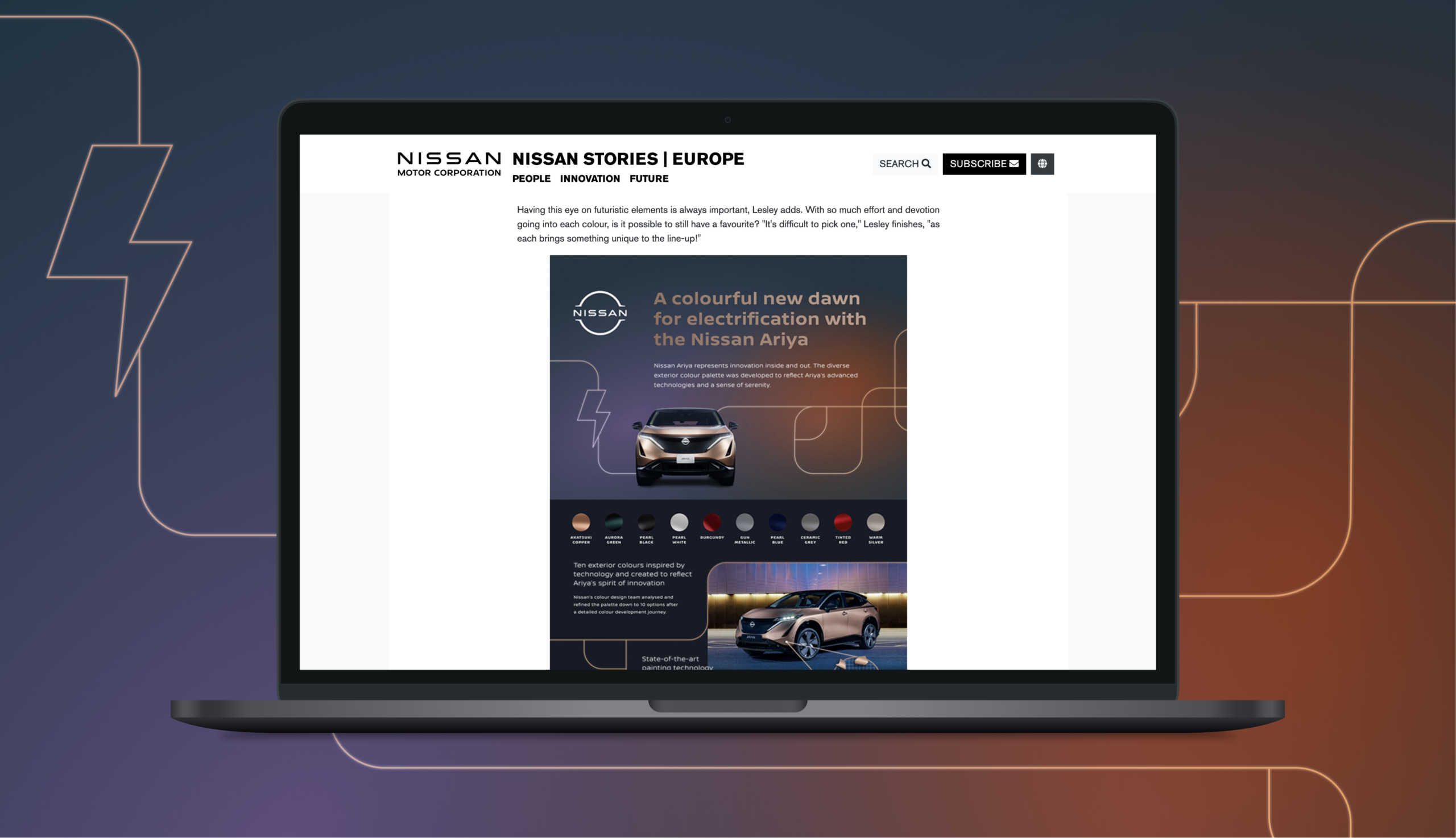
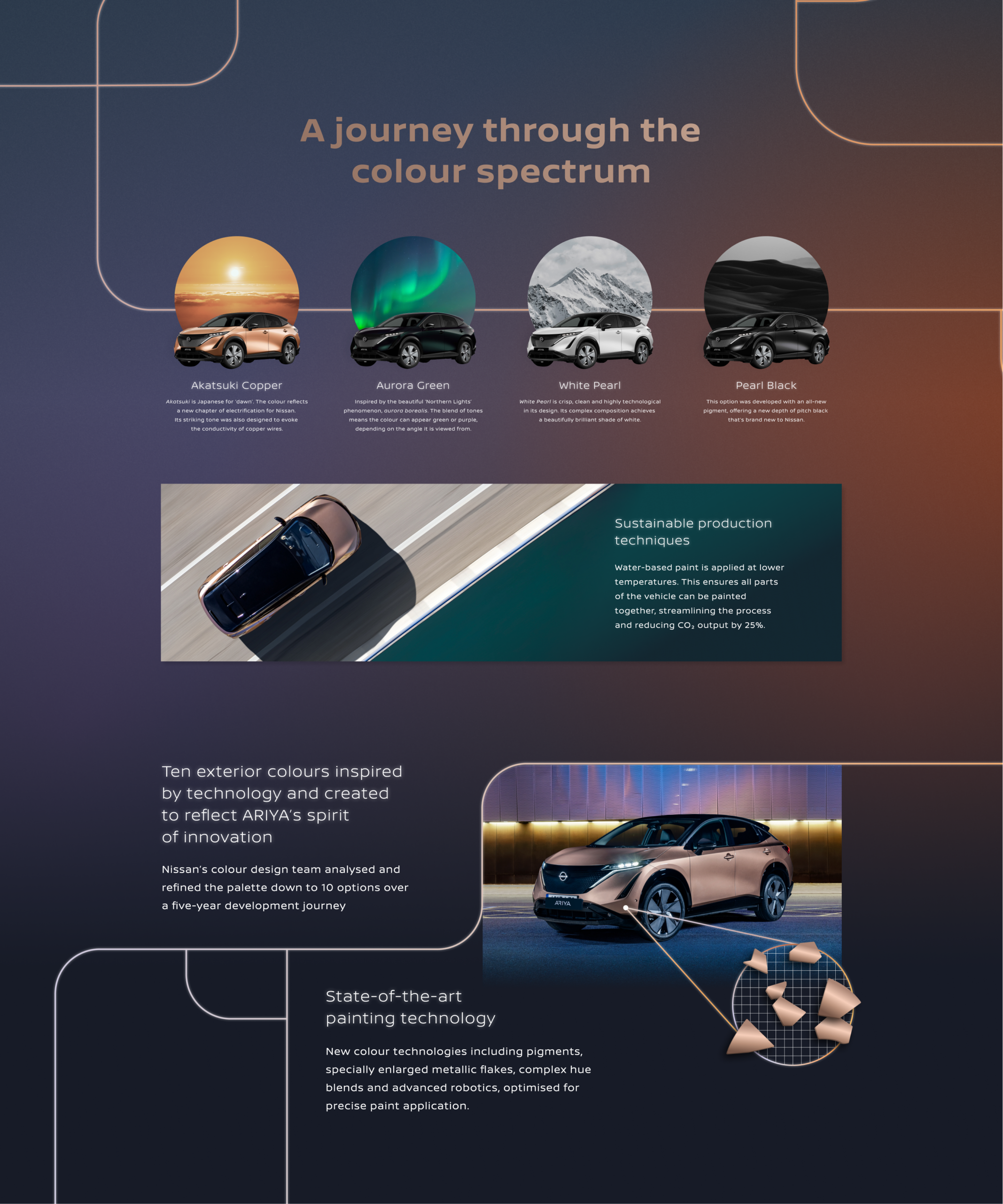
Nissan also wanted a piece of supporting literature that could really sell the elements from within the story, giving it a bit more detail and depth. To support this, we created an accompanying pdf download aimed primarily at media partners. This still maintained the sense of design dynamism and excitement, using gradients and metallic colours. We also wanted to touch on the fact that the vehicle was electric and so used linear strokes to represent cords and power flow. We also used a really condensed length so that it was quick to read and could easily be embedded in any form of online media such as the Nissan stories page.
DP World are a global logistics company with a pivotal presence in the UK. Their portfolio includes the ownership and management of two deep-water ports, with freight rail terminals, at London Gateway and Southampton, alongside associated logistics parks and an advanced software business providing online links to customers and border control.
With a footprint that directly affects much product import into the UK, the chances are that if you’ve bought something from abroad DP World have been involved somewhere along the way – shipping everything from food and drink to tech and automotive.
Profile raising through video
DP World and PR agency Edelman wanted to promote their operations in the UK across social channels and on their website to better inform audiences on the role that the ports play within the UK. Our team were commissioned to create a film that showcased their strengths and picked up on key stories for primarily consumer trade audiences. We delivered scripting, voiceover, design, animation, production and final output.
A focus on London Gateway
London Gateway is a major contributor to the success of UK logistics. It’s a semi-automated facility and uses robotic, automated stacking cranes to assist with managing containers as they are moved from ship-to-shore, onto and off trucks and trains with maximum efficiency. Positioned as the UK’s most integrated logistics hub offering the best tidal access, largest port rail terminal and easy access to roads transport we were commissioned to produce a video that highlighted these strengths, promoted primarily to a trade audience.