Designing investor communications that generate interest

Phil Reid
Founder & Strategic Director
An annual report is one of the few times a year your investors, your people and your market all agree to pay attention at once.
Most companies squander it – a dense PDF, published, skimmed, filed, forgotten. But a report built around a story worth telling, with numbers worth looking at and a format built to be used, does something a spreadsheet never will: it makes people believe in where you’re going.
To make something memorable you need to help the reader emotionally invest in your brand and understand the true impact of your achievements. How your business wins affect individuals, businesses, communities as well as the bottom line. Try to frame your successes by adding testimonials, quotes, individual stories, something that brings your efforts into the real world and off the page. There is a lot of valuable content to be shared in annual reports but if you’re not presenting it well it goes to waste.
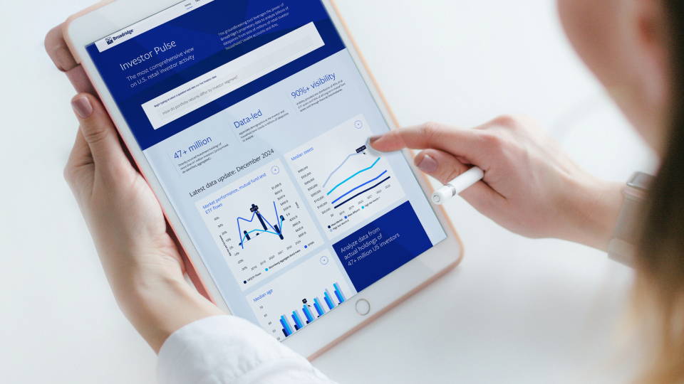
We put this into practice most recently with Broadridge on Investor Pulse, more formally its Investor Trends Report. The story there was never just what the data showed, it was why it mattered: what’s shifting in investor behaviour, and what that means for the decisions asset managers, wealth managers and advisors make next.
In the same way that social media is appreciated for the way it provides a ‘look behind the curtain’, your annual report can serve as a valuable piece of insight into your brand story. Strong brand relationships are forged through human connection so sharing your humanity in your report is vital. Don’t be afraid to include photographs or ways to visually reference your company, whether it’s your CEO, employees or the people that have benefitted from your work. Think about how best to showcase your culture, your purpose and utilise your brand voice to express your personality.
So what if good news is thin on the ground? Don’t panic. It’s tempting to say less when times are hard. However unexplained problems damage investors’ confidence. Your clear approach to your successes should be mirrored in your challenges. Honesty is vital for brand trust. Investors won’t be queuing up at your front door if they think you’re going to hide things from them. Then next year you can give an update on how the situation has developed.
Visualise your numbers
The human brain is wired to understand visual communication. Data is a really good way to bring interest and surprise to your report, a chance to pull out pertinent information that supports your story. Illustrations, photos, colours, table styles are all part of your brand and should uplift your overall design concept. Infographics are a great way to make data visually interesting while drawing attention to the facts, often helping to humanise the story you’re trying to tell.
Data visualisations have a long and interesting history, dating all the way back to the 18th Century where they have been used to motivate cultural change, highlight plights of racism and even identify disease. The African American activist and academic W.E.B Dubois in the 18th Century produced some hugely influential infographics to demonstrate the white supremacy issue. A particularly famous British infographic is the John Snow Cholera Map, which was pioneering in healthcare and helped to identify the disease as being passed through water, saving thousands of lives.
You need to strike a balance between selecting data presentations that enable the reader to interpret the numbers as well as being visually interesting. Beautiful data visualisations can be true art-forms, however an annual report still needs to be clear for investors and shareholders. Whether it’s a map, a graph, a chart, ensure that you’re choosing the most effective data visualisation. Similarly your titles don’t need to be dry, engage your readers with an interesting copy to support your data. ‘Ready and able: a look at progress’ is a lot more engaging than ‘Sector growth’.
Data visualisations can be something that really brings life and interactivity with your report. Whether this is in the physical with paper dials, clever folds or pull outs. These often translate extremely well into digital, encouraging user participation and data interrogation. Put simply, context, simplicity and design could revolutionise your report.
This is exactly what we did with Broadridge on Investor Pulse. What had always been an annual static PDF became an interactive digital tool, with dynamic charts and graphs, customisable filtering by sector, geography and investor profile, and benchmarking tools for comparing across demographics and market segments. Rather than being read once a year and filed away, it became something asset managers, wealth managers and advisors could come back to throughout the year to spot real shifts in investor behaviour as they happened.
Don’t forget digital
When done well, printed annual reports are as worthy as any design book of their place on the coffee table. Paper stock choices, clever printing, interesting folds and pull outs can all deliver a really absorbing tactile brand experience. However the pay off for this piece of beauty is often long lead times and sizeable budgets. This is where digital comes into its own. You can really bring a report alive on a screen; engaging the reader with clever animations in data visualisations, interactive tools, video and exciting imagery. Digital can also be a great investment for year on year use, updating a template with new content to refresh the look and feel without having to build a whole new system every time.
Online is also measurable, having the ability to track user numbers, behaviours and to understand where the most read content is could potentially help inform your wider company strategy. There is of course the other major benefit to digital of how shareable it is, broad reaching distribution for much less cost, even helping boost your company SEO. Broadridge’s own experience with Investor Pulse is a great example of this: the switch to an interactive format didn’t just make the report easier to read, it drove measurably higher engagement from exactly the audiences Broadridge most wanted paying attention, and helped strengthen Broadridge’s position as an industry thought-leader in US investor behaviour analysis, rather than just another firm publishing an annual PDF.
Tablet, phone or laptop. Whatever the device, you can browse your annual report with your morning eggs if you so wish, thanks to the wonderful web. Don’t forget the increasingly prevalent issue of the environmental impact. Even on the best recyclable paper, the carbon footprint of a digital report can’t be beaten.
None of this is theoretical for us. In December 2025, our work with Broadridge on Investor Pulse won a Nicsa NOVA Award for Industry Innovation in Technology, for exactly the reasons above: a narrative worth telling, numbers worth visualising, and a digital format built to be used all year round rather than filed away once a year. If your annual report is still living as a PDF nobody opens twice, we’d like to talk.
Phil Reid
Founder & Strategic Director