Challenge
The majority of UK companies are SMEs. They are a vital part of UK economic growth and job creation. But in a worsening economy, a lot of business owners’ confidence in their future depends on business loans. A 2022 survey by Funding Options showed that 88% of 1,000 SMEs expected to be looking for funding in the near future.
They need to be able to get this, and for their business to survive they often need to get it fast.
Business finance marketplace Funding Options wanted to create a new product to facilitate this lending. It had already developed and built its own technology stack, Funding Cloud(TM), which uses data analytics, open banking APIs and AI to make the process faster for SMEs, give greater transparency to lenders and make the market more efficient.
Now Funding Options wanted to make use of all the data it was accumulating to help lenders see patterns in loan applications, usage, uptake and more, giving them extensive market intelligence and insights. This would help lenders respond to SMEs in almost real time and offer them what they need, when they need it, evolve their lending propositions, make more accurate decisions about products, and create new ones.
We had already worked with the company on the launch of Funding Cloud(TM) and now it came to us again.
What we did
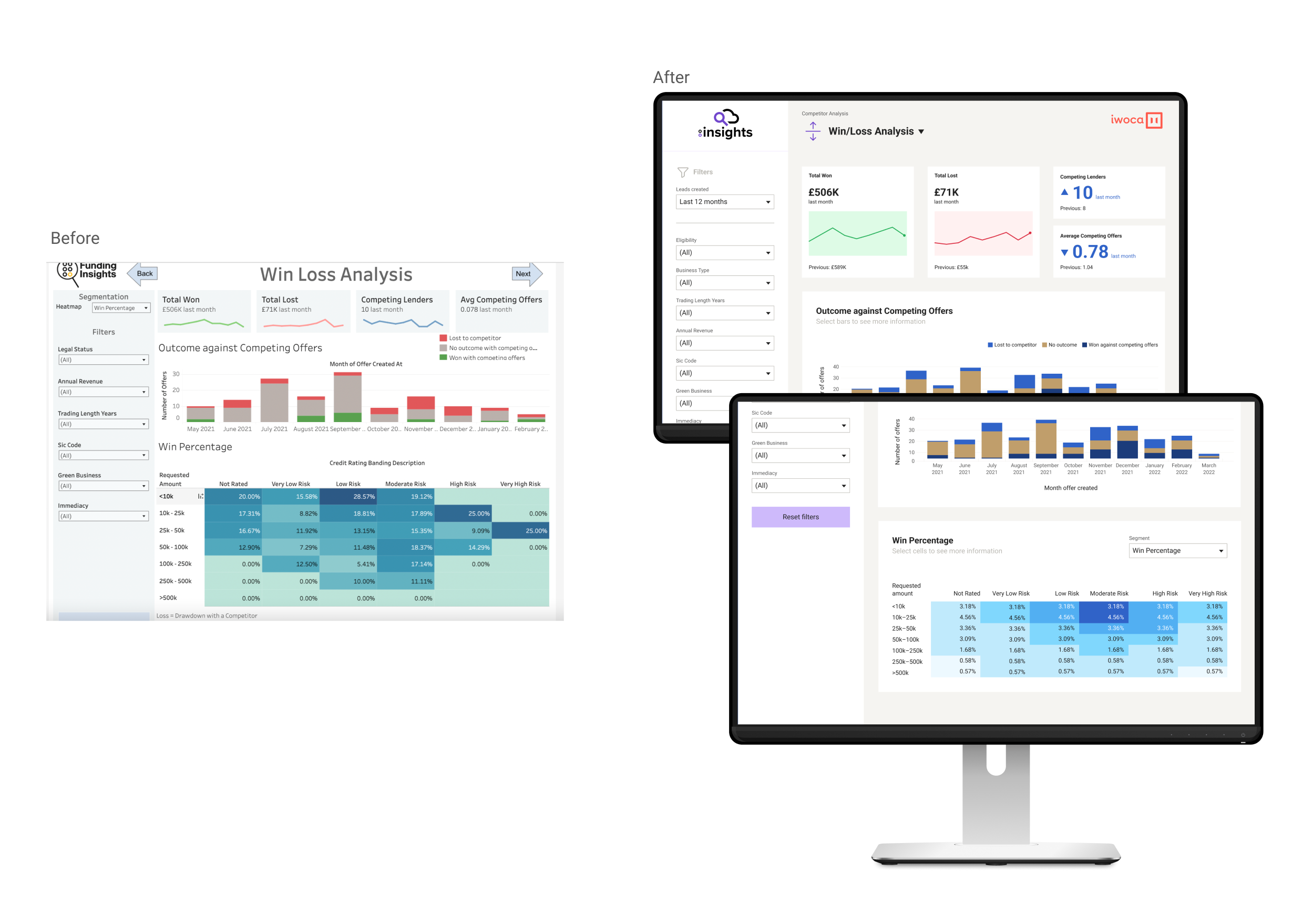
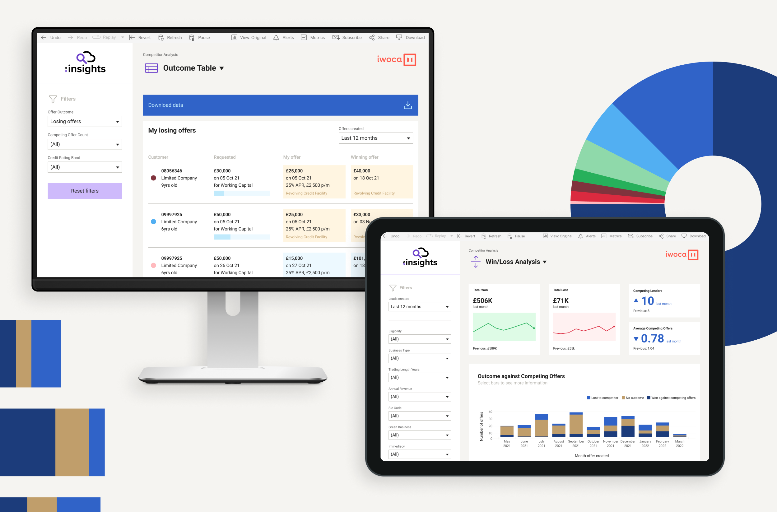
We collaborated with Funding Options to create FC:Insights, working on the UX, UI and visual design. Lenders can embed their products in the platform and through granular trend data they can understand their position relative to other lenders, adapt their products and pricing, see new opportunities and make commercial decisions.
Data visualisation
Data on its own is not enough. It has to be brought to life. When it’s presented visually in a simple, clear and attractive way, users can easily understand what it’s telling them. It can help them analyse complex data and see patterns and stories. It gives them insights that they can make informed decisions with and take action on, with confidence.
As well as its proprietary technology, Funding Options wanted to use Tableau an interactive data visualisation tool – to power this new digital product. Tableau would integrate with its own multiple data sources to create a range of dashboards for users.
We collaborated with a Tableau consultant to understand the possibilities of the system and how its use affects design choices. Working within its parameters, we decided how data would be displayed and we built all the chart types and landing pages.
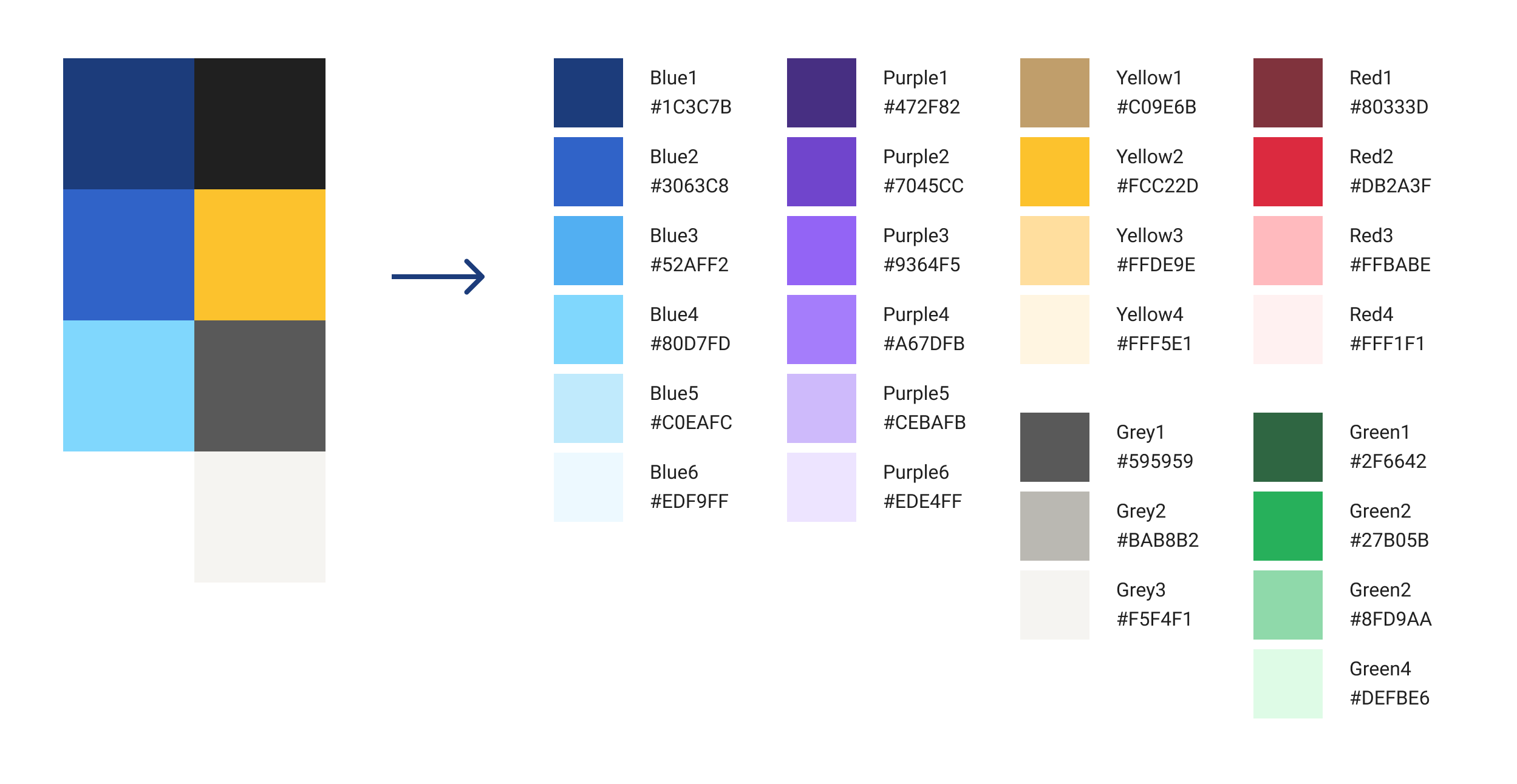
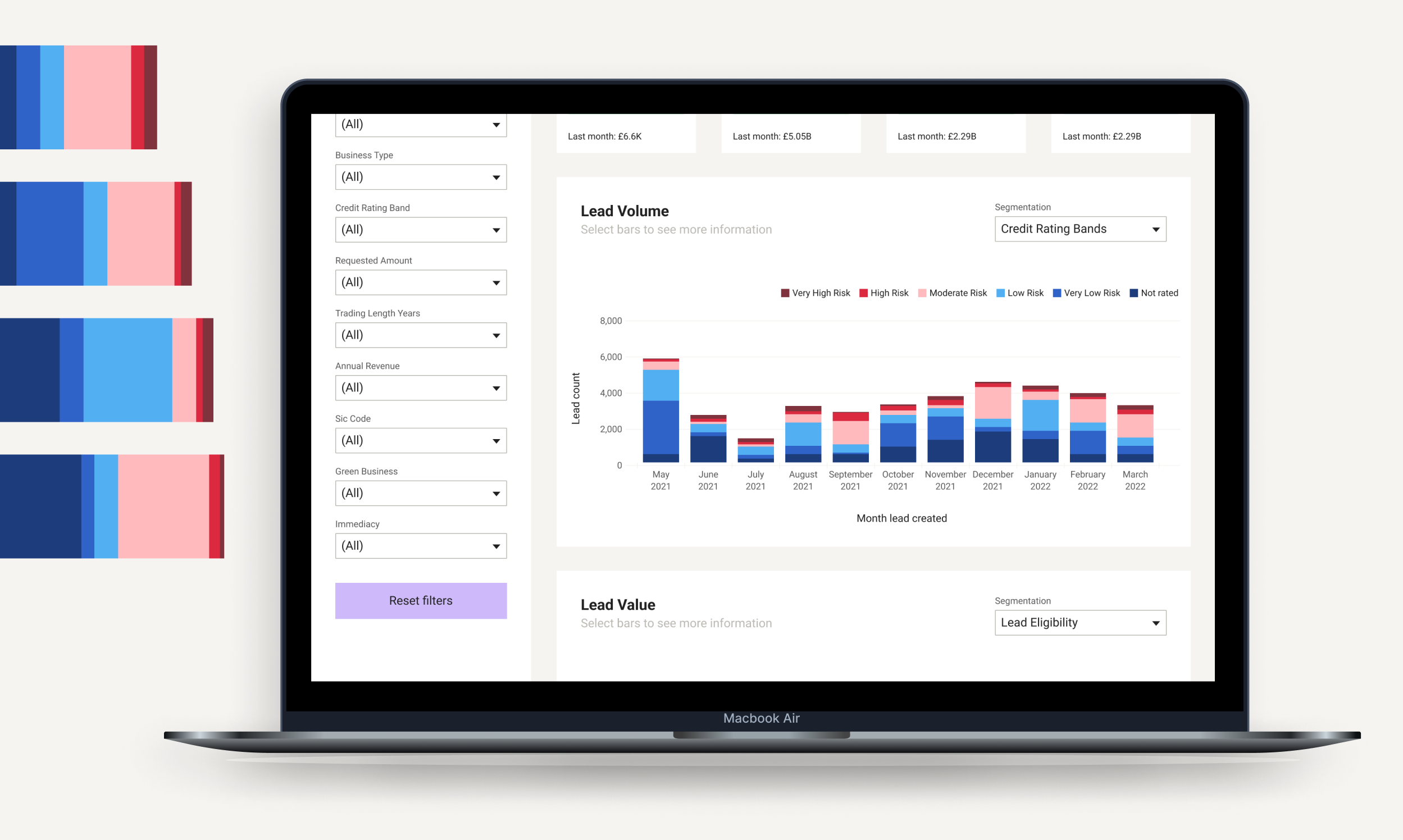
Once we had this, we created a roadmap for the product and a UX that signposts users to key data, and designed a visual style. This included colour palette, font choice and how space is used around the data for clear presentation.
Then we handed this to Funding Options’ development team to build, integrating with them to implement our design as part of the first release. This set the design foundation, ready for the product to be fully developed and launched. The project was done within a deadline of four weeks.
Outcome
We helped to create an intuitive and user-friendly platform, which – in a fragmented and highly competitive market – gives lenders near real-time knowledge and intelligence, so that they can make better lending decisions. FC:Insights is a technology milestone for Funding Options.
“During these tumultuous times, both lenders and business leaders need all the tools at their disposal to make faster, cost-effective decisions […] We are offering lenders intuitive data visualisation to place them at the forefront of innovative product development. Over time, we will aim to scale this data-rich marketplace further and improve it based on the feedback of our valued lender partners to enable the collective market to move faster than ever before.”
Malcolm Leach, CTO of Funding Options
Comprehensive fund brand analysis
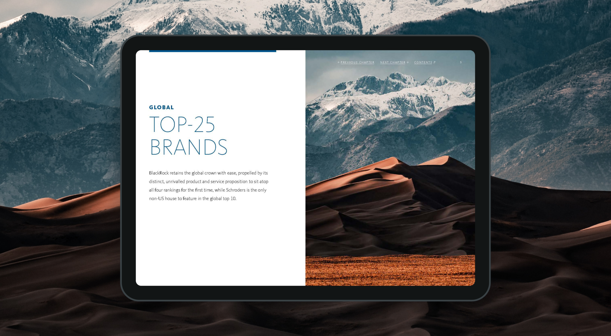
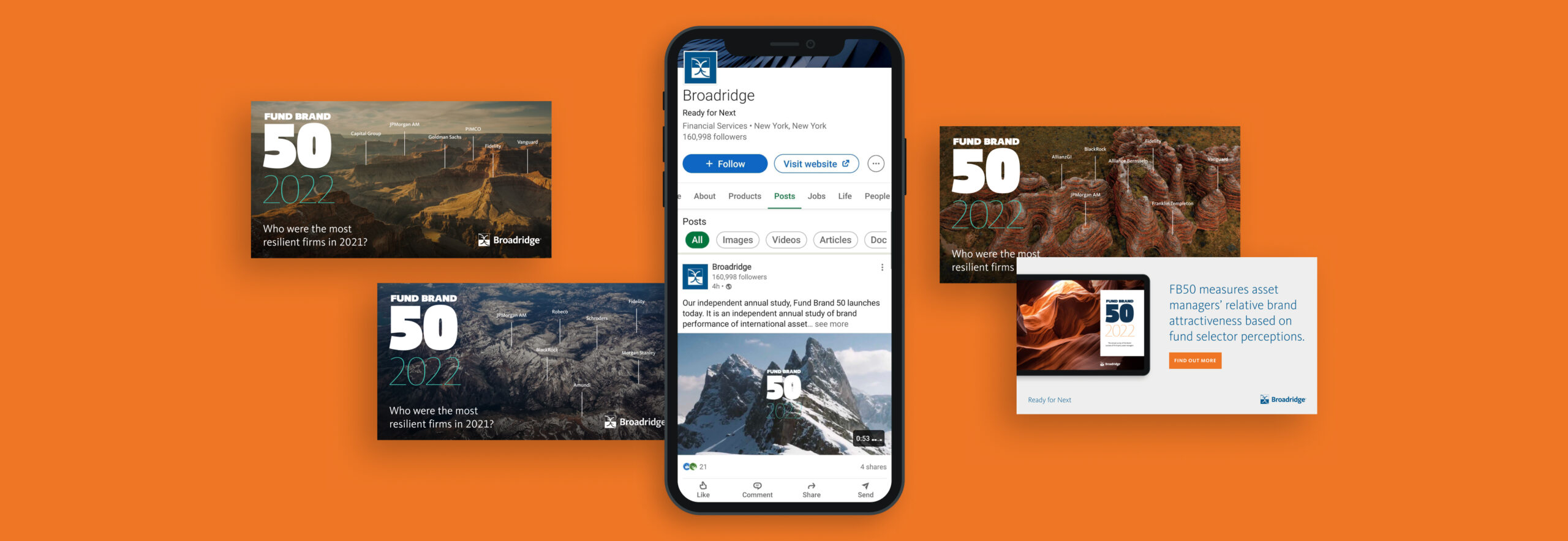
Fund Brand 50 is the most comprehensive annual study of the world’s top 50 cross-border asset management brands. We have worked since 2021 with MackayWilliams, and more recently Broadridge in producing a circa 130 page report and (in 2020) an online digital companion providing access to interrogate data and brand profile charts included in the printed report.2022 marks the third year of the report under new ownership since MackayWilliams was purchased by global fintech company Broadridge.

Changing brand ownership
The FB50 report has achieved an ever-growing following since launch and has built a reputation and equity in its brand that we didn’t want to dilute. At the same time, in transitioning to Broadridge’s ownership we wanted to reflect their new brand voice. Type, colour, and photography were all updated based on Broadridge’s brand guidelines in a manner that made sure to preserve the distinctive qualities of the FB50 brand.
An automated workflow
To assist with the production of the printed report in 2020 (in addition to creating the InDesign templates and managing the print and delivery process) we created a digital tool to automatically output each of the brand profiles from raw Excel data sheets to individual pdfs which could then be embedded in the report.
This greatly reduced the amount of time needed to produce those pages in the report, and ensured consistency across all 150 charts and tables that were to be created in that section.

A digital companion
To accompany the 2020 release of the printed report, we created an online digital tool that allows subscribers to interrogate the raw data and analyse the success factors behind the top 50 brands discussed in the report.
Each of the top 50 brand profiles can be viewed and compared against one another to see how other brands are measuring up in each of the key reporting areas.

As part of creating this online portal, Broadridge needed a secure method of on-boarding new subscribers – giving individuals access to the digital report. We created a custom user management system that empowered their admin team to grant access to new users and automatically trigger emails to be sent out notifying those users how they can register for access.
Building brand success
FB50 continues to grow from strength to strength. Revered within the fund industry, the report provides a transparent look at fund brand performance. In a marketplace where brand purpose and clarity are of increasing importance, this insight is helping brands better understand the drivers to success in their markets.
Broadridge is one of the world’s leading providers of financial technology and services, with $5bn+ in revenues and more than 14,000 employees in 21 countries. Its infrastructure provides a global communications hub that links thousands of companies and funds to millions of individual and institutional investors, underpinning daily trading of more than $9tn of equities, fixed income and other securities.
It has multiple products, services and insights, helping banks, broker-dealers, mutual funds, asset and wealth managers and public companies manage risk and accelerate growth. But it wasn’t presenting them well. Over time, through a combination of internal innovation and external mergers, it had accumulated multiple products. These looked inconsistent, were described differently and were not presented cohesively as a core offering.
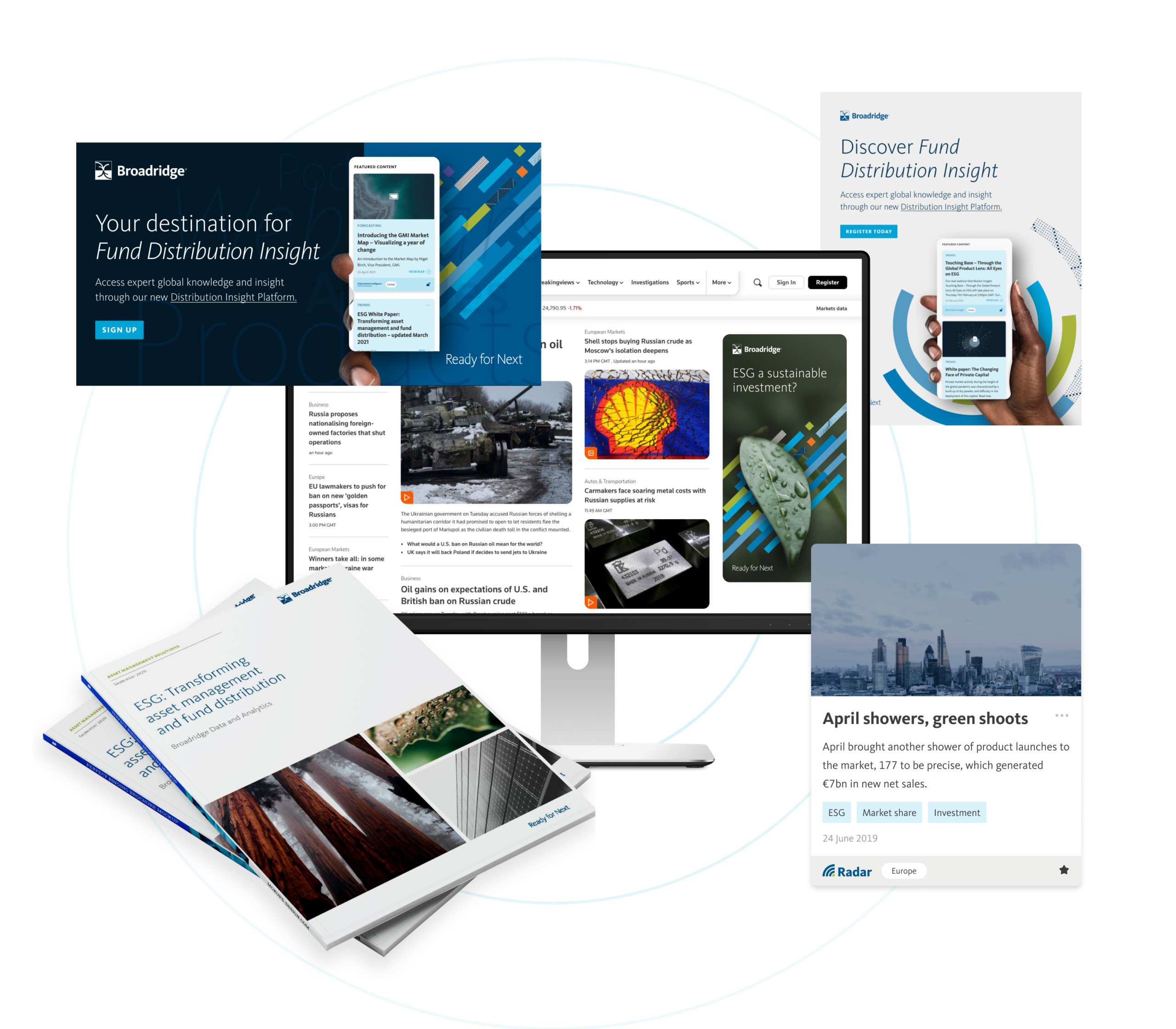
It was time to create an accessible, consistent, progressive digital experience where clients and potential clients can easily access everything. The commercial need was for a go-to-market strategy for 20+ products and services.
What we did
Our role was to help formulate a common approach across presentation, tone of voice and brand look and feel, bringing these products to market as part of a single, consistent core product suite.
First, this required us to delve into Broadridge’s existing proprietary systems and to think strategically. Our team looked at the product range, revenue mechanism, distribution and release schedule, associated content, regional outlook and more.
Strategy and team
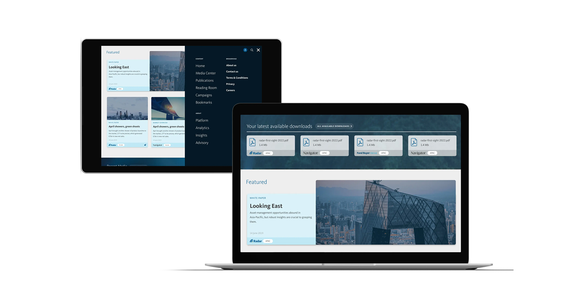
We realised we needed to build a new, single destination that would hold all of this in one place. The Distribution Insight platform would be a new future-facing website for Broadridge; its repository for everything distribution-focused.
We adopted an integrated-team approach, providing UI, UX and digital development support to the multiple internal teams building and developing different aspects of the platform. We worked closely together on technical decisions and provided rapid prototyping for key elements. This included research and development across integration and administrative logic, unique content mapping and infrastructure strategy.
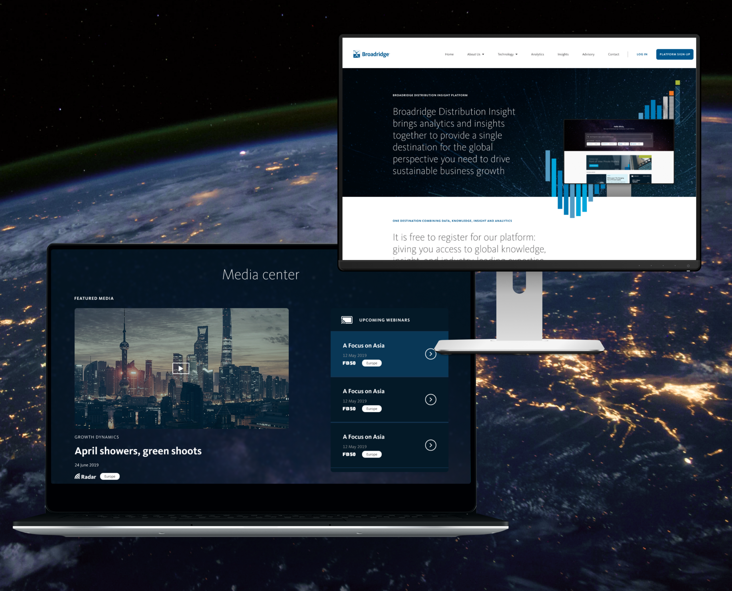
The new platform, Distribution Insight, brings Broadridge’s analytics, insights and advisory services together, giving asset managers a detailed picture of global markets and critical insights that can help them operate strategically and accelerate their growth.
Campaign activation
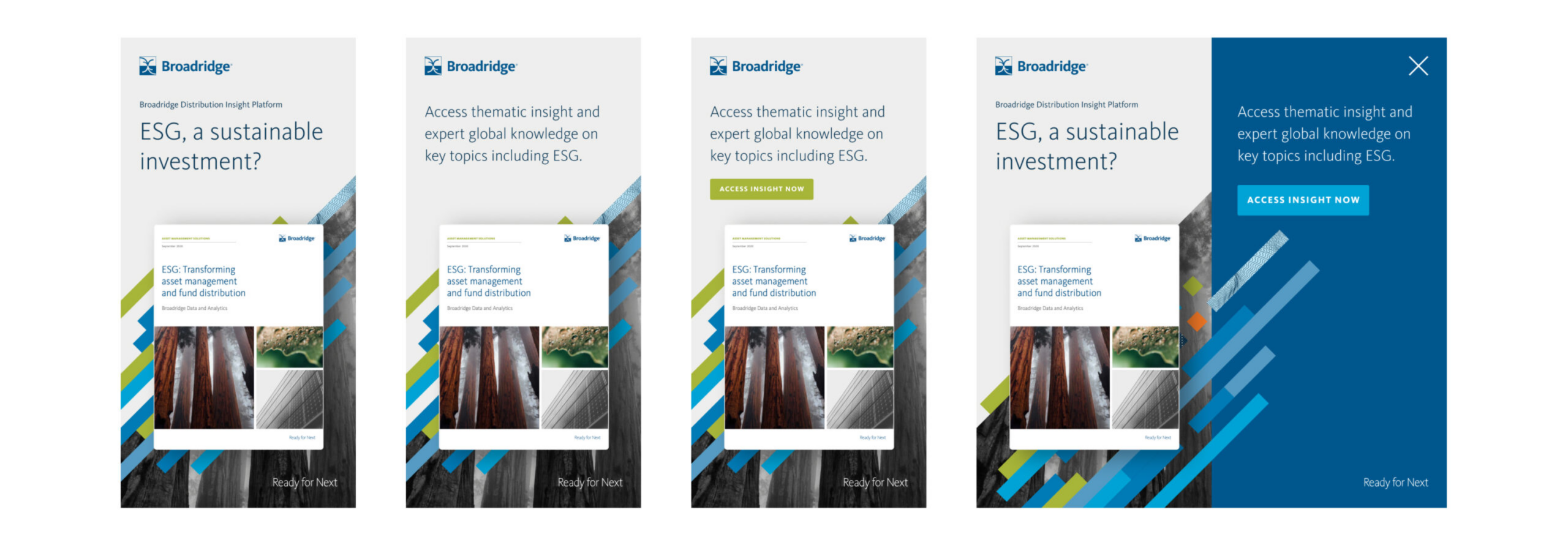
We were also asked to work on a launch campaign, and designed an activation programme for Broadridge’s teams to bring it to market. We designed creative executions across motion, interactive advertising and wider campaign creation. This work was featured in Reuters, FT’s Ignites Europe, Funds Europe and other platforms.
Outcome
Working hand in hand with Broadridge, we co-created a strategy, unified sales proposition and distinct visual approach for an entirely new digital sales concept, Distribution Insight. We conceived, planned, designed, built and launched a single digital environment with access to a suite of distribution products, both analytical and insight focused.
The system has supported multiple global teams with their product sales and growth strategies – and given their clients products and insights to inform their strategies and fuel their growth. We continue to help Broadridge maintain the system.
We now have a long-term partnership with the organisation and have become an extension of its global team, supporting multiple business units with the following services:
- Strategic brand positioning
- Product positioning and development
- Brand creative
- Digital product UI, UX and design
- Digital architecture and prototyping
- Digital development and build
- Product launch
- Campaign activation and social activity
Other projects have included AXA × Broadridge ↗ and Broadridge FundForum Digital Tool ↗
Broadridge was commissioned by global investment management firm AXA to provide knowledge and research insight on the topic of ESG investing, for a research report and campaign.
Thematic investing – building a portfolio around companies benefitting from long-term economic, political or societal structural shifts, rather than by sector or geography – is rapidly rising. With investors increasingly wanting to understand how such funds fit into a broader portfolio, AXA wanted to make the case for a thematic strategy, particularly ESG investing, to become a mainstream investment approach. AXA IM has a history of thematic investing, convinced that such a strategy can give investors superior growth potential, create new investment opportunities and help to future-proof their portfolios.
The company commissioned research from Broadridge to explore this topic.
For its analysis, Broadridge drew on its extensive global network of experts, data and research, using: interviews with 90 fund selectors in Europe, Asia Pacific and North America about their use of thematic funds; a dataset of assets, flows and other information on 91,000+ global funds; a global dataset of 1,471 thematic funds in 13 segments; plus several years of market research interviews with the 1,200 largest professional fund selector firms in Europe and Asia Pacific.
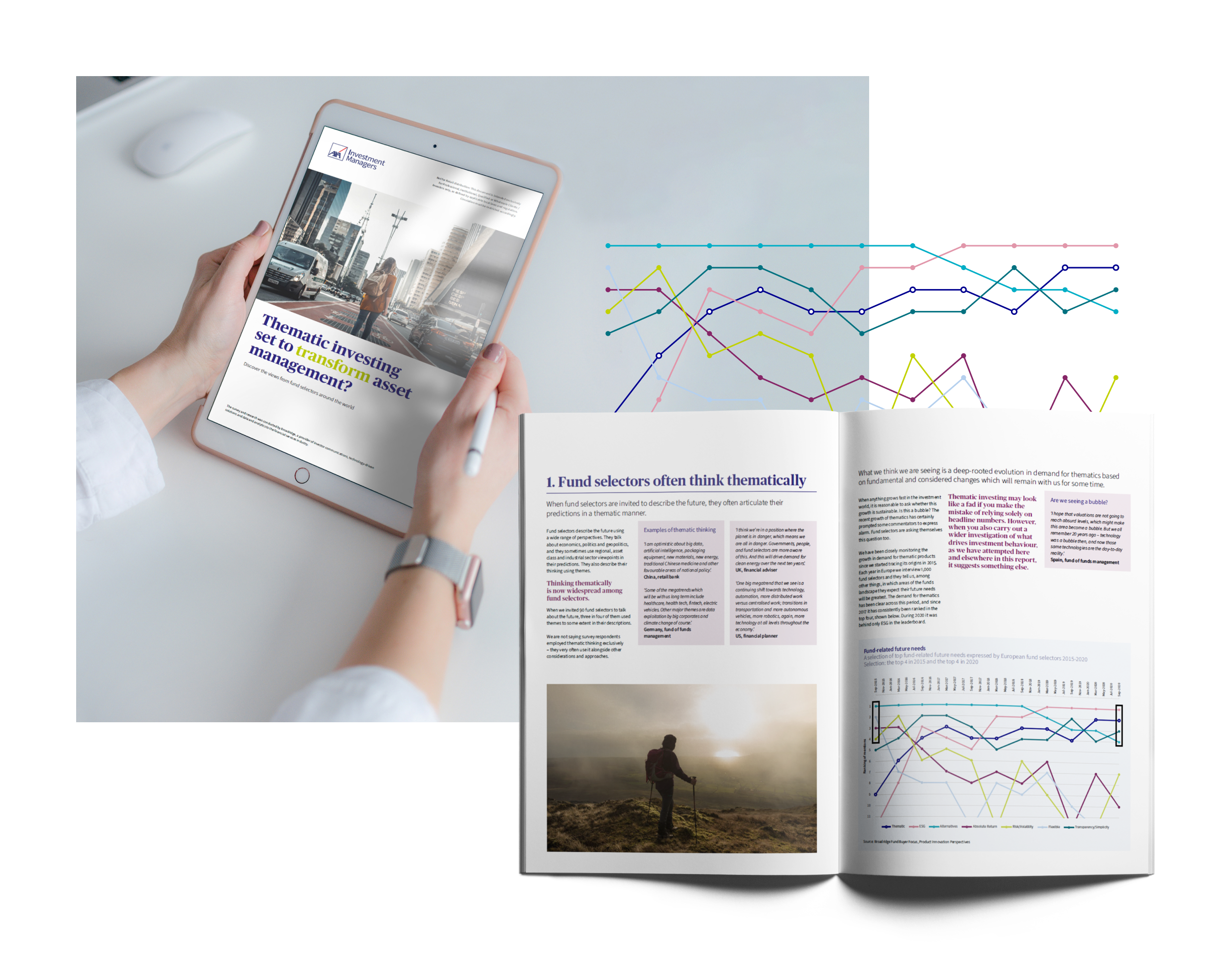
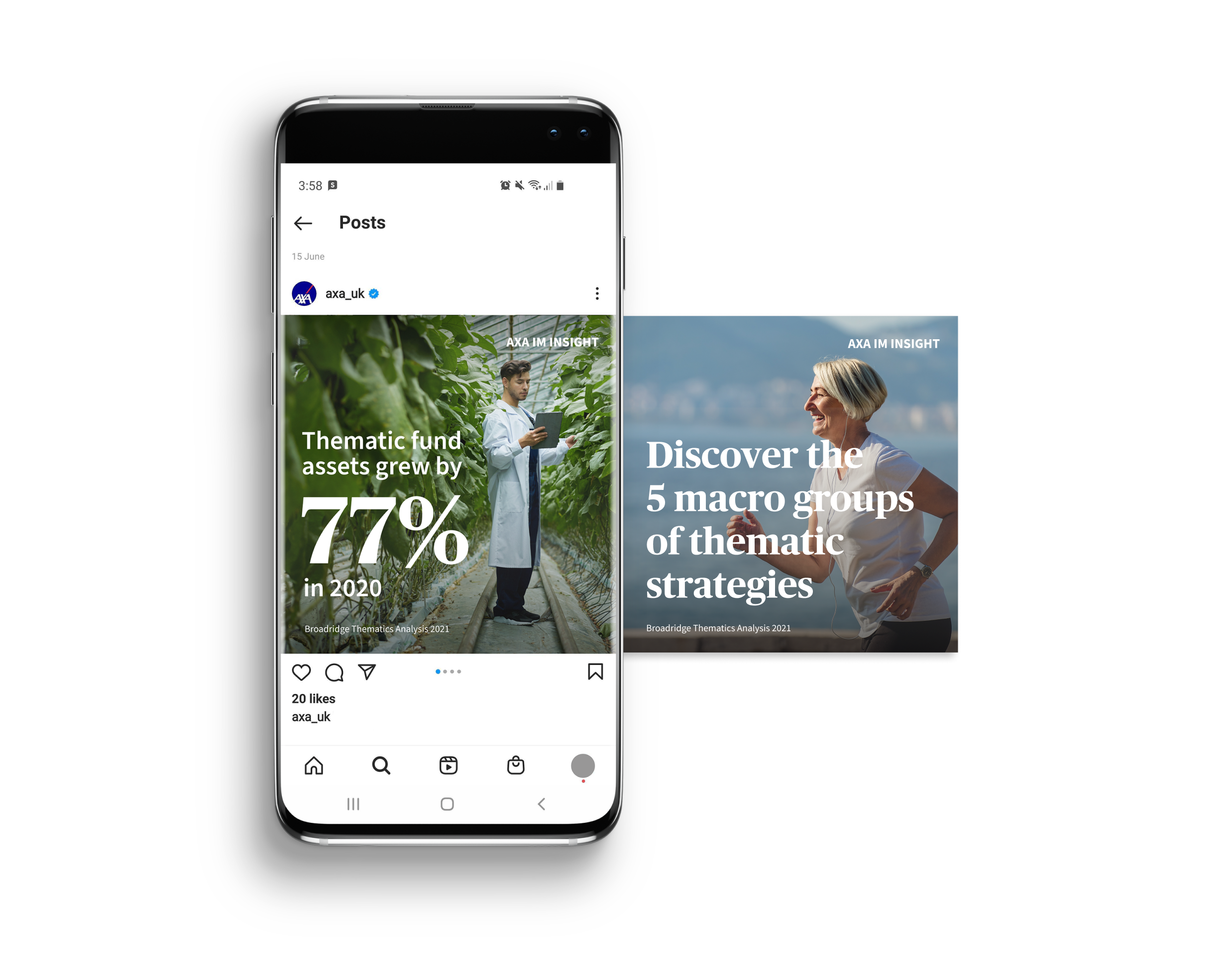
As Broadridge’s long-term creative partner, we were asked to design the report and create assets including animated videos for both companies to use on their social media.
What we did
The goal was to create a distinctive white paper and a campaign with assets that could be used across the white paper, AXA’s website and social media. We used AXA’s brand guidelines to guide the layout of the report and creation of new assets.
We had to integrate photography, and sourced images that are relevant and realistic for the content matter and match AXA’s optimistic, uplifting brand tone.
Showing the story behind data
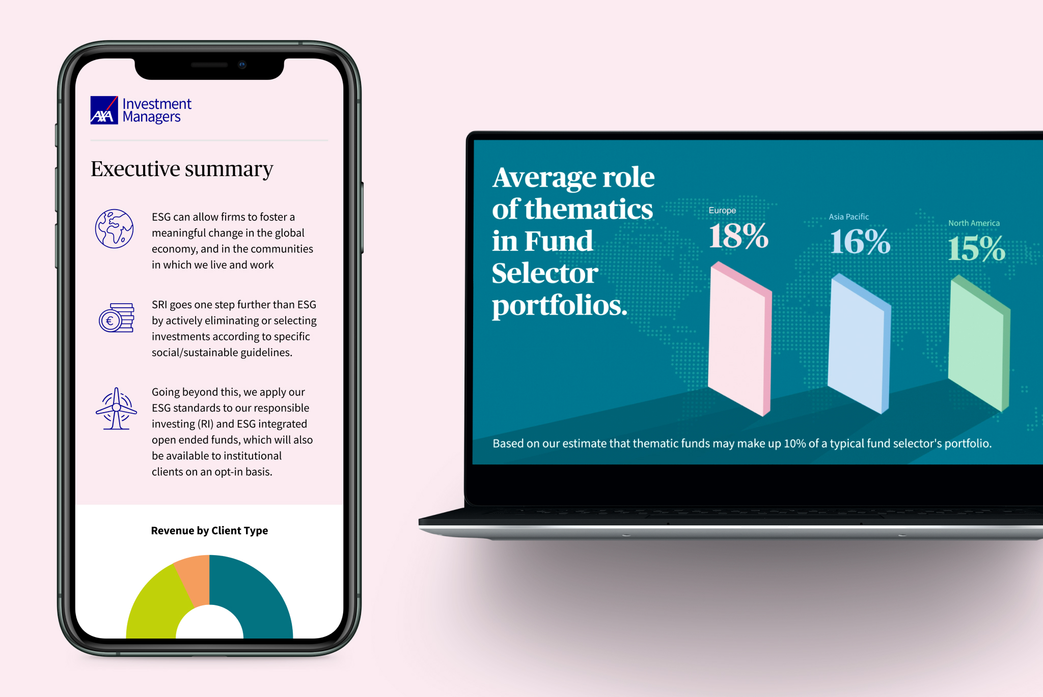
To clearly present Broadridge’s insights, we used data visualisation. For each data story, we created brand-appropriate visualisations that worked well in the PDF report and in regionalised versions (North America, Europe and Asia) as well as in summary documents and presentations. We also created a separate set for video animations to use on social media.

Collaboration
Good project management and sign-off process was essential as this was a collaborative effort between AXA and Broadridge and all our design elements had to be agreed by both. They had to approve our visual look and interpretation of the brand guidelines as well as the way we presented research findings. We worked closely with AXA’s brand team in France and the insights team at Broadridge to ensure that everyone was happy.
The outcome
We created an engaging visual identity for an in-depth global report that showcases AXA as a leader in ESG investing, plus campaign assets for use across different platforms.
What is Funding Cloud?
Funding is the fuel that companies need to grow, adapt and survive. But all too often, businesses find it hard to secure the finance they need. There are too many confusing products, complex application forms and long waits.
When it was set up in 2011, Funding Options set about to transform the business finance market. Its aim was to make sure every business owner could make an informed choice and have access to instant funding decisions. Since then, it has helped more than 10,000 businesses get the finance they need, quickly and easily. That’s more than £0.5bn in funding for businesses across the UK and Netherlands.
In 2021, Funding Options had been developing and building its technology stack to help offer faster funding for clients and greater transparency for their partner lenders. This development was to be launched as a new platform, Funding Cloud.

What we did
We were brought in to help develop a launch campaign and positioning for the new product. Funding Options wanted to refine its message and establish how the launch would be communicated to its audiences of businesses and lenders. We were also tasked with developing a look and feel that’s consistent with the core brand but with a note of difference, and creating a product video showcasing and explaining Funding Cloud.
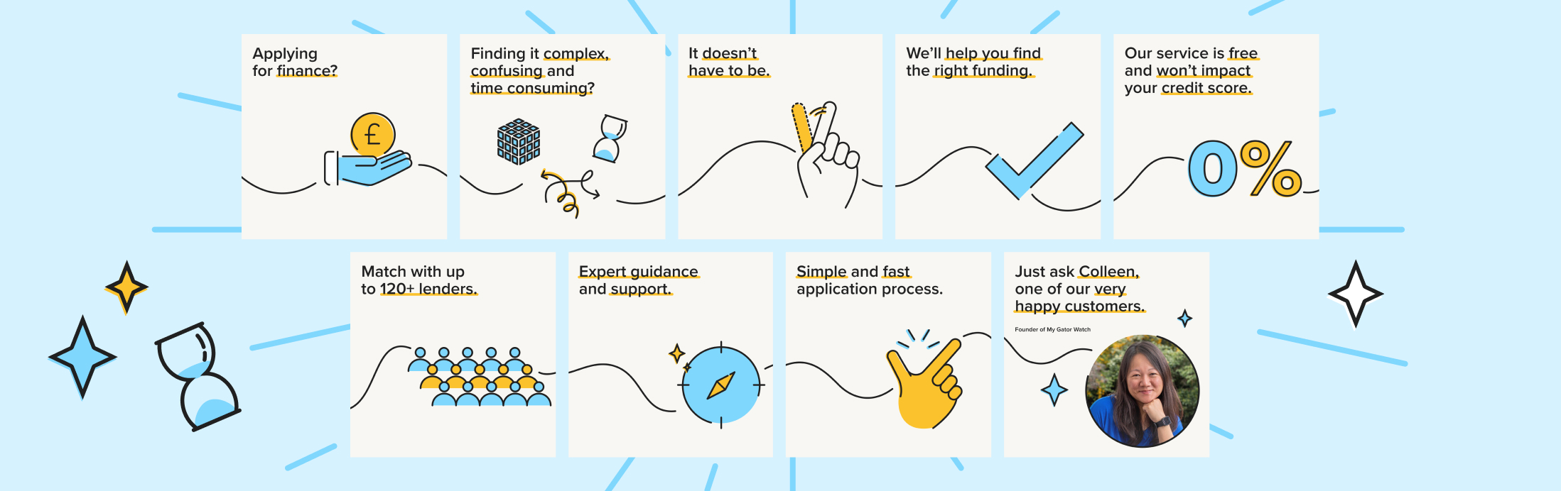
Funding Options also wanted a fresh tone and creative for its social activations, for SME and Advisory audiences. We created a number of animations to run as paid and organic social advertising for the Dutch and UK markets. We were retained for creative support for a period of three months to provide this.
Our approach
The timelines on the project were quite condensed. We quickly pinned down the messaging so that it could feed into all the other elements of the launch. Our role was to help review and refine it, with a strategic narrative and story that best reflects Funding Cloud’s position in the market and how it benefits its customers.
We began by identifying the product’s advantages of connection, speed and empowerment. For lenders, we focused on more granular concepts around transparency, customer matching and real-time views of customers. For businesses, we highlighted the lack of red tape, precise fund matching and the breadth of Funding Cloud’s lender network, using a simple tone of voice that gives confidence in Funding Cloud. Our language and strategic messaging then fed into Funding Cloud’s digital presence, as a destination for customer engagement.

Look and feel
With the messaging in place, we created a visual style for the look and feel of the campaign and product launch. Funding Options had already begun stripping back its core brand elements so that it could build a new direction. This gave our design team a degree of freedom to inject new creative elements and develop a best practice for animation and video that could be used in the future.
At the same time, our design resonated with the rest of the Funding Options brand and didn’t step so far away that it distracted from other communications. We used the core colour palette to create a soft, approachable visual style, with a printed style guide for brand consistency. We created visual motifs for businesses and lenders so that they could be easily identified in the video. These audience groups continued to be signposted within other communications as well as associated live event(s).
The result
Our work launched Funding Options’ new product in a clear, cohesive and exciting way. The messaging framework and the fresh visual look will also be used across wider communications, allowing the company to build on its brand awareness and increasing its customer base.
As the wider brand develops, we continue to work with the business to deliver further brand engagement.

Broadridge Financial Solutions, Inc. (BR), a global Fintech leader and part of the S&P 500® Index partner with some of the world’s leading companies and financial institutions. They help drive business transformation for their clients by delivering products across technology and operations, communications, data and analytics. Working with their Distribution Insights team, we were tasked to digitally showcase the products that they provide global clients.

Context and Challenge
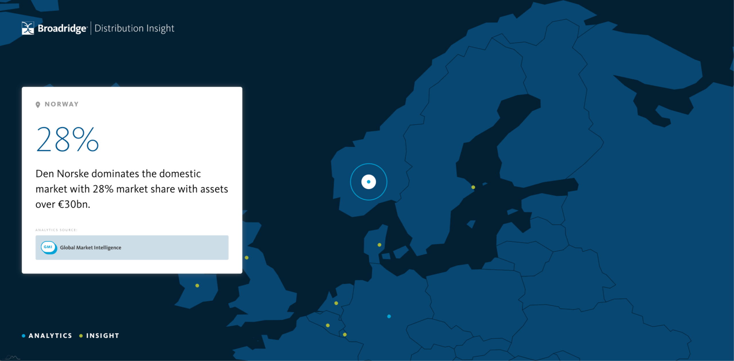
We were approached by the Distribution Insights team to create a digital tool for the Fund Forum event in Copenhagen. It needed to show the global reach of Broadridge products and demonstrate the power of the insight they were able to offer. Simultaneously it had to be a data collection tool; recording user interest and registering people for a competition to win a Google home device. The brief was that it needed to play on a loop through the television screen on the stand as well as having users interact with it on iPad, requiring the development of two parallel versions.
A global presence
Providing a sense of scale and a global overview to how product insight fits together was very important. We developed a system that allowed a locational point to animate from one element on a sphere to another. We then adapted this to display a stylised globe using the Broadridge branding, allowing us to demonstrate the company presence across each country. We also wanted users on an iPad to be able to target specific destinations if they so wanted, and added a country selector drop down to the homepage.

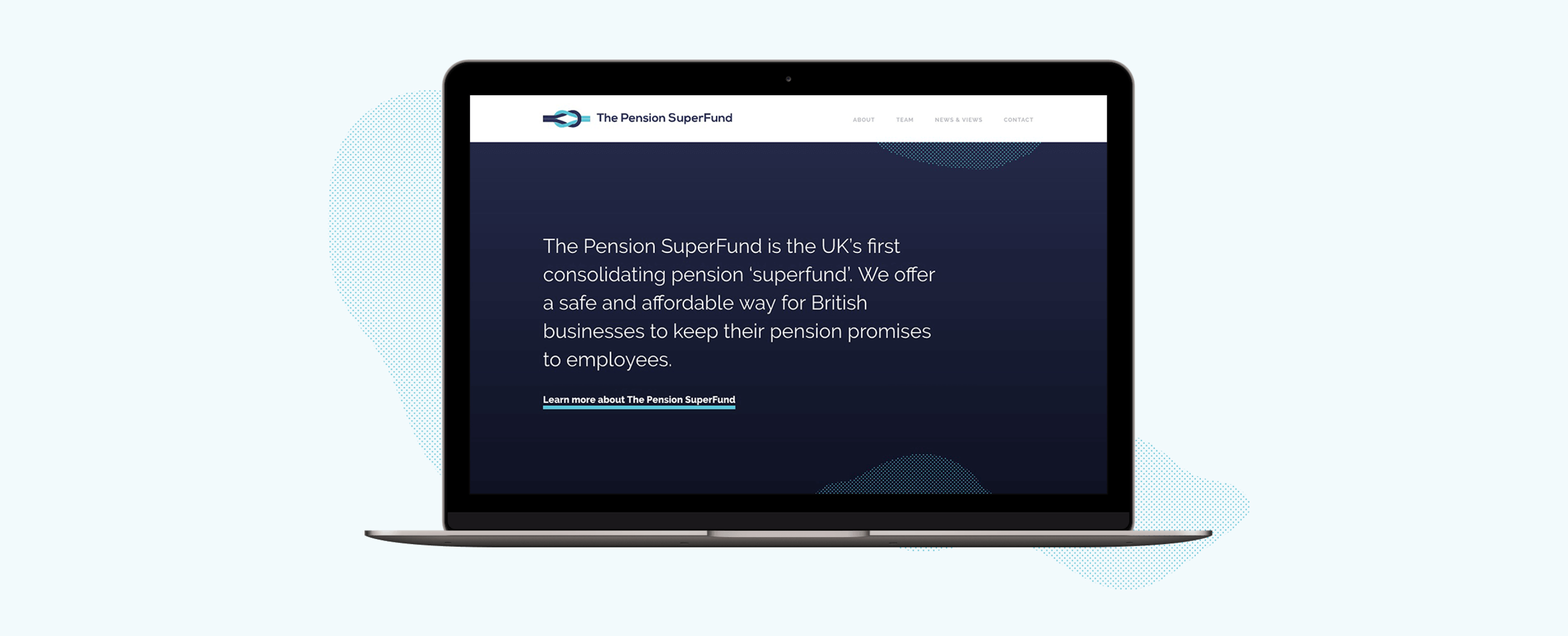
The Pension Superfund is the UK’s first consolidating pension ‘superfund’. Their product was entirely new to the market and so we wanted to create a clean and concise brand presence that visually presented the messaging and benefits in a simple and clear manner.

Appropriate design
Our design team introduced a streamlined colour palette and a monotone illustration style to ensure that the messaging was not overwhelmed. The site’s main purpose is to provide information to potential stakeholders, validating the Superfund’s existence and clarifying their proposition. We created a ‘news and views’ area to promote opinion and insight, to capture interested parties and motivate engagement of getting in touch. Utilising subtle animations and abstract textures to add visual interest and create a stylised design approach, the brand can flex as necessary.
A brand to build on
The brand base that has been created will support The Pension Superfund as it grows. The textured elements used within the design are flexible allowing them to be used effectively across a wide range of campaign materials whilst keeping brand consistency. The illustrations also serve as the beginning of a visual library that The Pension Superfund have ownership over going forwards.
Your website is a window for the world into your business, and perhaps your most valuable sales tool. Therefore it’s imperative that it performs as a conversion tool, aiding you in securing new business. In today’s digitally focussed climate it’s imperative that your site continues to be measured and perform. Your site should be delivering on structure, design and SEO. A website that delivers on all of these things, will mean more sales and greater brand recognition.

Project context
We were approached by Mazars, Europe’s 8th largest accountancy firm to help them measure and understand their site performance across key departments so that they could better optimise their content and design to help with customer conversions and lead generation.
We broke up the areas of analysis into three sections:
1. Data
Marketing used to be somewhat of a mystical art as it was often hard to measure your efforts and show data-driven results. This is no longer true, Google Analytics among other paid for services ensure that your website can be completely accountable and measurable.
In order to get a useful set of data to analyse, we worked with three years of data which ensured that all anomalies weren’t going to skew information, and that patterns could be identified if present. Firstly we looked site wide at user numbers, content popularity, entrance and exit pages. We then broke the data down into relevant departments to evaluate their performance in comparison to the wider site as well as their specific content popularity. This allowed us to see user consistencies, make recommendations to amend the design to content access and create relevant call-to-actions to keep users on the site providing them with more engaging content.
As well as helping inform decision-making, having an archive of data also ensures that a client can establish a status quo, understanding what one may expect to see across the site moving forwards so that measurable goals can be established.
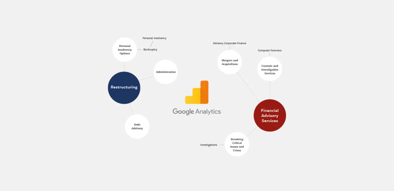

2. Terminology
The financial services industry has a wide range of specialised language which can often mean that it’s hard to deliver clear and simple messaging. Audiences can vary from industry professionals to potential clients that have no knowledge of what service they even need. When a user comes to your site without knowing your offer or your brand the business goal is to provide them with a solution. Too many things to focus on will mean that they can’t focus on any of them. Your company value will be lost.
In order to provide our client with the full picture of exactly how their terminology was performing we actioned the below:
- A comprehensive breakdown of Mazars department terminology alongside their key competitors so they could see exactly how the industry was communicating in comparison to themselves.
- Demonstration to how their current SEO was ranking for each of their specific service terms e.g if they were featured on page 1, page 2 etc.
- Creation of a detailed keyword forecast generated by AdWords for each of their potential Google search terms and their competitors comparative terms. This allowed the client to see what their potential audiences were searching for and then ensure that their site content included it.
This information was extremely valuable to the client as it allowed them to have a really clear understanding to how their terminology was performing. Unless content meets user intent, it’s very unlikely to rank highly on Google (meaning you could be missing out on valuable potential clients). We made recommendations on what changes could be made as well as creating an estimated budget for a marketing campaign around key search terms and competing ones.
3. Design
The design of your site is just as critical as the terminology. Creating a visual approach that supports your messaging helps users understand and engage with your brand. The design should support your user’s journey through the site, using clear call-to-actions to aide conversion rate optimisation. Responsive behaviour is also a must, according to eMarketer, 55% of survey respondents in the U.S. said they wouldn’t buy from a brand if its website or mobile experience was poorly designed.
In order to review the design for the client we pulled screenshots from key pages on their site and the comparative pages for competitors. This gave a visual overview of the marketplace and the visual language/style used within it, particularly focussing on how effectively the company demonstrated their process.
Results
Since completing this work our client has requested further analysis across different organisational departments. Understanding user behaviour is the most valuable tool in your digital arsenal; capturing users through search, presenting them with a clear offer, and supporting this with a strong and logical journey flow will lead to conversions, which ultimately means more business. Building a historical picture of your website performance means that you can build goals going forward and help develop your offering and increase your conversion rate. Get in touch today if this is something that you think can help your business and brand growth.
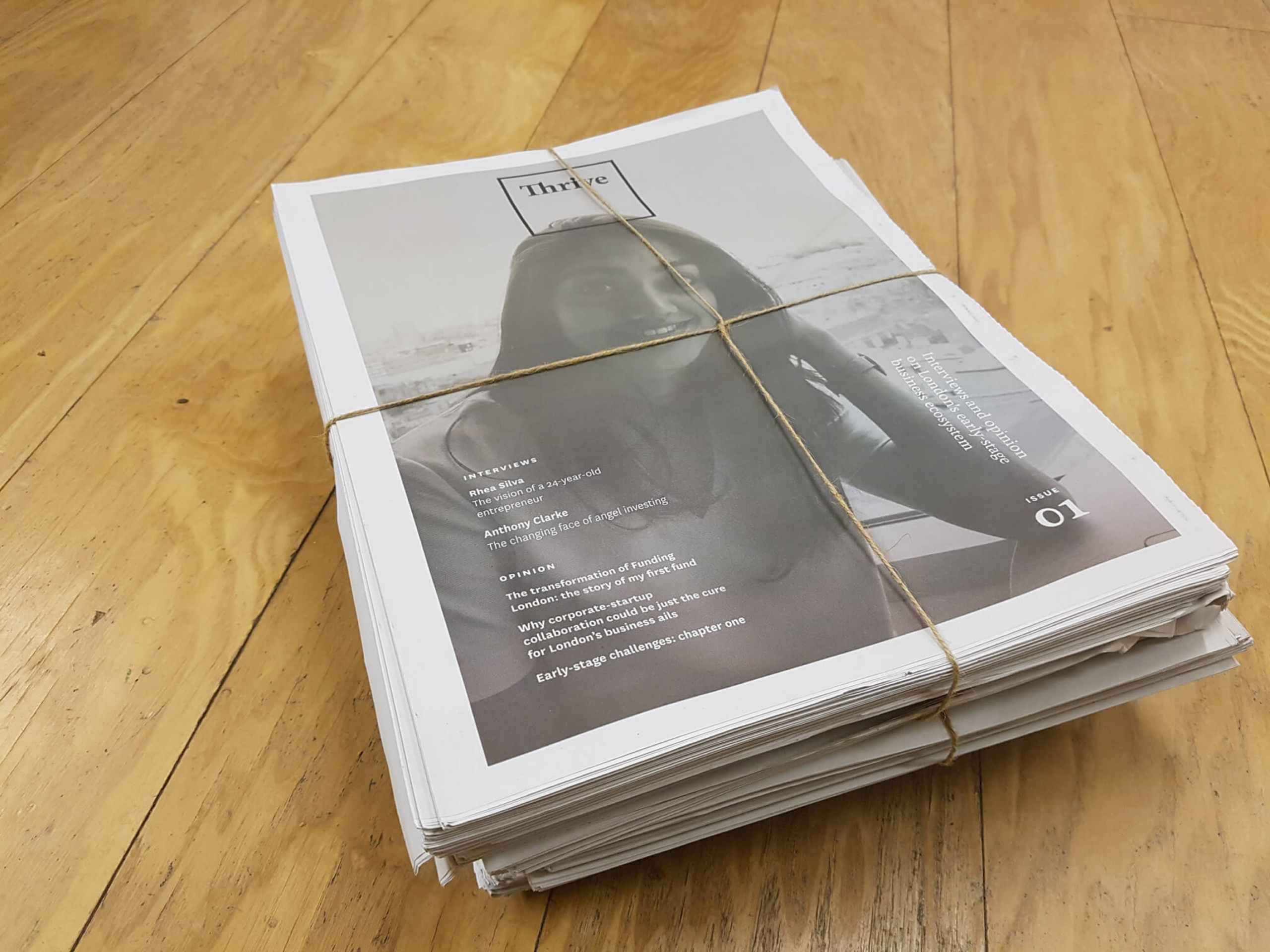
Thrive is an online journal that features interviews with and opinion from entrepreneurs, investors and industry experts. A mix of contributors from all areas of the industry is encouraged in order to spark genuine discussion about ongoing critical issues. While it showcases the effectiveness of successful ventures, it also encourages sharing lessons learned from missteps and unsuccessful projects.
Background
Funding London focus on bridging the funding gap for early-stage businesses in London. As part of their work with budding enterprises, they sensed a need for a resource for discussion and learning to illuminate the ever-evolving challenges for growing a successful business in London.As an ongoing partner with Funding London on their brand and website having won a nationwide procurement process, we were naturally excited to work with them to explore this new venture.
Together, we outlined the goals for the project and the kind of content that would be most useful to an early-stage audience. We determined that a set of interviews published each month and regularly added opinion pieces from expert contributors would be both relevant to the audience and feasible to achieve for the content creators. To maximise flexibility of content for possible contributors we set a brief for three types of assorted opinion pieces:
- Short quote/comment
- List of key points/top tips
- Extended thought piece
With a content plan in place we then worked with Funding London to create a strategy for building the brand. How would this product look and feel? How would it appeal to our intended audience and garner both readers and contributors?
Brand
We looked into what resources existed for early-stage businesses and found that what few there were didn’t focus heavily on the issues we were seeking to tackle. We sensed a space was open for establishing an intelligent brand voice to become a source of expertise on the early-stage market.
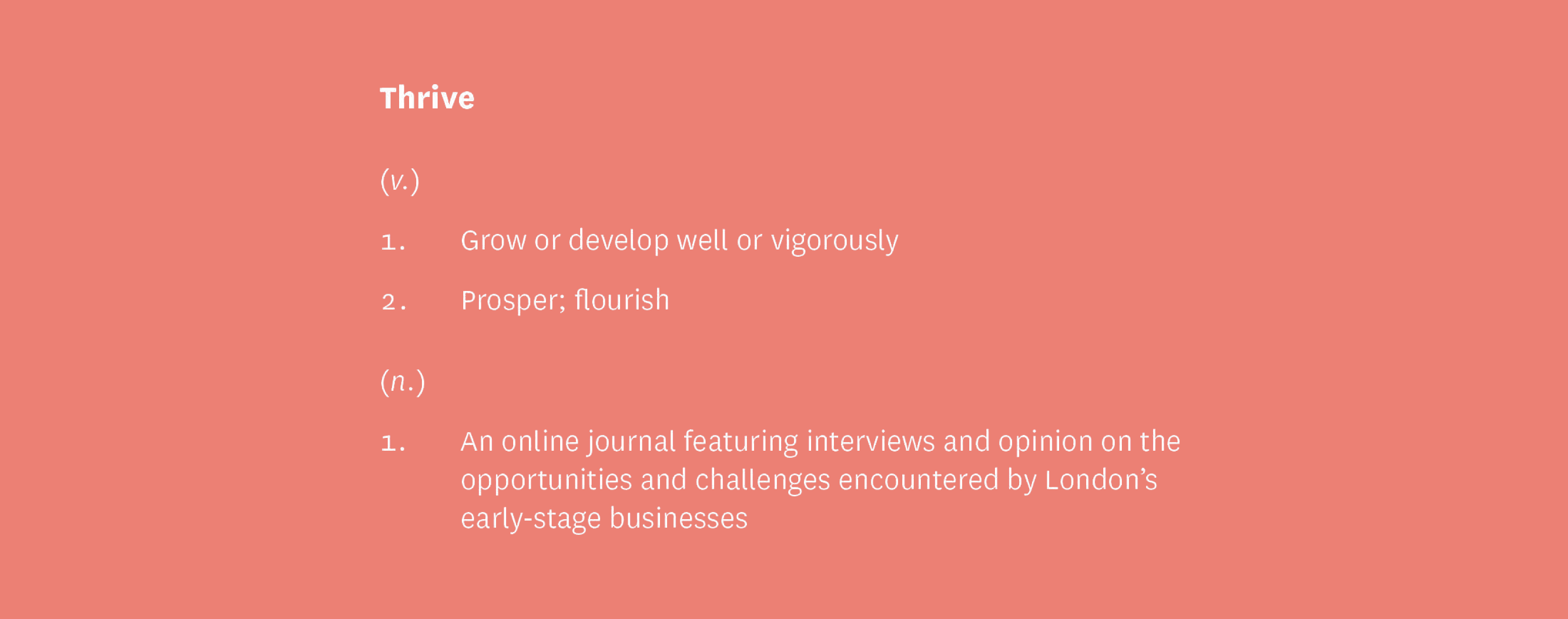
In addition to being a respected resource, we wanted to create a collaborative environment that encouraged the idea of mutual growth and participation. After going through a name selection process we chose Thrive to build on the idea of the flourishing early-stage environment that we were hoping to facilitate.
We created a custom set of illustrations of work-related paraphernalia in a hand-drawn style to bring a human touch to normally impersonal objects.

Build & launch
Shortly after establishing the core visual style we developed a brand deck to send out to Funding London’s network of contacts to build awareness and generate interest from possible contributors.
This first contact campaign to relevant contacts allowed us to gauge initial reactions to the brand and our messaging before we had launched the full site. This meant we could incorporate any relevant feedback into our ongoing development of the product before launch.
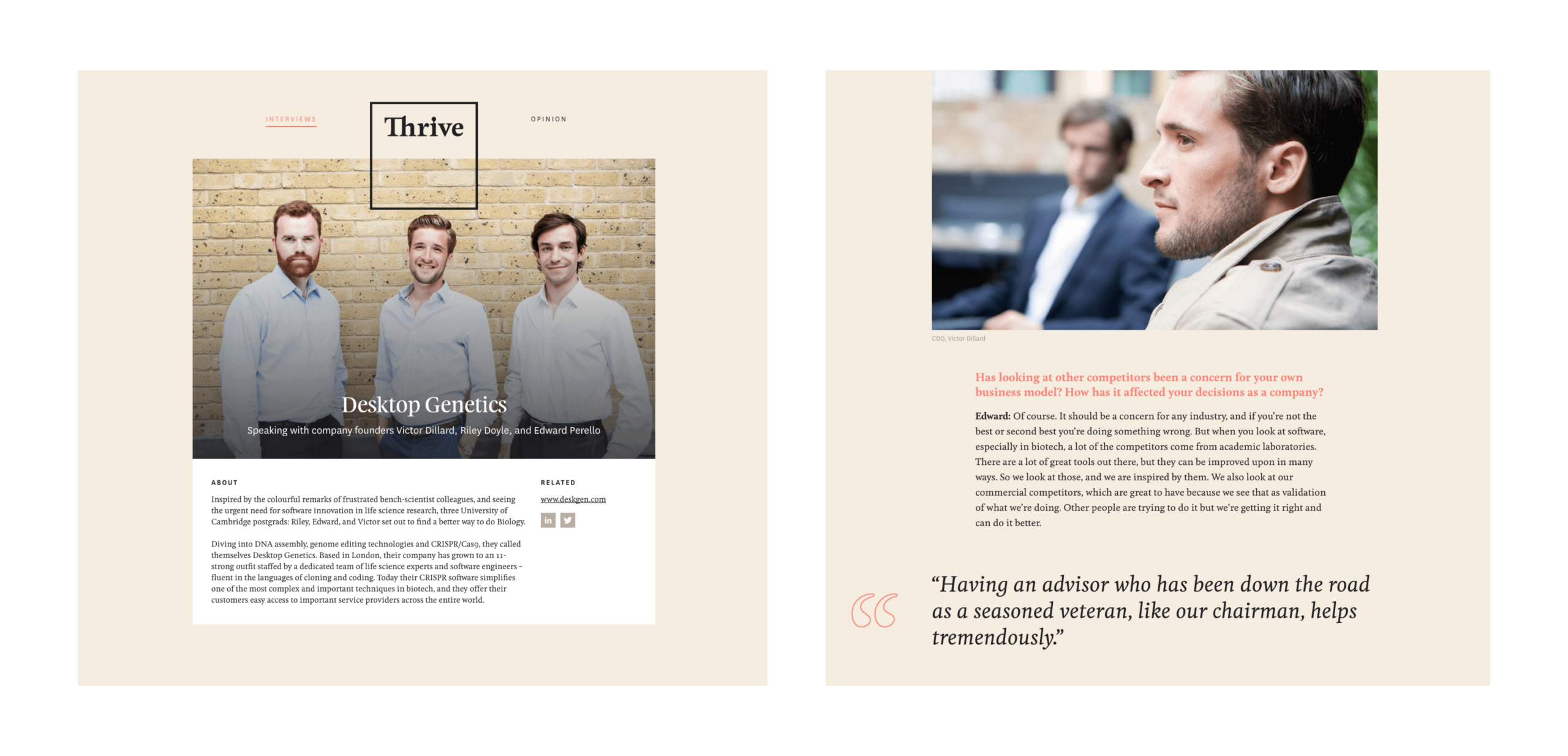
Working with Funding London, we attended interviews and editorially assisted with content production for the initial launch. We built and launched the site with content we had gathered both from internal writers at Funding London as well as pieces we had received from several outside contributors.
We supported the launch of the full site with the creation of a Mailchimp email marketing campaign – that could be customised directly by Funding London moving forward – with key messages and highlight content from the site to maximise exposure.
Printed publication
After a warm reception to the launch of the site and a steady flow of interested contributors we wanted to look at how we could continue to grow Thrive’s readership. With this in mind, we decided to create a physical publication using content from the site and distribute it at co-working spaces and early-stage incubator campuses across London. A printed product conceived and funded by Studiomade.
A new fintech concept
We were approached by instiHub’s founder to help develop the concept for a fintech product and build a viable, revenue-generating platform. We helped to map the blueprint, planning and validating how the product would work, as well as establishing the brand and tone for how the business would look and feel. Working closely with the founding team, we designed, tested and developed a ready-to-launch digital insight product for the asset management industry.
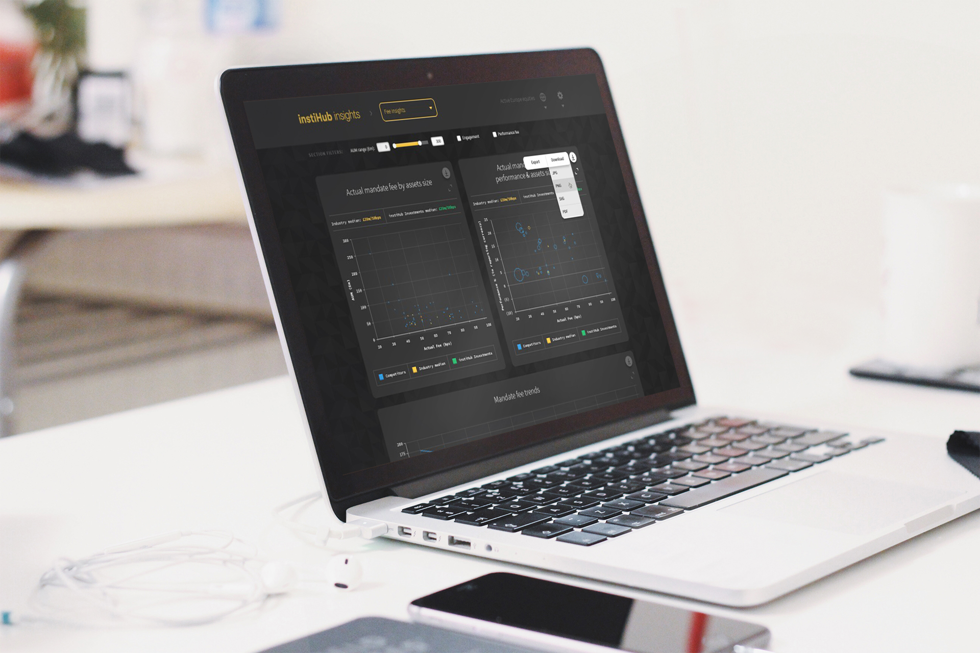
Our product creation was based on an entirely new technology infrastructure for the client. By reporting data derived from the values of actual mandates, we helped calculate performance comparators and forecasting functionality based on true market values as opposed to speculation based on aggregated performance data.

Refining the brief
From the beginning, we worked with instiHub to answer rigorous questions that would ensure we were all moving in the right direction. Who was this for, why would they use it, how would it be marketed, what were the future growth plans based on success, what kinds of visualisations and user flows did it need to tackle, and what is the value-add for the user?
Our questioning and the validation phase of work meant that both our team and instiHub’s team understood the reasoning behind each decision made, so that the end result was measured and tangible.

A data-led product
Our experience working with expansive datasets and architectures across finance, healthcare and technology has given us a robust and wide-reaching knowledge of data structure, visualisation and management. Sector-specific experience helped our team to quickly understand and interpret the needs of this project. The way we managed the data delivered the best result for the design and functionality of the product.
We designed a system infrastructure that could manage and deliver the data securely. Developing and implementing our own API logic, we helped devise the product schema and worked with instiHub’s technical leads to query their vast data library through efficient and scalable calls.
The result was an entirely new technology infrastructure for instiHub that positioned them with a digital platform that they can continue to build on.

Creating the brand’s look and feel
The branding had to be easily identifiable, to stand out in the market, but also flexible in how it can be used for data visualisation and user interface design. We built a clear specification that met the brand’s needs then crafted an approach that caters for bespoke charting, intricate data display, responsive digital environments, print advertising and online marketing.
Testing and launch
Data consistency was a vital part of this project’s success. Working through an iterative development and testing cycle, we stress tested various use scenarios. We ensured that shrouded data presentation and cross-brand comparisons were working correctly, the product was both stable and secure, all elements worked across different browsers and devices, and would continue to as the product grows.
We broke the testing into sprints, covering data validation, interrogating and manipulating the data filter system and the range of data presentations. Then in the launch phase, we supported instHub with marketing collateral to raise brand and product awareness.

Building for tomorrow
We helped instiHub take an idea from concept to full product and brand build and launch. Supporting their team with the following services, we co-created a revenue-generating platform in the asset management space:
- Strategic brand positioning
- Brand creative
- Digital product UI, UX design
- Database architecture, API creation and prototyping
- Digital development and build
- Product launch
instiHub has continued to expand on what our team built, and was acquired by AllFunds in 2022.